Indicator
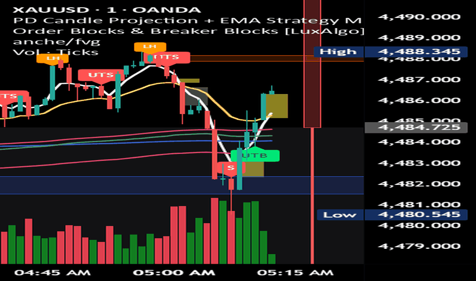
Quartile Footprint Bubbles @MaxMaseratiQuartile Levels Volume Acceptance/Rejection @MaxMaserati
This highly technical order flow tool merges quartile-based market structure with intrabar footprint analytics. It reveals the exact micro-price levels where liquidity resides and exposes whether buyers or sellers are seizing control at critical structural boundaries.
─── QUARTILE MARKET STRUCTURE ───
The indicator calculates the absolute trading range over a defined lookback period and mathematically divides it into four equal quartiles, projecting five dynamic structural zones:
100% (Upper Extremity) — Extreme Bearish Dynamic Resistance * 75% (Upper Quartile) — Bullish Dynamic Range / Support
50% (Midpoint) — Dynamic 50% Range / Equilibrium
25% (Lower Quartile) — Bearish Dynamic Range / Resistance
0% (Lower Extremity) — Extreme Bullish Dynamic Support
These quartile boundaries act as algorithmic tripwires. When price touches any of these levels, the indicator activates its footprint engine.
─── EXACT INTRABAR POC ───
Unlike basic indicators that plot blindly on the high or low of a candle, this tool scans a Lower Timeframe (LTF) inside the live bar to locate the exact Point of Control (POC).
Bubbles and text labels are plotted precisely at the micro-level where the heaviest volume transacted, revealing hidden pockets of liquidity just above or just below the quartile lines.
─── CONCENTRIC FOOTPRINT BUBBLES ───
When a quartile line is tested, concentric bubbles appear at the POC, sized dynamically using an advanced 5-tier percentile algorithm (50th, 75th, 90th, and 97th percentiles) to filter out market noise:
Outer Bubble (Volume Mass): Represents total market participation. A massive outer bubble indicates intense liquidity and institutional interest.
Inner Bubble (Delta Pressure): Represents the true bid/ask delta. Green indicates aggressive buying dominated the POC; Red indicates aggressive selling dominated.
Dual Text Labels: Cleanly displays the Total Volume (top, neutral color) over the Net Delta (bottom, colored) directly at the POC coordinate.
─── HOW TO TRADE IT ───
Defending the Extremes: Look for large green inner bubbles at the 0% or 25% quartiles (buyers defending support) and large red inner bubbles at the 75% or 100% quartiles (sellers defending resistance).
The 50% Equilibrium: The 50% Structural Pivot dictates trend context. Price holding above it with green bubbles on pullbacks is bullish. Price holding below it with red bubbles on retracements is bearish.
Spotting Absorption: A massive outer volume bubble containing a tiny inner delta bubble means huge volume was traded, but neither side won decisively. This signals institutional absorption, not a directional breakout.
─── KEY SETTINGS ───
Structure Lookback: The rolling window used to calculate the highest highs and lowest lows for the quartile grid.
LTF Resolution: The micro-timeframe used to scan for the Intrabar POC and Delta (e.g., 1-minute is optimal for a 15-minute chart).
Bubble Size Offset: Shift the visual scaling of all bubbles up or down (+1 to enlarge, -1 to shrink) to perfectly fit the visual density of your specific asset.
Targeted Toggles: Individually turn specific quartile lines, outer/inner bubbles, and text labels on or off for a perfectly clean workspace. Indicator

50% High-Probability M15 WicksDescription
This indicator isolates high-probability liquidity grabs and institutional reference points by tracking M15 (15-minute) candle wicks that exhibit unusual size and volume. It automatically calculates and projects the 50% equilibrium level of these specific wicks as key horizontal support/resistance areas.
Engineered for multi-temporal flexibility, it allows you to scale down to lower execution timeframes (M1, M5) or up to macro views (H1, H4) while maintaining the precise M15 levels fixed on your chart.
What it tracks & Why:
High-Probability Wick Filter: It calculates the average wick size over a specific period and only triggers when a 15-minute wick exceeds this average by a custom multiplier, ensuring it only flags significant market expansions.
Liquidity Sweeps: It validates the setup by confirming that the wick successfully swept the previous candle's high or low, signaling a true hunt for stops before a reversal.
Smart Proximity Mitigation: To maintain a clean workspace and avoid false signals, the indicator automatically deletes active levels in real-time if the price mitigates the 50% level or approaches it within a custom % ATR threshold (pre-mitigation zone).
Key Features:
True MTF Precision: Swap between any timeframe without lines shifting, breaking, or disappearing.
Real-time Price Labels: Displays floating current prices next to active levels for quick execution.
Fully Customizable Visuals: Easily toggle line styles (dotted, dashed, solid), thickness, transparency, and text sizes directly from the settings menu. Indicator

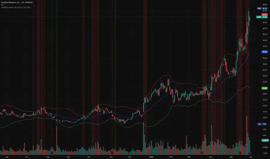
V-AEMA VMR [LB]Concept
The V-AEMA VMR (Volume-Adaptive Exponential Moving Average with Volatility-Modulated Regime) is a hybrid trend-following indicator that combines an EMA baseline with a volatility-based drift component. It produces a dynamic core line whose colour reflects the trend regime, surrounded by two levels of adaptive bands that expand or contract based on volume intensity. The indicator generates directional entry signals when price breaks the first band in the direction of the trend, and projects take-profit zones when price fully exits both bands.
Mathematical Foundation
The core line (Hybrid Line) is a weighted blend of a standard EMA and a volatility-shifted version of that same EMA :
HybridLine = EMA * W + (EMA + Drift) * (1 - W)
where the drift is derived from the Z-Score of price relative to the EMA, scaled by ATR :
Drift = Z_Score * ATR * 0.35
Z_Score = (Price - EMA) / StdDev(Price, L_vola)
Band width starts from a base volatility measure combining standard deviation and ATR :
BaseWidth = StdDev * 0.65 + ATR * 0.35
This base is then adjusted by a volume ratio and user-defined multipliers :
UpperWidth = BaseWidth * (BaseUpMult + (VolRatio - 1) * VolImpactUp)
LowerWidth = BaseWidth * (BaseDnMult + (VolRatio - 1) * VolImpactDn)
where VolRatio = min(max(Volume / SMA(Volume, L_vol), 0.35), 2.50) .
Two band levels are generated : Band 1 at HybridLine +/- Width, and Band 2 (extreme) at HybridLine +/- Width * 1.55 (upper) / 1.40 (lower).
What Problem Does It Solve ?
Conventional envelope indicators (Bollinger Bands, Keltner Channels) apply fixed multipliers to a single volatility metric and ignore volume dynamics. The V-AEMA VMR adapts its band width to both volatility and volume surges, producing wider bands during high-participation moves and narrower bands during quiet periods. The hybrid core line reduces pure EMA lag by incorporating a volatility offset, while the dual-band structure filters signals by strength : a break of Band 1 triggers an entry, while a break of Band 2 confirms an explosive move and projects a take-profit zone.
How To Interpret
Core line colour – cyan/green indicates the hybrid line is rising (bull regime) ; magenta/red indicates it is falling (bear regime).
Cloud and bands – the area between Band 1 and Band 2 forms a halo that thickens when volume expands. Narrow bands suggest low conviction or consolidation.
Entry signals – a triangle appears below the bar when price crosses above Upper Band 1 while the hybrid line is rising (long). A triangle appears above the bar when price crosses below Lower Band 1 while the hybrid line is falling (short). These signals are confirmed by the trend direction.
Take-profit zones – when the entire bar (high and low for shorts, low and high for longs) clears the extreme band (Band 2) in the direction of the signal, a coloured box is projected forward. The box represents a potential target zone based on the breakout amplitude and ATR, scaled by the TP Factor.
Info panel – displays the current regime (BULL/BEAR), the volume ratio (values above 1.0 indicate above-average participation), and the current upper/lower deviation values in price units.
Parameters
EMA Length – period of the base exponential moving average (default 55).
Volatility Length – period for the standard deviation used in the Z-Score calculation (default 34).
Volume Length – period for the volume moving average used in the volume ratio (default 34).
EMA Weight – blend ratio between the pure EMA and the volatility-drifted version. Higher values produce a smoother line ; lower values make it more reactive to volatility (default 0.80).
Upper Base Deviation – core multiplier for the upper band width before volume adjustment (default 1.55).
Lower Base Deviation – core multiplier for the lower band width before volume adjustment (default 1.05).
Volume Impact Upper/Lower – sensitivity of the upper and lower bands to the volume ratio. Higher values make bands expand more aggressively when volume surges (default 0.95 / 0.55).
ATR Length – period of the Average True Range used in band width and TP zone calculations (default 14).
Show Cloud – toggles the filled areas between bands.
Show Info Panel – toggles the real-time dashboard.
Show Signals – toggles the entry triangles.
Show TP Zones – toggles the take-profit projection boxes.
TP Projection Bars – how many bars forward the TP zone extends.
TP Factor – scales the height of the TP zone relative to the breakout range.
Max Historical TP Zones – limits the number of TP boxes kept on the chart.
Reference
This indicator is a proprietary design synthesising concepts from adaptive moving averages (Kaufman, Ehlers), volatility envelopes (Bollinger, Keltner), and volume-weighted band models. It does not correspond to a single academic publication. Indicator

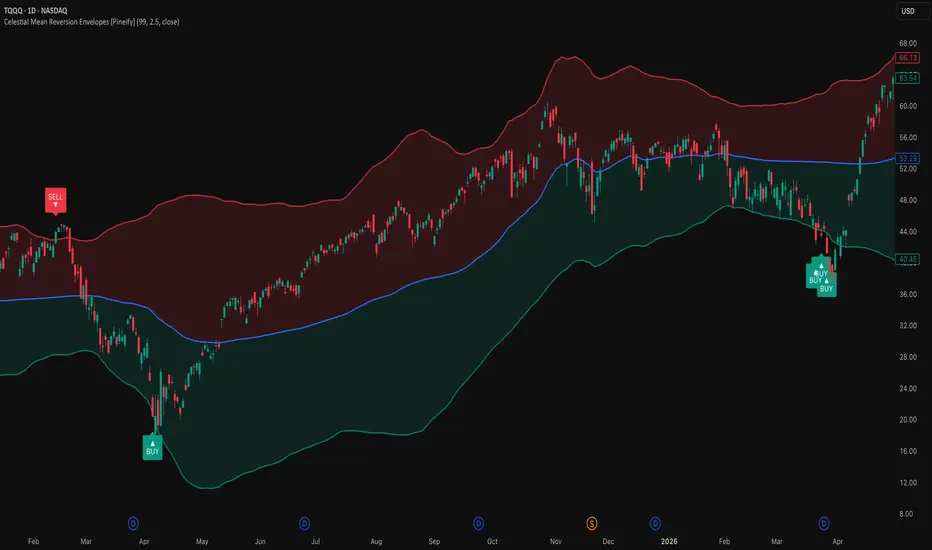
Celestial Mean Reversion Envelopes [Pineify]Celestial Mean Reversion Envelopes
This indicator identifies mean reversion opportunities by wrapping an adaptive moving average in standard deviation envelopes and signaling when price snaps back inside after piercing a band. Rather than using a fixed-period moving average as the baseline, the central line adapts its speed based on how frequently price is setting new highest highs or lowest lows — it tracks price quickly in trending conditions and almost freezes in ranges, so the bands shift organically with market character.
Key Features
Adaptive mean that responds to trend intensity rather than time alone — sluggish during consolidation, responsive during strong moves
Standard deviation envelopes calibrated to actual recent volatility, not fixed ATR multiples
Buy and sell signals generated on band crossunders/crossovers, confirming the reversal rather than anticipating it
Translucent overbought/oversold shading between the mean and each band for quick visual context
Built-in alerts for both reversion directions
How It Works
The calculation runs in two stages: first building the adaptive mean, then constructing the envelopes around it.
Extreme tracking — On each bar, the indicator checks whether a new highest high or lowest low has formed over the lookback window. Bars where a fresh extreme appears are marked with a value of 1; all other bars get 0. The SMA of these binary values over the same window gives the fraction of recent bars that produced a new extreme.
Squaring the fraction — Raising that fraction to the power of 2 produces a nonlinear smoothing coefficient. When trends are strong and new extremes appear on most bars, the coefficient approaches 1 and the adaptive mean tracks price closely. In a choppy range where few new extremes form, the coefficient collapses near zero and the mean barely moves. This technique is inspired by TRAMA (Trend Regularity Adaptive Moving Average) by e2e4mfck.
Adaptive mean update — Each bar the mean nudges toward the source price by the amount determined by the coefficient. The result is an average that effectively switches between "responsive" and "parked" behavior depending on what the market is doing.
Standard deviation envelopes — The upper and lower bands are placed at ±(StdDev × multiplier) from the adaptive mean, where StdDev is computed over the same lookback period. This makes the band width proportional to recent volatility: wider when price has been swinging, tighter during quiet periods.
Signal generation — A buy signal fires when source crossesunder the lower band (price dipped below, then closed back above it). A sell signal fires on a crossover of the upper band. The crossunder/crossover logic requires price to actually breach and then retrace — a bar that merely touches the band without closing through it does not trigger.
How the Components Work Together
The adaptive mean solves a problem that conventional envelope indicators ignore: when a market trends hard, a static EMA or SMA falls behind, making the upper band a poor reference for "too far, too fast." Because the adaptive mean accelerates during trends, the envelopes stay anchored to current price levels rather than lagging. This means the bands are more likely to represent genuine statistical extremes rather than just momentum riding.
The standard deviation layer adds a second dimension. Instead of a fixed pip or percentage offset, the band width expands when the market is volatile and contracts when it is calm — naturally suppressing signals during low-volatility compression and allowing wider moves during active sessions before flagging exhaustion.
Together these two layers create a filter that roughly says: "price reached a statistically unusual distance from where the trend currently sits, then pulled back." That combination reduces fakeout signals compared to using static bands on a lagging baseline.
Trading Ideas and Insights
On higher timeframes (daily, 4H), buy signals at the lower band that coincide with a key support level or volume spike may offer higher-confidence entries. Look for the adaptive mean to be flattening — it suggests the trend is pausing rather than reversing.
In intraday trading, signals that appear after a sharp impulsive leg tend to perform better than signals generated inside a choppy range. The adaptive mean will often be steeply sloped after an impulse, indicating the signal is against the micro-trend — exercise more caution and use tighter risk.
When price oscillates between the bands repeatedly without triggering signals, the market is likely in a low-volatility squeeze. A breakout attempt that immediately pulls back (triggering a sell or buy signal) at the edge of that range can mark the failed breakout early.
The gradient fill zones serve as a running reference for where price stands relative to the mean. Price persistently in the upper (red) fill with a rising adaptive mean suggests a strong trend; consider fading only when price crosses back into the neutral zone.
Past performance of any signal pattern does not guarantee future results. Always combine signals with broader context — structure, volume, and higher-timeframe bias. These signals indicate potential exhaustion; they do not predict reversal magnitude.
Unique Aspects
The squaring of the trend-regularity fraction is the core differentiator. Most adaptive averages use linear coefficients; squaring creates a much sharper distinction between trending and ranging states, so the mean spends more time "frozen" during ranges and snaps to price quickly when momentum genuinely kicks in.
Signals require price to close back inside the band, not just touch it — this one-bar confirmation step reduces noise from wicks that briefly pierce a band and immediately reverse without a real close-to-close move.
Band width is purely standard-deviation based rather than ATR-derived, which means the scaling responds to the actual statistical dispersion of the source series rather than the high-low range. On instruments with many gaps this can produce meaningfully different widths than ATR bands.
How to Use
Add the indicator to any chart. It overlays directly on the price pane.
The blue line is the adaptive mean. When it is rising steeply the market is in an upward trending mode; when flat or slightly sloped, it is ranging.
The red-shaded zone above the mean is the overbought area; the green-shaded zone below is the oversold area. Price spending extended time in one zone suggests momentum, not necessarily exhaustion.
A green BUY label below a bar means price closed back above the lower band after briefly breaking it — potential reversion entry. A red SELL label above a bar means the opposite.
To set alerts, use the "Buy Alert" or "Sell Alert" conditions from the indicator's alert panel (Once Per Bar Close recommended to avoid premature triggers on intrabar wicks).
Customization
Adaptive Mean Length (default: 99) — Controls both the highest/lowest lookback and the SMA averaging window for the smoothing coefficient. Higher values slow the mean considerably and widen bands; lower values increase reactivity but also produce more frequent and less reliable signals.
Envelope Multiplier (default: 2.5) — Scales the standard deviation distance. 2.0 suits instruments with tighter typical ranges; raise to 3.0+ on highly volatile assets to avoid constant band touches that don't represent genuine extremes.
Source (default: close) — Change to hl2 or hlc3 to incorporate high and low into the baseline; close is typically sufficient for most reversion setups.
Color inputs — Adjust bullish/bearish/mean colors and toggle the gradient fill on or off depending on visual preference.
Conclusion
Celestial Mean Reversion Envelopes pairs an adaptive mean that adjusts its responsiveness to trend regularity with volatility-scaled deviation bands, targeting the specific moment when a stretched move closes back inside its statistical boundary. The approach is best suited to traders who wait for confirmation — the crossunder/crossover trigger ensures you're acting on a completed reversal bar, not an open wick. As with any mean-reversion tool, it works best when context confirms the extension is exhaustion rather than breakout continuation.
Indicator

Market Breadth Trend StrategyOverview
Many traders focus on major indexes such as the S&P 500 or Nasdaq when evaluating market conditions. While indexes show overall price movement, they do not always reflect how broadly that movement is supported across the market.
Market breadth is a way of studying participation. It can help traders understand whether strength or weakness is concentrated in a small group of stocks or spread across a wider portion of the market.
A market move supported by broad participation may provide different context than a move driven by only a few heavily weighted stocks.
Understanding Market Participation
Market breadth generally refers to the number of securities contributing to a market move.
Examples of breadth-related observations include:
The balance between advancing and declining stocks
The number of stocks reaching new highs or lows
The percentage of stocks trading above key moving averages
These measurements can provide additional perspective alongside price action and trend analysis.
Why Traders Monitor Breadth
Participation Matters
Strong participation may indicate that market activity is occurring across a wider group of stocks rather than being concentrated in a few names.
Additional Context
Breadth can be used as a supplementary tool when evaluating trends, momentum, and overall market conditions.
Market Observation
Some traders monitor breadth metrics to better understand changes in participation over time and how those changes compare with index performance.
Strategy Concept
This script uses a simplified breadth-style proxy derived from the chart's relationship to a long-term moving average.
It is important to note that this script does not use actual exchange-wide market breadth data. Instead, it creates a participation-style filter using price behavior on the current chart.
The strategy combines:
Trend identification using moving averages
A breadth-style participation filter
ATR-based risk management
The objective is to demonstrate how participation concepts can be incorporated into a trend-following framework for research and testing purposes.
Important Notes
This script uses a simplified participation-style filter and is not a substitute for exchange-wide breadth indicators.
Results will vary across symbols, timeframes, and market conditions.
The script is intended for educational, research, and testing purposes.
Disclaimer
This script is provided for educational and research purposes only. It demonstrates one way to combine trend analysis with a breadth-style participation filter. It is not financial advice and should be tested across different symbols, market conditions, and timeframes before being used in any trading workflow.
This version avoids performance claims, avoids implying predictive ability, and clearly explains the limitations of the breadth proxy. Strategy

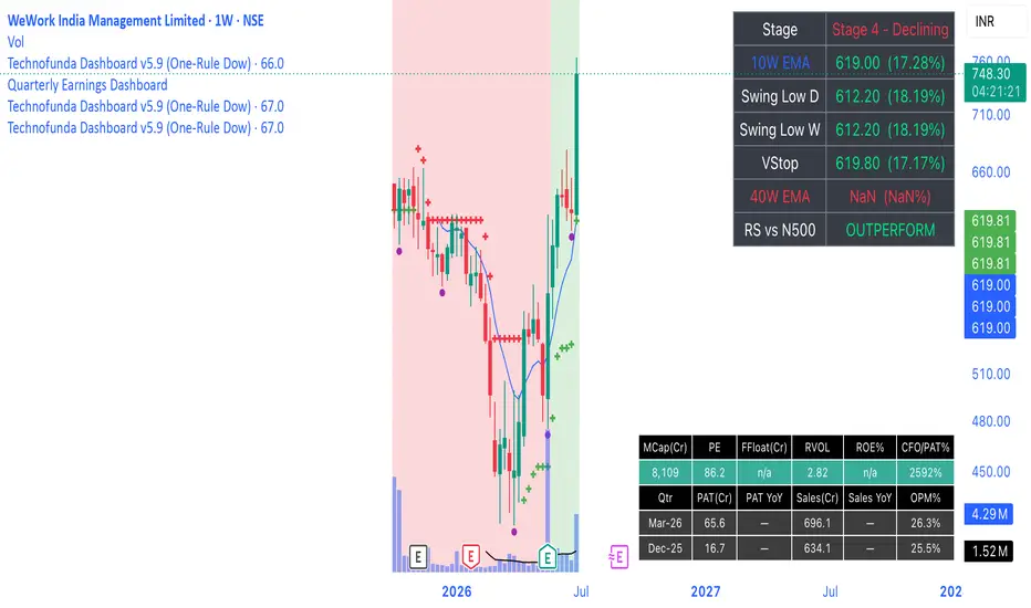
Technofunda Here's what the **Technofunda Dashboard** indicator does, feature by feature:
**1. VStop (Volatility Stop) — feature 1**
ATR(20) × 2 trailing stop, plotted as dots that track price: green dots below the candles when the trend is positive (LONG), red dots above when negative (SHORT). It flips when price crosses the stop. Built with na-safe guards so it computes correctly from the start.
**2. Auto-switching moving averages — feature 5**
The indicator detects your timeframe automatically: on a daily chart it shows 21 / 50 / 200 **SMA**; on a weekly chart it switches to 10 / 20 / 40 **EMA**. Three lines — fast (aqua), medium (orange), trend (fuchsia).
**3. Distance from the MAs — feature 2**
A table (top-right) shows how far price is from each MA, measured down from price to the MA as a % of price — positive when above, negative when below, colour-coded green/red.
**4. Weinstein Stage — feature 3**
Classifies the stock into Stage 1 (Basing), 2 (Advancing), 3 (Topping) or 4 (Declining) using the long-term MA (200 DMA / 40W EMA) and its slope: price above + MA rising = Stage 2, etc. Shown in the table, colour-coded.
**5. 52-week high / low — feature 4**
Green triangle above a bar that makes a new 52-week high, red triangle below a bar that makes a new 52-week low (252 bars on daily, 52 on weekly). The table also shows current distance to the 52W high and low.
**6. Relative strength vs Nifty 500 — feature 6**
Compares the stock to a benchmark (default `NSE:CNX500`) over a lookback window. The chart background tints light green when outperforming, light red when underperforming, and the table shows OUTPERFORM / UNDERPERFORM.
**7. Per-candle letter states — feature 7**
Each candle is tagged with one letter based on its live condition:
- **A** — VStop positive (baseline / just flipped up)
- **B** — positive *and* beating Nifty 500 by ≥5%
- **C** — positive *and* beating Nifty 500 by ≥10%
- **X** — VStop negative (baseline)
- **Y** — negative *and* price below the medium MA (20W EMA / 50 DMA)
- **Z** — negative *and* price below the slow MA (40W EMA / 200 DMA)
Higher tiers win (a stock up 12% shows C, not A+B+C; one below the 40W EMA shows Z, not X+Y). The 5% / 10% thresholds are adjustable inputs.
**Extras**
A summary table consolidating MA distances, Stage, VStop status, RS status and 52W proximity; alerts for VStop flips and new 52-week highs/lows; and editable inputs for ATR length/multiplier, benchmark symbol, RS lookback, B/C thresholds, and MA slope length.
Indicator

Indicator

Adaptive Regime Detector [4-State] [TSL]════════════════════════════════════════════════════════════
RELEASE NOTES — paste into TradingView's "Publish update" box
Script: Adaptive Regime Detector
Version: v1.3 — Volume Z-Score & High-Conviction Alerts
════════════════════════════════════════════════════════════
v1.3 — Volume Z-Score & High-Conviction Alerts
Added a same-time-of-day volume z-score reading to the dashboard, plus a new alert that fires when unusual participation lines up with a favorable regime.
The regime engine tells you WHAT kind of market you're in. The anchored VWAP from v1.2 tells you WHERE fair value sits within it. Neither answers WHO is actually showing up at the current bar. A trending regime on thin volume is a different trade than the same regime on conviction flow — and the z-score is what makes that distinction visible at a glance.
Implementation matches the standalone Volume Z-Score Readout: the script tracks the volume seen at each bar's position within the session across the trailing 21 sessions, then computes z = (current volume − same-time-of-day mean) / same-time-of-day stdev. The 09:30 cash open is benchmarked against past 09:30 opens, the lunch lull against past lunch lulls. Volume that's "high" only counts as unusual for that specific moment.
New "Volume Z-Score" input group:
· Show volume z-score row (default on) — adds a row to the dashboard with the live signed z-score, color-coded by tier: gray for |z| under 1.0, blue for 1.0 to 2.0, orange for 2.0 to 3.0, red for 3.0 and above. Displays "—" until at least 5 sessions of data have accumulated at the current slot.
· Sessions for baseline (default 21) — number of past sessions used for the mean and stdev calculation. 21 ≈ one trading month.
· High-conviction z threshold (default 2.0) — z-score above which counts as unusual enough to alert.
· Alert on high-conviction setups (default on) — fires once when the z-score crosses above the threshold WHILE the regime is TREND or TREND+VOL. Uses the same transition-detection pattern as the regime-change alert, so you won't get spammed on every bar where the condition continues to hold.
The dashboard auto-resizes between 7 and 8 rows based on whether the z-score row is shown — toggle it off and the table is identical in layout to v1.2. Existing dashboard position and size preferences carry over unchanged.
No changes to the regime classification engine or the anchored VWAP. Percentile scoring, the confirmation buffer, VWAP anchor logic, and the existing regime-change alert all behave identically to v1.2. The z-score is additive — disable it and the indicator behaves exactly as it did before the update. Indicator

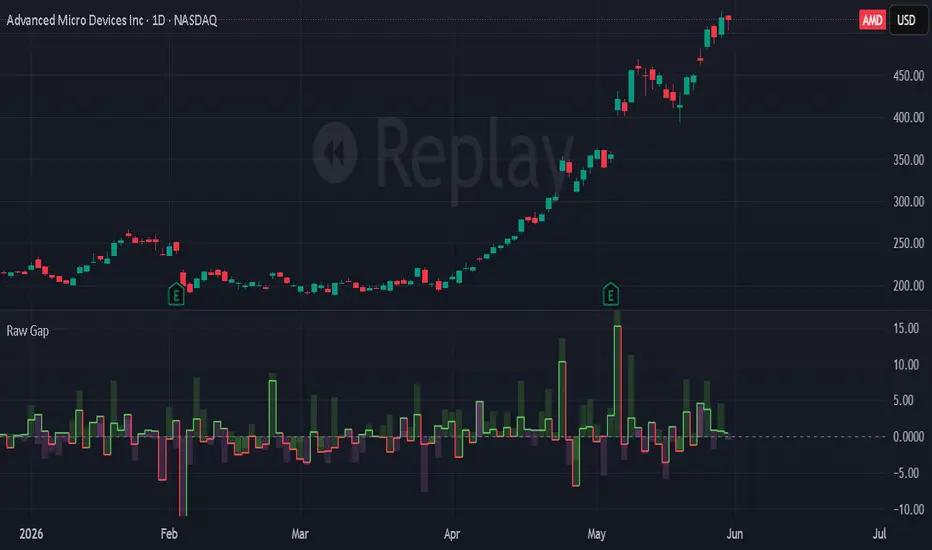
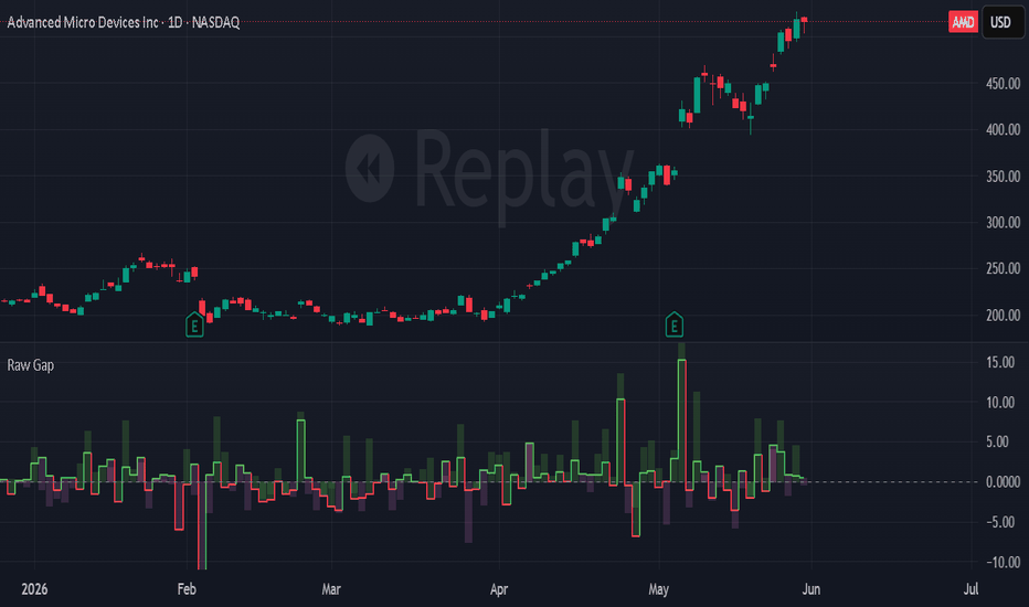
Gap [Zemu]Gap
1. Description
Zemu is a gap continuation indicator focused on the relationship between overnight displacement and intraday follow-through. The indicator visualizes whether the opening imbalance was accepted, rejected, or faded during the session by comparing the gap against the subsequent intraday move. The goal is structural clarity, using a compact visual format to make continuation and failed continuation regimes easier to identify.
2. Features
Zemu plots the opening gap as a stepped bar structure, allowing overnight displacement to remain visually persistent throughout the session. Intraday follow-through and the combined net position are plotted as column structures using directional coloring derived from the intraday move. This allows continuation, disagreement, and reversal states to remain visually distinct without additional overlays or complexity.
Gap Calculation:
(Open - Previous Close) / Previous Close
Intraday Move:
(Close - Open) / Open
The indicator intentionally uses a minimal visual architecture focused on readability and interpretation.
3. Context
Overnight session gaps and subsequent intraday continuation dynamics are most pronounced due to exchange-based trading hours. Whilst primarily designed for stocks on the daily timeframe, this indicator can also be applied to indices, futures, and forex markets, although gap behavior in these instruments may exhibit weaker continuation characteristics depending on session overlap and trading structure. Cryptocurrency markets are generally less suited to the framework due to their continuous 24/7 trading environment.
4. Framework
Zemu is part of the ETMassif framework that is focused on price displacement and participation. Related work within the same research space examines how volume and price vectors interact during and after gap events, how wick-local participation reveals institutional activity at price extremes, and how persistent gap and wick levels continue to influence price structure over time.
日本語概要 (Japanese Summary)
Zemuは、ギャップ(窓開け)と当日の値動きの関係を可視化するためのインジケーターです。寄付き後にトレンドが継続したのか、ダマシ(失敗)に終わったのか、あるいはもみ合い(吸収)となったのかをシンプルな構造で表示します。ギャップはステップ(階段)構造として表示され、日中の値動きと合成されたネットポジションはカラム(柱状)形式で描画されます。視認性と構造の把握を重視し、不要な複雑化を避けた設計となっています。
中文概要(Chinese Summary)
Zemu 是一款用於分析跳空缺口與日內走勢關聯性的指標。本指標透過比較跳空缺口(Gap)與後續的日內走勢,藉此觀察市場對開盤失衡的延續、失敗或反轉表現。缺口以階梯式結構呈現,日內延續與淨位移則以柱狀圖(Column)形式顯示。整體設計強調簡潔、高可讀性與價格結構本身,避免過度複雜化。
Disclaimer:
This script is a research tool for market structure analysis and educational purposes only. It does not constitute financial advice. Trading involves risk. Indicator
Explainable Quant Scorecard [TradeDots]Explainable Quant Scorecard
Summary
This indicator computes a composite 0 to 100 evidence score by combining seven independent normalized sub-scores: Trend, Momentum, Volatility Regime, Participation, Relative Strength, Exhaustion Risk, and Multi-Timeframe Alignment. The composite is regime-dependent: when ADX indicates a trending regime, the trend and momentum weights are boosted; when ADX indicates a range regime, the exhaustion-risk weight is boosted instead. All factor weights are exposed as inputs so the model is fully auditable and tunable. A flagship dashboard panel displays every sub-score, the composite, the active regime, and a one-line interpretation.
The intent is to give traders a transparent multi-factor reading on every bar rather than another single-indicator signal. The composite is an evidence score, not a probability or prediction.
What is original here
Composite indicators that mash several oscillators together exist in the public library. This script's contributions are:
Honest factor separation. Each sub-score measures a different dimension (trend, momentum, volatility, participation, relative strength, exhaustion, multi-timeframe). Many composites silently combine correlated readings (such as two momentum oscillators) and present the result as if it were multi-factor confirmation. This script's seven factors are deliberately chosen to be diverse.
Regime-dependent weighting. The composite is not a fixed weighted average. When the market is trending, trend and momentum factors carry more weight; when ranging, exhaustion-risk carries more. This addresses the well-known problem that trend-following inputs and mean-reversion inputs should not be weighted equally in all conditions.
Sub-score divergence detection. The script tracks the maximum deviation of any sub-score from the composite. A large deviation triggers a "sub-score divergence" alert, warning the trader that the factors disagree even when the composite looks clean.
Full transparency. All weights, all thresholds, and the regime trigger levels are user inputs. No black-box.
How it works
Each bar, seven sub-scores are computed.
1. Trend score. EMA slope over a configurable lookback, normalized to 0 to 100 via min-max over a percentile window.
2. Momentum score. Rate-of-change of close over a configurable length, min-max normalized.
3. Volatility regime score. Bollinger Bandwidth percentile mapped to a discrete numeric: compressed BBW (below the lower threshold) maps to 30, expanding BBW (above the upper threshold) maps to 70, normal BBW maps to 50. A label ("Compressed", "Normal", "Expanding") is generated alongside the numeric.
4. Participation score. Volume percentile multiplied by a close-location alignment factor. For a bullish-direction reading, a close near the bar's high earns full alignment; for a bearish-direction reading, a close near the bar's low. The result is a 0 to 100 score that rewards volume and direction-consistent closes.
5. Relative strength score. The asset's return over a configurable horizon, minus the benchmark's return over the same horizon, divided by the asset's own volatility. The result is percentile-ranked over a longer lookback (default 252 bars) to produce a 0 to 100 reading. The benchmark symbol is a user input.
6. Exhaustion risk score. Distance from the trend EMA in ATR units, mapped inversely to 0 to 100 (high exhaustion gives a low exhaustion-score, which is consistent with the convention that high scores are "good" for the composite). The dashboard inverts the label so users see "Exhaustion: High" rather than "Exhaustion: 20".
7. Multi-timeframe alignment score. The trend direction (EMA-fast vs EMA-slow) is fetched at three user-configurable higher timeframes. Each HTF's agreement with the chart-timeframe direction contributes 100, 50, or 0 to the alignment score. The final factor is the average across three timeframes.
The composite is the weighted average. When regime_weighting is enabled and ADX indicates a trending regime (above the user threshold), the trend and momentum weights are multiplied by 1.5 and the exhaustion-risk weight by 0.5. When ADX indicates a range regime (below the lower threshold), the trend and momentum weights are multiplied by 0.5 and the exhaustion-risk weight by 1.5. In a "Mixed" regime, weights are unchanged.
A four-line interpretation is assigned by composite range:
75 or higher : "Constructive, multi-factor agreement"
60 to 74 : "Mixed but constructive"
40 to 59 : "Mixed — wait for alignment"
below 40 : "Bearish or unclear"
Repainting and data integrity
All sub-scores are computed on confirmed bar values. Alerts are gated by barstate.isconfirmed. The benchmark and the three multi-timeframe trend references are fetched with request.security() using prior-bar sources together with barmerge.lookahead_on — the standard non-repainting idiom that returns the last confirmed value from the requested context. These calls do not access future data.
How to read the chart
The composite is plotted as a line in the indicator pane, color-shifted on a red-to-green gradient based on the score.
Horizontal reference lines at 25, 50, and 75 demarcate bearish, midpoint, and bullish zones.
Sub-score plots are available but off by default to keep the pane clean. They can be enabled via input toggle.
The dashboard panel shows the direction in the header, then a row for each of the seven sub-scores (numeric or labelled), then a divider, then the composite score, then the interpretation line and the active regime.
Inputs
Inputs are grouped into seven sections.
Core Settings : trend EMA lengths and norm lookback, momentum ROC length, generic norm lookback, BB length and multiplier, ATR length, ADX length.
Relative Strength : benchmark symbol, RS return horizon, RS volatility length, RS percentile lookback.
Multi-Timeframe : three HTF inputs (default 60-minute, 240-minute, daily).
Factor Weights : a 0 to N weight for each of the seven sub-scores.
Regime Modulation : regime-weighting enable toggle, trend ADX threshold, range ADX threshold.
Visual Settings : dashboard toggle, panel position, panel size, panel background color, composite-plot toggle, sub-score-plot toggle.
Any Alert() function call conditions : per-alert toggles.
Alerts
Four alert conditions are provided:
Score ≥ 75 Bullish (composite at or above 75 with trend direction up)
Score ≥ 75 Bearish (composite at or above 75 with trend direction down)
Score Regime Flipped (composite crossed the 50 midpoint in either direction)
Sub-Score Divergence (any sub-score moves more than 30 points from the composite — a warning that factors disagree)
Each is declared via alertcondition() and fired programmatically through alert() when the corresponding input toggle is enabled, with alert.freq_once_per_bar_close. Alert messages include {{ticker}}, {{interval}}, and {{close}} placeholders.
How to use this script
Read this indicator as your master "is the evidence stack constructive" check, not as an entry trigger.
A composite of 75 or higher with trend direction up is the suite's highest-conviction long setup; the inverse for shorts.
Read the regime cell. In a trending regime, weight your decision toward the trend and momentum sub-scores. In a range regime, weight toward exhaustion risk and relative strength.
If the dashboard shows a high composite but the "Sub-Score Divergence" alert is firing, the agreement is shallow — investigate which factor disagrees before sizing up.
Pair with a setup-specific indicator (sweep, breakout, zone) for entry timing. This script does not give entries.
Limitations and honest caveats
The composite is a weighted heuristic combination of normalized factors, not a calibrated probability. A composite of 80 does not imply an 80% probability of any outcome.
Regime detection uses ADX, which is lagging. The regime label will not reflect a fresh regime change on the first bar.
The Relative Strength benchmark is a single symbol chosen by the user. Choosing an inappropriate benchmark (for example, comparing a small-cap stock to a crypto-currency benchmark) will produce noisy RS readings.
The three MTF references add request.security() calls. On instruments without history at those timeframes, the MTF score may be incomplete on early bars.
Composite values pin to one tail when factor weights are mis-configured. The default weights are reasonable starting values; users are expected to tune for their instrument and timeframe.
The script makes no claim about which direction price will move; it scores the evidence stack currently visible.
Disclaimer
This script is published for informational and educational purposes. It is not investment advice and is not a recommendation to buy or sell any instrument. Composite evidence scores are descriptive, not predictive. Users are solely responsible for their own trading decisions and risk management.
Indicator

Sentinel Cascade [JOAT]Sentinel Cascade
Sentinel Cascade is a three-stage adaptive Supertrend overlay. Where a classic Supertrend uses one fixed-ATR band, this script chains three Supertrend stages on top of each other and modulates each stage's width with a different regime signal. Bands tighten when the market is trending cleanly and widen when volatility expands or behavior turns mean-reverting.
What makes it different
A standard Supertrend gives one binary direction state. Sentinel Cascade gives three nested direction states that act like a confluence stack. Alignment of all three is the highest-conviction read.
The ATR feeding the Supertrend is smoothed through a Kaufman Efficiency Ratio. Trend-efficient periods get a faster ATR response. Choppy periods get a slower response.
Stage 2's width scales with a volume Z-score. High-volume bars widen the band so transient noise is less likely to flip the stage.
Stage 3's width scales with a lightweight two-point Hurst estimator (R/S over short and long windows). Trending Hurst above 0.5 widens. Mean-reverting Hurst below 0.5 tightens.
A Sentinel pulse fires only when Stage 3 flips AND Stage 2 confirms the new direction within three bars. A coincidence filter for higher-quality regime shifts.
How it works
Compute a basis price as the midpoint of the recent highest high and lowest low.
Compute a KAMA-smoothed ATR from the basis.
Build Stage 1 as a Supertrend on the basis using the KAMA-ATR and the Stage 1 factor.
Build Stage 2 as a Supertrend on Stage 1's output, with its factor multiplied by a clamped volume-Z modulator.
Build Stage 3 as a Supertrend on Stage 2's output, with its factor multiplied by a clamped Hurst modulator.
Track the Sentinel pulse, the ATR-percentile regime (squeeze / normal / expansion), and a running count of intraday Stage 3 flips.
Reading the chart
Three stacked trend lines. Stage 1 thickest, Stage 3 thinnest. Colors flip between bull and bear on direction changes.
A gradient ribbon between Stage 1 (or Stage 2 by user choice) and Stage 3 brightens when the stack is spread, fades when it converges.
An optional iridescent candle recolor scales tint with distance from Stage 3.
A horizontal sight-line projects Stage 3's current level back into history so past respect or rejection at that level is visible.
Persistent flip markers record each Stage 3 flip and retroactively append an OK or FAIL tag after a user-defined persistence window.
A right-edge state block summarizes alignment of all three stages plus the ATR squeeze and expansion read.
Signals
Stage 3 bull / bear shift (any flip)
Cascade alignment (all three stages agree)
Stage 2 retest / bounce inside an active trend
ATR squeeze and expansion entry (percentile-based)
All signals are gated on barstate.isconfirmed or barstate.ishistory. No future-bar referencing. No lookahead_on.
Inputs
Cascade : range basis length, ATR period, KAMA efficiency length, Stage 1 / 2 / 3 factors.
Regime : volume-Z lookback, Hurst short / long windows.
Visual : bullish color, bearish color, toggles for ribbon, sentinel pulse, iridescent candles, bounce markers, ribbon anchor.
On-chart : stage value labels, flip timeline labels, squeeze background tint, Stage 3 cloud, sight-line, state block, daily flip counter.
Dashboard : position, size, watermark row.
How traders use this
Trend continuation : take in the direction of Stage 3 when price retests Stage 2 from the trending side.
High-conviction entries : wait for cascade alignment (all three stages agree) before sizing up.
Mean-reversion fades : when Hurst is clearly below 0.5 and a Stage 3 flip prints near recent extremes, the new trend is statistically less likely to persist.
Volatility context : ATR percentile regime tells you whether the move is happening in a compressed, normal, or extended volatility environment. Sizing should account for that.
Limitations
The two-point Hurst estimator is a fast approximation, not the full rescaled-range statistic. It is monotonically meaningful but is not a precise persistence coefficient.
Like every Supertrend variant, this is a trend-following construct. It is best on instruments with clear directional regimes and worst in extended choppy ranges.
Pivots and percentile-based regime classifications need warm-up bars before their values stabilize.
Past behavior is not a guarantee of future behavior. No indicator can remove market uncertainty.
Compatibility
Pine Script v6, single-file open-source indicator. Works on any symbol and any timeframe. Uses no request.security calls. Non-repainting beyond the normal Supertrend right-bar reactivity inherent to band ratchet logic.
Defaults
Mint bullish color, red bearish color, top-right medium dashboard, all on-chart visualizations on. Open the inputs panel to tune for your instrument or to declutter for screenshots.
Indicator

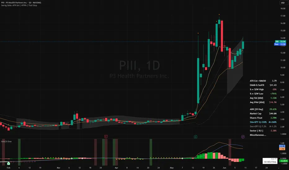
MACD Dive [TTM Squeeze | Dual Lock %R]Disclaimer : This indicator is not financial advice and is strictly for educational and informational purposes only. The metrics and signals provided herein (including momentum crosses, trend saturation state icons, and squeeze markers) are calculated based on historical market data and do not guarantee future performance. Trading stocks and commodities involves significant risk of loss. The user assumes full responsibility for all trading decisions and should always perform their own due diligence before executing trades.
MACD Dive is a multi-state momentum and volatility context engine. By layering momentum oscillation (MACD/PPO/MACD-V) with market stalemates (volatility squeeze) and trend exhaustion (Dual %R saturation), this suite transforms a standard MACD into a multi-dimensional 'No-Go' gatekeeper. This synergy is what gives the engine its edge: it actively blocks the trader from whipsawing in sideways chop or buying into a dying trend, highlighting high-probability market turns where momentum, volatility, and trend capacity perfectly align.
Standard oscillators have a scaling problem. This script lets you choose your engine:
MACD (Classic): Measures momentum in absolute dollars. Great for visual reactivity, but a "2.0" reading means something different on a $5 stock versus a $500 stock.
PPO (Percentage): Measures momentum in percentages. Standardizes the reading across all assets, making it ideal for fixed-rule algorithmic trading.
MACD-V (Volatility Normalized): This divides the MACD by the Average True Range (ATR). It measures momentum in "Units of Volatility," mathematically adapting to market chaos so that signals remain consistent across both different assets and shifting volatility regimes (quiet markets vs chaotic markets).
This suite includes a fully optimized divergence detection engine:
Regular Divergence (Solid Lines): Identifies Trend Reversals. Price pushes to a new extreme, but momentum fails to follow, signaling exhaustion.
Hidden Divergence (Dashed Lines): Identifies Trend Continuations (Slingshots). Price pulls back, but momentum fully resets, signaling a high-probability entry in the direction of the dominant trend.
Located in your chosen corner, the HUD provides an instant visual readout with hover tooltips for active Engine Mode, %R Fatigue state, Oscillator crossover validation, and Squeeze environment. Vertical background highlights in green or red represent filter-passed momentum crossovers, like the MACD bullish cross. Use the extensive inline tooltips in the indicator's settings panel for a comprehensive breakdown of every tunable parameter.
Adaptive Time-Frames & RSI Gatekeeper
Think of this as an automated gear shifter. When looking at lower timeframes (below a user-defined boundary, e.g. 1 hour), the engine automatically scales down to tight, agile lookback periods. When viewing high timeframes, it dials up to filter out noise.
Buying a bullish MACD cross when the RSI is already at 85 increases risk of buying the top when the tank is empty. The optional RSI Safety Filter acts as a strict ceiling/floor blocker. If momentum crosses upward but the asset is mathematically overbought, the indicator suppresses the background highlight. It prevents signals on MACD crosses that have no fuel left.
VOLATILITY ENGINE: BB-KC Squeeze Radar
Building on John Carter’s TTM Squeeze by mapping the contraction of Bollinger Bands inside Keltner Channels to identify market stalemates. The implementation here color codes between a Loose Squeeze (BB inside 1.5 KC) and a hyper-compressed Tight Squeeze (BB inside 1.0 KC) to show the staged intensity of the coiled spring.
While the market coils sideways, a 20-period Linear Regression calculates the trajectory of price deviation inside the bands. The directional bias is shown by customizable markers on the zero line (default ⌃ or ⌄). This reveals hidden institutional accumulation or distribution before the trigger is pulled. To bypass "dead money" risk, the script tracks the first clean candle close or intraday pierce outside the Keltner bounds following a squeeze, catching the expansion phase exactly as it starts.
Furthermore, it accounts for the "Disappearing Mark" phenomenon. Bollinger Bands expand instantly when price moves, causing standard squeeze signals to vanish 1-3 bars before the real breakout candle. This script uses a memory state to remember recent compression, firing a "squeeze release" marker (default ❖) the exact moment price closes outside the Keltner bounds. Trade the release, not the waiting room.
Note: While MACD Dive tracks this compression mathematically on its zero-line, you can see the actual physical boundaries of the breakout by pairing it with my companion Swing Data suite . Plotting its Keltner Channel at 1.5 multiplier over your price chart allows you to visually verify the exact moment the squeeze release mark is ignited.
SATURATION ENGINE: Dual-Lock %R and Momentum Rot
This suite tracks sustained trend maturity using a fast/slow dual Williams %R setup. The conceptual pairing of a fast and slow %R to identify overbought/oversold exhaustion is credited to upslidedown's excellent Trend Exhaustion indicator . I highly recommend applying their script to your chart if you want to visually learn how the two %R lines interact.
While upslidedown’s implementation offers multiple display modes to paint visual boxes and exhaustion zones directly over price action, the focus here is on the discrete icons for trend status at the top and bottom of the MACD pane: Ignition (·), Saturation (□), and Fatigue (×). This suite adapts native ta.wpr() math assuming the trader is already familiar with Dual %R mechanics. Specific "Sprint" and "Marathon" tuning guidance is provided in the tooltips: heavily smoothing the fast line to ignore intraday noise, while lightly smoothing the macro slow line to preserve its reach into extreme zones.
It also features one major addition: the Stall. While Dual %R tracks Price Location (confirming price is structurally pinned at the highs), it doesn't track Velocity (confirming energy is sustained). To solve this, a Stoch RSI "Rot" detector runs quietly inside the saturation state. If price continues to float at the highs but internal velocity drops below a critical threshold, the script overlays a Stall marker (•). Designed as a "one-shot" early warning, it fires only on the first detection per trend saturation leg to prevent chart clutter. This differentiates a strong trend lock from a rotting lock, warning us that the move is running on fumes: giving us the exact cue to tighten stops, trim into parabolic strength, and strictly avoid adding new size.
BACKTESTER READY
Out-of-the-box compatibility with a comprehensive built-in README guide is available directly inside the settings menu. For traders who prefer a "Diamond Hands" approach, the indicator fully maps to Jason5480's TTS Framework convention, outputting strict integer states (1, -1, 2, -2) to hold full position size until the trailing macro baseline completely fractures. My personal backtester, Cosmos Signal Commander (which may be released to the public in the future), broadcasts a composite float signal capable of managing active trade positioning. It tracks entries, hard stops, and partial take-profits (swapping the trailing stop from tight to a wide "runner" buffer upon hitting extended ATR targets).
PERFORMANCE OPTIMIZATION
O(1) Memory States: Replaced lag-heavy ta.barssince() and 50-bar for loops in the Divergence engine with O(1) var state trackers.
String Caching: HUD table strings are built once in the global var scope to prevent constant memory allocation and garbage collection lag.
UI Mutation: The HUD uses table.cell_set_* to alter data dynamically, bypassing the stutter caused by destroying and redrawing tables on every tick.
Native C++ Backend: Replaced custom highest/lowest math arrays with native ta.wpr() functions for the %R engine to maximize computation speed.
Ghost State Resets: When switching the backtester logic to "Long Only" mode, the engine actively hunts and kills lingering short-memory variables so they don't inadvertently suppress valid long signals.
Indicator

Indicator
Edo SuperTrend CoreEdo SuperTrend Core — Clean Single-Line SuperTrend with RSI Trend Confirmation, Directional Intensity Fill and Trend Duration Counter
SuperTrend, created by Olivier Seban, is one of the most widespread trend-following indicators: it uses the Average True Range (ATR), introduced by J. Welles Wilder, to build a dynamic trailing stop that switches sides when price crosses it. It is clear and effective, but it has a known limitation: in sideways or noisy markets it produces false flips —trend changes that reverse within a few bars— and, drawn the classic way with its two bands, it clutters the chart.
Edo SuperTrend Core was built to solve those two things. It keeps the original SuperTrend algorithm, but adds a momentum confirmation filter that requires the RSI to agree before accepting a trend change, and simplifies the representation to a single line with an intensity fill and a duration counter. The goal is a clean trend reading with fewer false turns, without giving up the classic logic.
Edo SuperTrend Core does not generate automatic buy or sell signals: it visualizes the state and the maturity of the trend so the trader can integrate it into their own judgment.
WHAT THE INDICATOR DOES
The indicator combines four elements on a single layer. The SuperTrend line is a single dynamic level that acts at once as a trend reference and as the flip level, the closing price that, if crossed, would change the trend. The RSI confirmation filter requires momentum to agree in order to validate a trend change. The directional intensity fill, between price and the line, highlights the phase of the move. And the duration counter shows how many bars the current trend has been active.
CONCEPTUAL CALCULATION BASIS
The base is the classic SuperTrend: the ATR measures volatility and, from a multiple of that ATR, a dynamic level is computed that sits below price in an uptrend and above price in a downtrend. In the classic implementation two bands are plotted; here only the active level is shown, which keeps the chart cleaner.
On top of that base, Edo SuperTrend Core adds its own layer: when the SuperTrend signals a trend change, that change is only accepted if the 14-period RSI confirms it, above 50 to validate a bullish turn and below 50 to validate a bearish one. If momentum does not agree, the indicator keeps the previous trend. This filter is the central difference versus a standard SuperTrend: it discards part of the flips that noise generates in sideways markets. The basic reading is direct: with the SuperTrend below price the trend is bullish, and with the SuperTrend above price, bearish.
SENSITIVITY PROFILES
A single selector adjusts the behavior of the SuperTrend by modifying the internal ATR parameters. The Fast profile uses ATR 7 and factor 2.0: higher sensitivity, reacts sooner and produces more changes, useful on lower timeframes. The Balanced profile uses ATR 10 and factor 2.3: it is the default setting, balancing reactivity and stability. The Slow profile uses ATR 14 and factor 3.0: smoother and more stable detection, with fewer turns, useful on higher timeframes.
INTENSITY FILL
Between price and the SuperTrend line a fill is drawn whose color follows the direction of the trend and whose opacity is configurable. Its purpose is to make the phase and the magnitude of the separation between price and level visible at a glance: the greater the distance, the more extended the move is relative to its trailing stop. The RSI, besides filtering the trend changes, provides the momentum context that accompanies that phase, whether expansion, consolidation or exhaustion.
TREND DURATION COUNTER
Each time the trend changes, the indicator writes at the midpoint of the previous leg the number of bars that trend lasted. It is a purely informative figure that helps judge the maturity of the move: a trend that has already accumulated many more bars than the previous ones may be more extended, whereas a freshly started one is barely beginning to develop.
ALERTS
Edo SuperTrend Core includes four alert conditions configurable from the standard TradingView alerts dialog, split into two levels according to the momentum filter. The confirmed bullish trend change fires when the flip to bullish has passed the RSI filter, with momentum agreeing; it is the indicator's definitive trend signal. The confirmed bearish trend change is its downside equivalent. The raw flip up warns that price has crossed the SuperTrend line upward, still pending RSI confirmation, and serves as an early warning of a possible turn not yet validated; the raw flip down is its bearish equivalent. The confirmed and raw pair lets the trader choose their level of anticipation: the raw flip warns sooner but may reverse, while the confirmed one arrives a step later but has already filtered out part of the false turns.
HOW TO READ IT
The position of the line relative to price defines the trend and its side, and the color confirms the state at a glance. When a trend change occurs it is worth remembering that it has already passed the RSI filter, that is, that momentum was agreeing: turns confirmed by momentum tend to be more reliable than a pure SuperTrend flip. The fill and the separation between price and line indicate whether the move is expanding or losing strength. The duration counter places the current trend against the previous ones, and a trend well above the usual duration invites watching the flip level more closely. That flip level, the level of the line, is the closing price that would change the trend and serves as a dynamic stop reference.
ORIGINALITY AND JUSTIFICATION
Olivier Seban's SuperTrend and Wilder's RSI and ATR are public-domain classics, and Edo SuperTrend Core names and credits them without reservation. What it adds over a standard SuperTrend is specific: an RSI confirmation filter that discards part of the false flips of the classic SuperTrend in sideways markets, a single-line representation instead of the two bands, an intensity fill that makes the phase of the move legible, and a duration counter that adds a maturity reading. The combination of momentum filter, phase reading and duration is what distinguishes this version, not the base algorithm.
CONFIGURATION
Profile: Fast, Balanced or Slow, which adjusts the ATR and the factor. Gradient Opacity: the visual intensity of the fill, from 10 to 100%. All calculations adapt automatically to the chart's timeframe.
OPEN SOURCE
Edo SuperTrend Core is published as an open source and free indicator. The full Pine Script is publicly available on TradingView for study, adaptation and integration into any workflow.
This indicator is a technical analysis tool intended exclusively for educational and informational purposes. It does not generate automatic buy or sell signals and should not be considered financial advice. Trading in financial markets carries a significant risk of capital loss. Past results do not guarantee future results. Always use proper risk management.
Indicator

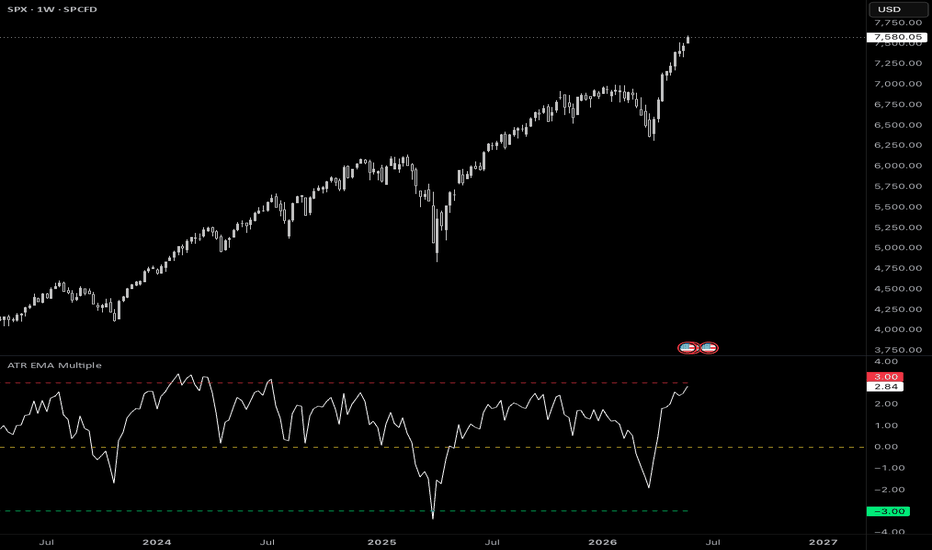
ATR EMA MultipleA TradingView (Pine Script v6) oscillator that measures how far price has stretched from its moving average, expressed in units of ATR (Average True Range).
Instead of asking "how many dollars/points is price away from its average?", this indicator asks "how many typical bars of volatility is price away from its average?" That makes the reading comparable across different symbols, timeframes, and volatility regimes.
WHAT IT PLOTS
The main line (white) is the oscillator:
oscillator = (close - EMA(close, maPeriod)) / ATR(atrPeriod)
A value of +2 means price is currently 2 ATRs above its EMA.
A value of -1.5 means price is 1.5 ATRs below its EMA.
The yellow line at 0 marks price sitting exactly on its EMA.
A red line above and a green line below act as reference bands. How those two
bands are placed is controlled by the Line Mode setting (see below).
Typical use: when the oscillator pushes into or beyond the red band, price is
unusually extended to the upside; the green band marks unusual extension to the
downside. How you act on that (mean-reversion, breakout confirmation, etc.) is
up to your strategy.
SETTINGS
ATR and EMA Settings
ATR Period (default 14)
Lookback for the ATR used as the volatility unit.
Moving Average Period (default 21)
Lookback for the EMA that price is measured against.
Reference Lines
Line Mode (default Manual)
Chooses how the red/green bands are positioned:
"Manual" or "Std Deviations".
Manual mode
You set the band levels directly, in ATR units.
Manual: red line ATR level (default 3)
Red band drawn at this fixed oscillator value (e.g. +3 ATRs).
Manual: green line ATR level (default -3)
Green band drawn at this fixed oscillator value (e.g. -3 ATRs).
The bands are flat, fixed horizontal lines. Good when you want a constant, opinionated threshold.
Std Deviations mode
The bands adapt to the symbol's recent behaviour. You specify how many standard deviations from 0 each band should sit, and the script measures the actual standard deviation from the data.
Std Dev: red line std devs above 0 (default 2)
Red band at this many standard deviations above 0.
Std Dev: green line std devs below 0 (default 2)
Green band at this many standard deviations below 0.
Std Dev: lookback length (bars) (default 200)
How many recent bars are sampled to measure the standard deviation.
The bands move over time as volatility behaviour changes, automatically tightening in calm conditions and widening in stretched ones.
HOW "STD DEVIATIONS" MODE IS CALCULATED
This is worth understanding before you rely on it, because it is a deliberate, slightly non-standard choice.
The standard deviation is measured separately for the positive and negative sides of the oscillator, and anchored at 0 (not at each side's own average):
sigma_positive = sqrt( mean( oscillator^2 over bars where oscillator > 0 ) )
sigma_negative = sqrt( mean( oscillator^2 over bars where oscillator < 0 ) )
red band = (+ std devs above) x sigma_positive
green band = (- std devs below) x sigma_negative
Two consequences of this design:
Anchored at 0, not at the mean. Because the bands are described as "N standard deviations above 0 / below 0", the spread is measured as the root-mean-square of values around 0 -- not the textbook standard deviation around the sample mean. This keeps 0 (price = EMA) as the true center of the scale.
Asymmetric by design. The upside and downside are measured independently, so a market that stretches further on rallies than on sell-offs (or vice versa) will get an asymmetric pair of bands that reflects that.
On a freshly loaded chart the bands stay blank until the lookback window contains at least one positive and one negative reading.
READING THE COLOURS
Oscillator White Price distance from EMA, in ATR units.
Upper band Red Upside extension threshold.
Lower band Green Downside extension threshold.
Zero line Yellow Price equals its EMA.
NOTES & LIMITATIONS
The indicator is not a standalone trading system -- it's a normalization/context tool. Combine it with your own entry/exit logic and risk management.
Readings are only comparable when the ATR Period and Moving Average Period are held constant.
The red/green reference bands are drawn as dashed lines to distinguish them from the solid white oscillator.
On instruments with periods of zero volatility (ATR = 0), the oscillator value is undefined for those bars.
LICENSE
Open source -- published for the TradingView community. Attribution appreciated.
Indicator
Indicator

AetherEdge - Autoencoder Anomaly🖊️ Overview
AE-ANO is a self-evolving detector of market dislocations. It turns the current bar's state into a feature vector and passes it through a linear autoencoder — compress to a narrow bottleneck, decode back — with weights trained online by gradient descent to minimize reconstruction error on normal structure. Once it has learned the normal manifold, a bar that breaks the usual relationships between features (a flash move, a structure break, a shock) cannot be reconstructed well — a high reconstruction error = an anomaly. The error is standardized into a sigma score, a Mahalanobis-style distance flags magnitude outliers, and the most dislocated feature is named.
🔶 Key Features
Linear autoencoder engine — compresses and reconstructs a 6-dimensional state vector, measuring deviation from normal via reconstruction error.
Self-evolving online learning — encoder/decoder weights learn by gradient descent, continually updating the definition of "normal" to the market.
Reconstruction-error thermometer — the anomaly score (σ) over time as a neon-gradient filled area (calm → hot).
Anomaly pulses — bars whose score exceeds the threshold are marked on price with a glowing marker and background flash (intensity scales with magnitude).
Mahalanobis distance — a Euclidean distance in standardized space flags magnitude outliers (distance from center), complementing the autoencoder.
Feature panel — colors which feature (return/vol/range/body/momentum/trend) is dislocated and names the lead driver.
Live statistics panel — anomaly score, reconstruction error, Mahalanobis distance, lead feature, bottleneck, and last anomaly.
Non-repainting design — learning on confirmed bars only; each bar is judged against what was learned before it, with no look-ahead.
🧠 Technical Architecture
The feature vector is six standardized features — return, volatility (log squared return), range expansion, body/candle character, momentum (RSI), and trend deviation. On each confirmed bar, a forward pass with the current weights (learned through t−1) computes code = We·x (encode), x̂ = Wd·code (decode), and err = x − x̂, giving the reconstruction error ‖err‖. This is standardized by the error's EMA mean and standard deviation into a sigma score (err − mean)/std. After judging, the encoder and decoder weights are updated by backprop SGD (stabilized with weight decay and clipping).
This "judge-then-learn" order flags one-off anomalies before they're absorbed into normal. Yet if an anomaly persists, the weights learn the new structure — adapting to a non-stationary market (the self-evolution). The Mahalanobis-style distance is ‖x‖ in standardized space (distance from the normal center, expected ≈ √D under normality), measuring magnitude outliers to complement the autoencoder (which captures correlation-breaking, structural anomalies). The lead feature is the dimension with the largest reconstruction error — showing what is dislocated now.
🎯 Three design choices stand out. First, the linear autoencoder learns the usual correlations between features and flags bars that break them (e.g., a large move with no accompanying range) as high error. Second, standardizing the error into σ enables an instrument-independent threshold. Third, judging before learning and confining updates to confirmed bars keeps historical anomaly scores non-repainting.
⚙️ Recommended Settings & Tuning Guide
As a crypto starting point — BTC/ETH (1D, 4H): bottleneck 2, learning rate 0.02, standardization length 100, error window 100, threshold 2.5σ; flash moves and structure breaks are clearly marked. High-volatility names (SOL, XRP): raise the learning rate toward 0.03 for faster adaptation, and the threshold to 3.0σ to catch only genuine anomalies amid normal volatility. For more sensitivity, set the bottleneck to 1 (a tighter normal manifold) and the threshold to 2.0σ.
Per parameter: Bottleneck (k) sets sensitivity — smaller defines "normal" more tightly and is more sensitive to deviation. Learning rate sets adaptation speed (higher is nimbler but too high destabilizes). Standardization length sets the feature baseline. Error window sets the anomaly-score baseline (shorter is more locally adaptive). Threshold (σ) sets pulse sensitivity.
💡 How to Use in Practice
The core read is anomaly score × lead feature. While the score stays calm (NORMAL), the market is within its learned normal structure — existing logic tends to work. The moment the score spikes above the threshold (pulse fires) signals structure has temporarily broken — the start of a breakout, a liquidity shock, a flash move, or a news reaction. The lead feature tells you what is anomalous (e.g., a spike with no volume shows up as Body/Range), helping characterize it. The EXTREME level marks especially strong dislocations — a cue for risk management (revisit stops, cut size).
For multi-timeframe work, read higher-timeframe anomalies for major structure breaks and time execution on a lower timeframe. Because it shows when structure breaks (not direction), pair it with trend or directional signals (e.g., avoid trend-following during anomalies).
⚠️ Important Notes
Nothing displays until the warmup period (default 150 bars) completes. Reloading the indicator retrains the weights from scratch — learning state is not persisted. This is a linear autoencoder and does not fully capture nonlinear normal structure (reconstruction error measures deviation from a linear manifold). If an anomaly persists, it is by design learned as the new "normal" (adaptation to non-stationarity). The Mahalanobis distance is a simplified version assuming diagonal covariance (Euclidean in standardized space). The anomaly score shows no direction, only structural breakage. Judging precedes learning, and updates occur on confirmed bars only.
🚨 Disclaimer
This indicator is for educational and informational purposes only and does not constitute financial or investment advice. Past performance is not indicative of future results. All trading involves risk. Use it alongside your own thorough testing and sound risk management; all trading decisions remain solely your own responsibility. Indicator

AetherEdge - Bayesian Changepoint Detection🖊️ Overview
AE-BCP is a Bayesian detector of structural breaks (Adams & MacKay, 2007). Rather than flagging regime shifts with a hard threshold, it maintains a posterior distribution over the run length — the number of bars since the last changepoint — and updates it recursively with every new observation. A Gaussian conjugate predictive (on standardized returns or log-volatility) scores how surprising each bar is under each run-length hypothesis. Beliefs self-evolve recursively, and P(run length = 0) is the live probability that a structural break just occurred. The classic triangular run-length posterior is painted as a heatmap.
🔶 Key Features
BOCPD engine — recursively updates the run-length posterior into growth and changepoint probabilities, outputting structural breaks as a probability.
Self-evolving recursive Bayesian update — each run-length hypothesis's predictive model (sufficient statistics) and the posterior update online with every observation.
Changepoint probability (soft detection) — P(run length = 0) as a continuous 0–1 probability; threshold crossings are marked on price.
Run-length posterior heatmap — the time × run-length × probability triangular heatmap (BOCPD's signature visual), aligned to the price timeline.
Expected run length (regime age) — estimates how many bars the current regime has lasted, collapsing to zero at changepoints (shown as a line).
Volatility or drift — monitor log squared returns to detect volatility-regime changes, or returns to detect drift changes.
Live statistics panel — changepoint probability, regime age, MAP run length, last changepoint, and hazard rate.
Non-repainting design — all updates on confirmed bars only, with no look-ahead.
🧠 Technical Architecture
The monitored feature (Volatility mode = log squared return, Returns mode = return) is standardized over a long window, fixing the predictive variance at ~1. On each confirmed bar, the predictive probability of each run-length hypothesis r is pred(x_t|r) = N(x_t | m_r, σ²(1+1/r)) (m_r = the run's mean). From these, growth P(r_t=r+1) ∝ P(r_{t-1}=r)·pred·(1−H) and changepoint P(r_t=0) ∝ Σ_r P(r_{t-1}=r)·pred·H are computed and normalized. H is the hazard rate (= 1 / mean regime length), the prior probability of a changepoint.
Each run-length's sufficient statistics (sum of the run's observations) update as sum = sum + x_t on growth and sum = 0 (prior) on a changepoint. Run length is truncated at Rmax for tractability. Outputs are the changepoint probability P(r_t=0), expected run length E =Σr·P(r), and MAP run length argmax P(r). The posterior is binned into a rolling buffer and, on the last bar, drawn as a heatmap (boxes) aligned to the price timeline.
🎯 Three design choices stand out. First, standardization fixes the predictive variance, allowing a robust Gaussian-conjugate implementation with no gamma functions. Second, monitoring log squared returns turns "variance changes" into "mean changes," so a simple mean-change model captures volatility-regime breaks. Third, confining updates to confirmed bars keeps the historical posterior non-repainting.
⚙️ Recommended Settings & Tuning Guide
As a crypto starting point — BTC/ETH (1D, 4H): Monitor = Volatility, mean regime length 60, standardization length 200, max run length 100, changepoint threshold 0.30; volatility-regime breaks are clearly marked. For more frequent turns: lower mean regime length toward 30 (higher hazard, more sensitive) and lower the threshold to 0.25. To suppress noise: raise mean regime length to 100 and the threshold to 0.40.
Per parameter: Mean regime length is the key knob (hazard = its reciprocal) — shorter detects changepoints more often, longer is conservative. Monitor selects Volatility (vol breaks) or Returns (drift changes) for your purpose. Standardization length sets the baseline scale window (longer is steadier). Max run length sets how far back regimes are retained. Changepoint threshold sets marker sensitivity.
💡 How to Use in Practice
The core read is changepoint probability × regime age. When the changepoint probability is low and stable and the regime age keeps rising, the current regime (trend or range) is persisting — strategies aligned with that premise tend to work. The moment the changepoint probability spikes above the threshold (diamond marker fires) signals the volatility or drift structure has changed — a point to review existing positions or switch strategy to the new regime. Each time the heatmap triangle resets (run length collapses to zero), you can see the market entering a new phase visually.
For multi-timeframe work, read higher-timeframe changepoints for major structural turns and execute on a lower timeframe. It also serves as a meta-filter to run trend or mean-reversion strategies only while the regime is stable.
⚠️ Important Notes
Nothing displays until the warmup period (default 200 bars) completes. Reloading the indicator rebuilds the posterior from scratch — learning state is not persisted. This is a Gaussian-conjugate model with a known (≈1, via standardization) predictive variance that detects mean changes in the monitored feature (Volatility mode captures volatility changes via the log-squared transform). Run length is truncated at Rmax, so for very long regimes the expected run length saturates near the cap. The changepoint probability is a posterior belief, not a certain verdict, and detection requires evidence to accumulate, so it lags by a few bars. Updates occur on confirmed bars only.
🚨 Disclaimer
This indicator is for educational and informational purposes only and does not constitute financial or investment advice. Past performance is not indicative of future results. All trading involves risk. Use it alongside your own thorough testing and sound risk management; all trading decisions remain solely your own responsibility. Indicator

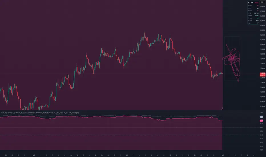
AetherEdge - Principal Component Analysis🖊️ Overview
AE-PCA extracts the market's eigen-state from the correlation structure of a basket of assets. It builds a rolling correlation matrix online and extracts the leading principal components — PC1 (market factor), PC2 (rotation/dispersion) — via power iteration with deflation. From the eigenvalues it derives the Absorption Ratio (λ₁/N) — the share of basket variance explained by one factor — which reveals, at a glance, the "everything moves together" systemic fragility of the market. The eigenbasis continuously re-orients each bar to the current correlation structure.
🔶 Key Features
Online PCA engine — builds a rolling correlation matrix with forgetting and extracts the top two principal components by power iteration (heavy use of the matrix type).
Absorption Ratio (systemic stress) — λ₁/N quantifies market concentration = fragility; sharp rises capture the "correlation convergence" that precedes crashes.
Self-evolving eigenbasis — eigenvectors are warm-started and re-converged each bar, tracking shifts in correlation smoothly (subspace tracking) with sign continuity preserved.
Phase-space comet — projects the live return vector onto PC1/PC2 and traces the market's path through factor space as a comet trail on a floating canvas to the right of the chart.
Factor loadings — identifies the asset that loads most heavily on PC1 (the one leading the market).
Dispersion gauge — 1 − Absorption Ratio shows the degree of diversification.
Live statistics panel — absorption ratio, cumulative (PC1+PC2), eigenvalues λ₁/λ₂, dispersion, lead asset, and PC1/PC2 scores.
Macro-overlay design — the basket is independent of the chart symbol, so you can overlay market-wide stress on any chart you view. Confirmed-bar updates, no look-ahead.
🧠 Technical Architecture
From 6 asset returns, first and second moments (means, covariances) are updated online with forgetting factor λ, then divided by each asset's standard deviation to build the correlation matrix R (N×N). PC1 is found by power iteration v ← Rv/‖Rv‖, with eigenvalue λ₁ from the Rayleigh quotient. Then deflation R₂ = R − λ₁v₁v₁ᵀ is applied, and PC2 obtained by power iteration with Gram-Schmidt orthogonalization. Since the correlation matrix has trace N, the absorption ratio is λ₁/N and the cumulative is (λ₁+λ₂)/N.
Factor scores are computed by projecting the standardized current returns z_i=(r_i−μ_i)/σ_i onto the eigenvectors (PC1 score = Σz_i·v₁_i). Eigenvectors are warm-started from the previous bar for fast convergence and sign stability across bars (PC1 is oriented so Σv₁ > 0). A high absorption ratio means "correlation convergence = single-factor dominance = fragility"; a low one means "dispersion = diversification." All updates occur on confirmed bars.
🎯 Three design choices stand out. First, using the correlation (not covariance) matrix yields a scale-free absorption ratio that isn't dominated by a single high-volatility asset. Second, warm-starting the eigenvectors suppresses sign flips and flicker, giving smooth scores. Third, confining updates to confirmed bars keeps historical values non-repainting.
⚙️ Recommended Settings & Tuning Guide
As a crypto starting point — a basket of the 6 majors (BTC/ETH/SOL/BNB/XRP/ADA), 1D/4H: adaptation λ = 0.97, Calm threshold 0.40, Stress threshold 0.60; crypto-wide risk-on/off separates cleanly. For nimbler anomaly detection: lower λ toward 0.95 to react faster to correlation shifts, and raise the Stress threshold to 0.65 so only genuine convergence triggers, reducing noise.
Per parameter: Adaptation λ is the main knob — near 0.99 correlations are smooth and long-run; near 0.95 they respond quickly to shocks. Calm/Stress thresholds should be tuned to your basket's composition and its typical absorption ratio (closer to uncorrelated → lower λ₁/N; strongly correlated → higher). Comet length / canvas width tune the phase-space display. The basket can be freely swapped for the assets whose correlation you want to track.
💡 How to Use in Practice
The core read is the absorption-ratio regime. When the ratio is low and stable (CALM), the market is diversified and stock-picking tends to work. When it spikes into the Stress zone, correlations have converged into an "everything moves together" fragile state — a cue to reduce concentration as a leading sign of self-reinforcing declines or risk-off. When the phase-space comet stretches strongly in one direction, the market is factor-driven (trending); when it swirls near the center, it's ranging/rotating. The Lead Asset is the one currently driving the whole market.
For multi-timeframe work, read the higher-timeframe absorption ratio for the macro risk backdrop and execute single-name trades on the lower timeframe. Paired with trend and volatility tools, it serves as a top-level risk filter (e.g., avoid fading during stress spikes).
⚠️ Important Notes
This indicator fetches external data (request.security) for 6 symbols. Specifying invalid or illiquid symbols drops their contribution and degrades accuracy — compose the basket from liquid symbols. Nothing displays until warmup completes. Reloading the indicator rebuilds the correlation moments from scratch — learning state is not persisted. The absorption ratio is a proxy for systemic fragility (akin to Kritzman's absorption ratio), not a directional signal by itself. The sign of the PC2 score is arbitrary. The phase-space comet is drawn in the chart's right margin, so display requires right-side space. Power iteration is an approximation of the top two components, and updates occur on confirmed bars only.
🚨 Disclaimer
This indicator is for educational and informational purposes only and does not constitute financial or investment advice. Past performance is not indicative of future results. All trading involves risk. Use it alongside your own thorough testing and sound risk management; all trading decisions remain solely your own responsibility. Indicator

AetherEdge - Gaussian Mixture Regimes🖊️ Overview
AE-GMM is a self-evolving regime detector that treats the market as a probability distribution rather than carving it up with rigid rules. It models the joint distribution of momentum × volatility as a mixture of K Gaussian components — one per regime — and keeps learning their means, variances, and weights through online Expectation-Maximization with forgetting. Every bar receives a soft probability vector (a posterior) over regimes, rendered as a flowing probability ribbon that lets the market's state blend and shift before your eyes.
🔶 Key Features
Gaussian mixture + online EM engine — the E-step (responsibilities) and M-step (sufficient statistics) run every bar, estimating the regime distribution incrementally.
Self-evolving forgetting mechanism — a forgetting factor λ weights recent data, so the model quietly reshapes itself as regimes emerge and dissolve.
Soft probability ribbon — the K regime probabilities, stacked into a flow in the lower pane; not hard boundaries, but "how much of each regime is present now."
Semantic regime coloring — each component is auto-colored by the character of its learned centroid (Risk-On / Range / Risk-Off / Stress), sidestepping the label-switching problem.
Projection onto price — force_overlay tints the main chart's background by the dominant regime, deepening with confidence.
Live statistics panel — dominant regime, confidence, per-regime probabilities, regime duration, the adaptation factor λ, and model fit (log-likelihood).
Diagonal-covariance robustness — no matrix inversion, numerically stable; learning on confirmed bars only, with no look-ahead.
🧠 Technical Architecture
The feature space is two-dimensional — a momentum axis (z-scored ATR-unit trend deviation) and a volatility axis (z-scored log realized-volatility). Each component is a diagonal-covariance Gaussian with mean μ_k, variance σ²_k, and weight π_k. Every bar, responsibilities (posteriors) are computed as γ_k(x) = π_k·N(x|μ_k,σ²_k) / Σ_j π_j·N(x|μ_j,σ²_j), normalized stably via log-sum-exp in the log domain.
Learning proceeds by incremental EM. On each confirmed bar, the sufficient statistics (responsibility mass N_k, Σγx, Σγx²) are updated with a forgetting factor λ, and π_k, μ_k, σ²_k are re-derived from them. Lower λ weights recent data and adapts quickly; higher λ acts as longer memory and stays steady. Components are initialized spread around a ring in feature space, starting from diverse regimes and migrating toward the data. Each regime's color is decided every bar from its learned centroid (high volatility → Stress; positive momentum → Risk-On; negative → Risk-Off; in between → Range).
🎯 Three design choices stand out. First, soft responsibilities let regime transitions be expressed as a blend of probabilities — the "in-between" is visible. Second, character-based coloring keeps colors meaningful regardless of index shuffling. Third, confining parameter updates to confirmed bars — with only the forming bar's posterior updating live — keeps historical output non-repainting.
⚙️ Recommended Settings & Tuning Guide
As a crypto starting point — BTC/ETH (1D, 4H): K = 3, λ = 0.99, standardization length 200, vol length 20; Risk-On / Range / Stress separate cleanly. High-volatility names (SOL, XRP): lower λ toward 0.97 for faster adaptation, and set K = 4 to split Stress into upside vs downside stress, revealing the internal structure of rough action.
Per parameter: λ (adaptation) is the key knob — near 0.999 regimes are smooth and persistent; near 0.95 they switch nimbly. K (regimes) ranges from 2 (on/off) to 4 (finer states). Standardization length sets the feature baseline window — longer is steadier, shorter more locally adaptive. Stress Vol (z) sets how much of a volatility rise counts as "Stress."
💡 How to Use in Practice
The core read is dominant regime × confidence. When the ribbon is thick in a single color (high confidence) and stable, strategies aligned with that regime tend to work (trend-following in Risk-On, fading in Range). When ribbon colors blend, it signals a regime transition — a cue to cut size or stand aside. When the Stress (amber) probability rises, volatility is expanding — useful for staging breakouts or de-risking.
For multi-timeframe work, read the higher-timeframe regime for the backdrop and execute on a lower timeframe. With the price-chart background tint enabled, regime "epochs" sit directly over the candles, making context easy to combine with trend or volume tools.
⚠️ Important Notes
Regimes are hidden until the warmup period (default 200 bars) completes. Reloading the indicator, or changing settings, makes the model relearn across the entire history from scratch — learning state is not persisted. This is a diagonal-covariance approximation and does not explicitly model correlation between features. Regime probabilities are the model's probabilistic beliefs, not certain forecasts. Parameters update on confirmed bars, while the forming bar's probabilities move live.
🚨 Disclaimer
This indicator is for educational and informational purposes only and does not constitute financial or investment advice. Past performance is not indicative of future results. All trading involves risk. Use it alongside your own thorough testing and sound risk management; all trading decisions remain solely your own responsibility. Indicator
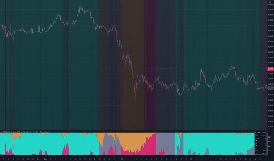
AetherEdge - Q-Learning Regime Agent🖊️ Overview
AE-QRA is a reinforcement-learning agent that learns its policy from experience, right on your chart. It discretizes the market into 27 regimes (Trend × Momentum × Volatility) and learns which action to take in each — Short, Flat, or Long — by maximizing reward through tabular Q-learning. No instructions, no labels: the agent relies on reward alone, sharpening its judgment as it shifts from exploration to exploitation.
🔶 Key Features
A real Q-learning engine — the TD(0) update Q(s,a) ← Q(s,a) + α runs every bar, updating a value table over states × actions.
Reward function — reward = position × next-bar return − turnover cost. Profitable decisions are reinforced; needless trading is penalized.
Exploration–exploitation, made real — an ε-greedy policy whose ε decays over time, automatically shifting from random exploration to exploiting the learned policy.
Policy heatmap — the learned policy across 27 regimes, visualized as a 9-cell color grid at the live volatility slice; the cell for the current regime glows.
Regime coloring — bars and background are tinted by the agent's current stance, growing more saturated with conviction.
Action-flip markers — triangle markers mark switches to Long or Short.
Live statistics panel — action, conviction, exploration rate ε, cumulative reward (policy P&L), regime coverage, and the current state.
Fully deterministic, non-repainting design — the exploration RNG is seed-fixed; learning and decisions occur on confirmed bars only, on a one-bar lag.
🧠 Technical Architecture
The state space is built from three discrete features — ATR-unit trend deviation (↓/·/↑), RSI momentum (↓/·/↑), and volatility percentile rank (low/mid/high). Their product gives 27 states, with three actions (Short = −1 / Flat = 0 / Long = +1). The value table Q is persisted as a var matrix (27 × 3).
On each confirmed bar, the agent first observes the reward of its previous action (position × realized return − switching cost), then updates that value via TD(0) using the maximum Q at the next state. It then selects the next action ε-greedily. ε decays as ε = ε_min + (ε_start − ε_min)·exp(−step/decay) — exploratory early on (frequent random actions), exploiting the learned policy as it matures. Conviction is computed as the separation of the three Q-values at the current state and feeds both the background tint and the panel. Because the RNG is a deterministic LCG, the policy is reproducible under identical settings.
🎯 Three design choices stand out. First, embedding a switching cost in the reward suppresses over-trading at the learning level and makes Flat a meaningful choice. Second, confining learning and decisions to confirmed bars on a one-bar lag eliminates future leakage. Third, the deliberately compact 27-state design helps the policy converge even on shorter histories.
⚙️ Recommended Settings & Tuning Guide
As a crypto starting point — BTC/ETH (1D, 4H): α = 0.10, γ = 0.95, ε-Start = 0.90, ε-Decay = 500, switching cost 3 bps; this yields clean trend adaptation. High-volatility names (SOL, XRP): raise switching cost to 5–8 bps to curb trade frequency, and shorten ε-Decay toward 300 so the agent reaches the exploitation phase faster through the noise.
Per parameter: Learning rate α sets adaptation speed — 0.15–0.25 in fast-rotating regimes, 0.05–0.10 in stable ones. Discount γ sets foresight — higher weights long-run reward (0.95–0.99 for swings, 0.85–0.92 for scalps). ε-Decay sets the length of the exploration phase — larger explores longer and learns more cautiously. Switching cost doubles as a direct knob on trade frequency.
💡 How to Use in Practice
The core read is the agent's stance × conviction. A flip to Long (triangle marker) with high conviction and a rising cumulative reward reads as a tailwind for buying dips. The policy heatmap is a powerful context tool: by reading the colors of the cells adjacent to the current regime (the glowing cell), you can anticipate how the agent will act if the market shifts slightly. When ε is still high, the policy is undecided, so treat signals as informational only.
For multi-timeframe work, confirm the macro bias from the higher-timeframe stance (1D), then execute aligned flips on a lower timeframe (1H–4H). Layered over market structure (S/R, order blocks) or volume, it adds which regime, and with what conviction, the agent chooses to go long — useful confirmation context.
⚠️ Important Notes
Until the warmup period (default 300 bars) and the exploration phase pass, actions are largely exploratory (random). Reloading the indicator, or changing settings/seed, makes the agent relearn across the entire history from scratch — learning state is not persisted. The panel's "Policy P&L" is an in-sample, while-learning metric that does not fully account for switching cost or fill slippage; it is not a backtest or forward result. The 27-state tabular design is intentionally coarse — it learns a regime policy, not fine price structure. Decisions update on confirmed bars, and the agent's stance is not a direct buy/sell instruction.
🚨 Disclaimer
This indicator is for educational and informational purposes only and does not constitute financial or investment advice. Past performance is not indicative of future results. All trading involves risk. Use it alongside your own thorough testing and sound risk management; all trading decisions remain solely your own responsibility. Indicator

Volatility Bands Using t-Distribution & Prediction IntervalsThis indicator is a statistical tool designed to project a dynamic range where the next asset price is expected to fall within a specific level of confidence.
Unlike standard volatility bands, a prediction interval is a statistical range that estimates where a single future observation will fall, given a specific probability. Because predicting a single future outcome introduces more inherent uncertainty than predicting an average, these bands are wider and mathematically tighter for forecasting next-bar anomalies.
How it Works
This indicator uses a Student's t-distribution (or an optional z-distribution for performance) to calculate historical volatility thresholds.
Finding the Estimated t-distribution
When you select a 95% Confidence Level, the script sets an error alpha of 5% (1 - 0.95). Because asset price movement can deviate to either the upside or downside, it splits this error equally into both tails (a two-tailed test). The script normalizes this, targeting an exact area of 0.025 (2.5%) in the extreme tails of the curve.
To find where that target area lies, the script reconstructs the Probability Density Function (PDF) of the Student's t-distribution. The height of the curve depends heavily on the Degrees of Freedom (df = length - 1).
Because Pine Script doesn't have a native Gamma function, the script uses double factorials to calculate the complex math coefficients. If your sample size (length) is exceptionally high (>300), the t-distribution naturally mirrors a regular normal distribution, so it switches to a standard Gaussian curve equation to save some time.
// Calculate double factorial
double_fac(int n) =>
float res = 1.0
int curr = n
while curr > 1
res := res * curr
curr := curr - 2
res
// t-distribution formula
cur_dist(float x, int cur_df) =>
float res = 0.0
if cur_df > 300
res := 0.3989422804014326779 * math.exp(-x * x * 0.5)
else
float coeff = double_fac(cur_df - 1) / (math.sqrt(cur_df) * double_fac(cur_df - 2) * (cur_df % 2 == 0 ? 2.0 : math.pi))
res := coeff * math.pow(1.0 + x * x / cur_df, -0.5 * (cur_df + 1))
res
To find the approximate t-value that corresponds to our target tail area, the script performs numerical integration using the Trapezoid Rule (trapezoid_reverse). This is the most time consuming part.
// Reverse trapezoidal to calculate t-value from area
trapezoid_reverse(float p, int cur_df) =>
float max_p = 0.5
float max_stat = 300.0
float add_prec = 1.0
float result_i = 0.0
if p == max_p
result_i := 100000000.0 // Infinity
else
float trap_sum = 0.0
float gap_width = p / (add_prec * 1250.0)
float i = 0.0
float last_func = cur_dist(0.0, cur_df)
while trap_sum < (2500.0 * add_prec) and i < max_stat
i := i + gap_width
trap_sum := trap_sum + last_func
last_func := cur_dist(i, cur_df)
trap_sum := trap_sum + last_func
result_i := i
result_i
Calculating the Prediction Interval
Once the t-critical value is found, it is then put into the standard prediction interval formula. The script uses EMA instead of SMA to improve responsiveness to current trends.
float prediction_interval_top = mean + tCrit * stdev * math.sqrt(1 + 1/length)
float prediction_interval_bot = mean - tCrit * stdev * math.sqrt(1 + 1/length)
Because the calculations for the t-distribution estimates are computationally expensive, you can select the lookback window for using the t-distribution. You can also choose to use the faster z-score for historical bars.
Note 1: The larger the sample size, the smaller you may have to set your lookback window in order to fit within the execution time limits.
You can use this for:
Overbought/Oversold, Mean reversion signals
Dynamic Stop-loss/Take-profit (SL/TP)
1. Overbought/Oversold/Mean Reversion
The indicator creates a red background to indicate that the candlestick has broken above the top 95% prediction interval band. It can be interpreted as a potential reversal.
2. Dynamic Stop-loss/Take-profit (SL/TP)
You can utilize the plotted mean and the confidence interval as entry/exit points. For example, you could put a stop-loss at the bottom band, and a take profit at the top band.
Alerts:
Price Above Top PI (Close crossed out)
Price Below Bottom PI (Close crossed out)
High Above Top PI (Wick touched/pierced top)
Low Below Bottom PI (Wick touched/pierced bottom)
Settings:
Length: The size of the sample for the standard deviation & mean calculations. 30 is recommended.
Source: Used for standard deviation & mean calculations. For example: Changing the source to 'high' would make the indicator predict the range of the next 'high'.
Confidence Level: Dictates how wide the bands should be. A 95% confidence level is default. Must be entered as a decimal between 0 and 1.
Lookback Length: Used to limit the amount of bars to back calculate the prediction interval using the t-distribution. Default is 300.
Use z-score: Use the z-score to calculated past values. Note that this will introduce error. For example, for a sample size of 30 and a 95% confidence level, using a z-score instead of a t-score will introduce a ~4.2% error in your interval width, causing your actual prediction interval to drop from 95% down to ~94.0%.
Background Colors:
Green: The low/close of the candle breached the lower band. Potential bullish reversal.
Red: The high/close of the candle breached the upper band. Potential bearish reversal.
Limitations:
The indicator assumes that the data follows a bell curve, which the markets do not.
The indicator may lag behind actual price action.
The indicator may produce false signals.
The indicator does not predict future prices.
Disclaimer: All trading decisions and responsibilities rest solely on the user of the indicator. Indicator