Baseline charts explained
Baseline charts use lines to display price levels and shaded areas to show where price is above or below a set percentage. You can use them to identify pivotal points to assess an asset’s volatility and trend strength.
CONTENTS:
What is a baseline chart?
Baseline charts may be a good choice when you need to see how far up or down an asset has gone from a particular percentage level. It automatically adjusts to the chart area that is currently displayed on the chart.
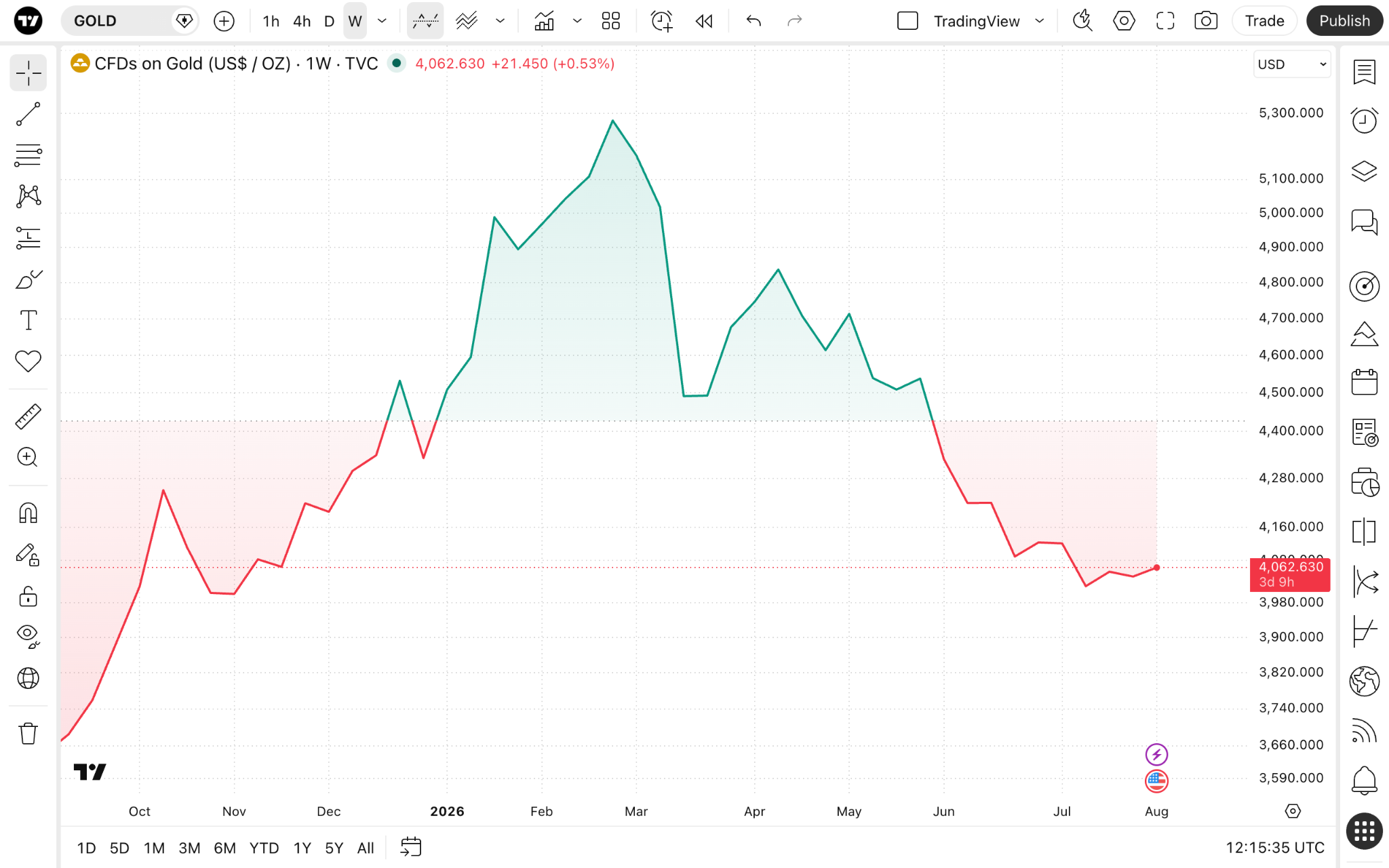
It is similar to a standard line chart, using similar visualization techniques, and provides additional information on how a trend has changed over time.
For instance, if you see that the previously green area starts to narrow and the price is moving closer to a baseline, this might be a signal of a weakening trend. Also, the baseline itself may serve as a support or resistance zone.
Baseline charts vs line charts
These two chart types display similar data with the same inputs for price level, but have unique applications and benefits.
Baseline
- May be more informative for trend change recognition.
- Helps to spot crucial support and resistance levels.
- Works with all chart patterns, similar to line charts.
Lines
- Doesn't show the exact point at which a pivot occurred.
- Easier to read for general trends, but not changes.
- Better for comparing multiple assets.
Enabling the chart type
On Supercharts, open the chart type menu on the upper toolbar and select "Baseline."
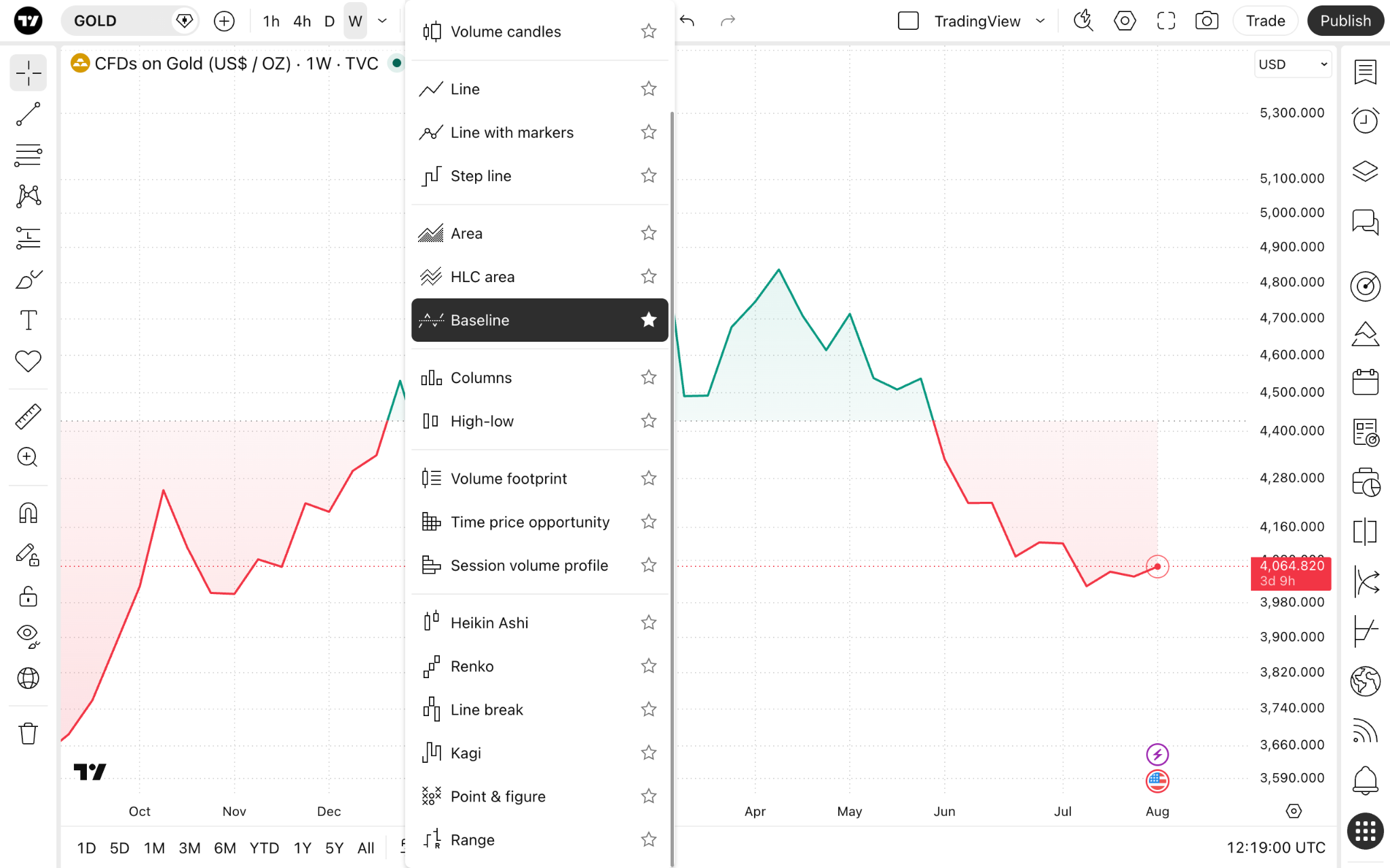
Settings
On the upper toolbar, click the gear "Settings" button and open the "Symbol" tab.
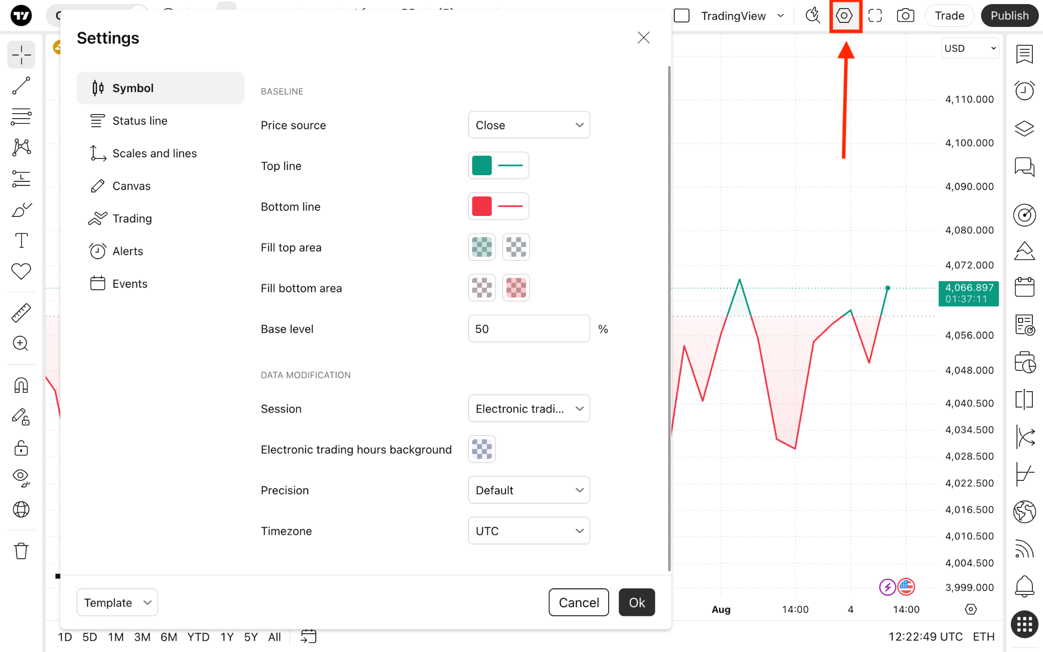
The "Baseline" section lists settings specific to this chart type:
- Price source: Choose the price you want the chart to show. By default, it is set to close price, meaning the line will be plotted by connecting the asset's closing price during the selected timeframe in a sequence. But you can change it to one of the following:
- Open: Shows the opening prices.
- High: Shows the highest prices.
- Low: Shows the lowest prices.
- Close: Shows the closing prices.
- (H + L)/2: Shows the average of the highest and lowest prices.
- (H + L + C)/3: Shows the average of the highest, lowest, and closing prices.
- (O + H + L + C)/4: Shows the average of the opening, highest, lowest, and closing prices.
- Top line: Choose the color, thickness, and opacity of the price above the baseline.
- Bottom line: Choose the color, thickness, and opacity of the price below the baseline.
- Fill top area: Adjust the fill color and opacity of the area above the baseline.
- Fill bottom area: Adjust the fill color and opacity of the area below the baseline.
- Base level: Set the value of the baseline. It is calculated as a percentage of the chart's height. By default, it is set to 50%. 0% is the lower border of the chart and 100% is the upper border of the chart.
Baseline charts in a nutshell
Baseline charts may be the right choice for trend trading and for spotting support and resistance levels. They are designed for simplicity and to avoid cluttering your chart.
Also read: