EURUSD: 4H Major Demand (SUP 78) Meets 1H Falling Wedge BreakoutEURUSD Technical & Order-Flow Analysis | 4H Tactical · 1H Trigger
━━━━━━━━━━━━━━━━━━━━━━━━━━━━━━━━━━━━━━━━━━━━
QUICK SPECIFICATIONS
━━━━━━━━━━━━━━━━━━━━━━━━━━━━━━━━━━━━━━━━━━━━
• Asset: EUR/USD (Spot FX)
• Bias: Tactical Bullish (Long / Mean Reversion)
• Entry Zone: 1.1478 – 1.1485
• Structural Invalidation (SL): 1.14470 (~35 pips)
• Target 1: 1.15000 (+18–20 Pips · First hurdle & BE trigger)
• Target 2: 1.15300 (+48–50 Pips · Tactical intermediate target)
• Target 3: 1.15550 (+72–75 Pips · Front-running major 124-touch wall)
• Risk / Reward: Up to 1 : 2.2
━━━━━━━━━━━━━━━━━━━━━━━━━━━━━━━━━━━━━━━━━━━━
1. THE MACRO PICTURE (4H): HISTORICAL DEMAND DEFENSE
━━━━━━━━━━━━━━━━━━━━━━━━━━━━━━━━━━━━━━━━━━━━
Following the 220-pip liquidation from the August high (1.1700), EURUSD has compressed into a multi-month institutional accumulation shelf:
• SUP 78 (29+ historical touches between 1.1465 and 1.1485)
• SUP 76 (21+ historical touches at 1.1455)
This price pocket has served as a reliable floor in March, May, and early August. Over the last 4 sessions, downside impulse momentum has noticeably flattened out, indicating sell-side exhaustion.
━━━━━━━━━━━━━━━━━━━━━━━━━━━━━━━━━━━━━━━━━━━━
2. TACTICAL CONFIRMATION (1H & 15M)
━━━━━━━━━━━━━━━━━━━━━━━━━━━━━━━━━━━━━━━━━━━━
While 4H establishes the location, lower timeframes provide the execution trigger:
1. Double-Bottom Liquidity Sweep:
Price tested 1.14550 on Sept 17 and retested it on Sept 18, printing long absorption wicks with zero follow-through breakdown.
2. Descending Wedge Breakout Confirmed:
• Market Regime: Descending Wedge (5.6 ATR span)
• Structure State: Bullish Break Confirmed
• Footprint Delta: +35% Aggressive Buyer Delta
3. 15M Trend Alignment:
The 15M execution frame has flipped into "Breakout Trend" with a series of higher lows (1.1455 → 1.1468 → 1.1475) and a 92% historical zone delivery rate.
━━━━━━━━━━━━━━━━━━━━━━━━━━━━━━━━━━━━━━━━━━━━
3. VOLUME REALITY CHECK: WHY WE ARE DISCIPLINED ON TP
━━━━━━━━━━━━━━━━━━━━━━━━━━━━━━━━━━━━━━━━━━━━
The Volume Radar on the 4H currently reads:
• Relative Volume: 0.35x average (QUIET)
• CVD Trend: Distributing
Because volume is currently quiet and overall 4H order flow remains cautious, we do NOT expect an immediate parabolic run to 1.1600+. Instead, we treat this as a high-probability mean-reversion bounce into overhead institutional supply walls:
• First Hurdle (1.15000): RES 67 sits right here, representing a breakdown level from Sept 16 (broken on a 2.3x volume spike). This is our first partial exit and where risk is reduced to zero.
• Major Ceiling (1.15550): The institutional wall at ★ RES 83 contains 124+ historical touches. We exit ahead of this level rather than hoping for a clean slice through.
━━━━━━━━━━━━━━━━━━━━━━━━━━━━━━━━━━━━━━━━━━━━
EXECUTION & RISK MANAGEMENT
━━━━━━━━━━━━━━━━━━━━━━━━━━━━━━━━━━━━━━━━━━━━
• Execution: Enter within 1.1478 – 1.1485.
• Invalidation: Clean 4H close below 1.14470 (violates both SUP 76 and the 1.14550 double-bottom trough).
• Management: Upon reaching 1.15000, secure 35%–40% profit and adjust stop loss to breakeven. Leave the remainder to run toward 1.1530 and 1.1555.
Trade your plan, manage your exposure, and respect market invalidation.
 Long
Long
Bitcoin (BTCUSD) — Falling Wedge Inside a Bigger Range, **Bitcoin (BTCUSD) — Falling Wedge Inside a Bigger Range, Targeting a Breakout Toward 81,200+ 🟠**
**Market Structure Overview:**
BTC exploded higher from the 76,000 zone, tapped just above 82,000, then pulled back into consolidation. Since then, price has been carving out a **falling wedge** — a series of lower highs and lower lows that are converging, which is typically a bullish continuation/reversal pattern rather than a bearish one.
**What's happening on the chart:**
🔹 **Falling Wedge Pattern (marked in red):** Price is compressing downward inside two converging trendlines. Falling wedges statistically resolve upward more often than not, especially when they form after a strong impulsive move like the rally from 76K to 82K.
🔹 **Bullish Order Block (~77,600–78,000):** This is the last zone of aggressive buying before the breakout leg to 82K. It's currently being retested as the wedge grinds lower — a natural magnet for price before any reversal.
🔹 **Demand Zone (DZ ~76,400–76,800):** This is the deeper liquidity pool below current price. If the wedge breaks down further instead of holding the Bullish OB, this is the next realistic support to watch — it also lines up with the origin of the original impulsive rally.
🔹 **Target Zone (~81,200):** Marked at the prior high/resistance area. This is the logical target if the wedge resolves bullishly and price reclaims the breakdown level.
**Setup / Signal Breakdown (bottom summary):**
📍 **Primary setup:** Watch for price to tap either the Bullish OB or the deeper DZ, followed by a bullish reaction candle (rejection wick, bullish engulfing, or higher low forming) — that's the long trigger.
📍 **Confirmation signal:** A clean break and close above the falling wedge's upper trendline would confirm bullish momentum is taking over, adding confluence to the long bias.
📍 **Bearish invalidation:** A strong close below the DZ (~76,400) would invalidate the bullish wedge thesis and suggest deeper downside continuation instead.
📍 **Risk management note:** Wedge patterns can extend longer than expected — wait for confirmation rather than anticipating the bounce blindly.
**Bias:** Cautiously bullish while price holds above the DZ, with 81,200 as the primary upside target on confirmation.
---
📚 **This is an educational post only — not financial advice.** Always manage your own risk and confirm setups with your own analysis before trading.
💬 Like/comment/follow if this breakdown added value — more setups coming soon!
#BTCUSD #Bitcoin #Crypto #TradingView #PriceAction #FallingWedge #SmartMoneyConcepts #TechnicalAnalysis Long 
Gold Breaks a Falling Wedge: Is $4,470 the Next Target?Gold ( OANDA:XAUUSD ) is currently trading near the key trading levels of $4,400 and $4,370.
From a classical technical analysis perspective, gold has formed a Falling Wedge Pattern and is now trading above its upper trendline, supporting a potential bullish reversal.
Can gold confirm this breakout and extend its recovery toward $4,470?
Technical Analysis
From an Elliott Wave perspective, gold appears to have completed a Double Three Correction(W-X-Y) inside the Falling Wedge Pattern.
The breakout above the upper trendline further supports the possibility that the corrective structure has ended and a new bullish move is developing.
💡 Educational Note: A Falling Wedge is generally considered a bullish reversal pattern. A confirmed breakout above its upper trendline can signal that bearish momentum is weakening and buyers are regaining control.
I expect gold to resume its bullish move over the coming hours and rise at least toward $4,437.
If bullish momentum increases, the move could extend toward $4,461 and eventually the key trading level of $4,470.
Trade Setup
First Take Profit(TP): $4,437
Second Take Profit(TP): $4,461
Stop Loss(SL): $4,360
Key Trading Levels: $4,400 _ $4,370 _ $4,470
Which level do you think gold will reach first?
🟢 $4,461
🔴 $4,360
📌 Gold Analysis(XAUUSD), 1-hour time frame.
🛑 Always use proper risk management and set a Stop Loss(SL) for every position.
🚀 If this analysis helps your trading plan, a BOOST would help more traders discover it.  Long
Long
Options Blueprint [Int]: Balancing Upside With Nearby ResistanceDirection Is Only Half of the Decision
A bullish chart does not automatically imply that the most distant bullish target should determine the trade.
This distinction becomes particularly important when price is showing evidence of upside momentum while approaching a technically meaningful resistance area. In that situation, there are really two questions: Where could price move, and what could happen before it gets there?
That distinction between direction and location is the central lesson in this case study.
The current daily chart of E-mini Nasdaq-100 futures, NQ, provides a useful example. The technical structure contains several bullish elements, but it also places a significant obstacle relatively close above current price. Rather than ignoring that obstacle and simply targeting the highest chart projection, an options trader can potentially structure the position around the area where price may first encounter difficulty.
The Bullish Evidence
At the time of the chart, NQ was trading around the 29,550–29,570 area.
Recent price action shows two potentially constructive patterns. The first is a possible double bottom within the recent consolidation. The second is a falling wedge whose upper boundary was pierced during the latest trading session.
A falling wedge can represent declining selling pressure when successive downward swings become progressively compressed. A break through its upper boundary does not guarantee continuation, but it can signal that the balance between buyers and sellers is changing.
There is another piece of evidence on the chart. A 20-period Bollinger Band places its moving average through the recent consolidation, and price has begun challenging and trading around that average after piercing the falling wedge.
Taken together, the wedge break, potential double bottom and interaction with the Bollinger moving average create a reasonable technical basis for studying a bullish scenario.
But bullish evidence does not exist in isolation.
The Obstacle Above Price
The upper Bollinger Band is located around 30,170, and a separate resistance area is clustered around approximately 30,170–30,200.
That creates an interesting conflict.
Traditional pattern analysis could justify a considerably higher objective, with the chart showing a potential target near 31,000. However, price would first need to travel through an area where two different analytical references identify resistance.
This is where a useful trading distinction appears: a chart target is not the same thing as a condition that must occur.
The bullish patterns may suggest that 31,000 is technically possible. They do not tell us that price must move directly there, nor do they tell us how price will behave around 30,200 first.
That nearby obstacle changes how the bullish thesis can be expressed.
Turning Resistance Into Part of the Structure
One way of approaching this scenario is with a call calendar spread rather than simply purchasing a call and relying on a large directional move.
The illustrative structure shown on the chart uses the same 30,200 strike with two different expiration dates:
A September 18 30,200 call is purchased for approximately 83 index points, while a September 11 30,200 call is sold for approximately 8.50 points.
The resulting net debit is approximately 74.50 index points.
Because options on E-mini Nasdaq-100 futures use a $20 multiplier, that corresponds to approximately $1,490 for one calendar spread before commissions, fees and execution differences.
The selection of 30,200 is not arbitrary. It places the calendar strike almost directly at the technical area where the upper Bollinger Band and resistance zone converge.
That changes the question being asked by the position.
Instead of requiring NQ to move all the way toward 31,000, the calendar initially asks whether price could migrate toward approximately 30,200 while the shorter-dated option loses time value faster than the longer-dated option.
Why Calendars Behave Differently
A calendar spread is not simply a cheaper version of a long call.
Its value depends on several variables interacting simultaneously: price, time and implied volatility.
If NQ rises gradually toward 30,200 as the September 11 expiration approaches, the structure may develop favorably because the short call is approaching expiration while the September 18 call still retains additional time.
But there are other possibilities.
If NQ remains substantially below 30,200, both options may lose value and the longer-dated call can still deteriorate.
If NQ rises too quickly and moves significantly beyond 30,200, the short call can gain value rapidly and the calendar may behave very differently from a simple directional long-call position.
Changes in implied volatility can also alter the result. A decline in longer-dated implied volatility can reduce the value of the September 18 option even when price moves in the expected direction.
For those reasons, a calendar does not have the same fixed expiration payoff geometry as a vertical spread.
The TradingView modeling shown for this illustration estimated an initial maximum debit of 74.50 points and a modeled peak outcome of approximately 237.66 points. With the $20 NQ options multiplier, those amounts correspond to approximately $1,490 and $4,753.20 respectively.
That produces a modeled peak-to-debit relationship of roughly 3.19:1 under the assumptions used in that snapshot. It should not be interpreted as a fixed reward-to-risk ratio. The shape and location of the calendar's payoff profile change as time passes and volatility changes.
The Economic Calendar Matters Too
The technical setup is developing during an unusually relevant sequence of U.S. economic releases.
On September 4, the U.S. Bureau of Labor Statistics reported that August nonfarm payrolls increased by 162,000 while unemployment remained at 4.1%. Average hourly earnings increased 0.3% during the month and 3.1% over the previous year.
That combination creates two competing interpretations for equity markets. Labor-market resilience can support expectations for continued economic activity, while stronger employment can also affect expectations for monetary policy.
Technology shares nevertheless showed relative strength during the September 4 session. Semiconductor stocks were among the stronger areas of the equity market even as broader U.S. indexes traded lower.
The next inflation releases add another layer. As scheduled by the Bureau of Labor Statistics, August Producer Price Index data are due September 10, followed by the Consumer Price Index on September 11.
If inflation data were to come in softer than market expectations, lower interest-rate pressure could potentially support longer-duration growth shares, which are influential within the Nasdaq-100. A stronger inflation reading could produce the opposite response and make nearby technical resistance more relevant.
There is an additional timing consideration: the September 11 CPI release occurs on the same date as the expiration of the short call used in this calendar.
Then, on September 15–16, the Federal Open Market Committee is scheduled to meet. The long September 18 call therefore remains alive through that event.
The two calendar legs are consequently exposed to different portions of the event calendar. That can influence implied volatility and makes active management particularly important.
September 11 Is a Management Decision, Not Just an Expiration
A common misconception with calendars is that the shorter-dated option is simply sold repeatedly until the longer-dated option eventually expires.
In practice, each expiration creates a new decision.
If NQ remains below 30,200 as September 11 approaches, the short call may have lost substantial time value. The trader could close that option, allow an out-of-the-money option to expire, or reassess the entire structure.
If NQ is near 30,200, the calendar may be close to the area around which its payoff profile was originally constructed. At that point, price, remaining time and implied volatility become more important than the original chart target.
If NQ has moved substantially above 30,200, the position requires particularly careful attention.
E-mini Nasdaq-100 weekly options are European-style. At expiration, an in-the-money option is automatically exercised based on the applicable fixing, with exercise resulting in a position in the underlying NQ futures contract.
That means allowing an in-the-money short call to reach expiration is not simply an accounting event. It can create a short NQ futures position while the September 18 long call remains open.
A trader who does not want that resulting futures exposure would normally need to make the management decision before expiration.
What Does Rolling Actually Mean?
After the September 11 short call has been removed, several different choices may exist.
The entire calendar could be closed.
The September 18 long call could be retained by itself, which would transform the position into a directional long call with a different risk profile.
Another September 18 call at a different strike could be sold, converting the remaining long call into a same-expiration vertical spread.
Alternatively, if the trader wants to continue using a calendar-style approach beyond September 18, the longer-dated option could first be rolled farther into the future. A new shorter-dated call could then be sold against that extended long option, creating another calendar or a diagonal depending on the strikes selected.
There is an important limitation: the original long call expires only one week after the September 11 short call. That leaves little room for repeated rolling while keeping the original September 18 long option.
Selling a new call that expires after the long call without first extending the long side would create a very different and potentially uncovered risk after September 18.
Rolling therefore should not be automatic. It is a new trade decision based on the market structure that exists at that time.
Defining Invalidation Before Managing the Position
The chart also provides an important reference below price.
A support area begins around 29,213 and extends lower toward approximately 28,930. If price were to break decisively through that region, the bullish interpretation of the falling wedge and potential double bottom would become materially weaker.
That provides a technical invalidation framework.
For the original unadjusted calendar, the initial net debit of approximately 74.50 points represents the defined maximum monetary risk of the spread itself, excluding transaction costs. A trader could therefore use either an options-based risk threshold, a chart-based invalidation level, or a combination of both when deciding whether the original thesis remains intact.
Those are different concepts.
The technical invalidation level describes when the chart thesis has changed. The maximum debit describes the maximum amount committed to the initial options structure. Neither should be confused with futures margin.
Any adjustments can also change the original risk profile.
NQ, MNQ and Contract Size
The chart uses E-mini Nasdaq-100 futures, ticker NQ, while the same underlying market can also be followed through Micro E-mini Nasdaq-100 futures, ticker MNQ.
According to current contract specifications, one NQ futures contract has a multiplier of $20 times the Nasdaq-100 Index and a minimum price movement of 0.25 index points, equal to $5 per tick.
MNQ is one-tenth that size: $2 times the index, with the same 0.25-point minimum movement equal to $0.50 per tick.
Around the index level shown on the chart, that places the notional value of one NQ futures contract near $591,000 and one MNQ contract near $59,000.
The options structure illustrated here specifically uses options on NQ. Each E-mini Nasdaq-100 option represents one NQ futures contract and uses the $20 multiplier. CME also lists options on Micro E-mini Nasdaq-100 futures, but they are separate contracts with their own market characteristics.
Exchange performance-bond requirements for futures positions vary with market volatility and can change. They are separate from the maximum debit of the calendar spread. This distinction becomes especially important if an option is exercised and produces an underlying futures position. Currently:
NQ Margin is ~$42,000 per contract
MNQ Margin is ~$4,200 per contract
The Transferable Lesson
The most important part of this case study is not whether NQ eventually reaches 30,200 or 31,000.
It is the decision process.
Technical analysis may identify a bullish direction while simultaneously identifying an obstacle before the theoretical target. Options provide ways to structure a position around that conflict rather than pretending the conflict does not exist.
Here, the falling wedge, possible double bottom and moving-average interaction create the bullish evidence. The 30,170–30,200 area creates the constraint. The call calendar then uses that constraint as part of the structure itself.
That leads to a broader principle:
Direction tells us what we think price may do. Location helps determine how we may want to express that view.
Sometimes the highest chart target is less important than understanding what price has to overcome first.
Data Consideration
When charting futures, the data provided could be delayed. Traders working with the ticker symbols discussed in this idea may prefer to use CME Group real-time data plan on TradingView: www.tradingview.com - This consideration is particularly important for shorter-term traders, whereas it may be less critical for those focused on longer-term trading strategies.
General Disclaimer
The trade ideas presented herein are solely for illustrative purposes forming a part of a case study intended to demonstrate key principles in risk management within the context of the specific market scenarios discussed. These ideas are not to be interpreted as investment recommendations or financial advice. They do not endorse or promote any specific trading strategies, financial products, or services. The information provided is based on data believed to be reliable; however, its accuracy or completeness cannot be guaranteed. Trading in financial markets involves risks, including the potential loss of principal. Each individual should conduct their own research and consult with professional financial advisors before making any investment decisions. The author or publisher of this content bears no responsibility for any actions taken based on the information provided or for any resultant financial or other losses.  Education
TAO — Multi-Year Falling Wedge | Targets to $2kBittensor (TAO) is approaching a major decision point after spending years compressing inside a large descending/falling wedge structure.
On the high timeframe, TAO has continued to print lower highs while repeatedly defending the broader support region, causing price to contract toward the apex of the structure. This type of compression can become significant when price eventually resolves through the upper descending trendline.
The important point here is that the bullish thesis is conditional on confirmation. I am not treating the pattern as complete until TAO can break the upper boundary and demonstrate acceptance above it.
The Pattern
The chart shows a large falling wedge / descending compression structure developing from TAO's previous major highs.
The structure is interesting because:
Selling pressure appears to be compressing rather than expanding.
Price is approaching the apex after an extended period of consolidation.
The upper resistance trendline has been tested repeatedly.
TAO remains substantially below its previous high, leaving considerable expansion potential if the macro structure resolves upward.
The declining volume profile during much of the consolidation is consistent with a market undergoing prolonged compression.
The falling-wedge interpretation is consistent with the conventional technical-analysis framework for converging downward-sloping boundaries, although confirmation requires an actual breakout rather than simply anticipating one.
Estimated Measured Move
The chart marks TAO's previous major impulse from approximately $149 to $756, an advance of roughly:
$607
That gives us a straightforward way to estimate the potential expansion following a confirmed breakout.
If TAO breaks the wedge around the $500–$600 region, adding the prior ~$607 impulse produces an approximate classical measured-move objective around:
$1,100–$1,200
That aligns extremely closely with the 1.272 Fibonacci extension at ~$1,174 shown on the chart.
This makes the $1,170–$1,200 region my first major high-timeframe measured-move zone rather than an arbitrary price target.
Fibonacci Expansion Targets
If TAO establishes a confirmed macro breakout and subsequently enters price discovery, the Fibonacci extensions on this chart provide additional areas to monitor:
1.272 Fib — ~$1,174
Primary measured-move / first major extension zone.
1.414 Fib — ~$1,478
Secondary expansion target.
1.618 Fib — ~$2,058
Major golden-ratio extension and potentially the most important longer-term upside target on the chart.
Above that, the chart begins moving into substantially more speculative extension territory, including the 2.0 Fib near $3,823. I would treat those higher extensions as scenario levels rather than primary targets unless market structure eventually supports them.
What Confirms the Setup?
For me, simply touching the descending resistance isn't enough.
I want to see:
1. A decisive high-timeframe breakout above the wedge.
2. Increasing volume accompanying the breakout.
3. Acceptance above the broken resistance rather than an immediate rejection back inside the pattern.
4. Ideally, a successful breakout/retest sequence establishing the former resistance as support.
Until that occurs, TAO technically remains inside the compression structure.
Bullish Roadmap
A confirmed breakout would put the previous high around $750–$760 back into focus first.
Reclaiming that area would materially strengthen the macro structure and open the door toward:
~$1,174 → ~$1,478 → ~$2,058
The particularly interesting part is the confluence around $1,174: the prior impulse's measured move and the 1.272 Fibonacci extension independently point toward approximately the same region.
That is the level I would pay the most attention to if this wedge ultimately confirms.
Invalidation
The bullish thesis weakens materially if TAO loses the lower wedge/support structure and establishes acceptance beneath it.
A falling wedge is a setup, not a guarantee. The breakout determines whether the projected measured move becomes actionable.
TAO is compressed. The structure is mature. Now the market has to confirm the direction.
This analysis is for educational and informational purposes only and does not constitute financial advice. Targets shown are technical projections, not predictions or guarantees. Always conduct your own research and manage risk appropriately.  Long
Long
 Long
Long
 Long
Long
Long 
BTC vs. SPX: The Reset Before the Next Cycle?**BTC vs. SPX: The Reset Before the Next Cycle?**
One of the more interesting charts in the market right now isn't BTC/USD.
It's **BTC/SPX**.
When Bitcoin is divided by the S&P 500, a repeating structure becomes much easier to see:
**Expansion → Falling Wedge / Reset → Breakout → Expansion**
And it has happened multiple times during this relative-strength advance.
Look at the sequence on the chart.
Each major push higher in BTC/SPX has been followed by a controlled downward-sloping consolidation. Instead of completely breaking the relative-strength trend, Bitcoin resets against equities, establishes another higher base, and eventually begins the next leg higher.
Now we're seeing a very similar structure developing again.
### Why BTC/SPX Matters
BTC/USD only tells us what Bitcoin is doing against the dollar.
BTC/SPX asks a different question:
**Is capital being rewarded more for holding Bitcoin or the broad U.S. equity market?**
When BTC/SPX trends higher, Bitcoin is outperforming the S&P 500.
That makes the current consolidation particularly interesting.
The ratio remains within the broader relative-strength advance, while another downward-sloping reset has formed near the highs.
If this structure resolves the same way the previous ones did, a breakout would suggest **Bitcoin is beginning another period of relative outperformance versus equities.**
### The Pattern I'm Watching
Previous sequence:
**BTC/SPX impulse higher
→ falling consolidation
→ breakout
→ higher high**
Then again:
**Impulse
→ reset
→ breakout
→ higher high**
And again.
Now:
**Impulse
→ reset
→ ?**
The question is whether the current structure becomes the next continuation.
A confirmed break above the descending trendline — particularly if followed by expansion in the ratio — would strengthen that thesis.
Failure to break out, or loss of the broader higher-low structure, would invalidate the immediate continuation setup.
### Bigger Picture
This is why periods where Bitcoin appears to be "doing nothing" can be deceptive.
Markets don't move vertically.
Strong trends repeatedly go through **expansion, consolidation, and re-expansion**.
BTC/SPX is currently testing whether this is simply another reset in Bitcoin's relative-strength cycle.
If history rhymes again, the next move may not just be Bitcoin moving higher.
It could represent **another rotation toward Bitcoin outperforming traditional equities.**
**BTC/SPX is the chart I'm watching for confirmation.**
*This analysis is for educational purposes only and is not financial advice. Past chart structures do not guarantee future results. Always conduct your own research and manage risk appropriately.*
Long 
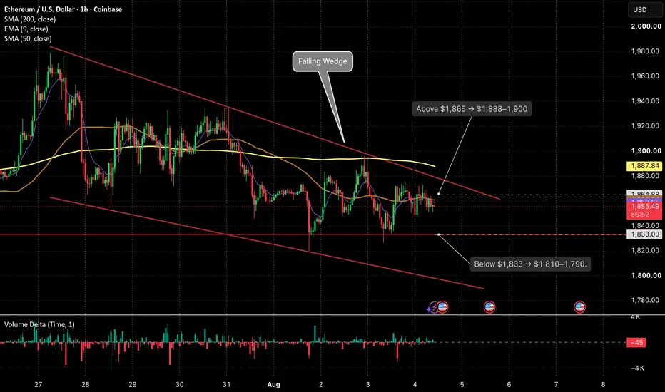
Can Ethereum escape the $1,800–1,900 range today?Can Ethereum escape the $1,800–1,900 range today?
▫️ ETH trades near $1,854, below the EMA 9 at $1,859 and SMA 200 at $1,888. Volume and momentum remain weak.
▫️ Lower oil prices have temporarily eased inflation concerns, but U.S.–Iran negotiations remain unconfirmed. Traders are waiting for action rather than diplomatic promises.
▫️ Prediction-market traders see a 98% probability of ETH remaining above $1,800 by noon ET, but only a 3% probability of it exceeding $1,900. Expectations remain firmly range-bound.
▫️ ETH is compressing inside a falling wedge. Immediate support sits at $1,833, while $1,865–1,888 remains the main resistance zone.
A confirmed hourly close above $1,865 opens the way toward $1,888–1,900. Losing $1,833 would expose $1,810–1,790.
Disclaimer: This is not invest advice. $EURUSD - Falling Wedge at Resistance: Watch $1.16Hi guys! 👋
🔔 Euro has been recovering after a continuous drop since mid-January, which pushed price to a new year-to-date low at $1.13245. That decline was orderly — not a crash, not panic selling — and it left a clear technical structure behind it.
🔔 The correction formed a falling wedge, internally structured as a 5-wave ABCDE sequence. Wedges of this type are typically continuation or reversal patterns depending on where they appear in the broader trend, and this one is sitting at a location that demands attention.
🔔 At the time of publishing, EURUSD is testing the upper band of the wedge. So far it's failing to break out, floating inside a narrow channel defined by the SMA-100 and EMA-51 — two levels that have been acting as a ceiling and a floor simultaneously. That's compression. Compression breaks eventually, and when it does it tends to move fast.
🔔 The level to watch is $1.16.
🔔 It's where the wedge resistance, the 200-day SMA, and a major historical support/resistance zone all converge. A daily close above $1.16 opens the door to a sustained bullish move.
🔔 $1.16 resistance backed by the 200-day SMA
🔔 Key support and resistance map
Bias : Rejection at $1.16 → back inside the wedge, retest of lower support levels
Invalidation : Daily close above $1.16 is bullish continuation toward the February highs
✊ Good luck with your trades! ✊
• If you like the idea, hit the 🚀 button
• Please ✍️ your thoughts in the Comments section
• And follow me for more updates.
WTI: How to read a Falling WedgeWTI: How to read a Falling Wedge
A falling wedge is a pattern where price moves lower, but the range becomes tighter over time.
It usually shows that sellers are still in control, but their pressure may be weakening. Each new low is lower than the previous one, yet price starts compressing instead of accelerating lower.
On this WTI 4H chart, oil is still trading inside a falling wedge after a sharp decline from the previous highs. Price is now testing the lower side of the pattern, which makes this a key decision zone.
The important lesson is this:
A falling wedge is not a buy signal by itself.
It becomes bullish only after price breaks above the upper trendline and confirms the move.
That confirmation is not here yet.
Technically, WTI remains below the EMA 9, EMA 20, SMA 50 and SMA 200. This means the broader structure is still bearish, even though the wedge may be showing that downside momentum is starting to slow.
How to read it:
🟢 Bullish confirmation:
A clean 4H close above the upper wedge line would suggest that sellers are losing control. If price then holds the broken trendline as support, WTI could recover toward the SMA 200 and the 8,300–8,600 resistance area.
🔴 Bearish continuation:
If WTI closes below the recent low near 7,469, the bullish wedge idea weakens. In that case, price could continue lower toward 7,200–7,000.
⚪ Neutral zone:
While price remains inside the wedge, there is no confirmed direction. The pattern is only a warning that momentum may be changing, not proof of a reversal.
Key takeaway:
Pattern first, confirmation second, trade idea last.
The falling wedge shows that bearish pressure may be losing strength, but without a breakout, the market is still in a downtrend.
⚠️ Not financial advice.  Long
Long
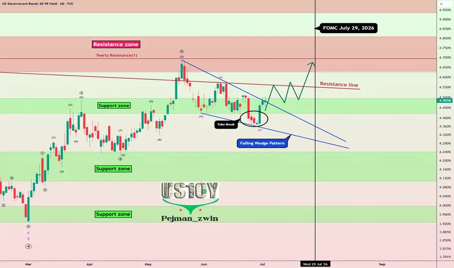
US10Y Fake Break:Is a New Bond Yield Rally About to Shake MarketToday, I want to analyze the U.S. 10-Year Government Bond Yield ( TVC:US10 ), as it is one of the key financial market indices that can show us the broader market direction for various assets like Gold ( OANDA:XAUUSD ), Silver ( OANDA:XAGUSD ), U.S. stock indices (including the S&P 500 ( FOREXCOM:SPX500 )), and especially Bitcoin ( BINANCE:BTCUSDT ) in the crypto market. Stay with me.
On the daily timeframe, the U.S. 10-Year Government Bond Yield is currently moving near a support zone (4.24%-4.10%) and has formed a fake break. Typically, after fake break patterns, the market tends to move in the opposite direction, with upward momentum (educational note).
From a classical technical analysis standpoint, the U.S. 10-Year Government Bond Yield seems to have formed a falling wedge pattern, which could signal a potential upward breakout.
From an Elliott Wave perspective, after breaking the upper line of the falling wedge pattern, we could anticipate the start of the next impulsive wave upward.
I expect the U.S. 10-Year Government Bond Yield to continue its upward trend in the coming days and at least reach the next resistance zone(4.64%-4.50%). This rise could lead to a decline in risk assets such as U.S. equities, gold, silver, and even the crypto market, including Bitcoin.
Target: Resistance zone(4.64%-4.50%)
Stop Loss(SL): 4.35%
Note: The U.S. 10-Year Government Bond Yield could potentially maintain its upward trend ahead of the FOMC meeting on July 29. After the release of new economic data and once we hear Warsh’s latest remarks, we may get a clearer signal about the next major move or a possible trend reversal.
------------
How Rising 10-Year Bond Yields Influence Major Assets
When 10-year government bond yields move higher, they tend to reshape investor behavior across markets:
Bitcoin & Cryptocurrencies
As yields climb, capital often rotates toward safer, income-generating assets like bonds. This shift can reduce demand for high-risk assets such as Bitcoin, potentially leading to price pressure.
Gold
Gold typically struggles in a rising yield environment. Since it doesn’t generate income, higher bond yields increase the opportunity cost of holding gold, which can weigh on its price.
U.S. Equities
Stocks, especially growth and tech sectors, may face headwinds. Higher yields usually mean higher borrowing costs, which can compress margins and slow down expansion for companies reliant on financing.
------------
What’s your view on US10Y? If US10Yr rises, could we see declines in gold, U.S. stock indices, and the cryptocurrency market?
💡 Please respect each other's opinions and express agreement or disagreement politely.
📌 US 10-Year Government Bond Yield Analyze (US10Y%), Daily time frame.
🛑 Always set a Stop Loss(SL) for every position you open.
✅ This is just my idea; I’d love to see your thoughts too!
🔥 If you find it helpful, please BOOST this post and share it with your friends.  Long
Long
 Long
Long