AG Pro Volume Profile Acceptance Ladder [AGPro Series]AG Pro Volume Profile Acceptance Ladder
Overview / What it does
AG Pro Volume Profile Acceptance Ladder is a volume-structure indicator designed to monitor whether price is building acceptance, holding acceptance, or losing acceptance inside a rolling volume-defined band. Instead of treating volume profile as a static reference snapshot, this script tracks acceptance as a progressive process. The goal is not to predict where price must go next, but to help the user read whether the market is spending enough time and participation inside a value zone to justify calling that area accepted.
The script builds a rolling profile window, estimates the active acceptance band, and then classifies current behavior into states such as Probe, Build, Accept, Shift Watch, Shift Confirmed, and Fail. This creates a ladder-style framework for reading when the market is stabilizing within one value region and when that acceptance may be migrating toward another region. In practice, that makes it useful for users who want a structured way to distinguish temporary interaction from more durable volume-based acceptance.
A key design goal of this script is to separate acceptance progression from simple attraction-to-level logic. Some tools are built around whether price is pulled back toward a reference such as a POC or another central level. This script focuses on a different question: is the market actually building and holding acceptance inside a rolling value zone, and is that acceptance stable enough to be treated as an active auction area rather than a temporary touch.
Because of that framing, the indicator is best read as a market-structure context tool. It maps an evolving acceptance zone, estimates a directional ladder bias, and provides state transitions that can be used to organize chart reading, scenario planning, or alert workflows. It is not an execution engine, not a broker-grade order book product, and not a substitute for independent trade management.
Unique Edge
The distinguishing feature of this script is that it treats acceptance as a staged process rather than a single level event. The output is not limited to a profile center or a value-area drawing. Instead, the script evaluates how price behaves relative to a rolling volume-defined band and converts that behavior into a progression model.
That matters because a market can interact with a value area in very different ways. It can briefly probe it, begin building around it, hold it in a more stable manner, shift acceptance upward or downward, or fail to maintain acceptance altogether. By organizing those conditions into a ladder of states, the script attempts to make the auction process easier to read in real time.
This also makes the indicator materially different from a standard POC-centered interpretation. The emphasis here is not on magnetic pull toward one volume reference. The emphasis is on whether acceptance is forming, strengthening, or migrating. In that sense, the script is better understood as an acceptance progression map than as a simple volume anchor display.
Methodology
The script uses a rolling lookback window and distributes bar-based volume across a defined number of bins in order to approximate a local volume profile. From that rolling profile it derives the active central reference, the current acceptance band, and the relative participation of that band within the profile window.
Using those profile components, the script calculates several internal measures. These include how often price remains inside the band over a recent hold window, how often price re-enters the band after leaving it, how stable the band center is relative to recent values, and whether the active center appears to be migrating in a meaningful way. These measures are then blended into an aggregate acceptance score and a ladder bias.
The state engine uses those components to classify behavior into the following progression states:
- Reject
- Probe
- Build
- Accept
- Shift Watch
- Shift Confirmed
- Fail
These states should not be read as guarantees of continuation or reversal. They are condition labels describing how the script currently interprets interaction with the active acceptance band.
Signals & Alerts
The script includes deterministic state-based alerts so users can build workflows around changes in acceptance conditions.
Available alert events:
- Acceptance Building
- Acceptance Confirmed
- Upward Ladder Migration Confirmed
- Downward Ladder Migration Confirmed
- Acceptance Failed
- Acceptance Lost
These alerts are designed to reflect state transitions inside the indicator logic. They do not imply expected profitability, win rate, or directional certainty.
Key Inputs
- Profile Window: Defines the rolling lookback used for the local profile estimate.
- Bin Count: Controls the profile resolution.
- Value Area %: Defines how much of the rolling profile volume is used to construct the active acceptance band.
- Migration Sensitivity: Controls how easily the script classifies center shifts as migration activity.
- Probe Band Multiplier: Expands the outer interaction zone around the active acceptance band.
- Hold Lookback: Defines the window used for hold and re-entry style calculations.
- Theme / Panel Location / Panel Font Size / Label Font Size: Presentation controls for chart readability.
- Show Previous Acceptance Band / Show State Markers / Forward Extension Bars: Visual controls for context and labeling.
Limitations & Transparency
This script does not use exchange-native tick-by-tick volume profile data. It uses a bar-based approximation built from the information available to Pine Script on the chart. As a result, the acceptance band and profile structure shown by the indicator should be interpreted as a model of local volume distribution, not as a perfect reconstruction of exchange-level auction detail.
The ladder states are also model outputs, not objective market facts. Small changes in lookback, resolution, or volatility regime can influence how the script classifies the same area. Users should therefore treat the states as structured analytical context rather than as standalone instructions.
The indicator is also not intended to replace broader market analysis. Trend structure, liquidity conditions, volatility regime, higher-timeframe context, and instrument-specific behavior can all affect how useful an acceptance reading is in practice.
Risk Disclosure
This script is for chart analysis and educational use only. It does not provide financial advice, investment advice, or trade recommendations. All markets involve risk, and no indicator can guarantee outcome, timing, or future performance. Users should apply independent judgment, test settings carefully, and use risk management appropriate to their own methodology.
What this script is not
- It is not a promise of continuation or reversal.
- It is not a broker-grade volume profile engine.
- It is not a substitute for execution planning or risk control.
- It is not a claim that acceptance automatically leads to trend persistence. Indicatore

Volume Bubble Levels [BackQuant]Volume Bubble Levels
Overview
Volume Bubble Levels is a volume-expansion and liquidity-mapping tool designed to identify statistically significant participation events and project them forward as actionable structural levels.
Instead of treating volume as a secondary confirmation metric, this indicator treats volume spikes as primary events and builds a framework around them:
Detect abnormal volume relative to a rolling baseline.
Classify those events into tiers based on intensity.
Visualize them directly on price using scalable “bubble” markers.
Project their high and low as forward levels (“naked levels”).
Track whether those levels remain untouched, get retested, or are invalidated.
The result is a system that highlights where meaningful participation occurred , and more importantly, whether the market has returned to those areas .
This shifts the focus from “what price did” to “where size traded and what has or hasn’t been revisited since.”
Core idea
Markets move through phases of normal participation and abnormal participation . Most bars are noise. Occasionally, a bar prints with volume significantly above its baseline, indicating:
Aggressive positioning,
Large order execution,
Liquidity events,
Absorption or distribution,
Forced flows (liquidations, stops, news reactions).
These events often leave behind structural footprints.
Volume Bubble Levels captures those footprints and answers:
Where did abnormal participation occur?
How strong was it relative to recent history?
Have those levels been revisited?
Are there still “untouched” zones where liquidity may remain?
Volume baseline and normalization
The first step is establishing what “normal” volume looks like.
The script computes a rolling moving average of volume:
volMa = MA(volume, volMaLen, volMaType)
You can choose the type:
SMA for stable baseline,
EMA for faster adaptation,
RMA for smoother response,
WMA for weighted emphasis on recent bars.
Then the script computes a ratio:
volRatio = volume / volMa
This is the key metric.
Interpretation:
volRatio ≈ 1 → normal participation.
volRatio > 1 → above-average participation.
volRatio >> 1 → abnormal participation.
Everything in the script is built off this ratio.
Tiered volume classification
Instead of treating all volume spikes equally, the script classifies them into three tiers:
Tier 1 — Elevated : moderate expansion above baseline.
Tier 2 — High : strong participation.
Tier 3 — Extreme : major volume event.
Defined as:
Tier 1: volRatio ≥ t1Mult
Tier 2: volRatio ≥ t2Mult
Tier 3: volRatio ≥ t3Mult
Each higher tier overrides the lower:
Tier 3 > Tier 2 > Tier 1
This creates a hierarchy of importance:
Tier 1 = “noticeable”
Tier 2 = “significant”
Tier 3 = “structural”
Directional context (bull vs bear volume)
Each volume event is also classified directionally:
Bull = close ≥ open
Bear = close < open
This matters because:
Bull volume spikes often represent aggressive buying or short covering.
Bear volume spikes often represent aggressive selling or long liquidation.
So every event carries two dimensions:
Magnitude (Tier 1 / 2 / 3)
Direction (bull / bear)
Bubble visualization (what the circles mean)
Volume events are plotted directly on price as circular “bubbles.”
Key properties:
Position: plotted at the closing price of the bar.
Color: determined by tier and direction.
Size: determined by how far the volume exceeds the threshold within its tier.
Size bucketing within tiers
Each tier is subdivided into five size buckets:
Tiny
Small
Normal
Large
Huge
This is done by splitting each tier’s range into equal steps.
Example:
Tier 1 spans from t1Mult → t2Mult.
That range is divided into 5 segments.
Higher volRatio within that tier = larger bubble.
So a large Tier 1 bubble may still be smaller than a small Tier 2 bubble, preserving hierarchy.
What bubbles represent in practice
Each bubble is a localized participation event .
Interpretation:
Cluster of bubbles → sustained participation.
Single large bubble → isolated liquidity event.
Tier 3 bubble → major structural event, often worth tracking.
They are not signals by themselves. They are markers of where something important happened .
Naked levels: projecting volume events forward
The core feature of this script is not the bubbles themselves, but what happens after them.
For every qualifying volume event, the script creates:
A horizontal line at the bar’s high.
A horizontal line at the bar’s low.
These are called naked levels .
Why both high and low:
High captures the upper boundary of the event.
Low captures the lower boundary.
Together, they define the full price range where abnormal volume occurred.
What “naked” means
A level is “naked” if:
Price has not yet traded back through it.
These are important because:
They represent unresolved areas.
Liquidity may still be resting there.
Market participants involved in the original event may still be positioned around that level.
Level lifecycle
1) Creation
On a volume event:
High line and low line are created.
Stored with metadata:
- price
- tier
- direction
- creation bar
2) Extension
Each level extends forward in time:
Updated every bar.
Projected to the right until resolved.
3) Takeout (resolution)
A level is considered “taken” when price trades through it:
High level taken when: high > level price
Low level taken when: low < level price
Once taken:
The line is terminated.
Removed from active tracking.
4) Expiry
Levels also expire after a fixed number of bars:
If (current bar - birth bar) > extendBars → level is removed.
This prevents infinite clutter and ensures relevance.
Why naked levels matter
These levels act like:
Liquidity magnets,
Revisit zones,
Areas of unfinished business.
In practice:
Price often returns to high-volume zones.
Untouched levels can act as targets.
Revisits can trigger reactions, pauses, or reversals.
This aligns with auction market theory:
Markets seek to revisit areas of high participation.
Unfinished auctions tend to get completed.
Tier-aware level significance
Not all levels are equal:
Tier 1 levels = weaker, more frequent.
Tier 2 levels = meaningful.
Tier 3 levels = major structural zones.
The script reflects this visually:
Tier 3 lines are thicker.
Colors differ by tier and direction.
So you can quickly identify:
Which levels matter most.
Color system
Each tier has separate bull/bear colors.
This allows:
Bullish volume zones vs bearish volume zones.
Visual distinction between accumulation-type and distribution-type activity.
Because:
A high-volume bullish bar and a high-volume bearish bar represent very different order flow contexts.
Line styling
You can choose:
Dotted
Dashed
Solid
This does not affect logic, only readability.
What this indicator is NOT
It is important to understand what this tool is not doing:
It is not a volume profile.
It does not aggregate volume by price level.
It does not measure cumulative delta.
It does not predict direction directly.
Instead, it is:
Event-based , not distribution-based.
Forward-projecting , not historical summarizing.
Structure-focused , not signal-focused.
How to use it
1) Identify important zones
Focus on:
Tier 2 and Tier 3 bubbles.
Clusters of bubbles.
These represent areas of significant participation.
2) Track naked levels
Watch:
Untouched levels ahead of price.
Levels near current price.
These often act as:
Targets,
Reaction zones,
Liquidity pools.
3) Watch level interactions
When price approaches a level:
Rejection → confirms level relevance.
Clean break → invalidates it.
Chop around level → absorption.
4) Combine with structure
This tool works best with:
Trend context,
Support/resistance,
Market structure,
Other flow indicators.
Example interpretations
Scenario 1: Strong bullish bubble cluster
Multiple Tier 2–3 bullish bubbles form.
Price moves away without revisiting.
Interpretation:
Strong accumulation zone.
Untouched lows may act as future support or targets.
Scenario 2: Price returns to naked level
Price revisits a previously untested level.
Interpretation:
Liquidity is being re-engaged.
Potential reaction point.
Scenario 3: Level invalidation
Price blows through a level with strong continuation.
Interpretation:
That level no longer holds structural significance.
Market has repriced beyond that participation zone.
Strengths
Highlights meaningful participation events.
Projects actionable forward levels.
Separates noise from structural volume.
Works across assets and timeframes.
Limitations
Depends on volume quality (less reliable on low-liquidity assets).
Does not indicate direction by itself.
Can produce many levels in volatile environments.
Requires interpretation, not plug-and-play signals.
Summary
Volume Bubble Levels transforms abnormal volume events into forward-projected structural levels. By measuring volume relative to its own baseline, classifying it into tiers, and projecting both the high and low of those events, the indicator builds a dynamic map of where meaningful participation occurred and whether those areas remain unresolved. The bubbles highlight the event, but the real value comes from the naked levels, which act as evolving liquidity zones that can influence future price behavior. Indicatore

AG Pro Volume Delta Imbalance Map [AGPro Series]AG Pro Volume Delta Imbalance Map
OVERVIEW / WHAT IT DOES
AG Pro Volume Delta Imbalance Map is an overlay-style volume pressure tool designed to visualize directional participation asymmetry directly on the price chart. Instead of presenting volume as a standalone histogram or reducing the analysis to a single cumulative line, this script maps estimated directional imbalance into a chart-native structure built around a basis line, a flow spine, and an adaptive ribbon. The result is a cleaner view of whether recent participation is leaning bullish, bearish, or balanced, while keeping the analysis anchored to actual price movement.
The script is built for traders who want a more visual interpretation of directional volume pressure without relying on a separate lower-pane oscillator. The main purpose is not to predict tops, bottoms, or reversals in isolation. Its role is to help users read where directional pressure is expanding, where it is fading, and where the current state remains neutral or low-conviction. By placing the analysis directly on the chart, the script aims to make flow conditions easier to compare with market structure, pullbacks, trend continuation attempts, and local regime shifts.
A key design objective of this script is practical readability. Many volume-based tools either become too abstract for quick chart work or too visually dense to remain useful during live decision-making. Here, the imbalance model is translated into a compact overlay with a smoothed directional spine, a ribbon that adapts to pressure intensity, optional burst labels, optional zone-start labels, and a summary panel that reports the current state, bias, strength, persistence, label mode, and exhaustion condition. This keeps the output interpretable across multiple markets and timeframes without forcing the user to decode a complicated dashboard.
This script should be understood as a directional-volume map, not as a trade automation engine. It is intended to support chart reading, context building, and workflow discipline. It can help highlight when directional participation is broadening, when pressure alignment is improving, or when a previously strong move begins to lose quality. Those observations can then be combined with price structure, support and resistance, volatility context, and the user’s own execution framework.
UNIQUE EDGE
The main differentiator of this script is that it does not approach volume pressure in the same way as classic cumulative-flow or oscillator-style tools. Traditional cumulative tools such as OBV compress volume behavior into a running line, while money-flow oscillators often frame the analysis around momentum-style expansion and contraction in a lower pane. AG Pro Volume Delta Imbalance Map takes a different route: it transforms estimated directional pressure into an on-chart flow structure that is designed to be read alongside candles, pullbacks, transitions, and continuation attempts.
Another differentiating element is the emphasis on flow state rather than raw volume magnitude alone. The script is not simply asking whether volume is high or low. It is asking whether directional participation is leaning to one side strongly enough to create an interpretable imbalance state, whether that pressure is stabilizing or intensifying, and whether that condition is durable enough to remain relevant across several bars. This creates a more structural view of participation rather than a purely reactive one.
The visual architecture is also intentionally distinct. The flow ribbon is not only cosmetic. It is designed to express directional pressure breadth around the spine, while the spine itself provides a simpler anchor for the prevailing flow direction. Optional labels then mark either stronger burst moments or the beginning of a new directional zone, depending on user preference. This allows the script to serve different chart-reading styles without changing the core methodology.
Finally, transparency matters. This script does not claim to be a true bid/ask footprint, a tape-reading engine, or an exact institutional order-flow detector. It uses an estimated directional-volume proxy derived from price-location and candle-structure behavior. That distinction is important. The objective is to provide a disciplined, readable directional-pressure framework within the constraints of standard chart data, not to imply access to information the script does not use.
METHODOLOGY
The model begins with a directional-pressure proxy built from three components: close location within the bar, candle body dominance relative to the full range, and directional sign reinforcement from candle structure. These inputs are blended into a bounded hybrid bias value intended to estimate whether recent volume participation was more likely to have leaned bullish or bearish within the bar. That estimate is then scaled by the bar’s volume to produce directional volume estimates and a delta-style imbalance reading.
The raw imbalance is normalized using a volume baseline so that the output remains more comparable across changing participation environments. The normalized value is then smoothed to reduce excessive noise and to create a more usable state engine. From there, bullish, bearish, and balanced conditions are determined through explicit thresholds. This means the displayed state is not arbitrary. It is driven by a consistent threshold structure that helps separate neutral conditions from more meaningful directional pressure.
The chart overlay is built around three visual elements. First, a basis line offers a stable reference. Second, the flow spine tracks the smoothed imbalance state translated onto price space. Third, an adaptive ribbon expands or contracts around the spine based on imbalance strength, which helps communicate whether directional participation is broadening or losing intensity. Together, these components aim to make flow conditions visible without overwhelming the chart.
The script also tracks persistence and a simplified exhaustion heuristic. Persistence reflects how long the current directional state has remained in force, while exhaustion attempts to highlight cases where imbalance remains strong but starts to weaken while price response underperforms. This is not a reversal guarantee. It is a contextual warning that a previously forceful participation state may be losing efficiency.
SIGNALS & ALERTS
The script can label directional events in two different styles. In Burst Labels mode, labels are reserved for stronger acceleration moments inside an existing directional condition. In Zone Start Labels mode, labels are printed when a new directional zone begins. This distinction matters because some traders prefer confirmation after pressure expansion, while others prefer earlier visual markers at the start of a state change.
Bullish and bearish imbalance burst alerts are available for users who want notification when directional pressure expands beyond the relevant threshold. These alerts are best interpreted as flow acceleration events, not standalone entry signals. In practice, many users will prefer to combine them with local structure, pullback quality, reclaim behavior, or continuation context.
The script also includes bias reversal alerts and imbalance strength expansion alerts. These are useful for monitoring whether a previously balanced or opposing environment is transitioning into a new directional condition, or whether an already active imbalance is strengthening enough to deserve attention. The summary panel helps reinforce these changes by showing state, bias, strength, persistence, label mode, and exhaustion status in a compact format.
A separate exhaustion-risk alert is provided for conditions where the model detects that a strong imbalance may be fading in quality. This should be interpreted as a caution flag, not as a direct call to reverse or exit automatically. In many workflows, it is more useful as a prompt to reassess the context, tighten risk discipline, or watch for weakening continuation quality.
KEY INPUTS
Normalization Lookback controls the volume baseline used in the imbalance normalization process. Larger values can stabilize the model, while smaller values can make the output more reactive. Imbalance Smoothing influences how quickly the directional state responds to changing pressure. Shorter smoothing reacts faster but may increase noise, while longer smoothing can improve stability at the cost of responsiveness.
Map Basis EMA Length affects the visual anchor used for the overlay. ATR Length and Spine ATR Multiplier influence how the spine is translated into price space and how the ribbon behaves around it. Flow Ribbon Width controls the breadth of the visible pressure corridor, while Bull Flow Width Boost allows the bullish side to be widened slightly for visual emphasis when appropriate.
Bullish and Bearish Imbalance Thresholds define when the script considers directional pressure strong enough to move out of the balanced state. Burst Threshold determines when the model treats a move as a more meaningful acceleration event. Extreme Threshold contributes to the exhaustion logic and strength classification. Users can also choose whether labels represent burst moments or zone starts, depending on how early or selective they want the chart annotations to be.
Visual controls allow users to show or hide the basis line, flow ribbon, spine glow, backdrop, burst labels, exhaustion labels, spine tag, and panel. Panel position, panel theme, text sizing, label sizing, and offset controls are included so that the script can be adapted to different chart layouts and personal reading preferences without changing the underlying methodology.
LIMITATIONS & TRANSPARENCY
This script uses an estimated directional-volume model. It does not use order-book data, footprint data, bid/ask tape data, or exchange-level aggressor classification. As a result, the displayed imbalance should be understood as a chart-based directional proxy, not as an exact measurement of true traded delta.
Because the model relies on price-location and candle-structure inputs, the output can behave differently across instruments with different volatility profiles, gap behavior, liquidity conditions, and session structures. It is normal for a setting that looks well balanced on one asset or timeframe to require refinement on another. Users should expect to tune thresholds and visual parameters when moving between markets.
Signals and labels are contextual. A bullish label inside a weak range environment does not carry the same meaning as a bullish label that appears after a reclaim, a pullback stabilization, or a clean continuation structure. Likewise, a bearish label during highly erratic volatility may be less reliable than a similar reading inside a smoother directional sequence. The script is designed to assist interpretation, not to replace it.
No single output from this script should be treated as a guaranteed trade trigger, reversal call, or risk-management rule. The panel, ribbon, spine, and labels are tools for reading participation conditions. They are most useful when integrated with broader chart context, including trend structure, invalidation logic, nearby levels, liquidity conditions, and the user’s own process.
RISK DISCLOSURE
This script is for chart analysis and educational use. It does not provide financial advice, portfolio advice, or guaranteed trade outcomes. All trading and investing involve risk, including the risk of loss. Past market behavior and prior indicator responses do not guarantee future results.
Users remain fully responsible for how they interpret and apply the script. Any signal, label, or state reading should be evaluated within a complete decision process that includes market context, risk definition, and position management. This script should not be used as the sole basis for entering, exiting, or sizing a trade.
If you use this tool in live market conditions, it is sensible to test it across different assets and timeframes and to confirm that its behavior matches your own execution logic before relying on it in a real-money workflow. Indicatore

CVD IQ [TradingIQ]Hello Traders!
🔹 CVD IQ
CVD IQ is a delta-driven analytical tool designed to reveal how aggressive buying and selling activity translates into price movement.
Instead of relying purely on price, this indicator reconstructs order flow dynamics using lower timeframe data , allowing you to see:
Where did the pressure come from… and how efficiently did it move price?
It focuses on answering a deeper question:
Was the move driven by real participation, or was it inefficient, absorbed, or divergent?
aggressive buy vs sell activity (CVD)
price vs delta divergences
efficiency of price movement relative to flow
cost of moving price (delta per tick)
absorption and imbalance conditions
multi-scale flow analysis (bar, day, swing)
classic divergence detection (RSI style)
🔹 What the indicator shows
🔸 Cumulative Volume Delta (CVD)
CVD is built using lower timeframe data to approximate aggressive buying and selling.
This allows you to track:
whether buyers or sellers are in control
how much pressure is building over time
when participation is increasing or fading
🔸 IMMEDIATE Divergence detection (Classic & Cost Models)
The indicator detects when price and delta are out of sync .
Classic divergence highlights:
price making new highs while delta weakens
price making new lows while delta strengthens
potential exhaustion or reversal conditions
Cost-based divergence goes further by evaluating:
how much delta was required to move price
whether moves are becoming more or less efficient
hidden weakness in “expensive” price movement
This shifts your perspective from:
“price is moving”
to:
“how much effort did it take to move price?”
🔸 CVD Cost Per Tick (Efficiency Analysis)
One of the most important features.
The indicator measures:
Delta per tick = how much aggressive volume was required to move price
This allows you to identify:
efficient moves (low cost → strong response)
inefficient moves (high cost → weak response)
potential exhaustion when cost rises sharply
Each swing is classified into categories like:
Very High Cost
High Cost
Normal Cost
Low Cost
Very Low Cost
High cost often signals absorption or resistance from opposing liquidity .
🔸 Swing-based flow analysis
The indicator breaks market structure into swings and evaluates:
delta across each swing
cost of movement between pivots
relative efficiency vs previous swings
This helps you understand:
whether trends are strengthening or weakening
if continuation is becoming harder
when liquidity is likely opposing the move
🔸 Delta-Implied Close (Expected Price)
The script estimates where price should have closed based on delta.
This gives insight into:
whether price overperformed or underperformed relative to flow
hidden absorption when price fails to match delta
inefficiencies between participation and result
Important Note
This model is adaptive and continuously updates based on changing market conditions. It is not a predictive engine, but rather a framework for interpreting how order flow is currently interacting with price.
🔸 Delta Analysis Table (Bar / Day / Swing)
A live table provides a structured breakdown of flow and price response across three contexts:
current bar
current day
current swing
It includes:
aggressive buy & sell volume
buy/sell percentages
net delta
imbalance ratios
price movement in ticks
close position within range
delta cost per tick
cost classification
absorption detection
This allows you to quickly answer:
Who is in control, and is price responding properly?
🔹 Table Overview
Metric
Name of the metric shown in each row.
Bar
Value calculated for the current bar only.
Day
Value accumulated from the start of the current day.
Swing
Value accumulated from the start of the current swing.
🔹 Flow
Aggressive Buys
Total buy-side market order volume. Higher values indicate stronger buying pressure.
Aggressive Sells
Total sell-side market order volume. Higher values indicate stronger selling pressure.
Buy %
Percentage of total aggressive volume coming from buyers. Higher values indicate buy-side dominance.
Sell %
Percentage of total aggressive volume coming from sellers. Higher values indicate sell-side dominance.
Net Delta
Aggressive buys minus aggressive sells. Positive values favor buyers, negative values favor sellers.
Imbalance Ratio
Relative dominance between buyers and sellers, expressed as a multiple. Higher values indicate stronger directional control.
🔹 Price Response
Total Aggression
Combined aggressive buy and sell volume. Represents total market participation.
Bar Tick Move
Price movement measured in ticks. Shows how far price moved over the period.
Close Position
Where price closed within its range. Higher values mean the close is nearer the high, lower values nearer the low.
🔹 Efficiency & Cost
Delta Cost / Tick
How much delta was required to move price by one tick. Higher values indicate less efficient movement and potential absorption.
Cost
Classification of how expensive the move is relative to recent conditions. High cost suggests resistance or absorption, low cost suggests efficient movement.
Ticks per 1k Delta
Number of ticks price moved per 1000 delta. Higher values indicate more efficient price movement.
Price Move per 1k Delta
Actual price movement per 1000 delta. Higher values indicate stronger price response to order flow.
🔹 Delta-Based Expectations
Delta-Implied Close
The price level where the bar would be expected to close based on the underlying delta.
Move Ratio
Actual price movement relative to the delta-implied move.
1.0 = expected response
1.0 = stronger than expected
<1.0 = weaker than expected
🔹 How to read it
Each component provides a different layer:
CVD → who is active
Divergence → when price and flow disagree
Cost → how efficient the move is
Table → structured confirmation across contexts
Together, this shifts your thinking from:
“price moved up”
to:
“buyers were aggressive - but did price actually respond?”
🔹 Example interpretations
strong delta + efficient move → clean continuation
strong delta + weak move → absorption
rising cost over time → trend weakening
divergence signals → potential reversal or trap
low cost + expansion → strong directional move
🔹 Why this indicator is useful
It gives you:
participation behind price
context for whether moves are efficient
early detection of exhaustion or absorption
a way to quantify “effort vs result”
multi-timeframe flow insight (bar, day, swing)
🔹 Best use cases
confirming trend strength
identifying weak breakouts
spotting absorption at key levels
analyzing liquidity interaction
enhancing price action or liquidity-based models
🔹 Important note
This script uses lower timeframe data to approximate aggressive volume.
This means:
accuracy depends on data availability
different symbols may behave differently
lower timeframe selection impacts results
🔹 Inputs you can customize
lower timeframe for CVD calculation
divergence models (Classic / Cost / Both)
divergence sensitivity (small, medium, large swings)
cost structure length and thresholds
visual styling and colors
delta analysis table size
Closing Notes
CVD IQ is built to show the relationship between participation and outcome .
As always, thank you TradingView! Indicatore

Indicatore

Indicatore

AG Pro Volume Profile POC Magnet Map [AGPro Series]AG Pro Volume Profile POC Magnet Map
Overview
AG Pro Volume Profile POC Magnet Map is a chart-overlay indicator built around one practical question: how strongly is the current Point of Control attracting, holding, or losing price?
Instead of trying to replicate a full volume-profile workstation, this script focuses on the behavior of the active POC and the surrounding value area. The goal is to turn a familiar volume-profile concept into a cleaner decision-support map that helps users judge whether price is still interacting with the current fair-value center, rejecting it, reclaiming it, or beginning to establish value elsewhere.
The script is designed for users who want a visual framework around POC behavior without covering the chart with heavy histogram structures or overly complex dashboards. It highlights the active POC, the current Value Area High (VAH), the current Value Area Low (VAL), a compact magnet band around the POC, and a small set of reaction labels that describe how price is interacting with that area.
In short, this indicator is not trying to tell users what to buy or sell. It is trying to make one specific market reference more readable: the relationship between price and the current POC region.
What the script does
At a high level, the script does five things:
1) It builds a fixed-lookback volume-distribution map from recent chart data.
2) It derives the active POC, VAH, and VAL from that distribution.
3) It measures how close price is to the current POC and how often price revisits or accepts that region.
4) It converts those observations into a compact Magnet Score and state readout.
5) It marks a small set of price/POC interaction events such as Tag, Reject, and Reclaim.
The result is a visual tool that combines reference levels and contextual interpretation in one overlay.
Unique edge
Many indicators can show a POC. This script is built to answer a more specific question: what is the quality of the current POC as a magnet for price?
That difference matters. A raw POC line can be useful, but by itself it does not explain whether price is repeatedly returning to it, drifting away from it, rejecting it, or stabilizing around it. This script adds that missing context by combining the active POC with a behavior layer.
The design goal is not “more features.” The design goal is clearer interpretation:
- Is price still accepting the current value center?
- Is the POC functioning as a pullback magnet?
- Is price rejecting the area instead of accepting it?
- Is value beginning to migrate?
That is the role of the score, the state engine, and the reaction labels.
Methodology
The script uses a fixed lookback window and divides the recent price range into user-defined bins. It then allocates each bar’s volume to one price bin using the selected bar source, which can be Close or HLC3. From that distribution it identifies:
- POC: the highest-volume bin in the lookback window
- VAH: the upper boundary of the selected value area percentage
- VAL: the lower boundary of the selected value area percentage
After the levels are derived, the script evaluates how price is behaving relative to the active POC region.
The Magnet Score is built from multiple components:
- Distance: how far current price is from the POC, normalized by ATR
- Revisit behavior: how often price has returned to the POC region
- Acceptance behavior: how often price has closed near the POC region
- Stability: whether the POC is relatively stable or drifting quickly
- Rejection pressure: whether interactions with the POC region are ending in rejection rather than acceptance
These components are combined into a bounded 0-100 score. Higher readings suggest that the current POC remains a stronger center of attraction. Lower readings suggest weaker pull, weaker acceptance, or a market beginning to operate away from the current value center.
The script then classifies context into states such as:
- Magnet Strong
- Magnet Active
- POC Tagged
- POC Rejected
- Accepted Away
- Magnet Weakening
This state layer is designed to summarize the current context rather than generate automatic trading instructions.
How to read the chart
POC
The POC is the main reference line. It marks the highest-volume price zone inside the selected lookback distribution. If price repeatedly returns to it, reacts from it, or consolidates around it, that line is functioning as an active center of interest.
VAH and VAL
VAH and VAL define the current value-area boundaries. These help users judge whether price is still operating inside value or beginning to establish acceptance above or below it.
Magnet band
The magnet band is a narrow region around the POC. It exists to make POC interaction easier to read visually. It is not a claim that every touch is meaningful. It is simply a compact visual tolerance zone around the active POC.
Reaction labels
The script can display a small set of event labels:
- Tag: price reached the current POC region
- Reject: price interacted with the area and moved away
- Reclaim: price crossed back through the active POC after being on the other side
These labels are meant to help describe interaction, not to replace confirmation logic, risk management, or broader market context.
Panel
The panel summarizes:
- Magnet Score
- POC Distance
- POC Drift
- Value Context
- Last Reaction
- Current POC / VAH / VAL values
This gives users a quick status view without needing to inspect every line manually.
Typical use cases
This indicator may be useful when users want to:
- monitor whether pullbacks are still returning to the active POC
- judge whether price is still auctioning inside value or beginning to accept away from value
- compare different symbols for how “sticky” the current POC region appears to be
- add context to an existing structure, trend, or mean-reversion workflow
- keep a cleaner chart while still tracking basic volume-profile behavior
The script is intended as a context and interpretation layer. It is not a complete trading plan on its own.
Key inputs
Lookback Bars
Controls the size of the historical window used for the profile calculation. A larger value creates a broader context. A smaller value makes the profile more reactive.
Rows / Bin Count
Controls profile granularity. Higher values create more detailed binning. Lower values produce a smoother, simpler map.
Value Area %
Defines how much of total lookback volume is included inside the value area used to derive VAH and VAL.
Price Source For Bin Allocation
Lets users choose whether each bar’s volume is allocated using Close or HLC3. This changes how the profile is distributed across bins.
ATR Length
Used in normalization and spacing calculations, including the distance component and label positioning.
Magnet Band Width (ATR)
Controls the thickness of the tolerance zone around the active POC.
Distance Ceiling (ATR)
Caps how far price can be from the POC before the distance component is treated as maximally weak.
Revisit Window and Acceptance Window
These affect how the script measures repeated interaction and acceptance around the active POC region.
POC Drift Lookback
Used to estimate whether the active POC is relatively stable or shifting.
Label controls
Users can adjust label visibility, density, cooldown behavior, and right-edge line labels to keep the chart cleaner or more descriptive depending on preference.
Alerts
The script includes alert conditions for:
- POC Tag
- POC Reject
- POC Reclaim
- Magnet Strong
- Magnet Active
- Magnet Weakening
- Accepted Away
These alerts are event-based notifications tied to the script’s contextual logic. They are not performance claims and they should not be interpreted as guaranteed entry or exit signals.
Limitations and transparency
This script uses a fixed-lookback, bar-based approximation of volume distribution. It does not reconstruct native exchange-level order flow, bid/ask delta, or true tick-by-tick auction detail.
Volume is allocated to bins using a selected bar source rather than full intrabar volume-at-price reconstruction. That means the profile is intentionally simplified so it can remain lightweight and readable inside a standard Pine overlay.
Because the script uses a rolling lookback window, the active POC, VAH, and VAL can change as older bars leave the window and newer bars enter it. That is normal behavior for this design.
The reaction labels are descriptive, not predictive. A Tag does not imply reversal. A Reject does not guarantee continuation. A Reclaim does not guarantee trend resumption. They are context markers showing how price interacted with the current POC area according to the script’s definitions.
This tool should be read in conjunction with price structure, volatility, liquidity conditions, and user-defined execution rules.
What this script is not
This script is not:
- a full session volume-profile suite
- an order-flow or footprint tool
- a prediction engine
- a guaranteed reversal detector
- a stand-alone trade system
It is a focused overlay for interpreting how price is behaving around the current Point of Control and value-area structure.
Practical interpretation notes
In many markets, the POC acts like a reference area rather than a directional signal. The more often price returns to it and the more often price stabilizes near it, the more useful that region can become as a working fair-value reference.
By contrast, when price begins to hold above VAH or below VAL and stops interacting meaningfully with the POC region, the script may shift toward weaker magnet states or accepted-away context. That does not automatically imply trend continuation, but it does suggest that the current value center may be losing influence.
Users may find this especially useful when comparing:
- balanced conditions vs. directional conditions
- shallow pullbacks vs. deeper value retests
- symbols that keep rotating through value vs. symbols that are clearly accepting away from it
Risk disclosure
This indicator is for chart analysis and market context only. It does not provide investment advice, trading advice, or guaranteed outcomes.
All indicators simplify market behavior. This script is no exception. Markets can ignore previously important value references, react differently across symbols and timeframes, and change behavior as volatility regimes shift.
Users are responsible for their own confirmation process, execution decisions, and risk management. Indicatore

AG Pro VWMA Dislocation Map [AGPro Series]AG Pro VWMA Dislocation Map
OVERVIEW
AG Pro VWMA Dislocation Map is a state-based charting tool designed to measure how far price is trading from its volume-weighted mean, how persistent that displacement has become, and whether the move is still expanding or beginning to normalize.
This script is built around a simple but often underexplored idea: distance from a moving average is not equally meaningful in all situations. A small deviation can matter when it is persistent and building under directional participation, while a larger deviation can become less informative when the move is already mature and beginning to contract. Instead of treating every separation from the mean as identical, this script organizes that behavior into a structured framework.
The result is a visual map centered on VWMA behavior rather than a classic crossover model. The goal is not to guess tops or bottoms, and it is not to replace broader market structure analysis. The goal is to help the user read displacement quality, persistence, and normalization pressure around a volume-weighted equilibrium reference.
This makes the script useful in two very different but related contexts. In intraday use, it can help identify when a move is still building away from the mean versus when extension may already be mature. In swing use, it can help frame whether price is holding a healthy distance from its weighted mean or rotating back toward equilibrium.
WHAT MAKES IT DIFFERENT
This script is not presented as “another moving average” and it is not intended to function as a simple VWMA trend filter. Its design focus is the behavior around VWMA, not the line by itself.
The main distinction is the state model. Instead of reducing the chart to a binary above/below interpretation, the script tracks whether displacement is mild, active, persistent, extended, overextended, re-approaching, or rebalanced. That adds context to moves that may otherwise look similar at first glance but are materially different in maturity and behavior.
A second distinction is normalization. Raw distance in price units can be misleading across different symbols, different volatility conditions, and different phases of the same market. For that reason, the script evaluates displacement relative to a normalization unit rather than using absolute price distance alone. This is intended to make the map more comparable and more structurally meaningful.
A third distinction is presentation. The indicator is designed as a chart-reading framework, with a central weighted-mean structure, layered displacement bands, background state context, a last-bar state label, and a compact information panel. The output is meant to be descriptive and contextual rather than promotional or predictive.
METHODOLOGY
The script begins with a VWMA reference built from user-defined length and source settings. Around that reference, it measures normalized price displacement. The normalization can be based on ATR, standard deviation, or a hybrid approach, depending on the selected mode.
From there, the script derives several internal components:
1. Distance
This reflects how far price is trading from the VWMA after normalization. The purpose is to measure relative displacement rather than raw tick or point difference.
2. Persistence
This tracks how long the current directional displacement has remained active. A move that has stayed consistently above or below the weighted mean for multiple bars may carry a different interpretation than a one-bar separation.
3. Expansion
This evaluates whether the displacement is still building. Rising displacement can indicate that price is not merely away from the mean, but continuing to separate from it.
4. Normalization
This evaluates whether the displacement is beginning to contract toward the mean. It does not forecast reversal by itself. It is intended to show whether the existing separation is losing expansion pressure and moving into a more balanced phase.
5. Regime
The script also classifies contextual slope behavior into a simplified regime reading. This is not meant to be a full market regime engine. It is a compact contextual aid for distinguishing broader trend-like conditions from quieter or more balanced environments.
These components feed the state engine and the panel metrics. The result is not a claim of certainty, but a structured way to read where price is operating relative to a volume-weighted center.
STATE MODEL
The indicator organizes behavior into discrete chart states. These states are designed for interpretation, not for deterministic outcome prediction.
Balanced
Price is trading close to the VWMA and displacement is limited.
Early Dislocation
Price is beginning to separate from the weighted mean, but the move is still in an early stage.
Persistent Dislocation
Distance is no longer only emerging; it has remained active for a more sustained period.
Extended
The move has reached a stronger separation from the mean and may require more caution in interpretation.
Overextended
Displacement is extreme relative to the current normalization model. This does not mean price must reverse immediately. It indicates an elevated extension condition.
Re-approaching
Distance is beginning to contract and the move may be rotating back toward VWMA equilibrium.
Rebalanced
Price has moved back toward the mean after a prior displacement phase.
The practical value of this model is that it helps separate fresh movement from mature movement. Two charts can both be above VWMA, but one may be in an early building phase while another may already be extended and normalizing.
HOW TO READ THE PANEL
The information panel is designed to provide a quick summary of the current state without overwhelming the chart.
Score
A composite reading of displacement behavior. This is a contextual score, not a performance metric and not a probability estimate.
Bias
A directional summary based on price relative to VWMA.
Regime
A simplified context tag derived from the weighted-mean behavior.
Distance
The current normalized displacement from VWMA.
Persistence
The number of bars associated with the current directional displacement run.
Normalization
A compact measure of contraction pressure toward the weighted mean.
Footer interpretation
A short descriptive line showing the current qualitative state context and whether displacement is expanding or contracting.
The panel is intended to summarize current conditions, not to replace full chart reading.
VISUAL STRUCTURE
The chart output is designed to be read in layers.
The central weighted-mean structure provides the equilibrium reference.
The inner visual structure highlights the core region around VWMA.
The displacement bands expand outward to show increasingly stretched conditions relative to the normalization thresholds.
The background tint provides a broad state cue so users can quickly identify periods of balance, active displacement, or higher extension.
The last-bar state label is included to make the current state readable at a glance without scanning the full panel.
This layered design is intentional. It allows the script to remain visually expressive while still communicating a hierarchy: center, displacement, extension, and normalization.
HOW THIS TOOL MAY BE USED
Some users may apply the script as a continuation context tool. In that workflow, the focus is less on exact entries and more on whether a move is still developing in a healthy way away from the weighted mean.
Some users may apply it as an extension-awareness tool. In that workflow, the purpose is to identify when a move may already be mature and when aggressive continuation assumptions deserve more caution.
Others may use it as a mean-normalization context tool. In that workflow, the interest is not whether price is simply above or below VWMA, but whether the separation is holding, expanding, or rotating back toward equilibrium.
Because of this flexibility, the script is not restricted to one market style. It can be used as an analytical overlay in trending markets, in rotational conditions, or as part of a broader discretionary review process.
SIGNALS AND ALERTS
The script includes alerts tied to state transitions and context changes. These alerts are descriptive events based on the model, not trade promises.
Persistent Dislocation
Triggers when the script enters the Persistent Dislocation state.
Extended
Triggers when the script enters the Extended state.
Overextended
Triggers when the script enters the Overextended state.
Re-approaching
Triggers when the script enters the Re-approaching state.
Rebalanced
Triggers when price rotates back toward the weighted mean after prior displacement.
Score Threshold Cross
Triggers when the composite score crosses above the user-defined threshold.
Bias Flip
Triggers when directional bias flips across VWMA.
These alerts are intended to support monitoring and workflow organization. They should be interpreted in the context of the broader chart.
KEY INPUTS
VWMA Length
Controls the length of the volume-weighted mean.
Normalization Mode
Selects whether normalized displacement is built from ATR, standard deviation, or a hybrid of the two.
Normalization Length
Controls the lookback used in the normalization engine.
Distance Smoothing
Adjusts smoothing applied to the displacement behavior.
Regime Lookback
Controls the lookback used in the regime context calculation.
State Thresholds
Define how mild, active, strong, and extreme displacement are classified.
Persistence Confirmation Bars
Helps distinguish brief separation from more sustained displacement.
Re-Approach Confirmation Bars
Controls how quickly the script recognizes contraction back toward the mean.
Visual Settings
Allow the user to manage bands, background context, VWMA visibility, line strength, opacity behavior, and label placement.
Panel Settings
Allow layout, position, theme, and text sizing adjustments.
The script is intended to be configurable so the same framework can be adapted to different symbols and timeframes without changing its core logic.
LIMITATIONS AND TRANSPARENCY
This script does not predict future price direction.
It is not a standalone trading system, not an execution engine, and not a substitute for full chart analysis.
A strong displacement can remain strong for longer than expected. An overextended reading does not guarantee immediate reversal. A re-approaching or rebalanced state does not guarantee that a larger directional move has ended.
Like any normalized framework, the output depends on the settings chosen by the user. Different symbols, timeframes, volatility environments, and threshold selections can meaningfully change the visual behavior and state classification.
The script should be understood as a descriptive map around a volume-weighted mean, not as a promise of edge by itself.
RISK DISCLOSURE
This indicator is for analytical and educational charting use only.
It does not provide financial advice, investment advice, or guaranteed outcomes.
All trading and investing involve risk. Users should evaluate any signal, state change, or alert in the context of their own process, market conditions, risk controls, and independent judgment.
AG Pro VWMA Dislocation Map is designed to help structure interpretation around VWMA displacement behavior. It is not designed to remove uncertainty from markets, and it should not be used as the sole basis for financial decisions.
Indicatore

ATR Trailing Stops for Hyperliquid Spot + Perps [HYPR-run]DESCRIPTION:
A drop-in ATR trailing exits module. Four architectures that maximize
profit on winning trades using volume weighted volatility instead of fixed levels or
plain ATR. Built modular; the trailing logic is self-contained so you
can drop it into any existing indicator or strategy as a plug-and-play
exits block. Two independent stops (long/short), spot and perps.
DISCOVERING EDGE
ATR trailing exits are popular, everyone uses them, but this indicator doesn't just trail on volatility, it trails on meaningful volatility that very few people measure. In order to gain a persistent, mechanical edge in how winners run and protect capital on the trades that don't work, we explored a more meaningful expression of ATR trailing exits.
VOLUME-WEIGHTED ATR vs PLAIN ATR
Plain ATR treats every candle equally. Volume-weighted ATR will only expand stops when volume validates the volatility, preventing premature exits on noise and letting winners run further on real moves. Over hundreds of trades this single difference can compound in the spirit of letting winners run further, losers stay controlled versus fixed levels or vanilla ATR.
- Four modes (A3.1, A4.0, A4.1, A4.2) cover different trailing
behaviors: ratcheting, chandelier anchor, free-floating, and raw
baseline. All size stop distance from volatility, not fixed levels.
- Modular engine. The trailing logic is self-contained; drop it into
any existing indicator or strategy as a plug-and-play exits block.
- Alerts fire built-in JSON webhook payloads. Paste your webhook URL,
create the alert, execute on the exchange of your choice.
ATR MODES
A3.1: LinReg + plain ATR, no ratchet. The baseline. Linear regression
projects where price is heading, plain ATR sets the distance. Stop moves
freely in both directions. Use as a reference or when you want a raw
trailing stop.
A4.0: LinReg + VWATR + Efficiency Ratio + ratchet (default). The
all-rounder. Volume-weighted ATR discounts low-liquidity candles. The
Efficiency Ratio (Kaufman) measures trend quality: in a clean trend it
widens the stop to let price run; in chop it tightens. Ratchet floor
means the stop only moves in your favor.
A4.1: Chandelier + VWATR + ratchet + first-bar multiplier. Anchored to
the highest high (longs) or lowest low (shorts). First-bar multiplier
sets a tighter initial stop, then the standard multiplier takes over as
the ratchet locks in gains. Use when entering off key levels.
A4.2: LinReg + VWATR, no ratchet. Same as A4.0 but without ratchet
floor or Efficiency Ratio. Stop moves freely with the projection, giving
the trade room through consolidation at the cost of less locked profit.
FEATURES
- Four ATR architectures selectable via dropdown
- Volume-weighted ATR: low-liquidity candles contribute less
- Efficiency Ratio: tightens in chop, widens in trend (A4.0)
- Ratchet floor: stop only moves in your favor (A4.0, A4.1)
- First-bar multiplier for tighter initial protection (A4.1)
- Separate ATR lookbacks for longs and shorts
- Separate multipliers for longs and shorts
- Two-bar confirmation prevents single-wick fakeouts
- Gradient fill between price and stop (intensifies near danger)
- Stop line color shifts with ATR regime (green stable, amber expanding)
- Ratchet circles mark each new locked-in level on the stop line
- Dashboard: mode, stop price, gap %, ER, VWATR %, regime state
- Dark/light theme toggle for any chart background
- Independent long/short alert toggles
- No JSON snippet needed; close payload is built into the script
HOW IT WORKS
Volume-weighted ATR scales each bar's true range by its volume relative
to the lookback average. High-volume bars contribute more; thin candles
contribute less. This prevents low-liquidity spikes from inflating stop
distance. Separate lookbacks for longs (default 14) and shorts (default
26) reflect that crypto drops faster than it climbs.
The Efficiency Ratio measures directional movement versus noise on a 0-1
scale. It scales the ATR multiplier between 0.8x (choppy) and 1.2x
(trending), adapting stop width to market regime. Only active in A4.0.
Two-bar confirmation requires a confirmed close beyond the stop level.
A single wick does not trigger the exit. The cross must hold for at
least one additional bar close.
ALERTS
Close Long fires as SPOT (sell spot position). Close Short fires as
PERPS (close short; spot is long-only). Toggle each independently.
Alert payload is built into the script as JSON; works with any webhook
receiver that accepts market/ticker/position fields.
CREDITS
ATR: J. Welles Wilder (1978)
Efficiency Ratio: Perry Kaufman Indicatore

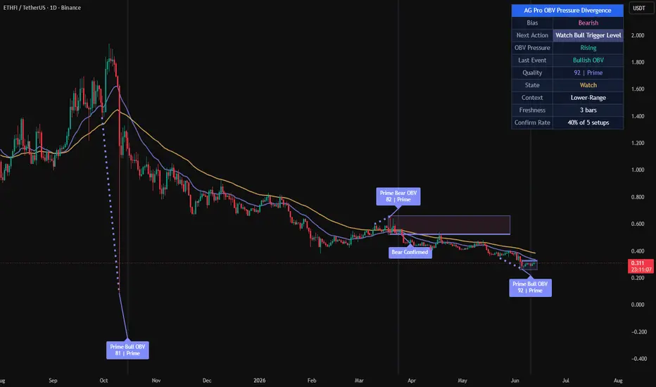
AG Pro OBV Pressure Divergence [AGPro Series]AG Pro OBV Pressure Divergence
Overview
AG Pro OBV Pressure Divergence is a context-aware divergence quality map built around the relationship between price structure and On-Balance Volume pressure.
The script is designed to identify bullish and bearish divergence events, then rank those events by participation quality, structural context, and follow-through behavior. Instead of treating every divergence as equally important, it separates weaker pressure disagreements from more meaningful setups and organizes them into a cleaner decision framework.
This is not a generic divergence marker that prints every local mismatch between price and an underlying series. Its purpose is to classify divergence events through a layered process that includes pivot structure, price displacement, OBV behavior, trend context, confirmation timing, and visual emphasis.
The result is a tool that can be used to study when price and participation begin to disagree, while still preserving a practical chart view that remains readable during live market conditions.
What this script does
- Detects bullish divergence when price forms a lower low while OBV forms a higher low
- Detects bearish divergence when price forms a higher high while OBV forms a lower high
- Filters divergence candidates using pivot separation and ATR-based price swing requirements
- Scores events by quality instead of treating all signals the same
- Highlights the strongest events with more prominent chart objects
- Tracks confirmation and invalidation behavior after the initial event
- Displays a compact summary panel for state, pressure, context, and freshness
Unique Edge
Many divergence tools stop at basic detection. They show a disagreement between price and an oscillator or cumulative volume series and leave the rest to the user.
This script takes a different approach.
Its goal is not to maximize the number of divergence labels on the chart. Its goal is to classify divergence quality.
That difference matters. A simple divergence can appear in noisy conditions, in weak structural locations, or without any meaningful follow-through. In those cases, the event may still be technically valid, but not equally useful from an analytical point of view.
AG Pro OBV Pressure Divergence attempts to address that by combining several layers:
1. Structural divergence detection
2. ATR-normalized price displacement filtering
3. OBV pressure comparison between pivots
4. Local trend context using fast and slow EMA structure
5. Setup monitoring through confirmation and invalidation logic
6. Visual hierarchy that distinguishes lower-quality from higher-quality events
Because of this design, the script is better understood as a divergence classification framework rather than a simple divergence marker.
It is also distinct from breakout, reclaim, or trend continuation tools. It does not evaluate break-retest mechanics, VWAP reclaim logic, or general trend strength as its primary objective. Its focus is the quality of price-versus-participation disagreement.
Methodology
The script begins by identifying swing pivots through a configurable pivot length. These pivots form the structural anchor points used to compare price and OBV behavior.
For bullish divergence:
- price must form a lower low
- OBV must form a higher low
For bearish divergence:
- price must form a higher high
- OBV must form a lower high
After a raw divergence is found, the script applies additional requirements before the event is accepted:
Pivot Separation
A minimum bar gap is enforced between pivots so that tightly packed micro-swings do not dominate the output.
Minimum Price Swing
The distance between the two relevant pivots is measured relative to ATR. This prevents very small structural changes from being treated like full-quality events.
Pressure Evaluation
The OBV relationship between the two pivots is examined to determine whether participation is actually improving or weakening in a meaningful way.
Trend Context
Fast and slow EMA structure is used to frame whether the event is appearing against or within the prevailing price environment.
Contextual Location
The script also evaluates where the event is occurring in its local range structure. This helps separate mid-range noise from more interesting reversal or exhaustion locations.
Scoring
All of the above components contribute to a quality score. That score is then used to separate lower-priority events from stronger ones.
Confirmation
After the initial event, the script tracks a confirmation window. During that window, the setup may confirm, remain pending, expire, or become invalidated.
This layered structure is intentional. The script does not assume that a divergence label alone is enough.
Signal Structure
The script organizes events into a sequence instead of a single binary output.
Event Detected
A new bullish or bearish divergence is found and scored.
Pending State
The event remains active while the script monitors whether follow-through appears within the confirmation window.
Confirmed
If the confirmation condition is met within the allowed window, the event is marked as confirmed.
Invalidated
If price fails the setup before confirmation, the event is marked as invalidated.
Expired
If no confirmation occurs within the defined number of bars, the setup is no longer treated as active.
This state-based behavior is useful because it prevents the chart from presenting all divergence events as finalized conclusions the moment they appear.
Quality Model
The script uses a quality threshold and a premium threshold to distinguish event strength.
Lower-quality events can still be displayed when the user wants a fuller map of all structure, but the script can also be configured to focus only on stronger setups.
This creates three practical layers of interpretation:
Building
A divergence exists, but the score is lower and the event should be treated with more caution.
High
The event passes the main quality threshold and receives stronger visual treatment.
Premium
The event exceeds the premium threshold and receives the strongest category treatment in the script.
This does not mean that premium events are guarantees, and it does not imply that lower-quality events are unusable. It simply reflects that not every divergence deserves the same level of attention.
Panel Summary
The summary panel is intended to give quick context without forcing the user to inspect every label one by one.
The panel includes:
- Bias
A simple view of the current directional background based on the fast and slow EMA relationship.
- Pressure
A quick summary of whether OBV pressure is rising, falling, or mixed.
- Last Event
Shows the most recent detected divergence direction.
- Quality
Displays the score and current classification of the most recent event.
- State
Shows whether the most recent tracked setup is in watch, confirmed, invalidated, or idle state.
- Context
Provides a compact view of the local environment, such as trend-up, trend-down, or range-related placement.
- Freshness
Indicates how many bars have passed since the latest tracked event.
Visual Design
The chart output is intentionally organized with hierarchy.
Qualified events are easier to spot than weaker ones.
Confirmation labels are visually distinct from initial event labels.
Link lines help explain which two pivots created the divergence.
Optional background pulse and active setup zone provide temporary emphasis without permanently dominating the chart.
EMA context remains available but is visually secondary to the divergence structure.
Tooltips are included for key settings so that the logic behind the inputs remains understandable directly from the settings panel.
Signals and Alerts
The script includes alert conditions for the main state transitions:
- New Bullish Pressure Divergence
- New Bearish Pressure Divergence
- Premium Bullish Pressure Divergence
- Premium Bearish Pressure Divergence
- Bullish Pressure Divergence Confirmed
- Bearish Pressure Divergence Confirmed
- Pressure Divergence Invalidated
These alerts are designed to reflect internal script states rather than making claims about future price outcomes.
Key Inputs
Pivot Length
Controls how swings are defined. Higher values reduce noise but may delay detection.
OBV Smoothing
Smooths the OBV series before divergence analysis. Higher values create a cleaner but slower pressure curve.
Minimum Pivot Separation
Prevents overly compressed pivots from producing excessive clustering.
Minimum Price Swing (ATR)
Requires meaningful structural movement before a divergence is accepted.
Quality Threshold
Defines the minimum score required for a divergence to be treated as a qualified event.
Premium Threshold
Defines the score level required for premium classification.
Confirmation Window (Bars)
Controls how long a pending event is monitored before it expires.
Use Close-Based Confirmation
Switches confirmation logic between close-based behavior and intrabar high/low behavior.
Main Label Size
Scales event, confirmation, and invalidation labels.
Panel Text Size
Controls panel readability independently from chart labels.
Drawing Emphasis
Adjusts how visually prominent lines, EMA context, and active zone objects appear on the chart.
How to use it
This script is best approached as a context tool, not as a stand-alone decision engine.
A practical workflow may look like this:
1. Identify whether the panel context is aligned with a broad directional background or whether the market is behaving more like a range.
2. Observe whether a new divergence appears in a meaningful local location rather than in the middle of random price noise.
3. Compare the quality score and classification.
4. Watch whether the event confirms or invalidates within the chosen time window.
5. Combine the information with your own structure, risk, and execution framework.
The script is often more informative when used to reduce attention on weaker disagreements and concentrate on better-formed pressure divergences.
Who it may be useful for
This script may be useful for users who want:
- a more structured way to study price and OBV disagreement
- a cleaner divergence map with stronger visual hierarchy
- a chart that distinguishes raw detection from confirmed follow-through
- a volume-pressure oriented lens that is different from standard oscillator-only divergence tools
It may be less suitable for users who want a high-frequency signal stream, a one-click entry engine, or a tool that treats every local divergence as equally relevant.
Limitations and Transparency
This script has important limitations.
First, divergence is an analytical concept, not a guaranteed turning-point mechanism. A divergence can appear and still fail, extend, or resolve slowly.
Second, the scoring model is a ranking method, not a prediction formula. A higher score does not mean certainty. It only means that the event better satisfies the script's internal conditions.
Third, pivot-based logic requires structure to form. This means the script necessarily depends on completed swing information and will not behave like a forward-only projection model.
Fourth, confirmation and invalidation logic are simplifications intended to organize event follow-through. They do not replace full trade management, execution rules, or independent risk control.
Fifth, any indicator that uses volume-derived inputs depends on the characteristics of the underlying market data. Users should be aware that data quality and market structure can differ across symbols and venues.
This script is therefore best used as a contextual classification tool rather than a complete standalone methodology.
What this script is not
- It is not a guarantee of reversals.
- It is not a promise engine.
- It is not a fully automated trading system.
- It is not a substitute for independent structure analysis or risk management.
- It is not designed to predict every local top or bottom.
- It is not intended to imply that premium signals are always superior in every market condition.
Its purpose is narrower and more practical:
to organize OBV-based divergence events into a more useful analytical framework.
Risk Disclosure
This script is for chart analysis and research purposes only.
It does not provide financial advice, investment advice, portfolio advice, or a guarantee of future market behavior. Market conditions can change quickly, and any signal or classification generated by the script can fail or become invalid.
Users should make independent decisions and apply their own risk controls before acting on any chart output.
In summary
AG Pro OBV Pressure Divergence is a public, chart-based tool for analyzing divergence quality through the interaction of price structure and OBV pressure.
Its main contribution is not that it detects divergence, but that it attempts to rank divergence events by structural relevance, pressure context, and follow-through state.
For users who want a cleaner way to study whether price and participation are beginning to disagree, this script aims to provide a more selective and better-organized framework than a raw all-events divergence marker.
Indicatore

[Kpt-Ahab] HeatMap FusionWhat is “HeatMap Fusion”?
HeatMap Fusion merges RSI, Volume Trend, ROC and an enhanced SuperTrend into one stacked heat-map. Smooth colour gradients reveal—at a glance—whether each component is bullish, neutral, or bearish, without cluttering the chart with multiple separate panes.
Key Features
Multi-indicator heat-map
Three symbols with volume- or price-based colouring.
RSI, ROC and SuperTrend share the same colour scale → instant market-breadth read-out.
View switcher – choose RSI, ROC, SuperTrend, Volume SMA, Up/Down Volume or ALL from a single dropdown.
Six colour schemes (red⇅green, purple⇅blue, etc.) for both light and dark layouts.
Optional RSI divergence detection.
Heikin-Ashi–driven SuperTrend plus Rapid Volatility Trend lines.
Performance-optimised – only three request.security() calls for the selected symbols.
Inputs
Group Core settings
Indicator Layer to display
Color Scheme (Heatmap) 6 presets
Symbol 3 tickers, volume/price mode, look-back length
RSI Period, MA type, BB width, divergence flag
Volume Trend SMA length, up/down columns
ROC Period & intensity threshold
SuperTrend Two ATR sets, Heikin-Ashi on/off
(Every parameter is commented inside the script.)
How to Use
Add the script to any chart.
Set SymCal to on when your symbol has real volume data (futures, ETFs, equities).
Replace the three default tickers with your own—e.g. ES1!, ZB1!, CL1! for a macro setup.
Pick a colour scheme; Purple ⇅ Blue looks great on dark backgrounds.
Choose ALL for the full heat-map with labels, or isolate any single layer via the dropdown.
Notes
The heat-map lives in the main pane on fixed Y-bands (0 – 70). Do not enable Auto-Fit scaling.
If a symbol has no volume, SymCal = on yields no colouring—switch it off to fall back to price-based gradients. Indicatore

Indicatore

Indicatore

Indicatore

AG Pro VWAP Reclaim Quality [AGPro Series]AG PRO VWAP RECLAIM QUALITY
OVERVIEW
AG Pro VWAP Reclaim Quality is a chart-first tool built to evaluate whether a move back above VWAP is clean, weak, delayed, or structurally fragile.
This script does not treat every recovery above VWAP as equally meaningful. Instead, it grades the reclaim event itself and then follows what happens next: whether price can hold above VWAP, whether the retest is constructive, and whether the reclaim deteriorates shortly after recovery.
The objective is simple: separate efficient VWAP reclaims from noisy or late recoveries that may look promising at first glance but fail to show durable acceptance.
This makes the script useful for traders who want more context than a basic VWAP cross. A standard cross can show that price moved from one side of VWAP to the other. This script is designed to evaluate the quality of that transition.
UNIQUE EDGE
The focus here is not generic VWAP direction bias and not a simple above/below state model.
The main edge of the script is its reclaim-quality framework. It evaluates the reclaim as a sequence rather than as a one-line event:
1) reclaim strength,
2) post-reclaim acceptance,
3) retest behavior,
4) timing quality,
5) failure risk.
That structure is what differentiates it from ordinary VWAP cross tools.
A reclaim that closes back above VWAP with a strong bar, holds acceptance, and survives a disciplined retest should not be treated the same as a reclaim that occurs late, stalls immediately, or fails after a shallow recovery. This script is designed to reflect that distinction visually and systematically.
In practical terms, the script attempts to answer a more specific question:
Is this reclaim simply back above VWAP, or is it actually behaving like a higher-quality recovery?
METHODOLOGY
The script starts by tracking session VWAP and identifying reclaim attempts after price has spent time below it.
Once a reclaim is detected, the script evaluates several components:
1) Reclaim strength
The reclaim bar is assessed using distance from VWAP, body efficiency, and close location within the bar. This helps distinguish decisive recoveries from marginal crosses.
2) Acceptance above VWAP
After the reclaim, the script measures whether price is actually holding above VWAP over the next bars. Stable acceptance is treated differently from mixed or poor acceptance.
3) Retest behavior
The script checks whether price revisits VWAP inside a defined tolerance area and whether that test is held constructively. A confirmed retest is handled as separate information rather than being merged blindly into the initial reclaim.
4) Timing quality
Reclaims that occur after an extended stay below VWAP, or later in the intraday session, can be penalized. This allows the script to separate timely recoveries from delayed ones.
5) Failure logic
A reclaim can later be downgraded if price loses structure below VWAP after the recovery. This failure layer is intentionally more selective so that minor noise is not treated as a meaningful reclaim breakdown.
The result is a compact grading model that produces a readable chart-first output instead of a large diagnostic dashboard.
HOW TO READ THE OUTPUT
Main chart labels:
- CLEAN: reclaim quality is strong and structurally healthy
- LATE: reclaim occurred, but timing quality is weaker or delayed
- RT HOLD: VWAP retest was revisited and held constructively
- FAILED: reclaim lost quality and broke down after recovery
Panel fields:
- VWAP Reclaim: current reclaim classification
- Reclaim: strength of the reclaim move itself
- Acceptance: quality of post-reclaim holding behavior
- Retest: whether a constructive retest is confirmed
- Bias: summary interpretation of the current reclaim state
- Quality: compact score representation
The chart is intentionally designed to stay visual and readable. The panel provides state context, while the labels highlight the important transition points.
SIGNALS AND ALERTS
The script includes alert conditions for:
- Clean Reclaim
- Late Reclaim
- Retest Hold
- Failed Reclaim
These alerts are intended to map to the reclaim lifecycle rather than to every minor VWAP interaction.
For more conservative usage, bar-close confirmation is generally preferable when evaluating reclaim quality, especially on volatile instruments or during rapid intrabar movement.
KEY INPUTS
Some of the main controls include:
- VWAP source
- ATR length
- reclaim distance normalization
- minimum prior bars below VWAP
- late reclaim thresholds
- acceptance lookback
- retest tolerance and retest window
- failure delay bars
- panel text size and panel theme
- label visibility and label discipline controls
The script also includes label filtering logic to reduce clustering and keep the chart cleaner by default.
WHAT THIS SCRIPT IS DESIGNED FOR
This script is designed for traders who want to evaluate reclaim quality around VWAP, not merely track whether price is above or below it.
Typical use cases may include:
- reviewing whether a recovery above VWAP has enough structural follow-through
- filtering weak reclaims from stronger continuation candidates
- identifying retest discipline after reclaim
- spotting delayed or fragile recovery behavior
- keeping a cleaner visual workflow around VWAP-based chart reading
LIMITATIONS AND TRANSPARENCY
This script is not a prediction engine and should not be interpreted as a guaranteed continuation model.
A reclaim labeled as clean can still fail.
A reclaim labeled as late can still continue.
A failed reclaim label does not automatically imply a larger bearish trend.
The tool is designed to classify reclaim behavior around VWAP, not to replace broader market structure analysis.
Like all chart-based tools, outputs can vary depending on instrument, volatility regime, timeframe, and user settings.
VWAP-based behavior is also context-dependent. Market environment, liquidity, trend phase, and volatility expansion can all influence reclaim behavior beyond what a single script can capture.
This script is therefore best used as a structured interpretation tool, not as a standalone decision framework.
RISK DISCLOSURE
This indicator is for chart analysis and research use only. It does not provide investment advice, portfolio advice, or trade guarantees.
Always evaluate signals within broader market context, risk management, and your own execution process.
No single indicator should be relied upon in isolation.
NOTES
This publication focuses on reclaim quality around VWAP rather than generic VWAP crosses.
The aim is to keep the logic interpretable, the visuals readable, and the methodology transparent. Indicatore
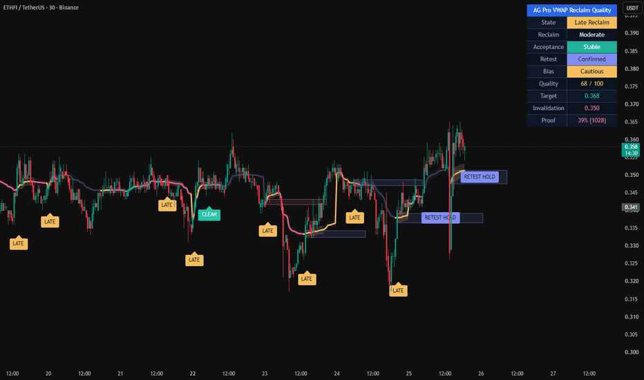
Periodic Anchored VWAPPeriodic Anchored VWAP
Overview
The Periodic Anchored VWAP is a professional volume-weighted average price indicator that anchors VWAP calculations to fixed calendar periods. Unlike traditional anchored VWAP tools that require manual point-and-click anchoring, this indicator automatically resets VWAP calculations at predefined interval boundaries (hourly, daily, weekly, monthly), providing a clean, systematic approach to volume-weighted support and resistance analysis.
Key Features
13 Anchor Periods: 1H, 4H, 6H, 12H, 1D, 3D, 1W, 2W, 1M, 2M, 3M, 6M, 12M
Smart Timeframe Filtering: Automatically hides VWAPs when chart timeframe equals or exceeds anchor period
Individual Period Controls: Toggle each VWAP on/off independently with custom colors
Master Toggle: Global show/hide for all VWAP lines
Dynamic Labels: Real-time price labels at the right edge of chart
Compact Settings: Streamlined input panel with inline color pickers
How It Works
The Golden Rule
VWAP is displayed ONLY when: Chart Timeframe < Anchor Period
This ensures VWAP lines always represent meaningful continuous calculations. For example:
1H VWAP appears only on timeframes smaller than 1 hour (e.g., 15min, 5min, 1min)
1D VWAP appears only on timeframes smaller than daily (e.g., 4H, 1H, 15min)
1W VWAP appears only on timeframes smaller than weekly (e.g., daily, 4H, 1H)
Anchor Logic
Each VWAP resets at its respective period boundary:
Intraday Anchors (1H, 4H, 6H, 12H): Reset at the start of each hour/4-hour/6-hour/12-hour period
Daily Anchors (1D, 3D): Reset at daily market open
Weekly Anchors (1W, 2W): Reset at weekly market open
Monthly Anchors (1M, 2M, 3M, 6M, 12M): Reset at month boundaries
Input Settings
Master Control:
VWAP Display Show / Hide Global toggle for all VWAP lines
Intraday Anchors (Default: Off):
1H => Teal => Short-term intraday reference
4H => Pink => Medium-term intraday reference
6H => Magenta => Half-day session reference
12H => Cyan => Full session reference
Anchor VWAP Periods (Default: On):
1D => Yellow/Green => Daily support/resistance
3D => Purple => Multi-day trend reference
1W => Blue => Weekly pivot levels
2W => Light Blue => Bi-weekly trend
1M => Green => Monthly support/resistance
2M => Dark Green => 2-month horizon
3M => Yellow => Quarterly reference
6M => Orange => Semi-annual trend
12M => Red => Annual benchmark
Visual Display
VWAP Lines: Colored lines plotted at 2px thickness for clear visibility:
Right-Edge Labels: Compact labels showing period and current VWAP value
Smart Label Colors: Black or white text automatically based on line color for optimal readability
Use Cases
Intraday Trading:
Use 1H, 4H, 6H, 12H VWAPs on lower timeframes (e.g., 5min, 15min) to identify intraday support/resistance levels
Multiple intraday VWAPs reveal stacked liquidity zones
Swing Trading:
1D, 3D, 1W, 2W VWAPs help identify trend direction and mean reversion levels
Weekly VWAP provides context for daily price action
Position Trading:
1M, 3M, 6M, 12M VWAPs offer long-term benchmarks for valuation assessment
Multiple monthly VWAPs show multi-year price distribution
Multi-Timeframe Analysis:
Visualize up to 13 VWAP levels simultaneously
Identify confluences where multiple VWAP periods align
Observe how price interacts with different anchored levels
Important Notes
Timeframe Limitations: VWAPs automatically hide when the chart timeframe is equal to or greater than the anchor period (prevents misleading point-to-point lines)
Intraday Anchors Disabled by Default: Enable only the periods relevant to your trading style to reduce visual clutter
Monthly Anchors: Use 30-day approximation for minute calculations; display logic ensures they only appear on daily or lower timeframes
Label Positioning: Labels appear 1-13 bars to the right of the current bar to prevent overlap with price action
Performance
Efficiently coded with looped label management
No repainting — all calculations are historical
Compatible with all markets and symbols
Version History
v.1.0 => Initial release with 13 anchor periods, timeframe validation, and dynamic labels
Start using Periodic Anchored VWAP to elevate your volume-weighted analysis across all timeframes!
Indicatore
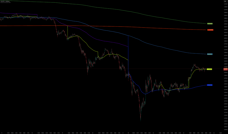
Fibonacci Volume Confluence Engine [PhenLabs]📊 Fibonacci Volume Confluence Engine
Version: PineScript™ v6
📌 Description
The Fibonacci Volume Confluence Engine is a multi-layered confluence detection system that combines ATR-filtered swing pivot detection with a bar-by-bar volume profile to automatically identify and score every Fibonacci retracement level by the volume traded within it. Rather than drawing static lines and leaving interpretation to the trader, this engine classifies each level as Strong, Moderate, or Weak based on real market participation — separating the levels the market genuinely respects from those it simply passes through.
At its core, the indicator anchors Fibonacci retracements to structurally confirmed swing highs and lows, filtered by ATR distance to eliminate noise. A rolling volume histogram is then constructed over a configurable lookback window and mapped against each of the seven Fibonacci levels. The result is a set of visually distinct confluence zones on your chart, backed by quantified volume data rather than discretionary judgment.
Beyond Fibonacci, the engine incorporates Break of Structure and Change of Character detection from the confirmed swing sequence, an optional Multi-Timeframe Fibonacci overlay sourced from any higher timeframe, and a live on-chart dashboard summarising trend direction, key levels, confluence counts, and the most recent structure signal — making it a complete structural analysis tool rather than a single-purpose retracement drawer.
🚀 Points of Innovation
Volume-scored Fibonacci levels — every level is quantitatively graded by the concentration of volume traded within its price zone, not by subjective confluence counting
ATR-adaptive pivot filtering — swing highs and lows are only accepted when their distance from the opposing swing meets a minimum ATR multiple, keeping anchors structurally meaningful across all instruments and timeframes
Manual bar-loop volume profile — the histogram is built with a direct bar iteration loop rather than built-in functions with series-length limitations, guaranteeing stable computation from the very first confirmed pivot
Integrated BOS and CHoCH detection — structure breaks are classified as either continuation or reversal signals based on the confirmed swing sequence, with five individual alert conditions
Multi-timeframe Fibonacci overlay — a second independent Fibonacci set sourced from any higher timeframe can be displayed simultaneously on the current chart with its own style controls
🔧 Core Components
ATR-Filtered Swing Engine: Detects pivot highs and lows using configurable lookback length, then filters each candidate by requiring a minimum ATR-scaled distance from the opposing swing. Only structurally significant pivots are accepted as Fibonacci anchors.
Fibonacci Retracement Layer: Draws the seven standard levels (0%, 23.6%, 38.2%, 50%, 61.8%, 78.6%, 100%) from the most recent confirmed swing pair. Direction is automatically set to bullish or bearish based on which swing type was most recently confirmed.
Volume Profile Engine: Iterates over up to 500 bars, assigns each bar’s volume to a price bin based on its midpoint, and builds a 10–50 bin histogram over the configurable lookback window. Uses array pre-allocation with set-based zero-filling for runtime stability.
Confluence Classifier: Maps each Fibonacci level to its corresponding volume bin, sums the center bin plus weighted adjacent bins for a smoothed reading, then classifies the result as Strong (top 30%), Moderate (40–70%), or Weak (20–40%) relative to the peak bin.
BOS and CHoCH Detector: Compares the last two confirmed swing highs and lows to determine trend direction (HH+HL = uptrend, LH+LL = downtrend), then monitors for close-based breaks of the most recent swing level in both the trend direction and against it.
HTF Fibonacci Overlay: Requests pivot data from a user-selected higher timeframe via request.security, tracks the most recent HTF swing pair, and draws a separate Fibonacci set with independent color, line style, and width controls.
Information Dashboard: A 2-column, 10-row table rendered on the last bar displaying trend direction, Fibonacci type, swing prices, ATR, the 61.8% level, confluence summary, HTF status, and last structure signal.
🔥 Key Features
Volume-Backed Confluence Zones: Each Fibonacci level that registers meaningful volume concentration is highlighted with a shaded zone box and a strength label (◆ Strong / ◇ Moderate / · Weak), so the most significant levels stand out immediately without any manual assessment.
Fully Configurable Fibonacci Display: Line width, label size, extension length, and individual level colors are all independently adjustable, allowing the Fibonacci overlay to be styled to suit any chart theme or personal preference.
BOS and CHoCH Signals with Alerts: Break of Structure and Change of Character labels are plotted directly on the bar where the break occurs, with five alert conditions covering each signal type individually and a combined catch-all.
Multi-Timeframe Fibonacci Overlay: Enable a second Fibonacci set from any higher timeframe (default: Daily) and display it alongside the current timeframe levels with a distinct color and line style to provide macro structural context.
Live On-Chart Dashboard: All key data — trend, Fibonacci direction, swing prices, ATR, the golden ratio level, confluence counts, HTF status, and last signal — is displayed in a compact table that updates on every bar close.
ATR Pivot Filter: The ATR multiplier filter can be tuned from 0.1 to 5.0, giving full control over how aggressively noise is filtered. Higher values produce fewer, more significant pivots suitable for higher timeframe analysis.
🎨 Visualization
Fibonacci Level Lines: Seven horizontal lines extend forward from the most recent swing anchor point for a configurable number of bars. Each level has its own independent color input. The 50% level is rendered as a dashed line to distinguish it from the structural levels.
Fibonacci Level Labels: A text label is placed at the right end of each line showing the ratio name and exact price, styled with the corresponding level color against a transparent background for chart cleanliness.
Confluence Zone Boxes: Where a Fibonacci level overlaps a significant volume bin, a semi-transparent shaded box spans the full line extension at the width of ATR × the tolerance multiplier. Color reflects strength: green for Strong, yellow for Moderate, grey for Weak.
Confluence Strength Labels: A small icon and text label (◆ Strong, ◇ Moderate, · Weak) is placed just beyond each confluence zone box, color-matched to the zone, for instant strength identification without inspecting the box fill.
HTF Fibonacci Lines and Labels: The higher-timeframe Fibonacci set is drawn in its own color with a selectable line style (Solid, Dashed, or Dotted) and prefixed with “HTF” in the label text to distinguish it from the current timeframe levels.
Pivot Markers: Confirmed swing highs are marked with a small downward triangle above the bar; confirmed swing lows with a small upward triangle below, using independently configurable colors.
BOS and CHoCH Labels: Structure signal labels appear directly on the signal bar — below the bar for bullish signals and above for bearish — in their respective configured colors with white text.
Information Dashboard: A dark-themed 2×10 table rendered in the selected corner showing all key indicator state values, with color-coded text reflecting bullish (teal), bearish (red), and neutral (grey) conditions.
📖 Usage Guidelines
Swing Pivot Detection
Pivot Lookback Length — Default: 10 | Range: 3–50 — Controls how many bars on each side of a candidate pivot must be lower (for highs) or higher (for lows) to confirm the pivot. Increase for fewer, more major swings; decrease for more reactive pivots.
ATR Period — Default: 14 | Range: 1–100 — The ATR period used to compute the minimum distance filter. A standard 14-period ATR works well for most instruments.
ATR Filter Multiplier — Default: 0.5 | Range: 0.1–5.0 — The minimum distance between a new pivot and the opposing swing, expressed as a multiple of ATR. Increase to require more separation and reduce noise; decrease to accept closer pivots.
Fibonacci Levels
Show Fibonacci Levels — Default: On — Master toggle for all Fibonacci lines and labels.
Fibonacci Line Extension — Default: 50 | Range: 10–200 — How many bars forward the Fibonacci lines extend from the anchor point.
Fibonacci Line Width — Default: 1 | Range: 1–4 — Pixel width of all Fibonacci level lines.
Label Size — Default: Small | Options: Tiny, Small, Normal — Size of the Fibonacci level labels.
Level Colors (0%, 23.6%, 38.2%, 50%, 61.8%, 78.6%, 100%) — Independent color inputs for each level, allowing full visual customization.
Volume Profile and Confluence
Show Confluence Zones — Default: On — Master toggle for all confluence zone boxes and labels.
Volume Lookback Period — Default: 100 | Range: 20–500 — Number of historical bars included in the volume histogram. Longer lookbacks produce a more stationary profile; shorter lookbacks reflect recent volume distribution.
Volume Profile Bins — Default: 25 | Range: 10–50 — Number of price buckets in the histogram. More bins give finer resolution; fewer bins give broader zone detection.
Confluence Zone Width (ATR%) — Default: 0.5 | Range: 0.1–2.0 — Height of the shaded confluence box as a multiple of ATR. Increase for wider, more visible zones; decrease for tighter, more precise zones.
Strong / Moderate / Weak Confluence Colors — Independent color inputs for each confluence tier.
Multi-Timeframe Fibonacci
Enable HTF Fibonacci — Default: Off — Enables the higher-timeframe Fibonacci overlay.
Higher Timeframe — Default: D — The timeframe from which swing pivots are sourced for the HTF overlay.
HTF Pivot Lookback — Default: 10 | Range: 3–50 — Pivot lookback length applied on the higher timeframe.
HTF Fib Color — Default: Purple — Color applied to all HTF Fibonacci lines and labels.
HTF Line Style — Default: Dashed | Options: Solid, Dashed, Dotted — Visual style of HTF lines.
HTF Line Width — Default: 2 | Range: 1–4 — Pixel width of HTF Fibonacci lines.
BOS / CHoCH Detection
Show BOS Signals — Default: On — Displays Break of Structure labels on the chart when a continuation break is detected.
Show CHoCH Signals — Default: On — Displays Change of Character labels on the chart when a reversal break is detected.
BOS Color — Default: Blue — Color of BOS labels.
CHoCH Color — Default: Orange-Red — Color of CHoCH labels.
Display Settings
Show Pivot Markers — Default: On — Displays small triangle markers at confirmed swing highs and lows.
Pivot High / Low Colors — Independent color inputs for swing high and swing low markers.
Show Info Dashboard — Default: On — Enables the on-chart information table.
Dashboard Position — Default: Top Right | Options: Top Right, Top Left, Bottom Right, Bottom Left — Corner placement of the dashboard table.
✅ Best Use Cases
Identifying high-probability Fibonacci levels by filtering out the ones with weak volume backing and focusing entries and exits around Strong confluence zones only
Smart Money Concept and ICT-style analysis where BOS and CHoCH signals are used to identify trend continuation and potential reversal points within a defined swing structure
Multi-timeframe confluence trading where the HTF overlay is used to identify macro structure and the current timeframe levels are used for precision entries within that context
Swing trading on any instrument where objective, volume-backed support and resistance levels are needed without manual drawing or constant chart maintenance
Breakout confirmation by watching for BOS signals that occur at or near Strong confluence Fibonacci zones, providing both structural and volume-based validation
⚠️ Limitations
Fibonacci levels are anchored to the most recent confirmed swing pair only — historical Fibonacci sets from earlier swings are not retained on the chart
Volume profile accuracy depends on the lookback length relative to the current price range; on instruments with very large recent moves the profile may not fully reflect the range containing all active Fibonacci levels
BOS and CHoCH detection requires at least two confirmed swing highs and two confirmed swing lows before trend direction can be established — signals will not appear on the earliest bars of a chart
The HTF Fibonacci overlay uses lookahead enabled on historical bars to maintain visual consistency; this is standard practice for HTF overlays and does not affect current bar calculations
On instruments without volume data (some indices and forex pairs on certain brokers) confluence classification will produce zero-volume bins and all levels will show no confluence
💡 What Makes This Unique
Volume-quantified Fibonacci levels: Unlike every standard Fibonacci tool, each level is graded by actual market participation data — volume concentration — rather than by visual proximity to other technical elements
Noise-resistant pivot anchoring: The ATR filter ensures Fibonacci levels are only drawn from swings that represent genuine structural moves, not minor price fluctuations that create misleading retracement grids
Runtime-stable volume engine: The histogram is built with a direct loop and pre-allocated array rather than built-in series functions, ensuring error-free execution from bar 1 on any chart length
Unified structural analysis: Fibonacci retracements, volume confluence, trend structure (BOS/CHoCH), multi-timeframe context, and a live data dashboard are all integrated into a single indicator with no external dependencies
🔬 How It Works
1. Swing Pivot Detection and Filtering
PineScript’s pivothigh and pivotlow functions scan for candidate swing points using the configured lookback length
Each candidate is then tested against the ATR filter — it is only accepted if its distance from the opposing swing meets or exceeds ATR × the multiplier setting, eliminating noise and ensuring anchors represent real structure
2. Fibonacci Level Calculation
When a new valid pivot is confirmed, the most recent swing high and low pair is selected as the anchor, with direction set automatically based on which pivot type was most recently validated
The seven standard ratios are applied to the anchor range and the resulting price levels are stored in a persistent array for use by the confluence engine and dashboard
3. Volume Profile Construction
The lookback window is iterated bar by bar; each bar’s midpoint price is mapped to one of the configured bin slots and that bar’s volume is added to the bin’s running total
The array is pre-allocated at script scope with the maximum bin count and zero-filled at the start of each rebuild cycle, ensuring there are never out-of-bounds access errors regardless of when the first pivot is confirmed
4. Confluence Classification
Each Fibonacci level’s price is mapped to its corresponding bin index; a weighted sum of the center bin and its two neighbours is computed to smooth the reading
The sum is compared against the peak bin volume using three thresholds (70%, 40%, 20%) to assign a Strong, Moderate, or Weak classification, which drives both the visual zone and the dashboard count
5. Structure Signal Detection
After each new pivot updates the swing sequence, the last two highs and last two lows are compared to determine whether the market is in a confirmed uptrend, downtrend, or undefined structure
On every bar, a close-based break of the most recent swing level is tested — breaks in the trend direction fire a BOS signal; breaks against it fire a CHoCH signal — with the result fed to both chart labels and alert conditions
💡 Note:
For best results, use a Pivot Lookback Length and ATR Filter Multiplier that match the significance of swings you trade on your chosen timeframe. Lower timeframes generally benefit from smaller lookback values (5–8) and lower ATR multipliers (0.3–0.5), while higher timeframes produce cleaner results with larger values (15–20 lookback, 1.0–2.0 multiplier). Enable the HTF overlay when you want macro Fibonacci context without switching charts. Indicatore

Indicatore

Big Order Bubbles [Trading IQ]Hello Traders!
🔹Big Order Bubbles IQ
Big Order Bubbles IQ is a visualization tool designed to help traders identify and interpret large participation events in the market.
Instead of raw volume bars or hidden order flow, this indicator highlights where meaningful size enters the market , allowing you to quickly spot areas of aggressive buying or selling.
It focuses on answering a simple but powerful question:
Where are the largest players actually active?
high participation events
aggressive buying vs selling pressure
large order clustering within a bar
turning points driven by size
extreme volume spikes relative to recent activity
🔹What the indicator shows
🔸Big order bubbles
Large orders are displayed directly on the chart as bubbles, sized relative to their magnitude.
This allows you to instantly see:
where large trades occurred
how significant they were compared to others
whether they were buying or selling aggression
🔸Buy vs Sell pressure (histogram)
The lower panel separates large buying and selling activity into a histogram view.
This gives you a quick read on:
net aggressive buying (large orders only)
net aggressive selling (large orders only)
🔸Turning point detection
In “Turning Points” mode, the script attempts to identify large orders that occur at structurally meaningful moments.
This helps highlight:
potential exhaustion points
areas where liquidity is being absorbed
reversal zones driven by size
🔸Extreme volume detection
In “Extreme Vol” mode, the indicator focuses purely on outliers in volume.
This is useful for:
spotting abnormal participation
detecting sudden institutional activity
highlighting momentum ignition events
🔸Live tick big order tracking
When enabled, the indicator can track large orders in real time using tick-based data.
This mode is designed for:
scalping environments
real-time order flow awareness
capturing large prints as they happen
🔸Big order table
A live table shows the most recent large orders, including:
side (buy/sell)
size
price
time since execution
This gives you a quick reference for recent activity without scanning the chart.
🔹How to read it
Bubble size shows how large the order was relative to others
Bubble color shows whether it was buying or selling pressure
Histogram shows the total imbalance within the bar
Location shows where large participants chose to act
This combination helps you move beyond “volume exists” and toward:
“volume mattered here.”
For example:
large buy bubbles at lows can suggest absorption or accumulation
large sell bubbles at highs can suggest distribution or rejection
clusters of large orders can indicate key liquidity zones
lack of large participation during a move can signal weakness
large bubbles during an already strong move can indicate a stop loss cascade or liquidation event
🔹Why this indicator is useful
It gives you:
clear visualization of large orders
relative sizing instead of raw numbers
buy vs sell separation
context through turning points or statistical extremes
optional real-time tracking for intraday traders
🔹Best use cases
confirming whether moves are supported by size
spotting potential reversals driven by large players
detecting liquidity grabs and absorption
adding order flow context to price action or liquidity models
🔹Important note
This indicator is a chart-reading tool , not a prediction engine.
Large orders can:
initiate moves
absorb moves
or simply pass through the market without follow-through
Context matters.
Always consider:
location
trend
liquidity
and surrounding structure
🔹Important consideration
Order flow on TradingView is derived from available data , not a full centralized order book.
This means:
some activity may be approximated
different symbols may behave differently
tick-based modes depend on data availability
The goal is not perfect reconstruction, but practical insight .
🔹Inputs you can customize
The script includes flexible controls such as:
volume aggressiveness threshold
maximum bubble size scaling
dollar-based filtering for large orders
lower timeframe selection
turning point vs extreme volume model
live tick storage and behavior
visual styling and color controls
Closing Notes
And that’s about it!
This script is built to make large participation visible, intuitive, and actionable .
It may receive updates based on feedback - stay tuned!
Thank you TradingView as always! Indicatore
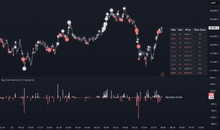
Volume Bubbles [QuantAlgo]🟢 Overview
The Volume Bubbles indicator is a multi-layered volume cluster detection system that identifies statistically significant volume events directly on your price chart, classifying them by magnitude (Small, Medium, Big) and direction (Buy, Sell, Mixed). By combining adaptive percentile thresholds across multiple lookback windows with optional volume delta analysis, this indicator highlights moments of elevated trading activity that often signal institutional participation, trend acceleration, or potential reversals across every timeframe and market.
🟢 How It Works
The indicator begins by establishing a lower timeframe for volume delta calculation. When auto-select is enabled, it picks a granular timeframe based on your chart period, using 1-second bars for sub-minute charts, 1-minute bars for intraday charts, 5-minute bars for daily charts, and 60-minute bars for higher timeframes. This allows the indicator to estimate net buying and selling pressure within each chart bar:
= taLib.requestVolumeDelta(lowerTimeframe)
float netDelta = nz(lastDelta)
float absDelta = math.abs(netDelta)
The core detection engine then calculates percentile thresholds for both volume and absolute delta across three independent lookback windows (Short, Medium, Long). Each window computes its own threshold for each cluster tier using linear interpolation:
float vSmallShort = ta.percentile_linear_interpolation(volume, shortLen, smallPct)
float vSmallMid = ta.percentile_linear_interpolation(volume, midLen, smallPct)
float vSmallLong = ta.percentile_linear_interpolation(volume, longLen, smallPct)
This means a bar's volume is not compared against a single average but ranked against the full distribution of recent volume history from multiple perspectives. A Small cluster must exceed the 75th percentile (top 25%), a Medium cluster the 90th percentile (top 10%), and a Big cluster the 97th percentile (top 3%) by default.
To filter noise, a consensus system requires agreement across the lookback windows before confirming a cluster:
f_consensus(bool pS, bool pM, bool pL, string mode) =>
int hits = (pS ? 1 : 0) + (pM ? 1 : 0) + (pL ? 1 : 0)
switch mode
"Any Window" => hits >= 1
"Majority (2 of 3)" => hits >= 2
"All Windows (strictest)" => hits >= 3
In Majority mode, for example, at least two of the three windows must agree that volume exceeds the threshold before a cluster is plotted. This prevents false signals from temporary spikes that look significant in one context but not another.
Once a cluster is confirmed, it is classified as Buy, Sell, or Mixed based on the selected method. Candle Direction uses the bar's open/close relationship, Delta Direction uses the sign of net volume delta, and Both requires agreement between the two, labeling any conflict as Mixed.
🟢 Key Features
▶ The indicator offers four detection methods, each designed to balance sensitivity and precision depending on data availability and trading style.
1. Volume Only: Uses raw bar volume as the sole input for cluster detection. This is the simplest and most universal mode, working on any symbol that provides volume data. It identifies all statistically elevated volume events regardless of whether buying or selling dominated, making it useful for spotting general activity surges around key levels, news events, or session opens.
2. Delta Only: Uses the absolute value of net volume delta instead of total volume. This mode triggers only when directional pressure (not just raw activity) is statistically elevated. It filters out high-volume bars where buying and selling were roughly balanced, focusing instead on bars where one side clearly dominated. Requires lower timeframe data availability.
3. Volume + Delta: Both volume and delta must independently exceed their respective percentile thresholds. This is the strictest detection mode. A cluster only appears when there is both unusually high total activity and unusually strong directional flow, filtering out ambiguous bars where volume was high but evenly split between buyers and sellers.
4. Volume OR Delta: Either elevated volume or elevated directional delta triggers a cluster. This is the most inclusive mode, capturing both pure volume events (such as index rebalancing or option expiration activity) and strong directional surges that may occur on relatively normal total volume. Best suited for traders who prefer broader coverage and are comfortable filtering signals with additional context.
▶ Detailed Tooltip Overlay: Hovering over any bubble reveals a comprehensive diagnostic panel summarizing the full context behind that cluster. The tooltip displays the cluster tier and direction label (e.g., BIG BUY or MEDIUM SELL), the formatted volume value, net delta value (or "n/a" if delta data is unavailable), the volume-to-average ratio expressed as a multiple, the active detection method (with a fallback note if delta was unavailable and the method defaulted to Volume Only), the individual window confirmations for both volume and delta shown as a compact S M L grid indicating which of the short, medium, and long lookback windows passed their threshold, and the classification mode used to determine the buy/sell label. This gives full transparency into exactly why each cluster was detected and how it was classified, without cluttering the chart itself.
▶ Built-in Alert System: Pre-configured alert conditions for Big clusters, Medium-or-larger clusters, and any cluster detection, allowing you to receive notifications for the volume events that matter most to your strategy.
▶ Visual Customization: Choose from 5 color presets (Classic, Aqua, Cosmic, Cyber, Neon) or define your own custom color scheme. Optional in-bubble text displays volume, delta, ratio, or combinations, while the tooltip diagnostic panel remains accessible on hover regardless of whether bubble labels are enabled or disabled.
🟢 Important Notes
1. This indicator requires volume data to function. Make sure you are using a ticker from an exchange that provides volume data. Symbols that do not report volume (such as certain forex pairs on specific brokers or custom-built indices) will trigger a warning message on the chart and produce no signals. If you see the "No Volume Data" warning, switch to a symbol or exchange that supports volume reporting.
2. Whether you are scalping on lower timeframes or swing trading on daily and weekly charts, Volume Bubbles is designed to complement your existing setup rather than replace it. Use it as a confirmation layer alongside your preferred strategy to identify when statistically significant volume activity aligns with your trade thesis, adding a data-driven edge to entries, exits, and key level analysis across any timeframe and market. Indicatore

Volume TableWhat it does:
The Volume Table displays a live running list of candle volume directly on your chart. Instead of staring at the volume bars at the bottom of your screen trying to compare them, this table organizes everything cleanly so you can read it in seconds.
It shows 3 columns side by side — your current chart timeframe, plus 2 additional higher timeframes that you set yourself. So if you’re trading on the 5 minute chart you might set the other two to the 1 hour and 4 hour. Now you can see what volume looks like on all three at the same time without ever leaving your chart.
What each column means:
∙ Bar — tells you which candle you’re looking at. NOW is the live candle updating in real time. -1 is the last closed candle, -2 the one before that, and so on
∙ Dir — the direction of that candle. UP means it closed higher than it opened, buyers won. DN means it closed lower than it opened, sellers won
∙ Volume — the actual volume number for that candle, formatted for easy reading (K for thousands, M for millions)
∙ Avg — the 20 candle average volume, sitting at the top of each section so you always have a reference point
What the colors mean:
∙ Green text — that candle was bullish. This means the close price was higher than the open price. The candle started at one price, and by the time it closed buyers had pushed it higher. The volume on that candle was driven by buying pressure. The more volume behind a green candle, the more conviction the buyers had
∙ Red text — that candle was bearish. This means the close price was lower than the open price. The candle started at one price, and by the time it closed sellers had pushed it lower. The volume on that candle was driven by selling pressure. The more volume behind a red candle, the more conviction the sellers had
∙ Gold text — this is the most important one. Gold means the volume on that candle was abnormally high compared to the recent average. Something significant happened. Big players, a news event, a breakout — whatever the cause, that candle had unusual activity behind it
To put it simply — a green candle means the close was above the open. A red candle means the close was below the open. Volume tells you how much activity happened while that battle between buyers and sellers was taking place. High volume means a lot of participants were involved and the move carries more weight. Low volume means fewer participants and the move may not be as reliable.
How to set it up:
1. Add the indicator to your chart
2. Open the settings and set Timeframe 2 and Timeframe 3 to higher timeframes than the one you are currently trading on
3. Adjust the Number of Slots to control how many candles of history you want to see
4. Use the Font Size setting to make the table larger or smaller to fit your screen
5. The Abnormal Volume Multiplier controls how sensitive the gold highlight is — a setting of 2.0 means a candle needs twice the average volume to turn gold. Raise it if you want only the most extreme spikes, lower it if you want it to trigger more often
In summary:
Watch the NOW row. When it turns gold, check the direction. If the close is above the open it means buyers drove that abnormal volume. If the close is below the open it means sellers drove it. When multiple timeframes are showing gold at the same time, pay close attention — the market is telling you something important. This tool will not tell you when to buy or sell, but it will show you where the significant volume is happening and who is in control so you can make a more informed decision.
Disclaimer:
This indicator is for informational and educational purposes only. It does not constitute financial advice, investment advice, or a recommendation to buy or sell any asset. All trading involves risk and you can lose more than you invest. Past performance of any strategy or signal is not indicative of future results. Always do your own research and due diligence before making any trading decisions. Never trade with money you cannot afford to lose. The creator of this tool is not a licensed financial advisor and is not responsible for any losses incurred as a result of using this indicator. Trading decisions are solely your own responsibility. Indicatore

Indicatore

Indicatore