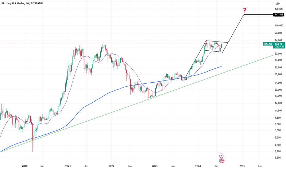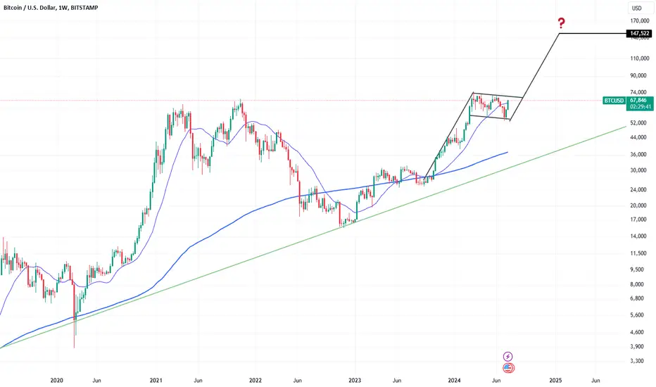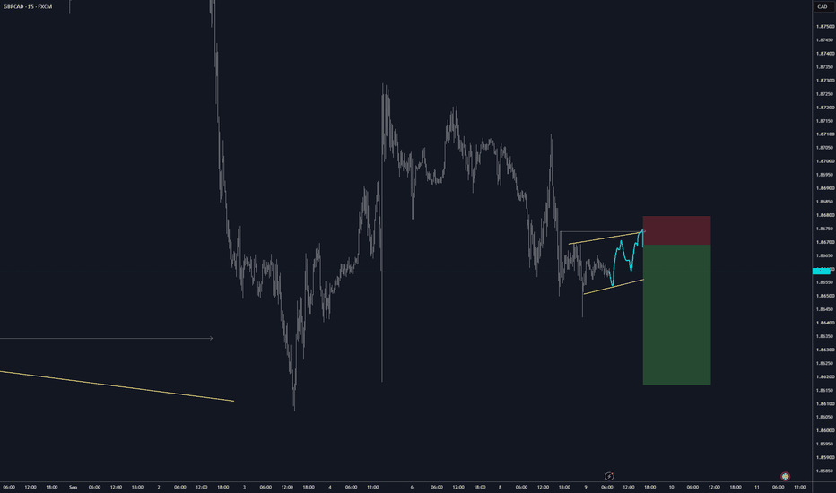
Flag
AUDCAD: Strong Bullish Setup 🇦🇺🇨🇦
There is a high probability that AUDCAD will continue rising
after a retest of a recently broken structure.
A bullish breakout of a resistance line of a flag indicates
a strong buying pressure.
Expect a price rise to 0.986
❤️Please, support my work with like, thank you!❤️
I am part of Trade Nation's Influencer program and receive a monthly fee for using their TradingView charts in my analysis.
Gold Forms Bullish Flag After Strong Weekly CloseGold ended the week with strong bullish momentum, and price action has now followed through by presenting another potential continuation setup for traders looking to stay aligned with the trend.
The current structure forming on the chart is a bullish flag pattern, which typically appears after an impulsive move higher followed by a period of controlled consolidation. In this case, that consolidation may be setting the stage for another potential breakout to the upside.
As always, however, the interpretation of this setup depends heavily on your trading philosophy.
For traders who prioritize structure and believe that support and resistance levels should be respected until proven otherwise, this is a zone that may warrant caution.
On the other hand, for traders who focus on momentum and the idea that “the trend is your friend,” this type of structure can represent opportunity.
Neither approach is inherently right or wrong. In trading, there is no universal truth that applies across all strategies. There is only what is right or wrong relative to your personal trading plan, your risk tolerance, and your methodology.
The key is not whether you trade the pattern, but whether your decision is consistent with a tested and defined approach.
Akil
XAUUSD: Bullish Flag Breakout or Pullback to Order Block?Current Setup:
Gold is trading inside a bullish flag pattern. The next move will be decisive.
Two Possible Scenarios:1. Bullish Breakout (Preferred Scenario)
If price breaks above the upper trendline of the flag with strong momentum, we can expect a direct pump on Monday. This would confirm continuation of the uptrend.2. Pullback Scenario
If price breaks below the flag support, the next high-probability buying zone is the Bullish Order Block at 4060-4070.
Summary: Break above flag → Strong bullish momentum
Break below flag → Buy at 4060-4070 (strong demand zone)
This range is key for the short-term direction.
This is not financial advice. Always manage your risk properly.
Bullish Flag in Moschip-- Educational purposeMoschip Technologies Ltd is a semiconductor and system design company with a focus on Turnkey ASICs, Mixed Signal IP, semiconductor & product engineering, and IoT solutions catering to aerospace & defence, consumer electronics, automotive, medical and networking & telecommunications
This small cap stock has formed bullish POLE FLAG pattern after downtrend from 288.45 (in Oct 2025) to 146.8 (in March 2026) i.e. almost - 50% correction in 6 -7 months. After making low in March 2026 stock has started rising and now bullish flag is formed with 2 months consolidation phase. Also stock has closed above 0.5 fibo level
Company is listed in Feb 2025 So not much data is available. But looking at the high demand for semiconductors it could be one of the 4x-5x candidate.
Long position can be initiated at around 215-220 level keeping in mind time horizon of 6-7 years.
Its a pure technical signal, fundamentals are not that good.
TARGET : 572 (160%)
STOP LOSS : 193 (-12%) ON WEEKLY CLOSING BASIS
RR RATIO : 1:13
TIME HORIZON 7 YEARS (TILL JULY 2033)
ONLY LONG TERM INVESTMENT PURSPECTIVE, NOT FOR SHORT TERM TRADING
GS to reach new All Time Highs... XLF is looking to make higher highs which in turn means, GS will make higher highs.
XLF has formed and broken it's second bullflag in the past two months to continue it's uptrend.
GS has found support at the 50ema and followed thru the next day with a stronger showing before pulling back.
GS moves in bunches and is a giant amongst the banks witha fundamental showing to back it.
S&P 500 is in a pennant. Those usually resolve higher.
Post rally consolidation has taken hold and formed a pennant. But the market is now entering one of its strong months on average (July) and pennants normally resolve higher in the direction of the preceding move, which is up.
There is plenty of room to run when looking at stochastics on the daily chart.
The MACD histogram (also on daily) is flipping towards positive and a crossover that follows price breaking out would help confirm.
The Bull Flag Pattern: Why Volume Decides Whether It HoldsMost traders treat a bull flag as a shape: sharp rally, small pullback, buy the breakout. The shape is the easy part, and it is why so many flag trades fail. What separates a genuine pause from a top is volume, the one thing most chart guides leave out of the drawing.
The bull flag pattern is one of the few continuation setups with real evidence behind it, but that evidence depends on a condition the textbook diagram rarely shows: read the volume and you read whether the trend is resting or being handed to someone else.
What Is a Bull Flag Pattern?
A bull flag is a continuation pattern inside an uptrend, built from two parts. The pole is a steep, almost vertical impulse driven by aggressive buying. The flag is a brief, shallow consolidation that drifts sideways or slightly down. The structure goes back to Edwards and Magee's 1948 classic Technical Analysis of Stock Trends , which first organized continuation patterns into a system.
On a bull flag pattern chart, the pole stands nearly vertical and the flag tilts gently against it. The bull flag chart pattern works because of who acts in each phase: the pole is fresh demand, and the flag is short-term holders taking profit while the trend's core buyers hold. Because that selling is light profit-taking, not new supply, volume should fall through the flag and surge on the breakout.
This is the part the diagrams skip. If volume stays heavy or climbs while the flag forms, you are not watching a pause but distribution: larger holders unloading into the rally. Falling volume is the lie detector, and a flag without it is not a flag.
The anatomy of a bull flag: an impulsive pole, a shallow flag, and a breakout. Volume contracts through the flag and expands on the breakout.
Same shape, opposite meaning. Volume stays heavy: that is selling into the rally, and the breakout is far more likely to fail.
How to Trade a Bull Flag Pattern
Three checks decide whether a consolidation is a real flag.
Shallow pullback. The flag should retrace no more than about half the pole. A deeper pullback erases the impulse and points to a reversal, not a rest.
Falling volume. Volume must decline as the flag develops and expand on the breakout. Flat or rising volume is the distribution warning.
Brief duration. A flag is a short pause relative to its timeframe. One that drags on becomes a directionless trading range.
Entry: a close above the flag's upper boundary, ideally on a clear jump in volume that confirms real buyers are pushing price out.
Stop loss: below the flag low. A close back inside the pole voids the setup. One tick under the breakout candle is too tight and gets swept by noise.
Target: the pole's height projected up from the breakout (flags fly at half-mast). Treat it as a tendency, not a promise: only about half of flags actually reach the full projection, so take partials along the way.
A complete bull flag trade: entry on the volume-backed breakout, stop below the flag low, target one pole-length above, with risk-to-reward fixed before entry.
Bull Flag vs Bear Flag
The cleanest way to frame bull flag pattern vs bear flag is the trend they pause. A bull flag forms in an uptrend and slopes down against it; a bear flag forms in a downtrend and slopes up. The geometry mirrors, but the evidence does not: the studies that confirmed the long side found much weaker results for the bear flag, so treat the short side with more caution.
Bull Flag
Prior trend: uptrend
Flag slope: down or sideways, against the trend
Volume in flag: falling
Trade: long on a break above the flag
Bear Flag
Prior trend: downtrend
Flag slope: up or sideways, against the trend
Volume in flag: falling
Trade: short on a break below the flag
An XRP Bull Flag Pattern in Practice
A textbook XRP bull flag pattern appeared during the sharp late-2024 rally. Price ran almost vertically to form the pole, then paused in a tight, slightly downward channel for a few daily candles while volume thinned out. That contraction signalled profit-taking, not a reversal, and when price closed above the flag on a volume surge, the trend resumed. Had volume stayed elevated, the same shape would have been a reason to stand aside.
An XRP bull flag during the late-2024 advance: pole, a flag on fading volume, then a volume-backed breakout that continued the trend.
When the Bull Flag Works and When It Fails
The case for it. The bull flag is one of the rare patterns that has been tested directly rather than just asserted. A 2002 study ran a bull flag template across decades of New York Stock Exchange data and found its buy signals beat random selection. A 2007 study on the Nasdaq and Taiwan indices found that the closer price matched the flag shape, the higher the average return, beating a buy-every-day benchmark. A 2024 study of the Shanghai market reported bull flag buy signals working around 80 percent of the time. Three markets, three eras, the same direction of result.
The case against it. Drawing a flag is subjective, so two traders mark the same chart differently, and an edge that showed up on old data can fade as markets adapt. Worth noting: those studies tested price shape only and ignored volume entirely, which is exactly the filter this article argues you should add on top.
Market regime is decisive. A flag only continues a trend that exists. In a strong uptrend it has something to continue and the breakout has fuel; in a choppy market the same shape is noise that breaks both ways. A clean flag pressed against higher-timeframe resistance fails often. Read the trend before you trust the flag.
A bull flag pattern is not a shape to buy on sight but a test the market passes or fails. The geometry tells you where price paused; the volume tells you whether the pause is real. Demand a shallow pullback and volume that falls into the flag and surges on the break. A flag without falling volume is distribution waiting to disappoint.
$VVV Bears in Full Control Updated Analysis + Targets For ShortsHad a few rough trades a few months ago which forced me to reevaluate my trading setups entirely, and I gotta say it was probably one of the best things that could have happened to me.
My new strategy has been absolute fire lately.
Case in point, this NYSE:VVV SHORT.
Nailed the entry earlier in the month, and been riding it ever since. Notice how PA just keeps getting pushed down by the 9EMA and 20MA.
The RSI Bearish Divergence on Venice Token has been blatantly obvious for sometime now.
PA currently at the 100MA but looks like it wants to melt through.
We could see a small bounce before testing the 50% Gann.
That’s the line in the sand for bulls. If that doesnt hold, next target is ~$8.50… If that doesn’t hold, ~$5.50 next.
GBPCHF: Bullish Trend Continuation 🇬🇧🇨🇭
GBPCHF broke and closed above a resistance line of a bullish
flag pattern on a 4H time frame.
It matches perfectly with a valid change of character.
I expect that the price will continue rising and reach 1.0721 level soon.
❤️Please, support my work with like, thank you!❤️
I am part of Trade Nation's Influencer program and receive a monthly fee for using their TradingView charts in my analysis.
Ethereum to $800 - The Inevitable Breakdown - June 2026
SYMBOL: COINBASE:ETHUSD | DIRECTION: SHORT | TIMEFRAME: 2-Month
Published: June 2026
Ethereum is different. You’ve heard, presumably. Ultrasound money. EIP-1559. The merge. Proof of stake. Deflationary tokenomics. The base layer for the decentralised financial system. The flippening. Staking yields. The whole internet of value.
These arguments have been present and passionately delivered for approximately every single moment of ETH’s decline from $4,900 to the current price. They will still be present at $800. They were also present at the 2022 low of $880 and at the 2018 low of $80. The arguments do not change, but the price does.
Let us examine what the 2-month chart is actually saying, while the Telegram group is sharing rocket emojis.
On the above 2-month chart a bear flag has confirmed (see 6 and 9 week charts), a measured move of -80.86% targets $800, and RSI has broken below 47 for the first time in Ethereum’s listed history. A number of reasons now exist to expect significantly further downside. They include:
1) Bear flag confirmed. Bear flags are not complicated. Price makes a sharp leg down, consolidates in an upward-sloping channel that feels like a recovery (it is not a recovery), then breaks lower and travels the distance of the original leg. This one confirmed on June 9th.
The measured move projects a decline of 80.86% from the breakdown point, targeting $800. A target Ww forecast back in 2023 that is taking longer than the heat death of the universe to realise. It seems I forget people actually do believe Raoul Pal's real vision price predictions.
For context: ETH fell 82% in 2022. It fell 94% in 2018. This would be the third time the same percentage drawdown has occurred in the same asset with the same community explaining why it won’t. It is, genuinely, almost impressive.
2) RSI below 47 on the 2-month chart - a first in ETH’s history. In the entire listed history of Ethereum, RSI on the 2-month chart has never closed below 47. Not in 2018 when the asset fell 94%. Not during the COVID collapse of 2020. Not in the 2022 bear market. Every single time RSI approached this level, buyers appeared and momentum returned. It has now broken below it for the first time ever. When a floor that has held for the entire life of an asset finally gives way, the market is not sending a mixed message. It is sending the only message it has left.
3) Stochastic RSI at the floor. The Stochastic RSI is printing at its lowest reading on this timeframe. A technical bounce from here is entirely possible and should be expected, oversold is not the same as bottomed. But the underlying momentum of this asset, measured over the 2 month timeframe, is in a condition it has never been in before. Bounces within structural breakdowns are selling opportunities, not recoveries. The 2022 bear market produced several violent rallies of 40-60%. None of them changed the destination.
4) Confirmed Double top distribution . The pattern has been here before. The Engulfing channel printed green accumulation signals at the 2019 base and the 2020 recovery, both correctly identified the beginning of major rallies. At the 2025-2026 top, the same channel printed distribution: red against green, a failed push into the upper band, bearish engulfing signals at the high. Compare this structure to the 2021 top. They are, to an uncomfortable degree, identical. The market has shown you this before. It is showing you it again.
Targets
1st target: $1,000, a round number. Former base of the 2021–2022 cycle. The market will want to test it. Expect a reaction.
2nd target: $800 and below. The bear flag measured move. Annotated directly on the chart.
3rd target: $300-350 the golden ratio. Where hope becomes despair
What about the upside?
A confirmed 2-month close back above the bear flag’s upper boundary. .. approximately $3,500 cancels this idea entirely. If that happens, the pattern interpretation is wrong and the argument changes. Until then, the measured move stands. The burden of proof is not on the sellers here.
The crowd
The Ethereum community is a remarkable thing. Every bear market produces a freshly laundered set of reasons why the next one will be different. In 2018 it was the enterprise adoption narrative. In 2022 it was the merge. Now it is restaking, Layer 2 scaling, and BlackRock’s interest in tokenised assets. Each narrative is, genuinely, technically interesting. None of them has succeeded in preventing a pattern that has now repeated three times on the same timeframe, at approximately the same percentage drawdown, while the same community explains with great conviction why the price will not do what the price is doing. The gold medal for optimism in the face of a confirmed bear flag, a historic RSI breakdown, and a third 80% decline goes to ETH holders. Extraordinary people.
Is it possible ETH recovers from here, breaks all-time highs and becomes the reserve currency of the decentralised financial system? Of course it is. Anything is possible.
Is it probable, with a confirmed bear flag, the first ever break below RSI 47, a completed distribution top identical to 2021, and a measured move pointing at $800? Look left. Look at 2018. Look at 2022. Is this time different?
Ww
Type: Speculative short / educational | Timeframe: 6–18 months
===============================================
Disclaimer : This idea is for educational and informational purposes only. It is not financial advice. Trading cryptocurrencies involves extreme volatility and substantial risk of loss. Always do your own research and consult a qualified financial adviser before making any investment decisions. Past performance is not indicative of future results.
TSLA: Trend Reversal Signal — First Higher Bottom SetupTesla has broken two consecutive previous highs, which is a classic early indication that the trend may be shifting from bearish to bullish. This break of structure suggests buyers are starting to regain control.
Price is currently pulling back into the 62.5% Fibonacci retracement, creating an ideal zone for a first higher‑bottom setup.
A Buy STOP at $381 is appropriate for confirmation, with a stop‑loss below $364 to keep the structure valid.
🎯 Profit Target #1: $472
📈 Reward–Risk Ratio: 5.4 : 1
🎯 Profit Target #2: $508
📈 Reward–Risk Ratio: 7.5 : 1
This setup offers strong asymmetry, combining a structural trend shift with a deep Fibonacci pullback — a powerful combination for swing traders.
COIN: THE BLUE-CHIP THAT TRADES LIKE A S COINDuring this Nasdaq meltup, investors are hunting for growth anywhere they can find.
Tech firms with expanding margins (like Nvidia or Microsoft).
Small cap drone manufacturers that are in the right sector, anything AI related, Power.
Give people a story and they will bid it up.
As a Bitcoin proxy, it plays second fiddle to MSTR.
If they are using NASDAQ:COIN for exchange fees... then fees are larger when there is industry FOMO.
There is none currently.
Liquidity-Driven Fractals: If you strip the ticker labels off the chart, a speculative memecoin and supposed institutionally owned "proxy-equity" like NASDAQ:COIN , they look nearly identical.
High-Slope Rallies: Powered by FOMO, not earnings reports.
Volatile Reversals: Characterised by "liquidation events" rather than fundamental re-ratings.
The "Exit Liquidity" Problem: Just like a shitcoin, NASDAQ:COIN is dependent on the "onboarding of new participants" (the retail FOMO crowd) to sustain its price level.
When the retail liquidity dries up, the "altcoin chart" behaviour dictates that the stock will see a sharper, more violent drawdown than a traditional "blue-chip" tech stock.
Structural Fragility: Traditional Nasdaq stocks (like the Mag 7) have massive institutional "floors"—dividend payouts, stock buybacks, and deep cash reserves.
NASDAQ:COIN , like a classic shitcoin, lacks these fundamental stabilisers, leaving it exposed to the whims of the speculative cycle.
$NYSE:BB - Breaking out of a Bullish FlagNYSE:BB just reported positive earnings and it's reacting by breaking out of a bullish flag that's been forming since around March.
My play for this is to wait for a retest of the $9 - $9.30 and use it as a buying opportunity.
Price target is $15 - $16.80
Depending on your entry/exit, this has a 60 - 85% upside.
Dow Jones eyeing bull flag/support confluencePrice action on the Dow Jones Industrial Average is in the process of chalking up a potential bullish flag between the all-time high of 52,286 and 51,398. You will also note that the index is forming a rising wedge pattern between 45,057 and 49,717.
While the noted patterns offer conflicting signals, the fact that the lower edge of the rising wedge merges with the lower boundary of the bullish flag pattern, and that this market is entrenched within a strong uptrend, suggests that a rebound from the merge point (red circle) could be something dip buyers watch for.
Written by FP Markets Chief Market Analyst Aaron Hill