ZEC VDS LONG SetupI’ve been asked a few times to take a look at ZEC and tune VDS for it, so I finally did.
I configured VDS specifically for LONG (BUY) setups on the 4H timeframe.
ZEC is currently in an uptrend, and the SELL signals are still too noisy to be useful. So for now, I’m intentionally focusing only on BUY setups.
On higher timeframes, there simply isn’t enough history yet to build a setup I’d consider reliable.
One thing I find interesting is that the signals become noticeably cleaner as more history develops. The early part of the chart contains significantly more noise, while the more recent BUY signals look much more consistent.
That said, I’m personally staying out of ZEC for now.
I’ve mentioned before that I think the asset has become heavily hyped and, in my view, looks overheated . So this setup is mostly here because several of you asked me to configure VDS for ZEC, rather than because I’m looking to trade it myself.
As more history develops and the hype settles down, we’ll have a much better dataset to evaluate.
For now: 4H, LONG only.  Long
Long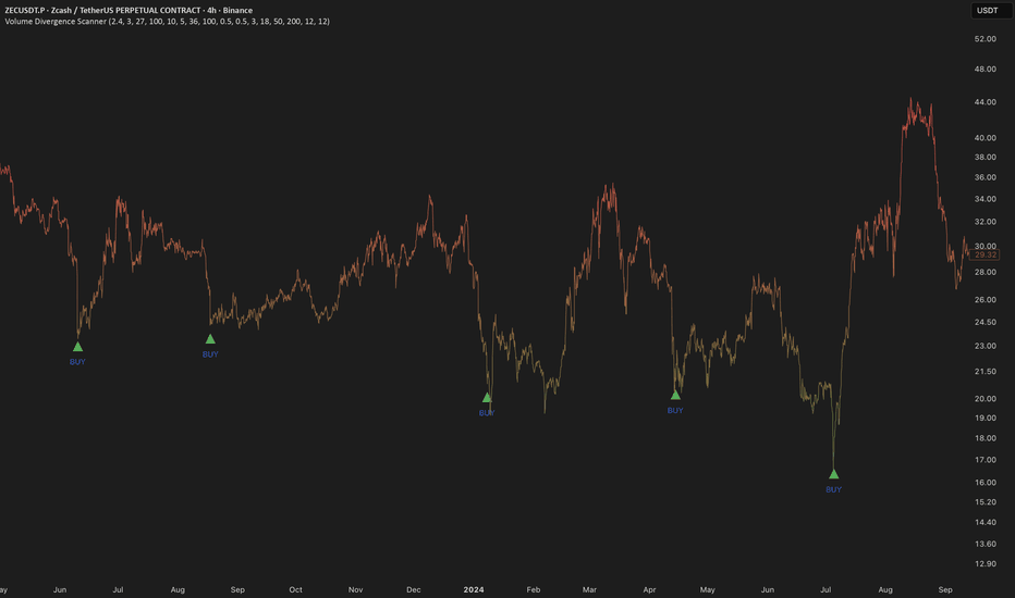
 Short
Short
Gold cools off after sharp intraday push higherPrice
Gold is trading near 4,370, up about 1.2% on the day after touching highs near 4,402 earlier in the session, though price has pulled back roughly 0.7% from that intraday high.
Volume Sentiment
On the 1H chart, the Heikin-Ashi layer sits in FOMO territory and continues to push higher, while the raw layer remains below the FOMO threshold and has not yet confirmed the move. On the daily chart, the Heikin-Ashi layer has crossed into FUD territory, while the raw layer sits close to the zero line, pointing to a more balanced buyer/seller presence over the longer horizon.
MACD
On the 1H chart, the signal has crossed into positive territory, but the histogram is easing off, suggesting the recent push higher is losing steam. On the daily chart, both lines continue to decline, with the histogram alternating between upticks and downticks over the last few bars, showing no firm direction yet.
Bollinger Bands
On the 1H chart, price consolidated near the middle band for several candles before a strong buying push carried it to the upper band, which has since been followed by a sharp pullback back toward the middle band. On the daily chart, price is sitting below the middle band.
Across both timeframes, the 1H chart shows a strong short-term push higher that is already fading, with Heikin-Ashi volume sentiment still elevated but MACD momentum cooling. The daily picture is more balanced, with sentiment near neutral and MACD losing steam without a clear direction. Overall, recent price action has stayed within the 4,300–4,500 range, with no strong directional bias confirmed on either timeframe yet.
Not financial advice — just sharing what the data is showing right now.  Short
Short
My view on Intel Stock: Going against the crowd (#INTC)NASDAQ:INTC
While most market participants react blindly to the initial impulse, believing in an immediate and sharp reversal to the upside, I prefer to look deeper into market mechanics. My view contrasts sharply with the crowd: I believe it is way too early to celebrate this local bounce in Intel shares, and the technical structure clearly points to another wave of downside.
On the daily timeframe, a well-defined descending channel is unfolding. From above, price is facing heavy pressure from a dynamic resistance block consisting of the 50-day and 100-day moving averages, which have recently formed a bearish cross. This factor serves as a major psychological barrier for buyers. Any attempts to rally from current levels will be heavily capped by profit-taking within the channel, as retail demand simply lacks the strength to break this block without institutional backing.
The path of least resistance for the price right now is downward. The primary target for this move is the $70–$74 range, where a key technical confluence zone is forming. This is exactly where the long-term 200-day moving average has caught up. However, the core of my thesis lies much deeper than simple lines on a chart.
Just below, in the $65 area , lies a massive April imbalance accompanied by colossal horizontal volume profiles. To me, it is obvious that the primary position of smart money is accumulated right there. Large institutional players think in terms of liquidity: they will not add to their positions at current prices alongside the retail crowd. The price will move down not for the sake of "filling the gap," but because a large buyer will intentionally push the market into the $70 zone to trigger a massive sweep of early long stops.
Only after this harsh shakeout—when the crowd finally capitulates and panics into selling at the absolute bottom—will smart money absorb these sell orders into their limit bins. As soon as this high-volume accumulation process is complete, the true institutional reversal will begin. It is exactly within this $70–$74 range that I will be looking for signs of selling exhaustion to enter the market at the most favorable price, targeting long-term goals at $143 and $220. Trading off institutional liquidity rather than retail emotion is the only safe way to approach this chart.
This publication is for analytical purposes only and does not constitute individual investment advice. Share your thoughts in the comments and don't forget to support the idea with a like if you found the analysis useful! ETH/USDT — 1D: another sell signal at $2,500The VDS signals have historically captured the major reversal points on ETH since 2022.
A new SELL signal has just appeared around $2,500, following a strong move higher from the previous BUY signal near $1,600 .
The timing is interesting. When the market turns extremely bullish and social media is filled with expectations of a new bull market, it may be worth looking at the chart from a purely technical perspective rather than following the crowd.
That said, this is a daily timeframe, so the setup needs time to develop. The SELL signal can disappear and reappear around these levels as the structure continues to form . I wouldn't treat a single daily signal as an immediate call for a major drop.
ETH could also spend some time distributing around the current levels before the larger move develops, as we've seen after previous VDS signals.
For now, I'm watching the technical picture closely.
The main move is still what matters, and VDS is currently pointing to increased downside risk.  Short
Short
 Short
Short
 Short
Short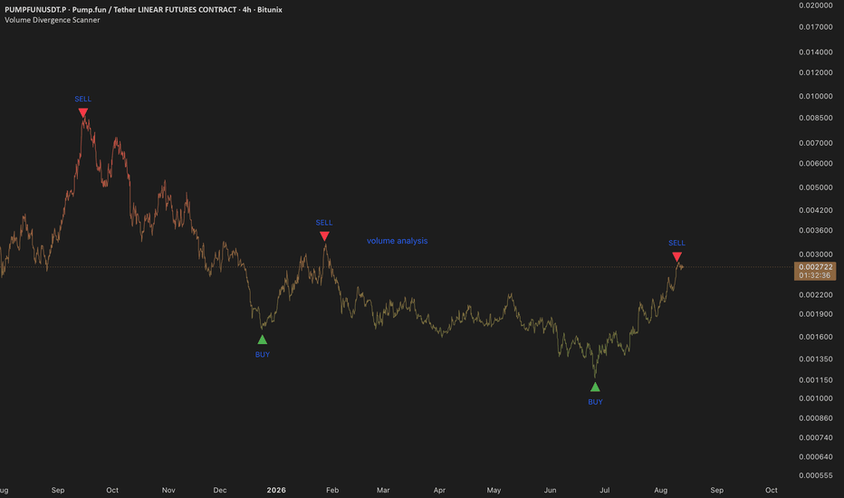
BTC Short SFP 8 hr- All time Fav SetupThe Swing Failure Pattern (SFP) has endless characterizations, and this one here is one of our favorite, which is why it's a short trigger in the strategy shown here. Not only do we have a solid 9 bar OBV down with slope, it's a bearish engulfing 10 previous bars, with a follow through immediately after the signal. ROC 200 is below the zero line and in white territory which means the consolidation has been lengthy and fully exhausted; it’s in the zone for the real move to present.
This is a simple set-up we take every time. The reason we take it every time is that the SFP rejected the volume profile VAH right into a HVN in an exhausted consolidation . It could be the early entry to the $57.7k range lows.
The obvious HVN/POC is what this trade has to overcome to target the VAL $60.6k. We want to see price auctions below that HVN and spend time and space there to feel more confident in the trade.
During ranging and choppy regimes like BTC has been in since early June, we found that when we don't take this trade, then we miss the entry for the final move to range lows. The previous sfpL on 8/02 was a similar situation, but it failed to push through the volume profile VAH.
If the current bar closes full with a lower low, the strategy will trigger an immediate add on this bar or if/when it presents in coming bars.
If price moves just 2% down from here, the trapped buyers roughly doubles and will start to close positions (sell) that will require more buyers to step in, which looks unlikely considering they haven’t been able to catch a bid above 65k for almost 2.5 months. Long 
 Short
Short
NVIDIA (NVDA) Technical Analysis: Elliott Wave and Support LevelNVIDIA (NVDA) remains in a strong long-term uptrend, but my current Elliott Wave count places the structure in a late stage.
On the monthly chart, I look at the larger market structure, the long-term rising channel, and the higher-degree Elliott Wave count. I then move to the weekly chart to look more closely at the current fifth wave and the possible scenarios from here.
My working count places NVDA in wave five inside the larger wave three, with the final smaller fifth subwave potentially developing now. The current fifth wave may still extend higher, or the larger correction may begin from this area.
For the correction, I am monitoring several major Volume Profile support zones:
$165–200
$90–150
$40–50
$15–30
The first area is the one I am watching now. If price holds this zone and moves higher, the fifth-wave extension scenario remains active. If price breaks the zone and stays below it, the next lower support area becomes more relevant.
This is a technical scenario map based on Elliott Wave, market structure, the long-term price channel, and Volume Profile. I will update the analysis as new price action develops.

A Volume Cluster Is a Planning Zone, Not a SignalA Volume Cluster Is a Planning Zone, Not a Signal
Volume Profile is sometimes treated as a prediction tool. A trader sees a high-volume area and assumes that price must reverse there, or treats the Point of Control as automatic support or resistance.
A volume cluster does not predict the next move. It shows where significant trading activity has already occurred. This makes the area analytically important, but the direction still has to come from price behaviour.
What a Volume Cluster Shows
A volume cluster is an area where a large amount of trading took place within the selected range. These areas are often called high-volume nodes, while the largest concentration of volume is commonly called the Point of Control.
A cluster may become an area where price slows down, consolidates, rejects, breaks through, or returns for another test. The cluster identifies the location to monitor, but it does not determine the outcome in advance.
The PGNY Example
The first chart shows PGNY after a large decline from its previous highs. Instead of recovering immediately, price moved sideways within a lower range.
The Volume Profile revealed two important participation areas:
a lower cluster where buyers repeatedly appeared;
an upper cluster where price repeatedly struggled.
Price tested the upper cluster several times but failed to establish sustained trading above it. Declines towards the lower cluster repeatedly attracted buyers, keeping the market contained between the two zones.
This structure created a difficult environment for directional trading. Buying near the upper cluster carried rejection risk, while selling near the lower cluster carried rebound risk. The zones were important, but neither provided direction without additional confirmation.
A Cluster Is a Decision Area
When price reaches a volume cluster, I focus on the reaction rather than assuming a reversal. The main questions are:
Does price enter the cluster?
Does it remain inside the area?
Can it close and hold beyond the zone?
Does it reject and return to the previous range?
Does the area hold after a breakout and retest?
These observations help distinguish temporary penetration from genuine acceptance.
Acceptance and Rejection
Acceptance develops when price enters an area and continues trading there. For example, if price moves above the upper cluster, holds the area, and successfully retests it, the structure begins to change.
Rejection produces the opposite reading. If price enters the cluster but quickly returns below it, the market has not accepted the higher prices. The same logic applies to the lower zone: a brief move below it matters less than the market's ability to remain below it.
Why Waiting Can Be the Correct Decision
PGNY remained trapped between two major participation zones without producing clean acceptance above the upper cluster or below the lower cluster. In this environment, forcing a bullish or bearish conclusion would add trades without adding clarity.
Technical analysis does not always need to produce a position. Sometimes its value is showing that the market remains unresolved and that waiting is the more disciplined response.
How I Use Volume Clusters
Identify the major volume clusters.
Mark the active participation range.
Observe the reaction at each zone.
Separate temporary penetration from acceptance.
Watch for a breakout and successful retest.
Combine Volume Profile with the broader structure.
Volume Profile provides the map. Price behaviour shows how that map should be interpreted.
Final Takeaway
A volume cluster identifies an area where significant trading activity previously occurred. It does not automatically provide a buy or sell decision.
Watch whether price accepts, rejects, breaks, or reclaims the area. The cluster shows where attention is required, while the subsequent structure determines what the zone means.
Informational and educational analysis only.  Education
XAUUSD: Wave 4 Base Complete, Wave 5 Setup Building at $4,024The weekly count is clean. Wave 1 off the 2022 low, Wave 2 correcting in an ABC, Wave 3 extending hard into the 5,400 region, then Wave 4 pulling back in its own ABC to find support at 4,024. That's the structure. What matters now is whether Wave 4 is finished.
In CAP: this is a textbook Elliott Wave 4 terminal into an OTE-adjacent retracement zone. Wave 4 corrections typically retrace less than Wave 2, and this one hasn't touched the Wave 1-to-2 territory. Structurally proportionate, not overextended.
The 3D chart on the right is where the real signal sits. Price broke down hard from 5,400 through May and June, then flattened into a base right at 4,024, the exact Wave 4 low from the weekly count. Two timeframes agreeing on the same level is confluence, not coincidence.
Volume on the 3D base has been fading into the flattening, not expanding. That's consistent with absorption rather than continued distribution. Sellers pushing gold to 3,960 and failing to hold it below 4,000 on the low tells you supply is running out of runway at this level, even without a delta readout to confirm it directly.
If Wave 4 is complete, Wave 5 targets the 5,700 to 6,300 zone, an extension consistent with the length of Wave 3. If it isn't, price fails to hold 4,024 and the correction isn't over.
What invalidates this: a weekly close below the Wave 2 high, which would violate basic Elliott rules and void the count entirely. What confirms it: reclaiming and holding above 4,175, the level currently acting as the pivot on the 3D chart.
Seneca said luck is what happens when preparation meets opportunity. The count has been prepared since 2022. The opportunity is whether 4,024 holds. Long 
 Education
Market Learning Series - Chapter 4Why Volume Matters More Than Most Beginners Think
Introduction
When most beginners look at a chart, their attention immediately goes to price.
They focus on whether the stock is moving up or down.
Very few spend time understanding volume.
However, experienced market participants often view volume as one of the most important pieces of information available on a chart.
Price shows what happened.
Volume helps us understand how much participation was involved in making it happen.
________________________________________
A Simple Story
Imagine two shops selling the same product.
The first shop attracts hundreds of customers every day.
The second shop receives only a handful of visitors.
Even if both shops report similar sales on a particular day, the level of participation tells a different story.
The same principle applies to financial markets.
Price movement supported by strong participation often carries a different meaning than price movement supported by very little participation.
________________________________________
What Volume Represents
Volume simply measures the number of shares or contracts traded during a specific period.
Every transaction requires:
A buyer
A seller
The total activity between these participants creates volume.
Higher volume generally suggests greater market interest.
Lower volume may indicate limited participation.
________________________________________
Why Volume Matters
1. It Helps Confirm Price Movement
A price move supported by strong volume often indicates broader participation.
When many participants agree on a direction, the move may carry greater significance.
2. It Reveals Interest
Volume often helps identify where market participants are paying attention.
Certain price levels attract significantly more activity than others.
3. It Highlights Important Areas
Large volume often appears near major turning points, breakouts, breakdowns, or areas where demand and supply are actively interacting.
________________________________________
Price Without Volume Can Be Misleading
Imagine a stock moving sharply higher.
At first glance, the move appears impressive.
However, if very few participants were involved, the move may not carry the same significance as a move supported by broad participation.
This is why many traders study both price and volume together rather than independently.
________________________________________
The Relationship Between Price And Volume
While volume alone does not predict future movement, it often provides valuable context.
Many experienced traders ask questions such as:
Is participation increasing?
Is participation decreasing?
Is the current move attracting attention?
Are market participants supporting the move?
These questions help build a more complete picture of market behaviour.
________________________________________
STWP Learning Note
Price tells the story.
Volume tells us how many people believed in that story.
Studying both together often provides deeper insight than studying either one alone.
________________________________________
Key Takeaway
Volume is more than just a set of bars beneath a chart.
It represents participation, interest, and activity within the market.
While price shows direction, volume often helps explain the strength and conviction behind that movement.
Learning to observe volume is an important step toward understanding market behaviour more effectively.
________________________________________
⚠️ Disclaimer
This content is shared strictly for educational and learning purposes. It should not be considered investment advice, trading advice, or a recommendation to buy or sell any security. Financial markets involve risk, and individuals should conduct their own research or consult a qualified financial professional before making any investment decisions.
– STWP
 Education
Short 
 Long
Long
MBT1!: If all you have is a hammer, every problem becomes a nailI was always told that you need the right tool for the job. In trading, if the only tool you use is Price Action, you’re going to treat every move the same. But under the hood, not all price moves are created equal.
Look at these two charts of Micro Bitcoin Futures (MBT1!). On the left, we have the 4H, on the right the Weekly.
Despite the massive difference in timeframes, the "engine" is telling the exact same story.
In both cases, you can see price pushing higher. To some, this might look like a breakout or a trend continuation. However, in both cases, as price is moving up, the volume differential is absolutely collapsing. The fuel for the move was disappearing while the price was climbing.
This is where the right tools matter. The Kinetic Bias indicator gave us a heads up before the drop happened.
On the 4H, even as price pushed higher, the Bias Cloud never flipped. It remained bearish, telling us that the momentum wasn't actually shifting. This was a fake move.
On the Weekly: We saw a clear Bearish Divergence. Price made a higher high, but the indicator made a lower high, followed by the Bias Cloud confirming the move by flipping Bearish.
The mechanics of a reversal are often the same. Price can lie, but volume and kinetic energy tend to tell the truth.
Don't just swing a hammer at every green candle you see. Look at the volume differential. Check the bias. Make sure the move actually has something behind it. Short 
 Short
Short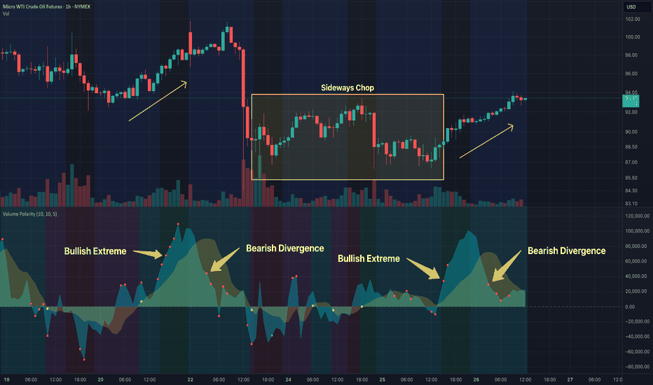
Long