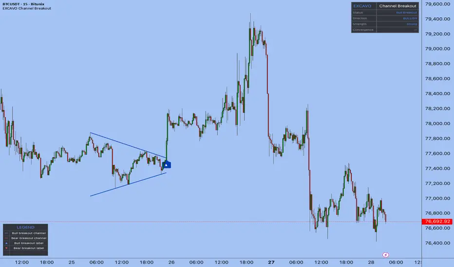
Auto Trend Channels [AFD]A trend channel is only worth drawing if price actually respected it. This script builds every channel from three confirmed swing pivots, checks each bar between the anchors against the boundaries, and puts the channel on your chart only once a bar has closed inside it. Then it marks, on the drawing itself, the exact bar it became usable - so you always know which part of the channel is history and which part you could have acted on.
WHAT IT DOES
Auto Trend Channels finds parallel channels from confirmed swing pivots and follows each one through its whole life: accepted, broken, retouched, returned or expired.
Three pivots, exact geometry - a rising channel joins two rising swing lows and runs its upper boundary parallel through the swing high between them. A falling channel joins two falling swing highs, with the parallel through the swing low between. No regression fit, no approximate parallels.
Every bar between the anchors is checked - a candidate is rejected if any bar in its span pokes past a boundary by more than your Containment allowance. Its width has to sit between your Minimum and Maximum width, both measured in units of the chart's own average range, frozen when the channel is built.
Usable means a bar closed inside it - a channel is drawn only after a confirmed close lands between its boundaries. The dotted vertical Known line marks that bar.
One active channel per layer - a newer candidate never replaces an intact channel. Turn on Longer swing channel for a second, larger layer on the same timeframe, drawn heavier and fainter so the two stay tellable apart.
HOW A CHANNEL LIVES AND DIES
Active - solid boundaries in the rising or falling colour, shaded inside, extending to the current bar. The label at the right edge reads the direction and Active.
Close outside - the first confirmed close beyond a boundary, past your Close allowance, starts a return watch. The channel switches to the history colour, goes dashed, loses its shading, and its label reads Watching above or Watching below. It keeps extending while the watch runs.
Boundary retouch - the first later bar whose high or low reaches the broken boundary while the close stays outside gets a one-time mark on that channel. Recorded once, never counted or rated.
Returned inside - a confirmed close back between the boundaries within the watch window finishes the channel as Returned inside. A finished channel never reactivates.
Watch ended - no close back inside within the window, and the channel is finished with its right edge frozen where it ended. Separately, once a channel's first anchor passes your horizon it is retired and leaves the chart, whatever state it was in.
Finished channels stay on the chart up to your Retained channels count, dashed and grey, so you can see what each channel did after it broke. Channels hidden by that count keep running their watch and still alert.
WHAT YOU GET ON THE CHART
Upper and lower boundaries, with an optional midpoint and quarter lines.
The Known marker on a dotted vertical line at the acceptance bar.
Event labels at the bar that produced them, offset clear of the candles: Close above, Close below, Boundary retouch, Returned inside.
Optional A, B and C markers on the three source pivots.
An optional Forming channel view: the candidate a layer is currently building, dotted, faint and labelled as not accepted. Off by default, because a candidate can change or vanish before it is accepted.
A corner notice stating linear-price geometry and confirmed-pivot delay, with an optional status panel: per-layer state, live boundary prices, watch counts and how many sets are drawn.
Nine colour themes, including Paper for light charts and a Colourblind safe palette built on the published Okabe-Ito blue and vermilion, plus Custom pickers.
Three display switches - Channel labels, Channel fill and Corner table - to strip the drawing down to the lines alone when you want a clean chart.
ALERTS AND THE DATA WINDOW
Ten named alert conditions - Formed, Close above, Close below, Returned inside and Boundary retouch, for each layer - plus one combined dynamic alert that lists every enabled event on the bar with its layer, the channel's anchor timestamps and its raw boundaries. Each alert switch gates both the named condition and the combined message. Twenty Data Window plots expose the live upper, mid and lower values, the acceptance bar, the event flags and the watch counts, so every number on the chart can be read and exported.
SETTINGS WORTH KNOWING FIRST
Swing length sets how many bars either side confirm a pivot: raise it for fewer, larger, later channels, lower it for more, smaller, sooner ones. Pivots searched is how far back each construction reaches. Containment allowance, Minimum width and Maximum width are all multiples of the average true range frozen at construction, so they carry across symbols and timeframes without retuning. Close allowance is how far a close must clear a boundary before it counts as outside; 0 accepts any close beyond. Return watch is how many bars a broken channel is watched for a close back inside. Most tooltips end with a concrete example of what changing that setting does.
WHAT IT WILL NOT DO
It is not a signal tool. A channel is a description of where price has already been, and a break, a retouch or a return is a description of a close that already happened. Nothing here is an entry, an exit, a target, a probability or evidence of an edge, and no channel is ranked against another. Retouches are marked, never counted.
WHAT IS DISCLOSED RATHER THAN HIDDEN
Channels appear late by design. A pivot confirms Swing length bars after it prints, and a channel is drawn only after a bar closes inside it, so a new channel first appears drawn back over earlier anchors. The Known marker shows exactly where the usable part starts: left of it is where the geometry came from, not something you could have traded.
Linear-price geometry. Boundaries are parallel in price per bar. On a logarithmic price axis they are not log-space parallels, and the script cannot detect your axis setting. Slope is per bar, so a channel keeps its slope straight across a weekend gap.
Standard time-based charts only. Renko, Kagi, Range, tick and other nonstandard charts get a corner warning and no channels.
Reconstruction can change with loaded history, session settings, data adjustments or inputs. Whether this script repaints has not been observed on a replay and is not claimed here either way; confirm it with the bar-replay tool on your own symbol and timeframe.
No request.*() calls, no higher-timeframe data, no volume. Everything is computed from the chart's own bars.
ORIGINALITY AND CREDIT
Most auto-channel scripts fit a regression line and offset it, or join two points and draw a parallel at a fixed distance. This one builds exact three-pivot geometry, validates the full span between the anchors, waits for a confirmed close inside before it calls the channel usable, marks that bar on the drawing, and follows the channel through a bounded watch after it breaks. The geometry, engine and label patterns are adapted from Auction Foundry's own Auto Trendlines, Classical Auto Chart Patterns and Zone Forge.
Open source under the Mozilla Public License 2.0. (c) Auction Foundry.
This indicator describes channel geometry built from your chart's own price history. It is not a forecast, not a signal, and not financial advice. 지표

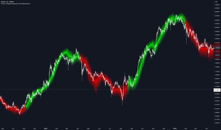
Variance-Weighted Regression Trend [BackQuant]Variance-Weighted Regression Trend
Overview
Variance-Weighted Regression Trend is a rolling linear-regression trend indicator that adjusts the influence of observations according to the estimated variance of their regression residuals.
The script first calculates a standard ordinary least-squares regression across the selected window. It then measures the squared residuals around that fit and uses those residuals to estimate how variable the regression error has been through the sample.
Those variance estimates are converted into relative weights. Lower estimated residual variance can receive more influence, while higher estimated residual variance can receive less. A second weighted regression is then calculated using those weights.
The indicator also includes:
EMA, RMA or rolling-average residual variance.
Configurable inverse-variance weighting strength.
Weight regularization and upper/lower weight limits.
Weighted R² and slope-quality diagnostics.
Two regression-channel methods.
Optional trend-flip quality confirmation.
OLS comparison.
Linear regression projection.
Trend colouring and alerts.
Calculation
The basic process is:
Fit an ordinary least-squares regression over the Regression Length.
Calculate the squared residual of every observation around that fit.
Smooth those squared residuals to estimate local residual variance.
Add a regularization floor to reduce unstable extreme weights.
Convert variance into relative observation weights.
Clamp weights between the selected minimum and maximum.
Calculate a second weighted regression.
The weighted line is therefore influenced more by observations receiving larger relative weights and less by those receiving smaller ones.
Variance Weighting
The weighting is based on regression residual variance , not ATR, trading volume or raw price volatility.
For each point:
Residual = Source - OLS fitted value
Squared Residual = Residual²
The squared residuals are then processed using the selected Variance Model.
EMA
Uses exponential smoothing and responds more quickly to recent residual changes.
RMA
Uses a slower recursive smoothing process.
Rolling Mean
Uses a finite moving average of squared residuals.
Weight Power
Weight Power controls how strongly estimated variance affects the regression.
The raw weighting relationship is:
Weight ∝ 1 / Variance^Weight Power
0 gives equal weighting, making the final fit behave like the OLS regression.
1 applies standard inverse-variance-style weighting.
Values above 1 increase the difference between low- and high-variance observations.
Higher settings can make the regression more selective, but can also concentrate too much influence in a small part of the sample.
Variance Regularization
Very small variance estimates can otherwise create extremely large inverse weights.
The script therefore adds a fraction of the window's mean squared residual to each local variance estimate.
Higher regularization makes the weights more uniform.
Lower regularization allows stronger differences between observations.
Minimum and Maximum Relative Weight
Raw weights are normalized relative to their average before being clamped.
A relative weight above 1 means the observation has greater-than-average influence.
A value below 1 means it has less.
The Minimum Relative Weight prevents high-variance observations from effectively disappearing from the regression.
The Maximum Relative Weight prevents very low-variance observations from dominating the entire fit.
Weighted Regression
Once the final weights are calculated, the script solves a weighted linear regression:
Y = Intercept + Slope × X
The displayed line is the current endpoint of that rolling weighted regression.
Each new bar shifts the regression window and recalculates:
OLS.
Residuals.
Variance estimates.
Weights.
Weighted slope and intercept.
OLS Comparison
The optional OLS line shows the endpoint of the initial equal-weight regression.
This makes it easy to see how much the variance weighting is actually changing the result.
If Weight Power is set to 0, the weighted regression and OLS should be effectively aligned.
As the weighting becomes more aggressive, the lines may separate depending on the residual structure inside the window.
Trend State
Trend direction comes from the sign of the weighted regression slope.
Positive slope = bullish.
Negative slope = bearish.
A bullish flip occurs when the stored trend changes from bearish to bullish.
A bearish flip occurs when it changes from bullish to bearish.
Quality Confirmation
Quality Confirmation can be enabled to prevent weak slope changes from immediately flipping the trend state.
When enabled, an opposite slope must also satisfy:
Minimum Weighted R².
Minimum Slope / Standard Error.
If those conditions are not met, the existing trend state remains active even if the current slope temporarily changes sign.
Weighted R²
Weighted R² measures how well the weighted straight-line regression describes the current sample.
Higher values indicate that the weighted observations are more closely aligned with a linear fit.
Lower values indicate a less orderly linear relationship.
R² does not determine trend direction and should not be interpreted as a forecast of future performance.
Slope / Standard Error
The script calculates the absolute weighted slope relative to its estimated standard error:
|Slope| / Slope Standard Error
This is used as a practical slope-quality measure.
Higher values indicate that the fitted slope is larger relative to the estimated regression error.
It is used by the optional Quality Confirmation setting and is not presented as a formal significance test.
Regression Channels
Two channel-width methods are available.
Weighted Residual RMS
Uses the weighted root-mean-square distance of observations from the fitted regression.
This reflects the general amount of scatter around the line.
Regression Standard Error
Uses the calculated standard error of the fitted current regression value.
This normally represents a different and often narrower measure than residual RMS.
The Channel Multiplier scales whichever method is selected.
Expand During Poor Fit
When enabled, the channel becomes wider as Weighted R² decreases.
This is intended to visually reflect greater uncertainty when the current window is poorly described by a straight line.
The expansion affects only the channel width.
It does not alter the regression or trend calculation.
Projection
The Projection extends the current regression slope forward by the selected number of bars.
It is simply:
Current fitted line extended using the current slope.
It is not a separate forecasting model.
As the regression changes on new bars, the projection also changes.
Current Relative Weight
The Data Window shows the final relative weight assigned to the newest observation.
A value:
Above 1 = greater-than-average influence.
Below 1 = less-than-average influence.
This can help show how the current observation is being treated by the variance-weighting model.
Effective Sample Size
The indicator also reports:
Effective N = (Sum of Weights)² / Sum of Squared Weights
This provides a simple measure of weight concentration.
If weights are similar, Effective N remains close to the full Regression Length.
If a smaller group of observations receives most of the weight, Effective N falls.
This is useful when experimenting with aggressive Weight Power or wide weight limits.
Trend Strength
Trend Strength is used only for the regression glow.
It combines:
60% Weighted R².
40% normalized Slope / Standard Error.
It does not affect the regression or signals.
ATR(14) is used only to scale the visual width of the glow and flip bloom to the instrument.
Input Guide
Regression Length
Controls the size of the rolling regression sample.
Projection Bars
Controls how far the current fitted slope is extended visually.
Variance Length
Controls how quickly the residual-variance estimate changes.
Variance Model
Selects EMA, RMA or Rolling Mean smoothing of squared residuals.
Weight Power
Controls the strength of inverse-variance weighting.
Variance Regularization
Reduces extreme differences between weights.
Minimum / Maximum Relative Weight
Limits how little or how much influence any one observation can receive.
Channel Width
Selects Weighted Residual RMS or Regression Standard Error.
Channel Multiplier
Scales the regression channel.
Poor Fit Expansion
Optionally widens the channel as R² deteriorates.
Quality Confirmation
Requires minimum regression fit and slope quality before allowing trend flips.
How to use it
The indicator can be used as:
A regression-based trend filter.
A comparison between ordinary and variance-weighted regression.
A way to study how residual-based weighting changes a rolling trend estimate.
A trend-quality filter using R² and slope strength.
A regression channel for visualizing fit dispersion.
The OLS Comparison and Data Window values are particularly useful when testing the weighting settings, because they show whether the extra weighting is materially changing the regression or simply producing a result close to ordinary least squares.
Limitations
The variance estimates are derived from OLS residuals inside the same rolling window.
The model is a custom two-stage weighted regression rather than a full generalized least-squares procedure.
Higher Weight Power can concentrate the fit in a relatively small part of the sample.
Linear regression cannot represent every type of market structure.
High R² does not imply future trend continuation.
The forward projection is only a linear extrapolation of the current fit.
Quality Confirmation can reduce weak flips but can also delay genuine changes in direction.
Data Window
The script exposes:
Weighted Slope.
Weighted R².
Slope / Standard Error.
Weighted Residual RMS.
Regression Standard Error.
Current Relative Weight.
Effective Sample Size.
Trend Strength.
Alerts
The indicator includes:
Variance-Weighted Regression Bullish: trend changes from bearish to bullish.
Variance-Weighted Regression Bearish: trend changes from bullish to bearish.
Variance-Weighted Regression Flip: either transition occurs.
Summary
Variance-Weighted Regression Trend starts with a normal rolling OLS regression, measures the residual variance around that fit, and uses those estimates to assign relative weights to the observations in a second regression.
The weighting strength, variance smoothing, regularization and weight limits are all configurable, making it possible to move from essentially equal-weight OLS to a much more selective fit.
The final weighted slope controls the trend state, while Weighted R² and the Slope / Standard Error score can optionally be used to filter weak reversals.
Regression channels, OLS comparison, forward projection and the visual strength system provide additional context around the core weighted regression without changing the underlying trend logic.
지표
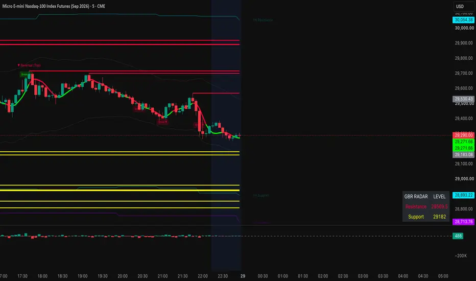
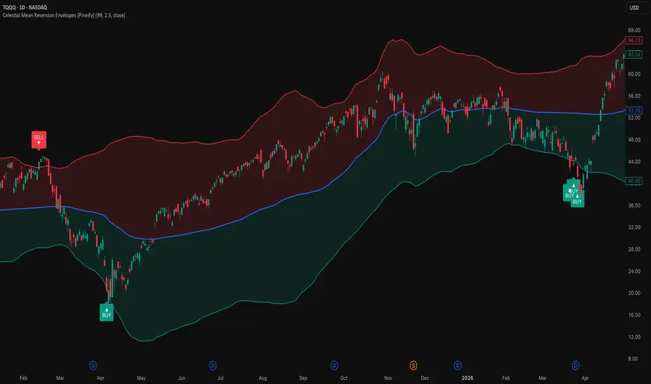
MA Ribbon Aurora_Channel_V1 (DRIZZLE_ALGO56) MA Ribbon with Aurora Channels UI
█ Overview
MA Ribbon with Aurora Channels UI is an experimental indicator designed to modernize the classic Moving Average Ribbon. Instead of relying on static trailing averages—which frequently lag during sharp structural shifts—the system fuses custom MA ribbons with Flipped (Inverse) Ribbon Dynamics, Volume Expansion Multipliers, and Asymmetrical Wick Ratios, wrapped inside a real-time HUD interface.
The indicator converts standard ribbon dispersion into a multi-layered, volatility-adaptive envelope (Core Channel, Expansion Envelope, and Trigger Buffer). The channel automatically expands during high-volume momentum breakouts and contracts during low-volatility consolidation phases.
⚠️ Author Note: This project is an experimental research prototype. Optimal performance requires manual tuning of parameter settings (smoothing lengths, volume sensitivity, and width multipliers) based on your target asset, timeframe, and prevailing market regime.
█ How It Works
⚪ Dynamic Midline Engine
The system averages all active moving averages (supporting SMA, EMA, SMMA, WMA, VWMA) to create a central equilibrium reference line.
⚪ Flipped Ribbon & Width Engine
Rather than relying purely on standard moving average distance, the indicator calculates inverse mirror projections for every active ribbon line to measure true structural price dispersion:
flip = 2 * source - ma
The maximum deviation across normal and flipped lines defines the raw channel width, which is then smoothed using an exponential moving average:
rawWidth = math.max(math.abs(diff1), math.abs(diff2), math.abs(diff3), math.abs(diff4))
⚪ Volume-Driven Expansion
Channel width dynamically scales upward when volume participation exceeds its baseline moving average, ensuring bands react instantly to institutional volume spikes:
volRatio = volume / volMa
volBoost = 1.0 + math.max(0.0, volRatio - 1.0) * volSens
⚪ Asymmetrical Wick Balancing
Upper and lower envelope boundaries expand independently based on the ratio of directional wicks relative to ATR. This prevents false boundary breaches caused by one-sided wick rejections:
upAsym = 1.0 + asymStr * (ur / math.max(atrVal, syminfo.mintick))
dnAsym = 1.0 + asymStr * (lr / math.max(atrVal, syminfo.mintick))
⚪ Aurora Multi-Layer Bounds
The engine calculates three distinct volatility zones:
Core Channel: The primary equilibrium zone surrounding the midline.
Expansion Envelope: Outermost normal volatility bounds where directional acceleration occurs.
Trigger Buffer: An extreme extension boundary for mean-reversion cues.
⚪ Signal Engine & HUD Dashboard
The script tracks zone transitions, logging whether a boundary breach represents a 1st Touch or a Retest. The real-time HUD table tracks current zone regime, duration, ribbon compression percentage, active volume boost, and touch history directly on the chart.
█ How to Use
⚪ Volatility Contraction & Compression
When the Ribbon Tightness value on the HUD falls below 30%, the MA ribbon is in deep compression. Price residing strictly inside the Core Channel signals neutral range consolidation prior to a breakout.
⚪ Trend Expansion & Momentum Setup
A candle close outside the Expansion Envelope indicates institutional volume acceleration. Look for 1st Touch (triangle) or Retest (circle) shapes for momentum entries aligned with expanding channel width.
⚪ Mean-Reversion / Profit-Taking Setup
When price reaches or breaches the outer Trigger Buffer, market expansion is overextended. Look for mean-reversion rejections back toward the Core Channel or Midline.
█ Settings
MA Ribbon Inputs
MA #1 – #4: Enable or disable up to four independent moving averages. Select the MA type (SMA, EMA, SMMA, WMA, VWMA), source, length, and plot color.
Display
Show Normal / Flipped Ribbon: Toggle visibility of standard ribbon lines or mirror projections.
Show Core / Envelope / Trigger: Toggle individual channel layer visibility.
Show Dashboard & Position: Enable the real-time HUD and select its chart overlay anchor.
Show Signal Shapes: Enable breakout and retest signal markers.
Channel Engine
Core Multiplier: Sets the width multiplier for the inner fair-value channel.
Envelope Multiplier: Controls the distance of the momentum envelope bounds.
Trigger Buffer Multiplier: Controls the outer overextension boundary.
Width & Edge Smoothing: Sets the EMA smoothing applied to raw dispersion and final channel edges.
Volume MA Length & Sensitivity: Adjusts how strongly volume spikes expand channel boundaries.
Asymmetry Strength: Controls how aggressively upper/lower bounds deform in response to long wicks.
Colors
Core Upper / Lower: Custom colors for the inner channel clouds.
Envelope / Trigger / Midline: Color selection for boundary lines and fill layers.
Cloud Transparency: Adjusts the opacity gradient of background fills.
Disclaimer
The content provided in my scripts, indicators, ideas, algorithms, and systems is for educational and informational purposes only. It does not constitute financial advice, investment recommendations, or a solicitation to buy or sell any financial instruments. I will not accept liability for any loss or damage, including without limitation any loss of profit, which may arise directly or indirectly from the use of or reliance on such information.
All investments involve risk, and the past performance of a security, industry, sector, market, financial product, trading strategy, backtest, or individual's trading does not guarantee future results or returns. Investors are fully responsible for any investment decisions they make. Such decisions should be based solely on an evaluation of their financial circumstances, investment objectives, risk tolerance, and liquidity needs. 지표

Dynamic Deviation Channels (RSI Trigger) [ChartPrime]Dynamic Deviation Channels (RSI Trigger)
🔶 OVERVIEW
Standard volatility channels paint static bands across your entire chart, ignoring shifting market momentum and leading to false breakouts in trending environments. The Dynamic Deviation Channels (RSI Trigger) solves this by combining ATR-based volatility bands with a dynamic Relative Strength Index filter.
Instead of showing overlapping channels on both sides simultaneously, the indicator intelligently displays upper bands only when momentum is bullish/neutral and lower bands only when momentum shifts bearish, keeping your workspace clean and focused on active market participation zones.
🔶 HOW IT WORKS
The indicator processes market structure and momentum through a multi-stage execution pipeline:
Adaptive Mid-Line Trend Matrix: Computes a configurable moving average (SMA, EMA, WMA, or RMA) to serve as the central channel baseline, dynamically coloring itself based on short-term price slopes.
ATR Volatility Multipliers: Expands outward from the central basis using multi-tiered ATR deviations to establish structured Level 1, Level 2, and Level 3 boundary channels.
RSI Directional Filtering: A smoothed RSI engine checks prevailing momentum state. When the RSI value is at or above 50, upper channel bands activate; when it drops below 50, lower channel bands engage.
Smart Signal Generation: Plots precise entry triangles when price interacts with the primary deviation bands, utilizing a built-in bar gap control to prevent signal clustering.
🔶 KEY FEATURES
Conditional Band Rendering: Automatically hides inactive channel zones based on RSI momentum thresholds, eliminating chart clutter during strong directional trends.
Multi-Tiered Deviation Zones: Features three distinct deviation multiplier levels with custom background fills to highlight volatility expansion and over-extension zones.
Glowing Mid-Line Display: A highlighted central moving average complete with a soft glow effect for immediate trend-direction recognition.
Live Deviation Labels:** Clean, real-time price labels pinned to the final bar of each active upper and lower deviation boundary for instant reference.
🔶 TRADING APPLICATIONS
Momentum-Aligned Rebounds:** When lower bands are active during a bearish-to-neutral momentum phase, look for price rejections off Deviation Level 1 or 2 to catch high-probability counter-trend bounces.
Volatility Expansion Breakouts:** Monitor price interaction with outermost Level 3 bands. A clean break past these boundaries during high-volatility regimes signals an aggressive continuation move.
Trend Filtering via Mid-Line:** Use the glowing central moving average slope and color state to determine primary bias before taking entries off individual deviation levels.
🔶 SETTINGS
Moving Average (Length / Type): Controls the lookback period and calculation method (SMA, EMA, WMA, RMA) for the central baseline channel.
RSI Filter (Length / Source): Adjusts the sensitivity and data input source used by the momentum filter engine to toggle upper and lower band visibility.
Deviation Bands (Multipliers / Display Toggles): Customizes the width spacing for all three deviation tiers and lets you toggle the visibility of the outermost channels.
🔶 CONCLUSION
The Dynamic Deviation Channels (RSI Trigger) brings clarity to volatility channel analysis. By filtering band display through real-time RSI momentum, it ensures you are only looking at the structural levels that matter most for your current market direction. 지표

MarketMaulers Auto TrendlinesMarketMaulers Auto Trendlines draws the diagonal structure you would have drawn yourself, and then stays with the line through the part that matters. Two confirmed pivots anchor it, the market's own touches validate it, and its parallel rail is projected through the furthest price travelled while the line was forming. Then it waits for the break, and reports which of the only two things that can follow a break took place.
Forming · Validated · Broken · Retested / Failed break
THE RETEST IS THE PRODUCT
Anyone can draw a line through two pivots and print a marker when price closes through it. The break is the least informative moment in a trendline's life. Most lines break, and the break on its own says nothing about whether the level still matters.
Two things can follow, and they mean opposite things.
• RETEST. Price comes back and respects the line from the OTHER side. Old support is now resistance. The line survived its own break as a reference and is arguably more useful after it than before.
• FAILED BREAK. Price closes straight back on the original side. The break was noise, the line was never beaten, and anyone who traded the break is offside.
This tool waits for one of those and names it. That is the read you cannot get by eyeballing the chart in the moment, because in the moment the two look identical.
FROM ZERO: WHY A DIAGONAL LINE IS A DIFFERENT ANIMAL FROM A HORIZONTAL ONE
A horizontal level is a price. It sits at one number and it is still that number tomorrow. A trendline is a price AND a rate. It asks the market to keep making higher lows at a certain speed, or lower highs at a certain speed. That is a much stronger claim, which is why trendlines break more often than horizontal levels and why the break carries less information when they do.
It is also why a line has to be earned rather than drawn. Two points define any line at all. Three or more touches is the market repeatedly agreeing to the rate.
HOW A LINE EARNS ITS PLACE
Five gates, each closing a specific way auto-trendline scripts produce clutter.
• Confirmed pivots only, paired for direction. A rising support line needs a second swing low strictly HIGHER than the first, a falling resistance line a second high strictly lower. A zero slope is unreachable by construction, so this file never draws a horizontal line.
• A cleanliness scan. Every bar between the two anchors is checked for a close through the line. A line price has already spent time on the wrong side of was never a valid line, and drawing it anyway is how a chart fills with lines nobody would have drawn by hand.
• Touch counting with a spacing rule. A touch is a bar reaching within a quarter of an ATR of the line, and touches within three bars of each other count once. Without the spacing rule one slow drift along a line counts as five touches and validates anything.
• Near-duplicate rejection. Two lines are compared at two sample points, now and fifty bars back, and the newer one is dropped if they sit within 0.75 ATR at BOTH. Comparing at a single point lets two lines with different slopes look identical at the moment they cross.
• A slope cap and abandoned-line retirement. Near-vertical lines off a single spike are refused, and a line price has stayed far away from for twenty consecutive bars is retired. That is what keeps ancient support lines from hanging under current price forever.
TWO WAYS A LINE BREAKS, AND THE SECOND ONE IS THE INTERESTING ONE
The obvious break is distance: a close sitting at least 0.35 ATR beyond the line. That catches the decisive break and it misses the slow one.
Price can park a fraction through a line, too shallow to trigger the distance test and too close to trigger retirement, and grind there bar after bar. Under a distance-only rule the line stays marked VALIDATED with price on the wrong side of it for as long as the grind lasts, which is a tool stating something false. So three consecutive wrong-side closes break a line at any distance. Decisive breaks are caught by distance, grinds by persistence, and there is no state left where the display and the price disagree.
A RETESTED LINE GOES BACK TO WORK
Most implementations treat the retest as the end of a line's life, which is backwards from what the retest proves. A line that broke, was left alone, and then held from the other side has demonstrated it still matters, and the tools that go quiet there stop watching at the exact moment the line earned its keep.
The mechanism is a POLARITY FLIP rather than a new line. Old support becomes resistance, so the side the break test looks at flips while the line's geometric identity does not. It is still a rising line, it keeps its color and its channel offset, and it starts being tested for a break to the upside. The label carries R1, R2, R3 so a twice-proven line is visibly different from a fresh one, and the cycle is capped at three, after which retested is terminal. A line oscillating around price cannot churn forever.
The status card reports both facts rather than picking one. RISING · RES is a rising line currently acting as resistance. Unflipped lines read RISING · SUP and FALLING · RES, which is what they always meant, said out loud.
THE CHANNEL
Once a line is validated, its parallel rail is projected through the furthest the market travelled away from it while the line was forming. The rail comes from a real extreme rather than from a statistical fit, so the width means something specific: this is how far this structure has been willing to travel from its own floor. Fill and opacity are yours to set, and the fill carries the state, so there is no color legend to memorize.
CONVERGENCE, WITH A TIME
Two validated lines with different slopes meet at an apex, and an apex is a price AND a bar. That is a triangle or a wedge resolving, one of the oldest readable objects in chart reading. It needs both lines retained as DATA rather than as drawings, which is why most auto-trendline scripts cannot offer it at all.
It is reported on the card and alerted, not drawn. A marker painted into future bars would say the same thing and add a drawing to a chart whose whole design rule is fewer marks. And it is a fact, not a forecast: it says where and when the structure runs out of room, not what happens when it gets there.
HIGHER TIMEFRAME LINES
A second engine, off by default, sharing the concepts of the chart-timeframe engine and none of its code paths. If the higher-timeframe layer is wrong, the layer you already trust keeps working.
Why most higher-timeframe trendline overlays are unsound is worth stating. A security call hands back prices. It does not hand back the ability to walk backwards through higher-timeframe bars, and the cleanliness scan IS a walk. So an HTF line built off a plain security read cannot be validated the way a chart line is, and most implementations quietly skip the check. Here, completed higher-timeframe bars are pushed into a ring buffer as they close and the whole HTF engine walks those. A real scan, real HTF touches, and a break that is a real HTF close through the line.
Breaks are judged by the timeframe that OWNS the line. A 15m candle closing through a 4H trendline is not a 4H close, and treating it as one is the most common way an HTF overlay lies. The visible consequence is that an HTF line can die up to one HTF bar later than the chart makes it look like it should. That is correct, and it will look wrong the first time.
What the HTF layer deliberately does not do, each one a decision rather than an omission: no channel, no polarity flip, no apex participation, and no separate alerts. The rail is measured by the same pass that validates the chart line. Converging HTF and chart slopes needs a unit conversion that is wrong the moment the chart timeframe changes. And two engines firing the same alert would double every notification. One slot, defaulted off, because new surface gets proven before it gets duplicated.
THE STATUS CARD
Six live lines on a chart and no way to tell which one matters this bar. The card names the nearest line, the distance to it in points and in ATR, its geometry and its current role, how many broken lines are still awaiting a verdict, and the soonest apex. A table rather than a label, because a label draws inside the price pane and loses the z-order fight with candles.
ALERTS
Trendline validated · Trendline broken · Trendline retest confirmed · Failed trendline break · Trendline convergence approaching
The convergence alert is the one worth leaving on. The other four report something that has already finished, which is useful for a journal. Convergence is the one thing the tool knows about the future, so it is the one alert that can reach you while there is still something to do about it. It is edge-triggered: it arms while the apex is beyond your warning distance and fires once on the way in, rather than firing every bar of the approach until you mute it forever.
WHY IT DOES NOT REPAINT
Lines anchor on confirmed pivots only, and a pivot is not known until the required bars have closed after it. Every state change is judged on a closed bar. The chart-timeframe engine contains no security call at all, and the higher-timeframe engine reads only completed HTF bars, never the one in progress, using the last-closed idiom with an atomic tuple so high, low, close and time cannot straddle a boundary. The cost is a deliberate lag of a few bars on every anchor, and that lag is the guarantee.
WHAT THIS TOOL IS NOT
It draws structure. It shades no band, marks no zone, and makes no claim about resting orders anywhere. When a broken line is reclaimed, this tool calls it a FAILED BREAK, which is a statement about structure and is what the price action supports on its own. A liquidity tool looking at the same bar would call it a sweep, which is a statement about order flow. Same behavior, different claim, and only one of them is visible on the chart.
MADE TO FIT YOUR CHART
Eight card positions, three text sizes, separate colors for rising and falling lines and for their higher-timeframe counterparts, line width, channel fill and opacity, labels on or off, and a toggle per section. Detection, channel, break and retest, style, higher timeframe, card and alerts are separate groups. Pivot length, minimum touches, maximum active lines, the slope cap, the retirement distance, the retest confirmation mode and the retest window are all exposed.
HOW TRADERS ACTUALLY USE IT
Pivot Length decides everything downstream, because it decides which swings exist to be paired. If the chart looks emptier than you expect, that is the first knob, ahead of the touch count.
Minimum touches is the honesty dial. Two touches is a line you drew. Three is a line the market drew. Three is the default for that reason.
Treat a break as the question and the following bars as the answer. Wait for RETESTED or FAILED before deciding what the break meant. The whole tool is built so you do not have to guess which one you are sitting in.
Works on any market and any timeframe.
Display only. This draws structure and reports what happened to it, it does not fire buy/sell signals and it does not forecast. Educational tool, not financial advice.
Published open-source. The pivot pairing and cleanliness scan, the near-duplicate rejection, the two-mode break test, the polarity-flip lifecycle, the apex pre-filter and the higher-timeframe ring buffer are all readable in the source. Everything above explains what it draws and how it decides what to draw; the code is there so you can check that the description is accurate rather than take it on faith. Read it, fork it, argue with the constants. 지표

Keltner Rings [Quantum Algo]Keltner Rings
═══════════════════════════════════════════════
🔶 OVERVIEW
Keltner Rings is a complete reading system built on Keltner Channels — volatility bands placed around an exponential moving average, with width set by the Average True Range. Three nested rings form a gradient volatility field around price, a regime classifier determines what kind of market you are actually in, and the dashboard translates it into plain instructions: when riding the upper band is strength, and when the very same touch is fade material.
That distinction is the heart of this tool. The most common way traders lose money with any channel indicator is applying range logic in a trend — shorting an upper-band touch while price is band-walking higher. Keltner Rings classifies the regime first, interprets every touch accordingly, generates three distinct signal families, and scores each family's historical performance on your exact symbol and timeframe.
═══════════════════════════════════════════════
🔶 WHAT ARE KELTNER CHANNELS?
Keltner Channels are volatility-based bands around a moving average. The concept originates with Chester W. Keltner (1960); the modern formulation — an exponential moving average with bands offset by multiples of the Average True Range — was popularized by Linda Bradford Raschke. Because the Average True Range expands and contracts with real movement, the channel breathes with the market: wide in storms, tight in calm.
This tool extends the classic single channel into three rings — inner, middle and outer — creating a graded map of how far price has traveled from its average in volatility-adjusted terms.
═══════════════════════════════════════════════
🔶 WHAT IS A BAND WALK?
In a genuine trend, price does not oscillate politely around its average — it presses against the channel and rides it, closing beyond the inner ring bar after bar. This is the band walk, and it is the single most misread behavior in channel trading: it looks overbought, and it is actually strength. Keltner Rings detects the walk explicitly (a configurable count of consecutive closes beyond the inner ring), paints the walking bars in full trend color, and marks the walk's beginning as a continuation signal rather than a fade.
═══════════════════════════════════════════════
🔶 WHY IS THIS ORIGINAL?
1. Regime-aware interpretation. The classifier combines average slope, band-walk state, squeeze condition and the channel's own width percentile into four regimes — Trend Up, Trend Down, Range, Squeeze — and the dashboard's "How To Read It" row states, live, how touches should be interpreted right now. The tool teaches its own correct usage.
2. Three signal families, separated on purpose. W marks the start of a band walk with the trend (continuation). R marks a middle-ring rejection in a range regime only (reversion, exactly where reversion belongs). S marks a squeeze release through the inner ring (expansion). One tool, three behaviors, never confused with each other.
3. Per-family statistics on your chart. Every family's ten-bar outcomes are tracked in first-in-first-out samples, shrunk toward neutral at small sizes, with Wilson lower bounds. Each signal's tooltip quotes its own family record on the current symbol at the moment it prints — and the dashboard shows all three records side by side.
4. The width cone. Channel width is ranked as a percentile inside its own recent history, so "tight" and "wide" are defined by this symbol's behavior, never by fixed numbers.
5. The squeeze, credited and integrated. Bollinger Bands closing inside the Keltner ring — the compression concept popularized by John F. Carter — is detected with duration tracking, gold coil markers on the average, and directional release signals.
═══════════════════════════════════════════════
🔶 HOW IT WORKS
— The exponential average and Average True Range build three rings at configurable widths; five gradient fills render the volatility field between them.
— Average slope, walk counters, squeeze state and width percentile feed the regime classifier every bar.
— Signals: W fires when the walk count is reached with the trend; R fires on middle-ring rejections in range regimes; S fires when a mature squeeze releases through the inner ring.
— Each family's outcomes feed its own statistics; the dashboard and tooltips report them with sample counts.
All signals are evaluated on confirmed bars and do not repaint. All drawings are capped for performance.
═══════════════════════════════════════════════
🔶 HOW TO USE IT
— Read the regime row first, then the guidance row — they tell you which of the three signal families is currently in its natural habitat.
— In trends: treat inner-ring pullbacks as entries in the trend direction, and let the painted band walk carry the position; the walk ending is your first warning.
— In ranges: middle-ring touches with rejection candles target the average — the R family's record shows how this symbol has respected that logic.
— In squeezes: the coil duration and width percentile tell you how compressed the spring is; the S release gives the direction, and the family record tells you how trustworthy releases have been here.
— Works on all markets and timeframes; every threshold is volatility-adjusted or percentile-based, so nothing needs retuning per symbol.
═══════════════════════════════════════════════
🔶 SETTINGS
— Keltner Channels: exponential average length, Average True Range length, three ring widths.
— Regime & Signals: trend slope threshold, band-walk bar count, width history window, cooldown, squeeze ring width.
— Statistics: sample cap, minimum samples, shrinkage strength, Wilson z-score.
— Visuals and dashboard: full color control, band-walk painting toggle, position and text size.
═══════════════════════════════════════════════
🔶 ALERTS
— Squeeze Started — compression began.
— Squeeze Release Up / Down — compression resolved through the inner ring.
— Band Walk Started — consecutive closes locked beyond the inner ring with the trend.
— Reversion Signal — middle-ring rejection in a range regime.
═══════════════════════════════════════════════
🔶 FAQ
Q: How is this different from standard Keltner Channels?
A: The standard indicator draws one channel and leaves interpretation to you — including the fatal ambiguity of what an upper-band touch means. This tool adds the regime classifier, the three-ring field, the band-walk engine, explicit signal families for continuation, reversion and expansion, and per-family statistics, so every touch arrives with its context and its track record.
Q: Does it repaint?
A: No. All signals are evaluated on confirmed closes; a printed signal never changes.
Q: Keltner Channels or Bollinger Bands?
A: They answer different questions. Bollinger Bands use standard deviation and react sharply to close-to-close variance; Keltner Channels use the Average True Range and breathe more smoothly with the full bar range. This tool uses both — the channel as the structure, and the Bollinger relationship as the squeeze detector.
Q: What do the family percentages mean?
A: The share of past signals in that family after which price had moved favorably ten bars later, on the current symbol and timeframe, shrunk toward fifty percent at small samples. They describe history — they are not predictions.
Q: Which settings matter most?
A: Band Walk Bars (higher = stricter walks, fewer W signals) and the ring widths — the defaults of one, two and three Average True Ranges follow common practice and suit most markets.
═══════════════════════════════════════════════
🔶 CREDITS
The original channel concept is by Chester W. Keltner (1960); the modern exponential-average and Average True Range formulation was popularized by Linda Bradford Raschke. The Average True Range is by J. Welles Wilder Jr. (1978). Bollinger Bands are by John Bollinger, and the band-compression squeeze concept was popularized by John F. Carter. The Wilson score interval is by Edwin B. Wilson (1927). The regime classifier, three-ring field, band-walk engine, signal families, per-symbol statistics and all code in this script are original work — no third-party or open-source script code was reused.
═══════════════════════════════════════════════
🔶 LIMITATIONS
— Regime classification is descriptive, not predictive: regimes are identified as they form, and transitions are only visible once underway.
— Reversion logic is disabled by design outside range regimes; traders who want to fade trends will not find those signals here.
— Statistics describe the current chart's history only; past frequencies never guarantee future outcomes.
═══════════════════════════════════════════════
🔶 DISCLAIMER
This indicator is a research and charting tool provided for educational purposes. It is not financial advice, and nothing it displays is a recommendation to buy or sell any asset. Trading involves substantial risk of loss. Always do your own analysis and manage risk responsibly. 지표

SmartFit Trend Channels [MarkitTick]💡 This tool builds a linear regression channel that does not sit on a fixed, arbitrary lookback window. Instead, it continuously re-anchors itself at confirmed swing pivots, filters its regression source through a selectable adaptive smoothing stage, validates every channel against a statistical fit-quality test, and optionally gates its breakout signals behind a trend-strength filter. Confirmed breakouts trigger directional alerts (including ready-to-route webhook JSON payloads), while a compact on-chart dashboard keeps the current channel's statistics visible at all times.
✨ Originality and Utility
Most regression-channel tools on the platform work from a single static bar count chosen by the user, redraw the entire channel on every bar, and offer no way to judge whether the underlying price action is actually behaving linearly enough for a straight-line model to be meaningful. This script addresses all three limitations at once. It measures channel validity using the Pearson correlation coefficient rather than assuming a regression fit is automatically useful, it restarts its lookback window dynamically at the most recent statistically valid swing pivot rather than a fixed period, and it finalizes historical segments as discrete drawn objects instead of continuously repainting a single line across the whole chart.
● Why These Components Are Combined
The regression engine, the pivot-anchoring logic, the adaptive source filter, the ADX gate, and the merge engine are not stacked together arbitrarily; each solves a specific weakness left open by the others. The adaptive smoothing stage reduces the high-frequency noise that a raw-price regression is otherwise highly sensitive to. The pivot-anchoring logic solves the "where should this channel actually start" problem that fixed-length regression channels never address. The Pearson fit-quality filter prevents the tool from drawing a confident-looking straight line through what is statistically a sideways, non-linear market. The ADX filter exists specifically to reduce breakout signals firing inside genuinely trendless conditions. The merge engine exists to prevent the chart from filling with redundant, near-identical channel segments once the pivot-anchoring logic starts producing frequent restarts on lower timeframes. Together, these form one coherent statistically-aware channel system rather than five unrelated features bundled for the sake of it.
🔬 Methodology and Concepts
● Regression Engine
At its core, the script performs an ordinary least-squares linear regression across the bars since the current channel's anchor point, producing a slope and intercept that define the channel's midline. This calculation always runs on confirmed, closed price data, never on the live forming bar.
● Statistical Validity Filter
Every regression is scored with the Pearson correlation coefficient, which measures how well price actually fits a straight line on a scale of -1 to 1. A minimum bar count and a minimum absolute correlation strength (both user-configurable) must be met before a channel, or a breakout signal derived from it, is considered valid. Channels that fail this test are still drawn, but are visually flagged as low-confidence rather than treated as a directional signal.
● Deviation Bands
Upper and lower channel boundaries are placed a user-defined number of standard deviations away from the regression midline, based on the vertical dispersion of price around that line. This produces a statistically scaled envelope rather than a fixed-percentage or fixed-tick band.
● Adaptive Source Filter
Instead of regressing on raw closing price, the script can first pass price through one of several smoothing methods, selectable per chart:
SMA / EMA / RMA — standard simple, exponential, and Wilder-smoothed moving averages, offered as baseline options with different responsiveness-to-noise tradeoffs.
Double WMA — a weighted moving average smoothed a second time through another weighted pass, trading additional lag for a cleaner underlying line.
Triple VWMA — a volume-weighted moving average smoothed through three successive passes, intended for instruments where volume-weighting the trend estimate is meaningful.
HMA — a low-lag moving average designed to track price more closely than a standard average of the same length.
LLAMA — a proprietary MarkitTick method that blends a simple average baseline with a linear slope term measured across the filter length, effectively projecting the recent directional momentum forward onto the smoothing output rather than only averaging past values.
Kalman Filter — a recursive single-state estimator that continuously balances its own prediction against each new price print, with the filter length controlling how much weight is given to new information versus the existing estimate.
Selecting "None" regresses directly on the previous confirmed close.
● Dynamic Pivot Anchoring
The script tracks confirmed swing highs and swing lows using a symmetric bar-confirmation window (either auto-scaled to the chart's timeframe or manually set). These pivots are only accepted once enough bars have closed on both sides of the candidate bar to confirm it, so no pivot is ever assumed before it is actually confirmable. When a breakout occurs, the script evaluates whether the most recent opposite-type pivot has a strong enough regression fit of its own to serve as a more representative channel origin; if it does, the newly drawn segment is anchored there instead of at the current bar.
● Confirmation Lag Notice
Because segment anchors are only finalized once a breakout confirms them, a newly drawn historical segment's starting point is placed at a bar in the past, after the fact. This is standard behavior for any pivot-anchored channel tool and does not involve unconfirmed or future data, but it does mean the visual origin of a finalized segment was not known in real time at that bar; it becomes fixed only once the breakout that closes out the prior segment occurs.
● Channel Merge Logic
When enabled, a newly forming channel is compared against the band edges of the segment it is replacing. If the gap between them falls within a user-selected tolerance (expressed as a multiple of the current standard deviation), no new discrete segment is drawn and the channel is treated as a continuation. This keeps visually similar, closely-spaced channels from cluttering the chart as separate labeled objects.
● ADX Trend Filter
An optional Average Directional Index filter can require a minimum trend strength reading before a breakout is allowed to register as a directional signal, reducing the number of signals generated while the market is directionless.
● Breakout Signal Logic and Webhook Alerts
A directional signal fires only on a confirmed bar, only when the minimum bar count and fit-quality thresholds are met, and only once per new breakout (not on every bar the price remains beyond the band). Each signal type — long entry, short entry, and their corresponding opposite-side close — has its own configurable action label, which is packaged into a JSON payload suitable for forwarding to third-party automation or webhook services.
🎨 Visual Guide
The live, currently forming channel is drawn as three connected lines — an upper band, a midline, and a lower band — with the space between the bands filled in a translucent color. Green indicates a bullish-sloped channel, red indicates a bearish-sloped channel, and gray indicates a channel that has not met the minimum fit-quality threshold and should be treated as statistically unreliable. A small label at the live edge of the channel states its bias, its fit percentage (the Pearson correlation expressed as a percentage), and its standard deviation value. When a segment finalizes, its own colored line-and-fill combination plus a labeled marker remain on the chart as a permanent historical record of that channel. An optional setting recolors the chart's candles using the live channel's bias color for an at-a-glance read of current conditions without needing to look at the channel itself. In the corner of the chart (position configurable), a compact dashboard table lists the ticker and timeframe, current bias, a bar-style fit-quality gauge, the standard deviation value, the current upper and lower band prices, the number of bars in the active channel, the pivot length in use, the current breakout/breakdown state, and — only when the relevant filters are enabled — the live ADX reading and the selected adaptive filter type.
📖 How to Use
Read channel color and the dashboard's Bias row together: a green, high-fit-percentage channel reflects a statistically supported uptrend in the regression sense, while red reflects the equivalent downtrend condition. Treat gray, low-fit-percentage channels as periods where price is not moving in a way a straight line meaningfully describes, and weight any signal generated during those conditions accordingly. A directional signal, visible as a Breakout or Breakdown state on the dashboard and paired with an alert firing, indicates confirmed price has closed beyond the channel's statistical deviation band with sufficient trend history and fit quality behind it — this is a signal generator, not a backtested strategy, so no historical win-rate or equity curve is produced by the script itself. Enabling the ADX filter is most useful on instruments or timeframes prone to frequent whipsaw, where it will suppress breakouts that occur without adequate underlying trend strength. Choosing a smoother adaptive filter (Double WMA, Triple VWMA) will produce fewer but later channel restarts; choosing a more responsive one (HMA, Kalman, LLAMA) will track price more closely at the cost of more frequent re-anchoring. Enable channel merging on lower timeframes or choppier symbols to keep the chart readable; disable it if you want to see every discrete regression segment the script produces. To receive the webhook-ready alerts, create an alert on the script using the "Any alert() function call" option, or select one of the four named alert conditions individually if only a subset of signals is needed.
⚙️ Inputs and Settings
The Core group controls the statistical backbone of the tool: automatic or manual pivot lookback length, whether nearby channels merge and how strict that merge tolerance is, the minimum Pearson fit strength and minimum bar count required for a channel to be considered valid, and the deviation z-score used to size the bands. The Filters group holds the optional ADX trend gate (toggle, threshold, and length) and the adaptive source filter selection along with its length. The Visuals group controls channel line width and whether chart candles are recolored by the live channel bias. The Dashboard group sets which corner of the chart the statistics table is drawn in. The Alerts group defines the text sent in the "action" field of each of the four webhook JSON payloads (long, short, close-long, close-short), allowing the payload vocabulary to be matched to whatever automation platform is receiving it. The Colors group governs the bullish, bearish, and weak-fit channel colors, the support/resistance accent colors used in the dashboard gauge, and the dashboard's background, header, text, and warning colors.
🔍 Deconstruction of the Underlying Scientific and Academic Framework
The regression core is an ordinary least-squares fit — the same slope and intercept formulas taught in introductory statistics, chosen because they minimize the sum of squared vertical distances between the line and each price point in the window. Layered on top of this is the Pearson product-moment correlation coefficient, the standard statistical measure of how strongly two variables are linearly related; applying it to price-versus-time is the same logic underlying R²-based confidence filters used in quantitative trend-following research, here repurposed as a simple accept/reject gate for whether a channel is worth trusting. The deviation bands draw on the same statistical foundation as Bollinger-style envelopes — a mean or trend estimate flanked by a multiple of the underlying standard deviation — except the dispersion here is measured as residual distance from a sloped regression line rather than from a flat moving average, and a z-score of 1.96 specifically corresponds to the approximate 95% interval of a normal distribution, a deliberate nod to standard statistical confidence-interval convention. The pivot-confirmation logic is a symmetric-window fractal test in the tradition of classic swing-high/swing-low detection methods, used here purely as a principled way to choose a channel's starting point rather than as a standalone trading signal. The ADX/DMI component follows Welles Wilder's original directional movement framework for measuring trend strength independent of trend direction. Among the adaptive filters, the Kalman option applies a simplified single-state predict-correct estimator common in signal processing and control theory, while the LLAMA option applies a linear-extrapolation-style adjustment to a moving average — conceptually related to trend-adjusted smoothing methods such as Holt's linear exponential smoothing, which projects recent momentum forward rather than only averaging past observations.
⚠️ Disclaimer
All provided scripts and indicators are strictly for educational exploration and must not be interpreted as financial advice or a recommendation to execute trades. We expressly disclaim all liability for any financial losses or damages that may result, directly or indirectly, from the reliance on or application of these tools. Market participation carries inherent risk where past performance never guarantees future returns, leaving all investment decisions and due diligence solely at your own discretion. 지표

Ronaldo Bicycle Kick Orbit Break Reversal [ Viprasol ]Ronaldo Bicycle Kick — Orbit Break Reversal (Viprasol)
WHAT IT DOES (the idea)
Most reversal tools watch a single line. This one watches a region. It treats recent price structure as a set of confirmed swing points that "orbit" a structural centre of mass, and it trades the moment price escapes that orbit to the upside. Like a ball coiling around a centre and then leaving orbit — that break is the signal. The name is a sporting homage to a spectacular finish; the tool itself is pure geometry.
HOW IT DETECTS
1. Swings: a lightweight zigzag keeps the last several confirmed pivots. A pivot is only accepted after the required number of bars close to its right, so swings do not move once printed.
2. Orbit geometry: from the last K swings (default 6) it computes the geometric centroid — the mean bar position and mean price. It then measures the average (root-mean-square) distance those swings sit from the centroid price. That distance, scaled by "Orbit radius," becomes the orbit ring. A minimum radius floor (in ATR) filters out flat, meaningless rings.
3. Escape: the setup arms only when the orbit is valid. The signal fires on the first bar that CLOSES above the top of the orbit ring (centroid price + radius) having closed at or below it on the prior bar.
ENTRY / STOP / TARGET
- Entry: the close of the escape bar (long only).
- Stop: the lowest swing price inside the orbit, minus an ATR buffer.
- Target: Entry + R multiple x risk (default 2R), where risk = Entry - Stop.
Each trade draws an entry line plus filled TP and SL zones that extend forward bar by bar until price touches one of them, then freeze.
NON-REPAINTING
Signals are built from confirmed pivots and only evaluated on a confirmed (closed) bar. Nothing is placed on the developing bar, so a printed signal does not disappear or shift on later ticks. The dotted "live orbit" preview is a forward-looking sketch of the current geometry and is not a signal.
KEY FEATURES
- A real orbit ellipse is drawn around the centroid so you can see the ring being broken.
- Extend-until-hit TP/SL zones with a one-trade-at-a-time option.
- Optional hide-new-setup-while-in-trade to reduce clutter.
- Adjustable pivot width, swing count, orbit radius, ATR floor, R multiple, stop buffer, and a minimum-bars-between-signals gap.
INPUTS OVERVIEW
Swing pivot left/right bars; swings used for the orbit; minimum swings for validity; orbit radius multiplier; minimum orbit radius in ATR; ATR length; TP R multiple; SL ATR buffer; signal gap; one-trade toggle; visual colours and label offset.
HOW TO USE
1. Add to any liquid symbol and timeframe; it works on all.
2. Watch for the dotted orbit ring to form around recent structure.
3. Take note when a bar closes above the ring and the GOAL label prints.
4. Use the drawn entry, TP, and SL zones as a visual trade map; adjust the R multiple and stop buffer to your own plan.
5. Raise the pivot width or ATR floor on noisy, low-timeframe charts to demand cleaner structure.
LIMITATIONS (honest)
- This is a pattern and education tool, not a signal service or an autotrading system. It highlights a geometric condition; it does not predict outcomes.
- Long-only by design. It will not flag downside setups.
- In strong one-way trends the orbit ring can be escaped repeatedly; in choppy ranges valid orbits may be sparse. Context and discretion still matter.
- Requiring confirmed pivots means the orbit is defined slightly after a swing forms, which is the cost of non-repainting behaviour.
- Past behaviour of any pattern does not guarantee future results.
CREDITS
Built on public, well-known concepts: Average True Range (J. Welles Wilder) for volatility scaling, and standard pivot/zigzag swing detection. The orbit-centroid geometry and the escape logic are original Viprasol work. The "Bicycle Kick" name is an affectionate sporting homage and does not imply any endorsement or affiliation.
This script is an educational tool and is not financial advice. Trade your own plan and manage risk.
Original Viprasol work; no third-party Pine code reused.
지표

Volume Regression Channel [BOSWaves]Volume Regression Channel - Regression-Anchored Volume Flow Visualization with Inward Pressure Bars, Edge Flares, and Cumulative End Profile
Overview
Volume Regression Channel is a regression-anchored volume flow analysis system that fits a polynomial or linear curve to recent price history and maps buy and sell volume pressure inward from the channel boundaries toward the centerline on every bar, where bar height, coloring, edge flare intensity, and end profile distribution are all driven by actual volume participation and close-position-derived directional weighting rather than fixed histogram positions or arbitrary price levels.
Instead of displaying volume as a separate panel histogram detached from price context, this system integrates volume directly into the regression channel structure. Each bar's volume is split into buy and sell components based on where close sat within the bar's range, and those components are rendered as inward-pointing bars anchored to the upper and lower channel edges, with bar height proportional to normalized volume and coloring distinguishing above-average from below-average participation. The result is a channel where the volume activity on every bar is visible in spatial relationship to the channel boundaries that define the structural context.
This creates a complete price and volume framework within a single overlay. The regression curve defines the trend's expected path. The gradient channel fills communicate the statistical distance from the centerline. The inward volume bars reveal participation intensity and directional split at each bar. The flow-colored centerline segments expose directional pressure evolution across the window. Edge flares highlight exceptional volume events occurring near the channel boundaries. Bound diamond markers identify the first bar of each new boundary touch. And the cumulative end profile extending from the current bar provides a full buy-sell volume distribution summary across the channel's price range for the entire regression window.
Price is therefore evaluated not just for its position within the regression channel but for the volume participation and directional flow composition supporting its location at every bar across the full lookback window.
Conceptual Framework
Volume Regression Channel is founded on the principle that a regression channel becomes significantly more analytically powerful when volume participation is integrated directly into its structure rather than displayed separately, allowing the trader to simultaneously assess where price sits relative to the statistical trend expectation and how much and what type of volume supported each bar's position within that channel.
Standard regression channel tools provide structural price context through the curve and its standard deviation bounds but offer no volume intelligence, leaving traders to consult a separate panel to understand participation dynamics. This framework eliminates that separation by embedding volume directly into the channel geometry, with inward bars, edge flares, centerline flow coloring, and the end profile all deriving from the same volume and price data that defines the channel itself.
Three core principles guide the design:
Volume should be displayed in direct spatial relationship to the channel structure it relates to, with inward bars anchored to the boundaries and sized proportionally to participation intensity so that high-volume bars are immediately identifiable within their structural context.
Buy and sell volume should be separated using close position within the bar range, rendering the directional split of each bar's participation as distinct inward segments that reveal whether volume at each price location was predominantly absorbed by buyers or sellers.
A cumulative end profile should summarize the full window's volume distribution at the current channel position, providing a reference for where participation has been most concentrated across the regression window without requiring a separate profile indicator.
This shifts regression channel analysis from structural price context alone into an integrated price-volume framework where participation intensity, directional flow composition, and cumulative distribution are all visible within the channel geometry itself.
Theoretical Foundation
The indicator combines matrix ordinary least squares regression fitting to HL2 price data, standard deviation channel construction, close-position buy-sell volume splitting, volume SMA normalization for significance classification, three-layer gradient polyline fill construction, inward volume bar rendering with dynamic width scaling, flow-weighted centerline segment coloring, edge flare detection combining volume and boundary proximity conditions, and an overlap-weighted cumulative buy-sell profile with smoothing applied across the channel rows.
The regression is computed using the same OLS matrix approach as conventional polynomial regression, producing a prediction array covering all bars in the lookback window for both linear and quadratic modes. The channel width is scaled by the rolling standard deviation of HL2, ensuring channel boundaries adapt to the instrument's actual price variability. Volume splitting uses close position within the high-low range as the proxy for directional commitment, with bars closing near the high allocating more volume to buying and bars closing near the low allocating more to selling. The end profile smooths each row's accumulated buy and sell volume with a three-point weighted average before normalizing and rendering.
Four internal systems operate in tandem:
Regression Channel Engine : Computes OLS curve fitting in linear or polynomial mode, derives the standard deviation channel width, and constructs all polyline geometry for the gradient fills, glow boundary lines, and centerline using chart.point arrays that follow the regression curve.
Inward Volume Bar System : For each bar in the recent display window, normalizes volume against the window maximum, splits the normalized height into buy and sell components by close position, and renders inward lines from the channel edges with dynamic width scaling and above-average volume coloring.
Edge Flare and Bound Marker System : Monitors each recent bar for the combination of above-threshold volume and boundary zone proximity, rendering bright glowing line segments on the channel edge when qualifying conditions are met, and places diamond markers at the first bar of each new boundary touch.
Centerline Flow and End Profile Engine : Divides the centerline into sixty flow segments and computes volume-weighted directional bias for each, coloring segments by flow direction and strength. Simultaneously accumulates overlap-weighted buy and sell volume into channel rows across the full window, smooths the distribution, and renders horizontal profile bars extending from the current bar edge.
This design ensures volume participation is embedded into every layer of the channel visualization while the end profile provides a complete cumulative distribution summary that updates with each new bar.
How It Works
Volume Regression Channel evaluates price through a sequence of regression-aware and volume-integrated processes:
Regression Curve Fitting : On the last bar, the OLS matrix computation produces a prediction array covering all bars in the configured lookback window using either a linear or polynomial fit to HL2, providing the baseline curve that all channel geometry and volume positioning follows.
Channel Width Calculation : The standard deviation of HL2 over the regression window multiplied by the SD multiplier defines the channel half-width, establishing the upper and lower boundary distances from the curve at each bar position.
Gradient Fill Construction : Three polyline polygon regions are constructed for each of the upper and lower channel halves at proportional fractions of the standard deviation width, filled with progressively increasing opacity from inner to outer to produce a smooth visual gradient across the channel depth.
Boundary Glow Rendering : Triple polylines at the upper and lower channel boundaries create a glow effect using wide low-opacity outer lines and a narrow full-opacity core line, providing visually prominent boundary markers that follow the regression curve.
Volume Normalization and Splitting : For each bar in the volume display window, raw volume is normalized against the window maximum to produce a proportional height score. Close position within the high-low range splits this height into buy and sell components, with the buy portion anchored to the lower boundary and the sell portion anchored to the upper boundary pointing inward.
Inward Bar Rendering : Buy and sell component heights are rendered as inward-pointing lines from the respective channel edges with dynamic width scaling based on relative volume and opacity intensifying for above-average participation bars.
Edge Flare Detection : Each recent bar is tested for the combination of volume exceeding the flare multiplier threshold and price high or low reaching within the configured edge zone percentage of the channel boundary. Qualifying bars receive bright dual-layer line segments on the boundary edge with width scaling by relative volume strength.
Bound Diamond Placement : Each bar is tested for initial channel boundary contact, with a diamond marker placed at the first bar of each new upper or lower boundary touch to mark where price newly reached the statistical extremes.
Centerline Flow Coloring : The centerline is divided into sixty equal segments and each segment's volume-weighted close position bias is computed across its constituent bars. Segments are colored green, red, or neutral based on the directional flow value and intensity with line width scaling to strength.
End Profile Construction : All bars in the regression window contribute their volume to the profile rows based on price overlap between the bar range and each row boundary, with the contribution split into buy and sell portions by close position. The accumulated distribution is smoothed and normalized before rendering as horizontal buy and sell bars extending from the current bar.
Together, these elements form a continuously updating integrated price-volume framework where the regression structure, volume participation, flow direction, and cumulative distribution are all rendered within the same channel geometry on each bar update.
Interpretation
Volume Regression Channel should be interpreted as a regression-anchored structural framework with embedded volume participation intelligence at every level:
Regression Curve : The fitted centerline represents the trend's statistical best-fit path through the lookback window, with the flow-colored segments revealing whether volume-weighted directional bias above or below the curve was predominantly bullish or bearish across each portion of the window.
Channel Boundaries : The upper boundary with its red glow represents the upper standard deviation limit where price is statistically extended above the regression expectation. The lower boundary with its green glow represents the lower limit where price is statistically extended below.
Gradient Fill Depth : The three-layer gradient within each channel half provides visual depth cues, with the innermost near-transparent fill representing mild deviation and the outermost fully opaque fill representing maximum channel boundary proximity.
Inward Buy Bars (Green) : Lines extending upward from the lower channel boundary reflect the buy-attributed volume portion of each bar. Taller bars indicate greater buying participation. Brighter coloring indicates above-average total volume on that bar.
Inward Sell Bars (Red) : Lines extending downward from the upper channel boundary reflect the sell-attributed volume portion of each bar. Taller bars indicate greater selling participation. Brighter coloring indicates above-average total volume.
Neutral Volume Bars (Gray) : Below-average volume bars render in neutral gray regardless of direction, identifying periods of low participation where the directional split carries reduced analytical significance.
Edge Flares : Bright glowing line segments on the channel boundary mark bars where significant volume occurred close to the boundary edge, identifying high-participation boundary interaction events that frequently precede reversals or continuations from the statistical extremes.
Bound Diamonds : Small colored diamonds at boundary touch initiation bars mark where price first reached the channel edge after a period of interior activity, identifying the onset of boundary interaction sequences.
End Profile : The horizontal bar chart extending from the right edge shows the cumulative volume distribution across the channel's price range for the full regression window, with green segments showing buy-attributed volume and red segments showing sell-attributed volume at each price row. The longest bars identify the price levels with the greatest total participation concentration.
Colored Candles : Optional candle coloring reflects whether price is above or below the regression centerline, providing a continuous directional bias reference directly on the price chart.
Boundary proximity, inward bar height and direction, edge flare frequency, centerline flow coloring, and end profile distribution collectively provide more analytical depth than any element in isolation.
Signal Logic & Visual Cues
Volume Regression Channel does not generate discrete buy or sell signals but provides continuous structural and volume participation reference through several interaction cues:
Edge Flare Events : High-volume boundary proximity bars highlighted by bright edge flares identify exceptional participation at the statistical extremes, marking the bars most likely to precede structural reactions from channel boundaries.
Bound Diamond Initiation : Diamond markers at the first bar of new boundary touches identify where price has newly entered channel extreme territory, providing early warning of boundary interaction sequences before their outcome is determined.
Centerline flow segment coloring provides ongoing directional pressure context across the full window, with color and width encoding whether the volume-weighted bias at each point in the regression history was bullish, bearish, or neutral.
Strategy Integration
Volume Regression Channel fits within regression-informed structural and volume-participation-based analytical approaches:
Boundary Interaction Trading : Use channel boundary touches combined with edge flare presence as elevated-significance interaction events. High-volume flares at the boundary suggest meaningful participation at the statistical extreme that frequently precedes a reaction back toward the centerline or a volume-supported continuation beyond it.
End Profile Acceptance Reading : Use the end profile distribution to identify the price rows with the greatest cumulative participation concentration. Price returning to high-volume profile rows encounters levels where the greatest historical participation occurred within the regression window, making them structurally significant references for support, resistance, or reversion.
Inward Bar Volume Divergence : Monitor situations where price is approaching a boundary but inward bar height from the opposing direction is increasing, indicating growing participation against the directional move and potentially signaling that the boundary interaction will result in rejection rather than continuation.
Centerline Flow Direction : Use centerline flow coloring as a mid-channel directional bias indicator. Sustained green flow segments suggest dominant buying pressure within the regression window. Sustained red segments suggest dominant selling. Neutral gray segments indicate a contested equilibrium without clear directional participation weight.
Regression Mode Selection : Use Polynomial mode for markets with visible curvature in their trend structure where the quadratic bend produces a more accurate fit. Use Linear mode for markets trending in a straight consistent direction where the polynomial's additional degree of freedom would overfit noise.
Profile Distribution Skew Analysis : Compare the buy and sell distribution balance in the end profile to assess whether the window's participation was predominantly concentrated above or below the centerline, providing a volume-based directional bias reading that complements the price-based trend assessment.
Technical Implementation Details
Regression Engine : Matrix OLS with design matrix construction, normal equation formation, matrix inversion, and prediction array application for linear or polynomial curve fitting to HL2
Channel Construction : Standard deviation-scaled channel width with three-layer gradient polyline fills and triple-line glow boundaries following the regression curve
Inward Volume System : Window-maximum normalization with close-position buy-sell splitting, dynamic width scaling by relative volume, and above-average volume color intensification
Edge Flare System : Volume multiplier threshold combined with boundary zone percentage proximity testing with dual-layer glow line rendering and width scaling by relative volume
Centerline Flow : Sixty-segment volume-weighted close-position bias computation with directional color and width encoding
End Profile : Overlap-weighted row accumulation across the full regression window with three-point smoothing, normalization, and horizontal buy-sell bar rendering with curved outline polyline
Performance Profile : All rendering triggered on last bar with full object cleanup and rebuild each cycle, configurable regression length capped at 490 bars for object management
Optimal Application Parameters
Timeframe Guidance:
1 - 5 min : Intraday regression flow tracking with shorter length and tighter SD multiplier for fast-adapting channel that captures intraday trend structure with responsive volume distribution
15 - 60 min : Session-level structural volume analysis with balanced regression length and moderate SD multiplier for meaningful channel geometry across typical session directional moves
4H - Daily : Swing-level regression channel profiling with longer lookback and polynomial mode for a curve-following channel spanning multi-session trend structures
Suggested Baseline Configuration:
Regression Length : 236
SD Multiplier : 1.75
Mode : Polynomial
Volume SMA : 15
Bar Height (ATR×) : 2.1
Show Edge Flares : Enabled
Show Bound Diamonds : Enabled
Show Centerline : Enabled
Show End Profile : Enabled
Color Candles : Enabled (requires disabling original chart candles in chart settings)
These suggested parameters should be used as a baseline; their effectiveness depends on the instrument's volatility characteristics, volume behavior, and preferred channel sensitivity, so fine-tuning is expected for optimal performance.
Parameter Calibration Notes
Use the following adjustments to refine behavior without altering the core logic:
Channel too wide or narrow : Adjust SD Multiplier to expand or contract the channel width relative to the instrument's typical deviation from the regression curve, calibrating boundary distance to realistic price excursion ranges.
Curve fits too loosely to recent price : Decrease Regression Length to shorten the lookback window, producing a tighter curve that adapts more quickly to recent structural changes. Switch to Polynomial mode if visible trend curvature is present.
Inward bars too tall or short : Adjust Bar Height (ATR×) to scale the maximum inward bar height, making volume bars more prominent during high-participation sessions or more subtle on instruments with lower volume variance.
Too many or too few edge flares : Increase Flare Volume Multiplier to restrict flares to only exceptional volume events, or adjust Flare Edge Zone % to control how close to the boundary price must be before a flare qualifies.
End profile too wide or compact : Adjust Profile Width to control the maximum horizontal extent of the end profile bars, calibrating the profile size to the available chart space at the current zoom level.
Profile rows too coarse or granular : Adjust Profile Rows to increase or decrease vertical resolution, with higher values providing finer detail across the channel's price range and lower values producing broader, more readable rows.
Too many bound diamonds cluttering the chart : The diamond system marks only first-bar boundary touches. On instruments with frequent boundary contact the marker density may be high. Disable Show Bound Diamonds and rely on edge flares alone for boundary interaction identification.
Adjustments should be incremental and evaluated across multiple session types rather than isolated market conditions.
Performance Characteristics
High Effectiveness:
Trending markets where the regression curve provides an accurate fit to the directional price path and the channel boundaries represent meaningful statistical extremes with genuine participation significance
Liquid instruments with consistent volume where the buy-sell splitting produces reliable directional participation readings and the end profile accumulates a statistically meaningful distribution across the regression window
Boundary interaction strategies where edge flares and bound diamond markers identify high-participation channel extreme events that frequently precede structural reactions
Distribution analysis workflows where the end profile provides a regression-relative volume profile summary that replaces or complements standalone volume profile indicators
Reduced Effectiveness:
Choppy, directionless markets where the regression curve has no clear shape and channel boundaries are penetrated frequently without the sustained trend structure required for meaningful boundary interaction analysis
Low-liquidity instruments where thin volume produces unreliable buy-sell splits and end profile distributions that reflect random participation patterns rather than genuine directional flow
Markets with frequent gaps where the HL2 series used for regression produces curves distorted by discontinuous price events that shift the channel relative to actual price structure
Very short regression windows where insufficient bars per channel row produce end profiles dominated by noise rather than statistically meaningful participation concentration
Consolidation environments where price oscillates near the regression centerline without reaching channel boundaries, reducing the analytical value of edge flares and bound diamonds while producing uniformly short inward bars
Integration Guidelines
Confluence : Combine with BOSWaves momentum tools, order block analysis, or structural indicators to validate channel boundary interactions and edge flare events with broader analytical context
End Profile Reference : Use the end profile distribution as a volume-based reference layer for price levels visited by price within the regression window. High-volume rows in the profile identify price levels with the greatest historical participation concentration, making them structurally significant references for future interaction.
Inward Bar Divergence Monitoring : Monitor inward bar height on opposing sides as price approaches boundaries. Growing opposing-side bars during boundary approach suggest increasing counter-directional participation that may oppose the boundary continuation.
Regression Mode Consistency : Maintain a consistent regression mode when using the channel as an ongoing structural reference. Switching between Linear and Polynomial shifts the curve and redistributes the channel geometry, making successive comparisons of profile distribution and boundary levels unreliable.
Centerline Cross Awareness : Treat price crossing the regression centerline as a potential flow transition event. Combined with a centerline flow segment color change from one direction to the other, centerline crossings with above-average volume suggest genuine directional repositioning within the channel structure.
Disclaimer
Volume Regression Channel is a professional-grade regression-anchored volume flow analysis tool. It uses OLS curve fitting with close-position volume splitting and cumulative profile construction but does not predict future price movements. Results depend on market conditions, instrument volume characteristics, parameter selection, and disciplined execution. BOSWaves recommends deploying this indicator within a broader analytical framework that incorporates momentum context, order flow analysis, and comprehensive risk management. 지표

Sigmoid Alpha Bands | NAL1. Overview
Sigmoid Alpha Bands | NAL is an adaptive trend and volatility framework built around a sigmoid-weighted EMA baseline and dynamically adjusted volatility bands.
Instead of smoothing price with a fixed alpha, the indicator modifies its responsiveness using a selected market feed. Momentum, volatility, volume, or price disparity can control how quickly the baseline adapts to changing conditions.
The surrounding bands can also respond asymmetrically to bullish and bearish return shocks. This allows the upper and lower boundaries to develop independently rather than remaining equally spaced around the baseline.
2. Calculation
The indicator begins by selecting the market variable used to control the baseline’s adaptive smoothing weight.
Momentum measures changes in RSI, volatility measures changes in ATR, volume measures changes in smoothed volume, and disparity measures changes in price relative to its EMA.
sigmoidFeed = switch sigFeed
"Momentum" => ta.change(ta.rsi(src, modLen), changeL)
"Volatility" => ta.change(ta.atr(modLen), changeL)
"Volume" => ta.change(ta.ema(volume, modLen), changeL)
"Disparity" => ta.change(src / ta.ema(src, modLen), changeL)
The selected feed is passed through a sigmoid function, converting it into a bounded adaptive weight.
That weight modifies the standard EMA alpha. When the sigmoid weight increases, the baseline can respond more quickly. When it decreases, the baseline becomes more stable.
sigmoidWeight = sigmoid_function(sigmoidFeed)
baseAlpha = 2.0 / (emaLen + 1.0)
adaptiveAlpha = f_clamp(baseAlpha * (0.5 + sigmoidWeight), 0.01, 1.0)
The final adaptive baseline is calculated recursively using the changing alpha.
sigmoid_ema = f_sigmoid_ema(src, sigmoidFeed, sigLen)
The indicator then calculates its base volatility using one of four methods: standard deviation, ATR, mean absolute deviation, or median absolute deviation.
volatilityRaw = switch volFeed
"SD" => ta.stdev(src, volLen)
"ATR" => ta.atr(volLen)
"MeanAD" => ta.dev(src, volLen)
"MedianAD" => f_median_ad(src, volLen)
This raw volatility value is also processed through a sigmoid-adaptive smoothing layer. The result becomes the symmetric volatility foundation used by the bands.
volatilityFeed = ta.change(volatilityRaw / nz(ta.ema(volatilityRaw, volLen), volatilityRaw), changeL)
volatility = f_sigmoid_ema(volatilityRaw, volatilityFeed, volLen)
When asymmetric bands are enabled, positive and negative log-return shocks are separated into bullish and bearish variance components.
bullShock = math.pow(math.max(ret, 0.0), 2.0)
bearShock = math.pow(math.max(-ret, 0.0), 2.0)
totalShock = bullShock + bearShock
Each shock component is adaptively smoothed and compared with total variance. This produces separate upper and lower volatility multipliers.
The multipliers are constrained around their longer-term average so the bands can adapt without becoming unstable.
upperVol = math.max(nz(symmetricVol, syminfo.mintick) * upperMultAdj, syminfo.mintick)
lowerVol = math.max(nz(symmetricVol, syminfo.mintick) * lowerMultAdj, syminfo.mintick)
The final bands are positioned around the sigmoid-adaptive baseline.
upperBand = sigmoid_ema + finalUpper * volMul
lowerBand = sigmoid_ema - finalLower * volMul
A bullish state is established when price closes above the upper band. A bearish state is established when price closes below the lower band. While price remains between the boundaries, the existing state is preserved.
if close > upperBand
NAL := 1
if close < lowerBand
NAL := -1
3. Key Features
Sigmoid-weighted adaptive EMA baseline.
Selectable momentum, volatility, volume, or disparity adaptation feed.
Multiple volatility calculation methods.
Optional asymmetric bullish and bearish volatility bands.
Independent modeling of positive and negative return shocks.
Controlled asymmetry through long-term multiplier normalization.
State-based candle coloring, layered volatility hulls, glow effects, and directional fills.
4. Use
Sigmoid Alpha Bands is designed to identify when price expands beyond an adaptively smoothed volatility structure.
A close above the upper boundary reflects bullish expansion beyond the current baseline and volatility regime. A close below the lower boundary reflects bearish expansion beneath that structure.
The asymmetric mode allows the indicator to recognize that bullish and bearish volatility do not always develop with equal intensity. As market pressure changes, each side of the channel can adjust independently while remaining anchored to the same adaptive baseline.
This indicator is designed as a specialized component within a complete strategy architecture. Its role is to isolate the interaction between adaptive trend, changing volatility, and directional return pressure. Its full value emerges through the way this information is integrated into a broader decision framework.
지표

Strong Gradient Channel | ProjectSyndicateStrong Gradient Channel combines a full order-flow volume profile along the slope of a linear-regression channel, splits every price level into real buy and sell mass, grades the auction, and projects a forward route that stays locked inside the channel walls. It is not a channel with an indicator bolted on — the channel, the profile, the order flow and the outlook are one connected engine, and every number on the panel is measured, not invented.
USDJPY
🟥🟩 IMPORTANT INFO: The channel, the volume profile and the deviation walls are all computed over the same regression window, so the tool self-calibrates to whatever you load it on. Defaults are tuned for a wide 480-bar window on HLC3. Works on any symbol and timeframe; on very high timeframes drop the Channel Length so the profile stays representative of current structure.
📐 A Volume Profile That Follows the Trend — the core of this tool. Every other volume profile is drawn as flat horizontal rows, which quietly assumes price has no trend. This one doesn't. The profile is poured along the regression slope, so each row is a parallelogram tracking the channel's gradient. In a trending market that means the POC, the value area and every heavy level sit where volume actually built — on the diagonal — instead of being smeared into a flat histogram that ignores the move. The result is a value map that tells the truth about a sloped market.
🧲 Real Buy / Sell Split, Not Guesswork. Each candle's volume is broken into its internal buy and sell halves using intrabar data pulled from a lower timeframe, then classified by close-location, body-direction, or a weighted blend you control. Every profile row renders as a stacked bull + sell parallelogram, so you see not just where volume traded but which side owned each level. A Delta POC line marks the row holding the largest one-sided imbalance, and rows exceeding mean + 2σ are flagged as institutional — unusually heavy single-level activity.
ES
⭐ POC, Value Area & Naked POC Magnets. The point of control, the value-area high and low, and the profile extremes are all drawn as sloped lines that ride the channel and extend to the right edge with live price labels. On top of that, the script tracks Naked POCs — the point-of-control of unusually strong individual candles — and extends each one to the right as a magnet until price trades back through it, then retires it. Untested value tends to get revisited; this shows you exactly where it lives.
♻️ Contrarian Fade Engine — auction exhaustion at the walls. When price pierces a channel wall and the order flow shows the move is running out of participation, the engine fires a FADE ▲ / FADE ▼ signal graded by a 0–10 conviction score. It isn't a naive "price touched the band" trigger — it reads the auction against the move and only fires when exhaustion and a local extreme line up, with a cooldown so you don't get a cluster of the same idea. Each signal can plot its own target and invalidation line.
🗺️ Scenario Projection — the powerful new part. This is not a hand-drawn arrow. The script walks the live channel forward from the last bar and assembles a route from surveyed structure: 1 · TRIGGER — the first objective. In Channel Extremes mode it rides the wall in the trigger direction; in Key Levels mode it snaps to the nearest POC / VA / ΔPOC. 2 · REVERSE — a retrace of that leg, sized by your ratio. 3 · RETEST — a partial recovery that deliberately fails short of the trigger extreme. 4 · TARGET — the objective on the far side of price: the opposite wall, or the strongest key level. 5 · EXTENSION — a continuation leg toward the far wall, if you enable Extended detail. Trigger direction defaults to Auto, taken from the live net-flow bias (buy/sell split + slope + CVD). Every leg is a clean straight segment, bars-per-leg are allocated proportionally to price travel, and the whole path is clamped inside the sloped walls — so the outlook can span the full channel from the red wall to the green wall without ever looking synthetic or bowing outside structure.
📊 Command Dashboard — every figure measured. A compact panel that reports the whole engine at a glance, in five themed positions and four text sizes: CHANNEL & TREND — price regime (overbought / inside / oversold vs the walls), current price, slope and channel width. LIVE ORDER FLOW — the running buy/sell split and CVD read for the loaded window. VOLUME PROFILE — POC, value-area high/low and delta-POC prices straight off the sloped profile. AUCTION & FADE — the live fade signal, its direction, and its conviction stars. REGIME — a plain-language read of the overall state, including bullish / bearish reversal watches when regime and flow disagree. SCENARIO PATH — the full waypoint list: trigger, reverse, retest, target, extension, with prices and moves.
ETH
🔬 Non-Repainting By Construction. The regression, the profile and all levels are computed on closed bars and drawn on the last bar. Intrabar order flow is read from confirmed lower-timeframe data. Fade signals fire on bar close with a cooldown. Nothing is redrawn backwards once placed.
🎨 Clean Themed Visuals. Five palettes engineered for a pure-black background (Obsidian Aurora, Magma, Plasma, Deep Ocean, Graphite Mono), or full custom colors. Dashed value-area lines, a solid POC, red upper and green lower walls, an optional channel-body fill, a spectral volume-weighted ramp on the profile rows, and a scenario path drawn as a soft-glow core line with diamond waypoint markers, a terminal arrowhead and dotted trigger / target rails. An optional on-chart legend key explains every glyph.
🔔 Built-In Alerts & Standard-Chart Guard. Fade and structure events are surfaced on the panel and chart, firing on bar close. The script refuses to run on Heikin Ashi and Renko charts, because those distort the volume and price action the whole engine depends on — a guard most profile tools quietly skip.
🔧 Fully Customizable. Channel length, source and wall basis (Std Dev / Max Deviation / ATR) with independent upper and lower multipliers. Profile rows, width, anchor side, buy/sell split, value-area percent and every level toggle. Intrabar granularity and classification mode. The full fade filter set — conviction floor, extreme lookback, cooldown, target length. Naked-POC score floor and count cap. The complete scenario set — path detail, anchor mode, trigger direction, projection length, retrace and retest ratios, wall padding, right-extension length. Plus every theme, panel and legend option.
NVDA
🎯 Why this is different. Most volume-profile tools draw flat rows and pretend the market isn't trending. This one pours the profile along the actual regression slope, splits every level into real buy and sell mass, grades auction exhaustion at the walls, tracks untested POCs as forward magnets, and then projects a straight-line route that spans the full channel and stays locked inside it. Value, order flow, structure and outlook — one engine, one honest picture.
🧭 How to use it. · Read the dashboard before the chart. CHANNEL & TREND tells you where price sits relative to the walls; LIVE ORDER FLOW tells you which side is pressing; REGIME gives you the one-line summary. · Use the sloped profile as your value map. Price above a rising POC with buy-heavy rows is a different market than price below a falling POC — the diagonal keeps that distinction intact. Treat the POC and value area as magnets and the institutional rows as heavy shelves. · Watch the walls for the fade. A FADE ▲ / FADE ▼ at a wall with a high conviction score is the engine flagging exhaustion of a push into the extreme — a mean-reversion cue back toward the POC, not a blind reversal. · Treat the scenario as a roadmap, not a promise. TRIGGER is where the first objective sits, TARGET is the logical destination on the far side. In Channel Extremes mode the outlook spans wall-to-wall; switch to Key Levels for a tighter path that snaps to profile structure. If the Auto direction reads the wrong way for your bias, set Trigger Direction to Up First or Down First. · Combine, don't obey. Everything shown is descriptive of current structure, value and order flow — pair it with your own analysis and risk management.
EURUSD
⚙️ Key settings to know first. · Channel Length (default 480) — the single most important dial. It sets the regression window and the profile sample. Longer = the broader, structural channel; shorter = a reactive, local channel. · Source (default HLC3) — what the regression is fit to. HLC3 is smoother and less wick-sensitive than close. · Band Basis + Upper/Lower Mult — how wide the walls sit. Std Dev is statistical, Max Deviation hugs the most extreme wick, ATR is a volatility multiple. Independent multipliers let you build an asymmetric channel. · Trigger / Target Anchor — Channel Extremes makes the outlook span the whole channel wall-to-wall; Key Levels keeps it tight to POC / value area. · Extend Channel Right (bars) — how far the walls, midline and levels (and the room for the scenario) project past the last bar. · Use Intrabar Volume + Classification — the accuracy of the buy/sell split. Blend is the balanced default; turn intrabar off for a lighter, whole-candle read. · Min Conviction Score (Fade) — raise it to see only the highest-quality wall fades, lower it to see more.
⚠️ Important. This is a decision-support tool, not a standalone buy/sell system, and it makes no performance guarantees. Everything it displays is descriptive of current channel position, sloped-profile value, real order-flow split and measured auction state. The scenario path is level geometry rendered forward — a current-state projection that re-solves as structure changes, not a forecast of price, and it carries no probability claim. Volume-split figures are reconstructed from intrabar data and bar geometry, not raw tick data. Behaviour varies by symbol, timeframe and configuration. Always combine it with your own analysis and risk management, and test it on your market before trading it live. 지표

지표
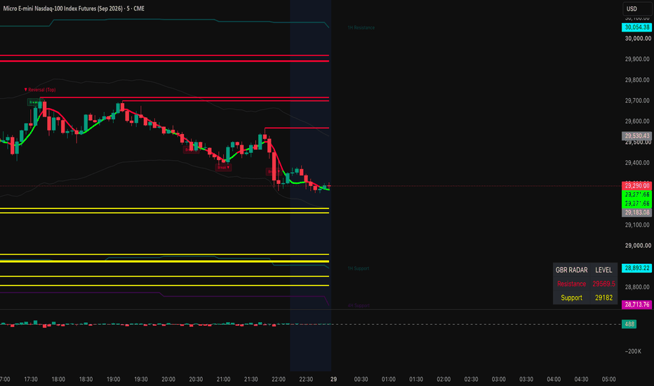
Channel Volume Profilwizard channel vp idm is a visual analysis tool built around a dynamic price channel, an anchored volume profile, value area levels, volume nodes, inducement zones, liquidity sweeps, and confluence labels.
the purpose of this indicator is to help traders read where price is positioned inside an active market structure. it combines channel direction, volume acceptance, value area behavior, and liquidity reactions into one clean visual layout.
this indicator does not predict the market. it is designed to organize technical analysis and highlight areas where price may react, slow down, reject, or continue.
main concept
the script builds a dynamic channel around price using a regression-based structure. inside this channel, it calculates an anchored volume profile that follows the slope of the market.
unlike a classic horizontal volume profile, this profile is projected inside the active channel. when the market is rising, the profile follows the upward slope. when the market is falling, the profile follows the downward slope.
this makes the profile easier to read in trending conditions, because the volume zones stay aligned with the current market path.
what the indicator displays
poc
poc stands for point of control. it marks the area with the highest volume inside the profile. this is often an area of acceptance where price may return, pause, or consolidate.
vah
vah stands for value area high. it is the upper boundary of the value area. if price rejects this level, a move back toward the poc may be watched. if price accepts above it, the market may be trying to expand higher.
val
val stands for value area low. it is the lower boundary of the value area. if price rejects this level, a move back toward the poc may be watched. if price accepts below it, the market may be trying to expand lower.
hvn
hvn stands for high volume node. it marks an area where volume concentration is high. these levels may act as areas of acceptance, reaction, or slowdown.
lvn
lvn stands for low volume node. it marks an area where volume concentration is low. these levels may act as fast movement zones, rejection zones, or imbalance areas.
idm
idm represents an internal inducement area. it helps identify internal liquidity zones that may be swept before a reaction or continuation.
drop marker
the drop marker highlights a possible liquidity sweep. it appears when price takes a level or zone and then moves back inside.
a label
the a label is a confluence marker. it combines several conditions such as sweep, rejection, value area interaction, volume behavior, poc reclaim, and structure context. it should not be used alone. it is a visual signal for deeper analysis.
how to use the indicator
start by looking at the channel direction.
if the channel is rising, the trader can focus more on reactions near the lower part of the channel, val, or bullish sweep zones.
if the channel is falling, the trader can focus more on reactions near the upper part of the channel, vah, or bearish sweep zones.
if price is near the middle of the channel, the market may be balanced. in that case, it is usually better to wait for a clear rejection, breakout, sweep, or acceptance shift.
how to use the poc
the poc is the main acceptance level of the current profile.
when price is above the poc, the market may be accepting higher prices.
when price is below the poc, the market may be accepting lower prices.
when price keeps returning to the poc, the market may be consolidating or building balance.
a clean break and hold above the poc can show stronger bullish acceptance.
a clean break and hold below the poc can show weaker structure or bearish acceptance.
how to use vah and val
vah and val define the value area.
a rejection from vah can show that price is failing to accept higher levels.
a rejection from val can show that price is failing to accept lower levels.
an acceptance above vah can suggest expansion to the upside.
an acceptance below val can suggest expansion to the downside.
beginners can use vah, poc, and val as a simple map:
vah = upper value zone
poc = balance zone
val = lower value zone
how to use hvn and lvn
hvn and lvn are displayed as small dotted levels with tiny labels.
hvn can act as a reaction or slowdown zone because price has previously accepted volume there.
lvn can act as a faster movement zone because there was less volume acceptance there.
these levels are not automatic buy or sell signals. they are reference points that should be combined with price action, structure, and risk management.
how to use idm
idm labels show internal inducement areas.
an idm can represent a zone where liquidity was built and later taken by the market. when price sweeps an idm and then reintegrates, it may help explain a reaction or shift in behavior.
an idm near val may support a bullish reaction if price sweeps and returns inside the channel.
an idm near vah may support a bearish reaction if price sweeps and returns inside the channel.
how to use the drop marker
the drop marker shows a potential liquidity sweep.
a drop below val or below the lower channel can suggest that price swept lower liquidity and then returned inside.
a drop above vah or above the upper channel can suggest that price swept upper liquidity and then returned inside.
it is usually better to wait for candle close before interpreting the marker.
how to use the a label
the a label represents a stronger confluence condition.
a bullish a near val or the lower channel can suggest possible absorption if price sweeps liquidity and closes back inside.
a bearish a near vah or the upper channel can suggest possible distribution if price sweeps liquidity and closes back inside.
the a label becomes more meaningful when it appears near poc, vah, val, hvn, lvn, or idm.
it should always be confirmed with market context, candle close, and risk management.
important settings
channel / vp lookback
controls how many bars are used for the channel and the volume profile. a higher value gives a broader view. a lower value gives a more reactive view.
regression length
controls the base of the channel. a higher value makes the channel smoother. a lower value makes it react faster to recent price movement.
vp rows
controls the number of rows in the volume profile. more rows create more detail, but too many rows can make the chart heavier.
value area %
controls the value area calculation. the common default is 70.
poc source
chooses how the poc is calculated. raw is stricter. smoothed is more stable visually.
vah / val source
chooses whether value area boundaries use raw volume or smoothed volume.
keep vp / levels inside rails
keeps the volume profile and main levels inside the channel so they do not overlap the outer rail visuals.
auto guard from neon rails
adds extra spacing from the visual rail bands to keep the profile and levels clean.
show inner lines
shows or hides decorative inner channel lines. when disabled, inner decorative lines are removed, while important levels such as poc, vah, val, hvn, and lvn remain visible.
show hvn / lvn small lines
shows small dotted high volume node and low volume node markers.
idm validation mode
controls how idm labels are displayed.
balanced sweep is more flexible.
strict bos is more selective.
early candidate displays potential idm areas earlier.
a minimum score
controls how selective the a label is. a higher value gives fewer signals. a lower value gives more signals.
beginner workflow
step 1
identify the channel direction.
if the channel is rising, focus on bullish reactions near the lower channel, val, or sweep zones.
if the channel is falling, focus on bearish reactions near the upper channel, vah, or sweep zones.
step 2
check where price is compared to the poc.
above poc can show stronger acceptance.
below poc can show weaker acceptance.
around poc can show balance or consolidation.
step 3
watch vah and val.
vah is the upper value boundary.
val is the lower value boundary.
look for rejection, acceptance, or sweep around these levels.
step 4
use hvn and lvn as reaction levels.
hvn may slow price down.
lvn may lead to faster movement or sharp rejection.
step 5
wait for confirmation.
a drop marker shows a sweep.
an a label shows confluence.
an idm label shows internal liquidity.
when several elements appear in the same area, that zone becomes more important for analysis.
example use case
price is rising inside the channel.
price pulls back toward val.
a drop marker appears below val.
price closes back inside the channel.
an a label appears near the lower channel.
in this case, the trader can study the area as a possible bullish reaction zone. this does not mean automatic entry. the trader should still check market structure, candle close, risk, and invalidation level.
another example
price reaches the upper channel and trades near vah.
a drop marker appears above vah.
price closes back below vah.
an a label appears near the top of the channel.
this can be studied as a possible rejection zone. the trader should still confirm with structure, risk management, and broader market direction.
usage tips
do not use the indicator alone.
always check the broader trend.
wait for candle close before making a decision.
avoid trading every label.
focus on zones where several elements align.
adjust settings depending on the asset and timeframe.
use proper risk management.
test the indicator before using it in live conditions.
risk notice
this indicator is an educational and technical analysis tool. it is not financial advice and does not guarantee any result. all signals and levels should be used as visual references inside a complete trading plan. every trader is responsible for their own decisions, risk management, and execution.
지표

Self Calibrating Probability ChannelSELF-CALIBRATING PROBABILITY CHANNEL
A forecast channel whose width is set by conformal prediction, tuned by a parameter-free online calibrator, and proven on your own chart. You pick a coverage level - say 90% - and the indicator shows you, live, the percentage it has actually achieved over recent bars, on every timeframe. Most bands assert a width; this one measures whether the width was right and corrects itself until it is, with nothing to tune.
WHAT IT IS
Bollinger Bands, Keltner Channels, Donchian Channels and standard-deviation regression channels all draw a width from a formula and ask you to trust it. None of them tell you what fraction of price actually landed inside. A "2 standard deviation" band is only a true 95% band if returns are normally distributed and stationary - which markets are not - so the real hit-rate drifts, usually without the user ever knowing.
This indicator inverts that. It forecasts where price should be next bar, measures how wrong that forecast has actually been, and builds the band directly from the empirical distribution of those errors. Then it watches its own hit-rate bar by bar and self-corrects. The result is a channel that earns its stated confidence level instead of assuming it - and reports, honestly, where it is and isn't holding.
THE METHOD (plain language)
1. Forecast path. Each bar, a one-step-ahead forecast of price is formed. You can pick a Kalman level-and-velocity tracker, a linear-regression slope, an EMA projection, or an anchored VWAP - or leave it on Auto, which runs all of them and blends them online by recent accuracy, so the centre line self-calibrates too. The forecast for the current bar uses only prior bars, so it is genuinely out-of-sample.
2. Error window. The gap between forecast and outcome is the forecast error. A rolling window of recent errors is kept, stored in volatility (ATR) units so the band breathes with the market. Each error is recorded only after its band has already been scored, so the band never includes the bar it is being tested on.
3. Conformal bands. For a chosen confidence level, the band edges sit at the matching quantiles of the recent error distribution (split-conformal prediction). Because it uses the actual error quantiles - including their skew - the bands are asymmetric when the errors are, rather than forcing a symmetric width. Four levels are drawn at once (50 / 70 / 90 / 95%) as nested zones, so the channel doubles as a probability heatmap: the dark core is where price spends most of its time, the faint outer edge marks rare excursions.
4. Parameter-free self-calibration (DtACI). After each bar the indicator checks whether price fell inside each level and nudges the width to hold the target. Rather than asking you to pick a calibration speed, it runs several speeds as competing "experts" and continuously blends them by how well each has tracked coverage recently (Dynamically-tuned Adaptive Conformal Inference). There is no rate to tune - the calibration tunes itself.
5. Live coverage proof, including by regime. The dashboard shows, for every level, the target versus the actually-achieved coverage over a rolling window, each tagged calibrated / under / over. It also reports the realised 90% coverage broken down by market regime - so you can see, for instance, that the band holds 92% in a quiet range but 87% in a volatile breakout. You are not asked to trust the band; you are shown its track record on the symbol, timeframe and regime in front of you.
6. Forward cone. A widening cone projects the likely range several bars ahead. Its width is built from actual multi-step forecast errors (not a square-root-of-time assumption), and its centre curves as projected momentum decays rather than extrapolating in a straight line. An optional bootstrap cloud resamples the real errors into sample forward paths - a direct picture of the distribution the bands come from.
7. Context and early warning. A two-axis regime read (trend strength x volatility) labels conditions; a turbulence detector watches for clustering of outer-band breaches and flags, in advance, when coverage is likely to degrade; a coiled-spring marker notes when a compressed range begins to expand; and an optional higher-timeframe row shows whether the larger trend agrees.
WHY THESE PARTS BELONG TOGETHER (one engine, not a bundle)
This is a single forecasting loop, not a collection of separate indicators sharing a chart. Each part is a required step, and removing any one breaks the whole:
- The forecast path produces an expected price and a drift. Without it there is no quantity whose error can be measured.
- The conformal band converts that path's own recent errors into prediction intervals. Without the forecast there is no error to bound; without the band the forecast is an unqualified guess.
- The online self-calibration adjusts the band to hold the target hit-rate as conditions change. Without it the intervals slowly drift out of calibration and the stated confidence becomes false.
- The live coverage readout verifies the loop is actually working, overall and per regime. It is the proof step a formula-based band cannot offer.
- The context layers (regime, turbulence early-warning, graded breaches, compression-release, higher-timeframe agreement) all read the same forecast errors and exist only to tell you WHEN the interval is most trustworthy and when it is about to fail.
So the components are not combined for convenience; they form a closed measure-and-correct cycle - forecast, bound the error, recalibrate, verify - which is precisely why they are published as one script rather than several overlays.
WHAT MAKES IT DIFFERENT
Conformal prediction is a distribution-free framework - its coverage guarantee holds for any underlying distribution given exchangeable errors, with no assumption that returns are Gaussian. It is standard in machine-learning uncertainty quantification but essentially absent from charting tools, which lean almost entirely on standard-deviation or ATR multiples. Pairing it with a parameter-free online recalibrator, a self-weighting forecast centre, and an on-chart coverage readout - including a per-regime breakdown - is the original contribution here. No moving-average envelope, regression channel or volatility band can state "I targeted 90% and have actually delivered 90% over the last 250 bars, and here is exactly where I don't" - this one can, and shows it.
WHAT YOU SEE ON THE CHART
- A multi-zone channel around a forecast centre line, shaded from the high-probability core out to the rare-excursion edge, coloured by forecast direction, and adaptive to dark or light chart backgrounds.
- A widening forward cone, optionally filled with a faint cloud of resampled paths.
- Right-side labels marking the forecast and the 90 / 95% edges as price levels.
- Small triangles when price breaks beyond the outer band; a ring when that breach is also high-quality (graded on displacement, close position, volume, range expansion and structure); an amber diamond when a quiet range starts to wake up.
- A dashboard with the live forecast, the 90% band range and where price sits within it, the full calibration table, the per-regime coverage, a reliability score, the forecast bias, the sample count, the calibration mode, and an optional higher-timeframe row.
- A plain-language "how to read" key, so the chart is approachable without any statistics background.
HOW TO READ AND USE IT
Mean reversion: when price reaches the outer (90 / 95%) zone in a ranging regime, it is statistically stretched and tends to revert toward the centre line. The "band position" readout and the calibration table tell you how stretched, and how trustworthy that edge currently is.
Trend continuation: a sustained walk along one side of the channel, especially with the cone tilted that way and the higher-timeframe row aligned, indicates a directional regime rather than noise.
Anomaly / breakout: a plain triangle is a volatility event; a ringed one is the same event confirmed as high-quality. A turbulence flag warns that the bands may be about to lose calibration.
Reliability and regime: treat the bands as most actionable when reliability is high, the calibration rows read "calibrated", and turbulence is quiet. The per-regime coverage tells you which conditions the channel is currently most trustworthy in.
SETTINGS OVERVIEW
- Forecast path (Auto / Kalman / Linear Regression / EMA / Anchored VWAP) and smoothing lengths.
- Calibration: residual window, recency window, volatility normalisation, parameter-free DtACI on/off (with a manual ACI rate as fallback), coverage-evaluation window.
- Forward projection length, cone momentum decay, optional bootstrap cloud.
- Anomaly sensitivity, swing pivot length, coiled-spring thresholds, turbulence sensitivity.
- Higher-timeframe context, price source, and full theme controls.
The price source is selectable and volume is borrowed where a symbol reports none, so it works across futures, equities, forex and crypto on any timeframe. Defaults read well intraday; longer windows suit higher timeframes.
HONESTY AND LIMITATIONS
- Non-repainting: each bar's forecast uses only prior bars, each error is recorded only after its band is scored, anomalies confirm on bar close, and the higher-timeframe row uses the last confirmed higher-timeframe value. Historical bands do not change after the fact.
- Conformal coverage is a statistical expectation over a window, not a per-bar guarantee. In a sharp regime break the realised hit-rate will dip until the window and calibrator re-adapt - and the dashboard, including its per-regime breakdown, shows that dip honestly rather than hiding it.
- The bands describe the distribution of short-horizon forecast error. They are a probabilistic context for price, not a prediction of direction and not a trading system.
- Calibration needs enough samples; on a fresh chart the channel needs its warm-up window before the figures are meaningful, and the cone needs a few extra bars beyond that.
This script is for research and education. It is not financial advice and not a solicitation to trade. Markets carry risk; test any tool on your own data and timeframe, and make your own decisions.
지표

Auto Andrews' Pitchfork Adaptive Channel# Auto Andrews' Pitchfork — Adaptive Median-Line Channel, Regime & Calibration
## What it is
On TradingView an Andrews' Pitchfork is a manual drawing tool: you place three points by hand and it draws a median line with two parallel tines. This script automates that geometry and, more importantly, surrounds the raw lines with the decision context a drawn pitchfork can never give you — whether the channel currently fits the market, whether a touch is likely to revert or break, and how the median and tines have actually behaved on the symbol you are looking at.
It detects the swing pivots, builds the channel, auto-selects the variation (Standard / Schiff / Modified Schiff) whose median best bisects the recent price path, and then runs a regime, reversion, break-strength and calibration stack on top of that one channel. It works on any symbol and any timeframe; every raw-data series is user-selectable in Settings.
## Why these components are combined (how the parts work together)
A bare auto-pitchfork only answers "where are the lines." On its own it shows the same picture in a quiet range, where price rotates back to the median, and in a strong trend, where price rides a tine and keeps going — the classic median-line failure. Every layer in this script exists to remove one specific blind spot of the bare geometry, and each layer feeds the next. They are not independent indicators stacked together; they are all derived from, or applied to, the same auto-built channel.
- **Auto-geometry (pivot detection + variation fit)** draws the channel and chooses the variation that best fits the actual price path, so the median is meaningful rather than an arbitrary hand placement.
- **Regime (efficiency ratio + ADX + volatility clustering)** decides whether a tine touch should be expected to fade (revert) or be ridden (continue) — the question the geometry alone cannot answer.
- **Reversion math (variance ratio + Ornstein-Uhlenbeck half-life)** is the statistical check on that decision: is the series actually mean-reverting, and if so, in roughly how many bars does a stretch to the median decay.
- **Break-strength scoring** rates how decisive a move beyond a tine is — magnitude versus ATR, volume participation, range expansion, the close's position within the bar (an anti-wick check), and a compression-then-release pattern. This turns "price crossed the tine" into a graded Fade / Ride / Invalid read instead of a binary one.
- **Volume nodes (POC, HVN/LVN)** classify whether each tine sits on a high-volume acceptance shelf (reaction likely) or a low-volume gap (likely sliced through), so proximity becomes a quality read.
- **Confluence (anchored VWAP, volume POC, higher-timeframe swing levels)** marks where the auto-geometry agrees with independent reference levels.
- **Calibration** measures, past-only, how often the median and each tine were actually respected on this symbol, reported with Wilson confidence intervals and a containment percentage, so the reliability read is earned from data rather than assumed.
The histogram of these reads is the synthesis: the dashboard ranks and states the channel's current condition in plain terms, but every figure is descriptive context, never a trade instruction.
## How to use it
1. Add it to any chart and set your data sources under "Data Source (any market)." For symbols with no native volume (some cash indices and FX feeds), enter a volume-bearing proxy in "Borrow volume from symbol."
2. Read the channel as a map: the median is equilibrium, the tines are the channel edges, and the warning lines mark over-extension.
3. Read the Status row: FADE means expect rotation inside the channel; RIDE means a strong break in a trend (the tine is being ridden); INVALID means the channel broke and a re-anchor is expected.
4. Use Regime, Half-life and Var-ratio to judge whether a tine touch is a fade or a continuation; use the volume-node tag and Confluence to judge whether a level is likely to hold; use Respect and Containment to judge whether the fork fits this symbol at all.
5. Treat every value as probabilistic context to combine with your own analysis and risk management.
## Optional context (off by default)
Two optional layers extend the tool without cluttering the default view:
Higher-timeframe context forks overlay lightweight median-and-tine outlines of the same auto-geometry on 5× and/or 15× the chart timeframe, so you can see how the current channel sits inside the larger structure. Only the higher-timeframe pivots are pulled (non-repainting, confirmed bars), and the outlines are drawn in time coordinates so they align across resolutions. They are intentionally minimal — no fills, glow, or analytics — because the full regime, break-strength and calibration stack stays on the current-timeframe fork, which is the one the dashboard describes. Enable them only when you want the multi-scale picture; on very high chart timeframes a 15× resolution can be non-standard and that outline will not populate.
Re-anchor on break lets a fresh fork begin building from post-break structure whenever the channel is invalidated, rather than only when new prominent pivots form. The broken channel stays on screen (dashed) until enough post-break pivots confirm to render the new one — there is an inherent pivot-confirmation lag, so the new fork appears a few bars after the break, not at the exact break bar. A minimum-bars guard prevents repeated re-anchoring in choppy conditions.
## Settings for any market
The High, Low and Price source inputs select the raw series the engine runs on, so it is not tied to one instrument. The volume-borrow input is blank by default and only activates on symbols that truly report no native volume. All optional layers degrade gracefully when their data is unavailable, and a data-health read flags when volume is unreliable.
## Originality
This is an original implementation. The contribution is not any single layer but the closed loop built around an automatically generated pitchfork: auto-geometry feeds a regime and break-strength engine that classifies the channel state, a half-life and variance-ratio core that quantifies reversion, volume-node context that grades each tine, and a past-only calibration tracker that reports how the lines have actually behaved — all from the one channel, rather than as separate tools placed side by side.
## Limitations (honest)
Pivots confirm after the configured right-bars lag and are non-repainting by construction. Volume-based layers require real volume. Calibration figures are descriptive of past behaviour only — they are not a backtest and not a probability of future results. Every read is probabilistic context.
## Disclaimer
This is a study / indicator for chart analysis and education only. It is not a strategy, not a recommendation, and not financial advice. It places no orders and guarantees no result. Markets involve risk, and a level's past behaviour does not assure future behaviour. Do your own research and manage your own risk.
지표

Celestial Mean Reversion Envelopes [Pineify]Celestial Mean Reversion Envelopes
This indicator identifies mean reversion opportunities by wrapping an adaptive moving average in standard deviation envelopes and signaling when price snaps back inside after piercing a band. Rather than using a fixed-period moving average as the baseline, the central line adapts its speed based on how frequently price is setting new highest highs or lowest lows — it tracks price quickly in trending conditions and almost freezes in ranges, so the bands shift organically with market character.
Key Features
Adaptive mean that responds to trend intensity rather than time alone — sluggish during consolidation, responsive during strong moves
Standard deviation envelopes calibrated to actual recent volatility, not fixed ATR multiples
Buy and sell signals generated on band crossunders/crossovers, confirming the reversal rather than anticipating it
Translucent overbought/oversold shading between the mean and each band for quick visual context
Built-in alerts for both reversion directions
How It Works
The calculation runs in two stages: first building the adaptive mean, then constructing the envelopes around it.
Extreme tracking — On each bar, the indicator checks whether a new highest high or lowest low has formed over the lookback window. Bars where a fresh extreme appears are marked with a value of 1; all other bars get 0. The SMA of these binary values over the same window gives the fraction of recent bars that produced a new extreme.
Squaring the fraction — Raising that fraction to the power of 2 produces a nonlinear smoothing coefficient. When trends are strong and new extremes appear on most bars, the coefficient approaches 1 and the adaptive mean tracks price closely. In a choppy range where few new extremes form, the coefficient collapses near zero and the mean barely moves. This technique is inspired by TRAMA (Trend Regularity Adaptive Moving Average) by e2e4mfck.
Adaptive mean update — Each bar the mean nudges toward the source price by the amount determined by the coefficient. The result is an average that effectively switches between "responsive" and "parked" behavior depending on what the market is doing.
Standard deviation envelopes — The upper and lower bands are placed at ±(StdDev × multiplier) from the adaptive mean, where StdDev is computed over the same lookback period. This makes the band width proportional to recent volatility: wider when price has been swinging, tighter during quiet periods.
Signal generation — A buy signal fires when source crossesunder the lower band (price dipped below, then closed back above it). A sell signal fires on a crossover of the upper band. The crossunder/crossover logic requires price to actually breach and then retrace — a bar that merely touches the band without closing through it does not trigger.
How the Components Work Together
The adaptive mean solves a problem that conventional envelope indicators ignore: when a market trends hard, a static EMA or SMA falls behind, making the upper band a poor reference for "too far, too fast." Because the adaptive mean accelerates during trends, the envelopes stay anchored to current price levels rather than lagging. This means the bands are more likely to represent genuine statistical extremes rather than just momentum riding.
The standard deviation layer adds a second dimension. Instead of a fixed pip or percentage offset, the band width expands when the market is volatile and contracts when it is calm — naturally suppressing signals during low-volatility compression and allowing wider moves during active sessions before flagging exhaustion.
Together these two layers create a filter that roughly says: "price reached a statistically unusual distance from where the trend currently sits, then pulled back." That combination reduces fakeout signals compared to using static bands on a lagging baseline.
Trading Ideas and Insights
On higher timeframes (daily, 4H), buy signals at the lower band that coincide with a key support level or volume spike may offer higher-confidence entries. Look for the adaptive mean to be flattening — it suggests the trend is pausing rather than reversing.
In intraday trading, signals that appear after a sharp impulsive leg tend to perform better than signals generated inside a choppy range. The adaptive mean will often be steeply sloped after an impulse, indicating the signal is against the micro-trend — exercise more caution and use tighter risk.
When price oscillates between the bands repeatedly without triggering signals, the market is likely in a low-volatility squeeze. A breakout attempt that immediately pulls back (triggering a sell or buy signal) at the edge of that range can mark the failed breakout early.
The gradient fill zones serve as a running reference for where price stands relative to the mean. Price persistently in the upper (red) fill with a rising adaptive mean suggests a strong trend; consider fading only when price crosses back into the neutral zone.
Past performance of any signal pattern does not guarantee future results. Always combine signals with broader context — structure, volume, and higher-timeframe bias. These signals indicate potential exhaustion; they do not predict reversal magnitude.
Unique Aspects
The squaring of the trend-regularity fraction is the core differentiator. Most adaptive averages use linear coefficients; squaring creates a much sharper distinction between trending and ranging states, so the mean spends more time "frozen" during ranges and snaps to price quickly when momentum genuinely kicks in.
Signals require price to close back inside the band, not just touch it — this one-bar confirmation step reduces noise from wicks that briefly pierce a band and immediately reverse without a real close-to-close move.
Band width is purely standard-deviation based rather than ATR-derived, which means the scaling responds to the actual statistical dispersion of the source series rather than the high-low range. On instruments with many gaps this can produce meaningfully different widths than ATR bands.
How to Use
Add the indicator to any chart. It overlays directly on the price pane.
The blue line is the adaptive mean. When it is rising steeply the market is in an upward trending mode; when flat or slightly sloped, it is ranging.
The red-shaded zone above the mean is the overbought area; the green-shaded zone below is the oversold area. Price spending extended time in one zone suggests momentum, not necessarily exhaustion.
A green BUY label below a bar means price closed back above the lower band after briefly breaking it — potential reversion entry. A red SELL label above a bar means the opposite.
To set alerts, use the "Buy Alert" or "Sell Alert" conditions from the indicator's alert panel (Once Per Bar Close recommended to avoid premature triggers on intrabar wicks).
Customization
Adaptive Mean Length (default: 99) — Controls both the highest/lowest lookback and the SMA averaging window for the smoothing coefficient. Higher values slow the mean considerably and widen bands; lower values increase reactivity but also produce more frequent and less reliable signals.
Envelope Multiplier (default: 2.5) — Scales the standard deviation distance. 2.0 suits instruments with tighter typical ranges; raise to 3.0+ on highly volatile assets to avoid constant band touches that don't represent genuine extremes.
Source (default: close) — Change to hl2 or hlc3 to incorporate high and low into the baseline; close is typically sufficient for most reversion setups.
Color inputs — Adjust bullish/bearish/mean colors and toggle the gradient fill on or off depending on visual preference.
Conclusion
Celestial Mean Reversion Envelopes pairs an adaptive mean that adjusts its responsiveness to trend regularity with volatility-scaled deviation bands, targeting the specific moment when a stretched move closes back inside its statistical boundary. The approach is best suited to traders who wait for confirmation — the crossunder/crossover trigger ensures you're acting on a completed reversal bar, not an open wick. As with any mean-reversion tool, it works best when context confirms the extension is exhaustion rather than breakout continuation.
지표

Anchored Trend Channels [MQLSoftware]Anchored Trend Channels is a structural overlay that maps each phase of price action between confirmed swing points as its own parallel trend channel. Instead of fitting one curve or band to all of price history, it breaks the chart into discrete pivot-to-pivot segments and renders each one as a self-contained anchored channel with its own slope, width, and angle. The active channel projects forward with a dashed extension so future support and resistance levels are visible at a glance.
A second, finer regression channel (Micro) lives inside the currently forming Macro segment to show local momentum and its relationship to the broader trend. A compact right-side panel reads off the resulting structure, the active segment angle, the segment chain, multi-timeframe context, and three optional structural events.
This is a visual analytical tool intended for chart reading and structure mapping. It does not execute trades and does not provide financial advice.
Key Features
Pivot-anchored Macro channels that segment price action into discrete trend phases (one channel per phase, anchored on confirmed swing pivots)
Active segment with a forward-extending dashed projection of about 20 bars, showing where the channel boundaries would lie if the trend continues
Adaptive Micro regression channel inside the active segment, with R-squared fit quality readout
Trend Bias scoring weighted by segment length and angle, combined with net price move across the analysis window
Acceleration metric showing how much the Micro angle deviates from the Macro angle (faster, slower, or flat)
Right-side panel with Macro angle, segment chain visualization, Micro R-squared, MTF context, and three structural signal states
Non-Repaint Mode toggle for users who prefer closed-bar-only updates on the active segment
Three optional structural event markers (Segment Break, Macro Pullback, Micro Continuation) with a configurable cooldown to avoid clustering
Core Concept
Most channel and trend indicators on TradingView take one of two approaches. They either fit a single continuous curve to all of price (linear regression channels, ATR-trailing bands, smoothed moving averages with deviation bands) or they detect individual trendlines through two pivots and project them indefinitely. Both approaches have known limitations. A single continuous channel cannot describe a market that has clearly changed phase. Two-pivot trendlines drift, get broken, and need constant manual maintenance.
This indicator builds on a third approach: piecewise channels anchored on confirmed pivots. Each finished segment is a closed, immutable object that describes one phase of price action between two opposite swing points. The chain of segments left behind is a structural history of how the trend developed, where it accelerated, where it reversed.
The indicator adds three specific algorithmic elements on top of that base.
1. Quality Filters at Segment Birth. Before a new segment is committed, two filters check that the pivot move is structurally meaningful. The pivot-to-pivot price distance must exceed a configurable ATR multiple (default 2.5x), and the bar count must exceed a minimum length (default 8 bars). Pivots that fail either check are skipped, so the visible chain reflects real phase changes, not noise.
2. Pivot-Anchored Geometry with Max-Deviation Width. Each segment's basis line is the straight line between its two anchor pivots. The channel half-width is the maximum deviation of any bar inside the segment from that basis line, scaled by a user multiplier and floored by an ATR-based minimum. This produces channels that visibly contain the price action that built them, rather than mathematical fits that ignore visible swings.
3. Trend Bias from Weighted Segments Plus Net Move. Most chain-based indicators classify direction by counting up-segments versus down-segments. That gives equal weight to a 30-bar trending move and a 5-bar choppy retracement. This indicator weights each segment by the product of its bar count and its absolute angle, then combines that with the net price move across the analysis window measured in ATR units. The result is a Trend Bias label (Strong Bull, Bullish, Mixed, Bearish, Strong Bear) that reflects which side has accumulated the actual structural progress, not just the count of segments.
Anatomy of the Display
Historical segments are drawn as parallel green or coral channels between confirmed past pivots. They are immutable once committed and form a left-to-right chain that visually traces the structure of the trend.
The active segment is the right-most channel, drawn in bright color with a wider glow layer. It anchors on the most recent confirmed pivot and extends to the current bar. The dashed projection continues the channel about 20 bars to the right at the current slope, so users see where price would touch the upper and lower boundaries if the segment kept its angle.
The Micro channel is a 20-bar linear regression with standard-deviation bands, rendered in cyan or pink depending on its own direction. It only appears when the regression's R-squared fit quality clears a user threshold, so it auto-hides when local price action is too noisy for a meaningful regression.
H and L pivot markers sit at the pivot anchor points. H labels mark confirmed high pivots, L labels mark confirmed low pivots.
The right-side panel groups the data into Trend Bias (top), Macro Active Segment (angle, direction, bars in segment, segment chain), Micro Channel (angle, direction, R-squared, acceleration), Signals (three states), and MTF (current angle of two higher timeframes).
Acceleration in the panel is the Micro angle minus the Macro angle. A positive number means the local momentum is steeper than the surrounding trend phase (often early-stage continuation). A negative number means the local momentum is flattening relative to the surrounding trend phase (often late-stage or stalling).
Optional Structural Event Markers
Three structural events can be displayed as on-chart markers. These describe what is happening to the channel geometry. They are not trade entries.
Segment Break (BRK). Price closes beyond the opposite boundary of the active segment. In an active uptrend channel, this is a close below the lower boundary. In a downtrend channel, a close above the upper boundary. This marks a violation of the active phase structure.
Macro Pullback (PB). Price closes within 0.2 ATR of the band on the same side as the trend direction. In an uptrend, price closes near the lower boundary. In a downtrend, price closes near the upper boundary. This marks a touch back to the channel boundary in the direction of the active phase.
Micro Continuation (CONT). The Micro channel breaks its own boundary in the same direction as the Macro segment, while the segment is still in its early stage (3 to 25 bars in). This marks a moment when local momentum aligns with the broader trend phase early in its life.
All three event types are gated by a configurable cooldown (default 15 bars) to prevent clustering. Each event is computed on closed bars only.
Multi-Timeframe Panel Row
The MTF row at the bottom of the panel shows the active segment angle on two higher timeframes. The two HTFs are selected automatically from the standard timeframe ladder based on the current chart timeframe. For example, on a 15m chart the panel reads 4H and 1D. On a 1H chart it reads 1D and 1W. HTF values are read with `lookahead=barmerge.lookahead_off` and a one-bar offset, which is the standard non-repainting pattern for higher-timeframe reads.
Notes on Repainting
Historical segments do not repaint. They are built from confirmed pivots (`ta.pivothigh` and `ta.pivotlow` with a right-bars parameter). A pivot is only confirmed several bars after it forms, so historical segments remain anchored in place forever once committed.
The active segment updates as new bars print. With Non-Repaint Mode ON (default), it recalculates only on closed bars, so its boundaries remain stable intra-bar. With Non-Repaint Mode OFF, it updates on every tick for users who prefer maximum responsiveness and accept the visual jitter.
Pivot detection has an inherent delay equal to the pivot lookback (default 30 bars on Very Long sensitivity). A pivot becomes visible after that many bars have closed past it. This is a property of all pivot-based indicators, not a flaw specific to this script.
All signal markers and alerts are gated by `barstate.isconfirmed`. They fire exactly once per closed bar and never intra-bar.
MTF panel data uses `lookahead=barmerge.lookahead_off` with a one-bar offset on every series, which is the canonical non-repainting pattern for higher-timeframe context.
Typical Analysis Workflow
A common analytical workflow may include:
Reading the Trend Bias label and color in the panel header to anchor an overall directional view
Checking the segment chain in the panel against the visible historical channels on the chart to confirm structure is consistent
Watching the active segment's dashed projection to identify forward levels where the channel boundaries are heading
Comparing the Micro channel direction and angle against the Macro segment direction and angle (Acceleration row) to read whether local momentum aligns with the broader phase
Cross-checking the MTF row to see whether higher timeframes are in the same structural direction or in conflict
Treating Segment Break, Macro Pullback, and Micro Continuation markers as structural events for context, then combining that read with other forms of analysis and risk management
Configuration
Pivot Sensitivity - Short (5), Medium (10), Long (18), or Very Long (30). Lower values produce more segments of shorter average length. Higher values produce fewer, longer-lived segments. Very Long is the default and produces the cleanest premium look.
Min Segment Size (x ATR) - Minimum price distance between consecutive pivots, measured in ATR. Pivots below this threshold are skipped. Higher values produce fewer, more significant segments.
Min Segment Length (bars) - Minimum bar count between consecutive pivots. Short segments are skipped.
Channel Width Multiplier - Multiplier on the max-deviation width. 1.0 means the channel just contains the price action that built it. 1.2 to 1.5 adds visible breathing room.
Min Band Width (x ATR) - Floor on the channel half-width. Prevents razor-thin channels on short segments where deviation is small.
Max Segments Stored - FIFO cap on historical segments (default 15). Older segments are removed as new ones form.
Regression Length (Micro) - Number of bars in the Micro regression window (default 20).
Std Dev Multiplier (Micro) - Width of the Micro band in standard deviations.
Min R-squared to Show (Micro) - Hides the Micro channel when regression fit quality is below this threshold.
Signal Cooldown (bars) - Minimum bars between consecutive same-type signal markers.
Non-Repaint Mode - When ON (default), the active channel uses closed-bar data only. When OFF, it updates live with each tick.
Show toggles - Macro segments, Micro channel, panel, status badge, endpoint labels, pivot markers, signal markers, basis lines, channel fills, MTF row.
Markets and Timeframes
The indicator can be applied across multiple markets and timeframes:
Forex
Stocks and Indices
Commodities
Cryptocurrencies
Because slope is ATR-normalized and channel width is ATR-floored, the visual behavior remains consistent across instruments and timeframes. The Pivot Sensitivity preset can be tuned per chart for the cleanest read on a given symbol and timeframe.
Alerts
Three alert conditions are available:
Segment Direction Changed - fires when the active segment direction flips between uptrend and downtrend
Segment Break - fires when price closes beyond the opposite boundary of the active segment
Micro Continuation - fires when the Micro channel breaks its own boundary in the same direction as the active Macro segment, in the early portion of the segment
All alerts evaluate on confirmed bars to avoid intra-bar oscillation. 지표
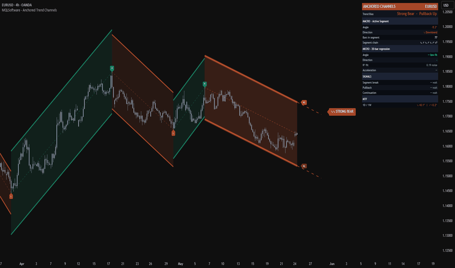
Auto Trendlines & Market Structure - MTFAuto Trendlines & Market Structure - MTF
Auto Trendlines & Market Structure - MTF is a visual analytical indicator that automatically draws support and resistance trendlines through swing pivots and classifies the resulting structure into one of seven states: Uptrend, Downtrend, Expanding, Contracting, Range, HH Trending, or LL Trending. A compact panel in the top-right shows how that classification compares across the current chart timeframe and three higher timeframes.
The goal is to remove the subjectivity of manual trendline drawing while keeping the chart readable: only the two currently relevant lines (one from recent pivot highs, one from recent pivot lows) are drawn as active, while older invalidated lines fade into a dashed historical layer for context.
This is a visual analytical tool intended for chart reading and structure mapping. It does not execute trades and does not provide financial advice.
Key Features
Auto-detected trendlines through the two most recent valid pivot highs (resistance) and pivot lows (support)
Adaptive pivot lookback that scales with ATR-relative volatility, with optional fixed-length mode
Seven-class structure classification rather than a binary up/down trend
Multi-timeframe panel scanning the current TF plus three higher TFs
Validation logic that rejects lines penetrated by older pivots beyond an ATR-based tolerance
Historical line trail (dashed) preserved when an active trendline gets broken or replaced
Two-layer neon line rendering and gradient channel fill scaled by ATR
Core Concept
Most automatic trendline scripts simply connect the two most recent pivots and call it a trendline. This produces noisy output in choppy markets and resists no contradiction from older swings. This indicator adds three layers on top of that base.
1. Pivot Validation. Before a candidate trendline becomes active, it is checked against up to four older pivots in the same direction. If any of them sits more than 0.3 ATR above a resistance line (or below a support line), the candidate is rejected. This filters out lines that look correct on the latest two pivots but conflict with established structure.
2. ATR-Normalized Slope. Slope is stored not in raw price-per-bar units but in ATR-per-bar units. This makes slope comparable across instruments and timeframes: a normalized slope of 0.1 means roughly one-tenth of an ATR per bar regardless of whether the chart is EURUSD on 15m or BTCUSD on 4H. Strength buckets (Weak / Moderate / Strong / Very Strong) are then defined on this normalized scale.
3. Seven-Class Structure Classification. Instead of collapsing everything into "up or down", the indicator combines the slope sign of both lines:
Both up — Uptrend
Both down — Downtrend
Resistance up, support down — Expanding (broadening)
Resistance down, support up — Contracting (converging)
Both flat within threshold — Range
Only support active — LL Trending (one-sided structure)
Only resistance active — HH Trending (one-sided structure)
This classification surfaces structural states that a single trend label cannot describe — particularly Expanding and Contracting, which often precede volatility expansions or breakouts.
Trendline Lifecycle
Each line goes through a defined lifecycle:
Built from the two newest valid pivots in its direction
Projected to the right and rendered with a colored core plus a wider transparent glow
Replaced when a newer pivot pair forms a more recent line — the previous line is then frozen as a dashed historical reference
Invalidated when price closes more than 0.5 ATR beyond the line — at that moment the line stops projecting, freezes at the breakpoint, and a break alert can fire
The historical trail is capped at 80 frozen lines (FIFO) so the chart does not accumulate clutter on long histories.
Multi-Timeframe Panel
A compact panel in the top-right corner displays the current trend classification across the current timeframe and three higher timeframes. The three HTFs are selected automatically from the standard ladder (1m, 5m, 15m, 1H, 4H, 1D, 1W, 1M, 3M, 12M) based on the active chart timeframe — for example, on a 1H chart the panel shows 4H, 1D, 1W.
Each row shows:
Timeframe label
Block-bar strength gauge
Class name (Uptrend / Downtrend / Expanding / Contracting / Range / HH Trending / LL Trending / Building)
Strength tier (Weak / Moderate / Strong / Very Strong)
The panel also shows the current chart's HH and LL line levels and the absolute and percentage channel width when both lines are active. HTF data is pulled with non-repainting parameters so the panel stays consistent on confirmed bars.
Typical Analysis Workflow
A common analytical workflow may include:
Reading the structure class on the chart timeframe to understand the immediate state
Comparing it to the three higher timeframes in the panel to detect alignment or conflict
Watching the channel width as the structure transitions between Expanding, Contracting, and Range
Using line breaks and the dashed historical trail to time potential structure shifts
Combining the structure read with other forms of analysis and risk management
Configuration
Pivot Lookback Mode — Adaptive (default) scales the pivot length with ATR-relative volatility (between 5 and 10 bars on each side). Fixed lets you set a single lookback between 3 and 15 bars.
Show Trend Lines — Toggles the active two-layer neon trendlines.
Show Channel Fill — Fills the area between active lines with a gradient. Only rendered when both lines are active and the structure is Uptrend, Downtrend, or Range (skipped during Expanding and Contracting to avoid visual confusion).
Show MTF Panel — Toggles the multi-timeframe panel.
Show Pivot Markers — Triangle markers at the most recent pivots, capped at 6 to avoid clutter.
Show Trend Status — Large class badge above price.
Show Line Labels — "HH" and "LL" anchor markers at the right end of each active line.
Line Width (Core) — Width of the inner core line. The outer glow is always rendered at core + 7.
Markets and Timeframes
The indicator can be applied across multiple markets and timeframes:
Forex
Stocks and Indices
Commodities
Cryptocurrencies
Because slope is ATR-normalized and pivot lookback is volatility-adaptive, the visual behavior remains consistent across instruments and timeframes without manual re-tuning.
Alerts
Three alert conditions are available:
Trend Class Changed — fires when the structure classification transitions between any of the seven states
Resistance Break — fires when price closes more than 0.5 ATR above the active resistance line
Support Break — fires when price closes more than 0.5 ATR below the active support line
All alerts evaluate on confirmed bars to avoid intra-bar oscillation.
Notes on Repainting
Active trendlines are anchored to confirmed pivot highs and pivot lows, which are themselves only validated after a pivot lookback window has fully passed. Once an active line is drawn its anchor points do not move. The MTF panel uses confirmed higher-timeframe values with a one-bar offset, so its readings stay consistent across historical and realtime bars. Alerts trigger only on confirmed bars.
Important Notes
This indicator is an analytical visualization tool. It does not execute trades and does not provide financial advice. All outputs are informational and should be interpreted within the context of independent market analysis and proper risk management.
Past behavior of any technical indicator does not guarantee future results.
If you find this indicator useful, feel free to add it to your favorites and share your feedback in the comments. Community feedback helps improve future updates. 지표
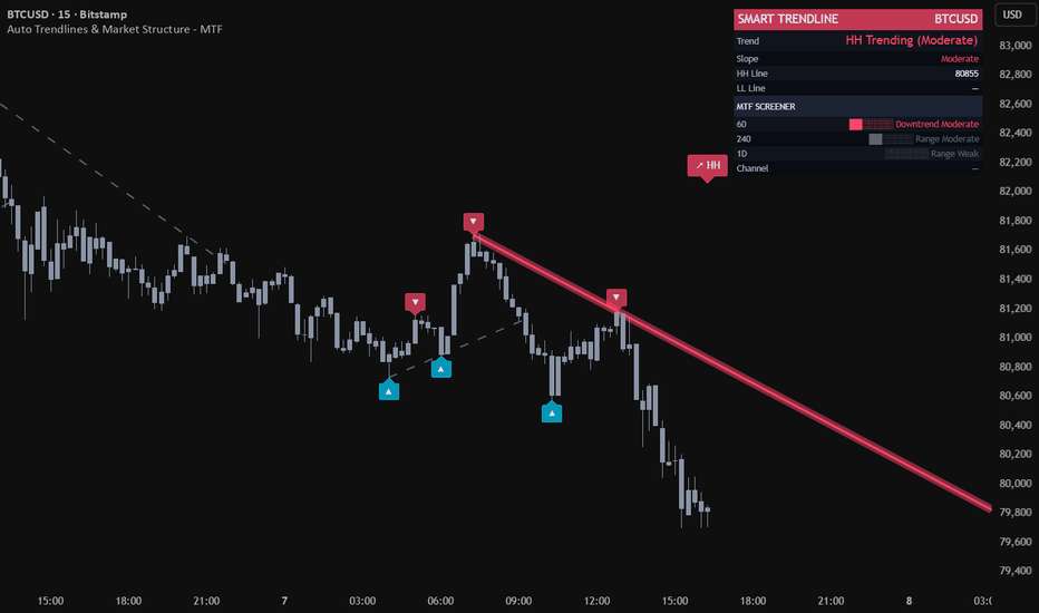
Channel Breakout [EXCAVO]Automatic Convergent Channel Detection with Multi-Filter Breakout Confirmation
The Channel Breakout automatically detects convergent channel patterns — wedges, flags, and triangles — by fitting trendlines through confirmed swing pivots on both boundaries simultaneously. When price breaks out with volume and momentum confirmation, the indicator signals the direction with colored channel lines and an entry label on the breakout candle.
This is not a basic highest/lowest channel. The boundaries are built from verified pivot points, and a convergence filter ensures only genuinely contracting channels qualify — expanding ranges and sideways boxes are excluded.
━━━━━━━━━━━━━━━━━━━━━━━━━━━━━━━━━━━━━━━
▸ HOW TO USE
Step 1 → Add the indicator. It begins scanning for convergent channel
patterns using swing pivots on the current timeframe.
Step 2 → Wait for a channel to form. The indicator draws the upper and
lower boundary lines in blue while price remains inside.
Step 3 → Watch for the breakout signal. When price closes beyond either
boundary with confirmation, channel lines turn blue (bull) or
red (bear), and an arrow label appears on the breakout candle.
Step 4 → Check the dashboard. It shows the current pattern state,
breakout strength (Strong / Medium / Weak), and the directional
bias score that built up while price was inside the channel.
Step 5 → Read the strength rating. Strong breakouts combine high volume,
deep body penetration, and RSI alignment. Weak breakouts show
fewer confirming factors and may warrant additional analysis.
━━━━━━━━━━━━━━━━━━━━━━━━━━━━━━━━━━━━━━━
▸ HOW IT CALCULATES
◆ Pivot Detection
Swing highs and lows are identified with ta.pivothigh / ta.pivotlow using a
configurable lookback (Pivot Detection Length, default 5 bars each side). Only
confirmed, closed pivots are used — no repainting. All recent pivots within the
Max Channel Width lookback are stored and passed to the trendline fitting engine.
◆ Best-Fit Trendline Algorithm
For the upper boundary, the engine tests every pair of stored pivot highs (a, b).
For each candidate line through (a, b), it counts how many other pivot highs lie
within ATR × Touch Tolerance of the line while no pivot exceeds it by more than
ATR × Max Deviation. The line with the most qualifying touches becomes the upper
boundary. The same process runs independently for pivot lows to find the lower
boundary. Both boundaries must exist with at least Min Touches (default 2) to
form a valid channel.
◆ Convergence Filter
Once both boundaries are found, the engine measures channel width at the earliest
shared bar (widthStart) and at the current bar (widthNow):
convRate = 1 − (widthNow / widthStart)
A channel is only accepted when convRate >= Min Convergence Rate (default 0.02).
This rejects expanding wedges and flat ranges, keeping only contracting patterns.
◆ Breakout Detection and Strength Score
On each confirmed bar close, the engine projects both boundary lines to the current
bar. A bull breakout fires when close > upper boundary; a bear breakout when
close < lower boundary. The breakout strength score blends five components:
penetration depth relative to ATR (25%), candle body ratio (15%), body commitment
relative to the broken boundary (15%), volume vs SMA-20 spike (25%), and RSI
alignment above/below 50 (20%). Score >= 65 = Strong, >= 35 = Medium, < 35 = Weak.
◆ Confirmation Filters
Three optional filters gate the breakout signal. Volume Spike Multiplier requires
the breakout bar's volume to exceed 20-bar SMA by a configurable factor. Volume
Contraction Filter requires that average volume inside the channel was lower than
before the channel formed — confirming energy compression. Momentum Confirmation
requires RSI > 50 for bull breakouts and RSI < 50 for bear breakouts. Any filter
can be disabled for forex or low-volume instruments.
━━━━━━━━━━━━━━━━━━━━━━━━━━━━━━━━━━━━━━━
▸ WHAT MAKES IT DIFFERENT
◆ Pivot-Confirmed Boundaries
Most auto-channel scripts use ta.highest / ta.lowest, which anchors lines to the
highest wick in a window regardless of pattern shape. This indicator builds
boundaries only through confirmed swing pivot points, the same anchor logic a
trader would use when drawing manually.
◆ Convergence-Only Filter
The convRate filter rejects any channel that is not actively narrowing. Sideways
ranges, expanding wedges, and parallel channels are all excluded. Only patterns
where price is compressing toward a decision point qualify.
◆ Best-Fit Touch Counting
The engine evaluates every pair of pivots and selects the line with the highest
touch count, not just the first two pivots it finds. A channel supported by four
touches is stronger than one supported by two, and the algorithm reflects that
by preferring denser confirmation.
◆ Multi-Component Strength Score
The breakout strength is not a simple volume check. It combines five independent
signals — penetration depth, body ratio, body commitment relative to the broken
level, volume spike, and momentum direction — into a single 0-100 score that
classifies the breakout as Strong, Medium, or Weak.
◆ Directional Bias Score
While price is inside the channel, the dashboard tracks a real-time directional
bias built from channel slope (35%), RSI deviation from 50 (35%), and price
position within the channel range (30%). This gives a probabilistic lean on
which side of the channel is more likely to break before the signal fires.
━━━━━━━━━━━━━━━━━━━━━━━━━━━━━━━━━━━━━━━
▸ DASHBOARD
Real-time panel (top right) with key state metrics:
Status - Active (channel forming) / Bull Breakout / Bear Breakout / Scanning
Direction - directional bias with arrow and % while channel is active (e.g. ▲ 64%); BULLISH or BEARISH after breakout
Strength - Strong / Medium / Weak (breakout strength score); — while channel is forming
Convergence - narrowing rate of the active channel in %; — when no channel
Legend table (bottom left) explains every visual element. Toggle in Dashboard settings.
━━━━━━━━━━━━━━━━━━━━━━━━━━━━━━━━━━━━━━━
▸ SETTINGS
Main Settings
Pivot Detection Length - 5 (bars left/right for swing pivot confirmation; lower = more sensitive)
Min Touches per Boundary - 2 (minimum pivot touches required per trendline)
Max Channel Width (bars) - 120 (maximum lookback for channel search)
Min Convergence Rate - 0.02 (minimum narrowing ratio; higher = stricter contraction)
Filters
Volume Spike Mult - 1.2 (breakout bar volume vs SMA-20; set 0.5 to disable on forex)
Volume Contraction Filter - ON (require declining volume inside the channel)
Momentum Confirmation - ON (RSI > 50 for bull, < 50 for bear)
Visual
Show Channel Patterns - ON (draw boundary lines)
Show Pattern Background - OFF (subtle bgcolor while inside active channel)
Channel Lines
Line Width - 2 (boundary line thickness; 1-4)
Risk Management
Show Entry Labels - ON (arrow label on the breakout candle)
Dashboard
Show Dashboard - ON
Position - Top Right (Top Left / Top Right / Bottom Left / Bottom Right)
Font Size - Small (Small / Normal)
Advanced
Touch Tolerance (ATR) - 0.15 (pivot distance to count as a touch; 0.10-0.25)
Max Deviation (ATR) - 0.30 (maximum pivot overshoot from the line)
Min Channel Width (ATR) - 0.5 (minimum channel width filter)
Alerts
JSON Alerts - OFF (structured JSON payload for 3Commas, Wunderbit, and similar bots)
━━━━━━━━━━━━━━━━━━━━━━━━━━━━━━━━━━━━━━━
▸ ALERTS
Bull Breakout - price closes above the upper channel boundary with confirmation
Bear Breakout - price closes below the lower channel boundary with confirmation
Any Breakout - either direction; use for a single alert covering both signals
New Pattern - a new convergent channel has been detected and is now active
━━━━━━━━━━━━━━━━━━━━━━━━━━━━━━━━━━━━━━━
Best regards,
EXCAVO
Disclaimer
Trading involves significant risk. This indicator is a technical analysis tool
and does not constitute financial advice, investment recommendations, or a
guarantee of future results. Past indicator behavior does not guarantee future
performance. Always use proper risk management and your own judgment.
지표

Lumina Trend Channels & Bands [Pineify]Pineify - Lumina Trend Channels & Bands
Lumina Trend Channels & Bands is an overlay indicator that builds a volatility-adjusted trend channel around a Volume-Weighted Moving Average (VWMA). VWMA forms the baseline, while ATR bands define how far price must move before trend state changes.
Key Features
VWMA midpoint weighted toward higher-volume closes.
ATR-based upper and lower bands that adapt to current range.
Persistent trend state while price remains inside the channel.
Triangle markers on the first cross above the upper band or below the lower band.
How It Works
The script calculates a VWMA of close, then adds and subtracts ATR multiplied by the Band Multiplier. A close above the upper band sets bullish state; a close below the lower band sets bearish state. Between the bands, the prior state is preserved.
Compute the VWMA baseline.
Measure ATR and scale it by the Band Multiplier.
Plot upper and lower channel bands around the VWMA, then mark the first crossover or crossunder.
How the Components Work Together
VWMA supplies the directional anchor, while ATR decides how much evidence price needs before a breakout is treated as meaningful. In high volatility the bands widen and demand a stronger close; in quiet conditions the channel tightens and reacts sooner. The cloud fill emphasizes the active side of the trend.
Trading Ideas and Insights
A bullish triangle may indicate continuation after price clears the upper boundary.
A bearish triangle may flag downside momentum when price loses the lower band.
Inside-channel movement is a drift zone. Wait for bar close on live bars; fast reversals can lag, and ranges can whipsaw.
Unique Aspects
Trend state is retained inside the ATR channel, reducing flip-flopping around the VWMA.
The asymmetric cloud emphasizes the active trend side while keeping the opposite band visible.
How to Use
Add the indicator to a clean price chart.
Use the midline and channel to judge bullish, bearish, or undecided territory.
Treat triangles as potential breakout starts, then look for confirmation.
No built-in alert conditions are included in this version.
Customization
Trend Baseline Length (default: 50) - VWMA lookback. Higher values smooth the channel but add lag.
Volatility (ATR) Length (default: 14) - ATR lookback for band width.
Band Multiplier (default: 2.0) - Channel distance. Higher values reduce breakouts; lower values are more sensitive.
Bullish/Bearish Trend Colors - Adjust line, cloud, and marker colors.
Conclusion
Lumina Trend Channels & Bands is for traders who want a clean VWMA trend channel with volatility-aware breakout markers. Use it as context alongside structure, volume, and risk management rather than as a standalone system.
지표

Gaussian Channel System [GCS]## DESCRIPTION
Gaussian Ribbon Engine (GRE) is a multi-layer trend analysis system built on the Arnaud Legoux Moving Average (ALMA), which applies a Gaussian (bell curve) weighting function to price data instead of the linear or exponential weights used by traditional moving averages.
**Mathematical Foundation**
ALMA uses a Gaussian kernel — the same bell-curve distribution found in statistics and physics — to weight the prices in its lookback window. The Gaussian function is parameterized by two values: offset (which shifts the bell curve left or right, controlling responsiveness vs. smoothness) and sigma (which controls the width of the bell curve, determining how sharply weights decay from the center). The formula applies: w(i) = exp(-((i - offset * (N-1))^2) / (2 * sigma^2 * N^2)), where each price bar receives a weight according to its position on the Gaussian curve. This produces a moving average with mathematically optimal noise filtering properties.
GRE constructs five ALMA layers with increasing periods (default 9, 21, 55, 100, 200), creating a visual ribbon. When all five layers align in order (fastest on top for bullish, fastest on bottom for bearish), the market is in full directional agreement. The spread between the outermost layers, measured as a percentage and compared to its own historical average, identifies squeeze (convergence) and expansion (divergence) conditions.
**9-Point Confluence Scoring**
The scoring matrix evaluates: price vs. Layer 1, Layer 1 vs. 2, Layer 2 vs. 3, Layer 3 vs. 4, Layer 4 vs. 5 alignment, Layer 1 slope direction, Layer 3 slope direction, RSI above/below 50, and DI+/DI- directional movement. Signals fire when the score crosses the configurable threshold with ADX confirmation.
**Features**
- Five-layer ALMA ribbon with Gaussian kernel weighting
- Adjustable offset (0-1) and sigma parameters for fine-tuning the Gaussian bell shape
- Ribbon spread analysis with squeeze and expansion detection
- 9-point confluence scoring with visual dot notation in dashboard
- ATR-based dual take-profit levels (TP1 and TP2)
- Squeeze breakout signals when ribbon compresses then expands
- ADX and volume confirmation filters
- Full color-coded dashboard with regime classification
- Multiple alert conditions
--- 지표

지표
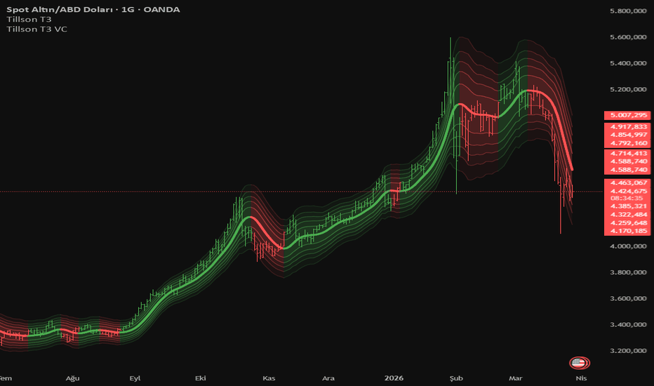
Spline Quantile Regression Channel [LuxAlgo]The Spline Quantile Regression Channel indicator implements an advanced non-linear regression model to fit a flexible, multi-level channel over recent price action. Unlike standard linear regression which identifies the mean trend, this tool fits specific price percentiles (quantiles) using cubic splines, providing robust support and resistance zones that adapt to market volatility and non-linear structures.
🔶 USAGE
The indicator is designed to provide a sophisticated view of the current trend and its extremes. By fitting cubic splines to specific quantiles, the script offers a "bendable" channel that can follow complex price movements more accurately than traditional straight-line regressions.
🔹 Trend Identification
The median line (default 0.5 quantile) represents the central tendency of the price action. When the spline is sloping upward, it indicates a non-linear bullish regime; a downward slope indicates a bearish regime.
🔹 Support and Resistance
The upper and lower bands represent the specified extremes (e.g., the 90th and 10th percentiles). These act as dynamic boundaries:
Prices reaching the upper band often indicate overextended conditions within the current lookback period.
Prices reaching the lower band suggest the asset is trading at the lower end of its recent distribution.
🔹 Forecasting
The indicator projects the calculated spline into the future using a dashed line. This forecast is a mathematical extrapolation of the current non-linear trend, helping traders visualize where the price distribution is headed if the current momentum and curvature persist.
🔶 DETAILS
The script employs several advanced mathematical concepts to ensure accuracy and stability:
Cubic Spline Basis: The model uses a piecewise polynomial basis ($1, x, x^2, x^3$) combined with truncated power functions at "knots." This allows the curve to change its curvature locally, adapting to swings that a simple polynomial cannot capture.
Quantile Optimization: Instead of minimizing squared errors (OLS), the script uses an Iteratively Reweighted Least Squares (IRLS) solver to minimize the "check function." This allows the script to target specific percentiles of the price data.
Numerical Stability: To prevent matrix overflows common in high-degree polynomial calculations, the script standardizes price data (Z-score) and scales time coordinates between 0 and 1 before performing matrix inversion.
🔶 SETTINGS
🔹 Spline Configuration
Lookback Period: The number of historical bars used to fit the spline regression. Larger windows result in a more "macro" trend, while smaller windows react quickly to recent changes.
Internal Knots: Determines the "flexibility" of the spline. More knots allow the curve to follow price swings more tightly, while fewer knots yield a smoother, more rigid curve.
🔹 Optimization
IRLS Iterations: The number of optimization passes for the solver. Higher values improve the accuracy of the quantile fit, especially in volatile markets.
Forecast Length: The number of bars to project the calculated spline into the future.
🔹 Quantile Levels
Upper Quantile: The specific percentile for the upper band (e.g., 0.95 for the top 5%).
Median Quantile: The central percentile (typically 0.5 for the median).
Lower Quantile: The specific percentile for the lower band (e.g., 0.05 for the bottom 5%).
🔹 Visuals
Colors: Individual color settings for the upper, median, and lower bands.
Line Width: Controls the thickness of the polylines rendered on the chart.
지표