AlgoZ Pro Price ActionAlgoZ Pro Price Action is a clean price action based forex indicator built to help traders identify potential Buy, Sell, and Exit areas using a combination of market structure, trend filtering, volatility logic, and dynamic trade management.
This indicator is designed around the idea that not every trade needs to have a high win rate to be useful. Instead of only looking for quick scalp targets, AlgoZ Pro Price Action is built to manage trades with a runner-style approach. The goal is to cut weak trades faster, protect trades that start moving in the right direction, and allow stronger moves to continue when momentum is present.
The default settings are best suited for 1-minute EUR/USD forex trading. Other forex pairs and timeframes may work differently and should be tested before use.
The indicator uses market structure breaks to identify possible directional shifts. When price breaks key internal support or resistance levels, the script checks multiple filters before plotting a signal. These filters are designed to reduce low-quality signals during chop, weak momentum, or overextended conditions.
AlgoZ Pro Price Action includes Buy, Sell, and Exit labels directly on the chart. Buy signals are shown in teal, Sell signals are shown in pink, and Exit signals are shown in a neutral color. The bars can also be colored based on the active signal direction so it is easier to visually track the current market bias.
One of the main parts of this indicator is the trend lock system. The trend lock helps prevent the indicator from flipping back and forth too quickly during noisy market conditions. It uses EMA trend structure, slope behavior, and confirmation bars to decide whether the market is currently favoring Buy-side or Sell-side continuation. Countertrend signals must be stronger before they are allowed through, which helps reduce random reversal signals during an active move.
The indicator also includes automatic forex pair adjustment. It detects whether the chart is a JPY pair or a non-JPY forex pair and automatically adjusts pip size calculations. This helps prevent issues where a stop or exit calculation is too tight or too wide because of the symbol’s price format. The script also includes auto volatility tuning, which uses ATR-based logic to scale stop size, runner triggers, trailing stop distance, dead-trade protection, and cooldown behavior based on the current pair’s movement.
Trade management is handled through a dynamic exit engine. Instead of using only fixed take profit levels, the indicator uses runner logic. Once a trade moves far enough in profit, the trade can enter runner mode. From there, the script can move the stop, protect profit, and trail the trade if the move continues. This allows stronger trades to breathe while still giving the indicator a way to exit when momentum fades.
AlgoZ Pro Price Action also includes dead-trade protection. If a trade has been open for a certain number of bars and has failed to make meaningful progress, the script can plot an Exit signal. This is designed to help remove weak trades that are not moving enough to justify staying in them.
The indicator includes several optional filters and controls, including EMA trend filtering, ADX strength filtering, chop filtering, candle body quality filtering, minimum EMA separation, price distance from the slow EMA, overextension protection, post-exit cooldown, and emergency protection logic.
Main features include:
• Buy, Sell, and Exit labels
• Teal and pink AlgoZ Pro visual theme
• Price action and market structure based signals
• Internal support and resistance break logic
• Optional BOS / CHoCH structure markings
• EMA trend filtering
• ADX trend strength filter
• Chop and range filter
• Candle quality filter
• Trend lock system
• Countertrend signal protection
• Auto pip size detection
• Auto adjustment for JPY and non-JPY forex pairs
• ATR-based auto pair tuning
• Dynamic stop logic
• Runner-style trade management
• Breakeven / profit lock logic
• Trailing stop logic for stronger moves
• Dead-trade exit protection
• Optional bar coloring
• Optional entry and stop lines
• Optional status table
Recommended default use:
1-minute EUR/USD forex chart.
Other forex pairs and timeframes may require adjustment depending on spread, volatility, session, and market conditions. 지표

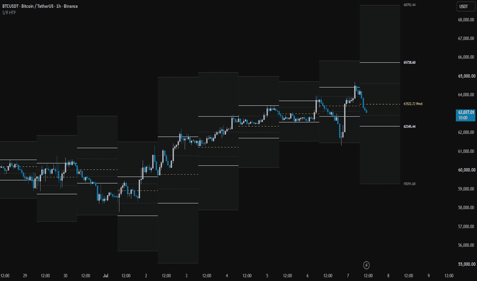
HTF Support/Resistance Multi-TapThe HTF Multi-Tap S/R Zones is an advanced structural indicator designed for lower timeframe traders who need higher timeframe confluence without cluttering their charts.
Instead of drawing infinite lines everywhere, this indicator tracks historical pivot points from a Higher Timeframe (HTF) of your choice and dynamically builds highly-validated "Zones of Interest" directly onto your current chart. It is specifically engineered to find areas where price has repeatedly struggled to break through.
Core Features:
Dynamic Wick Absorption (Zones): When price wicks into the same general area, the script doesn't just plot a single static line. It dynamically expands the top and bottom borders of a "Zone" to encompass the full range of the historical wicks, giving you a literal block of rejection to trade against.
Zone Merging: If two adjacent zones expand enough to touch each other, the indicator will seamlessly merge them into one massive, highly significant structural block.
Volume & Tap Tracking: Every time price taps a zone, the script records the touch and pulls the exact volume that occurred on that HTF candle. The zone's label clearly displays the total accumulated volume and the number of taps it took to build it.
Automated Volume Grading: The indicator continuously scans the active zones on your chart and automatically tags the zone with the absolute highest historical volume with a (⭐ Max Vol) label, instantly showing you the strongest defensive wall on the board.
Clean & Focused: By default, it only displays the 3 closest Support zones and the 3 closest Resistance zones to the current price, keeping your chart clean and focused strictly on the levels that matter right now.
How to Use (Confluence):
This is not a standalone entry signal; it is a confluence tool.
If you are trading on a 1-minute or 5-minute chart, set the indicator's HTF to 15m or 1H. Use these projected zones as high-probability areas to look for your lower timeframe entry models (like break of structure, fair value gaps, or engulfing candles). The (⭐ Max Vol) zones are prime locations for strong reversals or major breakout continuations.
Settings:
Higher Timeframe: Choose which timeframe to pull structural pivots from.
Proximity Threshold %: Adjust how close price needs to come to an existing zone to be considered a "Tap" and expand the box. Increase this slightly for highly volatile assets to absorb larger wicks.
Minimum Taps: Determine how many times a level must be tested before it is considered valid and plotted on your screen.
지표

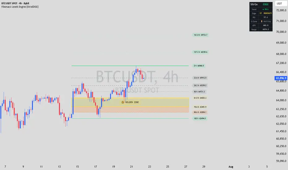
Fibonacci Levels Engine [StrixEDGE]What It Does
Fibonacci Levels Engine automatically detects the most recent swing high and swing low within a configurable lookback window, draws the standard Fibonacci retracement grid (0 %, 23.6 %, 38.2 %, 50 %, 61.8 %, 78.6 %, 88.6 %, 100 %) plus the 127.2 % and 161.8 % extensions, and projects every level into the future so you can see where price is heading relative to the structure.
What separates this indicator from a plain Fibonacci overlay is the Edge Analysis layer — three original components that work together to tell you how meaningful a given Fibonacci zone is right now, not just where it sits on the chart:
1. Edge Score (0–100) — A composite confluence gauge displayed in the dashboard.
2. Proximity Heatmap — Dynamic line opacity that makes levels glow as price approaches them.
3. ATR Volatility Band — A band around the Golden Zone midpoint that adapts to current volatility.
How It Works
Core: Swing Detection & Fibonacci Grid
The indicator scans the last N bars (default 20, configurable 5–300) to find the highest high and lowest low. It determines trend direction by comparing which extreme occurred first: if the swing low is further back in time than the swing high, the structure is bullish (price moved from low to high); otherwise it is bearish. Fibonacci ratios are then calculated from that range and drawn as horizontal levels from the swing origin to a user-defined projection length (default 30 bars into the future).
Two shaded zones highlight areas of interest:
- Golden Zone (0.618–0.786) — the highest-probability retracement area in classical Fibonacci theory.
- Deep Zone (0.786–0.886) — often the last line of defense before a full retracement.
Both zones, the 50 % midline, and the extension levels can be toggled on or off independently.
Edge Score — Confluence Gauge
The Edge Score combines three independent measurements into a single 0–100 reading:
RSI Momentum Alignment | 0–35 | In a bullish structure, a low RSI (below 35) scores highest because it signals oversold conditions near support. In a bearish structure, a high RSI (above 65) scores highest. Intermediate RSI values receive proportionally lower scores. |
| Proximity to Golden Zone | 0–35 | Measures the absolute distance between the current close and the Golden Zone midpoint as a ratio of the total Fibonacci range. The closer price is to the midpoint, the higher the score. |
| EMA Trend Alignment | 0–30 | Checks the stacking order of the 8, 21, and 55-period EMAs. A fully aligned stack (e.g., EMA 8 > EMA 21 > EMA 55 in a bullish structure) scores 30; partial alignment scores 20; misalignment scores 10. |
The resulting score is classified as STRONG (≥ 75), MODERATE (≥ 50), WEAK (≥ 25), or LOW (< 25) and displayed with a color-coded label in the dashboard. A high Edge Score means RSI, price proximity, and trend direction are all converging at the Fibonacci zone — not just that price touched a line.
Proximity Heatmap
Every Fibonacci level's line opacity is recalculated on each bar based on how far the current close is from that level. When price is near a level, the line becomes more opaque (visually brighter); when price is far away, the line fades. This is computed as a transparency value derived from the ratio of (distance to level) / (total Fibonacci range), scaled between 10 and 75. The effect lets you instantly see which levels are "active" without scanning numbers — the relevant lines stand out on their own.
ATR Volatility Band
A translucent band is drawn around the Golden Zone midpoint, extending ± 0.5 × ATR (default 14-period). This addresses a practical problem: a Fibonacci level is a single price, but real entries need a buffer that accounts for market noise. The band widens in volatile conditions and contracts in quiet ones, giving you a dynamic "fair value area" inside the Golden Zone rather than a fixed line.
Dashboard Panel
A compact table in the top-right corner of the chart displays:
- Trend — Current structural direction (Bull / Bear) with color coding.
- Edge — The composite Edge Score and its label.
- RSI — Current RSI value, color-coded for overbought/oversold extremes.
- G-Zone — Live status showing ✅ with the midpoint price when the close is inside the Golden Zone
or ⏳ Waiting when it is outside.
- ATR — Current Average True Range value.
- Range — The total Fibonacci range (swing high minus swing low).
Dashboard text size is adjustable (Tiny / Small / Normal / Large).
How to Use It
Identify the structure — Add the indicator to your chart. The dashboard immediately tells you whether the current swing structure is bullish or bearish and shows the Edge Score.
Watch the Golden Zone — When price pulls back toward the 0.618–0.786 area, check the dashboard: a high Edge Score (50+) means RSI and trend EMAs are aligned with the retracement, which increases the odds of a bounce. The G-Zone row will switch from ⏳ to ✅ when price enters the zone.
Use the Volatility Band for entries — Rather than placing a limit order on the exact 0.618 or 0.786 line, use the ATR band as your entry zone. It automatically adjusts to current volatility, giving you a wider buffer in choppy markets and a tighter one in clean trends.
Read the heatmap — Glowing lines tell you which levels price is currently interacting with. If a line is bright and the Edge Score is high, that level carries more weight. If the line is faded, price is far away and the level is not in play.
Settings Overview
- Pivot Lookback (5–300, default 20) — Number of bars scanned for swing high/low detection.
- Right Projection (5–200, default 30) — How far levels extend into the future.
- Golden Zone / Deep Zone / 50 % / Extensions — Toggle individual level groups.
- Edge Score Panel — Show or hide the dashboard.
- ATR Volatility Band — Show or hide the dynamic band.
- Proximity Heatmap — Enable or disable the distance-based line opacity effect.
- ATR / RSI Length — Periods for the ATR and RSI calculations used in the Edge Score and Volatility Band.
- Style — Full color customization for bullish/bearish, zones, bands, levels, labels, and line width.
Set alerts — Four built-in alert conditions are included:
- Price enters the Golden Zone (0.618–0.786)
- Price enters the Deep Zone (0.786–0.886)
- Edge Score reaches 75 or above (strong confluence)
- Price crosses the 0 % or 100 % level (breakout / full retracement) 지표

Opening Range Breakout ORB - Signals, Targets & Alerts [LunqFX]The Opening Range Breakout (ORB) is one of the most traded intraday strategies — but most ORB indicators only draw the opening range box and leave you guessing. This Opening Range Breakout indicator goes further: it marks the opening range, detects the first genuine breakout, filters fakeouts, projects measured-move targets, and — uniquely — builds a live breakout statistics engine from the last 100 trading days of the symbol on your chart.
What makes this ORB indicator different
Instead of a static box, you get a data-driven read on how your market actually behaves after the opening range:
First-break direction split — how often the day breaks up vs down
Hold rate — how often the first breakout direction holds into the close
Fakeout rate — how often the first breakout fails back inside the range
Target hit rates — how often price reaches 1x and 2x the opening-range height
So before you take the trade you can see, for example, that on this symbol the upside breakout holds into the close 62% of the time and the 1R target is reached on 48% of breakout days.
How the opening range breakout is calculated
Auto mode works on every market with zero setup. The opening range starts at each day's open of the symbol's own exchange — stocks at the 09:30 session open, crypto at the 00:00 UTC daily open, forex and futures at their session open — and lasts a chosen number of minutes (the classic 5-minute, 15-minute or 30-minute ORB). A Custom mode lets you define any session window, such as the London or New York open.
When the opening-range window closes, the range high and low are locked and projected forward as levels.
The first candle close beyond the range (or wick, if you prefer) is treated as the breakout. Targets are projected at 1x and 2x the range height in the breakout direction.
A close back inside the range before the first target is reached is flagged as a fakeout. A breakout that reaches 1R first and only then returns is counted as a valid breakout, not a fakeout.
At the end of each trading day the outcome is recorded — direction, hold, fakeout, targets — and the dashboard percentages are plain rolling hit rates. No repainting, no curve fitting.
How to use it
Breakout day trading: trade the first breakout with more context — use the hold rate to judge whether the break on your symbol is worth taking, and size your target from the 1R / 2R hit rates.
Fakeout fade: when a symbol shows a high fakeout rate, the failed breakout back inside the range is often the better setup; the fakeout is marked in real time.
Range-quality filter: the dashboard shows the opening range as a multiple of ATR, so you can skip abnormally small ranges that tend to break out randomly.
Works on any symbol and any intraday timeframe (1m–15m recommended): index futures and CFDs (NAS100, SPX500, US30, NQ, ES), stocks and ETFs (SPY, QQQ), gold (XAUUSD), Bitcoin and crypto, and forex majors.
Dashboard
A clean on-chart panel shows today's live status (building range → inside range → breakout → target hit or fakeout), the opening-range high/low and its size in ATR, and the full statistics block with the sample size always visible.
Settings
Auto anchor (any market, zero setup) or fully custom session window with timezone control — 5 / 15 / 30-minute ORB or any session open
Close-based or wick-based breakout logic
Adjustable target multiples, rolling statistics window, and visuals
Alerts for range locked, breakout up, breakout down, fakeout, target 1 and target 2
Optional gradient momentum candles that can be switched off
No repainting
The opening range is fixed the moment its window closes. Breakouts, fakeouts and targets are confirmed on closed bars only, and the statistics are built exclusively from completed trading days — never recalculated backwards.
This indicator is an educational market-analysis tool, not financial advice. Historical statistics describe past behavior and are not a guarantee of future results. Always confirm with your own analysis and manage your risk.
지표

Edo Order BlocksEdo Order Blocks — Displacement-Detected Order Blocks Scored 0-100, with Active / Tested / Mitigated States and a Strongest-Block Panel
An order block is the last opposite candle before an impulse that breaks away from a level — the last bearish candle before a sharp move up, or the last bullish candle before a sharp move down. In the Smart Money Concepts approach, that candle marks a zone where institutional activity was left unfilled, so when price returns to it, it becomes a natural reference of supply or demand. The problem with most order block tools is that they draw every zone, cluttering the chart with references that never mattered. Edo Order Blocks takes the opposite approach: it scores each zone and draws only the ones that earn it.
Edo Order Blocks detects order blocks by displacement, scores each one from 0 to 100 on objective quality factors, filters out the weak ones, and tracks every surviving zone through its full life — from Active to Tested to Mitigated. Everything is validated on closed bars, so the indicator does not repaint. It is the order-block specialist of the Edolab structure family, designed to pair with Edo Smart Money Map, which maps the BOS / CHoCH structure around these zones.
DISPLACEMENT DETECTION
A new order block is triggered by a displacement: a confirmed candle that closes beyond the highest high (bullish) or lowest low (bearish) of the last N bars, in the direction of its own body. The Displacement Lookback input (10 by default) sets how many bars define that range. This impulse-based trigger captures the moment price breaks away with conviction, which is precisely when an order block is left behind. From the impulse, the indicator looks back up to the Origin Lookback (15 by default) to find the last opposite candle — the origin of the move — and draws the zone between its high and low.
THE QUALITY SCORE
Every candidate order block is scored from 0 to 100 before it is drawn, combining four objective factors: body strength (the candle's body relative to ATR), volume strength (volume relative to its 20-period average), displacement strength (how far the close pushed beyond the range, in ATR units), and trend alignment (whether the block sits on the right side of the EMA 50). Body and volume weigh 30% each, displacement and trend alignment 20% each. The Minimum Score input (40 by default) acts as a filter: only blocks that score at or above it ever reach the chart. Raise it to keep only the highest-conviction zones; lower it to see more. The score is printed on each block's label, so its quality is visible at a glance.
ORDER BLOCKS AND THEIR LIFE
Each drawn zone is a box between the high and low of the origin candle, labelled Bull OB or Bear OB with its score, extended to the right as a live reference. To keep the chart clean, only the most recent blocks per side are kept, up to Max Order Blocks per side (8 by default); older ones are removed as new ones appear.
THREE STATES: ACTIVE, TESTED, MITIGATED
Unlike a simple active/used flag, Edo Order Blocks tracks three states, evaluated on every closed bar. Active: a fresh zone price has not touched since creation — a solid box extending to the right. Tested: price has tapped the zone but not closed through it — the border turns solid and bold, marking that the zone has been challenged and held. Mitigated: price has closed through the zone — the box turns dashed, fades and stops extending, recording that the zone has been consumed. The Touch Mode input decides what counts as a test: Wick (default) marks it as soon as a wick reaches the zone, while Close requires a candle to close inside it. A bullish block is mitigated when price closes below its base; a bearish block, when price closes above its top. Each transition fires its own alert.
INFORMATION PANEL
The panel condenses the read into a compact table. It shows the number of active order blocks on each side, the Strongest OB — the highest-scoring active block, with its side, score and price level — and the active Minimum Score filter. The Strongest OB row is the quickest way to find the single zone the indicator rates highest right now. The panel sits in any of the four chart corners (Top Right by default), comes in three sizes (Tiny / Small / Normal) and two themes (Dark / Light), and can be hidden entirely.
NO REPAINTING
Displacement is validated on closed bars only, using the highest/lowest of completed candles offset by one bar, so a zone never appears or disappears intrabar. A wick that pierces a level but closes back inside generates nothing — the indicator waits for the close. This removes the false zones that clutter tools which react instantly, at the cost of confirming each block once the impulse has completed. There are no higher-timeframe functions: all logic runs on the current chart timeframe.
CONFIGURATION
The inputs are grouped by block. Detection sets the displacement lookback, the origin lookback and the minimum score. Order Blocks sets the maximum per side and the touch mode (Wick / Close). Style exposes the bull and bear colours, the zone opacity, whether the score is shown on the label, the label size and the Dark/Light theme. Panel controls panel visibility, position and size. The defaults are calibrated to work without adjustment on stocks, crypto, forex, indices and futures, on any timeframe — the only input most users tune is the Minimum Score, to make the indicator more or less selective.
ALERTS
Six predefined alerts cover the full life of a zone: New Bull OB and New Bear OB fire when a fresh order block above the score threshold is created; Bull OB Tested and Bear OB Tested fire when price first taps a zone; and Bull OB Mitigated and Bear OB Mitigated fire when price closes through a zone and consumes it. The new-block alerts flag fresh references, the tested alerts fire exactly when a zone is challenged, and the mitigation alerts mark when a reference is spent. All alerts fire on bar close, consistent with the indicator's anti-repaint validation.
HOW TO READ IT
A clean reading uses the score and the states together. High-score zones are the references worth watching: a Bull OB scored 80 sits on a strong-bodied, high-volume, trend-aligned impulse, a far more reliable demand zone than one scored 45. Watch the Active-to-Tested transition: when price returns to an active block and taps it, the zone is being challenged — the bold border marks the moment of reaction. A Tested block that holds and sends price away keeps its relevance; a Mitigated one has been consumed and steps aside. The Strongest OB panel row points to the single best active zone at any time, and pairing Edo Order Blocks with Edo Smart Money Map places these scored zones inside the broader BOS / CHoCH structure for full context.
OPEN SOURCE
Edo Order Blocks is published as a free open source indicator. The full Pine Script is publicly accessible on TradingView for study, adaptation and integration into any workflow. Part of the Edolab Markets free tools ecosystem alongside Edo Smart Money Map, Edo Liquidity Zones, Edo ZigZag Auto Fib SR, Edo Multi Stoch and more available on TradingView.
This indicator is a technical analysis tool for educational and informational purposes only. It does not generate automatic buy or sell signals and should not be considered financial advice. Trading financial markets involves significant risk of capital loss. Past performance does not guarantee future results. Always use proper risk management.
지표

Futures Sessions with NY Opening Range, Levels, FVGs, & HolidaysThis is a session-anchored intraday framework for futures. Every element on the chart is derived from the same session definitions, so the tools stay consistent with each other: the sessions paint the ranges, the completed ranges leave behind levels, the level lifecycle is tied to the session clock, the NY Opening Range anchors the morning, fair value gaps give context inside the ranges, and holiday markers explain the days when sessions are missing or shortened.
Session Ranges
Each market session is defined using IANA names (America/New_York, Asia/Tokyo) – never fixed UTC offsets. The indicator renders identically no matter what timezone your chart is set to (Exchange, New York, etc). Daylight saving is handled automatically: New York flips between EST and EDT on its own, and Tokyo has no DST, so its position against the New York clock simply shifts with the US clock changes (Tokyo's 9:00 open lands at 20:00 New York in summer, 19:00 in winter).
Each session is a shaded fill: Asia in red, London in yellow, New York in blue as defaults.
NY Pre-Open: a dotted range tracks the morning trade from the ORB open at 8:00 America/New_York until the session fill starts at 9:30. It is derived from the ORB input, so moving the ORB moves it too.
Globex Open: the CME futures trading day opens at 18:00 America/New_York (17:00 Chicago), indicated by the pre-open dotted range before the session fill starts at Tokyo open when volume comes in.
New York Opening Range (ORB)
The ORB captures the range of the America/New_York 8:00–8:15 candle, shown as a box with a dashed midline in maroon. It is visible on all smaller timeframes and up to 1h. The ORB ends on the last candle of the New York session — the end time is derived from the NY session input, so the two can never drift apart.
If the ORB range is oversized (18 or more points, configurable), the box is flagged with a red "ORB INVALID" label and shows the range in points.
Sessions Levels (Untested Highs and Lows)
When a session completes, its final highs (black) and lows (teal) are drawn from the candle and extend to the right indefinitely until a level is tested on its first touch. You can configure whether a test means a wick touch (ICT/liquidity style, the default) or a candle close beyond the level (support/resistance style).
Tested levels stay on the chart until the session running at the time of the test ends, so you can use them as points of reference until then. During the London/NY overlap, New York counts as the running session. A level tested during a session gap survives the gap and is handed to the next session that opens. At the NY ORB open at 8:00, all tested levels are removed to prevent clutter.
Untested levels never expire. You can toggle the prices on the price scale on or off based on preference.
Fair Value Gaps
Classic three-candle imbalances in both directions: bullish when a candle's low is above the high from two candles back, bearish when a candle's high is below the low from two candles back. Gaps are shaded in green (by default, configurable) from the middle candle and extend to the right until price trades fully through it (bullish: a low at or below the gap bottom; bearish: a high at or above the gap top), then it is removed. Each gap can draw its Consequent Encroachment — a dashed line at the 50% of the gap, the level where a gap is commonly considered mitigated. Inputs: fill color, CE toggle and color, minimum gap size in points (useful on low timeframes), and a cap on how many gaps are kept.
Holiday Markers
US (NYSE) holidays: a dotted vertical line and a Statue of Liberty marker anchored to the ORB's first candle. Detection is fully rule-based — weekday-observance rules for every holiday, and Good Friday computed from the Easter algorithm (Butcher's computus), so nothing is hardcoded and no yearly maintenance is needed.
Note: NYSE does not observe New Year's on the prior Friday when January 1 falls on a Saturday, and holidays observed on a Friday/Monday (like July 4 on a weekend) are marked on the actual closure day.
Japanese holidays: a dotted vertical line and a shrine marker anchored to the Tokyo session's first candle. Covers the fixed-date holidays, the Happy Monday holidays, both equinox holidays (astronomical formulas, valid through 2150), Monday substitute holidays, the occasional Silver Week citizens' holiday, and the TSE year-end closures (Dec 31, Jan 2, Jan 3).
Markers sit at the bottom of the pane. Days when CME is fully closed have no bars, so there is nothing to mark — markers appear on holidays with shortened or normal trading.
Alert
One built-in alert condition: Tokyo Range Break — fires when price closes outside the completed Tokyo session range, active from the Tokyo close until 11:30 New York time.
How to Use
Built for intraday charts of 1h and below (it draws nothing on higher timeframes). The ORB needs a 15-minute chart or lower to line up with whole candles. Defaults are tuned for CME index futures (ES/MES); the session inputs work on any symbol with continuous futures-style hours. Old drawings persist until Pine's 500-object limits trim the oldest.
These tools are combined because each one feeds the next: the sessions define the ranges, the completed ranges produce the levels, the level lifecycle runs on the session clock and the ORB open, the pre-open dotted ranges share the same derived timings, and the holiday markers explain the days when the rest of the framework is dark. Changing one session input moves everything that depends on it, consistently. 지표

FxNeel Institutional Swing & FVG MatrixDeveloped under the FxNeel, this open-source Pine Script v6 indicator is designed for professional traders utilizing advanced market structure frameworks and institutional volume tracking. The script focuses on identifying clear structural key points while maintaining chart cleanliness through intelligent filtering.
Key Features:
Four-Way Independent Swing Structure: It dynamically tracks Short-Term Highs (STH), Short-Term Lows (STL), Intermediate-Term Highs (ITH), and Intermediate-Term Lows (ITL).
Automatic Overlap Filter: To ensure chart clarity and prevent clutter, the indicator automatically removes minor STH/STL lines and labels once a major institutional pivot (ITH/ITL) is fully confirmed.
Dynamic Fair Value Gap (FVG) Engine: It tracks dynamic market imbalances (Bullish/Bearish FVGs) with real-time, state-based mitigation logic, modifying or removing zones as price action tests the gaps.
Granular UI Customization: Features a fully structured settings panel where visibility, line styles, text colors, and exact 4-way label alignments (Vertical and Horizontal) can be customized independently for each swing type. 지표

지표

지표
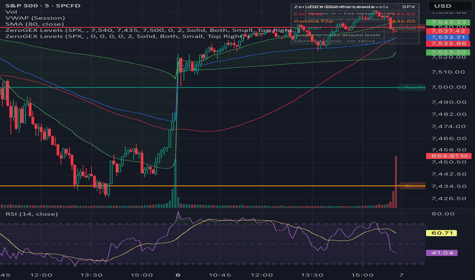
ZeroGEX Daily Gamma LevelsManually plot key options-positioning levels on your chart: Gamma Flip,
Call Wall, Put Wall, and Max Gamma / Pin.
These levels are used by SPY, SPX, and QQQ traders to identify potential
support, resistance, pinning zones, and volatility-regime shifts.
HOW TO USE
1. Add the indicator.
2. Open Settings and enter today's Gamma Flip, Call Wall, Put Wall, and
Max Gamma / Pin. Each draws as a horizontal line with a price label,
plus an on-chart info box. Set any level to 0 to hide it. Optional
price-cross alerts are included.
This script is manual-entry only — it does not pull data. Daily gamma
levels are published for free at zerogex.io.
For informational and educational purposes only. Not financial advice. 지표
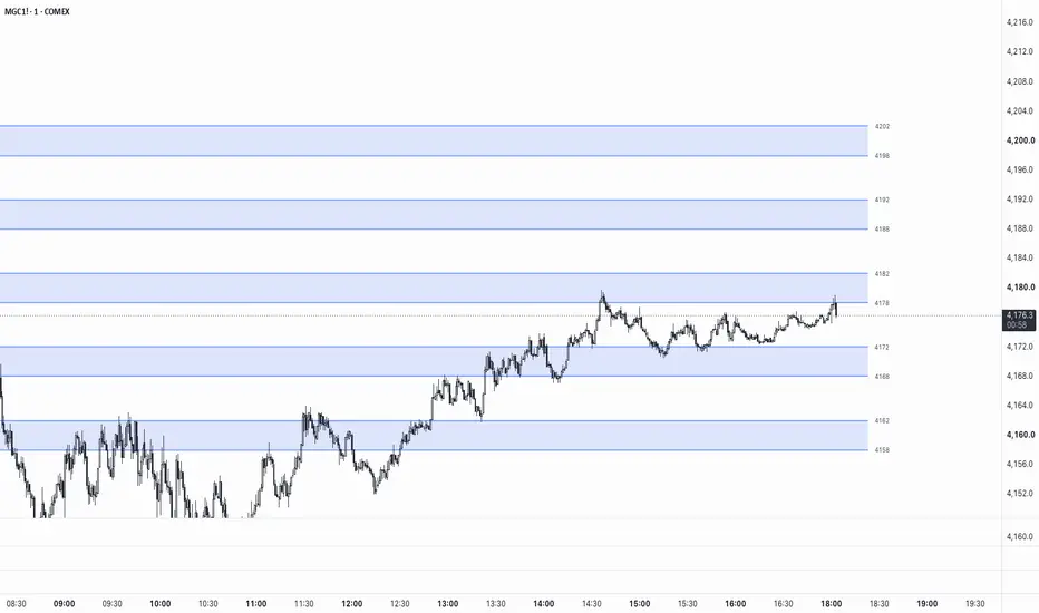
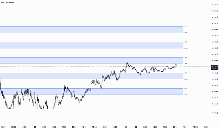
NQ8020-GC0802Round-Level Zones — Auto NQ/GC Support & Resistance Map
This indicator automatically maps out horizontal reaction zones around round-number price levels for Nasdaq (NQ/MNQ) and Gold (GC/MGC) futures, adjusting its logic to match the instrument you're viewing.
How it works
The script detects the symbol you're on and applies the appropriate round-level structure:
NQ / MNQ → zones are drawn from xx80 to xx20 around each round hundred (e.g. a zone at the 24,000 level runs from 24,020 down to 23,980)
GC / MGC → zones are drawn from xx8 to xx2 around each round ten (e.g. a zone at 3350 runs from 3352 down to 3348)
Zones re-center automatically as price moves, giving you a consistent, always-current map of nearby round-number levels without manually drawing lines on each instrument.
Features
Works on both NQ/MNQ and GC/MGC — no separate indicators or settings to switch
Adjustable number of zones displayed above/below price (1–50)
Customizable zone fill color, border line color, style (solid/dashed/dotted), and width
Optional price labels on each zone boundary
Adjustable right-side offset and left-extension of lines
On-chart warning if applied to an unsupported symbol
Why round numbers matter
Round price levels tend to attract order flow — stops, limit orders, and psychological decision points cluster around them. Having these zones pre-mapped can help with spotting potential reaction areas, planning entries/exits, or keeping round-number context visible without cluttering the chart with manual drawings.
Usage notes
Designed specifically for the round-number structures of NQ/MNQ (hundreds) and GC/MGC (tens). This is a visual reference tool only and does not generate buy/sell signals — always combine with your own strategy, market structure analysis, and risk management. 지표
Helix Lucky MTF Bias and Breakout DashboardHelix Lucky MTF Trend and Breakout Dashboard
📊 Overview
Helix Lucky MTF Trend and Breakout Dashboard is an overlay indicator designed to organize trend, momentum, breakout context, key levels, and multi-timeframe alignment into one chart-based dashboard.
The purpose of the script is not to combine unrelated indicators into a single display. The script separates market analysis into distinct layers so each component has a specific role:
1. Trend structure
2. Momentum confirmation
3. Breakout context
4. Multi-timeframe alignment
5. Key level awareness
6. Setup scoring
7. Optional visual confirmation tools
The result is a confluence-based workflow that helps traders review whether multiple independent conditions are aligned before making a trading decision.
🧩 How the Main Components Work Together
The script uses moving averages, VWAP, MACD, ZLSMA, UT Bot logic, Supertrend, ADX, RSI, and Opening Range Breakout logic as separate inputs within the same framework.
The moving average group provides basic trend structure by comparing shorter-term and longer-term averages. The default structure uses a fast EMA, medium EMA, and long SMA, but users can configure the moving average types and lengths.
VWAP provides session or higher-period price-location context. It can be anchored to the session, day, week, month, quarter, or year and may be displayed with standard deviation or percentage-based bands.
MACD is used as a momentum confirmation layer. The script includes a minimum separation filter so very small MACD differences can be filtered out instead of being treated the same as stronger momentum shifts.
ZLSMA is optional and can be used as an additional trend-direction filter.
The UT Bot component is used as the primary chart label engine. It uses an ATR-based adaptive trailing stop. The script adjusts the trailing distance using volatility, momentum, and volume conditions, then produces Buy or Sell labels when price crosses the trailing stop and the configured filters allow the signal.
Supertrend provides a separate trend-regime layer. This gives the user a second way to compare the UT Bot label against a broader trend condition.
ADX is used to evaluate whether trend strength is above the user-selected threshold. RSI can be used either in a classic 30/70 bias mode or with custom pullback zones.
The Opening Range Breakout component tracks whether price is above, below, or inside the selected opening range window. This helps separate trend-following conditions from range-bound conditions.
🧠 Why This Is More Than a Simple Mashup
Each component is assigned a different purpose. The script is designed so the same tools are not all treated as equal standalone signals.
Trend tools identify direction.
Momentum tools evaluate confirmation.
Volume and relative volume help evaluate participation.
Opening Range Breakout logic identifies range expansion.
The Bias Table compares selected conditions across multiple timeframes.
The Price Point Dashboard displays important reference levels and live context.
The scoring layer organizes these conditions into a rule-based summary.
This structure allows the script to reduce chart clutter while still showing how the underlying conditions agree or disagree.
🕒 Multi-Timeframe Bias Table
The Multi-Timeframe Bias Table displays up to eight selectable timeframes, including 1 minute, 5 minutes, 15 minutes, 30 minutes, 1 hour, 2 hours, 4 hours, and Daily.
Each row evaluates one condition, such as moving average structure, price relative to VWAP, MACD alignment, Supertrend direction, ZLSMA slope, RSI condition, ADX threshold, Opening Range Breakout status, and longer-period bias.
The table also includes an average agreement reading. This reading is not a prediction and does not represent a win rate. It simply shows how many selected conditions are aligned across the active timeframes.
By default, the script can hide timeframes below the current chart timeframe. This is intended to reduce lower-timeframe noise when viewing higher-timeframe charts.
📍 Price Point Dashboard
The Price Point Dashboard displays reference levels and market context in one location. These can include prior day high, prior day low, prior day close, pivot levels, moving averages, 52-week high, Fibonacci reference levels, VWAP information, Opening Range Breakout status, ATR, gap percentage, relative volume, and other selected dashboard fields.
The dashboard is intended to help users see where price is trading relative to important reference levels without manually adding each level to the chart.
📈 Trend Strength Score
The Trend Strength Score is a rule-based 0 to 100 score that measures how strongly the current bar aligns with selected bullish trend conditions.
The score uses five weighted components:
- EMA alignment
- VWAP location
- MACD alignment
- Supertrend direction
- ADX strength
The score is a summary of internal conditions only. It does not predict future price movement.
🎯 Trade Probability Score
The Trade Probability Score is a rule-based 0 to 100 setup-quality score. It is calculated from twelve weighted factors:
- Multi-timeframe alignment
- EMA stack
- VWAP location
- Price relative to the 200-period moving average
- MACD alignment
- Supertrend direction
- ADX strength
- Relative volume
- Opening Range Breakout status
- Relative strength versus a selected benchmark
- Volatility state
- Position relative to key levels
The score is intended to summarize confluence. A higher score means more of the script’s internal conditions are aligned. It does not mean that a trade will be profitable, and it should not be interpreted as a guaranteed probability of success.
💧 Liquidity Sweep Detection
The script can detect liquidity sweep conditions by checking whether price moves beyond a recent swing high or swing low and then closes back inside that level.
A Sweep High label indicates that price moved above a recent high and then closed back below that level.
A Sweep Low label indicates that price moved below a recent low and then closed back above that level.
These labels are intended to identify possible rejection behavior around recent swing points. They should be used as context, not as standalone trade signals.
⚖️ Relative Strength
The script includes relative strength comparison against configurable benchmark symbols. The default benchmarks are QQQ and SPY.
Relative strength is calculated by comparing the current symbol’s intraday return against the benchmark’s intraday return. A positive value means the current symbol is outperforming the benchmark over that comparison period. A negative value means it is underperforming.
🌡️ Volatility State
The Volatility State feature classifies the current volatility environment as Squeeze, Normal, or Expansion.
This is based on Bollinger Band width compared with Keltner Channel width and recent volatility behavior.
Squeeze indicates compressed volatility.
Normal indicates a standard volatility environment.
Expansion indicates that volatility has increased relative to recent conditions.
This feature is included to help users understand whether price is consolidating, behaving normally, or expanding in volatility.
🕯️ Candlestick Pattern Labels
The script includes optional candlestick pattern labels. These patterns are detected on the same timeframe as the chart. They are not calculated from a separate hidden timeframe.
Optional labels include:
- Bullish Engulfing
- Bearish Engulfing
- Hammer
- Shooting Star
- Morning Star
- Evening Star
- Inside Bar
- Tweezer Top
- Tweezer Bottom
- Doji
- Dragonfly Doji
- Gravestone Doji
- Sweep High
- Sweep Low
These labels are intended as additional context. They should not be treated as standalone entries without reviewing trend, momentum, volatility, and key-level context.
🛑 Suggested Stop Loss and Take Profit Reference Lines
The script can plot suggested stop loss and take profit reference lines after a UT Bot label appears.
The stop line is calculated from internal structure such as the UT Bot stop, Supertrend, VWAP, moving average, Donchian floor, and a minimum ATR-based risk floor depending on settings and context.
Take profit reference lines are based on R-multiple distances from the suggested stop. These are visual planning tools only. They do not place trades, manage positions, or execute orders.
🧭 How to Use the Script
A typical workflow is:
1. Select the chart timeframe and market being reviewed.
2. Review the Multi-Timeframe Bias Table to understand directional alignment.
3. Check whether the chart is trending, ranging, breaking out, or consolidating.
4. Review the Price Point Dashboard for key levels and market context.
5. Watch for a UT Bot Buy or Sell label if labels are enabled.
6. Compare the label direction with Supertrend, MACD, VWAP, ADX, and the Bias Table.
7. Review the Trend Strength Score and Trade Probability Score as confluence summaries.
8. Use the suggested stop and take profit reference lines only as visual planning tools.
9. Apply independent risk management and confirm the setup with your own analysis.
🌍 Timeframes and Markets
The script can be applied to different chart timeframes and TradingView-supported markets. Lower timeframes may produce more signals and more noise. Higher timeframes may produce fewer signals but can provide broader context.
The Multi-Timeframe Bias Table is intended to help users avoid looking at a single timeframe in isolation.
⚠️ Important Limitations
This script is an indicator, not a strategy. It does not place trades, backtest trades, manage orders, or connect to a brokerage account.
The scoring systems are rule-based summaries of current chart conditions. They are not win-rate models, machine-learning predictions, or guarantees of future results.
Signals, labels, and dashboard values can vary by symbol, timeframe, liquidity, volatility, and user settings.
The Bias Table is a live context dashboard and may update while the current bar is forming. This is expected behavior because some values are based on developing bar data.
The “Draw visuals only on bar close” setting gates the UT Bot entry visuals and suggested stop/take-profit drawings to confirmed bars. It does not freeze every live dashboard value while a bar is developing.
Liquidity Sweep labels can be gated to bar close using the Bar Close Only setting.
The script is designed for standard chart analysis. Signals on non-standard chart types may behave differently because those chart types can use synthetic price construction.
No signal, score, table reading, or label should be used as a guarantee of future price movement. Users should apply their own analysis and risk management.
🧾 Credits and Inspiration
This script was inspired by the concept of combining a multi-timeframe bias table, trend labels, and a price-level dashboard into one overlay.
The current script is a ground-up Pine Script v6 implementation with additional architecture, including the rule-based Trade Probability Score, Trend Strength Score, liquidity sweep detection, relative strength comparison, volatility state classification, configurable dashboards, candlestick pattern labels, and suggested risk-reference lines.
The script also uses common technical analysis concepts such as moving averages, VWAP, MACD, RSI, ADX, ATR, Supertrend-style trend logic, and Opening Range Breakout logic. These common concepts are organized into a single decision-support framework rather than presented as separate standalone indicators. 지표

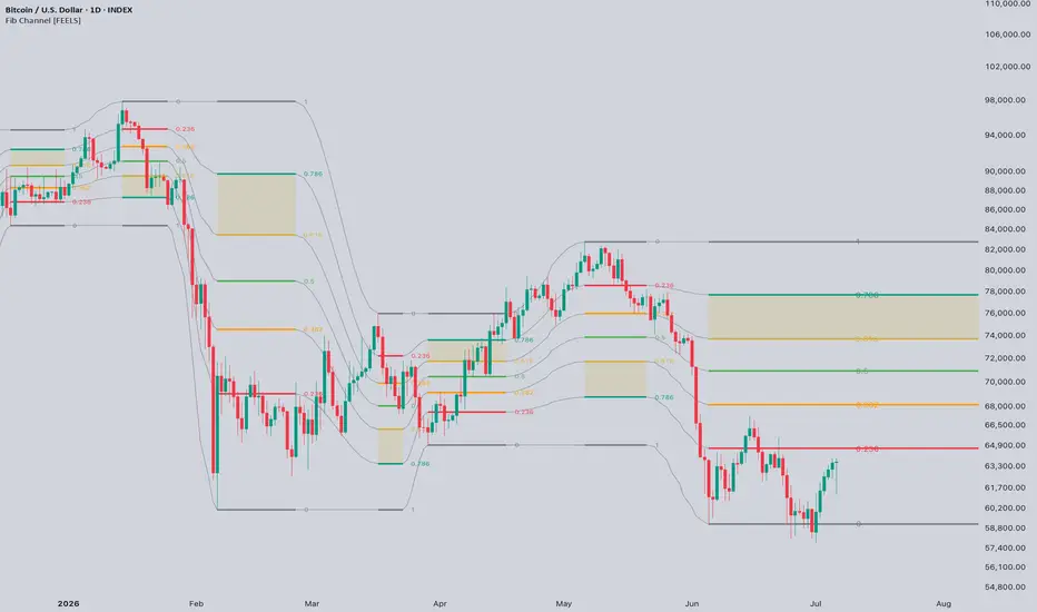
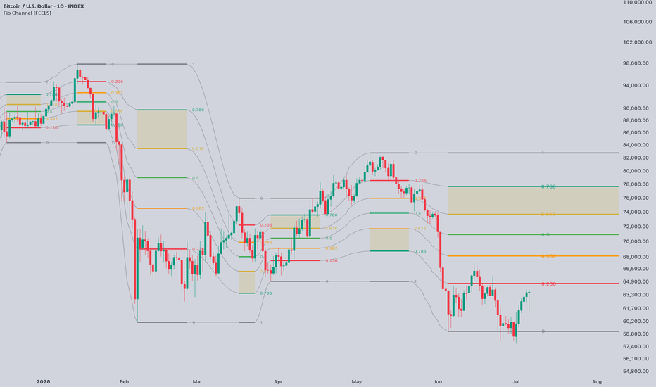
Fibonacci Retracement Channel [FEELS]Stop dragging fib tools around your chart. Fib Channel plots a complete, classic Fibonacci retracement on every major swing, anchored wick to wick, right where you would draw it by hand. It shades the golden pocket, projects extension targets and links the whole history into one flowing channel.
You always know which level the market is trading against right now, and where price goes if that level holds. Instead of a single fib on the latest swing, or a pile of overlapping grids, you read the entire trend as a chain of retracements: where price respected the 0.618, where the golden pocket launched the next leg, and where a retracement failed and the trend flipped.
HOW IT WORKS
- A swing engine based on confirmed pivots finds every move larger than "Min swing size". The threshold is set in ATR, so it adapts to any symbol and timeframe.
- "Merge minor pullbacks" ignores counter-moves smaller than the threshold, so each fib measures the full impulse, not its last leg.
- Every qualifying swing gets the full grid: 0, 0.236, 0.382, 0.5, 0.618, 0.786, 1. The ratio is printed at every level.
- Thin curves connect the grids into a channel, so the history stays readable.
- The golden pocket (0.618-0.786) is shaded on every fib.
- Extension targets -0.272 and -0.618 are projected beyond the extreme of the latest fib.
- Log-scale mode for macro swings, where linear and log fibs diverge a lot.
- Optional reaction dots mark bars that touched a level and closed back on the right side of it.
- Optional "Fade broken fibs": when price closes beyond the 1.0 level, the fib turns grey, stops extending and drops its targets.
HOW TO TRADE IT
1. Golden pocket pullback. In a trend, wait for price to enter the shaded 0.618-0.786 zone of the latest fib and get rejected. The "Golden pocket touch" alert does the waiting for you.
2. Extension targets. Once the retracement holds and price reclaims 0.236, the dashed -0.272 and -0.618 lines are the take-profit map for the next leg.
3. Broken fib. A close beyond 1.0 means the whole move was retraced. That is an early warning the trend may be flipping ("Full retracement break" alert).
REPAINTING
- A fib prints after its pivot confirms, i.e. "Swing length" bars after the extreme. It cannot appear earlier, there is no lookahead.
- While a swing keeps making new extremes, the latest fib follows them, the same way you re-drag a manual fib. Once the next swing confirms, the fib is fixed and never changes again.
- If you want zero intrabar movement, turn on "Bar-close mode" and the live chart will match bar replay exactly.
ALERTS
Ten total: touches of 0.236, 0.382, 0.5, 0.618, 0.786, golden pocket entry, both extension targets, full retracement break, new swing fib.
SETTINGS
Every input has a tooltip. The main ones: "Swing length" and "Min swing size" control how major the swings must be, "Fib history" sets how many fibs stay on the chart. Line widths, number sizes and all colors are adjustable.
ORIGINALITY
Unlike single-fib auto tools, this script renders the complete history of swing retracements as one connected channel, with impulse-merging swing logic, extension targets, reaction dots and an explicit invalidation state. The swing engine and the chained rendering are written from scratch. 지표
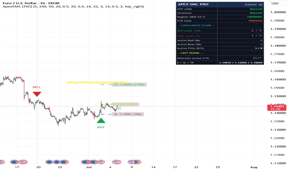
ApexSignalPro SMC [ForexCracked]🔵 OVERVIEW
ApexSignalPro SMC is a confluence-scored Smart Money Concepts indicator that fires a signal only when multiple institutional footprints align on the same bar. Every signal carries a live score from 0 to 5 showing how many structural conditions agree — market structure, order blocks, fair value gaps, premium/discount location, and higher-timeframe bias.
Instead of the "every crossover is a signal" approach, it uses a strict confluence gate, a range-regime filter, and forced signal alternation — far fewer signals, much higher conviction. A live dashboard shows the score, active zones, and the last trade plan at a glance.
🔵 WHY THESE COMPONENTS ARE COMBINED
A break of structure alone, an order-block touch alone, or a single fair value gap all fire often and fail often. They become far more reliable when they occur together and agree with the higher-timeframe trend. Rather than overlaying five separate tools and leaving you to judge them, this script quantifies their agreement into one 0–5 score and only trades when enough align. Three principles guide it:
• Direction comes from market structure (BOS / CHoCH), not from price crossing smoothed averages
• Entries require confluence, never a single condition
• Signals alternate (BUY → SELL → BUY), never stacking the same direction in one leg
🔵 THE FIVE SCORED FACTORS (1 point each)
1️⃣ Market structure (BOS / CHoCH) points in the signal direction
2️⃣ Price is inside an unmitigated order block
3️⃣ Price is inside an unmitigated fair value gap
4️⃣ Correct half of the range — discount for longs, premium for shorts
5️⃣ Higher-timeframe EMA bias agrees
🔵 HOW A SIGNAL FIRES A BUY or SELL prints only when ALL of these are true:
• The confluence score meets your minimum (default 3 of 5)
• A strong-bodied candle closes in that direction
• The ADX regime filter confirms trending, not ranging
• The signal is opposite the previous one (forced alternation) Each signal draws Entry, Stop (beyond the nearest order block + ATR buffer), and Take Profit (configurable R:R), with pip labels.
🔵 HOW IT READS THE MARKET
• Market structure — confirmed swing pivots; a close beyond the last pivot is a BOS, the first break against structure is a CHoCH that flips the state
• Order blocks — the last opposing candle before an impulsive displacement (body > 1.2× ATR); tracked until mitigated or aged out
• Fair value gaps — three-candle imbalances filtered by a minimum ATR size; removed when filled
• Premium / discount — the swing-range midpoint splits discount (below) from premium (above) • Regime — ADX must exceed your minimum, suppressing signals in flat ranges
🔵 HOW TO USE
• Favour score 4–5 signals; treat score 3 with extra confirmation
• Require the dashboard HTF bias to match the signal for trend-aligned entries
• Use retests of unmitigated OBs or FVGs in the trend direction as continuation entries
• Size each trade off the drawn stop distance at a fixed account risk
• Raise Min Confluences to 4 for fewer, stronger signals
🔵 RECOMMENDED SETTINGS
• Swing Length: 5
• Higher Timeframe: 240 (H4) on H1 charts, D on H4 charts
• HTF EMA: 50 · OB Max Age: 20 · FVG Min Size: 0.3× ATR
• ADX Min: 22 · Min Confluences: 3 · SL Buffer: 0.5× ATR · R:R: 2.0
🔵 BEST / WEAKEST CONDITIONS ✅ Trending majors, gold, and indices on H1–H4; London / New York overlap ⚠️ Low-volatility ranges, gapped markets, and sub-5-minute noise
⚠️ DISCLAIMER ApexSignalPro SMC structures signals from Smart Money Concepts. It does not predict future price movement. Results depend on market conditions, settings, and your own execution and risk management. Shared for educational and research purposes; not financial advice. 지표

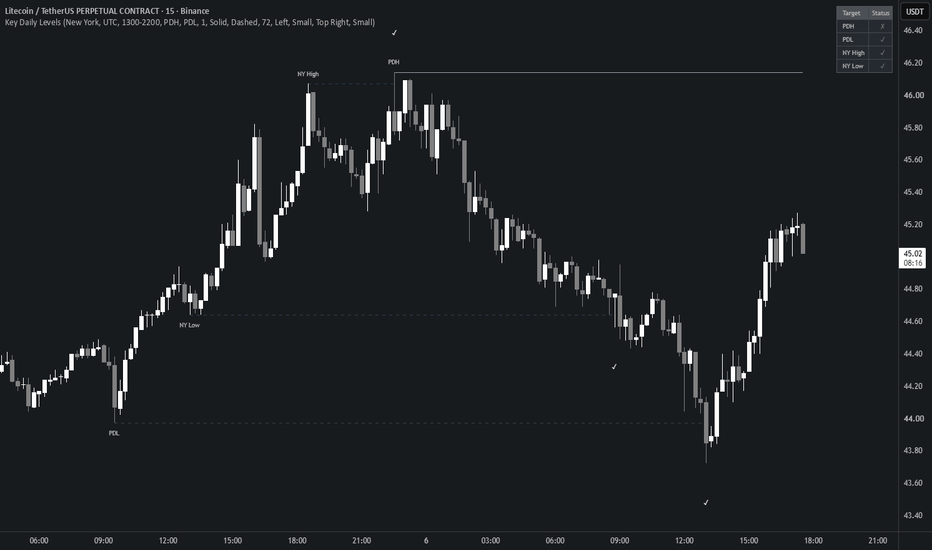
Key Daily Levels by Flip On DipKey Daily Levels marks the reference points most intraday traders watch: the previous day high and low, and the high and low of a session you choose.
Sessions cover New York, London, Tokyo and Sydney, plus a custom option for any other window. Each preset uses the session's local exchange hours and adjusts for daylight saving on its own, so the times stay correct through the year instead of drifting an hour twice a year.
When a session extreme sits at the same price as the previous day high or low, the two are combined into one line instead of being drawn twice. The label then reads something like PDH (NY High), so both are kept without doubling up on the chart.
Each level is drawn from the bar where it formed and runs until price takes it out. The line stops on the exact bar that crossed it. The wick counts, so it doesn't wait for a close. A level still holding is shown solid; once it gets taken it turns dashed and fades, and a small check is dropped on the bar that swept it. A small table in the corner lists each level and whether it has been swept.
Cross detection accounts for gaps, and the trading day is read from each symbol's own calendar rather than a fixed clock, so levels stay accurate on crypto, futures and stocks, on continuous charts and gapped ones alike.
Colors, line styles and width, label options, the sweep marker and the table are all configurable.
Open source, free to study or extend. 지표
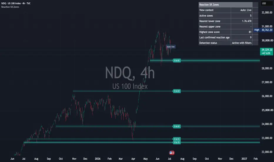
Reaction Based Support and Resistance Zones## Overview
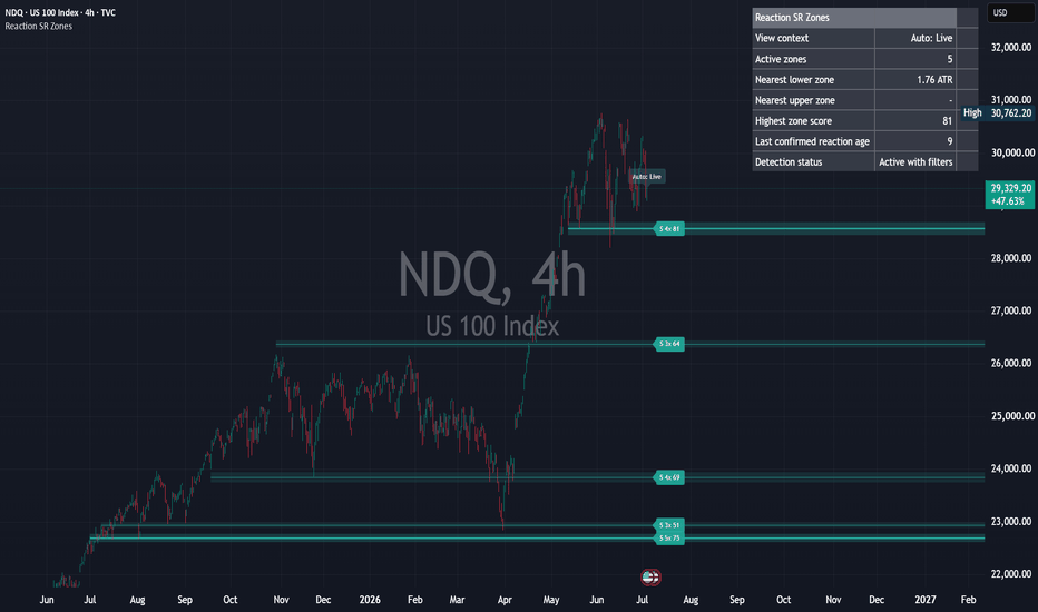
Reaction Based Support and Resistance Zones is a visual price-action study tool for reaction-based horizontal zones and local reaction levels.
The script is designed to show where price has recently reacted, how those reactions are grouped into zones, and how the same reaction context can be studied both in the current live chart and in historical visible-range views.
It does not generate trading signals. It does not provide entries, exits, targets, stops, position sizing, win rate, or performance claims.
## What it shows
This script can display:
- Live reaction zones based on confirmed pivot reactions.
- Support-like, resistance-like, mixed, and inactive reaction roles.
- Touch count, freshness, ATR-normalized reaction strength, width penalty, and a visual zone score.
- Visible Range Research context for historical chart study.
- Local Window Levels across the visible historical window.
- A compact dashboard with neutral context information.
- Neutral live alerts for confirmed reaction-zone events.
The displayed zones and local levels are historical reaction context. They are not predictions.
## Context modes
The script includes three context modes:
### Live
Live context shows the current reaction-zone state at the latest bars. This is the normal current-chart view. Live context can extend active zones to the right for readability.
Live is the only context that can trigger alerts.
### Visible Range Research
Visible Range Research reconstructs the reaction context as it existed at the right edge of the currently visible chart range.
This mode is intended for historical visual study. When the user scrolls or zooms the chart, the research view recalculates for that visible range.
Visible Range Research does not trigger alerts.
### Auto Hybrid
Auto Hybrid is the default mode.
When the latest bars are visible, the script uses Live context. When the chart is scrolled back into historical data, the script switches to Visible Range Research.
## How it works
The script uses confirmed pivot highs and confirmed pivot lows as reaction events.
A support-like reaction is based on a confirmed pivot low. A resistance-like reaction is based on a confirmed pivot high.
Nearby reactions are clustered into reaction zones. Each zone stores information such as:
- center price
- zone width
- first and last reaction
- touch count
- support-like and resistance-like reaction counts
- average and maximum reaction strength
- invalidation state
- visual quality information
Zones are scored using a configurable combination of touch count, freshness, ATR-normalized reaction strength, width penalty, quality information, and invalidation state.
Only confirmed pivots are used. Unconfirmed pivot points are not displayed.
## Local Window Levels
Visible Range Research includes a local-window layer built directly from confirmed pivot reactions.
Local Window Levels are independent from the right-edge context zones. This means smaller reactions on the left, center, or right side of the visible historical chart can remain visible even if they later become part of a broader context zone.
Local Window Levels can:
- appear on the left, center, or right side of the visible chart
- start and end inside the visible window
- continue from the visible left edge if they already existed at that point
- end before the visible right edge
- show smaller historical reaction areas that may not be obvious from broader zones alone
This behavior is intentional. The local layer is for historical visual study, not for prediction.
## Local detection quality
The local layer includes quality controls for confirmed pivot reactions.
Balanced Quality is the default profile. It is designed to reduce obvious noise while still keeping useful local reaction context visible.
Exploratory shows more local reactions for broader visual study.
Strict and Very Strict reduce the number of local levels by requiring stronger reaction quality.
Local reaction quality can consider:
- ATR-normalized reaction distance
- wick or close-away validation
- local pivot prominence
- same-swing duplicate suppression
- short-term local clustering
Line density is controlled before a local level is confirmed. Confirmed local levels are not hidden merely for visual clarity in the rendering stage unless a hard object limit or explicit user setting applies.
## Historical visual study
In Visible Range Research, local levels are drawn relative to the currently visible chart window.
A local level does not need to extend to the visible right edge.
Short lines, mid-window lines, and lines that end before the right side of the chart are normal. They show where local reaction areas existed during that historical view.
This mode helps users study how reaction areas formed, continued, changed, or stopped being relevant across past market structure.
## Dashboard
The dashboard provides compact context information, including:
- current view context
- active zone count
- nearest lower reaction zone
- nearest upper reaction zone
- highest zone score
- last confirmed reaction age
- detection status
The dashboard uses neutral wording. It does not recommend any trading action.
Dashboard text size, backdrop strength, position, and right-side spacing are adjustable for readability near the price scale.
## Alerts
Alerts are live-context event notifications only.
Available alert events include:
- New reaction zone confirmed
- Existing reaction zone updated
- Price touched an active reaction zone
- Reaction zone became inactive
- Reaction zone reactivated after a confirmed reaction
Visible Range Research rendering does not trigger alerts.
## How to use it
Use this script as a visual context tool for price areas where confirmed historical reactions have occurred.
Possible study uses include:
- observing recent reaction zones in Live context
- reviewing how reaction areas formed in past visible chart windows
- comparing broader reaction zones with smaller Local Window Levels
- adjusting detection quality profiles to fit the symbol and timeframe
- keeping the chart clean while still preserving reaction context
The default settings are starting points, not optimized settings.
## Limitations
Reaction zones and local levels are historical context, not forecasts.
A reaction area can stop reacting at any time.
Pivot-based events appear only after confirmation, so there is a natural confirmation delay.
Visible Range Research recalculates when the chart is scrolled or zoomed.
Lower timeframes and highly volatile symbols can produce more local levels.
Strict settings may remove useful reactions. Exploratory settings may show more lines.
This is a visual study tool, not a strategy or backtest engine.
## Non-repaint explanation
The script uses confirmed pivot highs and confirmed pivot lows only.
A pivot reaction is processed only after the required pivot-right confirmation bars have passed.
Unconfirmed pivots are not displayed.
The script does not use request.security() with lookahead.
Visible Range Research reconstructs the reaction context using only the information available up to the visible right edge.
Scores and visual states can update as new confirmed bars become available, but this is based on confirmed historical data and does not use future data relative to the active context.
## What this script does not do
This script does not generate trading signals.
It does not provide entries, exits, targets, stops, position sizing, win rate, or performance claims.
It does not predict future price movement.
It does not simulate orders.
It is not a strategy.
It is not a backtest system.
It is not financial advice.
## 日本語補足
このインジケーターは、価格が実際に反応した水平帯を可視化するための研究用ツールです。
Liveでは最新状態の主要な反応ゾーンを表示します。
Visible Range Researchでは、過去にスクロールした表示範囲の右端時点を基準に、当時存在していた反応コンテキストを再構築します。
Local Window Levelsは、表示範囲内の確定pivot反応から作られる局所的な反応ラインです。左側、中央、右側に出る短い線や、右端まで伸びない線は仕様です。過去相場の中で、どこに細かい反応帯が存在したかを研究するためのものです。
ライン数は、描画側で検知済みのものを隠して減らすのではなく、検知品質やローカルクラスタリングによって調整します。
このスクリプトは売買シグナルではありません。エントリー、エグジット、利確、損切り、ポジションサイズ、勝率、収益性、将来予測を提供しません。投資助言ではありません。 지표
JPM Collar Levels - SPXJPM Collar Levels - SPX plots manually updated quarterly JPM collar reference levels for the S&P 500 Index.
The indicator is designed for traders and analysts who want a clean way to keep the main JPM collar levels visible on the SPX chart without turning them into signals, targets, or magic lines.
The script currently plots three reference levels for each loaded quarterly collar:
- Short Call
- Long Put
- Short Put
These levels are hardcoded and updated manually after each quarterly reset.
Important convention:
The reported quarter is displayed during the following active quarter.
For example, Q2 2026 collar levels are active from July 1, 2026 to October 1, 2026.
This matters because the collar is not meant to be read as a normal calendar-quarter label. The levels are reported after a reset and then used as reference levels during the next active period.
What this indicator does:
- Plots JPM collar levels directly on SPX.
- Shows the active quarter more clearly than older quarters.
- Allows users to display only the current active quarter, the last year, or all loaded historical quarters.
- Optionally shows distance from current SPX price to each active level in points, percent, or both.
- Includes alerts for first touch per quarter or every touch.
- Shows a warning on common S&P 500 proxies such as SPY, ES, US500, or SPX500.
- Stays silent on unrelated symbols.
- Shows an update warning only after the latest loaded collar period has ended.
What this indicator does not do:
- It does not generate buy or sell signals.
- It does not predict price direction.
- It does not define support or resistance.
- It does not claim that price must react at these levels.
- It does not backtest a strategy.
- It does not estimate probabilities.
These are reference levels only.
I use them as market structure context, not as trade instructions. A level can matter because large collars and option structures may become part of how traders frame risk, hedging, and positioning. That still does not mean price has to respect the level. Markets are not polite.
Recommended use:
Use this indicator to keep quarterly JPM collar reference levels visible while analyzing SPX price action, volatility, positioning, and broader market context.
The cleanest default view is “Last year”, which shows the active quarter plus recent historical context. Users who only want the current structure can switch to “Current only”.
Distance labels are optional and turned off by default to keep the chart clean.
Symbol note:
This script is designed for SPX. It intentionally avoids plotting the levels on S&P 500 proxies such as SPY, ES, US500, SPX500, VOO, or IVV, because those instruments trade at different prices and the raw SPX collar levels do not map directly without adjustment.
Manual update note:
The levels are hardcoded. They must be updated manually after each quarterly JPM collar reset. If the latest loaded period has ended, the script will show an update warning.
Settings section
Main settings:
Visible history
- Current only: shows only the active collar period.
- Last year: shows the active period plus recent historical quarters.
- All loaded: shows all hardcoded quarters available in the script.
Distance display
- Off: clean labels only.
- Percent: shows distance from current SPX price to the active levels in percent.
- Points: shows distance in SPX points.
- Points + Percent: shows both.
Label contrast
- Soft: cleaner chart, lower visual noise.
- Normal: easier to read.
- Strong: highest label visibility.
Alerts
- First touch per quarter: each level can trigger once during the active quarter.
- Every touch: alerts can trigger again when price touches a level again.
Release notes
Initial public version.
Includes manually updated JPM quarterly collar reference levels for SPX, with configurable visible history, optional distance labels, SPX-only symbol handling, and alert modes for level touches.
The script is open-source and intended as a clean reference tool, not a trading signal. 지표

Bedaiwi's Smart PivotsBedaiwi's Smart Pivots is a three-level market-structure indicator that classifies price turning points as Minor, Intermediate, and Major highs and lows.
HOW IT WORKS
Minor Pivots
A Minor High is confirmed when the middle bar of a three-bar formation has a high that is strictly higher than the highs immediately before and after it.
A Minor Low is confirmed when the middle bar has a low that is strictly lower than the lows immediately before and after it.
Equal highs and equal lows are not treated as Minor pivots.
Intermediate Pivots
Intermediate pivots are derived from confirmed sequences of Minor pivots.
An Intermediate High is identified when a higher Minor High is followed by a lower Minor High.
An Intermediate Low is identified when a lower Minor Low is followed by a higher Minor Low.
Major Pivots
Major pivots apply the same hierarchical logic to confirmed Intermediate pivots.
A Major High is identified when a higher Intermediate High is followed by a lower Intermediate High.
A Major Low is identified when a lower Intermediate Low is followed by a higher Intermediate Low.
SYMBOLS AND COLORS
- Red diamond: Intermediate High
- Green diamond: Intermediate Low
- Red exclamation mark: Major High
- Green exclamation mark: Major Low
Optional Minor pivots use the same High and Low color settings.
When the replacement option is enabled, an Intermediate symbol is removed and replaced with an exclamation mark if the same point is later promoted to Major status.
HISTORICAL PLOTTING AND CONFIRMATION DELAY
Pivot identification requires subsequent price information.
A Minor pivot is confirmed only after the following bar closes. Intermediate and Major pivots require additional confirmed pivot sequences, so their confirmation occurs later.
After confirmation, the indicator places the symbol on the historical bar where the relevant high or low occurred. Therefore, a symbol displayed on an earlier bar was not necessarily available in real time on that bar.
Historical placement is used only to show the actual location of the confirmed turning point. It should not be interpreted as a signal that was known on the historical pivot bar.
SETTINGS
Users can:
- Show or hide Minor pivots
- Show or hide Intermediate pivots
- Show or hide Major pivots
- Replace an Intermediate symbol when it becomes a Major pivot
- Customize High and Low pivot colors
PRACTICAL USE
Smart Pivots can help users:
- Study market structure
- Identify significant historical swing highs and lows
- Separate short-term fluctuations from higher-level price structure
- Review possible support and resistance areas
- Add context to discretionary price-action analysis
LIMITATIONS
Smart Pivots is an analytical indicator. It does not place trading orders and does not define entries, exits, stop-loss levels, profit targets, position sizing, or expected returns.
Pivot confirmation is delayed by design because later price action is required. Results may vary between symbols, timeframes, sessions, and data feeds.
The indicator does not identify final market tops or bottoms with certainty. Historical observations do not guarantee future market behavior.
This script is provided for research and educational purposes only. It is not financial or investment advice. 지표

Edo Smart Money MapEdo Smart Money Map — Market Structure Mapping with BOS / CHoCH Classification, Order Blocks and a Structural Bias Panel
Price does not move at random. It leaves behind a sequence of highs and lows that tells you who is in control: while it prints higher highs and higher lows the structure is bullish, and when that sequence breaks the other way, something has changed. That is the core idea of the Smart Money Concepts approach, and it is exactly what Edo Smart Money Map maps automatically — without oscillators, without moving averages, reading nothing but the structure of the price itself.
The indicator does not flood the chart with signals. It answers three concrete questions and leaves the rest to the trader: where does structure break, was that break a continuation or a reversal, and which origin zones — order blocks — are still alive as references of supply and demand. Everything is condensed into clean marks on price and a four-line panel.
MARKET STRUCTURE: SWINGS AND PROFILES
Everything starts with the swings — the relevant highs and lows whose break defines the structure. A swing high is confirmed when a candle has the highest high of its surroundings; a swing low, the lowest low. The size of that surrounding window is set by the Structure Profile: Scalper (5 bars each side) detects fast swings for intraday work, Swing (10 bars, the default) is the balanced setting for 4H and daily, and Long Term (21 bars) marks only the major swings for weekly and higher horizons. An optional layer labels each confirmed swing as HH, HL, LH or LL directly on price; it is off by default to keep the chart clean.
BOS — BREAK OF STRUCTURE (CONTINUATION)
A BOS confirms that the prevailing trend continues. It fires when the close pushes beyond the last relevant swing in the direction of the structural bias: in a bullish structure, the close clears the last relevant high; in a bearish one, it loses the last relevant low. The indicator draws a horizontal line at the broken level and a BOS label in the bullish or bearish colour, and keeps the panel bias unchanged — a BOS reaffirms the control of whoever already held it.
CHoCH — CHANGE OF CHARACTER (REVERSAL)
A CHoCH is the first sign that control may be changing hands. It fires when price breaks structure against the prevailing bias: in a bullish structure, the close loses the last relevant low; in a bearish one, it reclaims the last relevant high. The distinction from a BOS is purely contextual — the same level break is a BOS if it goes with the previous bias and a CHoCH if it goes against it — so the indicator keeps the structural direction in memory and decides the label on each break. After a CHoCH the panel bias flips. It is not an entry by itself, but the cue to reassess the bias and watch the order block the impulse leaves behind.
ORDER BLOCKS AND THEIR STATE
Every confirmed structure break triggers the search for the order block that originated it: the last opposite candle before the impulse that broke the level — the last bearish candle before an up move, or the last bullish candle before a down move. The indicator looks back a configurable number of bars (Impulse Lookback, 20 by default), draws a box between that candle's high and low with a Bull OB or Bear OB label, and extends it to the right while it stays alive. To avoid clutter, only the most recent order blocks per side are kept, up to Max Order Blocks (8 by default).
Each order block lives in one of two states, evaluated on every closed bar. Active: an intact zone price has not touched since it was created — a solid box extending to the right. Mitigated: a zone price has reached — its border turns dashed, its shading fades and it stops extending. The Mitigation input decides when a zone counts as touched: Wick (default) marks it as soon as a wick reaches the zone, while Close requires a candle to close inside it. A Bull OB is evaluated by its upper edge, a Bear OB by its lower edge, and the moment of mitigation fires the corresponding alert. Only Active order blocks are counted in the panel.
INFORMATION PANEL
The panel condenses the structural state into four readings under a header. Structure shows the prevailing bias — ▲ BULLISH, ▼ BEARISH or • NEUTRAL — in its colour. Last Event shows the latest confirmed event — Bull or Bear, BOS or CHoCH. Bull OB (active) and Bear OB (active) count the order blocks still alive on each side. The panel sits in any of the four chart corners (Top Right by default), comes in three sizes (Tiny / Small / Normal) and two themes (Dark / Light), and can be hidden entirely.
NO REPAINTING
Every structure break is validated on closed bars only. A wick that pierces a level intrabar but closes back inside generates nothing — the indicator waits for the close. This removes the false breaks that clutter tools which mark instantly, at the cost of confirming events once the move has already happened. There are no higher-timeframe functions: all logic runs on the current chart timeframe, which keeps it light and repaint-free.
CONFIGURATION
The inputs are grouped by block. Structure sets the profile and toggles BOS, CHoCH and the HH/HL/LH/LL swing labels. Order Blocks toggles the zones, sets the maximum per side, the mitigation mode (Wick / Close) and the impulse lookback. Style exposes the bullish and bearish colours, the order block colours, the zone opacity, the label size and the Dark/Light theme. Panel controls panel visibility, position and size. The defaults are calibrated to work without adjustment on stocks, crypto, forex, indices and futures, on any timeframe — the Swing profile on 4H and daily is the most common starting point.
ALERTS
Six predefined alerts cover every meaningful event: Bullish BOS and Bearish BOS confirm trend continuation up or down; Bullish CHoCH and Bearish CHoCH flag a possible change of character; and Bull OB Mitigated and Bear OB Mitigated fire when price returns to an origin zone of demand or supply. The CHoCH alerts are the most useful for catching potential reversals, the BOS alerts confirm a trend is still alive, and the mitigation alerts fire exactly when a reference zone is being tested. All alerts fire on bar close, consistent with the indicator's anti-repaint validation.
HOW TO READ IT
A clean reading chains the layers into common patterns. Healthy trend: while the panel holds its bias and successive events are BOS in the same direction, the structure is sound and each break leaves a fresh order block to watch on the next pullback. Reversal warning: a CHoCH after a run of BOS is the first cue that control may be shifting — not an entry, but the moment to lower conviction in the prior direction and watch the order block the change leaves behind. Pullback into an active order block: after a BOS price often retraces into an active zone of the correct side, where the Active-to-Mitigated transition marks the exact moment price enters the reference. Confluence: an order block that overlaps a prior liquidity zone, a key level or a higher-timeframe support gains weight over an isolated one.
OPEN SOURCE
Edo Smart Money Map is published as a free open source indicator. The full Pine Script is publicly accessible on TradingView for study, adaptation and integration into any workflow. Part of the Edolab Markets free tools ecosystem alongside Edo Liquidity Zones, Edo ZigZag Auto Fib SR, Edo EMA Core Cross, Edo Multi Stoch and more available on TradingView.
This indicator is a technical analysis tool for educational and informational purposes only. It does not generate automatic buy or sell signals and should not be considered financial advice. Trading financial markets involves significant risk of capital loss. Past performance does not guarantee future results. Always use proper risk management. 지표

Cumulative Rejection Heatmap [MarkitTick]💡 This advanced visual analytics tool is designed to track, aggregate, and display price rejection zones over a rolling historical window. By focusing entirely on market wicks—the footprints of supply and demand absorption—this script constructs a dynamic heatmap that highlights where price has repeatedly struggled to close. Instead of simply looking at volume or closing prices, it isolates the exact microscopic levels where buyers and sellers have historically stepped in to reverse the momentum, providing a crystal-clear map of underlying market mechanics.
● ✨ Originality and Utility
Traditional technical analysis often relies on closing prices or volume-at-price concepts like the Volume Profile. While valuable, these standard tools can sometimes obscure the specific price extremes where true order absorption occurs. This tool takes an entirely original approach by creating a "Rejection Profile."
It systematically scans every single bar within a defined historical window, mathematically measures the length of the upper and lower wicks, and compares them against the total range of the bar. When a wick meets a stringent, user-defined threshold, it is classified as a valid rejection. Over time, these individual rejection events are accumulated into specific price bins, forming a dense, visual heatmap.
The utility here is unparalleled for traders who rely on price action and liquidity concepts. By rendering a visual concentration of wicks, the chart immediately reveals hidden support and resistance walls that might not be evident through standard line-drawing techniques. It removes subjectivity from the process, mathematically proving where the market is consistently refusing to allow price to travel.
● 🔬 Methodology and Concepts
The core engine of this script relies on a rolling matrix computation combined with strict volatility filtering. The methodology can be broken down into several distinct logical phases:
Volatility Filtering: Before any rejection is considered, the script measures the current bar's true range against a fraction of the Average True Range (ATR). If the bar's range is too small, it is deemed market noise or chop, and is entirely ignored. This prevents tight, low-volatility consolidation from falsely inflating the rejection heatmap.
Wick Ratio Calculation: For valid bars, the script calculates the exact length of the upper wick (High minus the maximum of Open/Close) and the lower wick (minimum of Open/Close minus Low). This value is divided by the total bar range. If this ratio exceeds the minimum wick ratio threshold, a rejection event is triggered.
Price Discretization (Binning): The script continuously tracks the highest high and lowest low of the entire lookback window. It divides this total vertical price space into a user-defined number of equal-sized bins.
Rolling Matrix Accumulation: Using an advanced matrix data structure, the script logs each rejection event into its corresponding price bin. As the lookback window rolls forward in time, the oldest data is systematically overwritten by the newest data. This ensures the heatmap is constantly adapting to current market conditions without retaining stale historical data that is no longer relevant.
● 🎨 Visual Guide
The script overlays multiple layers of visual intelligence directly onto the main price chart, designed to be quickly readable without cluttering the workspace.
• The Rejection Heatmap
Projected forward from current price action, a series of horizontal boxes forms the heatmap. The vertical height of each box represents a specific price bin, while the color intensity indicates the density of rejections within that bin. Colors transition dynamically using a custom gradient. Areas with little to no rejection remain dark and transparent, while areas of extreme rejection light up in high-contrast neon tones. Each box contains a subtle text label displaying the exact number of rejection hits and its percentage relative to the most rejected level.
• Support and Resistance (S/R) Lines
The script automatically identifies the top bins with the absolute highest concentration of historical rejections. It projects dashed horizontal lines across the chart at the exact center of these bins. These lines act as major, mathematically validated support and resistance levels, highlighted in a distinct, user-defined border color.
• Directional Triangles
When an immediate price rejection occurs on the live chart, a small geometric shape is printed to alert the user:
A downward-pointing triangle above the bar indicates a significant upper wick rejection, signaling sudden selling pressure or supply absorption.
An upward-pointing triangle below the bar indicates a significant lower wick rejection, signaling sudden buying pressure or demand absorption.
• The Analytics Dashboard
A sleek, customizable table is anchored to a corner of the chart, providing a heads-up display of the current market state. It displays the active asset, the rolling window size, the current ATR, and the exact price level of the highest rejection density. Furthermore, it features a text-based ASCII progress bar showing the peak density relative to historical maximums, and a Bull/Bear Bias metric that calculates the exact ratio of upward versus downward rejections over the entire window.
● 📖 How to Use
Traders can integrate this visual framework into a variety of market approaches, primarily focusing on mean reversion, breakout confirmation, and precise risk management.
Identifying Liquidity Pools: The brightest zones on the heatmap represent areas where limit orders have historically absorbed market orders. Traders can use these glowing zones as highly probable target areas for taking profits, as price tends to gravitate toward and stall at heavy liquidity.
Validating Breakouts: If price breaks cleanly through a bright red, high-density rejection zone and closes beyond it, it indicates a significant shift in market structure. A zone that previously acted as a ceiling (supply) may now act as a floor (demand) upon a retest.
Stop Loss Placement: The automated S/R lines and high-density bins provide logical areas for stop-loss placement. Placing a stop just outside a heavy rejection bin ensures that the trade is only invalidated if the market successfully chews through a known area of heavy opposition.
Real-Time Execution: The live directional triangles can be used as immediate trigger signals when they align with the broader heatmap context. For example, an upward-pointing triangle printing exactly as price dips into a historically dense lower rejection bin provides a high-probability entry for a long position.
● ⚙️ Inputs and Settings
The script is highly customizable, allowing the user to tailor the mathematical sensitivity and visual output to their specific asset and timeframe.
• Heatmap Configuration
Window: The rolling lookback period. A larger window encompasses more macro price action, while a shorter window reacts faster to recent volatility.
Bins: Determines the vertical resolution. More bins create thinner, more granular price slices; fewer bins create wider, more generalized zones.
Min Wick Ratio: The strictness of the rejection criteria. A higher value (e.g., 0.60) requires the wick to make up at least 60% of the entire bar, filtering out weak signals.
Min Range (xATR): Filters out low-volatility bars to prevent tight consolidation from skewing the data.
Heatmap Width %: Controls how far the visual heatmap projects into the future on the right side of the chart.
• Dashboard and Visuals
Dashboard Pos: Anchors the analytics table to any corner of the chart to prevent obstruction of price action.
Top S/R Levels: Determines how many distinct dashed support/resistance lines are drawn based on the highest-ranking bins.
Use Neon Gradient: Toggles the dynamic color shading of the heatmap boxes.
• Alerts Configuration
Action Long / Action Short: Custom JSON string inputs that allow the user to format specific payloads for automated trading platforms or webhooks when a live rejection triangle prints.
● 🔍 Deconstruction of the Underlying Scientific and Academic Framework
At its academic core, this tool is heavily rooted in Auction Market Theory and the statistical discretization of continuous price variables. Auction Market Theory posits that financial markets exist solely to facilitate trade between buyers and sellers, constantly probing upward and downward to find areas of liquidity (fair value). When price extends too far and encounters a massive wall of limit orders, aggressive market orders are absorbed, and price is rapidly driven back in the opposite direction. On a candlestick chart, this aggressive absorption is permanently recorded as a wick.
By systematically isolating wicks, this script is effectively reconstructing the historical limit order book imbalance. It moves away from the continuous nature of time-series data and utilizes statistical binning—a process of dividing a continuous numerical range into discrete, non-overlapping intervals (bins). This is mathematically analogous to constructing a multidimensional probability density histogram.
The underlying matrix acts as a Markovian state tracker, where the probability of future price rejection at a specific interval is inferred from the historical density of prior absorptions within that exact same interval. The application of the Average True Range (ATR) as a high-pass volatility filter ensures that the statistical sample is robust, eliminating low-amplitude noise and focusing the mathematical weight strictly on statistically significant standard deviation expansions.
⚠️ Disclaimer
All provided scripts and indicators are strictly for educational exploration and must not be interpreted as financial advice or a recommendation to execute trades. We expressly disclaim all liability for any financial losses or damages that may result, directly or indirectly, from the reliance on or application of these tools. Market participation carries inherent risk where past performance never guarantees future returns, leaving all investment decisions and due diligence solely at your own discretion. 지표

Adaptive S/R Box Zones with Dynamic Stop Loss & EMA FilterTitle: Adaptive S/R Box Zones with Dynamic Stop Loss & EMA Filter
Description:
This indicator is an advanced tool designed to automatically identify key Support and Resistance (S/R) levels by blending momentum, volatility, and structural pivot points. The core objective of the script is to visualize asymmetric risk zones (Stop Loss zones) and filter out false breakouts using an integrated EMA momentum filter.
How it works:
S/R Detection Logic: Levels are not derived from simple highs and lows. The script utilizes a sophisticated algorithm that dynamically combines the RSI (Relative Strength Index) to spot extreme overbought/oversold conditions, a HMA-based CMO (Chande Momentum Oscillator) for momentum confirmation, and historical Close Pivots.
Asymmetric SL Zones (Boxes): Instead of standard symmetric lines that often distort spatial risk, the indicator renders dynamic box shapes. The height of these zones automatically adapts to the market's current volatility using the ATR (Average True Range).
The Resistance Zone expands asymmetrically upward from the level, offering a clear visual map for placing Stop Losses on Short setups.
The Support Zone expands asymmetrically downward from the level, defining the logical Stop Loss area for Long setups.
EMA Momentum Filter & Trigger: The script features an optional EMA crossover filter. When enabled, the detection of a new S/R zone acts as a dynamic "setup alert", while the actual BUY or SELL signal triggers only when the price breaks through the EMA line, confirming directional momentum.
Key Features & Inputs:
Zone Height (ATR Multiplier): Controls the thickness of the risk zones based on market volatility.
S/R Timeframe: Multi-timeframe (MTF) functionality to plot higher time frame levels onto your current chart.
Signal Trigger Mode: Toggle between On Candle Close and After Candle Close (waits for the candle to seal to prevent repainting).
EMA Filter Toggle: Can be fully deactivated if you prefer to receive raw signals immediately upon the formation of S/R levels. 지표

Wave Structure PRO v2 [Viprasol]Wave Structure PRO v2 is an automated Elliott Wave structure engine. It builds a ZigZag from confirmed pivots, searches for a valid 1-2-3-4-5 impulse and the following A-B-C correction, validates every candidate against Elliott's three hard rules, and scores how closely each wave matches its ideal Fibonacci proportion. On top of the count it draws the Elliott base channel, Wave 3 / Wave 5 Fibonacci targets, the next-wave retrace zone, and the exact price level where the count becomes invalid.
This is a structure assistant, not a prediction oracle. Elliott counting is inherently ambiguous, and this engine recounts as new pivots confirm. Everything it shows is derived from confirmed swing points, and it tells you honestly when no valid count exists.
HOW IT WORKS
ZigZag Pivot Engine:
Swing highs and lows are detected with a symmetric pivot window (default 8 bars left and right). A pivot only enters the structure after it is confirmed, and consecutive same-direction extremes are merged so the ZigZag always alternates high-low-high-low. The engine keeps the most recent 32 pivots as its working structure.
Sliding-Window Count Search:
The engine scans across the entire pivot structure for the most recent valid count — it does not require the pattern to end exactly at the newest pivot. A completed impulse whose correction is still developing stays on the chart and is marked "prior" in the panel, so a single awkward swing at the right edge does not wipe the analysis. At each candidate position a full 9-pivot impulse + A-B-C structure is preferred over a 6-pivot impulse alone.
Hard-Rule Validation:
Every candidate impulse must pass Elliott's three non-negotiable rules before it is accepted:
1. Wave 2 never retraces more than 100% of Wave 1
2. Wave 3 is never the shortest among Waves 1, 3, and 5
3. Wave 4 never enters the price territory of Wave 1
The A-B-C correction is additionally validated for direction and structure (B stays below the impulse extreme, C extends beyond A).
Fibonacci Quality Score:
Each wave is measured against its textbook ideal — Wave 2 near 0.5-0.618 of Wave 1, Wave 3 extending 1.618+ of Wave 1, Wave 4 near 0.382 of Wave 3, Wave 5 near equality with Wave 1. The four fits combine into a 0-100 "textbook fit" score. Extended fifth waves are scored against the alternative ideal of 0.618 x (Wave 1 + Wave 3), so a legitimately extended fifth is recognized instead of being punished, and the panel flags it as "extended 5th".
Invalidation Level:
For every accepted count the engine draws the price at which the structure stops being valid — a correction that retraces 100% of the impulse start invalidates the count. The exact level is shown on the chart, in the panel, and in the data window, giving you an objective line in the sand instead of a subjective opinion.
Alternation Check:
Waves 2 and 4 are compared as retracements of Wave 1 — when their depths differ meaningfully the panel confirms the alternation guideline is present, and shows an explicit "absent" flag when it is not.
KEY FEATURES
- Automatic 1-5 impulse and A-B-C correction detection with wave labels on the chart
- Sliding-window search — finds the most recent valid count anywhere in the structure, marked "prior" when its final pivot is not the newest swing
- Elliott's 3 hard rules enforced on every count — invalid structures are never labeled
- 0-100 Fibonacci quality score with per-wave ratio annotations at each pivot
- Extended fifth wave recognition with alternative 0.618 x (W1+W3) scoring path
- On-chart invalidation level with price label
- Elliott base channel (2-4 trendline with parallel through Wave 3)
- Wave 3 and Wave 5 Fibonacci extension targets with configurable multiples
- Next-wave retrace target zone (0.382-0.618 of the full impulse)
- Analysis panel: count state, quality, all four wave ratios, alternation, rule status, invalidation price
- Data-window outputs (quality, direction, stage, invalidation) usable by strategies and screeners via input.source
- Transition-based alerts that fire on state changes, not on every pivot refresh
HOW TO USE
Setup:
1. Add to any chart — works on all markets and timeframes
2. Use a standard candlestick chart (not Heikin Ashi)
3. Tune "Swing Sensitivity" to the wave degree you trade: higher values = larger-degree waves, lower values = smaller subdivisions
4. Defaults (sensitivity 8) suit 1H-4H charts on liquid instruments
Reading the Chart:
- Numbered labels 1-5 mark the impulse pivots; A-B-C labels mark the correction (orange)
- Small ratio numbers at pivots 2, 3, 4, 5 show each wave's Fibonacci proportion
- Dotted / dashed blue lines = Wave 3 and Wave 5 extension targets
- Cyan channel = Elliott base channel projected forward
- Purple box = expected retrace zone for the next corrective wave
- Red line = invalidation level; if price crosses it, the count is wrong
- Panel header: up/down arrow shows count direction; "prior" means the count completed before the newest swing
Reading the Panel:
- Quality 70+ = clean textbook structure; below 50 = forced fit, treat with caution
- "NO COUNT" genuinely means no valid structure exists right now — the engine never shows leftover metrics from a dead count
- The Invalidation row gives the exact price that voids the current count
SETTINGS
ZigZag: Swing sensitivity (pivot bars left/right), ZigZag visibility and color.
Waves: Wave label toggles for 1-5 and A-B-C, bullish/bearish/corrective colors, label size.
Fibonacci & Quality: Ratio annotations toggle, target visibility, Wave 3 and Wave 5 extension multiples, target color.
Channel & Target Zone: Base channel toggle and color, retrace zone toggle and color.
Invalidation: Level visibility and color.
Analysis Panel: Show/hide, position.
Alerts: Quality threshold for the high-quality alert, dynamic alert() messages toggle.
ALERTS
1. Count found — a new valid wave count appeared (fires once per count, not on every pivot extension)
2. Count invalidated — the active count stopped being valid
3. 1-5 + A-B-C complete — the correction finished, full cycle in place
4. High-quality count — a new count scored above your quality threshold
With "Dynamic alert() Messages" enabled, alert() notifications include the symbol, timeframe, direction, quality score, and invalidation price. Create the alert with condition "Any alert() function call".
LIMITATIONS & DISCLAIMER
- Elliott Wave counting is subjective by nature; this engine applies one rigorous, rule-based interpretation and recounts as new pivots confirm
- Pivots confirm with a delay equal to the swing sensitivity — labels appear after the swing completes, never in real time at the extreme
- The count can change when a developing swing extends; the transition alerts are designed around this, firing on genuine state changes only
- Wave degree is determined by your sensitivity setting; the engine does not track multiple degrees simultaneously
- Quality scoring measures Fibonacci proportion fit, not probability of continuation
- This indicator is for educational and analytical purposes only — it is not financial advice. Always use proper risk management.
ORIGINALITY
All code is original Viprasol work. Elliott Wave theory itself is public knowledge (R.N. Elliott); no third-party script was reused. v2 supersedes Wave Structure PRO with a stale-state fix, sliding-window count search, invalidation levels, extended-fifth scoring, data-window outputs, and transition-based alerts. 지표

Bitcoin Power Law Corridor (Santostasi)This macro indicator plots the Bitcoin Power Law Corridor, based on the renowned mathematical model popularized by astrophysicist Giovanni Santostasi and researcher HC Burger. Unlike traditional financial models that rely on human assumptions (like the failed Stock-to-Flow model), the Power Law is a scientific theory based on organic network growth, similar to structures found in physics and biology.
Bitcoin does not grow exponentially forever; instead, it follows a sub-exponential growth curve with diminishing relative returns but massive absolute gains. This script tracks that exact path and resolves a common limitation in TradingView by using advanced time-based trendlines to project the bands into the empty future canvas.
How the Math Works
The indicator calculates the fair value of Bitcoin using the time elapsed since the Genesis Block (January 3, 2009) raised to a specific power (exponent n ≈ 5.845).
This growth pattern mimics two fundamental natural laws:
1. Kleiber's Law (Biology): Demonstrates that as living organisms grow larger, their energy efficiency increases scalingly. Similarly, the Bitcoin network becomes more robust and stable as it grows.
2. Urban Scaling Laws (Cities): Cities like Rome or New York grow organically according to a power law. Because millions of people freely choose to interact within them, they compound over centuries without a single point of failure. Bitcoin's price chart directly mirrors this organic network density.
The Three Structural Bands
On a Logarithmic scale, this indicator displays three vital structural milestones:
Blue Line (Fair Value): The mathematical median and fundamental fair price of Bitcoin based on Metcalfe's Law (network effects) and global adoption.
Green Dashed Line (The Floor): The ultimate macro defense line (calculated around the P10 percentile). Historically, Bitcoin has never closed a weekly candle below this hard floor. It serves as the ultimate long-term accumulation zone.
Red Dashed Line (The Ceiling): The overextension/bubble band. When price approaches this line, the market is historically overextended (e.g., 2013 and 2017) and highly risky.
Key Features of this Script
Future Projection: Standard TradingView lines stop at the current live bar. This script bypasses that limitation using line.new segments, allowing you to drag the chart to the left and view the exact mathematical support and resistance targets for 2028, 2034, and beyond.
Fully Customizable: You can tweak the Genesis date, change the power law exponent, or adjust the log-offsets for the floor and ceiling bands in the settings menu.
CRITICAL INSTRUCTION
This indicator MUST be viewed on a Logarithmic Scale (LOG) .
Click the 'LOG' button in the bottom-right corner of your TradingView chart.
On a standard linear scale, the bands will be completely distorted and unusable.
Best viewed on the Daily (1D) or Wekely (1W) timeframe. 지표