AMD Po3 with Live Edge Stats WillyAlgoTrader Version OrGa## English
### AMD Po3 with Live Edge Stats — OrGa
The **OrGa version** is an enhanced New York Session-focused adaptation of the original AMD Po3 concept by WillyAlgoTrader.
The indicator is designed to identify **Power of Three / AMD market cycles**:
**Accumulation → Manipulation → Distribution**
Instead of treating every liquidity grab as a trade signal, the script first detects a statistically compressed accumulation range. A valid manipulation requires price to sweep one side of the range and subsequently **close back inside the range**. Only after this confirmation is the Distribution phase activated.
### Core Logic
**Accumulation**
* Detects compressed ranges using a Donchian-based volatility percentile model
* Default range boundaries are derived from confirmed pivot highs and lows
* Minimum range maturity prevents very young consolidations from generating premature sweep signals
**Manipulation**
* Detects liquidity sweeps above or below the accumulation range
* A sweep alone is not sufficient
* Price must return and close back inside the range within the configured number of bars
* If price fails to return, the event is classified as a breakout rather than a manipulation
**Distribution**
* A confirmed sweep below the range projects an upward distribution
* A confirmed sweep above the range projects a downward distribution
* The confirmed Distribution candle acts as the reference entry candle
### 🐊 Entry Signals
Confirmed Distribution entries are displayed directly on the chart:
**🐊 D ▲ = Long setup**
**🐊 D ▼ = Short setup**
The signal is generated only after candle close.
The entry emoji can be changed in the indicator settings.
### Reference Trade Model
For every confirmed setup the indicator calculates:
* Reference Entry
* Stop Loss
* Distribution Target
* Risk-to-Reward Ratio
* Risk distance in %
* Trade outcome statistics
The Stop is placed beyond the full manipulation extreme with an ATR-based safety buffer.
The Distribution target is calculated using a configurable Fibonacci extension.
**OrGa default: 1.618**
The Fib extension remains fully adjustable, allowing values such as:
* 1.272
* 1.5
* 1.618
* 2.0
The target should be interpreted as an expected distribution objective rather than a mandatory take-profit level.
### OrGa Liquidity & Confluence Model
The OrGa version adds contextual liquidity levels to help evaluate the quality of each AMD setup.
Available confluences include:
* Previous Day High / Previous Day Low
* London High / London Low
* Daily Open
* New York Session VWAP
Each confirmed Distribution setup receives a **Confluence Score**.
Example:
**🐊 D ▲ 3/4**
The score helps distinguish a random range sweep from a sweep occurring at meaningful market liquidity.
By default, the confluence score is informational and does **not** block signals.
An optional minimum score filter can be enabled if only higher-confluence setups should be traded.
### New York Session Optimisation
The OrGa configuration is primarily designed around the **15-minute chart** and the New York trading session.
Default workflow:
**4H Trend Bias → 15M AMD Setup → optional 5M Execution**
The default New York manipulation window is:
**09:30–12:00 America/New_York**
Using the native New York timezone automatically accounts for US daylight-saving changes. Traders using European chart time therefore do not need to manually adjust the session throughout the year.
### Higher-Timeframe Bias
The OrGa default HTF filter is:
**4H Close vs EMA 50**
* Above EMA50 → Long distributions preferred
* Below EMA50 → Short distributions preferred
The HTF data uses the previous confirmed higher-timeframe candle to avoid future-data leakage.
If a manipulation is rejected by the HTF bias, the range can optionally re-arm and wait for a sweep of the opposite side.
### Alerts
TradingView alerts are available for confirmed entries.
Separate conditions are provided for:
**🐊 OrGa LONG Entry**
**🐊 OrGa SHORT Entry**
Entry signals are confirmed on candle close.
The script also supports dynamic alerts for:
* Liquidity Sweep
* Confirmed Distribution
* Target reached
* Stop hit
* Timeout
Webhook JSON formatting is available for external integrations.
### Repainting
The core AMD signal logic is evaluated on **confirmed candles only**.
The higher-timeframe bias uses confirmed HTF data.
Pivot-based range boundaries require confirmation bars, which introduces normal pivot confirmation lag, but this is not future leakage.
The script is therefore designed for live use without intentional future-data leakage or classic signal repainting.
### Recommended Usage
The indicator should not be used as a blind Buy/Sell system.
Higher-quality setups typically combine:
* Valid accumulation
* Liquidity sweep
* Return inside the range
* 4H directional bias
* PDH / PDL or London liquidity
* Daily Open positioning
* Session VWAP alignment
* Strong New York timing
For refined execution, a confirmed 15M Distribution signal can be followed by a 5M market-structure confirmation such as CHOCH, FVG retest or liquidity reclaim.
The objective of the OrGa version is not to generate more signals, but to identify **cleaner and more contextual AMD setups with transparent risk, targets and live statistics**.
---
## Deutsch
### AMD Po3 with Live Edge Stats — OrGa
Die **OrGa-Version** ist eine auf die New-York-Session ausgerichtete Weiterentwicklung des ursprünglichen AMD-Po3-Konzepts von WillyAlgoTrader.
Der Indikator sucht nach **Power-of-Three- bzw. AMD-Marktzyklen**:
**Accumulation → Manipulation → Distribution**
Dabei wird nicht jeder Liquidity Grab automatisch als Trading-Signal interpretiert. Zuerst muss eine statistisch komprimierte Accumulation Range entstehen. Danach muss eine Range-Grenze gesweept werden und der Kurs anschliessend **wieder innerhalb der Range schliessen**. Erst dann wird die Distribution bestätigt.
### Kernlogik
**Accumulation**
* Erkennt enge Ranges über ein Donchian-basiertes Volatilitäts-Perzentil
* Die Range-Grenzen werden standardmässig aus bestätigten Pivot Highs und Pivot Lows gebildet
* Eine Mindest-Reifezeit verhindert Signale aus sehr jungen und instabilen Ranges
**Manipulation**
* Erkennt Liquidity Sweeps oberhalb oder unterhalb der Accumulation Range
* Ein Sweep alleine ist noch kein Signal
* Der Kurs muss innerhalb der definierten Anzahl Kerzen wieder in die Range zurückkehren und dort schliessen
* Erfolgt keine Rückkehr, wird die Bewegung als Breakout und nicht als Manipulation gewertet
**Distribution**
* Sweep unterhalb der Range → erwartete Distribution nach oben
* Sweep oberhalb der Range → erwartete Distribution nach unten
* Die bestätigte Distribution-Kerze bildet den Referenz-Entry
### 🐊 Entry-Signale
Bestätigte Distribution-Setups werden direkt im Chart dargestellt:
**🐊 D ▲ = Long-Setup**
**🐊 D ▼ = Short-Setup**
Das Signal entsteht erst nach dem Schluss der Kerze.
Das Entry-Emoji kann in den Einstellungen geändert werden.
### Referenz-Trade-Modell
Für jedes bestätigte Setup berechnet der Indikator:
* Referenz-Entry
* Stop Loss
* Distribution Target
* Risk-to-Reward
* Risikoabstand in %
* Ergebnisstatistiken
Der Stop liegt hinter dem vollständigen Manipulations-Extrem und erhält zusätzlich einen ATR-basierten Sicherheitsabstand.
Das Distribution Target basiert auf einer frei einstellbaren Fibonacci Extension.
**OrGa-Standard: 1.618**
Der Wert kann jederzeit beispielsweise auf folgende Werte geändert werden:
* 1.272
* 1.5
* 1.618
* 2.0
Das Ziel ist als erwartete Distribution-Reichweite zu verstehen und nicht zwingend als fixer Take Profit.
### OrGa Liquidity- und Confluence-Modell
Die OrGa-Version ergänzt zusätzliche Marktlevels, damit die Qualität eines AMD-Setups besser beurteilt werden kann.
Berücksichtigte Confluences:
* Previous Day High / Previous Day Low
* London High / London Low
* Daily Open
* New York Session VWAP
Jedes bestätigte Distribution-Setup erhält einen **Confluence Score**.
Beispiel:
**🐊 D ▲ 3/4**
Dadurch lässt sich unterscheiden, ob lediglich irgendeine Range-Grenze gesweept wurde oder ob der Sweep gleichzeitig an relevanter Marktliquidität stattgefunden hat.
Standardmässig dient der Score nur als Zusatzinformation und blockiert keine Signale.
Optional kann ein Mindestscore aktiviert werden, wenn nur Setups mit höherer Confluence gehandelt werden sollen.
### Optimierung für die New-York-Session
Die OrGa-Konfiguration ist primär für den **15-Minuten-Chart** und die New-York-Session ausgelegt.
Empfohlener Workflow:
**4H Trend Bias → 15M AMD Setup → optional 5M Execution**
Das standardmässige Manipulationsfenster für New York lautet:
**09:30–12:00 America/New_York**
Durch die Verwendung der echten New-York-Zeitzone werden Sommer- und Winterzeit automatisch berücksichtigt. Bei einem europäischen TradingView-Chart muss die Session deshalb nicht laufend manuell angepasst werden.
### Higher-Timeframe Bias
Der OrGa-Standard verwendet:
**4H Close gegenüber EMA50**
* Über EMA50 → Long-Distributionen bevorzugt
* Unter EMA50 → Short-Distributionen bevorzugt
Für den HTF-Bias wird ausschliesslich die vorherige bestätigte 4H-Kerze verwendet.
Wird eine Manipulation vom HTF-Bias abgelehnt, kann die bestehende Range optional re-armed werden und auf einen Sweep der gegenüberliegenden Seite warten.
### TradingView-Alarme
Für bestätigte Entries stehen separate TradingView-Alarmbedingungen zur Verfügung:
**🐊 OrGa LONG Entry**
**🐊 OrGa SHORT Entry**
Die Entry-Alarme werden erst nach bestätigtem Candle Close ausgelöst.
Zusätzlich unterstützt der Indikator dynamische Alarme für:
* Liquidity Sweep
* bestätigte Distribution
* Target erreicht
* Stop getroffen
* Timeout
Für externe Integrationen kann eine Webhook-JSON-Ausgabe aktiviert werden.
### Repainting
Die eigentliche AMD-Signallogik wird ausschliesslich auf **bestätigten Kerzen** ausgewertet.
Auch der Higher-Timeframe Bias basiert auf bestätigten HTF-Daten.
Die Pivot-Grenzen benötigen einige Kerzen zur Bestätigung. Dadurch entsteht ein normaler Pivot-Bestätigungs-Lag, jedoch kein Future Leak.
Der Indikator ist damit für den Live-Einsatz ausgelegt und verwendet keine absichtliche zukünftige Kursinformation.
### Empfohlene Anwendung
Der Indikator sollte nicht als blindes Buy-/Sell-System verwendet werden.
Hochwertige Setups kombinieren idealerweise:
* saubere Accumulation
* Liquidity Sweep
* Rückkehr innerhalb der Range
* passenden 4H Bias
* PDH / PDL oder London Liquidity
* passende Position gegenüber dem Daily Open
* Session-VWAP-Bestätigung
* gutes Timing innerhalb der New-York-Session
Für einen präziseren Entry kann nach einem bestätigten 15M-Distribution-Signal auf dem 5M-Chart beispielsweise auf CHOCH, FVG-Retest oder Liquidity Reclaim gewartet werden.
Das Ziel der OrGa-Version ist nicht, möglichst viele Signale zu erzeugen, sondern **sauberere und besser kontextualisierte AMD-Setups mit transparentem Risiko, Zielprojektion und Live-Statistik zu liefern**.
지표

CORNELUS LA PIRAMIDEATR Risk Dashboard (FX)
A minimal position-sizing dashboard for forex. It reads the ATR of the
current chart timeframe, converts it into a stop distance, and shows how
many lots you can trade while keeping the theoretical risk at or below a
fixed dollar amount.
Four lines, nothing else:
ATR - average true range in pips, current timeframe
Stop - ATR x multiplier, in pips
Risk - your dollar risk, entered manually
Lots - position size, rounded down to 0.01
HOW IT WORKS
1. ATR is calculated on whatever timeframe the chart is on. Nothing is
hard-coded - switch from 5m to 1h and the numbers follow.
2. Stop distance = ATR x multiplier. This is a DISTANCE, not a price.
The script draws no lines and places no orders.
3. Risk per lot = stop distance x units per lot x quote-currency rate.
The quote currency is converted to USD automatically using
request.currency_rate(), so the dollar figure is correct on USDJPY,
GBPJPY, EURAUD, NZDCAD and any other cross - not just USD-quoted pairs.
4. Lots = risk / risk per lot, always rounded DOWN to 0.01.
EXAMPLE - EURUSD, ATR 4.5 pips, multiplier 1.5, risk $200
Stop = 4.5 x 1.5 = 6.75 pips (0.000675)
Risk/lot = 0.000675 x 100,000 x 1 = $67.50
Lots = 200 / 67.50 = 2.962 -> 2.96
2.96 x $67.50 = $199.80, at or below the $200 limit.
Displayed values are rounded to one decimal for readability, but the
sizing math uses the raw unrounded stop. A stop shown as "6.8" is
divided as 6.75.
SETTINGS
ATR Length default 14
ATR Multiplier default 1.5
Risk $ default 500
Units per Lot default 100000 (standard lot)
For metals, set Units per Lot to 100 for XAUUSD or 5000 for XAGUSD.
Leave it at 100000 for all currency pairs.
NOTES
- Pip size is derived as mintick x 10, which handles JPY pairs correctly.
- Sizing is risk-based only. It does not check available margin - a valid
lot size can still exceed what your leverage allows.
- Spread is not included in the stop. On very low timeframes the stop can
be only a few pips, where spread is a significant share of the risk.
- The last bar updates live, so figures move until the bar closes.
Not financial advice. Position sizing is one input among many. 지표

Relative Volume Candles & Narrow RangesRelative Volume Candles & Narrow Ranges brings volume and price contraction directly onto the chart. Five candle color-levels reveal volume dry-ups, normal participation, and expanding activity, while selective dots identify unusually narrow ranges. Together, they help swing traders assess consolidations, pullbacks, and price moves at a glance.
Low-volume and narrow-range clusters can be valuable areas to monitor because a tightening consolidation or quiet pullback may precede a sharp price expansion.
HOW IT WORKS
Relative Volume Candles & Narrow Ranges makes it easy to see how much trading activity supports each price candle. Rather than requiring a separate volume pane, the script translates relative volume into five bullish and bearish color shades.
These five levels distinguish volume dry-up from normal volume and explosive volume. On a dark chart, low-volume candles use the lightest shades. On a light chart, they use the darkest shades (see below). This makes quiet, low-participation candles easier to find.
Dots above candles identify narrow ranges. Their frequency adapts to the symbol’s recent range behavior, and users can make these dots more or less selective or disable them entirely.
The script was designed primarily for equities on the daily timeframe, with swing traders, position traders, and active investors in mind. You may find the same volume and range relationships helpful on other markets and timeframes.
FEATURES
The indicator combines relative-volume candles with selective narrow-range markers in one chart-level view.
Five relative-volume levels: Separates low volume from normal volume and more explosive volume.
Bullish and bearish palettes: Our defaults retain normal price colors while showing relative-volume levels in different shades, but you can choose more distinctive coloring as well.
Narrow-range dots: Highlights candles with particularly compressed price ranges.
Adjustable dot frequency: Controls how selective the narrow-range markers are, from Very High to Very Low, with an option to disable them.
Dark and Light color schemes: Reverses the shade order so volume dry-ups stand out against either background.
Customizable appearance: Includes editable candle colors, dot color, dot size, and brightness adjustments.
USE CASES
Finding quiet consolidations
Low-volume colors reveal where participation is drying up. Narrow-range dots help locate the tightest candles within the consolidation. Together, they can draw attention to areas where price and volume are becoming increasingly quiet. In our humble opinion, this is where our script shines.
Assessing pullbacks
A pullback occurring on declining relative volume can carry a different character from one accompanied by expanding participation. Narrow ranges can provide additional context when the pullback begins to stabilize or tighten.
Monitoring potential entries
Some of the strongest price expansions begin after a quiet cluster of low-volume, narrow-range candles. The indicator helps make those conditions visible, allowing traders to monitor them alongside price structure, support and resistance, and their own entry criteria.
Evaluating price moves
Expanded volume colors show when participation is increasing. This can help traders assess whether a breakout, rally, decline, or reversal attempt is attracting noticeably greater activity.
SETTINGS
Relative Volume
RVOL Lookback: Number of recent bars used to calculate average volume. The current bar is excluded.
Profound Dry-Up Below: Sets the upper boundary for the lowest relative-volume level. These candles use the lightest color on dark charts and the darkest color on light charts.
Constructive Dry-Up Below: Sets the upper boundary for the second-lowest relative-volume level. These candles use the second-lightest color on dark charts and the second-darkest color on light charts.
Expanded Volume Above: Sets the point above which volume is treated as expanded. These candles use the second-darkest color on dark charts and the second-lightest color on light charts.
Telling Volume Above: Sets the point above which volume is treated as telling. These candles use the darkest color on dark charts and the lightest color on light charts.
Volume between the Constructive Dry-Up and Expanded Volume thresholds is treated as normal.
Range Context
ADR Length: Number of recent bars used to calculate the average price range. The current bar is excluded.
Range Dot Frequency: Selects the narrowest ranges relative to the symbol’s recent history. Lower frequencies produce fewer, more exceptional dots.
Range Dot Size: Sets the size of the narrow-range dots to Tiny, Small, or Normal.
Range Dot Color: Sets the color of the narrow-range dots.
Main Color Settings
Color Scheme: Selects the palette order designed for either a Dark or Light chart background.
Dark Scheme Dimming (%): Makes the Dark scheme darker with positive values or lighter with negative values.
Light Scheme Dimming (%): Makes the Light scheme darker with positive values or lighter with negative values.
Relative Volume Colors (Light to Dark)
This section contains five editable bullish and bearish color pairs, ordered from lightest to darkest. The selected color scheme determines how these shades correspond to the five relative-volume levels. 지표

ATR-Normalized Monte Carlo PROATR-Normalized Monte Carlo PRO is a probabilistic forecasting tool designed to estimate a range of possible future price paths using the asset’s own historical behavior normalized by Average True Range (ATR).
Instead of assuming that returns follow a theoretical normal distribution, the script builds an empirical sample of historical price movements expressed in ATR units. These normalized movements are then randomly resampled to generate multiple forward price paths.
The objective is not to predict an exact future price, but to estimate the distribution of possible outcomes over a configurable forecast horizon.
How the model works
For each historical bar, the script calculates an ATR-normalized close-to-close movement:
Normalized Move = (Current Close - Previous Close) / Previous ATR
This transforms historical price changes into comparable volatility-adjusted units.
The Monte Carlo engine then randomly samples these historical ATR-normalized movements and applies them to the current ATR environment to generate multiple simulated price paths.
For each future step, the script calculates the following distribution percentiles:
• P05 — lower 5th percentile
• P25 — lower quartile
• P50 — median simulated outcome
• P75 — upper quartile
• P95 — upper 5th-percentile boundary
These levels form a forward probability envelope around the current price.
Forecast horizon
The forecast can be defined in two ways:
Sessions
The script estimates the average number of chart bars per trading session using recent historical sessions and converts the selected number of sessions into forecast bars automatically.
Bars
The user can directly specify the number of future bars to simulate.
This allows the model to adapt to intraday and higher-timeframe charts without requiring a fixed number of bars per session.
ATR risk units
The script includes four methods for defining the Target and Stop risk unit:
Bar ATR
Uses the current chart ATR directly.
Session ATR
Scales the current ATR by the square root of the estimated number of bars per session:
Session ATR = ATR × sqrt(Bars per Session)
This is the default setting.
Horizon ATR
Scales ATR across the entire forecast horizon:
Horizon ATR = ATR × sqrt(Forecast Bars)
Manual Scale
Allows the user to define a custom ATR scaling factor.
Target and Stop levels are then calculated as multiples of the selected risk unit.
Example:
Target = +3.0 Session ATR
Stop = -1.0 Session ATR
This corresponds to a theoretical 1:3 risk-to-reward structure.
Probability metrics
The dashboard displays several Monte Carlo-derived probabilities:
P(Close > Current)
Percentage of simulated paths whose terminal price finishes above the current market price.
P(Target First)
Percentage of simulations that reach the selected Target before reaching the Stop.
P(Stop First)
Percentage of simulations that reach the Stop before reaching the Target.
P(Unresolved)
Percentage of simulations that reach neither level within the selected forecast horizon.
These metrics distinguish directional probability from the probability of completing a specific trade structure.
Dynamic Probability Bias
The script classifies the current simulation distribution into five configurable states:
• Strong Bullish
• Bullish
• Neutral
• Bearish
• Strong Bearish
By default, the classification is based on the percentage of simulated terminal prices finishing above the current price.
The thresholds are user-configurable.
The Probability Bias is therefore dynamic and may change as price, ATR, historical normalized movements, and the forecast horizon change.
It should be interpreted as a summary of the current Monte Carlo distribution, not as a trading signal.
Dashboard
The configurable dashboard includes:
• Current timeframe
• ATR value and ATR percentage
• Historical sample size
• Number of simulations
• Forecast mode
• Estimated bars per session
• Forecast bars
• Base ATR
• Session ATR
• Horizon ATR
• Selected risk-unit mode
• P05 / P25 / P50 / P75 / P95
• Probability of closing above current price
• Target-first probability
• Stop-first probability
• Unresolved probability
• Target / Stop structure
• Risk-to-reward ratio
• Dynamic Probability Bias
The dashboard position, text size, colors, borders, and left/right column alignment can be customized.
How to use it
A practical workflow is:
1. Select the chart timeframe.
2. Choose the historical lookback.
3. Select the number of Monte Carlo simulations.
4. Define the forecast horizon in sessions or bars.
5. Select the ATR risk-unit method.
6. Define Target and Stop multiples.
7. Evaluate the percentile envelope together with the probability metrics.
For example, a bullish Probability Bias does not necessarily imply a high probability of reaching a +3 ATR Target. The script intentionally separates directional probability from Target/Stop feasibility.
Originality and purpose
This script combines three concepts into one framework:
• empirical Monte Carlo resampling,
• ATR-normalized historical price movement,
• session-aware forecast and risk scaling.
Rather than applying a fixed theoretical return distribution, the simulation uses the instrument’s own recent volatility-adjusted historical behavior.
The purpose is to provide a probabilistic framework for scenario analysis, volatility-aware risk assessment, and trade planning.
Important limitations
Monte Carlo simulation does not predict future market prices.
The model assumes that historical ATR-normalized movements are relevant to future scenarios. Market structure, volatility regimes, gaps, liquidity conditions, news events, and structural changes may cause future behavior to differ materially from the historical sample.
The current implementation also resamples individual historical movements independently. It therefore does not fully preserve serial correlation, volatility clustering, or multi-bar market regimes.
Target and Stop probabilities are simulated estimates and should not be interpreted as guaranteed probabilities of future execution.
Results may also vary as the latest bar, ATR, historical sample, and simulation draws change.
Use standard price charts when evaluating the script. Non-standard chart types can materially alter the underlying price series and produce misleading interpretations.
Disclaimer
This script is provided for educational and analytical purposes only.
It does not provide financial advice, investment recommendations, trade signals, or guarantees of profitability.
Monte Carlo simulations, probability estimates, percentile projections, and hypothetical scenarios are based on historical data and assumptions. They do not guarantee future results.
Trading and investing involve risk, including the possible loss of capital. Users are responsible for their own analysis, risk management, and trading decisions.
지표

Reversal Probability Profile [AlgoAlpha]🟠 OVERVIEW
Reversal Probability Profile maps where confirmed price reversals have historically concentrated. Instead of treating every support or resistance level equally, it builds a price-based profile from confirmed pivot highs and lows and shows which areas have produced the greatest concentration of reversals.
The profile combines pivot-based support and resistance, reversal density, price clustering, and a maximum reversal zone. This gives traders a structured view of where price has repeatedly changed direction and how the density at one level compares with the strongest reversal area in the current calculation range.
Active support and resistance levels also display a normalized Reversal Probability. This value represents the reversal density at that level relative to the highest-density profile bin. It is a relative density measure, not a statistical forecast of the probability that price will reverse.
🟠 CONCEPTS
Pivot High — A confirmed local high where price is higher than the surrounding bars defined by the Pivot Left Bars and Pivot Right Bars settings. These pivots represent historical bearish reversal points.
Pivot Low — A confirmed local low using the same left and right confirmation structure. These pivots represent historical bullish reversal points.
Reversal Probability Profile — A price profile built from confirmed pivot highs and lows. Each pivot contributes to its corresponding price bin and nearby bins according to the Bin Smoothing Radius.
Reversal Probability — The density of a price bin divided by the density of the tallest profile bin. The tallest bin is therefore 100%, while other levels are expressed relative to it. This measures relative historical reversal density rather than a statistical probability of a future reversal.
Max Reversal Zone — The price bin containing the highest smoothed pivot count. It forms the profile's point of maximum reversal density.
Pivot Clusters — Groups of historical pivot prices with similar price locations. The script groups these prices into clusters and uses separate colors to make recurring reversal regions easier to distinguish.
Support and Resistance Levels — Horizontal levels created from confirmed pivot lows and highs. Nearby levels can be filtered using an ATR-based overlap distance so that similar pivots do not produce excessive duplicate levels.
🟠 FEATURES
Reversal Probability Profile — Displays historical reversal density across the visible calculation range, with wider bins representing greater density relative to the maximum reversal zone.
Probability-Labeled Support and Resistance — Displays active pivot levels together with their price and normalized Reversal Probability, while broken levels can remain as faint historical references.
Max Reversal Zone — Highlights the profile bin with the greatest concentration of confirmed reversals and marks its corresponding price level.
Cluster Visualization — Color-codes pivot regions and can display cluster levels and historical pivot markers to show where reversal prices have grouped.
Reversal Alerts — Provides alerts for new support and resistance pivots, level breaks, maximum or high-density zone touches, and bullish or bearish reversal-zone touches.
🟠 HOW TO USE
Start with the profile — Look for the widest sections. These show price regions where confirmed reversals have concentrated more heavily than surrounding areas.
Use the Max Reversal Zone as a reference — It represents the strongest reversal-density bin in the current calculation window and provides the 100% reference used by the other probability values.
Compare active levels by Reversal Probability — A level closer to 100% sits in a region with reversal density closer to the profile maximum. Treat this as relative historical density rather than a forecast of future reversal odds.
Distinguish support from resistance — Green support levels originate from pivot lows, while red resistance levels originate from pivot highs. Watch how price behaves when it returns to these areas.
Read clusters as broader areas of interest — Repeated pivots near similar prices form clusters. These can help identify reversal regions that are supported by several historical turning points instead of one isolated pivot.
Use broken levels for context — When enabled, previously broken support and resistance remain visible as faint dotted references. This helps separate active levels from historical structure.
Adjust Pivot Left Bars and Pivot Right Bars to control sensitivity — Lower values identify smaller local turns. Higher values require broader price structure before a pivot is confirmed.
Adjust the Calculation Lookback and Pivot Memory to control how much historical reversal structure contributes to the current profile.
Use the profile together with current price action — A high-density zone identifies where reversals occurred historically. It does not by itself confirm that price will reverse on the next test.
🟠 CONCLUSION
Reversal Probability Profile combines confirmed pivots, support and resistance, reversal-density profiling, and price clustering in one chart view. It gives traders a relative measure of where reversals have historically concentrated and a way to compare current price levels against the strongest reversal zone.
지표

Rarity Tint [BSL]Almost every indicator uses colour to tell you something it believes. This one
uses colour to tell you how much it knows.
Rarity Tint shades the chart background by a single number: how many
earlier bars were in the same market state as the current one. A state the
market has been in hundreds of times is almost clear glass. A state seen twice
before is nearly opaque. A small panel prints the count and the total it was
drawn from, so the shading always has a number standing behind it.
ONE SUBSTITUTION, AND THAT IS THE WHOLE PRODUCT
The usual arrangement puts a claim in the colour and the sample size in a
footnote, if it appears at all. Here the colour IS the sample size. You cannot
look at the shading without also seeing how much evidence it rests on, because
they are the same thing.
There is nothing in the footnote, because there is no claim.
READING THE SHADE
Darker means rarer. The scale saturates: once a state has occurred as many
times as the saturation setting, the tint stops changing, so a state seen 400
times does not look different from one seen 40. Both are common; the
distinction between them is not worth a visual difference.
The count uses bars strictly BEFORE the current one. The bar being described
is never part of its own evidence.
Nothing is shaded until the minimum number of bars has been counted. A rarity
reading taken over 30 bars is a statement about those 30 bars, not about the
market, and showing it would be worse than showing nothing. Until the minimum
is reached the panel says how many bars it has and why there is no tint yet.
There is a second reason the chart can come up blank, and the panel names that
one too. If the current state has occurred more times than the saturation
setting, the shading is fully transparent by design, and on a long chart that
is true of nearly every state. The panel then reads SATURATION 40 · STATE SEEN
MORE OFTEN · NO TINT · RAISE SATURATION TO SEE ONE. A blank chart is a real
answer here, so the product says which answer it is rather than leaving you to
guess whether it is broken.
The bar still forming is marked with the word FORMING rather than a count that
the next tick could change. Beside it the panel prints the count of the last
CLOSED bar, so the number the shading stands for is visible while you are
watching a live chart.
WHAT A STATE IS HERE
A state is a cell built from three axes. By default the script computes its
own: how far the close sits from a 50-period EMA, the ATR, and volume, each
ranked over a rolling window so the cell means the same thing on any
instrument.
You can replace all three. Turn the built-in axes off and each one comes from
an indicator you connect through the Source setting, the same dropdown
TradingView uses everywhere for picking a series.
Two consequences are worth knowing before you do it. The Source dropdown
reaches only indicators ALREADY LOADED on the chart. It cannot see one you
have not added. And changing any axis redefines every cell, so the entire
history is recounted rather than adjusted. The numbers you were reading a
moment ago do not carry over.
The built-in axes sit behind a switch for an honest reason: TradingView only
allows a connectable input to default to a built-in price series, so none of
the three declared defaults could be offered as a default connection. The
switch is how they are delivered without pretending otherwise.
HOW FAR BACK THE COUNTING GOES
As far as the chart has loaded, and no further. A chart showing 5,000 bars
counts over 5,000 bars; scroll back and the counts grow. Nothing is stored
between sessions. The counters are rebuilt from the loaded history each time
the script runs. Two people looking at the same symbol can see different
numbers and both be right, and the panel prints the total so the difference is
never hidden.
THE SETTINGS
- Use the built-in three axes: on
- Built-in axis 1, EMA length: 50
- Built-in axis 2, ATR length: 14
- Rank window: 100 bars
- Minimum counted bars before any tint: 300
- Occurrences at full transparency: 40
- Panel position: Bottom center
The panel can go in any of six places. It starts at the bottom center: clear of
the price scale, clear of the other scripts in this catalogue, which keep to the
right, and clear of the legend and the logo, which hold the two left corners.
WHY IT STOPS ON HEIKIN ASHI AND RENKO
Ranking requires the values being ranked to be comparable to each other. On
Heikin Ashi, Renko, Kagi, Point & Figure and Range charts the bars are built
from the market rather than taken from it, so a state computed there describes
the construction. Counting how often a constructed state occurred is counting
something that never traded.
On those chart types the tint, the counters and the published values switch
off and the panel shows one frozen warning naming the chart type.
PUBLISHED FOR OTHER SCRIPTS
Two values are published for other indicators to pick up in their Source
setting.
The first is the cell the bar fell into. It is a NAME written as a number:
cell 7 is not larger than cell 3, and averaging these would produce nothing.
The second is the occurrence count: how many earlier bars shared that cell.
Both carry no value at all before the script has an opinion, which is
different from a count of zero. No value means "nothing measured yet". Zero
means "measured, and this state had never occurred".
The script's alert condition is listed in the same dropdown. It is not a value
and there is nothing useful to read from it. The two named here are what the
script publishes.
WHAT IT WILL NOT TELL YOU
It never says what a rare state implies. It measures how much evidence exists
and stops.
It does not name the state: cell 7 is a code, not "compression" or "trend",
because naming it would smuggle in a meaning the count does not support. It
does not suggest that rare is dangerous, tradeable or interesting. It reports
no outcome of any kind: adding what happened next would turn an evidence meter
into a prediction, which is a different product with different obligations.
Which historical bars were the nearest matches, and what followed them, is
that different product, where the distance measure and the neighbour count
have to be disclosed.
This tool describes how often a state has occurred. It does not predict price,
guarantee performance or provide trading advice. Validate the behaviour on
your own symbols, timeframes and execution assumptions before making
decisions.
Open-source Pine Script® v6. Educational use only. 지표

Hourly Alpha Profile Terminal [The Quant Science]Hourly Alpha Profile Terminal is an advanced quantitative analysis tool developed for the TradingView platform, designed for traders operating on intraday timeframes up to 60 minutes. Its main goal is to unveil the hidden structure of price volatility and directionality on an hourly basis , focusing on a specific day of the week chosen by the user. Instead of relying on traditional momentum indicators, this script historically maps market behavior hour by hour, calculating win rates and risk intensity for all 24 hours of the day.
🔷 What It Does
The script performs real-time statistical and visual analysis directly on the chart through two dedicated quantitative terminals.
The Win Rate Profile Terminal divides the entire day into 24 hourly slots from 00:00 to 23:59, analyzes how many hourly cycles closed bullish compared to the total for the selected day of the week, and returns a success percentage win rate and an explicit directional bias of bullish, bearish, or neutral, accompanied by a visual progress bar.
The Volatility Profile Terminal calculates the logarithmically normalized standard deviation of hourly returns for each time slot, generating a volatility index and risk-based intensity bars to identify precisely which hour of the day experiences the most violent price movements as the peak risk slot.
🔷 How to Use It
To obtain correct data, the indicator requires an intraday timeframe less than or equal to 60 minutes, such as 1m, 5m, 15m, or 60m. If applied to daily, weekly, or higher charts, the terminal blocks execution and displays an error warning.
Add the script to your intraday chart on TradingView, open the indicator settings to select the day of the week you want to analyze, and observe the overlapping tables on the chart to identify hours with high win rates above 55% for trend opportunities or hours with extreme volatility for risk management.
🔷 What It Is Used For
Hourly Seasonality Analysis for discovering during which times of day a given asset historically shows a strong directional tendency.
Entry Timing Optimization for avoiding false breakouts during low-directionality or erratic risk hours and focusing on statistical high-probability slots.
Risk Management and Volatility Mapping for understanding when the market becomes more volatile to prevent excessive slippage or correctly position stop losses based on peak risk hours.
🔷 Who Uses It
Day Traders and Scalpers who need a statistical edge based on recurring market behaviors during trading sessions like the London or New York opens.
Quantitative and Systematic Traders looking to filter operational setups by integrating hourly probability matrices.
Market Analysts seeking an objective and visual reading of market microstructure without cluttering the chart with classic oscillators.
🔷 User Interface Management
Settings: Day to Analyze allows you to choose the day of the week to analyze from Monday to Sunday.
Win Rate Terminal Positio n allows you to position the probability table in your preferred corner of the screen using options like Top Right, Top Left, Bottom Right, Bottom Left, or Center.
Win Rate Terminal Size lets you adjust the text size inside the table to Small, Normal, or Large.
Volatility Terminal Position manages the screen position of the volatility table.
Volatility Terminal Size modifies the text size of the volatility table to fit any screen resolution.
🔷 To be used in combination with the Bias Detector Terminal
This script completes a suite consisting of two scripts:
🔹 Bias Detector Terminal used to find a day with a bias. For example, by analyzing Bitcoin on a Daily timeframe, we find a bias for Saturday.
👉 Bias Detector Terminal:
🔹 Hourly Alpha Profile Terminal let us dive deeper into the market and analyze the Saturday intraday session.
지표

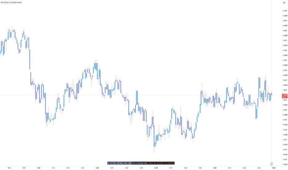
Cost Floor Painter [BSL]Is this bar even big enough to pay for its own round trip?
Most people pick a timeframe before they ever ask that. Cost Floor Painter
answers it for every bar on the chart, and then reports how often the
answer was yes.
HOW IT ANSWERS
You enter a round-trip cost once, in ticks: your spread plus your commission
plus whatever slippage you expect to pay. The script converts that to a price
distance using the instrument's own tick size, so the same setting keeps
working when you switch symbols.
Every closed bar is then measured against it. A bar that covered the cost is
painted solid. A bar that did not is painted in the SAME colour, faded. A
single-row panel reports how many of the last 50 closed bars cleared, with the
50 printed beside it.
The measurement is true range, not high minus low. If a session opened away
from the previous close, that jump is distance the instrument actually
travelled, and counting it is the honest reading. The panel names this on its
face, TRUE RANGE followed by your cost in ticks and in price, so you can see
which definition produced the number. Cost-to-Range Gauge measures the
same predicate over a window and names it the same way, so two tools that
agree by construction can be seen to agree.
A bar whose range lands exactly on the cost counts as covered.
WHERE THE READING BITES
On daily bars almost everything clears, whatever cost you enter. A day of
EURUSD moves eighty pips and a round trip costs two; the comparison is not
close and the panel will read 100%. That is a true answer and a dull one. The
reading gets interesting on the timeframes where bar size and cost are the
same order of magnitude, which for most instruments means minutes rather than
days. Checked on 2026-09-04: at the default cost, BTCUSDT, AAPL and EURUSD all
read 100% on the daily.
WHY FAILING BARS ARE THE SAME COLOUR
A second colour would say: this is a different kind of bar. It is not. A bar
one tick short of the cost is not a different animal from one a tick over, and
colouring it separately would invent a boundary the market does not have.
Fading says: the same kind of thing, weaker. That is the true statement, and
it is the only claim the paint makes.
THE BAR STILL OPEN GETS NO VERDICT
The current bar is drawn as an outline. It is never painted, never counted and
never published, because its range can still change. Whatever it looks like
now, it has not finished being a bar.
THE COST IS YOURS AND THE SCRIPT CANNOT CHECK IT
Spread, commission and slippage are numbers you supply. No chart indicator can
read your broker's fee schedule, and this one does not pretend to. If your
figure is wrong, every reading here is wrong by the same amount, and that is
why the panel shows the conversion from ticks to price, so you can
sanity-check it against your own fills.
WHAT YOU CAN SET
- Round-trip cost: 4.0 ticks
- Coverage window: 50 closed bars
- Colour the bars: on
- Outline the forming bar: on
- Panel position: Bottom center
There are six positions to choose from and the panel starts at the bottom
center. That is the strip TradingView leaves empty. The chart legend and the
trading buttons live top left, the platform's own logo sits bottom left and
covers whatever starts there, and the price scale takes the right. Move it if it
covers something.
The two display switches change the picture and nothing else. Turn the paint
off and the counts, the share and the published value are identical.
Below 50 closed bars there is no share at all. The panel says how many bars it
has instead of dividing by a number it does not have.
WHERE IT REFUSES TO WORK
Heikin Ashi, Renko, Kagi, Point & Figure and Range charts build their bars
from the market rather than showing them. The range of a constructed bar is
not the distance a trade would have paid for, so measuring a cost against it
would produce a number that looks right and means nothing.
On those chart types the paint, the share and the published value stop, the
background carries a wash you cannot miss, and the panel collapses to one
frozen row naming the chart type.
WHAT OTHER SCRIPTS CAN READ
One value is published for other indicators to pick up in their Source
setting: whether the bar cleared the cost. It is 1 for a bar that covered it,
0 for a bar that did not, and no value at all before the script has an
opinion. That is not the same as a 0.
That value is a filter, not a signal. It describes bar size and carries no
direction. It says nothing about whether to be long or short, and connecting
it to a tool that expects entry events would produce entries nobody signalled:
the value sits at 1 for every large bar in a row, and a tool reading events
would treat each change from 0 to 1 as a fresh instruction.
The dropdown will show more than this one value. The outline drawn on the
forming bar is offered there too, along with the two alert conditions, and the
outline is switched off by a display box. Take the value named above.
WHAT IT WILL NOT TELL YOU
It never reports what happened after a bar cleared the cost. There is no
direction in it, no entry, no exit, no stop and no position size. It
recommends no timeframe, no instrument and no cost figure. No percentage
appears anywhere without the number it was divided by.
What a cost does to a sequence of trades is a different question, answered by
Execution-Aware Trend , where the same figure becomes an executed cost
with next-bar fills and a fixed in-sample / out-of-sample split.
This tool describes bar size against a cost you declare. It does not predict
price, guarantee performance or provide trading advice. Validate the behaviour
on your own symbols, timeframes and execution assumptions before making
decisions.
Open-source Pine Script® v6. Educational use only. 지표
Percent Range Tool
Percent Range Tool is an overlay indicator that lays a percentage scale over the chart, measured from the current close.
It's built for anyone who thinks in percentage distances rather than in absolute prices — for judging how far a move would have to carry, for setting targets and stops in percentage terms, or for comparing symbols whose price levels have nothing in common.
Rather than working from fixed percentage steps that have to be reset for every symbol and every timeframe, the scale sizes itself: it takes the highest high and the lowest low within a lookback window, measures how far each of them sits from the current close, and lets the wider of the two distances stand for one hundred percent. Everything in between is divided into equal steps.
A single length input therefore governs the entire scale, while its placement and its color stay adjustable.
Calculation
Length: number of bars searched for the highest high and the lowest low.
Appearance
Offset: distance in bars between the current bar and the right-hand end of the levels.
Extend Levels to the Left: carries every level to the left across the whole chart.
Line Color: color of the lines and of their labels.
Label Size: font size of the percentage labels.
The indicator draws twenty horizontal lines, ten above the close and ten below it, each labelled with its percentage at the right-hand end.
The outermost pair marks the full distance the market covered within the lookback window; from there the levels step inward in equal increments, and their alternating lengths and line styles make the steps easy to count at a glance.
Since only the wider of the two distances sets that outer edge, the nearer of the two extremes lands somewhere inside the scale rather than on an edge of its own.
On higher timeframes the scale often runs wider than one hundred percent, because the distance to the high is open-ended while the distance to the low can never exceed one hundred percent — a price cannot fall further than to zero.
The levels that would land at or below zero are left out entirely, so on those charts fewer lines appear below the close than above it.
The whole block sits to the right of the last candle, in the empty space beyond the current bar rather than over the price action itself, so depending on how much room the chart leaves on the right it may take some scrolling before the levels come into view.
Extended to the left, they run back across the chart instead, which places every percentage beside the bars it refers to — the staggered lengths then no longer have any effect, and the steps are told apart by line style alone.
Only the current state is drawn.
Nothing is placed on past bars and there is no history to scroll back through: with every new bar the lookback window moves on, and both the close and the two extremes it is measured against can change, so the levels are rebuilt and the percentages on the labels shift with them.
On the bar still forming they follow the live price and settle once that bar closes.
Because the scale is derived from the range rather than fixed, its numbers differ from symbol to symbol and from timeframe to timeframe — a quiet market produces a narrow scale, a volatile one a wide scale.
This indicator is intended solely for market analysis and does not constitute investment advice or a guarantee of success.
Use it at your own discretion and risk; past results are not indicative of future performance.
지표

Tail Range Percentile Radar [Pineify]Tail Range Percentile Radar
Overview
Tail Range Percentile Radar separates candle rarity from candle shape. Four aligned scan lanes compare true range, real body, upper wick and lower wick with their own recent histories. It describes anatomy, not the next move.
Problem Definition
An ATR multiple measures distance from an average, but the same multiple can occur in very different distributions. A long range may also be mostly gap, body or wick. A wick-to-body ratio alone is unstable near a doji and says nothing about historical rarity. Ask two questions: is this component unusual, and does it occupy enough of this candle to matter?
Design Rationale
Separate ranks preserve anatomy hidden by one volatility score. The candidate is excluded from its reference window so an extreme cannot alter its own baseline. Half-weight ties avoid treating repeated tick sizes as distinct observations. A minimum high-low share rejects historically rare but visually trivial parts. Averaging all four ranks was rejected because a large body could mask an exceptional wick; retaining four lanes costs screen space but preserves the reason for each event.
Key Features
Four prior-only percentile populations with explicit zero handling.
Independent range and share-qualified body or wick flags.
A confirmed anatomy strip, three close-only alerts and optional statistics.
How It Works
TR is the largest of high-low, the distance from high to the previous close, and the distance from low to the previous close. Body is absolute close-open; wicks are the distances from the body edges to high and low. Each magnitude is rounded to the symbol's tick size. Its rank is 100 times the count of smaller prior values plus half the equal values, divided by N. Zero parts receive zero. All N preceding bars must have valid OHLC and previous-close data; invalid coverage leaves every lane blank.
A flag needs rank at or above Q. Body and wick flags additionally need their configured share of high-low; a zero high-low gives zero shares. Tail flags do not require extreme TR. The displayed type prioritizes dual tail, upper tail, lower tail, directional body, gap-led range, then range only. Gap-led requires extreme TR and at least 35% of TR outside high-low. Component flags remain independent of this display priority.
How Multiple Indicators Work Together
The four measurements are one candle decomposition, not unrelated trading signals. Rank supplies historical context; share supplies geometric relevance; their conjunction supplies body and tail flags. TR retains total movement, including movement beyond high-low relative to the previous close. Without share, tiny parts can be highlighted; without separate ranks, unusual anatomy disappears inside a single range score.
Trading Ideas and Insights
An upper-tail event identifies an unusually large upper wick, not proven selling pressure or a short entry. A lower tail is equally descriptive. Compare a tail inside ordinary TR with a range event dominated by a body: the patterns answer different anatomy questions. Clusters invite chart review but do not establish reversal odds.
Unique Aspects
Relative to an ATR threshold or candle ratio, the added mechanism is a prior-only, tie-aware four-population comparison with geometric qualification and explicit mixed-tail precedence. It preserves tail rarity even when total range is ordinary. Zero suppression prevents absent wicks from becoming exceptional merely because a reference sample contains many zeros.
How to Use
Read the lanes from top to bottom: gold TR, purple body, orange upper wick, teal lower wick. Each uses its own zero baseline and equal height for 0-100; stacked positions are not a shared numeric axis. Dashed rails mark Q, vivid columns show qualifying components and dots confirm them at close. Use the table or Data Window for actual ranks and anatomy codes. The diamond strip marks the selected closed-bar type.
Customization
Start with N=200, Q=95, wick share=20% and body share=55%; these are design starting points, not optimized settings. Shorter N responds sooner but uses fewer comparisons; higher Q or shares rejects more bars. The statistics window defaults to 100 chart bars. Its rates use eligible closed bars, with sample coverage shown; overlapping flags can sum above 100%. Guides, tips, strip, table and four colors are configurable.
Assumptions and Limitations
Use standard OHLC charts; synthetic candles change the meaning of anatomy. Price scale changes, splits, session gaps, stale bars and regime shifts can distort the raw-size reference. No volume or order-flow data is used. Rank 95 is a sample comparison, not a 5% future probability; it also does not measure how far beyond history a new maximum lies. At least N valid prior observations plus previous-close coverage are needed. Live ranks, shading and table type can change intrabar; tips, strip and alerts require close. Alerts apply to every qualifying closed bar, so consecutive bars can each alert and dual tails can trigger both tail alerts. Choose once per bar close. Parameters, chart history and feed revisions can change results. There is no entry, exit, profitability or reversal model.
Conclusion
The range percentile radar distinguishes unusual total movement from unusual candle parts while keeping rarity and shape separate. Use it as a compact explanation of observed tail volatility, with independent decision rules.
지표

SPMA Trend | NAL1. Overview
SPMA Trend | NAL is an adaptive trend and volatility framework built around the Shock Percentile Moving Average.
Unlike a conventional moving average that continuously follows price, the SPMA selectively updates when the current price change ranks above a configurable percentile of recent returns. This creates an event-driven baseline that places greater emphasis on stronger positive price shocks while holding its previous value during lower-ranked movement.
SPMA Trend expands this concept with adaptive volatility bands, asymmetric shock modeling, empirical quantile boundaries, and optional slope confirmation to form a complete directional regime model.
2. Core Calculation
The SPMA begins by ranking the current price change against its recent historical distribution.
Ret = close - close
Per = ta.percentrank(Ret, percentrank_lookback)
Gate = Per > percentile_gate
When the percentile gate is satisfied, the baseline updates to the current EMA value. Otherwise, it retains its previous level.
MA := na(MA ) ? emaValue : Gate ? emaValue : MA
This produces a persistent baseline whose movement is concentrated around stronger ranked price events rather than every fluctuation in price.
3. Adaptive Volatility Framework
SPMA Trend surrounds the baseline with a configurable volatility structure.
Five volatility models are available:
Standard Deviation — measures dispersion around the mean.
ATR — measures price-range volatility.
Mean Absolute Deviation — measures average absolute dispersion.
Median Absolute Deviation — provides a more robust measure of dispersion with reduced sensitivity to extreme observations.
Quantile — constructs the upper and lower boundaries from the empirical distribution of historical price deviations from the SPMA.
The Quantile model is inherently asymmetric. Positive and negative residuals are evaluated separately, allowing each side of the structure to reflect its own historical distribution.
residual = close - SPMA
= f_quantile_volatility(residual, VolLen, QuantilePct)
For the conventional volatility models, an optional asymmetric mode analyzes positive and negative log-return shocks independently. This allows upper and lower volatility expansion to respond differently when the distribution of market shocks becomes unbalanced.
The resulting volatility estimate is applied around the SPMA to create the final adaptive boundaries.
upperBand = SPMA + finalUpper * VolMul
lowerBand = SPMA - finalLower * VolMul
4. Signal Structure
The bullish regime is deliberately selective.
Price must break above the upper volatility boundary while the SPMA itself is rising. When enabled, the percentage slope of the SPMA must also exceed the configured slope threshold.
if SPMA > SPMA and close > upperBand and (UseSlope ? SlopeGate : true)
NAL := 1
A bearish regime is established when price moves below the lower adaptive boundary.
if close < lowerBand
NAL := -1
Between qualifying transitions, the previous directional state is retained. This converts individual volatility-band events into a persistent trend regime rather than a sequence of isolated crossover signals.
5. Key Features
Shock-percentile adaptive baseline.
Event-driven rather than continuously updating trend structure.
Five selectable volatility models.
Mean and median absolute-deviation volatility.
Empirical asymmetric residual quantiles.
Optional positive/negative shock-adjusted volatility bands.
Configurable SPMA slope confirmation.
Persistent bullish and bearish regime states.
Adaptive band, glow, fill, and candle visualization.
6. Use
SPMA Trend is designed as a specialized trend-regime component within a broader systematic framework.
The indicator combines three distinct layers of information: the significance of recent price movement determines when the baseline adapts, the volatility model determines how far price must expand from that structure, and the optional slope gate measures whether the underlying SPMA is developing with sufficient positive directional strength.
This creates a framework centered on identifying meaningful expansion away from an event-driven price structure rather than responding to every short-term movement.
Its primary value is as a distinct structural layer within a complete strategy architecture, where shock significance, volatility expansion, and directional development can be integrated with other independent forms of market information. 지표

Volatility of Returns | NickJoanVolatility of Returns | NickJoan
Core Idea
Volatility of Returns measures the standard deviation of logarithmic returns over a user-defined lookback window. This is the industry-standard approach to calculating historical volatility, widely used in finance for risk management, option pricing, and portfolio analysis.
The indicator displays volatility as an annualized percentage, making it easy to compare across different assets and timeframes. An optional moving average helps smooth the volatility series and identify trends in volatility itself.
Calculation Logic
The indicator follows a straightforward three-step process:
1. Log returns calculation
For each bar, the script calculates the logarithmic return:
• logRet = log(close / close )
2. Standard deviation calculation
The script calculates the standard deviation of log returns over the specified lookback period:
• stdevLogRet = stdev(logRet, length)
This measures how much returns typically deviate from their mean.
3. Annualization
The raw standard deviation is then annualized by multiplying by the square root of the annualization period:
• volatility = stdevLogRet × √annPeriod × 100
For daily crypto charts, the default is √365. This converts the per-bar volatility into an annualized percentage.
Chart Output
The indicator displays in a separate pane below the price chart:
Volatility line
• Shows the annualized volatility percentage
• Plotted in blue
Moving average line (optional)
• Shows the smoothed volatility trend
• User-selectable type: SMA, EMA, WMA, or RMA
• Plotted in gray with thicker linewidth
• Can be toggled off via input
Inputs
CALCULATION
• Volatility Lookback (bars): window for standard deviation calculation. Default: 90.
• Annualize: toggles annualization on/off. Default: true.
• Annualization Period: period used for annualization. Default: 365.
MOVING AVERAGE
• Show Moving Average: toggles MA overlay visibility. Default: true.
• MA Type: MA calculation method (SMA, EMA, WMA, RMA). Default: EMA.
• MA Length: MA lookback period. Default: 30.
How to Use It
Volatility level assessment
• Low volatility: calm, consolidating market
• Medium volatility: normal market conditions
• High volatility: turbulent, fast-moving market
Note: "Low" and "High" are relative to the asset class. Crypto naturally has higher volatility than stocks or forex.
Volatility trend identification
Use the moving average to identify whether volatility is rising or falling:
• Volatility above MA: elevated relative to recent trend
• Volatility below MA: suppressed relative to recent trend
• MA sloping up: volatility is increasing
• MA sloping down: volatility is decreasing
Risk management
Use volatility to adjust position sizing and risk parameters:
• High volatility: reduce position size, widen stop losses
• Low volatility: can increase position size, tighter stops
• Rising volatility: prepare for potential breakout or increased uncertainty
• Falling volatility: consolidation phase, wait for direction
Best Use Cases
• Historical volatility measurement
• Risk management and position sizing
• Volatility trend analysis
• Cross-asset volatility comparison
• Portfolio risk monitoring
Notes
The indicator is designed for daily crypto charts but works on any timeframe.
• Daily timeframe: use Annualization Period = 365
• 4H timeframe: use Annualization Period = 2190 (365 × 6)
• 1H timeframe: use Annualization Period = 8760 (365 × 24)
• Or disable annualization for raw per-bar volatility
The lookback period determines sensitivity:
• Shorter lookback (20-30 bars): more reactive to recent spikes
• Medium lookback (60-90 bars): balanced approach
• Longer lookback (180-365 bars): smooth, long-term trends 지표

Aurora_FLux_VWAP_V2 (Drizzle_ALGO56)Aurora Flux is an adaptive VWAP system that combines volume-weighted price analysis, dynamic volatility envelopes, ADX trend filtering, and lower-timeframe wick volume analysis.
The indicator builds a volume-weighted VWAP core and expands its bands using both volume intensity and ADX strength. It then analyzes lower-timeframe data to measure how much volume occurred in the wicks versus the body of each candle. When strong wick volume coincides with price entering the outer zones, multi-layer intensity clouds light up to visualize buying or selling pressure.
The result is a clear visual map of rejection strength around the VWAP structure.
█ How It Works
⚪ Adaptive VWAP Core
Calculates either a Session VWAP or a Rolling VWAP together with volume-weighted variance. Band width is then modulated by two forces at the same time: current volume ratio and normalized ADX strength.
⚪ Wick Volume Analysis
Uses lower-timeframe data to split every chart candle into body volume and wick volume. A smoothed wick-volume ratio is calculated and used as the main intensity driver.
⚪ Intensity Mapping
When price enters the Extreme Zones (or the Main Channel depending on the selected mode), the current wick ratio is converted into an intensity value.
• Upper intensity reflects Sell pressure
• Lower intensity reflects Buy pressure
The intensity directly controls the opacity of the multi-layer clouds.
⚪ Session Average Tracking
A running average of Upper and Lower intensity is maintained throughout the session and displayed in the Dashboard. This shows the dominant rejection bias of the day.
█ How to Use
⚪ Identify Rejection Zones
Strong Extreme Zone clouds highlight price areas where high wick volume rejected the move.
These zones can act as high-quality support or resistance.
⚪ Read Buy vs Sell Pressure
• Rising Upper Intensity = increasing Sell pressure
• Rising Lower Intensity = increasing Buy pressure
Compare the current intensity with the Session Average to judge whether the rejection is stronger or weaker than the day’s average.
⚪ Combine with ADX
When ADX is high, the bands automatically widen. This reduces false signals during strong trends and keeps the focus on mean-reversion environments.
⚪ Classic Stdev Bands
Optional multi-level standard deviation bands can be enabled for additional fixed statistical reference levels.
█ Settings
• VWAP Mode (Rolling / Session)
• Base Deviation Multiplier & Volume Expansion Factor
• ADX Length, Smoothing and Band Multiplier
• Cloud Mode (Extreme Zone / Main VWAP / Both)
• Extreme Zone Offset & Width
• Main Channel and Extreme Zone colors (single color → automatic gradient)
• Automatic or Manual Lower Timeframe
• Wick Volume Ratio Threshold
• Dashboard HUD
█ Development Status
This indicator is still experimental and under active development.
Default settings are a starting point. Optimal results usually require manual fine-tuning of the Volume Expansion Factor, ADX Influence, Wick Threshold and Zone Width depending on the instrument and timeframe.
█ Feedback
Found a bug, have a suggestion, or want a specific improvement?
Feel free to reach out via TradingView private messages or leave a comment under the script. Feedback is highly appreciated.
█ Disclaimer
The content provided in this script is for educational and informational purposes only. It does not constitute financial advice, investment recommendations, or a solicitation to buy or sell any financial instruments. Past performance is not indicative of future results. All trading involves risk, and you are solely responsible for your own trading decisions. 지표

Stretch z distance from session VWAPStretch z — distance from session VWAP, normalised
Ten dollars from VWAP means something completely different on a dead Tuesday than it does thirty seconds after a number drops. Most "distance from VWAP" tools don't know that — they plot the raw dollar gap and leave you to eyeball whether it looks big today. This pane won't plot a number until it's been made to mean the same thing on any day, in any volatility regime, on any instrument.
The problem with a dollar amount
Raw distance from VWAP isn't comparable across sessions, let alone across symbols. A given point distance on gold during a quiet Asian session and the same point distance thirty seconds after a data release aren't the same event, even though the ruler says they are. The fix is standardisation: divide the raw distance by a measure of how far price normally sits from VWAP right now, and the number stops being "$10" and starts being "how unusual is this, given what unusual looks like today." Do that consistently and the reading also becomes portable — the same z = 2 means roughly the same thing on GC and on NQ, without retuning a single input between them.
Two normalisers, two different claims
You get an explicit choice, because the two options aren't interchangeable and I didn't want to hide that. Dividing by the rolling standard deviation of the spread produces an actual z-score — a statement about how many typical deviations price currently sits from VWAP, with the probabilistic interpretation that implies. Dividing by daily ATR instead produces a distance expressed in units of a familiar, point-based measure — easier to reason about at a glance, portable across timeframes you already think in ATR terms, but it is not a z-score, and the same band thresholds mean something different depending on which one you picked. The tool doesn't pretend these are the same thing wearing different clothes.
Don't trust a variance estimate you just started counting
There are two ways to estimate "normal" dispersion, and each has a real cost. A rolling window (60 bars by default) gives a stable estimate built on a real sample size, but it can straddle a session boundary — at 09:35 that window is still mostly measuring yesterday's regime, not today's. A session-anchored estimate restarts at the open and builds its variance forward, bar by bar, from a running sum and sum-of-squares (with Bessel's correction applied for a proper sample variance) — statistically cleaner, because it only ever describes the session you're actually in, but noisy and untrustworthy for the first handful of bars, when "normal dispersion" is being estimated off three or four data points. Rather than plot a confident-looking number built on a sample too small to support it, the pane suppresses the reading — and the alerts — until the estimate has enough bars behind it to mean something.
A parametric score deserves a non-parametric gut check
A z-score's "how unusual is this" framing leans on the reading behaving roughly like a normal distribution, and a futures spread doesn't always cooperate with that assumption. So alongside the z-score itself, the readout reports where the current |z| ranks against its own trailing 500-bar history — the same question, asked empirically, without needing the distribution to be well-behaved. If the two ever disagree meaningfully, that disagreement is informative on its own.
The bands aren't decorative — they're calibrated
Distance from VWAP isn't universally good or bad; what it means depends entirely on what you're trying to do with it. The readout scores the same z-band differently for three separate trade setups, and the weighting isn't monotonic in the same direction for all three — one setup scores highest when price sits close to VWAP and falls off as stretch increases, while another actually peaks in the 2–3σ band rather than near zero, which lines up with what earlier backtesting on that setup already found. Treating "how stretched is price" as a conditioning variable that different setups respond to differently, rather than a single filter everyone reads the same way, is the actual point of the table — a live, at-a-glance version of a relationship that was originally found by looking backward, not a number invented for the chart.
How I actually use it
Before taking any of the three setups this table tracks, I check the band and the points column, not just the raw z-score — a "big" z-score isn't automatically good or bad news, and the table already tells me which setup it favors and which it doesn't. The percentile column is my sanity check against the regime itself: a 2–3σ reading on a slow, thin session is a genuinely rare event; the same reading thirty seconds into a volatile one might barely be top-quartile, and the percentile is what tells the two apart when the z-score alone can't. The two band-cross alerts do the actual watching — I don't need to sit on the pane all session waiting for the reading to become interesting; it tells me when it has.
(Default window length and weights are set to match a scoring workbook I built earlier in this framework — you don't need that workbook to use this pane, but if the defaults look oddly specific, that's why.)
No time travel
Session VWAP is a standard, non-repainting session-anchored calculation. Daily ATR is retrieved through a security request with lookahead explicitly disabled and offset by one bar before the request, the documented non-repainting pattern for higher-timeframe data. Nothing on the pane, and no alert it fires, depends on information that wasn't available at the time.
What's proven, and what isn't yet
The normalisation logic and the small-sample discipline are sound on their own statistical merits — that part doesn't need a backtest to justify it. The per-setup weights are a different matter: they encode a relationship I'd already found in earlier research on this framework's setups, not a fresh statistical test run by this indicator itself, and the three band edges (1σ, 2σ, 3σ) are conventional defaults rather than something optimised inside this script. A companion scoring workbook in the same framework carries Monte-Carlo-validated adaptive thresholds; this pane trades that adaptivity for a lighter, always-on read, and it's worth knowing which tool you're looking at if the two ever disagree.
Limitations
Runs on any TradingView plan — unlike footprint-based tools, this only needs price and volume, not order-by-order data.
Built for standard candlestick charts; since it emits alertconditions, treat it like any signal-generating script and avoid Heikin Ashi, Renko, or other synthetic chart types.
Session-anchored mode needs roughly 20 bars into the session before its reading is trustworthy; the pane stays blank until then rather than show a number that isn't earned yet.
Default bands and setup weights are tuned for the framework and instrument I built this on; treat them as a starting point, not a universal constant, on a different symbol or session. 지표

Squeeze Regime Map [BSL]Squeeze Regime Map classifies volatility contraction, confirmed release and
directional expansion as explicit states. It answers “what volatility regime
is the current chart in?”, not “what trade should I take?”
This is an original BarState Labs implementation built from an independent
written specification. It does not reproduce another publication's formula,
defaults, interface, chart grammar or source code.
HOW IT WORKS
Normalized volatility is Wilder ATR divided by close and expressed as a
percentage:
`nATR = RMA(True Range, ATR length) / close × 100`
The current nATR is ranked inside the latest complete rolling window using an
inclusive percentile:
`VOL PCTL = 100 × count(window values <= current nATR) / window size`
Inclusive ties are deliberate. The implementation uses this explicit bounded
definition rather than relying on an opaque rank function.
Directional impulse is displacement over the selected momentum length,
normalized by current ATR and then EMA-smoothed:
`impulse = EMA((close - close ) / ATR, smoothing)`
Impulse labels the direction of a confirmed release only when its magnitude is
at least the configured minimum. A weak release is recorded as unresolved
instead of being forced up or down.
STATE MACHINE
- Compression begins when VOL PCTL is at or below the compression-entry level.
- Compression persists until the separate release threshold is reached. This
hysteresis prevents repeated threshold chatter.
- The first qualified exit is a one-bar Release Up or Release Down state and a
one-bar +1 or -1 machine-readable pulse.
- A weak exit returns to Neutral and increments the unresolved ledger.
- On the next bar, a directional release becomes Expansion only when volatility
reaches the expansion threshold and impulse keeps the same qualified
direction.
- Expansion persists while volatility remains above the release threshold and
direction agrees. Otherwise the state returns to Neutral.
- A new compression always takes transition precedence.
The default thresholds are 20 / 40 / 70 percentile. They must satisfy
`compression < release <= expansion`; an invalid order renders `CONFIG ERROR`
and freezes committed output until corrected.
CONFIRMED-BAR BEHAVIOR
State, duration, release plots, diagnostics and alert pulses commit only on
confirmed bars. On an open realtime bar, the panel says `OPEN BAR — HELD` and
retains the previous confirmed values. Historical, elapsed realtime and Bar
Replay bars use the same transition order.
This does not prevent upstream exchange or broker feed corrections from
changing rebuilt history after reload. The script makes no external data
requests and uses only the current chart symbol and timeframe.
OUTPUTS
The pane contains:
- volatility percentile and declared threshold guides;
- a visually clipped impulse histogram;
- optional confirmed regime backgrounds;
- optional confirmed release markers;
- Compact and Full evidence panels with state, duration, normalized metrics,
release counts, unresolved events and readiness.
Hidden machine-readable plots expose:
- Regime code: -3, -2, 0, 1, 2 or 3;
- Compression score: 100 minus VOL PCTL;
- Confirmed release: +1, -1 or 0.
The Confirmed release plot can be selected directly as Signal Audit Lab's
Event source with the Signed pulse decoder. In the validation run, BSL-002's
18 up and 19 down releases matched BSL-001's 18 long and 19 short accepted
events exactly.
ALERTS
Four alert conditions are provided:
- Confirmed volatility release up;
- Confirmed volatility release down;
- Confirmed directional expansion up;
- Confirmed directional expansion down.
Release alerts use the same one-bar booleans as the exported pulse. Expansion
alerts fire only on entry into expansion.
LIMITATIONS
- This is a regime classifier, not a forecast, entry/exit system or strategy.
- A release direction is a normalized momentum label, not evidence of future
return.
- Percentile and state depend on the loaded symbol, timeframe, feed, history
and settings.
- Warm-up requires a complete percentile window and valid momentum history.
- The maximum 500-value percentile window is bounded but intentionally more
expensive than the default 126-value window.
- No optimization, multi-symbol scan, multi-timeframe request, order model,
position sizing or profitability claim is included.
VALIDATION
The release candidate passed 14 deterministic reference tests, a 14/14 live
Pine harness, BTCUSDT/AAPL × 1D/1H runtime checks, exact reload parity,
realtime and replay gates, valid/invalid threshold boundaries, four alert
conditions, 390 px rendering, BSL-001 signed-source integration and a 32,137
execution Profiler run at the maximum 500-bar window.
ORIGINALITY AND SOURCE
Category demand was selected from a dated metadata corpus. No protected,
invite-only or closed source was accessed, and no source from a compared open
publication was imported. The script uses standard true-range, Wilder RMA,
percentile-count and EMA calculations and is released under MPL 2.0.
CHANGELOG
v1.0.0
- Initial open-source release candidate.
- Explicit compression, release and expansion state machine with hysteresis.
- Inclusive rolling volatility percentile and normalized directional impulse.
- Confirmed +1 / -1 release export for Signal Audit Lab.
- Compact/Full evidence panels, four alerts and visible limitations.
지표

Kamote v1.0Kamote v1.0 gives traders a clear, color-coded decision system that tells them the current market regime and the single highest-probability strategy to use—or when to stay out—across Intraday, Day, and Swing horizons.
It does this by combining five independent, hysteresis-protected filters into one coherent recommendation engine, displayed in a clean status matrix with fully configurable alerts. The result is fewer forced trades in dead or chaotic conditions and higher-confidence entries when the conditions actually align.
### Core Value: One Dashboard That Replaces Guesswork ###
Most indicators show isolated signals. Kamote synthesizes volatility regime, higher-timeframe trend direction, trend efficiency, volume behavior, and horizon-specific strategy scoring into a single, actionable output. Traders see at a glance:
Whether volatility is Dead, Healthy, or Extreme
Whether the higher-timeframe linear-regression slope is Bullish, Bearish, or Flat
Whether multi-timeframe Kaufman Efficiency Ratio confirms real trend strength
Whether volume is Expanding, Contracting, or Flat
The optimal strategy (Trend Long/Short, Pullback Long/Short, Momentum Long/Short, Breakout, Mean Reversion) or “Stay Out / None”
Color coding makes the matrix instantly readable. Green supports action, red signals caution or exit, yellow flags transitional states.
### How the Engine Works ###
Kamote runs a single higher-timeframe data request (automatically set by the chosen trading mode) and blends it with chart-timeframe calculations. All regime classifications use percentile ranks plus hysteresis bands so the status does not flicker on every minor bar.
Volatility Regime (ATR Percentile + Hysteresis)
ATR is ranked over a lookback window. Dead (< low percentile), Extreme (> high percentile), or Healthy. Hysteresis prevents rapid oscillation between states. Extreme + contracting volume + weak efficiency is treated as structural noise and forces a “Stay Out” recommendation.
Higher-Timeframe Trend Filter (ATR-Scaled Linear Regression Slope)
Slope is calculated on the higher timeframe, normalized by ATR, and classified Bullish / Bearish / Flat. The threshold itself scales with volatility so the filter stays relevant in both quiet and explosive markets.
Multi-Timeframe Efficiency Ratio
Kaufman’s Efficiency Ratio is computed on both chart and higher timeframes, then blended with user-adjustable weights. A minimum threshold gates whether the move is efficient enough to support trend or momentum strategies.
Volume Regime (Percentile + Hysteresis)
Volume is ranked and classified Expanding / Contracting / Flat. Expanding volume supports breakouts and trend continuation; contracting volume favors mean-reversion or short-side setups depending on direction.
Horizon-Aware Strategy Scoring
The script first checks for hard invalid states (extreme volatility + contracting volume + weak efficiency, flat slope + weak efficiency + flat volume, or swing-mode + flat slope + extreme ATR). If any invalid condition is true, the recommendation is “Stay Out.”
Otherwise it scores eight strategy candidates using eligibility gates and horizon-specific weights:
Trend and Pullback strategies are favored on Day and especially Swing horizons.
Momentum strategies are favored on Intraday.
Breakout receives a boost on Intraday and a discount on Swing.
Mean Reversion is favored on Swing and discounted on Intraday.
The highest-scoring eligible strategy is displayed. Confidence modifiers (healthy ATR, volume alignment, weak prior efficiency, etc.) further refine the score so the recommendation is not binary.
### Designed for Real Trading Workflows ###
Three preset modes (Intra / Day / Swing) automatically adjust higher-timeframe, efficiency length, volume lookback, slope threshold, ATR window, and hysteresis. Users can still fine-tune every parameter. Layout can be horizontal or vertical and placed in any corner. Alerts fire only on confirmed state changes for ATR regime, slope direction, efficiency cross, volume regime, and strategy recommendation—keeping notification noise low.
### Why Traders Adopt It ###
Kamote does not claim to predict the future. It enforces discipline by making regime and edge explicit. When the matrix is green and a strategy is named, the conditions that historically support that style of trade are present. When it says “Stay Out,” the market is offering no edge. That single piece of information—knowing when not to trade—is often more valuable than any entry signal.
The script is pure Pine Script v6, overlay=false, and designed to sit alongside price action or other tools without cluttering the chart. It is built for discretionary traders who want a systematic regime filter and for systematic traders who need a clean, multi-factor permission layer.
Install Kamote v1.0, select your trading horizon, and let the status matrix tell you what the market is actually offering right now. 지표

Intraday Pullback Sniper (BB, Stoch RSI, Liquidity, HTF)An intraday entry-timing indicator.
It looks for pullbacks into a Bollinger band in the direction of the higher-timeframe bias — buying dips in an up regime, selling rallies in a down one — and marks the candle where the pullback has run far enough and the lower-timeframe structure has turned back.
It marks conditions. It does not place stops, targets or position sizes, and it does not tell you to buy. That decision stays with you.
TWO DOTS, AND THE DIFFERENCE BETWEEN THEM IS THE WHOLE IDEA
A small dot means a setup is armed. Four conditions on the same candle: the wick touched a band, the candle closed back inside and in the half that faces that band, the Stoch RSI was at its extreme within the last few candles, and the bias allows that direction. Read it as "price bounced off the band, I am watching."
A large dot means every enabled condition is met. On top of a setup still running from an earlier candle it needs the structure of the entry timeframe to have confirmed the turn, a second band touch with a rejection on this very candle, the bias, the liquidity sweep if you require one, an open session, and the cooldown after the last signal to have passed. Read it as "price did it a second time, and the structure turned in between."
The decisive part is the time gap. The band has to be touched twice, and the structure has to confirm between the two. A large dot can therefore never appear on the same candle as its own small dot — the following one at the earliest. A new small dot on a signal candle is normal: that candle meets the setup conditions as well, so it arms the next setup while the current one fires.
WHAT IT DRAWS
On the price chart: Bollinger Bands, the bias EMA, setup and signal dots with the price they occurred at, swing labels (HH / HL / LH / LL), market structure (BOS / CHOCH / MSB) for several timeframes, liquidity levels named by side and rank, and session boxes sized to the high and low each session made.
In its own pane: the Stoch RSI the logic actually runs on, its levels, dots at the extremes, the bias as a background tint, and a strip along the bottom that runs for as long as a setup is still waiting for its signal.
HOW SWINGS ARE FOUND
Everything structural — swing labels, market structure and liquidity — comes from one single engine using the classical definition of a turning point. A swing high is the highest candle of a window with the same number of candles on its left and on its right, so it is a local extreme in the literal sense. It is confirmed and never repainted, at the cost of a delay equal to that window.
Highs and lows strictly alternate. A second point of the same kind before the opposite one does not open a new leg; it replaces the current one if it is more extreme, otherwise it is discarded. Two degrees are calculated: a short one with a lookback of 2, the classic fractal, and a longer one for the larger move.
Structure breaks are judged on the close, never on wicks. A break with the prevailing direction is a BOS, one against it a CHOCH; both are MSB events.
Liquidity levels are swing points price has not closed beyond. Once a candle of that timeframe closes through a level, the orders resting there have been filled and the level is dropped. A wick through it with a close back on the old side is a sweep, not a break, so the level survives and is marked as swept.
HOW TO USE IT
Put the chart on the setup timeframe, 5 minutes by default. The entry timeframe must be lower than the chart; its candles are read from inside each chart candle. All higher-timeframe data comes from closed candles only, and signals are evaluated at the close of a chart candle, never intrabar.
The 5-minute default describes the preset, not a limit. Every timeframe is adjustable — a 15m chart with a 1H bias and 5m entry structure works the same way. The status table tells you if the chart and the setup timeframe do not match.
For alerts, pick "Any alert() function call" with the trigger "Once Per Bar Close". One alert then covers both directions, and the message carries symbol, direction, price, bias, setup direction, structure state, sweep and session. Separate SNIPER LONG and SNIPER SHORT conditions exist as well.
Every setting has a tooltip. Group 0 holds a glossary of the labels and a short guide to the alerts.
ON THE DEFAULTS
The defaults are deliberately on the safe side and the strict bias is on. If you get too few signals, switch conditions off one at a time and watch what changes — that is far more instructive than loosening several at once. The liquidity sweep is the one filter that is off by default; switch it on for the stricter variant.
LIMITATIONS, HONESTLY
Lower-timeframe data on TradingView is limited to a few months of intrabar history depending on your plan. Further back the entry structure and the signals that depend on it are missing, while everything else keeps drawing normally.
A swing is only confirmed after its window has passed, so the most recent candles cannot carry a label yet. That delay is the price of never repainting, and it is not a bug.
The indicator needs no volume, so it works on CFDs, forex and futures alike. It assumes continuous trading without large gaps — on instruments that gap overnight a band touch can come from the opening gap rather than from a rejection, and the logic is of little use there.
Suited to liquid, continuously traded instruments: index CFDs, major crypto, major forex pairs, liquid futures. On crypto the sessions carry no meaning; either switch all three off or trade the overlapping hours deliberately.
This is a tool for your own analysis, not financial advice. Past behaviour of any setup says nothing about future results. 지표

MA Ribbon Aurora_Channel_V1 (DRIZZLE_ALGO56) MA Ribbon with Aurora Channels UI
█ Overview
MA Ribbon with Aurora Channels UI is an experimental indicator designed to modernize the classic Moving Average Ribbon. Instead of relying on static trailing averages—which frequently lag during sharp structural shifts—the system fuses custom MA ribbons with Flipped (Inverse) Ribbon Dynamics, Volume Expansion Multipliers, and Asymmetrical Wick Ratios, wrapped inside a real-time HUD interface.
The indicator converts standard ribbon dispersion into a multi-layered, volatility-adaptive envelope (Core Channel, Expansion Envelope, and Trigger Buffer). The channel automatically expands during high-volume momentum breakouts and contracts during low-volatility consolidation phases.
⚠️ Author Note: This project is an experimental research prototype. Optimal performance requires manual tuning of parameter settings (smoothing lengths, volume sensitivity, and width multipliers) based on your target asset, timeframe, and prevailing market regime.
█ How It Works
⚪ Dynamic Midline Engine
The system averages all active moving averages (supporting SMA, EMA, SMMA, WMA, VWMA) to create a central equilibrium reference line.
⚪ Flipped Ribbon & Width Engine
Rather than relying purely on standard moving average distance, the indicator calculates inverse mirror projections for every active ribbon line to measure true structural price dispersion:
flip = 2 * source - ma
The maximum deviation across normal and flipped lines defines the raw channel width, which is then smoothed using an exponential moving average:
rawWidth = math.max(math.abs(diff1), math.abs(diff2), math.abs(diff3), math.abs(diff4))
⚪ Volume-Driven Expansion
Channel width dynamically scales upward when volume participation exceeds its baseline moving average, ensuring bands react instantly to institutional volume spikes:
volRatio = volume / volMa
volBoost = 1.0 + math.max(0.0, volRatio - 1.0) * volSens
⚪ Asymmetrical Wick Balancing
Upper and lower envelope boundaries expand independently based on the ratio of directional wicks relative to ATR. This prevents false boundary breaches caused by one-sided wick rejections:
upAsym = 1.0 + asymStr * (ur / math.max(atrVal, syminfo.mintick))
dnAsym = 1.0 + asymStr * (lr / math.max(atrVal, syminfo.mintick))
⚪ Aurora Multi-Layer Bounds
The engine calculates three distinct volatility zones:
Core Channel: The primary equilibrium zone surrounding the midline.
Expansion Envelope: Outermost normal volatility bounds where directional acceleration occurs.
Trigger Buffer: An extreme extension boundary for mean-reversion cues.
⚪ Signal Engine & HUD Dashboard
The script tracks zone transitions, logging whether a boundary breach represents a 1st Touch or a Retest. The real-time HUD table tracks current zone regime, duration, ribbon compression percentage, active volume boost, and touch history directly on the chart.
█ How to Use
⚪ Volatility Contraction & Compression
When the Ribbon Tightness value on the HUD falls below 30%, the MA ribbon is in deep compression. Price residing strictly inside the Core Channel signals neutral range consolidation prior to a breakout.
⚪ Trend Expansion & Momentum Setup
A candle close outside the Expansion Envelope indicates institutional volume acceleration. Look for 1st Touch (triangle) or Retest (circle) shapes for momentum entries aligned with expanding channel width.
⚪ Mean-Reversion / Profit-Taking Setup
When price reaches or breaches the outer Trigger Buffer, market expansion is overextended. Look for mean-reversion rejections back toward the Core Channel or Midline.
█ Settings
MA Ribbon Inputs
MA #1 – #4: Enable or disable up to four independent moving averages. Select the MA type (SMA, EMA, SMMA, WMA, VWMA), source, length, and plot color.
Display
Show Normal / Flipped Ribbon: Toggle visibility of standard ribbon lines or mirror projections.
Show Core / Envelope / Trigger: Toggle individual channel layer visibility.
Show Dashboard & Position: Enable the real-time HUD and select its chart overlay anchor.
Show Signal Shapes: Enable breakout and retest signal markers.
Channel Engine
Core Multiplier: Sets the width multiplier for the inner fair-value channel.
Envelope Multiplier: Controls the distance of the momentum envelope bounds.
Trigger Buffer Multiplier: Controls the outer overextension boundary.
Width & Edge Smoothing: Sets the EMA smoothing applied to raw dispersion and final channel edges.
Volume MA Length & Sensitivity: Adjusts how strongly volume spikes expand channel boundaries.
Asymmetry Strength: Controls how aggressively upper/lower bounds deform in response to long wicks.
Colors
Core Upper / Lower: Custom colors for the inner channel clouds.
Envelope / Trigger / Midline: Color selection for boundary lines and fill layers.
Cloud Transparency: Adjusts the opacity gradient of background fills.
Disclaimer
The content provided in my scripts, indicators, ideas, algorithms, and systems is for educational and informational purposes only. It does not constitute financial advice, investment recommendations, or a solicitation to buy or sell any financial instruments. I will not accept liability for any loss or damage, including without limitation any loss of profit, which may arise directly or indirectly from the use of or reliance on such information.
All investments involve risk, and the past performance of a security, industry, sector, market, financial product, trading strategy, backtest, or individual's trading does not guarantee future results or returns. Investors are fully responsible for any investment decisions they make. Such decisions should be based solely on an evaluation of their financial circumstances, investment objectives, risk tolerance, and liquidity needs. 지표

HTF FVG Tracker (M1D)HTF FVG Tracker
Keeps a running ledger of the hourly, four-hour and eight-hour fair value gaps on any intraday chart. Each gap is drawn the moment its candle set completes on its own timeframe, and each zone runs its own timeframe's length forward and then stops — so the day reads left to right as a clean staircase of imbalances, hour by hour, instead of a pile of boxes all stretching to the live candle at once.
It is a marking tool, not a signal tool. It draws where higher-timeframe imbalances printed and what has happened to them since, and leaves the read to you.
The zones
A bullish gap (BISI) is a candle whose low sits above the high two candles back; a bearish gap (SIBI) is a candle whose high sits under the low two candles back. Each is measured on the tracked timeframe's own candles — H1, H4 and H8, each with its own switch — and drawn from its displacement candle forward.
Every zone carries its name inside the box at the right edge, centred on the zone's midline: H1+ for a bullish hourly gap, H4- for a bearish four-hour one. A setting adds the displacement candle's New York hour, so a four-hour gap reads H4+ 2PM. The fill colour states direction; the border is a solid line on every zone so the edges stay readable where timeframes overlap.
The window
By default a zone extends exactly its own timeframe past its formation: an hourly gap gets one more hour, a four-hour gap four hours, an eight-hour gap eight — then its right edge is fixed. How many of its own candles it runs is a setting, and a second mode keeps the newest zone per timeframe extending until the next zone on that timeframe prints instead.
Either way, if a new gap prints while an earlier zone on the same timeframe is still open, the earlier zone is cut at the new zone's left edge. Nothing overlaps raggedly, and every box's width tells you how long it was the live imbalance.
Volume imbalance and suspension blocks
A fair value gap measured wick to wick understates a fast leg. Where the candle bodies also gap on either seam of the displacement candle while the wicks still bridge it, that volume imbalance is part of the same region, and the zone absorbs it — the edge extends from the wick to the body it should have reached. Each seam is tested on its own.
A suspension block is three same-direction candles whose bodies gap at both seams with no wick gap anywhere — a span price never traded back through. It is drawn as its own zone, from the first candle's close to the last candle's open, tagged SB.
A body gap across a session or weekend break is a calendar artefact, not an imbalance, so any seam spanning more than one candle's worth of time is excluded from both rules. Absorption and suspension blocks each have their own switch.
Fills
A fill is a candle body closing through the far edge of the zone. A wick into the zone is a touch, and a touch never counts. By default a fill inside the zone's window shortens the box to the fill bar but keeps it on the chart — the ledger is the point, and a filled gap is still part of the day's record. You can instead leave a fill unmarked, or delete the zone outright. Zones older than a set number of days are removed either way.
Consequent encroachment
Each zone can carry its midpoint — the consequent encroachment of that gap — as a dotted line through the box. One switch.
Method & repainting
Each timeframe is read with a single higher-timeframe request using confirmed candles only — offset by one bar with lookahead, the standard non-repainting form. Detection is gated to the chart bar's close, so a zone appears on the first closed chart bar after its higher-timeframe candle completes, and nothing appears mid-bar and then withdraws.
In the default mode a zone's full window is drawn as soon as the zone prints, so its right edge can sit a little ahead of the live candle until the window closes. In the until-the-next-FVG mode the newest zone per timeframe extends rightward as bars print — that is the box tracking the present, not its history changing.
The chart timeframe has to be at or below the timeframe being tracked. On a 4-hour chart you get the H4 and H8 ledgers only, and above H8 the script says so on the chart rather than drawing nothing.
Alerts
Three, one per timeframe, firing on bar close when a new zone prints on that timeframe — gap or suspension block.
What it will not do
It places no entries, exits, stops or targets, draws no bias and grades no gap. It does not decide which imbalance matters — that is a judgement about context this script does not have. A quiet day showing only a handful of zones is the tool working, not failing.
Settings
The three timeframe switches and days of history; the zone extension mode and its candle count; volume imbalance absorption, suspension blocks, and the fill behaviour; bullish, bearish and border colours with the zone fill transparency; the consequent encroachment line, the New York hour tag, and label text size.
Disclaimer
This is a decision-support tool for discretionary ICT trading. It is not financial advice, and no market's past behaviour is indicative of future results. 지표

Buy Signal Ema Macd CrossBuy Signal Ema Macd Cross — Xcelerate Trade
All-in-one indicator for TradingView: multi-factor BUY confluence on the price chart + classic MACD (12, 26, 9) in a separate pane below.
WHAT YOU GET
• Price chart: MA14 (purple) and MA200 (red) — MA25/50/99 optional
• BUY labels when all confluence rules align (not on a single isolated MACD cross)
• Live Confluence table — MACD, Signal, Histogram, condition checks, active window
• Movable table — 9 screen positions (corners & centers)
• MACD pane: official TradingView-style histogram (4-tone momentum colors), MACD line, Signal line (orange), zero line
BUY SIGNAL LOGIC
A BUY fires only when these align within the Confluence window (default: 8 bars):
1. MACD crosses above Signal (bullish cross)
2. Close above MA14 and MA200
3. Price recently crossed above MA200 (within window)
4. MA14 recently crossed above MA200 (within window)
5. Cooldown: minimum 12 bars between BUY labels (anti-spam)
Optional (default OFF): BUY only when MACD is below zero — cross and signal must occur under the zero line (classic recovery-from-oversold setup).
Analysis limited to the last 500 bars on chart load.
KEY SETTINGS
• Moving averages: show/hide MA14, MA25, MA50, MA99, MA200
• MACD: 12 / 26 / 9, EMA oscillator & signal
• Confluence window & cooldown — tune for your timeframe and volatility
• Display: BUY label color, confluence table on/off, table position
ALERTS
• BUY confluence (all conditions met)
• MACD crosses above / below Signal
• MACD histogram rising→falling / falling→rising
WHO IT'S FOR
Traders who want filtered BUY entries combining trend (MA200), short-term momentum (MA14), and MACD confirmation — intraday and swing on forex, gold, crypto, indices. Always validate on demo and adjust window/cooldown for your market.
DISCLAIMER
Technical analysis tool only — not financial advice. Past signals do not guarantee future results. Trade at your own risk. 지표

Zeiierman Bands (Zeiierman)█ Overview
Zeiierman Bands (Zeiierman) is an adaptive liquidity-band indicator designed to visualize price equilibrium, liquidity stress, directional pressure, and mean-reversion opportunities directly around price.
Instead of using a standard moving average with symmetrical volatility bands, the indicator builds a custom Liquidity Mean using price, volume participation, candle range, wick behavior, and liquidity interaction. The upper and lower bands then adapt independently depending on the stress developing on each side of the market.
A higher-timeframe Liquidity Tension model colors the bands:
• Bull Color = positive directional pressure
• Bear Color = negative directional pressure
• Neutral Color = insufficient directional pressure
Reclaim triangles identify situations where price reaches a liquidity extreme and then begins moving back toward equilibrium.
█ How It Works
⚪ Liquidity Mean
Volume participation is compared with candle movement to estimate liquidity acceptance. Wick behavior is then used to adjust the price being weighted into the mean.
acceptance = relativeVolume / relativeRange
The result is a liquidity-weighted equilibrium instead of a conventional moving average.
⚪ Asymmetric Liquidity Bands
Upside and downside deviation are calculated separately using normal price dispersion, wick activity, and liquidity stress.
upper = mean + deviation * upperStress
lower = mean - deviation * lowerStress
This allows one side of the bands to expand more than the other when liquidity pressure becomes uneven.
⚪ Liquidity Color
The color engine compares price with the previous completed candle from the selected higher timeframe and combines that position with Path Efficiency.
normalizedPosition = 2 * (close - htfMid) / htfRange
rawTension = normalizedPosition * pathEfficiency
Persistent positive tension creates the Bull regime, persistent negative tension creates the Bear regime, and weaker conditions remain Neutral.
⚪ Reclaim Signals
A reclaim setup becomes armed after price reaches an outer liquidity extreme. The signal appears when price then reclaims the inner band toward the Liquidity Mean.
longReclaim = armedLong and crossover(z, -reclaimLevel)
shortReclaim = armedShort and crossunder(z, reclaimLevel)
The optional OU Filter removes reclaims when the current environment does not behave sufficiently like a mean-reverting process.
When Align Reclaims With Trend is enabled, Long Reclaims are allowed only during the Bull regime and Short Reclaims only during the Bear regime.
█ How to Use
Bull-colored bands indicate positive higher-timeframe Liquidity Pressure, while Bear-colored bands indicate negative Liquidity Pressure. Neutral bands indicate that directional pressure is not strong enough to establish either regime.
⚪ Bullish Setup
If the bands are blue, look for rejection from the lower bands. These areas can act as potential bounce zones because the setup is aligned with higher-timeframe liquidity pressure.
⚪ Bearish Setup
If the bands are yellow, look for rejection from the upper bands. These areas can act as potential rejection zones because the setup is aligned with higher-timeframe liquidity pressure.
⚪ Volatility Contraction & Expansion
When the bands begin to contract, volatility is decreasing, and price is becoming more compressed. This can signal that the market is building toward a larger move.
A breakout followed by band expansion shows that volatility is increasing and price is moving out of the compressed range.
⚪ Bearish Setup
In this example, the bands contract before price breaks lower. The bands then expand as bearish momentum accelerates, confirming the volatility expansion and continuation of the move.
⚪ Bullish Setup
In this example, the bands contract as price consolidates and volatility decreases. Price then breaks higher and the bands expand as bullish momentum increases. A second contraction develops before another breakout, followed by a stronger volatility expansion and continuation of the bullish move.
█ Settings
Length: Controls the primary calculation window.
Deviation: Controls the distance of the outer bands.
Reclaim Ratio: Controls the position of the inner reclaim bands.
Use OU Filter: Enables the mean-reversion filter for reclaim signals.
OU Strictness: Controls how selective the OU filter is.
Color Timeframe: Selects the timeframe used by the Liquidity Color Engine.
Auto Color Timeframe: Automatically moves the color engine higher according to the timeframe mapping.
Path Efficiency Length: Controls how price travel efficiency is measured.
Tension Build Length: Controls how quickly directional tension strengthens.
Tension Release Length: Controls how quickly tension fades or reverses.
Maximum Tension: Caps the Liquidity Tension value.
Trend Tension Threshold: Determines when Bull or Bear coloring becomes active.
Reclaim Signals: Shows or hides reclaim signals and their reclaim alerts.
Align Reclaims With Trend: Allows Long Reclaims only in the Bull regime and Short Reclaims only in the Bear regime.
Fill Bands: Shows or hides the area between the outer bands.
-----------------
Disclaimer
The content provided in my scripts, indicators, ideas, algorithms, and systems is for educational and informational purposes only. It does not constitute financial advice, investment recommendations, or a solicitation to buy or sell any financial instruments. I will not accept liability for any loss or damage, including without limitation any loss of profit, which may arise directly or indirectly from the use of or reliance on such information.
All investments involve risk, and the past performance of a security, industry, sector, market, financial product, trading strategy, backtest, or individual's trading does not guarantee future results or returns. Investors are fully responsible for any investment decisions they make. Such decisions should be based solely on an evaluation of their financial circumstances, investment objectives, risk tolerance, and liquidity needs.
지표

FCP | Market Pulse | Multi Symbol Volatility ScannerMarket Pulse ranks up to 40 symbols by how violent their current candle is relative to their own recent behaviour.
THE METRIC
For every symbol on a fixed scan timeframe:
ratio = (high − low) / ATR(14)
The ATR is read from the previous bar, so an explosive candle cannot inflate its own baseline and cancel itself out. Because the range is divided by that symbol's own ATR, the number is unitless — a 2.5 on EURUSD and a 2.5 on BTCUSDT mean the same thing. One threshold works for FX, indices, metals and crypto at once, which a pip- or percent-based filter cannot do.
A symbol is listed when its ratio reaches the trigger multiple. Anything below it is ignored, so the panel stays empty most of the time and only fills up when something is actually happening.
READING THE PANEL
SYMBOL — the live scan period, sorted by ratio, strongest first
PREVIOUS — the same list for the last closed period, so a chart opened mid-period still shows what just moved
xATR — how many times its own average range the candle has covered
CHG% — direction and size of the move, (close − open) / open
▲ ▼ — green for an up candle, red for a down candle
"quiet" means nothing crossed the threshold. That is the normal state.
Nothing is stored between periods. A symbol drops off by itself as soon as it cools down, and markets that are closed are excluded so a frozen quote is never reported as a live burst.
SETTINGS
Scan timeframe — every symbol is measured on this timeframe regardless of the chart. Keep the chart at the same timeframe or lower.
ATR length — default 14.
Trigger at N x ATR — 2.0 to 2.5 catches ordinary bursts, 5 catches only major shocks.
Symbols — 40 slots, each a checkbox plus a symbol picker. Untick a slot to drop it from the panel and the alert. Retarget any slot to your own data provider.
ALERTS
Create the alert with "Any alert() function call". One alert fires per closed scan bar and lists every symbol over the threshold, in the same order the panel shows them.
The Telegram JSON option formats the message as a ready-to-post sendMessage payload. Enter your own chat id, then point the alert webhook at the Telegram sendMessage API endpoint for your bot.
Webhooks require a paid TradingView plan with two-factor authentication enabled. Your bot token lives only in the webhook URL — it is never part of this script. Never share it or screenshot the alert dialog; if it leaks, revoke it in BotFather.
Turn the option off if you route alerts through your own relay server instead.
LIMITS
40 symbols is a hard ceiling — Pine allows no more than 40 data requests per script. 지표

Session block profileEvery part of the trading day has a personality. See yours in one table.
Description
Splits the trading session into fixed-length blocks and, for each block, keeps a rolling history of what that part of the day has done over the last N sessions. Three descriptive measures per block: how large its range tends to be relative to the average block, how much volume it tends to carry relative to the average block, and how directional it tends to be, measured as the average of the block's body over its range.
How it calculates
Each bar is assigned to a block from its minute of the day in the chosen time zone. A block's high, low, open, close, and volume accumulate on confirmed bars. When the first confirmed bar of a different block or a different day arrives, the completed block is written into its rolling history and that block's means are recomputed once. Range and volume indices are each block's mean divided by the average across all blocks with enough history, so 1.00 is an average block. Body ratio is the mean of |close - open| divided by (high - low) for the block, so 0 is a doji and 1 is a full-body bar.
How to read it
Range and volume shade toward green as they rise above the average block. Body shades toward amber as blocks become more directional. The current block's label is amber. Alternate blocks can be shaded on the chart so the grid is visible against price. This is a description of what each part of the day has tended to do. It is not a forecast.
Repainting
Closed blocks do not repaint. History is written only when a block completes. The current block is marked but its partial values are not shown as a statistic.
Originality and attribution
Session statistics by time of day are a familiar idea. What is original here is the block-keyed rolling history with cached per-block means, the three-measure normalization against the session's own average block, and the heat-table presentation. This is not derived from and does not reuse code from any existing published script.
Honest limitations
The session must start and end on the same calendar day in the chosen time zone. Sessions that cross midnight are not supported.
A partial first day in chart history contributes a partial block. The minimum-sessions setting exists to absorb that.
Half days, holidays, and early closes pollute a block's history for as many sessions as the lookback.
Range and volume are relative to the average block within this session window, so the indices are only comparable inside one configuration.
Body ratio is not a trend measure. A block can have a high body ratio and still be a small, meaningless move.
Nothing here is a signal. A high-range block is not a direction. 지표


