Reading the Character of the Next Market CycleCrude Oil: Impulse or Diagonal? Reading the Character of the Next Market Cycle
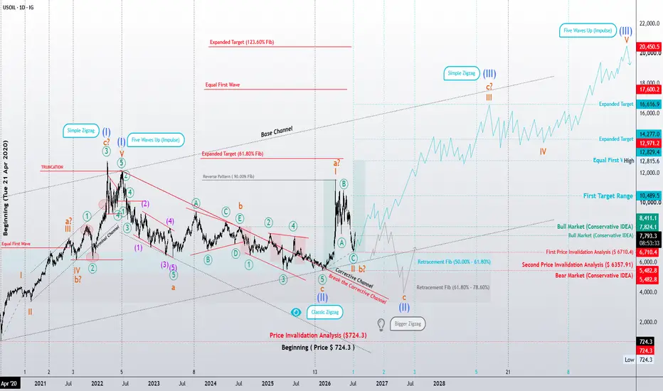
In my previous long-term analysis, the primary expectation was that crude oil was developing the final fifth wave of the largest degree as a classic Impulse. If that interpretation proves correct, the long-term bullish outlook remains valid and significantly higher price objectives could still become achievable over the coming years.
However, as the market structure continues to evolve, another equally valid Elliott Wave scenario deserves serious consideration.
Rather than unfolding as a traditional impulse, the final advance may develop as a Diagonal. At this stage, the structure could take the form of an Ending Diagonal, an Extended Diagonal, or—most likely—a Contracting Diagonal (wedge).
If this scenario unfolds, the long-term bullish outlook remains intact. The difference lies not in the direction of the trend, but in its character. Instead of a fast, decisive advance, price may continue to climb through an overlapping, grinding, and increasingly exhausting structure—behavior that is typical of terminal diagonals.
At the same time, the conservative scenario remains fully valid.
Under this interpretation, the decline from the previous major high represents only Wave A of a larger corrective structure. The following rally retraced more than 90% of that decline and reached approximately 11,555.4, a behavior that remains consistent with several corrective formations.
As a result, the current decline could be developing as an impulsive Wave C of a Classic Zigzag (A-B-C). Alternatively, it may become part of a larger Double Zigzag correction.
Another possibility that should not be overlooked is the development of a Flat correction—either a Regular Flat or an Expanded Flat. In such a case, Wave C could itself unfold as an Expanding Ending Diagonal. Although less common, this structure is fully consistent with Elliott Wave guidelines and is often characterized by increasing volatility, broadening price swings, and persistent overlap between waves.
At this stage, no single scenario has been confirmed. The evolution of price structure—and respect for key invalidation levels—will ultimately determine which path the market chooses.
Beyond Price: Studying the Character of Waves
Over the years, my research has gradually moved beyond simply counting waves or projecting price targets.
One question continues to capture my attention:
Can market structure reveal not only where price may go, but also the character of the environment in which future market cycles will unfold?
This is why I spend as much time studying the character of waves as I do their labels.
Many traders assume that every impulse must resemble the textbook ideal. My observations suggest otherwise. Every market has its own personality. Some trends unfold with exceptional strength and clarity, while others advance through prolonged overlap, hesitation, and exhaustion.
Perhaps these differences are not random.
Financial markets do not exist in isolation. They constantly interact with one another. Sometimes they move together through positive correlation. Sometimes they move in opposite directions. At other times, these relationships strengthen, weaken, or even reverse as global economic conditions evolve.
Understanding these relationships is far more complex than identifying a wave count, and I believe there is still much to discover.
In the case of crude oil, for example, a prolonged period of geopolitical tension, recurring disruptions to strategic energy routes, political conflicts, or a sustained war of attrition could create market conditions that are more consistent with the personality of an Ending Diagonal than with a clean, explosive impulse.
Conversely, an abrupt and severe supply shock could produce the kind of powerful momentum more commonly associated with a classic Impulse.
This is not an attempt to predict geopolitical events.
Rather, it is an attempt to understand whether market structure may reflect changes in collective psychology before those changes become fully visible through headlines and economic data.
This remains an ongoing personal research project rather than a definitive conclusion. My objective is not simply to forecast price, but to better understand the relationship between wave structure, crowd psychology, intermarket behavior, and the broader forces shaping future market cycles.
Perhaps markets do more than anticipate price.
Perhaps they also whisper something about the future itself.
Patterns whisper. I listen.
— Mr. Nobody
CFDs on Brent Crude Oil
Jun 6
Crude Oil: The Long-Term Elliott Wave Projection
CFDs on Crude Oil (WTI)
7 days ago
US Oil (WTI) – 4H Elliott Wave Update
 Long
Long
 Short
Short
 Short
Short
Why I Believe Bitcoin Is Heading Toward the $34,000–$27,000 An Elliott Wave, Volume Profile, and Time-Based Analysis
Bitcoin has been remarkably resilient despite persistent selling pressure. While many market participants are expecting the next leg toward new all-time highs, my current Elliott Wave count suggests that the market may still have one significant corrective phase left before the next major bull cycle begins.
This article explains why I believe Bitcoin has a high probability of declining into the $34,000–$27,000 region, and why this isn't a bearish long-term thesis, but rather the completion of a larger corrective structure.
The Bigger Picture: Wave 1 Is Complete
The foundation of this analysis begins on the higher timeframe.
My current interpretation is that Bitcoin has already completed its Primary Wave 1 from the 2022 bear market low to the recent all-time high. What we are seeing today is not the beginning of another impulsive bull leg, but rather the development of Primary Wave 2 .
Wave 2 corrections often convince the majority of participants that the bull market has ended. Ironically, they serve the opposite purpose. They prepare the market for the much larger Wave 3 advance.
At present, I believe Wave 2 is unfolding as a Zigzag (A-B-C) correction.
Zooming Into the Daily Chart
Looking at the daily timeframe, the corrective structure becomes much clearer.
Wave A appears to have completed, followed by a corrective Wave B. The market is now developing Wave C , which itself subdivides into a five-wave impulsive structure.
Within that structure, Bitcoin is currently positioned in what I believe is Wave ii of Wave C .
If this count is correct, the market still needs to complete:
- Wave ii
- Wave iii
- Wave iv
- Wave v
before the entire Wave 2 correction can be considered complete.
This is the primary reason why I remain bearish over the medium term despite occasional bullish rallies.
Why $34,000–$27,000?
This projection isn't based on a single indicator.
Instead, it comes from several independent tools that all point toward the same area.
When multiple methodologies converge on one price region, the probability of that region acting as a significant reversal zone increases considerably.
1. Elliott Wave Projection
Using standard Elliott Wave Fibonacci projections, the measured target for Wave 5 of Wave C falls within approximately:
$34,000 down to $27,000
This is the natural termination zone if the current impulse completes normally.
Rather than selecting an arbitrary price target, the projection comes directly from the proportional relationship between Waves 1, 3, and 5.
2. Weekly Fibonacci Retracement
The second layer of confirmation comes from the weekly chart.
If we measure the entirety of Primary Wave 1 and project the expected retracement for Primary Wave 2, classical Elliott Wave theory suggests that Wave 2 frequently retraces somewhere between:
- 50%
- 61.8%
- 78.6%
of Wave 1.
Remarkably, this retracement region overlaps almost perfectly with the lower-timeframe Wave C projections.
Whenever higher-timeframe Fibonacci retracements align with lower-timeframe wave projections, the level deserves much greater attention.
3. Parallel Channel Structure
Price has also been respecting a well-defined descending parallel channel throughout the correction.
Rather than moving randomly, Bitcoin has consistently reacted to the channel boundaries.
As long as price continues respecting this channel, the path toward the lower boundary remains the highest-probability scenario.
Channels are often overlooked in Elliott Wave analysis, yet they frequently provide the roadmap for corrective movements.
The fact that the projected Wave v terminates near the lower boundary of the channel adds another layer of technical confluence.
4. Fixed Range Volume Profile
Perhaps one of the strongest confirmations comes from market profile analysis.
Using a Fixed Range Volume Profile across the entire advance, the Point of Control (POC) is located near $27,850 .
The POC represents the price where the highest amount of trading activity has occurred.
Markets naturally tend to revisit these high-volume acceptance areas because they represent regions where buyers and sellers previously agreed on value.
Interestingly, this level also coincides with the projected Elliott Wave completion.
5. The Breakaway Gap
Adding further confidence is the presence of a historical breakaway gap in roughly the same region.
Breakaway gaps often become important reference points during future corrections.
When a gap aligns with:
- Elliott Wave projections
- Fibonacci retracements
- Volume Profile POC
- Channel support
it becomes increasingly difficult to dismiss that area as coincidence.
Multiple Independent Confluences
This is why the $34,000–$27,000 region stands out.
It isn't because one indicator says so.
It's because multiple independent methodologies all arrive at nearly the same destination.
The current thesis is supported by:
- Elliott Wave projections
- Higher timeframe Fibonacci retracement
- Descending parallel channel
- Fixed Range Volume Profile POC
- Historical breakaway gap
The more independent tools that agree, the stronger the probability becomes.
The Remaining Question:
When Could Bitcoin Reach Its Bottom?
Price targets are only half the equation.
Timing is often the more difficult variable.
For this, I use one of the lesser-known concepts introduced by Glenn Neely in Mastering Elliott Wave .
Unlike traditional Elliott Wave analysis, Neely places significant emphasis on time relationships , not just price relationships.
His core principle is remarkably simple:
"No three adjacent waves of the same degree should be simultaneously equal in duration."
In corrective structures, two common relationships frequently appear:
Scenario 1
A + B = C
This means Waves A and B consume similar amounts of time, while Wave C becomes the longest and extends beyond both.
Scenario 2
A + C = B
Here, Waves A and C require roughly the same amount of time, while Wave B becomes the longest segment.
These time relationships help determine whether a correction is likely complete—or whether another leg is still developing.
If three adjacent waves all consume nearly identical amounts of time, Neely argues that the wave labeling is likely incorrect or that one portion of the correction remains unfinished.
In other words, time acts as a validation tool for wave structure , not merely an observation after the fact.
Applying Neely's Method to Bitcoin
Applying this framework to Bitcoin produces an interesting result.
From the charts:
- Wave A lasted approximately 123 days.
- Wave B lasted approximately 89 days.
- The projected Wave C is estimated to last roughly 212 days.
Notice something interesting:
123 + 89 = 212
This closely follows Neely's A + B = C relationship, where the duration of Wave C is approximately equal to the combined duration of Waves A and B.
This provides an additional layer of confidence, not because time predicts price, but because the correction is developing in a manner that is consistent with one of Neely's most common corrective time relationships.
Projecting that duration forward places the potential completion of Wave C around early December 2026 , which also aligns with the projected Elliott Wave completion in the $34,000–$27,000 confluence zone.
Coincidentally, this timing also aligns with the projected completion of the Elliott Wave structure near the $34,000–$27,000 confluence zone.
Looking at Previous Market Cycles
The timing becomes even more interesting when we compare it with Bitcoin's historical market cycles.
The previous major bear market bottom occurred in November 2022 , approximately two years after the May 2020 Bitcoin halving . Historically, Bitcoin has often formed major cyclical lows around this point in the post-halving cycle before beginning its next impulsive advance.
The most recent Bitcoin halving took place in April 2024 . As we are now more than two years beyond that event, the current market is entering the same historical window in which Bitcoin has previously established significant long-term bottoms.
This historical timing closely aligns with the time-based projection derived from Neely's methodology. While historical cycles never guarantee future outcomes, the convergence between Elliott Wave structure, Fibonacci retracement levels, channel support, volume profile, and Neely's time analysis suggests that early December represents a reasonable window for Bitcoin to establish a potential cycle low .
Final Thoughts
No analysis is guaranteed, and markets are under no obligation to follow any single model. Elliott Wave, Fibonacci retracements, volume profile, channel analysis, and time relationships are all probabilistic tools—not certainties.
However, when multiple independent methodologies begin pointing toward the same price and time window, the probability of that scenario naturally increases.
In Bitcoin's case, the evidence currently suggests that the ongoing Wave 2 correction could complete within the $34,000–$27,000 region , with early December 2026 emerging as a potential timeframe for the cycle bottom. Should this outlook play out, it would mark the completion of a higher-degree Wave 2 correction and potentially set the stage for the beginning of Primary Wave 3 , which is typically the strongest and most explosive phase of an Elliott Wave cycle.
Short 
 Short
Short
 Long
Long
Long
 Short
Short
XAU/USD 14 July 2026 Intraday AnalysisH4 Analysis:
-> Swing: Bullish.
-> Internal: Bearish.
Bias and analysis to remain the same as analysis dated 30 June 2026.
Price did not print bullish CHoCH to indicate bullish pullback phase initiation. Price instead printed a new low followed by a bullish CHoCH
Price is currently trading within and established internal range, however, I will continue to monitor price with respect to depth of pullback.
Intraday expectation:
Price to trade up to either premium of internal 50% EQ, or H4 demand zone before targeting weak internal low, currently priced at 3,942.100.
Note:
Gold remains volatile as tensions between the US, Israel, and Iran keep safe‑haven demand elevated.
Markets are reacting quickly to every headline, while uncertainty around the Fed’s easing path and shifting U.S. policy under President Trump, especially tariffs continues to fuel choppy price action.
For newer traders, the key is simple, stay flexible and manage risk carefully, as fast spikes and sudden reversals are a normal part of the current XAU/USD environment.
H4 Chart:
M15 Analysis:
-> Swing: Bearish.
-> Internal: Bearish.
Price has printed according to yesterday's analysis dated 14 July 2026 where I mentioned in alternative scenario that due to H4 internal structure being bearish, price could potentially target strong internal low and print a bearish iBOS.
Price subsequently printed a bearish iBOS and bullish CHoCH to indicate bullish pullback phase initiation.
Price is currently trading within a established internal range, however, I shall monitor price action with regards to depth of pullback.
Intraday expectation:
Price to trade up to either premium of internal 50% EQ, or M15 demand zone before targeting weak internal low, priced at 3,983.545.
Note:
Gold remains highly reactive on M15 as geopolitical risk continues to drive quick, headline‑led moves.
The tension between the US, Israel, and Iran is keeping safe‑haven demand elevated, with markets still sensitive to any sign of escalation.
At the same time, shifting US tariff policy under President Trump is adding extra uncertainty, fuelling sharp intraday swings and increasing the likelihood of sudden sentiment flips. Liquidity pockets and whipsaws remain common, making disciplined risk management essential.
Gold’s geopolitical premium is still firmly in place, and until tensions ease, short‑term volatility is likely to stay front‑loaded.
M15 Chart:
Long 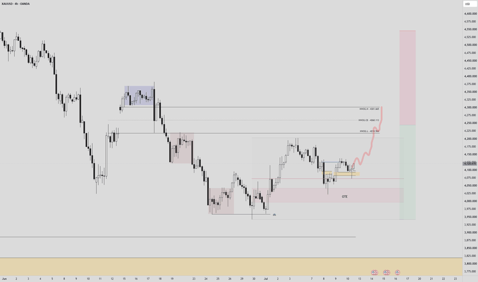
DXY | Corrective Structure Under the MicroscopeDXY | Corrective Structure Under the Microscope: Leading Diagonal or Complex Zigzag? 🌀
Greetings, fellow wave practitioners.
The Aggressive Scenario assumes that the U.S. Dollar Index (DXY) has entered a higher-degree corrective phase from its major peak. According to the Elliott Wave Principle, Wave (A) may currently be developing through one of two valid structural paths.
The first possibility is a Leading Diagonal, a motive structure that fully satisfies Elliott Wave rules and guidelines while matching the current character of price action. If this interpretation is correct, the present recovery should eventually be followed by one more decline to complete Wave (a) and finalize the entire Leading Diagonal.
The second possibility is that Wave (A) is evolving as a Double Zigzag (W-X-Y) or even a Triple Zigzag (W-X-Y-X-Z). In this case, the market is still building a complex corrective structure that may require considerably more time than a simple Zigzag before reaching completion.
The common denominator between both counts is the expectation of a three-wave corrective structure on the higher degree. As long as the initial invalidation level remains intact, both scenarios continue to be technically valid.
From a structural perspective, the next decisive signal would be a break above Wave (B), followed by the development of another corrective pattern. Such behavior would provide the first meaningful confirmation that buyers are regaining control and would significantly strengthen the case for a long-term bullish phase in the U.S. Dollar Index.
At this stage, the objective is not to predict the future with certainty. The objective is to identify which Elliott Wave structure the market is constructing. Once that structure is confirmed, the long-term roadmap becomes substantially clearer.
Patterns whisper. I listen.
— Mr. Nobody 📊🌀
U.S. Dollar Currency Index
Jun 5
The DXY Time Paradox: Monday Engineering & Elliott Wave Dissecti
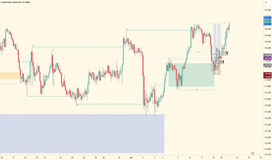
CAD Update- Trade JournalHigher-timeframe structure remains bullish. Through higher-timeframe mapping, the trend was confirmed, allowing me to continue positioning buys in line with the confirmed order flow.
Once price gave the mid-term shift and broke the lower high, bullish continuation became the expectation. Since then, price has delivered exactly as anticipated, reaching my take-profit objectives and securing profits.
If you look closely within the current range, you’ll notice the two most recent shallow black boxes. The original plan was to scale into the position with four entries, adding as price confirmed strength. The small lightning bolt icons mark where those additional positions were supposed to be executed.
Unfortunately, I was exhausted after several late nights studying the charts and missed those add-on opportunities. Even with the missed scale-ins, the overall analysis remained valid, price respected the mapped structure, and the targets were achieved.
Now it’s on to the next phase. A new range will form, new liquidity will develop, and new high-probability points of interest will present themselves. Until then, patience remains key.
The edge isn’t chasing price—it’s tracking structure and waiting for the next opportunity.
On to the next mapping. 📈
Remember: Patience is key
Tracking remains the edge
“It always was my sitting.” — Jesse Livermore
Fiserv, Inc 80% drop in 16 months! - July 202SYMBOL: BMV:FISV | DIRECTION: NEUTRAL | TIMEFRAME: Weekly
Published: July 2026
Ever get the feeling you’re not loved?
Not twelve months ago Fiserv was a $127.4billion market cap. Then they went on a money spending spree. Perhaps they got a good teaser rate on that new shinny credit card?
Today at $26.90 billion market cap and a $29.31 billion debt, Fiserv has more in common with a penny stock than pretending to masquerade as an established business.
While $29 billion is a massive number, credit rating agencies and institutional investors aren't overly panicked for a few key reasons. Fiserv's heavy debt load boils down to a classic private equity backstory and a specific business model.
1. The $17 Billion Inheritance (The First Data Merger)
2. Aggressive FinTech Acquisitions & Share Buybacks. Doh.
So, it’s all roses?
Not quite.
The collapse of Fiserv’s stock price (from its peak near $170 down to the $50 range) over the past 12 to 18 months was triggered by a corporate "perfect storm." The company was hit by a massive earnings shock, sudden management turnover, and the revelation that previous leadership had been artificially boosting short-term profits at the expense of long-term health. And I thought Crypto bros were king of the fixer uppers.
In fact, if the business continues to operate as it has done recently, then the future is bleak. Are you an employee? Brush up that CV before your co-workers read this post.. the chart is printing red flags on every corner for those that care to look.
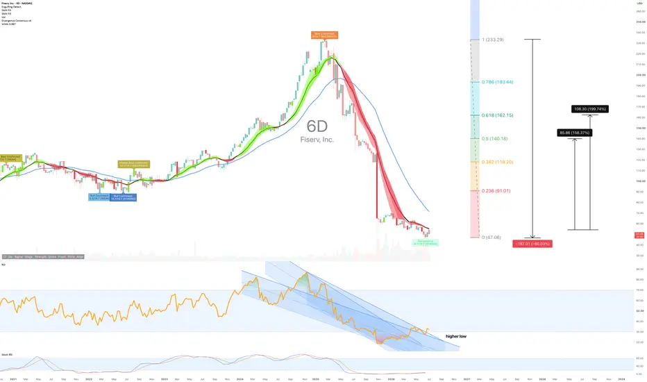
Fiserv has dropped seventy three percent from its fifty two week high. The chart looks like someone took a sledgehammer to it. Lower highs, lower lows, with price now sitting at the third percentile of its annual range. The selling pressure remains genuine. Volume is expanding on down moves, which means the people doing the dumping know something. I.e. the business is.. (insert your preferred expletive).
And yet.
Daily through weekly charts print a strong regular bullish divergence. 16 from18 oscillators are in agreement. RSI on the weekly has collapsed to 34.9, deeply oversold territory. The price structure has triggered an internal balance condition that historically rotates upward with high probability. The tension is real: short term reversal mechanics are lining up against a backdrop of structural decay.
Where’s the money making part?
Bear with me..
On the above 6 day chart Fiserv Inc has triggered a high probability rotation setup whilst maintaining an intact downtrend structure. Three reasons now exist to watch for a near term trade, not an investment.
They include:
1. Daily through weekly regular bullish divergence.
The momentum indicator has fallen deeper than price, a classic reversal signal. Does the crowd ever believe a reversal when the macro picture is this bleak?
2. Internal balance trigger with high probability condition.
Price has rotated into a zone where historical behaviour favours upward movement. This is a near term trade structure, not a fundamental recovery. The setup exists independent of whether the downtrend resumes.
3. Weekly RSI at thirty four point nine: deeply oversold.
The weekly momentum oscillator sits in territory that has historically preceded at least a corrective bounce.
Now the danger:
One caveat worth acknowledging: the bigger picture remains structurally ugly. A breakdown of annual moving average across most equities has historically preceded ten or more years of bear market behaviour. Fiserv has already done the damage. This setup is a trade into what may be a secular downtrend, not a reversal of it. The probability of a move is high. The probability of this becoming an investment is low. You are trading gravity on pause, not gravity reversed.
Annual moving average breakdown
Targets
1st and 2nd targets are basically market structure that oddly enough align with Fibonacci levels:
1st: 160% at $140 area
2nd: 200% at $160 area
The crowd
The consensus is divided. The technical analysts see oversold conditions and are whispering about bounces. The macro observers are silent, having already written this one off as a victim of whatever regime is now in charge. Most traders will sit in the fear of the bigger picture and miss the counter move entirely. They are wrong about timing, not direction. This trade exists in the gap between "this is a dying stock" and "this is oversold this week." Both things are true.
The chart started it. I am simply reporting back.
Good luck.
Ww
Type: Intraday to swing | Timeframe: Weekly
===================================================
Disclaimer
Isn't it amazing you're getting this for cheap? Top notch quality info without cost, what's my angle? You're in luck, I just like studying data. A study that'll continue until the overgrown garden demands my attention.
In the meantime, this idea is for educational and informational purposes only. It is not financial advice. Equities involve significant risk. Always do your own research and consult a qualified financial adviser before making any investment decisions. Past performance is not indicative of future results.  Long
Long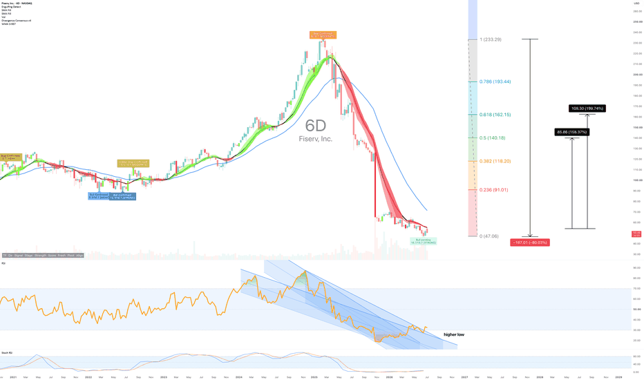
Bitcoin Daily Analysis 13 July 2026Hi everyone! The weekly candle has closed, so let’s dive into a multi-timeframe analysis, moving from the monthly chart all the way down to our 1-hour entry triggers.
Monthly Timeframe
First, let's look at the monthly chart. Last month's red candle was incredibly powerful, driving the price straight down to close inside a major support zone. For the current monthly candle, we still have 18 days left until the close. Given how massive the previous bearish candle was and how it forced the current month into a strong support area, it wouldn’t be surprising to see this month's candle end up relatively small, rather than repeating the aggressive trend of the past months. But of course, the market is always unpredictable, so our best approach is to map out our scenarios and stay prepared.
Weekly Timeframe
On the weekly timeframe, two weeks ago, we saw a candle that strongly engulfed its predecessor; while there was some selling pressure within that candle, buyers ultimately stepped in and forced a close above the red candle's open. However, the weekly candle that just closed shows clear signs of bullish exhaustion. It printed a tiny body with both upper and lower shadows. Therefore, alongside the overall weekly downtrend, we still aren't seeing any real strength from the buyers.
Daily Timeframe
The last two daily candles developed over Saturday and Sunday, so they carried very low volume and don’t offer much analytical value. However, if we were to pick out a clue, it would be the long upper shadow and the red body pointing downward.
4-Hour & 1-Hour Timeframes (Execution)
Everything becomes much clearer on the 4-hour chart. With the reopening of global markets, price got hit with an incredibly sharp rejection from the $64,396 resistance, accompanied by strong volume.
We have a few execution scenarios for opening positions now:
Active Short Scenario: If you opened a short position on the 1-hour candle break below the floor of the box we discussed yesterday ($63,753) and placed your stop loss above the ceiling of that range, your trade is highly likely still open. Depending on your risk-to-reward strategy, you should be locking in profits here.
New Short Setups: Right now, price is sitting on a 1-hour local support. You could aggressively enter a short position upon a breakdown of this level, placing the stop loss above the newly formed 1-hour swing high—though in my opinion, this is highly risky. A much safer alternative is to sit tight and wait for a confirmed break below $61,755 to trigger your short.
Long Scenario: For longs, there are two ways to play it. The first is to wait for price to trade back up to $64,396.5 and enter on a clean resistance breakout. The second, earlier entry would be if price establishes a bullish market structure with higher highs and higher lows on the 4-hour or 1-hour timeframe before reaching that key resistance. This earlier setup might be preferred because the sellers showed immense strength at that $64,396.5 zone—causing severe consolidation followed by a violent rejection—meaning that waiting for a breakout there might end up giving us an uncomfortably wide stop loss.
I hope you enjoyed today's multi-timeframe update and find it useful. As always, make sure to keep your risk and money management in check!
 Short
Short