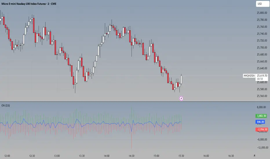
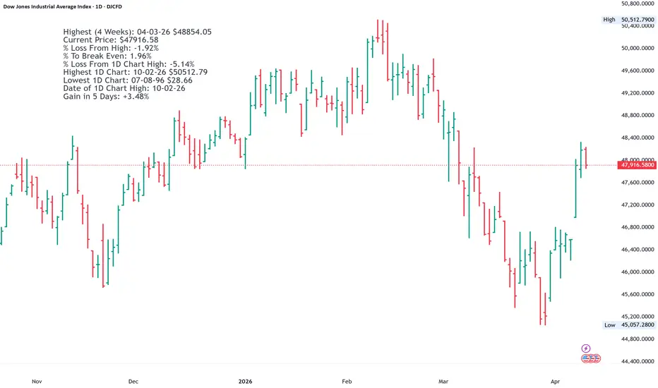
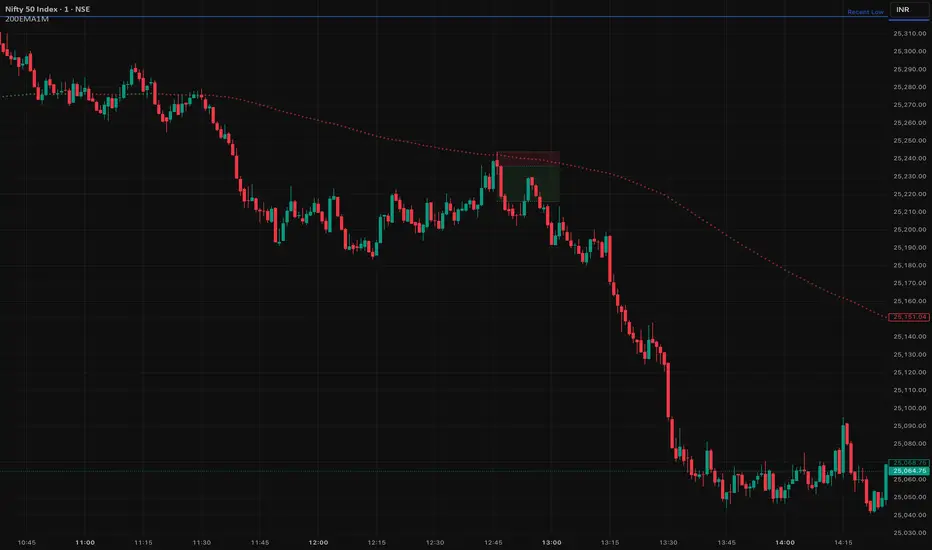
Blockcircle Price Gaps (PG)I got tired of price gap indicators that dump every zone on the chart and leave you to figure out which ones actually matter. I have tried every single one imaginable. Therefore, I built this one to score each gap automatically based on how close it is, how it formed, and whether it aligns with the trend. Instead of cryptic numbers, it just tells you: Strong, Moderate, or Weak, plus how far away it is. You see what matters, skip what doesn't. Hopefully, you find it helpful!
If you have other ideas to improve it even further, please let me know, and I can integrate them.
WHAT MAKES IT ORIGINAL AND DIFFERENT
Standard gap indicators display every detected imbalance with identical visual treatment, leaving traders to manually assess which zones matter. This creates cluttered charts and analysis paralysis.
This BLOCKCIRCLE PRICE GAPS (PG) indicator solves that problem with a Relevance Engine that automatically scores each gap from 0 to 100 and translates scores into plain language: Strong, Moderate, or Weak. Each zone displays its strength rating and distance from the current price, so you instantly know which gaps deserve attention and how far the price must travel to reach them.
The scoring combines four factors that research shows correlate with zone effectiveness:
Proximity: Gaps closer to the current price score higher because nearby zones influence immediate price action more than distant ones.
Formation Volume: Gaps created during above-average volume suggest institutional activity rather than random price movement.
Impulse Strength: Gaps formed by strong moves (measured against ATR) indicate genuine supply/demand imbalance rather than noise.
Trend Alignment: Support gaps in uptrends and resistance gaps in downtrends receive bonus points for trading with momentum.
Visual intensity reflects strength automatically. Strong zones appear darker and more prominent. Weak zones fade into the background. You see what matters without decoding numbers.
HOW IT WORKS
Price Gaps form when aggressive buying or selling creates an imbalance, leaving unfilled space between candles. These zones often act as support (bullish gaps below price) or resistance (bearish gaps above price) when the price returns to them.
Detection uses the standard three-candle method: a bullish gap exists when the current low exceeds the high from two bars prior. A bearish gap exists when the current high falls below the low from two bars prior.
What makes this implementation different is continuous relevance tracking . Each bar, every gap receives an updated score based on current conditions . As the price moves away, the proximity scores decrease. As gaps age, time decay gradually reduces their overall relevance. When capacity limits are reached, the lowest-scoring gap is removed first, ensuring your chart always shows the most actionable zones.
Labels show practical information:
Strength rating (Strong, Moderate, or Weak)
Zone type (Support or Resistance)
Distance from current price with direction (+12% means above, -8% means below)
FEATURES
Relevance scoring with automatic strength classification
Plain-language labels showing strength and distance
Color intensity that reflects zone importance
Retest detection when price returns to unfilled gaps
Proximity filtering to hide distant zones
Age filtering to remove stale gaps
Size filtering for minimum and maximum gap thresholds
Relevance-based capacity management
Information panel with zone counts and trend context
Multiple label style options
HOW THE COMPONENTS WORK TOGETHER
The system operates as a filtering pipeline:
Size filters remove gaps that are too small (market noise) or too large (extreme events unlikely to fill).
The Relevance Engine scores qualifying gaps based on proximity, volume, impulse, and trend.
Gaps below the minimum score threshold are hidden.
Proximity and age filters remove distant or stale gaps.
When at capacity, the lowest-scoring gap is removed to make room for new detections.
This layered approach ensures only the most relevant gaps appear on your chart.
CONFIGURABLE SETTINGS
Display Settings control how many zones appear and how they are displayed.
Label Style lets you choose what information displays: Strength plus Distance (default), Strength Only, Distance Only, Score Only, or None.
Relevance Engine settings include the master toggle and minimum score threshold. The Scoring Weights section allows advanced users to adjust how much each factor contributes.
Filters control size thresholds, maximum distance from price, and maximum age in bars.
Retest Alerts notify you when the price returns to an unfilled gap with three sensitivity options.
Zone Behavior controls whether filled gaps are removed and what counts as a filled gap.
HOW TO USE
The default settings work well for most timeframes and markets. Strong zones (shown in brighter colors with yellow text) have multiple factors aligned and deserve the most attention. Moderate zones are worth watching. Weak zones provide context but may not produce reliable reactions.
For active trading, focus on Strong and Moderate zones within 10% of the current price. These are the most likely to influence near-term price action.
For swing trading, expand the Maximum Distance setting to see zones further from the price that may become relevant as trends develop.
When the Retest alert fires, the price is returning to an unfilled gap. Evaluate the zone strength, look for price reaction at the zone boundary, and consider whether the move aligns with the broader trend before trading.
The information panel shows:
Support: Count of bullish gaps (potential buying zones)
Resistance: Count of bearish gaps (potential selling zones)
Unfilled: Zones not yet touched by price
Avg Strength: Overall quality of visible zones
Trend: Current direction based on EMA alignment
LIMITATIONS
Relevance scoring is probabilistic, not predictive. A Strong gap is more likely to produce a reaction based on historical patterns, but any zone can fail.
The trend component uses EMA crossovers (20/50/200), which may lag in choppy markets.
Distance calculations update each bar. During volatile moves, labels may briefly show different values as price swings.
DEFAULTS
These are the defaults, but you would adjust and calibrate it to a specific asset, as needed:
Maximum Zones: 12
Label Style: Strength + Distance
Minimum Score: 20
Maximum Distance: 25%
Maximum Age: 300 bars
If you have any questions at all, please ask away! Penunjuk

Penunjuk

Alg0 Hal0 CCI SnapAlg0 ۞ Hal0 CCI Snap
1. The Core PhilosophyThe A۞H CCI Snap is a dual-confirmation momentum oscillator. Unlike standard oscillators that only look at one data stream, this tool separates Market Structure (Background Trend) from Momentum Velocity (CCI Snap). It is designed to identify "Mean Reversion" opportunities and "Trend Continuation" snaps.
2. The Interface (Visual Components)The CCI Line (Blue): Tracks the "typical price" relative to its average. It tells you how fast the market is moving.The Signal Line (Yellow): A customizable moving average (HMA, TEMA, etc.) of the CCI. It filters out the "jitters" of the blue line.Background Trend (Green/Red): This is independent of the CCI. It tracks whether the actual Price is above or below a long-term Moving Average (default is 50 SMA).The 5-Color Heatmap Dashboard: A real-time data table that calculates the "Heat" of the current momentum compared to the last 3 bars.
3. How to Trade with A۞H CCI Snap
۞ The "Snap" Entry (Trend Continuation)This is the highest probability trade. You are looking for a momentary dip in a strong trend.Check Background: Background must be solid Green.Observe CCI: The Blue CCI line dips below the Yellow Signal line (a "cooling off").The Trigger: Enter when the Blue line snaps back above the Yellow line.Confirmation: The Dashboard should show Dark Green (Accelerating Bullish Heat).
۞ The Zero-Line Rejection (Trend Strength)
The 0 line is the "Fair Value" of momentum.Bullish: In a Green background, if CCI drops toward 0 but bounces off it without crossing, it confirms the trend is extremely strong.
Bearish: In a Red background, if CCI rises toward 0 but "rejects" and heads back down, it confirms heavy selling pressure.
۞ Exhaustion Warning (Mean Reversion)If the CCI is above +200 or below -200, the market is overextended. Look at the Dashboard Heatmap: If the CCI is at +210 but the cell color turns from Dark Green to Light Green, the "Heat" is leaving the move. This is your signal to tighten stop-losses or take profits.
4. Input Customization Guide and Recommendations
* Setting GroupFunctionPro-TipCCI CoreSets the sensitivity of the blue line.
* Use 14 for scalping, 20 for day trading.
* CCI SignalSets the smoothing of the yellow line.
* HMA (Hull) is best for crypto due to low lag.Background
* TrendDrives the Green/Red chart color.
* Set to 50 SMA for a "Trend Filter" or 200 SMA for "Macro" view.
* Alert SettingsToggles specific notifications.
* Turn off "Zero Cross" if you only want major Trend Flips.
5. Interpreting the Heatmap Dashboard:
۞ Dark Green (+): Bullish Acceleration (Buy/Hold).
۞ Light Green (+): Bullish Deceleration (Caution/Take Profit).
۞ Gray (0): No Momentum (Range-bound/Sideways).
۞ Orange/Light Red (-): Bearish Deceleration (Short Cover/Bottom Fish).
۞ Dark Red (-): Bearish Acceleration (Sell/Short).
!! Important Technical Note!!
VWAP Option: If you select VWAP as your Trend MA Type, the background will only color on charts that provide Volume Data (Stocks, Crypto, most Futures). It will appear gray on most Forex pairs. Penunjuk

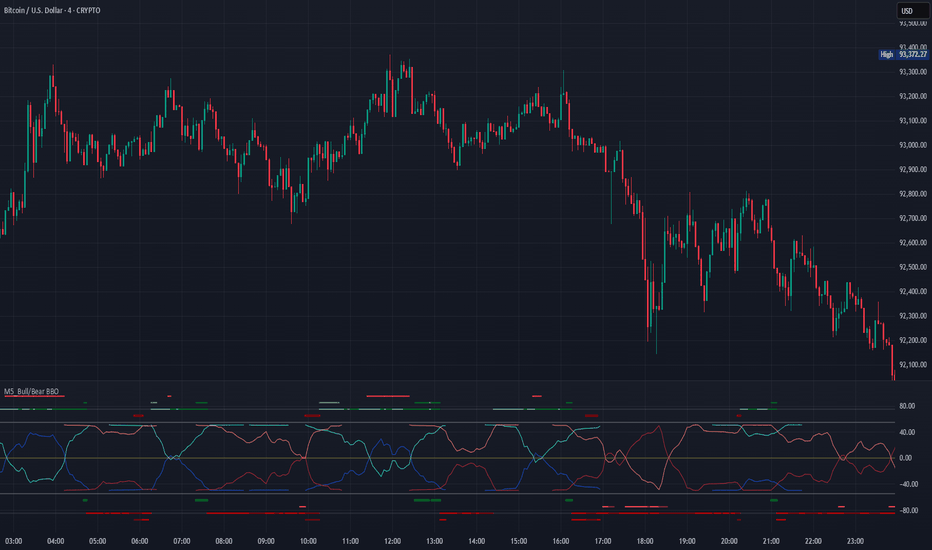
M5_Bull/Bear BBOM5_ Bull/Bear BBO is a derivative oscillator built from LuxAlgo’s original Bollinger Bands Breakout Oscillator (BBO).
This version restructures the original breakout logic into a bull / bear adaptive oscillator, introduces inverted symmetry, and expands the visual system with dynamic level states and conditional color logic. The goal is to provide contextual momentum awareness rather than discrete trade signals.
A key design focus is the interaction between dominant pressure and the absence of opposing pressure. Buying and selling pressure may coexist, but moments where opposing pressure fully dissipates are treated as structurally significant — a “door opening” condition where price is no longer constrained by counter-pressure and is free to expand.
Pressure is explicitly mirrored from the opposite side, creating a symmetrical framework where each side’s expansion is reflected against the other. These mirrored structures are allowed to cross, not as directional signals, but as markers of peak intensity or exhaustion within an expanding pressure phase.
Transitional regimes — where one pressure fades before the other fully emerges — are intentionally left visible rather than smoothed away. These areas often produce late confirmation or no follow-through at all, and are presented as a challenging but informative market state rather than a condition to be optimized away.
The script is intended for visual analysis and context alignment, not as a standalone entry/exit system.
Credits & Licensing
Original concept and base implementation: LuxAlgo
Modifications, restructuring, and visual system: Metaltek5
License: Creative Commons Attribution–NonCommercial–ShareAlike 4.0 (CC BY-NC-SA 4.0)
This script is published as open source under the same license as the original work.
Non-commercial use only. Attribution and share-alike required.
Annotated example illustrating dominant pressure, mirrored behavior, and door opening conditions Penunjuk
Penunjuk

Penunjuk

Penunjuk

Penunjuk

Strategi

Penunjuk
WC Cross Clouds with Arrows - Customizable EditionThis is an enhanced and fully customizable version inspired by the original "WC CROSS CLOUDS with Arrows" indicator by AlfsDipz (thank you for the great foundation!).
What it shows:
• Two clouds for visual trend context:
- Static black WMA cloud (default WMA 21 & 24) – helps identify overall market structure
- Directional cloud (default SMA 9 & 21, but fully configurable) – green when fast MA is above slow MA (bullish), red when below (bearish)
• Clean signals with arrows + text:
- Green triangle up + "LFG" → New bullish regime starts (fresh crossover upward)
- Red triangle down + "DBD" → New bearish regime starts (fresh crossover downward)
• Small realtime label showing current regime + bars since last signal
New features / improvements compared to original:
• Fully user-configurable MA lengths for both clouds
• Choose MA type for the directional cloud (SMA, EMA, or WMA)
• Customizable source (close, hl2, open, etc.)
• Cleaner signal logic (only shows arrows when trend direction actually changes)
• No duplicate/false signals during ranging markets
• Works in Pine Script v6 (latest version)
How to use:
- Green cloud + "LFG" arrow → potential long opportunity
- Red cloud + "DBD" arrow → potential short / exit long
- Use together with your own price action, support/resistance, volume, etc.
Feel free to use, modify, expand, fork, or build upon this script however you like!
Credit to AlfsDipz for the original concept and cloud style that inspired this version.
Happy trading everyone!
Dove– Chesapeake, VA Penunjuk

Penunjuk

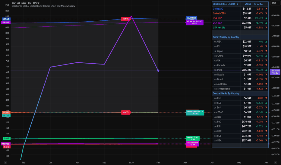
Blockcircle Global Central Bank Balance Sheet and Money SupplyOVERVIEW
This indicator aggregates money supply (M2) and central bank balance sheet data from the world's largest economies into a single, unified view of global liquidity conditions. Rather than manually tracking dozens of separate data feeds or building your own aggregation logic, you get a ready-to-use tool that pulls from FRED, TradingView Economics, and real-time FX rates to convert everything into USD terms automatically.
Global liquidity has historically served as a leading indicator for risk assets. When central banks expand their balance sheets and the money supply grows, capital tends to flow into equities, crypto, and other risk-on assets. When liquidity contracts, markets often follow. This indicator gives you that macro context directly on your chart.
The global liquidity movement (expansionary or contractionary) often leads to asset price appreciation/depreciation in CRYPTOCAP:BTC , SP:SPX , etc
WHAT MAKES IT ORIGINAL AND DIFFERENT
Combines both M2 money supply AND central bank balance sheet data in one place, whereas most existing tools focus on only one metric
Aggregates 11 economies for M2 (USA, EU, China, Japan, UK, Canada, India, Russia, Brazil, Australia, Switzerland) and 10 central banks for balance sheet data
Automatically handles currency conversion using live FX rates so all values display in USD
Includes a dedicated US Net Liquidity calculation (Fed Balance Sheet minus Reverse Repo minus TGA) which filters out temporary distortions that other aggregate tools ignore
Provides granular country by country breakdown in the information table so you can identify which central banks are driving the aggregate trend
Offers four moving average types (SMA, EMA, WMA, RMA) for trend smoothing with configurable length
HOW IT WORKS
The indicator requests monthly M2 data from TradingView's Economics feeds for each included country. Central bank balance sheet data is pulled the same way. All non-USD values are converted using daily FX rates from major currency pairs. The script then sums these converted values to produce the Global M2 and Global CBBS lines.
For US liquidity specifically, the script pulls weekly data for the Reverse Repo Program (RRP) and Treasury General Account (TGA) from FRED. Net Liquidity is calculated as: Fed Balance Sheet minus RRP minus TGA. This formula removes funds parked in reverse repos and Treasury cash balances, showing what is actually circulating in the financial system.
KEY FEATURES
Global M2 Money Supply line tracking 11 major economies with individual toggles for each country
Global Central Bank Balance Sheet line tracking 10 central banks with individual toggles
US-specific components, including Reverse Repo, TGA, and Net Liquidity as separate plot lines
Moving average overlays with selectable type and length for identifying trend direction
Fill the option between M2 and CBBS lines to visualize the gap between money supply and central bank assets
Value labels at line endpoints showing current readings and period-over-period percentage change
Comprehensive information table with optional country breakdown view
Full color customization for all lines, configurable line width, and style options
Alert conditions for significant M2 and CBBS changes plus MA crossover signals
HOW TO USE
Add to any chart and observe the overall direction of global liquidity. Rising lines generally support risk on positioning, while declining lines suggest caution
Watch for divergences between the M2 and CBBS lines. If money supply grows faster than central bank assets, private credit may be expanding. If CBBS rises faster, central banks are actively injecting liquidity
Use the US Net Liquidity line to understand short term dollar liquidity conditions separate from longer term global trends
Enable moving averages to filter noise and identify when liquidity trends are changing direction
Toggle individual countries on or off in the settings to see how specific regions contribute to the total
Reference the information table for exact values and percentage changes without leaving your chart
SETTINGS BREAKDOWN
Table Settings: position, text size, and whether to show the country breakdown
Display Settings: toggle visibility for each line, fill area, value labels, percent labels, and the info table
Line Styling: customize colors for each metric, adjust line width, and select solid, dashed, or dotted style
Moving Average: enable or disable MA overlays for M2 and CBBS, select MA type, and set length
Global M2 Countries: individually enable or disable each of the 11 economies
US Liquidity Components: toggle RRP and TGA data
Global CBBS Countries: individually enable or disable each of the 10 central banks
Alerts: set percentage threshold for change based alerts
IMPORTANT CONSIDERATIONS
Data updates depend on the publication schedule of each source. M2 and CBBS data are typically monthly with some delay. US Fed Balance Sheet, US RRP and US TGA update weekly
FX conversion uses daily close rates which may introduce minor discrepancies during volatile currency periods
Some emerging market data may have longer reporting lags than developed market data
Hope you find it useful and impactful to your trading and investment decisions! If you have any questions at all, please just ask, happy to help Penunjuk
Risk & Lot Calculator PanelFXMANS Risk & Lot Panel
Smart Risk Management Tool for TradingView
- Overview
FXMANS Risk & Lot Panel is a lightweight and professional risk management tool designed to help traders calculate position size (lot) and take-profit levels directly on the chart, without cluttering the screen.
The panel is displayed as a minimal table in the top-right corner of the chart and automatically adapts to the currently opened symbol.
This tool focuses on clarity, precision, and usability, making it suitable for scalpers, day traders, and swing traders.
- Key Features
Automatic Direction Detection
The script can automatically determine BUY or SELL direction based on:
Entry Price
Stop Loss Price
Logic:
Stop Loss below Entry → BUY
Stop Loss above Entry → SELL
Manual override is available if auto direction is disabled.
Risk-Based Lot Size Calculation
Calculates position size based on:
User-defined risk amount in USD
Distance between Entry and Stop Loss
Symbol-specific tick size and point value
Ensures consistent risk management across all markets.
Automatic Take Profit (RR Based)
Take Profit is calculated automatically using a predefined Risk / Reward (RR) ratio.
Supports both BUY and SELL scenarios.
- Symbol-Aware Calculation
Uses TradingView’s built-in symbol properties:
syminfo.mintick
syminfo.pointvalue
Works correctly on:
Forex
Indices
Metals
Crypto
- Minimal & Non-Intrusive UI
Small, fixed panel located at the top-right corner
Designed to avoid covering price action
Clean FXMANS-style color palette
- Safe Panel Size Control
Panel size can be adjusted from settings:
Small
Medium
Large
Size changes are handled without modifying layout geometry, preventing UI bugs.
- How It Works
Enter your Entry Price and Stop Loss Price
Define your Risk Amount ($)
Set your desired Risk / Reward ratio
The script automatically calculates:
Trade Direction (BUY / SELL)
Lot Size
Take Profit Level
All results are displayed instantly in the panel
- Example Use Case
Risk: $100
Entry: 1.0850
Stop Loss: 1.0800
RR: 2.0
- The panel will automatically display:
Direction: BUY
Lot Size adjusted to risk exactly $100
Take Profit at 2R
- Important Notes
Entry and Stop Loss prices must be valid (greater than zero).
The tool does not place trades automatically.
Calculations are for position sizing only and may vary slightly depending on broker specifications.
- Disclaimer
This script is intended for educational and analytical purposes only.
Trading involves risk, and users are responsible for their own trading decisions.
- Ideal For
Traders who follow strict risk management rules
Forex, crypto, and index traders
Scalpers and intraday traders
Anyone who wants clean and fast position sizing on TradingView Penunjuk

Penunjuk

Penunjuk

Penunjuk
Bitcoin Halving Cycles [DotGain]Halving Cycles
A lightweight, time-anchored Bitcoin halving cycle visualizer built for clean charting, repeatable process planning, and simple profit/DCA timing references.
This Code was heavily inspired by KevinSvenson_ who created Bitcoin Halving Cycle Profit .
What this indicator does
This script plots the key “cycle landmarks” relative to each halving date:
Halving (⛏) – the cycle anchor
Profit START – marks the beginning of the post-halving profit window (default: 40 weeks )
Profit END / Last Call – marks the final phase of the profit window (default: 77 weeks )
DCA START – marks the point where long-term accumulation becomes the focus again (default: 135 weeks )
How to read it
Vertical lines = the exact cycle milestones
Bottom labels = description of each milestone aligned to its line (keeps the chart clean)
Green background (optional) = active Profit Zone on existing bars
Red background (optional) = optional warning zone after Profit END
HUD Panel (top-right)
The HUD gives you a fast “where are we in the cycle?” view with two modes:
Current Cycle
Shows: Halving date, Weeks since, and time remaining to Profit START / Last Call / DCA START within the current cycle.
Next Halving (Projection)
Shows: Countdown to the next enabled future halving, plus the projected weeks from today to Profit START / Last Call / DCA START after that future halving.
Future Halvings (manual)
You can manually add up to 3 future halving dates (Halving #1–#3).
This is useful for forward planning and cycle projection even before the event happens.
Enable Halving #1 / #2 / #3
Set Year / Month / Day for each
Optional: show/hide future markers & projections
Note: background zones only shade existing bars . Future projections are shown via lines/labels.
Settings overview
Show all cycles – plots every enabled cycle (historical + optional future). If disabled, only the current cycle is drawn.
Show Profit Zone background – green shading during the active profit window (current cycle only).
Show vertical markers + labels – toggles all milestone lines + labels.
Show HUD – toggles the HUD panel.
HUD Mode – switch between Current Cycle and Next Halving (Projection).
Cycle Logic – edit offsets in weeks (Profit START / Profit END / DCA START).
Optional Warning Zone – show a post-profit warning shading for a chosen number of weeks.
Have fun :)
Disclaimer
This Halving Cycles indicator is provided for informational and educational purposes only. It does not, and should not be construed as, financial, investment, or trading advice.
This indicator is an independent implementation of a time-based Bitcoin halving cycle visualization tool and is not affiliated with, or endorsed by, any third-party trading systems, strategies, protocols, or trademarked methodologies. The cycle zones, milestone markers, and countdown values displayed by this indicator are generated by a predefined set of algorithmic rules based on historical halving dates and user-defined time offsets. They do not constitute a direct recommendation to buy, sell, or hold any financial instrument or digital asset.
All trading and investing in financial markets involves a substantial risk of loss. You may lose part or all of your invested capital. Past performance does not guarantee future results. This indicator highlights historical and projected time-based market cycles and may produce false, lagging, incomplete, or misleading signals. Market behavior is influenced by many external factors and can deviate significantly from historical patterns or expectations.
The creator DotGain assumes no responsibility or liability for any financial losses, damages, or decisions made based on the use of this indicator or the information it provides. You are solely responsible for your own trading and investment decisions. Always conduct your own research (DYOR), use proper risk management, validate insights with additional tools or analysis, and consider your personal financial situation and risk tolerance before making any financial decision. Penunjuk

Penunjuk
Penunjuk

Penunjuk

Penunjuk

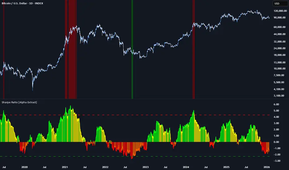
Sharpe Ratio [Alpha Extract]A sophisticated risk-adjusted return measurement system that calculates annualized Sharpe Ratio with dynamic color-coded visualization distinguishing return quality across positive and negative performance regimes. Utilizing rolling period calculations with smoothed moving average comparison, this indicator delivers institutional-grade performance assessment with overbought/oversold threshold detection for extreme risk-adjusted return conditions. The system's four-tier color classification combined with histogram fills and background highlighting provides comprehensive visual feedback on whether current returns justify their volatility risk across varying market cycles.
🔶 Advanced Sharpe Ratio Calculation Engine
Implements classic Sharpe Ratio methodology measuring mean daily return divided by return standard deviation with annualization factor for consistent interpretation. The system calculates daily percentage returns, computes rolling mean and standard deviation over configurable periods, applies square root of 365 scaling for annualized comparison, and generates unbounded ratio values where higher positive readings indicate superior risk-adjusted performance.
// Core Sharpe Ratio Framework
Daily_Return = close / close - 1
Mean_Return = ta.sma(Daily_Return, Period)
StdDev_Return = ta.stdev(Daily_Return, Period)
Sharpe_Ratio = (Mean_Return / StdDev_Return) * sqrt(365)
🔶 Dynamic Four-Tier Color Classification
Features sophisticated color logic distinguishing between strong positive returns (green), weakening positive returns (yellow), weakening negative returns (orange), and strong negative returns (red) based on relationship to smoothed average. The system compares current Sharpe against SMA-smoothed baseline, applying green when positive and accelerating, yellow when positive but decelerating, orange when negative but improving, and red when negative and deteriorating for nuanced regime assessment.
🔶 Smoothed Baseline Comparison Framework
Implements SMA smoothing of Sharpe Ratio with configurable period to establish momentum reference line for trend determination within risk-adjusted returns. The system calculates simple moving average of raw Sharpe values, uses this smoothed line as directional benchmark, and determines whether current risk-adjusted performance is strengthening or weakening relative to recent average for color classification logic.
🔶 Extreme Threshold Detection System
Provides overbought and oversold level identification with configurable upper and lower bounds marking exceptional risk-adjusted return extremes. The system defaults to +4.3 for overbought threshold (extremely favorable risk-return profile) and -2.3 for oversold threshold (severely unfavorable risk-return profile), applying dashed horizontal reference lines and background highlighting when Sharpe breaches these statistical extremes requiring attention.
🔶 Histogram Fill Visualization Architecture
Creates gradient-filled histogram between Sharpe Ratio line and zero baseline using dynamic color matching with 30% transparency for intuitive positive/negative return distinction. The system fills area above zero with bullish colors (green/yellow) and below zero with bearish colors (orange/red), providing immediate visual confirmation of whether returns are compensating for volatility risk or destroying risk-adjusted value.
🔶 Background Zone Highlighting Framework
Implements subtle background coloring when Sharpe enters extreme overbought or oversold zones, alerting traders to statistically significant risk-adjusted return conditions. The system applies semi-transparent red background when ratio exceeds +4.3 (exceptionally strong risk-adjusted returns potentially unsustainable) and green background when below -2.3 (severely poor risk-adjusted returns potentially reversionary), creating visual alerts without obscuring price action.
🔶 Annualization Methodology Integration
Utilizes standard square root of time scaling (sqrt(365)) to convert rolling period Sharpe calculations into annualized format for cross-temporal comparison. The system applies this mathematical transformation ensuring Sharpe values represent expected annual risk-adjusted returns regardless of calculation period length, enabling consistent interpretation whether using 100-day or 200-day rolling windows.
🔶 Zero-Line Reference System
Provides critical zero-line plot serving as boundary between positive risk-adjusted returns (capital allocation justified by return/risk profile) and negative risk-adjusted returns (strategy destroying value on risk-adjusted basis). The system emphasizes this threshold as decision point where values above zero suggest continuation while values below zero indicate reconsideration of exposure.
🔶 Momentum-Based Color
Transitions Implements intelligent color switching logic that considers both absolute Sharpe value and its momentum relative to smoothed average, creating four distinct regimes for granular performance assessment. The system enables identification of bullish acceleration (green), bullish deceleration (yellow), bearish improvement (orange), and bearish acceleration (red) for nuanced position management beyond simple positive/negative classification.
🔶 Configurable Period Optimization
Features adjustable calculation period and smoothing length enabling optimization across different trading timeframes and volatility regimes. The system defaults to 150-period calculation (approximately 6-7 months of daily data) with 30-period smoothing, but allows customization from short-term tactical assessment to long-term strategic evaluation based on investment horizon and strategy requirements.
🔶 Performance Optimization Framework
Employs efficient rolling calculations with streamlined daily return processing and optimized standard deviation computation for smooth real-time updates. The system includes minimal computational overhead through single-pass mean and variance calculations, enabling consistent performance across extended historical periods while maintaining accuracy of risk-adjusted return measurements.
This indicator delivers sophisticated risk-adjusted return analysis through classic Sharpe Ratio methodology with enhanced visual classification distinguishing return quality and momentum. Unlike simple return-focused indicators, Sharpe Ratio penalizes volatility ensuring traders evaluate whether returns justify the risk undertaken. The system's four-tier color coding, smoothed baseline comparison, and extreme threshold detection make it essential for portfolio managers and systematic traders seeking objective performance assessment beyond raw price gains. High positive Sharpe values indicate efficient return generation relative to volatility risk, while negative values signal value destruction on risk-adjusted basis requiring strategy reassessment. The indicator excels at identifying periods when risk-taking is rewarded (green zones) versus periods when volatility exceeds returns (red zones) across cryptocurrency, forex, and equity markets for optimal capital allocation decisions. Penunjuk