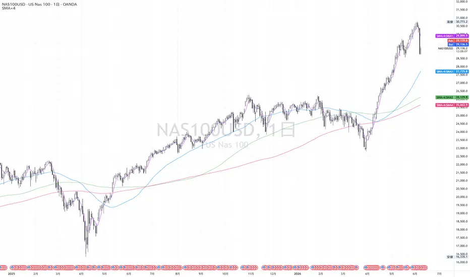
Timeframe fix Multi SMA Daily and WeeklyHow it works
All moving averages are calculated from the symbol’s closing price using the standard Simple Moving Average formula. The important design choice is that the moving averages are fixed to their intended higher timeframes:
* The 13D, 20D, 50D, and 200D SMAs are always calculated from daily candles.
* The 50W, 100W, and 200W SMAs are always calculated from weekly candles.
This means the values do not change into “chart-timeframe SMAs” when the user switches to an intraday, hourly, 4-hour, or other lower timeframe chart. For example, the 200D SMA remains the 200-day SMA even when viewed on a 15-minute chart, and the 50W SMA remains the 50-week SMA even when viewed on a daily or intraday chart.
The script uses TradingView’s higher-timeframe data requests to project these fixed daily and weekly SMA levels onto the active chart. This allows traders to analyze lower-timeframe price action while still seeing the same higher-timeframe reference levels they would see on the daily or weekly chart.
For the plotted lines, the script uses higher-timeframe values with gaps enabled, so the displayed levels behave visually like native higher-timeframe data on lower timeframes. For the last-bar labels, the script retrieves the latest available daily or weekly SMA value without gaps, so the labels remain visible and readable at the current price scale.
Lookahead is disabled, so the script does not intentionally use future higher-timeframe data.
Penunjuk

Adaptive SuperTrend Map | Alpha S+Adaptive SuperTrend Map | Alpha S+
Adaptive SuperTrend Map is a trend-following and regime-aware SuperTrend tool built on the standard SuperTrend calculation structure.
It uses a classic ATR-based SuperTrend formula, then adds an adaptive multiplier, market-regime filtering, flip confirmation logic, and a smoother curved visual line for cleaner chart presentation.
The main purpose of this script is to help users study trend direction, trend-following structure, volatility-adjusted trailing levels, and changing market conditions directly on the price chart.
────────────────────
Core Concept
────────────────────
The core idea of this script is to keep the logic of a standard SuperTrend while improving how it adapts to different market environments.
A normal SuperTrend uses:
• a source price
• ATR
• an ATR multiplier
• upper and lower trailing bands
• trend direction changes when price crosses the previous active band
This script keeps that structure but adds adaptive behavior.
The multiplier can adjust based on:
• relative volatility expansion or contraction
• ADX-based trend or chop conditions
• user-defined minimum and maximum multiplier limits
This means the SuperTrend can become more conservative during choppy conditions and more responsive during stronger trend conditions, depending on the selected settings.
The script also separates the calculation logic from the visual display.
The raw SuperTrend line is used for trend direction, flip logic, and alerts.
The curved visual line is used only for chart readability, allowing the trend path to appear smoother without replacing the underlying calculation logic.
────────────────────
What This Script Shows
────────────────────
This script can display:
• adaptive SuperTrend line
• curved visual trend line
• optional raw SuperTrend reference line
• bullish trend flips
• bearish trend flips
• regime ribbon
• current trend state label
• chop / wait state
• adaptive multiplier value
• ADX-based market regime
• volatility ratio between fast ATR and slow ATR
The visual structure is designed to help users quickly see whether the market is trending upward, trending downward, or moving through a weaker sideways environment.
────────────────────
How It Works
────────────────────
1. The script calculates ATR using the selected ATR method.
2. It builds standard SuperTrend upper and lower bands using the selected source price and multiplier.
3. The trend direction changes when price closes beyond the previous active SuperTrend band.
4. The active SuperTrend line becomes the trailing reference for the current trend.
5. The script measures relative volatility by comparing fast ATR and slow ATR.
6. ADX is used to classify whether the market is closer to a trend condition or a choppy condition.
7. The base multiplier can be adjusted upward or downward depending on volatility and regime conditions.
8. Optional flip filters can require EMA position, minimum ADX, and candle body confirmation.
9. The raw SuperTrend line remains the logic reference for trend direction and alerts.
10. The curved visual line smooths the displayed SuperTrend path for better chart readability.
11. A regime ribbon can be displayed around the visual line to emphasize the current trend environment.
12. A current-state label can display trend state, multiplier, ADX, curve mode, and ATR mode.
This structure is designed to keep the indicator understandable while adding adaptive behavior to the classic SuperTrend framework.
────────────────────
Inputs And Customization
────────────────────
Users can adjust:
• ATR period
• source price
• base multiplier
• ATR calculation method
• adaptive multiplier on/off
• minimum multiplier
• maximum multiplier
• fast ATR length
• slow ATR length
• volatility sensitivity
• ADX length
• ADX smoothing
• chop ADX threshold
• trend ADX threshold
• chop multiplier adjustment
• trend multiplier adjustment
• flip quality filter
• EMA filter length
• minimum ADX for flip markers
• candle body confirmation
• minimum body size relative to ATR
• curved visual line on/off
• curve smoothing mode
• curve smoothing length
• curve reset on trend flip
• raw line reference
• main line visibility
• glow line visibility
• flip markers
• regime ribbon
• current state label
• background highlight
• line width
• glow width
• colors and transparency
These settings allow the script to be adjusted for different symbols, timeframes, and trading styles.
────────────────────
Visual Elements
────────────────────
The script includes several visual elements:
• Main SuperTrend line:
Shows the active adaptive SuperTrend path.
• Glow line:
Adds a wider transparent layer around the main line for better visibility.
• Curved visual line:
Smooths the displayed SuperTrend path while keeping raw SuperTrend logic as the calculation reference.
• Raw SuperTrend reference:
Optional line that shows the unsmoothed SuperTrend value.
• UP / DN markers:
Optional markers that appear when filtered bullish or bearish trend flips are detected.
• Regime ribbon:
A subtle ribbon around the SuperTrend line that helps visualize the current trend or chop state.
• Current state label:
Displays the current trend state, adaptive multiplier, ADX, curve mode, and ATR mode.
• Optional background:
Can lightly highlight bullish, bearish, or chop environments.
────────────────────
Reference States
────────────────────
Trend Up:
The active SuperTrend direction is bullish. Price has moved above the previous bearish band and the trend state is upward.
Trend Down:
The active SuperTrend direction is bearish. Price has moved below the previous bullish band and the trend state is downward.
Chop / Wait:
ADX is below the selected chop threshold. This indicates that the environment may be weaker, more sideways, or less suitable for aggressive trend-following interpretation.
Bullish Flip:
A bullish transition occurs when the SuperTrend changes from bearish to bullish. If flip filtering is enabled, the marker appears only when the additional quality conditions are met.
Bearish Flip:
A bearish transition occurs when the SuperTrend changes from bullish to bearish. If flip filtering is enabled, the marker appears only when the additional quality conditions are met.
Adaptive Multiplier:
The multiplier can expand or contract based on volatility and regime conditions. This helps the SuperTrend behave differently in trend and chop environments.
Curved Visual Line:
The curved line is a display layer. It is designed for readability and does not replace the raw SuperTrend calculation used for direction and alerts.
────────────────────
How To Use
────────────────────
This script can be used as a trend structure and regime filter.
General interpretation examples:
• When the SuperTrend line is below price and the trend state is bullish, the market is in an upward SuperTrend structure.
• When the SuperTrend line is above price and the trend state is bearish, the market is in a downward SuperTrend structure.
• UP markers can highlight bullish trend flip conditions.
• DN markers can highlight bearish trend flip conditions.
• When the script shows a chop or wait condition, trend-following signals may require more caution.
• The regime ribbon can help users visually separate cleaner trend environments from weaker or more uncertain conditions.
• The raw reference line can be enabled when users want to compare the smoothed visual line with the underlying calculation line.
This script is best used together with price action, support and resistance, volume, volatility, momentum, and higher-timeframe context.
It should be treated as a trend-following structure tool, not as a standalone entry or exit system.
────────────────────
Confirmation And Repainting Notes
────────────────────
The script uses standard SuperTrend-style bar-based logic.
Trend direction and flip conditions are based on the raw SuperTrend calculation.
The curved visual line is only a smoothing layer for display. It is not intended to replace the raw trend logic.
On realtime candles, values can update before the candle closes because price, ATR, ADX, and volatility conditions can still change intrabar.
For more conservative interpretation, users should wait for candle close confirmation before acting on trend flips or state changes.
The script does not use future price data to predict market direction.
────────────────────
Limitations
────────────────────
This script does not predict future price movement.
It does not identify exact tops or bottoms.
It does not guarantee that a SuperTrend flip will lead to a sustained trend.
Like most trend-following tools, it can react late during sharp reversals.
In sideways or noisy markets, false flips can still occur.
The adaptive multiplier may reduce some noise, but it cannot remove all false signals.
Different symbols and timeframes may require different settings.
The curved visual line can make the chart easier to read, but users should remember that raw SuperTrend logic is the actual calculation reference.
This script should not be used as a standalone trading system.
────────────────────
Disclaimer
────────────────────
This publication is for educational and informational chart analysis only.
It does not constitute financial advice, investment advice, or a recommendation to trade any financial instrument.
All trading and investment decisions are the responsibility of the user.
━━━━━━━━━━━━━━━━━━━━
Adaptive SuperTrend Map | Alpha S+
Adaptive SuperTrend Map은 표준 SuperTrend 계산 구조를 기반으로 만든 추세 추종 및 시장 상태 분석 지표입니다.
기본적인 ATR 기반 SuperTrend 공식에 adaptive multiplier, 시장 상태 필터, 추세 전환 확인 로직, 그리고 더 부드러운 곡선형 시각화 라인을 결합했습니다.
이 스크립트의 목적은 추세 방향, 추세 추적 구조, 변동성 기반 trailing level, 그리고 변화하는 시장 상태를 가격 차트 위에서 직접 분석할 수 있도록 돕는 것입니다.
────────────────────
핵심 개념
────────────────────
이 스크립트의 핵심은 표준 SuperTrend의 논리를 유지하면서, 다양한 시장 환경에 더 유연하게 반응하도록 만드는 것입니다.
일반적인 SuperTrend는 다음 요소를 사용합니다.
• 기준 가격
• ATR
• ATR multiplier
• 상단 및 하단 trailing band
• 가격이 이전 활성 밴드를 돌파하면 추세 방향 전환
이 스크립트는 이 구조를 유지하면서 adaptive behavior를 추가합니다.
Multiplier는 다음 조건에 따라 조정될 수 있습니다.
• 상대적인 변동성 확대 또는 축소
• ADX 기반 추세 또는 횡보 상태
• 사용자가 설정한 최소 및 최대 multiplier 제한
이를 통해 SuperTrend는 횡보 구간에서는 더 보수적으로, 강한 추세 구간에서는 더 민감하게 반응할 수 있습니다.
또한 이 스크립트는 계산 논리와 시각적 표시를 분리합니다.
Raw SuperTrend line은 추세 방향, 전환 판단, 알림 조건의 기준으로 사용됩니다.
Curved visual line은 차트 가독성을 위한 표시용 라인으로 사용되며, 실제 계산 논리를 대체하지 않습니다.
────────────────────
이 스크립트가 보여주는 것
────────────────────
이 스크립트는 다음 요소를 표시할 수 있습니다.
• adaptive SuperTrend line
• 곡선형 visual trend line
• 선택 가능한 raw SuperTrend reference line
• 상승 추세 전환
• 하락 추세 전환
• regime ribbon
• 현재 추세 상태 라벨
• chop / wait 상태
• adaptive multiplier 값
• ADX 기반 시장 상태
• fast ATR과 slow ATR 사이의 변동성 비율
이 시각 구조는 시장이 상승 추세인지, 하락 추세인지, 또는 약한 횡보 환경인지 빠르게 파악하는 데 도움을 주도록 설계되었습니다.
────────────────────
작동 방식
────────────────────
1. 스크립트는 선택된 ATR 방식으로 ATR을 계산합니다.
2. 선택한 기준 가격과 multiplier를 사용해 표준 SuperTrend 상단 및 하단 밴드를 만듭니다.
3. 가격이 이전 활성 SuperTrend band를 종가 기준으로 벗어나면 추세 방향이 전환됩니다.
4. 활성 SuperTrend line은 현재 추세의 trailing reference 역할을 합니다.
5. Fast ATR과 Slow ATR을 비교해 상대적인 변동성 상태를 측정합니다.
6. ADX를 사용해 시장이 추세 환경에 가까운지, 횡보 환경에 가까운지 분류합니다.
7. 기본 multiplier는 변동성과 시장 상태에 따라 위아래로 조정될 수 있습니다.
8. 선택형 flip filter는 EMA 위치, 최소 ADX, 캔들 몸통 확인 조건을 요구할 수 있습니다.
9. Raw SuperTrend line은 추세 방향과 알림의 기준으로 유지됩니다.
10. Curved visual line은 차트 가독성을 위해 SuperTrend 경로를 부드럽게 표시합니다.
11. Regime ribbon은 현재 추세 환경을 더 시각적으로 보여줄 수 있습니다.
12. Current state label은 추세 상태, multiplier, ADX, curve mode, ATR mode를 표시할 수 있습니다.
이 구조는 클래식 SuperTrend의 이해하기 쉬운 구조를 유지하면서 adaptive behavior를 추가하기 위해 설계되었습니다.
────────────────────
입력값 및 설정
────────────────────
사용자는 다음 항목을 조정할 수 있습니다.
• ATR period
• 기준 가격
• 기본 multiplier
• ATR 계산 방식
• adaptive multiplier 사용 여부
• 최소 multiplier
• 최대 multiplier
• fast ATR length
• slow ATR length
• volatility sensitivity
• ADX length
• ADX smoothing
• chop ADX threshold
• trend ADX threshold
• chop multiplier adjustment
• trend multiplier adjustment
• flip quality filter
• EMA filter length
• flip marker용 최소 ADX
• 캔들 몸통 확인 조건
• ATR 대비 최소 몸통 크기
• 곡선형 visual line 사용 여부
• curve smoothing 방식
• curve smoothing length
• 추세 전환 시 curve reset 여부
• raw line reference
• main line 표시 여부
• glow line 표시 여부
• flip marker
• regime ribbon
• current state label
• background highlight
• line width
• glow width
• 색상 및 투명도
이 설정들을 통해 서로 다른 종목, 시간대, 매매 스타일에 맞게 조정할 수 있습니다.
────────────────────
시각 요소
────────────────────
이 스크립트는 다음 시각 요소를 포함합니다.
• Main SuperTrend line:
활성 adaptive SuperTrend 경로를 보여줍니다.
• Glow line:
메인 라인 주변에 더 넓은 반투명 레이어를 추가해 가시성을 높입니다.
• Curved visual line:
Raw SuperTrend logic은 유지하면서, 화면에 표시되는 SuperTrend 경로를 더 부드럽게 보여줍니다.
• Raw SuperTrend reference:
스무딩되지 않은 SuperTrend 값을 확인할 수 있는 선택형 라인입니다.
• UP / DN markers:
필터링된 상승 또는 하락 추세 전환이 감지될 때 나타나는 선택형 마커입니다.
• Regime ribbon:
SuperTrend line 주변에 표시되는 얇은 리본으로, 현재 추세 또는 횡보 상태를 시각적으로 구분하는 데 도움을 줍니다.
• Current state label:
현재 추세 상태, adaptive multiplier, ADX, curve mode, ATR mode를 표시합니다.
• Optional background:
상승, 하락, 횡보 환경을 약하게 배경으로 강조할 수 있습니다.
────────────────────
참고 상태
────────────────────
Trend Up:
활성 SuperTrend 방향이 상승 상태입니다. 가격이 이전 bearish band 위로 이동했고, 추세 상태가 상승으로 전환된 상태입니다.
Trend Down:
활성 SuperTrend 방향이 하락 상태입니다. 가격이 이전 bullish band 아래로 이동했고, 추세 상태가 하락으로 전환된 상태입니다.
Chop / Wait:
ADX가 설정된 chop threshold보다 낮은 상태입니다. 이는 시장 환경이 약하거나, 횡보 성격이 강하거나, 공격적인 추세 추종 해석에 적합하지 않을 수 있음을 의미합니다.
Bullish Flip:
SuperTrend가 하락에서 상승으로 전환되는 상태입니다. Flip filter가 켜져 있으면 추가 품질 조건이 충족될 때만 마커가 표시됩니다.
Bearish Flip:
SuperTrend가 상승에서 하락으로 전환되는 상태입니다. Flip filter가 켜져 있으면 추가 품질 조건이 충족될 때만 마커가 표시됩니다.
Adaptive Multiplier:
변동성과 시장 상태에 따라 multiplier가 확장되거나 축소될 수 있습니다. 이는 SuperTrend가 추세와 횡보 환경에서 다르게 반응하도록 돕습니다.
Curved Visual Line:
곡선형 라인은 표시용 레이어입니다. 방향과 알림에 사용되는 raw SuperTrend 계산을 대체하지 않습니다.
────────────────────
사용 방법
────────────────────
이 스크립트는 추세 구조와 시장 상태를 확인하는 필터로 사용할 수 있습니다.
일반적인 해석 예시는 다음과 같습니다.
• SuperTrend line이 가격 아래에 있고 추세 상태가 bullish라면 상승 SuperTrend 구조로 볼 수 있습니다.
• SuperTrend line이 가격 위에 있고 추세 상태가 bearish라면 하락 SuperTrend 구조로 볼 수 있습니다.
• UP marker는 상승 추세 전환 조건을 보여줄 수 있습니다.
• DN marker는 하락 추세 전환 조건을 보여줄 수 있습니다.
• 스크립트가 chop 또는 wait 상태를 표시할 때는 추세 추종 신호를 더 보수적으로 해석하는 것이 좋습니다.
• Regime ribbon은 더 깨끗한 추세 환경과 약하거나 불확실한 구간을 시각적으로 구분하는 데 도움을 줄 수 있습니다.
• Raw reference line은 스무딩된 visual line과 실제 계산 라인을 비교하고 싶을 때 켤 수 있습니다.
이 스크립트는 가격 행동, 지지와 저항, 거래량, 변동성, 모멘텀, 상위 시간대 흐름과 함께 사용하는 것이 좋습니다.
단독 진입 또는 청산 시스템이 아니라, 추세 추종 구조 분석 도구로 보는 것이 적절합니다.
────────────────────
확인봉 및 리페인트 안내
────────────────────
이 스크립트는 표준 SuperTrend 방식의 봉 기반 로직을 사용합니다.
추세 방향과 flip 조건은 raw SuperTrend 계산값을 기준으로 합니다.
Curved visual line은 표시를 위한 smoothing layer일 뿐, raw trend logic을 대체하지 않습니다.
실시간 캔들에서는 가격, ATR, ADX, 변동성 조건이 봉 마감 전까지 변할 수 있으므로 값이 변동될 수 있습니다.
보다 보수적인 해석을 원한다면 추세 전환 또는 상태 변경은 봉 마감 이후 확인하는 것이 적절합니다.
이 스크립트는 미래 가격 데이터를 사용해 시장 방향을 예측하지 않습니다.
────────────────────
한계
────────────────────
이 스크립트는 미래 가격 움직임을 예측하지 않습니다.
정확한 고점 또는 저점을 식별하기 위한 도구가 아닙니다.
SuperTrend flip이 지속적인 추세로 이어진다는 보장은 없습니다.
대부분의 추세 추종형 도구처럼 급격한 반전 구간에서는 반응이 늦을 수 있습니다.
횡보 또는 노이즈가 많은 시장에서는 false flip이 발생할 수 있습니다.
Adaptive multiplier는 일부 노이즈를 줄이는 데 도움을 줄 수 있지만, 모든 가짜 신호를 제거하지는 못합니다.
종목과 시간대에 따라 다른 설정이 필요할 수 있습니다.
곡선형 visual line은 차트 가독성을 높일 수 있지만, raw SuperTrend logic이 실제 계산 기준이라는 점을 기억해야 합니다.
이 스크립트를 단독 매매 시스템으로 사용해서는 안 됩니다.
────────────────────
중요 고지
────────────────────
본 게시물은 교육 및 정보 제공 목적의 차트 분석 자료입니다.
투자 자문, 특정 금융상품 거래 권유, 또는 수익 보장을 의미하지 않습니다.
모든 투자 판단과 그 결과에 대한 책임은 이용자 본인에게 있습니다. Penunjuk

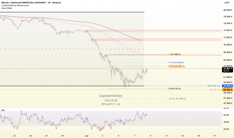
Daily EMA Stack 10/21/50/100/200Daily EMA Stack 10/21/50/100/200
A clean multi-timeframe EMA overlay that displays the 10, 21, 50, 100, and 200 Daily EMAs on any chart timeframe.
Unlike standard moving averages that recalculate based on the current chart interval, this indicator anchors all calculations to the Daily timeframe. Whether you're viewing a 1-minute, 5-minute, hourly, daily, or weekly chart, the displayed EMAs remain the true Daily EMAs.
Features:
• 10, 21, 50, 100, and 200 Daily EMAs
• One-click visibility instead of managing multiple indicators
• Individual EMA on/off controls
• Consistent Daily EMA levels across all timeframes
• Color-coded for quick identification
• Lightweight and uncluttered design
EMA Colors:
10 EMA – Red
21 EMA – Orange
50 EMA – Green
100 EMA – Cyan
200 EMA – Purple
Designed for momentum, swing, and growth traders who use Daily moving averages for trend analysis while executing on lower timeframes.
Penunjuk
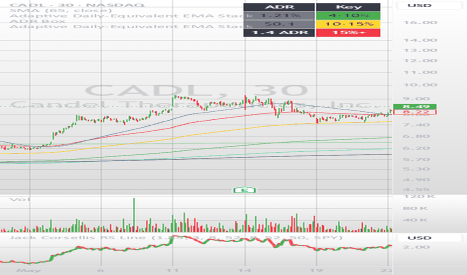
Strategi

VWAP Gravity Bands [JOAT]VWAP Gravity Bands is an open-source Pine Script v6 overlay that builds an anchored VWAP field with a smoothed T3 basis and ATR ladder bands. It is designed to show how far price has traveled from a session, weekly, or monthly value anchor, then classify that distance as center pull, ladder drift, expansion, or outer-band reaction.
The script is useful when a trader wants the chart to show both location and behavior around VWAP. Instead of a single VWAP line, it creates a full distance map around the anchor, colors candles by their distance from the basis, and highlights confirmed outer reactions without using arrow-style signal clutter.
Core Concepts
1. Anchored VWAP Selection
The anchor can reset on the session, week, or month. The script uses timeframe.change() to produce the reset pulse and ta.vwap() to calculate the anchored value.
anchorTimeframe = anchorChoice == "Week" ? "1W" : anchorChoice == "Month" ? "1M" : "1D"
anchorPulse = timeframe.change(anchorTimeframe)
rawVwap = ta.vwap(sourceInput, anchorPulse)
2. T3 Basis Smoothing
Raw anchored VWAP can move sharply at the beginning of an anchor period. VWAP Gravity Bands runs that value through a T3-style smoother to create a cleaner basis while preserving responsiveness.
e1 = ta.ema(src, length)
e2 = ta.ema(e1, length)
e3 = ta.ema(e2, length)
basis = c1 * e6 + c2 * e5 + c3 * e4 + c4 * e3
3. ATR Ladder Bands
The band ladder is based on ATR, not fixed percentages. This lets the distance field expand and contract with the market's current movement range.
ladderUnit = atr * bandStep
upperOne = basis + ladderUnit
lowerOne = basis - ladderUnit
upperThree = basis + ladderUnit * 3.0
lowerThree = basis - ladderUnit * 3.0
4. Distance State Model
Distance from VWAP is normalized by the ladder unit. The script classifies large directional continuation as expansion and failed outer-band tests as reactions.
5. Gradient Candle Coloring
Candles can be colored by their normalized distance from VWAP. This helps identify when price is balanced around the anchor, drifting away from it, or stretched toward an outer band.
Features
Session, weekly, or monthly anchor: Select the VWAP reset period from inputs
T3-smoothed VWAP basis: Cleaner centerline for visual trend and location analysis
ATR ladder bands: Three upper and lower bands scale with current volatility
Expansion state detection: Highlights directional movement away from the basis
Outer reaction detection: Marks confirmed failed tests near the outer ladder
Distance candle mode: Optional gradient candles based on normalized VWAP distance
Dashboard: Shows anchor, state, distance, ATR step, and basis slope
Alert conditions: Upper reaction, lower reaction, upper expansion, and lower expansion
Input Parameters
Visual System:
Palette Preset: Selects color pair
Distance Candles: Enables candle coloring by VWAP distance
Dashboard: Shows top-right state panel
Raw VWAP: Displays the unsmoothed anchored VWAP
Outer Reaction Marks: Shows compact TP-style outer reaction markers
VWAP Gravity:
Anchor: Session, Week, or Month
Source: Price source used for VWAP
T3 Basis Length: Smoothing length for the VWAP basis
T3 Factor: Controls T3 smoothness
ATR Length: Volatility length used for ladder distance
ATR Step: Distance between ladder bands
Expansion Step: Threshold for expansion classification
Reaction Step: Threshold for outer reaction classification
How to Use This Indicator
Step 1: Choose the Anchor
Use Session for intraday context, Week for swing context, and Month for broader value location.
Step 2: Read Distance From Basis
The dashboard distance value shows how many ladder units price is away from the smoothed VWAP basis.
Step 3: Separate Expansion From Reaction
Expansion means price is moving away from VWAP with slope confirmation. Reaction means price tested an outer area and closed back inside.
Step 4: Use the Bands as Context
The bands are not automatic entry levels. They show location. Combine them with market structure, candle behavior, and risk planning.
Indicator Limitations
VWAP is volume-based and may behave differently on symbols with sparse volume
The first bars after a new anchor can be less stable because VWAP is starting a new sample
Reaction markers show a confirmed close back inside a zone, not a future reversal forecast
ATR bands adapt to volatility but can widen quickly after large bars
Originality Statement
VWAP Gravity Bands is original in how it combines anchored VWAP selection, T3 smoothing, ATR ladder geometry, distance-colored candles, and separate expansion/reaction states. It is built from public Pine v6 functions and original logic rather than copied indicator source.
Disclaimer
This script is provided for educational and informational use only. It is not financial advice or a recommendation to buy or sell any financial instrument. Trading involves substantial risk of loss. VWAP location and band reactions can fail in trending, news-driven, or low-liquidity markets. Always use independent analysis and proper risk management.
-Made with passion by jackofalltrades
Penunjuk

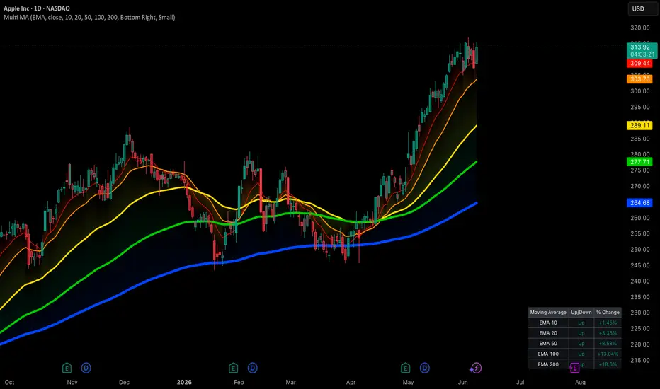
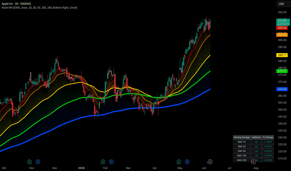
Multiple MA Dashboard [PUCHON]📊 Multiple MA Dashboard
The Multiple MA Dashboard plots up to 5 moving averages of a chosen type (EMA, SMA, WMA, or RMA) directly on your chart and summarizes their relationship to price in a clean, real-time table. Instead of eyeballing where price sits relative to each average, this indicator gives you an instant Up/Down read and the exact percentage distance for every MA.
✨ Features:
- 📈 5 Configurable Moving Averages: Set independent lengths (defaults: 10, 20, 50, 100, 200) sharing one MA type and source.
- 🔁 Switchable MA Type: Choose between EMA, SMA, WMA, and RMA from a single dropdown — all 5 lines update together.
- 📋 Live Dashboard Table: Displays each MA's label, trend direction (Up/Down), and percentage distance from price, refreshed on the latest bar.
- 🎨 Dynamic Trend Coloring: Lines, fills, and table text automatically switch between your chosen "Up" and "Down" colors based on whether price is above or below each MA.
- 🌈 Price-to-MA Fill Zones: Shaded regions between price and each MA make the gap easy to see at a glance.
- ⚙️ Fully Customizable: Adjust MA lengths, source, dashboard position, text size, and theme colors to fit your setup.
🧮 Calculation Logic:
The core getMa function selects the moving average algorithm based on the user's choice, while each MA's color and table row are derived from a simple comparison between price and that MA.
getMa(simple string type, series float src, simple int len) =>
switch type
"EMA" => ta.ema(src, len)
"SMA" => ta.sma(src, len)
"WMA" => ta.wma(src, len)
"RMA" => ta.rma(src, len)
=> ta.ema(src, len)
💡 Interpretation:
- 🟢 Up (price > MA): Price is trading above the average — shown in your "Up Trend" color with a positive % distance.
- 🔴 Down (price < MA): Price is trading below the average — shown in your "Down Trend" color with a negative % distance.
- 📏 % Change: The percentage gap between price and each MA, useful for gauging how stretched or compressed price is relative to that average.
⚠️ Disclaimer:
This tool is provided for educational and informational purposes only. It does not constitute financial advice and does not guarantee future performance. Always combine it with your own analysis and proper risk management. Penunjuk
Penunjuk

Market Momentum Energy [ZurvanEG]⯁ Market Momentum Energy
◇ Overview
Market Momentum Energy is a directional energy oscillator designed to evaluate whether current market movement has enough strength, participation, and directional conviction to matter. Instead of measuring price change alone, it converts movement into a normalized energy reading that reflects direction, intensity, volatility context, participation, and movement quality.
It helps separate clean directional pressure from noise, low-volume drift, volatility expansion, compression, or late-stage exhaustion. Its purpose is to show whether movement has meaningful energy behind it, whether that energy is expanding or fading, and whether conditions are closer to ignition, weak movement, saturation, or possible reversal pressure.
◈ Core Framework
At its core, the indicator uses a motion-energy model that measures directional movement through price displacement or regression-based slope, then normalizes it against recent volatility for better comparison across regimes, instruments, and timeframes.
The motion reading is shaped through a power curve, while an optional effort layer can modulate it using volume or true range. After that, self-normalization keeps energy, thresholds, dead zones, saturation levels, and signal logic more stable across changing volatility conditions.
The framework also includes quality filtering, final energy smoothing, signal logic, energy bands, divergence detection, optional energy MA, adaptive visuals, candle coloring, signal-volume markers, alerts, and a compact info table.
◇ Signals
The signal system highlights energy ignition events. Signals are generated when energy crosses a defined threshold, with controls for quality, saturation, HMA-based short-term direction confirmation, re-arm behavior, and optional alternation.
◇ Signal Volume Markers
The indicator can draw transparent volume-based circles directly on signal candles. Circle size is based on cumulative volume over a user-defined lookback period, making it easier to identify signals that appear after unusually high participation. This feature is most meaningful on markets with reliable volume data.
◇ Energy Bands
The energy bands provide statistical context for the current energy reading. They help identify stretched momentum, possible exhaustion zones, or unusually strong directional expansion. To keep the chart clean, bands can appear only when energy gets close to them and remain visible for a few bars after activation.
◇ Dead Zone & Saturation
The dead zone marks areas where energy is too weak to be treated as meaningful. The saturation level marks areas where energy is already strong or potentially overextended. Together, they organize the oscillator into practical states: weak, active, strong, and overextended.
◇ Divergence
The divergence module detects confirmed regular divergence between price and energy. It can help identify cases where price makes new highs or lows while energy fails to confirm. Pivot confirmation and filtering conditions are included to reduce weak or irrelevant divergence marks.
◇ Visual System
The visual layer makes energy state easy to read at a glance. Energy is shown as a directional histogram with optional line view, optional energy MA, adaptive intensity, contraction fading, dead-zone shading, energy bands, candle coloring, and signal-volume circles on the price chart.
The coloring system helps distinguish expanding energy, contracting energy, positive and negative movement, weak zones, saturated conditions, and high-participation signal areas.
◇ Alerts
Configurable alerts are included for bullish signals, bearish signals, bullish divergence, and bearish divergence. They support monitoring and workflow automation, but should still be evaluated with broader market context and risk management.
◇ Info Table
The compact info table summarizes current energy, quality, and market state. It acts as a quick reference panel for identifying dead zone, active direction, or strong energy conditions without inspecting every plot manually.
◇ Use Case
Market Momentum Energy is intended for traders who want a clearer way to evaluate directional movement strength. It can help identify momentum ignition, monitor whether energy is expanding or fading, avoid low-energy noise, detect overextended conditions, and add context to possible reversal or continuation setups.
It may be useful for trend-following traders, momentum traders, discretionary price-action traders, and system builders who want a structured energy layer for filtering market conditions.
It helps answer questions such as:
⬦ Is the market moving with enough energy?
⬦ Is the move clean or choppy?
⬦ Is momentum expanding or fading?
⬦ Is energy holding above or below its moving average?
⬦ Did the signal appear after unusually high cumulative volume?
⬦ Is the signal early enough, or already near saturation?
⬦ Is price making a new extreme while energy fails to confirm?
⬦ Is the market in a low-energy dead zone?
◈ Conclusion
Market Momentum Energy is built for traders who want more than a basic momentum oscillator. By combining normalized motion, participation effort, quality filtering, energy bands, divergence detection, final smoothing, signal-volume visualization, adaptive visuals, alerts, and structured signal logic, it provides a broader view of directional market energy.
Rather than simply showing whether price is rising or falling, the indicator focuses on whether movement has enough strength, participation, and directional conviction to matter.
In short, Market Momentum Energy is a practical tool for evaluating the strength, quality, and state of market movement before acting on a trade idea.
Penunjuk

Dual Moving Average ExponentialOverview
This script is a clean, optimized extension of TradingView's official, built-in Moving Average Exponential (EMA) indicator. Instead of cluttering your chart by loading multiple single indicators, this script allows you to plot two independent EMAs simultaneously within a single indicator slot, saving you valuable layout space.
It retains the full functionality of the original script, including the advanced Moving Average Smoothing and Bollinger Band features, applying them directly to the primary EMA.
Key Features
Dual EMA Plotting: Set independent lengths, sources, and offsets for two separate exponential moving averages (e.g., a fast EMA and a slow EMA for trend crossovers).
UI Customization: Color pickers have been added directly to the inputs menu, allowing you to change the line colors on the fly without entering the script settings style tab or editing the code.
Organized Input Groups: Settings are cleanly separated into "EMA 1", "EMA 2", and "Smoothing" sections for easy navigation.
Original Smoothing Matrix: Includes the native script's ability to smooth EMA 1 using SMA, EMA, SMMA, WMA, VWMA, or to generate EMA-based Bollinger Bands.
How to Use
Trend Identification: Use a fast EMA (e.g., 9 or 21) alongside a slow EMA (e.g., 50 or 200) to quickly identify trend direction and potential crossover signals.
Support & Resistance: Utilize the dual lines to identify dynamic support and resistance zones (the "space" between the two EMAs) rather than relying on a single price point.
Advanced Filtering: Turn on the "Smoothing" options in the settings menu to apply secondary filters or Bollinger Bands to your primary EMA for volatility and momentum analysis. Penunjuk

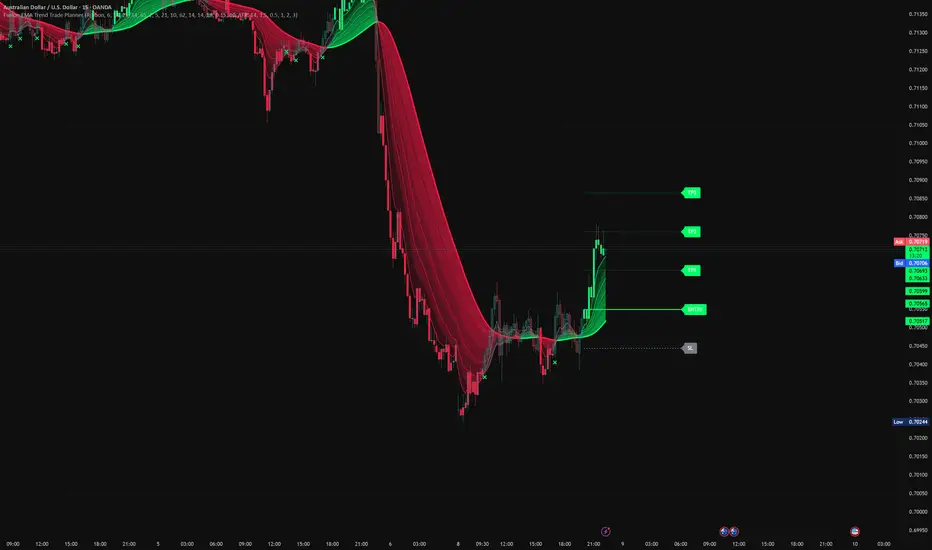
Fusion EMA Trend Trade PlannerFusion EMA Trend Trade Planner
Back to basics.
This tool was built for traders who want a cleaner way to read trend direction, avoid messy chop, and plan risk before entering a trade.
Instead of filling the chart with separate tools for trend, confirmation, filtering, and risk levels, this script combines those steps into one simple workflow.
The goal is not to predict the future.
The goal is to answer four basic questions:
• Is the market trending?
• Is the trend clean or messy?
• Does the broader context support the move?
• Where would entry, stop loss, and take profit levels sit?
━━━━━━━━━━━━━━━━━━━━
🔹 Core Idea
━━━━━━━━━━━━━━━━━━━━
Fusion EMA Trend Trade Planner is built around a simple trend-following process:
1. Find clean EMA structure.
2. Check the 21-period Basis Cloud.
3. Use optional filters if extra confirmation is wanted.
4. Plot a simple risk/reward trade plan.
5. Watch for trend deterioration.
━━━━━━━━━━━━━━━━━━━━
🔹 Fusion EMA Structure
━━━━━━━━━━━━━━━━━━━━
The main trend engine uses four exponential moving averages.
A bullish trend is shown when the EMAs are stacked cleanly:
Fast EMA > Medium EMA > Slow EMA > Anchor EMA
A bearish trend is shown when the EMAs are stacked the opposite way:
Fast EMA < Medium EMA < Slow EMA < Anchor EMA
This is different from a basic two-line crossover.
A single moving average can show direction, but a stacked EMA structure can show both direction and trend quality.
When the EMAs are separated and aligned, the trend structure is cleaner.
When the EMAs compress or cross, the market may be losing structure.
When the structure is mixed, candles can turn grey. This is a visual warning that the trend is no longer clean.
━━━━━━━━━━━━━━━━━━━━
🔹 Fusion Ribbon
━━━━━━━━━━━━━━━━━━━━
The ribbon shows the relationship between the four EMAs.
When the ribbon is clean and expanded, trend structure is stronger.
When the ribbon compresses or turns grey, the market may be entering chop, transition, or weak trend conditions.
This makes it easier for newer traders to visually separate:
• Clean trend
• Weak trend
• Choppy market
━━━━━━━━━━━━━━━━━━━━
🔹 21-Period Basis Cloud
━━━━━━━━━━━━━━━━━━━━
The Basis Cloud is built around a smoothed 21-period basis average.
The number 21 was chosen because it is a Fibonacci number commonly used by trend traders as an intermediate market rhythm.
The cloud also uses a shorter reference average to create a layered visual zone around the basis.
The Basis Cloud is not designed as a simple crossover signal.
Its job is to act as a directional context layer.
In simple terms:
• Green cloud = basis direction is rising
• Red cloud = basis direction is falling
The Fusion EMA Structure and Basis Cloud are calculated separately.
This means traders can compare two different views of the market:
• EMA trend structure
• 21-period basis direction
When both agree, the setup has cleaner directional context.
When they disagree, conditions may be weaker or less clear.
━━━━━━━━━━━━━━━━━━━━
🔹 Higher Timeframe Filter
━━━━━━━━━━━━━━━━━━━━
An optional higher timeframe Fusion EMA can be used for extra context.
This helps traders avoid taking setups that go directly against broader trend structure.
For example:
• Current chart is bullish
• Higher timeframe is also bullish
• Setup has better alignment
This does not guarantee success, but it helps keep trades in line with the bigger picture.
━━━━━━━━━━━━━━━━━━━━
🔹 Optional Quality Filter
━━━━━━━━━━━━━━━━━━━━
The script includes an optional Quality Filter for traders who prefer additional confirmation.
By default, the indicator focuses on Fusion EMA Structure, Basis Cloud direction, and Trade Planning.
For traders who want a more selective approach, the Quality Filter can be enabled to evaluate:
• EMA ribbon expansion
• Price position relative to the Basis Cloud
• Higher timeframe agreement
• ADX trend strength
The filter is not intended to predict win rates or assign confidence scores.
Its purpose is simply to reduce participation during weaker trend conditions.
Many traders may prefer to leave the filter disabled and use Fusion EMA Structure and Basis Cloud alignment alone.
━━━━━━━━━━━━━━━━━━━━
🔹 Trade Planner
━━━━━━━━━━━━━━━━━━━━
When a valid setup appears, the script can draw a full trade plan:
• Entry
• Stop Loss
• TP1
• TP2
• TP3
Stop loss can be calculated using:
• ATR-based stop
• Percentage-based stop
Take-profit levels are based on adjustable risk/reward values.
This helps traders see the risk before entering instead of chasing candles blindly.
The Trade Planner is a visual planning tool only. It does not place trades automatically.
━━━━━━━━━━━━━━━━━━━━
🔹 Grey Exit Marker
━━━━━━━━━━━━━━━━━━━━
If a trade is active and the EMA structure turns grey, the script can print a small X marker.
This means the original clean trend structure has weakened.
It does not mean price must reverse.
It simply means the condition that created the trade setup is no longer clean.
━━━━━━━━━━━━━━━━━━━━
🔹 Suggested Workflow
━━━━━━━━━━━━━━━━━━━━
For a bullish setup:
1. Wait for green candle structure.
2. Check that the ribbon is clean.
3. Check that price is above the Basis Cloud.
4. Use the optional Quality Filter if you want extra confirmation.
5. Use the Trade Planner to review entry, stop loss, and targets.
6. Watch for grey candles or exit markers.
For a bearish setup:
1. Wait for red candle structure.
2. Check that the ribbon is clean.
3. Check that price is below the Basis Cloud.
4. Use the optional Quality Filter if you want extra confirmation.
5. Use the Trade Planner to review entry, stop loss, and targets.
6. Watch for grey candles or exit markers.
━━━━━━━━━━━━━━━━━━━━
🔹 Originality
━━━━━━━━━━━━━━━━━━━━
This script was designed as a complete trend-following workflow, not as a random collection of indicators.
The goal of this script was not to merge unrelated indicators into a single chart.
Each component was selected to perform a specific role within the workflow:
• Fusion EMA Structure identifies trend alignment.
• Fusion Ribbon visualizes trend quality.
• 21-Period Basis Cloud provides directional context.
• Optional Quality Filter helps reduce participation during weaker conditions.
• Trade Planner converts trend conditions into predefined risk levels.
• Grey Exit Marker highlights trend deterioration.
Together, these components form a single trend-analysis and trade-planning process rather than functioning as separate standalone indicators.
The purpose is to move from trend reading to trade planning in one clean process.
━━━━━━━━━━━━━━━━━━━━
🔹 Important Notes
━━━━━━━━━━━━━━━━━━━━
This indicator does not:
• Predict future price movement
• Guarantee profitable trades
• Estimate win probability
• Replace risk management
• Call every top or bottom
It is designed to help traders identify cleaner trend conditions and plan trades more consistently.
Simple idea:
Find the trend.
Check the structure.
Plan the risk.
Do not chase messy candles. Penunjuk

AI Source Switching Moving Average (Zeiierman)█ Overview
The AI Source Switching Moving Average is an adaptive price-selection and trend intelligence system that combines historical analog recognition, machine learning classification, neural learning, feature optimization, dynamic source selection, and AI-driven trend management into a single framework.
Rather than calculating a moving average from a fixed source such as Close, Open, High, or Low, the indicator continuously evaluates which price source currently contains the most useful market information.
The script transforms each OHLC source into a multi-dimensional feature space, stores historical behavior, searches for similar historical environments, and allows those analogs to vote on which source currently provides the highest predictive value.
An adaptive feature-weighting engine continuously learns which characteristics best separate bullish and bearish conditions, while an online neural model adds a second layer of directional intelligence.
█ Why Is This One Unique
Most moving averages are static.
You select a source:
• Close
• Open
• High
• Low
Then the moving average simply smooths that source. This indicator does something fundamentally different.
Instead of assuming one source is always optimal, it continuously evaluates all four OHLC streams and determines which source currently contains the strongest information based on historical behavior.
The indicator effectively asks:
"Which price source has historically produced the best outcome under conditions most similar to the current market?"
That selected source then becomes the input for the moving average and AI Supertrend. This transforms a traditional moving average into a dynamic source-selection engine.
█ How It Works
⚪ Builds Multi-Dimensional OHLC Features
The model does not analyze raw prices directly.
Each OHLC source is transformed into a behavioral fingerprint consisting of:
• Trend Structure
• Mean-Reversion State
• Momentum
• Volatility Profile
• Range Position
• Price Slope
Every source becomes its own market state representation.
oT = featTrend(open, atrNow)
oM = featMean(open)
oMo = featMomentum(open)
oV = featVol(open)
oR = featRange(open)
oS = featSlope(open, atrNow)
The same feature process is applied to High, Low, and Close.
hT = featTrend(high, atrNow)
lT = featTrend(low, atrNow)
cT = featTrend(close, atrNow)
Instead of asking:
"Where is price?"
The model asks:
"How is this source behaving?"
⚪ Creates A Historical Memory Bank
Every confirmed bar is stored together with:
• Source feature state
• Future market outcome
• Volatility-normalized labels
This becomes the learning dataset.
moveFwd = close - close
bandFwd = learnAtrFactor * atrNow
outcome = moveFwd > 2 * bandFwd ? 3 :
moveFwd > bandFwd ? 2 :
moveFwd > 0 ? 1 :
moveFwd < -2 * bandFwd ? -3 :
moveFwd < -bandFwd ? -2 :
moveFwd < 0 ? -1 : 0
Each stored row contains the feature snapshot plus the outcome label.
rowO = makeRow(oT , oM , oMo , oV , oR , oS , outcome)
Each confirmed observation becomes a real historical example the model can reference later.
if barstate.isconfirmed and bar_index > horizonBars + 120
if validO
addBank(bankO, rowO, memoryDepth)
addBank(bankAll, rowO, memoryDepth * 4)
⚪ Uses Historical Analog Matching
Once enough data has been collected, the model begins searching for historical situations that resemble current conditions.
Similarity is measured using a compressed Lorentzian-style distance function:
compress(d) =>
math.log(1.0 + math.abs(d))
The gap between the current feature state and each historical row is then calculated across all features.
gapTo(t, m, mo, v, r, s, array row) =>
wT * compress(t - row.get(0)) +
wM * compress(m - row.get(1)) +
wMo * compress(mo - row.get(2)) +
wV * compress(v - row.get(3)) +
wR * compress(r - row.get(4)) +
wS * compress(s - row.get(5))
This helps reduce outlier influence and prevents any single feature from dominating the comparison process.
The goal is not to find identical charts. The goal is to find historically similar market environments.
⚪ Let Historical Analogs Vote
After finding the closest historical examples, the model allows them to vote.
Closer analogs receive greater influence. More distant analogs contribute less.
wg = 1.0 / (1.0 + g)
score += cls * wg
bull += cls > 0 ? wg : 0.0
bear += cls < 0 ? wg : 0.0
The weighted voting system produces:
• Analog Score
• Directional Bias
• Agreement Fraction
• Similarity Tightness
• Market Conviction
analog = total > 0 ? score / total : 0.0
dir = analog > 0.15 ? 1 : analog < -0.15 ? -1 : 0
agree = total > 0 ? (dir == 1 ? bull : dir == -1 ? bear : 0.0) / total : 0.0
tight = clamp(1.0 - avgGap / gapScale, 0.0, 1.0)
This creates a probabilistic ranking system rather than a binary signal engine.
⚪ Auto-Optimizes Feature Importance
Different markets reward different behaviors.
A feature that is extremely predictive today may become less useful tomorrow. The indicator solves this problem using adaptive Fisher-discriminant optimization.
The engine continuously measures which features best separate bullish outcomes from bearish outcomes.
f = math.pow(meanB - meanS, 2) / (varB + varS + 0.000001)
• Features with higher predictive value receive larger weights.
• Features with lower predictive value gradually lose influence.
norm = maxF > 0 ? fish.get(j) / maxF : 1.0
imp.set(j, math.max(floor, norm * 8.0))
The optimized weights are smoothed over time.
wAuto.set(j, prev + fisherSpeed * (wRaw.get(j) - prev))
This allows the model to adapt automatically without requiring manual optimization.
⚪ Adds Neural Learning
Beyond analog classification, the indicator includes an online neural learning layer.
The neural model continuously updates itself using confirmed market outcomes and adjusts internal directional bias over time.
neuralScore(t, m, mo, v, r, s) =>
nt * t + nm * m + nmo * mo + nv * v + nr * r + ns * s + nb
The neural layer evaluates:
• Trend Structure
• Mean Reversion
• Momentum
• Volatility
• Range Position
• Slope Behavior
Training is performed using an Adam-style optimizer.
adam(weight, grad, mom, vel, step) =>
newMom = beta1 * mom + (1.0 - beta1) * grad
newVel = beta2 * vel + (1.0 - beta2) * grad * grad
mHat = newMom / (1.0 - math.pow(beta1, step))
vHat = newVel / (1.0 - math.pow(beta2, step))
newWeight = weight - learnRate * mHat / (math.sqrt(vHat) + eps)
This creates a second intelligence layer that works alongside the analog engine.
⚪ Ranks All Four Sources
Every bar receives independent scores for:
• Open
• High
• Low
• Close
rO = rankSource(oT, oM, oMo, oV, oR, oS, oAnalog, oAgree, oTight, oK)
rH = rankSource(hT, hM, hMo, hV, hR, hS, hAnalog, hAgree, hTight, hK)
rL = rankSource(lT, lM, lMo, lV, lR, lS, lAnalog, lAgree, lTight, lK)
rC = rankSource(cT, cM, cMo, cV, cR, cS, cAnalog, cAgree, cTight, cK)
The ranking combines:
• Analog Classification Strength
• Historical Agreement
• Similarity Quality
• Feature Separation
• Neural Confidence
rankSource(t, m, mo, v, r, s, analog, agree, tight, k) =>
neural = useNeural ? neuralScore(t, m, mo, v, r, s) : 0.0
directional = math.abs(analog) / 3.0
raw = directional * 0.35 + agree * 0.25 + tight * 0.20 + normScore(neural) * neuralInfluence + (k >= kNeighbors ? 0.10 : 0.0)
clamp(raw, 0.0, 1.0)
The highest-ranked source becomes the active source for both the moving average and Supertrend.
bestId = safeRO >= safeRH and safeRO >= safeRL and safeRO >= safeRC ? 0 :
safeRH >= safeRL and safeRH >= safeRC ? 1 :
safeRL >= safeRC ? 2 : 3
This means the indicator can dynamically switch between Open, High, Low, and Close depending on which source currently demonstrates the strongest historical edge.
⚪ Builds An Adaptive AI Moving Average
After selecting the best source, the indicator calculates a moving average using that dynamically chosen input.
hardSrc = bestId == 0 ? open :
bestId == 1 ? high :
bestId == 2 ? low : close
The selected source is then smoothed and passed into the moving-average engine.
aiSourceRaw = hardSrc
aiSource = ta.ema(aiSourceRaw, srcSmoothLen)
aiMA = ma(aiSource, maLen, maType)
Unlike traditional averages that remain tied to a fixed source, the AI MA continuously adapts to changing market conditions.
The result is a smoother and more context-aware trend representation.
█ Main Weakness
The indicator is not deep learning.
It does not train a large neural network.
Instead, it operates as an online analog classifier enhanced by adaptive feature weighting and lightweight neural optimization.
Because it learns from historical analogs, performance can vary depending on:
• Symbol
• Timeframe
• Market Regime
• Memory Depth
• Feature Configuration
• Learning Horizon
As with all adaptive systems, historical similarity does not guarantee future outcomes.
█ How To Use
⚪ Reading The AI Moving Average
• Rising average = bullish conditions dominate.
• Falling average = bearish conditions dominate.
• Strong slope = stronger trend conviction.
• Flat slope = weaker directional conviction.
The AI Moving Average can be used much like a traditional moving average, but with the added benefit of dynamic source selection.
Use it for:
• Identifying trend direction
• Spotting trend changes
• Confirming momentum shifts
• Dynamic support and resistance analysis
• Pullback and retest opportunities
• Trend continuation setups
In bullish conditions , traders may look for price to remain above the moving average and use pullbacks into the average as potential continuation zones.
In bearish conditions , traders may look for price to remain below the moving average and use rallies into the average as potential resistance areas.
⚪ Reading The AI Supertrend
The AI Supertrend acts as:
• Trend Filter
• Dynamic Trailing Stop
• Market Structure Guide
• Bullish flips indicate positive trend conditions.
• Bearish flips indicate negative trend conditions.
Because the band width adapts to model confidence, trend changes become more responsive during strong conditions and more tolerant during weak conditions.
Use the AI Supertrend for:
• Trend confirmation
• Trade management
• Trailing stop placement
• Exit planning
• Market structure analysis
• Trend-following systems
Many traders may choose to remain long while price stays above the bullish trail and remain short while price stays below the bearish trail.
The Supertrend can also be used as a dynamic stop-loss framework, allowing positions additional room during uncertain conditions while tightening risk management when the AI model detects stronger directional conviction.
█ Settings
MA Type: Selects the moving average formula used after source selection.
MA Length: Controls the smoothing period of the AI moving average.
AI Source Smoothing: Smooths source transitions after source switching.
Memory Depth: Controls how many historical examples are stored.
Analog Count: Controls how many historical analogs participate in voting.
Learning Horizon: Controls how far ahead outcomes are evaluated.
Analog Spacing: Controls sampling diversity within the memory bank.
Learning Sensitivity × ATR: Controls how future outcomes are classified.
Use Neural Online Training: Enables the adaptive neural learning layer.
Neural Influence: Controls neural contribution to source ranking.
Learning Rate: Controls neural adaptation speed.
Huber Delta: Controls error sensitivity during training.
Auto Optimize Feature Weights: Enables adaptive feature importance learning.
Adaptation Speed: Controls weight adjustment speed.
Weight Floor: Sets minimum feature influence.
Minimum Rows: Controls when Fisher optimization becomes active.
Show AI Supertrend: Displays the adaptive trail.
ATR Length: Controls volatility measurement.
ATR Multiplier: Controls trail width.
AI Band Adaptivity: Controls AI influence over trail width.
-----------------
Disclaimer
The content provided in my scripts, indicators, ideas, algorithms, and systems is for educational and informational purposes only. It does not constitute financial advice, investment recommendations, or a solicitation to buy or sell any financial instruments. I will not accept liability for any loss or damage, including without limitation any loss of profit, which may arise directly or indirectly from the use of or reliance on such information.
All investments involve risk, and the past performance of a security, industry, sector, market, financial product, trading strategy, backtest, or individual's trading does not guarantee future results or returns. Investors are fully responsible for any investment decisions they make. Such decisions should be based solely on an evaluation of their financial circumstances, investment objectives, risk tolerance, and liquidity needs.
Penunjuk

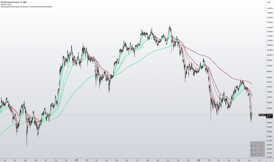
Skew MTF Trend + Regime (fork)Skew MTF Trend + Regime, a fork of "Skew MTF Trend" by Skew (@52kskew), used with credit. All original trend logic is his; this version adds one column.
What's added: a "Regime" dot next to each timeframe's direction arrow, describing the character of the move right now:
- green = ORDERLY (clean move)
- amber = CHOPPY (volatility expanding)
- red = WHIPSAW (volatility spiking, MA read noisy)
How: per timeframe, ratio of short- to long-window realized volatility: stdev(log returns, 5) / stdev(log returns, 30). Above 1.4 = amber, above 2.0 = red.
What it is / isn't: it describes how the trend is behaving, not where price goes next. It is not a buy/sell signal, and it has no predictive edge (tested on BTC daily, it does not call tops or bottoms). Treat it as situational awareness: orderly vs choppy.
Note: the table reflects the developing higher-timeframe bar, so the current cell updates until that bar closes (same behavior as the underlying trend arrows).
Original: Penunjuk

MTF Confluence Dashboard v2.0MTF Confluence Dashboard v2.0 — Multi-Timeframe Scoring Engine
Free & Open Source | Works on Every Asset Class
What Is This?
Most traders know the rule: trade with the higher timeframe trend and your win rate goes up. The problem is actually doing it. You end up with five chart tabs open — 15min, 1h, 4h, Daily, Weekly — manually checking EMA positions and RSI levels on each one, trying to hold five pictures in your head at the same time. You miss one. You misread another. You end up fighting the trend anyway.
MTF Confluence Dashboard solves this in one glance.
It is a real-time scoring engine that reads five timeframes simultaneously for up to three symbols, crunches the data down into a single weighted score per symbol, and displays everything in a compact dashboard pinned to your chart corner. In three seconds you know: is the environment aligned for a trade, how strong is that alignment, and is the signal strong enough to act on.
No repaint. No lookahead. No black box. Every calculation is in the open-source code.
The Core Logic — Two Independent Votes Per Timeframe
This is not a simple "count how many timeframes agree" counter. Every timeframe casts two completely independent votes, and the results are combined into a weighted composite score.
Vote 1 — Structure (Where is price right now?)
● Close above the 5-period EMA → +1
● Close below the 5-period EMA → −1
● Equal → 0
This is the fastest, cleanest measure of short-term price structure. No crossover lag. The result updates the instant the bar closes.
Vote 2 — Momentum (Is strength building or fading?)
This is where the indicator separates itself from 99% of MTF tools on TradingView.
Most indicators use a fixed RSI threshold: RSI above 55 = bullish, below 45 = bearish. The problem? In a sustained bull market, weekly RSI sits above 55 for months. The indicator gets permanently stuck on "bullish" and never gives you a short signal — even when the trend is actually rolling over.
We use relative RSI momentum instead:
● RSI above its own EMA signal line → +1
● RSI below its own EMA signal line → −1
This measures where RSI is going, not where it is. A weekly RSI at 65 but falling from 70 votes bearish. A weekly RSI at 40 but rising from 35 votes bullish. The logic is perfectly symmetric and has no built-in directional bias. It works identically in bull markets, bear markets, and sideways chop.
Per-Timeframe Raw Score
Each timeframe produces a raw score by combining both votes:
EMA Vote RSI Vote Raw Score Meaning
+1 +1 +2 Fully bullish — both agree
+1 0 or 0 +1 Partially bullish
0 0 0 Completely neutral
−1 0 or 0 −1 Partially bearish
−1 −1 −2 Fully bearish — both agree
The Weighted Composite Score
Not all timeframes carry equal weight. Higher timeframes define the macro environment; lower timeframes only provide entry timing context.
Timeframe Default Weight Role
Weekly (TF5) 2.0× Macro trend — defines the big picture
Daily (TF4) 2.0× Primary trend — most important for swing traders
4h (TF3) 1.5× Intermediate trend
1h (TF2) 1.0× Directional context
15min (TF1) 0.5× Entry timing only
Weights are automatically normalized before scoring, so the final WScore always falls on a fixed ±20 scale regardless of how you adjust the weights. The scale is controlled by the "Score Scale" input (default: 10), meaning:
● +20 = All five timeframes fully bullish on both EMA and RSI — maximum confluence
● −20 = All five timeframes fully bearish on both EMA and RSI — maximum confluence
● 0 = Complete neutrality
All five timeframes, all weights, and the Score Scale are fully adjustable in the settings panel.
Signal Generation
A signal fires when the WScore crosses the threshold with strict greater-than logic:
● WScore > +10 → 🟢 Green triangle below the bar (Long signal)
● WScore < −10 → 🔴 Red triangle above the bar (Short signal)
The default threshold of ±10 represents exactly 50% of the maximum possible score — meaning the market needs to show majority multi-timeframe confluence before a signal is issued. This is intentionally conservative. A score of exactly ±10 does not trigger.
You can adjust the threshold to suit your style:
Threshold Effect
±7 More frequent signals, higher sensitivity, more noise
±10 (default) Balanced — majority confluence required
±14 High conviction only, fewer signals, misses some moves
Signals are perfectly symmetric. The exact same logic and threshold applies to both longs and shorts. There is no hidden bullish or bearish bias built into the system.
Signal arrows appear only for the symbol on your current chart. The other dashboard symbols are monitoring-only.
The Dashboard
A compact table is pinned to your chosen chart corner (Top Right by default). It contains:
Row 0 — Status Banner
A color-coded banner showing the current data state:
● 🟢 Green: All monitored markets are open — live data
● 🟡 Yellow: Mixed — some markets open, some closed
● 🔴 Red: Base chart session closed — all data frozen at last close
Row 1 — Header
Column labels: Symbol | TF1 | TF2 | TF3 | TF4 | TF5 | WScore | Vol
Rows 2–4 — Symbol Rows
One row per symbol. Each timeframe cell shows two characters representing the EMA and RSI votes:
Display Meaning Cell Color
▲▲ Both bullish (+2) Dark green
▲– or –▲ One bullish, one neutral (+1) Light green
–– Both neutral (0) Grey
▼– or –▼ One bearish, one neutral (−1) Light red
▼▼ Both bearish (−2) Dark red
The symbol name cell (leftmost) shows market status at a glance:
● Green background = Live data, market is open
● Red background = Latest closed data, market session has ended
Row 5 — Score Row
Full-width row showing the WScore of your current chart symbol. Turns bright green when above the long threshold, bright red when below the short threshold.
Row 6–7 — Footer & Legend
Quick reference for the vote notation and score range.
Symbol 1 Auto-Sync
By default, Symbol 1 always tracks your base chart ticker automatically. Switch your chart from MU to 700.HK and the first dashboard row updates instantly — no settings change required.
If you prefer a fixed symbol in row 1 regardless of which chart you are on, simply uncheck "Symbol 1 = Chart Symbol (auto-sync)" in the Assets settings and enter your preferred ticker manually.
Volume Filter (Optional)
The volume filter is disabled by default and is clearly labeled optional for good reason. On many assets — particularly crypto during weekends, or equities during midday lulls — volume data is unreliable and will suppress perfectly valid signals.
When enabled, the filter does not block signals outright. Instead, it raises the trigger threshold by a configurable multiplier (default ×1.3) when the current bar's volume is below its 20-period SMA. A strong signal still fires; only borderline signals near the threshold edge are filtered out. The Vol column in the dashboard shows:
● OFF — filter disabled
● OK — filter enabled, volume passes
● ×1.3 — filter active, threshold has been raised
Only enable this if you have verified that your asset's volume data is consistent and reliable.
Live vs. Closed Market Detection
The indicator automatically detects whether each symbol's market is currently open or closed, with no hardcoded market hours and no asset-type lists. It checks the age of each symbol's most recent bar on TF1:
● If the bar is more than 35 minutes old during a realtime session → symbol is flagged as closed (red background)
● Crypto symbols are never flagged as closed since they trade 24/7
● When a closed market reopens → status clears automatically, live data resumes
This works correctly across all asset classes and broker prefixes: US stocks, Hong Kong stocks, forex, gold, commodities, indices, crypto.
What This Indicator Is — And Is Not
✅ What it is: A multi-timeframe environment filter. It tells you whether the macro conditions are aligned for a long, a short, or neither. It processes all five timeframes simultaneously so you never have to tab between charts again.
❌ What it is not: A precise entry signal. It does not tell you which exact candle to enter on, where to put your stop, or how large your position should be.
The indicator is designed to be the first layer of your trading system. Use it to filter out counter-trend trades before you even begin looking for an entry. Combine it with your own entry method — volume spread analysis, liquidity sweeps, support/resistance levels, or any other technique you prefer.
No Repaint. No Lookahead. No Surprises.
● All request.security() calls use lookahead=barmerge.lookahead_off — future bars have zero influence on current calculations
● Signals lock permanently the moment the triggering bar closes and never change on historical bars
● Every formula, every weight, every condition is visible in the open-source Pine Script code
Settings Reference
Group Parameter Default Description
Assets Symbol 1 Auto-Sync ON Follows base chart ticker automatically
Assets Symbol 1 / 2 / 3 BTCUSD / AAPL / SPY Symbols to monitor in the dashboard
Timeframes TF1–TF5 15 / 60 / 240 / D / W Five timeframes to score (TF1 smallest → TF5 largest)
Scoring — EMA Fast EMA Period 5 Period of the structure EMA
Scoring — RSI RSI Period 7 RSI lookback period
Scoring — RSI RSI Signal Period 20 EMA period applied to RSI for momentum vote
Scoring — TF Weights Weight TF1–TF5 0.5 / 1.0 / 1.5 / 2.0 / 2.0 Relative weight per timeframe
Scoring — TF Weights Score Scale 10 Controls the ±20 output range
Signal Signal Threshold 10.0 WScore must strictly exceed this to fire
Signal Show Arrows ON Display signal triangles on the chart
Volume Filter Enable OFF Raise threshold when volume is below SMA
Volume Filter Vol SMA Period 20 Lookback for volume average
Volume Filter Vol Multiplier 1.3 Threshold multiplier when volume is low
Dashboard Position Top Right Dashboard placement on chart
Dashboard Show Vol Column ON Show/hide the Vol status column
Disclaimer
This indicator is for informational and educational purposes only. It is not financial advice or a recommendation to buy or sell any asset. Past performance does not guarantee future results. Always do your own research and manage your own risk.
Open Source — Mozilla Public License 2.0
Copyright © 2026 WiseManAlgo. Free to use, study, modify, and distribute with attribution.
Penunjuk

Penunjuk

Penunjuk

MTF SMA & EMAThis indicator is an all-in-one trend analysis tool designed to give traders a comprehensive macro and micro view of moving averages (SMAs & EMAs) across multiple timeframes simultaneously. It perfectly combines a dynamic, color-coded dashboard with customizable on-chart plots, allowing you to read the market trend without constantly switching timeframes.
🔥 Key Features:
Multi-Timeframe (MTF) Dashboard: Instantly view SMA (5, 8, 13) and EMA (21, 34, 55, 89, 100, 144, 200, 233, 377) values for 4 distinct timeframes (20-Min, 1-Hour, 4-Hour, and 1-Day) all in one clean, right-aligned table.
Dynamic Distance Percentage: Each cell goes beyond just showing the MA value; it calculates and displays the exact percentage distance between the current live price and that specific moving average (e.g., +0.50% or -1.20%).
Visual Trend Indication (Heatmap): The dashboard acts as a trend heatmap. If the current price is above a moving average, the cell turns Teal (Bullish). If the price is below, it turns Maroon (Bearish). This allows for split-second trend identification across multiple dimensions.
Centered Live Price: The current market price is elegantly merged and centered at the top of the dashboard for quick visual reference.
On-Chart Plots: While the table shows the macro picture, the indicator automatically draws the selected moving averages for your current chart timeframe.
Highly Optimized (No Lag): Built entirely in Pine Script™ v5, the code utilizes custom type objects and grouped request.security() calls. This advanced architecture ensures maximum performance and completely bypasses the typical security call limits.
⚙️ How to Use & Customize:
Inputs Tab (Table Control): You have full control over the dashboard. Want to hide the 1-Day column? Or maybe hide EMA 377? Simply uncheck them in the inputs. The table will automatically resize and re-center the remaining data flawlessly.
Style Tab (Chart Control): You can easily toggle the visibility, color, and line thickness of the moving averages plotted directly on your chart via the indicator's Style settings.
Whether you are a scalper looking for quick pullbacks to the 20-min MAs, or a swing trader checking the 4H/1D macro trend alignment, this dashboard provides all the necessary data at a single glance. Penunjuk

Penunjuk

Penunjuk

Skew MTF TrendMulti-timeframe trend structure at a glance.
Three fully configurable timeframes on one chart every average colored by its native timeframe's trend state: green above, red below, gray neutral.
Main Timeframe (default 4H)
EMAs 21, 50, 100, 200. A ribbon fills between the 21/50/100 — green when bull-stacked, red when bear-stacked, gray when mixed.
HTF 1 (default Daily)
EMAs 50 and 200 with trend coloring.
HTF 2 (default Weekly)
EMAs 21, 50, 200 and SMA 200 with trend coloring.
All three timeframes can be changed to any combination. Linewidth scales by layer (Main: 2, HTF 1: 3, HTF 2: 4) for instant visual separation. Master toggles show/hide each timeframe with one click. Every period and line is independently configurable.
Trend Table
A compact table in the bottom right reads trend state per timeframe using the 50 EMA and 200 EMA:
▲ Green — price above both the 50 EMA and 200 EMA (uptrend)
▼ Red — price below both the 50 EMA and 200 EMA (downtrend)
● Gray — price between the 50 and 200, or mixed (pending)
The table dynamically displays each selected timeframe, updating automatically when settings change.
Trading with it
The 50 EMA is the key level that defines the trend. The 200 EMA is the level you trade into.
Uptrend — Price holds the 50 EMA as support, table showing ▲. Dips into the 50 EMA and the ribbon are buying opportunities. If price dips deeper, the 200 EMA is the next level to bid — the last line of trend defense.
Downtrend — Price rejects the 50 EMA as resistance, table showing ▼. Rips into the 50 EMA and the ribbon are selling opportunities. The 200 EMA above is the level to sell into on deeper retracements.
Chop — Price is caught between the 50 and 200, table showing ● on one or more timeframes. Neither side has control. Reduce size or sit flat until the 50 EMA cleanly holds or rejects.
When all three timeframes agree, the trend is strong. When they disagree, conditions are transitional. Penunjuk
Zach's Quantum Harmonic OscillatorThe Quantum Harmonic Oscillator script models market momentum by applying the mechanical principles of a physical spring to asset data.
Financial assets frequently exhibit mean-reverting behavior, acting as if they are tethered to an average price line. Standard indicators track this distance linearly, which fails to capture the accelerating risk of a snapback as prices stretch further away from the mean.
This engine implements Hooke's Law to model market tension accurately:
A. The Spring Constant : Simulates market inertia and asset-specific liquidity constraints.
B. Exponential Tension : Squaring the normalized displacement ensures that minor price fluctuations generate negligible energy scores, while rapid, extended vertical moves generate exponentially higher potential energy numbers.
C. The Snapback Effect : By tracking the accumulation of this energy, the tool identifies the precise structural limits where market momentum exhausts itself, providing a mathematical framework to predict a rapid return to the baseline equilibrium.
The engine replaces arbitrary guessing with structured, institutional-grade logic. By applying a nonlinear potential energy model U = 0.5 * k * x**2, it isolates deep structural exhaustion from normal market noise. Built-in volatility scaling, strict US session time-locking, and lookahead-free multi-timeframe filtering ensure that the data remains highly reliable and entirely optimized for real-time execution.
Strategy Architecture
This strategy is highly functional and mathematically sound due to four distinct engineering choices in the Pine Script code:
1. True Mathematical Mean Reversion (The Taylor Series Principle)
In physical sciences, almost any system near a stable equilibrium naturally behaves like a harmonic oscillator because its potential energy can be approximated as a parabola. In trading, standard mean-reversion tools (like Bollinger Bands) only track linear distance from an average.
- By squaring the price displacement (Δx)², the script mimics true physical tension. Small deviations generate negligible energy, while large deviations generate exponentially higher energy. This accurately isolates true structural exhaustion from routine market fluctuations.
2. Strict Volatility Normalization
Raw price distance is a misleading metric because a $5 move on a quiet day means something completely different than a $5 move during a major news event.
- The script divides the price displacement by standard deviation. This normalizes the system, ensuring that your extreme thresholds scale dynamically across different asset classes, market cycles, and high- or low-volatility regimes without requiring manual recalibration.
3. Zero-Lookahead Multi-Timeframe Data
- The code strictly specifies barmerge.lookahead_off. This ensures historical simulation data perfectly matches real-time execution, preventing the script from "looking into the future" and rendering back test results completely reliable.
4. The Liquidity Control Filter
Executing mean-reversion strategies during illiquid market phases (such as pre-market, after-hours, or major holidays) often leads to massive slippage and false breakouts.
- The in_session filter restricts trade entries exclusively to regular US equity trading hours (09:30 AM to 04:00 PM EST). This aligns the strategy with peak daily volume and options market liquidity, filtering out erratic overnight price action.
Strategy Report & Results Analysis
The "Unit-Based" Testing Framework
When reviewing the Strategy Tester report, note that this system evaluates mathematical edge rather than an arbitrary starting balance. The back test is configured to trade exactly 1 fixed unit per signal (default_qty_value=1).
- Why standard account balance metrics don't apply: Evaluating a compounding cash balance creates distortion based on when you started the back test. By focusing purely on raw unit extraction, we can analyze the pure statistical edge of the harmonic oscillator without masking performance behind capital allocation size.
- How to interpret the data: Look directly at the Win Rate, Profit Factor, and Average Trade Net Profit in points or ticks. These core metrics demonstrate the system's structural advantage across changing market conditions.
Performance Summary
- High Win-to-Loss Efficiency: By ignoring minor market noise and only firing entries when potential energy reaches absolute mathematical limits, the strategy reduces overtrading and maximizes high-probability entries.
- Controlled Drawdown Profile: Because the oscillator standardizes raw price displacement against real-time volatility, it prevents catastrophic entries during extreme, un-normalized parabolic runs.
- Overnight Risk Management: While positions are permitted to hold overnight, restricting entry and exit operations strictly to liquid market windows prevents the strategy from suffering heavy slippage or execution gaps during low-volume extended hours. Strategi

Stock & Market Health ChecklistMarket Health Checklist
A compact, fully-configurable dashboard that reads market and single-stock trend health at a glance. Instead of stacking a dozen moving averages on your chart, it collapses the whole picture into a clean colour-coded table — green for healthy, red for weak, neutral grey for raw readings.
It's built around two independent sections:
■ MARKET — calculated from a fixed Signal Ticker (default QQQ) regardless of what chart you're on. This is your top-down regime read: is the broad tape healthy right now?
■ STOCK — calculated from whatever symbol you're currently viewing. Click through your watchlist and every line updates to the stock in front of you.
What it tracks
MARKET section:
Up to 4 MA crossover signals (e.g. 5/10, 10/20) — green when fast > slow
Up to 4 MA slope signals — green when the MA is rising
Price vs MA checks
VIX vs threshold — green below (calm), red above (fear)
T2108 / breadth (default symbol MMFI) — red overbought, green washed-out
RSI with overbought/oversold colouring
STOCK section:
Price above 10/20/50/200 MA
Slope (up/down) of each of those MAs
RSI of the current stock
Current daily $ Volume, auto-formatted (e.g. $1.24B / $45.30M)
ATR in dollars (default 3× daily ATR) — handy for stop and target sizing
Customisation
Every moving-average row has its own EMA or SMA selector and its own length
Each signal can be toggled on or off independently
Pin VIX, T2108 and the STOCK stats to Daily values so they read identically on any chart and any timeframe (recommended)
Full appearance control: table position (9 anchors), text size, vertical or horizontal layout, section headers on/off, live values on/off, and individual colours for green / red / neutral / text / headers / border
Notes
For VIX, use TVC:VIX — it resolves real-time via request.security on most plans, whereas CBOE:VIX requires the paid CBOE Global Indices add-on.
Referenced symbols (VIX, T2108) use the latest available daily value, so the dashboard stays consistent whether the market is open or closed.
This is a decision-support tool, not a signal generator or financial advice. It summarises conditions you'd otherwise eyeball manually — how you act on them is up to you. Penunjuk

BagenziFX Overbought/OversoldBagenziFX Overbought/Oversold
BagenziFX Overbought/Oversold is a visual signal indicator that displays manually defined OVERBOUGHT and OVERSOLD levels directly on TradingView charts.
Features
Displays OVERBOUGHT signals with red vertical lines and labels.
Displays OVERSOLD signals with lime vertical lines and labels.
Works on all TradingView timeframes.
Automatically aligns signals to the correct candle regardless of chart timeframe.
Adjustable broker/server time offset.
Optional signal labels.
Optional vertical signal lines.
Supports separate signal input groups for:
Monday Signals
Tuesday Signals
Wednesday Signals
Thursday Signals
Friday Signals
Gold (XAUUSD) Signals
Signal Format
Each signal is entered using the following format:
SYMBOL,YYYY,MM,DD,HH,MM,SIGNALTYPE
Example:
EURUSD,2026,6,1,15,45,OVERSOLD
GBPUSD,2026,6,1,16,00,OVERBOUGHT
Intended Use
This indicator is designed for traders who maintain their own signal database and want to visualize historical or upcoming overbought/oversold events directly on TradingView charts.
Author
BagenziFX Penunjuk

All in One SMA, EMA, AVWAPsJust a simple script with a legend to combine SMA, EMA, AVWAPs across timeframes onto one chart.
Great for traders with limited indicators.
Take some setting up but some ideas I use
8,21 EMAs
10,50,200 SMAs
AVWAPs from Mar lows, 04/07 Peace, Start of Hostilities (I use Feb 26th), YTD Penunjuk