Monotonic Trend Consensus [QuantAlgo]🟢 Overview
Monotonic Trend Consensus is a trend-following oscillator built on rank correlation between price and time rather than moving averages or crossovers. It scores how consistently price is ordered across multiple lookback windows and combines them into a single bounded reading on a -1 to +1 scale, holding the same meaning on any symbol or timeframe so traders can separate a broadly aligned trend from directionless noise and read when a move has stretched to saturation.
🟢 How It Works
The foundation is Spearman rank correlation between price and time, computed over each active window. Closes inside the window are ranked against one another, time forms its own rising sequence of ranks, and the difference between the two collapses to a single coefficient (rho):
float price_rank = less + (eq + 1.0) / 2.0
float time_rank = float(len - i)
float rho = 1.0 - 6.0 * sumd2 / denom
The coefficient reads +1 when each bar closes above the last in unbroken order, 0 when there is no consistent order, and -1 when each bar steps lower. Because it scores ordering rather than smoothing price into a line, it reflects the current window directly rather than trailing behind it, though it still needs a full window of bars to form. Ranking also limits the pull of any single outlier bar, and the bounded output is what lets one threshold hold across markets without rescaling.
A single window describes direction; the tool runs several and averages them into a consensus spanning fast, medium, and slow horizons:
consensus := array.avg(rhos)
Agreement is then measured as the share of windows leaning the same way as the consensus, and this conviction figure must clear a floor before a direction prints, working alongside the strength threshold:
conviction := 100.0 * agree / active
raw_bull = consensus > threshold and conviction >= min_conviction
raw_bear = consensus < -threshold and conviction >= min_conviction
A reading registers only when both clear at once: consensus past the threshold and windows aligned enough to meet the conviction floor. Fail either and the line stays flat. With Show Neutral on, those flat stretches reset to neutral; with it off, the line holds its last direction until the next qualifying move.
🟢 Signal Interpretation
▶ Bullish Consensus (Green): Consensus sits above the upper threshold with enough windows aligned, meaning recent bars are ordered upward across horizons. Trend traders read the turn into green as a possible long or continuation as the score presses toward +1. Mean-reversion traders treat a reading pinned near +1 as a stretched, broadly-agreed advance rather than a buy, and look to fade only once the line rolls back off the extreme, since the score can hold high through a sustained trend.
▶ Bearish Consensus (Red): Consensus sits below the lower threshold with conviction met, with bars ordered downward across horizons. Trend traders read the turn into red as a possible short or continuation as the score presses toward -1. Mean-reversion traders treat a reading pinned near -1 as a saturated decline where a bounce becomes more plausible, and look to fade on the turn back up rather than at the low itself.
▶ Neutral (Gray): With Show Neutral on, the line goes gray whenever no direction qualifies, either because consensus sits inside the threshold or conviction falls short. The zero line acts as the balance point and behaves like support or resistance for the reading itself: a score rejected at zero from above points to bullish order reasserting, a score capped at zero from below points to bearish order holding, and a clean break through leans toward a regime change. Reading this midline behavior against price is where market structure tools pair well, separating a base building above a structural level from a coil forming under overhead supply. Trend traders stand aside until the line commits; mean-reversion traders find less to work with here than at the edges.
▶ Reading the Extremes: The axis caps at +1 and -1, marking maximum agreement across every active window. Trend traders take an extreme as a sign a move is still in force; mean-reversion traders take it as a stretched zone and watch for the score to turn back toward zero as agreement breaks. An extreme that aligns with a known structural level gives a fade a cleaner reference than one in open space, and neither read holds on the extreme alone, since a strong trend can stay saturated before it cools.
🟢 Features
▶ Preconfigured Presets: Three setups map to different holding styles. "Default" suits swing work on 4-hour and daily charts, pairing a mid-range window spread of 8, 13, 21, and 34 with a 0.35 threshold and a 60% conviction floor, so a direction needs both strength and agreement before it flags. "Fast Response" pulls the windows in to 5, 8, 13, and 21 and eases the threshold and conviction floor so the reading keeps pace with quicker intraday swings. "Smooth Trend" stretches the windows out to 21, 34, 55, and 89 and raises both gates for daily and weekly position trading, where a premature flip costs more than a late one. Choosing a preset takes over the manual window, threshold, and conviction fields.
▶ Built-in Alerts: Four conditions track every change in state. "Bullish Trend Signal" triggers when the consensus confirms to the upside. "Bearish Trend Signal" triggers when it confirms to the downside. "Trend Lost / Neutral" triggers when an active direction fades back to flat, which is also the event a mean-reversion trader watches for after an extreme. "Any Trend Change" rolls the two directional events into a single notification for anyone who wants one alert covering both ways.
▶ Visual Customization: Six color schemes (Classic, Aqua, Cosmic, Cyber, Neon, and Custom) carry a matched pair of bullish and bearish colors through the consensus line, its tiered gradient fill down to the zero baseline, and the optional bar and background tints. Marker lines sit at the positive and negative trigger levels to show the zone the consensus has to cross, and each window's own score can be switched on as a faint backing line so you can see which horizons are driving or dragging the combined figure. Bar coloring paints the price candles in the active trend color at an adjustable transparency, while background coloring spreads that tint across the pane.
Penunjuk

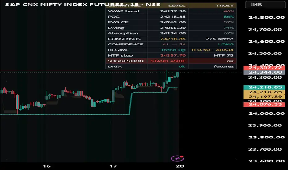
Adaptive Consensus Trail Structure, Regime & SelfAdaptive Consensus Trail — Structure, Regime & Self-Test
A trailing stop that sits on the agreement of several structural references, adapts to the market regime, and forward-tests its own signals so the numbers it shows are measured, not asserted.
What it is
Most trailing stops follow one idea — an ATR band, a SuperTrend, a moving average. This one places the stop where a small committee of independent structural references agree, reads how confident that agreement is, widens or tightens itself according to the market regime, and then continuously audits its own flips and reports the edge it actually produced on your data.
The committee has five members, each locating support/resistance from a different lens:
Anchored VWAP band — fair value for the session/week/month
Session / naked volume Point-of-Control — the price the most volume traded at, carried forward until revisited
Fair-Value-Gap midpoint — unfilled imbalance
Swing pivot — structural memory
Order-flow absorption — where aggressive buying/selling was absorbed (via Bulk Volume Classification)
Why these parts belong in one script (mashup justification)
Each reference alone whipsaws on an index, and each is right in different conditions. They are combined because they correct one another, and the entire value of the script is in that interaction — not in any single line:
A reliability layer scores every reference's historical respect rate with a Wilson lower bound, so a reference that keeps getting ignored loses its vote instead of dragging the stop around.
A consensus layer keeps only the densest agreeing cluster of references, so the stop sits on genuine agreement rather than on an average nobody respects, and far-apart references never force a permanent "no signal."
A regime layer (efficiency ratio + ADX + band-width + a volatility-cluster read + a Hurst persistence estimate) widens the band and tightens the flip confirmation in chop — this is what removes the whipsaw.
A self-test layer forward-scores every flip and recalibrates the confidence number so it means what it says.
Split apart, these are five overlays that each mislead in a range. Wired together, they are one self-correcting, self-auditing trail. That is the reason for combining them.
How it works (six layers)
References are computed on the bar close.
Reliability — rolling-capped respect counts per reference give a Wilson lower-bound "trust." POC is a magnet, so it is judged by forward reaction (did price reject away before breaking through?), not a same-bar close, which keeps its trust honest.
Consensus — the densest agreeing cluster within an ATR band becomes the trail's target; the envelope and confidence are measured on that cluster only.
Adaptive backbone — an efficiency-ratio / regime-adaptive band (Adaptive, Chandelier, or Blend) that widens in chop.
The trail — high confidence pulls the stop toward structure (floored a minimum ATR off price); low confidence rides the wide band, so it flips less in noise.
Self-test — every flip is forward-resolved by triple-barrier first-touch against an unconditional base rate, split by strength tier and by regime, with a walk-forward in-sample→out-of-sample check, a runs test of independence, a Brier score, and a confidence recalibration.
How to use it
Read the top banner for the one-line bias — BULLISH / BEARISH / WAIT — and the READ legend for what to do. The coloured line is your stop: support in an uptrend, resistance in a downtrend. BUY / SELL labels print only on confirmed, sufficiently-confident, higher-timeframe-aligned flips.
The dashboard gives detail top-down: each reference's level and trust, the consensus, raw → calibrated confidence, regime (with Hurst and ADX), the higher-timeframe invalidation stop, and a FULL / HALF / STAND-ASIDE suggestion.
Before sizing, open the Self-Test panel and read the Edge column (hit% − base%), not the raw hit-rate. A ★ means the edge's confidence interval clears the base rate. Prefer signals where the walk-forward change isn't badly negative and the runs test isn't "streaky." Being honest about it: on many indices this tool shows real edge in range and volatile regimes on higher timeframes and little-to-none on very low timeframes or once a trend is already confirmed — the panel makes that transparent so you can pick your spots.
Works on any market
Set the Price source, and for symbols with no native volume set a Borrow-volume proxy (e.g. a futures contract). The panel theme adapts to your chart background automatically. Backbone: Adaptive / Chandelier / Blend. Absorption: order-flow (BVC) or simple. An optional intrabar resolution builds a finer volume profile where available.
Originality
The committee-of-references design, the cluster-not-average consensus, the reliability weighting that lets references lose their vote, the forward-reaction POC respect test, and the confidence self-calibration are the author's own work. The underlying techniques are standard and fully credited below.
Non-repaint
References, regime, consensus and the trail all evaluate on the close of the bar; the live bar is provisional and settles on close. Self-test events are logged and resolved only on confirmed bars and resolve on bars after their trigger at fixed barriers, so hit / base / edge use no look-ahead. The higher-timeframe stop uses a lookahead-off request.
Concept credits
Wilson score interval (E. B. Wilson); efficiency ratio (P. Kaufman); ADX / DMI / ATR / volatility-stop lineage (J. W. Wilder); anchored VWAP (industry standard); volume profile / value area / point-of-control — Market Profile (J. P. Steidlmayer, developed by J. F. Dalton); triple-barrier first-touch labelling (M. López de Prado); runs test of randomness (A. Wald & J. Wolfowitz); rescaled-range / Hurst exponent (H. E. Hurst); Brier score (G. W. Brier); Bulk Volume Classification / VPIN (D. Easley, M. López de Prado & M. O'Hara); reliability-bin (isotonic-style) calibration is standard forecasting practice.
Limitations & disclaimer
"Absorption" is a volume proxy — base data has no true tick order flow, so the buy/sell split is estimated from bar moves, not measured. Confidence is context, not a promise of profit. The self-test is descriptive of past behaviour on the loaded symbol (fixed barriers, no costs or slippage) — a study aid, not a backtest and not a guarantee. A measured edge is what flips did historically here, not a forecast.
This script is for research and education only. It is not financial advice, not a recommendation to buy or sell, and not a guarantee of any outcome. Trading carries risk of loss; your decisions are your own. Test on your own data and use independent risk management before relying on it. Penunjuk

RichmondHillCM - Liquidity Stress Index V 1.2RichmondHillCM - Liquidity Stress Index V 1.2
The LSI tracks the spread between SOFR (Secured Overnight Financing Rate — the cost of borrowing cash overnight against Treasuries in the repo market) and IORB (Interest on Reserve Balances — the risk-free rate the Fed pays banks on reserves held at the Fed), expressed in basis points.
Why it matters
IORB acts as a soft floor for money-market rates: a bank has little incentive to lend cash below what it can earn risk-free at the Fed. So the position of SOFR relative to IORB is a direct read on how scarce cash is in the funding system.
LSI below 0 (aqua): SOFR trades under the IORB floor. Reserves are abundant, repo plumbing is easy, funding conditions are comfortable.
LSI above 0 (red): SOFR is bid above the floor. Cash is getting scarce, balance-sheet and repo capacity are starting to bind, and reserves are sliding from "abundant" toward "scarce."
Sustained positive prints are a classic early-warning signal of funding stress — the September 2019 repo blow-up being the textbook example. Watching this spread helps anticipate when the Fed's reserve backdrop is tightening enough to force a policy response (standing repo facility usage, balance-sheet adjustments, or an end to QT).
How to read it
Zero line = the IORB floor.
Dashed line = a configurable stress threshold (default 5 bps). When LSI breaks above it, the background shades red to flag an elevated-stress regime.
The further and longer LSI stays positive, the more acute the funding pressure.
Inputs
Smoothing (SMA length): 1 = raw daily spread; raise to filter day-to-day noise.
Stress threshold (bps): the level above which funding stress is flagged.
Notes
SOFR and IORB are sourced from FRED and published daily, with IORB stepping only on FOMC decisions — so on intraday charts the daily values hold flat. The daily timeframe is the honest resolution for this gauge. Each leg is requested separately and differenced in-script for robust alignment rather than relying on a spread symbol.
Original concept credit: @gstoyanov. Released under the Mozilla Public License 2.0. Penunjuk

Penunjuk

Compression / Release - Yang-Zhang percentileA volatility-state indicator that shows whether a market is coiled or expanding. It needs no options data and works on any symbol — stocks, futures, FX, crypto.
To be clear about what it is: this measures realized volatility, not implied. It computes Yang-Zhang volatility (which uses the full OHLC bar, so it captures intrabar range and handles overnight gaps and drift — more efficient than a close-only measure) and ranks it against the instrument's own recent history. It describes the present and the past only; it carries no forward-looking or market-expectation information. Some scripts present the same math as a "synthetic IV rank," which is a misleading label — there is no implied volatility here.
What you see:
The yellow line is Compression, a 0–100 percentile. Low means current volatility is narrow relative to its own history (compressed, coiled); high means it is wide (already expanded). It uses ta.percentrank, the IV-percentile flavor that counts every day in the lookback, which is more robust to single-day spikes than range-based IV rank.
The columns are Release, drawn from a zero baseline: the change in the compression percentile over the release window. Green columns up mean volatility is expanding now; red columns down mean it is contracting now. Each bar is single-sided. This measures expansion as it happens — it does not predict it.
The green dot marks a Release start: the bar the compression line climbs back above the compression level, i.e. volatility leaving the squeeze zone.
How to read it together: the line tells you where you are (high or low in the volatility distribution), the columns tell you which way it is moving. The cleanest "loaded" state is the line near 20 with columns flat or turning green; the "already expanded" state is the line pinned near 100.
Inputs: Yang-Zhang window (default 20, ~1 month). Compression percentile lookback (default 252 ≈ 1 year — the standard IV rank/percentile convention; shorter reacts faster to regime shifts but loses the annual frame). Release window (default 10). Compression/expansion levels (20 / 80). Best read on a daily chart.
Limitations, stated plainly: direction is never implied — a release can resolve up or down, so a green column is not a buy signal. It is a measurement of state, not a timing signal; the line can stay near an extreme for a long time during sustained regimes and is not a reversal trigger. Pair it with your own trend tools for direction. Penunjuk

Penunjuk

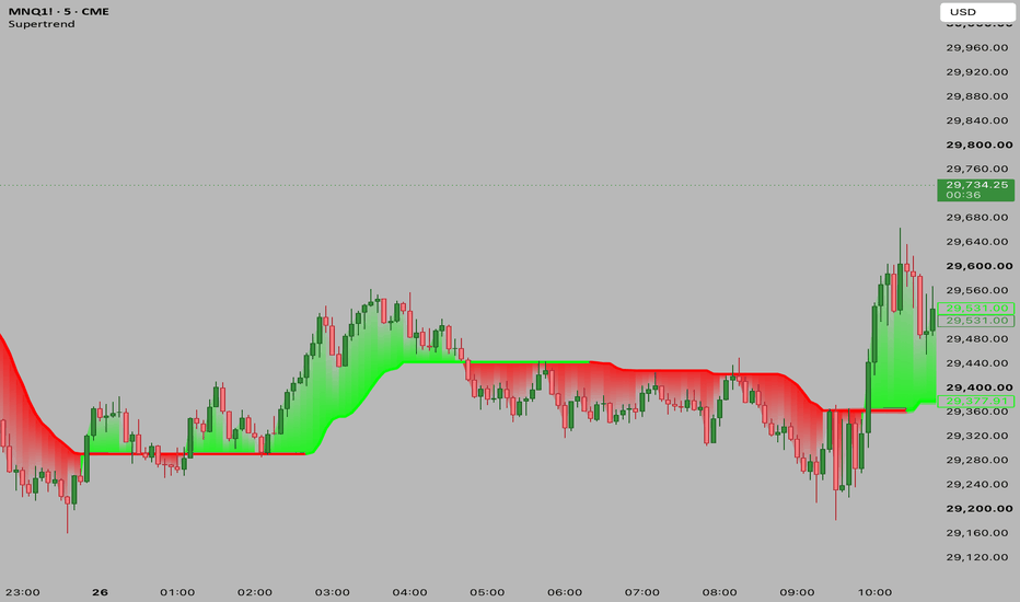
Adaptive Supertrend [ForexCracked]🔷 OVERVIEW
Adaptive Supertrend is a trend-following tool that automatically adjusts its sensitivity to current market volatility. A classic Supertrend uses one fixed factor, which whipsaws in choppy conditions and lags in calm ones. This version measures the live volatility regime and scales the ATR factor between a low and a high setting, so the trail tightens when volatility is low and widens when volatility is high.
🔷 CONCEPTS
Supertrend trails price using an ATR band whose width is set by a "factor." Instead of one fixed factor, this script ranks the current ATR against its own recent range (a 0–100 volatility percentile) and maps that rank onto a factor between your Min and Max settings:
• Low volatility → smaller factor → tighter trail, earlier signals. • High volatility → larger factor → wider trail, fewer false flips.
🔷 HOW TO USE
• Stay with the trend while the line sits below price (up) or above price (down). • A flip of the line marks a potential trend change, shown with a Buy or Sell label. • Read the Info panel for the live trend and the current volatility regime (Low / Medium / High). • Combine it with structure or support and resistance for confirmation, and always use a stop. No single indicator is a complete system.
🔷 SETTINGS
• ATR Length — lookback for the ATR band. • Min Factor / Max Factor — the range the factor adapts between. • Volatility Lookback — bars used to rank the current volatility. • Style — Buy/Sell labels, gradient fill, info panel, bar coloring, and colors.
🔷 ALERTS
• Buy (flip up) and Sell (flip down).
Free and open-source. Educational tool, not financial advice. Penunjuk

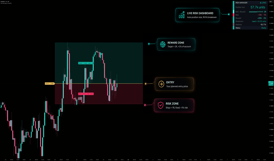
Position Size Calculator - Risk Manager, Risk/Reward & L[LunqFX]Risk Manager is an on-chart position size and risk/reward calculator for TradingView that turns proper risk management into one click. Set your account size and risk per trade %, and it instantly gives you the exact position size (units / lots / contracts / shares), your risk and reward in dollars, the risk/reward ratio, and the breakeven win rate you need to be profitable — all visualized as clean risk and reward zones right on the chart. It works out of the box with an auto ATR setup (Entry / Stop Loss / Take Profit placed for you), or type your own levels. Built in Pine Script v6, it works on forex, crypto, stocks, indices, futures, gold (XAUUSD) and Bitcoin (BTCUSD), on any timeframe — because it sizes risk, not signals. Keywords: position size, position sizing, risk management, risk reward, risk/reward ratio, lot size calculator, money management, stop loss, take profit, R multiple, risk per trade, breakeven win rate, Kelly criterion, day trading, swing trading, scalping.
◆ WHY THIS MATTERS
Most traders blow accounts not because of bad entries, but because of bad position sizing and inconsistent risk. Professionals risk a fixed small % per trade (commonly 0.5–2%) and know their risk/reward before they click buy. This tool enforces that discipline on every trade — no spreadsheets, no external calculators.
◆ WHAT IT DOES
Exact position size from your account balance and risk %, in units, lots, contracts, shares or coins.
Risk and reward in account currency and as a % of account.
Risk/reward ratio with a clean visual meter.
Breakeven win rate — the minimum win rate needed to be profitable at your current R:R (a metric most calculators skip).
Visual risk zone (red) and reward zone (green) drawn between Entry, Stop and Target.
Optional fractional Kelly suggested risk %.
A modern, colour-coded dashboard.
◆ HOW IT WORKS
Auto mode (default): Entry is set at price, Stop at a chosen ATR distance, and Target at your chosen R multiple — a valid setup appears instantly on any instrument.
Manual mode: turn Auto off and enter your own exact Entry / Stop / Target prices in the settings.
Position size = (account balance × risk %) ÷ (distance from entry to stop). This guarantees that if the stop is hit, you lose exactly your chosen risk %.
Reward = position size × distance to target; R:R = reward ÷ risk.
Breakeven win rate = 100 ÷ (1 + R:R) — e.g., at 2R you only need to win >33% of trades to break even.
Lots/contracts = units ÷ your contract size (100000 for a forex standard lot, 1 for stocks/crypto, your multiplier for futures).
◆ HOW TO USE IT
Set Account balance and Risk per trade % once (e.g., 1%).
Pick Auto direction (Long/Short) or switch to manual and place your real Entry/Stop/Target.
Read the Position size — that is exactly how much to trade so your loss at stop = your set risk.
Check the R:R meter and Breakeven — only take trades whose math fits your strategy’s win rate.
Use the red/green zones to see risk and reward visually before entering.
Adjust Contract size to match your instrument (forex lots, futures multiplier, etc.).
◆ SETTINGS
Trade Setup (auto ATR or manual prices, direction, ATR stop, target R), Account & Risk (balance, risk %, contract size, size label), Kelly (optional), Visuals (box length, neon candles), Panel (text size, position, colours).
◆ ALERTS
Price hit Entry · Price hit Stop · Price hit Target.
◆ ORIGINALITY
This is original work. The auto-ATR setup engine, the account-aware sizing, the visual risk/reward zones, the colour-coded dashboard with the R:R meter and the breakeven-win-rate readout are all my own implementation. No third-party code is used.
◆ LIMITATIONS
This is a planning and sizing tool, not a signal generator — it does not tell you when to buy or sell.
Position size assumes your account currency matches the quote currency; for cross-currency pairs or unusual contracts, set Contract size to match your broker’s lot/units.
The auto ATR setup is a starting template — always adjust Stop and Target to real structure.
Results depend on the inputs you provide (balance, risk %, contract size); double-check them for your broker.
◆ NON-REPAINTING
This is a calculator: it draws from your inputs and the current price and never alters historical bars.
Risk Manager is an educational tool, not financial advice. Trading involves risk of loss. Always do your own research and manage risk responsibly. © LunqFX. Penunjuk
Penunjuk
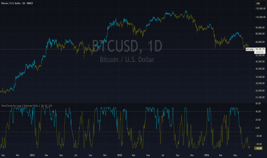
Multi-Indicator Confluence Strategy Automator [MarkitTick]💡 A comprehensive, multi-dimensional technical analysis suite engineered to evaluate market conditions through a rigorous synthesis of trend, momentum, volatility, and cross-asset correlation metrics. Designed for traders who require a systematic approach to market entry and risk management, this script aggregates signals from multiple proven indicators and applies advanced statistical filters to minimize false positives. By unifying foundational technical analysis with advanced mathematical concepts like the Hurst exponent and momentum inflation, this tool provides a highly objective, data-driven environment for evaluating market structure and defining structured trade parameters.
✨ Originality and Utility
Standard trading methodologies often rely on isolated indicators, which can lead to high failure rates in dynamic market environments. The originality of this script lies in its robust confluence engine, which demands simultaneous alignment across multiple independent market dimensions before generating a signal.
Instead of merely stacking moving averages, this suite integrates a strict Boolean gating system that evaluates:
A primary directional baseline derived from a Hull Moving Average combined with an Average True Range volatility buffer.
A directional movement and momentum confirmation matrix utilizing the Average Directional Index and Commodity Channel Index.
Dynamic volume filtering to ensure market participation supports the price action.
Advanced statistical gating mechanisms, including confluence decay, regime detection, and cross-asset correlation analysis.
This utility is exceptionally valuable for systematic traders, as it translates complex, multidimensional market data into a highly legible, unified dashboard while automatically projecting risk-adjusted stop-loss and take-profit levels dynamically based on current market volatility.
🔬 Methodology and Concepts
● The Confluence Engine
The core of this strategy revolves around a scoring system that evaluates bullish or bearish alignment. A valid signal requires a minimum confluence score, calculated by assessing the following core components:
• Baseline Trend
The script utilizes a Hull Moving Average to determine the primary market bias. To eliminate noise, a volatility buffer equivalent to a fraction of the Average True Range is applied, ensuring that only definitive breakouts beyond the baseline are considered valid directional shifts.
• Directional Movement (ADX/DMI)
The first confirmation layer relies on the Average Directional Index alongside the Directional Movement Indicators. A trend is only considered active if the ADX exceeds a user-defined threshold, and the relationship between the positive and negative directional indicators defines the bias.
• Momentum Oscillators (CCI)
The second confirmation layer employs the Commodity Channel Index to measure the current price level relative to an average price level over a given period. Bullish or bearish confirmation requires the CCI to pierce specific upper or lower thresholds.
• Volume Validation
A volume filter ensures that signals are backed by significant market interest. The current period's volume must exceed a rolling exponential moving average of historical volume, multiplied by a strict sensitivity factor.
• Advanced Gating Filters
Confluence Decay: A time-based penalty system that degrades the value of a signal if the confluence state persists for too long without triggering an entry, preventing late entries into exhausted trends.
Hurst Regime Detector: Classifies the market as trending or mean-reverting, gating signals that conflict with the overarching statistical regime.
Momentum Inflation Ratio: Normalizes current price velocity against historical volatility to detect and filter out exhaustion spikes.
Cross-Asset Lead-Lag: Computes the Pearson correlation against a secondary asset to confirm macroeconomic or sector-wide alignment before entry.
🎨 Visual Guide
The script employs a highly intuitive visual hierarchy designed to keep the chart clean while providing maximum data density.
● Chart Elements
• Heatmap Candles
The standard price candles are color-coded based on the baseline trend state. Bullish bars are colored a vibrant teal, bearish bars are marked in a distinct red, and neutral states default to a muted slate blue. This visual heuristic allows traders to instantly recognize the dominant market regime without processing raw numerical data.
• Signal Markers
When all confluence conditions and advanced gates are met, the script plots distinct entry markers: small upward-pointing triangles below the bar for long signals, and downward-pointing triangles above the bar for short signals.
• Risk Management Levels
Upon a confirmed signal, the script dynamically draws horizontal lines representing the trade parameters:
Entry Line: A dashed, neutral-colored line projecting the exact trigger price.
Stop Loss (SL): A dashed, red line projected against the trend based on a multiple of the Average True Range.
Take Profit (TP1, TP2, TP3): Three dotted, green lines representing scaled exit targets, dynamically calculated using expanding volatility multiples.
Each line is accompanied by a precise price label anchored to the right side of the chart.
● The Information Dashboard
A comprehensive table is anchored to the top right of the screen. It displays the real-time status of the Baseline, Confirm 1, Confirm 2, Volume, Exit status, and the aggregate Score. Furthermore, it outputs the exact values for ADX, ATR, Decay Age, Hurst Exponent, Momentum Inflation, Baseline Distance-Integral, and Lead-Lag Correlation, using a color-coded text system (Green for bullish/favorable, Red for bearish/unfavorable, Yellow for warnings).
📌 Note : the best way to resolve visual overlap is to navigate to the Object Tree and drag the indicator above the main chart layer, or simply hide the native candles in your chart settings.
📖 How to Use
● Interpreting Signals
Traders should monitor the chart for the appearance of the signal triangles. Because the script utilizes a strict minimum gap requirement between signals, traders will not be overwhelmed by repetitive alerts during a sustained trend.
● Executing Trades
Once a signal appears, the script automatically projects the optimal Entry, Stop Loss, and three Take Profit levels on the chart. Traders can use these exact price labels to populate their exchange order tickets or algorithmic routing software.
● Managing Positions
The built-in Exit Indicator, driven by a faster CCI calculation, will trigger an alert when counter-trend momentum builds, providing an objective reason to manually close or trail stops on an active position before the hard stop loss is hit.
● Dashboard Monitoring
Use the dashboard table to gauge the overall health of the trend. If the Confluence Score drops or the Confluence Decay percentage reaches high levels, it is highly advisable to tighten stops on existing positions, as the mathematical probability of trend continuation has diminished.
⚙️ Inputs and Settings
● Core Indicator Tuning
Baseline HMA Length: Adjusts the sensitivity of the primary trend filter.
ADX/DMI Length & Threshold: Defines how strong a trend must be to pass the first confirmation gate.
CCI Length & Threshold: Sets the momentum required for the second confirmation gate.
Volume RMA Length & Multiplier: Configures the strictness of the volume participation filter.
● Risk Parameters
ATR Length: The lookback period for volatility measurement.
SL ATR Mult: The multiplier applied to the ATR to define the stop-loss distance.
TP1, TP2, TP3 ATR Mult: The multipliers defining the three scale-out profit targets.
● Advanced Filter Settings
Confluence Decay: Toggles the time penalty system and defines the maximum bars before full decay.
Hurst Regime Detector: Toggles regime filtering and sets the threshold for trending vs. mean-reverting environments.
Momentum Inflation Ratio: Toggles velocity normalization and sets the threshold ratio for exhaustion alerts.
Cross-Asset Lead-Lag: Defines the correlation ticker, correlation lookback window, and minimum Pearson threshold.
🔍 Deconstruction of the Underlying Scientific and Academic Framework
● Rescaled Range Analysis and the Hurst Exponent
This script integrates a specialized implementation of the Hurst Exponent, a statistical measure originally developed in hydrology, to classify financial time series data. It calculates the cumulative deviation of the asset's price from its Simple Moving Average over a defined rolling window. By identifying the maximum and minimum cumulative deviations, the script establishes the range, which is then normalized against the standard deviation of the price series to compute the rescaled range ratio. The final Hurst value is derived logarithmically. A value significantly greater than 0.5 mathematically confirms a persistent, trending regime, while a value below 0.5 indicates an anti-persistent, mean-reverting environment.
● Momentum Inflation via Volatility Normalization
The script tackles the academic problem of momentum illusion, where sheer point movement is mistaken for structural momentum, by normalizing absolute price speed against the Average True Range. It then compares this normalized current velocity against a rolling historical average of normalized velocity. If the resulting ratio exceeds the user-defined threshold, the script identifies the movement as mathematically over-extended, gating further entries to prevent buying the top or selling the bottom of a volatility spike.
● Cross-Asset Correlation Dynamics
To account for macroeconomic interconnectedness, the script employs a rolling Pearson correlation coefficient between the primary asset and a defined leading indicator. By analyzing the covariance of the two assets relative to the product of their standard deviations over a specific window, it mathematically verifies if the broader sector or macroeconomic environment supports the localized signal.
● Distance-Integral Calculations
The Baseline Distance-Integral utilizes a rolling mathematical sum of the spatial delta between the closing price and the moving average. This integral provides a quantifiable area-under-the-curve measurement, offering deeper insight into the cumulative kinetic energy of a trend rather than relying solely on point-in-time cross signals.
⚠️ Disclaimer
All provided scripts and indicators are strictly for educational exploration and must not be interpreted as financial advice or a recommendation to execute trades. We expressly disclaim all liability for any financial losses or damages that may result, directly or indirectly, from the reliance on or application of these tools. Market participation carries inherent risk where past performance never guarantees future returns, leaving all investment decisions and due diligence solely at your own discretion. Penunjuk

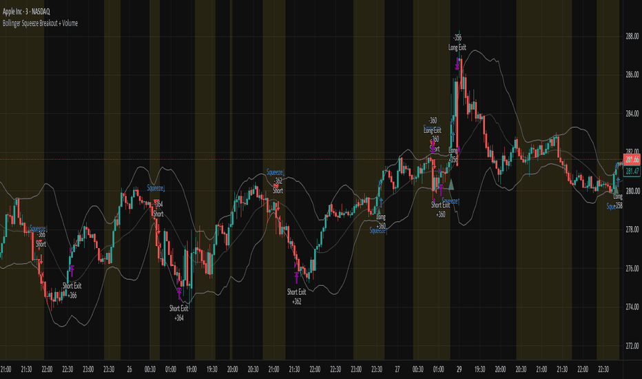
Bollinger Squeeze Breakout + VolumeA volatility contraction often precedes a volatility expansion. When Bollinger Bands narrow significantly, it signals that the market has entered a period of low energy, and low energy rarely lasts. This strategy is built around that principle: it waits for a genuine squeeze, then enters only when price breaks out of the bands with volume confirming that the move has real participation behind it, not just noise.
The logic
A squeeze is identified when the Bollinger Band width (the distance between the upper and lower bands relative to price) falls below its own recent average,meaning volatility is unusually compressed compared to the recent past. Once that condition is met, the strategy watches for price to close outside either band. A long entry triggers when price closes above the upper band during a squeeze, confirmed by volume exceeding its 20-period average. A short entry triggers under the mirrored condition on the lower band. Stops and targets are based on ATR, since the appropriate distance for both should scale with the market's actual movement at the time of entry, not a fixed number.
This approach tends to filter out the false breakouts that occur during already-volatile, choppy conditions, since the entry only fires after a genuine period of compression, which is when breakouts have historically had more follow-through.
Notes on use
The squeeze threshold and lookback length are the two inputs worth tuning per instrument, a 50-period lookback works reasonably well on daily and 4-hour charts, but lower timeframes may benefit from a shorter lookback to react faster to genuine volatility shifts. As with any breakout strategy, backtest across both trending and range-bound periods before drawing conclusions, since this approach is built specifically to perform during regime transitions and may underperform in markets that stay range-bound for extended periods without ever truly compressing.
This is shared for educational and discussion purposes. As always, backtest thoroughly on your own instruments and timeframes, and treat this as a starting framework rather than a finished system. Feedback and variations are welcome in the comments. Strategi
Penunjuk

Penunjuk

Advanced Volatility1. Normalized ATR (%) - The Blue Line
What it is: The standard Average True Range (ATR) divided by the current closing price.
Why it matters: It tells you exactly what percentage the asset moves on an average bar. If the nATR is 2.0%, you know the asset swings roughly 2% per candle. This is incredibly useful for setting dynamic stop losses and take profits that scale mathematically with the asset's price, rather than guessing arbitrary dollar amounts.
2. BB Width (%) - The Orange Line
What it is: The distance between the Upper and Lower Bollinger Bands, divided by the Middle Band.
Why it matters: This acts as a highly effective "Squeeze" proxy. Volatility is cyclical; it contracts, then it expands. When you see the Orange line drop to extremely low historical levels, it means the Bollinger Bands are pinching tight. This contraction indicates that energy is building up, and a massive breakout/expansion move is imminent.
3. Historical Volatility (%) - The Fuchsia Line
What it is: A strict statistical calculation heavily used in options pricing (often referred to as HV or Realized Volatility). It calculates the standard deviation of logarithmic returns over a period, and annualizes it (multiplying by √252 trading days).
Why it matters: It gives you the "true" statistical variance of the asset. A rising Fuchsia line means the market is becoming highly chaotic and unpredictable, while a falling line means the market is returning to a stable, directional grind.
By layering all three of these metrics on one panel, you can easily spot when a market has compressed to zero (all lines dropping near the Zero Base) right before a massive trend erupts! Penunjuk

Penunjuk

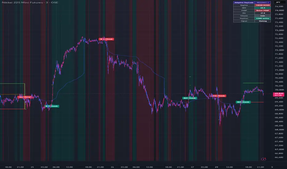
Adaptive Daytrade SignalThis is an adaptive day trading signal that analyzes market conditions using ADX+EMA; in trending markets, it automatically switches to VWAP+EMA to follow the trend on pullbacks, and in ranging markets, it switches to RSI + Bollinger Bands for counter-trend trading.
Recommended timeframes: 3- to 15-minute charts; Instruments: Nikkei 225 futures, S&P 500; for individual stocks, high-volume large-cap stocks; Session restrictions: For individual stocks, it’s effective to wait and see for the first 30 minutes after the open (adjust using “Limit to session”)
The key feature is that it automatically assesses market conditions and switches trading strategies accordingly. The chart background color lets you see the current market phase at a glance (green = uptrend, red = downtrend, gray = range-bound).
In trending phases (trend-following), the system waits for pullbacks or retracements to the EMA9 and enters only when the price is moving in the same direction as the VWAP. This is a classic approach in stock day trading and offers a good balance between win rate and potential profit.
In ranging phases (counter-trend), the system targets rebounds at the outer bands of the Bollinger Bands combined with RSI overbought conditions. Since attempting to follow the trend when there is no clear trend can result in being caught in a round-trip loss, the system automatically switches to this strategy when the ADX is weak.
In line with our opportunity-focused risk management policy, we set stop-losses relatively tight (based on the most recent swing or ATR × 1.0) and use a two-tiered profit-taking strategy: TP1 (1R) as a target for partial profit-taking, and TP2 (2.5R) to let profits run. Stop-loss and profit-taking lines are automatically displayed on the chart.
Since all parameters are adjustable, by adjusting the two settings—ADX trend threshold (trend detection sensitivity) and Volume vs. avg (volume filter)—you can balance the frequency of signals between prioritizing opportunities and prioritizing accuracy.
This indicator is calculated based on closing price candlesticks and does not use `request.security`, so there is no risk of repainting. However, signals are confirmed once the candlestick closes, and labels are displayed after the candlestick closes. Penunjuk

Penunjuk
Prior Level Reaction & Retest ProfilerShort description
An evidence-based profiler for first touches, reactions, breakouts, and confirmed retests at previous-day and previous-week highs and lows, with ATR-normalized outcomes and volatility-regime statistics.
Overview
Previous-day and previous-week highs and lows are widely used as support, resistance, breakout references, and liquidity levels. However, drawing these levels does not answer the practical question: how has this symbol historically behaved after first reaching them?
Prior Level Reaction & Retest Profiler converts each first interaction with PDH, PDL, PWH, and PWL into a measurable event. It records whether price moved away from the level, continued through it, produced a false-break reaction, remained unresolved, or formed a confirmed breakout retest. All distances are normalized with the previous completed daily ATR so observations remain comparable across changing volatility conditions.
This is a descriptive research and decision-support tool. It does not issue automatic buy or sell signals, and historical frequencies are not presented as predictions.
What the indicator measures
For every enabled level, the script selects one first-touch observation during that level's valid daily or weekly period. At the moment of contact, it freezes both the level and the previous completed daily ATR.
For a prior high:
Movement below the level is measured as reaction excursion.
Movement above the level is measured as breakout excursion.
For a prior low, those directions are reversed.
The event is then classified as:
Reaction: The configured reaction threshold is reached first.
Breakout: The configured breakout threshold is reached first.
False-break reaction: Price closes through the level but reaches the reaction threshold before the breakout threshold.
Ambiguous: Both thresholds are reached on the same evaluation bar, so their order cannot be determined from OHLC data.
Unresolved: Neither threshold is reached before the evaluation horizon ends or the source level expires.
Reaction and breakout percentages use directionally resolved observations as their denominator. The dashboard also displays the total sample, ambiguous observations, unresolved observations, and average maximum excursions in daily ATR units.
Why evaluation begins after the touch bar
Historical OHLC bars do not reveal whether the high or low occurred first. Counting the touch bar could therefore invent a sequence that is not present in the data. This script begins outcome evaluation on the following bar and explicitly preserves same-bar dual-threshold outcomes as ambiguous rather than guessing.
Breakout retest engine
When completed history favors breakout over reaction for a level, the optional retest engine follows a confirmed close through that level using a transparent state sequence:
Retest pending: A breakout close occurred and the engine is waiting for price to return.
Retest in progress: Price entered the ATR-normalized retest zone but has not yet confirmed.
Retest confirmed: Price touched the zone and produced a confirmed close back in the breakout direction. Users can optionally require a directional confirmation candle.
Target reached or invalidated: After confirmation, the script records whether the configured ATR target was traded before a confirmed close beyond the invalidation boundary.
Only confirmed chart bars change retest states. A confirmation by itself is not counted as a successful retest. Retest success is calculated only from completed post-confirmation target and invalidation outcomes.
Volatility-conditioned evidence
Retests are not assumed to behave identically in every volatility environment. When regime conditioning is enabled, the script stores the volatility regime present when the breakout setup begins and maintains separate target/invalidation histories for:
Low volatility: Previous daily ATR is at or below 0.80 of its 100-day average.
Normal volatility: The ratio is between 0.80 and 1.20.
High volatility: Previous daily ATR is at or above 1.20 of its 100-day average.
The live decision gate uses only the matching regime's completed retests. It does not borrow confidence from unrelated volatility conditions.
Evidence gate
The simple dashboard prevents attractive headline statistics from being mistaken for a tradable edge.
Observe only: The matching volatility regime has fewer completed retests than the configured minimum.
Stand aside: The sample is sufficient, but target-before-invalidation success is below the configured requirement.
Retest pending / in progress: The evidence gate passes, but confirmation is not complete.
Retest confirmed: The evidence gate passes and the required retest close is confirmed.
Target reached / invalidated: The live confirmed setup has completed.
For example, a level can have a high general breakout rate while its low-volatility retests have a poor success rate. In that situation, the dashboard shows Stand Aside rather than promoting the broader breakout statistic.
Display modes
Simple mode is the default. It shows only the current level segments and a plain-language decision card containing:
Setup
Active level
What to do now
Required confirmation
Invalidation condition
Supporting sample and regime evidence
Only the latest confirmed retest marker is displayed by default. Historical markers can be enabled for auditing.
Evidence mode shows the complete PDH, PDL, PWH, and PWL matrix with sample count, reaction rate, breakout rate, false-break rate, ambiguous and unresolved shares, and average excursions.
Main settings
Daily ATR length
Reaction and breakout thresholds in ATR units
Evaluation horizon in chart bars
Previous-day and previous-week level toggles
Retest-zone width and retest window
Optional directional confirmation candle
Minimum completed retest sample
Minimum acceptable retest success rate
Volatility-regime conditioning
Simple or Evidence display mode
Static and dynamic alerts
Changing chart timeframe changes the real duration represented by the bar-based evaluation and retest windows. Statistics should therefore be compared only when symbol, timeframe, and settings are consistent.
Alerts
Named alerts are available for:
First level touch
Reaction or breakout outcome
False-break reaction
Ambiguous outcome
Breakout close with retest pending
Retest confirmation
Retest failure or expiry
Confirmed-retest target reached
Confirmed-retest invalidation
Dynamic messages can be used by enabling the dynamic-alert setting and creating an alert with Any alert() function call.
Repainting and data behavior
Previous-day, previous-week, daily ATR, and ATR-average values are requested with a one-period offset. Only completed higher-timeframe values are used; no future data is accessed.
Retest state changes require confirmed chart bars. Once a historical event or retest outcome is finalized, its classification does not change. Active events can update as new bars close.
Limitations
Designed primarily for intraday charts.
OHLC data does not reveal intrabar high/low order; ambiguous cases are retained explicitly.
Gap openings can cross a level without trading every intervening price.
Available chart history and data-feed differences affect samples.
Regime-filtered samples can be considerably smaller than overall samples.
The reference target uses traded price, while post-confirmation invalidation requires a confirmed close.
Spread, slippage, commissions, liquidity, position sizing, and execution constraints are not modeled.
Historical behavior does not guarantee future results.
This indicator is not financial advice.
Penunjuk

Directional PurityDirectional Purity
Rather than a simple standalone strategy, Directional Purity is a professional trend-filtering and directional stability engine designed to supercharge any existing trading strategy. It eliminates the fatal flaw of traditional indicators like ADX—which measure trend strength with significant lag—by equipping your strategy with a zero-lag, mathematically precise gauge of directional purity.
Traditionally, ADX relies on double-smoothed EMAs of directional movements, causing delayed responses to trend breakouts and exhaustion. Directional Purity resolves this by using the mathematical equivalence of Chande's CMO and Kaufman's Efficiency Ratio (ER) as a volatility index to dynamically adapt a 13-period VIDYA (Variable Index Dynamic Average) base.
By utilizing a telescoping sum optimization, this script is fully vectorized (loop-free), ensuring extremely fast execution on any time frame.
Features:
- Live Dashboard: Shows real-time market state (Trending Bullish, Trending Bearish, Ranging) and Trend Purity %.
- Visual Fills: Highlights ranging zones in gray to prevent overtrading.
- Built-in Alerts: Triggers for trend breakouts, entering ranges, and direction shifts.
``` Penunjuk

Momentum Pro Dashboard | MouryaOverview
The Momentum Pro Dashboard is an institutional-grade, all-in-one Heads-Up Display (HUD) engineered specifically for active momentum and day traders. Built purely in Pine Script v6, this dashboard consolidates critical tape reading, volume analysis, and dynamic levels into a clean, mathematically balanced 3-column UI, eliminating the need to constantly switch tabs or clutter your chart with multiple indicators.
1. The Layout & Architecture
The script generates a 3-column Heads-Up Display (HUD) directly on your chart. It is completely dynamic—if you disable a feature in the settings, the table automatically shrinks to close any empty gaps.
Top Header: A spanning banner showing the Ticker, Company Name, Country, Exchange, Sector, and Industry. (It includes a manual override in the settings if TradingView tries to label the exchange as "BATS").
Column 1: Core fundamental data, session momentum percentages, and price extremes.
Column 2: Dynamic support/resistance levels (EMAs, VWAP Bands, and Pivots).
Column 3: A real-time, ticking Tape (Time & Sales) for live order flow.
2. Column 1: Core Metrics & Extremes
This column tracks the fundamental setup and the active momentum of the asset.
Current Price: The live price of the asset. The text turns Green if the day is positive, and Red if the day is negative.
Float & Mkt Cap: Formatted cleanly in Millions (M) or Billions (B).
Float Color Code: < 1M (Bright Green), 1M–5M (Standard Green), 5M–10M (Dark Green), 10M–20M (Yellow), > 20M (Red).
Daily % (Close-to-Close): Performance based strictly on yesterday's official Regular Trading Hours (RTH) close.
Intraday %: Performance based strictly on today's open.
GAP %: The difference between yesterday's close and today's open.
Daily Volume & Turnover: Total shares traded today, and the dollar amount of that volume (Volume * Price).
Rel. Vol. (Relative Volume): Compares today's volume pace to the 10-day average.
Color Code: < 1x (Red), 1x to 5x (Yellow), > 5x (Green).
Short %: Calculates true Short Interest by dividing FINRA's reported EOD Short Volume by yesterday's total trading volume.
Color Code: < 5% (Dark Green), 5–20% (Light Green), 20–50% (Yellow), 50–100% (Light Red), > 100% (Dark Red).
Buy/Sell %: A proxy for Bid/Ask hitting, showing the percentage of volume executed on upticks vs. downticks.
Per Lot: Shows the point value multiplier of the asset (crucial for Futures).
Day High & Day Low (Custom Cycle): Tracks the highest and lowest prices of the current session, starting exactly at the Post-Market open and running through the RTH close.
52W High & 52W Low: Rolling 1-year extremes.
ATH & ATL (All-Time High/Low): Dynamically scans all locally loaded chart data to find the absolute extremes without crashing TradingView's servers.
3. Column 2: Institutional Averages & Levels
This column provides your key support and resistance zones. Crucially, these are anchored to standard institutional timeframes so your levels perfectly match what Wall Street algorithms are looking at, ignoring weird pre-market distortions.
EMAs (1-4): Four customizable Exponential Moving Averages (Defaults: 10, 20, 50, 200).
VWAP Engine: A custom-built Volume Weighted Average Price calculator.
VWAP Main: The core session VWAP.
Upper Bands (1, 2, 3): Standard deviation bands above VWAP.
Lower Bands (1, 2, 3): Standard deviation bands below VWAP.
Pivots (P, R1-R5, S1-S5): Mathematical support/resistance levels. You can choose the calculation type in settings (Traditional, Fibonacci, Camarilla, etc.).
(Note: Every single EMA, VWAP band, and Pivot level has its own independent On/Off checkbox in the settings so you can declutter at will).
4. Column 3: The Tape (Time & Sales)
A highly optimized, array-based real-time order tracker right on your chart.
Rows: You can set it to show anywhere from 1 to 20 of the most recent trades.
Standard Colors: Green (Buy/Ask hit), Red (Sell/Bid hit), Gray (Neutral/Absorption).
Neon Block Order Highlights: In the settings, you define a "Large Print" threshold (e.g., 2,000 shares). Any order larger than that size flashes in Neon Green (Buy) or Neon Red (Sell) so you instantly spot institutional sizing.
5. Under-the-Hood Engineering (The "Secret Sauce")
Proximity Alerts: In the settings, there is a "Proximity Alert %" (default 0.15%). If the live price gets within 0.15% of any level in Column 1 or Column 2, that level turns Yellow to warn you. If price touches it directly, it turns Red.
Crash-Proof Data Handling: If you load this script on an asset that lacks certain data (e.g., Forex has no Short Interest or Float), the script will not crash. It will elegantly bypass the calculation and output a clean "—" in the table.
Cumulative Memory: The script utilizes varip arrays. This means it can remember and process data tick-by-tick between official candle closes, allowing the Tape to update instantly in real-time. Penunjuk

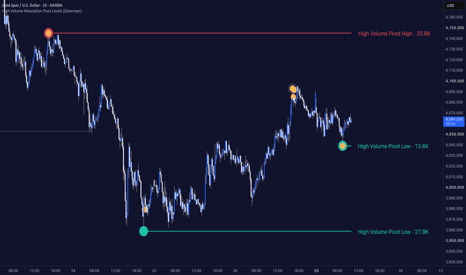
High Volume Absorption Pivot Levels (Zeiierman)█ Overview
High Volume Absorption Pivot Levels (Zeiierman) is a volume-based market structure indicator designed to identify significant pivot highs and lows where price shows signs of absorption during their formation.
Rather than plotting every swing point, the indicator filters pivots using two important characteristics:
• Elevated trading volume.
• Absorption candles that indicate a temporary balance between buyers and sellers.
Only pivots that satisfy these conditions become active support or resistance levels, allowing traders to focus on price levels that formed during periods of increased market participation.
⚪ Absorption and High Participation
The indicator combines traditional pivot detection with volume analysis.
A valid pivot requires:
• A confirmed swing high or swing low.
• Above-average volume on the pivot.
• An absorption candle occurring either around the pivot or directly on the pivot candle.
This helps remove many insignificant swing points while emphasizing areas where market participants were actively exchanging positions.
Once confirmed, these levels often serve as important reference points for future reactions, mitigation events, and retests.
█ How It Works
⚪ Pivot Structure Detection
The script continuously detects confirmed swing highs and swing lows using user-defined pivot lengths. These pivots become candidates for future support and resistance levels.
⚪ High Volume Filter
Not every pivot is plotted.
The pivot candle must also trade with above-average volume.
volume > sma(volume) × multiplier
This helps prioritize pivots that formed during periods of significantly higher participation than normal.
⚪ Absorption Candle Detection
The indicator searches for absorption candles around each pivot.
An absorption candle is defined as:
• Small candle body relative to the total range.
• Above-average trading volume.
█ How to Use
⚪ Identify Institutional Pivot Levels
Instead of displaying every swing point, the indicator focuses on pivots that formed during elevated participation.
This often highlights areas where larger market participants were active.
⚪ Target These Levels for Liquidity Sweeps
High-volume absorption pivots often become attractive liquidity targets.
As the market trends, the price frequently returns to sweep these levels before continuing in the direction of the prevailing trend or, in some cases, initiating a reversal.
These sweeps can represent:
• Liquidity collection before trend continuation.
• Stop-loss hunts around previous pivots.
• Profit-taking before the next market expansion.
• Potential reversal points if the sweep fails and strong opposing participation emerges.
Rather than treating these levels as fixed support or resistance, they should be viewed as important liquidity zones where market participants may become active.
█ Settings
Pivot Left / Right Length: Controls how swing highs and lows are confirmed.
Maximum Active Levels: Sets the maximum number of pivot levels displayed simultaneously.
Absorption Search Range: Defines how many candles around each pivot are searched for absorption.
Absorption Body %: Controls how small the candle body must be relative to the full candle range.
Absorption Volume Multiplier: Defines the minimum volume required for an absorption candle.
Require Absorption On Pivot Candle: Restricts valid pivots to those where the absorption candle occurs exactly on the pivot.
Pivot Volume Multiplier: Sets the minimum volume required for the pivot itself.
-----------------
Disclaimer
The content provided in my scripts, indicators, ideas, algorithms, and systems is for educational and informational purposes only. It does not constitute financial advice, investment recommendations, or a solicitation to buy or sell any financial instruments. I will not accept liability for any loss or damage, including without limitation any loss of profit, which may arise directly or indirectly from the use of or reliance on such information.
All investments involve risk, and the past performance of a security, industry, sector, market, financial product, trading strategy, backtest, or individual's trading does not guarantee future results or returns. Investors are fully responsible for any investment decisions they make. Such decisions should be based solely on an evaluation of their financial circumstances, investment objectives, risk tolerance, and liquidity needs.
Penunjuk
Penunjuk

Penunjuk