Learn to use line charts
Line charts are one of the most popular chart types, along with bar and candlestick charts. They are widely used in the industry because they are easy to understand and interpret — providing clear price visualization.
CONTENTS:
What is a line chart
As a basic type, line charts are perfect for beginners. They can help you quickly understand overall trends and see an asset's performance. Lines are usually generated using close prices, because these are considered the most important.
However, this chart type may be less suited for more complex analysis — lines don't provide detailed data on different aspects of price performance and don't take volume into account.
Due to their simplicity, line charts are perfect for price comparison. Several lines can be displayed in one layout to provide a clear picture without clutter.
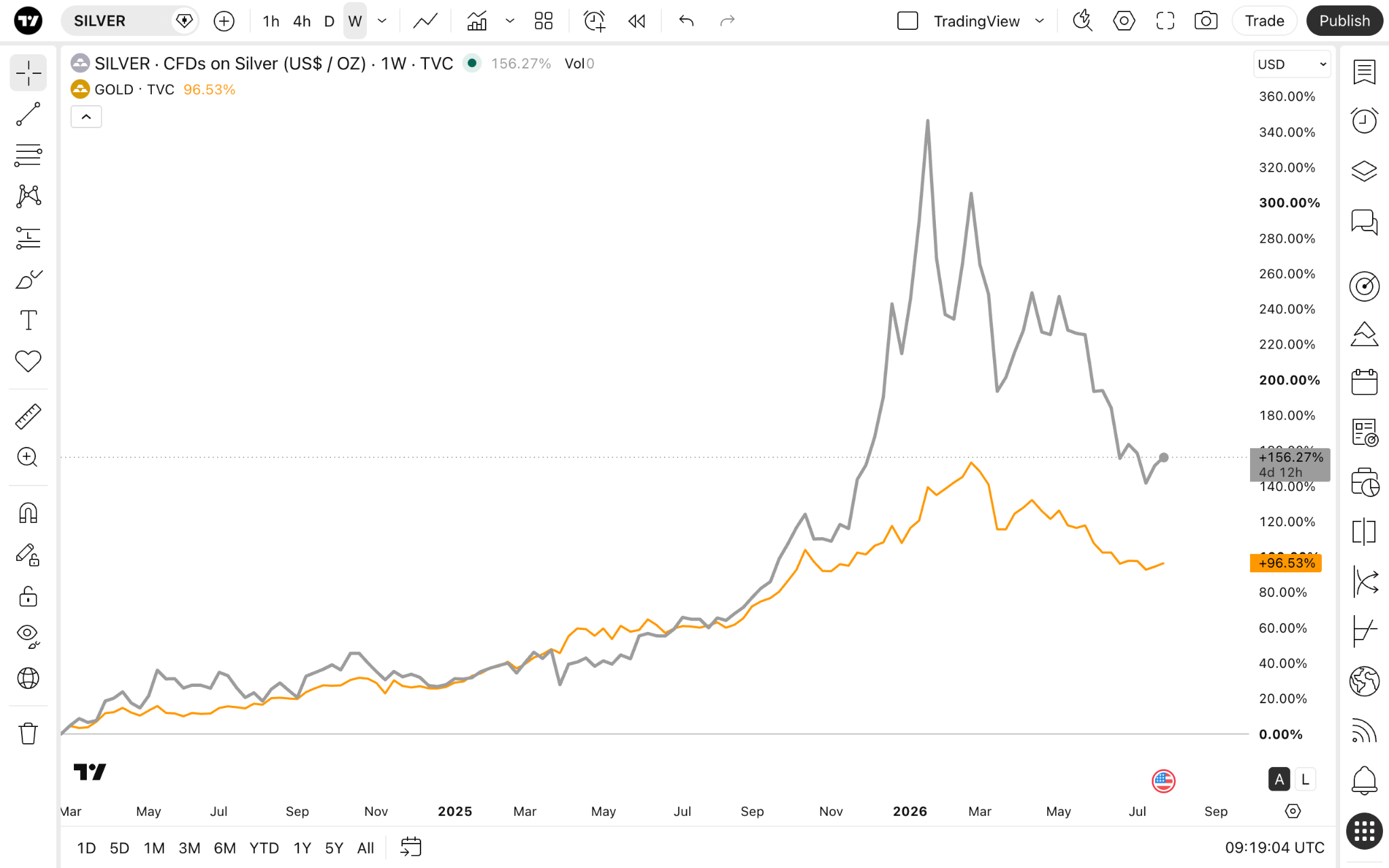
On Supercharts, you can display several symbols with the compare tool.
Line charts vs candles
These are considered standard chart types. You can use both of them — and we recommend doing so as no chart type can provide you with all the information needed for a comprehensive analysis. They each have their uses, providing a better understanding of one aspect of analysis or another.
Line charts
- Better for trend analysis
- More easily compare multiple assets on a single chart
- Better read indicators and drawings due to less clutter on the chart
- More suited for dashboards
Candlestick charts
- Provide more data, which can potentially misguide you
- More complex than lines and require more time to learn them
- May contradict indicators and drawings, creating more uncertainty
Enabling the chart type
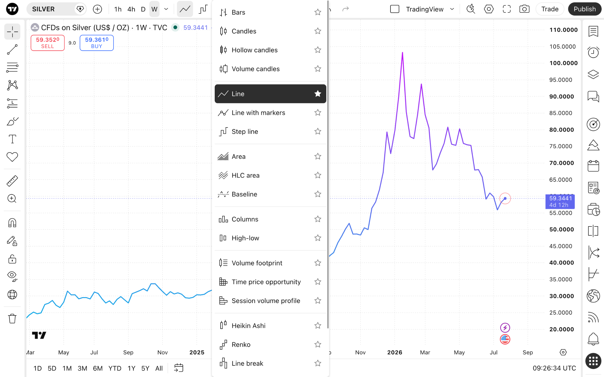
On Supercharts, open the chart type menu on the upper toolbar, and select Line.
Settings
To make the most of the line chart, you can customize it to display different price levels.
To do this, find the gear button on the top toolbar and open the "Symbol" tab.
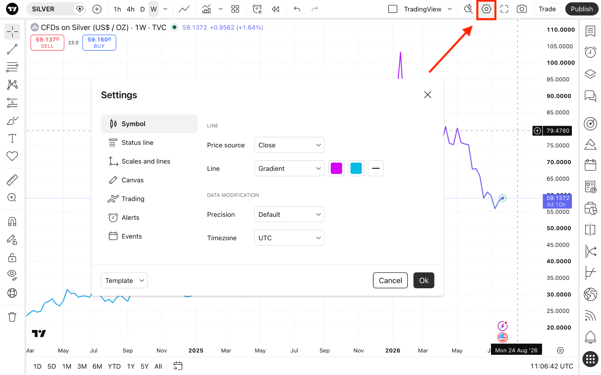
The "Line" section lists settings specific to this chart type:
- Price source: Choose the price you want the chart to show. By default, it is set to close price, meaning the line will be plotted by connecting the asset's closing price during the selected timeframe in a sequence. But you can change it to one of the following:
- Open: Shows the opening prices.
- High: Shows the highest prices.
- Low: Shows the lowest prices.
- Close: Shows the closing prices.
- (H + L)/2: Shows the average of the highest and lowest prices.
- (H + L + C)/3: Shows the average of the highest, lowest, and closing prices.
- (O + H + L + C)/4: Shows the average of the opening, highest, lowest, and closing prices.
- Line: Customize the line's color, gradient, thickness, and opacity.
Line charts in a nutshell
Line charts are a great starting point to studying technical analysis. They can help you quickly understand an asset's trend by providing you with the most important price levels at a glance.
They are a great choice for both light-weighted and trend analysis, presentations, and reports for stakeholders or your audience.
Also read: