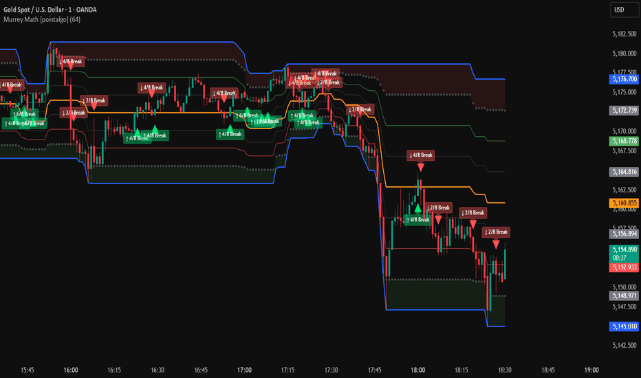
Wskaźnik

Wskaźnik

Wskaźnik
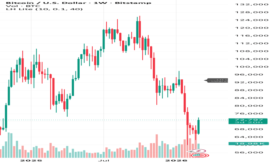
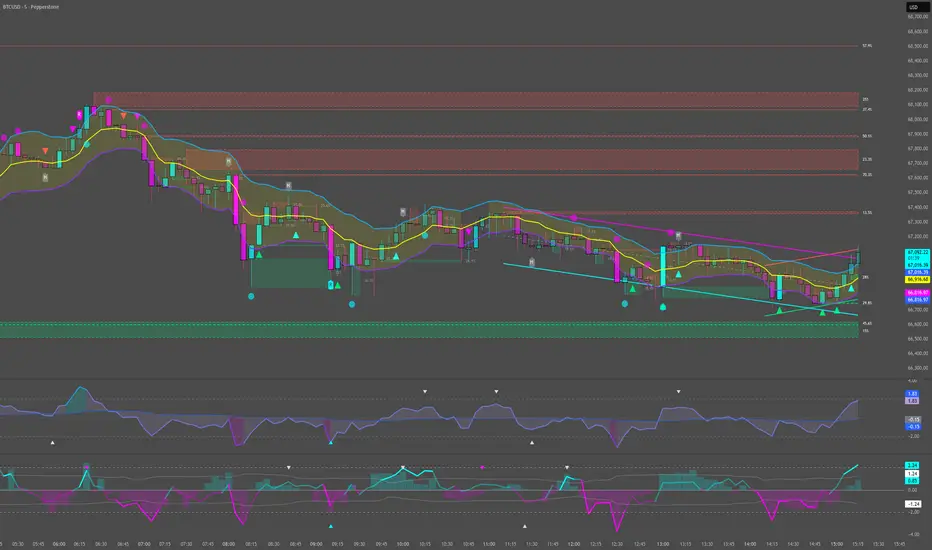
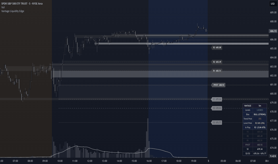
Vantage Liquidity EdgeABOUT
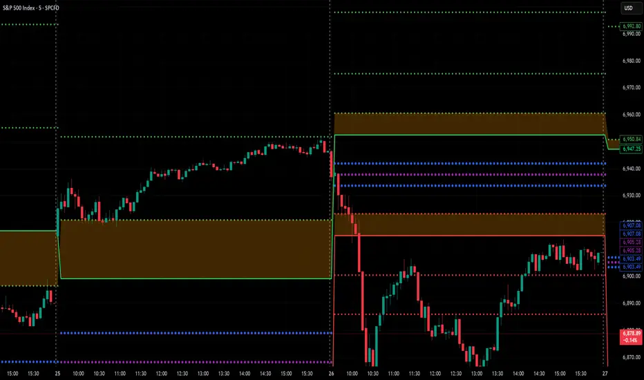
Vantage Liquidity Edge is an intraday positioning indicator that integrates dynamic level projections with liquidity sweep detection for a complete market structure overview. It uses kinetic energy, volume entropy, and price cycles to create adaptive support and resistance levels based on golden ratio expansions, overlaid with echo zones from confirmed liquidity sweeps that adjust with retests. A key feature is the resonance amplitude calculation, which combines signed kinetic energy (0.5 * volume * velocity²) with entropy-scaled volatility and dominant cycle rhythm.
Levels lock at market open, providing real-time trend and level probabilities alongside decaying liquidity echoes that strengthen visually with market interaction.
Bullish Trading Methods:
Demand Zone Entry: Enter long on a Vantage "BULL" bias (close above Pivot, Trend Prob >65%) at a LEM bull echo zone retest, confirmed by increasing opacity. Target the next R1/R2 level, with stop below the echo low.
Expansion Breakout: Buy breaks above R1 on high R2/R3 Level Prob (e.g., "R3 75%") during early expansion, supported by LEM sweeps below. Trail stops to Pivot.
Bearish Trading Methods:
Supply Zone Short: Short on a Vantage "BEAR" bias (close below Pivot, low Trend Prob <35%) at a retested LEM bear echo zone rejection, using opacity for confirmation. Target S1/S2, with stop above the echo high.
Fade Weakness: Short failures at R levels on "S3 XX%" Level Prob in choppy sessions, aligned with fresh LEM supply echoes. Use ATR targets to S zones, monitoring Pivot bias flips.
Wskaźnik
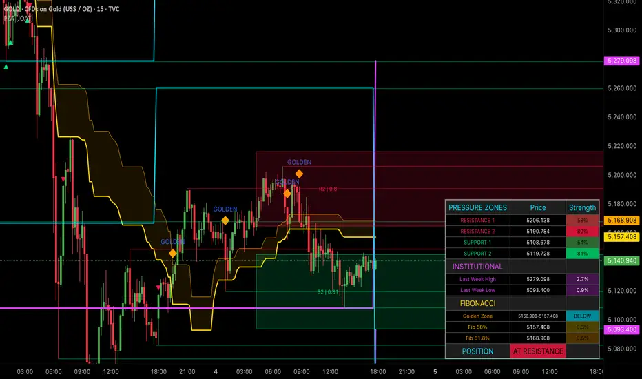
Pressure Zone Analyzer [JOAT]Pressure Zone Analyzer
Introduction
The Pressure Zone Analyzer is an advanced open-source support/resistance indicator that combines dynamic pivot-based zone detection, Fibonacci level analysis, institutional level tracking, zone strength scoring, and multi-timeframe analysis into a comprehensive pressure zone intelligence system. This indicator helps traders identify where significant buying and selling pressure exists, where institutional levels act as magnets for price, and which zones have the highest probability of holding.
Unlike basic support/resistance indicators that draw static horizontal lines, this analyzer dynamically tracks pressure zones based on pivot points, calculates zone strength using volume, touches, and age, integrates Fibonacci golden zone analysis, monitors institutional weekly/daily levels, and provides real-time position assessment. The indicator is designed for traders who understand that not all support/resistance levels are equal and that zone quality determines trading success.
Why This Indicator Exists
This indicator addresses the challenge of identifying high-quality support and resistance zones in real-time. Markets respect some levels and ignore others. By systematically analyzing zone characteristics, this indicator reveals:
Dynamic Pressure Zones: Identifies support and resistance zones based on pivot points with automatic updates
Zone Strength Scoring: Calculates zone quality (0-100%) using volume, touch count, and age
Fibonacci Integration: Tracks key Fibonacci levels (23.6%, 38.2%, 50%, 61.8%, 78.6%) and golden zone (50-61.8%)
Institutional Levels: Monitors weekly and daily highs/lows that act as institutional reference points
Premium/Discount Zones: Identifies institutional buying zones (discount 0-30%) and selling zones (premium 70-100%)
Multi-Timeframe Analysis: Tracks higher timeframe levels for additional confluence
Position Assessment: Provides real-time analysis of price position relative to all zones
Each component provides different zone intelligence. Pivot-based zones show where price reversed, strength scoring shows zone quality, Fibonacci shows mathematical levels, institutional levels show reference points, premium/discount shows institutional bias, and position assessment shows current market context. Together, they create a comprehensive pressure zone system.
Core Components Explained
1. Dynamic Pivot-Based Zone Detection
Pressure zones are identified using pivot highs and lows:
float pivotHigh = ta.pivothigh(high, pivotLength, pivotLength)
float pivotLow = ta.pivotlow(low, pivotLength, pivotLength)
When a pivot high is detected, a resistance zone is created:
if not na(pivotHigh) and barstate.isconfirmed
PressureZone newZone = PressureZone.new()
newZone.zoneLine := line.new(bar_index - pivotLength, pivotHigh, bar_index + 50, pivotHigh,
color=resistanceColor, width=2, extend=extend.right)
newZone.price := pivotHigh
newZone.startBar := bar_index - pivotLength
newZone.zoneType := "resistance"
newZone.volumeAtZone := volume
Similarly for support zones with pivot lows. Zones are stored in arrays and automatically managed (old zones are removed when maximum count is reached).
Zone thickness is calculated as a percentage of price:
calcZoneThickness(float price, float thicknessPercent) =>
float thickness = price * (thicknessPercent / 100)
Default thickness is 0.5% of price, creating a zone rather than a single line. This accounts for the fact that support/resistance is a zone, not a precise price level.
2. Zone Strength Scoring System
Zone strength is calculated using three weighted components:
calcZoneStrength(int touches, float volAtZone, int age, float volWeight, float touchWeight, float ageWeight) =>
// Volume score (0-1)
float avgVolume = ta.sma(volume, 50)
float volScore = avgVolume > 0 ? math.min(volAtZone / avgVolume, 3.0) / 3.0 : 0.5
// Touch score (0-1)
float touchScore = math.min(touches / 5.0, 1.0)
// Age score (0-1) - newer zones score higher
float ageScore = math.max(1.0 - (age / 500.0), 0.0)
// Weighted combination
float strength = (volScore * volWeight) + (touchScore * touchWeight) + (ageScore * ageWeight)
Default weights:
Volume Weight: 40% - Higher volume at zone formation indicates institutional interest
Touch Weight: 30% - More touches indicate stronger zone
Age Weight: 30% - Newer zones are more relevant than old zones
Strength interpretation:
> 70%: Strong zone - high probability of holding
50-70%: Moderate zone - decent probability of holding
< 50%: Weak zone - lower probability of holding
The indicator tracks touches in real-time:
for zone in resistanceZones
if inZone(high, zone.price, thickness)
zone.touches += 1
zone.volumeAtZone := math.max(zone.volumeAtZone, volume)
Each touch increases zone strength, and high-volume touches increase it further.
3. Fibonacci Level Analysis
Fibonacci levels are calculated based on recent swing range:
calcFibLevels(float high, float low) =>
float priceRange = high - low
float fib236 = low + (priceRange * 0.236)
float fib382 = low + (priceRange * 0.382)
float fib500 = low + (priceRange * 0.500)
float fib618 = low + (priceRange * 0.618)
float fib786 = low + (priceRange * 0.786)
The indicator focuses on key levels:
50% (0.5): Equilibrium level - often acts as support/resistance
61.8% (0.618): Golden ratio - strongest Fibonacci level
Golden Zone is calculated as the area between 50% and 61.8%:
calcGoldenZone(float high, float low) =>
float priceRange = high - low
float goldenTop = low + (priceRange * 0.618)
float goldenBottom = low + (priceRange * 0.5)
The golden zone represents optimal entry area with best risk:reward ratio. Entries in the golden zone allow tight stops below 50% with targets at swing high.
4. Institutional Level Tracking
The indicator monitors key institutional reference levels:
Weekly High/Low:
float lastWeekHigh = request.security(syminfo.tickerid, "W", high ,
barmerge.gaps_off, barmerge.lookahead_off)
float lastWeekLow = request.security(syminfo.tickerid, "W", low ,
barmerge.gaps_off, barmerge.lookahead_off)
Daily High/Low:
float yesterdayHigh = request.security(syminfo.tickerid, "D", high ,
barmerge.gaps_off, barmerge.lookahead_off)
float yesterdayLow = request.security(syminfo.tickerid, "D", low ,
barmerge.gaps_off, barmerge.lookahead_off)
These levels act as magnets for price because:
Institutional algorithms reference these levels for order placement
Retail traders watch these levels for breakouts/breakdowns
Options and futures contracts often reference these levels
Previous day/week ranges provide context for current price action
5. Premium/Discount Zone System
Based on weekly range, the indicator calculates institutional bias zones:
float weekRange = lastWeekHigh - lastWeekLow
// Premium Zone (70-100% of range) - Institutional selling zone
float premiumTop = lastWeekHigh
float premiumBot = lastWeekLow + (weekRange * 0.7)
// Discount Zone (0-30% of range) - Institutional buying zone
float discountTop = lastWeekLow + (weekRange * 0.3)
float discountBot = lastWeekLow
// Golden Zone (50-61.8% of range) - Optimal entry zone
float goldenTop = lastWeekLow + (weekRange * 0.618)
float goldenBot = lastWeekLow + (weekRange * 0.5)
Trading logic:
In Discount Zone: Look for long entries - institutions are likely buying
In Premium Zone: Look for short entries - institutions are likely selling
In Golden Zone: Optimal risk:reward for entries in direction of trend
Between Zones: Neutral area - wait for price to reach discount or premium
This concept is based on institutional order flow: institutions buy in discount zones (value area) and sell in premium zones (overvalued area).
6. Multi-Timeframe Level Analysis
The indicator tracks higher timeframe levels for additional confluence:
float htfHigh = request.security(syminfo.tickerid, htfTimeframe, high ,
barmerge.gaps_off, barmerge.lookahead_off)
float htfLow = request.security(syminfo.tickerid, htfTimeframe, low ,
barmerge.gaps_off, barmerge.lookahead_off)
HTF timeframe is customizable (default: Daily). When current timeframe zones align with HTF levels, confluence increases zone strength.
7. Real-Time Position Assessment
The indicator continuously assesses price position:
// Check if in golden zone
bool inGoldenZone = close >= goldenBottom and close <= goldenTop
// Check if near resistance
bool nearResistance = false
for zone in resistanceZones
if inZone(close, zone.price, thickness * 2)
nearResistance := true
// Check if near support
bool nearSupport = false
for zone in supportZones
if inZone(close, zone.price, thickness * 2)
nearSupport := true
Position status:
AT RESISTANCE: Price near strong resistance zone - consider shorts or exits
AT SUPPORT: Price near strong support zone - consider longs or exits
GOLDEN ZONE: Price in optimal entry area - look for entries in trend direction
NEUTRAL: Price not near any significant zones - wait for better positioning
Visual Elements
Pressure Zone Lines: Horizontal lines showing resistance (red) and support (green) zones
Zone Strength Boxes: Filled boxes showing only strongest zones (strength > 60%) with strength percentage
Fibonacci Lines: Key Fibonacci levels (50% and 61.8%) with distinct colors
Golden Zone Fill: Shaded area between 50% and 61.8% Fibonacci levels
Institutional Lines: Weekly high/low (purple, thick) and Daily high/low (yellow, medium)
HTF Lines: Higher timeframe high/low (cyan) for additional confluence
Premium/Discount Fills: Shaded zones showing premium (red), discount (green), and golden (orange) areas
Position Markers: Visual alerts when price enters golden zone or approaches strong zones
Comprehensive Table: Dashboard showing top 2 resistance zones, top 2 support zones, institutional levels, Fibonacci levels, and current position status
Input Parameters
Pressure Zone Settings:
Zone Detection Length: Period for swing range calculation (default: 50, range: 20-200)
Pivot Length: Period for pivot detection (default: 10, range: 5-50)
Max Zones: Maximum zones to display (default: 8, range: 4-20)
Zone Thickness Percent: Zone width as percentage of price (default: 0.5%, range: 0.1-2.0%)
Fibonacci Settings:
Show Fibonacci Levels: Toggle Fib lines (default: enabled)
Show Golden Zone: Toggle golden zone fill (default: enabled)
Institutional Levels:
Show Last Week High/Low: Toggle weekly levels (default: enabled)
Show Yesterday High/Low: Toggle daily levels (default: enabled)
Strength Scoring:
Show Zone Strength: Toggle strength boxes (default: enabled)
Volume Weight: Weight for volume component (default: 0.4, range: 0.0-1.0)
Touch Weight: Weight for touch component (default: 0.3, range: 0.0-1.0)
Age Weight: Weight for age component (default: 0.3, range: 0.0-1.0)
Multi-Timeframe:
HTF Timeframe: Higher timeframe for level tracking (default: Daily)
Show HTF Levels: Toggle HTF lines (default: enabled)
Colors:
All colors are fully customizable including resistance, support, Fibonacci, golden zone, HTF levels, and institutional levels.
How to Use This Indicator
Step 1: Identify Strongest Zones
Look at the table to see top 2 resistance and support zones with strength percentages. Focus on zones with strength > 70%.
Step 2: Check Institutional Levels
Monitor weekly and daily highs/lows. These act as magnets for price and often provide strong support/resistance.
Step 3: Assess Premium/Discount Position
Determine if price is in premium zone (look for shorts), discount zone (look for longs), or golden zone (optimal entries).
Step 4: Look for Fibonacci Confluence
When pressure zones align with Fibonacci levels (especially 50% and 61.8%), zone strength increases significantly.
Step 5: Monitor Position Status
Check the table's position row. "AT RESISTANCE" or "AT SUPPORT" signals potential reversal or bounce areas.
Step 6: Wait for Zone Tests
Don't chase price. Wait for price to return to strong zones before entering. The best entries occur when price tests a zone and shows rejection.
Step 7: Use HTF Confluence
When current timeframe zones align with HTF levels, probability of zone holding increases. Look for these high-confluence areas.
Best Practices
Use on 15-minute to 4-hour timeframes for optimal zone clarity
Focus on zones with strength > 70% - these have highest probability of holding
Multiple touches increase zone strength - zones that held before are likely to hold again
Golden zone entries offer best risk:reward - tight stops with large targets
Premium/discount zones work best in trending markets
Weekly levels are stronger than daily levels - prioritize weekly when they conflict
Wait for price to reach zones - don't anticipate, react
Look for volume confirmation when zones are tested - high volume rejections are strongest
Combine with price action - zones show where, price action shows when
HTF confluence significantly increases zone strength - prioritize these areas
Indicator Limitations
Zones don't always hold - even strong zones can break during major news or trend changes
Zone strength is relative to recent history - not absolute
Pivot-based detection requires sufficient price history - may not work on newly listed instruments
Maximum zone limits (8 default) mean some valid zones may not be displayed
Zone thickness is a percentage - may be too wide or narrow for some instruments
Premium/discount zones are relative to weekly range - not absolute value areas
Fibonacci levels are based on recent swing - may not align with longer-term structure
The indicator shows zones, not direction - requires trader interpretation
Works best on liquid instruments with clear support/resistance behavior
Zone strength scoring is a guide, not a guarantee - strong zones can still fail
Technical Implementation
Built with Pine Script v6 using:
Custom type definition for PressureZone with strength tracking
Array-based storage for resistance and support zones
Pivot-based zone detection with confirmation
Multi-component zone strength scoring
Touch and volume tracking for each zone
Fibonacci level calculations
Golden zone identification
Multi-timeframe security requests for institutional levels
Premium/discount zone calculations based on weekly range
Real-time position assessment
Dynamic table with 13 rows showing all metrics
Overlap prevention for visual clarity
Automatic zone cleanup when maximum count is reached
The code is fully open-source and can be modified to suit individual trading styles and preferences.
Originality Statement
This indicator is original in its comprehensive pressure zone analysis. While individual components (pivot-based S/R, Fibonacci, institutional levels) are established concepts, this indicator is justified because:
It synthesizes five distinct zone analysis methodologies into a unified system
Zone strength scoring combines volume, touches, and age with customizable weights
Automatic zone management prevents clutter while highlighting strongest zones
Integration of Fibonacci golden zone with pivot-based zones
Premium/discount zone system based on institutional order flow concepts
Multi-timeframe level tracking for confluence analysis
Real-time position assessment provides actionable trading context
Comprehensive table shows all metrics simultaneously for holistic analysis
Overlap prevention ensures clean charts without sacrificing information
Each component contributes unique zone intelligence: pivot zones show where price reversed, strength scoring shows zone quality, Fibonacci shows mathematical levels, institutional levels show reference points, premium/discount shows institutional bias, HTF levels show confluence, and position assessment shows current context. The indicator's value lies in presenting these complementary perspectives simultaneously with quantitative strength scoring and intelligent display management.
Disclaimer
This indicator is provided for educational and informational purposes only. It is not financial advice or a recommendation to buy or sell any financial instrument. Trading involves substantial risk of loss and is not suitable for all investors.
Pressure zone analysis is a tool for identifying potential support and resistance areas, not a crystal ball for predicting future price movement. Strong zones, high strength scores, and institutional levels do not guarantee profitable trades. Past zone behavior does not guarantee future zone behavior. Market conditions change, and strategies that worked historically may not work in the future.
The zones and levels displayed are mathematical calculations based on current market data, not predictions of future price movement. High-strength zones can break, golden zone entries can fail, and institutional levels can be violated. Users must conduct their own analysis and risk assessment before making trading decisions.
Always use proper risk management, including stop losses and position sizing appropriate for your account size and risk tolerance. Never risk more than you can afford to lose. Consider consulting with a qualified financial advisor before making investment decisions.
The author is not responsible for any losses incurred from using this indicator. Users assume full responsibility for all trading decisions made using this tool.
-Made with passion by officialjackofalltrades Wskaźnik

Nadaraya-Watson Dynamic Envelopes [identityKa]Welcome to another premium-grade, free-to-use trading tool developed by identityKa.
The Nadaraya-Watson Dynamic Envelopes is a highly advanced, visually smooth overlay indicator designed to capture dynamic support and resistance zones. Instead of relying on traditional, jagged moving averages, this indicator utilizes a Gaussian-inspired smoothing technique (via an optimized ALMA mathematical engine) to wrap the price action in a flowing, highly responsive channel.
Whether you are a day trader looking for mean-reversion setups or a swing trader identifying macro tops and bottoms, this indicator provides crystal-clear visual guidance without cluttering your chart.
🔥 Key Features:
Dynamic Smoothing Engine: Creates non-jagged, flowing upper (resistance) and lower (support) bands that adapt to market volatility.
Mean Reversion Signals: Prints distinct triangle shapes (Red for Bearish, Green for Bullish) when the price action sharply interacts with the outer envelopes, highlighting high-probability reversal zones.
Smart HUD Dashboard: Includes a clean, fully customizable on-chart dashboard that displays the current engine status, price position relative to the midline, and a real-time AI Suggestion (LONG, SHORT, or Dangerous) based on the algorithmic state.
100% Customizable: Every aspect of the indicator, from bandwidth smoothness and multipliers to theme colors (featuring the signature identityKa neon palette) and dashboard positioning, can be adjusted in the settings menu.
💡 How to Trade with It:
Mean Reversion: Look for bullish (green) triangle signals when the price touches or pierces the lower green envelope for potential long entries. Conversely, look for bearish (red) triangle signals at the upper red envelope for short entries.
Trend Continuation: In strong trending markets, the midline (white) often acts as dynamic support/resistance.
Pro Tip: This indicator works best when combined with a primary trend filter (such as our Alpha SuperTrend Signal). Avoid taking reversal signals against a very strong macroeconomic trend unless confirmed by other Price Action concepts.
⚙️ Settings & Alerts:
The script comes with built-in alert conditions for both Support Bounces (Bullish) and Resistance Rejections (Bearish), allowing you to automate your workflow. All settings are globally accessible in English.
Elevate your chart quality. Trade with precision. Trade with identityKa. Wskaźnik

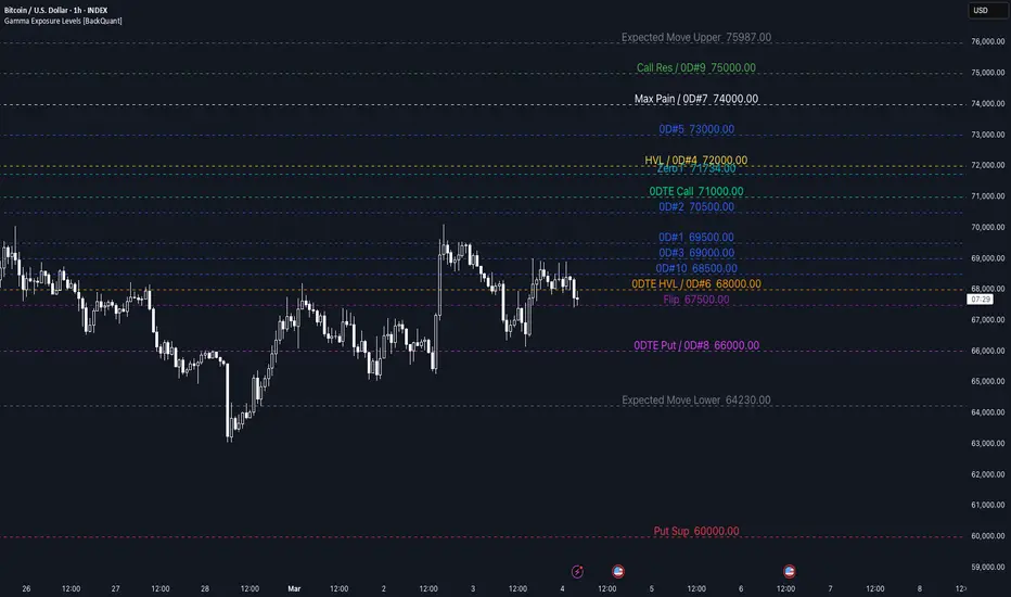
Gamma Exposure Levels [BackQuant]Gamma Exposure Levels
This indicator allows you to paste Gamma Exposure (GEX) level data directly into a text input on TradingView, automatically parsing the values and plotting them as labeled horizontal lines on your chart. It is designed for traders who use options-derived gamma exposure data as part of their technical analysis and want a fast, visual way to overlay those key price levels onto any chart and timeframe.
Rather than manually drawing lines for each level, this script reads a structured block of GEX output text, extracts every relevant dollar value, and draws color-coded, labeled levels across your chart. If two or more levels share the same price, their labels are automatically merged (for example, "Max Pain / Call Res $75,000") so the chart stays clean and readable.
What is Gamma Exposure (GEX)?
Gamma Exposure refers to the aggregate gamma held by options market makers (dealers) at each strike price. Gamma measures how much a dealer's delta (directional hedge) changes as the underlying price moves. When dealers hold large gamma positions, they must continuously hedge by buying or selling the underlying asset, which can either dampen or amplify price movement depending on the sign of that gamma.
When dealers are long gamma (positive GEX), they hedge against the prevailing trend: buying dips and selling rallies. This creates a stabilizing, mean-reverting effect around high-gamma strikes, making those levels act like magnets or support/resistance zones.
When dealers are short gamma (negative GEX), they hedge in the same direction as the move: selling into drops and buying into rallies. This amplifies volatility and can cause sharp, directional moves once a key gamma level breaks.
Understanding where these gamma levels sit gives traders a structural map of where options market makers are likely to add liquidity or accelerate a move.
How to Use This Indicator
Add the indicator to your chart.
Open the indicator settings and find the "Data Input" group at the top.
Paste your full GEX levels output into the text area. The indicator expects a structured text format (see the example format below).
The indicator will automatically parse all dollar values from the text and plot them as horizontal lines with labels.
Use the toggle checkboxes next to each level type to show or hide individual levels.
Customize colors, line style, line width, label size, label offset, and label position from the settings panel.
Expected Input Format
The indicator parses structured GEX output text. Below is an example of the expected format. Copy and paste a block like this directly into the text area input in the indicator settings:
GEX Levels - 04/03/2026, 12:17:19
All-Expiry Levels:
HVL: $72,000 +$1,841 (+2.62%)
Call Resistance: $75,000 +$4,841 (+6.90%)
Put Support: $60,000 $-10,159 (-14.48%)
0DTE Levels:
0DTE HVL: $68,000 $-2,159 (-3.08%)
0DTE Call: $71,000 +$841 (+1.20%)
0DTE Put: $66,000 $-4,159 (-5.93%)
Advanced:
Zero Gamma: $71,819 +$1,660 (+2.37%)
Max Pain: $74,000 +$3,841 (+5.47%)
Expected Move: $64,238 to $76,081
Flip Zones (All): $67,500
All-Expiry GEX Top 10 (by |gamma|):
1. $60,000 $-10,159 (-14.48%) | GEX: -20,711,741.86
2. $75,000 +$4,841 (+6.90%) | GEX: 18,876,578.2
3. $72,000 +$1,841 (+2.62%) | GEX: 17,530,960.01
4. $70,000 $-159 (-0.23%) | GEX: 17,494,795.02
5. $74,000 +$3,841 (+5.47%) | GEX: 13,573,146.08
6. $73,000 +$2,841 (+4.05%) | GEX: 10,380,107.7
7. $69,000 $-1,159 (-1.65%) | GEX: 10,341,883.98
8. $80,000 +$9,841 (+14.03%) | GEX: 8,636,674.83
9. $71,000 +$841 (+1.20%) | GEX: 7,962,084.65
10. $65,000 $-5,159 (-7.35%) | GEX: -7,257,124.01
0DTE GEX Top 10 (by |gamma|):
1. $69,500 $-659 (-0.94%) | GEX: 3,659,702.74
2. $70,500 +$341 (+0.49%) | GEX: 1,152,595.15
3. $69,000 $-1,159 (-1.65%) | GEX: 703,339.82
4. $72,000 +$1,841 (+2.62%) | GEX: 697,625.91
5. $73,000 +$2,841 (+4.05%) | GEX: 419,096.08
6. $68,000 $-2,159 (-3.08%) | GEX: 294,575.89
7. $74,000 +$3,841 (+5.47%) | GEX: 281,083.42
8. $75,000 +$4,841 (+6.90%) | GEX: 183,191.05
9. $66,000 $-4,159 (-5.93%) | GEX: -172,470.38
10. $68,500 $-1,659 (-2.37%) | GEX: 167,135.87
The indicator only extracts the dollar values from this text. The percentage changes, GEX magnitude values, and other metadata are informational context in the source data but are not plotted by this script.
Level Definitions
Below is a detailed explanation of every level this indicator can parse and plot. These are grouped the same way they appear in the indicator settings.
All-Expiry Levels
These levels are derived from gamma exposure aggregated across all option expiration dates.
HVL (High Volume Level) - The price with the highest total gamma exposure across all expirations. This is the strike where dealers hold the most aggregate gamma and therefore where hedging activity is most concentrated. Price tends to gravitate toward the HVL in positive gamma environments because dealer hedging creates a mean-reverting effect around this level. Think of it as the "center of gravity" for options-driven price action.
Call Resistance - The price level where call-side gamma creates overhead resistance. At this strike, the concentration of call gamma means that as price rises toward it, dealers who are long those calls must sell the underlying to stay delta-neutral. This selling pressure acts as a ceiling, making it harder for price to push through. Breaks above call resistance can signal a shift in positioning or the start of a gamma squeeze.
Put Support - The price level where put-side gamma creates downside support. At this strike, the concentration of put gamma means that as price falls toward it, dealers must buy the underlying to hedge. This buying pressure acts as a floor, cushioning the decline. A break below put support can accelerate selling as dealers flip from buying to selling, potentially triggering a sharp move lower.
0DTE Levels
These levels are derived exclusively from same-day (zero days to expiration) options. Because 0DTE options have extremely high gamma due to their proximity to expiration, they can dominate intraday price action even when their notional size is smaller than longer-dated positions.
0DTE HVL - The same-day high volume level. This is the intraday gamma center of gravity derived solely from options expiring today. It represents the strike where 0DTE dealer hedging is most concentrated and where intraday gamma polarity can flip. Particularly relevant for intraday traders, as 0DTE gamma effects intensify throughout the trading session and peak in the final hours before expiration.
0DTE Call - Same-day call resistance. The intraday ceiling created by 0DTE call gamma. Dealer hedging against these expiring calls creates selling pressure as price approaches this level. Because 0DTE gamma decays rapidly, this level can shift during the session and its strength increases as expiration approaches.
0DTE Put - Same-day put support. The intraday floor created by 0DTE put gamma. Dealer hedging against expiring puts creates buying pressure at this level. Like the 0DTE call level, its influence grows as the trading day progresses and gamma effects intensify near the close.
Advanced Levels
These levels provide additional structural context beyond the core support, resistance, and HVL framework.
Zero Gamma - The precise price where cumulative gamma across all strikes and expirations equals zero. This is one of the most important structural levels in gamma analysis. Above the Zero Gamma level, dealers are net long gamma and their hedging stabilizes price (buying dips, selling rallies). Below it, dealers are net short gamma and their hedging amplifies moves (selling into drops, buying into rallies). Crossing the Zero Gamma level often marks a regime change in how the market behaves, shifting from mean-reversion to trend-following dynamics.
Max Pain - The strike price at which the total value of all outstanding options (both calls and puts) would be minimized if the underlying expired at that price. In other words, it is the price where option holders collectively lose the most money. Max Pain theory suggests that there is a gravitational pull toward this level as expiration approaches, driven by dealers and market makers who benefit from options expiring worthless. It is most relevant in the final days before a major expiration.
Expected Move - The 1-sigma (one standard deviation) expected price range, plotted as two levels: Expected Move Upper and Expected Move Lower. This range represents the statistically expected boundaries of price movement based on current implied volatility. Roughly 68% of the time, price is expected to remain within this range. These levels help traders gauge whether the current price action is within normal bounds or represents an unusual move. A break beyond the expected move range can signal a volatility event or a shift in market regime.
Flip Zones - All price levels where gamma polarity changes sign. At these strikes, dealer hedging behavior transitions from stabilizing (long gamma) to destabilizing (short gamma) or vice versa. Flip zones act as transition boundaries. When price crosses a flip zone, the nature of dealer activity changes, which can lead to shifts in volatility, momentum, and the tendency for price to mean-revert or trend. Multiple flip zones in a narrow range can create a "no man's land" where positioning is mixed and price action becomes choppy.
GEX Top 10
The GEX Top 10 are the ten strike prices with the highest absolute gamma exposure, ranked by the magnitude of their gamma (|gamma|). These represent the strikes where dealer hedging activity is most significant, regardless of whether the gamma is positive (call-dominated, stabilizing) or negative (put-dominated, destabilizing).
The indicator provides a dropdown selector with five options for the GEX Top 10:
None - Do not plot any GEX Top 10 levels.
0DTE - Plot the Top 10 from same-day (0DTE) options only. Best for intraday analysis.
All Expiries - Plot the Top 10 from all expiration dates combined. Best for swing or multi-day analysis.
0DTE 1-5 - Plot only the top 5 from 0DTE options. Useful for reducing chart clutter while keeping the most significant intraday levels.
All Expiries 1-5 - Plot only the top 5 from all expiration dates. Useful for a cleaner multi-day view.
Each of the 10 GEX levels (GEX #1 through GEX #10) has its own individual toggle and color picker, so you can show or hide any specific rank and assign distinct colors to differentiate them.
Overlap Handling
It is common for multiple GEX levels to land on the same price. For example, Max Pain and Call Resistance might both be at $75,000, or a GEX Top 10 strike might coincide with the HVL. Rather than drawing overlapping lines and labels that clutter the chart, this indicator automatically detects when two or more levels share the same price (within a $0.50 tolerance). When a match is found, only one line is drawn at that price and the labels are merged with a "/" separator.
For example, if Max Pain is $75,000 and Call Resistance is also $75,000, the chart will show a single line labeled:
Max Pain / Call Res 75000
This keeps the chart clean and makes it immediately obvious when multiple structural levels converge at the same price, which often signals a particularly significant level.
Customization Options
The indicator provides extensive customization through its settings panel:
Per-Level Controls
Each level type has its own color picker and show/hide toggle on the same line.
GEX Top 10 levels (#1 through #10) each have individual color pickers and toggles.
A dropdown selector lets you choose which GEX Top 10 dataset to plot (0DTE, All Expiries, top 5 only, or none).
Line Style
Line Width: 1 to 4 pixels.
Line Style: Solid, Dashed, or Dotted.
Extend Lines: Both directions, Right only, Left only, or None.
Label Settings
Label Size: Tiny, Small, Normal, Large, or Huge.
Label Offset: Position the labels any number of bars to the right or left of the current bar (-200 to 500).
Label Side: Place labels on the Right or Left side of the chart.
Every toggle and input has a descriptive tooltip that appears on hover, explaining what the level represents and how it is used.
How the Parsing Works
The script uses Pine Script v6 string functions to scan the pasted text for known keywords (such as "HVL:", "Call Resistance:", "0DTE Call:", "Zero Gamma:", "Expected Move:", "Flip Zones:", etc.). For each keyword found, it locates the next "$" character and extracts the numeric value that follows, correctly handling both comma-separated thousands (e.g., $72,000) and decimal values (e.g., $71,819.50).
For the Expected Move, it parses both the lower and upper bounds from the "to" separator (e.g., "$64,238 to $76,081").
For Flip Zones, it scans for every "$" on the line and extracts each value, correctly distinguishing thousands-separator commas from delimiter commas between multiple zone values.
For the GEX Top 10 sections, it identifies the section header ("All-Expiry GEX Top 10" or "0DTE GEX Top 10") and parses the first dollar value from each numbered line, stopping when it hits a new section header or separator.
The indicator only draws on the last bar and uses a delete-and-redraw system to ensure that only one clean set of lines and labels exists at any time. Old drawings are removed before new ones are created on each update.
Important Notes
This indicator does not generate or calculate GEX data. It is a visualization tool that plots externally sourced gamma exposure levels onto your TradingView chart.
The indicator requires you to paste GEX data in the expected structured text format. If the text area is empty, nothing will be plotted.
GEX data is a snapshot in time. Options positioning changes throughout the trading day as new trades are opened and closed. Levels should be updated periodically for the most accurate representation of current dealer positioning.
GEX levels are not guaranteed support or resistance. They represent areas where dealer hedging activity is concentrated, which can influence price behavior but does not determine it. Always use GEX data as one component of a broader analysis framework.
Wskaźnik

Wskaźnik

Quantum Dynamic Mitigation Zones v1Quantum Dynamic Mitigation Zones - Institutional Order Flow Support/Resistance
Overview
Traditional Support and Resistance lines rely on lagging historical pivots. The Quantum Dynamic Mitigation Zones indicator brings true institutional order flow to your charts. It scans for massive, statistically significant volume anomalies (Whale executions) and draws rigid Supply and Demand zones forward in time. Most importantly, it visually simulates order book "Mitigation"—as price wicks back into these zones, the boxes physically shrink, showing you exactly how much institutional liquidity has been "eaten" before the level finally breaks.
Key Highlights
• Anomaly Detection: Scans the current timeframe for extreme volume spikes (e.g., 300%+ above the moving average) to identify where institutional money stepped in.
• Dynamic Mitigation Engine: As future price action retraces into a drawn zone, the script permanently erases the portion of the box that price touched.
• Visual Liquidity: Instead of guessing if a level is still strong, you can literally see if the box is wide and heavily defended, or if it has been reduced to a thin sliver about to break.
How to Trade It
When an anomaly zone is first created, do not chase the breakout. Wait for price to naturally retrace back to the box. If the price taps the edge of the box and rejects strongly, buy/sell the bounce. If price begins heavily "eating" into the box, narrowing its size, assume the institutional defense is depleted and prepare to trade the continuation breakout through the zone.
⚠️ DISCLAIMER: STRICTLY FOR EDUCATIONAL PURPOSES
The information, scripts, and concepts provided in this publication are for educational and informational purposes only and do not constitute financial, investment, or trading advice. Trading in financial markets (including Forex, Crypto, Stocks, and Commodities) carries a high level of risk and may not be suitable for all investors. You could lose some or all of your initial investment. Past performance is not indicative of future results. Always conduct your own due diligence, backtest any strategy thoroughly, and consult with a certified financial advisor before making any trading decisions. By using this script, you acknowledge that you are solely responsible for your own trading actions and outcomes.
Wskaźnik

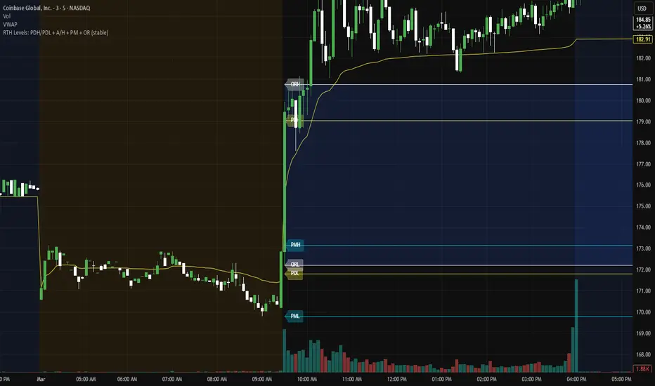
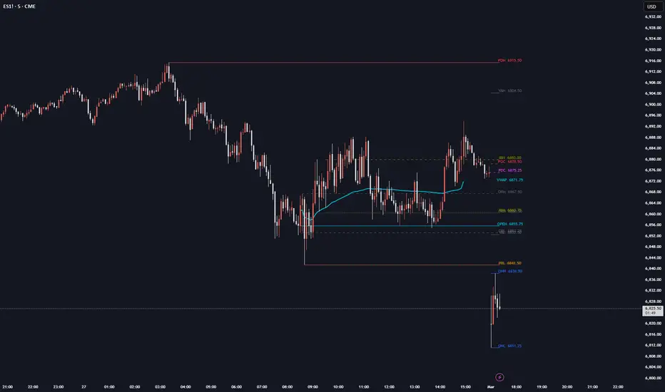
Daily MGI - OnlyFlowMGI (Market Generated Information) plots key daily reference levels used by auction market and order flow traders. It draws Prior Day High, Low, Mid, and Close, Overnight High/Low, Opening Range, Initial Balance, RTH VWAP, and Value Area levels — all with price labels extending to the current bar.
Each line originates from the bar where the level was actually printed, giving you immediate visual context on where the market established its boundaries.
Features:
- Full Day (ETH) or RTH Only mode for prior day levels
- Configurable Opening Range and Initial Balance durations with ±50/100/150/200% extensions
- RTH VWAP and session midline
- Approximate prior day Value Area (VAH/VAL/POC)
- All levels togglable with customizable colors and label sizes
- Lines draw from their origin point to the current bar
Built as a lightweight alternative to paid order flow packages. Designed for futures (ES, NQ, etc.) but works on any instrument with defined RTH/ETH sessions. Adjust the RTH and ETH session times in settings to match your market. Wskaźnik
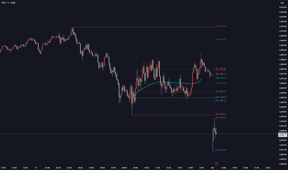
LiqLines Pro: Auto & Manual Percentage Grid
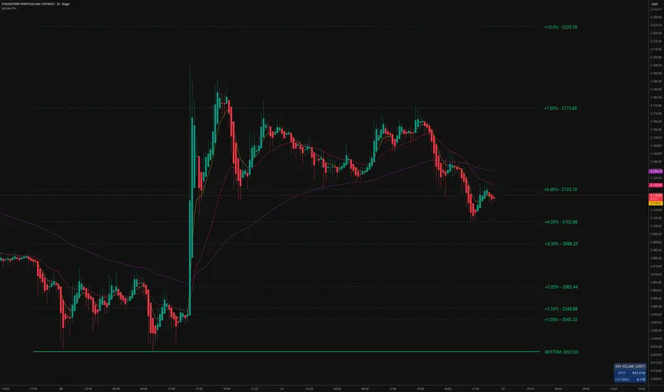
Description:
The LiqLines Pro indicator is a pure structural mapping tool designed to plot dynamic, percentage-based reference levels for any chosen asset. It allows traders to visualize exact mathematical distances from specific top and bottom coordinates, either automatically or via manual selection.
Core Mechanics and Calculation Engine:
1. Auto-Detection vs. Manual Level Selection
Auto-Detection (Default): By default, the script utilizes the ta.highest() and ta.lowest() functions over a user-defined lookback period (default 500 bars). It identifies the macro structural extremes within this window and projects the percentage grid based on those prices.
Manual Level Selection (Anchoring): The core feature of this tool is its integration of Pine Script's input.price() functionality. Users can override the auto-detection engine to set custom origin points. By selecting the indicator's "Settings" or "Reset Inputs", users can use their mouse to click directly on the chart, manually selecting the top or bottom level at any specific wick, breakout candle, or structural gap. Furthermore, users can freely adjust these levels by simply dragging and dropping the anchor lines up or down to new areas on the chart. The entire grid instantly recalculates based on this newly selected price. The script also includes a parity-check safety measure; if the asset is changed and the selected level falls completely out of bounds, it defaults back to auto-detection seamlessly.
2. Modular Percentage Tiers & Customization
Instead of relying on standard fixed ticks, the script calculates strict percentage deviations (e.g., +1.00%, +5.00%, -10.00%) from the active top and bottom levels. To maintain a clean chart interface, users have full control to toggle individual percentage lines on or off for both upward and downward directions. This allows traders to fully customize their grid, showing only the specific percentage levels they need for their strategy. By default, only the micro-levels (1% to 10%) are enabled .
3. Dynamic Proximity Alerts
The script includes a built-in mathematical proximity detector. It continuously calculates the absolute distance between the current close price and the plotted percentage lines. If the price enters a proximity threshold (strictly defined as a 0.1% distance from the level), the specific line and its corresponding label dynamically change color to Yellow. This provides visual feedback when price interacts with a specific percentage deviation zone.
Map your own structural levels and define your own trading zones…
Wskaźnik

Wskaźnik

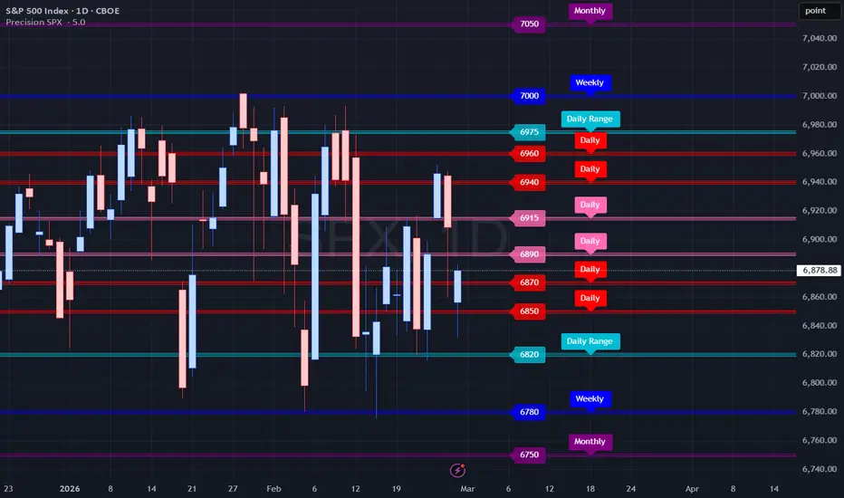
Precision SPXPrecision SPX — Multi‑Timeframe Levels + Automated Alerts for SPX Traders
Precision SPX is a manual‑control Support and Resistance system built for SPX traders who rely on structure, precision, and daily level updates. It plots Monthly, Weekly, Daily, and Daily Range levels to map where price may react, reverse, or consolidate. This version includes a full alert engine that notifies you the moment price interacts with any level.
Core Features
Multi‑Timeframe Levels
The indicator plots a complete structure:
Monthly Levels — High & Low
Weekly Levels — High & Low
Daily Levels — Six total (4 Red, 2 Pink)
Daily Range Levels — High & Low
All levels are manually entered for maximum precision.
Customizable Visuals
Adjustable label size
Adjustable horizontal label placement
Toggle level labels on/off
Clean color‑coded hierarchy
ES/SPY Conversion Support
Optional manual ES spread or SPY ratio input
Automatically adjusts SPX levels
Lightweight & User‑Friendly
No repainting
No heavy calculations
Easy to integrate into any chart layout
How It Works
Precision SPX plots manually‑controlled Support and Resistance levels across multiple timeframes. Each level is labeled and color‑coded so you can quickly identify:
Higher‑timeframe structure
Daily intraday reaction zones
Overnight range boundaries
Breakout and reversal points
How to Use It
1. Apply the Indicator
Add Precision SPX to your chart.
2. Enter Your Levels
Input your Daily, Daily Range, Weekly, and Monthly levels into the string fields.
3. Trade With Structure
Use the plotted levels to identify:
Reversals
Breakouts
Retests
Stop‑loss placement
High‑probability reaction zones
Combine with trendlines, volume profile, or oscillators for confirmation.
Built‑In Alerts
Precision SPX includes a complete alert engine so you can receive notifications when price crosses any level.
Alert Modes
Any alert() function call — triggers when price crosses any level, with duplicate‑candle suppression.
Individual Level Alerts — choose a specific level such as:
R2_Hi, R1_Hi, P_Hi, P_Lo, R1_Lo, R2_Lo, DR_Hi, DR_Lo, W_Hi, W_Lo, M_Hi, M_Lo.
Level Categorization
Daily Levels:
Red: R2_Hi, R1_Hi, R1_Lo, R2_Lo
Pink: P_Hi, P_Lo
Daily Range:
DR_Hi, DR_Lo
Weekly Levels:
W_Hi, W_Lo
Monthly Levels:
M_Hi, M_Lo
How to Add Alerts
Open the TradingView alert panel
Select Precision SPX as the condition
Choose Any alert() function call or a specific level
Set expiration, message, and notification preferences
Save
Daily Workflow
Because SPX levels change daily:
Update your daily string values
Create a new alert each day (TradingView requires this for updated values)
Alerts will trigger based on the conditions you select
Release Notes — Precision SPX
Feb 2026 — Major Update
Full alert engine added
“Any alert() function call” support
Duplicate‑candle suppression
Complete level categorization
Daily update workflow
Cleaned and reorganized structure
Legacy Notes (From Precision Levels)
Jun 12, 2025
Added highlighted price labels with adjustable size
Added ES/SPY conversion inputs
Dragging disabled when conversion is active
Jun 28, 2025
Added customizable label placement
Reordered string input structure
Standardized daily color order
Added toggle for level labels
Nov 8, 2025
Added Daily Range levels
Updated string hierarchy
Example structure:
Red, Red, Pink, Pink, Red, Red, DR_Hi, DR_Lo, Weekly, Weekly, Monthly, Monthly Wskaźnik

Wskaźnik

Wskaźnik
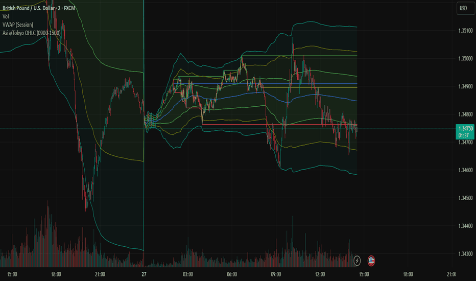
Trade by Design - v1.0.0Trade by Design — NY 17:00 Session Levels (v1.0.0)
Overview
Trade by Design plots key reference levels derived from a New York–anchored trading day that resets at 17:00 America/New_York. The indicator is designed to make higher-quality context levels visible on any intraday chart by automatically drawing:
Previous Week High/Low (HoW/LoW)
Previous Trading Day High/Low (HoD/LoD)
Current Day Running High/Low (iH/iL) with the current day’s range percentage
These levels can be used as structured support/resistance references and as a framework for intraday planning.
What the indicator draws
1) Previous Week Levels — HoW / LoW
HoW (High of Week): highest price reached during the previous NY-anchored week
LoW (Low of Week): lowest price reached during the previous NY-anchored week
Week boundary: the week is treated as starting at Sunday 17:00 New York time, aligning the week definition with the same session reset concept used for daily levels.
Why it matters: prior week extremes frequently act as decision points where price can reject, consolidate, or break and retest.
2) Previous Trading Day Levels — HoD / LoD
HoD (High of Day): highest price reached during the prior trading day
LoD (Low of Day): lowest price reached during the prior trading day
Trading day boundary: 17:00 NY → 17:00 NY (America/New_York)
Why it matters: prior day extremes are commonly used for liquidity, breakout, and mean-reversion context depending on market conditions.
3) Current Day Running Levels — iH / iL
iH (Initial/Current High): running high since the selected start time
iL (Initial/Current Low): running low since the selected start time
The label displays the % range between iH and iL, helping you assess the day’s realized movement at a glance.
Optional “Gap” handling (17:00–20:00 NY)
You can choose where the iH/iL calculation begins:
Include Gap (start at 17:00 NY): iH/iL tracks the entire NY trading day from the reset.
Exclude Gap (start at 20:00 NY): iH/iL ignores the 17:00–20:00 window and begins at 20:00 NY.
This option exists because some traders prefer measuring the day’s initial range from later liquidity conditions.
Controls & Settings
Visuals
Independent colors for weekly, daily, and current-day levels
Line width, line style (solid/dashed/dotted)
Separate transparency for current vs historical lines
Label size and label offset (in bars) to improve readability
History
Choose how many prior weeks to display (older weekly levels labeled sequentially)
Toggle visibility for historical HoD/LoD and historical iH/iL
Label convention
Current: HoW / LoW, HoD / LoD, iH / iL (with % range)
Historical: sequential suffixes are used to distinguish older levels (e.g., HoD2/LoD2, HoW2/LoW2, etc.)
Practical ways to use the levels (examples)
Support/Resistance map: treat HoW/LoW and HoD/LoD as structural boundaries for reactions and invalidations.
Breakout context: a clean break and acceptance beyond HoD/LoD (or HoW/LoW) can signal continuation; failure to accept can signal range behavior.
Volatility awareness: use the iH/iL % range to judge whether the day is expanding (trend-day potential) or compressing (range potential).
Confluence: align these levels with your own confirmation tools (market structure, volume, orderflow, trend filters, etc.).
Notes & limitations
Results depend on the symbol’s session data and the chart timeframe; some markets have unique trading hours that may affect how highs/lows form.
This indicator provides reference levels only and does not generate buy/sell signals.
Always apply risk management. This is not financial advice.
Version history
v1.0.0
Stable release of NY 17:00 anchored levels
Previous Week High/Low (HoW/LoW)
Previous Trading Day High/Low (HoD/LoD)
Current Day running High/Low (iH/iL) + range %
Optional inclusion/exclusion of 17:00–20:00 NY window for iH/iL
Historical rendering controls + styling options for production charting Wskaźnik

GCM Alpha Structure FrameworkDescription:
Title: GCM Alpha Structure Framework (GCM ASF)
‘Silence the Noise. Trade the Alpha.’
-By uniGram
Most Market Structure (SMC) indicators fail because they clutter your chart with endless lines, useless mathematical gaps, and retail noise. The GCM Alpha Structure Framework was engineered with a completely different philosophy: Zero Clutter. Maximum Precision.
This is not just another indicator; it is a complete algorithmic framework designed to track institutional footprints, project unmitigated liquidity zones, and identify extreme volatility reversals - all while keeping your chart pristinely clean and visually alpha.
🔥 CORE ENGINE & FEATURES:
• Precision Market Structure (Macro): Clean, structural breaks (BOS & CHoCH) perfectly mapped with classical text formatting. It defines the true trend without destroying your visual space.
• Deep OB & FVG Hunting: The framework mathematically hunts for the true opposite-colored institutional candle prior to a breakout. Zones dynamically project forward and automatically delete themselves the exact moment price mitigates them. You only see fresh, active liquidity.
• Stealth Volatility (Invisible BB): We removed the messy visual bands of traditional Bollinger Bands but kept the hardcore math. When price reaches a 2.0 Standard Deviation extreme, the candles themselves change color to reveal the institutional battle:
🟢 Neon Green (#2dff00): Bullish closure at an oversold extreme.
🟣 Fuchsia: Bearish closure at an overbought extreme.
• Aether Seamless Scalper & Dynamic S/R: Tracks the micro-pulse of the market using a seamless HMA dashed projector, while simultaneously mapping thick, transparent Support and Resistance (S/R) levels that turn dotted once broken.
• Static Y-Axis Gradient Masking: A buttery-smooth 10% opacity background trend mask that scales flawlessly without breaking into vertical layer lines when zooming.
• Sniper Alerts Engine: Built-in push notifications for structural breaks and extreme volatility zone taps.
🎯 THE "SNIPER" TRADE SETUP:
Wait for confluence. When price pulls back into an unmitigated Order Block (OB) or FVG and flashes a Neon Green (Bullish) or Fuchsia (Bearish) Stealth Volatility candle, you have caught the exact institutional entry point.
⚠️ RISK DISCLAIMER:
Trading in financial markets involves a high level of risk and may not be suitable for all investors. The GCM Alpha Structure Framework (GCM ASF) is provided for educational and informational purposes only and does not constitute financial, investment, or trading advice. Past performance of any trading system or methodology is not necessarily indicative of future results. By using this indicator, you acknowledge that you are solely responsible for your own trading decisions and risk management. The author (uniGram) assumes no responsibility or liability for any financial losses, damages, or missed opportunities incurred while using this script. Always do your own research (DYOR) and consult with a certified financial professional before executing any trades.
Trade the Framework. Trade the Alpha.
HAPPY TRADING
________________________________________
ಕನ್ನಡ ವಿವರಣೆ (Kannada Description)
ಶೀರ್ಷಿಕೆ: GCM ಆಲ್ಫಾ ಸ್ಟ್ರಕ್ಚರ್ ಫ್ರೇಮ್ವರ್ಕ್ (GCM ASF)
Silence the Noise. Trade the Alpha.’
-By uniGram
ಹೆಚ್ಚಿನ ಮಾರ್ಕೆಟ್ ಸ್ಟ್ರಕ್ಚರ್ (SMC) ಇಂಡಿಕೇಟರ್ಗಳು ನಿಮ್ಮ ಚಾರ್ಟ್ ಅನ್ನು ಅನಗತ್ಯ ಗೆರೆಗಳು ಮತ್ತು ಗೊಂದಲಗಳಿಂದ ತುಂಬಿಬಿಡುತ್ತವೆ. ಆದರೆ GCM Alpha Structure Framework ಅನ್ನು ವಿನ್ಯಾಸಗೊಳಿಸಿರುವುದು ಒಂದೇ ಉದ್ದೇಶದಿಂದ: ಶೂನ್ಯ ಗೊಂದಲ, ಗರಿಷ್ಠ ನಿಖರತೆ (Zero Clutter. Maximum Precision).
ಇದೊಂದು ಕೇವಲ ಇಂಡಿಕೇಟರ್ ಅಲ್ಲ, ಇದೊಂದು ಸಂಪೂರ್ಣ ಆಲ್ಗಾರಿದಮಿಕ್ ಸಿಸ್ಟಮ್. ಇನ್ಸ್ಟಿಟ್ಯೂಷನಲ್ (Institutional) ಹೆಜ್ಜೆಗುರುತುಗಳನ್ನು ಟ್ರ್ಯಾಕ್ ಮಾಡಲು, ಭರ್ತಿಯಾಗದ ಲಿಕ್ವಿಡಿಟಿ ವಲಯಗಳನ್ನು (Liquidity Zones) ಗುರುತಿಸಲು ಮತ್ತು ವೊಲಟಿಲಿಟಿಯ (Volatility) ತೀವ್ರತೆಯನ್ನು ಹಿಡಿಯಲು ಇದನ್ನು ನಿರ್ಮಿಸಲಾಗಿದೆ.
🔥 ಪ್ರಮುಖ ವೈಶಿಷ್ಟ್ಯಗಳು (Core Features):
• ನಿಖರವಾದ ಮಾರ್ಕೆಟ್ ಸ್ಟ್ರಕ್ಚರ್ (BOS & CHoCH): ಚಾರ್ಟ್ ಅನ್ನು ಅಂದಗೆಡಿಸದಂತೆ, ಅತ್ಯಂತ ಸ್ಪಷ್ಟವಾದ ಸ್ಟ್ರಕ್ಚರ್ ಬ್ರೇಕ್ಗಳನ್ನು ಲೇಬಲ್ ಮಾಡುತ್ತದೆ.
• ಸ್ಮಾರ್ಟ್ OB ಮತ್ತು FVG ಹಂಟಿಂಗ್: ಕೇವಲ ನೈಜವಾದ ಇನ್ಸ್ಟಿಟ್ಯೂಷನಲ್ ಕ್ಯಾಂಡಲ್ಗಳನ್ನು ಮಾತ್ರ ಇದು ಗುರುತಿಸುತ್ತದೆ. ಬೆಲೆಯು ಈ ವಲಯಗಳನ್ನು (Zones) ಮುಟ್ಟಿದ ತಕ್ಷಣ, ಆ ಹಳೆಯ ಬಾಕ್ಸ್ಗಳು ತಾನಾಗಿಯೇ ಅಳಿಸಿಹೋಗುತ್ತವೆ. ನಿಮ್ಮ ಚಾರ್ಟ್ನಲ್ಲಿ ಕೇವಲ ಆಕ್ಟಿವ್ ಆದ ಫ್ರೆಶ್ ಝೋನ್ಗಳು ಮಾತ್ರ ಕಾಣಿಸುತ್ತವೆ.
• ಸ್ಟೆಲ್ತ್ ವೊಲಟಿಲಿಟಿ (ಅದೃಶ್ಯ ಬೋಲಿಂಜರ್ ಬ್ಯಾಂಡ್ಸ್): ಚಾರ್ಟ್ ಮೇಲೆ ಬ್ಯಾಂಡ್ಸ್ಗಳನ್ನು ಎಳೆಯದೆ, ಅದರ ಗಣಿತವನ್ನು ಮಾತ್ರ ಹಿನ್ನೆಲೆಯಲ್ಲಿ ಬಳಸಲಾಗಿದೆ. ಬೆಲೆಯು ವೊಲಟಿಲಿಟಿಯ ತುತ್ತತುದಿಯನ್ನು ಮುಟ್ಟಿದಾಗ ಕ್ಯಾಂಡಲ್ನ ಬಣ್ಣ ಬದಲಾಗುತ್ತದೆ:
🟢 ನಿಯಾನ್ ಗ್ರೀನ್ (Neon Green): ಅತಿಯಾಗಿ ಮಾರಾಟವಾದ (Oversold) ಹಂತದಲ್ಲಿ ಬುಲಿಶ್ ಎಂಟ್ರಿ.
🟣 ಫ್ಯೂಷಿಯಾ (Fuchsia): ಅತಿಯಾಗಿ ಖರೀದಿಯಾದ (Overbought) ಹಂತದಲ್ಲಿ ಬೇರಿಶ್ ಎಂಟ್ರಿ.
• ಏಥರ್ (Aether) ಸ್ಕಾಲ್ಪರ್ & ಡೈನಾಮಿಕ್ S/R: ಟ್ರೆಂಡ್ನ ಸಣ್ಣ ಬದಲಾವಣೆಗಳನ್ನು (Micro-pulse) ಹಿಡಿಯಲು ಸ್ಕಾಲ್ಪರ್ ಲೈನ್ಗಳು ಮತ್ತು ಮಾರುಕಟ್ಟೆಯ ಡೈನಾಮಿಕ್ ಸಪೋರ್ಟ್/ರೆಸಿಸ್ಟೆನ್ಸ್ (S/R) ಲೆವೆಲ್ಗಳನ್ನು ಇದು ಪಾರದರ್ಶಕವಾಗಿ (Transparent) ತೋರಿಸುತ್ತದೆ.
• ಸ್ನೈಪರ್ ಅಲರ್ಟ್ಸ್ (Sniper Alerts): ಪರ್ಫೆಕ್ಟ್ ಆದ ಎಂಟ್ರಿ ಪಾಯಿಂಟ್ ಸಿಕ್ಕಾಗ ನೇರವಾಗಿ ನಿಮ್ಮ ಮೊಬೈಲ್ಗೆ ನೋಟಿಫಿಕೇಶನ್ ಬರುವಂತೆ ಕೋಡ್ ಮಾಡಲಾಗಿದೆ.
🎯 ಟ್ರೇಡಿಂಗ್ ಸೆಟಪ್ (The Setup):
ಬೆಲೆಯು ನಿಮ್ಮ ಹಸಿರು ಅಥವಾ ಕೆಂಪು ಬಣ್ಣದ OB / FVG ಬಾಕ್ಸ್ ಒಳಗೆ ಬಂದಾಗ, ಆ ಕ್ಯಾಂಡಲ್ Neon Green ಅಥವಾ Fuchsia ಬಣ್ಣಕ್ಕೆ ತಿರುಗಿದರೆ, ಅದುವೇ ನಿಮ್ಮ ಇನ್ಸ್ಟಿಟ್ಯೂಷನಲ್ "ಸ್ನೈಪರ್ ಎಂಟ್ರಿ".
⚠️ ಮುನ್ನೆಚ್ಚರಿಕೆ
ಫೈನಾನ್ಷಿಯಲ್ ಮಾರ್ಕೆಟ್ಗಳಲ್ಲಿ ಟ್ರೇಡಿಂಗ್ ಮಾಡುವುದು ಹೆಚ್ಚಿನ ಅಪಾಯವನ್ನು (Risk) ಒಳಗೊಂಡಿರುತ್ತದೆ. GCM Alpha Structure Framework ಅನ್ನು ಕೇವಲ ಶೈಕ್ಷಣಿಕ ಮತ್ತು ಮಾಹಿತಿ ಉದ್ದೇಶಗಳಿಗಾಗಿ (Educational purposes) ಮಾತ್ರ ಒದಗಿಸಲಾಗಿದೆ. ಇದಾವುದೇ ರೀತಿಯ ಹಣಕಾಸು ಅಥವಾ ಹೂಡಿಕೆ ಸಲಹೆಯಲ್ಲ (Not financial advice). ಯಾವುದೇ ಟ್ರೇಡಿಂಗ್ ಸಿಸ್ಟಮ್ನ ಹಿಂದಿನ ಫಲಿತಾಂಶಗಳು ಭವಿಷ್ಯದ ಲಾಭವನ್ನು ಖಾತರಿಪಡಿಸುವುದಿಲ್ಲ. ಈ ಇಂಡಿಕೇಟರ್ ಬಳಸಿ ನೀವು ತೆಗೆದುಕೊಳ್ಳುವ ಯಾವುದೇ ಟ್ರೇಡ್ಗಳು ಮತ್ತು ಅದರಿಂದಾಗುವ ಆರ್ಥಿಕ ಲಾಭ-ನಷ್ಟಗಳಿಗೆ ನೀವು ಮಾತ್ರ ಜವಾಬ್ದಾರರಾಗಿರುತ್ತೀರಿ. uniGram ಯಾವುದೇ ನಷ್ಟಗಳಿಗೆ ಹೊಣೆಗಾರರಾಗಿರುವುದಿಲ್ಲ. ಹಣ ಹೂಡಿಕೆ ಮಾಡುವ ಮೊದಲು ದಯವಿಟ್ಟು ನಿಮ್ಮ ಸ್ವಂತ ವಿಶ್ಲೇಷಣೆ ಮಾಡಿ (DYOR - Do Your Own Research).
Trade the Framework. Trade the Alpha.
HAPPY TRADING Wskaźnik

Fibonacci Confluence Grids (Levels + Time Zones) [Metrify]This script is built around a simple but often-misused idea: Fibonacci levels are only useful when the reference swing is meaningful. In practice, most traders do not fail because they “used the wrong ratio,” but because they anchored the Fib to a weak or inconsistent swing. A 0.618 level drawn from noise is still noise.
The core design of this indicator is therefore not “draw more levels” but to formalize three simple steps that we usually do inconsistently by eye:
identify an A→B swing,
filter that swing for significance, and
project both price levels and timing windows from that swing.
Once a valid swing is accepted, the script projects a configurable set of price Fibonacci levels (retracements and/or extensions) and a separate configurable sequence of time gates (bar offsets projected forward from point B). The price levels define a vertical map of potential reaction zones. The time gates define a horizontal map of potential timing windows. Used together, they create a 2D framework: not only where price may become sensitive, but also when the probability of a market event tends to increase.
Time gates: temporal structure and why “events cluster” around them
The time gate projects vertical markers forward from point B using a bar sequence (commonly Fibonacci-like). The key idea is not random, but practical timing structure.
Markets often exhibit rhythm: impulsive legs, pullbacks, consolidations, and expansions frequently have characteristic durations.
Time gates should be interpreted as attention windows: periods where you should expect the probability of a notable market event to be higher than usual. “Event” here is intentionally broad, because direction is not guaranteed:
acceleration / continuation burst
pullback completion and resumption attempt
volatility expansion after compression
reversal attempt (successful or failed)
fakeout / stop run / liquidity sweep
structural break and regime shift
This is why it’s accurate to say that significant events often occur around time gates. Not because the gate forces a reversal, but because it’s a timing checkpoint where participation and auction dynamics frequently change. Your edge comes from combining the gate with context: price location near a major Fib level, session behavior, and confirmation from price action/structure.
How to use it as a manual framework
A strong discretionary workflow is to treat this as a 2D confluence map: price zone × time window.
Start by asking: “Is the active A→B swing meaningful?” If it looks like chop, tighten filters (increase Min Size / Min Bars, or increase ZigZag reversal / pivot length). Once the swing quality is good, treat the map as a set of planned observation points.
When price approaches a major retracement (0.5/0.618/0.786) or extension (1.272/1.618), check whether a time gate is also nearby. If yes, you should expect higher information density so you watch for confirmation rather than forcing prediction.
Confirmation can be whatever your style uses: structure break, reclaim, rejection candle quality, volatility expansion, etc.
If price is mid-range (far from major fibs) and far from gates, that’s often low-quality territory for forcing trades —> your standards should be higher, not lower. Wskaźnik

SMC Market Structure & MTF Levels by Capitan-TradingOverview
The SMC Market Structure & MTF Levels is a comprehensive yet lightweight tool designed to help day traders and swing traders visualize market structure shifts, key multi-timeframe (MTF) levels, and custom trading sessions without cluttering the chart.
Underlying Logic & Features
This script is built around three core analytical modules:
1. Algorithmic Market Structure (CHoCH / BOS):
The indicator tracks market structure using a standard Pivot High / Pivot Low calculation (ta.pivothigh / ta.pivotlow). Users can define the sensitivity by adjusting the left and right lookback bars. When the price strictly closes (if 'Confirmed Only' is enabled) above the last detected pivot high, the script dynamically identifies a bullish shift (CHoCH/BOS). Conversely, a close below the last pivot low flags a bearish structural break.
2. Multi-Timeframe Levels with Staggered Visuals:
The script fetches the Previous Daily (PDH/PDL), Weekly (PWH/PWL), and Monthly (PMH/PML) highs and lows using secure request.security calls to prevent any lookahead bias. A common issue with MTF levels is overlapping labels when a Daily high coincides with a Weekly high. To solve this, the script applies a dynamic horizontal offset engine: Daily, Weekly, and Monthly lines project at different lengths into the future (e.g., +20, +28, +36 bars), ensuring all labels are perfectly readable side-by-side.
3. Session Boxes & Real-Time Dashboard:
Users can highlight up to three custom time sessions (e.g., Asian range, London Open, NY Open) with adjustable background boxes. Additionally, a minimalist, non-intrusive dashboard displays the current structural bias (Bull/Bear) and calculates the real-time percentage distance between the current price and the major MTF levels, giving traders an immediate gauge of liquidity proximity.
Usage:
Apply this tool to any timeframe to maintain a clear top-down perspective of structural shifts and major liquidity magnets. Wskaźnik

Wskaźnik

Intraday Levels [OmegaTools]Intraday Levels is a chart-overlay reference framework designed to map and continuously project key multi-session and multi-time-horizon price levels directly on intraday charts. The tool is built to provide a clean, configurable, and information-dense structure for traders who rely on recurring high/low reference points such as weekly extremes, daily extremes, major session ranges, and opening range levels. Its purpose is to transform these commonly used price anchors into a unified visual environment that remains readable even when multiple levels align at the same price.
The indicator tracks and displays a layered set of highs and lows from different market horizons and sessions, allowing the user to monitor confluence and relative positioning in real time. At the higher structural level, it maintains the current week high and low as well as the current day high and low. At the session level, it can track the Asian, London, and New York session ranges using predefined time windows. At the opening range level, it can additionally plot the initial 15-minute and initial 30-minute highs and lows. This combination makes the tool suitable for traders who use top-down intraday analysis and want to understand how short-term price action interacts with broader session and period-based reference zones.
A key strength of the script is its high degree of visual customization. Each level family can be enabled or disabled independently, which allows the chart to be tailored to different instruments, trading styles, and time-of-day workflows. For every group of levels, the user can choose a dedicated line style, assign separate colors for highs and lows, and define line thickness. This allows the user to create a visual hierarchy where higher-timeframe references, such as weekly and daily levels, can be emphasized more strongly, while session and opening-range levels can be displayed with lighter styling. The result is a structured display in which important levels remain easy to distinguish without overwhelming the chart.
The script is designed to project each tracked level forward by a configurable number of bars, which improves readability during active trading and allows the user to see level interactions before price reaches the current bar’s far-right edge. This forward extension is especially useful for execution planning, level-based alerts, and discretionary decision making, because the trader can visually align current price with nearby projected references without needing to inspect historical bars manually. The extension logic is applied consistently across all supported level categories, making the indicator visually coherent and predictable.
The session framework uses explicit time windows and is anchored to a defined timezone, ensuring repeatable calculations across instruments and chart settings. This is particularly important for session-based analysis, where consistency in time segmentation is essential. The script separately tracks the evolving highs and lows inside each enabled session window and then projects those levels on the chart as active references. By combining session-specific ranges with daily and weekly extremes, the indicator helps traders identify whether current price is trading near local session structure, broader period structure, or a confluence of both.
An important usability feature of this tool is its label management system for overlapping levels. In many markets, it is common for different reference levels to cluster at or near the same price, such as a daily high aligning with a session high or an opening range high. Instead of drawing multiple separate labels on top of each other, the indicator aggregates overlapping levels into a single merged label that lists all level names at that price. This significantly improves chart readability and reduces label clutter, especially on lower timeframes or during consolidation phases where level compression is frequent. The merging behavior is based on a price tolerance tied to the instrument’s tick size, which allows the script to treat near-identical levels as confluence zones rather than as visually separate labels.
The merged label system also preserves contextual information through color handling. When a merged label contains level names that share the same directional color context, the label text can retain that color. When overlapping levels use different colors, the script falls back to a neutral chart text color to maintain readability and avoid misleading emphasis. This design choice ensures that the visual output remains informative without sacrificing clarity when multiple categories of levels converge.
From a practical trading perspective, the tool is useful for several workflows. It can support intraday structure mapping by showing where price sits relative to current daily and weekly extremes. It can support session-based trading by highlighting Asian, London, and New York highs and lows that often act as liquidity pools, breakout points, or mean-reversion references. It can support opening-range strategies by displaying the initial 15-minute and 30-minute boundaries commonly used for early-session breakout and bias models. It can also support confluence analysis, where the trader is specifically looking for price zones where multiple independent references align and where reaction probability may be higher.
The indicator is particularly well suited for discretionary traders who combine price action, session structure, and liquidity-based reasoning. It is also useful for semi-systematic traders who want a stable chart overlay to standardize their pre-market and intraday execution process. Because the script keeps all major reference families inside a single tool, it can reduce the need to stack multiple indicators or manually draw and maintain horizontal levels throughout the session.
This tool is designed to be an execution-support and market-structure visualization aid rather than a standalone trading system. It does not generate directional entries or exits on its own, and it should be used in combination with broader context, risk management, and trade management rules. When integrated into a disciplined trading process, Intraday Levels provides a professional and highly configurable framework for organizing price structure, identifying confluence, and improving decision quality during intraday market analysis.
- Eros Wskaźnik

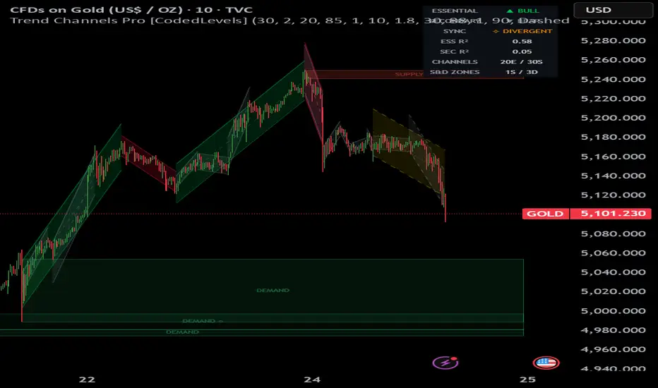
Trend Channels Pro [CodedLevels]Trend Channels Pro
A multi-layered trend structure engine that combines regression-based diagonal channels, supply & demand zones, and smart breakout detection into a single unified overlay.
━━━━━━━━━━━━━━━━━━━━━━━━━━━━━━━━━
🔹 WHAT IT DOES
This indicator builds a complete structural map of the market by layering three analytical systems:
1 — Trend Channels (Essential + Secondary)
Automatically detects swing pivots and fits linear regression channels across each completed trend leg. Channels are rendered as diagonal lines with shaded fills — visually identical to TradingView's built-in Regression Trend drawing tool, but fully automated. Two independent layers work simultaneously:
• Essential Trend — captures dominant market structure using higher-strength pivots. Channels are colored green (bullish legs) or red (bearish legs) based on structural direction.
• Secondary Trend — captures shorter-term structure within the essential trend. Channels are rendered in grey to visually separate them from the primary structure.
Both layers preserve full historical channels on the chart, giving you a complete visual record of how the trend has evolved over time.
2 — Forming Channel (Live)
A real-time channel drawn from the last confirmed pivot to the current bar. It updates on every new candle, showing you the trend leg that is actively developing — before it becomes a confirmed historical channel. Rendered in a distinct color with dashed lines so you can immediately distinguish it from completed channels.
3 — Supply & Demand Zones
Pivot-based zone detection using candle body mapping. Zones are qualified by departure strength — only pivots with meaningful follow-through moves generate zones. Features include:
• Automatic zone merging when nearby zones overlap
• Freshness tracking: fresh (untested) → retested → weakened → invalidated
• Zones auto-remove when price breaks through with conviction
• Centered labels: SUPPLY / DEMAND with freshness indicators
4 — Smart Breakout Signals
Detects when price closes beyond the latest secondary channel boundary. Includes:
• Minimum penetration filter (in ATR multiples) to eliminate marginal breakouts
• Optional volume confirmation
• Trend alignment filter — only signals that agree with the essential trend direction
━━━━━━━━━━━━━━━━━━━━━━━━━━━━━━━━━
🔹 HOW TREND DIRECTION WORKS
Unlike indicators that determine trend from a moving average or the last candle's slope, this indicator uses structural market analysis:
• Tracks successive pivot highs and pivot lows
• Higher High + Higher Low = Bullish structure
• Lower High + Lower Low = Bearish structure
This means the dashboard won't flip bearish just because price made a normal pullback within an uptrend. It reflects the actual market structure.
━━━━━━━━━━━━━━━━━━━━━━━━━━━━━━━━━
🔹 HOW TO USE IT
Essential + Secondary channels give you the structural framework — trade in the direction of the essential trend, use secondary channels for timing.
Supply & Demand zones provide confluence — a breakout signal firing near a fresh demand zone in a bullish essential trend is a high-probability setup.
The info table (top-right) shows: essential and secondary trend direction, alignment status (ALIGNED / DIVERGENT), R² values for channel quality, and zone counts.
━━━━━━━━━━━━━━━━━━━━━━━━━━━━━━━━━
🔹 ALERTS
• Bullish / Bearish breakout (with-trend filtered)
• Any secondary channel break (unfiltered)
• Price entering supply or demand zones
• Confluence alerts: breakout + zone overlap
━━━━━━━━━━━━━━━━━━━━━━━━━━━━━━━━━
🔹 SETTINGS
All layers can be independently enabled/disabled. Key parameters include swing lookback strength, channel width (standard deviation multiplier), max historical channels, zone merge distance, breakout penetration threshold, and full color customization.
━━━━━━━━━━━━━━━━━━━━━━━━━━━━━━━━━
Built for traders who think in terms of market structure, not just indicators. Wskaźnik

Wskaźnik