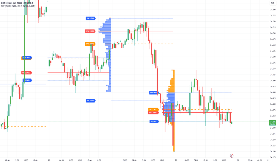
Session Volume Profile by AUMBaumgartner# Session Volume Profile – VPOC | TPOC | VAH | VAL
This indicator calculates the volume profile of a complete trading session and displays the key statistical price levels directly on the chart — based on the Market Profile principles developed by J. Peter Steidlmayer.
The volume of each session is distributed evenly across the High-Low range of each bar and accumulated into price buckets. This produces the following levels:
**VPOC – Volume Point of Control**
The price with the highest traded volume of the session. This is the fairest price, as the most trading activity occurred here.
**TPOC – Time Point of Control**
The price touched by the most bars during the session. The time-based variant of the POC.
**VAH – Value Area High**
The upper boundary of the Value Area. Above this level, price is statistically overvalued.
**VAL – Value Area Low**
The lower boundary of the Value Area. Below this level, price is statistically undervalued.
**Value Area (VA)**
The price range in which 70% of session volume was traded. Within the Value Area, price is fairly valued. The Value Area is calculated according to Steidlmayer's original method: starting from the VPOC, the next two price levels above and below are compared. The side with the higher volume is added to the Value Area. In case of a tie, the upper side is preferred. This process repeats until 70% of total volume is captured.
The horizontal histogram displays the volume distribution across all price levels of the session. The VPOC bar is highlighted and the Value Area is shown in a distinct colour.
**How to use**
Buy when price is below VAL, sell when price is above VAH — as long as the market is in balance. If price remains outside the Value Area for 30 minutes or more, a new price level is likely developing.
**Settings**
Session start and end (HHMM), Value Area percentage, Tick Multiplier for bucket granularity, volume distribution over Range or Close, histogram left or right of the session, and all colours individually customisable.
Optimised for EUREX futures (DAX, Euro Stoxx), but works on all markets and timeframes.
Based on the Market Profile theory of J. Peter Steidlmayer. Wskaźnik
Buy/Sell Pressure Meter [AGPro Series]Buy/Sell Pressure Meter
🔹 Overview
Buy/Sell Pressure Meter is a volume-flow analytics tool that quantifies the tug-of-war between buyers and sellers on every bar and on a rolling basis. Unlike traditional volume delta indicators that only plot raw bar-level buy minus sell, this tool layers four complementary lenses into a single oscillator: rolling pressure trend, imbalance streak tracking, intraday pressure shift count, and session-accumulated dominance. A subtle price-pane background tint gives a Bookmap-light read on intraday participation that works across crypto, futures, and liquid equities — without requiring tick-level order flow data.
🔹 Unique Edge
Most volume-delta scripts answer the question "which side was bigger on this bar?" This one answers a different, more useful question for intraday traders: "who has been in control, and how stable is that control?"
• Rolling Pressure Trend — a moving average of buy and sell pressure separately (dual histogram), so you see structural bias, not just bar-to-bar noise.
• Imbalance Streak Tracking — counts consecutive same-side dominant bars and labels only the final length of each significant streak at the moment the streak breaks. No per-bar label spam, one clean marker per event.
• Intraday Pressure Shift Count — how many times the rolling dominant side has flipped since session open. High shift count = rotational day. Low shift count = trending day.
• Session-Accumulated Net Delta — cumulative bull vs bear contribution since the day began, independent of the rolling window.
• Price-Pane Bookmap-Light Tint — a very high-transparency background tint paints the main chart pane when one side is rolling-dominant, so you see control visually without leaving the price chart.
These five lenses together are deliberately designed not to overlap with raw volume-delta or cumulative-volume-delta indicators. They describe the character of participation, not just its magnitude.
🔹 Methodology
Because standard chart data does not include true tick-level order flow, this script uses a widely-accepted proxy: up-bar volume is attributed to buy pressure, down-bar volume to sell pressure, and doji volume is split evenly. This is explicitly a simulated bias — not real bid/ask flow — and the script labels it as such in the panel.
From that proxy:
1. Current-bar bull pressure percentage = buyPressure / (buyPressure + sellPressure) × 100.
2. Rolling pressure = SMA of buy and sell pressure over the user-defined window (default 20 bars).
3. A bar is classified bull-dominant when its bull pressure percent exceeds the dominance threshold (default 55%), and bear-dominant at the mirror level.
4. Streaks count consecutive bars of the same classification and reset when a neutral or opposite bar prints. Peak length is captured at the moment of reset and optionally labelled on chart.
5. Pressure shifts compare the current rolling dominant side against the last confirmed non-neutral dominant side; a change increments the intraday shift counter (only on intraday timeframes).
6. Session delta is the cumulative net delta since the last daily rollover.
🔹 Signals & States
• Dual histogram — buy pressure (teal, upward) and sell pressure (pink, downward) plotted as rolling averages.
• Net delta center line — accent-colored line showing rolling buy minus sell.
• Price-pane background tint — subtle teal or pink when one side is rolling-dominant, gives a Bookmap-light feel without obscuring candles.
• Oscillator-pane echo tint — even more subtle tint mirroring the dominant side in the indicator pane.
• Shift markers — triangles on the pane when the dominant side flips.
• Streak peak labels — plotted only at streak termination, showing final length (e.g. "Bull 7").
• Alerts — pressure shift to bull, pressure shift to bear, bull imbalance streak, bear imbalance streak.
🔹 Key Inputs
Calculation:
• Rolling Pressure Length — default 20. Higher = smoother, slower reaction.
• Minimum Streak To Highlight — default 3. Used for alerts.
• Dominance Threshold — default 55%. Share of total pressure needed to classify a bar as dominant.
Visuals:
• Tint Price Pane On Dominance — toggles the Bookmap-light effect on the main chart.
• Show Streak Peak Labels + Minimum Streak Length To Label (default 5) — controls chart cleanliness.
• Show Pressure Shift Events — triangle markers on shifts.
• Background Tint Transparency — default 94, adjustable 80-99.
Panel:
• Panel Location, Theme (Dark / Light), Font Size, Label Font Size — all default to Normal and fully configurable.
🔹 How To Use
This is an analytical tool, not a standalone trading system. Typical use cases:
• Confirmation — when price breaks a structure level while the rolling net delta is strongly in the break direction and a streak is in progress, the break has participation behind it.
• Exhaustion — a long bull streak peak followed by a rolling shift to bear, or vice versa, often marks the end of the current impulse.
• Regime read — a day with many intraday pressure shifts is rotational; a day with 0-1 shifts is directional. Adjust your playbook accordingly.
• Companion to S/R, supply/demand, and volume profile tools — use the streak peak and shift events as a participation filter when price interacts with a zone.
Best results on liquid instruments with meaningful bar-to-bar volume variation. Low-volume illiquid tickers produce noisier readings.
🔹 Limitations & Transparency
• The buy vs sell attribution is a proxy derived from bar direction and bar volume. It is not real order flow, Level 2, or tick data. Bookmap, CVD from exchange feeds, and footprint tools access information that bar-level scripts structurally cannot replicate.
• On instruments or timeframes where many bars close near their open (doji-heavy regimes), proxy-based attribution becomes less informative.
• The intraday shift counter is only meaningful on intraday timeframes; on daily-and-above timeframes the panel explicitly shows this as n/a.
• The script is non-repainting on closed bars. Intrabar values update in real time and may change until the bar confirms.
• Pressure shifts and streaks describe past and current state. They are not predictions of future price.
🔹 Risk Disclosure
This script is provided as an analytical tool for educational and research purposes. It does not constitute financial advice, a trading signal, or a recommendation to buy or sell any asset. Past performance of any pattern, streak, or shift event does not guarantee future results. Users are solely responsible for their own trading decisions and risk management. Always combine any indicator with broader market context, position sizing discipline, and your own due diligence. Wskaźnik

Institutional Candle Detector [AGPro Series]🕯️ Institutional Candle Detector
Every trader has stared at a massive candle and asked the same question: "Was that the start of a move, the end of one, or just noise?" Most indicators stop at detection — they paint the candle, drop a label, and walk away. This one keeps watching.
Institutional Candle Detector uses a dual-track engine. The body-driven track flags high-conviction candles where ATR-normalized body size and relative volume both expand together, then classifies each event by body/wick geometry. The independent absorption track captures a different signature entirely — low-body candles on extreme volume, the classic aggression-absorbed footprint that body-only detectors miss. Every detected event is then re-evaluated over the following bars to produce a measurable outcome scorecard.
🔹 OVERVIEW
The script scans each bar for two separate, mutually-exclusive institutional signatures:
• Body-driven events. Body must exceed a multiple of ATR AND volume must exceed a multiple of its rolling average. Classified by geometry into Continuation, Reversal or Exhaustion.
• Absorption events. Volume extremely elevated BUT body contained — the market paid for a big move and did not get one. Price was absorbed.
Every detected candle is then given a reaction zone projected forward, and its outcome is automatically tagged after the configured look-forward window — Follow-Through (FT), Reverse (RV) or Consolidation (CN). The panel accumulates aggregate statistics across the loaded chart so the trader can see which candle type actually works on their instrument and timeframe.
🔸 UNIQUE EDGE
What separates this tool from generic "big candle" or "volume spike" indicators:
• Dual-track detection. A single filter cannot capture both explosive moves and absorption. This script runs two engines in parallel with independent thresholds.
• Four-class geometric taxonomy, each backed by a distinct detection path. Continuation and Reversal fire from the body-driven track with different geometry. Exhaustion catches the mid-profile edge cases. Absorption runs entirely off its own volume-first track.
• Automatic after-behavior tracking. Each event is re-examined after N bars and tagged with an outcome code. This is the part most scripts omit — and it's where edge lives.
• Aggregate statistics panel. Follow-through rate, reverse rate, consolidation rate, and per-class counts are computed continuously. The panel tells you whether institutional candles on this asset actually extend, reverse, or fade.
• Forward-projected zones, colored by class. Body-driven bull/bear events use state colors. Absorption uses an indigo accent so the rarer signature is instantly recognizable. Reversal zones use the contrarian color to emphasize the expected directional flip.
🔹 METHODOLOGY
Body-Driven Track (produces CONT, REV, EXH)
– Body is measured as absolute (close − open) and required to exceed Body × ATR multiple.
– Volume is required to exceed a configurable multiple of its SMA average.
– An optional wick filter rejects candles where total wick exceeds the body beyond a given ratio, removing wide-range noise that looks institutional but is not.
– Continuation: body% ≥ configured threshold (clean directional close).
– Reversal: opposing wick% ≥ configured threshold (sharp rejection after initial push).
– Exhaustion: passes the dual-gate but falls into neither clean category — mid profile, often late in a move.
Absorption Track (produces ABS)
– Volume must exceed an independently configurable multiple (higher than body-driven default).
– Body must be small — below a max Body × ATR and below a max Body / Range.
– When absorption fires, it takes precedence over body-driven classification.
After-Behavior Layer
– After lookFwd bars, the script compares the extreme price move in each direction against the original body size.
– If same-direction extension ≥ ftPct × body → Follow-Through (FT).
– If opposite-direction retrace ≥ revPct × body → Reverse (RV).
– Otherwise → Consolidation (CN).
Aggregate counters accumulate across the loaded chart, producing a running scorecard visible in the panel.
🔸 SIGNALS, STATES & MARKERS
On-chart signals
• Institutional body recolored by class — bull/bear direction for CONT and EXH; contrarian color for REV; accent color for ABS.
• Directional triangle marker above/below the bar.
• Classification label: INST-Bull 3.2x CONT or INST-Bear 5.4xV ABS format, ASCII only. Labels offset from the candle to stay readable on dense charts.
• Reaction zone box projected forward from the candle's high-low range, color-coded by class.
• Outcome marker (FT / RV / CN) plotted lookFwd bars after the event.
Alerts available
• Institutional Continuation
• Institutional Reversal
• Institutional Absorption
• Institutional Exhaustion
All four alerts fire on confirmed bars only.
🔹 KEY INPUTS
Detection Core (body-driven track)
– ATR Length (default 14)
– Volume Average Length (default 20)
– Min Body × ATR (default 2.0)
– Min Volume Multiple (default 2.5)
– Wick filter toggle and max Wick/Body ratio (default 2.5)
Absorption Track
– Enable Absorption Detection
– Absorption Min Volume Multiple (default 4.0)
– Absorption Max Body × ATR (default 1.5)
– Absorption Max Body / Range (default 0.40)
Classification
– Continuation body% threshold (default 0.60)
– Reversal opposing-wick% threshold (default 0.40)
After-Behavior
– Look-forward bars (default 5)
– Follow-through threshold as fraction of body (default 0.50)
– Reverse threshold as fraction of body (default 0.60)
Visuals
– Show/hide zones, zone projection length, opacity, max active zones
– Label size (default Small; increase if labels feel too compact)
– Institutional border width
– Outcome marker toggle
Panel
– 8-position panel placement
– Dark / Light theme
– Font size (default Normal)
– Recent events mini-list toggle
🔸 HOW TO USE
1. Start with defaults on a liquid asset. 4H is a strong baseline; 1H for active traders; Daily for swing context. On Daily, consider lowering Min Body × ATR to 1.5 if events are too rare.
2. Watch the panel accumulate events over two to four weeks on your instrument. The follow-through rate tells you whether institutional candles on this chart tend to extend or fade.
3. Trade-context usage:
– Continuation with a high historical follow-through rate on this asset → trend trades in candle direction after pullback into the zone.
– Reversal with a high historical reverse rate → fade setups at key levels.
– Absorption → aggressive flow was met by an equal or greater defender; often precedes a reversal or compression phase.
– Exhaustion → proceed with caution; frequently a late-move signature where the trend is losing clean structure.
4. Reaction zones act as provisional supply/demand. A retest of a zone with another institutional event near it is a confluence worth noting.
5. Tune thresholds per asset. High-liquidity instruments may need Body × ATR of 2.5+ to keep events selective; low-liquidity pairs can go down to 1.5. Absorption volume multiple can also be adjusted upward on already-volatile instruments.
🔹 LIMITATIONS & TRANSPARENCY
• This is an analytical indicator, not a strategy. No entry, exit, or stop logic is defined and no performance claims are made.
• Aggregate statistics are computed over the loaded chart window and will shift as more bars load or as timeframes change.
• Volume quality depends on the data feed; exchange-reported volume differs across sources for the same asset.
• Follow-through evaluation uses a fixed look-forward window; real trade management will differ.
• All results are historical and descriptive. Past behavior of any candle class does not guarantee future behavior.
🔸 RISK DISCLOSURE
Trading carries substantial risk. This tool is provided for analytical and educational purposes. Do your own research. Use position sizing and risk management appropriate to your account. Nothing in this script constitutes financial advice. Wskaźnik

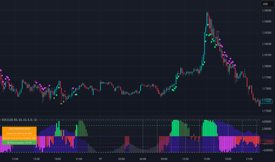
Adaptive Volume-Delta Score (VDS) | Order-Flow & DivergenceThe Adaptive Volume-Delta Score (VDS) is a technical analysis tool for the statistical classification of volume-delta activity. It utilizes an Adaptive-Switch Logic that toggles between historical bar reconstruction (request.security_lower_tf) and a real-time Rolling-Window Live-Tracker.
🛠 Core Functionality
1. The VDS Engine (Statistical Mapping)
Wick-Weighted Delta: The calculation is based on wick-weighting: (close-open)/range * volume. This weights the delta according to price displacement within the bar.
Symmetrical Mapping (-4.5 to 4.5): Raw values are statistically categorized via ta.percentrank and mapped onto a fixed scale.
+4.5 (100% Rank): The absolute maximum within the chosen lookback period.
+2.25 (75% Rank): Significant activity relative to the period.
0 (Median): The statistical midpoint (50% Rank).
-4.5 (0% Rank / Min.): The absolute floor of activity for the period.
Visualization Logic: This mapping is primarily used to plot volume activity and delta aggression within the same visual space, providing a consistent reference frame for comparing relative dominance.
Context Dependency: Signals are not absolute recommendations. The significance depends heavily on the Lookback Period, Thresholds, and the specific market environment.
2. Adaptive Logic & Data Integrity
Signal-Bridge: On lower timeframes (LTF), the indicator simulates the behavior of the Main Timeframe (Main-TF) using a rolling window. This allows for the observation of delta development while the bar is still forming.
🛡️ Integrity Dashboard: Visualizes the statistical consistency between live data and the historical baseline. Deviations (e.g., due to Pine Script's 5000-bar limit) are displayed transparently as warnings.
3. Dynamic Alert System
Automation: Alerts utilize the alert() function with the "Any function call" setting.
Intelligence: Messages are fully dynamic, reporting the mode (Live vs. History), signal type, safeguard status, and data integrity.
🚀 Quick Calibration Guide
Sensitivity: A longer Lookback Period stabilizes the statistics; a shorter period makes the score more reactive to short-term volume spikes.
Threshold Setup: Calibrate the Dominance Threshold (default 3.0) to isolate extreme aggression. Use the Volume Threshold to ensure a minimum level of market participation.
Visual Match: Activate the Price Chart Overlays and adjust your thresholds until the markers (Diamonds) correspond with your individual market interpretation.
Dashboard Check: Monitor the Confidence Score. If red warning values appear, consider adjusting your Lookback or Timeframe to maintain a stable statistical foundation.
🎨 Visual Guide: Understanding the Scale
Navy/Blue Columns: Standard activity within the selected statistical window.
Gray Columns: Phases below the Low Volume Threshold, indicating low relative market participation.
Lime/Fuchsia (Dominance): Occurs when volume and delta simultaneously exceed the defined thresholds (Aggression).
Olive/Maroon (Divergence): Period delta is positive/negative while price action is opposite (Decoupling/Absorption).
Diamonds: Optional projection of oscillator signals directly onto the candles in the price chart.
⚠️ Important Technical Notifications
The "Signal Bridge" (Rolling vs. Fixed Window):
HTF-Request Mode (Fixed): Measures delta starting from the candle open (e.g., 12:00 PM).
Live-Transfer Mode (Rolling): Analyzes a sliding window (e.g., the last 120 minutes). This provides a Lead-Time Advantage, detecting aggression as it happens regardless of the HTF clock. Both modes converge at the HTF bar close.
Data Integrity & Anomalies:
Session Gaps: High Main-TFs (like D1) can be affected by irregular session hours (e.g., Forex Sunday). Always monitor the Confidence Score (🛡️).
Replay Mode:
Displays "No Stat. Control" if historical LTF data is unavailable. We prioritize data honesty over estimated data.
🔔 How to set Alerts (Smart Signals)
Preparation: Open the VDS settings. Under "Alert Settings", choose which signals should trigger: Dominance, Divergence, or both.
Condition: Select "Adaptive Volume-Delta Score...".
Trigger Logic: Change setting to "Any alert() function call".
Frequency: Managed by the script (once_per_bar_close) to ensure statistical honesty.
Timeframe Choice: Use the Main-TF for final confirmed signals, or a Lower-Timeframe for Live-Tracker early warnings.
📊 Statistical Transparency (Data Window)
Raw metrics are displayed exclusively in the TradingView Data Window to keep the chart clean:
Runtime-Safe LTF: The analysis interval currently in use.
Max Safe Lookback: The mathematical limit for your current setup (5,000-bar ceiling).
Active Bar Limit: The actual usable data foundation.
Converted Sum of LTF Request Bars: The historical baseline used as an anchor for the Live-Tracker.
Relative Live-Data Size: Numerical basis of the Confidence Score (100% = Perfect Integrity).
Overall Requested Bars: Total data points analyzed within your Lookback Period. Wskaźnik
Volume Climax Detector [AGPro Series]Volume Climax Detector
Volume Climax Detector is an advanced volume analytics tool that identifies extreme institutional volume events using a three-filter VSA (Volume Spread Analysis) methodology. Rather than triggering on simple volume multiples, the script combines Volume Z-Score statistics, Spread analysis, and Close Location to isolate genuine climax bars — the kind of exhaustion moves Wyckoff and VSA traders look for at trend tops and bottoms.
🔹 OVERVIEW
Volume alone is a noisy signal. A "high volume bar" on one instrument is a quiet bar on another, and most volume-based indicators either miss real climaxes or fire on every uptick. This script takes a statistical approach: it measures how extreme each bar's volume is relative to its own recent history (Z-Score), confirms the bar structure makes sense (Spread and Close Location), and then classifies the event as a Buying Climax or Selling Climax using trend context — the Wyckoff way.
The result is a small number of high-conviction labels at exactly the places where large participants tend to exhaust themselves: panic buys at tops, panic sells at bottoms, and hidden absorption in between.
🔹 WHAT MAKES IT DIFFERENT
Most volume indicators apply a single threshold (e.g. volume > 2× average) and stop there. This script layers three independent VSA filters, each addressing a different failure mode:
• Volume Z-Score — adapts to the instrument's own volume distribution. A 3σ event on BTC is genuinely rare, regardless of session or timeframe.
• Spread filter — requires the bar's range to exceed its recent average. Eliminates the common false positive of a high-volume bar that barely moved (compression).
• Close Location — requires the close to sit in the upper or lower third of the bar. Separates conviction from indecision.
Beyond detection, two analytics layers set it apart from typical volume tools:
• Reversal Success Tracking — every climax is tracked forward for a configurable window, and the script records whether a meaningful counter-move actually materialised (measured in ATR). The panel shows a live Reversal Rate, so users get honest feedback on how well climaxes have worked on the current symbol and timeframe.
• Magnitude Scoring (1–10) — every climax receives a strength score derived from its Z-Score, making it easy to distinguish routine spikes from truly extreme events (marked with ★).
🔹 METHODOLOGY
1. Volume Statistics
The script computes a rolling mean and standard deviation of volume over a configurable lookback window (default 50 bars). The Z-Score tells how many standard deviations above the mean the current bar is. A reading of 3.0σ or higher (default threshold) corresponds to the top ~0.27% of bars — statistically rare, not just "above average."
2. Triple Filter Gate
A bar qualifies as a potential climax only when:
• Z-Score ≥ threshold (volume anomaly)
• Bar range ≥ spread multiplier × average range (wide spread)
• Close is in the upper 33% (strength) or lower 33% (weakness) of the bar range
3. Wyckoff Classification
• Buying Climax — qualifying bar during an established uptrend. Interpretation: buyers are exhausting themselves; potential topping action.
• Selling Climax — qualifying bar during an established downtrend. Interpretation: sellers are exhausting themselves; potential basing action.
• When no clear trend exists, classification falls back to close location plus bar direction so that sideways regimes still produce meaningful signals.
4. Confluence Grouping
When multiple same-direction climaxes occur close together in time or price, the script collapses them into a single label representing the strongest event in the cluster. This keeps charts readable without losing information — the panel still counts every individual climax.
5. Effort vs Result (optional)
A companion layer flags high-volume bars with unusually narrow spread — the classic VSA "No Demand" and "No Supply" conditions. These often signal hidden absorption ahead of a reversal and are shown as separate labels.
🔹 SIGNALS & ALERTS
Four built-in alert conditions:
• Buying Climax detected
• Selling Climax detected
• Extreme Climax (Z-Score above the extreme threshold, marked with ★)
• No Demand / No Supply divergence
Each alert payload includes the symbol, Z-Score, and magnitude score, ready for automation or review.
🔹 KEY INPUTS
• Volume Lookback (default 50) — rolling window for statistics.
• Z-Score Threshold (default 3.0σ) — minimum statistical extremity. Lower on intraday, higher for premium signals only.
• Extreme Threshold (default 4.0σ) — above this, climaxes are flagged with a ★.
• Spread and Close filters — each can be toggled independently for flexibility across asset classes.
• Trend EMA Length and Sensitivity — control how the script defines uptrend and downtrend, with an ATR-normalised slope check to avoid misclassifying sideways regimes.
• Reversal Window and Threshold — define what counts as a "successful" reversal for the panel statistic.
• Confluence controls — Time-first (default), Price-first, or Strict mode, plus bar and ATR tolerances.
• Climax Zones (optional, default off) — extends each climax bar's range forward as a reaction zone, similar to S/R.
🔹 HOW TO USE
• Start with defaults on any liquid instrument and timeframe. The script adapts to the local volume distribution automatically.
• On highly volatile intraday timeframes, consider raising the Z-Score Threshold to 3.5σ for fewer, cleaner signals. On slower timeframes, the default works well.
• Treat a ★ Extreme Climax as higher-conviction than a plain climax, and pay attention to the Magnitude Score for fine gradation.
• Use the Reversal Rate panel value as a feedback loop — if it is low on your chosen instrument and timeframe, either adjust thresholds or reconsider the setup.
• Combine with your own structural analysis (support/resistance, HTF trend, market structure) for confirmation. The script identifies the event, not the entry.
🔹 LIMITATIONS & TRANSPARENCY
• This is an indicator, not a strategy. It does not generate buy or sell orders and makes no assumption about position sizing or risk management.
• Climaxes are statistical events. They tend to mark inflection points, but no volume pattern resolves into a reversal every time. The built-in Reversal Rate panel value exists precisely to make this honest — users see the actual hit rate on their own chart.
• The script uses publicly available volume data from the chart's exchange. Volume quality varies by venue; results may differ on symbols with thin or unreliable volume reporting.
• Classification depends on trend context. In strongly sideways regimes, the fallback rules may label climaxes differently than a human analyst would; reviewing the Trend EMA and sensitivity inputs helps here.
• Labels are confirmed on bar close (no repaint). Panel counters and the Current Z-Score value update intrabar for live monitoring.
🔹 RISK DISCLOSURE
Trading involves substantial risk of loss. Past behaviour of any signal or statistic does not guarantee future performance. This script is a research and analysis tool — it is not investment advice, a recommendation, or a solicitation to trade. Users are responsible for their own decisions, risk management, and position sizing. Wskaźnik

Wskaźnik

VWAP Cross Flow Engine [AGPro Series]VWAP Cross Flow Engine
🔹 OVERVIEW
VWAP Cross Flow Engine is a precision scoring system for price-to-VWAP
crossovers. Instead of treating every VWAP cross as a binary signal,
this indicator measures the QUALITY of each crossover event in real
time using a weighted composite score derived from momentum, volume
expansion and optional sigma-band confluence. The engine is designed
for intraday scalpers and swing traders who rely on VWAP as a dynamic
equilibrium reference and need a structured way to separate high-
conviction continuation crosses from low-quality noise flips.
The script plots an anchored Volume-Weighted Average Price line with
optional volume-weighted standard-deviation bands, detects every
price/VWAP crossover event, scores each one on a 0–100 scale and
visualizes the result through compact X markers, directional bar
coloring, a retrospective quality dashboard and a dynamic bias zone
anchored on the strongest crosses.
🔸 UNIQUE EDGE
Most VWAP-based tools stop at plotting the line and marking raw
crossovers. VWAP Cross Flow Engine adds a multi-factor quality layer
on top of the crossover itself:
• Every cross receives a composite score, not a pass/fail flag
• Momentum sub-score derived from RSI distance from 50 at cross bar
• Volume sub-score derived from current volume vs SMA baseline
• Optional confluence bonus when cross occurs beyond 2-sigma envelope
• Retrospective follow-through measurement in ATR units
• Session-aware counters with automatic daily-vs-higher-timeframe
label switching
• ATR-based cooldown filter that prevents label overlap on any
timeframe, not just bar-count cooldowns that fail on daily charts
The combination of live scoring + retrospective success tracking in a
single panel is the core differentiator. It allows the trader to both
filter new crosses and study the historical reliability of VWAP cross
behavior on any symbol and timeframe.
🔷 METHODOLOGY
1. VWAP CALCULATION
Volume-weighted average of HLC3 (configurable) anchored to the
Session, Week or Month boundary. Cumulative price*volume and
cumulative volume series are reset at every anchor change.
2. SIGMA BANDS (optional)
Volume-weighted variance computed as E − E ² where X is the
source price weighted by volume. Square root produces the true
volume-weighted standard deviation. 1σ and 2σ envelopes are drawn
around the VWAP line.
3. CROSS DETECTION
Standard ta.crossover / ta.crossunder between close and VWAP.
4. QUALITY SCORING
• Momentum sub-score: |RSI(14) − 50|, scaled to 0–40 range
• Volume sub-score: volume / SMA(20), capped at 3x, scaled 0–30
• Confluence bonus: +5 if prior bar touched the opposing 2σ band
• Total live score (max 70 or 75) is rescaled to 0–100
5. COOLDOWN FILTER
A new cross is only plotted if BOTH conditions are met:
• At least N bars since the last plotted cross
• At least K × ATR price distance from the last plotted cross
6. FOLLOW-THROUGH TRACKING
Each cross is stored with its direction, price and ATR at the time
of the event. After N bars, the displacement (in the cross
direction) is measured. Success rate and average follow-through
in ATR units are maintained inside a rolling lookback window.
7. QUALITY ZONE
A rectangle zone (0.8 × ATR tall by default, 60 bars long) is
drawn at every strong cross (score ≥ 70). The zone acts as a
dynamic bias area anchored on high-conviction VWAP interactions.
🔶 SIGNALS & ALERTS
The indicator fires five distinct alert conditions:
1. High-Quality VWAP Cross Up — bullish cross above the min quality
threshold with cooldown satisfied.
2. High-Quality VWAP Cross Down — bearish cross above the min quality
threshold with cooldown satisfied.
3. Strong VWAP Cross (≥70) — score 70 or higher; anchors a new
quality zone.
4. Price Reached +2σ Band — price extended to the upper sigma band
(optional, requires bands enabled).
5. Price Reached −2σ Band — price extended to the lower sigma band
(optional, requires bands enabled).
🔹 KEY INPUTS
VWAP Reference
• Source — price series used for VWAP (default HLC3)
• Anchor Type — Session / Week / Month
• Show VWAP Line
Sigma Bands
• Show Sigma Bands (default OFF)
• Inner Band Multiplier (default 1.0)
• Outer Band Multiplier (default 2.0)
Quality Engine
• Momentum (RSI) Length
• Volume Average Length
• Follow-Through Bars
• ATR Length
• Min Quality To Plot (default 50)
• Use Sigma Confluence Bonus
• Cooldown — Minimum Bars (default 5)
• Cooldown — Minimum ATR Distance (default 0.5)
Visuals
• Show Cross X Labels
• Show Target Projection (default OFF)
• Show Quality Zone
• Quality Zone Height (ATR) / Length (Bars)
• Color Bars By Cross Strength
• Auto Label Size (upscale on 1D+)
Panel
• Show Dashboard Panel
• Panel Position (6 positions)
• Panel Theme (Dark / Light)
• Panel Font Size
• Success Rate Lookback Bars
🔸 HOW TO USE
• INTRADAY SCALPING — use Session anchor on 5m–1h charts. Focus on
crosses scoring 70 or higher. The quality zone becomes a short-term
bias area: price holding above a bull zone mid-line tends to favor
continuation, breaks back through the mid-line tend to indicate
weakening conviction.
• SWING BIAS — use Week or Month anchor on 4h and daily charts. Treat
strong crosses as potential regime-shift events. Monitor the
Success Rate metric to calibrate expectations for the current
market and instrument.
• MEAN-REVERSION — enable sigma bands and confluence bonus. Crosses
that form after a 2σ stretch tend to score higher and mark
statistically meaningful reversal attempts.
• FILTER CALIBRATION — raise Min Quality To Plot to 60 or 70 for
high-selectivity environments; lower to 40 for noisier instruments
where you want earlier confirmation.
The dashboard gives at-a-glance context: how many crosses have fired
this session, how many were strong, what the historical win rate
looks like in the current lookback window, the average ATR-normalized
follow-through, and whether price is currently above or below VWAP.
🔷 LIMITATIONS & TRANSPARENCY
• This is NOT a strategy and does not generate buy/sell orders.
• Score is a quality filter, not a directional prediction. A high-
score cross still carries market risk and can fail.
• Follow-through statistics depend on lookback window size and
timeframe; adjust Success Rate Lookback to match your trading
horizon.
• Sigma bands require a reliable volume feed. On low-liquidity
instruments the bands may be noisy or meaningless.
• Anchored VWAP resets at each new anchor (Session / Week / Month);
early-in-anchor values use fewer samples and are less stable.
• The indicator repaints only within the cross bar itself (like any
crossover detector). Once a bar closes, the plotted cross and its
score are fixed.
🔶 RISK DISCLOSURE
This script is a technical analysis tool intended for educational
and analytical purposes. It does not constitute financial advice,
investment advice or a recommendation to buy or sell any asset.
Trading financial markets involves substantial risk of loss. Past
performance of any indicator is not indicative of future results.
Users are fully responsible for their own trading decisions and
should combine this tool with independent analysis and proper risk
management. Wskaźnik

Wskaźnik

Session VWAP Reaction Engine [AGPro Series]Session VWAP Reaction Engine
Session VWAP Reaction Engine builds the active intraday session VWAP as a reaction anchor and classifies confirmed price behaviour around it into three clear event types — Reclaim, Bounce, and Reject — each validated by a configurable confirmation window, a minimum prior-side bar filter, and an optional VWAP slope alignment filter. A volatility-scaled reaction corridor, compact reaction zones, a session box, and a minimal right-side bias panel turn raw session flow into a clean, publication-ready read on acceptance, rejection, and continuation.
🔷 OVERVIEW
Most session VWAP tools simply plot the line. Session VWAP Reaction Engine goes further: it reads how price behaves around the line inside a selected session window (Asia, London, New York, or Custom) and labels that behaviour using three structural event classes:
• Reclaim — a confirmed cross and acceptance on the new side of session VWAP, after price has spent a minimum number of bars on the opposite side.
• Bounce — a test of the reaction corridor edge that closes back on the prevailing side, with body-range and slope alignment quality checks feeding a Strong / Clean / Weak strength read.
• Reject — a wick into session VWAP that fails to accept on the other side, resolving as pressure against the crossing attempt.
Each confirmed event paints a compact rectangular reaction zone, a single label near the zone, and updates a right-side bias panel so the current session's story is always readable at a glance.
🟦 WHAT MAKES IT DIFFERENT
▸ Event classification, not just a line. Reclaim, Bounce, and Reject are treated as distinct structural events — each with its own confirmation path and visual signature — instead of blending into a single "crossed VWAP" signal.
▸ Corridor-based reaction detection. Bounce and Reject use a volatility-scaled ATR corridor around session VWAP rather than a single-pixel touch, which matches how VWAP is typically tested in real intraday flow.
▸ Slope-aware trend filter. Optional VWAP slope alignment biases bounce events toward the prevailing session direction and filters out counter-flow reactions that tend to fail.
▸ Reaction Strength read. Bounces are classified Strong / Clean / Weak using body-to-range ratio, close location in range, and slope alignment — turning every bounce into a quality-graded event.
▸ Active-Only and Publish Focus visual modes. The chart stays clean by surfacing only the latest session and the latest confirmed reaction, with older structure fading or removed. Ideal for decision-making and presentation.
🟣 METHODOLOGY
1) Session anchor. The selected session (Asia / London / New York / Custom) resets a cumulative PV / V VWAP on every new session bar, giving a fresh reaction reference for that window.
2) Prior-side filter. Before any Reclaim or opposite-side reaction can qualify, price must have spent a minimum configurable number of bars on one side of session VWAP. This isolates structural interactions and rejects chop.
3) Reclaim confirmation. A raw cross must be followed by N consecutive confirmed closes on the new side (default 2) before the Reclaim is validated and painted.
4) Corridor reactions. A volatility-scaled corridor (ATR × user multiplier) around session VWAP defines where Bounce and Reject qualify. Bounces require a corridor-edge test plus a close back on the prevailing side with body confirmation; Rejects require a wick into session VWAP that closes on the originating side.
5) Bias and state synthesis. Live Bias (Bullish / Bearish Acceptance or Pressure, or Neutral Rotation) is derived from close position relative to VWAP and corridor. Reaction State reflects the latest confirmed event (Bullish Acceptance, Bearish Acceptance, Bounce Support, Bounce Resistance, Reject Pressure, Reject Lift).
6) Post-session context. After the session ends, the last session VWAP and corridor stay on the chart for a configurable number of bars so recent structure remains visible without polluting older history.
🟢 SIGNALS & ALERTS
Eight alertcondition hooks are provided, all bar-close confirmable:
• Bullish Session VWAP Reclaim Confirmed
• Bearish Session VWAP Reclaim Confirmed
• Bullish Session VWAP Bounce Confirmed
• Bearish Session VWAP Bounce Confirmed
• Bullish Session VWAP Reject Confirmed
• Bearish Session VWAP Reject Confirmed
• Reaction State Shifted Bullish
• Reaction State Shifted Bearish
A "Confirmed Alerts Only" toggle restricts firing to barstate.isconfirmed so alerts will not repaint before close.
🟡 KEY INPUTS
Session Engine
• Selected Session — Asia / London / New York / Custom
• Custom Session — HHmm-HHmm format (used when Custom is selected)
• Session Timezone — Exchange / UTC / London / New York / Singapore
Reaction Engine
• Reclaim Confirm Bars — number of confirmed closes required after a cross (default 2)
• Minimum Prior Side Bars — whipsaw filter on the opposite side before qualifying (default 2)
• Reaction Corridor Width (ATR) — half-width of the ATR corridor around VWAP (default 0.20)
• Reaction Zone Length (Bars) — how far a confirmed zone extends right (default 14)
• Use VWAP Slope Alignment — trend filter for bounce events (default on)
• VWAP Slope Lookback — slope estimation window (default 3)
• Post-Session Context Bars — how long last session structure stays visible (default 18)
Visual Story
• Active-Only Mode, Publish Focus Mode, Show Previous Reaction Ghost
• Show Session Box, Show VWAP Reaction Corridor, Show Confirmed Reaction Zone
• Show Reaction Label, Show Session VWAP, Show Right-Edge SVWAP Tag
• Visible History Bars (default 700), Label Font Size (default Normal)
Panel
• Show Bias Panel (top-right), Panel Font Size (default Normal)
Alerts
• Confirmed Alerts Only (default on)
🟠 HOW TO USE
1) Apply to any intraday timeframe (1m–4h). Session VWAP requires intraday data to anchor the session reference.
2) Choose the session that best fits your market focus — New York for US equities and US-hours crypto, London for FX and European hours, Asia for Asian-session flow, or a Custom window.
3) Watch the corridor as the session develops. Bounce and Reject events inside the corridor describe how the session is defending or failing the VWAP reference.
4) Use Reclaim events as session-context shifts — combine with your own structure (HTF trend, S/R, order flow) rather than treating them as standalone entries.
5) Read the right-side Bias Panel for a compact summary: Session Status, Bias, Last Reaction, Reaction Strength, Signal Age, Reaction State, and Latest Line status.
6) For screenshots and presentation use, keep Publish Focus Mode and Active-Only Mode enabled — older sessions fade and only the latest structure remains dominant.
🟤 LIMITATIONS & TRANSPARENCY
• Intraday-only. Session VWAP is meaningful only on intraday timeframes; on daily and higher, the indicator will remain idle.
• Session VWAP resets at the start of each selected session. Reactions are evaluated within that window only.
• Confirmed events use bar-close logic. Intra-bar touches of the corridor are not counted as events until the bar closes.
• Volume-dependent. Session VWAP uses symbol volume. On symbols without meaningful volume, VWAP accuracy will be limited.
• The Reaction Corridor is a volatility-scaled visual and detection band, not a support/resistance guarantee.
⚠️ RISK DISCLOSURE
This indicator is an analytical and visualisation tool. It is not a trading strategy, does not generate buy/sell recommendations, does not predict future price direction, and does not guarantee any specific outcome. All signals, zones, and panel readings describe past and current price behaviour around session VWAP, not forecasts.
Markets carry risk of loss. Always use independent risk management, position sizing, and your own trading plan. Past behaviour of any signal does not imply future performance.
Wskaźnik

Fixed Range Control Box [AGPro Series]Fixed Range Control Box
🔹 Overview
Fixed Range Control Box isolates a single high-conviction price range on your chart and classifies who is in control inside it. The tool draws one clean hero box around the most recent structural range, places a volume-weighted Control Line inside it, and tracks state transitions in real time: Inside, Upper, Lower, or Failed. When price structurally breaks the box, the range freezes, locking the reference so you can study the aftermath without visual drift.
Four range-definition modes are available — Pivot, Lookback, Compression, and Manual-Date — so the tool adapts to discretionary range traders, systematic rotation traders, and anyone who wants a fixed reference zone for backtesting or journaling.
🔸 Unique Edge
Most range tools on TradingView draw many boxes and leave the user to guess which one matters. Fixed Range Control Box is built around a different philosophy: one range, one story, one decision. The hero box is the visual focus; historical ranges fade into the background; the Control Line tells you which side of the range is winning the statistical argument.
Three design choices separate this from standard range-box scripts:
- Volume-weighted Control Line. Rather than dropping a midpoint line, the Control Line is computed from the volume-weighted typical price across the life of the range, with an edge-fallback to midpoint if the line drifts too close to either boundary. This produces a structurally meaningful reference instead of a geometric one.
- Retrospective fill on range rebuild. When a new range is committed, the script walks back through the range window and retroactively computes touch count, hold quality, and the Control Line. You see a fully-formed box with accurate statistics the moment it appears, not an empty box that slowly populates.
- Freeze-on-failure. When price closes beyond the range and the state transitions to Failed, the box locks at the break bar. No more drifting endpoints on broken structures — the reference stays where the story ended.
🔷 Methodology
The script cycles through four stages on every bar:
1. Range detection. Depending on the selected mode, the script looks for a qualifying range: confirmed swing pivots (Pivot), rolling highest/lowest (Lookback), short-ATR over long-ATR compression (Compression), or a user-defined date window (Manual). Gating rules — minimum lifespan, minimum width percentage, and a failed-state cooldown — prevent rapid re-triggers on noisy conditions.
2. Commit and retrospective fill. Once a range qualifies, the script snapshots the old range into history, installs the new one, and walks back through the window to compute the Control Line, touch count, and hold quality in a single pass. No warm-up period.
3. State machine. Each confirmed bar feeds the state machine. Strict logic requires bar closes on one side of the Control Line for the configured number of bars before switching to Upper or Lower; a close beyond either range boundary transitions to Failed.
4. Rendering. On the last bar, the hero box, Control Line, origin marker, and state badge are rebuilt from scratch. Historical ranges persist as muted boxes up to a configurable cap.
🔶 Signals & Alerts
Three alert conditions cover the full range lifecycle:
- New Control Box. Fires once per bar close when a new range is committed.
- Line Reclaimed (Bull or Bear). Fires when state transitions into Upper or Lower control, confirming directional bias inside the range.
- Control Failed. Fires once when price closes beyond the range and the box is frozen.
All alerts use alert() calls with once-per-bar-close frequency.
🔹 Key Inputs
- Range Mode — Auto-Pivot, Auto-Lookback, Auto-Compression, or Manual-Date.
- Pivot Length / Lookback Bars / Compression Window — window controls for each detection mode.
- Min Range Lifespan / Min Range Width % — structural filters to suppress micro-ranges.
- Failed Cooldown — bars to wait after a broken range before searching for a new one.
- Strict Control Logic + Reclaim Confirmation — governs how the Control Line state machine transitions.
- Visual controls — fade old boxes, max boxes kept, show state badge, show range origin, future projection bars, panel and label font sizes.
🔸 How to Use
1. Start on your primary timeframe and select the Range Mode that matches your style: Pivot for discretionary swing structures, Lookback for mechanical windows, Compression for auto-locking onto consolidations, Manual-Date for backtesting a specific episode.
2. Tune Min Range Width % and Min Range Lifespan so only structurally meaningful ranges appear.
3. Read the panel top-down: Mode confirms what you are tracking, Control tells you which side of the Control Line is winning, Range Age and Touches describe maturity and confluence, Hold Quality summarizes how cleanly price has respected the range, and State shows the live classification.
4. Use alerts to monitor the range lifecycle without staring at the chart.
🔻 Limitations & Transparency
- This is an analytical tool, not a strategy. It does not generate buy or sell recommendations and does not compute entries, stops, or targets.
- Past range behavior does not forecast future range behavior. Structural breaks can occur at any time.
- In very thin or illiquid markets, the volume-weighted Control Line can drift toward a boundary; the edge-fallback defaults to midpoint to protect against degenerate cases.
- Auto-Compression mode requires sufficient ATR history; expect a warm-up period on very recent symbols.
- The script is overlay-only and does not access other timeframes.
🔶 Risk Disclosure
Nothing in this script constitutes financial advice. Trading involves substantial risk of loss and is not suitable for every investor. Always do your own research and manage risk appropriately. Wskaźnik

Value Shift Ladder [AGPro Series]Value Shift Ladder
🔹 Overview
Value Shift Ladder is a market-structure mapping tool that extracts the most volume-accepted price shelves from a rolling lookback window and arranges them, in creation order, as the rungs of a ladder. Each rung is a volume-weighted zone where the market has recently spent the most time and traded the most contracts. The script then tracks how price interacts with every rung through a full Held → Broken → Reclaimed lifecycle and summarizes the entire chain into one readable ladder state: Rising, Falling, Mixed, Broken, Reclaiming, Building, or Neutral.
The goal is not to predict direction and not to produce buy or sell signals. The goal is to give the chart reader a continuously updated answer to one question: where is the market's current fair-value region, how is that region moving over time, and which prior value shelves are still relevant versus which have been abandoned. This makes the tool useful as a structural reference for volume-profile readers, auction-theory traders, and anyone who builds a bias from accepted-value migration rather than from trend lines or moving averages.
🔸 Unique Edge
Most volume-based tools either draw a single static profile snapshot, or plot every candidate level and leave the reader to filter. Value Shift Ladder does three things differently:
Multi-shelf chronological ladder. Instead of producing one value band, the script maintains a ranked set of up to eight volume-accepted shelves and arranges them in the order they were first registered. This preserves the migration history of accepted value instead of collapsing it into one average.
Proximity-gated visualization. Only shelves within a configurable ATR distance from current price are drawn on the chart, counted in the panel, and fed into the ladder direction state. Distant historical shelves exist in memory but do not clutter the chart or bias the readout — the ladder always reflects the value structure that is actually relevant to the current bar.
Adaptive, confidence-aware breaks. A shelf is not broken on a single close outside its band. Young shelves are strongly protected (3.0 × ATR), maturing shelves require a medium distance (1.5 × ATR), and fully-aged shelves use the user-defined break distance. Shelves that have been re-confirmed multiple times gain a 2× confidence multiplier on top of that, preventing established value regions from being lost to a single volatility spike.
🔸 Methodology
1) Volume Profile Construction
The script divides the rolling lookback window into equal price bins and distributes each bar's volume across every bin it touches, proportional to range coverage. Zero-range bars are assigned to their single bin. This produces a volume-weighted histogram of the lookback period.
2) Shelf Extraction
The top-K bins by volume are selected iteratively. After each pick, the chosen bin and its ATR-neighborhood are zeroed out before the next pick, enforcing a minimum separation between shelves and preventing a single high-volume cluster from dominating every rung. Each surviving bin becomes a shelf, anchored at its bin-center price.
3) Shelf Merging and Confidence
On every refresh, newly extracted shelves are checked against existing ones. If a new shelf falls within the ATR separation of an existing non-broken shelf, the existing shelf's volume is refreshed and its confidence score is incremented. Otherwise a new shelf is registered. Confidence is capped at ten and used downstream to scale break tolerance.
4) Lifecycle State Machine
Each shelf carries one of three states — Held, Broken, or Reclaimed. Held flips to Broken when price closes beyond an adaptive break distance for three recent bars. Broken flips to Reclaimed when price dwells back inside the band for a user-defined number of bars. Reclaimed auto-promotes to Held once the shelf has stabilized past a short age threshold.
5) Ladder Direction
Proximity-filtered active shelves are sorted by creation order. The last one, two, or three rungs are compared to produce a single state: Rising if the sequence is monotonically higher, Falling if lower, Mixed if non-monotonic, plus transient overrides for Broken, Reclaiming, Building, or Neutral conditions.
6) Pruning
Stale broken shelves expire after a timeframe-aware window. A hard cap of ten active shelves is enforced, with broken shelves removed first when the cap is hit.
🔹 Signals and Alerts
The script provides four deterministic state-change alerts, all tied to closed-bar transitions:
— New Ladder Step Formed: fires when a new volume-accepted shelf is first registered.
— Ladder Step Held: fires when an existing shelf is re-confirmed by the rolling profile.
— Ladder Step Broken: fires when a held shelf transitions to broken.
— Ladder Step Reclaimed: fires when a broken shelf transitions back to reclaimed.
These alerts describe structural state changes inside the indicator logic. They are not trade signals and do not imply expected profitability, win rate, or directional certainty.
🔸 Key Inputs
— Profile Mode (Auto / Manual): Auto derives lookback and refresh from the chart timeframe. Manual exposes both for full control.
— Manual Lookback (bars): Size of the rolling window used to build the profile.
— Manual Refresh Interval (bars): How often the profile is rebuilt.
— Profile Resolution (bins): Number of price bins the range is divided into.
— Target Shelf Count: Maximum number of shelves kept active.
— Min Volume Ratio: Minimum fraction of the top-bin volume a bin must hold to qualify as a shelf.
— Min Shelf Separation (ATR): Minimum ATR distance between two shelves.
— Break Distance (ATR): Fully-aged break tolerance.
— Reclaim Dwell Bars: Bars needed inside the band to flip Broken to Reclaimed.
— Max Visible Distance (ATR): Proximity gate for drawing and counting shelves.
— Display options: panel position, panel font size, on-chart label size, alerts toggle.
🔹 How to Use
Value Shift Ladder is designed as a structural reference rather than a signal engine. Typical reading workflows include:
— Bias framing. Read the Ladder state first. Rising or Falling indicates a one-sided migration of accepted value; Mixed indicates balance; Broken or Reclaiming highlights an active transition.
— Dominant reference. The Dominant row in the panel highlights the nearest held or reclaimed shelf within two ATR of price. Use it as the closest structural reference for scenario planning, not as an execution level.
— Proximity discipline. Because shelves more than the configured ATR distance away are not drawn, the ladder always reflects value structure that is currently relevant. When no shelves are visible, the market is between value regions — a context in which mean-reversion assumptions weaken.
— Confluence. The tool is designed to be combined with independent confirmation such as session structure, higher-timeframe bias, or volume analysis. It is not meant to stand alone as a decision source.
🔸 Limitations and Transparency
— Volume profile quality depends on the instrument's volume reporting. On symbols with unreliable or synthetic volume, shelf placement may drift.
— The profile is recomputed on the close of refresh bars. Intrabar readings on the current bar can change until the bar closes; state transitions evaluate the last three bars for breaks and the reclaim-dwell window for reclaims, so fresh transitions can flip until those bars close.
— On extremely illiquid sessions or instruments with frequent volatility spikes, the adaptive-break logic can delay transitions by design. This is a tradeoff in favor of stability.
— Past structural behavior at a shelf does not guarantee future behavior. The tool does not forecast direction and is not a trading strategy.
🔹 Risk Disclosure
This script is a structural visualization tool provided for educational and analytical purposes. It is not financial advice, not a trading strategy, and not a signal service. All trading involves risk of loss. Past market behavior is not indicative of future results. Users are fully responsible for their own trading decisions and for independently verifying the tool's behavior on their chosen instruments and timeframes before relying on it for any purpose. Wskaźnik

Volume Shelf Reaction Map [AGPro Series]Volume Shelf Reaction Map
🔷 OVERVIEW
Volume Shelf Reaction Map is a structural price-action tool that identifies horizontal zones where volume has historically stacked — "volume shelves" — and classifies, in real time, how price reacts each time it returns to them. Instead of showing a static S/R line, it answers a sharper question: when price revisits this level, does it hold, get reclaimed, get rejected, or lose the level entirely? Fresh shelves (never revisited) are visually separated from reused ones, so the chart communicates not just where the levels are, but which ones still carry unused participation behind them.
🧭 UNIQUE EDGE
Most support/resistance and volume tools stop at drawing a zone. This script adds a reaction-state layer on top of shelf detection:
• Five reaction states per shelf: TOUCH, HELD, RECL (reclaimed), REJ (rejected), LOST
• Fresh vs Reused classification — shelves that have already been tested at least once are faded, so untouched structural levels stand out immediately
• Sticky state logic — a shelf keeps its reaction color until a new transition actually occurs, preventing flicker between bars
• Passive-window coloring — shelves whose last reaction is older than the user-defined active window fade to the neutral accent color, keeping old/stale levels visible without dominating the chart
• Strongest-shelf-only reaction tags with cooldown — reaction labels are printed only for the highest-strength shelf and only on actual state transitions, producing a clean chart even on long histories
The result is a volume-aware reaction map rather than a crowded S/R overlay.
🧪 METHODOLOGY
1. Pivot detection — standard pivot highs and lows over a configurable pivot length act as shelf candidates.
2. Volume qualification — each pivot bar is checked against a rolling 20-bar volume average; bars above the Volume Filter multiplier contribute extra weight to shelf strength.
3. ATR-based clustering — candidates within a configurable ATR multiple of an existing shelf are merged using a touches-weighted mean price, stabilizing the shelf location as evidence accumulates.
4. Confirmation — a shelf must reach the Minimum Touches threshold before it is rendered; weak candidates are pruned after one-third of the lookback window.
5. State machine — on every confirmed bar, a shelf's reaction is updated against the prior close's side (support vs resistance context), using an ATR-scaled buffer to distinguish genuine holds and losses from noise.
6. Ranking and rendering — on the last bar, shelves are sorted by strength; only the top N are drawn, with fresh shelves rendered solid and reused shelves rendered thinner and faded.
🔔 SIGNALS & ALERTS
Three alert types, each debounced per shelf so the same state cannot spam consecutive bars:
• Shelf Touched — price range intersects a confirmed shelf for the first time since its last transition
• Shelf Respected — price HELDs, RECLs, or REJs at a shelf (reaction in favor of the shelf)
• Shelf Lost — price closes through a shelf with the required ATR buffer
Reaction tags on the chart (HELD / RECL / REJ / LOST) are printed only for the strongest shelf and only on a true state transition, with a user-adjustable cooldown for historical cleanliness.
⚙️ KEY INPUTS
Shelf Detection
• Lookback Window (bars) — how far back the pivot scan reaches
• Pivot Strength — bars required on each side of a pivot
• Cluster Distance (x ATR) — how tightly nearby pivots merge
• Minimum Touches — confirmation threshold
Filters & Cleanup
• Volume Filter (x average) — participation threshold for strength weighting
• Show Fresh Shelves Only — hide already-revisited shelves
• Max Shelves to Display — cap visible shelves for chart cleanliness
• Fade Reused Shelves — dim reused shelves so fresh ones stand out
• Reaction Sensitivity (x ATR) — ATR buffer used by the state machine
• Active Window (bars) — how recently a reaction must have occurred to show in full color
Visuals
• Label & Panel Size — Tiny / Small / Normal / Large (default: Normal)
• Show Reaction Tags — toggle on-chart state labels
• Tag Cooldown (bars) — minimum bars between tags on the same shelf
Panel
• Show Info Panel, Panel Location (6 anchors), Panel Theme (Dark / Light)
Alerts
• Shelf Touched, Shelf Respected, Shelf Lost
🧰 HOW TO USE
1. Add the indicator to any liquid symbol and timeframe. Volume-aware markets (crypto, index futures, major FX) and timeframes from 15m upward tend to produce the most structured shelves.
2. Start with defaults. The Active Window of 30 bars is a reasonable middle-ground; reduce it on intraday charts (around 20) or raise it on daily/weekly (30–60).
3. Read the panel:
• Active Shelves — how many of the eligible shelves are currently drawn
• Strongest Shelf — the top-ranked shelf by strength
• Current State — live reaction state of the top shelf
• Fresh / Reused — how the displayed shelves split between untested and already-tested levels
4. Use fresh shelves as higher-quality reaction candidates; treat reused shelves as context, not primary triggers.
5. Combine the HELD / RECL / REJ / LOST reactions with your own trigger logic (e.g. break-retest, liquidity sweeps, momentum shifts). This script is a location and reaction tool — not a standalone trade system.
🧱 LIMITATIONS & TRANSPARENCY
• This indicator describes historical structure and live reactions; it does not forecast price direction.
• Pivot-based detection requires the Pivot Strength window to complete on both sides, so fresh pivots appear with a natural lag equal to the pivot length.
• On very low-volume symbols or illiquid timeframes, shelves may be sparse or unstable.
• The state machine is bar-close based; intrabar wicks can temporarily intersect a shelf without changing its state until the bar confirms.
• Max drawing limits (max_lines_count, max_labels_count, max_boxes_count) are set to 120; extremely long histories combined with large lookbacks may drop the oldest drawings.
⚠️ RISK DISCLOSURE
This script is provided for educational and analytical purposes only. It is not a strategy, not a buy/sell signal generator, and not financial advice. Trading involves substantial risk of loss. Past behavior of levels, volume, or reactions does not guarantee future outcomes. Always apply your own risk management, position sizing, and independent judgment. The author and AGProLabs accept no responsibility for decisions made based on this indicator. Wskaźnik

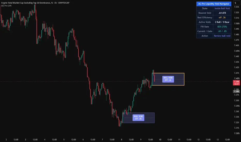
Liquidity Void Navigator [AGPro Series]Liquidity Void Navigator
🔹 OVERVIEW
Liquidity Void Navigator identifies impulsive price displacements that were produced with disproportionately low volume participation — the institutional footprint of a true liquidity void. Unlike geometric gap concepts that rely purely on wick-to-wick imbalance, this engine measures the efficiency of each impulsive bar: how much price moved relative to how much volume was transacted. When price travels faster than the order book justifies, a magnet zone is born. These zones frequently act as high-probability retest and mean-reversion targets for SMC and ICT traders.
🔹 UNIQUE EDGE
Most gap-based tools on TradingView detect Fair Value Gaps using a 3-bar geometric pattern. This indicator uses a fundamentally different signature:
- Volume Efficiency Ratio (core innovation): efficiency = (volume / avgVol) / (range / ATR). Values below the threshold reveal bars where price displacement outpaced volume effort — the statistical definition of a liquidity void.
- Body-based zones, not wick-to-wick: the void box spans the impulsive candle body, excluding wicks that represent liquidity sweeps.
- Dynamic lifecycle management: zones are tracked from birth through mid-line mitigation, with configurable trigger modes (close cross, wick touch, or full fill).
- Strongest-void emphasis: the lowest-efficiency active void automatically receives a bold neutral-colored border, giving traders an at-a-glance view of the most reliable magnet on the chart.
🔹 METHODOLOGY
Each completed bar is evaluated against four quality filters:
1. Range Expansion — bar range must exceed ATR × configurable multiplier (default 1.3).
2. Volume Efficiency — the efficiency ratio must fall below the configurable cap (default 0.85).
3. Minimum Height — void must be at least a fraction of ATR to filter micro-noise (default 0.5×).
4. Body Dominance — the candle body must represent at least 50% of the total range, confirming directional conviction rather than indecision.
Qualifying bars create a directional void zone spanning the body. An optional next-bar gap confirmation adds stricter FVG-style filtering. Active zones are continuously evaluated against the selected mitigation mode and updated in real time. Oldest active voids are pruned when the per-side cap is exceeded, keeping the chart focused on recent, actionable structure.
🔹 SIGNALS & ALERTS
Four alert conditions are available:
- New Bullish Liquidity Void — an upward impulsive void is detected.
- New Bearish Liquidity Void — a downward impulsive void is detected.
- Bull Void Mitigated — closing price crosses the mid-line of an active bullish void from above.
- Bear Void Mitigated — closing price crosses the mid-line of an active bearish void from below.
Each alert fires only on bar close to eliminate repainting concerns. Alert messages include the ticker and timeframe for multi-chart workflows.
🔹 KEY INPUTS
Void Detection
- Volume Baseline Lookback — window for average volume and range calculations.
- Min Range Expansion (×ATR) — minimum impulsive bar size.
- Max Volume Efficiency Ratio — core void qualification threshold.
- Min Void Height (×ATR) — filters micro-voids.
- Require Gap with Next Bar — optional strict confirmation.
- Mitigation Trigger — choose between Close Cross (institutional default), Wick Touch (strict), or Full Fill (swing).
Lifecycle
- Max Active Voids per Side — visual cap to prevent chart clutter.
- Zone Right Extension — how far zones project to the right.
- Show Mitigated Voids — optionally display filled zones in gray.
Visuals
- Bullish / Bearish / Mitigated colors, mid-line toggle, projection arrow toggle, label size.
Panel
- Show / position / font size.
🔹 HOW TO USE
Trend-aligned reversion entries: When price returns to an unmitigated void in the direction of the higher-timeframe trend, watch for rejection at the mid-line or far edge as a potential long (bull void) or short (bear void) trigger.
Breakout continuation context: Newly formed voids in the direction of a breakout often indicate institutional participation. Waiting for a retest of the void zone can provide improved risk-to-reward compared to chasing the breakout bar.
Strongest-void bias: The yellow-bordered void on the chart represents the lowest-efficiency (statistically strongest) active zone. Traders can treat it as the highest-probability magnet for price revisits.
Fill Rate context: A persistently high fill rate on a given symbol or timeframe indicates that voids fill rapidly — more suitable for scalping. A lower fill rate suggests that unfilled voids accumulate meaningfully, offering swing-style opportunities.
Multi-timeframe workflow: Identify voids on a higher timeframe (4H or 1D) as strategic bias zones, then use a lower timeframe (15m or 1H) for tactical execution when price approaches those higher-timeframe voids.
🔹 LIMITATIONS & TRANSPARENCY
- This indicator is built for liquid markets with reliable volume data. Thinly traded symbols or instruments without accurate volume feeds (some spot FX, certain indices) will produce unreliable results.
- Not every detected void will be retested or filled. Voids are statistical zones of interest, not guarantees.
- The indicator is a visualization and analytical tool, not a trading strategy. It does not generate buy or sell recommendations.
- Fill rate statistics are computed over the visible history of active and mitigated voids and are approximate; they are intended as a relative gauge of symbol behavior, not as a backtested performance metric.
- Mitigation triggers are bar-close based to avoid repainting. Intrabar signals may appear and disappear until the bar confirms.
- Zones have a fixed right extension from their birth bar; the indicator does not extend zones infinitely.
🔹 RISK DISCLOSURE
Trading financial markets involves substantial risk of loss and is not suitable for all investors. Past performance of any technical indicator, including this one, is not indicative of future results. This tool is provided for educational and analytical purposes only and does not constitute financial advice, investment recommendations, or solicitation to trade. Users are solely responsible for their own trading decisions, risk management, and outcomes. Always conduct independent analysis and consult with a qualified financial advisor before making investment decisions. Wskaźnik

Setup Quality Scorecard [AGPro Series]Setup Quality Scorecard
Setup Quality Scorecard grades every bar on a transparent 0-100 scale across ten independent confluence dimensions. Instead of another signal generator, it is a quality filter: it tells you how strong the current setup is, which factors are firing, and how often similar past setups have followed through. Works on any symbol, any timeframe.
🔹 OVERVIEW
Every trader has the same question before pulling the trigger: "Is this setup actually good, or am I forcing it?" Setup Quality Scorecard answers that question with a single auditable number. The composite score blends ten orthogonal factors — trend, momentum, volume, volatility, structure, S/R proximity, divergence, candle quality, session context, and higher-timeframe alignment — into a weighted 0-100 quality rating. Bars scoring above the A-Tier threshold are marked with support/resistance-style zones on the chart, so high-quality setup regions stay visible even as the market moves on.
🔹 UNIQUE EDGE
Most quality indicators hide their internals behind a black-box algorithm. This one is fully transparent. Every factor exposes its own 0-10 score in the panel, every factor weight is user-adjustable, and every historical signal is evaluated against a forward-looking hit-rate test. There are no secret filters, no proprietary confidence bands, and no cherry-picked backtest. If a setup scores 87, you can see exactly which factors contributed and which did not.
🔹 METHODOLOGY
Each of the ten factors is computed independently on the current bar and normalized to a 0-10 scale:
1. Trend Alignment — EMA 20/50/200 stack plus slope confirmation
2. Momentum — RSI zone position combined with 3-bar RSI delta
3. Volume Context — relative volume versus 20-period SMA, calibrated for real-world distribution
4. Volatility Regime — ATR percentile over the last 100 bars, favoring mid-range regimes
5. Structure — HH/HL or LH/LL confirmation via recent pivots
6. S/R Proximity — ATR-normalized distance to the nearest pivot level
7. Divergence — price-versus-RSI regular divergence captured at pivot time
8. Candle Quality — body-to-range ratio and wick balance
9. Session Context — active trading session weighting (London/NY overlap prioritized)
10. HTF Agreement — graduated higher-timeframe alignment scoring (full stack, partial stack, opposed regimes)
The ten factor scores are weighted by user-adjustable coefficients, summed, and normalized to produce the final 0-100 composite. Tier labels (S / A / B / C / D) are assigned against user-configurable thresholds.
🔹 SIGNALS AND ALERTS
When a bar crosses into A-Tier or higher, a zone is drawn using support/resistance-style geometry (body plus a small ATR cushion). Zones merge automatically when adjacent qualifying setups share the same directional bias, preventing chart clutter. Each zone is labeled with its tier and score in compact A·83 format, with a dotted leader line connecting the label to the zone edge.
Four built-in alert conditions are exposed:
- S-Tier Setup Detected (score crosses the S-Tier threshold)
- A-Tier Setup Detected (score crosses the A-Tier threshold)
- New Bullish Quality Setup (first A-tier bullish bar in a run)
- New Bearish Quality Setup (first A-tier bearish bar in a run)
🔹 KEY INPUTS
- General: Higher timeframe reference, rolling history window, forward evaluation bars
- Thresholds: S / A / B / C tier cutoffs, fully adjustable
- Factor Weights: ten independent sliders, 0.0 to 2.0, tune the scorer to your style
- Zones: adaptive extend (auto or manual), merge window, max height cap in ATR units, maximum age
- Labels: on-chart label mode (A-Tier only, S-Tier only, off), size presets
- Panel: position, size, factor breakdown toggle
🔹 HOW TO USE
Start with defaults and observe for a full session on your chart. Trend traders should raise the Trend and HTF Align weights. Reversal traders should raise Divergence, Structure, and S/R Proximity. Use the Active count in the panel as a quick filter: fewer than three factors above seven generally means a weak setup regardless of composite score. Use the hit-rate number to sanity-check whether your current configuration is performing on this asset and timeframe — if it is below 50 percent on a large sample, revisit your weight assignments.
🔹 LIMITATIONS AND TRANSPARENCY
The hit-rate metric is backward-looking. It measures how often past A-tier signals produced a one-ATR directional move within the next N bars. It is not a forecast of future performance. A hit rate with fewer than twenty signals is flagged with an info marker because the sample size is not yet statistically meaningful. Factor definitions are static — they do not adapt to regime changes automatically. Session weighting assumes standard crypto and equity session times in UTC; adjust if you are trading exotic hours. The script uses pivot-based structure, which lags by the pivot length on the right edge of the chart (a standard trade-off for noise suppression).
🔹 RISK DISCLOSURE
This indicator is an analytical tool, not financial advice. It does not predict future price movements. A high quality score does not guarantee a winning trade. Past performance of any displayed signal does not indicate future results. Always use proper risk management and position sizing. Never trade with capital you cannot afford to lose. Wskaźnik

Wskaźnik
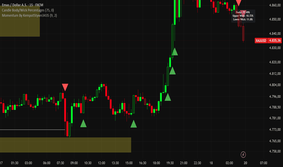
Cumulative Volume Delta Flow [AGPro Series]Cumulative Volume Delta Flow
🔹 **Overview**
Cumulative Volume Delta Flow is a hybrid CVD engine designed to expose order-flow imbalances without requiring footprint charts or exchange-native buy/sell data. It reconstructs cumulative delta using lower-timeframe breakdown when available, with intrabar polarity as a universal fallback — making it work on every symbol and every timeframe. On top of this engine, a triple-layer divergence detector identifies Regular, Hidden, and statistical Exhaustion signals, and every signal is scored by its own statistical strength with a ★/★★/★★★ rating system printed directly on the label.
The indicator is built for traders who want smart-money context at a glance: when buyers are absorbing, when a rally is losing real participation, and when a climactic flush is likely to reverse — with an immediate visual cue of how strong each signal is relative to the recent flow regime.
🔹 **Unique Edge**
Most CVD indicators are single-mode: either they plot cumulative delta, or they call a Regular divergence. This script combines four layers that rarely appear together in one tool:
- Hybrid engine with transparent fallback (no silent failure on high TFs)
- Exhaustion detection based on standard-deviation of CVD change, not price — catches reversals that price-only divergence misses
- Per-signal ★/★★/★★★ strength rating using type-specific statistical metrics (pivot-gap σ for Regular/Hidden, change σ for Exhaustion), so traders instantly know which signals deserve attention
- Optional reaction zones anchored at flow-driven pivots, behaving as dynamic support/resistance born from real participation events rather than pure price structure
🔹 **Methodology**
- The engine computes two parallel delta streams every bar: an intrabar polarity stream (weighted by wick balance for neutral/doji candles) and a lower-timeframe stream that iterates sub-bars and signs each by its close-vs-open direction
- In Hybrid mode, the LTF stream is preferred when it yields a non-zero value; the intrabar stream is used as fallback so the indicator never goes blank on exotic tickers or high timeframes
- A session/daily/weekly reset prevents long-run drift and keeps the cumulative counter meaningful across regime changes
- Pivots are detected on both price and CVD with a shared lookback window; the last two price pivots and their paired CVD values are tested for all four classical divergence relationships
- Exhaustion is a separate statistical trigger: the single-bar CVD change is compared against a 50-bar standard deviation; a σ breach in the direction opposite to the candle body is flagged as climactic absorption
- Each divergence label is rated with stars based on its type: Regular and Hidden use the CVD-pivot gap normalized by 50-bar CVD level stdev (how far apart the two flow pivots are), while Exhaustion uses the σ multiple of the current CVD change (how extreme the climactic event is)
- A cooldown window suppresses signal clustering in chop, and labels are offset by ATR-scaled distance with a leader line so they never collide with candles
🔹 **Signals & Alerts**
On-chart labels with star rating:
- Reg Bull / Reg Bear ★-★★★ — classical reversal divergence (price exhausts, flow refuses)
- Hid Bull / Hid Bear ★-★★★ — continuation divergence (pullback inside an active trend)
- Exh Bull / Exh Bear ★-★★★ — statistical flow climax above the σ threshold
Star thresholds for Regular/Hidden: ★★★ ≥ 2.0σ gap, ★★ ≥ 1.0σ gap, ★ < 1.0σ.
Star thresholds for Exhaustion: ★★★ ≥ 3.0σ, ★★ ≥ 2.0σ, ★ < 2.0σ (minimum trigger is 1.75σ).
Each signal carries its own color code and a leader line connecting the label back to the source candle for fast visual reading. Six discrete alertcondition slots are exposed plus three proactive alert() calls grouped by divergence family, so traders can route regular, hidden, and exhaustion signals to different channels.
🔹 **Key Inputs**
- Calculation Method: Hybrid, LTF Only, or Intrabar Only
- LTF Resolution: Auto (adaptive by chart TF) or fixed 1 / 3 / 5 / 15m
- CVD Reset: Session, Daily, Weekly, or None
- Pivot Length: 2–15 bars
- Toggles for Regular / Hidden / Exhaustion layers independently
- Exhaustion Threshold (σ): 1.0–4.0, default 1.75
- Min Bars Between Signals: anti-clustering cooldown (default 15)
- Reaction Zones: optional, with ATR width, extend length, and max active cap
- Label Size + Label Offset (ATR) for visual tuning
- Info Panel: 5 positions, 4 text sizes, full hide toggle
🔹 **How to Use**
- On the 4H timeframe, run the defaults on liquid instruments: BTCUSDT, ETHUSDT, SPX, ES, major FX pairs
- Treat ★★★ signals as the highest-priority reads of the chart — these are statistical outliers
- Treat ★★ signals as the normal tradeable population — the bulk of decision-making happens here
- Treat ★ signals as background context — use them for bias confirmation, not as primary entries
- Regular divergences are reversal warnings at structural highs/lows; they are most reliable when aligned with a key horizontal level or trendline
- Hidden divergences are trend-continuation entries during pullbacks inside a confirmed trend
- Exhaustion signals mark participation climaxes and often coincide with short-term reversals even when no classical pivot has formed yet
- Check the Info Panel's Last Signal row for the most recent event type and its star rating without scanning the chart
- Enable Reaction Zones when you want persistent S/R context from flow events; keep them off for minimal, label-only use
- Consider combining with a structure tool from the AGPro Series (SFP, Breaker, Unicorn) for confluence
🔹 **Info Panel**
The compact info panel on the chart surfaces seven live metrics: the current cumulative CVD value, the CVD trend classification (Up/Down/Flat based on price relative to its own EMA 21), the last signal's full name and star rating in color, the rolling divergence count over the last 200 bars (Bull / Bear), and the bar-age of the most recent bullish and bearish events. This gives a full situational snapshot without scrolling.
🔹 **Limitations & Transparency**
- CVD from intrabar polarity is an approximation, not true tick-level order flow. Exchange-native buy/sell volume is only available through footprint data
- On very high timeframes (Daily+), LTF breakdown may return partial data; Hybrid mode is recommended
- Divergence signals appear only after both pivot legs are confirmed; the second pivot needs `pivotLen` bars of right-side confirmation, so signals print with that lag
- Exhaustion requires at least 50 bars of CVD history for the standard-deviation baseline
- Star ratings are statistical descriptors of signal strength relative to recent flow, not trade-quality guarantees
- Past performance of any divergence pattern does not guarantee future results; this tool surfaces probabilistic context, not guaranteed reversals
🔹 **Risk Disclosure**
This indicator is an analytical framework, not a trading system or financial advice. Signals are technical observations intended to support decision-making; they do not account for fundamentals, news, liquidity, or your risk tolerance. Always use proper position sizing, stop-loss placement, and risk management. Test the tool on historical data and in a simulated environment before deploying it on live capital. Trading carries risk of substantial loss. Wskaźnik

Multi-Anchor VWAP Grid [AGPro Series]Multi-Anchor VWAP Grid
🔹 Overview
Multi-Anchor VWAP Grid is a volume-weighted analysis tool that plots five independently anchored VWAP lines on the same chart — anchored from swing high, swing low, higher-timeframe pivot, all-time high, and session open. Each anchored VWAP includes optional ±1σ and ±2σ standard deviation bands, forming a dynamic grid of volume-weighted support and resistance levels. When three or more VWAPs converge within a tight ATR-based band, the indicator draws a rectangular confluence zone highlighting the area as a higher-probability price reaction region.
The script is fully automatic. All five anchors are detected by internal engines (pivot detection, session detection, timeframe change detection, all-time-high tracker) and require no manual date picking or retroactive anchor placement. Install the indicator, select which anchors you want active, and the grid builds itself.
🔹 What It Does Differently
Most anchored VWAP tools plot one anchor at a time and require the user to manually place the anchor each time a new swing or event is identified. This script plots five anchors simultaneously and lets them compete for relevance. When multiple independent anchors agree on a price level, that agreement itself becomes the signal — visualized as a confluence zone. A single VWAP is one data point. Five VWAPs intersecting within 0.5 ATR of each other is a structural event.
The confluence detection engine tests each active VWAP as a reference point, counts how many others fall within the user-defined ATR tolerance, and picks the densest cluster on each bar. A minimum VWAP count threshold (default 3) prevents noise, and a lifecycle manager extends, adaptively resizes, and expires zones based on bar age and midpoint drift.
🔹 Methodology
**Anchor engines**
Swing High and Swing Low VWAPs reset on each confirmed pivot using the standard ta.pivothigh / ta.pivotlow detector with a configurable lookback length. HTF Pivot VWAP resets at the start of each selected higher-timeframe period (daily, weekly, or monthly) using timeframe.change. ATH VWAP resets whenever a new all-time high is printed on the visible chart. Session Open VWAP resets at the first bar of each trading session defined by the session window input.
**VWAP calculation**
Each anchor maintains three running accumulators since its last reset: sum of (price × volume), sum of volume, and sum of (price² × volume). VWAP is computed as the first divided by the second. Standard deviation is derived from the variance identity: sqrt(E − E ²), where E and E are computed from the running accumulators. Bands are plotted at configurable multipliers of this running standard deviation.
**Confluence engine**
On each bar, the script evaluates every active VWAP as a potential cluster center. For each candidate center, it counts how many other active VWAPs fall within ATR × tolerance distance. The cluster with the highest count wins. If the winning count meets or exceeds the minimum threshold, the bar is marked as confluence-active.
**Zone lifecycle**
When confluence becomes active, a new rectangular zone is created spanning the min/max of the clustered VWAPs. As long as confluence remains active and the cluster midpoint drifts less than 0.5 ATR from its original midpoint, the zone extends to the current bar and adaptively resizes with rate-limited expansion (maximum 1 ATR growth per bar per direction, preventing erratic stretching). If the midpoint drifts more than 0.5 ATR, a new zone is created. A 5-bar debounce prevents micro-breaks in confluence from prematurely closing active zones. Zones auto-expire after a configurable age limit (default 120 bars).
🔹 Signals and Panel Readouts
The information panel in the top-right corner (position and theme configurable) displays:
- **Price Bias** — count of VWAPs price is currently above vs below, with an overall BULL / BEAR / MIXED classification
- **Confluence** — current status (active with cluster count, or none) and the minimum-count threshold in use
- **Closest VWAP** — which of the five VWAPs is currently closest to price, and the distance in ATR units
- **Active VWAPs** — each enabled VWAP's current value and percent distance from close
Two alert conditions are built in: new confluence zone detection, and price crossing any active VWAP line.
🔹 Key Inputs
**Anchor Points group** — toggle each of the five VWAPs on or off, set swing pivot lookback length, choose HTF timeframe (D/W/M), define the session window for intraday anchoring.
**Deviation Bands group** — toggle bands on or off, configure band 1 and band 2 multipliers, enable or disable gradient fills between VWAP and the first band.
**Confluence Zones group** — toggle zones on or off, set minimum VWAPs required for a confluence (2 to 5), adjust the ATR-based tolerance, define maximum zone age in bars.
**Panel group** — toggle panel, choose location (six positions), select Dark or Light theme, set font size (Small / Normal / Large).
**Labels group** — toggle the compact end-of-line labels that identify each VWAP at the right edge of the chart.
🔹 How to Use
This indicator is designed as a context layer, not a standalone entry signal. Suggested workflow:
**1. Identify structural bias.** Check the Price Bias row in the panel. If 4 or 5 VWAPs sit below price (BULL), the market is trading above its most relevant volume-weighted averages across multiple timeframes and event contexts. The opposite applies for BEAR.
**2. Watch for confluence formation.** When the panel shows Confluence ACTIVE with 3 or more VWAPs clustered, a meaningful volume-weighted support or resistance area is forming. These zones often precede reaction or reversal behavior.
**3. Use bands for context.** When price trades near the ±1σ band of a single VWAP, reversion back toward that VWAP is statistically more likely. ±2σ extensions indicate volatility outliers.
**4. Cross-reference with your own tools.** This script is most useful combined with price action, volume profile, or a trend filter of your choice. It does not generate entries or exits on its own.
🔹 Tips
- On crypto 24h markets, set Session Window to 0000-2359 for a full-day session VWAP.
- Higher Swing Pivot Length values (30–50) filter noise on higher timeframes; lower values (10–15) are better for intraday.
- If the chart feels visually crowded, disable the ±2σ bands or reduce the number of active anchors. All five are rarely needed simultaneously.
- For the strongest confluence signals, increase Min VWAPs for Confluence to 4 — rarer but higher conviction.
🔹 Limitations and Transparency
- The script uses standard Pine Script pivot detection for swing anchors. Pivots are confirmed only after the pivot length has passed, which means swing VWAP anchors are placed retrospectively by that many bars. This is an inherent limitation of all pivot-based tools, not a bug.
- ATH tracking is limited to the visible chart range. On timeframes or symbols where the chart does not load full history, the "ATH" anchor represents the highest point within loaded data, not the true all-time high.
- Standard deviation bands assume price dispersion around each VWAP is approximately normal over the anchored period. In strongly trending markets, this assumption weakens and bands may widen significantly.
- Confluence zones are descriptive, not predictive. They mark areas where multiple volume-weighted averages happen to agree. They do not guarantee price reaction, only indicate where reaction is more plausible than average.
- Session Window input must match the instrument's trading hours to produce a meaningful intraday VWAP. Incorrect session definitions will produce misleading anchor points.
🔹 Risk Disclosure
This indicator is provided for educational and analytical purposes only. It is not financial advice, investment advice, or a recommendation to buy, sell, or hold any asset. All trading involves substantial risk of loss. Past chart behavior and historical VWAP reactions do not guarantee future results. Users are solely responsible for their own trading decisions and risk management. Always combine indicator output with independent analysis and appropriate position sizing. The author accepts no responsibility for any financial outcome resulting from the use of this script. Wskaźnik

Footprint: Cluster by Exchanges v2 [AlexKo]Footprint: Cluster by Exchanges v2
What the Indicator Does
Detects buy and sell clusters from footprint data (POC level + delta) and draws a **stacked set of colored boxes** at each cluster — one box per connected exchange. Box height is proportional to that exchange's volume relative to its own average, so you can instantly see **which exchanges participated in forming the cluster**.
How It Works
1. Cluster Detection
A cluster is confirmed on bar close when all of the following conditions pass:
| Condition | Buy Cluster | Sell Cluster |
|-----------|-------------|--------------|
| POC position | ≤ N% from candle bottom | ≥ (100−N)% from bottom |
| Delta (optional) | > 0 | < 0 |
| Min delta % | ≥ threshold | ≥ threshold |
| Min candle volume | ≥ threshold | ≥ threshold |
| Min range (ATR %) | ≥ threshold | ≥ threshold |
2. Fetching Exchange Volumes
Once a cluster is detected, volume is pulled from each enabled exchange via `request.security()`, automatically substituting the current chart ticker.
3. Visualization — Stacked Boxes
```
▲ ← label (hover → tooltip with full details)
┌──────────┐
│ OKX │ ← h = ATR × scale × (vol_okx / avg_okx)
├──────────┤
│ Bybit │ ← height reflects relative volume
├──────────┤
│ Binance │ ← bottom box = Exchange 1 in settings
● ← POC level of the cluster candle
```
Buy cluster** → stack grows **upward** from POC
Sell cluster** → stack grows **downward** from POC
- Each box is labeled with the exchange name
- Hovering the ▲/▼ marker shows the full tooltip
---
Tooltip (example)
```
▲ BUY CLUSTER
─────────────────────────
POC: 65 420.00 (18% from bottom)
Delta: +12 450 (+8.3%)
Buy: 54.2% │ Sell: 45.8%
─────────────────────────
Exchange Volume ×avg
─────────────────────────
Binance 1.2M ×2.3
Bybit 890K ×1.8
OKX 450K ×0.9
─────────────────────────
∑ Total: 2.5M
```
---
Parameters
Footprint Parameters
| Parameter | Default | Description |
|-----------|---------|-------------|
| Ticks per Row | 100 | Footprint row size in ticks |
| Value Area (%) | 70 | Value area percentage for POC calculation |
Clusters
| Parameter | Default | Description |
|-----------|---------|-------------|
| Cluster Zone (%) | 35 | POC in bottom/top N% of range = cluster. Recommended: 30–40% |
| Show Buy / Sell Clusters | true / true | Toggle each cluster type on/off |
| Accent Color: Buys / Sells | orange / blue | Color for the ▲/▼ label and frame |
Filters
| Parameter | Default | Description |
|-----------|---------|-------------|
| Confirm with Delta | true | Main filter. Buy cluster only when delta > 0 |
| Min Delta (% of Volume) | 0 | Minimum delta strength as % of volume. 0 = disabled |
| Min Candle Volume | 0 | Ignore low-activity bars. 0 = disabled |
| Min Candle Range (ATR %) | 0 | Doji filter. 0 = disabled |
Exchanges 1–5
| Parameter | Description |
|-----------|-------------|
| Enable | Toggle this exchange on/off |
| Prefix | TradingView exchange prefix: `BINANCE`, `BYBIT`, `OKX`, `BITGET`, `KRAKEN`, `COINBASE`, `BITMEX`, etc. |
| Ticker | Empty = current chart ticker. Fill manually if the exchange uses a different format (e.g. `XBTUSD` for Kraken) |
| Name | Text shown on boxes and in the tooltip |
| Color | Box fill and border color |
Bar Visualization
| Parameter | Default | Description |
|-----------|---------|-------------|
| Normalization Mode | % of Average | How bar heights are calculated (see below) |
| SMA Period (bars) | 20 | Moving average period for normalization. Volume / SMA = relative size |
| Height Scale (× ATR) | 0.08 | Base height when volume equals average. Increase if bars look too small |
| Max Multiplier | 5.0 | Growth cap. Volume > 5×average does not increase height further |
| Fill Transparency | 25 | 0 = fully opaque, 95 = nearly invisible |
| Info Label (exchanges + volumes) | true | Show per-exchange volume label outside the candle |
| Label Text Size | small | Text size for the label: tiny / small / normal |
| Label Offset (× ATR) | 0.5 | Distance from candle high/low in ATR units. 0 = flush with candle |
Normalization Modes
| Mode | Description |
|------|-------------|
| **% of Average** | Each exchange bar is scaled against its own SMA. Height = base when volume = average; capped at Max Multiplier × base |
| **% of Total** | Bar width represents the exchange's share of combined volume across all active exchanges on that bar |
| **Absolute** | All exchanges normalized against the combined average of all active exchanges |
Limitations
Object limit:** `max_boxes_count = 500`. With 3 active exchanges you can see ~165 cluster bars; with 5 exchanges ~100. Older objects are removed automatically.
Footprint data:** requires a TradingView subscription that includes Order Flow / Footprint access.
Box labels:** may not be visible if a box is very thin (small ATR or low scale). The hover tooltip always works.
Cluster detection** is based on the current chart's exchange only. Exchanges 1–5 provide volume breakdowns but do not affect whether a cluster is detected.
Alerts
| Alert Name | Trigger |
|------------|---------|
| Buy Cluster | Buy cluster detected on bar close |
| Sell Cluster | Sell cluster detected on bar close |
Alert message format: `{{ticker}} {{interval}} | Buy/Sell cluster by exchanges` Wskaźnik

Wskaźnik

Normalized VolumeNormalized Volume
Overview
Normalized Volume expresses the current bar's volume as a percentage of a rolling average, making it straightforward to compare volume intensity across different instruments, timeframes, and market sessions without manually adjusting thresholds.
A raw volume reading of 500,000 contracts is meaningless in isolation. Normalized Volume answers the more useful question: how does this bar's volume compare to what is normal for this instrument right now? A reading of 100 means the bar printed exactly average volume. A reading of 200 means it printed twice the average. This normalisation makes the same threshold usable across equities, futures, forex, and crypto.
How it works
The indicator calculates a Running Moving Average (RMA) of volume over a configurable lookback period, then divides the current bar's volume by that average and multiplies by 100 to express the result as a percentage.
NormVol = volume / ta.rma(volume, VolLen) * 100
Bars are colour-coded to communicate both volume intensity and price direction at a glance:
Bright green — volume exceeds the High Volume threshold and the bar closed up (bullish absorption or breakout)
Dark red — volume exceeds the High Volume threshold and the bar closed down (bearish absorption or breakdown)
White — volume is below the High Volume threshold (normal or low activity)
Inputs
Volume Period — lookback length for the RMA baseline. Shorter values (10–20) react quickly but are noisier; longer values (50–100) provide a more stable baseline. Default: 50.
High Volume — the percentage threshold above which a bar is considered high volume. A value of 150 means the bar must carry at least 1.5× average volume to trigger the highlight. Adjust higher (200+) on instruments with frequent volume spikes, or lower (120) on instruments with steadier volume profiles. Default: 150.
Usage notes
Use elevated normalised readings (above your High Volume threshold) to confirm breakouts, reversals, or supply and demand zone tests. A zone test accompanied by a high-volume bar is more significant than one on thin volume.
The colour distinction between green and red high-volume bars helps quickly identify whether aggressive buyers or sellers were responsible for the spike.
Because the baseline is a rolling RMA, the indicator adapts automatically to regime changes in liquidity — for example, pre-market thin volume will not distort intraday readings.
This indicator does not repaint. The RMA and the volume of any historical bar are fixed once the bar closes.
Recommended pairings
Normalised Volume works well alongside price action tools that benefit from volume confirmation: supply and demand zones, order blocks, VWAP, and breakout strategies. High-volume bars on key structural levels are a useful filter for separating high-probability setups from low-conviction noise. Wskaźnik
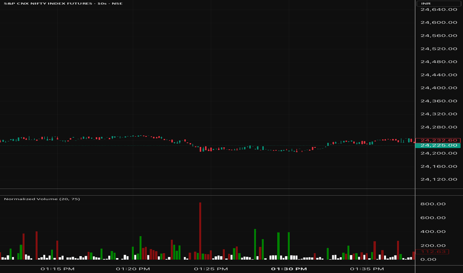
Adaptive Volume Concentration Levels + Volume-Price Shift BoxDescription
Adaptive Volume Concentration Levels + Volume-Price Shift Box combines two powerful market analysis concepts into one streamlined tool: adaptive volume-based support and resistance mapping, and a real-time volume-price flow dashboard.
The script identifies the most meaningful price zones based on where volume has concentrated over a chosen lookback range, helping highlight areas where the market has shown strong interest. At the same time, it displays a compact shift box that evaluates price, volume, VWAP, OBV, A/D behavior, and momentum to estimate whether market pressure is currently bullish, bearish, or neutral.
This makes the script useful for traders who want both structural levels and contextual order-flow style bias in a single indicator.
How It Works
The script has two main components:
-Adaptive Volume Concentration Levels
It scans historical price action over a customizable lookback period.
Price is divided into bins, and volume is accumulated into those bins.
The script then selects the highest-volume zones and converts them into horizontal support/resistance levels.
A higher timeframe option and smoothing feature can be used to reduce noise and reveal more stable levels.
Levels can be displayed with custom colors, line styles, transparency, and optional percentage labels.
- Volume-Price Shift Box
The dashboard evaluates several internal conditions:
VWAP trend and price distance from VWAP
OBV trend and OBV acceleration
A/D line trend
Relative volume versus average volume
Price momentum
Weighted bullish and bearish scores are calculated from these components.
The final shift score determines whether the current state is:
Bullish
Bearish
Neutral
The box then displays key readings such as shift strength, volume vs average, VWAP distance, shift duration, and OBV state.
Key Features
Adaptive volume-based support and resistance detection
Dual SR logic for identifying important high-volume price zones
Optional higher timeframe processing for cleaner structure
Price smoothing to reduce noise in level calculation
Customizable level count, bin density, transparency, labels, and styling
Real-time shift box with bullish, bearish, or neutral bias
Weighted scoring model using VWAP, OBV, A/D, volume, and momentum
Shift strength readout for quick bias confirmation
Shift duration tracking to show how long the current condition has persisted
Clean visual layout that combines structure and flow into one script
How to Use
Start by applying the indicator to your chart and adjusting the level settings based on your trading style.
For the volume concentration levels:
Increase the lookback if you want broader, more established levels.
Increase the number of bins for finer price granularity.
Use the minimum volume filter to remove weaker levels.
Turn on the higher timeframe option if you want more stable zones from a broader market perspective.
For the shift box:
Use the default settings first, then adjust sensitivity and component weights to better match your market and timeframe.
Watch for bullish or bearish shifts when price approaches one of the plotted volume levels.
Use the strength reading to judge whether the bias is weak or decisive.
Monitor duration to see whether the current directional pressure is fresh or extended.
A practical workflow is:
Use the horizontal levels as reaction zones
Use the box to judge whether current pressure supports continuation or rejection from those zones
Combine both with your existing entry and risk management rules
How It Helps
How It Helps
This script helps simplify decision-making by combining where price is likely to react with how price and volume are behaving right now.
The volume concentration levels help traders identify:
likely support and resistance
potential reaction zones
areas of prior market agreement or interest
The shift box helps traders evaluate:
whether buyers or sellers currently have control
whether momentum and volume are aligned
whether market pressure is strengthening or fading
Used together, the tool can help with:
trade location
directional confirmation
filtering weak setups
improving timing around important price zones
It is especially useful for traders who want a clearer view of both market structure and current flow conditions without cluttering the chart with multiple separate indicators.
Disclaimer
This indicator is provided for informational and educational purposes only. It does not constitute financial advice, investment advice, trading recommendations, or an offer or solicitation to buy or sell any financial instrument.
All indicator outputs, classifications (including bullish, bearish, or neutral states), and visual elements are derived from historical market data using user-defined parameters. These outputs are interpretive in nature and do not predict future market performance or guarantee any specific result.
Trading financial instruments involves substantial risk, including the risk of loss exceeding initial capital. Market conditions may change rapidly due to factors outside the scope of this indicator, including but not limited to economic events, news releases, liquidity conditions, execution quality, and slippage.
The developer assumes no responsibility or liability for any trading decisions, losses, or damages arising directly or indirectly from the use of this indicator. Users are solely responsible for evaluating the suitability of this tool for their own trading objectives, risk tolerance, and market conditions.
Past performance, indicator behavior, or historical alignment of signals does not guarantee future results. Use of this indicator constitutes acceptance of these terms.
Wskaźnik

Auction Intelligence█ AUCTION INTELLIGENCE
Auction Market Theory Overlay
An Auction Market Theory (AMT) overlay that analyzes market structure through volume profile analysis. It detects profile shape (D/P/b/DD), identifies balance vs. imbalance states, and tracks value migration — giving you the same auction-based framework used by institutional traders to understand market behavior.
Free and Open Source.
█ THE CONCEPT: WHY AUCTION MARKET THEORY MATTERS
Standard indicators tell you what happened. AMT tells you why . Markets are continuous two-sided auctions where buyers and sellers negotiate fair value:
Balance — Price rotates within an accepted value area. Expect mean-reversion and range-bound trading.
Imbalance — Price breaks away from the value area. One side dominates. Expect continuation.
Profile Shape — The distribution of volume tells you who is in control and what to expect next.
Value Migration — The direction where the POC and Value Area are shifting reveals the underlying trend.
█ CORE FEATURES
1. Volume Profile Engine
Distributes each bar's volume proportionally across price rows, building a volume-at-price distribution:
POC (Point of Control) — Highest volume row = strongest S/R level
VAH (Value Area High) — Upper boundary of the 70% value area = resistance
VAL (Value Area Low) — Lower boundary of the 70% value area = support
2. Profile Shape Detection
Automatically classifies the volume distribution into four distinct shapes:
D-shape — Balanced. Volume evenly distributed, POC near center. Expect rotation.
P-shape — Bullish. Volume concentrated in upper half. Buyers in control.
b-shape — Bearish. Volume concentrated in lower half. Sellers in control.
DD (Double Distribution) — Two distinct volume clusters. Market transitioning between value areas.
3. Balance vs. Imbalance Recognition
Three-factor analysis combining price position, VA width dynamics, and trend strength. The chart background colors automatically when imbalance is detected (cyan = bullish discovery, red = bearish discovery).
4. Value Migration Tracker
Monitors how the POC and Value Area midpoint shift over time:
Bullish Migration ▲ — POC and VA migrating higher = institutional buying
Bearish Migration ▼ — POC and VA migrating lower = institutional selling
Neutral ─ — No significant migration = consolidation
█ AUTO-TIMEFRAME ADAPTATION
All parameters automatically adjust based on the chart timeframe:
1-5 min → Lookback 30, 18 Rows, Migration Len 5
15-30 min → Lookback 40, 20 Rows, Migration Len 8
1 Hour → Lookback 50, 24 Rows, Migration Len 10
4 Hour → Lookback 70, 28 Rows, Migration Len 15
Daily → Lookback 100, 32 Rows, Migration Len 20
Weekly+ → Lookback 150, 40 Rows, Migration Len 30
Disable Auto-TF to use manual settings for full control.
█ DASHBOARD
A compact, dark-themed info panel displaying:
State — Current AMT state (BALANCE / IMBALANCE) with context
Shape — Detected profile shape (D / P / b / DD) with description
Migration — Value migration direction and strength
Position — Current price position relative to Value Area
POC / VAH / VAL — Key volume-based levels
█ ALERTS (4 CONDITIONS)
Balance → Imbalance — Market leaving the value area
Imbalance → Balance — Market returning to the value area
Profile Shape Changed — Volume distribution pattern shift
Value Migration Shift — Directional bias change in POC/VA migration
█ PRO VERSION
The PRO version (Auction Intelligence PRO v2.0) adds:
Initial Balance Range — IB Tracking + IB Extension Detection
Failed Auction Detection — VA Breakout Failures
Excess & Poor High/Low — Wick analysis at session extremes
Auction Rotation Factor — POC-cross frequency as market efficiency measure
Day Type Classification — Trend/Normal/Normal Var./Neutral/Double Dist. (Dalton)
Previous Day Value Area — PDPOC/PDVAH/PDVAL as reference levels
Enhanced Confluence Score — 0-12 scale with A+ to D grading
13 Alert Conditions
█ NON-REPAINTING
The volume profile is calculated from confirmed bar data only. The rolling lookback window recalculates on each confirmed bar using historical high/low/volume — no future data is used. No repainting.
█ WORKS ON
Crypto, Forex, Stocks, Futures, Indices — any timeframe from 1 minute to Monthly.
█ DISCLAIMER
This indicator is for educational and informational purposes only. It does not constitute financial advice. Always do your own research and manage your risk. Past performance does not guarantee future results. Trading involves substantial risk of loss.
Wskaźnik

Delta Divergence [LliterH]█ WHAT IT DOES
Delta Divergence detects real-time divergences between price movement and intrabar delta across six simultaneous time windows. When price moves in one direction but the net aggressive volume points the other way, the dashboard flags it as a BULL or BEAR divergence — giving you a multi-timeframe view of hidden order flow in a single overlay.
• BULL — Price falling while delta is positive: absorption or hidden buying pressure
• BEAR — Price rising while delta is negative: distribution or hidden selling pressure
• OK — Price and delta are synchronized, no anomaly detected
█ HOW IT WORKS
Delta is approximated from intrabar candles using request.security_lower_tf(). Each sub-candle within your chart bar is classified as buy or sell volume based on its direction (close vs. open or close vs. previous close). The net difference — buy volume minus sell volume — is the delta.
This delta is then accumulated over six configurable rolling time windows (default: 1m, 3m, 5m, 15m, 30m, 1h). The indicator compares the price direction across each window against its cumulative delta. When they disagree, you have a divergence.
The dashboard updates every bar and shows four columns per window:
• TF — Time window label
• Vol — Total volume with a directional arrow (↗ rising, ▼ falling vs. prior window)
• Delta — Net buy minus sell volume (Δ) with sign
• Signal — BULL / BEAR / OK with duration counter in seconds
Confluence across three or more windows simultaneously is the highest-confidence signal this tool produces.
█ HOW TO USE IT
Step 1 — Identify confluence
A single window diverging is noise. Look for 3 or more windows showing the same signal at the same time. If the duration counter is growing on all of them, you are looking at sustained pressure — not a random fluctuation.
Step 2 — Read the duration
The number next to BULL or BEAR shows how many seconds the divergence has been active. A BULL signal held for 90+ seconds across the 1m, 3m, and 5m windows carries more weight than one that appeared two seconds ago.
Step 3 — Confirm with price context
This indicator does not generate entries by itself. Use it alongside your structure, support/resistance, or session bias. The ideal scenario: price approaches a key level, the dashboard shows confluence with growing duration, and volume is expanding (↗ arrow).
Step 4 — Use the alerts
Set the "Multi-Window Bull/Bear Confluence (3+)" alert to get notified without watching the dashboard. When the alert fires, check duration and volume, then apply your entry logic.
█ EXAMPLE SETUP — BTC/USDT 5m
• Chart: BTCUSDT 5-minute
• Lower TF input: 1m
• Price drops into a demand zone and stalls
• Dashboard shows BULL on 1m, 3m, and 5m windows
• Duration on all three is above 60 seconds and growing
• Vol column shows ↗ on the 1m and 3m windows
• This is the confluence picture worth acting on
█ SETTINGS
Delta Engine
• Lower TF — Must be below chart timeframe (e.g. 1m on a 5m chart)
• Classification method — Close vs Open or Close vs Prev Close
• Volume Assumption — Optional 40/60 split when only one side is recorded
• Min Delta / Min Price Change — Noise filters to suppress weak divergences
Time Windows
• Six independent windows, all configurable in seconds (default: 60, 180, 300, 900, 1800, 3600)
Dashboard
• Table position, text size, volume column toggle, duration toggle, symbol display
Colors
• Full control over bull, bear, neutral, background, and header colors
█ IMPORTANT NOTE
Delta in this indicator is approximated from candle direction — not from tick-by-tick order flow data. True delta requires exchange-level trade data that Pine Script does not provide without a Premium+ data feed using seconds-based timeframes. This tool is designed as a confluence and screening layer, not as a replacement for dedicated order flow platforms.
█ ALERTS
• Bull Divergence Detected — any window enters BULL state
• Bear Divergence Detected — any window enters BEAR state
• Multi-Window Bull Confluence (3+) — three or more windows in BULL simultaneously
• Multi-Window Bear Confluence (3+) — three or more windows in BEAR simultaneously
█ DISCLAIMER
This indicator is provided for educational and informational purposes only. It does not constitute financial, investment, or trading advice. Past performance is not indicative of future results. Trading involves substantial risk of loss and is not suitable for every investor. Always conduct your own research and consult a qualified financial professional before making any trading decisions. The author is not responsible for any losses incurred from the use of this tool Wskaźnik