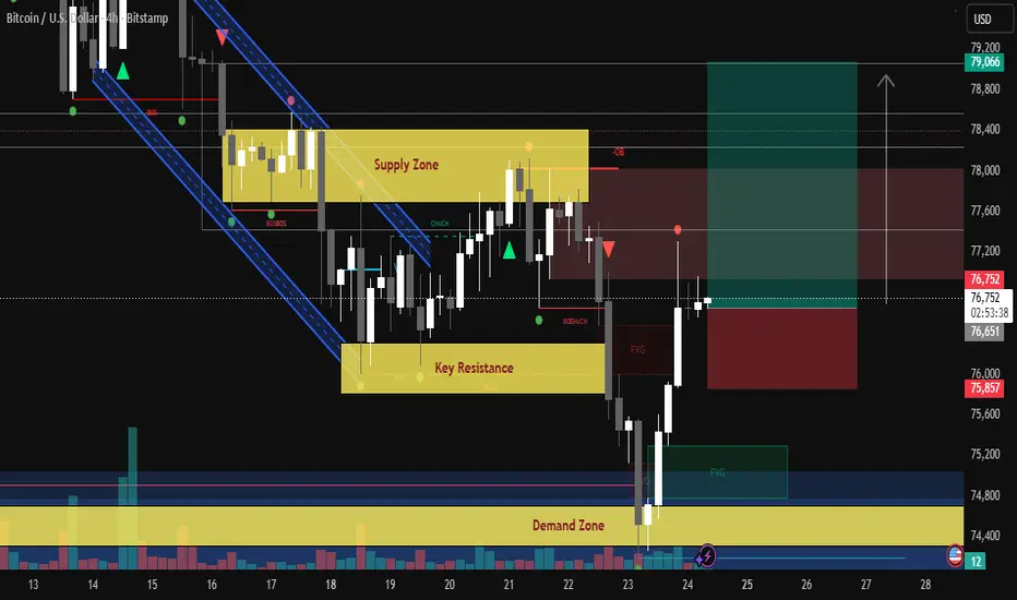
BTCUSD – Demand Zone se Bounce | SMC Setup | May 2026Bitcoin (BTCUSD) has been trading inside a descending channel on the 4H timeframe. Price recently swept liquidity below a key demand zone near 74,400–74,800, triggering a sharp bullish reaction — a classic Smart Money concept move.
KEY ZONES
Supply Zone: 77,800 – 78,400
Institutional selling area. Expect resistance here.
Key Resistance: 76,000 – 76,800
Previous support turned resistance. Needs 4H close above to confirm bullish move.
Demand Zone: 74,400 – 74,800
Strong buyer reaction zone. Price wicked here and bounced sharply.
FVG (Fair Value Gap): Imbalance zones visible. Price may revisit before moving higher.
━━━━━━━━━━━━━━━━━━━━
EDUCATIONAL SCENARIO
━━━━━━━━━━━━━━━━━━━━
Bias: Bullish (on confirmation)
Entry Area: 76,600 – 76,800
Target 1: 77,600
Target 2: 78,400
Target 3: 79,066
Stop Loss: 75,700
R:R Ratio: 1:2.5 (approx)
━━━━━━━━━━━━━━━━━━━━
CONFLUENCES
━━━━━━━━━━━━━━━━━━━━
BOS confirmed
CHoCH visible
Liquidity sweep below demand
Bullish rejection candle
Volume spike on reversal
FVG present in reversal area
Descending channel breakout attempt
━━━━━━━━━━━━━━━━━━━━
DISCLAIMER
━━━━━━━━━━━━━━━━━━━━
This analysis is for educational purposes only. It does not constitute financial or investment advice. Cryptocurrency trading carries significant risk. Always do your own research (DYOR) and consult a licensed financial advisor before making any trading decisions. Never invest more than you can afford to lose.  Long
Long
Bitcoin / U.S. Dollar — 4-Hour Analysis (Bitstamp)Price has broken structure to the downside (BOS) on the 4H timeframe, sweeping below the previous BOS level near $75,141, forming a clear Fair Value Gap (FVG) between approximately $74,800 – $76,400.
Key Observations:
• Multiple BOS (Break of Structure) confirmations on the way down from $78,400
• A CHoCH (Change of Character) was previously printed near $77,200 zone, which has now been lost
• Price is currently trading inside a demand/FVG zone (~$74,679 – $76,000)
• The projected move anticipates a liquidity grab into FVG, followed by a bullish recovery toward $77,200 – $77,336
• A bearish Order Block (OB) sits above near $78,000, which will act as resistance on any rebound
Bias: Short-term Bullish Rebound from FVG support — watching for confirmation before entries
Invalidation: Clean 4H close below $74,679 (yellow support level)
Targets:
• TP1: $76,800
• TP2: $77,336
• TP3: $78,000 (OB resistance — partial close zone)
This is a technical analysis idea based on Smart Money Concepts (SMC). Not financial advice. Always manage your risk. Long 
GRML – Bulls Took Over… What Comes Next?While the critical minerals narrative keeps gaining global attention, NASDAQ:GRML is now approaching a major technical decision zone that could determine whether bulls are preparing for the next impulsive move higher.📈
GRML has been overall bearish for months , consistently printing lower highs and lower lows while trading inside the falling red channel.📉
After months of bearish pressure, sellers started losing momentum and the bulls finally managed to take over by breaking above the falling wedge marked in red.⚡
Since then, GRML has been trading in a corrective phase rather than starting a fresh bearish impulse.
And now price is once again approaching the same demand zone that previously triggered the bullish breakout.📍
📊 Technical Highlights:
• Long-term demand zone holding
• Previous bullish structure break remains valid
• Current move looks corrective, not impulsive
• Potential higher low formation in progress
🎯 What’s Next?
As long as the green demand zone holds, bulls may attempt the next impulsive move higher.
The key trigger for bulls remains a confirmed bullish continuation from the current correction phase.
In such a scenario, bulls would regain stronger control.
🎯 First target: $1.4 supply zone
🎯 Second target: $3 round number
As long as price remains above the green demand area, the bullish continuation scenario remains valid. 📈
📌 Invalidation:
A clean breakdown below the demand zone would weaken the bullish scenario and increase the probability of a deeper bearish continuation.
The broader Greenland mining and critical minerals narrative has also been gaining attention recently, especially as investors continue searching for strategic resource plays outside traditional supply chains. 🌍
💡 Bigger Picture (Fundamentals)
Greenland Mines continues positioning itself within the growing critical minerals and strategic resources narrative , a sector gaining increasing global attention as Western countries seek alternative supply chains outside China. 🌍
The company has also been progressing its Greenland mining initiatives while recently securing additional Nasdaq compliance time, keeping investors focused on both operational progress and the potential recovery above the $1 psychological level. ⛏️
📌In brief, GRML is showing early signs of accumulation near a major demand zone, but bulls still need continuation momentum to unlock the next impulsive move.
⚠️ Disclaimer: This is not financial advice. Always do your own research and manage risk properly.
📚 Stick to your trading plan regarding entries, risk, and management.
Good luck! 🍀
All Strategies Are Good; If Managed Properly!
~Richard Nasr What Creates A Chart Pattern? A Look Inside Market Order FlowMost traders recognize chart patterns almost instantly. Rising wedges, triangles, channels, flags, and head-and-shoulders formations have become deeply embedded into technical analysis. Yet one important question is often overlooked:
Why do these patterns even form in the first place?
Price action does not move randomly from one geometric structure to another. Behind every chart pattern is a continuous interaction between buyers and sellers, liquidity entering and exiting the market, and areas where significant quantities of orders remain unfilled. In many cases, what traders identify as a “pattern” may simply be the visible footprint of deeper supply-and-demand mechanics operating underneath the surface.
The daily futures chart discussed here offers an interesting educational example of that concept.
In this case study, a rising wedge structure developed after price encountered a significant sell-side liquidity area. The subsequent breakdown beneath the wedge may suggest that the underlying order flow imbalance eventually overwhelmed bullish momentum, creating a potential continuation move toward a lower demand zone.
The Rising Wedge Structure
On the daily futures chart, price gradually advanced inside a rising wedge formation. Rising wedges are often characterized by:
Higher highs
Higher lows
Narrowing price compression
Decelerating bullish momentum
At first glance, the structure may appear bullish because price continues climbing. However, the progressive narrowing of the range can also reveal that buyers are struggling to maintain the same level of upward pressure seen earlier in the trend.
What makes this example particularly interesting is what occurred near the top of the structure.
A significant sell UFO resistance zone located between:
81,210
84,945
appears to have injected considerable sell-side pressure into the market. Rather than allowing price to continue expanding higher aggressively, this resistance area repeatedly absorbed buying activity. The result was a slowing of momentum and eventually the formation of the wedge peak itself.
This is where an important educational concept emerges:
The chart pattern may not be the cause of the move. Instead, the chart pattern could simply be the visible consequence of liquidity interactions occurring beneath the surface.
In other words, the rising wedge may have formed because large quantities of sell orders prevented bullish expansion from continuing freely.
That distinction matters.
Many traders learn chart patterns mechanically:
Rising wedge = bearish
Bull flag = bullish
Triangle = continuation
But patterns become significantly more meaningful when viewed through the lens of supply and demand dynamics.
How Order Flow Can Shape Price Structure
Markets move because buy orders and sell orders continuously interact with one another. When aggressive buyers overwhelm available sell liquidity, price tends to move higher. When aggressive sellers absorb buying pressure and gain control, price may begin moving lower.
This interaction creates the very structures traders later identify visually on charts.
In this example, the sell UFO resistance zone may represent a concentration of previously unfilled sell orders. As price entered that area, the available sell-side liquidity appears to have repeatedly rejected bullish attempts to continue higher.
The consequences became visible through:
Reduced upside momentum
Multiple rejections near resistance
Compression within the wedge
Eventual downside breakdown
Viewed from this perspective, the wedge itself becomes less important than the liquidity mechanics responsible for creating it.
This idea also helps explain why some chart patterns fail while others continue developing successfully. A pattern without meaningful liquidity context may lack the order-flow imbalance necessary to sustain a move. Conversely, when a recognizable structure aligns with major supply or demand levels, the probability of meaningful follow-through may improve.
That does not guarantee an outcome, of course. Markets remain uncertain environments. However, understanding why structures form can often provide more insight than memorizing the patterns alone.
The Breakdown And Measured Move
Price has now started breaking beneath the lower boundary of the wedge structure, potentially activating the measured-move scenario associated with the pattern.
A measured move attempts to estimate the magnitude of a potential move following a breakout or breakdown by projecting the height of the structure.
Interestingly, the projected downside target aligns closely with a buy UFO support zone located near:
69,795
This creates an important area of confluence.
Confluence occurs when multiple independent analytical factors point toward the same area on the chart. In this case:
The rising wedge measured move
A significant buy-side liquidity zone
Historical support interaction
all converge near the same region.
From an educational standpoint, this is important because isolated signals often carry less informational value than clusters of aligned evidence.
The buy UFO support near 69,795 could potentially act as a liquidity magnet for price during the downside move. At the same time, because this area may contain substantial buy-side interest, it could also become a location where bearish momentum begins slowing or stabilizing.
That dual role is one reason why many traders focus heavily on liquidity zones rather than relying solely on geometric chart projections.
Educational Trade Structure Example
To illustrate how some traders may structure risk around this type of scenario, consider the following hypothetical educational example.
Potential bearish thesis:
The rising wedge breakdown reflects weakening bullish momentum.
Sell-side liquidity near the wedge peak remains active.
Price could continue lower toward the buy UFO support near 69,795.
Hypothetical trade framework:
Potential entry consideration: Current levels or retracements higher into resistance
Hypothetical target: 69,795
Hypothetical protective stop: Above 84,945
What makes the stop placement particularly educational here is that it is not based solely on the wedge geometry itself.
Instead, the stop is positioned above the sell UFO resistance zone that appears to have created the wedge peak in the first place.
That distinction is important.
If price were to reclaim and sustain movement above 84,945, the underlying bearish order-flow thesis could weaken materially because the resistance liquidity that previously rejected price would no longer appear dominant.
This demonstrates an important principle in professional risk management:
Stops are often more effective when placed beyond liquidity invalidation zones rather than arbitrary chart lines.
Naturally, even well-structured setups can fail. Futures markets are highly dynamic environments influenced by:
Macro events
Volatility expansion
Institutional positioning
Liquidity conditions
News-driven order flow
This is why position sizing and risk management remain essential regardless of how compelling a setup may appear technically.
Understanding BTC And MBT Futures Contracts
For traders exploring futures products connected to this market, two commonly discussed contracts are the standard-sized BTC futures contract and the micro-sized MBT futures contract.
The standard Bitcoin futures (BTC) contract represents:
5 bitcoins per contract
The micro Bitcoin futures (MBT) contract represents:
0.1 bitcoins per contract
This size difference creates significantly different exposure profiles.
The micro contract is designed to provide smaller notional exposure, which may allow traders to scale risk more gradually or participate with lower capital requirements compared to the standard contract.
Approximate contract characteristics include:
Bitcoin Futures (BTC) Minimum tick: 5.00 per bitcoin = $25.00 per contract
Micro Bitcoin Futures (MBT) Minimum tick: 5.00 per bitcoin = $0.50 per contract
Margin requirements fluctuate over time depending on volatility and brokerage policies. At the time of writing, approximate exchange-related margin levels may vary substantially, but traders will commonly encounter:
Bitcoin Futures (BTC) Margin: ~$95,000 per contract
Micro Bitcoin Futures (MBT) Margin: ~$1,900 per contract
Traders should always verify current margin specifications directly with their futures broker before initiating any futures position.
Why Risk Management Matters More Than The Pattern Itself
One of the most dangerous misconceptions in trading is believing that identifying a pattern alone creates an edge.
In reality:
Patterns fail
Breakouts reverse
Liquidity shifts
Volatility changes
Market conditions evolve continuously
This is why risk management often matters more than prediction.
Even if the downside scenario discussed here develops further, no single setup should ever dominate overall portfolio exposure. Traders who survive long term typically focus less on certainty and more on managing uncertainty effectively.
Some important considerations include:
Position sizing relative to account size
Maximum acceptable loss per trade
Volatility-adjusted stops
Leverage awareness
Scenario planning
The educational value of this setup is therefore not limited to the wedge itself. The more important lesson may be understanding how:
liquidity zones,
supply and demand imbalances,
and order-flow interactions
can influence the very structures traders later interpret visually on charts.
Final Thoughts
Chart patterns are often taught as standalone formations. However, patterns may become significantly more meaningful when viewed as the visible outcome of hidden market mechanics operating beneath price action.
In this example, the rising wedge structure appears closely connected to a significant sell-side liquidity zone that repeatedly rejected bullish expansion. The subsequent breakdown then aligns with a measured-move projection targeting a major buy-side liquidity area near 69,795.
Whether price ultimately reaches that zone or not is less important than the broader educational takeaway:
Markets are shaped by liquidity interactions first, and chart patterns second.
Understanding that relationship may help traders move beyond simply recognizing patterns and toward understanding the forces that create them.
Data Consideration
When charting futures, the data provided could be delayed. Traders working with the ticker symbols discussed in this idea may prefer to use CME Group real-time data plan on TradingView: www.tradingview.com - This consideration is particularly important for shorter-term traders, whereas it may be less critical for those focused on longer-term trading strategies.
General Disclaimer
The trade ideas presented herein are solely for illustrative purposes forming a part of a case study intended to demonstrate key principles in risk management within the context of the specific market scenarios discussed. These ideas are not to be interpreted as investment recommendations or financial advice. They do not endorse or promote any specific trading strategies, financial products, or services. The information provided is based on data believed to be reliable; however, its accuracy or completeness cannot be guaranteed. Trading in financial markets involves risks, including the potential loss of principal. Each individual should conduct their own research and consult with professional financial advisors before making any investment decisions. The author or publisher of this content bears no responsibility for any actions taken based on the information provided or for any resultant financial or other losses. Education 
 Long
Long
Long 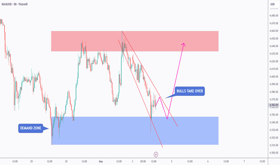
 Short
Short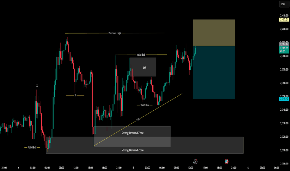
Long 
 Long
Long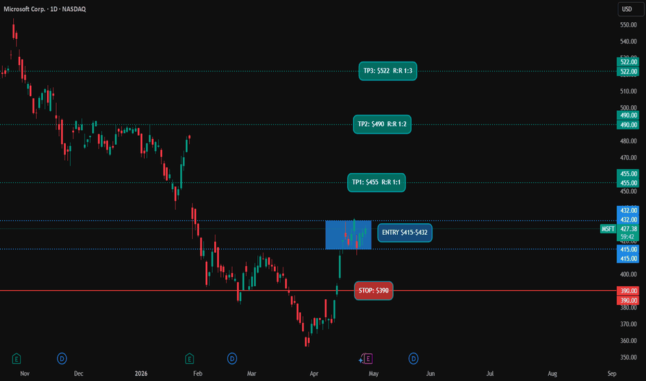
Descending Trendline Breakout – Bullish Targets Ahead Price has decisively broken above a strong descending trendline that had been acting as dynamic resistance for an extended period, indicating a clear shift in market structure. This breakout suggests that sellers are losing control while buyers are stepping in with increased momentum.
Before the breakout, price was consolidating near a well-defined demand zone, showing signs of accumulation. The move above the trendline confirms bullish intent, especially as price is now attempting to hold above this level—potentially turning previous resistance into new support.
If this structure holds, the market is likely to continue its upward move toward the next key resistance levels marked as targets at 187.311 and 187.707. These zones represent areas where price may face reactions, but a strong bullish push could lead to continuation beyond them.
Overall, as long as price maintains support above the broken trendline and continues forming higher lows, the bullish outlook remains valid. Any rejection or breakdown below the trendline, however, could signal a false breakout and shift the market back into consolidation or bearish pressure.  Long
Long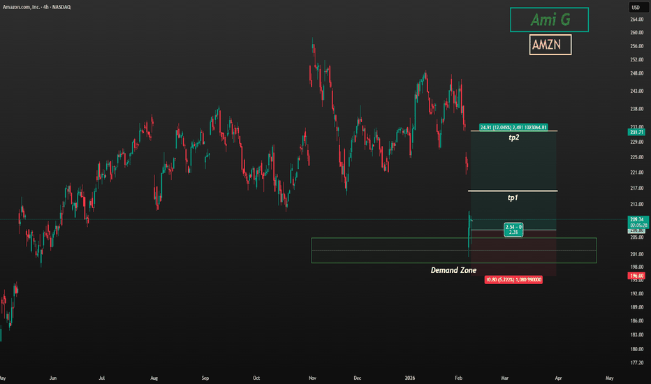
EUR/USD — Weekly Outlook | Multi-Timeframe Analysis Macro Bias: 📅 Monthly Timeframe
Price has decisively rejected from a well-defined monthly supply zone, compounded by confluence with a significant Fair Value Gap (FVG) and a major psychological round number. The most recent monthly candle closed below its predecessor, confirming that the macro structure remains bearish. The current price movement should be read as a corrective retracement within a broader downtrend, not a reversal.
📅 Weekly Timeframe
On the weekly chart, price swept the liquidity resting above the prior range and promptly rejected from a weekly supply zone aligned with the 1.18500 round number — a level that carries significant institutional weight. This rejection followed a prior Break of Structure (BOS), which validates the corrective nature of the recent rally.
With the monthly and weekly biases aligned to the downside, two scenarios are now in play:
Scenario A (Higher Probability): Price revisits the high of the latest weekly candle's upper wick — a standard liquidity target — before sellers reassert control. This is supported by the fact that the candle closed above the previous candle's wick, suggesting a near-term wick-fill is likely.
Scenario B: Direct bearish continuation without a wick revisit, contingent on daily confirmation.
The weekly close will be the deciding factor.
📅 Daily Timeframe
The daily chart clarifies the picture. Price rejected simultaneously from both the weekly and daily supply zones, and the most recent daily candle swept the liquidity from the prior candle's low — a bearish confirmation signal. A round number rejection adds further weight to the downside case.
Expected path: Price declines into the lower daily FVG, where a temporary reaction may develop. From there, a corrective bounce toward the weekly wick high is possible. Should price reach that level and show bearish rejection, the higher-timeframe downtrend is expected to resume toward lower structural targets.
⏱ H4 Timeframe
The H4 structure supports the roadmap above. The preferred approach is to monitor for intraday FVG formations on the H1 chart as potential entry triggers, targeting the lower daily FVG. If price closes above that daily FVG rather than rejecting it, the corrective bounce toward weekly liquidity becomes the primary scenario.
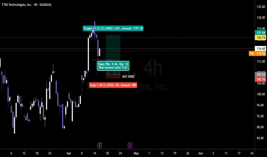
As long as price trades below the higher-timeframe supply cluster, rallies remain corrective in nature and should not be mistaken for trend reversals. TTMI High‑Conviction Pullback Into 4H Demand With 10R Upside PotTTM Technologies is showing a clean higher-timeframe setup after a strong move, with price pulling back into a defined weekly demand area near the 4h structure on your chart.
The business backdrop is constructive as well: FY2025 net sales came in at $2.906 billion, non-GAAP EPS reached $2.46, and Q4 2025 revenue was $774.3 million with A&D backlog at $1.61 billion.
The stock is currently trading around the $116 area on your chart, after tagging the recent highs and then retracing into a technically important zone. TTM’s FY2025 results also showed improving profitability and leverage, with non-GAAP operating margin at 11.7% and net debt/EBITDA down to 0.9x, which supports the case for institutional accumulation on weakness.
Analyst sentiment is supportive, with Public showing a Strong Buy consensus as of mid-April 2026, and the company has a Q1 2026 conference call scheduled for April 29, 2026.
🟢 Buy Zone 1 ($107.23 area)
Top of the blue demand shelf on your chart and the first area where buyers have already defended price.
Stop: $105.78
Position risk: $980
Qty: 13
Risk/Reward Ratio: 9.87
Target: $121.54
🟢 Buy Zone 2 ($96.00 area)
Deeper weekly support and a cleaner value area if the first zone fails.
Stop: $92.00
Position risk: $980
Qty: 13
Risk/Reward Ratio: 13+
Target: $124.00
Key Levels:
🔑 Current Price: $116.60
🔑 Buy Zone 1: $107.23 | Stop: $105.78
🔑 Buy Zone 2: $96.00 | Stop: $92.00
🔑 Recent High: $121.54
🔑 FY2025 Revenue: $2.906B
🔑 FY2025 Non-GAAP EPS: $2.46
🔑 FY2025 Net Debt/EBITDA: 0.9x
🔑 FY2025 A&D Backlog: $1.61B
🔑 Strong Buy Consensus: 100% on Public
🎯 Target 1: $121.54
🎯 Target 2: $124.00
TTM is not a story stock, it is a cash-generative industrial technology name with improving margins, lower leverage, and a strong defense/data-center mix. The setup is simple: if the weekly demand holds, the pullback looks like a normal continuation entry rather than a trend break.  Long
Long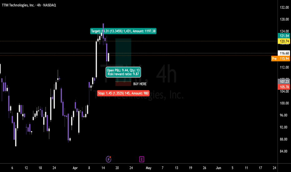
JUP: coiled spring or breakout? key levels to watch this weekJUP
Who’s still watching this thing chop around while the rest of the market rotates into new hype coins? Recently, according to industry sources, JUP has stayed on traders’ radars after the airdrop buzz and ongoing ecosystem talk, but price hasn’t followed with any explosive move yet. That combo of fading headlines and tight range is usually where the next decent swing hides.
On the 4H chart, price is sitting right in the mid green demand zone around 0.16 with RSI glued near 50, so we’re clearly in “coiled spring” mode. I’m slightly leaning bullish: repeated defenses of this support plus visible volume build in the same area tell me smart money is quietly accumulating, aiming for a run back into the red supply band above 0.17. I might be wrong, but as long as buyers hold this green box, I treat every dip into it as a potential reload, not panic fuel.
My base plan: ✅ look for a long setup between 0.158–0.162 with a target into 0.17–0.172 where the last sharp rejections came from. If this green zone fails and we get a clean 4H close below 0.158, I’m flipping the script and watching for a slide toward the next big demand area near 0.15 and even 0.14. I’m flat for now, just stalking the range breakout and ready to trade whichever side finally wins. BONK: coiled spring or fading meme? key levels for todayBONK
Anyone else watching this meme dog try to break its leash again? According to market chatter, Solana meme coins are back on the radar after fresh inflows into the ecosystem, and BONK is one of the usual suspects whenever liquidity rotates into the “degen” pocket. Today we saw buyers step in again right around the same demand zone that held last week.
On the 4H chart, price is ping‑ponging inside that orange mid‑range, sitting just above the green support band. RSI is mid‑50s, so not overbought yet, and the last dip into demand was bought up quickly with decent volume. My base view here is upside from this range, targeting the first red supply block above where we’ve seen repeated rejection wicks.
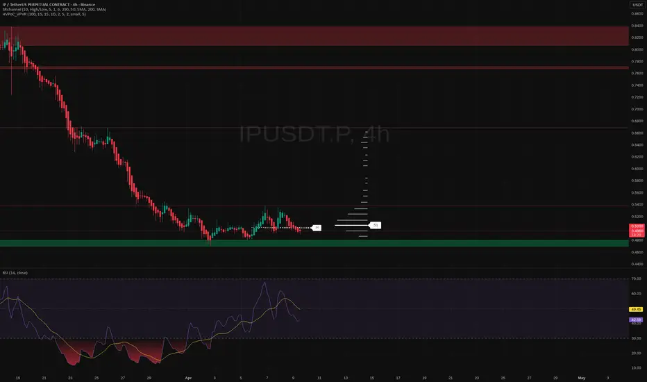
Game plan: I’m interested in longs while price holds above the green zone, with potential targets at the lower and mid red bands. If we lose that green support and start closing 4H candles below it, I’ll flip the script and look for a fade down to the next volume pocket. I might be wrong, but for now BONK still looks more like a coiled spring than a dead meme. ✅ IP: waiting for a move? key levels and targets to watchIP – bored watching it crab at the lows and wondering if it’s loading for a move? After the latest pullback across alts, this one has been quietly holding a chunky demand zone around 0.46 while funding and hype cooled off. According to market chatter, liquidity is rotating back into smaller caps again, so anything that survived the flush without breaking support stays on my radar.
On the 4H chart, price is sitting right on that green demand block with RSI curling up from the low 40s – classic “either bounce or die” spot. I’m leaning bullish from here, expecting a squeeze toward the 0.51 first liquidity pocket and potentially laddering higher if buyers step in. Horizonal volume thins out above, so if it starts running, empty air can get filled fast.
My game plan: ✅ look for a clean 4H close back above 0.50 with rising volume, then I like longs toward 0.51 and beyond. If we lose the green zone with a strong 4H close below ~0.46, idea’s invalid and I’d rather sit out and wait for a deeper discount. I might be wrong, but this looks like one of those spots where smart money quietly accumulates while everyone else has notifications off. I

Sei: ready for a breakout? key levels to watch this weekSei
Who else is watching this little L1 try to wake up again? According to the market, Sei keeps popping up in narratives around faster trading infra, and we just had a small sentiment boost after fresh ecosystem updates and volume coming back on majors. Price reacted with a sharp push into that red supply band, and now we’re cooling off right under it.
On the 4H, price is stuck between a local resistance zone around 0.056–0.058 and a chunky demand block sitting just above 0.05 where the volume profile spikes. RSI is mid-range with no major divergence, so I’m treating this as a healthy pause after an impulse, leaning slightly bullish as long as that green zone holds. If buyers step back in near 0.05, I expect another attempt to squeeze through the overhead red zone.
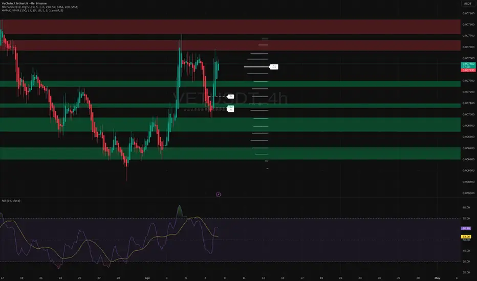
My plan: I like staggered bids around 0.052–0.05 with a tight invalidation below the lower green support. ✅ Base case for me is a grind back toward 0.06 and, if that breaks with volume, extension into the higher red supply area above. If 0.05 snaps clean, then I step aside and let it bleed lower – I might be wrong, but I don’t argue with broken support. VeChain: is this the dip to buy? key levels for todayVeChain. Who else is watching this dip after the recent pop in altcoins? While majors cool off after the latest macro jitters and mixed risk‑on sentiment, VET is quietly parking inside a chunky demand zone according to market chatter, with ecosystem news still supportive of the long‑term story. Volatility is back on the 4H and that’s usually when VET likes to move hard.
On the 4H chart we just bounced off that green demand block around 0.0069 with RSI curling up from near oversold, right where the high‑volume node sits. For me that tilts the odds to the upside, targeting the mid green zone first, then the red supply area above if buyers really step in. Structure still looks like a corrective pullback after the impulse up, not a full trend reversal... yet.
My base plan: as long as price holds above the 0.0068‑0.0069 support, I treat dips into that zone as potential longs, with a first take‑profit near the middle green band and stretch targets into the red zone. If we lose that support with strong volume, I stand aside and let it bleed toward the lower demand area before thinking “buy the blood” again. I might be wrong, but ignoring clear levels usually costs more than missing one trade ✅