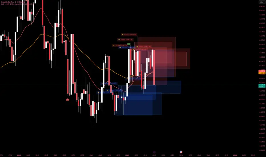
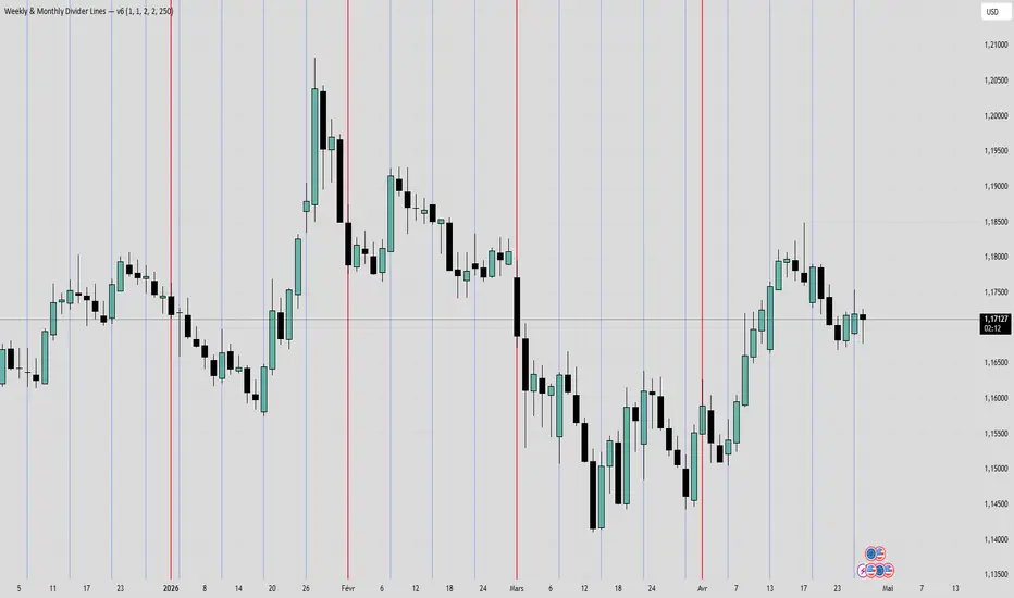
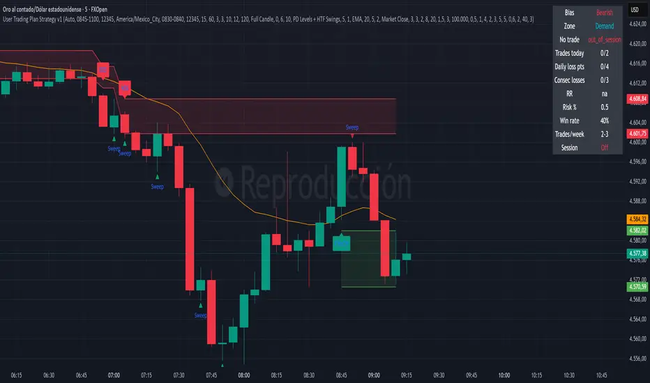
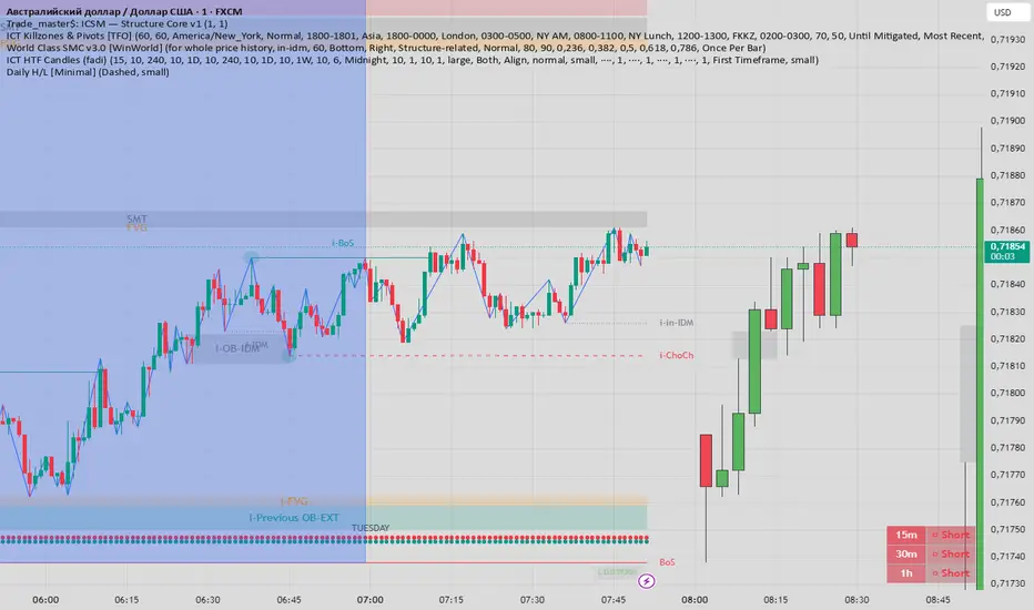
SMC - BUY and SELL SignalSMC — BUY & SELL Signal adalah indikator berbasis Smart Money Concept (SMC) yang dirancang untuk membantu trader mengidentifikasi peluang entry BUY dan SELL dengan lebih akurat menggunakan kombinasi analisis struktur pasar, Order Block, dan filter trend.
Fitur Utama:
✅ Signal BUY & SELL otomatis dengan filter ketat (EMA + RSI + Body Candle)
✅ Supply Zone (merah) & Demand Zone (biru) — Order Block otomatis
✅ BOS (Break of Structure) — konfirmasi perubahan struktur pasar
✅ EMA Fast & Slow sebagai filter trend
✅ Kill Zone — highlight waktu London Open & New York Open
✅ Key Level — garis support/resistance manual
✅ Alert siap pakai untuk notifikasi HP
Cara Penggunaan:
Signal BUY muncul saat harga di atas kedua EMA, trend naik, dan terjadi pembalikan bullish
Signal SELL muncul saat harga di bawah kedua EMA, trend turun, dan terjadi pembalikan bearish
Gunakan Supply Zone sebagai area take profit untuk posisi BUY
Gunakan Demand Zone sebagai area take profit untuk posisi SELL
BOS mengkonfirmasi bahwa struktur pasar telah berubah arah
Trading pada Kill Zone (area kuning/oranye) memberikan probabilitas lebih tinggi
Recommended Timeframe: 5M, 15M, 1H
Cocok untuk: XAU/USD, Forex Major, Crypto, Indices Индикатор

Momentum v2 By KempotStywn3435Momentum v2 By KempotStywn3435 is a TradingView indicator designed to detect strong momentum candles based on candle body size. The indicator compares the current candle body with the bodies of the previous three candles.
This script displays a green or red triangle when the latest candle has a significantly larger body than the previous candles. Its main purpose is to help traders identify potential strong momentum in the market.
How the Indicator Works
The indicator calculates the pure candle body size, which is the difference between the open and close prices, without including the candle wick or shadow.
The script calculates:
The current candle body
The previous 1st candle body
The previous 2nd candle body
The previous 3rd candle body
After that, the indicator finds the largest body from the previous three candles. The current candle body is then compared with that largest previous body.
Signal Conditions
A signal will only appear when two main conditions are met:
1. The current candle body must be larger than the minimum body size
The default value is:
min_body_size = 5.5
This means the current candle body must be greater than 5.5 points/pips, depending on the trading instrument.
2. The current candle body must be larger than the largest previous body multiplied by the size multiplier
The default value is:
size_multiplier = 2.0
This means the current candle body must be more than 2 times larger than the biggest body among the previous three candles.
Simple example:
If the largest body from the previous three candles is 10 points, then the current candle body must be greater than:
10 x 2.0 = 20 points
If the current candle body is greater than 20 points and also passes the minimum body size requirement, a momentum signal will appear.
Signal Meaning
Green triangle below the candle
Appears when a strong bullish momentum candle is detected.
This means:
close > open
This signal indicates strong buying pressure.
Red triangle above the candle
Appears when a strong bearish momentum candle is detected.
This means:
close < open
This signal indicates strong selling pressure.
Main Purpose of the Indicator
This indicator can be used to:
Detect breakout or impulse candles.
Identify the beginning of strong momentum.
Read buyer and seller pressure.
Act as an additional filter for manual entries.
Avoid entries when the market is weak or moving sideways.
Important Note
This indicator is not a fully automatic trading system. It is a visual tool that helps mark unusual momentum candles. The signal should be combined with other analysis methods such as market structure, support and resistance, trend direction, supply and demand, FVG, Fibonacci, or proper risk management.
Conclusion
Momentum v2 By KempotStywn3435 is a simple indicator for reading candle strength based on body size. When the current candle is significantly larger than the previous three candles, the indicator displays a triangle based on the candle direction.
A green triangle indicates strong bullish momentum, while a red triangle indicates strong bearish momentum. Индикатор

Multi-Session ORB SpecialistOverview
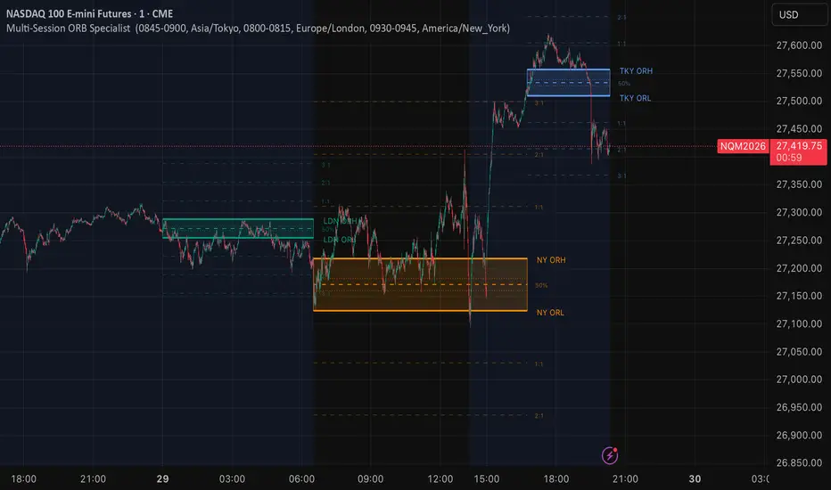
The Multi Session ORB Specialist is a precision volatility-capture tool designed for professional index traders (Nikkei 225, NASDAQ, DAX). It focuses on the "Initial Balance"—the high-intensity first 15 minutes of the Tokyo, London, and New York opens—to define the structural boundaries for the entire trading day.
Unlike traditional ORB indicators that clutter the chart with infinite lines, this specialist version utilizes Dynamic Session-Break Logic. Targets and range boundaries extend only until the subsequent market session begins, ensuring a clean, focused, and professional workspace that prevents "analysis paralysis."
Key Features:
Triple-Session Intelligence: Independent tracking of Tokyo (JST), London (GMT/BST), and New York (EST/EDT) opens.
The Golden Zone: Automatically plots the 38.2%, 50%, and 61.8% Fibonacci levels within the Opening Range to identify "Optimal Trade Entry" (OTE) retracements.
Algorithmic RR Targets: Precision-calculated Risk-to-Reward levels (1:1, 1:2, 1:3) based on the volatility of the opening 15-minute range.
Institutional Aesthetics: Professional-grade visual management using dashed/dotted hierarchy and clean bounding boxes to differentiate between range establishment and expansion phases.
Timezone Synchronization: Native support for global exchanges to ensure your ranges are captured exactly when the bell rings.
📈 Professional Trading Advice: How to Trade the ORB
The Opening Range (OR) represents the battle between institutional "Big Money" orders and retail reactions. Here is how to trade it professionally:
1. The "Broken Wing" Entry (Breakout)
The Setup: Wait for a 5-minute candle to close outside the ORH (High) or ORL (Low).
The Logic: A close outside the range indicates that one side (Bulls or Bears) has successfully absorbed the morning’s liquidity.
Stop Loss: Place your stop at the 50% Mid-Point of the OR box. If the price returns to the mid-point after a breakout, the breakout is likely a "fakeout."
2. The "Optimal Trade Entry" (Retest)
The Setup: Often, the Nikkei or NASDAQ will break out, then pull back before the real move happens.
The Logic: Look for a retracement into the Golden Zone (61.8% or 50%) inside the blue/green/orange box after a breakout has occurred.
The Trade: Enter when price touches the 61.8% level, targeting the 1:2 RR line. This provides a much higher R-multiplied return than chasing the initial break.
3. The "Targeting" Strategy
1:1 Level: This is "Bread and Butter." Many traders move their stop-loss to Breakeven (BE) once the 1:1 target is hit.
1:2 Level: This is the institutional standard. In a trending market, the 1:2 level is the most common mathematical "gravity point" for the session.
1:3 Level: Only hold for this level if the higher timeframe (1H or 4H) trend aligns with your breakout direction.
4. The Session Synergy Rule
If Tokyo breaks out to the upside and London also opens with a bullish breakout, the probability of New York continuing that trend is over 70%.
If London breaks out in the opposite direction of Tokyo, expect a "Range Bound" day and focus strictly on the 1:1 targets.
Индикатор

MA200 Expansion and Drawdown ThermometerMA200 Expansion & Drawdown Thermometer
Overview
This indicator measures and classifies every historical price cycle above and below a moving average, building a statistical thermometer that tells you — in real time — how extended the current move is relative to all past cycles.
How It Works
Every time price crosses above the selected moving average, the script opens a new expansion cycle and tracks the maximum percentage distance the HIGH reaches from the MA before price closes back below it. Symmetrically, every time price crosses below the MA, a drawdown cycle begins and tracks how far the LOW drops before price recovers. When each cycle ends, its peak expansion (or drawdown) percentage is stored in a historical array.
Thermometer Lines
At the right edge of the chart, three horizontal dashed lines project forward from the current MA value:
🔺 EXP MAX — the largest upside expansion ever recorded in the selected period
⚠️ EXP 75%ile — the 75th percentile of all historical expansions
📊 EXP AVG — the average expansion across all cycles
The same three levels are mirrored below the MA for drawdown cycles (blue/purple palette). Coloured fill zones between the lines create an intuitive heat-map: yellow → orange → red for upside risk, teal → purple → blue for downside risk.
Live Cycle Label
When price is currently in an active cycle, a label on the latest bar shows:
Maximum % reached so far in this cycle
Current close % distance from the MA
Remaining headroom to the historical maximum
Historical Table
A compact side table displays:
Period indicator — shows whether you are viewing the full history or a custom lookback window
Top N expansions (ranked, colour-coded by intensity vs. average and 75th percentile)
Top N drawdowns (same logic, mirrored below a divider)
Average and MAX summary for both sections
LIVE row (highlighted in yellow) when a cycle is currently active
Settings
Parameter Description
MA Length Period of the moving average (default 200)
MA Type SMA / EMA / WMA / HMA
Anni di storico Lookback window in years — 0 = full history
Top N per sezione How many ranked cycles to show in the table
Table Position Top/Bottom × Left/Right
Background tint Subtle colour fill above/below the MA
Coloured zones Toggle the thermometer fill bands Индикатор

Индикатор
Индикатор

Индикатор

Индикатор
Индикатор
Swordsmith Bulletproof Version 2 Swordsmith Bulletproof Version 2 is a 5-minute Opening Range Breakout (ORB) strategy built for futures
instruments — MNQ, MES, NQ, and YM — using a 9-condition confluence scoring system that requires a minimum
of 6 conditions to align before any trade is taken.
How it works:
Price must break the opening range high (long) or low (short), then pass a multi-layer filter:
1. HTF Trend — 15-minute dual EMA confirms macro direction
2. BOS / CHoCH — Smart Money market structure break or character change
3. Liquidity Sweep — confirms a sweep of resting liquidity before the move
4. Order Block — price interacting with an unmitigated demand or supply zone
5. Fair Value Gap — price filling or reclaiming a 3-candle imbalance
6. Volume Flow — above-average volume with directional confirmation and optional OBV slope
7. Smart Trail — ATR-based trailing direction filter
8. Momentum — RSI threshold with optional divergence filter
9. Session / Kill Zone — trades only during enabled NY or London windows, configurable by day of week
Exit logic:
TP1 (default 1R) exits 50% of the position and shifts stop to breakeven. TP2 (default 2R) closes the
remainder. After TP1, the Smart Trail optionally manages the stop for extended runners.
Prop firm risk controls:
Daily max loss, weekly max loss, max trades per day, consecutive loss cap, and optional profit targets —
all enforce a lockout that blocks new entries when limits are breached.
Dashboard displays live scores, HTF trend, ORB status, session state, daily/weekly P&L, risk lockout
status, and position info directly on the chart. Стратегия
Индикатор

Стратегия
Индикатор

Meme Season Score | Memecoin Cycle Timing
One number, 0 to 100, that answers a single question: is it meme season right now?
The Meme Season Score is a composite oscillator that condenses six different memecoin-cycle factors into one decision-relevant signal. Instead of staring at half a dozen separate dominance and market-cap charts trying to interpret what the data is saying together, you get a single weighted reading and a climate label.
▸ WHY THIS INDICATOR EXISTS
Existing memecoin tools on TradingView each do one narrow thing: one plots a meme dominance ratio, one shows Z-scores of individual coins, one is an EMA crossover on a single sector index. None of them blend multiple cycle factors into a single comparable score.
Generic "altseason indices" treat all alts as a homogeneous block — they cannot tell you whether memecoins specifically are leading or lagging the broader alt rotation. Memecoins behave differently from L1s, DeFi, or RWAs. They need their own framework.
This script is that framework: six factors, all relevant to memecoin cycle behavior, all weighted by their historical importance, all blended into one number you can act on.
▸ METHODOLOGY
Each of the six input factors is first converted to a rate-of-change over a rolling momentum window (default: 14 bars). That ROC is then converted to a percentile rank within a longer normalization window (default: 180 bars), giving a 0–100 score that reflects "where does today's reading sit within the recent distribution."
Inverse factors (where falling values are bullish for memes) have their percentile rank flipped before contributing to the composite.
The six factors and default weights:
• MEME.D trend — 25% — meme sector dominance rising = bullish
• MEME.C momentum — 20% — meme sector market cap accelerating = bullish
• BTC.D inverse — 20% — BTC dominance falling = capital rotating to alts
• OTHERS.D trend — 15% — altcoin dominance rising = risk-on environment
• STABLE.C inverse — 10% — stablecoin cap declining = stables being deployed
• MEME.C/TOTAL acceleration — 10% — meme share growing faster than market
All weights are user-adjustable in the inputs and are auto-normalized, so they don't have to sum to 100.
Note: MEME.D is not currently a native CRYPTOCAP ticker on TradingView, so it is derived as MEME.C / TOTAL × 100 inside the script.
▸ CLIMATE ZONES
The score is divided into five regimes, each with its own color and emoji label that appears on the chart:
• 0–20 ❄️ Meme Winter Capital fleeing memes (deep accumulation zone)
• 20–40 🌧️ Cool Mixed signals — selective plays only
• 40–60 ☀️ Warming Up Rotation beginning — early meme season
• 60–80 🔥 Meme Season Active Broad memecoin pumps — high conviction window
• 80–100 🚀 Peak Mania Extreme readings — historically precedes retracements
The main score line shifts color as it crosses zone boundaries. Background of the pane tints faintly with the current zone color (toggleable). A label on the last bar shows the live score and zone name.
▸ HOW TO READ IT
• Score above its 50-period EMA = momentum is strengthening
• Score below its 50-period EMA = momentum is weakening
• Cross above 60 = season conditions activating
• Cross above 80 = extreme conditions, historical risk zone
• Cross below 40 = season cooling off
• Cross below 20 = winter conditions, sentiment capitulation
The 50-EMA line is the slower trend reference; the colored line is the live signal. Watching their relationship is often more useful than watching either one alone.
▸ HOW TO USE IT
The script pulls all of its data from CRYPTOCAP indices via request.security, so the chart symbol does not affect the calculation. Putting it on CRYPTOCAP:MEME.C on the Daily timeframe gives the cleanest visual context (price chart of the meme sector above, score sub-pane below) but you can use any chart.
The default calculation timeframe is Daily, which is appropriate for cycle-level analysis. The score will show the same Daily-derived value regardless of what chart timeframe you are viewing.
▸ INPUT SETTINGS
Calculation Settings:
• Calculation Timeframe (default: Daily)
• Momentum Lookback in bars (default: 14)
• Normalization Lookback in bars (default: 180)
• Score Smoothing EMA (default: 3 — set to 1 for raw unsmoothed score)
Factor Weights — all six factor weights are individually adjustable from 0 to 100. Weights are auto-normalized so any combination is valid.
Display Options:
• Toggle the 50-period EMA of the score
• Toggle the floating score label
• Toggle the background climate tint
• Label size (small / normal / large / huge — use huge for screenshots)
▸ BUILT-IN ALERTS
Four alert conditions are defined and can be activated through the standard Add Alert dialog:
• 🔥 Meme Season Starting (score crosses above 60)
• 🚀 Peak Mania Warning (score crosses above 80)
• ☁️ Meme Season Ending (score crosses below 40)
• ❄️ Meme Winter (score crosses below 20)
▸ LIMITATIONS AND HONEST CAVEATS
• This is a contextual/regime tool, not a predictive one. The score tells you the current state of the meme cycle based on factors that have historically mattered. It does not predict future prices or guarantee any outcome.
• Percentile rank is by definition backward-looking. The score reflects how today's momentum compares to the recent past, not where prices are going.
• With default settings, the script needs roughly 194 daily bars of valid CRYPTOCAP data to warm up before producing a meaningful score (14-bar ROC plus 180-bar percentile window). MEME.C history begins in early 2024, so this is not a constraint for current charts.
• Memecoin market structure changes quickly. Tokens that drove the sector last cycle may be irrelevant in the next. The score works at the sector level and is robust to individual token churn, but it cannot tell you which specific memecoin to buy.
• Factor weights are calibrated to behavior observed in available CRYPTOCAP history. If the underlying market structure shifts substantially, weights may need adjustment.
▸ TECHNICAL NOTES
• Pine Script v6
• Open-source under the Mozilla Public License 2.0
• Uses 5 request.security calls (well below the 40-call limit), all to official CRYPTOCAP indices
• No repainting — all calculations use confirmed bar close values from the requested timeframe
▸ DISCLAIMER
For educational and informational purposes only. This script is a market analysis tool, not financial advice. Nothing here constitutes a recommendation to buy or sell any asset. Past behavior of the score in historical data is not a guarantee of future behavior. Cryptocurrency markets, and memecoin markets in particular, are highly volatile and can result in substantial losses. Always do your own research and trade with risk you can afford to lose.
Индикатор

Индикатор

Индикатор

Индикатор
Индикатор

Индикатор

Flow-RegimeFlow-Regime
A multi-source flow oscillator. It normalizes three independent measures of
market flow to a unified ±100 scale and combines them into a conviction-
weighted composite line, so you can see at a glance whether OBV, A/D, and
price flow are agreeing or diverging.
▌ What's plotted
Three normalized lines, each computed through the same pipeline
(CCI → percentrank → linear map to ±100):
• OBV-Flow — On-Balance Volume (signed cumulative volume)
• AD-Flow — Chaikin Accumulation/Distribution
• Price-Regime — price flow (ohlc4)
Plus a Fitted composite — the average of the three, amplified by |conviction|,
where conviction = average ÷ mean(|x|, |y|, |z|). When all three lines agree
the composite is amplified; when they conflict it is suppressed toward zero.
The Fitted line uses 5-tier coloring driven by how many of the three exceed
the neutral threshold (default ±20): solid green/red = all three agree, lighter
shades = two of three, gray = no consensus.
▌ Two lookback modes
Linear (default) — TF-specific lookback with sensible per-timeframe defaults
(1m=60, 5m=24, 15m=16, 1h=24, 4h=18, 1d=7, 1w=12, 1M=12), all editable.
Anchored — pick an anchor timestamp; the percentrank window grows from 0 at
that bar to (current_bar − anchor_bar) at the right edge of the chart. Use
this to lock the statistical baseline to a specific event — a regime start,
a major breakout, a news release. The anchor bar is marked with a yellow
diamond at fitted = 0.
▌ How to read it
The OB zone (≥ +70) and OS zone (≤ −70) are shaded — these are statistically
stretched conditions. Bars where the Fitted line reaches ±99 get a soft red/
green background tint as an "at the extreme" warning. Two corresponding alert
conditions are exposed for use with TV alerts.
This indicator does NOT emit trade signals. Per-line reversal dots and
confluence triangles are intentionally absent: those patterns can fit
historical noise convincingly without generalizing forward. Treat extremes
as flags to investigate, not entries to take.
Useful interpretive frames:
• All three lines extreme in the same direction = strongest evidence of
flow consensus.
• One or two lines diverging from the others at extremes = a divergence
worth examining on the chart.
• Fitted approaching ±99 = statistical extreme, regardless of direction.
▌ Notes
In Anchored mode, the first few bars after the anchor have very few historical
points to rank against, so percentrank values can swing to ±100 from sparse
data — read these bars with caution. CCI itself always uses the full real
price history regardless of mode, so its 20-bar internal window is never
distorted by the anchor.
Enable the Debug label in settings to verify which mode and lookback are
currently active on the chart. Индикатор

Индикатор

Индикатор

Индикатор