Stop Cluster Magnet Map [AGPro Series]Stop Cluster Magnet Map
🧠 Core Idea
Where are clustered stops likely sitting, and is price being pulled toward them or rejecting after a sweep?
📌 Overview / What it does
Stop Cluster Magnet Map is a rule-based liquidity and market-structure visualization tool designed to identify repeated swing-high and swing-low areas where stop orders may cluster.
The script maps upper and lower stop-cluster zones, grades their quality, tracks magnet pressure, and highlights potential sweep or rejection behavior after price interacts with those zones.
It does not predict future price direction, automate trades, or claim that any stop cluster must be taken. It only visualizes structural conditions that may deserve attention.
🎯 Purpose & Design Philosophy
This script was built to solve a common chart-reading problem: traders often talk about liquidity above highs or below lows, but many tools do not clearly separate clustered stop areas from random swing points.
The design goal is to make stop-cluster context visible at a glance without turning the chart into a noisy signal machine.
It helps traders who study price action, liquidity sweeps, equal highs, equal lows, stop hunts, and structural reaction zones.
⚡ Why This Script Is Different
Most tools mark every swing high or swing low as if each level has the same importance.
This script does NOT treat every pivot as meaningful liquidity.
Instead, it looks for repeated nearby swing points, builds a mapped stop-cluster zone, grades the cluster, tracks magnet pressure, and separates sweep behavior from simple proximity.
⚙️ Methodology
1. Context Detection
The script detects confirmed swing highs and swing lows using a configurable pivot length.
2. Reference Mapping
Nearby repeated swing highs are grouped into an upper stop cluster, while nearby repeated swing lows are grouped into a lower stop cluster.
3. Reaction Evaluation
The script evaluates distance, recency, number of touches, sweep events, and post-sweep close behavior.
4. Visual Output
The active stop-cluster zones, magnet rail, right-side tags, event labels, and decision panel are displayed using a clean AGPro visual hierarchy.
🗺️ How to Read the Chart
Zones represent areas where repeated highs or lows have created potential clustered stops.
Labels identify important events such as upper stops, lower stops, magnet pressure, and sweep behavior.
Colors follow the AGPro visual language: teal for lower-side or recovery-oriented context, pink for upper-side or risk-oriented context, yellow for neutral attention, and indigo for magnet reference.
The panel summarizes the current magnet state, score, upper/lower cluster quality, cluster prices, sweep risk, next context, and active timeframe.
🚦 Signals & States
• UPPER STOPS → repeated swing highs have formed a valid upper stop cluster
• LOWER STOPS → repeated swing lows have formed a valid lower stop cluster
• UPSIDE MAGNET → price is near a higher-quality upper stop cluster
• DOWNSIDE MAGNET → price is near a higher-quality lower stop cluster
• UPPER SWEEP → price moved above the upper cluster and closed back inside
• LOWER SWEEP → price moved below the lower cluster and closed back inside
• BALANCED CLUSTERS → both upper and lower clusters are active, with no dominant side
🔔 Alerts Logic
Alerts can trigger when a new upper or lower stop cluster becomes valid, when price sweeps a stop cluster and closes back inside, or when the dominant magnet side changes.
These alerts are attention markers only. They are not buy or sell signals.
🧩 Confluence Logic (Optional)
The context becomes stronger when a valid stop cluster has multiple touches, remains recent, price approaches the cluster, and sweep behavior appears with a close back inside the mapped zone.
Cluster quality plus proximity plus reaction behavior creates a stronger read than any single condition alone.
📊 When to Use
• Around equal highs or equal lows
• During range-bound markets where stop pools may form
• Before or after liquidity sweeps
• When price is approaching a visible cluster of prior swing points
• When evaluating whether a move is targeting external liquidity
⚠️ When NOT to Use
• In extremely illiquid markets
• During chaotic news-driven candles
• When price history is too short to build reliable clusters
• When the chart is dominated by random spikes rather than readable structure
• As a standalone entry or exit system
🎛️ Key Inputs
• Swing Pivot Length → controls how swing highs and lows are confirmed
• Cluster Validity Lookback → controls how long a cluster remains relevant
• Minimum Cluster Touches → controls how many nearby pivots are needed
• Cluster Width ATR → controls how wide each stop-cluster grouping can be
• Magnet Nearness ATR → controls how sensitive magnet proximity becomes
• Visual settings → control zones, labels, right-side tags, panel, and font sizes
🖥️ Interface & Visual Design
The interface is designed for fast chart reading.
The panel gives the current decision context. Zones show where clustered stops may sit. Labels mark key events. Right-side tags keep current levels readable without forcing the trader to inspect every candle.
The layout is intentionally clean, premium, and structured for public-chart screenshots.
🧪 Practical Usage Workflow
1. Read the panel to identify the current magnet state.
2. Check whether the upper or lower stop-cluster zone is active.
3. Watch how price behaves near the mapped cluster.
4. Evaluate whether a sweep closes back inside or continues beyond the zone.
5. Use broader market context before making any decision.
🔍 Interpretation Guidelines
A strong stop cluster does not mean price must move there.
A sweep does not automatically mean reversal.
The best interpretation comes from combining cluster quality, distance, market structure, volume behavior, volatility, and the trader's own higher-timeframe context.
🚫 What This Script Is NOT
This script is not a prediction engine.
It is not financial advice.
It is not an automated trading system.
It does not provide guaranteed signals.
It does not know where actual broker stop orders are placed.
⚠️ Limitations & Transparency
The script estimates stop-cluster areas using visible chart structure only.
Different timeframes may show different clusters.
High volatility can expand zones and change quality scores quickly.
Market conditions can shift, and a previously important cluster may lose relevance over time.
🧠 Market Context Notes (Optional)
Stop clusters often matter because repeated highs and lows can become obvious reference points.
When many traders see the same level, price may react around that area, sweep it, reject from it, or continue through it.
This script is designed to make that structural pressure easier to observe.
🧾 Use Case Examples (Optional)
When price approaches an upper stop cluster with a high quality score, the trader can monitor whether the market sweeps above it and closes back inside.
When lower stops cluster beneath a range, the trader can watch whether price is being pulled toward downside liquidity or rejecting before reaching it.
🧱 System Philosophy (Advanced)
The AGPro approach focuses on structured decision support, not hype.
This script turns repeated swing references into a readable liquidity map so traders can evaluate context instead of reacting to isolated candles.
🔐 Non-Promise Statement
No script can guarantee outcomes.
Stop-cluster mapping is a contextual tool, not certainty.
📉 Risk Disclosure
Trading involves risk.
Users are fully responsible for their own analysis, risk management, and trading decisions.
This script is provided for educational and analytical purposes only and does not constitute financial advice.
📚 Educational Note (Optional)
Use this tool to study how repeated highs, repeated lows, sweeps, and reactions appear across different timeframes.
The goal is to improve market observation, not to replace disciplined analysis. Gösterge

Initial Balance Suite [ChartSmith]Initial Balance Suite tracks the high, low, and midpoint established during a configurable opening window, then projects extension levels and archives prior sessions — giving you a complete picture of the day's structural framework from the first bar after the IB closes.
━━━━━━━━━━━━━━━━━━━━━━━━━━━━━━━━━━
WHAT IS THE INITIAL BALANCE?
━━━━━━━━━━━━━━━━━━━━━━━━━━━━━━━━━━
The Initial Balance is the price range established during the opening period of a session — traditionally the first hour of RTH trading. The high and low formed during this window define the day's foundational structure. When price stays inside the IB, the market is balancing. When price breaks out of it, the market is entering price discovery. Extension levels above and below the IB project how far that discovery might reach.
━━━━━━━━━━━━━━━━━━━━━━━━━━━━━━━━━━
SESSION SETTINGS
━━━━━━━━━━━━━━━━━━━━━━━━━━━━━━━━━━
Session Start — Set the hour and minute at which the IB window begins. Defaults to 9:30, the RTH open.
Timezone — Aligns the session start to the correct local time. Options: America/New_York · America/Chicago · Europe/London · Asia/Tokyo · UTC.
IB Length — Controls how long the opening window runs before the IB is considered complete. Available options: 30s · 1m · 2m · 3m · 5m · 10m · 15m · 30m · 1hr · 2hr · 4hr. The IB high and low accumulate bar by bar throughout this window, locking in the final levels only when the window closes.
Note: your chart timeframe must be shorter than or equal to the selected IB length for the levels to calculate correctly.
━━━━━━━━━━━━━━━━━━━━━━━━━━━━━━━━━━
INITIAL BALANCE LEVELS
━━━━━━━━━━━━━━━━━━━━━━━━━━━━━━━━━━
IB High (IBH) — The highest price reached during the IB window.
IB Low (IBL) — The lowest price reached during the IB window.
IB Mid (IBM) — The midpoint of the IB range: (IBH + IBL) / 2.
Fill Area — Shades the region between IBH and IBL to visually define the balance zone.
Extend Right — Extends all IB lines to the right edge of the chart until the next session begins.
Each level has independent color, width, and line style (Solid / Dashed / Dotted) controls.
━━━━━━━━━━━━━━━━━━━━━━━━━━━━━━━━━━
EXTENSION LEVELS
━━━━━━━━━━━━━━━━━━━━━━━━━━━━━━━━━━
Extension levels project above IBH and below IBL using multiples of the IB range. Each level can be toggled and colored independently.
+/− 50% — IBH/IBL ± (0.5 × IB Range)
+/− 100% — IBH/IBL ± (1.0 × IB Range)
+/− 150% — IBH/IBL ± (1.5 × IB Range)
+/− 200% — IBH/IBL ± (2.0 × IB Range)
+/− 300% — IBH/IBL ± (3.0 × IB Range)
All extensions share a global width and style setting. Extensions are off by default — enable Show Extensions to display them.
━━━━━━━━━━━━━━━━━━━━━━━━━━━━━━━━━━
PREVIOUS DAYS
━━━━━━━━━━━━━━━━━━━━━━━━━━━━━━━━━━
Completed sessions are automatically archived and displayed as prior-day reference levels. Each prior session is restyled with its own color, width, and line style so it stays visually distinct from the current session.
Days to Show — Controls how many prior sessions are kept on the chart (1–10). Sessions beyond this count are deleted automatically.
Fill Area — Optionally shades the prior session's IBH-to-IBL range. Off by default.
Show Extensions — Optionally carries prior session extension lines forward. Off by default.
When a new session begins, the current IB is immediately reclassified as a prior-day level — no manual management required.
━━━━━━━━━━━━━━━━━━━━━━━━━━━━━━━━━━
LABELS
━━━━━━━━━━━━━━━━━━━━━━━━━━━━━━━━━━
Labels appear at the right edge of each line and display the level name alongside its current price, formatted to the instrument's minimum tick. Size options: Auto · Tiny · Small · Normal · Large · Huge.
━━━━━━━━━━━━━━━━━━━━━━━━━━━━━━━━━━
ALERTS
━━━━━━━━━━━━━━━━━━━━━━━━━━━━━━━━━━
Twelve alert conditions are built in, all gated so they only fire after the IB has fully formed:
- IBH Cross Up / IBL Cross Down
- IBH Touch / IBL Touch
- +50% Cross Up / −50% Cross Down
- +100% Cross Up / −100% Cross Down
- +200% Cross Up / −200% Cross Down
- +300% Cross Up / −300% Cross Down
━━━━━━━━━━━━━━━━━━━━━━━━━━━━━━━━━━
USAGE NOTES
━━━━━━━━━━━━━━━━━━━━━━━━━━━━━━━━━━
- The IB locks in the moment the opening window closes — levels will not repaint after that point.
- Extensions default to off. Enable Show Extensions first, then toggle individual levels.
- Previous session extensions are also off by default and are controlled separately from the current session under Previous Days → Show Extensions .
- To use with non-US sessions, adjust both the Session Start time and the Timezone to match your exchange. Gösterge

Gösterge

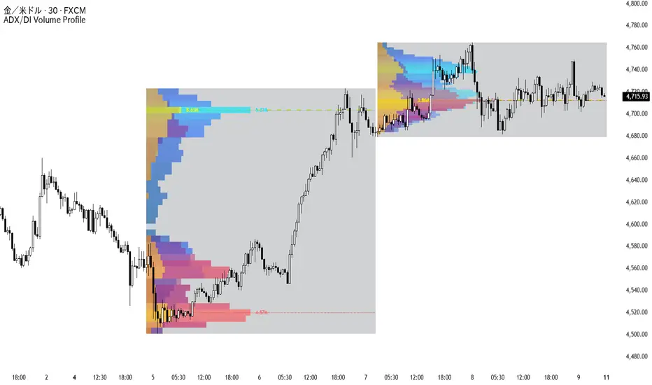
Opening Range + Session Windows + Volume ProfileOpening Range + Session Windows + Volume Profile
This is a revised repost of my previous script version that trended on the TradingView community indicators page. The script has been rewritten, renamed, and cleaned up so the publication follows TradingView House Rules more closely.
The goal of this indicator is to make intraday session structure easier to read from one chart.
Opening range levels can be useful, but they are much more useful when viewed with nearby volume-based context. A move away from the opening range is not always the same type of move. It can be moving into an area where volume previously built, away from an area where volume was thin, or toward a level where participation has already concentrated.
This script is built to help show that context visually.
📊 What the script shows
• Opening range high, low, and range box
• Configurable session windows
• Current session volume profile
• Previous session volume profile
• POC, HVN, and LVN levels
• Live and prior session node labels
• A terminal-style HUD for session state, trend, range size, POC, HVN, LVN, and impulse counts
• A pressure meter based on session volume standard deviation
• Filtered buy-volume and sell-volume impulse labels
🧠 Why it was built this way
The script is designed around one main idea: the opening range should not be viewed in isolation.
A breakout, rejection, or rotation around the opening range can look completely different depending on where volume is sitting around price. If price is moving into a high-volume area, that can suggest a different type of environment than price moving through a thinner low-volume area. If a prior POC or volume node is nearby, that may also change how a trader studies the move.
This indicator does not try to replace analysis. It simply brings the important intraday structure into one clean visual layout so the user can study the session with more context.
⚙️ How to use it
1. Set the main session and opening range times in the settings.
2. Use the opening range box to mark the first part of the session.
3. Watch how price behaves around the current and prior volume nodes.
4. Use POC, HVN, LVN, and session levels as structure references.
5. Use the HUD to quickly read session state, trend, range size, and active nodes.
6. Use the volume gauge and impulse labels to study stronger participation events.
7. Adjust the session windows to match the market and timezone you trade.
🔁 Current vs prior levels
Live session levels are labeled as LIVE .
Previous session levels are labeled as PRIOR .
This makes it easier to separate developing session structure from levels carried forward from the last completed session.
⚡ Volume impulse labels
The volume impulse labels are intentionally filtered. They are not meant to appear on every volume increase. The script only prints them when participation is stronger than normal based on the selected settings.
This helps keep the chart cleaner and prevents the indicator from turning into a label-heavy mess.
🕒 Session windows
The session windows are visual time references only. They are fully configurable from the settings and can be adjusted, enabled, or disabled depending on the market being viewed.
⚠️ Important notes
This is not a trading system.
This script does not place trades, issue alerts to buy or sell, provide financial advice, or tell the user what action to take. It is a decision-support tool for studying intraday structure, volume location, session context, and participation.
FOR PINECODERS TEAM: Promotional references, branding, and unclear wording have been removed, and this description has been expanded so users can understand the purpose of the tool without needing to read the Pine code. I cannot, within reason, direct users any further regarding specific use of this indicator as to avoid providing any form of financial advice. It is a framework tool for various use-cases outlined above.
The user is responsible for their own analysis, risk management, and execution decisions.
✅ Best used on
Intraday charts where opening range structure and volume context matter, including index futures, stocks, ETFs, and other liquid instruments with meaningful volume data. Gösterge

Range Control Transfer Map [AGPro Series]Range Control Transfer Map
🧠 Core Idea
Who controls the range now, and did control transfer from the buyer side to the seller side or from the seller side to the buyer side?
📌 Overview / What it does
Range Control Transfer Map is a range-control visualization tool built to study sideways markets where price rotates between upper and lower boundaries.
The script builds a mature range, separates it into buyer-control and seller-control zones, maps the internal control transfer band, tracks acceptance through that band, scores transfer quality, monitors failed-transfer risk, and summarizes the current control state in a compact AG Pro panel.
It does not predict future price, automate trades, or claim that a control-transfer event must continue. It is a structured decision-support map for reading range control, acceptance, failed transfer risk, and next-context conditions.
🎯 Purpose & Design Philosophy
Many range tools answer only one question:
Where are support and resistance?
This script was built to answer a more useful question:
Who controls the range now?
The design goal is to help traders separate passive sideways movement from meaningful control transfer inside a mature range.
⚡ Why This Script Is Different
Most range tools draw a box, mark the high, mark the low, and stop there.
This script does NOT treat every range touch as equally important.
Instead, it divides the range into buyer-control and seller-control halves, watches the midpoint transfer band, checks candle body commitment, reviews volume participation, evaluates range health, and tracks whether the active control side is still protected or starting to fail.
The focus is not only where the range is.
The focus is who is gaining or losing control inside it.
⚙️ Methodology
1. Range Detection
The script identifies a working range using recent high/low structure, ATR-normalized range height, and repeated edge interaction.
2. Range Health Scoring
Range Health combines range height balance, edge-touch behavior, and current position relative to the control line.
3. Control Zone Mapping
The upper half becomes the Seller Control Zone.
The lower half becomes the Buyer Control Zone.
The midpoint area becomes the Control Transfer Band.
4. Transfer Evaluation
When price accepts through the transfer band with enough candle body commitment, the script evaluates whether buyer or seller control has transferred.
5. Transfer Quality Scoring
Transfer Quality combines range health, candle body commitment, and volume participation into a 0-100 score.
6. Failure Risk Review
The script monitors whether the active transfer is losing the transfer band and moving back toward control reset.
7. Visual Output
The chart displays buyer/seller control zones, the control transfer band, active transfer labels, failed-transfer labels, right-side control tags, alerts, and a compact AG Pro panel.
🗺️ How to Read the Chart
Seller Control Zone = the upper half of the mature range where seller-side control is evaluated.
Buyer Control Zone = the lower half of the mature range where buyer-side control is evaluated.
Control Transfer Band = the internal midpoint band where control handoff is judged.
SELLER CONTROL = price has accepted through the transfer band in favor of the seller side.
BUYER CONTROL = price has accepted through the transfer band in favor of the buyer side.
BALANCE = the range is mature, but neither side has clean active control.
RANGE BUILDING = the current structure is not mature enough for control-transfer mapping.
Panel = summarizes control side, transfer quality, range health, failure risk, control zone, and next context.
🚦 Signals & States
• CONTROL TRANSFER UP → buyer-side control transfer detected.
• CONTROL TRANSFER DOWN → seller-side control transfer detected.
• FAILED BUYER CONTROL → buyer-side transfer failed back through the control band.
• FAILED SELLER CONTROL → seller-side transfer failed back through the control band.
• BUYER EDGE CONTROL → price reacts from the lower control side.
• SELLER EDGE CONTROL → price reacts from the upper control side.
• BALANCE → no clean control transfer is active.
• RANGE BUILDING → the structure is not mature enough yet.
🔔 Alerts Logic
Alerts trigger when a major range-control event appears.
• Buyer Control Transfer → buyer-side transfer detected.
• Seller Control Transfer → seller-side transfer detected.
• High-Quality Control Transfer → transfer quality reaches the required threshold.
• Failed Control Transfer → active control transfer loses the control band.
• Buyer Edge Control → optional alert for lower-edge control reaction.
• Seller Edge Control → optional alert for upper-edge control reaction.
Alerts are attention markers, not trade instructions.
🧩 Confluence Logic
The context becomes stronger when:
• The range has enough ATR-normalized height
• The range has repeated edge interaction
• Price accepts through the transfer band
• Candle body commitment supports the transfer direction
• Volume participation is not weak
• Transfer Quality is above the required threshold
• Failure Risk remains low after the transfer
• The panel state agrees with the chart label
When these elements do not align, the script avoids treating every range movement as a meaningful control shift.
📊 When to Use
• Range-control review
• Sideways market analysis
• Buyer/seller control mapping
• Failed transfer review
• Range acceptance study
• Crypto, stocks, futures, forex, and liquid markets
• 15m, 30m, 1H, 4H, and 1D charts
⚠️ When NOT to Use
• Very low-liquidity assets
• Extremely noisy micro timeframes
• Strong news spikes that distort range structure
• Clean one-directional trend environments with no mature range
• Markets where every midpoint cross is being over-interpreted
• Situations where a single label is expected to act as a guaranteed signal
🎛️ Key Inputs
• Range Lookback → defines the recent structure window used for range high, range low, and control line.
• Minimum Range Height ATR → defines the minimum range height required for a meaningful control map.
• Maximum Range Height ATR → prevents very wide structures from being treated as clean range-control maps.
• Use Intraday Adaptive Range → allows intraday charts to keep useful control maps without making higher-timeframe charts too noisy.
• Edge Touch Tolerance ATR → controls how close price must come to a range edge to count as an edge interaction.
• Control Band ATR → controls the thickness of the internal transfer band.
• Minimum Transfer Score → defines the quality threshold for meaningful control transfer.
• Minimum Body / Range → controls how much candle body commitment is required.
• Volume Confirm Ratio → defines how much participation is required for full volume credit.
• Failure Buffer ATR → controls where an active transfer starts to fail.
• Maximum Transfer Age → defines how long an active transfer can remain under review.
🖥️ Interface & Visual Design
The visual hierarchy is built around the active range:
The full range box defines the structure.
The upper half shows seller-control territory.
The lower half shows buyer-control territory.
The transfer band marks the internal handoff area.
Event labels mark control transfer and failed-control states.
Right-side tags keep buyer control, seller control, and transfer references visible.
The AG Pro panel compresses the current range-control context into a fast, readable summary.
🧪 Practical Usage Workflow
1. Read the panel Control Side.
2. Check whether the chart is Range Building, Balance, Buyer Control, or Seller Control.
3. Review where price is relative to the Control Transfer Band.
4. If a transfer label appears, compare it with Transfer Quality.
5. Watch whether Failure Risk remains low or starts rising.
6. Use the buyer and seller control zones as context areas, not automatic trade levels.
7. Confirm with broader market structure, liquidity, volume, and risk planning.
🔍 Interpretation Guidelines
A buyer-control transfer does not guarantee upside continuation.
A seller-control transfer does not guarantee downside continuation.
A failed-transfer label means the active control idea weakened.
A range-building state means the structure is not mature enough yet.
The script is best used as a range-control context layer, not as a standalone trading system.
🚫 What This Script Is NOT
This script is not a prediction engine.
It is not financial advice.
It is not an auto-trading system.
It does not provide guaranteed entry or exit signals.
It is not a simple support/resistance box.
It is not another generic range breakout indicator.
⚠️ Limitations & Transparency
Range quality depends on timeframe and market structure.
Very volatile markets can expand beyond a clean control map.
Low-liquidity symbols may create unreliable edge and transfer behavior.
Choppy markets can create repeated control-transfer attempts.
Volume behavior can differ across crypto, stocks, futures, and forex.
🧠 Market Context Notes
Ranges often move through recognizable control phases:
range building → balance → control transfer → defense → failure or continuation.
This script visualizes that sequence so users can avoid treating every support or resistance touch as equally meaningful.
🧾 Use Case Examples
If price accepts through the transfer band from the lower half, the script may mark CONTROL TRANSFER UP.
If price accepts through the transfer band from the upper half, the script may mark CONTROL TRANSFER DOWN.
If an active buyer-control transfer loses the band, the script may mark FAILED BUYER CONTROL.
If an active seller-control transfer loses the band, the script may mark FAILED SELLER CONTROL.
🧱 System Philosophy
The goal is not to predict the next breakout.
The goal is to understand control inside the range.
This script treats range behavior as a sequence:
structure → control zone → transfer band → acceptance → defense or failure.
🔐 Non-Promise Statement
No control-transfer label guarantees continuation.
No failed-transfer label guarantees reversal.
No range zone guarantees support or resistance.
All outputs should be interpreted as analytical context.
📉 Risk Disclosure
Trading involves risk.
This script is for educational and analytical purposes only.
It does not provide financial advice, investment advice, or guaranteed trading outcomes.
Users are fully responsible for their own decisions, risk management, and trade execution.
📚 Educational Note
Use the script to study how control shifts inside mature ranges.
The most useful question is not only where the range high and low are.
The better question is whether control has actually transferred inside the range.
Gösterge

Quantitative Smart Money Concepts Framework# Quantitative SMC Framework
An implementation of Smart Money Concepts that combines market structure (BOS / CHoCH / MSS), order blocks, fair value gaps, liquidity sweeps, equal highs/lows, and premium/discount zones into a single confluence framework. The methodology itself is public trading theory from Inner Circle Trader (ICT). The algorithms used to detect each component, and the scoring system that ties them together, are original work.
━━━━━━━━━━━━━━━━━━━━━━━━━━━━━━━━━━━━━━━━━
WHY THESE COMPONENTS BELONG IN ONE SCRIPT
━━━━━━━━━━━━━━━━━━━━━━━━━━━━━━━━━━━━━━━━━
SMC trading depends on confluence. A standalone order block is information, but an order block that sits inside a discount zone, overlaps an active fair value gap, and forms after a liquidity sweep is a setup. Pulling those components from separate indicators forces a trader to eyeball alignment by hand. This script computes alignment directly:
— Order blocks are scored 0–100 based on size, displacement at creation, volume, and overlap with any active FVG on the same side.
— Premium/Discount is anchored to the last major structural event (not the visible range), so confluence with structure is automatic.
— Sweep detection is referenced to actual minor pivots, so a sweep label only appears at structurally meaningful levels — levels where structural reactions often occur.
— Equal highs / lows highlight the liquidity pools that sweeps target.
The output is a single chart where these confluence elements appear together in one place.
━━━━━━━━━━━━━━━━━━━━━━━━━━━━━━━━━━━━━━━━━
IMPLEMENTATION NOTES
━━━━━━━━━━━━━━━━━━━━━━━━━━━━━━━━━━━━━━━━━
◆ Adaptive pivot engine
The default pivot detection confirms a swing only when price retraces by ATR × multiplier rather than after a fixed bar window. Pivot density adapts to volatility — fewer pivots on trending days, tighter ones on chop. A fixed-window mode is available for traders who prefer the classic approach.
◆ Order block quality filter
Instead of taking the last opposite candle before a break, the engine scans a 30-bar structural window and selects the most-extreme candle that passes three filters: body-to-range ratio ≥ 25%, range < 2.5 × ATR (no outlier candles), and above-average volume by a configurable multiplier. The volume filter is optional.
◆ Market Structure Shift vs Change of Character
When a CHoCH occurs, the breaking candle is checked for displacement (body size ≥ multiplier × ATR). Displacement breaks are labelled MSS, non-displacement reversals stay labelled CHoCH. This separates impulsive trend reversals from soft ones.
◆ AVWAP-anchored Premium/Discount
Equilibrium is computed as a volume-weighted average price anchored at the last trend reversal (CHoCH/MSS), not as the midpoint of the visible range. The anchor resets only on a genuine trend change, so continuation BOSes do not invalidate the level. A classic range-midpoint mode is available as an alternative.
◆ Strict liquidity sweep detection
A sweep is flagged only if the wick pokes through a recent minor structural pivot (not a rolling max/min), the wick is at least 0.8 × ATR, the wick is at least 35% of the candle's total range, and 8 bars have passed since the last same-direction sweep. This significantly reduces signal frequency compared to simple wick-based detection without pivot reference or cooldown.
◆ Fair Value Gap fade mode
When an FVG is mitigated, it can either be removed (classic behaviour) or rendered semi-transparent so historical imbalances and price reactions remain visible. An ATR-based minimum size filter removes micro-gaps.
━━━━━━━━━━━━━━━━━━━━━━━━━━━━━━━━━━━━━━━━━
CONFLUENCE SCORE
━━━━━━━━━━━━━━━━━━━━━━━━━━━━━━━━━━━━━━━━━
Each order block carries an optional 0–100 score:
— Size contribution (0–30): zone height relative to ATR
— Displacement contribution (0–30): body size of the breaking candle relative to ATR
— Volume contribution (10–20): above-average volume at zone creation
— FVG overlap (0–20): an active fair value gap of the same side intersects the zone
The score appears as a small label on each zone when enabled. A minimum-score filter hides everything below a chosen threshold.
━━━━━━━━━━━━━━━━━━━━━━━━━━━━━━━━━━━━━━━━━
HOW TO USE
━━━━━━━━━━━━━━━━━━━━━━━━━━━━━━━━━━━━━━━━━
Start on a 1D chart with default settings. Use the major structure (BOS / CHoCH / MSS) to set bias. The setup the scoring system is designed to surface is a high-score order block inside a discount zone, overlapping an FVG, formed after a liquidity sweep. For timeframes below 4H, increase the pivot ATR multiplier to 2.5–3.0 to reduce noise.
Live display mode keeps only the most recent structural elements on the chart. All History mode keeps the full archive — useful for visual backtesting, but slower.
━━━━━━━━━━━━━━━━━━━━━━━━━━━━━━━━━━━━━━━━━
COMPONENTS AND SETTINGS
━━━━━━━━━━━━━━━━━━━━━━━━━━━━━━━━━━━━━━━━━
— Major and minor market structure: BOS, CHoCH, MSS, iBOS, iCHoCH
— Adaptive ZigZag or fixed-window pivot engine
— Order blocks with quality filter, wick or close mitigation
— Fair value gaps with optional fade mode and ATR size filter
— Equal highs / equal lows with ATR-based tolerance
— Liquidity sweeps with cooldown between same-direction signals
— Premium / Discount via AVWAP or range midpoint
— Previous day / week / month highs, lows, and midpoints
— Mono or accent colour themes
— Optional bar painting by minor bias
— Alerts on every structural and signal event
━━━━━━━━━━━━━━━━━━━━━━━━━━━━━━━━━━━━━━━━━
NOTES
━━━━━━━━━━━━━━━━━━━━━━━━━━━━━━━━━━━━━━━━━
Smart Money Concepts methodology is public trading theory from Michael Huddleston (Inner Circle Trader). The implementation here — adaptive pivot engine, quality-filtered order blocks, AVWAP-anchored premium/discount, scoring system, and strict sweep detection — is independent work.
Feedback and bug reports welcome in the comments. Gösterge

Liquidity Timeframe Stack Map [AGPro Series]Liquidity Timeframe Stack Map
🧠 Core Idea
Are lower-timeframe liquidity sweeps aligned with the higher-timeframe liquidity shelf, or are they fighting the broader structure?
📌 Overview / What it does
Liquidity Timeframe Stack Map is a multi-timeframe liquidity context tool built to compare current-chart sweep behavior with higher-timeframe liquidity shelves.
The script maps the latest confirmed higher-timeframe upper and lower liquidity shelves, detects local buy-side and sell-side sweeps, evaluates wick-based reaction quality, and converts the result into a readable stack state.
It does not predict price direction, automate trades, or claim that every sweep will create a reversal. It is designed as a structured market context and visualization tool.
🎯 Purpose & Design Philosophy
This script was built to solve a common liquidity-reading problem:
A lower-timeframe sweep can look important by itself, but its meaning changes when it happens near a higher-timeframe shelf.
The goal is to help traders separate aligned liquidity reactions from isolated local noise. The script supports a context-first mindset: read the shelf, read the sweep, then judge whether the reaction is aligned or conflicting.
⚡ Why This Script Is Different
Most liquidity tools focus on detecting a sweep, stop run, equal high, or equal low.
This script does NOT treat every sweep as equally important.
Instead, it compares the local sweep against a higher-timeframe liquidity framework and classifies whether the move is a stack alignment, a stack conflict, or a neutral shelf interaction.
⚙️ Methodology
1. Higher-Timeframe Shelf Detection
The script reads confirmed pivot structure from the selected higher timeframe and builds active upper and lower liquidity shelf zones.
2. Local Sweep Detection
The chart timeframe is used as the lower-timeframe layer. Local buy-side and sell-side sweeps are detected when price takes a recent pivot level and closes back through it.
3. Reaction Evaluation
The script evaluates wick reaction quality after the sweep. Stronger wick rejection or reclaim behavior produces a higher reaction quality score.
4. Stack Classification
The script checks whether the local sweep occurred near the relevant higher-timeframe shelf. If the sweep and shelf context align, the script marks an HTF Buy Stack or HTF Sell Stack. If the sweep fights the broader shelf context, it marks a Stack Conflict.
5. Visual Output
The result is displayed through HTF shelf zones, sweep markers, stack labels, right-side tags, alerts, and a compact AG Pro panel.
🗺️ How to Read the Chart
Upper HTF Liquidity Shelf = the active higher-timeframe upper liquidity reference.
Lower HTF Liquidity Shelf = the active higher-timeframe lower liquidity reference.
Buy-Side Sweep marker = price swept a local upper liquidity reference and closed back below it.
Sell-Side Sweep marker = price swept a local lower liquidity reference and closed back above it.
HTF Buy Stack label = a sell-side sweep reacted near the lower HTF shelf with enough reaction quality.
HTF Sell Stack label = a buy-side sweep reacted near the upper HTF shelf with enough reaction quality.
Stack Conflict label = the local sweep behavior is not cleanly aligned with the broader HTF shelf context.
Panel = summarizes stack state, stack score, HTF shelves, LTF sweep state, reaction quality, next context, and invalidation reference.
🚦 Signals & States
• HTF BUY STACK → sell-side liquidity was swept near the lower higher-timeframe shelf with a qualifying reaction.
• HTF SELL STACK → buy-side liquidity was swept near the upper higher-timeframe shelf with a qualifying reaction.
• STACK CONFLICT → local sweep behavior is fighting or confusing the broader shelf context.
• LOWER SHELF → price is interacting with the lower HTF shelf area, but no full stack event is active.
• UPPER SHELF → price is interacting with the upper HTF shelf area, but no full stack event is active.
• NEUTRAL → no active shelf alignment or conflict is detected.
🔔 Alerts Logic
Alerts trigger when a new major stack condition appears.
• HTF Buy Stack Alignment → a sell-side sweep aligns with the lower higher-timeframe liquidity shelf.
• HTF Sell Stack Alignment → a buy-side sweep aligns with the upper higher-timeframe liquidity shelf.
• Liquidity Stack Conflict → the local sweep direction conflicts with the broader higher-timeframe shelf context.
• HTF Liquidity Shelf Touch → price enters either active higher-timeframe shelf zone.
Alerts are attention markers, not trade instructions.
🧩 Confluence Logic
The context becomes stronger when these elements align:
• Price is near an active higher-timeframe shelf
• Local liquidity is swept
• The candle closes back through the swept level
• Wick reaction quality is strong
• The panel state and chart label agree
When these elements do not align, the script treats the context as neutral or conflicting instead of forcing a directional interpretation.
📊 When to Use
• Multi-timeframe liquidity analysis
• Swing and intraday market preparation
• Smart-money-style structure review
• Sweep and reclaim evaluation
• Context checks before interpreting local reactions
• Markets where higher-timeframe levels matter
⚠️ When NOT to Use
• Very low-liquidity symbols
• Extremely noisy lower timeframes
• Markets with unreliable wick structure
• Situations where the selected higher timeframe is not meaningful
• Assets with large gaps or inconsistent session data
• Moments when a single local candle should not be over-interpreted
🎛️ Key Inputs
• Higher Timeframe Shelf → selects the timeframe used to build the broad liquidity shelves.
• HTF Shelf Pivot Length → controls how strict the higher-timeframe shelf structure is.
• LTF Sweep Pivot Length → controls how local sweep references are detected.
• Shelf Zone Width ATR → adjusts the visual thickness of HTF shelf zones.
• Max Shelf Width % Range → caps shelf thickness relative to the distance between the upper and lower HTF shelves, keeping the visual structure clean on wide timeframes.
• Near Shelf Distance ATR → controls how close a sweep must be to a shelf to count as aligned.
• Reaction Quality Threshold → sets the minimum wick reaction required for a strong stack event.
• Stack Score Smoothing → smooths the panel score for cleaner interpretation.
• Visual settings → control shelves, equilibrium line, sweep markers, event labels, right-side tags, and font sizes.
• Show Sweep Marker Letters → adds optional BS / SS text to local sweep markers. The default publication view keeps this disabled for a cleaner chart.
• Event Label Mode → Premium labels only strong HTF stack alignments. Detailed also labels stack conflicts.
• Adaptive Label Layout → automatically shortens and separates shelf labels when higher timeframes compress the HTF shelf cluster.
• Event Label Offset ATR → moves stack event labels farther from candles and shelf-center labels. HTF Sell Stack labels are pushed above the upper shelf zone, while HTF Buy Stack labels are pushed below the lower shelf zone to reduce overlap on publication screenshots.
• Right-side tags use adaptive positioning so the STACK tag avoids crowding the HTF UPPER and HTF LOWER tags when price is near a shelf.
🖥️ Interface & Visual Design
The interface is built around a clear visual hierarchy:
HTF shelves show the broader liquidity map.
Sweep markers show local liquidity events.
Stack labels show important alignment or conflict moments.
The AG Pro panel compresses the current state into a fast, readable decision-support summary.
🧪 Practical Usage Workflow
1. Start with the panel state.
2. Check where price is relative to the HTF upper and lower shelves.
3. Look for a recent buy-side or sell-side sweep marker.
4. Read the event label only if the sweep happened near the relevant shelf.
5. Use Reaction Q and Stack Score to judge whether the context is clean or weak.
6. Interpret the result inside the broader market structure.
🔍 Interpretation Guidelines
HTF Buy Stack does not mean price must go up. It means a sell-side sweep reacted near a lower higher-timeframe shelf with enough quality to deserve attention.
HTF Sell Stack does not mean price must go down. It means a buy-side sweep reacted near an upper higher-timeframe shelf with enough quality to deserve attention.
Stack Conflict is often more useful as a warning than as a signal. It tells the trader that the local sweep and broader shelf context are not cleanly aligned.
🚫 What This Script Is NOT
This script is not a prediction engine.
It is not financial advice.
It is not an auto-trading system.
It does not provide guaranteed entry or exit signals.
It does not claim that every liquidity sweep will reverse.
⚠️ Limitations & Transparency
Higher-timeframe pivot shelves are confirmed after structure develops, so they are not instant future levels.
Different chart timeframes may create different local sweep readings.
Very volatile markets may generate fast shelf touches without clean reactions.
Low-liquidity symbols may produce misleading wick behavior.
The selected higher timeframe should match the trader’s actual analysis horizon.
🧠 Market Context Notes
Liquidity analysis is strongest when local behavior is interpreted inside a broader structure.
A sweep near a meaningful higher-timeframe shelf can carry more information than a random sweep in the middle of a range.
This script is designed to make that distinction visible.
🧾 Use Case Examples
When price sweeps local sell-side liquidity near the lower HTF shelf and closes back above the swept level, the script may mark HTF BUY STACK if reaction quality is strong enough.
When price sweeps local buy-side liquidity near the upper HTF shelf and closes back below the swept level, the script may mark HTF SELL STACK if reaction quality is strong enough.
When a local sweep appears away from the relevant higher-timeframe shelf, the script may classify the move as neutral or conflicting.
🧱 System Philosophy
The script follows a context-first AGPro approach:
Structure first.
Liquidity second.
Reaction third.
Decision support last.
It is designed to reduce isolated signal thinking and encourage multi-timeframe interpretation.
🔐 Non-Promise Statement
No script can guarantee outcomes.
No shelf, sweep, score, or label should be treated as certainty.
The output should always be combined with broader market context and personal risk rules.
📉 Risk Disclosure
Trading involves risk.
Markets can move against any interpretation.
This script is for educational and analytical purposes only.
Users are fully responsible for their own decisions.
📚 Educational Note
Use this script to study how lower-timeframe liquidity behavior changes when it is read against higher-timeframe structure.
Gösterge

Historical Liquidity Proximity Heatmap [LuxAlgo]The Historical Liquidity Proximity Heatmap indicator highlights historical swing levels closest to the current price, using a volumetric heatmap to visualize potential areas of support and resistance.
One buy-side and sell-side volume-weighted average is also returned to provide clear breakout indications.
🔶 USAGE
This tool is designed to identify where significant liquidity resides by tracking historical pivot points and sorting them based on their proximity to the current price. By focusing on levels nearest to the market, traders can see a real-time "map" of potential structural obstacles or targets.
🔹 Identifying Liquidity Clusters
The indicator plots dots representing the nearest historical pivot highs (above price) and pivot lows (below price). When multiple dots are tightly packed together, it indicates a significant liquidity zone where historical price action was concentrated. The color of these dots is determined by the volume recorded at the time the pivot was formed:
High-Contrast Colors: Represent pivots formed on high volume, suggesting stronger institutional interest or "heavier" liquidity. Low-Contrast Colors: Represent pivots formed on lower volume, which may represent lighter liquidity zones.
🔹 Level Tests and Sweeps
Traders can monitor how price reacts as it approaches the nearest dots. If price touches a dot and immediately rejects, it confirms the historical level as active resistance or support. A "Liquidity sweep" occurs when price moves rapidly through one or more dots, clearing the nearest historical structures before a potential reversal or continuation.
🔹 Breakouts and Volumetric Averages
The indicator includes two dashed lines representing the Volume-Weighted Swing Average of the displayed liquidity points.
Volume-Weighted Highs: A dotted red line representing the average price of the nearest P pivot highs, weighted by their historical volume. Volume-Weighted Lows: A dotted green line representing the average price of the nearest P pivot lows, weighted by their historical volume.
A breakout above or below these Volumetric Averages suggests that the market has cleared the weighted "supply" or "demand" of the immediate vicinity, often leading to increased volatility.
🔶 DETAILS
The script maintains a historical buffer of pivots. On every bar, the script filters all stored pivots to identify those currently above the price (highs) and those currently below the price (lows).
These filtered levels are then sorted by price distance. The top P closest levels are selected for display. This ensures that the heatmap always focuses on the most relevant price levels regardless of how far the market has moved from older structures.
The color themes (Viridis, Magma, etc.) are perceptually uniform, meaning the transition from low-volume colors to high-volume colors is mathematically linear to the human eye, making it easier to gauge relative "liquidity weight" at a glance.
🔶 SETTINGS
🔹 Pivots
Pivot Left/Right Length: Determines the sensitivity of the pivot detection. Larger values find more significant structural swings, while smaller values find more frequent, minor levels. Historical Buffer Size: Controls how many historical pivots the script stores in memory. A larger buffer allows the script to track older historical levels.
🔹 Display
Number of Points (P): Sets the maximum number of closest levels to display and include in the Volumetric Average calculation. Dot Transparency: Adjusts the visibility of the heatmap dots on the chart. Color Theme: Allows selection between different heatmap palettes (Viridis, Inferno, Magma, Plasma, Cividis, Turbo) to represent volume intensity. Gösterge

Gösterge

Gösterge

ICT Dealing Range [EmpArchitect]█ OVERVIEW
ICT Dealing Range auto-detects the active confirmed swing range and maps premium, discount, equilibrium, and directional OTE context directly on your chart.
No manual Fibonacci drawing.
No signals.
No entries.
No targets.
This is a clean dealing-range framework for ICT, SMC, and price-action workflows.
The tool answers one question:
Where is price trading within the active range?
█ WHAT IT SHOWS
The script draws:
• Active confirmed swing range
• Premium zone
• Discount zone
• 50% equilibrium
• Directional OTE zone
• Range high and range low
• Compact dashboard state
Premium and discount are always based on the active range:
• Premium = above equilibrium
• Discount = below equilibrium
• Equilibrium = 50% midpoint of the range
█ DIRECTIONAL OTE
OTE is directional.
In Bull Pullback mode, the range is measured Low → High and the OTE zone is drawn inside discount.
In Bear Rally mode, the range is measured High → Low and the OTE zone is drawn inside premium.
Default OTE levels:
• 62%
• 70.5%
• 79%
The 70.5% midpoint is shown inside the OTE zone.
█ RANGE DETECTION
The indicator uses confirmed pivot highs and lows to define the active dealing range.
Auto mode uses the most recent valid alternating pivot sequence:
• Low → High = Bull Pullback
• High → Low = Bear Rally
A minimum ATR range-size filter helps reject noisy micro-ranges on lower timeframes.
Auto-Update can be turned off to freeze the current range.
█ DASHBOARD
The top-right dashboard summarizes current range context:
• Mode: Bull Pullback / Bear Rally
• Zone: Premium / Discount / EQ / Above Range / Below Range
• Bull OTE / Bear OTE: Inside / Above / Below
• Range: size in ATR, or Broken Low / Broken High if price exits the range
• Age: bars since the range formed
If price breaks below a bullish range low or above a bearish range high, the dashboard marks the broken-range state clearly.
█ RANGE MODE
Available modes:
• Auto — uses the latest valid alternating pivot sequence
• Bull Pullback — forces Low → High range, OTE in discount
• Bear Rally — forces High → Low range, OTE in premium
█ VISUAL SYSTEM
The color system matches the EmpArchitect suite:
• Premium = amber
• Discount = teal
• OTE = subtle white / silver
• EQ = gray dashed line
Line hierarchy:
• EQ = dashed, width 2
• Range edges = solid, thin
• OTE levels = dotted, thin
Right-edge labels show:
• 100% High
• 50% EQ
• 0% Low
• Bull OTE / Bear OTE
█ ALERTS
Included factual alerts:
• Price entered premium
• Price entered discount
• Price crossed equilibrium
• Price entered directional OTE
• Price left directional OTE
Alerts are context alerts only. They are not trade signals.
█ NON-REPAINTING LOGIC
Ranges are based on confirmed pivots.
Pivot-based ranges confirm only after the required right-side bars have closed. This is structural confirmation by design.
Once a range is confirmed, it remains stable until a new valid confirmed range replaces it, or Auto-Update is disabled to freeze the current range.
█ PAIRS WITH
Smart Liquidity Map — liquidity context
HTF Context Overlay — higher-timeframe reference levels
Liquidity Trap Zones — failed reversal / trap context
CISD tools — displacement confirmation context
█ NOTES
• Works on all instruments and timeframes
• Best on 15M–4H charts
• Pine Script v6
• Open-source
• Built by EmpArchitect
Educational context tool only.
Not financial advice.
Not a signal service. Gösterge

Gösterge
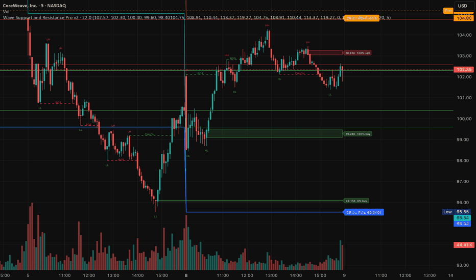
Liquidity Hunter v1.5Liquidity Hunter v1.5
Part of the Hunters Framework ... WHERE / WHEN / WHY
Liquidity Hunter answers WHERE ... where are the levels that matter?
Detects buyside and sellside liquidity zones from clustered swing highs/lows, then tracks how price interacts with them: approaching, sweeping, or breaking through.
Built on the LuxAlgo Buyside/Sellside Liquidity concept (CC BY-NC-SA 4.0) with significant enhancements for practical trading.
WHAT IT SHOWS
Liquidity zones are drawn where multiple swing highs or lows cluster at similar prices. These are levels where stop orders accumulate ... the fuel that moves price. The indicator detects these clusters and tracks their lifecycle.
Labels use intuitive directional naming:
- Buy Zone (green) ... sellside liquidity at swing lows. Price sweeps below, grabs stops, bounces up. You buy here.
- Sell Zone (red) ... buyside liquidity at swing highs. Price sweeps above, grabs stops, rejects down. You sell here.
ENHANCED FEATURES
Touch Count (Strength Weighting)
Each level shows how many times price has tested it. More touches = more stops accumulated = stronger reaction expected. Labels display the count: "Buy Zone " means 5 touches.
- 7+ touches = STRONG
- 5-6 touches = MODERATE
- Below 5 = WEAK
Sweep vs Break Detection
Not all liquidity interactions are equal.
- Sweep = price wicks through the level but closes back inside. Stops triggered, reversal likely. Orange markers.
- Break = price closes through the level. Structure broken, level invalidated. Level turns gray.
- Arrow signals appear on confirmed sweeps for clear visual entry cues.
EMA Sweep Filter
Filters sweep signals by EMA trend alignment. Only fires when the sweep direction agrees with the EMA trend.
- With Trend mode: buy sweeps valid above EMA, sell sweeps valid below EMA
- Counter Trend mode: opposite (works for specific instruments)
- Configurable EMA length (default 50)
- Diamond-shaped arrows distinguish EMA-filtered signals from raw sweeps
- Backtested on BTC 1H with EMA50: 76.5% WR, PF 4.87
Proximity Alerts
Alerts fire when price approaches a level within a configurable ATR distance (default 2x ATR). Gives you time to prepare before the sweep happens. Optional proximity zone bands show the trigger area.
Liquidity Voids
Detects gaps in the candle structure where price moved fast with no resting orders. These voids tend to get filled. Toggle on/off with bull/bear coloring.
WaveTrend Context in Alerts
When enabled, every alert includes the current WaveTrend state (bull/bear, WT2 level, overbought/oversold). This gives you instant confluence without checking another indicator. Works with Trend Hunter settings (channel 9, average 12, SMA 3).
Nearest Level Display
Dashboard showing distance to the nearest Buy Zone and Sell Zone with touch count and strength rating. Configurable position and size.
ALERTS
11 individual alertconditions for granular webhook/notification setup:
Sweep signals (raw):
- Buy Zone Swept (potential long)
- Sell Zone Swept (potential short)
- Any Sweep Signal
EMA-filtered sweeps:
- EMA BUY ... sweep + trend aligned
- EMA SELL ... sweep + trend aligned
- Any EMA Sweep Signal
Structure breaks:
- Buy Zone Broken (bearish structure break)
- Sell Zone Broken (bullish structure break)
Proximity:
- Approaching Buy Zone
- Approaching Sell Zone
- Approaching Any Level
All alert messages include level price, touch count, strength rating, and WT state.
HOW IT FITS THE FRAMEWORK
The Hunters Framework uses three indicators together:
1. Liquidity Hunter (this indicator) ... finds WHERE the key levels are
2. Trend Hunter ... finds WHEN to enter (WaveTrend MTF alignment, dots, pullbacks)
3. RSI+StochRSI ... tells you WHY (momentum divergence, confirmation)
Workflow: Liquidity Hunter shows you the battlefield (where stops sit). Trend Hunter tells you when the army is marching (trend direction + timing). RSI confirms whether the momentum supports the trade.
SETTINGS
Detection Length ... swing detection lookback (default 7, range 3-13)
Margin ... how close swing points must be to cluster (default 6.9)
EMA Length ... trend filter for sweep signals (default 50)
EMA Mode ... With Trend or Counter Trend
Mode ... Present (live levels only) or Historical (all levels)
Visible Levels ... how many levels to display (default 3)
Colors follow standard convention ... green for buy opportunities, red for sell opportunities. Fully configurable.
CREDITS
Based on Buyside & Sellside Liquidity by LuxAlgo (CC BY-NC-SA 4.0). Enhanced with touch counting, sweep/break distinction, EMA sweep filter, proximity alerts, WaveTrend context, and directional labeling. Gösterge

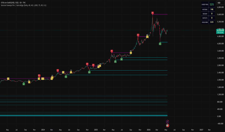
Session Sweeps Pro | GainzAlgoWhat are Liquidity Sweeps?
In modern algorithmic markets, price does not move randomly; it moves from one pocket of liquidity to the next. Liquidity Sweeps (also known as stop runs or "grabs" ) occur when price briefly breaches a well-defined technical level (like a swing high or low) to trigger the stop-loss orders resting there.
Once this liquidity is "tapped," large institutional players often use these orders to fill their own counter-positions, leading to a sharp reversal . Identifying where these sweeps have occurred and where they are likely to occur next, is the cornerstone of institutional-grade supply and demand trading .
Introducing: Session Sweeps by GainzAlgo
This indicator is a premium technical suite designed to visualize the "gravity" of market liquidity. Unlike 90% of liquidity indicators that simply label old highs and lows, the Session Sweeps uses a probabilistic model to map out exactly where the "business" of the market is being conducted.
It combines real-time sweep detection with a Cumulative Distribution Function (CDF) to provide a heads-up display (HUD) of the session's liquidity health.
How It Works:
The engine monitors price action for "breach and reclaim" signatures .
Detection: When a pivot high or low is swept and price closes back within the previous range, the script identifies a confirmed sweep .
Ghost S/R Zones: Upon detection, the script anchors a "Ghost Box" at the sweep level. These zones extend through the current session, acting as dynamic support and resistance levels that represent "already tapped" liquidity.
Conflict Resolution: To keep your charts clean, the script includes a built-in "De-overlapping" logic . If multiple sweeps occur in the same tight price area, it prioritizes the most significant level , preventing visual clutter.
The Liquidity Sweep CDF Profile
The centerpiece of this indicator is the HUD Profile on the right margin. While standard Volume Profiles show you where volume was traded, our Sweep CDF shows you the distribution of liquidity grabs .
Weighted Gravity: Every bar in the profile is weighted by the frequency of sweeps . A "thick" area in the profile indicates a price zone where the market has repeatedly reached for stops.
Color-Coded Probability: The profile uses a manual RGB interpolation (shifting from Neon Cyan to Magenta). As the bars widen and change color, they represent the cumulative probability (0% to 100%) of the session's total liquidity being found at or below that price.
Sweep POC (Point of Control): The yellow dashed line represents the Sweep POC , the specific price level with the highest density of liquidity sweeps in the current session. This is the market's true "Center of Gravity."
Session Anchoring & Menu Inputs
The indicator is built for the professional intraday and swing trader , offering full control over the data's scope:
Session Period: Select between Daily, Weekly, or Monthly anchors. The CDF profile and S/R zones will automatically reset at the start of each new period, ensuring your data is fresh and relevant .
Profile Resolution: Adjust the number of "Rows" to fine-tune the granularity of the CDF heatmap .
Risk Threshold: Customize the sensitivity of the Sweep Risk Index (top right), which monitors volatility compression to warn you when a sweep is statistically imminent .
How to Trade with Session Sweeps
Mean Reversion: Watch for price to approach the Sweep POC during low-volatility periods. These often act as magnets where price stabilizes.
Exhaustion Signals: Use the CDF percentages (85%, 70%, etc.). If price is trading at the 90% CDF level , it means the majority of the session's liquidity has already been "cleared" below. Pursuing further moves in that direction carries higher risk .
S/R Flips: Use the Ghost S/R Boxes as high-probability entry/exit zones. A Bearish Sweep zone that was once resistance will often act as a "re-entry" point if price returns to test the liquidity remaining in that pocket.
The Risk Index: Monitor the Sweep Risk % in the dashboard. When this index spikes ( Red ), be wary of placing stops at obvious swing points, as the "Stop Hunt" probability is at its peak.
Gösterge
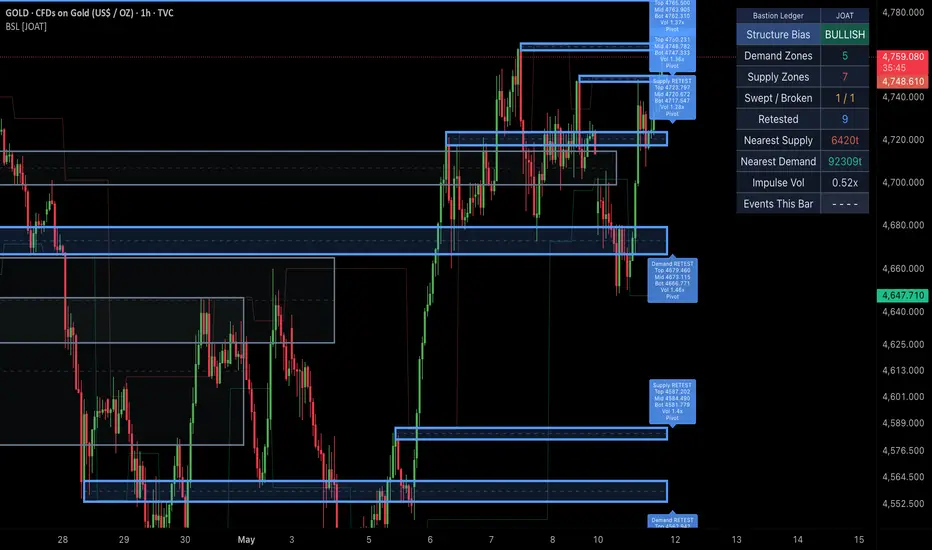
Bastion Ledger [JOAT]Bastion Ledger
Introduction
Bastion Ledger is an open-source liquidity and structure overlay designed to track active demand and supply zones through a full lifecycle model. The script builds zones from confirmed pivots and volume impulse events, then tracks how price interacts with those zones over time through active, swept, broken, retested, and archived states.
The problem Bastion Ledger solves is zone ambiguity. Many support and resistance tools simply draw a level and leave interpretation to the user. Bastion Ledger adds structure to that process by classifying how each zone was created and what has happened to it since. This makes the chart easier to read and gives the user a cleaner framework for identifying whether liquidity has held, been swept, failed, or transitioned into a retest state.
Core Concepts
1. Confirmed Pivot Structure
Zones created from pivots only appear after pivot confirmation. This introduces natural delay by design, but it prevents the script from creating forward-looking structure that disappears later.
2. Volume-Impulse Zone Creation
The script can also create zones from candles that exhibit high relative volume and efficient directional body behavior. This allows the overlay to capture not only swing structure but also displacement-origin areas.
3. Zone Lifecycle Model
Each zone progresses through a clear state model:
ACTIVE
SWEEPED
BROKEN
RETESTED
ARCHIVED
This is one of the defining features of the script. Instead of leaving historical rectangles behind with no context, the overlay tracks what has happened to each one.
4. Midpoint and Structure Rails
Every zone can include a midpoint reference and supporting structure rails to make reaction areas easier to inspect. This helps distinguish edge reactions from deeper zone acceptance.
5. Dashboard Context
The top-right dashboard summarizes active counts, nearest demand and supply distance, event state, and structure bias so the user can quickly orient themselves.
Features
Dual-source zone creation: Confirmed pivots and volume impulse zones
Stateful zone lifecycle: Tracks sweeps, breaks, retests, and archival
ATR-aware zone sizing: Zone height adapts to market conditions
Object-efficient rendering: Uses persistent objects with setter updates
Midpoint lines: Helps judge reaction depth inside each zone
Structure bias readout: Gives a quick demand-versus-supply view
Nearest-zone distance readout: Useful for contextual planning
Top-right dashboard: Medium-size summary panel
Confirmed-bar event logic: Creation and transitions are handled safely
Alertconditions: Zone create, sweep, break, retest, and structure breaks
How to Use This Indicator
Step 1: Identify the Nearest Active Zone
Use the plotted boxes and dashboard distance readouts to locate the nearest demand and supply area.
Step 2: Read the Zone State
An active zone is different from a swept or broken zone. The lifecycle state tells you whether the zone is still intact or has already lost integrity.
Step 3: Watch Retests After Breaks
Retested zones can be especially useful because they represent a transition from defended liquidity to broken structure and then a recheck of that failure.
Step 4: Combine with Regime Context
Bastion Ledger works best when combined with a separate trend or regime filter. Use it to map where reactions matter, not to replace directional context.
Indicator Limitations
Pivot-based zones confirm after the pivot completes, which is intentional non-repainting behavior
Very fast markets can move through multiple zone states in a short number of bars
Zone relevance declines over time, so older archived zones should not be treated like fresh liquidity
This script tracks structural interaction, not order flow or real exchange-level liquidity
Originality Statement
Bastion Ledger is original in its combination of pivot structure, volume-impulse zone creation, and lifecycle classification. The script is not just a rectangle drawer. Its core value lies in tracking how a zone evolves after creation and presenting that evolution in a consistent institutional overlay.
Disclaimer
This indicator is provided for educational and informational purposes only. It is not financial advice. Liquidity zones are interpretive tools based on historical price and volume behavior and do not guarantee future reactions.
- Made with passion by jackofalltrades
Gösterge

Sigma Structure [RWCS]What it is:
Sigma Structure is a confluence-based trading indicator that unifies three distinct analytical layers into a single, cohesive view: a Z-Score oscillator measuring price deviation from its 20 EMA, a normalized MACD histogram for momentum context, and an Order Block detection engine that identifies structural demand and supply zones directly on the price chart. The result is an indicator that tells you not just when price is statistically extended, but where that extension is occurring relative to meaningful price structure — giving every signal a location and every location a statistical weight.
How it works:
1. Z-Score layer: Price is measured as the number of standard deviations it sits above or below its 20-period EMA. This produces an oscillator that reads consistently across any asset or timeframe — a reading of +2 on Bitcoin means the same thing structurally as +2 on the S&P or EURUSD. The line color intensifies from faded to full aqua as it moves above zero, and faded to full fuchsia below, so the degree of extension is immediately legible at a glance. Fixed bands at ±1, ±2, and ±3 sigma define the statistical landscape.
2. MACD layer: A standard MACD histogram is computed normally, then linearly scaled so its rolling peak aligns with the ±3σ band. No calculation is modified — only the display axis is shared with the Z-Score. This means crossovers, divergences, and momentum shifts read identically to a standard MACD, but now live in the same visual space as the bands, letting you see momentum and mean-reversion context simultaneously.
3. Order Block layer: The indicator scans for order blocks using a sequential candle method — a bearish candle followed by a configurable number of consecutive bullish candles (demand), or a bullish candle followed by consecutive bearish candles (supply). Detected zones are drawn directly on the price chart as shaded regions with solid top boundaries and dashed bottom boundaries, color-coded aqua for demand and fuchsia for supply. Zones extend rightward bar by bar and self-invalidate the moment price closes through them, so what you see on the chart is always live and relevant.
4. Confluence signals: Two signal types fire when the Z-Score and Order Block layers align. An OB Reversal label appears when price is inside an Order Block while the Z-Score is at or beyond ±2σ — the statistical extension and the structural level are confirming each other as a fade opportunity. An OB Continuation label appears when price pulls back into an Order Block and the Z-Score reclaims zero — the trend is reasserting after a mean-reversion dip into demand or supply.
5. Volatility divergence: A background highlight layer compares price's rolling highs and lows against the rolling highs and lows of realized volatility (standard deviation of log returns). When price makes a new low without a corresponding expansion in realized volatility, a bullish divergence is flagged. The inverse flags bearish divergence. These are not entry signals on their own — they indicate moments where price action and volatility are telling different stories and warrant closer attention.
Possible ways to use it:
1. Reversal setups: When the Z-Score reaches ±2σ or beyond and price simultaneously tags an active Order Block zone, the statistical extension and structural level are aligned. The OB Reversal label marks these bars. Look for MACD histogram compression or a zero cross in the same window for additional confirmation before acting.
2. Trend continuation entries: In trending markets, price frequently pulls back into demand or supply zones and finds support exactly where it should. When the Z-Score crosses back through zero inside an active zone, the OB Continuation label fires — this is your structural retest with momentum confirmation.
3. Divergence as a filter: The volatility divergence highlights flag potential exhaustion in price moves that lack volatility confirmation. Use these as a reason to tighten risk or wait for the OB/Z-Score confluence before entering, rather than chasing the move.
4. EMA trend bias: The fast and slow EMA overlay on the price chart provides a quick structural read. Aligning your OB Reversal or Continuation signals in the direction of the EMA cross adds a higher-timeframe trend filter without requiring a second indicator.
5. Alert-driven scanning: Three configurable alerts cover the ±2σ Trade Zone cross, OB Reversal confluence, and OB Continuation setup. Set these across a watchlist to surface actionable conditions without manual chart monitoring.
Settings guide:
1. EMA / Std Dev Length: Both default to 20, matching a standard Bollinger Band configuration. Increase for smoother, slower signals on higher timeframes.
2. MACD Norm Lookback: Controls how far back the indicator looks to find the MACD histogram's peak for scaling. Higher values produce more stable scaling; lower values make the histogram more reactive to recent momentum.
3. Sequential Candles for OB: The number of consecutive candles required after the origin candle to confirm a block. Higher values produce fewer, higher-quality zones.
4. Max Active Zones: How many demand and supply zones can coexist on each side. Older zones are removed when the limit is reached.
5. Divergence Lookback: The rolling window for comparing price extremes against volatility extremes. Shorter values produce more frequent signals; longer values are more selective.
Disclaimer:
This indicator is published for educational and informational purposes only. Nothing presented here constitutes financial advice, a solicitation, or a recommendation to buy or sell any financial instrument. All trading involves risk, including the possible loss of principal. Past performance of any indicator or methodology is not indicative of future results. You are solely responsible for your own trading decisions. Always conduct your own research and consult a qualified financial professional before making any investment decisions. Gösterge

RBD SMC ConceptsRBD SMC Concepts is an institutional-grade Smart Money Concepts toolkit that combines higher-timeframe bias detection
with the four signals professional traders actually use: liquidity sweeps, order blocks, fair value gaps, and
break-of-structure events — all gated by HTF alignment to filter out counter-trend noise.
What it does
The script tracks structure on a higher timeframe and overlays four signal types on your current chart, only
displaying those that align with the HTF directional bias when the alignment filter is enabled.
HTF Bias Engine
Auto-maps your chart timeframe to a logical higher timeframe (5m → 30m, 15m → 1H, 1H → 4H, 4H → D) or override
manually. Tracks the last three confirmed swing highs and lows on the HTF and labels the bias as:
- Bullish: Higher Highs + Higher Lows
- Bearish: Lower Highs + Lower Lows
- Neutral: any other structure (range / mixed)
Order Blocks
On every LTF Break of Structure, marks the last opposing candle as an order block. Bullish OB = last down candle
before bullish BOS; bearish OB = last up candle before bearish BOS. Boxes auto-mitigate once price returns to them,
keeping the chart clean.
Liquidity Sweeps
Detects wicks that pierce the prior 10-bar swing high or low and close back inside the range. Reported as SSL ↑
(sell-side liquidity swept, bullish reversal signal) or BSL ↓ (buy-side liquidity swept, bearish reversal signal). A
close beyond the level is treated as a breakout, not a sweep.
Fair Value Gaps
Three-bar imbalances drawn as soft, low-opacity zones in a distinct hue from order blocks. Auto-mitigate when filled.
BOS / CHoCH Detection
Continuation breaks (BOS) vs character changes (CHoCH = BOS against the current HTF bias). Surfaced in the dashboard
rather than as chart clutter.
Dashboard
A compact top-right table in TradingView native dark palette shows at a glance:
- Active HTF and alignment filter state
- HTF Bias and Structure label (HH+HL / LH+LL / Ranging)
- Most recent structure event (BOS or CHoCH)
- Most recent sweep (SSL or BSL)
- Live count of active order blocks and FVGs
Position is configurable across 5 anchor points.
Alignment Filter
When enabled (default), only signals that align with HTF bias are displayed and alerted on. Bullish sweeps require
Bullish HTF; bearish sweeps require Bearish HTF; FVGs are hidden if they contradict bias. Toggle off to see all
signals raw.
Settings
- HTF auto-selection or manual override (30m / 1H / 4H / D / W)
- HTF pivot length (default 10)
- LTF pivot length for BOS and OB anchor (default 5)
- Max OBs per side, max FVGs per side
- Box forward extension in bars
- Auto-mitigation toggles for OBs and FVGs
- 4 built-in alerts: bullish sweep, bearish sweep, bullish CHoCH, bearish CHoCH
How to use
1. Apply on any timeframe; the HTF is auto-selected
2. Wait for HTF Bias to read Bullish or Bearish (skip Neutral conditions)
3. Watch the chart for SSL or BSL sweeps that align with bias
4. Use mitigated order blocks or FVGs in the rejection zone as entry triggers on a pullback
5. Stop above the swept high (BSL) or below the swept low (SSL); target the next opposing liquidity pool
Scope and limitations
This is a signal-detection and bias-alignment tool, not a buy/sell system. It draws zones and surfaces context; entry
timing, stop placement, and position sizing are the trader's job. The HTF bias engine uses lookahead_off and confirmed
pivots, so it does not repaint after the HTF bar closes — however, pivots inherently form pivot_length bars after the
actual swing, which is a property of the math, not a bug.
Pine v6. Works across stocks, futures, FX, and crypto on timeframes from 1m to weekly.
Headers to bold: What it does, HTF Bias Engine, Order Blocks, Liquidity Sweeps, Fair Value Gaps, BOS / CHoCH
Detection, Dashboard, Alignment Filter, Settings, How to use, Scope and limitations. Gösterge

SMC Supply & Demand Zones - H4 / H1 / M10Automatically identifies and draws supply and demand zones across three timeframes (H4, H1, and M10) simultaneously on any chart, using a strict volume-confirmed impulse candle definition rooted in Smart Money Concepts (SMC).
How zones are built
A zone is created only when all three conditions are met on the same candle:
Body size ≥ 1.5 × ATR(14) — filters out indecision candles
Close breaks beyond the prior 5 candles' high (demand) or low (supply) — confirms impulsive intent
Volume ≥ 1.5 × SMA(volume, 20) — requires institutional-level participation
Zone boundaries follow the SMC base candle rule: demand zones span from the impulse candle's open down to its low; supply zones span from its high down to its open.
Visual design
Each timeframe uses a distinct colour family so you can read confluence at a glance — H4 in blue, H1 in orange, M10 in green. Lighter shades mark demand, darker shades mark supply. When price closes fully through a zone, it fades to grey and is tagged with (mitigated) — it stays on the chart for context but is visually de-emphasised. Each zone carries a label (e.g. "H4 D", "H1 S") pinned to its right edge.
Settings
Toggle each timeframe on/off independently
Adjust the body multiplier, prior-bar lookback, and volume multiplier to match the instrument
Set separate caps for active and mitigated zones per timeframe (FIFO — oldest removed first)
Full colour control per timeframe and direction
Toggle labels and borders separately
Non-repainting
All three timeframe feeds use request.security() with lookahead = barmerge.lookahead_off and gaps = barmerge.gaps_off. Zones are created only on the bar where an impulse candle's close is first confirmed — no bar-0 data is used.
Recommended use
Load on your entry timeframe (M10 or M5) and use the H4/H1 zones as bias and confluence levels. Look for price to sweep into a higher-TF zone and react — that is your area of interest for entry confirmation on the lower timeframe. Gösterge

Svopex SwingSvopex Swing
A pivot-based swing-level indicator that marks every confirmed high and low with a horizontal line and a price box, then automatically tracks whether the
level has been filled (revisited) or remains untested. Originally built on top of LeviathanCapital's swing engine and adapted with extra filters and styling
for cleaner crypto and futures workflows.
What it does
The indicator detects pivot highs and pivot lows using configurable left/right bar lookbacks and draws:
- A horizontal line at every swing high (sell-side liquidity) and swing low (buy-side liquidity)
- A price box above/below the swing point that visualizes the level's "thickness" and accepts optional volume / OI text inside it
- A circle marker at the exact pivot bar so the swing point is easy to spot
Each level extends to the right until price comes back and fills it (high ≥ level ≥ low). Filled levels can be hidden, kept on chart, or trimmed
automatically.
Open Interest delta confluence
This is the indicator's main differentiator: each pivot is tagged with the Open Interest delta at the swing bar, aggregated from up to six perp feeds:
- Binance USDT.P / USD.P / BUSD.P
- BitMEX USD.P / USDT.P
- Kraken USD.P
Each feed has its own toggle so you can include only the venues you care about. The OI delta is then used to filter which swings get drawn:
- Positive OI Delta — show only swings that printed alongside increasing open interest (fresh longs / fresh shorts being added)
- Negative OI Delta — show only swings printed during OI-decline (position unwinding)
- / (off) — show all swings regardless of OI direction
Combined with a volume threshold and abs(OI delta) threshold, you can isolate only the most institutionally-loaded pivots and ignore retail noise.
Inputs
Detection
- Bars Right / Bars Left — pivot lookback (default 10 / 15)
- Lookback (D) — only draw swings within the last N days
Filters
- Volume > — minimum bar volume at the pivot
- OI Δ (abs.) > — minimum absolute open-interest change at the pivot
- Only Swings With — Positive / Negative / any OI delta
- Hide Filled — drop levels once price retraces through them
- Extend Until Fill — keep extending the line right-ward until it's hit
OI Sources
- Per-exchange / per-feed toggles for the six supported perp pairs
Appearance
- Show Boxes / Lines / Labels — independent toggles
- Show Volume / Show OI Δ — render the values inside the box text
- Highs color / Lows color — line + label + box colors per side
- Line Style — Solid / Dashed / Dotted, plus width
- Box Width / Box Type — TYPE 1 (snap to pivot) or TYPE 2 (% offset from pivot)
- Text Size & H-align — Tiny / Small / Normal / Large / Auto, left/center/right
How to use
1. Liquidity mapping — every untested swing high above current price is a pool of sell-side stops; every untested swing low below is buy-side stops. Use them
as targets and reaction points.
2. OI-loaded pivots — turning on the Positive OI Delta filter highlights only the swings where new positioning was added. These tend to be the strongest
levels because trapped longs/shorts defend them.
3. Trend bias — if recent highs are being filled (taken out) while lows stay untested, the bias is bullish, and vice versa.
4. Multi-timeframe — run the indicator twice on the same chart with different left/right values for a layered view (e.g., 5/5 for fast, 20/20 for structural).
Tips
- OI feeds default to crypto perp tickers — the indicator works best on BTC, ETH, SOL and other coins with active futures. On stocks/forex/indices, leave OI
filters off (set "/" and zero thresholds) and use it as a pure pivot tool.
- The Lookback (D) input is essential on long charts — without it the indicator can hit the 500-line/box cap and stop drawing.
- Combine Show OI Δ with Hide Filled = OFF to build a heat-map of where futures positioning was historically loaded.
Credits
- Base swing/pivot engine and OI aggregation by © LeviathanCapital — thank you.
- Filter, styling, and workflow adjustments by Svopex.
Open source under MPL 2.0 — fork, adapt, and share. Gösterge
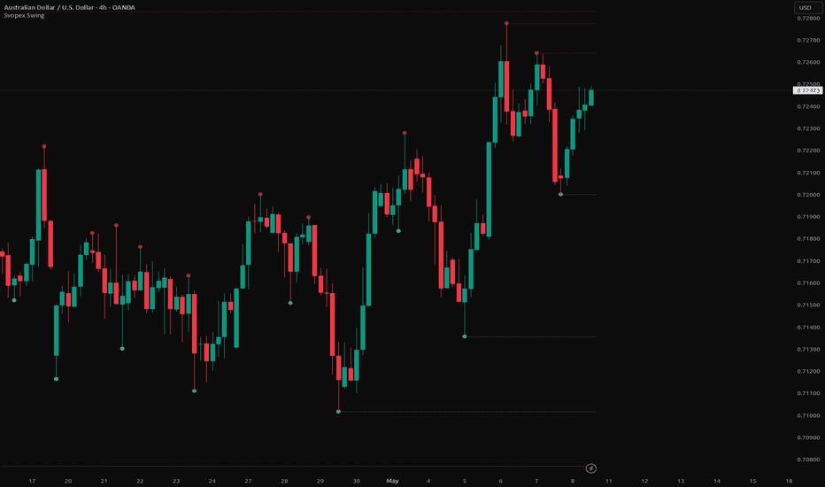
Svopex Pullback LevelSvopex Pullback Level
A pullback-break indicator that detects valid retracement levels using body-based pivot logic and confirms breakouts with higher-timeframe RSI momentum
confluence. Designed to mark the precise body extreme where a counter-trend move began — and signal when the original trend resumes.
What it does
When price makes a new N-bar low with a red body and the next bar closes green, the indicator walks back through the consecutive red candles and draws a
horizontal line at the highest body of that down-move — your short pullback level. The mirror logic plots a long pullback level at the lowest body of an
up-move that just printed a new N-bar high.
A break of the level (body close beyond it) closes the line and optionally triggers a confluence signal:
- Bullish break of a short level + HTF RSI ≥ HTF RSI-SMA → green dot below the bar + alert
- Bearish break of a long level + HTF RSI ≤ HTF RSI-SMA → red dot above the bar + alert
This filters out countertrend breakouts that happen against higher-timeframe momentum.
Why body extremes (not wicks)
Wick-based pivot levels are noisy — they reset on every false sweep. By tracking only candle bodies, the indicator captures the decision points where the move
actually consolidated, producing levels that act as cleaner support/resistance.
Inputs
Detection
- Lookback for new low/high (bars) — how many bars back must be cleared to qualify (default 20)
- Max bars for walk-back — cap on how far the body-walk searches for the move's origin (default 50)
- Detect short levels — toggle pullback levels from down-moves
- Detect long levels — toggle pullback levels from up-moves
Style
- Short level color / Long level color — independent color pickers
- Line width — 1 to 4
RSI confluence (HTF)
- Mark break + HTF RSI vs SMA filter — master toggle for the confluence dots and alerts
- HTF multiplier — higher timeframe = current TF × multiplier (default 2× — e.g., 1H chart → 2H RSI)
- RSI length — default 14
- RSI SMA length — default 14 (the trigger line)
- Bullish / Bearish confluence colors — independent
Outputs
- Horizontal lines at every pullback level until it breaks
- Green circles below the bar on bullish confluence breakouts
- Red circles above the bar on bearish confluence breakouts
- Alerts with full context: ticker, timeframe, break price, level price, HTF RSI value, HTF RSI-SMA value
How to use
1. Trend trading — wait for a confluence dot to appear at a key support/resistance level (use higher-timeframe structure or your own zones). The HTF RSI
filter ensures you're trading with momentum.
2. Trade management — un-broken pullback levels often act as targets for the next leg.
3. Pullback entries — when price retraces into a fresh pullback level on a lower timeframe, you have a defined invalidation (the level itself) and a defined
target (recent high/low).
Tips
- Tune lookback bars to your timeframe: shorter values (10–15) for scalping, longer (25–40) for swing.
- The HTF multiplier of 2× is a balanced default; increase to 3–5 for stricter momentum filtering, decrease to 1.5 to keep the filter close to the trading TF.
- Levels that get broken without confluence are still useful as price magnets — they just don't qualify as high-probability entries by this strategy.
Credits
Built by Svopex. Open source — fork and adapt. Gösterge

Svopex Key LevelsSvopex Key Levels
A comprehensive multi-timeframe key-levels indicator that plots the most-watched institutional reference points on a single overlay. Originally built on top
of @sbtnc's base code and extended with additional levels for daily trading convenience.
What it plots
For every timeframe, the indicator can display the Open, the previous period's High / Low, and the previous period's Mid (50% of the range):
- 4H — open, prev 4H high/low, prev 4H mid
- Daily — open, prev day high/low (PDH/PDL), prev day mid (PDM)
- Monday Range — current week's Monday high/low/mid (essential for FX weekly bias)
- Weekly — open, prev week high/low (PWH/PWL), prev week mid (PWM)
- Monthly — open, prev month high/low (PMH/PML), prev month mid (PMM)
- Quarterly — open, prev quarter high/low (PQH/PQL), prev quarter mid (PQM)
- Yearly — open, current year high/low (CYH/CYL), current year mid (CYM)
- FX Sessions — London / New York / Tokyo (Asia) ranges, with custom session times
Every level has its own toggle, color, and shorthand label option, so you can light up only the levels you trade.
Display options
- Standard mode — levels are drawn as horizontal lines anchored to their period's start.
- Right Anchored mode — labels and tails stay clustered to the right side of the chart for clean read-outs on busy screens.
- Merge Levels — automatically collapses overlapping levels into a single label so you don't end up with stacked text on confluence.
- Distance / Anchor Distance — controls how far the levels and labels extend.
Styling
- Line Style — Solid, Dashed, or Dotted
- Line Width — Small / Medium / Large
- Text Size — Small / Medium / Large
- Per-group colors — independent color picker for each timeframe / session
- Global Coloring — one switch to recolor everything to a single shade
- Global Text Shorthand — flip every label to its short form (PDH, PWM, CYL …) in one click
How to use
These levels are the price points where institutional liquidity, prior-period highs/lows, and session opens tend to concentrate — they're commonly used as
targets, reaction zones, or stop-hunt destinations. Combine the prev-day high/low with Monday range and the daily/weekly opens for a complete bias and target
framework. The 4H levels are useful for intraday entries; quarterly and yearly levels matter for swing positioning.
Credits
- Base code by @sbtnc — thank you.
- Extensions, additional levels, and styling rework by Svopex.
Open source under MPL 2.0 — fork, adapt, and share. Gösterge

ADX/DI Volume ProfileADX/DI Volume Profile
Hello everyone. Please excuse my English, as I am not a native speaker. I use translation tools, but I hope my passion for coding reaches you.
First of all, I want to express my deepest respect and gratitude to @LuxAlgo. Your incredibly creative scripts and stunning visual designs have always been a huge inspiration to my coding journey. Thank you!
Usually, ADX and DMI are drawn at the bottom of the chart to show when a trend is strong. But I wanted to know where (at what price) the trend was the strongest.
This script creates a "Spatial Energy Memory." It stacks buying and selling power not by time, but by price levels, and in this "Ultimate" version, it perfectly fuses Volume (market heat) with momentum.
Making Boxes:
We take the highest and lowest price of a fixed period and divide that space into equal rows.
Storing Energy (Volume Weighted):
If a candle passes through 5 rows, we calculate the ADX/DI momentum and multiply it by the Volume of that specific candle. The explosive "heat" of the market is then shared into those 5 rows.
Drawing Blocks:
The price row with the highest total points gets the longest block on the chart.
Blue Walls (+DI):
Strong buying energy and volume. Acts as a powerful support.
Red Walls (-DI):
Strong selling energy and volume. Acts as a heavy resistance.
ADX POC (Yellow Dashed Line):
The exact price where the trend energy exploded the most.
Local VWAP & Fibonacci:
Displays the Volume Weighted Average Price within the session, along with clean, non-obtrusive Fibonacci levels to identify dynamic support/resistance.
Fixed Steps Engine (Zero Repaint):
To ensure maximum reliability for real-time trading, this indicator locks the profile frames into fixed past sessions. The boundaries never shift, meaning your support/resistance levels are absolute and will never repaint.
Performance Optimized:
TradingView has a strict limit of 500 drawings per script. To prevent visual bugs and missing blocks, I have hard-capped the resolution to a maximum of 40 rows and 3 historical sessions. This ensures a highly stable and beautiful display, effectively preventing common visual glitches.
Streamlined Layouts:
Choose from Left, Right, or Center Aligned. You can independently set the layout for +DI, -DI, and ADX to create beautiful "Mirror" or "Butterfly" setups.
Noise Filter:
By increasing the Noise Filter, weak and transparent energy blocks are automatically stripped away, leaving only the true, thick walls of the market.
Enjoy the ultimate spatial view of the market!
(Japanese )
皆さんこんにちは。私は英語のネイティブスピーカーではないため、至らない表現があるかもしれませんが、このスクリプトに込めた熱意が皆様に伝われば嬉しいです。
まず初めに、LuxAlgo氏へ最大限の敬意と感謝を捧げます。あなたの驚くべきスクリプトと洗練された視覚的デザインは、私のコーディングの旅において常に巨大なインスピレーションの源でした。本当にありがとうございます。
通常、ADXやDMIはチャートの下部に表示され、「いつ」トレンドが強かったかを示します。しかし、私は「どの価格帯で」トレンドが最も強かったかを知りたいと考えました。
このスクリプトは時間軸ではなく価格帯(空間)ごとにパワーを積み上げ、さらに出来高(相場の熱量)を完全に融合させた「エネルギーの記憶」を描き出します。
箱を作る: 一定期間の最高値と最安値を取り、その空間を等間隔の行に分割します。
エネルギーを配分する(出来高補正): ローソク足が5つの箱を通過した場合、その時のADX/DIのモメンタムに出来高を掛け合わせます。大口が本気で叩いてきた「熱量」が、5つの箱に配分されます。
ブロックを描画する: 最終的に最も多くポイントが蓄積された価格帯に、最も長いブロックを描画します。
青い壁(+DI)/ 赤い壁(-DI): 強い買い(または売り)エネルギーと出来高が蓄積された場所です。強力なサポート/レジスタンスとして機能します。
ADX POC(黄色の破線): トレンドの勢いが最も爆発したコアとなる価格帯です。
Local VWAP & フィボナッチ: 期間内のVWAP(出来高加重平均価格)と、視界を邪魔しない洗練されたフィボナッチを表示します。
完全固定エンジン(リペイントなし): 実戦トレードでの信頼性を極限まで高めるため、プロファイルの枠組みは過去の一定期間で完全にロックされます。基準枠がズレたりリペイントしたりすることは一切なく、描画された壁は絶対的な基準として機能します。
パフォーマンス最適化(バグ防止): TradingViewの「最大500個の描画制限」による表示崩れを完全に防ぐため、解像度(最大40分割)と表示数(最大3セッション)に安全装置となる上限を設けています。これにより、システムの限界による表示崩れを未然に防ぎ、いかなる相場でも極めて安定した美しい表示を実現します。
洗練されたレイアウト: +DI、-DI、ADXの配置を独立して設定でき、買いと売りを反発させる「ミラー配置」なども自由に構築可能です。
ノイズフィルター: フィルターの数値を上げると、エネルギーの弱い透明なブロックが自動的に削ぎ落とされ、本当に意識される「分厚い壁」だけを残すことができます。
空間的な市場分析をお楽しみください!
Gösterge

OTE - Optimal Trade EntryOTE - Optimal Trade Entry
Marks the 61.8%–79% Fibonacci retracement of each confirmed impulse leg as a shaded zone. In ICT methodology this band — anchored at 61.8%, centred on the 70.5% "sweet spot," and bounded at 79% — is where institutional flow is most likely to re-enter after a pullback.
A bullish OTE zone is drawn when a swing high confirms after a swing low (an up-leg has completed), marking the expected pullback area for a long re-entry. A bearish OTE zone is drawn when a swing low confirms after a swing high (a down-leg has completed), marking the expected pullback area for a short. Three timeframes overlay simultaneously, with border weight increasing per TF so higher-timeframe zones always stand out.
How it works
For each of the three configured timeframes, the script runs pivot detection inside request.security and tracks the most recent confirmed swing high and swing low.
A swing high confirming after the most recent swing low triggers a bullish OTE: the impulse leg is from low to high, and the zone is drawn between the 61.8% and 79% retracements down from the high.
A swing low confirming after the most recent swing high triggers a bearish OTE: the impulse leg is from high to low, and the zone is drawn between the 61.8% and 79% retracements up from the low.
Each zone records the original swing (the Fibonacci anchor), its 70.5% midline, and its top and bottom bounds. A zone is marked mitigated the first bar price wicks into it. Mitigated zones stop extending right and re-render in grey; they can be hidden entirely if the chart gets busy.
All boxes, lines, and labels are rebuilt on the last bar so styling stays current.
How to read it
Each timeframe is differentiated by border weight (thin → medium → thick), leaving color free for direction:
Bullish OTE (default teal) — expected pullback area for a long
Bearish OTE (default red) — expected pullback area for a short
Mitigated (default grey) — price has already wicked into the zone
A few visual elements help anchor each zone:
Origin line — a vertical line from the anchor swing point to the zone edge, showing exactly where the Fibonacci was measured from. Useful when several zones stack and you need to identify the impulse leg each one belongs to.
70.5% midline — a dashed line through the centre of each zone. ICT methodology treats the midline as the precision-entry level within the band.
Label — timeframe and direction (▲ bullish, ▼ bearish).
When OTE zones from different timeframes stack at the same price, that's confluence — a 1H bullish OTE coinciding with a 4H bullish OTE is structurally more interesting than either zone alone.
Inputs
Show mitigated zones — keep entered zones on chart in dimmed style. Default on.
Labels — show or hide zone labels. Default on.
70.5% midline — draw the precision-entry line through the centre of each zone. Default on.
Origin line — draw the vertical anchor line from swing to zone. Default on.
Max zones (per TF) — cap on stored zones drawn per timeframe. Default 10.
Pivot Length — bars required on each side to confirm a swing. Default 5.
Timeframes 1/2/3 — defaults: 1H, 4H, Daily. Each independently enabled. TF3 off by default.
Colors — bullish, bearish, mitigated.
Built-in alerts
Bullish OTE Zone — fires when a new bullish OTE zone is formed on any enabled timeframe
Bearish OTE Zone — same, for bearish
Note: these fire on zone formation, not on price entry into the zone. If you want entry-trigger alerts, set TradingView alerts on price crossing into the published zone levels.
Notes
OTE is a focused subset of Fibonacci retracement analysis — it isolates the 61.8%–79% band, where ICT methodology argues the highest-probability re-entry sits. The full Fibonacci grid (0%, 23.6%, 38.2%, 50%, 61.8%, 78.6%, 100%) is available in the Automatic Fibonacci Retracement Levels (MTF) indicator if you want to see the whole structure rather than just the OTE band.
The pivot length controls what counts as an impulse leg. A length of 5 catches most meaningful intraday and swing structure. Smaller values produce overlapping zones from minor swings; larger values restrict to major impulse legs but lag substantially. Pick a value that matches what you'd manually call "the recent leg."
Higher-timeframe pivots don't confirm until pivot length bars after the actual swing. On a Daily timeframe with length 5, that's five days of delay between the actual high or low and the OTE zone appearing. Zones are non-repainting once printed, but they appear later than the swing itself.
A mitigated OTE isn't a failed one. Price wicking into the zone is the expected behaviour — the zone is doing its job. The mitigation flag is informational: it tells you the zone has been tested. Whether the test held or failed is a separate question your own system needs to answer.
The framework here borrows from Smart Money Concepts / ICT trading, where OTE is one of the canonical entry techniques. Whether you accept the institutional-flow narrative or just use the 61.8%–79% band as a high-quality retracement zone, the indicator is purely mechanical: it finds the impulse legs and draws the bands.
This is a structural tool, not a signal generator. It marks the highest-quality retracement zone of each completed impulse.
Five years of work on a trading system left me with dozens of indicators that ultimately didn't earn a place in the final build. They're not failures — they're tools that solved problems I no longer needed solved. So instead of shelving them, I'm publishing the majority of them open-source.
If you're a discretionary trader, take what's useful. If you're a systems builder, the source is yours to dissect, modify, and improve. The best return on five years of work is for it to keep working — for someone.
If you use this script — or part of it — in your own work, please credit the original with a link back to my profile.
Note: these indicators have been updated to Pine Script v6 — some manually, some with AI assistance. Gösterge