Gösterge

PD Location Screener (NY Session)PD Location Screener (NY Session) – Premium / Discount / Equilibrium Bias
This open-source overlay indicator is a lightweight visual screener that shows where current price is located relative to the **previous day's range** (PD high/low/midpoint), helping traders quickly identify:
- Discount zones (below 25% of PD range → potential buy bias)
- Premium zones (above 75% of PD range → potential sell bias)
- Equilibrium / neutral (near midpoint → balanced / choppy)
Core Concept
Many intraday traders use the previous day's range as a reference framework:
- Price below the midpoint (especially in the lower 25%) is considered **discount** → undervalued relative to yesterday → higher probability of mean-reversion buys or continuation if momentum builds
- Price above the midpoint (especially in the upper 25%) is considered **premium** → overvalued → higher probability of mean-reversion sells or fading
- Near the midpoint → equilibrium → often choppy or awaiting directional catalyst
This script adds a **NY session filter** (default 08:30–16:00 NY time) so the PD range calculation only includes bars during active New York hours — useful for avoiding thin Asian-range noise and focusing on high-liquidity period behavior.
Why this is useful
- Provides instant visual context for bias without cluttering the chart
- Helps filter trades: e.g., look for longs in discount + bullish structure, shorts in premium + bearish structure
- Session filter makes it particularly effective for NY/London overlap strategies (forex, indices, gold, futures)
How It Works
1. Tracks daily high/low only during NY session (optional toggle)
- Resets at new day
- Updates only when inSession = true
2. Calculates:
- Midpoint = (PD High + PD Low) / 2
- PD Range = PD High – PD Low
- Discount threshold = PD Low + 25% of range
- Premium threshold = PD Low + 75% of range
3. Bias flags:
- Discount: close < midpoint → green triangle below bar
- Premium: close > midpoint → red triangle above bar
4. Optional last-bar label:
- "DISCOUNT ZONE" (green)
- "PREMIUM ZONE" (red)
- "EQUILIBRIUM" (gray)
Visual Output
- Green triangle below bar → price in discount (buy bias area)
- Red triangle above bar → price in premium (sell bias area)
- Last-bar label (toggleable) showing current location
How to Use
- Best on **5m–1h timeframes** for intraday trading (forex majors, indices, gold, futures)
- Recommended pairs: EURUSD, GBPUSD, XAUUSD, NAS100, ES1!, NQ1!
- Typical workflow:
1. Wait for price to reach discount zone + bullish price action / structure → consider longs
2. Wait for premium zone + bearish price action → consider shorts
3. Avoid entries near equilibrium unless strong breakout catalyst
- Combine with:
- Order blocks, FVGs, liquidity sweeps
- Higher-timeframe trend filter
- Session open/high/low
- Toggle "Use NY Session Only" off if you want full 24h range (e.g., crypto or Asian-focused pairs)
Inputs
- Use NY Session Only: true = only NY hours count toward PD range (recommended)
- NY Session: default "0830-1600" (adjust if broker timezone differs)
- Show Location Labels: toggle last-bar text label
Publishing Recommendation
- Publish with a clean chart (e.g., 15m–1h XAUUSD or EURUSD during NY session)
- Show a period where price moves from discount → equilibrium → premium (triangles visible)
- No extra indicators/drawings needed
This is a simple, educational location bias tool — fully open-source. It highlights relative value zones — not trade signals. Trading involves significant risk of loss. Use discretion and proper risk management.
Feedback welcome — especially suggestions for adding PD open or 50% retracement lines! Gösterge

Gold/Spread AlgoXAUUSD 1-Minute RSI Scalping Strategy – Mean-Reversion with Fixed Exits
This open-source strategy is a high-frequency, counter-trend scalping system designed specifically for **XAUUSD (Gold)** on the 1-minute timeframe.
Core Logic
The strategy uses classic RSI(14) to identify short-term overextension:
- Long entry when RSI drops below oversold (default 30) → expects quick snap-back
- Short entry when RSI rises above overbought (default 70) → expects quick pullback
Entries are taken only when flat (no pyramiding). Exits are fixed in pips and set immediately on entry:
- Take Profit: +10 pips (0.10 in XAUUSD price)
- Stop Loss: –5 pips (0.05 in XAUUSD price)
- Built-in Risk:Reward = 1:2
This fixed structure gives the system positive mathematical expectancy even with moderate win rates (≈55–65% before costs), provided gold continues to exhibit frequent mean-reversion behavior on 1-minute charts.
Why this simple approach?
Gold is one of the most volatile and momentum-driven instruments on very short timeframes. Pure RSI extremes often capture quick exhaustion moves after news spikes, order flow imbalances, or session transitions — especially during London/NY overlap. Fixed pip targets prevent over-optimization and mimic real broker execution more closely than dynamic trailing or percentage-based exits.
Important Realism & Backtesting Notes
To produce non-misleading results, use these settings when publishing/testing:
- Initial Capital: $10,000 – $30,000 (realistic retail size)
- Position sizing: fixed 0.10–0.30 lots or 1–3% equity per trade
- Commission: 5–8 USD round-turn per lot (typical ECN/raw-spread)
- Slippage: 3–8 ticks (≈0.03–0.08 in price) — gold spreads widen during volatility
- Minimum dataset: 12–36 months of 1-minute data (aim for 800–2000+ trades)
- Risk per trade: usually 0.5–1.5% with defaults — never exceeds sustainable levels
Results vary significantly:
- Strongest in ranging or mildly trending sessions
- Weaker during strong directional moves or major news (NFP, FOMC, geopolitics)
- Expect drawdowns during trending regimes — this is NOT a trend-following system
Visual & Dashboard Elements
- RSI line + fill (blue/orange background) + overbought/oversold zones
- BUY/SELL triangles at entry points
- Professional top-right dashboard showing:
- Net Profit & Loss
- Total Trades / Win Rate / Profit Factor
- Winning / Losing Trades
- Current RSI value
- Position status (LONG / SHORT / FLAT)
- TP:SL ratio
Alerts
- 🟢 LONG ENTRY – RSI oversold
- 🔴 SHORT ENTRY – RSI overbought
How to Use
1. Apply to XAUUSD 1-minute chart only
2. Use realistic commission/slippage in Strategy Tester
3. Trade primarily during London & New York sessions for best liquidity
4. Avoid major news events or widen stops manually
5. Forward-test on demo for 2–3 months minimum
6. Always size conservatively — never risk more than 1–2% per trade
Publish Recommendation
- Use a clean chart: only this strategy, no extra indicators/drawings
- Show realistic tester results with commission/slippage applied
- Screenshot during active session with visible entry signals + dashboard
Educational tool — open-source for learning and testing. Not financial advice. Gold 1-minute trading is extremely volatile and carries high risk of loss. Trade responsibly. Strateji

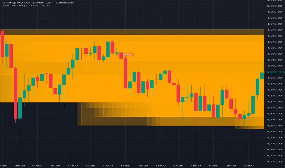
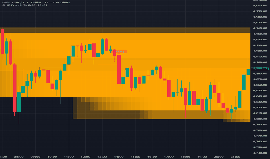
All-in-One SMC ProAll-in-One SMC Pro: CHOCH • BOS • FVG • Order Blocks • Liquidity + Discount/Premium
This open-source overlay indicator combines the five most widely used Smart Money / ICT (Inner Circle Trader) concepts into a single, customizable tool:
- Break of Structure (BOS)
- Change of Character (CHOCH)
- Fair Value Gaps (FVG)
- Order Blocks (mitigation blocks)
- Liquidity grabs (equal highs/lows)
- Discount / Premium zones
Why this combination?
SMC traders rarely use these concepts in isolation. A complete workflow typically involves:
1. Identifying market structure direction (BOS) or reversal (CHOCH)
2. Locating high-probability entry zones (Order Blocks, FVGs)
3. Confirming institutional manipulation (liquidity grabs of equal highs/lows)
4. Understanding price positioning relative to value (discount = buy bias, premium = sell bias)
Putting them all in one script reduces chart clutter, improves confluence visibility, and helps newer SMC users see how the pieces connect — without needing 5–7 separate indicators.
Core Concepts & Detection Logic
1. Break of Structure (BOS)
- Bullish BOS: price closes above previous swing high
- Bearish BOS: price closes below previous swing low
- Swing points detected with user-defined lookback (default 5 bars left/right)
2. Change of Character (CHOCH)
- Bullish CHOCH: price makes lower low but closes above previous swing high (bearish structure broken → bullish reversal signal)
- Bearish CHOCH: price makes higher high but closes below previous swing low (bullish structure broken → bearish reversal signal)
3. Fair Value Gaps (FVG)
- Bullish FVG: gap up after a bearish candle (low > high )
- Bearish FVG: gap down after a bullish candle (high < low )
- Sensitivity controlled via ATR multiplier (default 0.1 × ATR(14))
- Dashed horizontal lines mark the gap boundaries
4. Order Blocks
- Bullish OB: previous swing low after bullish BOS (potential demand zone)
- Bearish OB: previous swing high after bearish BOS (potential supply zone)
- Drawn as semi-transparent boxes extending rightward (lookback period adjustable)
5. Liquidity Grabs
- Detects clusters of equal highs/lows (default 3-bar lookback)
- Labels appear when price reverses after touching equal levels (classic stop-hunt / liquidity raid)
6. Discount / Premium Zones
- Equilibrium proxy = (H + L + C) / 3
- Discount: price below ~0.5% of equilibrium (green tint – buy bias area)
- Premium: price above ~0.5% of equilibrium (red tint – sell bias area)
Visual Customization
- Toggle each element independently (BOS, CHOCH, FVG, OB, Liquidity, Disc/Prem)
- Separate bullish/bearish colors + dedicated FVG/OB/Liquidity colors
- Max lines/labels set high (500) to handle longer histories
Alerts (built-in conditions)
- Bullish / Bearish BOS
- Bullish / Bearish CHOCH
- Bullish / Bearish FVG formation
How to Use
- Best on 5m–4h timeframes for forex, indices, crypto, gold (high-liquidity instruments)
- Typical SMC workflow example:
1. Look for CHOCH → potential trend reversal
2. Wait for BOS in new direction → structure confirmation
3. Seek entry at Order Block or FVG mitigation in discount/premium zone
4. Liquidity grabs near swing extremes often precede strong moves
- Combine with session times, news events, or higher-timeframe bias — never trade signals in isolation
- Adjust swingLen (3–10) for sensitivity: lower = more signals, higher = cleaner structure
Publishing Recommendation
- Publish with a clean chart (recommended: 15m–1h EURUSD, XAUUSD, BTCUSD, or NQ1!)
- Show a recent CHOCH → BOS → OB/FVG confluence sequence
- Remove all other indicators, drawings, and unnecessary gridlines
Always use discretion, proper risk management, and backtest thoroughly.
Feedback welcome — especially on FVG sensitivity or OB refinement ideas! Gösterge
Apex / ChartFanatics Bubbles + Clusters + SweepsApex / ChartFanatics Bubbles + Clusters + Sweeps
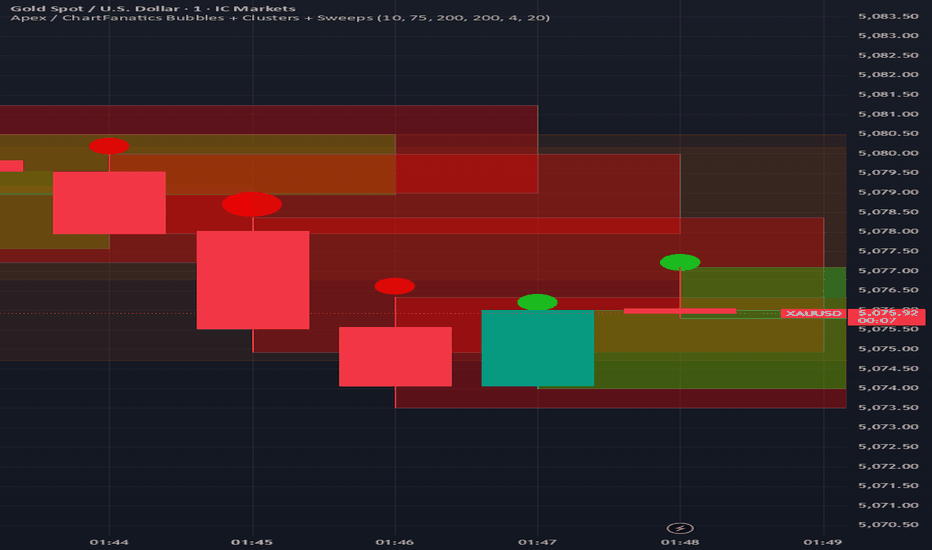
This open-source indicator combines four visual elements — Volume Bubbles, Volume Clusters, Liquidity Sweep Markers, and Dynamic Supply/Demand Zones — into a single overlay tool. The goal is to provide traders with a unified view of volume intensity, aggressive price action, and key institutional reference levels on any timeframe or instrument.
Why this combination?
Many volume and structure tools exist separately, but combining them creates synergy:
- Volume Bubbles highlight relative volume strength instantly (quick glance at participation level).
- Volume Clusters emphasize high-volume bars as potential support/resistance areas.
- Liquidity Sweep markers flag classic "fakeout" or stop-hunt behavior (aggressive wicks that fail to sustain).
- Supply/Demand zones provide context for where price is likely to react after sweeps or clusters form.
Together, these elements help traders spot:
- Areas of high institutional interest (clusters + zones)
- Potential reversals after liquidity grabs (sweeps + zones)
- Confirmation of momentum via volume size and candle direction (bubbles + clusters)
This mashup is not random — it follows a logical Smart-Money / Order-Flow inspired workflow: detect volume → identify aggressive liquidity raids → map reaction zones → visualize everything for fast decision-making.
Core Features & How They Work
1. Volume Bubbles (Quantile-Based)
- Volume is ranked against a rolling lookback (default 200 bars).
- Dynamic quantiles divide the volume range into buckets (default 10 levels).
- Bubble size scales with quantile rank (tiny → huge).
- Color: bright green (bullish close) or bright red (bearish close), with adjustable opacity.
- Only shown when volume exceeds 1.2× the lookback minimum (avoids noise).
- Tooltip shows exact volume, delta (close-open), and quantile position.
2. Volume Clusters
- Draws semi-transparent boxes around bars exceeding a user-defined minimum volume.
- Width adjustable (default 4 bars forward) to highlight clusters visually.
- Same bullish/bearish coloring as bubbles for consistency.
3. Liquidity Sweeps
- Detects classic sweep patterns on the previous bar:
→ Bullish sweep: high > previous high, but close < previous high AND bearish candle
→ Bearish sweep: low < previous low, but close > previous low AND bullish candle
- Marked with a bright yellow star (★) label + tooltip.
- Useful for identifying potential stop hunts or failed breakouts.
4. Supply & Demand Zones
- Uses pivot high/low (default lookback 20 left/right) to detect swing points.
- Supply zone: from pivot high downward by 2× ATR(14).
- Demand zone: from pivot low upward by 2× ATR(14).
- Zones extend rightward dynamically (up to +30 bars) and remain visible until new pivots form.
- Brownish for supply (resistance), greenish for demand (support).
Inputs & Customization
- Bubble Quantiles (3–15): more levels = finer volume grading
- Bubble Opacity: controls transparency
- Volume Lookback: historical window for quantile calculation
- Cluster settings: toggle, min volume, width
- Sweeps & Zones: individual toggles
- Zone Pivot Lookback: sensitivity of swing detection
How to Use
- Best on lower timeframes (1m–15m) for scalping/day trading or higher (1h–4h) for swing setups.
- Look for confluence:
→ Large green bubble + cluster + demand zone + bullish sweep = strong support area
→ Large red bubble + cluster + supply zone + bearish sweep = strong resistance area
- Use sweeps as early warning of potential reversal when price approaches a zone.
- Combine with your own price action or structure analysis — this is a visual aid, not a signal generator.
- Keep chart clean: toggle off unused features if cluttered.
Publishing Notes
- Publish with a clean chart (only this indicator active, no other overlays/drawings).
- Recommended symbols: volatile instruments (forex majors, indices, crypto, gold).
- Max labels/boxes set high (500) to handle long histories — reduce if performance issues occur.
This script is fully open-source for transparency and learning. It is provided for educational purposes — no guarantees of profitability. Trading involves risk.
Feedback welcome — happy charting! Gösterge
Volumetric Supply and Demand Zones [BOSWaves]Volumetric Supply and Demand Zones - Impulse-Based Zone Detection with Embedded Volume Profile Analysis
Overview
Volumetric Supply and Demand Zones is an impulse-driven zone identification system that marks significant reversal areas through swing detection and volume accumulation patterns, where zone boundaries dynamically reflect actual trading activity concentration rather than arbitrary price levels.
Instead of relying on traditional horizontal support/resistance lines or fixed pivot structures, zone placement, thickness, and volumetric composition are determined through ATR-normalized impulse detection, volume profile distribution analysis, and delta decomposition within base formation periods.
This creates adaptive supply and demand boundaries that reflect actual volume accumulation patterns rather than simple price extremes - contracting zones around high-volume concentration areas when profile shows tight distribution, expanding zones during dispersed volume activity, and incorporating positive/negative delta breakdowns to reveal whether zones formed under buying or selling pressure dominance.
Price interactions are therefore evaluated relative to volume-weighted zone structures and point-of-control levels rather than conventional naked price zones.
Conceptual Framework
Volumetric Supply and Demand Zones is founded on the principle that meaningful reversal zones emerge where significant volume accumulated during consolidation before impulse moves rather than at simple swing high/low pivot points.
Traditional supply and demand methods identify zones using price structure alone through swing detection or candlestick patterns, which often ignores the underlying volume distribution and buying/selling pressure that validates institutional accumulation or distribution. This framework replaces price-only logic with volume-weighted zone construction informed by actual trading activity concentration and delta composition.
Three core principles guide the design:
Zone boundaries should encompass base formation periods preceding impulse moves, not isolated pivot candles alone.
Volume profile distribution within zones must reveal where actual trading activity concentrated, identifying true points of control.
Delta decomposition exposes whether zones formed under buying pressure (demand accumulation) or selling pressure (supply distribution).
This shifts supply and demand analysis from naked price levels into volume-validated, delta-aware institutional footprint zones.
Theoretical Foundation
The indicator combines swing pivot detection, ATR-based impulse measurement, volume profile construction, and delta decomposition analysis.
A pivot detection system identifies local swing highs and lows using configurable left/right bar parameters. Impulse validation measures the subsequent price move magnitude relative to ATR, confirming whether the swing preceded a significant directional thrust. Zone boundaries encompass a lookback period of candles forming the base, with maximum height capped by ATR multiplier to prevent excessively large zones. Volume profile divides each zone into horizontal rows, distributing volume proportionally based on price overlap and identifying the point of control (highest volume row). Delta profile separates volume into buying versus selling components using close-open relationships, revealing net directional pressure within each profile row.
Five internal systems operate in tandem:
Swing Detection Engine : Identifies pivot highs and lows using symmetrical left/right bar confirmation for potential zone anchor points.
Impulse Validation System : Measures price movement magnitude following pivot formation, requiring ATR-multiple threshold breach to confirm zone significance.
Volume Profile Constructor : Divides zone height into configurable rows, allocates volume proportionally based on bar price range overlap with each row, identifies POC as highest-volume row.
Delta Decomposition Engine : Separates volume into buying (up-close bars) versus selling (down-close bars) components within each profile row, calculates net delta and dominant pressure direction.
Zone Merge Logic : Detects overlapping zones of same type (supply/supply or demand/demand), combines boundaries and recalculates volume/delta statistics with weighted blending.
This design allows supply and demand zones to reflect actual volume accumulation reality rather than reacting mechanically to price pivots alone.
How It Works
Volumetric Supply and Demand Zones evaluates price through a sequence of volume-aware zone construction processes:
Pivot Identification : Swing detection algorithm identifies local highs and lows using configurable left/right bar symmetry, marking potential reversal zone anchors.
Impulse Magnitude Validation : Following pivot formation, price movement measured relative to ATR over lookback period - move must exceed ATR multiplier threshold to confirm zone validity.
Base Period Boundary Definition : Zone encompasses pivot bar plus configurable lookback candles forming the consolidation base preceding impulse move.
Height Normalization : Raw zone height (high to low of base period) capped at maximum ATR multiplier to prevent zones becoming unreasonably large during extended consolidations.
Volume Profile Row Allocation : Zone divided into configurable number of horizontal rows, each bar's volume distributed proportionally based on price range overlap with row boundaries.
Point of Control Identification : Row with highest accumulated volume marked as POC, representing price level with maximum trading activity concentration within zone.
Delta Component Separation : Each bar's volume classified as buying (close > open) or selling (close < open), allocated to respective delta buckets within overlapping profile rows.
Delta Profile Construction : Net delta (buy volume minus sell volume) calculated per row, rendered as horizontal bars extending from zone right edge inward with green (positive) or red (negative) coloring.
Overlap Detection and Merging : New zones checked against existing zones of same type, overlapping zones within merge gap threshold combined with boundary expansion and volume/delta statistics aggregation.
Mitigation Detection : Price interaction monitoring using configurable method (wick or close) determines when zones violated, triggering zone deletion and cleanup of all visual elements.
Together, these elements form a continuously updating supply and demand framework anchored in volume accumulation reality and delta pressure composition.
Interpretation
Volumetric Supply and Demand Zones should be interpreted as volume-validated institutional footprint zones:
Demand Zones (Green) : Form at swing lows preceding upward impulse moves exceeding ATR threshold - represent areas where buyers accumulated positions before markup phase, volume profile shows where bids concentrated.
Supply Zones (Red) : Establish at swing highs preceding downward impulse moves exceeding ATR threshold - identify areas where sellers distributed positions before markdown phase, volume profile shows where offers concentrated.
Volume Profile Bars : Horizontal bars extending from zone left edge show relative volume distribution across price levels - longer bars indicate higher trading activity, revealing true institutional accumulation/distribution levels versus arbitrary zone edges.
Point of Control Line (White) : Horizontal line within zone marks price level with maximum volume concentration - represents the most significant institutional activity level, often acts as magnetic price level during retests.
Delta Profile Bars : Horizontal bars extending from zone right edge inward display net buying/selling pressure per price level - green bars show buy volume dominance (accumulation), red bars show sell volume dominance (distribution).
Zone Info Box : Text panel on right edge displays zone type (SUPPLY/DEMAND), status (Fresh/Tested), total volume, net delta, and touch count - provides quantitative validation of zone significance.
Fresh Status : Newly created zones not yet tested by price - highest probability reversal zones as institutional orders likely remain unfilled.
Tested Status : Zones where price returned and interacted with boundaries - touch count reveals how many times zone provided support/resistance, excessive touches suggest weakening.
Merged Zones : Wider zones with higher volume/delta values formed by combining multiple overlapping base periods - represent extended institutional accumulation/distribution areas with greater significance.
POC Brightness : Brightest (white) volume profile bar marks point of control - visual emphasis highlights the most critical price level within zone structure.
Volume distribution shape, POC placement, delta composition, and touch count outweigh simple zone boundary reactions.
Signal Logic & Visual Cues
Volumetric Supply and Demand Zones presents zone interaction insights rather than discrete directional signals:
Fresh Zone Formation : New supply or demand zone created when swing pivot followed by ATR-threshold impulse - suggests institutional footprint left behind, high-probability reversal area established.
First Retest (Fresh → Tested) : Price returning to previously untouched zone triggers status change and touch increment - historically highest-probability reaction level as unfilled orders likely remain.
POC Magnetic Behavior : Price gravitating toward white POC line during zone interaction - suggests institutional activity concentration level acting as support/resistance within broader zone.
Volume Profile Asymmetry : Profile showing volume concentrated at zone edge versus center reveals base formation character - edge concentration suggests quick accumulation before impulse, center concentration indicates prolonged consolidation.
Delta Divergence Patterns : Demand zones showing negative delta profile (red bars dominant) or supply zones showing positive delta (green bars) reveal weak zone formation - pressure composition conflicted with expected direction.
Delta Confirmation Patterns : Demand zones with strong positive delta (green bars) or supply zones with strong negative delta (red bars) validate institutional conviction - pressure aligned with expected reversal direction.
Excessive Touch Degradation : Touch count exceeding 3-4 interactions suggests zone weakening - repeated tests consume institutional orders, reducing reversal probability.
Mitigation Events : Price closing beyond zone boundaries (or wicking through, based on settings) triggers zone deletion - invalidation confirms institutional levels failed, trend continuation likely.
The primary value lies in volume-validated zone structure and delta composition analysis rather than simple boundary touches.
Strategy Integration
Volumetric Supply and Demand Zones fits within institutional footprint and order flow-aware trading approaches:
Fresh Zone Reversal Entries : Enter counter-trend positions at first retest of fresh zones with strong delta confirmation - unfilled institutional orders provide high-probability reaction levels.
POC-Precise Limit Orders : Place entries at POC line rather than zone edges - point of control represents maximum volume concentration, offering tighter stop placement and better risk/reward.
Delta-Filtered Zone Selection : Prioritize demand zones showing positive net delta and supply zones showing negative net delta-aligned pressure composition validates institutional conviction.
Volume Profile Distribution Analysis : Favor zones with tight volume concentration (profile bars clustered) over dispersed distribution - concentrated profiles suggest decisive institutional accumulation/distribution.
Merge-Enhanced Conviction : Treat merged zones with higher volume/delta totals as stronger reversal candidates - combined statistics represent extended institutional activity periods.
Touch Count Degradation Filtering : Reduce position sizing or avoid zones with 3+ touches - excessive interaction depletes institutional orders, weakening reversal probability.
Trend Continuation via Mitigation : Enter breakout positions when price closes beyond supply zones (uptrend) or demand zones (downtrend) - mitigation confirms trend strength overwhelming institutional levels.
Multi-Timeframe Zone Confluence : Apply higher-timeframe zones for macro structure, use lower-timeframe volume profile to identify precise entry levels within larger zones.
Technical Implementation Details
Core Engine : Pivot detection with symmetrical left/right confirmation, ATR-normalized impulse validation
Zone Construction : Base period lookback with ATR-capped height normalization and time-based extension
Volume Profile System : Proportional volume allocation across configurable rows with overlap percentage calculation
Delta Engine : Close-open relationship classification separating buy/sell volume with net delta calculation per row
POC Identification : Maximum volume row detection with visual emphasis rendering
Merge Logic : Overlap detection with gap threshold, boundary expansion, and weighted statistic aggregation
Visualization : Multi-element rendering (zone boxes, profile bars, delta bars, POC lines, info panels) with proportional sizing
Performance Profile : Custom type system for zone/profile/delta management, efficient array-based storage with configurable zone limits
Optimal Application Parameters
Timeframe Guidance:
1 - 5 min : Micro-structure supply/demand for scalping with tight ATR multipliers and reduced lookback
15 - 60 min : Intraday institutional footprint zones with balanced profile row count and merge sensitivity
4H - Daily : Swing-level accumulation/distribution areas with extended lookback periods and wider merge gaps
Weekly - Monthly : Macro institutional zones with maximum profile detail and extended zone persistence
Suggested Baseline Configuration:
Swing Length : 8
Impulse Size (ATR) : 1.2
Base Lookback Candles : 3
ATR Length : 14
Maximum Zone Height (ATR) : 4.0
Maximum Zones : 10
Extend Zones (bars) : 60
Merge Overlapping Zones : Enabled
Merge Gap (ATR) : 0.3
Mitigation Type : Wick
Profile Rows : 10
Profile Width (%) : 0.5
Show POC Line : Enabled
Show Delta Profile : Enabled
Delta Profile Width (%) : 0.35
Show Zone Info Box : Enabled
These suggested parameters should be used as a baseline; their effectiveness depends on the asset's volatility profile, volume characteristics, and preferred zone sensitivity, so fine-tuning is expected for optimal performance.
Parameter Calibration Notes
Use the following adjustments to refine behavior without altering the core logic:
Too many zones cluttering chart : Increase Swing Length (10 - 12) to demand stronger pivots, or increase Impulse Size multiplier (1.5 - 2.0) to require larger moves for zone validation.
Missing significant reversal levels : Decrease Swing Length (5-6) for earlier pivot detection, or reduce Impulse Size (0.8 - 1.0) to capture smaller but valid base formations.
Zones too large/tall : Reduce Maximum Zone Height ATR multiplier (2.5 - 3.0) to cap vertical size, or decrease Base Lookback Candles (1 - 2) for tighter base periods.
Zones too small to be useful : Increase Base Lookback Candles (4 - 6) to encompass longer consolidation periods, or raise Maximum Zone Height (5.0 - 7.0) for taller zones.
Profile bars too granular : Decrease Profile Rows (6 - 8) for coarser distribution showing major volume clusters only.
Profile lacking detail : Increase Profile Rows (15 - 20) for finer resolution revealing subtle volume distribution nuances.
Zones merging too aggressively : Decrease Merge Gap ATR multiplier (0.1 - 0.2) to require tighter overlap for merge qualification, or disable merging entirely.
Related zones not combining : Increase Merge Gap (0.5 - 0.8) to allow merging of zones with larger separation distances.
Zones invalidating prematurely : Switch Mitigation Type from "Wick" to "Close" to require closing violation rather than intrabar penetration.
Zones persisting too long after breach : Switch Mitigation Type from "Close" to "Wick" for faster invalidation on initial penetration.
Profile bars invisible : Increase Profile Width percentage (0.6 - 0.8) for longer bars, improving visibility on cluttered charts.
Delta profile obscuring volume profile : Reduce Delta Profile Width (0.2 - 0.3) to prevent overlap, or disable delta display temporarily.
Adjustments should be incremental and evaluated across multiple session types rather than isolated market conditions.
Performance Characteristics
High Effectiveness:
Range-bound and mean-reverting markets where institutional zones provide reliable turning points
Instruments with consistent volume characteristics where profile distribution reveals true accumulation/distribution
Swing trading approaches targeting zone-to-zone reactions with defined risk parameters
Reversal strategies seeking volume-validated entry levels rather than blind counter-trend positions
Markets where delta proxy correlates well with actual order flow (trending volume instruments)
Position trading benefiting from macro supply/demand structure with embedded volume context
Reduced Effectiveness:
Extremely low volume environments where profile distribution becomes unreliable and sparse
News-driven or gapped markets where zones form/invalidate without normal volume accumulation patterns
Highly trending markets where zones consistently mitigate without providing reversal opportunities
Instruments with erratic volume patterns making delta decomposition and profile interpretation misleading
Very high-frequency timeframes (seconds) where base formation periods too short for meaningful volume accumulation
Integration Guidelines
Confluence : Combine with BOSWaves structure, market profile, or traditional technical analysis for zone validation within broader context
Volume Profile Respect : Trust POC levels and high-volume profile bars over arbitrary zone edges for entry/exit precision
Delta Confirmation Priority : Favor zones where delta composition aligns with expected direction - positive delta in demand, negative delta in supply
Fresh Zone Preference : Prioritize first retests of untouched zones over repeatedly tested areas with high touch counts
Merge Recognition : Treat merged zones with elevated volume/delta statistics as higher-conviction institutional footprint areas
Touch Count Filtering : Reduce position sizing or avoid zones after 3+ touches as institutional order depletion reduces effectiveness
Mitigation Discipline : Exit zone-based positions decisively when price closes beyond boundaries, respecting invalidation signals
Multi-Timeframe Structure : Apply higher-timeframe zones for swing structure, use lower-timeframe profiles for tactical entry refinement
Disclaimer
Volumetric Supply and Demand Zones is a professional-grade supply/demand zone and volume profile analysis tool. It uses volume-based delta proxy to estimate directional pressure but does not access true order book data or institutional trade information. Results depend on market conditions, volume reliability, ATR characteristics, parameter selection, and disciplined execution. Volume profile and delta calculations represent approximations based on close-open relationships and price overlap formulas, not actual bid/ask transactions. BOSWaves recommends deploying this indicator within a broader analytical framework that incorporates price structure, order flow context, and comprehensive risk management. Gösterge

Mouchli Zone Projection ToolZone Projection Tool
The Problem: Manually drawing zones is tedious. You have to identify the consolidation, measure the distance, find the 50% line, and then manually clone/stack boxes up and down the chart. If you switch assets or timeframes, you have to do it all over again.
The Solution: This custom Pine Script automates the entire mathematical process. You simply define your two "Anchor Zones" (current support and resistance), and the script instantly builds the entire grid for you—perfectly spaced and optimized.
Key Features:
⚡ Automated Stacking: Input your bottom zone and top zone. The script calculates the exact center, determines the "grid step," and automatically projects zones UP and DOWN the chart.
📊 Multi-Asset Manager: Save your levels for up to 5 different assets (e.g., QQQ, ES, NVDA, SPY, BTC) in one single indicator. The script is smart—it automatically detects which chart you are looking at and loads the correct levels instantly.
🗓️ Daily & Weekly Overlays: Input both Daily Zones (Purple) and Weekly Zones (Orange) for the same asset. You can view them simultaneously to see where short-term and long-term structures overlap.
🎛️ Toggle Controls: Includes "Show/Hide" checkboxes for every zone set. Want to focus only on the Daily levels? Uncheck the Weekly box, and they disappear instantly without deleting your data.
📍 The "Halfway" Line: Automatically calculates and draws the dashed 50% transition line between every zone, identifying the "no-man's-land" where price often pivots.
How it works:
Add the indicator to your chart.
Open the Settings (gear icon).
Select your Ticker (e.g., Asset 1 = QQQ).
Enter your "Anchor" prices for Zone 1 (Support) and Zone 2 (Resistance).
Set your Projection UP and Projection DOWN counts to determine how far the grid extends.
The script will automatically draw the 50% lines and project the zones for you.
Gösterge

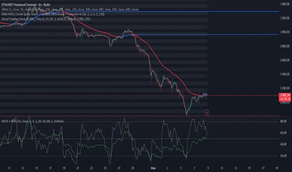
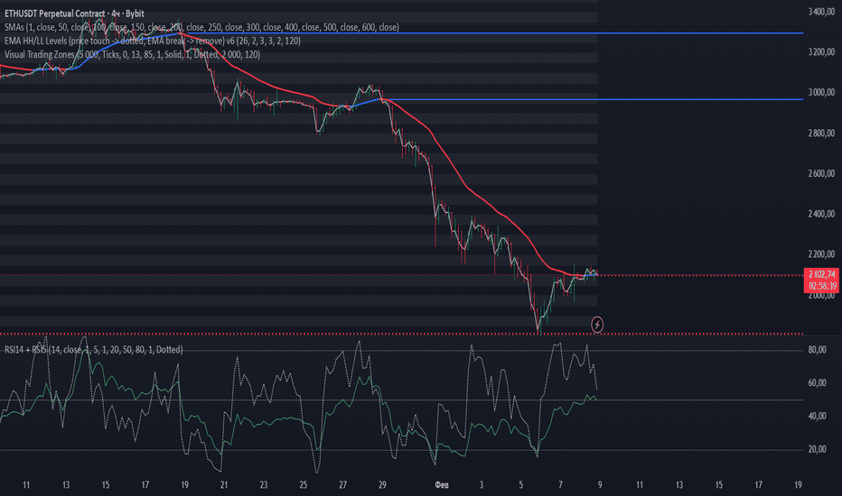
Visual Trading ZonesVisual Trading Zones is a chart-based indicator designed to display clear and structured price zones using evenly spaced levels.
The indicator automatically builds horizontal zones across the visible price range and helps traders visually identify potential areas of interest such as support, resistance, and reaction zones.
Key Features
Displays horizontal price zones with a fixed step
Optional main levels and sub-levels inside each zone
Clean and minimal visual presentation
Works on any market and timeframe
Fully customizable colors, line styles, and zone transparency
No signals, no alerts — purely visual analysis tool
How It Works
Price zones are constructed using a user-defined step size.
Each zone is visually highlighted, allowing traders to quickly see how price interacts with these areas over time.
The indicator does not repaint and does not generate trading signals.
It is intended to be used as a visual framework alongside any trading strategy.
Recommended Use
Identifying potential support and resistance zones
Market structure and range analysis
Confluence with price action, indicators, or volume tools
⚙️ Settings Overview
Step — distance between price zones
Step Unit — ticks or pips (for FX instruments)
SubLevels — number of internal levels within each zone
Show Zones / Lines / Prices — visual display options
Range Bars — number of bars used to build zones
Style Settings — colors, line styles, transparency Gösterge
Malaysian SnR Kai[DoN]
This indicator is a sophisticated trading tool based on Malaysian SnR (Support and Resistance) techniques. It is designed to identify high-probability reversal and continuation zones by filtering market noise and tracking the "life cycle" of a price level.
Here is a detailed explanation of its core features and logic:
1. SMA 21 "Quality Control" Filter
Unlike standard indicators that mark every pivot point, this script uses the 21-period Simple Moving Average (SMA) as a quality filter:
Resistance (A-Peaks): Only peaks that form above the SMA 21 are drawn.
Support (V-Bottoms): Only troughs that form below the SMA 21 are drawn.
The Logic: Sharp peaks/troughs that deviate from the moving average represent strong momentum and clear market rejection. These levels are much more likely to be respected by institutional traders.
2. Dynamic Role Reversal (RBS & SBR)
The indicator automatically tracks when a level's "role" changes, a concept central to Price Action trading:
RBS (Resistance Become Support): When a previously confirmed Resistance (A-Peak) is broken to the upside, it turns into a potential Support zone.
SBR (Support Become Resistance): When a confirmed Support (V-Bottom) is broken to the downside, it turns into a potential Resistance zone.
Auto-Delete (Invalidation): If price breaks through an RBS or SBR line again (violating the new role), the indicator instantly removes the line. This ensures your chart only shows levels that are currently valid.
3. Proximity Filter (Top 2 Closest)
To prevent "chart clutter," the script includes an intelligent filtering system for historical lines:
It calculates the distance between the current price and all active RBS/SBR lines.
It only displays the top 2 closest lines to the current price.
This keeps your focus on the levels that matter most for your next trade.
4. Higher Timeframe (HTF) Confluence
The indicator overlays SnR levels from a Higher Timeframe (e.g., Daily or 4H) onto your current chart:
These are displayed as dashed lines.
Trading Tip: When a Current Timeframe RBS/SBR level aligns with an HTF level, you have a "Confluence Zone," which significantly increases the win rate of a setup.
5. Advanced Visuals
Zones (Boxes): Instead of a thin line, the indicator draws a box (zone) that includes the price action near the peak/trough, acknowledging that SnR is an area, not a specific pip.
Labels at Origin: Labels (e.g., "V: 1.0850") are placed at the exact starting point of the level. This allows you to quickly see which specific historical move created the current level.
Future Extension: All active lines are extended into the future, providing a clear visual guide for where price might react next.
How to Use It in Your Strategy
Pullback Trading: Wait for the price to return to a cyan (Support) or orange (Resistance) zone. Look for rejection candles (pin bars, engulfing) within the box.
Role Reversal Entry: Watch for the price to retest an RBS (Resistance Become Support) line after a breakout. This is a classic "Buy the Dip" entry in an uptrend.
Confluence: The strongest signals occur when the price hits a Current TF line and an HTF dashed line at the same time.
Risk Management: If a line disappears from your chart, the "logic" for your trade has been invalidated. This can serve as a signal to close a position or move your stop loss.
Summary
This tool is built for traders who value clean charts and high-conviction levels. It automates the tedious work of drawing and deleting lines, allowing you to focus purely on price reaction at key decision points.
このインジケーターは、マレーシアスタイルのFX手法(特にSnRや役割転換を重視する手法)に基づいた、**「高勝率な反発・押し目ポイントを自動描画する」**ための非常に高度なツールです。
主な特徴は、SMA21によるフィルタリングと、役割転換(RBS/SBR)の自動管理にあります。
各機能の解説を以下にまとめました。
1. SMA21 フィルター(品質の選別)
ただの山や谷をすべて描画するのではなく、移動平均線(SMA21)を使って「意味のあるポイント」だけを抽出します。
Aライン(レジスタンス / 山): 頂点がSMA21より上にある場合のみ描画。
Vライン(サポート / 谷): 底がSMA21より下にある場合のみ描画。
理由: 移動平均線から乖離した位置にある「鋭い山・谷」は、市場参加者に意識されやすく、強い反発根拠になるためです。
2. ロールリバーサル(RBS/SBR)の自動管理
このインジケーターの最も強力な部分です。ラインが破られた後の「役割の交代」を追跡します。
RBS (Resistance Become Support):
元々「Aライン(山)」だったレジスタンスが、価格に上抜かれた後、今度は「サポート」として機能している状態。
SBR (Support Become Resistance):
元々「Vライン(谷)」だったサポートが、価格に下抜かれた後、今度は「レジスタンス」として機能している状態。
自動削除(再ブレイク判定):
一度役割が転換したライン(RBS/SBR)でも、価格が再びそのラインを突き抜けた場合、そのラインは「無効」とみなして自動的に削除されます。これにより、常に「現在有効なライン」だけがチャートに残ります。
3. 近接フィルター(情報の整理)
チャートがラインだらけになるのを防ぐため、RBSとSBRの履歴ラインは**「現在値に近い順に最大2本まで」**しか表示されません。常に今すぐトレードに役立つラインに集中できます。
4. HTF(上位足)SnRの重ね合わせ
現在の足よりも上位(例:日足や4時間足)の重要なラインを点線で表示します。
下位足でのエントリーポイントが、上位足のラインと重なっていれば、それは非常に強力な「コンフラウンス(根拠の重なり)」となります。
5. ビジュアル(視覚的な工夫)
ゾーン表示(ボックス): ライン単体ではなく、ヒゲを含めた「帯」として意識するためのボックスを描画します。
起点ラベル: ラベルをラインの発生源(起点)に表示することで、過去のどの山・谷から引かれたラインなのかが一目でわかります。
未来延長: リアルタイムでラインが右側に伸びるため、将来の反発予測がしやすくなっています。
トレードでの活用例
押し目買い/戻り売り:
SMA21フィルターを通った新鮮なA/Vライン、または現在表示されているRBS/SBRラインに価格が戻ってきたところを狙います。
根拠の重なり(合流):
現在の足のRBSラインと、上位足(点線)のサポートラインが同じ価格帯にある場合、そこは非常に強い反発ポイントになります。
損切りの目安:
表示されているラインを価格が実体で明確に抜けると、インジケーターからそのラインが消えます。これは「根拠が崩れた」サインであり、損切りの判断材料になります。
まとめ
このインジケーターは、**「トレンドの中での目立った節目」を見つけ、それが「役割を変えてからも機能しているか」**を自動で監視してくれる、トレーダーの環境認識を大幅に短縮するツールです。 Gösterge

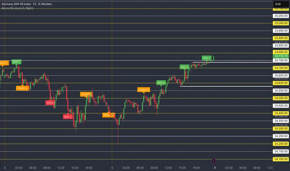
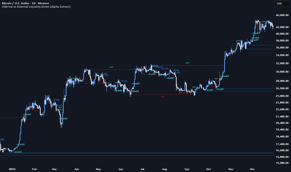
Internal vs External Liquidity Zones [Alpha Extract]A sophisticated dual-timeframe market structure visualization system that identifies and maps internal (short-term) and external (long-term) liquidity levels with comprehensive Break of Structure (BOS) and Change of Character (CHoCH) detection across both timeframes. Utilizing pivot-based zone creation with ATR-scaled heights and sweep classification, this indicator delivers institutional-grade liquidity mapping distinguishing between major swing liquidity (external) and minor retracement liquidity (internal) for multi-dimensional market structure analysis. The system's hierarchical structure framework combined with objective arrow projection and state-based zone coloring provides complete smart money concept implementation for advanced order flow trading.
🔶 Understanding Internal vs External Structure
External Structure represents major swing points using longer pivot lengths (default 10 bars), identifying significant highs and lows that define the broader market range and trend direction. These are the key levels where large institutional positions likely exist, stop losses cluster, and major trend reversals may occur. External structure breaks (eBOS/eCHoCH) signal significant shifts in market sentiment and often precede sustained directional moves.
Internal Structure captures minor swing points within the external range using shorter pivot lengths (default 3 bars), revealing short-term liquidity pools formed during retracements, consolidations, and minor corrections. These represent areas where smaller participants' stops accumulate and where price often reacts before continuing toward external objectives. Internal structure breaks (iBOS/iCHoCH) provide early warning signals and tactical entry opportunities within the broader external trend context.
The relationship between internal and external structure creates a hierarchical framework: external zones define the "what" (overall bias and major objectives), while internal zones reveal the "how" (tactical path and entry models). When internal structure breaks bullish while within an external bearish range, it signals potential reversal setup. When internal breaks align with external direction, it confirms trend strength.
🔶 Advanced Dual-Pivot Detection Framework
Implements separate pivot calculation systems for external and internal structure with configurable lookback periods optimizing for different swing magnitudes. The system identifies external pivots using extended length capturing major swing extremes, detects internal pivots using compressed length for minor retracement highs/lows, and optionally requires internal pivots occur within current external range boundaries ensuring hierarchical structure coherence.
// Dual Structure Detection
External_Pivot_High = ta.pivothigh(high, External_Length, External_Length)
External_Pivot_Low = ta.pivotlow(low, External_Length, External_Length)
Internal_Pivot_High = ta.pivothigh(high, Internal_Length, Internal_Length)
Internal_Pivot_Low = ta.pivotlow(low, Internal_Length, Internal_Length)
// Optional Range Requirement
Valid_Internal = requireInside ? (pivot within ) : true
🔶 BOS and CHoCH Detection System
Break of Structure (BOS) occurs when price breaks a recent structure point in the direction of the current trend, confirming trend continuation. The system identifies BOS when:
Price breaks above previous high while trend remains bullish (bullish BOS)
Price breaks below previous low while trend remains bearish (bearish BOS)
Previous structure point hasn't been violated yet
Change of Character (CHoCH) signals potential trend reversal when price breaks structure counter to the established trend direction. The system detects CHoCH when:
Price breaks above previous high while trend was bearish (bullish CHoCH - reversal signal)
Price breaks below previous low while trend was bullish (bearish CHoCH - reversal signal)
Both external (e-prefix) and internal (i-prefix) structures generate independent BOS/CHoCH labels, enabling multi-timeframe structure analysis where eCHoCH may signal major reversal while iBOS confirms minor trend within that reversal.
🔶 Intelligent Zone Creation Architecture
Features ATR-based or tick-based zone height calculation with separate sizing for internal and external liquidity levels, creating visual boxes centered on pivot points. The system calculates zone dimensions using configurable ATR multiples (default 0.40x) or fixed tick counts, positions zones symmetrically above/below pivot levels, and applies distinct color schemes distinguishing external highs (red), external lows (white), internal highs (cyan), and internal lows (blue).
🔶 Equal High/Low Detection Mode
Provides advanced internal zone mode that only creates zones when consecutive internal pivots form equal highs or equal lows within ATR-based tolerance, filtering noise and highlighting significant accumulation/distribution patterns. The system tracks previous internal pivots, compares new pivots against tolerance threshold, creates averaged zone when equality detected, and ignores isolated pivots that don't form patterns, reducing visual clutter while emphasizing institutional liquidity clustering.
🔶 Comprehensive Sweep Classification System
Implements three sweep detection modes distinguishing between liquidity grabs and genuine breakouts with state-based zone coloring:
Wick Mode: Marks zone as swept when wick touches but close remains outside
Close Mode: Requires close through zone for sweep classification
Wick+Close Classify Mode: Distinguishes sweeps (S - wick touches, close outside) from breaks (B - close through zone)
The system transitions zones through three states: Active (0 - untouched), Swept (1 - liquidity grabbed), Broken (2 - fully breached), applying progressive transparency increases to visually distinguish state changes and enabling traders to identify false breakouts versus genuine structural violations.
🔶 Objective Arrow Projection Framework
Features intelligent objective labeling that triggers when internal zones are swept, projecting arrows pointing toward opposite external structure as probable targets. The system generates "->ExtH" labels when internal low swept (suggesting move toward external high) and "->ExtL" labels when internal high swept (suggesting move toward external low), providing smart money concept implementation where internal liquidity grabs often precede runs toward external objectives.
🔶 Dynamic Zone Management System
Maintains separate arrays for external and internal zones with configurable history modes and maximum zone limits. The system implements "Latest Only" mode (clears previous external zones of same side when new pivot detected) or "Keep History" mode (preserves all zones up to maximum limit), automatically expires oldest zones when limits reached, and optionally clears all internal zones when new external pivot forms, maintaining clean chart presentation while preserving relevant liquidity context.
🔶 Trend Momentum Scoring Engine
Calculates sophisticated trend state using dual-component analysis combining momentum (price change normalized by volatility) with strength (MA separation and slope alignment). The system generates TrendScore objects containing momentum value, strength percentage, direction (-1/0/+1), and confidence score (0-100), uses these scores to classify BOS versus CHoCH by comparing previous and current trend states, and provides objective structural classification beyond simple price level violations.
🔶 Adaptive Zone Extension Logic
Implements intelligent right-edge management where active zones extend to current bar but freeze at touch/sweep point when cut-on-touch enabled. The system continuously updates zone right boundaries during active state, locks boundary at bar of first violation, and maintains locked position through subsequent bars, creating visual history of when liquidity was accessed while preventing misleading forward projection of filled zones.
🔶 Multi-State Visual Feedback System
Provides comprehensive color and transparency modulation based on zone state with two visual style options. "Soft Fill" mode uses semi-transparent fills with subtle borders, while "Outline" mode displays only colored borders with transparent fills. The system applies progressive transparency increases: Active (light), Swept (medium), Broken (heavy), with independent control over fill and border transparency enabling customization from subtle hints to prominent highlighting.
🔶 Structure Line Visualization Architecture
Creates dashed horizontal lines connecting structure break points to current bar with BOS/CHoCH labels positioned at midpoint between break bar and detection bar. The system draws lines at exact structure level, applies color coding matching bullish (green) or bearish (red) classification, and uses compact labels (eBOS, eCHoCH, iBOS, iCHoCH) for instant structural event identification without cluttering chart with excessive text.
🔶 Performance Optimization Framework
Utilizes efficient array management with configurable maximum limits (default 120 zones each type), automatic cleanup of oldest elements, and optional hiding of filled zones reducing active object count. The system includes intelligent state tracking minimizing recalculation overhead, optimized sweep detection using simple comparison logic, and streamlined zone update loops processing only active zones for consistent performance across extended sessions.
🔶 Why Choose Internal vs External Liquidity Zones ?
This indicator delivers institutional-grade market structure analysis through hierarchical dual-timeframe liquidity mapping with comprehensive BOS/CHoCH detection. The distinction between external (major swing) and internal (minor retracement) structure provides complete smart money concept implementation where external zones define bias and targets while internal zones reveal tactical entries and stop hunts. The system's sweep classification distinguishes liquidity grabs from genuine breakouts, objective arrows project probable targets based on internal sweeps toward external levels, and comprehensive BOS/CHoCH labeling across both timeframes enables multi-dimensional structural analysis. Perfect for order flow traders implementing ICT concepts, liquidity-based strategies, or market maker models in cryptocurrency, forex, and futures markets where understanding the relationship between internal accumulation and external objectives is essential for high-probability trade location and proper risk management. Gösterge
Colidation Breakout Structure(HA-CBS)Overview
Most breakout indicators suffer from "noise," reacting to every minor price movement and producing frequent fakeouts. HA-CBS solves this by utilizing Heikin-Ashi (HA) smoothing and Swing Point analysis to isolate periods of extreme energy accumulation (Consolidation) and verifying the subsequent breakout with Fair Value Gaps (FVG) .
⚠️ Usage Note: This script is strictly optimized for Heikin-Ashi charts . The core logic relies on Heikin-Ashi body (Open/Close) calculations. To ensure the signals align perfectly with the price action you see, please switch your chart type to Heikin-Ashi.
How it Works: The HA-CBS Logic
Unlike generic indicators that draw signals instantly, HA-CBS follows a rigorous three-step verification process to ensure market displacement is real:
Structural Mapping: Using a multi-term swing point algorithm, the script identifies key supply and demand boundaries.
Consolidation Counting (The "Coil"): The script measures how many consecutive Heikin-Ashi bodies remain "tucked" within the structural range. A built-in CANDLE_MARGIN_RATE ensures that insignificant doji-like candles don't disrupt the count. The longer the "coil," the higher the potential for an explosive breakout.
Kinetic Validation (FVG): When price finally breaks the structural boundary, the script checks for a Fair Value Gap. An FVG-backed breakout confirms that institutional "Impulse" is present, distinguishing a genuine trend start from a mere stop-run.
Key Features
Impulse Filter: Filters out low-momentum movements by requiring an FVG at the moment of the structural break.
HA-Body Precision: Focuses on the "core" of the candle, ignoring volatile wicks that often lead to false signals.
Multi-Term Flexibility: Users can toggle between Short, Intermediate, and Long-term swing structures to suit scalping, day trading, or swing trading.
Recent Candidate Mode: Use the Recent Only toggle to keep your chart clean by only displaying the most recent and relevant breakout candidate for each structure.
Trading Strategy
Strategy A: The Impulse Entry (Aggressive)
Enter the trade as soon as the HA-CBS signal is confirmed (HA Close breaks the structure with an FVG). This captures the immediate momentum as a new supply/demand imbalance is established.
Strategy B: The Mitigation Entry (Conservative)
Wait for price to return (retrace) to the identified HA-CBS Block. Institutional players often "mitigate" their positions by returning to the breakout source. This approach typically offers a higher Risk/Reward ratio.
Gösterge

Gösterge

Gösterge

Gösterge
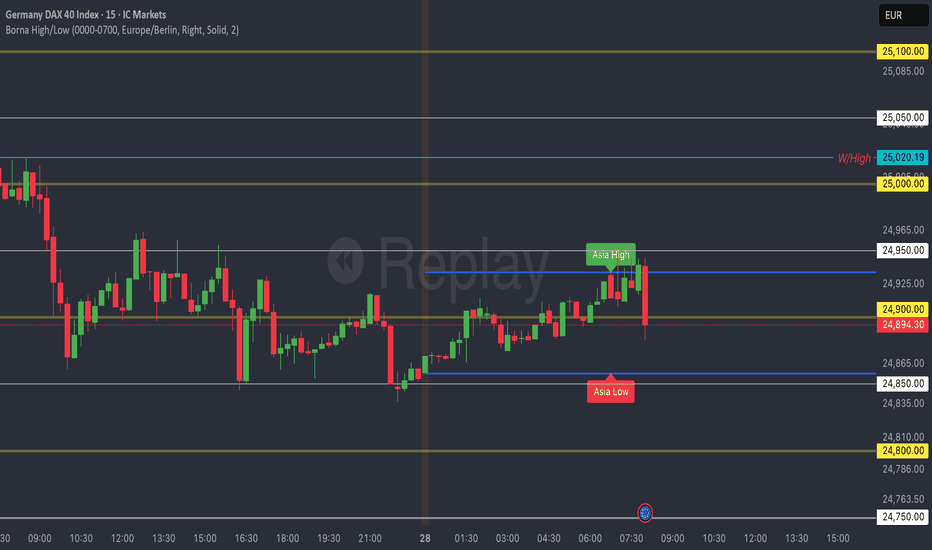
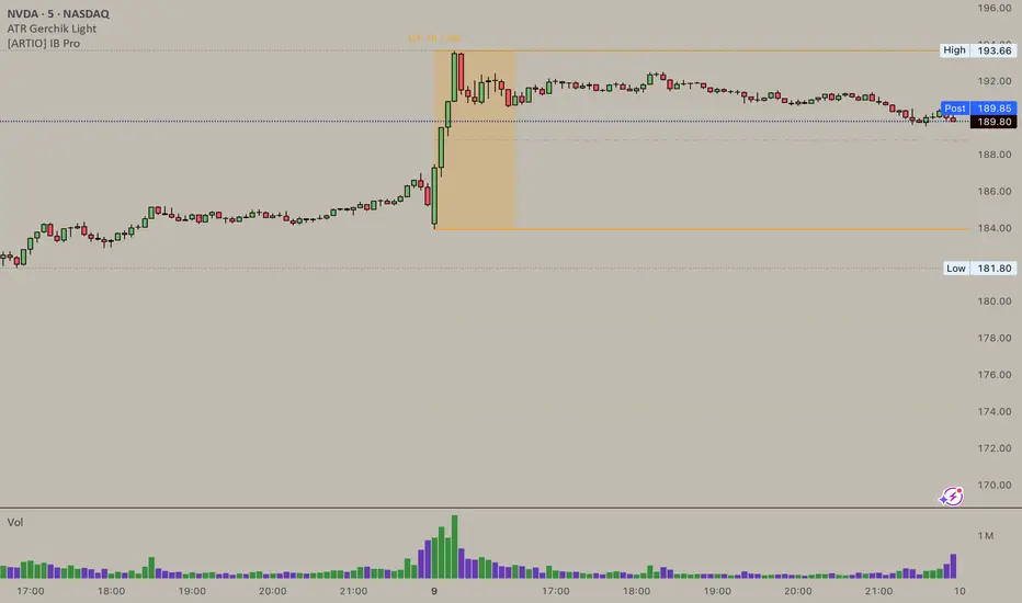
[CT] ORB SuiteThis indicator is an Opening Range first tool that also includes an Initial Balance framework, breakout detection, and a full target and alerting package. It is designed to define a clean Opening Range at the start of the regular trading session and then turn that range into an actionable breakout structure by plotting the key levels, projecting measured targets, and visually confirming the exact breakout candle on your chart. The Opening Range component can be configured as either the first bar of the session or a true time-based duration, such as 1, 2, 5, 10, 15, 30 minutes, or 1 hour, which lets you standardize the opening structure across different chart timeframes without needing to “count bars.” As price prints during the Opening Range window, the script continuously updates the OR high and OR low, then locks those levels once the window closes so you have a stable reference for the rest of the session. The OR area can be shaded for quick visual recognition, and an optional OR midpoint line and label can be displayed to help you judge whether price is accepting above the middle of the range or failing back through it.
Once the Opening Range is formed, the script upgrades the workflow by adding breakout qualification rules that you can control. You can choose confirmation based on a body cross, a close cross, or a close above or below the range boundary, which is a meaningful improvement over simple “touch” logic because it helps reduce false signals and makes the breakout trigger more consistent with how you actually trade. When a breakout is confirmed, the indicator can highlight the breakout candle itself so there is no ambiguity about which bar triggered the signal. You can highlight the candle body, the chart background, or both, and you can select separate colors for long and short breakouts. This makes chart review and live decision-making cleaner because you can immediately see where the breakout truly occurred instead of guessing between several candles that probed the level.
The next major upgrade is the breakout target system. After a long breakout, targets are calculated as true multiples of the Opening Range size, starting from the OR high and projecting upward by the selected multiples. After a short breakout, targets are calculated from the OR low and projected downward by the same multiple logic. By default, the script supports four take-profit targets, TP1 through TP4, with sensible preset multiples that step outward in a structured way, but you can customize each multiple to match your instrument and style. This target system is a practical enhancement because it provides objective, range-based profit-taking levels that align with common intraday expansion behavior rather than arbitrary fixed tick offsets. You also get full control over whether the target lines and labels appear only after a breakout triggers, which keeps the chart clean and prevents “pre-biasing,” or whether you want to see projected targets in both directions before the breakout occurs for planning and scenario mapping. In addition, the target hit detection is configurable so you can decide whether a target is considered “hit” by a simple high or low touch or only after a close crosses the target, which is important for traders who want stricter confirmation and cleaner backtesting logic.
Beyond the OR and targets, the indicator includes a complete Initial Balance module as an additional layer of structure. The IB duration is selectable and independent, and the script can plot IB high, IB low, and an optional IB midpoint, with optional fill shading to make the balance area obvious. A key upgrade here is the ability to base the breakout targets on either the Opening Range or the Initial Balance. This means you can run a pure OR breakout playbook, a pure IB breakout playbook, or compare both structures on the same session without changing indicators. This flexibility matters because OR breakouts tend to be more sensitive and earlier, while IB-based levels often better reflect the session’s early balance and can produce more stable expansion targets.
Another major improvement is the history and session management. The script can freeze all drawings at the end of the session so lines and fills do not incorrectly extend into the next day, and it can optionally keep a configurable amount of history, such as the last 20 sessions, so you can study how price reacts to prior OR and IB structures. You also have control over whether IB should be included in that stored history, which helps if you want a cleaner chart while still retaining the OR context. To support different chart themes and personal preferences, label styling is expanded with controls for label background colors, text colors, transparency, and horizontal offsets, so the levels remain readable without covering price action.
Finally, the alerting system is upgraded into a full set of actionable events. The indicator can generate alerts for session open and session close, for the moment the Initial Balance forms, for the moment the Opening Range forms, for long and short breakouts, and for each target hit from TP1 through TP4. Alerts can be used in standard alertcondition form or as dynamic alert() calls that include price-filled messages, which is a practical enhancement for traders who want their phone or desktop notifications to contain the exact level values rather than generic labels.
This script is a derivative work built on the original Initial Balance foundation authored by © czoa under the Mozilla Public License 2.0, with extensive additions and improvements by © ChaosTrader63 to expand it into a complete Opening Range and Initial Balance breakout suite. The core upgrades are the configurable time-based Opening Range, breakout candle highlighting, multi-target measured range projections through TP4 with optional pre-projection behavior, stricter breakout confirmation modes, target hit rules, richer history controls, stronger label customization, and a comprehensive alert system that turns the session structure into a usable trade planning and execution framework directly on TradingView. Gösterge

Volume Profile with HVN / LVN Detection (Low-TF Safe)Session-based volume profile with VPOC, HVN, and LVN detection, optimized for fast charts and runtime-safe lower-timeframe execution.
Volume Profile with HVN / LVN Detection (Low-TF Safe)
This indicator plots a session-based Volume Profile , highlights the Volume Point of Control (VPOC) , and automatically detects High Volume Nodes (HVNs) and Low Volume Nodes (LVNs) from the completed profile.
It is a performance-focused refactor of the original Volume Profile With HVN/LVN Detector , redesigned to work reliably on fast timeframes (including 5-second charts) without runtime errors.
Features
Session-based volume profile with adjustable row resolution
VPOC with optional extension and date labeling
Automatic HVN and LVN detection from the prior session
HVNs and LVNs displayed as levels or areas
Configurable strength, colors, and line/area styles
Runtime-safe lower-timeframe handling using request.security_lower_tf
Optimized to reduce execution overhead on high-frequency charts
Designed for traders who use volume structure to identify acceptance, rejection, and potential support/resistance zones across all chart timeframes.
---
What’s new in this version
Refactored lower-timeframe logic to prevent runtime errors on fast charts
Automatic, runtime-safe fallback when selected lower TF exceeds chart TF
Stable execution on very low timeframes (e.g. 5s, 10s)
Preserved original profile, VPOC, HVN, and LVN behavior
No repainting of completed session profiles
This update prioritizes stability, correctness, and cross-timeframe compatibility .
---
Credits & Attribution
This script is based on the original
“Volume Profile With HVN/LVN Detector”
by tradeforopp (revised by Madpuppy88 ).
The current version refactors the original implementation to improve:
Runtime safety on low timeframes
Performance on high-frequency charts
Robust multi-timeframe handling
Original concept and core logic credit remain with the original authors.
---
How to Use
VPOC highlights the price level of highest traded volume for the session and often acts as a magnet or balance point.
HVNs represent areas of acceptance where price previously traded heavily and may act as support/resistance or consolidation zones.
LVNs mark areas of rejection where price moved quickly and may act as inflection or breakout levels.
Use HVNs and LVNs from the prior session to frame intraday bias, targets, and risk zones.
On very fast charts, the script automatically falls back to chart-timeframe data to maintain stability.
Gösterge

Gösterge

ICT Bias ProICT Bias Pro: Dashboard + First Hour Range & Session FVGs
This indicator is a comprehensive "Bias Builder" designed for traders who follow Inner Circle Trader (ICT) concepts. It combines a multi-timeframe trend dashboard with a specific intraday strategy derived from ICT's recent teaching: "How Do I Engage Markets When I Don't Have An Initial Bias?"
The tool is designed to help traders find confluence between the Macro trend (Daily/4H) and the Micro execution (15M/5M) during the New York AM Session.
Features & Methodology
1. Multi-Timeframe Bias Dashboard Located in the corner of your chart, this dashboard provides a quick "Traffic Light" view of the market structure across 4 key timeframes:
Daily & 4-Hour: Establishes the macro direction.
15-Min & 5-Min: Monitors intraday order flow.
Logic: Bias is determined by comparing price relative to the 20 EMA and checking for Market Structure alignment. Green = Bullish, Red = Bearish.
2. The "First Hour" Trading Range (No-Bias Strategy) Following ICT’s specific logic for days when bias is unclear, this tool automatically highlights the 9:30 AM – 10:30 AM (New York Time) trading range.
Range High & Low: Defining the volatility of the opening hour.
Equilibrium (50%): The "Line in the Sand." Price holding above the 50% signals bullish strength (Premium); price below signals bearish weakness (Discount).
Quadrants (25% & 75%): Deep discount/premium zones for precision entries.
3. Session-Specific Fair Value Gaps (FVG) The indicator automatically detects and draws Fair Value Gaps that form only within that critical first hour of trading.
Auto-Extension: Boxes extend to the right until price "mitigates" (fills) them.
Consequent Encroachment (C.E.): Automatically plots the 50% dashed line inside every FVG, a key institutional support/resistance level.
Smart Mitigation: Once a gap is filled, the box changes color (user-selectable) to indicate it is no longer an active magnet.
How to Use This Indicator
This tool is designed to identify Confluence:
Check the Dashboard: Look for alignment on the Daily and 4H timeframes (e.g., Both Green).
Wait for 10:30 AM EST: Allow the script to draw the First Hour Range.
Trade the Confluence:
Bullish Setup: If the Dashboard is Green, look for price to hold above the 50% Equilibrium of the First Hour Range. Look for entries inside Bullish FVGs that form near the 50% or 75% levels.
Bearish Setup: If the Dashboard is Red, look for price to reject the 50% Equilibrium and stay in the lower half. Target Bearish FVGs near the 50% or 25% levels.
Settings & Customization
Dashboard Toggle: Show or hide the table to keep charts clean.
Colors: Fully customizable colors for Range High/Low, FVGs (Bullish/Bearish), and Mitigated gaps.
Text Positioning: Adjust FVG labels (Left/Center/Right) to prevent visual clutter on candles.
Credits & Attribution
Concept: Inner Circle Trader (Michael Huddleston).
Core Strategy: Based on the video "How Do I Engage Markets When I Don't Have An Initial Bias?"
Disclaimer: This tool is for educational purposes only. Past performance is not indicative of future results. Gösterge

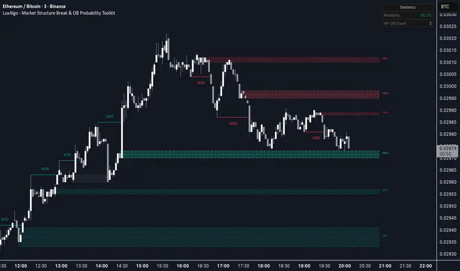
Market Structure Break & OB Probability Toolkit [LuxAlgo]The Market Structure Break & OB Probability Toolkit indicator provides an institutional framework for identifying high-probability liquidity zones and significant market structure transitions using momentum-based filters and volume analysis.
🔶 USAGE
The indicator aims to provide a systematic approach to structural analysis, allowing traders to identify clear institutional footprints. By integrating statistical filters, the tool helps isolate high-conviction signals from market noise.
🔹 Market Structure Breaks (MSB)
Unlike standard fractal-based breaks, the MSB logic in this toolkit utilizes a Momentum Z-Score filter . This ensures that structural shifts are only highlighted when price breaks a pivot with significant conviction.
Pivot Lookback: Custom sensitivity for identifying swing highs and lows.
Volatility Filtering: Only breaks exceeding the statistical threshold are labeled, helping traders avoid low-momentum fakeouts.
🔹 Institutional Order Blocks (OB)
The script automatically detects and manages Order Blocks based on the candle preceding an MSB. Every zone includes a Point of Control (POC) line for precise entry or target consideration.
Standard OBs: Formed during structural transitions, representing potential institutional interest.
High-Probability OBs (HP-OB): Zones identified with exceptionally high impulse and volume signatures (score > 80%). These are visually distinct to highlight their increased significance.
🔹 Session Range Integration
Traders can track the ranges of the London, New York, Tokyo, and Sydney sessions. This allows for the identification of structural breaks occurring at session extremes or during high-liquidity windows.
🔹 Strategy Application
Trend Direction: Identify the prevailing bias through MSB signals. A bullish MSB followed by a retracement into a Bullish OB provides a classic institutional entry scenario.
Zone Confluence: Look for High-Probability OBs that align with Session Highs/Lows for increased trade conviction.
Re-test Analysis: Enable "Extend Broken OBs" to see how price interacts with flipped liquidity zones.
🔶 DETAILS
The toolkit utilizes several advanced logic components to maintain chart clarity and analytical depth:
Intelligent Mitigation Logic: Active zones are managed in real-time. Traders can choose between "Historical" (shows all past zones) or "Present" (shows only active zones) display modes.
Mitigated Extension: A specialized feature to extend recently broken zones, allowing for re-test analysis of formerly active liquidity.
Overlap Filter: Option to hide overlapping Order Blocks to maintain a clean, actionable chart.
🔹 Analytics Dashboard
The built-in dashboard provides a real-time performance suite:
OB Reliability: A percentage-based efficiency metric tracking how many detected zones have been successfully mitigated by price.
High-Prob Zone Count: A live counter of active HP-OBs currently remaining on the chart.
🔶 SETTINGS
🔹 Market Structure
Pivot Lookback: Defines the sensitivity of the market structure detection by adjusting the lookback period for pivots.
MSB Momentum Z-Score: Sets the statistical threshold for a price move to be considered a valid structural break.
🔹 Visuals
Display Mode: Toggles between showing historical mitigated zones or only currently active ones.
🔹 Order Blocks
Max Active OBs: Controls the maximum number of blocks stored and displayed on the chart.
Extend Broken OBs: If enabled, recently mitigated blocks will remain visible to observe potential re-tests.
Hide Overlapping OBs: Removes redundant zones that occupy the same price area as existing ones.
🔹 Sessions
Show Session Ranges: Global toggle for session visualizations.
Session Toggles: Individual controls to enable London, New York, Tokyo, or Sydney ranges with custom time and color inputs.
Institutional trading concepts and Smart Money Concept (SMC) indicators involve significant risk. This tool is designed for educational and analytical purposes. Past performance is not indicative of future results. Gösterge

Gösterge

Power200EMA - MTF 200 EMA SuiteThe MTF 200 EMA Suite is a trend-confluence tool designed to reveal institutional support and resistance levels across multiple timeframes simultaneously. By plotting the 200-period Exponential Moving Average from six different time horizons onto a single chart, it allows you to identify "Power Zones" where various market cycles overlap.
Core Functionality
Multi-Timeframe Visibility: On a single lower-timeframe chart (like the 1m or 5m), you can see exactly where the 200 EMA sits on the 1m, 3m, 5m, 15m, 1h, and 4h horizons.
Institutional Benchmarking: The 200 EMA is the primary "line in the sand" used by institutional algorithms and bank traders to determine long-term trend bias.
Dynamic Clustering: When multiple EMA lines converge or "cluster" in one price area, it identifies a high-probability zone of institutional interest.
Floating Labels: Each line features an auto-updating label at the current price bar, allowing you to instantly identify which timeframe you are looking at without hovering over the plots.
Strategic Use
Trend Filter: Trade only in the direction where price is relative to the majority of the EMAs (e.g., only buy when price is above the 1h and 4h lines).
Mean Reversion: Use the higher-timeframe lines (1h/4h) as targets for price to return to during volatile over-extensions.
Support/Resistance: Use EMA clusters as "hard" barriers to place stops behind or to look for bounce-entry confluence. Gösterge

Core Market Levels [UkutaLabs]█ OVERVIEW
Core Market Levels is a precision trading indicator designed to identify the most important price levels where the market consistently makes decisions.
Rather than flooding the chart with unnecessary lines, this indicator focuses on core reference levels derived from recent price structure and market balance. These levels often act as high-probability areas of reaction, where price may stall, reverse, or accelerate.
The goal of Core Market Levels is to simplify decision-making by highlighting the prices that matter most, allowing traders to better understand market context, bias, and potential turning points.
█ PURPOSE
Markets spend the majority of their time reacting around key reference prices, not trending endlessly.
Core Market Levels helps traders:
Identify important decision zones
Anticipate areas of support, resistance, and liquidity
Improve entries, targets, and risk management
Reduce chart noise and over-analysis
This indicator is designed to work across all markets and timeframes, making it suitable for both intraday and swing traders.
█ HOW IT WORKS
Core Market Levels dynamically plots a set of key price levels based on recent market behavior.
These levels often represent:
Areas of prior acceptance or rejection
Zones where price frequently changes direction
Levels institutions are likely to reference for execution
When price approaches a Core Market Level, traders should expect increased interaction and watch for confirmation before entering trades.
█ USAGE
Core Market Levels can be used in several ways:
As support and resistance
As entry and exit reference points
For stop-loss and take-profit placement
To define market bias (above vs below key levels)
For best results, combine Core Market Levels with:
Price action
Candlestick patterns
Volume or momentum tools
Market structure analysis
█ BEST PRACTICES
Avoid treating levels as exact prices — think of them as zones of interest
Look for confluence with other forms of analysis
Higher timeframe Core Market Levels tend to carry more weight
Let price confirm before taking trades
█ FINAL NOTES
Core Market Levels is not a signal generator.
It is a market framework tool designed to help traders read price more clearly and make better, more informed decisions.
Used correctly, it provides a clean, objective way to stay aligned with the market’s most important levels. Gösterge

Blockcircle Price Gaps (PG)I got tired of price gap indicators that dump every zone on the chart and leave you to figure out which ones actually matter. I have tried every single one imaginable. Therefore, I built this one to score each gap automatically based on how close it is, how it formed, and whether it aligns with the trend. Instead of cryptic numbers, it just tells you: Strong, Moderate, or Weak, plus how far away it is. You see what matters, skip what doesn't. Hopefully, you find it helpful!
If you have other ideas to improve it even further, please let me know, and I can integrate them.
WHAT MAKES IT ORIGINAL AND DIFFERENT
Standard gap indicators display every detected imbalance with identical visual treatment, leaving traders to manually assess which zones matter. This creates cluttered charts and analysis paralysis.
This BLOCKCIRCLE PRICE GAPS (PG) indicator solves that problem with a Relevance Engine that automatically scores each gap from 0 to 100 and translates scores into plain language: Strong, Moderate, or Weak. Each zone displays its strength rating and distance from the current price, so you instantly know which gaps deserve attention and how far the price must travel to reach them.
The scoring combines four factors that research shows correlate with zone effectiveness:
Proximity: Gaps closer to the current price score higher because nearby zones influence immediate price action more than distant ones.
Formation Volume: Gaps created during above-average volume suggest institutional activity rather than random price movement.
Impulse Strength: Gaps formed by strong moves (measured against ATR) indicate genuine supply/demand imbalance rather than noise.
Trend Alignment: Support gaps in uptrends and resistance gaps in downtrends receive bonus points for trading with momentum.
Visual intensity reflects strength automatically. Strong zones appear darker and more prominent. Weak zones fade into the background. You see what matters without decoding numbers.
HOW IT WORKS
Price Gaps form when aggressive buying or selling creates an imbalance, leaving unfilled space between candles. These zones often act as support (bullish gaps below price) or resistance (bearish gaps above price) when the price returns to them.
Detection uses the standard three-candle method: a bullish gap exists when the current low exceeds the high from two bars prior. A bearish gap exists when the current high falls below the low from two bars prior.
What makes this implementation different is continuous relevance tracking . Each bar, every gap receives an updated score based on current conditions . As the price moves away, the proximity scores decrease. As gaps age, time decay gradually reduces their overall relevance. When capacity limits are reached, the lowest-scoring gap is removed first, ensuring your chart always shows the most actionable zones.
Labels show practical information:
Strength rating (Strong, Moderate, or Weak)
Zone type (Support or Resistance)
Distance from current price with direction (+12% means above, -8% means below)
FEATURES
Relevance scoring with automatic strength classification
Plain-language labels showing strength and distance
Color intensity that reflects zone importance
Retest detection when price returns to unfilled gaps
Proximity filtering to hide distant zones
Age filtering to remove stale gaps
Size filtering for minimum and maximum gap thresholds
Relevance-based capacity management
Information panel with zone counts and trend context
Multiple label style options
HOW THE COMPONENTS WORK TOGETHER
The system operates as a filtering pipeline:
Size filters remove gaps that are too small (market noise) or too large (extreme events unlikely to fill).
The Relevance Engine scores qualifying gaps based on proximity, volume, impulse, and trend.
Gaps below the minimum score threshold are hidden.
Proximity and age filters remove distant or stale gaps.
When at capacity, the lowest-scoring gap is removed to make room for new detections.
This layered approach ensures only the most relevant gaps appear on your chart.
CONFIGURABLE SETTINGS
Display Settings control how many zones appear and how they are displayed.
Label Style lets you choose what information displays: Strength plus Distance (default), Strength Only, Distance Only, Score Only, or None.
Relevance Engine settings include the master toggle and minimum score threshold. The Scoring Weights section allows advanced users to adjust how much each factor contributes.
Filters control size thresholds, maximum distance from price, and maximum age in bars.
Retest Alerts notify you when the price returns to an unfilled gap with three sensitivity options.
Zone Behavior controls whether filled gaps are removed and what counts as a filled gap.
HOW TO USE
The default settings work well for most timeframes and markets. Strong zones (shown in brighter colors with yellow text) have multiple factors aligned and deserve the most attention. Moderate zones are worth watching. Weak zones provide context but may not produce reliable reactions.
For active trading, focus on Strong and Moderate zones within 10% of the current price. These are the most likely to influence near-term price action.
For swing trading, expand the Maximum Distance setting to see zones further from the price that may become relevant as trends develop.
When the Retest alert fires, the price is returning to an unfilled gap. Evaluate the zone strength, look for price reaction at the zone boundary, and consider whether the move aligns with the broader trend before trading.
The information panel shows:
Support: Count of bullish gaps (potential buying zones)
Resistance: Count of bearish gaps (potential selling zones)
Unfilled: Zones not yet touched by price
Avg Strength: Overall quality of visible zones
Trend: Current direction based on EMA alignment
LIMITATIONS
Relevance scoring is probabilistic, not predictive. A Strong gap is more likely to produce a reaction based on historical patterns, but any zone can fail.
The trend component uses EMA crossovers (20/50/200), which may lag in choppy markets.
Distance calculations update each bar. During volatile moves, labels may briefly show different values as price swings.
DEFAULTS
These are the defaults, but you would adjust and calibrate it to a specific asset, as needed:
Maximum Zones: 12
Label Style: Strength + Distance
Minimum Score: 20
Maximum Distance: 25%
Maximum Age: 300 bars
If you have any questions at all, please ask away! Gösterge