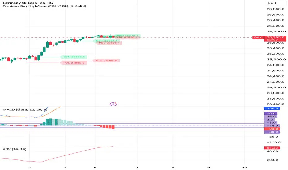
NQ Chop FilterNQ Chop Filter is a volatility and trade-confidence meter built for short-term NQ trading, especially on the 30-second chart.
This indicator is not a buy/sell signal and it is not meant to replace a trading strategy. It is designed to help judge whether current market conditions are strong, normal, cautious, or dangerous before managing risk.
The meter studies recent candle range, fast range expansion/compression, net price movement, directional efficiency, and wider trend/grind movement.
The dashboard gives a simple reading:
HIGH
Strong volatility and movement. Full confidence conditions. Larger targets are more reasonable.
NORMAL
Conditions are acceptable. Trading is still okay, but avoid sizing up blindly.
CAUTION
Market is less clean. Trade smaller, be more selective, and manage risk tighter.
DANGER
Weak movement or poor follow-through. Reduce size or wait.
How to use:
1. Add the indicator to an NQ chart.
2. Best used on the 15-second to 2-minute timeframe. Best on 30s.
3. Watch the dashboard before taking a trade.
4. Use HIGH and NORMAL as cleaner environments.
5. Use CAUTION and DANGER as risk warnings, not automatic signals.
6. Do not use this indicator by itself for entries.
7. Combine it with your own entry model, stop loss, take profit, and daily risk rules.
The main purpose is to avoid blindly trading the same size in all market conditions. It helps identify when the market is moving cleanly versus when price is slow, compressed, or choppy.
This script is for educational and informational purposes only. It is not financial advice. Gösterge

Gösterge
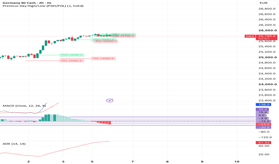
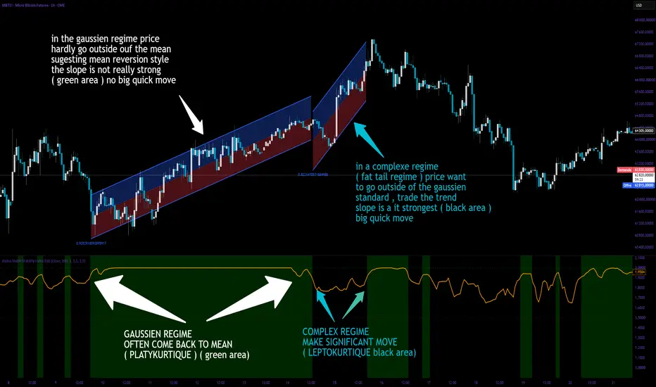
Alpha-Stable Stability Index [LB]Concept
The Alpha-Stable Stability Index estimates the tail index alpha of an alpha-stable distribution using McCulloch's quantile method (1986). Alpha ranges from 0 (extremely heavy-tailed, infinite variance) to 2 (Gaussian, finite variance). The indicator quantifies how prone the market is to wild, outsized moves and visually separates the chart into three regimes : Gaussian (green), transitional (black/default background), and heavy-tailed (red).
Mathematical Foundation
The estimation follows McCulloch (1986), "Simple Consistent Estimators of Stable Distribution Parameters". It relies on sample quantiles, which are robust and computationally light.
Given a window of N log-returns sorted in ascending order, four quantiles are extracted :
q05 = 5th percentile
q25 = 25th percentile
q75 = 75th percentile
q95 = 95th percentile
The tail-to-body ratio nu is computed as :
nu = (q95 - q05) / (q75 - q25)
For a Gaussian distribution, nu is approximately 2.0. For heavy-tailed stable distributions, nu increases beyond 3.0. The indicator maps nu to alpha using a calibrated rational approximation of McCulloch's Table I :
alpha = 2.0 - 0.70 * ln(nu - 1.9) - 0.04 * (ln(nu - 1.9))^2
The result is clamped to and optionally smoothed with an EMA. The indicator pane displays three distinct visual zones :
- Green background : alpha >= Gaussian Threshold (default 1.9). The distribution is near-Gaussian (mesokurtic). Returns are well-behaved, standard risk management applies.
- Black/default background : alpha between the two thresholds. Transitional regime — neither fully stable nor clearly heavy-tailed.
- Red background : alpha <= Heavy Tail Threshold (default 1.5). The distribution is leptokurtic. Fat tails dominate, extreme events are structurally more frequent.
A brief glossary for interpretation :
Leptokurtic — positive excess kurtosis ; the distribution has fatter tails and a sharper peak than the Gaussian. Alpha < 2.0 indicates leptokurtosis. Price action alternates between long quiet periods and sudden violent bursts.
Platykurtic — negative excess kurtosis ; thinner tails and a flatter peak than the Gaussian. Rare in financial returns but can appear in heavily mean-reverting or range-bound markets. Alpha close to 2.0 with low overall volatility may suggest platykurtic behavior.
Mesokurtic — kurtosis equal to that of the Gaussian (excess kurtosis = 0). Alpha = 2.0 corresponds to this regime. The green background signals this state.
What Problem Does It Solve ?
Classic volatility measures (standard deviation, ATR, historical vol) assume finite second moments and treat all deviations as coming from the same distribution. When the true return distribution is alpha-stable with alpha < 2, the variance is infinite and standard deviation becomes meaningless. The alpha index directly measures tail heaviness without assuming normality, and the green/black/red background gives an immediate visual cue of the risk regime.
How To Interpret
Alpha in the green zone (>= 1.9) — mesokurtic / near-Gaussian. Returns are well-behaved, standard risk management applies.
Alpha in the black zone (1.5 to 1.9) — transitional. The market is neither fully stable nor fully wild ; monitor for a move into the red zone.
Alpha in the red zone (<= 1.5) — leptokurtic / heavy-tailed. The distribution has undefined or extremely high variance. Large price swings are likely. Consider reducing position size, widening stops, and hedging tail risk.
Alpha declining — the market is transitioning toward instability ; rising tail risk ahead.
Parameters
Source — price data for return calculation (default close).
Window Length — number of bars used to compute the empirical quantiles. Longer windows give more stable estimates but react more slowly.
Smoothing — EMA period applied to the raw alpha estimate to reduce noise.
Heavy Tail Threshold — background turns red when alpha falls below this level (default 1.5).
Gaussian Threshold — background turns green when alpha exceeds this level (default 1.9).
Reference
McCulloch J.H., "Simple Consistent Estimators of Stable Distribution Parameters", Communications in Statistics — Simulation and Computation, Vol. 15, No. 4, pp. 1109-1136, 1986. Gösterge

Viprasol Liquidity Trail Matrix with Signal TargetOverview
The Viprasol Liquidity Trail Matrix with Signal Target is a trend-following signal engine that combines a volatility-adaptive trailing "liquidity" band structure with a Cardwell-style RSI regime filter, then turns confirmed pullback-and-continuation events into fully managed trade plans — entry, stop, three scaled targets, break-even logic, and an honest performance read-out. It is built for discretionary traders who want a single tool that answers three questions at once: what is the trend, is momentum backing it, and if a signal fires, exactly where are my entry, stop and targets.
This is an open-source, credited derivative. See the Credits & Originality section at the end — the trailing-matrix and Cardwell-RSI concepts are adapted from prior open-source work under CC BY-NC, with substantial original additions layered on top.
How It Works
Step 1 — Liquidity Trail Matrix (adapted)
A volatility trailing stop (ATR-scaled) defines the active trend and flips only when price closes decisively through it. Around that trailing line the script projects a ladder of "liquidity bands" spaced in ATR units, forming the retest zone price tends to revisit before continuation. In an uptrend the bands sit below price as stacked support; in a downtrend, above price as resistance. Because the spacing is ATR-based, the whole structure widens in volatile conditions and tightens in quiet ones.
Step 2 — Cardwell RSI Regime (adapted)
RSI is classified into a directional regime using Andrew Cardwell's range-rules principle: in a healthy uptrend RSI holds its 40-80 band, in a downtrend it works the 20-60 band. The regime flips bull when RSI thrusts through the upper trigger and bear when it breaks the lower trigger, holding state in between. Signals are only allowed in agreement with the regime, so the momentum context must confirm the trend before anything fires.
Step 3 — Confluence gating (adapted + new)
Before a signal is eligible it must pass a confluence gate: trend agreement, RSI regime agreement, an ADX minimum (chop filter), and an optional higher-timeframe bias pulled non-repainting (previous HTF bar, lookahead off). A minimum confluence score suppresses low-quality setups.
Step 4 — Retest entry + Signal Target (adapted)
When the confluence conditions hold and price pulls back into the band zone then closes back in the trend direction, a signal fires on the confirmed bar. The engine sets a structural stop, then projects TP1/TP2/TP3 as R-multiples of that risk and draws them on the chart with price and percent labels. Break-even logic moves the stop to entry after TP1.
Step 5 — Honest trade management + statistics (new)
Original additions in this release:
- One-trade-at-a-time engine: a trend flip no longer force-closes a trade. A position runs to its stop or final target, and a new entry only opens once the previous one is fully resolved. A reversal toggle restores the old flip-reversal behaviour if preferred.
- Max-bars-in-trade timeout so a lingering position cannot block the engine indefinitely.
- Hide-on-hit targets: each target line and label is removed the instant it is touched, keeping the chart clean.
- Staggered target labels so ENTRY/SL/TP1/TP2/TP3 never overlap.
- Session filter and post-stop cooldown (both optional, off by default).
- Honest performance panel: Avg R and Profit Factor computed on a transparent one-third-scale-out model, plus Max Drawdown in R and best/worst streak — so the win-rate (which counts a trade a win once TP1 is touched) is read alongside true expectancy.
- Suggested position size from an account-size and risk-percent input.
Non-repainting: trend, structure, signals and targets confirm at bar close; higher-timeframe data uses lookahead off on the previous bar.
Key Features
- Volatility-adaptive trailing liquidity-band matrix
- Cardwell RSI regime filter
- ADX chop filter + optional non-repainting HTF bias
- Range-distributed volume profile (POC / Value Area / low-volume nodes)
- Retest-continuation signals with confluence scoring
- Entry / SL / TP1-TP2-TP3 with R-multiple targets, break-even and hide-on-hit visuals
- One-trade-at-a-time management with optional reversal, timeout, session filter and post-stop cooldown
- Honest stats: win rate, Avg R, Profit Factor, Max Drawdown (R), streak, suggested size
- Multi-section dashboard, trend-tint candles, and a full alert suite with optional webhook JSON
How to Use
1. Add to any liquid symbol and timeframe. Confirm the dashboard reads a clear trend and RSI regime.
2. Wait for a LONG/SHORT marker — it only fires on a confirmed retest that passed the confluence gate. The number on the marker is the confluence score.
3. Trade the drawn plan: entry, stop, and TP1/TP2/TP3. The dashboard mirrors the live levels and, once trades close, shows Avg R / Profit Factor / Max DD so you can judge the edge honestly.
4. Tune selectivity with ADX Minimum and Min Score; tune trade behaviour with the reversal, timeout, session and cooldown settings.
Settings
- Trend Engine: ATR length, trail factor, band count and spacing
- Signals: min score, retest window, cooldown, integration mode, reversal toggle, session filter, post-SL cooldown
- RSI Regime: length, bull/bear triggers, confirm bars, integration mode
- Risk Management: SL mode, break-even, max bars in trade, account size, risk %
- Signal Targets: R-multiples for TP1/TP2/TP3
- Volume Profile / HTF / Dashboard / Colors: display and behaviour toggles, all with tooltips
Alerts
Dynamic alerts (ticker, timeframe, price, score, levels, RSI, regime) for: Long entry, Short entry, TP1/TP2/TP3 hit, break-even, stop-out, reversal, trend flips, and regime shift. Entry alerts can emit webhook-ready JSON.
Limitations & Disclaimer
This is an analysis and trade-planning tool, not a promise of profit. The built-in statistics are a session-level model (they reset on chart reload), assume idealised fills with no slippage or commission, and use a one-third-scale-out assumption for Avg R — real results differ. Signals confirm at bar close and do not repaint historically, but the still-forming bar is provisional until it closes. No indicator predicts the future; always combine with your own risk management. Nothing here is financial advice.
Credits & Originality (CC BY-NC 4.0)
This script adapts and builds upon prior open-source work and is published open-source, free, for non-commercial use, with attribution as required by the licence:
- "Liquidity Trail Matrix" by WillyAlgoTrader — the trailing liquidity-band structure concept.
- "Cardwell Range Analyze" by MarkitTick — the Cardwell RSI range-regime concept.
Changes made by Viprasol (this version): combined the two engines into one workflow and added the confluence gate, non-repainting HTF bias, range-distributed volume profile, R-multiple Signal Targets with break-even and hide-on-hit visuals, one-trade-at-a-time management with reversal toggle / max-bars timeout / session filter / post-stop cooldown, the honest statistics panel (Avg R, Profit Factor, Max Drawdown R, streak) and suggested position size, plus the multi-section dashboard and dynamic/webhook alerts.
Licence: Creative Commons Attribution-NonCommercial 4.0 (creativecommons.org). Educational, non-commercial use only. Not financial advice.
Gösterge

ATR Trailing Stop Strategy with EMA Trend FilterMost stop-loss approaches treat risk as a fixed number, a percentage, a dollar amount, a set number of points. The problem with fixed stops is that they ignore the market's actual behavior at any given moment. A 1% stop that makes sense in a low-volatility environment will get hit constantly in a high-volatility one. A wide fixed stop that survives a volatile period is needlessly large when the market quiets down.
ATR-based trailing stops solve this by scaling the stop distance to what the market is actually doing right now. ATR measures average true range, the average distance price moves per bar over a given period, including gaps. When volatility expands, the stop widens to give the trade room to breathe. When volatility contracts, the stop tightens to protect more of the open profit. The stop follows price as it moves in the trade's direction and never moves backward — only trailing further in the profitable direction or holding its level until price reverses through it and the trade closes.
The EMA filter is added for one specific reason: trailing stop systems are naturally reactive rather than predictive, which means without a trend filter they will generate signals in both directions during choppy, range-bound conditions. The 200 EMA acts as a simple regime gate.
Long trades are only considered when price is above the 200 EMA, broadly in an uptrend. Short trades are only considered when price is below it. This doesn't eliminate losing trades, but it meaningfully reduces the number of counter-trend entries that trail stop systems would otherwise generate in oscillating markets.
How the trailing stop works:
On each bar, the strategy calculates a long stop level at close - (ATR × multiplier) and a short stop level at close + (ATR × multiplier). When price is in an uptrend, the long stop ratchets upward with price but never moves down, it holds its highest reached level until price closes below it, at which point the trend flips to bearish and the stop becomes a downward-trailing short stop. The opposite applies in a downtrend. A trend flip from bearish to bullish generates a long entry signal if price is above the 200 EMA. A flip from bullish to bearish generates a short entry signal if price is below the 200 EMA.
Parameters worth adjusting:
The ATR multiplier controls the sensitivity of the trailing stop. A lower multiplier (1.5x or below) produces a tighter stop that flips trend direction more frequently, useful on lower timeframes where you want faster reaction but will generate more signals. A higher multiplier (2.5x or above) produces a wider stop that flips less often, better suited for higher timeframes where you want to stay in a trend longer and can tolerate larger drawdowns on individual trades before exit. The ATR length controls how many bars the average is computed over. Shorter lengths react faster to recent volatility changes; longer lengths smooth out volatility spikes.
The EMA length can be adjusted depending on your timeframe. 200 periods is the standard for daily charts. On a 4-hour chart, 100 to 150 periods covers a similar calendar range. On a 1-hour chart, 50 to 100 periods is reasonable. The goal is for the EMA to represent the dominant trend, not a short-term moving average that whipsaws with every swing.
What this is not:
This strategy does not predict market direction. It reacts to price behavior and exits when price reverses by a defined volatility-adjusted distance. It will produce losing trades, every trailing stop system does, and sequences of losses in choppy conditions are expected behavior, not a flaw. The expectation is that winning trades capture significantly more than they risk because the stop trails and locks in profit, while losing trades are cut at a defined ATR-based distance.
Evaluate this on your own instruments and timeframes with realistic backtest conditions before drawing any conclusions about expected performance.
Shared for educational purposes. This is not investment advice. Always backtest thoroughly and size positions according to your own risk tolerance. Strateji

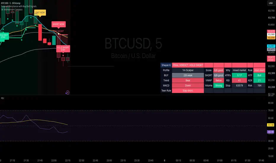
Shayan Khursheed Momentum CompassHere’s a clean TradingView description you can use:
Shayan Khursheed Momentum Compass
Shayan Khursheed Momentum Compass is a beginner-friendly day-trading indicator designed for 1m, 5m, 10m, 15m, and 30m momentum traders.
The goal is simple: make the chart easy to understand by showing a clear final verdict instead of forcing traders to read many indicators separately.
The dashboard gives plain-English signals:
FINAL VERDICT: BUY NOW
FINAL VERDICT: HOLD LONG
FINAL VERDICT: EXIT LONG
FINAL VERDICT: SHORT NOW
FINAL VERDICT: HOLD SHORT
FINAL VERDICT: EXIT SHORT
FINAL VERDICT: WAIT
The script analyzes multiple TradingView data points, including:
Fast and slow EMA momentum
Anchor EMA trend
VWAP position
Higher-timeframe trend confirmation
RSI momentum
MACD direction
ADX/DMI trend strength
Volume strength
ATR volatility
Pullback and breakout triggers
Dynamic stop line
Simple reading rules:
BUY NOW means look for a long entry.
HOLD LONG means stay in the buy.
EXIT LONG means close the buy.
SHORT NOW means look for a short entry.
HOLD SHORT means stay in the short.
EXIT SHORT means close the short.
WAIT means no trade.
The script also includes visual alerts such as BUY NOW, SHORT NOW, HOLD BUY STAY, HOLD SHORT STAY, FIRE SHORT, BUY BUY, and EXIT NOW to make the chart easier to follow during fast-moving markets.
This indicator is built to help traders stay disciplined, avoid guessing, and understand when momentum is strong enough to act.
This script is for education and analysis only. It is not financial advice. Always backtest, paper trade, and use proper risk management before trading with real money. Gösterge

Supply & Demand Zones[SideHustleTraders]v1.0Supply & Demand Zones v1.0
An advanced Supply & Demand zone indicator that automatically detects and scores high-probability institutional order zones using a quantitative multi-factor model.
Unlike basic S&D indicators that draw every zone, this tool ranks each zone using five weighted metrics — departure strength, volume, momentum, base width, and freshness — producing a composite score from 0 to 100 and assigning letter grades (A+, A, B). Only zones that meet your minimum score threshold are displayed, cutting through the noise and showing only the zones most likely to hold.
Each zone tracks its full lifecycle in real time — fresh, tested, and mitigated — with visual updates as price interacts with it. Fresh zones show solid borders, tested zones show dashed borders, and mitigated zones (where price closed through) fade to gray and auto-delete.
Built-in multi-timeframe support lets you stay on your 5 minute chart while projecting 30 minute or higher timeframe zones directly onto it, giving you full context without ever switching charts.
Includes a live dashboard table ranking all active zones by score, zone labels showing grade and touch count, and two alert conditions for new high-score zone formation and first retests of A/A+ zones.
Designed for futures, forex, and crypto. Works on any timeframe. Non-repainting. Gösterge

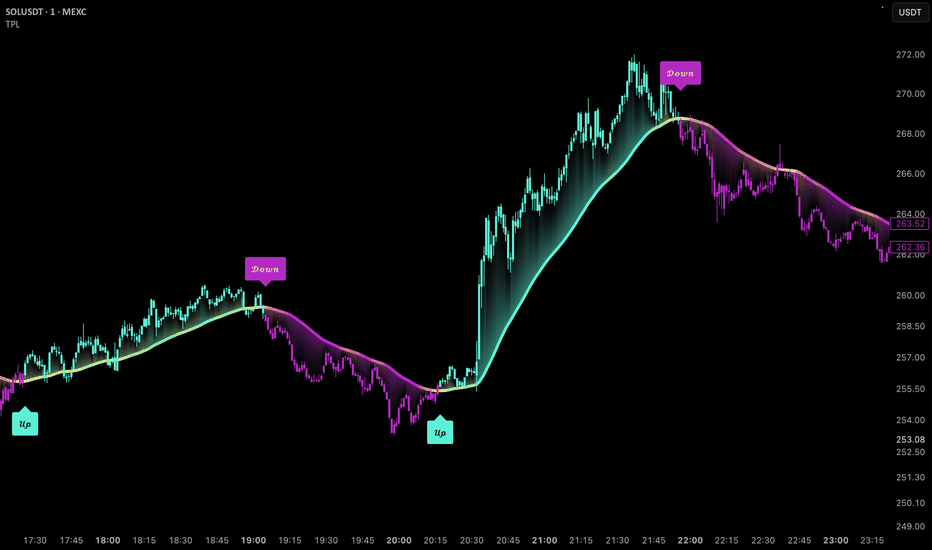
Uptrick: Trend Pressure LineIntroduction
Uptrick: Trend Pressure Line is a trend-following overlay that measures directional pressure by combining price displacement from a moving average, candle body strength, and short-term momentum into a single weighted composite. The composite is smoothed and converted into both a dynamic trend line and a bar coloring system, giving traders a continuous read on how strong buying or selling pressure is, rather than a simple binary trend flag.
Originality
While the script uses common building blocks such as an EMA baseline and ATR normalization, its originality lies in how these components are combined. Instead of relying on a single trend filter, the script blends three independently weighted pressure sources, price position relative to trend, candle body direction, and bar-to-bar momentum, into one normalized pressure value using user-adjustable weights. This composite pressure value is then used simultaneously to plot a smoothed adaptive trend line, generate a three-color gradient reflecting pressure intensity, calculate a reversal probability score based on how stretched pressure is relative to its recent range, and drive bar coloring through three separate selectable modes. No single one of these elements is novel on its own, but the integration of weighted multi-factor pressure scoring with a dedicated reversal exhaustion metric and multi-mode visual feedback is not a standard combination found in common trend or ATR-band indicators.
Features
Weighted trend pressure engine combining price position, candle body, and momentum into one composite score
Adjustable weighting for each of the three pressure components
Smoothed adaptive trend line plotted directly on the chart
Three-color gradient (bearish, neutral, bullish) that reflects live pressure intensity
Up and down trend signals with optional cooldown to reduce repeated signals
Four selectable signal anchor points (Default, High/Low, Close, Trend Line)
Optional take profit signals based on an ATR multiple from entry
Reversal probability calculation based on pressure stretch and distance from the trend line
Adjustable reversal lookback and sensitivity settings
Three selectable bar coloring modes (Reversal Probability, Latest Signal, Current Default)
Strong and extreme pressure level alerts for both bullish and bearish conditions
Dashboard table showing trend state, signal state, bars since last signal, pressure value, reversal percentage, bar mode, take profit status, ATR value, and trend line value
Four selectable table positions
19 distinct alert conditions covering signals, flips, pressure levels, and price/line crosses
Inputs
Source, Trend Length, ATR Length, Pressure Smoothness, and Line Smoothness control the core trend engine
Price Position Weight, Candle Body Weight, and Momentum Weight control how the three pressure components are blended
Show Up/Down Signals, Trend Threshold, Signal Cooldown, and Signal Anchor control signal generation and placement
Show TP Signals and TP ATR Multiplier control the optional take profit logic
Line Width, Gradient Sensitivity, Gradient Smoothness, and Bar Coloring Mode control the visual presentation
Reversal Lookback, Reversal Sensitivity, and High Reversal Alert Level control the reversal probability calculation
Strong Pressure Level and Extreme Pressure Level set the thresholds for pressure strength alerts
Show Table and Table Position control the on-chart dashboard
How It Works
The script builds a baseline using an EMA of price, then measures three separate pressures relative to ATR: how far price sits from that baseline, the strength of the current candle's body, and short-term momentum. These three values are combined using the user's weight settings and smoothed to produce a single pressure reading. This pressure reading is added to the baseline to draw the adaptive trend line, and it is also compared against a threshold to classify the market as bullish, bearish, or neutral, which drives the up and down signals. Separately, the script tracks how far current pressure is from its recent extreme and how far price has drifted from the trend line, combining both into a reversal probability percentage that increases as a trend becomes stretched.
How to Use
Watch the trend line color and the dashboard Trend row together to identify the current directional bias at a glance
Use the Up and Down labels as potential entry cues, and adjust Signal Cooldown if signals print too frequently on your chart's timeframe
Adjust the three weight inputs (Price Position, Candle Body, Momentum) if you want the pressure reading to favor trend positioning, candle strength, or short-term speed, depending on your trading style
Monitor the Reversal row on the dashboard as a trend matures; a rising percentage suggests the current move is becoming stretched and may be due for a pause or reversal
Switch Bar Coloring Mode to Reversal Probability if you want the candles themselves to visually flag exhaustion, or to Latest Signal if you prefer bars colored by the most recent up/down call
Enable Show TP Signals and set a TP ATR Multiplier if you want a visual marker for a fixed ATR-based profit target after each signal, then adjust the multiplier to match your own target distance
Use Signal Anchor to reposition labels relative to price action, high/low, or the trend line itself depending on chart clutter or personal preference
Set alerts on any of the nineteen available conditions to be notified of trend flips, pressure extremes, or price crossing the trend line without needing to watch the chart continuously
Conclusion
Uptrick: Trend Pressure Line gives traders a single adaptive line and pressure reading that reflects the combined influence of price positioning, candle strength, and momentum, along with a built-in gauge for how exhausted the current trend may be. It is intended as a trend and exhaustion visualization tool rather than a standalone signal generator.
Disclaimer
This script is provided for informational and educational purposes only and does not constitute financial advice. Past performance, including any signals or visual patterns shown on the chart, is not indicative of future results. Trading involves substantial risk, and users should perform their own analysis and risk management before making trading decisions based on this or any other indicator. Gösterge
Quantile Threshold Bands | NickJoanQuantile Threshold Bands | NickJoan
Core Idea
Quantile Threshold Bands measures the position of price within a lookback window and uses that information to define adaptive upper and lower threshold bands. The script calculates two percentile levels from a user-defined lookback window and uses them to classify the current source value as bullish or bearish.
When the price moves above the upper quantile, the indicator turns bullish. When the price moves below the lower quantile, it turns bearish. When it returns inside the band area, the script keeps the last active state until the opposite threshold is crossed again. This gives the indicator a persistent regime structure.
Calculation Logic
The indicator works through three steps:
Source selection.
- The user chooses the price series to analyze.
Quantile calculation.
- The script looks back over a chosen number of bars.
- From that window, it calculates a lower quantile band and an upper quantile band.
- These values are obtained with a nearest-rank percentile calculation.
State assignment.
- If the source is above the upper band, the state becomes bullish.
- If the source is below the lower band, the state becomes bearish.
- If the source is between the bands, the previous state remains active.
What the Bands Mean
The lower and upper bands represent the selected percentile levels inside the recent price window.
The lower band marks a lower threshold within recent price behavior.
The upper band marks a higher threshold within recent price behavior.
The area between them defines the central zone where price is neither breaking upward nor downward.
Because the levels are recalculated on every bar, they adjust as the market changes. The result is a dynamic set of thresholds that follow the market’s own recent distribution.
Chart Output
The script displays four visual elements on the chart:
Lower Quantile line.
Upper Quantile line.
Filled zone between the two bands.
Colored candles showing the active state.
The color logic is:
Aqua when the regime is bullish.
Olive when the regime is bearish.
No color yet before the first valid state is established.
The output is designed to make the current state readable at a glance.
Inputs
The indicator has four primary inputs:
Source - The series used in the quantile calculation.
Lookback - The number of bars used to build the rolling window.
Lower Quantile % - The percentile used for the lower band.
Upper Quantile % - The percentile used for the upper band.
The lower percentile must be smaller than the upper percentile.
Alerts
The script includes alerts for regime changes:
Long Signal - Triggers when the state turns bullish.
Short Signal - Triggers when the state turns bearish.
These alerts are designed to notify the trader when price breaks into a new regime.
How to Use It
This indicator can be used as a regime filter or market bias tool.
Typical use cases include:
Directional bias filter. Use the bullish state when price is above the upper quantile and the bearish state when price is below the lower quantile.
Threshold-based alerts. Use the long and short alerts to notify you when price breaks into a new percentile regime.
Range / compression read. The distance between the two bands can help show whether recent price action has been compressed or expanded. A narrow band zone suggests tighter recent movement, while a wider band zone suggests broader recent movement.
Trade filtering. Use it to decide whether to allow only long setups, only short setups, or no directional trades depending on regime.
Gösterge

Zero-Lag GARCH Bands | NAL1. Overview
Zero-Lag GARCH Bands | NAL is an adaptive volatility band indicator built from a Zero-Lag EMA baseline and an optimized GARCH-style volatility engine.
The indicator does not use a standard fixed-width channel. Instead, it estimates market variance through a recursive GARCH framework, smooths that volatility with a Zero-Lag EMA, and uses the result to create dynamic upper and lower bands around price structure.
The purpose of the indicator is to identify when price escapes a volatility-adjusted regime boundary, while allowing the band width to adapt to the underlying variance environment.
2. Calculation
The indicator starts by estimating volatility from lagged log returns. These returns are squared to create a variance component, which becomes the foundation of the GARCH model.
GARCH_LogReturn = math.log(close / close )
GARCH_SquaredLogReturn = math.pow(GARCH_LogReturn, 2.0)
GARCH_RealizedVariance = ta.sma(GARCH_SquaredLogReturn, GARCH_Lookback)
The script then searches through possible coefficient weights to find a beta/lambda value that better fits recent realized variance behavior. A second optimization loop is used to estimate gamma, which controls the long-run variance contribution.
These optimized coefficients are combined into a GARCH-style variance model using three components: long-run variance, recent shock variance, and lagged variance.
GARCH_Variance =
GARCH_Gamma * GARCH_LongRunVariance +
GARCH_Alpha * GARCH_SquaredLogReturn +
GARCH_Beta * GARCH_LaggedVariance
After the variance estimate is created, it is smoothed using a Zero-Lag EMA. This gives the volatility engine a faster response while still reducing noise.
GARCH_ProjectedVariance = f_zlema(GARCH_Variance, GARCH_SmoothLen)
GARCH_Volatility = math.sqrt(math.max(GARCH_ProjectedVariance, 0.0))
The baseline is also built with a Zero-Lag EMA, applied after a light EMA pre-smoothing step. This creates the central reference line for the band structure.
The final bands are created by scaling the Zero-Lag GARCH volatility against the selected source and band pressure setting. Higher band pressure creates a tighter band, while lower pressure allows the band structure to expand.
upperBand = baseline + (baseline_src / band_pressure) * GARCH_VolatilityMultiplier
lowerBand = baseline - (baseline_src / band_pressure) * GARCH_VolatilityMultiplier
A bullish state triggers when price closes above the upper band. A bearish state triggers when price closes below the lower band. When price remains inside the bands, the previous regime is held.
3. Key Features
Zero-Lag EMA baseline for reduced-lag price structure.
Optimized GARCH-style volatility engine.
Adaptive variance model using shock, lagged, and long-run components.
Zero-Lag smoothing applied to projected volatility.
Dynamic upper and lower volatility bands.
Band pressure control for adjusting channel tightness.
State-based candle coloring, band coloring, glow effect, and directional fills.
4. Use
Zero-Lag GARCH Bands is designed to identify when price begins escaping its volatility-adjusted structure. A close above the upper band reflects bullish expansion, while a close below the lower band reflects bearish expansion.
The GARCH engine gives the indicator a deeper volatility layer than a standard ATR or deviation channel. Instead of only measuring recent range, it models variance behavior and projects that into the band structure.
This indicator is best used as a specialized module within a complete strategy framework. Its role is to isolate volatility-adjusted regime expansion, where price is evaluated against a dynamic variance boundary rather than a static channel. The full value comes from how this volatility regime signal is integrated into a broader process for timing, structure, and execution.
Gösterge

Adaptive S/R Box Zones with Dynamic Stop Loss & EMA FilterTitle: Adaptive S/R Box Zones with Dynamic Stop Loss & EMA Filter
Description:
This indicator is an advanced tool designed to automatically identify key Support and Resistance (S/R) levels by blending momentum, volatility, and structural pivot points. The core objective of the script is to visualize asymmetric risk zones (Stop Loss zones) and filter out false breakouts using an integrated EMA momentum filter.
How it works:
S/R Detection Logic: Levels are not derived from simple highs and lows. The script utilizes a sophisticated algorithm that dynamically combines the RSI (Relative Strength Index) to spot extreme overbought/oversold conditions, a HMA-based CMO (Chande Momentum Oscillator) for momentum confirmation, and historical Close Pivots.
Asymmetric SL Zones (Boxes): Instead of standard symmetric lines that often distort spatial risk, the indicator renders dynamic box shapes. The height of these zones automatically adapts to the market's current volatility using the ATR (Average True Range).
The Resistance Zone expands asymmetrically upward from the level, offering a clear visual map for placing Stop Losses on Short setups.
The Support Zone expands asymmetrically downward from the level, defining the logical Stop Loss area for Long setups.
EMA Momentum Filter & Trigger: The script features an optional EMA crossover filter. When enabled, the detection of a new S/R zone acts as a dynamic "setup alert", while the actual BUY or SELL signal triggers only when the price breaks through the EMA line, confirming directional momentum.
Key Features & Inputs:
Zone Height (ATR Multiplier): Controls the thickness of the risk zones based on market volatility.
S/R Timeframe: Multi-timeframe (MTF) functionality to plot higher time frame levels onto your current chart.
Signal Trigger Mode: Toggle between On Candle Close and After Candle Close (waits for the candle to seal to prevent repainting).
EMA Filter Toggle: Can be fully deactivated if you prefer to receive raw signals immediately upon the formation of S/R levels. Gösterge

Apex Turn v4APEX TURN v4: Kalman Snapback with Fee Gate, Trend Guard and Fair Value Take Profit
Apex Turn is a mean reversion tool that hunts exhausted moves and trades the snap back to fair value. It was designed for crypto perpetual futures but works on any liquid market.
HOW IT WORKS
The script runs an adaptive Kalman filter on log price to estimate fair value, drawn as the orange line. The gap between price and fair value is normalized into a z score over a rolling window. When the z score stretches beyond the entry threshold (2.8 by default) and then hooks back toward the mean while still deeply stretched, the engine looks to trade against the extreme. Longs trigger at washed out lows and shorts trigger at blow off highs.
THREE GATES PROTECT EVERY SIGNAL
Gate one is the chop filter. The Kaufman Efficiency Ratio must confirm a ranging market before any mean reversion entry is allowed.
Gate two is the fee gate. The script projects the reward from current price to fair value, converts your maker and taker fees into R units based on the stop distance, and blocks any signal that would not cover all fees plus a minimum net gain of 0.35R. Blocked signals print as small gray crosses so you can see exactly what fees would have eaten.
Gate three is the strong trend guard. Fair value drift is measured in ATR per bar. When drift is strong, counter trend signals are suppressed until the market prints a release event: a momentum divergence on the z score, volume absorption at the extreme, or both together depending on the mode you select. Trend blocked signals print as orange squares and release events print as aqua diamonds.
EXITS
On entry the script freezes the current fair value as the take profit target, plotted in green, and places the stop in red at 1.5 ATR from entry. The default exit mode assumes you rest a reduce only limit order at the target so your winning exit pays the lower maker fee. Mean touch and overshoot exit modes are also included in the settings. A time stop closes stale positions after 45 bars.
ADAPTIVE ATR
The ATR length is anchored to real time rather than a fixed bar count. It always measures roughly 112 minutes of volatility, so stops, targets and fee math stay consistent whether you chart 30 seconds or 4 hours.
ALERTS
Four webhook ready alerts are included. Entry alerts carry the close price, the stop, the frozen take profit and the projected net R, so an automated system can place the full bracket the moment a position is born. Exit alerts fire for stop, target and time stop events.
SUGGESTED USE
Developed and tested for the 8 minute chart on liquid perpetual pairs. The 30 minute and 1 hour charts also suit the logic well. Timeframes under 5 minutes are not recommended because trading fees consume most of the edge there. Set the maker and taker fee inputs to match your own exchange tier before trusting the fee gate.
Signals are evaluated at bar close and do not repaint. Nothing in this script is financial advice and past behavior in testing does not guarantee future results. Always size positions responsibly and manage your own risk. Gösterge

Trend Health [FEELS]A trend rarely dies suddenly. It fades first: the move gets inefficient and counter-trend candles grow heavier. Trend Health paints that fading straight onto a supertrend-style ATR trail, and tightens the stop while it happens.
The band is saturated green or red while the trend is strong. As health decays the color drains toward amber, an amber dot prints where the dying starts, and the trail contracts under price so a weak trend exits earlier than a fixed stop would.
QUICK START
Add it to a chart and read the color. Bright band: trend intact, trail at full width. Fading band: trend losing quality, stop contracting. Amber band: dying trend, elevated flip risk. Scroll the history: most flips carry an amber warning dot some bars before them. The strip along the bottom compresses the full health history into one regime line, and the label at the right edge shows direction, state and the current health score.
HOW IT WORKS
Two layers: a health score, and a trail that consumes it.
Health score, computed every bar over the Health lookback window:
1. Directional efficiency. Kaufman efficiency ratio (net move divided by the sum of absolute bar-to-bar moves), zeroed when the net move points against the active trend, normalized so a reading of 0.5 counts as fully efficient.
2. Momentum side. RSI distance from the 50 line in the direction of the trend, scaled over 25 points.
3. Impulse asymmetry. Candle bodies printed with the trend versus against it over the window. When counter-trend bodies grow, this component decays before price structure breaks.
These three form the core score (weights 0.45 / 0.30 / 0.25). The displayed health adds a fourth read, the distance between price and the trail in ATR units, at 25 percent weight. The score is EMA-smoothed and resets on every flip.
The trail is a ratchet ATR stop built from scratch. Base width is ATR times the multiplier. With Adaptive tightening on, the effective multiplier is scaled by the core score, so a healthy trend trails at full width while a dying trend gets a progressively tighter stop. The distance component is excluded from the core on purpose, otherwise tightening would lower the score and tighten further in a loop. Toggle it off and you get a classic fixed-width trail; the health engine then only drives the color.
HOW TO USE
- Color is the instruction. Enter or hold on a saturated band, tighten manually or stand aside on amber.
- The dying alert fires when health crosses under the threshold while the trend is still running. On past data many flips were preceded by exactly this transition. Treat it as a condition read, not a forecast.
- Four alerts: flip up, flip down, trend dying, trend recovered.
- Designed on 4H to 1W. Works on any symbol and timeframe; on low timeframes expect more flips, especially in ranges with adaptive mode on.
PARAMETERS
- ATR length / ATR multiplier: trail geometry at full health.
- Adaptive tightening: health-driven contraction of the trail, on by default.
- Health lookback: window for the efficiency, momentum and asymmetry reads.
- Health smoothing: EMA on the raw score.
- Dying threshold: below this level the trend counts as dying; drives the amber floor, the warning dot, the label and the alert.
- Display toggles: trend fill, bar coloring, flip markers, dying warnings, health ribbon, status label.
- Sizing: marker size, label size and trail width are adjustable.
NOTES
- The trail state confirms at bar close. On the live bar the level and color can update until close.
- Health describes the present condition of the trend. It does not predict future prices.
- A dying warning is a condition mark, not an exit signal: health can recover and the trend can resume. Sharp reversals can flip a trend straight from high health without any warning printed.
- Adaptive mode trades later giveback for earlier exits, so in choppy ranges it flips more often than a fixed trail. That is the design, not a defect.
ORIGINALITY
The ratchet ATR trail is a classic public-domain concept reimplemented from scratch. What is original here is the three-component health model, the gradient mapping of that score onto the trail, bars and ribbon, and the feedback of the score into the stop width itself, which makes the flip points measurably different from a standard fixed-factor trail. RSI and the efficiency ratio are not displayed as separate indicators; they exist only as inputs to one scoring model. This is a single system, not a mashup. Gösterge

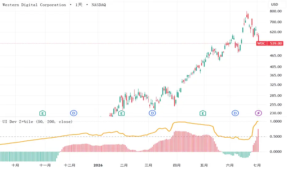
Ulcer Index Baseline Deviation - Z Columns & PercentileThis indicator compares Peter Martin's Ulcer Index against its own long-term baseline, then shows the result through two scale-free readouts, so that readings carry the same meaning across different symbols.
The Ulcer Index (Martin and McCann, 1989) measures the depth and duration of percentage drawdowns from prior highs, in other words how painful it has been to hold a position. Unlike standard deviation, it looks only at the downside. Martin read the index against its own long-term average: pain rising above its normal range signals elevated downside risk.
The script computes the Ulcer Index over a rolling window (default 50 daily bars), subtracts its long-term EMA (default 200 bars, roughly one year on a daily chart) to obtain the deviation, then presents that deviation in two ways over the same 200-bar window. The columns are a robust z-score, built from the median and the median absolute deviation with the usual 1.4826 consistency factor, so column height reads in standard-deviation equivalents and keeps resolving even while new records are being set. Column color follows the sign of the z-score: red when the deviation sits above its trailing median, teal when below. The orange line is a percentile rank scaled to zero-to-one: 0.5 means today's deviation sits at the trailing median, 1 means it is the record of the window.
How to read it: tall red columns with the orange line pinned near 1 mark a genuine extreme. Tall columns with the line in mid-range mean a large move that is routine for this symbol. A pinned line above modest columns means a normally calm symbol breaking its own record at ordinary size. Columns are persistent and will stay one color for weeks inside a drawdown regime. Note that the color flip only approximates the true baseline crossover: the deviation series is right-skewed, its trailing median sits slightly below zero, so the flip typically leads the crossover by a few bars. For the exact regime, chart the raw Ulcer Index against its EMA.
Notes and limits: both readouts are normalized to each symbol's own history, so they compare rarity and relative size, not absolute drawdown. To compare absolute pain across symbols, chart the raw Ulcer Index instead. Use identical settings on every symbol you compare, and allow several hundred bars of history for warm-up. The deviation, z-score, and percentile layers are an original extension, not part of Martin's published work, so validate behavior against historical drawdowns you recognize. This is a risk-regime gauge, not a buy or sell signal generator, and nothing here is investment advice. Gösterge

Gösterge

Bitcoin Power Law Corridor (Santostasi)This macro indicator plots the Bitcoin Power Law Corridor, based on the renowned mathematical model popularized by astrophysicist Giovanni Santostasi and researcher HC Burger. Unlike traditional financial models that rely on human assumptions (like the failed Stock-to-Flow model), the Power Law is a scientific theory based on organic network growth, similar to structures found in physics and biology.
Bitcoin does not grow exponentially forever; instead, it follows a sub-exponential growth curve with diminishing relative returns but massive absolute gains. This script tracks that exact path and resolves a common limitation in TradingView by using advanced time-based trendlines to project the bands into the empty future canvas.
How the Math Works
The indicator calculates the fair value of Bitcoin using the time elapsed since the Genesis Block (January 3, 2009) raised to a specific power (exponent n ≈ 5.845).
This growth pattern mimics two fundamental natural laws:
1. Kleiber's Law (Biology): Demonstrates that as living organisms grow larger, their energy efficiency increases scalingly. Similarly, the Bitcoin network becomes more robust and stable as it grows.
2. Urban Scaling Laws (Cities): Cities like Rome or New York grow organically according to a power law. Because millions of people freely choose to interact within them, they compound over centuries without a single point of failure. Bitcoin's price chart directly mirrors this organic network density.
The Three Structural Bands
On a Logarithmic scale, this indicator displays three vital structural milestones:
Blue Line (Fair Value): The mathematical median and fundamental fair price of Bitcoin based on Metcalfe's Law (network effects) and global adoption.
Green Dashed Line (The Floor): The ultimate macro defense line (calculated around the P10 percentile). Historically, Bitcoin has never closed a weekly candle below this hard floor. It serves as the ultimate long-term accumulation zone.
Red Dashed Line (The Ceiling): The overextension/bubble band. When price approaches this line, the market is historically overextended (e.g., 2013 and 2017) and highly risky.
Key Features of this Script
Future Projection: Standard TradingView lines stop at the current live bar. This script bypasses that limitation using line.new segments, allowing you to drag the chart to the left and view the exact mathematical support and resistance targets for 2028, 2034, and beyond.
Fully Customizable: You can tweak the Genesis date, change the power law exponent, or adjust the log-offsets for the floor and ceiling bands in the settings menu.
CRITICAL INSTRUCTION
This indicator MUST be viewed on a Logarithmic Scale (LOG) .
Click the 'LOG' button in the bottom-right corner of your TradingView chart.
On a standard linear scale, the bands will be completely distorted and unusable.
Best viewed on the Daily (1D) or Wekely (1W) timeframe. Gösterge

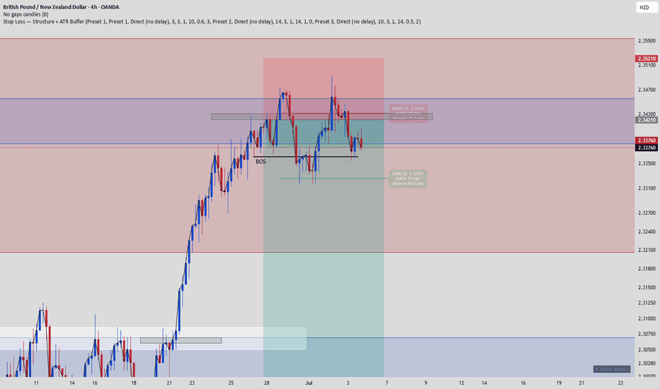
Stop Loss - structuur + ATR-bufferThis indicator helps you avoid getting stopped out by a few pips when price sweeps an obvious level. Instead of placing your stop exactly at the last swing low/high — where liquidity sits — it calculates a stop level with a volatility-based buffer:
Stop = last confirmed swing low/high ± (ATR × multiplier + extra pips)
The chart shows the swing level (dotted line), the buffered stop level for longs and shorts (solid lines), and a label with the exact stop price, buffer size, and distance in pips — use that distance for your position sizing.
Settings:
Swing sensitivity — how many candles left/right must confirm a swing. Higher = only major swings, lower = minor swings closer to price.
ATR period / multiplier — the buffer scales with volatility, so it automatically widens on volatile pairs and higher timeframes.
Extra pips — fixed margin for spread (stops are triggered on bid/ask, not the mid-price your chart shows).
Note: the default settings are a starting point, not a recommendation. Backtest on your own trades: measure how far wicks typically pierce your swing levels relative to ATR, and set the multiplier accordingly. A wider stop means a smaller position at the same risk percentage — never more risk. If the buffered stop breaks your minimum R:R, skip the trade instead of tightening the stop. Gösterge
Gösterge

Cardwell Range Analyze [MarkitTick]💡 A comprehensive, all-in-one technical analysis suite designed to decode market regimes, identify high-probability momentum shifts, and automate risk management visualization. Built upon the foundation of Andrew Cardwell's advanced Relative Strength Index (RSI) theories, this tool transcends traditional oscillator analysis. Rather than relying on static overbought and oversold thresholds, it dynamically tracks regime shifts by observing where momentum consolidates. When combined with trend confirmation, volatility-based targets, and directional movement filters, it provides a holistic view of the market state directly on your chart.
✨ Originality and Utility
Most traders utilize momentum oscillators in a vacuum, searching for mean-reversion signals at arbitrary boundaries. The utility of this script lies in its departure from that static approach. It introduces a multifaceted evaluation system that cross-references momentum bands with structural trend data. By integrating a Higher Timeframe (HTF) directional filter and an Average Directional Index (ADX) volatility threshold, it systematically filters out market noise and chop.
Its originality shines through the automated Trade Tools suite. Upon detecting a valid regime shift, the indicator instantly projects Average True Range (ATR) based Stop Loss and Take Profit levels, complete with risk-to-reward zoning. This allows traders to visually assess the mathematical viability of a setup before execution. The inclusion of a real-time diagnostic dashboard further elevates its utility, offering a heads-up display of all underlying metrics without cluttering the primary price action.
🔬 Methodology and Concepts
● Cardwell RSI Framework
Traditional RSI theory dictates that an asset is overbought at 70 and oversold at 30. However, the foundational concept here relies on range shifts. In a robust uptrend, RSI rarely reaches 30; instead, it finds support around 40 and can push up to 80. Conversely, in a downtrend, RSI encounters resistance around 60 and can fall to 20. This script mathematically codifies these ranges.
● Regime Confirmation
A raw regime is identified when the price resides on the correct side of the Trend Moving Average (SMA) while the RSI operates within the corresponding Cardwell range. To eliminate premature signals, a confirmation threshold requires the market to sustain this raw state for a consecutive number of bars.
● Structural and Volatility Filtering
To ensure signals align with macro momentum, the script queries a higher timeframe's trend state using non-repainting historical referencing. Additionally, the ADX is calculated to measure the absolute strength of the current trend. If the ADX falls below the minimum threshold, the market is deemed sideways, and signals are suppressed.
● Dynamic Risk Mapping
Once a validated signal fires, the script calculates dynamic price levels based on current market volatility (ATR). The Stop Loss is mapped at a fractional multiplier against the entry, while Take Profit levels are projected at linear multiples, mapping out a structured trade lifecycle.
🎨 Visual Guide
● Heatmap Candles
The standard price candles are dynamically recolored to reflect the prevailing market regime.
Teal Candles: Indicate a confirmed Bullish Regime.
Red Candles: Indicate a confirmed Bearish Regime.
Gray Candles: Indicate a Neutral state where conditions are mixed.
Black Wicks/Borders: Maintain visual clarity regardless of the body color.
● Trade Levels and Zones
When a signal triggers, specific horizontal projections appear on the chart:
Entry Line: A dashed blue line representing the closing price of the signal bar.
Stop Loss (SL) Line: A solid red line marking the invalidation point.
Take Profit (TP1, TP2, TP3) Lines: Dashed teal lines marking incremental profit targets.
Risk Fill: A translucent red background shading the area between the Entry and the Stop Loss.
Reward Fill: A translucent teal background shading the area between the Entry and the highest Take Profit.
● Dashboard
A specialized table anchored to the chart corner providing real-time data:
Regime: Displays current state (BULLISH, BEARISH, or NEUTRAL) in respective colors.
RSI Value: A visual progress bar measuring current RSI against a 100-scale, color-coded by intensity.
Trend & Ranges: Explicit text readouts of the current MA trend direction and defined RSI boundaries.
ADX Strength: A progress bar indicating the conviction of the trend.
📌 Note : the best way to resolve visual overlap is to navigate to the Object Tree and drag the indicator above the main chart layer, or simply hide the native candles in your chart settings.
📖 How to Use
● Interpreting Regimes
Monitor the color of the candles. A transition from Gray to Teal suggests a bullish momentum shift aligning with the underlying trend. This is your primary directional bias. You should generally look for buying opportunities when candles are Teal and selling opportunities when they are Red.
● Acting on Signals
When all conditions (Cardwell Range, Trend MA, HTF Trend, and ADX Chop Filter) align, a BUY or SELL label will populate below or above the price. These represent active momentum shifts.
● Managing Risk
Do not trade blindly on signals. Upon a signal firing, visually inspect the red Risk Zone versus the teal Reward Zone. Ensure the projected Stop Loss aligns with logical market structure (like a recent swing low or high). Use the progressive TP1, TP2, and TP3 lines to scale out of positions as the market moves in your favor.
● Monitoring the Dashboard
Keep an eye on the ADX Strength bar in the dashboard. If the bar is predominantly empty and red, the market is consolidating. Wait for the ADX bar to fill and turn orange or green before expecting strong follow-through on any signals.
⚙️ Inputs and Settings
• Core Settings
RSI Length: The lookback period for momentum calculation (default 14).
Trend MA Length: The lookback period for the primary structural trend baseline (default 50).
• Filters
Bull/Bear Ranges: The upper and lower bounds for the Cardwell RSI shifts.
Regime Confirm Bars: The consecutive number of bars required to validate a new regime.
Use HTF Confirmation: Toggles the higher timeframe trend filter.
HTF Timeframe: Select the specific higher timeframe to query (e.g., 240 for 4-hour).
Use Chop Filter: Toggles the ADX volatility requirement.
ADX Min Strength: The threshold value ADX must exceed to allow signals.
• Trade Tools
ATR Length: The lookback period for volatility modeling.
SL/TP Multipliers: Fractional inputs to dictate how wide the Stop Loss and Profit Targets are projected relative to the ATR.
• Alerts
Action Strings: Customizable JSON payload strings for integrating with third-party automated execution platforms via webhooks.
🔍 Deconstruction of the Underlying Scientific and Academic Framework
This indicator synthesizes three foundational pillars of quantitative market analysis: momentum distribution, structural mean, and volatility modeling.
First, it deconstructs the Relative Strength Index, initially formulated by J. Welles Wilder Jr. in 1978. Wilder mathematically defined momentum as the ratio of average gains to average losses. However, the Cardwell extension incorporated into this script addresses a fundamental flaw in Wilder's fixed bounding by applying regime-dependent probability distributions. In a positively skewed asset (uptrend), the probability mass of the RSI shifts upward, meaning a reading of 40 represents a statistically significant mean-reversion point (oversold) rather than 30.
Second, the script applies directional movement theory via the Average Directional Index (ADX). The ADX smooths the differences between the positive and negative directional indicators (+DI and -DI) to isolate the scalar strength of the trend vector, devoid of direction. By requiring a minimum ADX threshold, the algorithm mathematically enforces a non-stationary environment, filtering out random walk (white noise) conditions where momentum signals carry no statistical edge.
Finally, the projection of trade levels utilizes the Average True Range (ATR). ATR is a rigorous measure of the variance in asset prices, accounting for opening gaps and limit moves. By mapping target boundaries as functional multiples of ATR, the script ensures that standard deviation and local market dispersion strictly govern risk parameters, adapting dynamically to expanding or contracting market distributions.
⚠️ Disclaimer
All provided scripts and indicators are strictly for educational exploration and must not be interpreted as financial advice or a recommendation to execute trades. We expressly disclaim all liability for any financial losses or damages that may result, directly or indirectly, from the reliance on or application of these tools. Market participation carries inherent risk where past performance never guarantees future returns, leaving all investment decisions and due diligence solely at your own discretion. Gösterge

Structural Layer 2: Execution State EngineThe Structural Layer 2: Execution State Engine is a first-principles market classifier that strips away lagging indicators to analyze the raw relationship between price velocity and volume.
Built from scratch using rolling mathematical Z-scores, this indicator measures real-time market effort versus result. It compares current price spread (velocity) and external exchange volume against their structural baselines, grouping price action into four distinct "Execution States."
By categorizing every bar based on standard deviations from the mean, it visually highlights whether a move is backed by true conviction, being absorbed by larger players, or simply drifting on thin liquidity.
🚦 The 4 Execution States (Color Coded)
This indicator paints your chart’s bars to reveal the underlying market state (optimized for white backgrounds):
🔵 Blue (State A - Breakout Momentum): High Velocity + High Volume. True directional conviction. Price is covering significant distance backed by heavy participation.
🟠 Orange (State B - Institutional Absorption): Low Velocity + High Volume. High effort, low result. Heavy volume is entering the market, but the price isn't moving. This signals potential absorption, accumulation, or distribution by larger participants.
🟣 Purple (State D - Fragile Vacuum): High Velocity + Low Volume. Fast price movement on thin air. These are low-liquidity vacuum moves that are structurally fragile and often prone to mean reversion.
⚪ Light Gray (State C - No-Trade Drift): Low Velocity + Low Volume. The baseline noise. No significant volume and no significant price movement. Generally a chop or no-trade zone.
⚙️ Key Features
External Volume Routing: Fetch volume directly from major exchanges (default: Binance/Coinbase SOLUSD) to bypass localized data gaps and get a truer read on market participation.
Math from First Principles: Relies strictly on raw math (rolling means, variance, and Z-scores) instead of wrapped, smoothed TA functions that introduce lag.
Customizable Lookback: Adjust the structural lookback window (default: 48 hours) to tune the engine to your preferred timeframe and volatility baseline.
How to Use:
Use the bar colors to dictate your execution style. Ride momentum on Blue bars, look for reversals or traps on Orange bars, be cautious of fake-outs on Purple bars, and protect your capital from chop on Gray bars. Gösterge

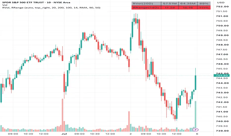
Sheabot Relative Volume and RangeDisplay a combined table showing relative volume and relative range (also known as Daily True Range vs Average True Range) on all timeframes. The table rows change colors based on the relative volume and relative range values. The values and colors can be configured.
These indicators are combined together for a more efficient display in the same location. These indicators also commonly move together. A low relative volume will also likely have a low relative range. A high relative volume may accompany the price breaking out past the average range and a relative range over 100%. The relative range can also help set price targets. If the relative range is less than 100%, then the stock has not yet moved to its average range.
These concepts are used and inspired by the great @ripster47 .
Relative Volume
Table displays current volume, average volume, and relative volume as a percent of current volume / average volume over the timeframe.
When the timeframe is 1D or less, then the current volume is the volume for the day so far, and the average volume is calculated over the past bar length days.
When the timeframe is greater than 1D, then the current volume is the volume for the week/month/year so far, and the average volume is calculated over the past bar length weeks/months/years.
High Percent: Default is 100. Relative volume below this is considered low and the table row is colored grey. Relative volume above this is considered high and the table row is colored yellow.
Unusual Percent. Default is 200. Relative volume above this is considered unusual and the table row is colored green.
Relative Range
Table displays daily true range (DTR), average true range (ATR), and relative range as a percent of DTR / ATR over the timeframe.
When the timeframe is 1D or less, then the daily true range is the difference between the high and low price since open, and the average true range is calculated over the past bar length days.
When the timeframe is greater than 1D, then the daily true range is the difference between the high and low price for the past week/month/year, and the average true range is calculated over the past bar length weeks/months/years.
Normal Percent: Default is 50. Relative range below this is considered low and the table row is colored grey. Relative range above this is considered normal and the table row is colored yellow.
High Percent. Default is 90. Relative range above this is considered high and the table row is colored red.
Gösterge

Liquidity Trail Matrix [WillyAlgoTrader]📊 Liquidity Trail Matrix (LTM) is an overlay trend-following system that combines a four-band proportional ATR trailing stack, a 5-factor retest quality score (0–100), a non-repainting higher-timeframe bias filter, a range-distributed volume profile of the current trend segment (POC / Value Area / HVN / LVN), and a full trade engine with wick-anchored stops, three R-multiple targets, break-even automation and honest session statistics — all in one indicator.
The core insight: a single trailing stop line gives you a binary answer — "in trend" or "flipped". But price interacts with the liquidity zone around the trail in layers: shallow pullbacks, deep sweeps, and full reversals all look different. LTM replaces the single line with a graded four-band matrix, scores every pullback-and-reclaim by depth, candle quality, volume, higher-timeframe alignment and trend maturity, and overlays where volume actually accumulated during the current trend leg — so you can see whether a retest is landing on real acceptance (HVN / POC) or falling into a volume vacuum (LVN).
Works on all markets (crypto, forex, stocks, indices, commodities) and all timeframes. On zero-volume symbols the profile automatically switches to a range-weighted proxy.
🧩 WHY THESE COMPONENTS WORK TOGETHER
A trailing stop alone tells you the trend direction but nothing about entry quality — every touch of the line looks the same. A volume profile alone shows you where volume traded but has no concept of trend regime or entry timing. A retest signal alone fires on any bounce, whether it happens in a mature trend with higher-timeframe support or in the dying bars of an exhausted move. Used separately, these tools leave you guessing.
LTM chains them into one pipeline:
ATR band stack → trend flip detection → pullback depth measurement → 5-factor quality scoring → HTF bias confirmation → trade engine (entry / SL / TP / BE) → segment volume profile context → session outcome tracking
The band stack defines the trend and, critically, grades how deep each pullback penetrates (Band 1 = shallow, Band 4 = extreme). That depth becomes the largest single component of the retest score. The score is then adjusted by the reclaim candle's close location, relative volume, trend age, and the higher-timeframe EMA-50 bias — five independent dimensions that a plain trailing stop cannot see. Every confirmed signal is handed to the trade engine, which places a structure-aware stop, three risk-multiple targets and manages break-even. Meanwhile the volume profile is rebuilt from the exact flip bar of the current trend, so POC, Value Area and LVN levels always describe this leg — telling you whether your entry sits on volume acceptance or in a vacuum. Finally, every closed trade feeds the on-chart statistics, so the dashboard shows how this exact configuration has behaved on this exact chart.
Remove any link and the chain breaks: without band depth there is no meaningful score; without the score every bounce is a signal; without the segment-anchored profile the volume context is stale; without the trade engine the signals have no defined risk; without stats you never learn whether the settings fit the instrument.
🔍 WHAT MAKES IT ORIGINAL
1️⃣ Proportional four-band trail geometry — spacing that scales with width.
Most multi-line trails use fixed offsets (base, base+1, base+2 ATR). LTM computes every band as a proportion of the base multiplier:
Band K distance = base × (1 + K_offset × step), giving four multipliers:
— m1 = base
— m2 = base × (1 + step)
— m3 = base × (1 + 2 × step)
— m4 = base × (1 + 3 × step)
With the default Balanced preset (base 4.0, step 0.25) that yields 4.0 / 5.0 / 6.0 / 7.0 ATR. Because spacing is proportional, the geometry of the stack stays visually and behaviorally consistent whether you run tight Scalping bands (2.5 × ATR, step 0.20) or wide Deep Trend bands (6.0 × ATR, step 0.30). Each band ratchets independently (max-lock in uptrends, min-lock in downtrends) and never loosens.
Why this matters: fixed +1/+2/+3 offsets make the stack proportionally "fat" at small base values and "thin" at large ones — proportional spacing keeps pullback depth grading meaningful at any width.
2️⃣ Selectable flip depth — you choose which band defines a reversal.
The trend flips only when price closes beyond a user-chosen band from the previous bar: Fast (Band 2), Balanced (Band 3, default) or Deep (Band 4). Comparing against the previous bar's band value prevents same-bar feedback between the flip and the band update. A warm-up guard (max(3 × ATR length, 60) bars) suppresses all signals until the ATR stack is statistically stable.
Why this matters: flip sensitivity becomes an explicit, single-purpose setting instead of an accidental side effect of band width.
3️⃣ 5-factor retest quality score (0–100) — every signal explains itself.
When price touches any band and then reclaims Band 1 with a directional candle inside the retest window (default 8 bars), LTM computes:
— 📐 Pullback depth (max 25) : Band 2 touch = 25, Band 3 = 18, Band 1 = 15, Band 4 = 10. The maximum touched depth during the pending window is used. Note the deliberate non-linearity: Band 2 scores highest — deep enough to reset liquidity, not deep enough to threaten the trend. Band 4 sweeps score lowest because they often precede full reversals.
— 🕯️ Reclaim candle (max 20) : close location value CLV = (close − low) / (high − low) for longs (mirrored for shorts). CLV > 0.7 → 20 points, > 0.5 → 12, else 5. A reclaim that closes near its extreme shows commitment.
— 📊 Volume (max 20) : current volume vs. the previous bar's 20-period SMA — the spike must not dampen itself by inflating its own average. Volume > 1.2 × baseline → 20, > 1.0 × → 12, else 5. Symbols without volume data receive a neutral 12.
— 🧭 HTF bias (max 20) : aligned with the higher-timeframe EMA-50 direction → 20, no HTF data → 10, against bias → 0.
— ⏳ Trend age (max 15) : 10–150 bars into the trend → 15 (mature, established), under 10 bars → 8 (unproven), over 150 → 5 (aging).
Signals print only when the total meets the Min Retest Score (default 80) and the shared anti-whipsaw cooldown (default 5 bars, deliberately shared across both directions) has elapsed. Every diamond label shows the score, and its tooltip breaks down all five components — no black-box signals.
4️⃣ Non-repainting higher-timeframe bias.
HTF bias compares the higher timeframe's previous closed bar close against its EMA-50, requested with confirmed-bar indexing so the value never changes retroactively. Bias is a soft score component (0/10/20 points), not a hard filter — counter-bias signals can still print if the other four factors are strong enough.
5️⃣ Segment volume profile — range-distributed, anchored to the live trend leg.
The profile is rebuilt on the last bar from the exact flip bar of the current trend (capped by Max Profile Bars, default 500) — no arbitrary lookback padding. Accumulation is range-distributed: each bar's volume is split across every price bin its high–low range overlaps, weighted by overlap fraction:
bin_volume += bar_volume × overlap(bin, bar_range) / (bar_high − bar_low)
This shows where volume actually traded, not where bars happened to close. From the histogram LTM derives:
— 🟡 POC — the highest-volume bin of the segment, drawn with price and volume label. The strongest magnet / defense level of this leg.
— 📦 Value Area (70%) — expanded symmetrically from POC by always adding the larger neighboring bin until 70% of segment volume is enclosed. VAH / VAL edges act as dynamic S/R.
— 📈 HVN — local volume peaks ≥ 0.55 × POC volume (configurable): acceptance shelves where price tends to stall.
— 🕳️ LVN — local troughs ≤ 0.30 × POC volume inside the Value Area (configurable): volume vacuums that price tends to travel through quickly. Each LVN is labeled and feeds a dedicated break alert.
On symbols with no volume feed (forex, some CFDs) the engine substitutes a true-range proxy per bar, so the profile stays structurally meaningful instead of failing.
6️⃣ Trade engine with strict signal-trade parity.
Every confirmed signal (scored retest or trend flip) acts, with unambiguous rules:
— flat → open a position in the signal direction
— opposite position → reverse (close and enter the new direction on the same bar)
— same-direction position → ignored (no pyramiding, no stop tampering)
There are exactly four closure paths: SL hit, break-even stop-out, TP3 touch, or reversal by an opposite signal. Hit detection uses three safety guards: an entry-bar guard (SL/TP are never evaluated on the entry bar itself), a pessimistic same-bar rule (if a bar touches both SL and a TP, the SL wins — statistics never get the benefit of the doubt), and a break-even latency rule (a stop moved to break-even mid-bar cannot trigger on that same bar — the engine checks against the bar-start stop value).
7️⃣ Wick-anchored stop-loss mode.
Two SL modes at entry:
— Wick-Anchored (default) : SL = signal bar's wick extreme ± 0.25 × ATR buffer, with a minimum distance of 0.5 × ATR enforced. The stop hides behind the structure that produced the signal instead of floating at an arbitrary distance.
— ATR : classic fixed SL Multiplier × ATR from entry.
TP1 / TP2 / TP3 are pure risk multiples of the actual SL distance (defaults 1R / 2R / 3R), so the reward structure automatically adapts to how much room the stop needed. Four risk presets (Conservative 2.5 × ATR SL, TP 1/2/4R; Balanced 1.5, TP 1/2/3R; Aggressive 1.0, TP 1.5/2.5/4R; Scalping 0.8, TP 0.8/1.5/2R) plus full Custom control. Optional break-even moves the stop to entry after TP1.
8️⃣ Honest session statistics with a fixed win definition.
A closed trade counts as a win only if TP1 was touched before closure — including break-even stop-outs after TP1 (you banked at least 1R or protected the position). Everything else is a loss, including reversals that never reached TP1. The dashboard shows closed trades, W/L, win rate with a ▰▱ gauge, and a "Form" strip of the last 10 outcomes. Stats are session-scoped and reset on chart reload — this is transparent live tracking of the current settings on the current chart, not a backtest report.
9️⃣ Trend P&L tracker and theme-aware visual system.
An optional floating label follows price in real time and shows the directional % move since the current trend flip (a falling bear trend shows positive %), anchored by a dotted baseline at the trend start price. The label turns red when the trend is under water. The entire visual layer — band transparencies, heatmap fills, dashboard, profile, SL/TP palette — has separate Dark and Light calibrations (Auto-detected from the chart background), because bright hues that look right on dark charts wash out on white ones. TP lines recolor to solid teal with a ✓ when touched; the SL line dims and the entry label annotates "→ SL (BE)" when break-even activates. SL/TP lines persist after the trade closes as a visual record until the next entry replaces them.
⚙️ HOW IT WORKS — CALCULATION FLOW
Step 1 — Band geometry: The preset (or Custom inputs) resolves the base multiplier and proportional step; four multipliers m1–m4 are derived and multiplied by ATR (default length 13).
Step 2 — Ratcheting trail: In an uptrend each band only rises (max-lock); in a downtrend only falls (min-lock). On a flip the whole stack re-seeds on the opposite side of price.
Step 3 — Flip detection: A close beyond the previous bar's value of the chosen flip band (2/3/4) reverses the trend state. Flip labels print on confirmed bars after the warm-up period.
Step 4 — Pullback tracking: Any touch of Band 1–4 against the trend arms a pending retest with its maximum depth, valid for the retest window; pendings decay each bar and are voided on a flip.
Step 5 — Reclaim and scoring: A directional close back beyond Band 1 triggers scoring: depth (25) + candle (20) + volume (20) + HTF bias (20) + trend age (15). Score ≥ threshold and cooldown elapsed → confirmed signal on bar close.
Step 6 — Trade engine: The signal opens or reverses a position; SL is placed (wick-anchored or ATR), TP1–TP3 are projected as risk multiples; break-even, TP recolors and the four closure paths are managed bar by bar with pessimistic resolution.
Step 7 — Segment profile: On the last bar the profile is rebuilt from the flip bar: range-distributed accumulation → POC → 70% Value Area expansion → HVN/LVN detection → drawing.
Step 8 — Reporting: The dashboard updates trend state, signal state, profile levels, live trade card and session statistics; alerts fire on bar close in within-bar chronological order (management → closures → reversal → entries → info).
📖 HOW TO USE
🎯 Quick start:
1. Add the indicator to your chart and pick a Band Width Preset: Scalping for 1–15M, Balanced for most timeframes, Deep Trend for D–W position trading.
2. Set the Higher Timeframe Bias one or two steps above your chart (e.g. 1H while trading 15M).
3. Choose a Risk Preset that matches your style, or leave Balanced.
4. Watch the dashboard: Trend + HTF Bias aligned means you only consider signals in that direction with full conviction; the retest diamonds do the timing.
5. After 15–20 closed trades, read the Stats section and tune Min Retest Score up (fewer, cleaner signals) or down (more signals) for your instrument.
👁️ Reading the chart:
— 🟢 / 🔴 Band stack + heatmap = the liquidity trail zone; the deeper the fill, the closer price is to a trend flip.
— ◆ diamond with a number = confirmed scored retest entry (the number is the 0–100 quality score; hover the tooltip for the full component breakdown).
— ▲ / ▼ FLIP = confirmed trend reversal through the chosen flip band.
— Long ▲ / Short ▼ = trade entry taken by the engine on a flip (printed when there is no retest diamond on the same bar, so every entry is visibly marked).
— ENTRY / SL / TP1–TP3 lines = the live trade card; TP lines turn solid teal with ✓ when touched; a dimmed SL with "→ SL (BE)" on the entry label means the stop sits at break-even.
— 🟡 POC line = highest-volume price of the current trend leg; dashed VAH/VAL = Value Area edges; LVN labels = volume vacuums inside the Value Area.
— ▲ +X.XX% floating label (optional) = real-time directional P&L of the current trend since the flip.
📊 Dashboard fields:
— Trend / Age : direction of the band stack and bars since the last flip.
— HTF Bias : higher-timeframe EMA-50 direction (soft score component).
— Signal : current engine position — LONG, SHORT or Wait.
— Last signal : most recent event, its score, and bars elapsed.
— POC / VA High / VA Low : live segment profile levels.
— Entry / SL / TP1–TP3 / R:R / SL Dist % : the open trade card ("BE @" marks a break-even stop; ✓ marks touched targets); collapses to one row when flat.
— Trades / W-L / Win rate / Form : session statistics; ▰ = win, ▱ = loss, newest on the right.
🔧 Tuning guide:
— Too many weak signals: raise Min Retest Score toward 85–90, or increase Signal Cooldown.
— Too few signals: lower Min Retest Score toward 55–65, or widen the Retest Window to 10.
— Whipsaw flips on a choppy symbol: switch Flip Band to Deep (Band 4) or move to the Deep Trend preset.
— Flips lag too far behind on fast moves: Flip Band → Fast (Band 2) or the Scalping preset.
— Stops feel too tight / too wide: switch SL Mode between Wick-Anchored and ATR, or change the Risk Preset; on volatile symbols prefer Conservative.
— Profile looks coarse on long trends: raise Profile Rows to 50+ and Max Profile Bars toward 800.
— Counter-trend retests keep printing: set an explicit Higher Timeframe Bias — counter-bias signals lose 20 points and rarely clear a high threshold.
⚙️ KEY SETTINGS
⚙️ Trend Engine:
— Band Width Preset (default Balanced): Scalping 2.5 × ATR / step 0.20, Balanced 4.0 / 0.25, Deep Trend 6.0 / 0.30, or Custom.
— Base Multiplier (default 5.0) and Band Spacing (default 0.25): manual geometry, active in Custom preset only.
— ATR Length (default 13): lookback for band-width ATR.
— Source (default close): price series for trailing and flips.
— Flip Band (default Balanced / Band 3): which band a close must breach to flip the trend.
— Higher Timeframe Bias (default empty = chart TF): HTF for EMA-50 bias scoring.
🎯 Signals:
— Min Retest Score (default 80): 0–100 quality threshold for retest diamonds.
— Retest Window (default 8 bars): how long a band touch stays armed for a reclaim.
— Signal Cooldown (default 5 bars): minimum spacing between signals, shared across directions.
📦 Volume Profile:
— Show Segment Volume Profile (on), Profile Rows (30), Profile Width (34 bars), Max Profile Bars (500).
— Show POC (on), Show Value Area 70% (on), Show HVN / LVN Levels (on), Profile Label Size (Small).
🛡️ Risk Management:
— Risk Preset (default Balanced): Conservative / Balanced / Aggressive / Scalping / Custom.
— SL Mode (default Wick-Anchored): structure-aware wick stop vs. fixed ATR distance.
— ATR Length (Risk) (14), SL Multiplier (1.5), TP1 / TP2 / TP3 Multipliers (1.0 / 2.0 / 3.0 × risk) — Custom preset.
— Break-Even After TP1 (on): stop moves to entry once TP1 is touched.
— Show SL/TP Lines / Labels / % Distance and per-line style controls (Entry dotted, SL solid, TP dashed by default).
🎨 Visual:
— Theme (Auto / Dark / Light), Show Trail Bands , Show Band Heatmap Fill , Show Retest Signals , Show Flip Labels , Show Trend P&L Tracker (off by default), label size controls, watermark toggle, Bull / Bear color pickers.
📊 Dashboard:
— Show Dashboard (on), position (5 anchors), font size, and independent toggles for the Market, Profile, Trade and Stats sections.
🔧 Advanced:
— HVN Threshold (default 0.55 × POC volume): minimum relative volume for an acceptance node.
— LVN Threshold (default 0.30 × POC volume): maximum relative volume for a vacuum node.
🔔 ALERTS
— 🟢 LONG ENTRY / 🔴 SHORT ENTRY — ticker, timeframe, price, signal score, SL, TP1–TP3, R:R. Plain text or JSON webhook format ({"action":"buy"...}) for bot integrations.
— 🎯 TP1 / TP2 / TP3 HIT — target touches with prices (optional).
— 🛡️ BREAK-EVEN — stop moved to entry after TP1 (optional).
— 🛑 SL HIT / BE STOP-OUT — stop-loss trigger with direction, entry and stop prices; a distinct BE variant when the stop was at break-even.
— 🔄 REVERSAL — position reversed by an opposite signal, with the closed trade's outcome (after / before TP1).
— ▲ / ▼ TREND FLIP — informational flips that did not open or reverse a trade.
— ⚡ LVN BREAK — a close crossing a Low Volume Node of the live segment profile (price entering a volume vacuum often accelerates).
All alerts fire once per bar close. Alerts are ordered by within-bar chronology: trade management → closures → reversal → new entries → informational.
⚠️ IMPORTANT NOTES
— 🚫 No repainting. All signals, entries and alerts are confirmed on bar close (barstate.isconfirmed). The trend flip compares against the previous bar's band value. The HTF bias uses the higher timeframe's previous closed bar, so its value never changes retroactively. A warm-up guard suppresses signals for the first max(3 × ATR length, 60) bars.
— 📐 The segment volume profile is a live construct. It is redrawn on the last bar for the current trend leg and evolves as the leg grows — this is by design (it describes the present segment), and historical profile states are not preserved.
— 📊 Session statistics reset on chart reload. They are transparent live tracking of the current settings on the current symbol and timeframe — not a backtest, and past performance does not guarantee future results.
— ⚖️ Same-bar ambiguity is resolved pessimistically. If one bar touches both a stop and a target, the stop wins in the statistics. Intrabar sequence cannot be known from OHLC data, so the engine never gives itself the benefit of the doubt.
— 🕳️ Zero-volume symbols use a range-weighted proxy for the profile, and the volume score component defaults to a neutral value — profile shapes on such symbols reflect price dwell time, not traded volume.
— 🛠️ This is an analysis and trade-planning tool, not an automated trading bot. It detects trend state, scores retests, projects stops and targets, and tracks outcomes — trade decisions remain yours.
— 🌐 Works on all markets and timeframes. Gösterge

Median Gaussian Trend | NAL1. Overview
Median Gaussian Trend | NAL is an adaptive trend-band indicator built from a median price baseline, Gaussian smoothing, and Gaussian-weighted volatility bands.
The indicator is designed to filter raw price movement into a smoother directional structure. Instead of using a simple moving average or standard deviation channel, it first compresses price through a median calculation, then applies Gaussian smoothing to create a cleaner baseline. Around that baseline, it builds adaptive upper and lower bands using Gaussian-weighted deviation.
The result is a robust, smooth trend regime tool that identifies when price breaks outside its filtered volatility structure.
2. Calculation
The indicator starts by calculating a median of the selected source. This helps reduce noise by focusing on the central value of recent price action instead of reacting directly to every candle.
That median value is then passed through a Gaussian filter. The Gaussian filter gives more structured weighting to the lookback window, producing a smoother baseline while still preserving directional movement.
The indicator then calculates a Gaussian-weighted deviation around the smoothed median baseline. This creates a custom volatility measurement that is more aligned with the filtered baseline rather than raw price alone.
The upper and lower bands are then built around the Gaussian-smoothed median. The script allows separate upper and lower multipliers, which lets the band structure be asymmetric if needed.
upper = median_base + sd_range * sd_mul
lower = median_base - sd_range * sd_mulb
A bullish state triggers when price closes above the upper band. A bearish state triggers when price closes below the lower band. When price remains inside the bands, the previous regime is held.
3. Key Features
Median-based price filtering.
Gaussian-smoothed baseline.
Gaussian-weighted volatility deviation.
Adaptive upper and lower trend bands.
Separate upper and lower band multipliers.
State-based candle coloring, band coloring, glow effect, and directional fills.
4. Use
Median Gaussian Trend is designed to identify when price escapes its smoothed median-volatility structure. A close above the upper band reflects bullish expansion, while a close below the lower band reflects bearish expansion.
The median component helps reduce noisy price behavior, while the Gaussian smoothing and deviation engine create a more refined trend envelope. This makes the indicator useful for reading directional structure without relying on a raw moving average channel.
This indicator is best used as a specialized module within a complete strategy framework. Its role is to isolate a filtered volatility-trend layer of price behavior, where the real value comes from how the signal is integrated into a broader process for regime, timing, and execution.
Gösterge