Multi Trend Score OscillatorsOscillators Multi Trend score
Part 1: How the Indicator Works Under the Hood
//The script evaluates the market using three independent concepts: Trend Direction, Momentum, and Market Regime (Volatility). It works on a strict point system that ranges between a maximum bullish score of +2.0 and a maximum bearish score of -2.0.
Trend Filter (Moving Averages): Max +/- 1.0 Point
It checks a fast 15 EMA and a slower 50 EMA.
Bullish (+1.0): If the 15 EMA is above the 50 EMA and the price is trading above the 15 EMA.
Bearish (-1.0): If the 15 EMA is below the 50 EMA and the price is trading below the 15 EMA.
Momentum Filter (MACD): Max +/- 1.0 Point
It analyzes the MACD line, Signal line, and Zero line.
Bullish Points: Gets +0.5 if the MACD line is above the Signal line, and another +0.5 if the MACD line is above the center zero line.
Bearish Points: Loses -0.5 if the MACD line is below the Signal line, and another -0.5 if the MACD line is below zero.
The Gatekeeper (ADX Filter)
Before plotting, it checks the ADX (Average Directional Index). If the ADX is below 20, it means the market is ranging, chopping sideways, or dead.
The Penalty: If ADX < 20, it slashes the final score by 75% (trendScore * 0.25). This flattens the wave near zero, saving traders from getting chopped up in range-bound markets.
Indicator Overview: Multi-Indicator Trend Score (MITS)
MITS is a quantitative dashboard squeezed into a single, clean oscillator pane. It eliminates analysis paralysis by combining Moving Average trends, MACD momentum, and ADX market //regimes into a dynamic Trend Score between -2 and +2.
🔹 Key Features:
//Confluence Scoring: Rather than looking at EMAs and MACD separately, the script calculates their confluence in real time.
ADX Volatility Gatekeeper: When the market enters a low-volume, sideways chop zone (ADX < 20), the script automatically flattens the scoring engine by 75%. This prevents false //breakout signals.
Clean Visuals: Smooth area-gradient fill anchors to a zero-line baseline. Bright Green represents aggregate bullish confluence; Deep Red highlights aggregate bearish confluence.
How to Trade It:
Score > 1.0: Strong Bullish Confluence. Look for long entries or ride the trend.
Score < -1.0: Strong Bearish Confluence. Look for short entries or protect capital.
Flatline / Near Zero: The market is either flipping trends or trapped in a low-volatility chop zone filtered by the ADX. Sit on your hands.
Gösterge

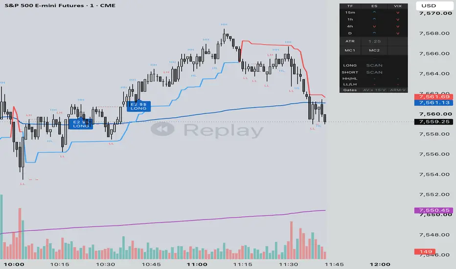
[ A L P H A X ] PIVOT - Smart Money StructureAlphaX PIVOT — Smart Money Structure + OTE Pullback Engine: Market Structure Tracking, Optimal Trade Entry Zones, Liquidity Sweep Detection & 7-Layer Confluence Scoring
AlphaX PIVOT is a professional-grade smart money pullback system built around two of the most powerful concepts in institutional price action: market structure and the Optimal Trade Entry zone. Where breakout-based systems enter at the moment of structural displacement — chasing the move after it has already begun — PIVOT waits for the market to pull back into the precise Fibonacci retracement zone where institutional continuation orders are resting, and fires only when a qualified rejection candle confirms within that zone with multi-layer confluence backing. The result is a system that gives you the same directional conviction as a breakout entry at a structurally superior price — buying the pullback into institutional demand after a bullish BOS or CHoCH, selling the pullback into institutional supply after a bearish structure shift — with a stop anchored to the structural swing low or high rather than an arbitrary ATR distance. Designed for precision-entry traders across crypto, forex, gold, and indices on any timeframe.
━━━━━━━━━━━━━━━━━━━━━━━━━━━━━━━━━━━━━━━━
📐 The Core Philosophy — Why Pull Back to OTE?
A Break of Structure or Change of Character tells you that the market has shifted direction at the institutional level. But the bar that breaks structure is rarely the optimal entry — it has already moved aggressively, the risk/reward from entry is reduced, and a pullback is statistically likely before the continuation begins.
The Optimal Trade Entry concept solves this. After a structural displacement move, price almost always retraces into a specific Fibonacci retracement zone — the 61.8% to 78.6% retracement of the displacement leg — before the next move in the structural direction begins. This zone is where institutional orders waiting at discount prices (in a bull structure) or premium prices (in a bear structure) are filled. Entering in the OTE zone means entering where institutions are entering, with the displacement leg already confirmed as the directional signal and the structural swing as the natural stop reference.
PIVOT detects every structural event, computes the OTE zone for the displacement leg in real time, and monitors for qualified rejection entries within that zone — all while running a 7-layer confluence engine that scores every potential entry before it fires.
━━━━━━━━━━━━━━━━━━━━━━━━━━━━━━━━━━━━━━━━
🏗 Market Structure Engine — Tracking BOS & CHoCH
The market structure engine runs a real-time fractal pivot detection system that tracks the most recent confirmed swing high and swing low on every bar, identifies every Break of Structure and Change of Character event, and maintains a live structural trend state.
Pivot detection:
Swing highs and lows are detected using a configurable pivot length (default: 5 bars each side). A pivot is confirmed when the specified number of bars on both the left and right side are lower (for a pivot high) or higher (for a pivot low). This creates confirmation — not just a local high or low, but a genuine fractal swing point.
Break of Structure (BOS):
When price closes above the most recent confirmed swing high while the structure is already bullish, a bullish BOS is detected — confirming the uptrend is intact and continuing. When price closes below the most recent swing low in a bearish structure, a bearish BOS is confirmed. BOS events are continuation signals — the existing structure is reinforcing itself.
Change of Character (CHoCH):
When price closes above a swing high while the structure is bearish, a bullish CHoCH is detected — the character of the market has changed from bearish to bullish. A bearish CHoCH is the inverse. CHoCH events are the highest-quality structural signals — they represent genuine institutional trend reversals and form the trigger for PIVOT's highest-conviction setup type.
Structure break mode:
The Close Only setting (default: on) requires a candle body close beyond the swing level for a BOS or CHoCH to register. When off, any wick touch counts. Body close is the stricter, cleaner mode — it eliminates false structure breaks caused by wick spikes that fail to close through the level, producing fewer but more reliable structural events.
Live swing levels:
The most recent confirmed swing high (plotted as a red dashed line) and swing low (yellow-green dashed line) are maintained on the chart in real time, extending forward until superseded by a new confirmed pivot. These levels represent the current active liquidity pools — the precise levels where the next sweep event is likely to occur.
━━━━━━━━━━━━━━━━━━━━━━━━━━━━━━━━━━━━━━━━
📦 Structure Leg Box & Equilibrium — The Dealing Range
Every confirmed structure break event spawns a Structure Leg Box — a semi-transparent purple rectangle anchored to the displacement leg that produced the structural event. This box is the visual equivalent of the ANCHOR trend segment box, providing immediate context for the current structural move's price range.
Box construction:
For a bullish structure break, the leg box spans from the previous swing low (the origin of the displacement) to the close that broke structure — capturing the full range of the institutional displacement move. For a bearish structure break, it spans from the previous swing high down to the structure break close.
Equilibrium line:
The midpoint of the structure leg box — the 50% retracement level — is plotted as a purple dotted line extending forward. This is the leg's equilibrium level and the dividing line between discount (below EQ, favorable for longs) and premium (above EQ, favorable for shorts). The Premium/Discount requirement enforces that PIVOT signals can only fire when price is in the institutionally correct zone relative to this level.
Live updating:
The box expands as the trend develops — if price makes new highs in a bull leg, the box top extends upward. The equilibrium adjusts continuously. This ensures the OTE calculations always reflect the full extent of the current structural leg, not just the initial displacement.
━━━━━━━━━━━━━━━━━━━━━━━━━━━━━━━━━━━━━━━━
🎯 The OTE Zone — Optimal Trade Entry Band
The Optimal Trade Entry zone is a Fibonacci retracement band calculated from the structure leg's high and low — the 61.8% to 78.6% retracement zone (configurable). This is the institutional re-entry zone — the price area where sophisticated traders who missed the initial displacement fill their positions on the pullback.
OTE calculation for bull structure:
OTE Top = Leg High − (Leg Range × OTE Fib Low). Default: Leg High − (Range × 0.618)
OTE Bottom = Leg High − (Leg Range × OTE Fib High). Default: Leg High − (Range × 0.786)
This creates a band in the lower portion of the leg range — price must retrace between 61.8% and 78.6% of the upward displacement before the OTE zone is active.
OTE calculation for bear structure:
OTE Bottom = Leg Low + (Leg Range × OTE Fib Low)
OTE Top = Leg Low + (Leg Range × OTE Fib High)
This creates a band in the upper portion of the leg range — price must retrace between 61.8% and 78.6% of the downward displacement before the OTE zone is active.
Why the 61.8–78.6% zone: The 61.8% (golden ratio) and 78.6% (square root of 0.618) retracement levels are the two most consistently respected Fibonacci levels in institutional price delivery. They represent the deepest pullback levels that remain structurally valid — a retracement beyond 78.6% technically invalidates the structure leg's momentum. Entries within this zone maximize reward (entering near the deepest discount in a bull leg) while minimizing risk (the stop is at the structural swing, not far from the OTE bottom).
OTE zone visualization: A semi-transparent purple box rendered from the leg start bar to two bars beyond the current bar, spanning the OTE top and bottom prices. The zone extends and updates in real time as the leg evolves. The exact OTE band price levels are displayed on the dashboard for immediate reference.
In-OTE detection: The current bar is considered in the OTE zone when the bar's low (for bull setups) reaches within the OTE band, or the bar's high (for bear setups) reaches within the OTE band. This detects the precise moment price has retraced into the optimal entry area.
━━━━━━━━━━━━━━━━━━━━━━━━━━━━━━━━━━━━━━━━
💧 Liquidity Sweep Detection
The sweep detection engine identifies liquidity grab events relative to recent price extremes, adding an important second dimension to PIVOT's entry context. A sweep is detected when price briefly extends beyond the recent high or low reference level by a minimum ATR depth, then reverses and closes back inside — the classic stop-hunt signature.
Bull sweep: The current bar's low extends below the lowest low of the lookback period (default: 20 bars) by at least the minimum sweep depth (default: 0.1× ATR), and the bar closes above that low and closes bullish (close above open). Sell-side liquidity has been grabbed.
Bear sweep: The high extends above the highest high of the lookback period by at least the minimum depth, and the bar closes below that high and closes bearish. Buy-side liquidity has been grabbed.
Sweep recency: PIVOT accepts sweeps from the current bar or either of the two preceding bars — a three-bar recency window. This accommodates the common scenario where the sweep candle precedes the OTE entry bar by one or two bars, allowing the confluence engine to credit the sweep even when entry occurs slightly after the grab.
Setup B — Sweep + CHoCH: When a sweep occurs within 40 bars of a Change of Character event and price is simultaneously in the OTE zone with a rejection candle, PIVOT's second setup type fires — the Sweep + CHoCH entry. This is the highest-conviction entry type: a CHoCH confirms the structural reversal, the sweep confirms institutional liquidity accumulation, and the OTE entry delivers the optimal price. All three institutional signals converging simultaneously.
Sweep markers (optional): Small orange circles can be plotted above or below bars where sweeps are detected. Off by default — sweeps count toward confluence scoring regardless of whether markers are displayed — but enabling them provides visual awareness of every liquidity event on the chart.
━━━━━━━━━━━━━━━━━━━━━━━━━━━━━━━━━━━━━━━━
🕯 Rejection Candle Confirmation
Every PIVOT entry requires a qualifying rejection candle within the OTE zone — the candle that demonstrates price has touched the OTE level and been rejected back in the structural direction.
Bull rejection (Bullish Rejection or Engulfing):
Bullish Rejection — the bar closes bullish (close above open) and the close-to-low distance represents more than 55% of the bar's total range. The lower wick consumes the majority of the bar's range — buyers overwhelmed sellers that pushed into the OTE zone
Bullish Engulfing — a bullish close that fully engulfs the prior bearish candle — closing above the prior open while the prior candle was bearish. Confirms a clean reversal of the pullback momentum
Bear rejection (Bearish Rejection or Engulfing):
The mirror conditions — a bearish close with the high-to-close distance exceeding 55% of range, or a bearish engulfing of the prior bullish candle.
Why candle confirmation is essential: The OTE zone being touched is a necessary but not sufficient condition for entry. Price can drift through the OTE zone on low momentum without producing a genuine reversal. The rejection candle requirement ensures that the OTE touch produced a visible institutional response — not just a passive drift through the zone.
━━━━━━━━━━━━━━━━━━━━━━━━━━━━━━━━━━━━━━━━
🧠 The 7-Layer Confluence Engine
Every potential entry is evaluated across seven independent confluence layers. The default minimum is 5 of 7 — a high-quality gate that blocks setups where several dimensions of confirmation are missing.
━━━━━━━━━━━━━━━━━━━━━━━━━━━━━━━━━━━━━━━━
Layer 1 — Market Structure Direction
Awards 1 point when the current structural trend agrees with the signal direction — bullish structure for longs (structure == 1), bearish for shorts. This is also a hard prerequisite enforced in the setup conditions — no PIVOT signal can fire without the structural trend being established in the signal direction. Structure is simultaneously a confluence layer and a foundational entry requirement.
━━━━━━━━━━━━━━━━━━━━━━━━━━━━━━━━━━━━━━━━
Layer 2 — OTE Zone Touch
Awards 1 point when the current bar is within the OTE retracement band for the active leg direction — the 61.8–78.6% retracement zone. Also a hard prerequisite in the setup conditions. Ensures the entry is at the institutionally optimal retracement depth, not at an arbitrary price within the leg range.
━━━━━━━━━━━━━━━━━━━━━━━━━━━━━━━━━━━━━━━━
Layer 3 — Premium/Discount Zone
Awards 1 point when price is in the correct zone relative to the leg equilibrium — below EQ (discount) for bull entries, above EQ (premium) for bear entries. The PD Zone layer enforces the institutional entry positioning principle: buy when price is cheap relative to the leg's fair value, sell when expensive. A valid OTE touch in the wrong PD zone (above EQ for a bull entry) carries a fundamental positioning problem — this layer blocks it.
━━━━━━━━━━━━━━━━━━━━━━━━━━━━━━━━━━━━━━━━
Layer 4 — HTF Bias
Awards 1 point when the higher timeframe EMA structure (default: 60-minute, 21/55 EMA) agrees with the signal direction, using the same strict condition as SURGE and ANCHOR — the HTF fast EMA must be above the slow EMA and the HTF close must be above the fast EMA for a bull vote. A bull OTE entry against a bearish HTF is a counter-trend trade; this layer ensures PIVOT's signals align with the macro institutional flow.
━━━━━━━━━━━━━━━━━━━━━━━━━━━━━━━━━━━━━━━━
Layer 5 — Liquidity Sweep
Awards 1 point when a qualifying sweep has occurred within the three-bar recency window in the correct direction. A sweep before or coinciding with the OTE entry dramatically increases the probability that the pullback is a genuine institutional accumulation event rather than a mechanical retracement. When the Sweep Filter is disabled, this layer is not available for scoring — the total achievable score drops to 6 of 6 in that configuration.
━━━━━━━━━━━━━━━━━━━━━━━━━━━━━━━━━━━━━━━━
Layer 6 — Rejection Candle
Awards 1 point when a qualifying bull rejection or bullish engulfing candle (long) or bear rejection or bearish engulfing candle (short) is present on the current bar. This is the candle confirmation layer — confirming that the institutional response to the OTE touch is visible and decisive on the current bar.
━━━━━━━━━━━━━━━━━━━━━━━━━━━━━━━━━━━━━━━━
Layer 7 — ADX + Volume Expansion
Awards 1 point when both the ADX filter and the volume expansion filter pass simultaneously. ADX confirms the market has directional strength rather than ranging. Volume exceeding the moving average confirms genuine institutional participation on the entry candle rather than a low-activity drift through the OTE zone. Both conditions must be true for the single layer point — they are evaluated jointly.
━━━━━━━━━━━━━━━━━━━━━━━━━━━━━━━━━━━━━━━━
🏷 Two Setup Types — A and B
PIVOT fires signals through two distinct setup configurations, each representing a different institutional entry scenario. Both can be enabled simultaneously.
Setup A — OTE Pullback:
The foundational PIVOT setup. Fires when the market structure is established (BOS or CHoCH has confirmed), the displacement leg is active, price pulls back into the 61.8–78.6% OTE zone, a rejection candle forms within the zone, and the full confluence stack meets the minimum score. This is the highest-frequency setup type — it captures the standard institutional pullback sequence following any qualifying structure event.
Setup B — Sweep + CHoCH:
The premium PIVOT setup. Requires all Setup A conditions plus a Change of Character within the lookback window (40 bars) and a qualifying liquidity sweep within the three-bar recency window. The sequence is: liquidity sweep (stop hunt) → CHoCH (structural reversal confirmation) → OTE pullback (optimal entry). When all three institutional events converge simultaneously in the OTE zone with a rejection candle, this is among the highest-conviction setups available in the entire AlphaX indicator suite.
━━━━━━━━━━━━━━━━━━━━━━━━━━━━━━━━━━━━━━━━
🎯 Structural Stop Loss Placement
PIVOT uses structurally anchored stop placement — the stop is placed beyond the most recent confirmed swing low (for bull entries) or swing high (for bear entries), plus a small configurable ATR buffer (default: 0.25× ATR).
Why this is the correct stop for OTE entries: The OTE entry is made on the premise that the structural swing low (bull) or high (bear) will hold — it is the key level whose violation would invalidate the entire structural thesis. If price closes through the swing low after a bull OTE entry, the structure leg is negated, the displacement was a false break, and the position thesis is fundamentally wrong. The structural swing is therefore not an arbitrary stop choice — it is the precise price at which the trade is provably wrong.
This produces stops that adapt naturally to the leg size: large legs with distant swings produce wider stops and wider profit targets; tight legs with nearby swings produce tighter, higher-precision entries. The risk/reward is computed dynamically as `(close − slGuide) × TP Reward (R)`.
━━━━━━━━━━━━━━━━━━━━━━━━━━━━━━━━━━━━━━━━
📊 Live Dashboard
The 16-row real-time dashboard displays the complete internal state across four sections.
STRUCTURE
Market Struct — current structural trend: ▲ BULLISH, ▼ BEARISH, or — NEUTRAL
PD Zone — current position relative to leg equilibrium: ◧ DISCOUNT, ◧ PREMIUM, or — EQ
Leg EQ — the exact leg equilibrium price (50% of the structure leg range) in real time
OTE Band — the current OTE zone bottom and top prices. Updates live as the leg expands
FILTERS
HTF Bias — higher timeframe EMA alignment: ▲ BULL, ▼ BEAR, or — FLAT
ADX — live ADX value with ✓ or ✗ pass/fail
Session — ✓ ACTIVE or ✗ OFF
LEVELS
Swing Hi — the most recent confirmed fractal swing high price. This is the current sell-side liquidity level and bear structural reference
Swing Lo — the most recent confirmed fractal swing low. The current buy-side liquidity level and bull structural stop reference
CONFLUENCE
Bull Score — live 0–7 confluence score. Background highlights yellow-green when threshold is met
Bear Score — live 0–7 score. Background highlights red when threshold is met
Live confluence label: During BUILDING and active leg phases, a small label near the OTE zone on the last bar shows B x/7 · S x/7 in real time — identical to ANCHOR's live score display — so you can monitor confluence building without dashboard attention.
━━━━━━━━━━━━━━━━━━━━━━━━━━━━━━━━━━━━━━━━
📈 Chart Visual System
Structure Leg Box (purple, semi-transparent) — the dealing range of the current displacement leg from structural origin to current price extreme. Adapts as the leg evolves
OTE Band Box (purple, deeper tint) — the 61.8–78.6% retracement zone of the current leg, extending two bars beyond the current bar for forward visibility
Leg Equilibrium Line (purple dots) — the 50% midpoint of the structure leg, continuously updated
Swing High Line (red dashed) — the most recent confirmed fractal swing high
Swing Low Line (yellow-green dashed) — the most recent confirmed fractal swing low
▲ Small Triangle (BOS Bull) — bullish Break of Structure, semi-transparent yellow-green
▲ Large Triangle (CHoCH Bull) — bullish Change of Character, bright yellow-green, larger size
▼ Small Triangle (BOS Bear) — bearish Break of Structure, semi-transparent red
▼ Large Triangle (CHoCH Bear) — bearish Change of Character, bright red, larger size
● Circle (optional, orange) — sweep detection markers when Show Sweep Markers is enabled
▲ Large Triangle (bull signal) — PIVOT long entry. All conditions confirmed
▼ Large Triangle (bear signal) — PIVOT short entry
Live confluence label — B x/7 · S x/7 near the OTE zone on the current bar
SL Guide (red dotted circles) — structural stop loss level below/above the swing reference
TP Guide (yellow-green dotted circles) — dynamically computed reward target based on R multiple
━━━━━━━━━━━━━━━━━━━━━━━━━━━━━━━━━━━━━━━━
🚀 How to Trade with AlphaX PIVOT — Step by Step
Step 1 — Identify the Structural Context
Check the dashboard Market Struct row. ▲ BULLISH or ▼ BEARISH tells you the directional bias. — NEUTRAL means no structure is established — no setup can develop
Note the Swing Hi and Swing Lo levels on the dashboard. These are the current liquidity pools and structural stop references
Check HTF Bias — does the higher timeframe agree with the current structure? HTF alignment is worth 1 confluence point and significantly improves setup quality
Step 2 — Watch for a Structure Event
A large bright ▲ CHoCH triangle below the bar marks a bullish Change of Character — the highest-priority structural event. The structure leg box and OTE zone will draw immediately
A smaller ▲ BOS triangle marks a bullish Break of Structure — confirmation the trend is continuing
After either event, the Structure Leg Box and OTE Band are drawn in real time. Note where the OTE zone sits in absolute price terms from the dashboard's OTE Band row
Step 3 — Wait for the OTE Pullback
After the displacement, watch price retrace toward the OTE zone. The purple OTE box on the chart gives you the exact price boundaries
Check PD Zone on the dashboard — for bull entries, you want ◧ DISCOUNT to confirm price is below the leg equilibrium when it enters the OTE
Watch the live B x/7 score label near the OTE zone. As price approaches the zone, the score builds in real time
Step 4 — Enter on the PIVOT Signal
A ▲ triangle at the OTE zone confirms all conditions — structure direction, OTE touch, PD zone, HTF bias, sweep (if applicable), rejection candle, and ADX/volume
The SL guide is plotted below the structural swing low (bull) — your structural invalidation level
The TP guide is plotted at the computed reward target based on your configured R multiple
For Setup B signals (Sweep + CHoCH), all three institutional events have converged — this is the highest-conviction PIVOT entry available
Step 5 — Manage and Exit
At the TP guide level, take partial or full profit
If a new CHoCH fires in the opposite direction during the trade, the structure has reversed — this is the exit signal for any remaining position
If price retests the OTE zone again during the same structural leg without triggering a new signal (cooldown active), wait for the cooldown to clear and assess whether the fresh confluence score still meets the minimum
━━━━━━━━━━━━━━━━━━━━━━━━━━━━━━━━━━━━━━━━
⚠ Identifying Low-Quality Conditions — When Not to Trade
Stand aside when:
Market Struct shows — NEUTRAL — no structural direction is established. Without a confirmed BOS or CHoCH, the leg box and OTE zone have no directional context. Wait for a structural event to occur before looking for OTE entries
HTF Bias opposes structure direction — a bullish current timeframe structure against a bearish HTF is a counter-trend setup. These carry significantly lower success rates. The HTF alignment layer will not score, reducing the confluence count
Price is in the wrong PD zone for the setup direction — a bull entry above the leg equilibrium (premium) or a bear entry below (discount) means entering when price is institutionally expensive relative to the leg's fair value. The PD zone filter blocks these when enabled
Score is at 4/7 and the minimum is 5/7 — the setup is present but not enough layers confirm. Do not force entries when confluence is borderline
Structure events (BOS/CHoCH) are flipping rapidly in both directions — alternating bull and bear structure events in quick succession indicate a choppy market with no clean trend. The OTE zones will be constantly resetting without producing completed pullback sequences
OTE zone is very close to the swing low (bull) or swing high (bear) — when the OTE band and the structural stop reference are nearly at the same price, the risk/reward is poor. The stop would be just below the OTE entry. Reduce position size or pass the setup
The ideal PIVOT setup:
CHoCH event followed by a clean displacement leg with a well-defined leg box
Price retraces into the OTE zone while in discount (bull) or premium (bear)
A qualifying sweep has occurred within the last three bars
HTF Bias aligned with structure direction
Rejection candle forms within the OTE zone
Confluence score at 6/7 or 7/7
ADX confirms trending and volume is expanding
━━━━━━━━━━━━━━━━━━━━━━━━━━━━━━━━━━━━━━━━
⚡ Key Features
📐 Real-time market structure engine — fractal pivot detection with configurable sensitivity, tracking BOS and CHoCH events with body-close confirmation mode
📦 Structure Leg Box — automatically drawn from the structural origin to the current price extreme, expanding in real time as the leg develops
🎯 Optimal Trade Entry zone — 61.8–78.6% Fibonacci retracement band computed from the structure leg, rendered as a live OTE box and displayed with exact price levels on the dashboard
⚖ Leg Equilibrium line — 50% midpoint of the structure leg acting as the dynamic PD zone divider, plotted continuously and updated as the leg grows
💧 Liquidity sweep detection — identifies stop-hunt events relative to the recent price range with configurable ATR depth and three-bar recency window
🏅 Two setup types — Setup A (OTE Pullback after any BOS/CHoCH) and Setup B (Sweep + CHoCH + OTE — the highest-conviction institutional entry pattern)
🕯 Dual candle confirmation — bullish/bearish rejection candles and engulfing candles both qualify, ensuring the OTE touch produced a genuine institutional reversal response
🧠 7-layer confluence engine — Market Structure, OTE Touch, PD Zone, HTF Bias, Liquidity Sweep, Rejection Candle, and ADX + Volume Expansion all scored independently
📊 Live confluence label near OTE zone — B x/7 · S x/7 displayed in real time on the current bar without requiring dashboard reference
🎯 Structural stop loss — placed beyond the confirmed swing low (bull) or swing high (bear) plus ATR buffer, anchored to the genuine structural invalidation level
💹 Dynamic TP target — computed as `risk × R multiple`, adapting to leg size rather than using a fixed ATR distance
📡 HTF EMA bias filter — strict dual-condition HTF alignment (EMA crossover + price above fast EMA) for maximum higher timeframe conviction
🕐 Session filter — restricts signals to configurable active trading hours
📊 16-row live dashboard — Structure, Filters, Levels, and Confluence sections updated in real time
🔔 6 alert conditions — long/short entry, bull/bear CHoCH, sweep low, sweep high
🎨 Fully cohesive dual-tone color system — yellow-green for all bullish elements, red for all bearish, purple for structural reference levels and OTE zone, orange for sweeps
⚙ Fully configurable — pivot length, structure break mode, OTE Fibonacci levels, sweep depth and lookback, setup types, confluence minimum, HTF timeframe and EMAs, ADX, volume filter, session, SL buffer, TP reward multiple, and all colors are independently adjustable
━━━━━━━━━━━━━━━━━━━━━━━━━━━━━━━━━━━━━━━━
⚙ Settings Reference
Structure Engine
Pivot Length (bars each side) — fractal sensitivity. 3 for scalping, 5 for standard intraday (default), 7+ for swing trading
Structure Break: Close Only — when on, requires a candle body close beyond the swing level (default: on). Off = wick touch counts
Show Active Swing Levels — toggle swing high and swing low dashed lines
Show BOS / CHoCH Markers — toggle all structure event triangles
CHoCH Only (hide BOS markers) — when on, only CHoCH events are marked. BOS events still update structure but are not labeled
Structure Leg & OTE
Show Structure Leg Box — toggle the displacement leg dealing range box
Show Leg Equilibrium (50%) — toggle the leg midpoint line
Show OTE Band (62–79%) — toggle the Fibonacci retracement entry zone box
OTE Fib Low — lower Fibonacci level of the OTE band (default: 0.618)
OTE Fib High — upper Fibonacci level of the OTE band (default: 0.786)
Require Premium / Discount — when on, longs require discount positioning, shorts require premium (default: on)
Liquidity Sweep
Enable Sweep Filter — when on, Layer 5 scores the recent sweep and Setup B becomes available
Show Sweep Markers — toggle optional orange circle markers at sweep detection bars
Min Sweep Depth (xATR) — minimum wick extension beyond the reference extreme to qualify as a sweep (default: 0.1)
Sweep Reference Lookback — bars used to define the recent high/low reference for sweep detection (default: 20)
Entries & Confluence
Setup A · OTE Pullback — enable standard OTE pullback entries after BOS or CHoCH
Setup B · Sweep + CHoCH — enable the premium sweep + reversal + OTE setup type
Min Confluence Layers (of 7) — minimum score required for a signal (default: 5)
Show Entry Signals — toggle signal triangles
Show Confluence Label — toggle the live B/S score label near the OTE zone
Signal Cooldown (bars) — minimum bars between consecutive signals (default: 8)
Filters
HTF Trend Filter — toggle the higher timeframe EMA alignment requirement
HTF Timeframe — the higher timeframe for EMA data (default: 60-minute)
HTF Fast / Slow EMA — EMA periods on the HTF (defaults: 21 / 55)
ADX Trend Filter — toggle the ADX strength requirement (default: off)
ADX Length / ADX Minimum — ADX parameters (defaults: 14 / 18)
Volume Expansion Confirm — when on, entry candle volume must exceed the moving average by the minimum multiplier
Min Volume vs Avg — minimum volume ratio for the expansion filter (default: 1.1)
Volume Avg Length — SMA length for the volume baseline (default: 20)
Session Filter — toggle active hours restriction (default: off)
Active Session — configurable session window
Exit Guidance
ATR Length — lookback for ATR calculation (default: 14)
Show SL / TP Guides — toggle stop and target dotted circle plots
SL Buffer Beyond Swing (xATR) — additional ATR buffer beyond the structural swing stop reference (default: 0.25)
TP Reward (R) — take profit distance as a multiple of the risk from entry to stop (default: 2.0)
Display
Show Dashboard — toggle the full dashboard panel
Dashboard Position — Top Left / Top Right / Bottom Left / Bottom Right
Colors
Bull / Bull Bright — yellow-green family for bullish signals, fills, and labels
Bear / Bear Bright — red family for bearish signals, fills, and labels
Sweep / Alert — orange for sweep markers and alerts
Equilibrium / OTE Band — purple for structural reference levels and OTE zone
SL Guide / TP Guide — stop and target circle colors
Bull / Bear Label Text — text color for signal labels
Dash Text / Dash BG / Dash Header / Dash Section / Dash Frame — full dashboard color control
━━━━━━━━━━━━━━━━━━━━━━━━━━━━━━━━━━━━━━━━
🔔 Alert Conditions (6 total)
Entry Alerts
Pivot Long Entry — all conditions confirmed for a long OTE setup. Signal label fired
Pivot Short Entry — all conditions confirmed for a short OTE setup
Structure Alerts
Pivot Bull CHoCH — bullish Change of Character detected. Watch for OTE pullback in discount zone
Pivot Bear CHoCH — bearish Change of Character detected. Watch for OTE pullback in premium zone
Sweep Alerts
Pivot Sweep Low — sell-side liquidity swept below recent lows. Potential long setup developing
Pivot Sweep High — buy-side liquidity swept above recent highs. Potential short setup developing
All alert messages are formatted as const strings for clean webhook and notification platform integration.
━━━━━━━━━━━━━━━━━━━━━━━━━━━━━━━━━━━━━━━━
🎯 Recommended Settings by Instrument & Timeframe
The default configuration is optimized for XAUUSD on M5–M15 , with general suitability for major forex pairs and crypto on the same timeframes:
Pivot Length at 5 — the classic fractal sensitivity for intraday gold and forex. Balances signal frequency with structural significance
Close Only on — body close structure breaks eliminate the vast majority of wick-based false breaks on gold and volatile instruments
Setup B (Sweep + CHoCH) on — the highest-quality setups on gold involve a sweep before the CHoCH, making this setup type particularly effective on XAUUSD
HTF at 60-minute — the standard intraday reference for M5–M15 trading
ADX filter off by default — the OTE + rejection candle requirements already provide strong quality filtering without needing ADX as an additional gate
For other instruments or timeframes, adjust:
M1–M3 scalping — reduce Pivot Length to 3, increase Cooldown to 5, reduce TP Reward to 1.5, use tight session filter
H1–H4 swing trading — increase Pivot Length to 7–10, set HTF to Daily or Weekly, increase TP Reward to 3.0–4.0, increase SL Buffer to 0.5
Crypto (BTC, ETH) — increase Sweep Depth to 0.2–0.3× ATR for the wider wicks typical of crypto, consider enabling ADX filter at 20
Indices (NAS100, US30) — use Pivot Length 5–7, enable Session Filter to 09:30–16:00, enable ADX filter
More signals — lower Min Confluence to 4, disable PD Zone requirement, enable Setup A only, reduce Cooldown
Ultra-selective entries only — raise Min Confluence to 6 or 7, require Setup B only, enable ADX filter, enable Volume Expansion
━━━━━━━━━━━━━━━━━━━━━━━━━━━━━━━━━━━━━━━━
👥 Who This Is For
🎯 OTE and Fibonacci pullback traders — PIVOT is the definitive quantitative implementation of the Optimal Trade Entry framework. Every component — structure detection, leg computation, Fibonacci zone rendering, and rejection confirmation — is automated and scored
🏦 Smart money concepts and ICT methodology traders — PIVOT encodes the CHoCH → displacement → OTE pullback sequence that forms the core of ICT's entry model. The Sweep + CHoCH setup type specifically captures the stop hunt → reversal → optimal entry sequence
🥇 Gold (XAUUSD) and forex traders — the default settings are calibrated for intraday gold trading, where OTE pullbacks after CHoCH events are among the most consistent institutional patterns available
📊 Traders who want structure-defined risk — the structural stop placement means every trade has a stop at a genuinely meaningful level — the swing that would invalidate the structure thesis — rather than an arbitrary ATR distance
🧠 Systematic traders who want to quantify OTE entries — the 7-layer scoring system removes subjectivity from OTE trading. Every potential entry is scored objectively against the same seven criteria on every bar
📈 Traders who want to enter later at a better price — PIVOT's entire philosophy is about waiting for the pullback. If you consistently enter at breakouts and then watch price retrace before continuing, PIVOT is the solution — it waits for that retracement and enters at the optimal Fibonacci level within it
⚠ Traders who struggle with stop placement — the structural swing reference + ATR buffer produces a stop that makes structural sense. You are not guessing where to put the stop — the market's structure tells you exactly where it belongs
━━━━━━━━━━━━━━━━━━━━━━━━━━━━━━━━━━━━━━━━
📝 Notes
All signals are confirmed on bar close — the indicator is non-repainting by design. Pivot detection, structure break logic, OTE zone calculation, and confluence scoring all finalize on confirmed bars only
The pivot detection has an inherent offset of pivotLen bars — a pivot is only confirmed after pivotLen bars have passed on both sides. This is standard behavior for fractal-based pivot systems and is not repainting — it is the mathematical requirement for confirming the fractal pattern
The Structure Leg Box and OTE Zone are redrawn only on the last bar for chart cleanliness. Historical bars retain signal markers and BOS/CHoCH labels but do not show outdated box overlays
The CHoCH window for Setup B (40 bars) means a Sweep + CHoCH setup can fire up to 40 bars after the CHoCH event, as long as the OTE zone is still valid and all other conditions are met. On slower timeframes this window covers a wider clock-time range — adjust if needed
The confluence label near the OTE zone is drawn only on the last bar. It is a real-time awareness tool, not a historical indicator
Maximum 500 labels, 500 lines, and 80 boxes are rendered. On very active charts, the oldest markers may be removed by TradingView's limits
The session filter is off by default — PIVOT's structural approach is timeframe and session-agnostic. Enable the session filter for instruments where specific sessions (London, NY) produce more reliable structure events
The TP guide is computed dynamically as risk × R multiple. On bars where the swing reference and current price are very close (producing near-zero risk), the fallback is ATR × R multiple
━━━━━━━━━━━━━━━━━━━━━━━━━━━━━━━━━━━━━━━━
⚠ Disclaimer
This indicator is a technical analysis and visualization tool intended for educational and informational purposes only. It does not constitute financial advice or a recommendation to buy or sell any financial instrument. All signals are generated from historical and real-time price data using mathematical calculations — their accuracy or profitability is not guaranteed. Past performance of any signal type does not guarantee future results. Always conduct your own analysis, use proper risk management, and consult a licensed financial advisor before making any trading decisions. The author accepts no responsibility for any losses incurred from the use of this indicator.
━━━━━━━━━━━━━━━━━━━━━━━━━━━━━━━━━━━━━━━━
Built for traders who know that the move has already started — and who want to enter it at the precise price where the institutions who created the move are still adding to their position. Gösterge

Strateji
Gösterge

Momentum Squeeze Breakout EngineDescription
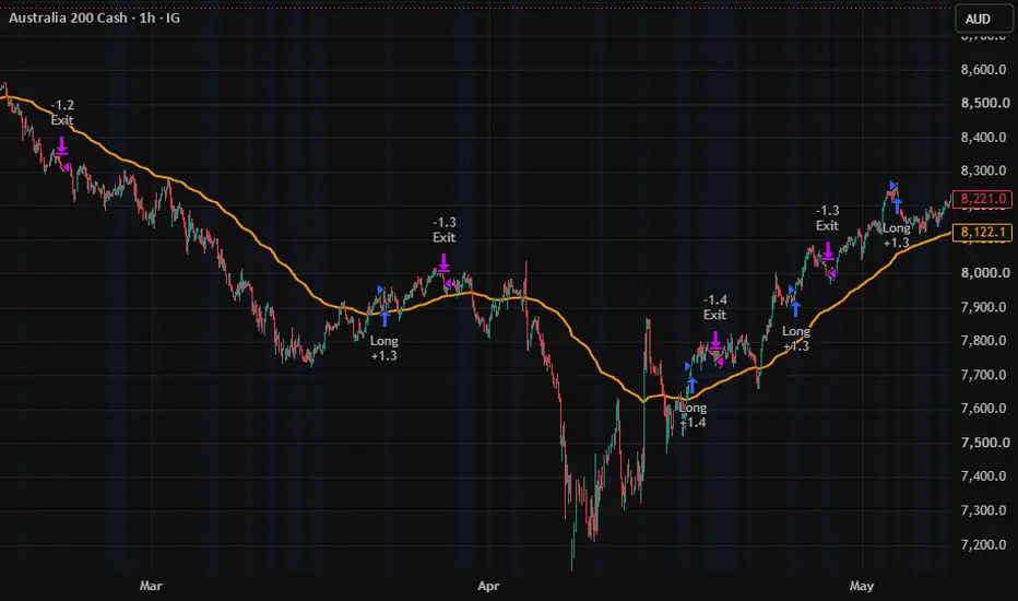
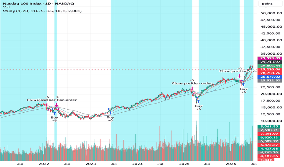
*Momentum Squeeze Breakout Engine* is a quantitative, trend-following breakout strategy engineered to capture explosive directional moves emerging from periods of asset compression (squeezes). By combining precise volatility boundaries, structural market sentiment filters, and micro-momentum triggers, this strategy systematically avoids false breakouts.
### Core Mechanics & Features
1. Volatility Squeeze Identification
The foundation of this strategy relies on the relationship between *Bollinger Bands* and *Keltner Channels. When the Bollinger Bands contract *inside the Keltner Channels, it confirms a highly compressed, low-volatility environment (highlighted by the subtle blue background zones). This indicates stored market energy primed for release.
2. Rigid Structural Macro Filter (200 EMA)
To eliminate counter-trend traps, the strategy utilizes a strict 200-period Exponential Moving Average (EMA) as a macro baseline. Long entries are strictly prohibited if the asset is printing below this line, ensuring you only trade high-probability expansions aligned with the dominant institutional trend.
3. Holistic Intra-Bar Bias
Rather than relying purely on close prices, the script calculates an internal *Holistic Bias* engine. It evaluates where the close falls relative to each bar's high-low range over a specific structural lookback period. A valid breakout requires a positive cumulative sentiment bias (cumBias > 0), ensuring authentic accumulation is taking place.
4. Micro-Momentum (Rate of Change) Filter
To prevent entering "slow drift" scenarios or low-volume fakeouts, a 3-period Rate of Change (ROC) velocity check is integrated. A breakout will only trigger an entry if the price action demonstrates immediate expanding velocity (priceROC > 0).
# Execution Rules
* *BUY Signal:* Generated when a compression zone has broken out within the last 3 bars, the price crosses above the Upper Bollinger Band, the macro trend is bullish (Price > 200 EMA), holistic bias is positive, and positive momentum velocity is confirmed.
* *EXIT Signal:* Generated when the price crosses below the Lower Bollinger Band following a squeeze or when the holistic bias shifts negatively, functioning as a structural trailing mechanism.
* *Signal Spacing:* Features a built-in 15-bar cooldown rule to prevent over-trading and signal clustering within volatile consolidation nodes.
### Best Practices
* *Intended Timeframe:* Optimized for the *1-Hour (1H)* chart.
* *Assets:* Best suited for high-liquidity assets including Major Crypto Pairs (BTC, ETH), Blue- Chip Equities, Indices and Major Forex Pairs.
* *Risk Management:* Default settings utilize a 100% equity allocation model for raw backtesting transparency, but traders should scale their position sizes according to their personal risk tolerances.
### Disclaimer
*Financial and Trading Risk Warning:*
This script is an educational and analytical tool designed to demonstrate quantitative breakout concepts using historical data. It is published as an open-source resource for informational purposes only and does not constitute financial, investment, or trading advice.
Past performance is not indicative of future results. Market conditions change constantly, and systematic strategies can experience significant drawdowns. Automated trading involves substantial risk of capital loss. Never trade with money you cannot afford to lose. The author assumes no liability or responsibility for any financial losses incurred from the use or modification of this code. Always perform your own independent research and forward-test on a demo account before risking live capital. Strateji

Gösterge

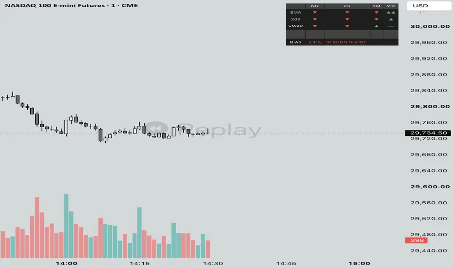
Correlated Assets TableA quick cross-check on whether the rest of the complex agrees with you. It tracks NQ, ES, YM, and the VIX and shows, for each, where price sits against an EMA envelope. A move with all three indices pulling the same way and VIX cooperating is worth more than NQ running by itself. Only take your chart's signal when the table backs it, and treat a split as a yellow light. Each symbol comes in through request.security, so the values settle as bars close. It's confirmation, not a precise entry clock.A quick cross-check on whether the rest of the complex agrees with you. It tracks NQ, ES, YM, and the VIX and shows, for each, where price sits against an EMA envelope. A move with all three indices pulling the same way and VIX cooperating is worth more than NQ running by itself. Only take your chart's signal when the table backs it, and treat a split as a yellow light. Each symbol comes in through request.security, so the values settle as bars close. It's confirmation, not a precise entry clock. Gösterge

Gösterge

Gösterge

Gösterge

Gösterge

Gösterge

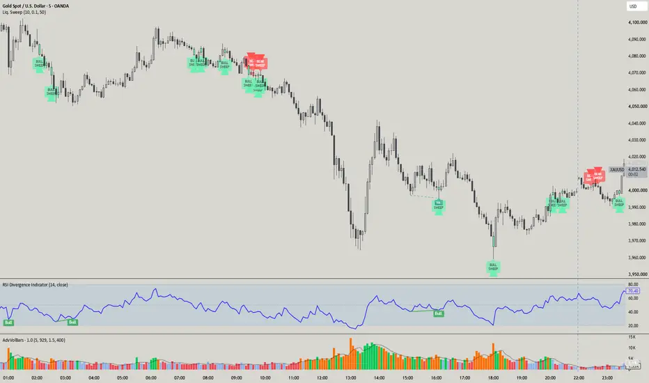
Liquidity Sweep Detector [Proozac]# Liquidity Sweep Detector
**Pine Script v6 — Overlay Indicator**
---
## What It Does
Detects two related concepts from institutional liquidity theory:
1. **Equal Highs / Equal Lows (EQH / EQL)** — price levels where the market reached the same high or low on two separate occasions. These levels concentrate retail stop orders (buy stops above EQH, sell stops below EQL) and act as magnets for institutional order flow.
2. **Liquidity Sweep** — when price breaks through an EQH or EQL with a wick but *closes back on the opposite side*. This is the signal that institutions triggered the stops, absorbed that liquidity, and are now positioned in the opposite direction — the classic "stop hunt" or "liquidity grab."
---
## Detection Logic
### Equal Highs / Equal Lows
```
EQH: two pivot highs within a configurable % tolerance of each other
EQL: two pivot lows within a configurable % tolerance of each other
```
The indicator finds swing highs and lows via `ta.pivothigh` / `ta.pivotlow`. For each new pivot it compares against the 5 most recent ones. If the relative difference is within the `Equal Level Tolerance %` threshold, a dashed line is drawn between the two points and labelled `EQH` or `EQL`.
### Bullish Sweep (long signal)
```
wick_low < EQL AND close > EQL AND open > EQL
```
The wick pierces below an equal low but the candle body closes above it. Price swept the sell stops and snapped back — potential bullish reversal.
### Bearish Sweep (short signal)
```
wick_high > EQH AND close < EQH AND open < EQH
```
The wick pierces above an equal high but the candle body closes below it. Price swept the buy stops and snapped back — potential bearish reversal.
---
## Inputs
| Input | Default | Description |
|-------|---------|-------------|
| **Swing Length (Pivot)** | 10 | Bars required on each side to confirm a swing. Higher = fewer but more reliable pivots |
| **Equal Level Tolerance %** | 0.1 | Percentage margin for two pivots to be considered "equal". Increase for volatile assets |
| **Max Lookback for Equal Levels** | 50 | How far back to search for matching pivot levels |
| **Equal Highs Line Color** | Red | Color for EQH lines |
| **Equal Lows Line Color** | Green | Color for EQL lines |
| **Bearish Sweep Color** | Bright Red | Color for bearish sweep signal and candle |
| **Bullish Sweep Color** | Bright Green | Color for bullish sweep signal and candle |
| **Show Equal Level Lines** | true | Toggle EQH/EQL lines on/off |
| **Show Sweep Signals** | true | Toggle triangle signals on/off |
| **Show Sweep Labels** | true | Toggle "BULL SWEEP" / "BEAR SWEEP" labels on/off |
---
## Visual Signals
| Element | Description |
|---------|-------------|
| Red dashed line + "EQH" label | Liquidity pool at highs |
| Green dashed line + "EQL" label | Liquidity pool at lows |
| Green triangle below bar + label | Bullish sweep detected (potential long entry) |
| Red triangle above bar + label | Bearish sweep detected (potential short entry) |
| Candle color change | The sweep candle is highlighted in the signal color |
---
## How to Use
**Basic setup:**
1. Add to any chart (works best on 15m, 1H, 4H timeframes).
2. Look for confluence: a sweep on an EQL that also sits on a demand zone or Order Block produces the highest-conviction signals.
3. Enter on the candle after the sweep, stop below the sweep candle's wick low (bullish) or above the wick high (bearish).
**Setting up alerts:**
Three `alertcondition` entries are built in and ready to use:
- `Bullish Liquidity Sweep`
- `Bearish Liquidity Sweep`
- `Any Liquidity Sweep`
In TradingView: Alerts → Condition → select the indicator → choose the desired alert type.
---
## Configuration Tips
| Asset type | Recommended tolerance |
|---|---|
| Forex majors | 0.05 – 0.1 % |
| Crypto (BTC/ETH) | 0.2 – 0.5 % |
| Futures / indices | 0.05 – 0.15 % |
- A higher `Swing Length` (15–20) produces fewer, more confirmed signals. A lower value (5–7) is more reactive but generates more false positives.
- EQH/EQL lines do not extend into the future — they naturally disappear once swept, which is exactly the point of interest.
---
## Conceptual Background
Based on the **ICT (Inner Circle Trader)** and **Smart Money Concepts** framework: large operators need liquidity to fill their positions. Equal highs and equal lows are the zones where retail stop orders accumulate. The institutional player pushes price into those levels, harvests the liquidity, then reverses — that reversal move is the entry opportunity.
This is different from a breakout strategy. A sweep signal is *not* a breakout confirmation — it is a **failed breakout** that indicates smart money is positioned against the breakout direction.
Gösterge

Precision Price Gamma [PGamma]Here's the full updated description with all the fixes — car analogy corrected, image captions added, ready to copy:
Precision Price Gamma (PGamma) is a second-derivative momentum indicator that measures the acceleration of momentum, not momentum itself.
━━━━━━━━━━━━━━━━━━━━━━━━━━
WHY PGAMMA IS DIFFERENT
━━━━━━━━━━━━━━━━━━━━━━━━━━
Most momentum indicators tell you how strong a move is. PGamma tells you whether that strength is increasing or fading — going one step further by measuring whether momentum is strengthening or weakening. This allows PGamma to identify changes in market pressure before many trend-following indicators respond.
━━━━━━━━━━━━━━━━━━━━━━━━━━
THE FOUR STATES
━━━━━━━━━━━━━━━━━━━━━━━━━━
Γ↑ Accelerating — Bullish momentum is positive and still strengthening.
Γ⌃ Bull Weakening — Bullish momentum remains positive, but buying pressure is beginning to fade.
Γ↓ Bear Pressure — Bearish momentum is dominant and selling pressure continues to strengthen.
Γ⌄ Bear Exhaustion — Bearish momentum remains negative, but selling pressure is beginning to weaken.
━━━━━━━━━━━━━━━━━━━━━━━━━━
HOW IT WORKS
━━━━━━━━━━━━━━━━━━━━━━━━━━
PGamma smooths the source series, then computes the slope of that smoothed series — the first derivative, or Momentum. It then smooths Momentum and computes its slope — the second derivative, or Price Gamma. The four states are determined by the sign of both values simultaneously.
Momentum determines the current direction of market pressure. Gamma determines whether that pressure is strengthening or weakening. They often disagree near turning points — and those disagreements are often the most informative signals PGamma produces.
Think of it like driving a car. Momentum is your speed. Gamma is whether you are pressing the gas or the brake. You can be moving backward while pressing the brake — still moving backward, but slowing. That is negative momentum with positive gamma. In market terms, price may still be making lower lows, but each push down is losing force. That often precedes consolidation, a bounce, or a reversal.
Two examples of this disagreement are illustrated in the first two snapshots — a red candle during a green Gamma Timeline, and a green candle during an amber Gamma Timeline. The third snapshot illustrates when Momentum and Gamma align, showing a green candle with a green Gamma Timeline during Accelerating state.
━━━━━━━━━━━━━━━━━━━━━━━━━━
THE STATE MATRIX
━━━━━━━━━━━━━━━━━━━━━━━━━━
Momentum | Gamma | State
+ | + | Accelerating
+ | - | Bull Weakening
- | - | Bear Pressure
- | + | Bear Exhaustion
Momentum and Gamma often disagree near turning points. A positive Gamma reading while Momentum remains negative does not mean the market is bullish — it means bearish momentum is losing acceleration. Those disagreements are where PGamma is most useful.
━━━━━━━━━━━━━━━━━━━━━━━━━━
UNDERSTANDING THE DASHBOARD
━━━━━━━━━━━━━━━━━━━━━━━━━━
State — Combines Momentum and Price Gamma into one of the four market conditions above. Read the State row first.
Momentum — The first derivative of price. Positive = bullish momentum dominates. Negative = bearish momentum dominates.
Gamma — The second derivative of momentum. Above Zero = momentum is accelerating. Below Zero = momentum is decelerating. Gamma often changes direction before Momentum, making it useful for identifying transitions in market pressure.
Bias — A simplified interpretation combining Momentum and Gamma into a single directional context label.
━━━━━━━━━━━━━━━━━━━━━━━━━━
GAMMA TIMELINE
━━━━━━━━━━━━━━━━━━━━━━━━━━
The Gamma Timeline displays the historical sequence of Price Gamma states as a continuous color band along the bottom of the chart. Each colored segment represents one bar, allowing traders to quickly identify transitions between acceleration, weakening, pressure, and exhaustion without obscuring price action. Green for Accelerating, amber for Bull Weakening, red for Bear Pressure, sky blue for Bear Exhaustion. Toggle on or off in Display settings.
━━━━━━━━━━━━━━━━━━━━━━━━━━
GETTING STARTED
━━━━━━━━━━━━━━━━━━━━━━━━━━
1. Add PGamma to any chart. It works on all instruments and timeframes.
2. In Settings → Display, choose your panel position and size.
3. In Settings → Calculation, adjust Momentum Smoothing, Momentum Length, and Gamma Length to suit your timeframe. Default values are calibrated for intraday 1m–60m charts.
4. Read the State row first. Then use Momentum and Gamma to understand why the state is what it is.
5. Use Bias as a quick at-a-glance directional context.
6. Use the Gamma Timeline to read state history across the session at a glance.
━━━━━━━━━━━━━━━━━━━━━━━━━━
HOW TO USE IT
━━━━━━━━━━━━━━━━━━━━━━━━━━
PGamma is not a buy or sell signal. Think of PGamma as a market condition indicator rather than a trade signal. Use it as a confirmation layer alongside your existing methodology. Typical applications:
• Confirming trend continuation when State shows Accelerating.
• Identifying weakening rallies before reversals when State shows Bull Weakening.
• Recognizing building pressure before visible breakdowns when State shows Bear Pressure.
• Spotting exhaustion during extended trends when State shows Bear Exhaustion.
When used alongside a GEX level tool, price approaching a Call Wall with Γ⌃ Bull Weakening is a different setup than price approaching the same level with Γ↑ Accelerating. PGamma makes that distinction visible.
Because PGamma analyzes smoothed momentum rather than candle color, bullish candles can appear during Bear Pressure and bearish candles can appear during Bull Weakening. This reflects underlying momentum conditions rather than individual price bars — and is often an early warning of what is developing beneath the surface.
━━━━━━━━━━━━━━━━━━━━━━━━━━
WORKS WELL ALONGSIDE
━━━━━━━━━━━━━━━━━━━━━━━━━━
PGamma complements indicators that identify where important price levels exist.
• Trend indicators
• Moving averages
• Volume Profile
• VWAP
• Options Gamma Exposure (GEX)
• Support and Resistance
• Market Structure
These tools identify where price may react. PGamma helps evaluate how price is behaving as it approaches those levels.
━━━━━━━━━━━━━━━━━━━━━━━━━━
WHAT THIS TOOL IS NOT
━━━━━━━━━━━━━━━━━━━━━━━━━━
PGamma measures changes in momentum. It does not predict future prices or guarantee reversals. Use it as analytical context alongside your existing trading methodology.
━━━━━━━━━━━━━━━━━━━━━━━━━━
SETTINGS OVERVIEW
━━━━━━━━━━━━━━━━━━━━━━━━━━
Calculation: Source, Momentum Smoothing, Momentum Length, Gamma Length
Display: Show Dashboard, Panel Position (6 locations), Panel Size (Small / Normal / Large), Show Gamma Timeline Gösterge

Multi-Timeframe Trend Table (Weighted)**Multi-Timeframe Trend Table (Weighted) — Market Bias Dashboard**
This indicator is a **multi-timeframe trend analysis system** designed to evaluate overall market direction using a weighted combination of **ATR trend structure, Stochastic RSI momentum, and Moving Averages** across multiple timeframes.
It aggregates data from higher to lower timeframes into a single **bias scoring table**, giving traders a clear, structured view of market sentiment and directional strength.
---
### 🔍 Core Concept
Instead of relying on a single timeframe or indicator, this tool builds a **composite market bias model** by:
* Analysing trend strength across multiple timeframes (Monthly → 1M)
* Applying weighted importance to each timeframe
* Combining three key systems:
* ATR-based trend direction (volatility structure)
* Stochastic RSI momentum shifts
* Moving Average bias filter
---
### 📊 Key Features
• **Multi-Timeframe Structure**
* Monthly, Weekly, Daily, 4H, 1H, 30m, 15m, 1m analysis
* Hierarchical trend evaluation from macro → micro
• **Weighted Bias System**
* Assigns importance to each timeframe (customisable)
* Higher timeframes dominate overall market direction
* Produces a final **bullish / bearish bias score**
• **Triple Indicator Confirmation**
Each timeframe uses:
* ATR trend logic (volatility direction)
* Stochastic RSI (momentum confirmation)
* Moving Average filter (trend bias)
• **No Repainting Logic**
* Uses confirmed higher timeframe closes only
* Prevents false real-time signal shifts
* Ensures stable, reliable bias readings
• **Signal Threshold System**
* Custom X-signal trigger based on bias strength
* Highlights strong directional conviction zones
---
### 📊 How to Use
**Bullish Bias**
* Higher timeframes align bullish
* Weighted score exceeds threshold
→ Market favours long setups
**Bearish Bias**
* Higher timeframes align bearish
* Weighted score exceeds threshold
→ Market favours short setups
**Neutral / Mixed Bias**
* Conflicting multi-timeframe signals
→ Avoid directional trading or wait for alignment
---
### ⚠️ Best Practice
This is a **market context tool**, not a standalone entry system.
For best performance combine with:
* Liquidity zones
* Market structure (BOS / CHoCH)
* Support & resistance levels
* Entry triggers from lower timeframe setups
---
### 🚀 Ideal For
* Swing traders
* Position traders
* Smart money / structure-based trading
* Multi-timeframe confirmation strategies
* Crypto, Forex, indices
---
### 🧠 Trading Philosophy
**Higher timeframes define direction.
Lower timeframes define execution.
This tool bridges both into one bias model.**
---
**Trade with alignment, not randomness.** Gösterge

Gösterge

Gösterge

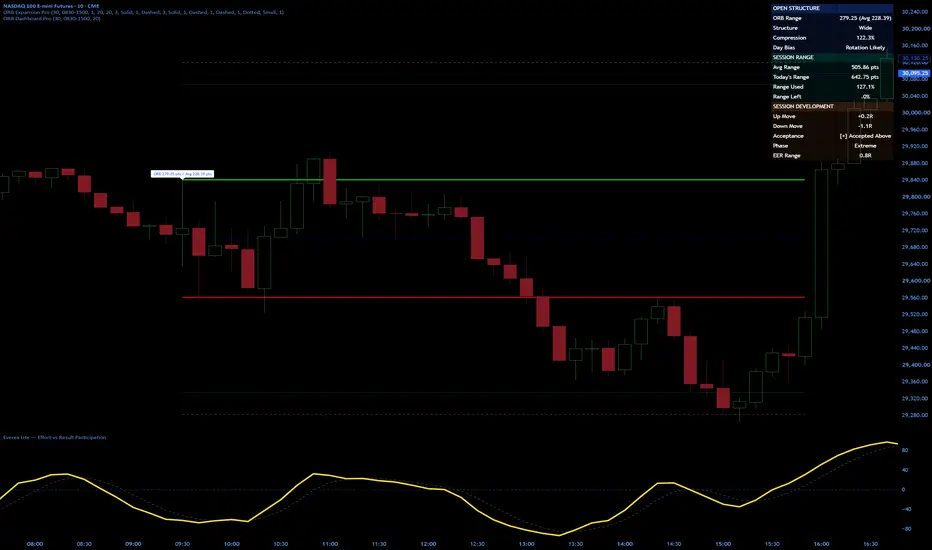
ORB Expansion Pro (Expansion Ranges and EER)ORB Expansion Pro
Description
ORB Expansion Pro transforms the Opening Range Breakout from a simple breakout strategy into a complete market expansion framework.
Most ORB traders focus only on whether price breaks above or below the opening range. The problem is that a breakout alone provides no context about how far price is likely to travel or whether the move is already extended.
ORB Expansion Pro solves that problem by automatically calculating historical Opening Range statistics and projecting expansion levels based on real market behavior.
The indicator tracks Opening Range size, historical averages, expansion multiples, and expected range development to help traders evaluate opportunity, risk, and remaining session potential.
Key Features
✔ Automatic Opening Range calculations
✔ Historical average ORB analysis
✔ Expansion projections beyond the ORB
✔ Expected Expansion Range (EER) levels
✔ Session development tracking
✔ Objective profit target framework
✔ Visual expansion mapping directly on the chart
✔ Designed for futures, stocks, ETFs, and indexes
How Traders Use It
Identify unusually small or large opening ranges
Measure current expansion versus historical expectations
Set objective targets using expansion multiples
Evaluate whether a move is early, mature, or extended
Improve trade management and profit-taking decisions
Avoid chasing moves that have already exhausted expected range
Best Used With
ORB Dashboard Pro
Volume Profile
VWAP
Auction Market Theory
Market Structure Analysis
Real Trading. Real Testing. Real Results.
** Related Indicators from Traders Workshop
• ORB Expansion Pro
• ORB Dashboard Pro
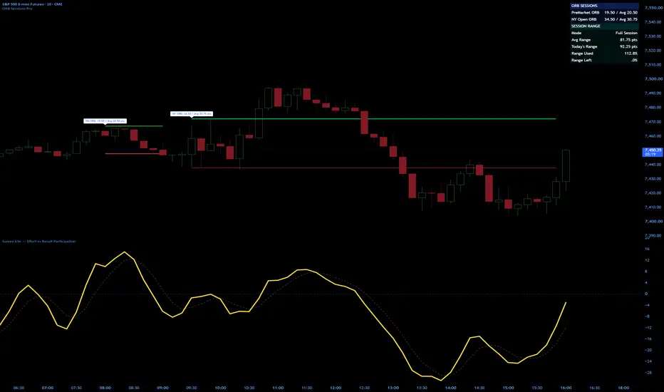
• ORB Sessions
• Everex Lite
• Flow MA Cloud Gösterge

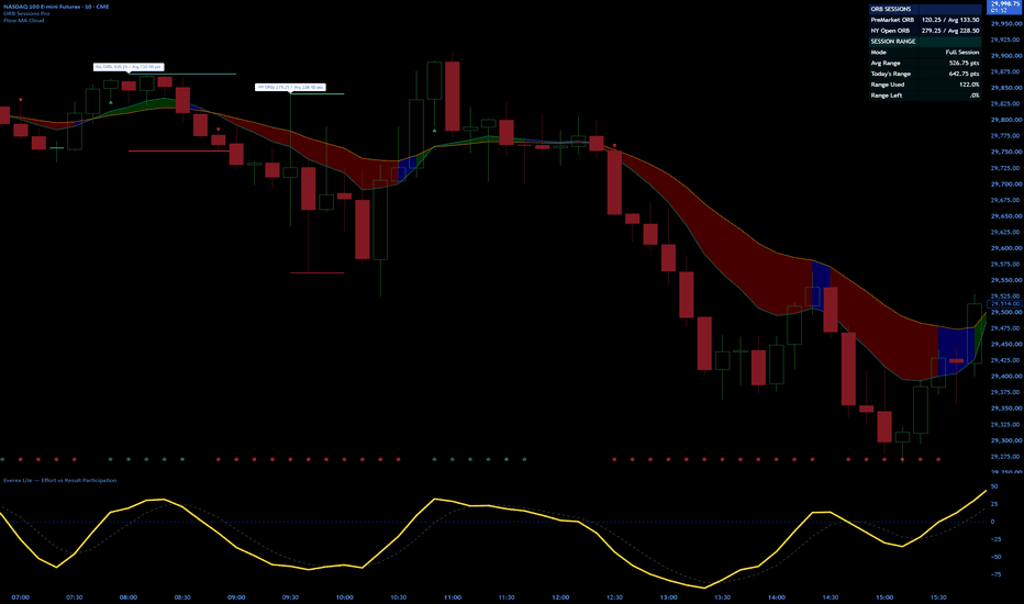
Flow MA CloudFlow MA Cloud is a clean trend and market flow visualization tool built around the relationship between two fully configurable moving averages.
Unlike traditional moving average crossover indicators that focus solely on entry signals, Flow MA Cloud is designed to help traders quickly identify directional bias, trend strength, and changes in participation through dynamic cloud coloring and optional flow-state confirmation.
Supported moving average types include:
• SMA (Simple Moving Average)
• EMA (Exponential Moving Average)
• WMA (Weighted Moving Average)
• RMA (Running Moving Average)
• VWMA (Volume Weighted Moving Average)
• HMA (Hull Moving Average)
** Suggested Default Setup: 9 EMA / 21 EMA
Both moving averages can be configured independently, allowing traders to create anything from traditional EMA trend clouds to custom flow and trend models.
** Pairs well with ORB Sessions Pro for directional bias and Everex Lite for participation confirmation.
Additional features include:
• Dynamic bullish, bearish, and neutral cloud visualization
• Optional slope-based flow confirmation
• Bullish and bearish crossover markers
• Optional background bias highlighting
• Custom alert conditions for crossover and flow-state changes
• Adjustable colors, line widths, and visual settings
The cloud changes color based on both moving average positioning and directional slope, helping traders distinguish between strong trends, weakening trends, and neutral market conditions.
Flow MA Cloud is designed to be simple, visually clean, and easy to integrate into existing trading workflows for futures, stocks, forex, and cryptocurrency markets.
Real Trading. Real Testing. Real Results.
### Related Indicators
Flow MA Cloud is part of the Traders Workshop indicator suite.
For a complete market workflow, consider pairing it with:
• ORB Sessions Pro — Tracks Pre-Market and NY Open Opening Ranges, session statistics, average range expectations, and expansion levels.
• Everex Lite — A streamlined Effort vs Result indicator designed to visualize participation and directional flow.
Together, these tools help traders answer three critical questions:
1. Where is the market likely to move? (ORB Sessions Pro)
2. What is the current trend direction? (Flow MA Cloud)
3. Is participation supporting the move? (Everex Lite)
Real Trading. Real Testing. Real Results.
Gösterge
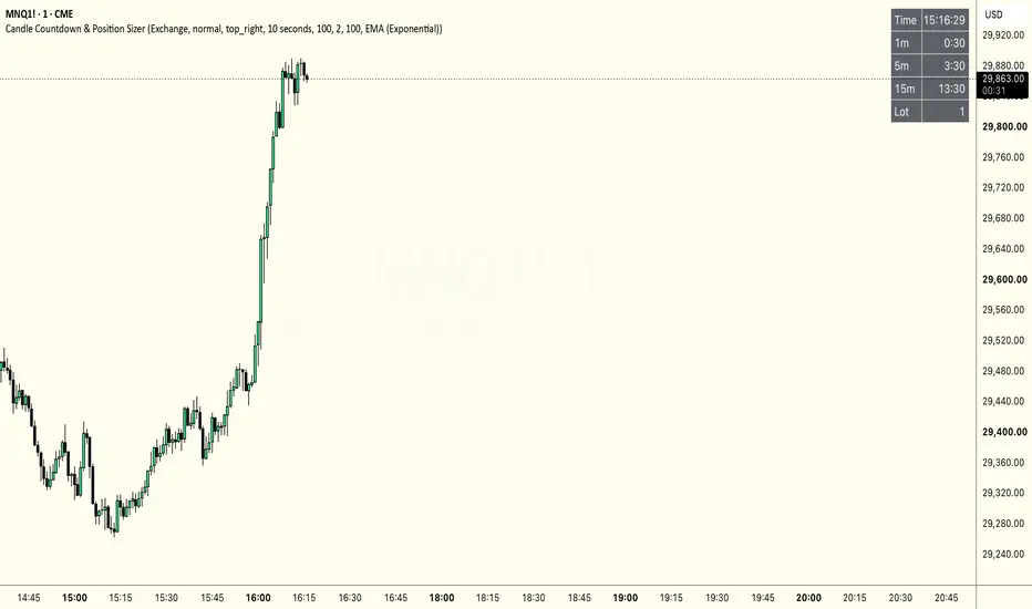
Candle Countdown & Position SizerCandle Countdown & Position Sizer
A compact on-chart table that keeps the two things a scalper checks most in one place: time and size.
It shows:
- Live clock with seconds, in the timezone you pick (Exchange, UTC, NY, London, Tokyo, Sydney).
- Countdown to the next 1m, 5m and 15m candle — so you always know how long the current bar has left. Each row turns to your chosen alert color in the final seconds before the candle closes.
- Suggested lot size based on ATR volatility, so your risk stays constant trade to trade.
How the sizing works
Tell it three things:
- how many dollars you're willing to lose on the trade,
- how wide your stop is, as a multiple of ATR (default 2× ATR),
- the ATR length and smoothing (Wilder or exponential — default EMA 100).
It computes the stop distance from current ATR and returns the lot size that caps your loss at that dollar amount if the stop is hit, rounded to a whole number. Flip on the debug toggle to also see the raw ATR and stop
distance behind the calculation.
Notes
- Updates arrive on price ticks, so during very quiet periods the clock may skip a second.
- Lot size uses the symbol's point value — always confirm it against your broker's contract specs before trading.
- Candle countdowns are anchored to UTC and are exact for intraday timeframes on 24h markets.
Not financial advice — a position-sizing aid. You are responsible for your own risk.
Gösterge

Everex Lite (Effort vs Result Participation)Everex Lite is a streamlined Effort vs Result participation indicator inspired by the original RedK Everex concept.
The indicator measures the relationship between market participation (effort) and price movement (result) to help traders visualize how efficiently price is moving through the auction.
Rather than focusing solely on volume or momentum, Everex Lite evaluates whether price progress is being supported by participation. This can help identify conditions such as:
• Strong participation supporting directional movement
• Absorption and stalled auctions
• Weakening momentum
• Thin liquidity moves
• Potential shifts in participation strength
Everex Lite intentionally removes several components from the original implementation to create a cleaner and easier-to-read display. The result is a lightweight tool that focuses on the core Rate of Flow (ROF) model and Signal Line while reducing visual clutter.
Features:
• Simplified Rate of Flow (ROF) calculation
• Optional Line or Histogram display modes
• Configurable Signal Line
• Multiple moving average types (WMA, EMA, SMA, HMA, RMA)
• Optional participation levels
• Clean, lightweight design
This indicator is best used alongside market structure, VWAP, volume profile, support/resistance levels, and Auction Market Theory concepts.
Everex Lite is not designed as a standalone buy or sell signal. Instead, it provides additional context regarding participation and price efficiency to help traders better understand the auction taking place beneath the chart.
Credits:
This indicator is a simplified derivative of the original RedK Everex indicator. Full credit for the original Effort vs Result implementation belongs to RedK.
If you find the indicator useful, please leave a like and share your feedback. Gösterge

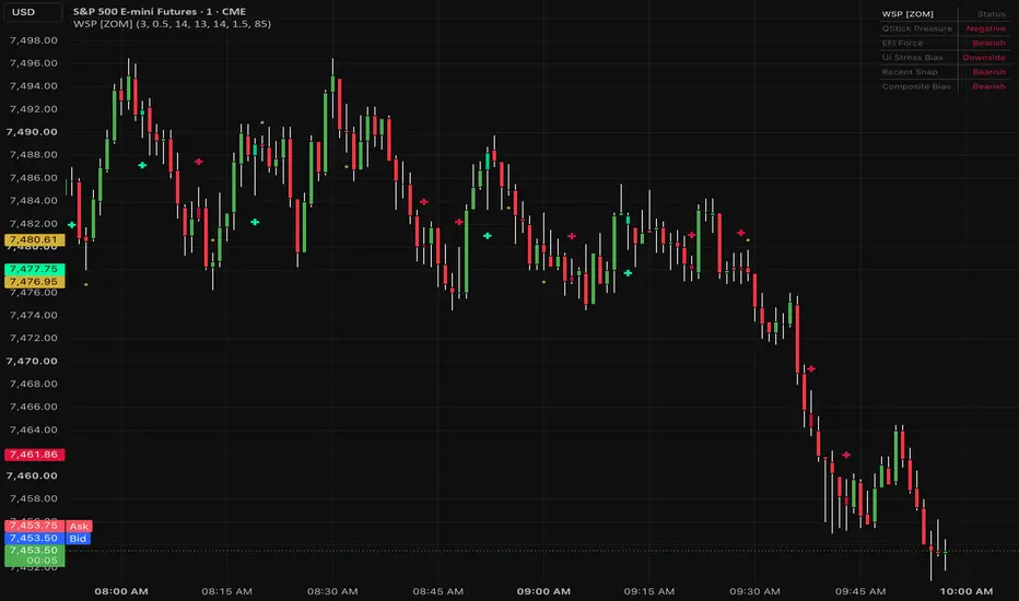
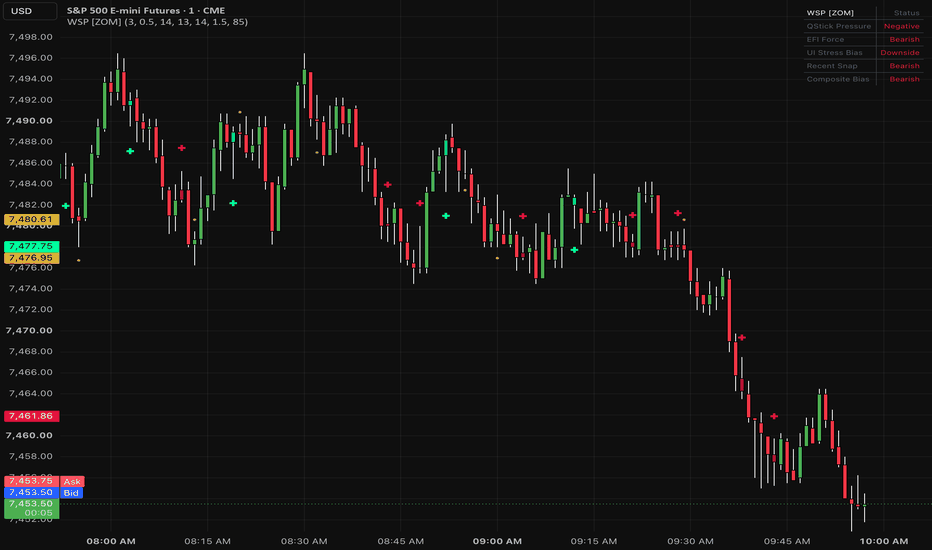
Wick Snap Pressure [ZOM]Wick Snap Pressure is an overlay pressure marker designed to highlight meaningful wick rejections only when they are supported by candle pressure, volume impulse, and stress context. The goal is to avoid treating every long wick as a signal. Instead, the script looks for a rejection candle that also has supporting evidence from lesser-used pressure tools.
The calculation combines four parts. First, wick rejection ratio checks whether the upper or lower wick is large enough relative to the candle body and total range to represent a visible rejection. Second, QStick measures smoothed close-minus-open candle pressure, which helps show whether recent candle bodies are leaning bullish or bearish. Third, Elder Force Index measures whether price movement is being supported by volume impulse. Fourth, Ulcer Index stress is used as a context filter so the script can avoid confirming snaps while adverse stress is still expanding.
Bullish watch markers appear when lower-wick rejection and early QStick pressure align before full confirmation. Bullish snap markers require stronger agreement: lower wick rejection, improving bullish QStick behavior, positive Force Index, and non-expanding stress. Bearish watch and bearish snap signals mirror the same logic using upper-wick rejection, negative QStick pressure, negative Force Index, and suitable stress behavior.
The visual layout is intentionally lightweight. It uses subtle bar coloring, small above/below-bar markers, and a compact dashboard instead of projected zones or static drawings. Mint markers represent bullish snap pressure, crimson markers represent bearish snap pressure, and gold watch markers show earlier setups that have not fully confirmed. The dashboard summarizes QStick pressure, Force Index direction, Ulcer stress bias, the most recent snap, and the composite bias.
I use this as a tape-reading and reaction aid around pullbacks, failed pushes, VWAP tests, prior swing levels, and local reversal attempts. It is not a standalone buy/sell system. Strong trend days can produce countertrend wick signals that fail, so the best use is as a confirmation layer alongside market structure, trend, liquidity context, and risk controls.
Key inputs include QStick length, Force Index length, Ulcer Index length, wick/body threshold, signal cooldown, marker offset, dashboard visibility, and palette colors. Lower wick thresholds create more signals. Higher thresholds demand more obvious rejection and reduce signal frequency.
Open-source script for educational use only. Not financial advice. Gösterge
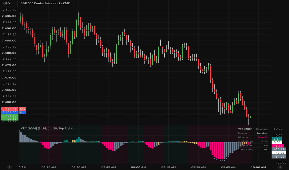
Volatility Rotation Compass [ZOM]Volatility Rotation Compass is a lower-pane regime and momentum-rotation tool built from a combination of Vortex directional spread, Choppiness Index, and normalized volume z-score. The goal is to separate directional expansion from low-quality chop instead of treating every oscillator move through zero as equally useful.
The core calculation starts with the Vortex Indicator. The script compares positive and negative Vortex movement to estimate which side is controlling directional flow. That directional spread is then scaled by a trendiness factor derived from Choppiness Index: lower chop values give more weight to directional movement, while higher chop compresses the compass score. A normalized volume z-score is used as a participation filter so stronger readings are favored when volume is above its recent baseline.
The main compass oscillator is plotted around a zero line. Teal/green histogram pressure represents bullish expansion, rose/crimson pressure represents bearish expansion, and amber/gray behavior represents indecision, chop, or weakening participation. Subtle background shading shows the active regime so the lower pane can be read quickly without turning the chart into clutter.
Bull rotation markers appear when the compass pushes above the bullish threshold while chop falls and volume confirms participation. Bear rotation markers appear when the compass pushes below the bearish threshold under similar trend and participation conditions. Exhaustion dots identify stretched readings where the compass is extended but chop begins to rise, which can warn that momentum is becoming less efficient.
I use this as a regime filter and timing aid, not as a standalone entry system. A bullish rotation is more useful when it aligns with higher-timeframe structure, a reclaim, or clean continuation candles. A bearish rotation is stronger when price is failing below structure, rejecting supply, or continuing after a breakdown. Exhaustion dots are not automatic reversal calls; they are warnings to reduce confidence in chasing late movement.
Key inputs include Vortex length, Choppiness length, volume z-score length, smoothing, signal visibility, exhaustion dot visibility, dashboard position, and palette colors. Shorter lengths make the compass faster but noisier. Longer lengths make it slower but more stable. The dashboard summarizes regime, direction, volume z-score, chop reading, trend score, and compass value so traders can see why the current state is being plotted.
This script intentionally uses standard plots, histograms, background color, markers, and tables instead of static projected drawings. That keeps the visuals anchored to the chart across scrolling and timeframe changes.
Open-source script for educational use only. Not financial advice. Gösterge