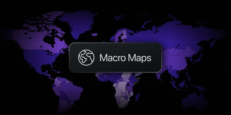
Macro Maps is your way to see macroeconomics across the entire world and every individual country. We’ve updated the tool to make working with data even more convenient.
See what’s changed:
- A map that’s easy to read — spot differences between countries at a glance with distinct indicator colors and stronger contrast between shades. There’s also a compact tooltip that shows details without blocking the map.
- Interactive legend — hover over a range and the map will highlight the countries that fall within it.

- Updated screenshot page — you’ll always know which indicator and date you were analyzing. And if you want to check the latest data — the button to jump back to the maps is always there.

- Map extras — view data for all countries in a table or read the latest economic news. Everything in one place, switch as you like.

Open Macro Maps as a standalone page or directly from the right-side panel anywhere on the platform — the tool is always within reach.
Explore the updated Macro Maps and discover global data in a whole new way. Let us know what you think — it helps us keep moving forward.
Team TradingView