How to set up a Heatmap? What is size by and color by?
Two parameters in the toolbar above the map define what the heatmap shows:
- Size by — what the size of each cell represents;
- Color by — what the color of each cell represents.
Together, they turn the map into an answer to a specific question — for example, "how did the largest companies perform today?"
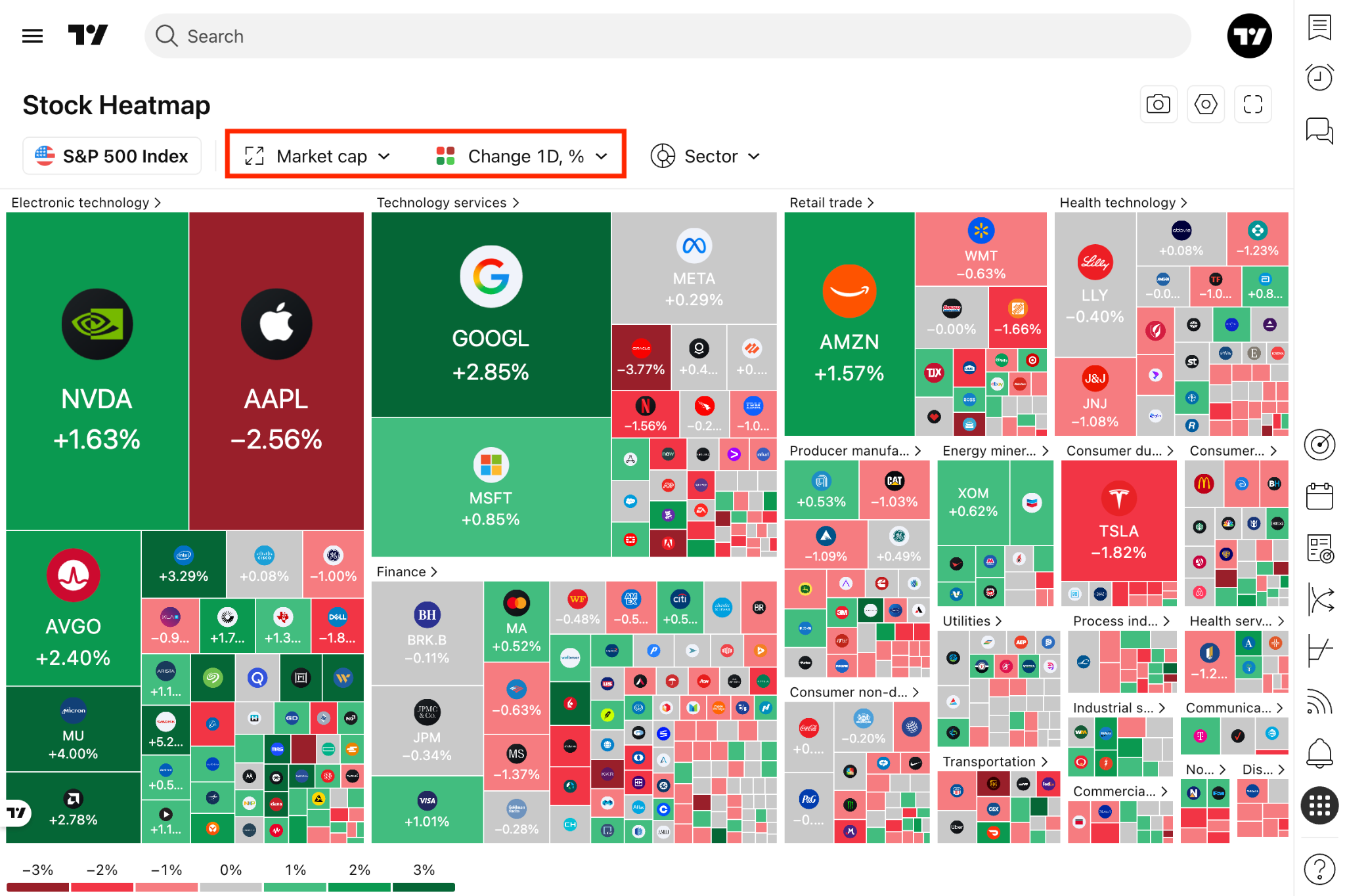
Size by
What it does
- Sets the area of each cell: the higher the value of the selected metric, the larger the cell.
- Sets the sorting of the map: symbols are arranged from largest to smallest value.
This lets you immediately see the weight of an asset in the market or index — a multi-trillion-dollar company occupies a significantly larger cell than a small-cap company.
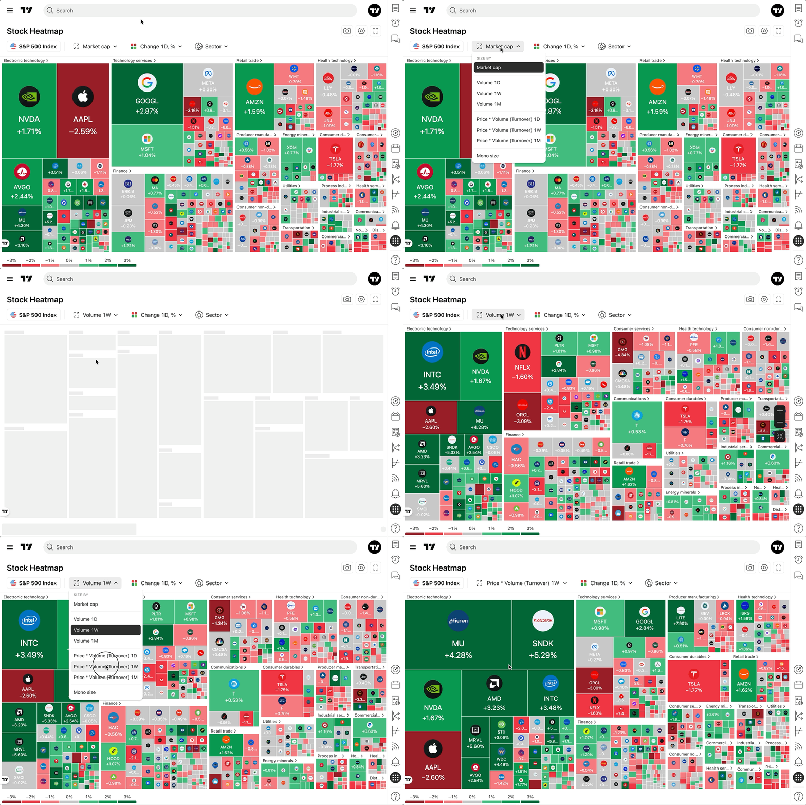
Default size by metrics per each heatmap type
Other size by metrics in the dropdown
Color by
What it does
Sets what the cell color represents. By default, the map is colored by the daily price change — Change 1D, % (Change 24h, % on the Crypto Coins Heatmap):
- Green — the symbol is rising;
- Red — the symbol is falling;
- Grey — the price is almost unchanged.
The stronger the move, the more intense the color.
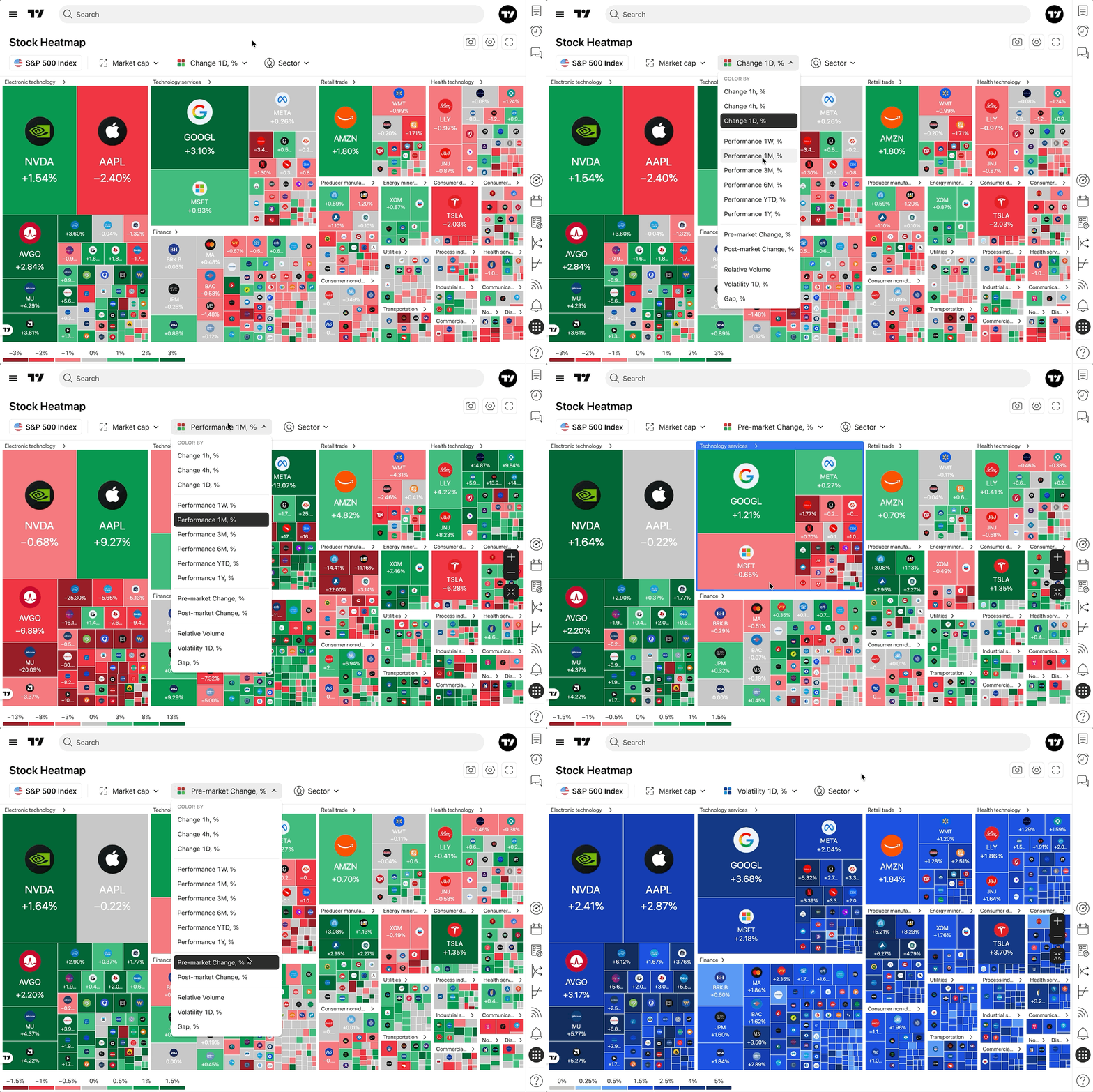
Other color by metrics in the dropdown
Note: metrics that can only grow in one direction, such as Relative Volume, use a single-color intensity scale instead of red and green.
The legend
The selected Color by metric defines the scale of the legend at the bottom of the map — for example, from −3% to +3% for the daily change. Each range in the legend is a button, so the legend also works as a filter:
- Click a range to hide the symbols that fall into it.
- Click it again to bring them back.
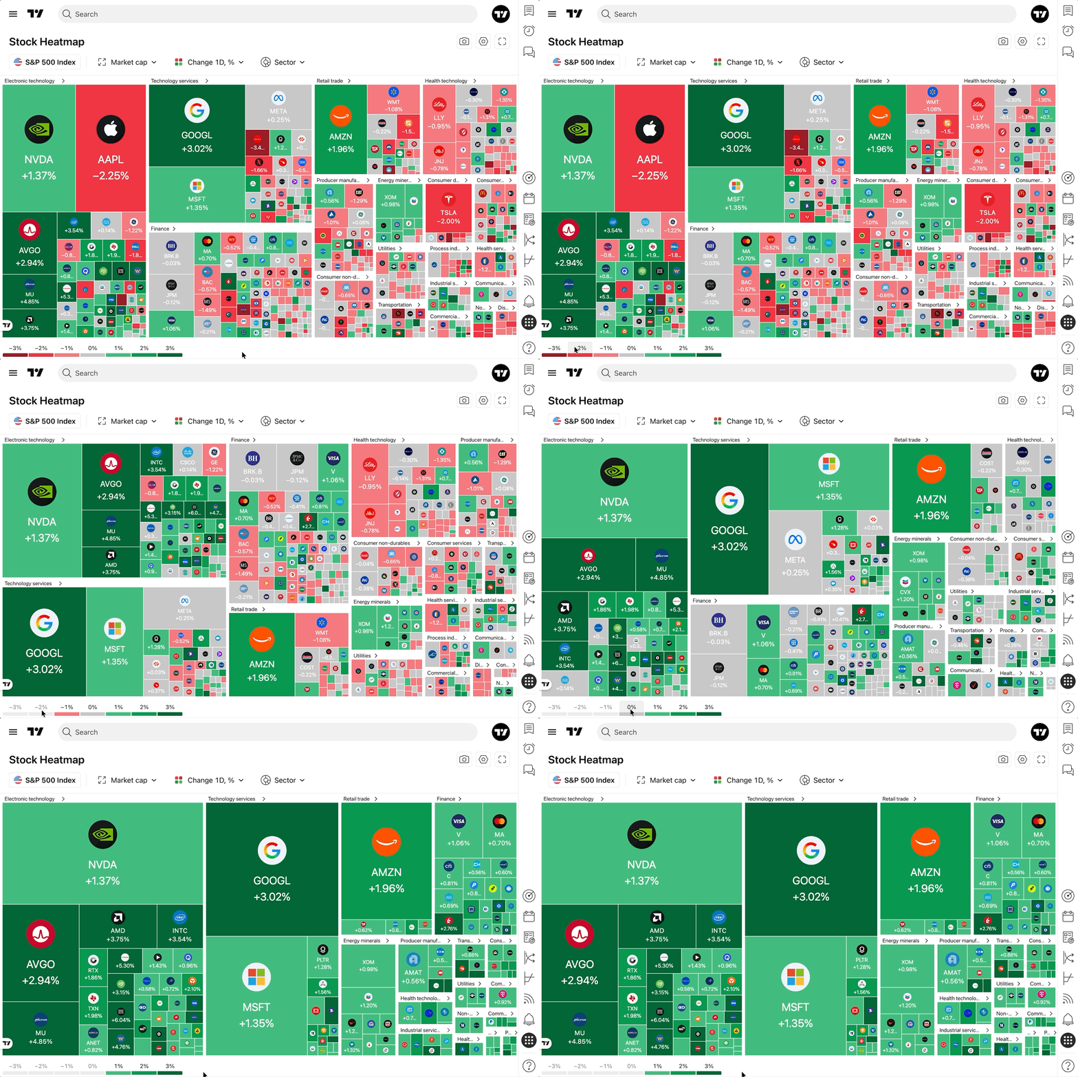
See Range calculation and color logic of the Heatmaps for how the ranges are calculated.
Checking the exact values
Hover over any cell to see the exact values behind it: the price, the selected Size by metric (e.g. market cap), and the selected Color by metric (e.g. daily change).