TradingView heatmaps: from global trends to details
Comprehensive financial analysis begins with defining your scope. On TradingView, you can access the Stock Heatmap, ETF Heatmap, and Crypto Coins Heatmap. All three tools offer similar capabilities, allowing you to quickly identify trends and market shifts.
CONTENTS
- What are heatmaps?
- How to access heatmaps
- How to use heatmaps
- Example
- Viewing modes
- Additional features
- Heatmaps vs. Screeners
What are heatmaps?
Heatmaps are visual analytical tools designed to help you instantly spot market leaders, laggards, and emerging trends based on two key visual indicators:
- Cell size: Reflects the relative weight or importance of an asset based on key metrics (such as market capitalization, turnover, or assets under management).
- Cell color: Displays performance dynamics based on your chosen analytical parameter (such as price change, overall performance, or volatility).
How to access heatmaps
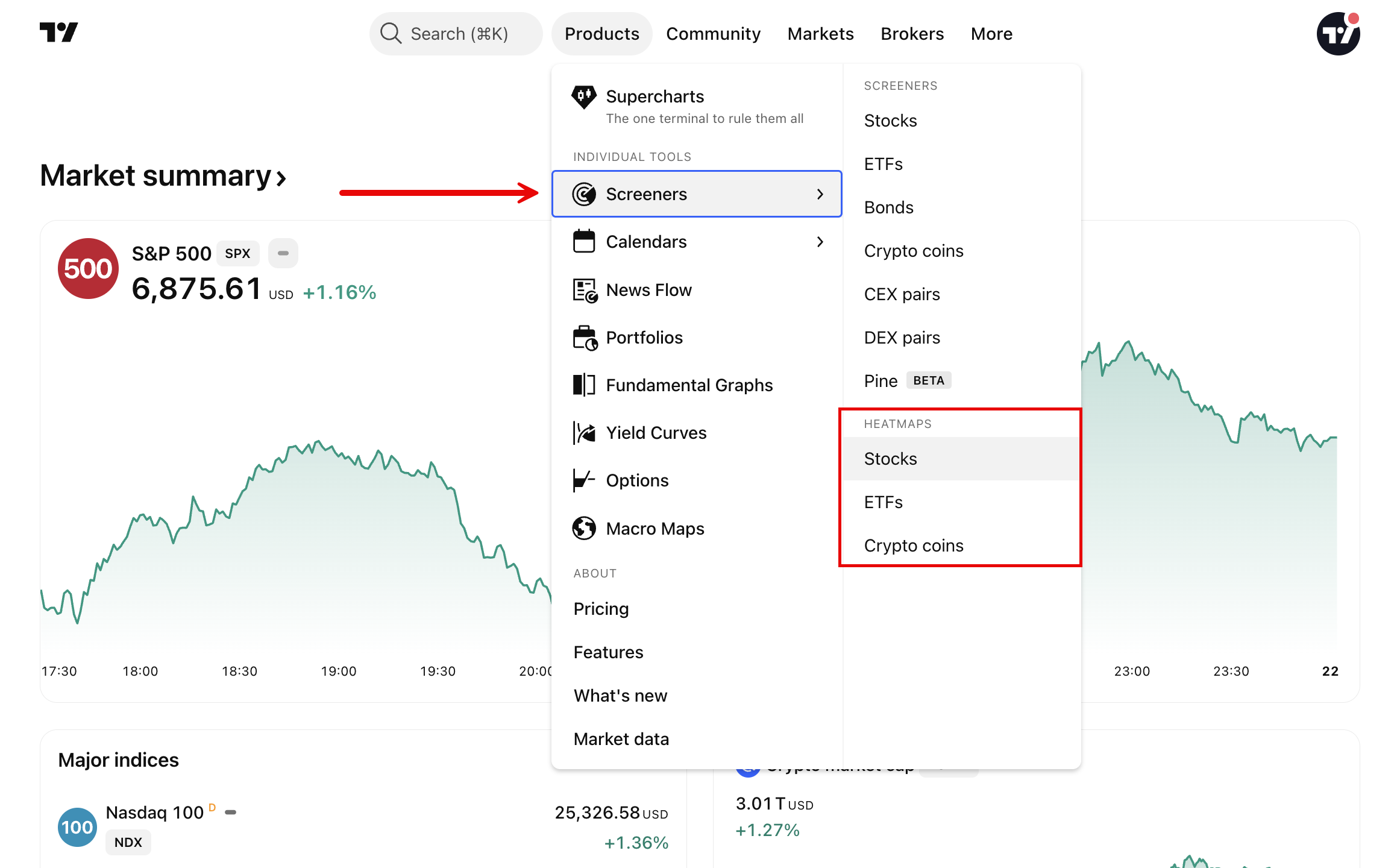
From any page on TradingView, hover over the Products dropdown in the main navigation menu, select Screeners, and click on the specific heatmap you need.
How to use heatmaps
1. Select market data
Filter the broader market down to your specific area of interest:
- Stocks: Select a specific index or an entire country's market.
- ETFs: Choose the specific countries whose funds you want to display.
- Cryptocurrencies: Filter by All coins, excluding Bitcoin, excluding stablecoins, or DeFi.
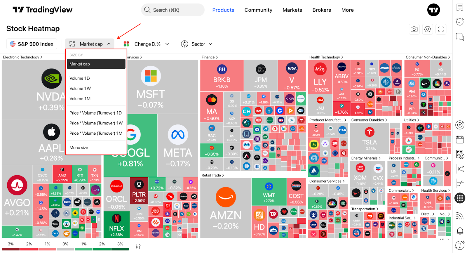
2. Configure cell size
The size of a tile determines its relative area on the map. A larger area indicates a higher value for the selected metric, allowing you to quickly assess an asset's "weight" and compare it against others.
Available size parameters:
3. Configure cell color
Color reflects the asset's dynamics, such as growth, decline, performance, or volatility. The brightness and specific shades help you immediately identify market outliers.
Available color parameters:
4. Grouping Factors
Assets can be organized into visual clusters. The relative size of these groups depends on the size parameter you selected earlier.
Stocks are grouped by sector.
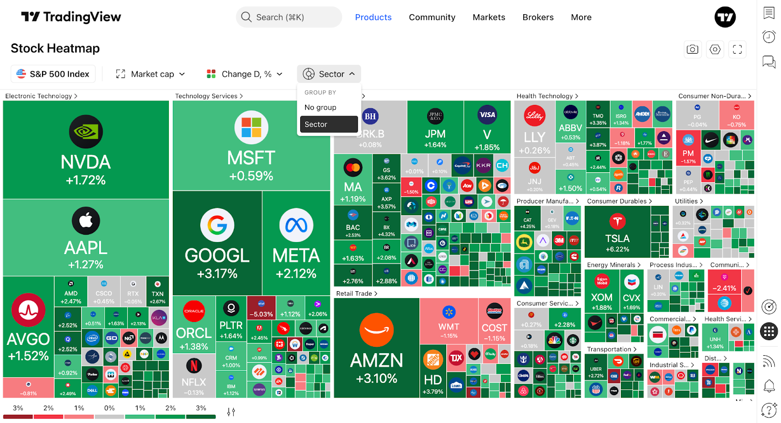
ETFs are organized by asset class.
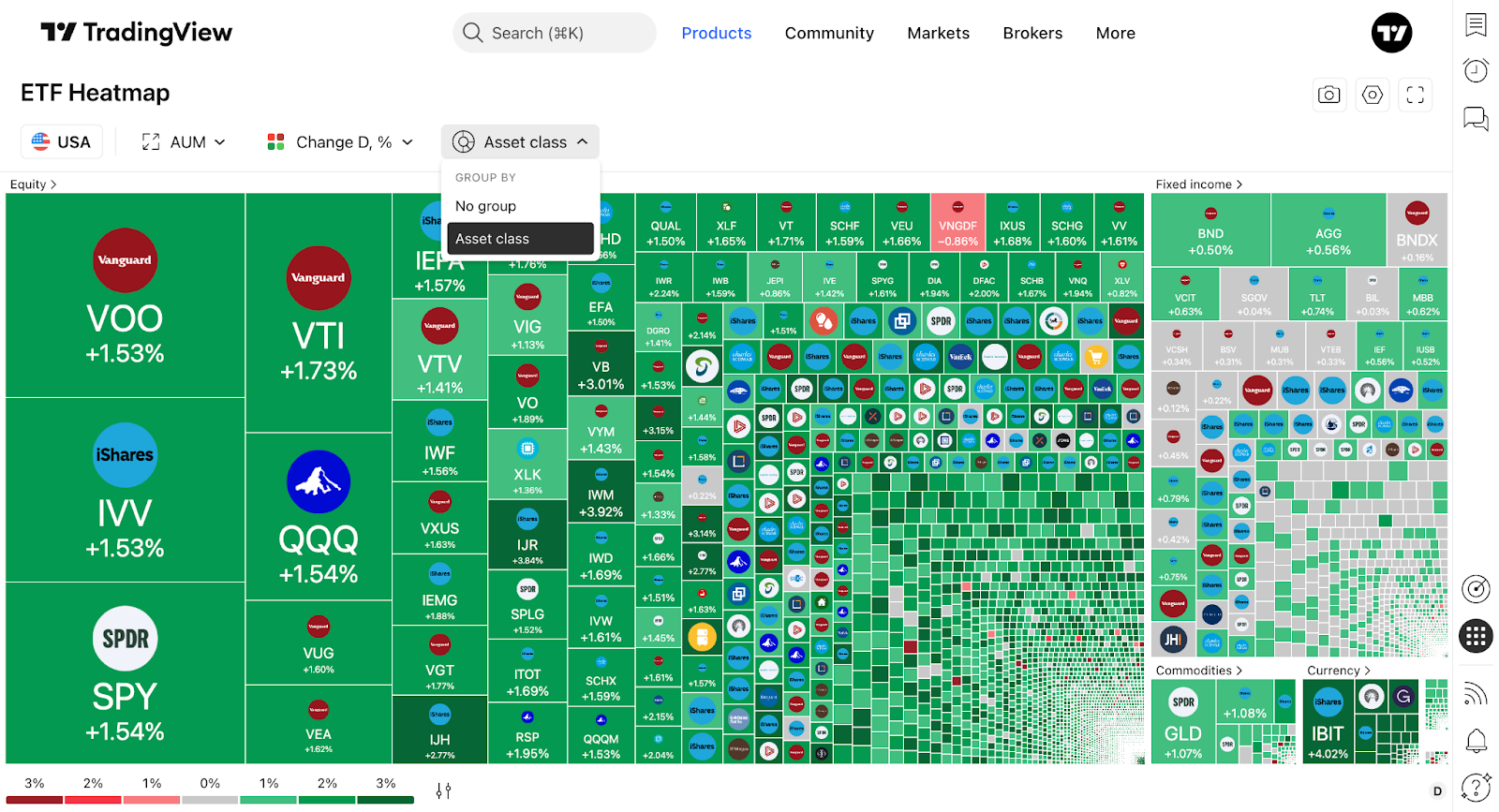
Cryptocurrencies are displayed on a single level without hierarchical grouping.
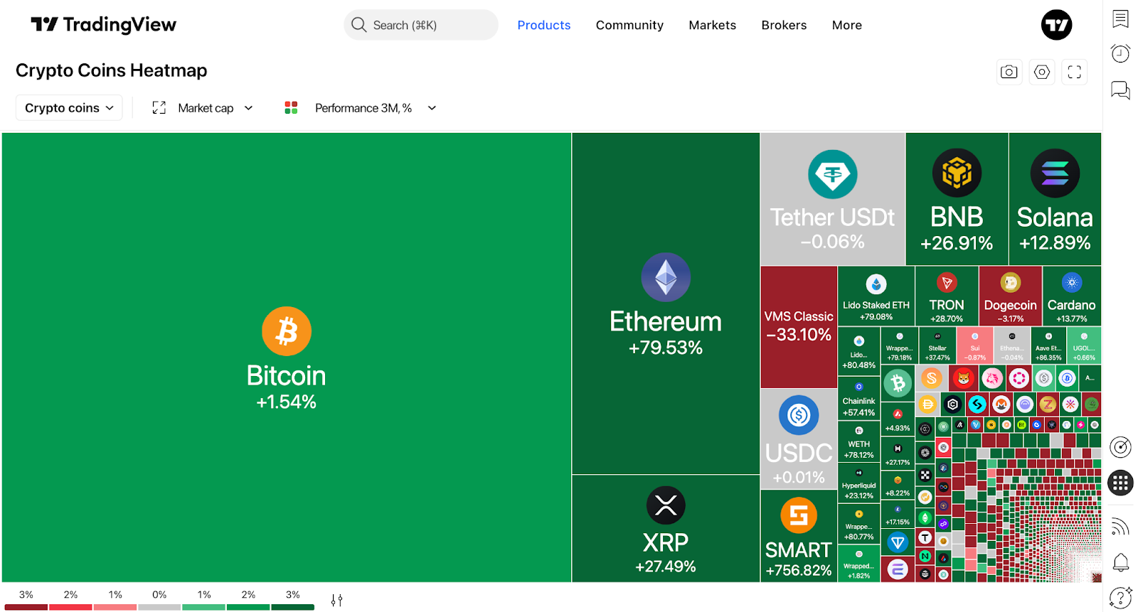
Tip: Clicking on a group's name (e.g., a specific sector or asset class) opens a detailed, zoomed-in heatmap containing only the symbols within that group. Your chosen size and color settings will apply automatically.
Example: identifying what moves the S&P 500
Here is a quick workflow to analyze the daily drivers of the S&P 500 index:
Navigate to Products → Screeners → Heatmaps → Stocks.
Select the S&P 500 index from the available market data dropdown.
Choose size by Market Cap and color by Change % (Daily).
Ensure the view is grouped by Sector to see industry performance.
Click on any sector to zoom in on its specific symbols. Hover over individual tiles to view tooltips with exact metrics, and click on a tile to open the detailed symbol page.
To focus exclusively on performance color without the distraction of market cap sizes, switch your size setting to Mono Size without grouping.
Click the camera icon on the toolbar to share your heatmap directly to X.
Viewing modes
Heatmaps can be customized into four distinct layouts to suit your analytical needs:
- Classic with grouping: Cells vary by color and size, and assets are clustered into groups (sectors for stocks, asset classes for ETFs).
- Classic without grouping: Cells vary by color and size, but all assets are displayed together on a single flat level.
- Mono Size with grouping: All tiles are equal in size, but assets remain clustered. This is ideal for purely color-based trend analysis within specific sectors.
- Mono Size without grouping: All tiles are equal in size and displayed on a single level. This provides the cleanest overview when you want to focus entirely on the parameter dictated by color.
Additional features
Toolbar and sharing
Click the Camera (Share) icon to:
- Download the heatmap as an image.
- Copy the image to your clipboard.
- Copy a direct link to your current heatmap view.
- Share directly to X or Facebook.
Display settings
Customize how information is presented on the tiles:
- Logos: Toggle company or coin logos on/off.
- Title: Choose to display None, the Ticker Symbol, or the full Description.
- Display Value: Select what data appears inside the tile (Price, Volume, Performance, or None).
- Color Scheme: Switch between Classic, Color Blind friendly, or Monochrome palettes.
Interface tools
- Fullscreen Mode: Expand the heatmap to fill your screen. This increases the working area, making tiles larger and easier to compare at a glance.
- Tooltips: Hover your cursor over any tile to reveal a tooltip packed with key information for that symbol—highly useful when viewing small tiles.
- Legend: The color scale at the bottom of the screen helps you accurately interpret shades and value ranges (e.g., exact percentage boundaries), making market conditions easier to read.
Heatmaps vs. Screeners
While both tools help analyze markets, identify trends, and detect anomalies to assist in decision-making, their approaches are fundamentally different:
- Screeners are built for deep, detailed searches using precise mathematical conditions and flexible filters.
- Heatmaps are designed for rapid visual overviews, giving you instant detection of market shifts, outliers, and relative weight.
Using them together provides a complete workflow: instant visual analysis followed by detailed, granular filtering.
Heatmaps in a nutshell
Heatmaps offer a powerful visual analysis of stocks, ETFs, and cryptocurrencies using intuitive size and color coding. By translating complex market data into cell sizes (comparison metrics) and colors (performance or volatility changes), they allow you to instantly grasp broad market overviews, spot outliers, and monitor multiple assets simultaneously.
Also read: