Area charts explained
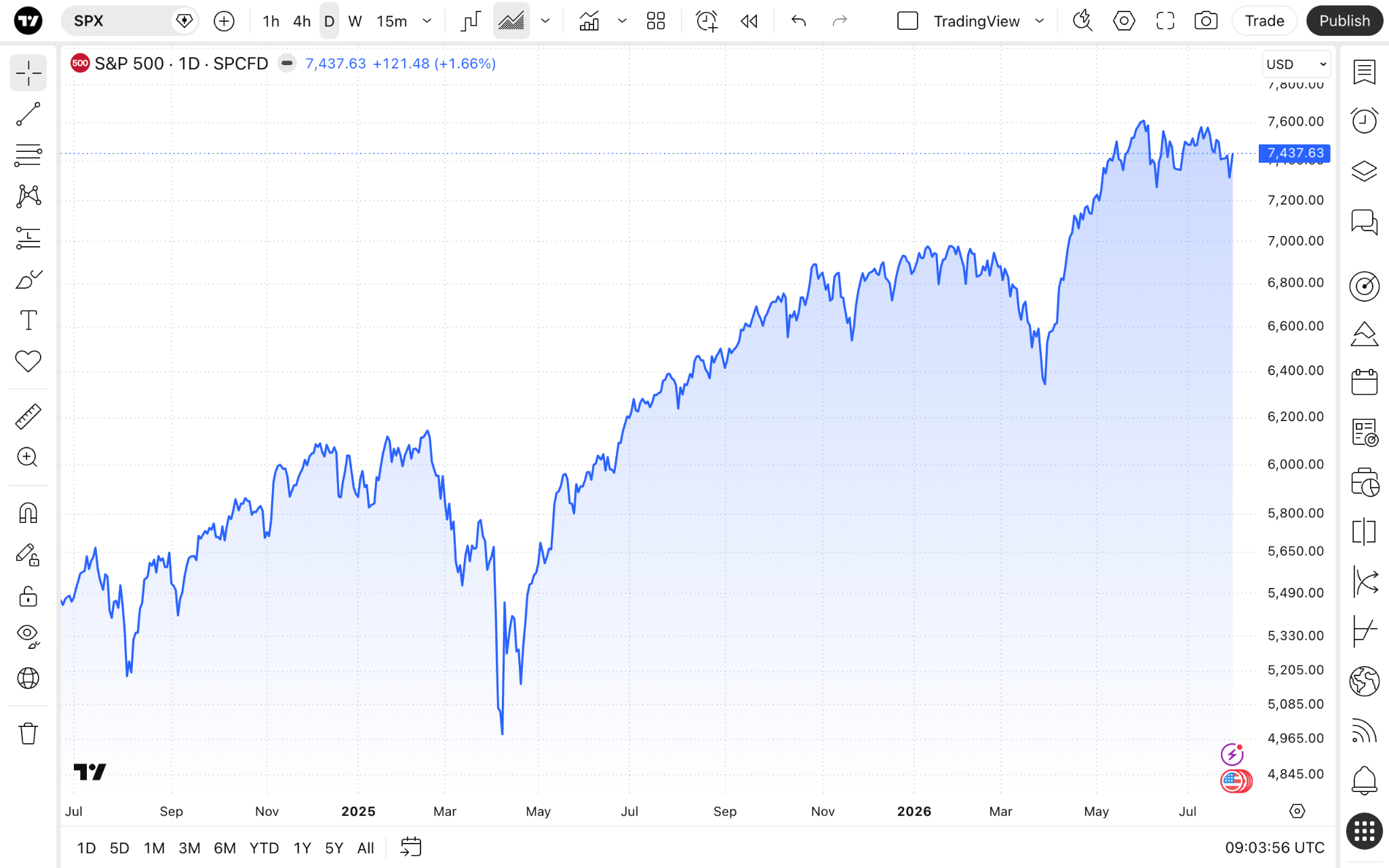
Area charts use fill underneath the price line to highlight price changes. They are used to emphasize the size of price fluctuations and can help you quickly identify the significance of a trend.
CONTENTS:
What is an area chart?
This variation of standard line charts uses similar inputs to plot the price line. Its use cases vary from trend recognition to making presentations and reports. Due to its nature, it helps you more easily recognize significant price moves.
Area charts vs line charts
Area charts are a variation of standard line charts. Here, the space underneath the price line until the X axis is shaded in to help you better read changes.
Area charts
- More intuitive visual interpretation, which emphasizes values change magnitude.
- May be more suited for cumulative data.
- Better formatted for trend reports or when a significant value change matters.
Line charts
- Focus more on trends.
- Require more time to interpret sharp changes.
- More suited for comparing multiple assets or values.
Enabling the chart type
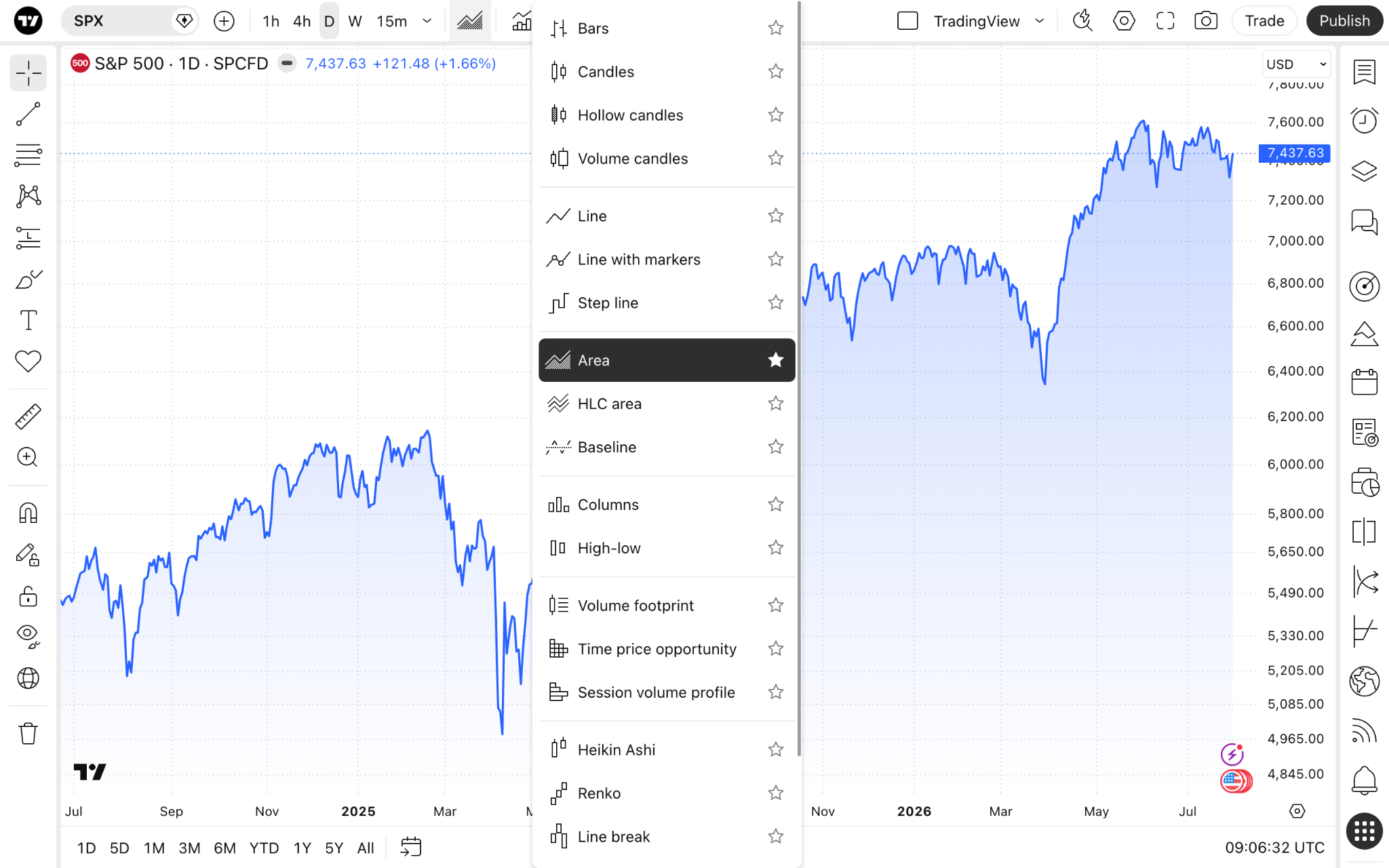
On Supercharts, open the chart type dropdown menu on the upper toolbar, and select "Area."
Area chart settings
To change the chart's inputs or colors, click the gear button on the upper toolbar, and open the "Symbol" tab.
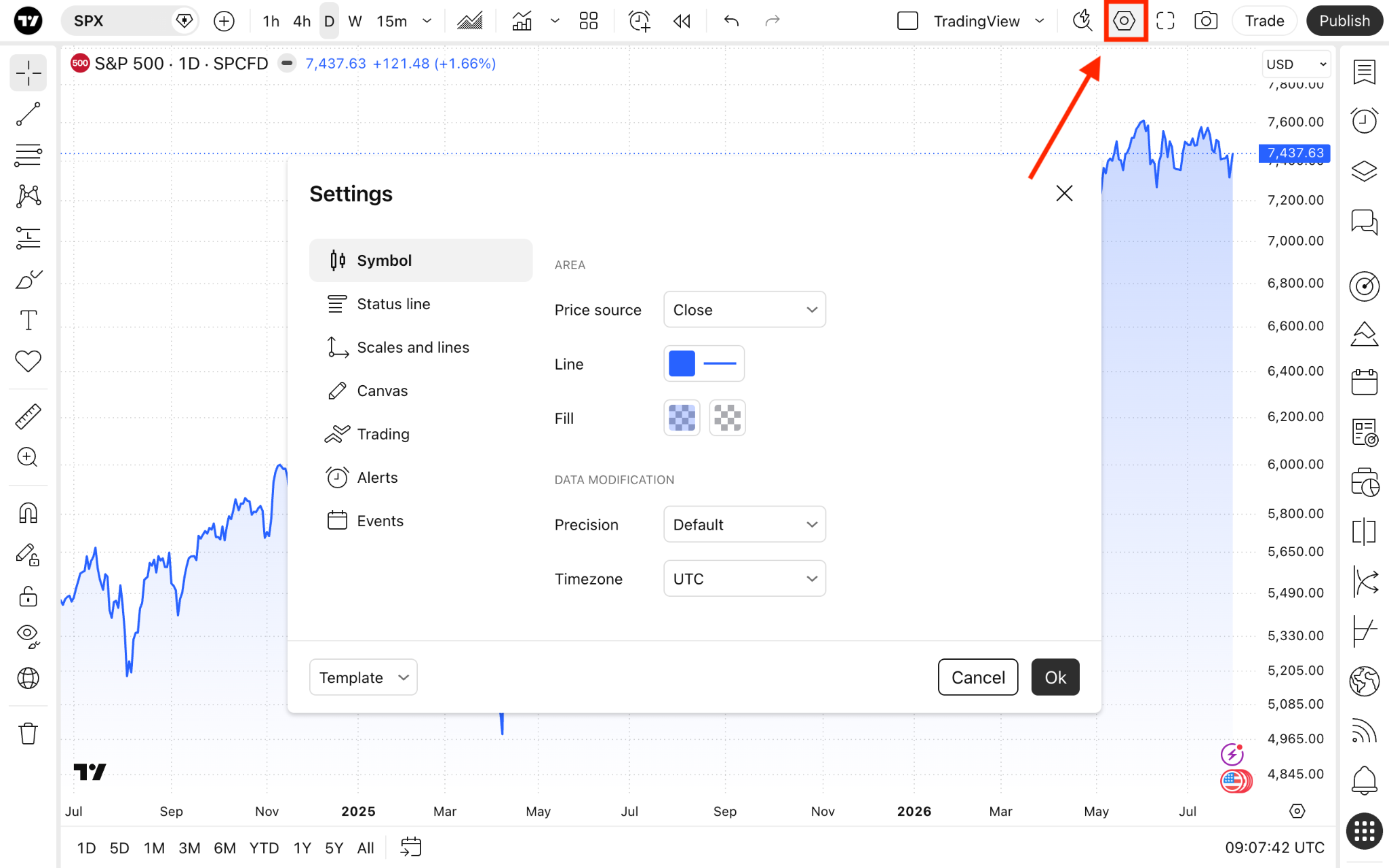
The "Area" section lists settings specific to this chart type:
- Price source: Choose the price you want the chart to show. By default, it is set to close price, meaning the line will be plotted by connecting an asset's closing price during the selected timeframe in a sequence. But you can change it to one of the following:
- Open: Shows the opening prices.
- High: Shows the highest prices.
- Low: Shows the lowest prices.
- Close: Shows the closing prices.
- (H + L)/2: Shows the average of the highest and lowest prices.
- (H + L + C)/3: Shows the average of the highest, lowest, and closing prices.
- (O + H + L + C)/4: Shows the average of the opening, highest, lowest, and closing prices.
- Line: Customize the line's color, gradient, thickness, and opacity.
- Fill: Change colors and opacity of the filled in area underneath the line.
Area charts in a nutshell
Area charts can help you easier read sudden price movements and value changes. They are also well suited for reports where you need to highlight zones of growth or decline.
Also read: