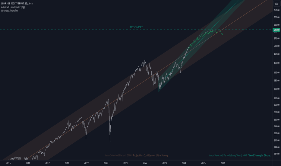
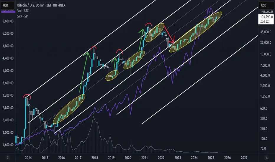
[Bearish Scenario] S&P Potential Top at This Multiyear ChannelHey all, I'm walking you through a purely technical idea here on the S&P, where we're hitting the top of a logarithmic rising channel that spans from 2022 - 2026.
More validity would be added to this "Topping idea" if the price goes on to trail higher, perhaps even breaking above the channel, but ultimately creating a:
Bearish divergence
Stumbling back into the channel
For now that hasn't happened, but it is helpful to see this technical structure beforehand so you won't get caught offguard.
Note: Bullish Idea is Still in Play
If you're an EW trader, you could see this as a wave 3 of 5, meaning that S&P is about to break much higher than its current price level.
Obviously, that would invalidate the bearish scenario.
That's it, just a simple idea to bring to your attention. Trade safe and take care.
- Yang
LOGARITHMIC
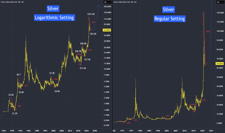
What's Next For Precious Metals - Use Logarithmic Setting If we study the historical data using the regular setting, we may miss this phenomenon: a price collapse right before a major uptrend. However, if we switch to logarithmic mode, this price behavior becomes clear.
Why use logarithmic mode when studying the historical behaviour?
Answer: This scale makes historical peaks and troughs easier to see because it plots price movements based on percentage changes rather than absolute dollar amounts.
I came across several videos claiming that precious metals usually fall before surging to new highs. However, none of them provided actual statistics to back up this claim. Therefore, I decided to analyze the historical data for gold and silver to see if this assertion is accurate.
See the video version:
100-Ounce Silver Futures
Code: SIC
Minimum fluctuation
0.01 index points = $1.00
Disclaimer:
• What presented here is not a recommendation, please consult your licensed broker.
• Our mission is to create lateral thinking skills for every investor and trader, knowing when to take a calculated risk with market uncertainty and a bolder risk when opportunity arises.
CME Real-time Market Data help identify trading set-ups in real-time and express my market views. If you have futures in your trading portfolio, you can check out on CME Group data plans available that suit your trading needs tradingview.com/cme/
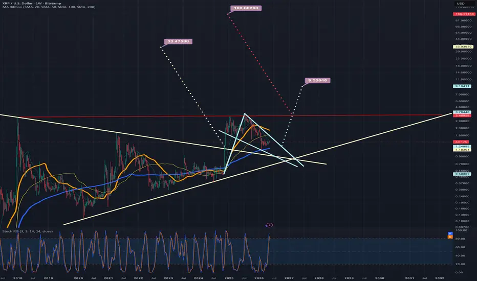
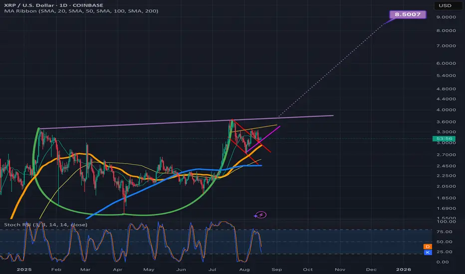
A daily chart version of the previous xrpusd logchart ideaIn addition to the weekly xrpusd log chart I just posted I figure it would be wise to also post the daily timeframe version of it too. If somehow the daily 50ma (in orange) can maintain support we will break up from this light blue pennant much sooner than where I have the dotted light blue line placed here. However, we also have the current resistance of the darker blue daily 200ma just overhead and we can see how it is starting to mimic the trajectory of the top trendline of the light blue pennant which will create double reinforced resistance in which case that could be enough to overcome the support of the orange 50ma in the short term. We will have to watch and see in the coming few weeks. The wedge on the linear chart suggests a breakout could occur within 1- 2 weeks time or so. I will link both the linear wedge chart and the weekly version of this log chart down below *not financial advice*
An updated look at the weekly logchart for xrpusdWe can see price action is currently consolidating inside a bull pennant that I have colored light blue here and as long as the blue 200 weekly MA maintains solid support price should break upward from the pennant by the time it reaches where I have placed the dotted measured move line. If that is the point at which it breaks out the target is around $9.19 or so but on my linear weekly chart (not shown here) price is currently a weekly candle or 2 away from breaking above the top trendline of a wedge on that chart that has a breakout target around 3.09 or so. So if that linear wedge plays out odds are good we would also breakout up from this log chart pennant considerably sooner than where I have arbitrarily placed the dotted line, in which case the price target for this log pennants breakout would be even higher than 9.18 potentially even above 10 dollars at that point. We can also see that we have two other even bigger chart patterns here on this weekly log chart as well. The tan colored symmetrical triangle, and the ascending triangle with the red line as its top trendline. The tan triangle’s breakout target around $33 and the ascending triangles target all the way up at $100. Being a log chart, some of these bigger patterns will take much longer to hit their targets than the linear chart patterns usually take to reach theirs, however I believe we are very likely to hit the smaller light blue pennant’s breakout target by sometime next year at the latest and possibly even this year, I have included the linear weekly wedge chart for xrpusd in a link below *not financial advice*
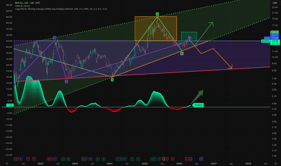
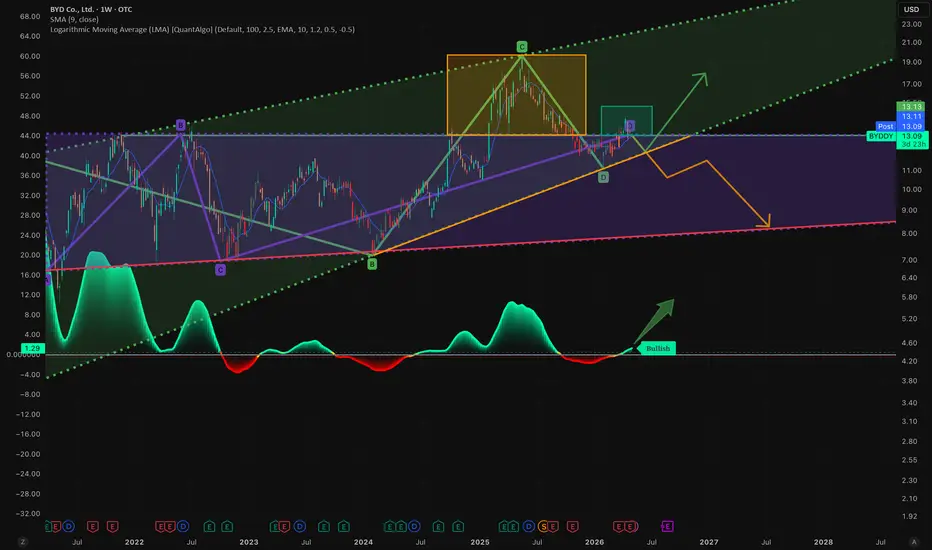
BYD ascending triangle breakout formationBYDDY price is testing the ceiling of a multi-year ascending triangle formation with bullish logarithmic moving average (LOGMA) movement to the upside. If price can test this breakout zone (turquoise rectangle), price volatility may likely continue to the upper channel (in green), if it cannot then price will likely consolidate back into the sideways ascending triangle formation (in purple).
Bull pennant on monthly btcusd log chartIf the monthly 50ma (in orange) can find a way to maintain solid support, then bitcoin should breakout upward from the current bullpennant right around where I arbitrarily placed the dotted purple line. This would give the bull pennant a breakout target of around 460k. Of course, Being a logarithmic chart pattern on a 1 month timeframe, this target could take several years to reach. *not financial advice*
BTC Roadmap 2026-2027 ~ $320KHello BTC Watchers.
A quick update on BTC outlook for 2026 and a possible target for the next 2 years.
Incase you missed the explanation on the logarithmic chart, I mapped out the date-ranges, as well as how far the price fell logarithmically after each top. You'll see the word "lines" on the chart. This simply indicates the amount of diagonal trendlines it has fallen. By using this pattern-dedicated approach, a commonality is found which may be useful in speculating a future price. Because if not for past history, how else would we speculate on the future?
It's interesting to note that the past 3 ATH's (all time high's) are each lower than the previous if you compare it not to price but to the "lines". Even the fifth high (the one coming next) will be on a lower click-line than the previous, and that estimate is already over 300k. This is a really helpful way to speculate a future high because usually, on a regular-view chart, the zone above the ATH is uncharted territory. You could use a Fibonacci trend-based extension, but this is limited to the cycle that you're using for input points. Logarithmic chart + indicators factor in the entire history of the price.
This would mean the new peak could be in 2026 around USD 300k.
It's important to note that this ay not be a straight line up. As you'll see, although the price has been increasing exponentially, there have been periods of hard pullbacks or corrections. These are great times to enter the market, NOT when the price is close to the peak of the curve (in green).
So currently, it's likely we're seeing the beginning of a slow bearish cycle / correction or dip in the road before starting another impulse wave up towards a new ATH.
In the short term, it may seem like we're bullish due to the flag patterns showing up everywhere. But in reality, this is more likely a corrective bounce up before another minus 20% - 30% drop:
Moreso, before we consider a MEANINGFUL reversal we must first see a daily candle close ABOVE the 200d MA< which is the upper grey:
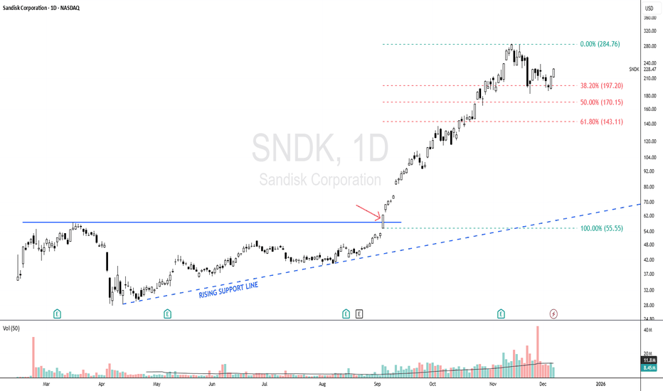
SNDK - Bullish Scenario Since 04 Sept, Momentum Still Intact!SNDK - CURRENT PRICE : 228.47
🔥 Bullish Scenario Supported by Trend Structure & Fibonacci Reactions
SNDK began showing early signs of a bullish scenario when price respected a rising support line , indicating steady accumulation and higher lows forming. The major bullish confirmation occurred on 04 September , when price broke above the 55.55 level (look at red arrow), triggering strong momentum and leading to a rapid vertical rally. As with many fast-moving stocks, a healthy retracement followed, and SNDK pulled back precisely toward the Fibonacci 38.2% golden ratio, where the stock found support and began forming a new base. This behavior suggests the prior uptrend remains intact, and the uptrend may resume as long as the stock continues to hold above this retracement zone.
Some Elliott Wave practitioners may also interpret the current structure as a developing Wave 5, suggesting the potential for another upside leg if the trend continues to follow impulsive wave behavior.
Take note that I'm using logarithmic scale chart because the share price has already risen more than 300% since the 04 September breakout, making it more suitable for analyzing large percentage moves and trend structure.
ENTRY PRICE : 228.47
FIRST TARGET : 270.00
SECOND TARGET : 324.00 (Projected based on Fibonacci extension)
SUPPORT : 183.00 (The low of 21 Nov HAMMER candle)
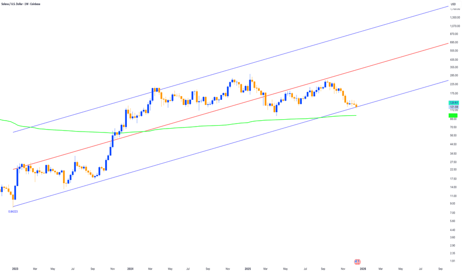
SOLUSD at long-term linear-regression supportSOLUSD has had a rough year in 2025 with major drawdowns and new highs as well. Neither bulls nor bears have had a painless path.
Will 2026 be different? A lot depends on the Fed, liquidity, inflation prints, and more.
But SOL found a bottom today at the -2 standard deviation line on a log-scale linear regression going back to the all-time low in December 2022. This is a convenient tool developed by @Forza that is an open-source script that "slightly modifies TradingView's built-in linear regression script" which allows it to be plotted on log-scale charts. I've thought recently that it may be worth taking a shot at SOL long, with risk limited to the -2 standard deviation line on a log scale chart.
The AVWAP from the inception of the chart (shown weekly above and dates back to June 2021 for this particular exchange's chart), lies around $96-$97.
No certainties exist in trading or investing, and a flush in 1Q would bring further pain to bullish SOL traders and long-term SOL investors. But if SOL continues its bullish path since late 2022, it could reach new all-time highs in 2026-2027. Maybe it's an investment worth considering. As always, do your own research!
BTC 2026 Outlook - Roadmap Speculation to $300KHello BTC Watchers.
Let's talk about BTC in the Logarithmic view.
I mapped out the date-ranges, as well as how far the price fell logarithmically after each top. You'll see the word "lines" on the chart. This simply indicates the amount of diagonal trendlines it has fallen. By using this pattern-dedicated approach, a commonality is found which may be useful in speculating a future price. Because if not for past history, how else would we speculate on the future?
It's interesting to note that the past 3 ATH's (all time high's) are each lower than the previous if you compare it not to price but to the "lines". Even the fifth high (the one coming next) will be on a lower click-line than the previous, and that estimate is already over 300k. This is a really helpful way to speculate a future high because usually on a regular-view chart, the zone above the ATH is uncharted territory. You could use a Fibonacci trend-based extension, but this is limited to the cycle that you're using for input points. Logarithmic chart + indicators factor in the entire history of the price.
This would mean the new peak could be in 2026 around USD 300k.
It's important to note that this ay not be a straight line up. As you'll see, although the price has been increasing exponentially, there have been periods of hard pullbacks or corrections. These are great times to enter the market, NOT when the price is close to the peak of the curve (in green).
So could it be that this is just another dip in the road towards a new ATH - despite the recent market liquidation?
A new look at previous logarithmic channelWith the trendlines of this channel slightly shifted we can see that it is possible that priceaction has already tested the top trendline of the channel. However in my previous version of this idea which I will try to post below it hasn’t connected with the top trendline yet. Would make more sense for it to be having the rejection it is having if it has already retested this top trendline though so I decided to post this version of the chart too so I can keep an eye on both. Even if somehow this does signal some sort of top it looks like we have very strong support on the next trendline just below the current one which should have the monthly 50ma double reinforcing its support in the very near future. SOo in that case that 50k zone there should hold strong support,but hopefully this is So another correction and not the top in which case the current trendline we have just retested will hold support. *not financial advice*
Introduction to a Trading System 1: Setting timeframes + bonusIntroduction to a Trading System: Setting Timeframes & Logarithmic Scaling
This educational video is the first in the "Signal and Structure" series, where an experienced crypto trader with 5+ years in cryptocurrency and additional forex background shares their systematic approach to chart analysis and trading.
Key Topics Covered:
Logarithmic Scale Fundamentals
- Why log scale is essential for cryptocurrency trading
- How it provides better perspective on price movements across different time periods
- Demonstrates using Bitcoin's price history how log scale reveals the true magnitude of moves and shows market maturation
Strategic Timeframe Selection System
- Introduces a unique 5-timeframe system based on dividing by 4:
- Monthly (30 days) - the base unit
- Weekly (≈30÷4 days)
- 2-Day (≈week÷4)
- 12-Hour (48 hours÷4)
- 3-Hour (12÷4)
Trading Philosophy
- Emphasizes simplification over complexity in trading
- Explains why using non-standard timeframes (2-day instead of daily) provides an edge
- Discusses how higher timeframes show cleaner structure while lower timeframes display more chaos
- Advocates for making trading easier by reducing noise and confusion
Practical Insights
- Higher timeframes (monthly/weekly) show more reliable patterns and are watched by institutional traders
- Lower timeframes become increasingly chaotic but still contain tradeable patterns
- The importance of stepping back to see the bigger picture in markets
The instructor brings a unique perspective influenced by classic traders like Gann and Wyckoff, and has developed over 140 custom indicators for their trading system. The video sets the foundation for understanding market structure before diving into signals and trading strategies in future episodes.
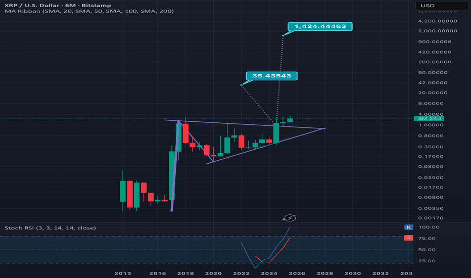
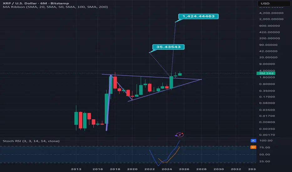
6 month log scale xrpusd chart updatedMy previous version of this chart I placed the breakout tarts arbitrarily before the actual breakout so I wanted to post an updated version with the two targets lined up directly at the point of the breakout. Smaller target is for just the triangle and the bigger target for the entire bullish pennant. Remember this being a 6 month time frame this could take several years still even to hit the highest target *not financial advice*
Monthly logarithmic chart on total3 suggests it could 44x!On the total3 chart we can see the majority of altcoins (excluding ethereum) have been consolidating for quite a long time in this ascending triangle which s also a bullish pennant. These patterns break to the upside far more than they break to the downside and this current one is nearing its apex. If we clued the pole of the pennant to calculate the Bullish breakout target/measured move, we can see that the target is 44 x higher than the current price. Of course this beng a logarithmic scale pattern, it may not ht its full 100% breakout target for multiple years even, but the angle of the measured move line does suggest we could see it reach such heights by 2028 and possibly even before it. *not financial advice*
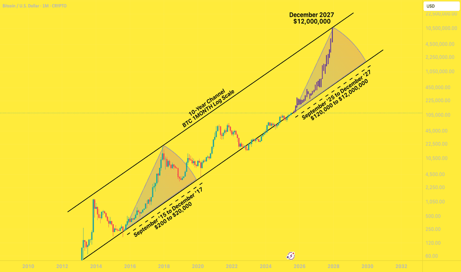
BTC to $12,000,000 December '27I had a years-old bookmarked chart from @MillionaireEconomics that I wanted to update and pick a random, extremely bullish candle pattern from the last time BTC came off the bottom channel to slap on it.
Riddle me this:
Why shouldn't Bitcoin go to $12,000,000 by December 2027?
Saylor continues to lead the way for global companies to scramble to build their own BTC warchests. These early adopters are having investor money dumped into them by the truckload.
Countries are stacking BTC
The BTC ETFs are a smash hit
Trump is all for making his own multi-billy family bitty stack
Mid-curvers will sell far too early, for far too little.
In the next two years, you'll be bombarded with countless, seemingly good reasons to sell your Bitcoins for hundreds of thousands of dollars - and then millions of dollars.
A shocking number of people will be far too early to sell. They will wake up in a cold sweat, night after night, haunted by their "could-have-been" stack, the number that updates in their head ten times a day, going up by six or seven figures a day .
... until they FOMO right back in at $11,999,999.
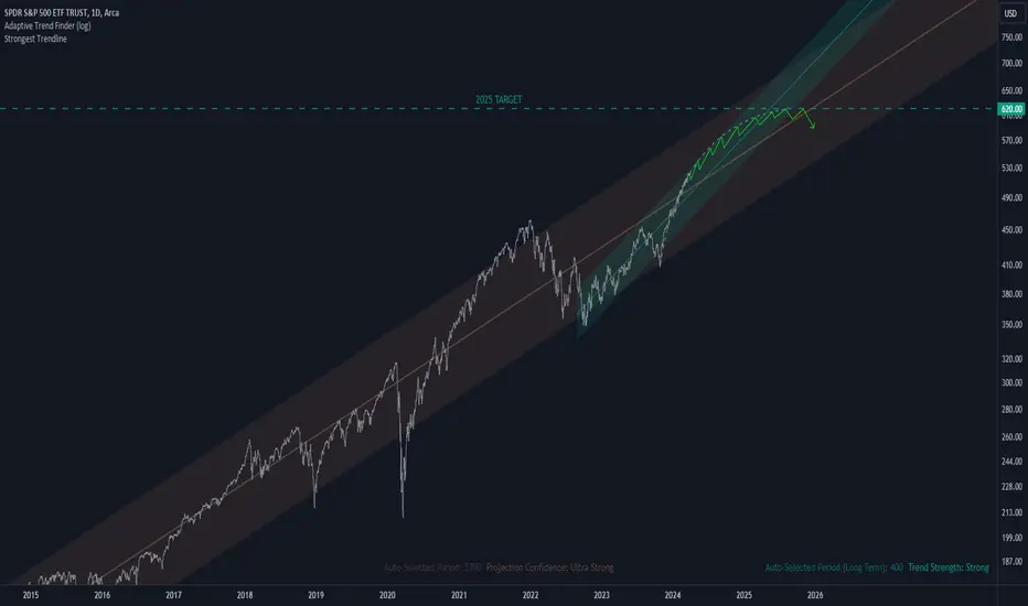
SPY Price Projection: Mid-2025 TargetRevealing Market Trends: Logarithmic Regression Analysis Indicates Bullish Path for SPY
In the ever-evolving realm of financial analysis, the search for reliable predictions remains ongoing. Logarithmic scale regression analysis, coupled with potent indicators, has emerged as a promising tool for discerning trends, particularly regarding assets like the SPY.
This analysis delves into the utilization of logarithmic scale regression alongside two robust indicators, offering insights into the potential trajectory of the SPY's price movement. It's essential to note that the interpretations and predictions presented are based on my analysis alone and should not be construed as financial advice. As with any market analysis, uncertainties persist, and actual outcomes may diverge from projections.
Logarithmic scale regression accounts for the exponential nature of price movements, providing a nuanced perspective on long-term trends. When combined with indicators such as moving averages or momentum oscillators, the analysis gains depth, revealing not only the direction but also the strength of the trend.
After meticulous examination of historical data and the application of analytical tools, our analysis suggests a bullish trajectory for the SPY, with a projected price nearing 620 EUR by mid-2025. This projection implies a significant uptrend from the current date, with a potential increase of approximately 20% over the specified timeframe.
However, it's crucial to approach such forecasts with caution, recognizing the inherent risks associated with financial markets. While our analysis indicates a positive outlook, market conditions can change rapidly, leading to deviations from expected trends.
In summary, logarithmic scale regression analysis, supported by robust indicators, offers valuable insights into market trends and potential price movements. While our analysis suggests a bullish sentiment for the SPY, investors should conduct thorough research and seek professional advice before making investment decisions.
Disclaimer: The analysis provided is based on personal interpretation and should not be considered financial advice. Investing in financial markets carries risks, and actual outcomes may differ. Readers are encouraged to conduct their own research and consult with financial professionals before making investment decisions.
BTC can still WIN After DeepSeek DumpTings are looking rough for BTC and ETH in the daily.
Let's talk about ETH first.
The previous time I posted on ETH, we took a look at a bullish pattern forming - the Inverse Head and Shoulders Pattern.
VS the VERY different picture we see today after the weekly closed underneath support:
Apart from chart patterns and bullish indicators - I was also confident that the price of ETH would increase, as we haven't seen a new ETH all time high, compared to the drastic ATH Bitcoin made. This, would be unusual. So the question remains - why did the pattern fail so miserably?
There is no reason specifically as to WHY chart patterns fail - especially if they seem so strong. Some may argue its whale play, others may say it's a news event etc... But either way, the only real way to safeguard a trade from a failing pattern is to wait for confirmation . And the worst ting is - even then, it may still fail. However, this is by far a safer play than just relying on a pattern that's busy forming. Here's a short idea of what a confirmation would look like on some bullish patterns (blue):
Now, to talk about BTC in the Logarithmic view.
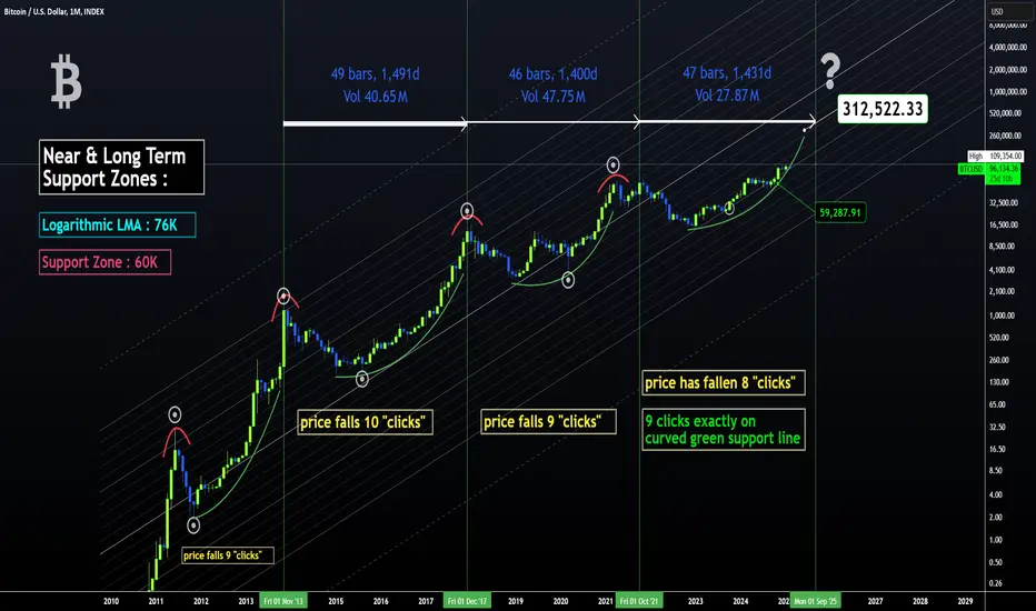
I mapped out the date-ranges, as well as how far the price fell logarithmically after each top. You'll see the word "clicks" on the chart. This simply indicates the amount of diagonal trendlines it has fallen. By using this pattern-dedicated approach, a commonality is found which may be useful in speculating a future price. Because if not for past history, how else would we speculate on the future?
It's interesting to note that the past 3 ATH's (all time high's) are each lower than the previous if you compare it not to price but to the "click lines". Even the fourth high (the one coming next) will be on a lower click-line than the previous, and that estimate is already over 300k. This is a really helpful way to speculate a future high because usually on a regular-view chart, the zone above the ATH is uncharted territory. You could use a Fibonacci trend-based extension, but this is limited to the cycle that you're using for input points. Logarithmic chart + indicators factor in the entire history of the price.
So could it be that this is just another dip in the road towards a new ETH ATH - and potentially even another BTC increase?
______________________
BINANCE:ETHUSDT BINANCE:BTCUSDT
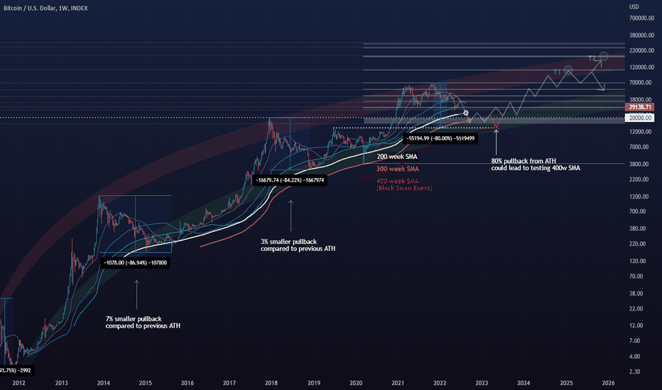
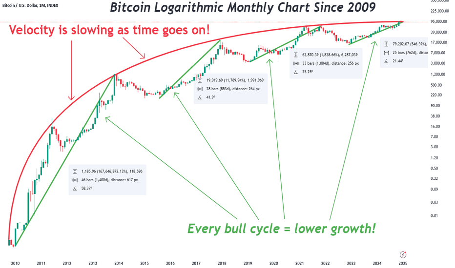
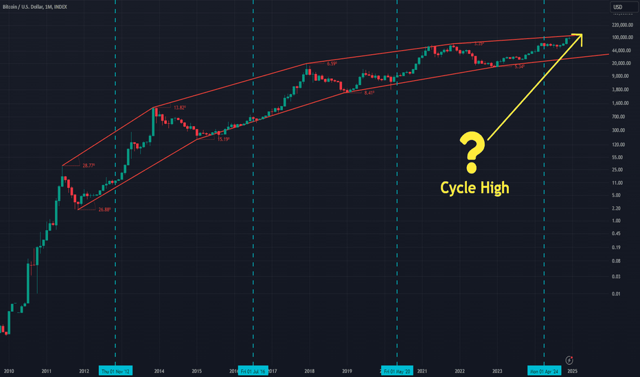
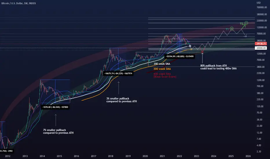
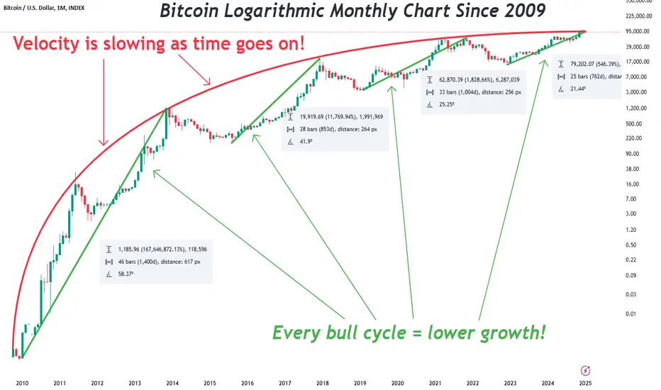
Bitcoin Logarithmic Chart Since 2009Bitcoin is currently in a bull cycle similar to previous cycles. Bitcoin has a notorious 4 year cycle that almost everyone knows about due to it's halving. This means the current bull cycle should extend into late 2025. However, things may be a little different from what most people would expect this time.
This is an all-time Bitcoin logarithmic chart going back to 2009 which is when Bitcoin was released. This is a monthly chart so all the information can fit onto a single screen.
The red line shows a trajectory similar to an airborne projectile of some kind. As time goes on, the velocity is slowing. We all know what happens next when velocity slows down too much. Gravity takes over!
The green lines were drawn from the lows to the highs. I realize they may be off by a candle or so depending on data source or where somebody want to put the start/end times, but this doesn't change the overall concept. Every bull cycle has lower growth in terms of %. This is just a fact.
There are 3 important notes I want to make other than slowing velocity:
1) Bitcoin is already extended up to the red line this cycle. Which just so happens to coincide with the strong psychological $100000 level.
2) Notice how the growth percentages are drastically lower each cycle. Bitcoin is currently up more than 500% from it's low point this cycle. The previous cycle only made a 1829% move. So the high for this cycle may have already been made.
3) We are about 25 candle into the current cycle. Each cycle has different durations from low point to high point though. The shortest cycle was only 28 candles. Bitcoin may very well have made it's high point this cycle already. If not, there may be only a few months left of bullish movement.
See my previous analysis using a regular linear chart which I made near the top. Both long-term charts are in agreement.