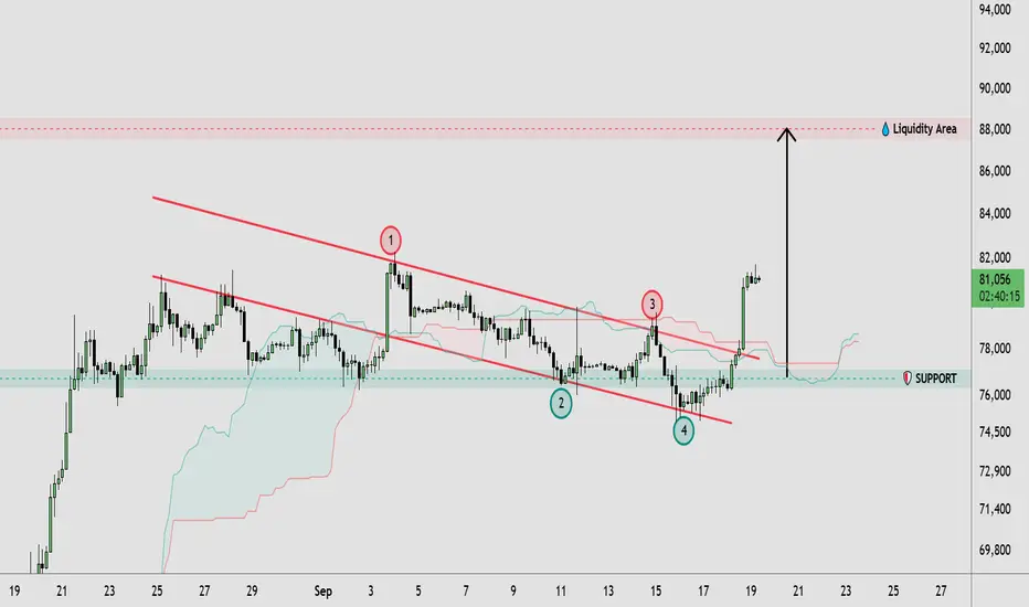
BTCUSD Breaks Descending Channel | 88K Liquidity in Focus🔹 BTCUSD has broken above the descending channel structure after multiple tests of its upper boundary, suggesting a shift in short-term price action. Price is currently holding around the 81,000 area after a strong bullish expansion from the 76,000–77,000 support zone. The breakout places attention on the recent swing highs around 82,000, while the larger highlighted liquidity area near 88,000 remains an important resistance region. The previous channel structure and support zone continue to provide key areas for market structure analysis.
🔸 If BTCUSD maintains the breakout and holds above the former channel resistance, price could continue building toward higher liquidity, with the 88,000 area becoming a potential zone of interest. Traders may wait for price confirmation and a successful retest before considering any trade. If the breakout fails and price moves back below the 76,000–77,000 support area, the bullish structure could weaken and a deeper retracement might develop.
This analysis is for educational purposes only and does not constitute financial or investment advice. Always conduct your own research before making trading decisions.  Long
Long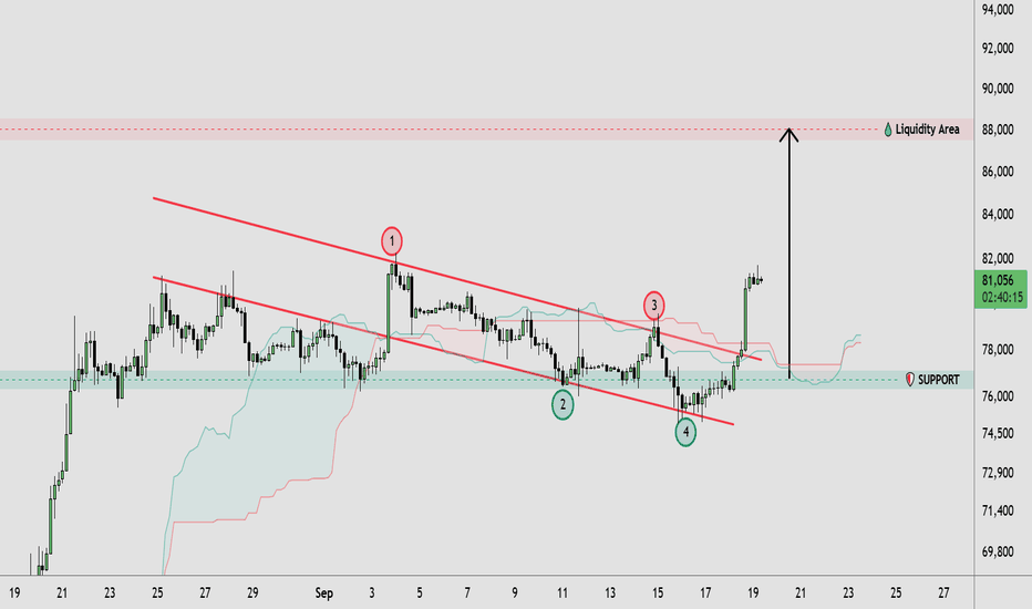
XAUUSD — Weekly Wave 5 Lower Toward 4,060
From Kelly’s view, gold enters next week inside a broader bearish corrective structure. Price is currently trading around 4,378, after recovering from the 4,240–4,250 area, but the rebound is still developing beneath a descending channel and an important sell zone around 4,390–4,410.
The key idea is simple: the current recovery may represent a corrective Wave (4), while the main weekly scenario remains a continuation lower into Wave (5) if sellers defend the upper resistance zone.
⟡ Market structure
Gold remains inside a descending structure after the major peak near 4,680. Recent rebounds have continued to form below important resistance, while the descending channel is still controlling the broader direction.
The current recovery from around 4,240 has pushed price back toward the 4,390–4,410 sell zone, where Fibonacci resistance and the projected Wave (4) completion area overlap.
For next week, 4,334 is the first important support. A clean break below this level could confirm renewed bearish momentum and expose the 4,240–4,255 area.
If that support also fails, the larger Wave (5) projection points toward the 4,045–4,075 zone.
➤ Key levels
◌ Current price area: 4,375–4,385
◌ Main sell zone: 4,390–4,410
◌ Strong resistance: 4,410–4,430
◌ Strong support: 4,334
◌ Secondary support: 4,240–4,255
◌ First target: 4,334
◌ Second target: 4,240–4,255
◌ Main target: 4,045–4,075
◌ Invalidation: Above 4,430
⌁ Elliott Wave view
Wave (1): The first bearish leg pushed price lower from the previous recovery high.
Wave (2): Gold produced a corrective rebound before sellers regained control.
Wave (3): The stronger bearish impulse extended toward the 4,240 area.
Wave (4): The current rebound may be completing near 4,390–4,410, where the descending channel and Fibonacci resistance overlap.
Wave (5): If sellers reject this zone, the final bearish leg could develop toward 4,240 first, followed by the larger 4,045–4,075 target area.
▸ Trading scenario
Preferred bearish scenario
Entry: 4,390–4,410 after bearish confirmation
Stop Loss: Above 4,430
Take Profit 1: 4,334
Take Profit 2: 4,240–4,255
Take Profit 3: 4,045–4,075
The cleaner plan is to wait for rejection from the sell zone rather than chase price lower around current levels. A bearish reaction near 4,390–4,410, followed by a break below 4,334, would strengthen the Wave (5) scenario.
Alternative scenario:
If gold breaks above 4,410–4,430 and holds above the descending structure, the bearish Wave (5) setup may be delayed and price could extend toward the next higher resistance before sellers regain control.
◌ Invalidation
The main bearish scenario would weaken if price gains sustained acceptance above 4,410, and a confirmed break above 4,430 would invalidate the preferred Wave (5) structure for next week.
⌁ Kelly’s view
Kelly’s main view remains bearish for next week while gold stays below 4,390–4,430.
The current rebound may still have room to test the sell zone, but the broader structure favors another bearish leg if sellers defend resistance. 4,334 is the first confirmation level, while 4,240–4,255 remains the next major support before the larger 4,045–4,075 Wave (5) target comes into focus.
Do you think gold will reject the 4,390–4,410 sell zone first, or break 4,334 directly next week?  Short
Short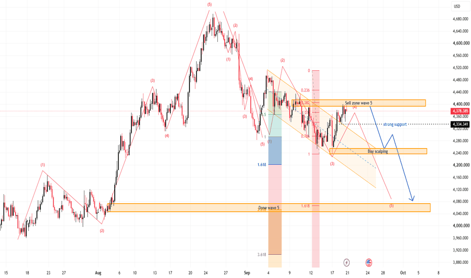
 Short
Short
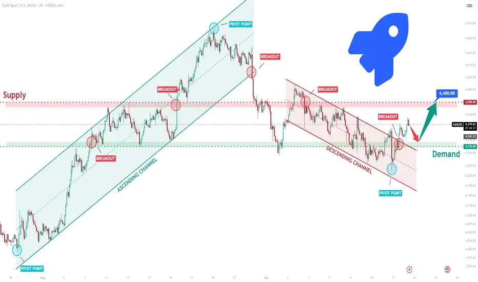
XAUUSD Long: Channel Breakout Could Drive Price Higher To 4,450$Hello traders! Here’s my technical outlook based on the current XAUUSD (2H) chart structure. XAUUSD previously traded inside an ascending channel before breaking higher and later forming a descending channel. Price then tested the Supply Zone near 4,450, where sellers rejected the upside before pulling back toward demand.
Currently, XAUUSD is trading below the 4,450 Supply Zone while holding above the 4,310 Demand Zone. The recent bounce from support suggests buyers are preparing for another move higher.
As long as XAUUSD remains above 4,310 and respects the current support structure, the bullish scenario remains valid. A continuation higher could target 4,450 (TP1). However, a break below 4,310 would weaken the bullish outlook. Manage your risk! Long 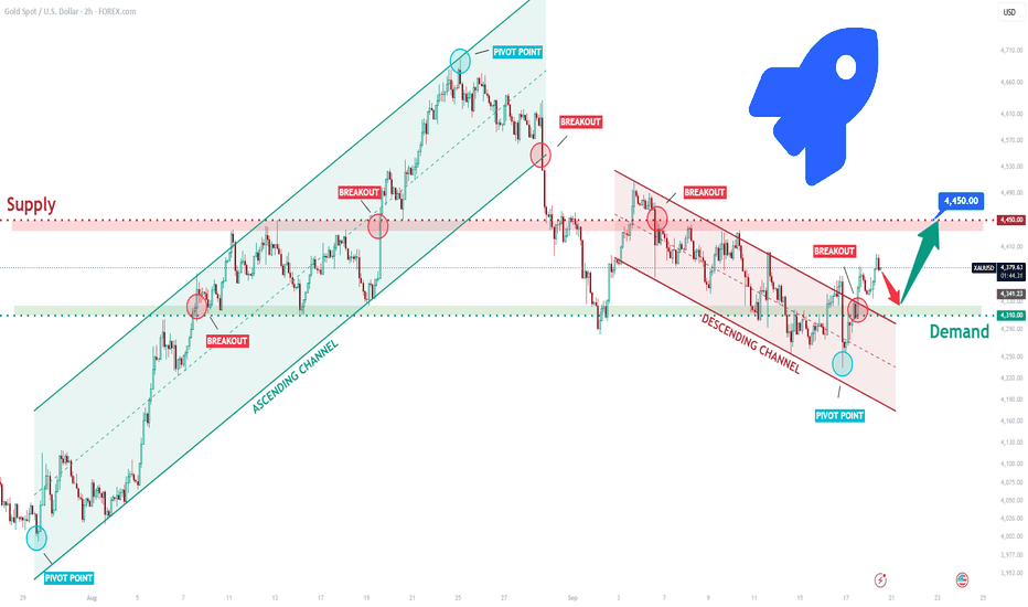
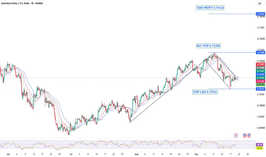
AUDUSD — Bullish Flag Breakout SetupAfter months of bearish pressure that dominated the first half of the year, AUDUSD has made a remarkable recovery. Since mid-July, the pair has been carving out a textbook bullish structure — printing a clean series of Higher Highs and Higher Lows — a classic sign that buyers are firmly in control and the market is in a healthy Advancing Phase.
The rally was strong and impulsive, with price gaining significant ground in a relatively short period of time. This kind of momentum tells us that there is genuine buying interest behind this move — not just a temporary bounce.
The Flag Formation
After such a strong impulse move pushing price all the way up to the 0.7238 resistance zone, it was only natural for the market to pause and consolidate. This is exactly what happened. Price pulled back in an orderly and controlled manner — not a sharp reversal, not panic selling — just a healthy cooldown. This consolidation formed a Bullish Flag pattern, which is one of the most reliable continuation patterns in technical analysis.
The flag has been respecting its boundaries cleanly. Price is compressing, momentum is being reset, and the market appears to be coiling up for the next move. This is exactly the kind of price action that precedes a strong breakout.
What We Are Looking For
A clean breakout and close above the upper boundary of the flag at 0.72388 would confirm that the consolidation phase is over and the trend is ready to resume. Once buyers take control above that level, the path toward 0.74126 opens up — a significant supply zone and our target for this setup.
The stop loss is placed at 0.70751, below the flag structure and recent swing low — giving the trade enough room to breathe while keeping risk defined.
Levels to Watch:
🔵 Buy Stop: 0.72388 (breakout confirmation)
🔴 Stop Loss: 0.70751 (below flag & swing low)
🟢 Take Profit: 0.74126 (supply zone)
As always, patience is key. We do not chase — we wait for the market to come to our level and confirm before entering.
Not financial advice. Trade your own plan. XAUUSD — Descending Channel Breakout Toward 4,500 Liquidity🔹 XAUUSD is showing a broader corrective structure within a descending channel, while recent price action suggests buyers are gaining some control after reacting from the 4,250–4,300 support area. Price has pushed back above the channel’s upper boundary, indicating a potential breakout attempt, with resistance developing around 4,400–4,450. The marked liquidity area near 4,500–4,520 remains an important upside zone, while the recent higher lows suggest improving short-term market structure.
🔸 If the breakout remains supported, XAUUSD could continue toward the 4,500 liquidity area as buyers test higher resistance. Traders may wait for price confirmation and sustained acceptance above the breakout area before considering any trade. If the breakout fails and price falls back below the 4,300 region, the market could revisit the 4,250–4,270 support zone and potentially resume the broader corrective structure.
This analysis is for educational purposes only and does not constitute financial or investment advice. Always conduct your own research before making trading decisions. Long 
Bitcoin Daily | The Structure Is Still the Story⏱️ Reading time: About 3 minutes
On the Bitcoin Daily chart, the main question for us is not simply whether price is going up or down.
The more important question is:
What is the current structure telling us?
From the major low marked on the chart, Bitcoin has developed a significant upward move. Now, we are watching one of the most important structural decision points in the market.
Scenario 1: Bullish Case
In the bullish scenario, the current upward move could be part of a larger impulsive structure.
First, we want to see this current structure develop and eventually complete. After that, a correction would be normal.
A correction does not automatically mean that the bullish structure has failed.
If the correction is followed by another impulsive move, a Leading Diagonal, or even a smaller nested 1–2 structure, that could provide important evidence for further upside.
The area around $126,255–$126,272 is especially important.
A valid break above this area could provide the first meaningful confirmation of the bullish scenario.
If the structure continues to support this scenario, the next structural targets shown on the chart are:
$168,628 → $195,184 → $237,116
These are not predictions or guarantees.
They are simply potential structural targets based on the current Elliott Wave scenario.
Scenario 2: Bearish Case
The bearish scenario is still possible.
If the current upward move fails to develop into a valid impulsive structure, and price begins forming another corrective structure, this could mean that the current rally is only part of a larger correction.
In that case, the 50%–61.8% retracement area becomes important, followed by the 61.8%–78.6% zone.
And there is one important point to remember:
One five-wave move alone is not enough to confirm a bullish trend.
For us, the sequence is more important:
Impulse → Correction → New Impulse
If this sequence develops according to Elliott Wave rules and guidelines, the bullish scenario becomes stronger.
If it doesn't, we simply reassess the structure and allow the market to show us what comes next.
The $15,479 level remains our major bullish invalidation level on this chart.
So as long as the larger structure continues to respect this level, the broader bullish possibility remains structurally valid.
And perhaps the most important idea is this:
We don't try to force the market to fit our count.
We adjust our count to fit the market.
Patterns whisper. I listen.
— Mr. Nobody 🎧📊
Bitcoin
Jun 22, 2023
Strong bullish cryptocurrency market???YES
Long 
Long 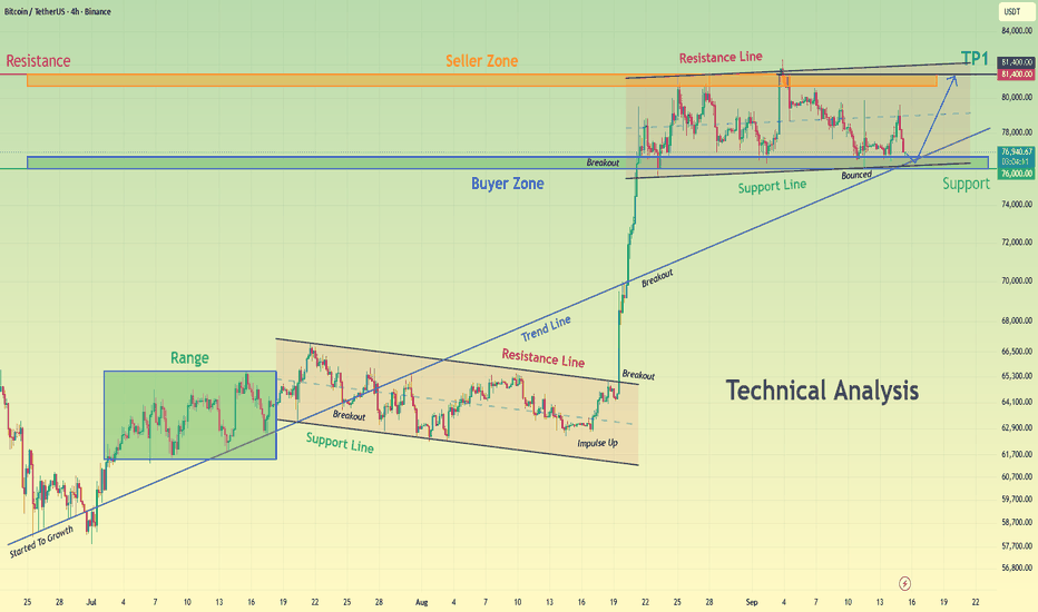
XAUUSD — 4,370 Retest Before 4,406?
Gold is trading around 4,386 after extending the M30 recovery above the rising trendline.
The short-term structure remains constructive, but price is now approaching an important resistance area.
The simple read
4,370 is the key breakout support.
If buyers defend this zone, Gold may continue toward 4,398–4,406.
A clean break above 4,406 could open the way toward the upper resistance around 4,437.
If 4,370 fails, the deeper structure support around 4,331 becomes the next important reaction area.
Key price zones
4,370 — breakout support
4,331 — key structure support
4,398–4,406 — major resistance
4,437 — upper resistance target
The M30 recovery is still healthy while price holds above the rising trendline.
But resistance is close.
Do not chase the candle.
Wait for the pullback.
Wait for reaction.
Can 4,370 hold and send Gold through 4,406? Long 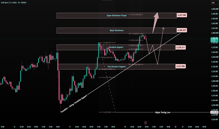
XAUUSD — Bullish Retest Toward 4,410Fundamental Analysis
Gold finishes the week on firmer footing as easing crude oil prices reduce near-term inflation pressure, helping XAUUSD recover despite the U.S. dollar remaining near a seven-week high. Gold posted its first weekly gain in four weeks, while markets now price roughly a 55% probability of another Fed hike in October after this week’s 25 bp increase.
Treasury yields have also eased from their post-Fed highs, although the U.S. 10-year remains close to the important 5% area. Next week, traders will focus on U.S. PMI data, Fed communication and whether lower energy prices can continue moderating inflation expectations.
Technical Analysis
On H1, XAUUSD is trading near 4,378 after successfully reacting from the previous 4,355–4,367 buy zone and reaching the 4,389–4,395 resistance area.
Price has printed a BOS above 4,377, while the rising support trendline continues to protect the recovery structure.
The preferred continuation area remains 4,355–4,367, where Fibonacci 0.618, previous structure and the marked buy zone converge.
If buyers defend this area again, gold may retest 4,389, followed by the key 4,410 liquidity high.
A deeper correction could reach 4,342, with the H1 FVG around 4,323–4,342 acting as secondary support.
Important Key Levels
4,410 — Main liquidity target
4,389–4,395 — Immediate resistance
4,377 — BOS / short-term pivot
4,355–4,367 — Main buy zone
4,342 — Fibonacci support
4,323–4,342 — H1 FVG
Below 4,338 — Bullish invalidation
Trading Scenario
Main Buy Setup
Entry: 4,355–4,367
Stop Loss: 4,338
Take Profit 1: 4,389
Take Profit 2: 4,400
Take Profit 3: 4,410
Buy Condition
Wait for a controlled retracement into 4,355–4,367 and bullish confirmation. A liquidity sweep, long lower wick, bullish engulfing candle or H1 reclaim above 4,367 may signal renewed buyer pressure.
A sustained H1 break below 4,338–4,342 would weaken the continuation setup.
Overall View
The H1 structure remains constructively bullish while price holds above the rising support structure. Since gold is currently near the 4,377–4,390 resistance area, chasing fresh longs offers less attractive positioning.
The preferred plan is to wait for another retracement into 4,355–4,367. If buyers defend the zone, XAUUSD could retest 4,389–4,400 and potentially attack the 4,410 liquidity high.
Will gold defend 4,355–4,367 again before breaking 4,410? Long 
Gold (XAUUSD): Same Resistance Shelf Across Three Timeframes◆ Read: XAUUSD is testing a resistance shelf in the 4385–4400 zone that shows up independently across the 1H, 4H, and 15m charts, not one signal repeating, three separate structural reads converging on the same price. The 4H version of this shelf has recorded 55 total touches; the 15m shows a nearby level at 52.
◈ What's building underneath: raw volume regime reads QUIET on both the 1H and 15m right now, but the cumulative volume delta trend is Accumulating on every timeframe shown. Net buying pressure has been building steadily without a dramatic spike, a grind rather than an explosion.
⚠ If this shelf holds and price rejects: there's a well-tested support stack beneath, a zone with 23 touches near 4325 on the 1H, and a cluster with 28-45 touches in the 4315–4370 range on the 15m.
🔒 No signals, no promises, a structural read across timeframes, not a trade recommendation. Always manage risk and do your own analysis.
BTCUSD Bullish Structure Holds Resistance & Liquidity in Focus🔹 BTCUSD is consolidating after a strong upward expansion from the 64,000 area, with price currently holding above the 75,500–76,000 support zone. The structure remains constructive, while price is consolidating below the 82,000–82,500 resistance area. Overhead liquidity around 84,500–85,000 remains an important area to watch. A confirmed breakout above resistance could support further upside, while rejection may keep BTCUSD within the current range.
🔸 From a price action and market structure perspective, traders may wait for confirmation before considering any trade. If buyers reclaim the resistance area with a confirmed breakout, BTCUSD could potentially move toward the higher liquidity zone. On the other hand, a sustained break below the 75,500–76,000 support could weaken the current structure and open the possibility of a deeper retracement. This scenario remains dependent on future price action and confirmation.
Educational analysis only. Always conduct your own research before making trading decisions. Long 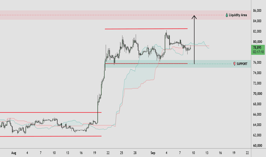
 Short
Short
H1 Major Supply Rejection Toward Lower LiquidityXAUUSD is trading around 4,378 after extending its recovery from the lower H1 structure. Price has returned directly into the 4,385–4,405 Major Supply Zone, where the broader bearish trendline also remains relevant.
Gold reached a one-week high on Friday as easing crude oil prices reduced part of the inflation pressure that had dominated markets earlier in the week. Spot gold climbed about 1.2%, while softer energy prices helped Treasury yields retreat from their recent highs.
However, the broader macro backdrop remains restrictive. The Fed has raised rates to 3.75%–4.00% and still expects further tightening, while markets currently price roughly a 55% probability of another hike in October. The dollar also remains near a seven-week high, and the U.S. 10-year yield has recently traded above 5%, limiting the strength of gold’s recovery.
Technical View
The H1 recovery has improved after the recent MSS and rebound from lower demand, but price is now entering the main decision area.
The 4,385–4,405 Major Supply Zone aligns with the previous bearish trendline and recent swing structure. This makes the current area less attractive for chasing longs.
A rejection or failed acceptance above this supply could trigger a corrective move back toward the 4,335–4,350 Demand Zone.
If that demand fails to absorb selling pressure, the larger downside objective sits around 4,270–4,290, where the marked downside target and previous liquidity structure align.
Below that, the 4,235–4,250 Major Demand / SSL Zone remains the deeper structural support.
Key Zones
Current Price: 4,378.385
Major Supply / Sell Area: 4,385–4,405
Demand Zone: 4,335–4,350
Downside Target: 4,270–4,290
Major Demand / SSL: 4,235–4,250
Bearish invalidation: sustained H1 acceptance above 4,410–4,420
Trading Plan
Sell Priority: 4,385–4,405
Condition: wait for price to retest Major Supply and show bearish rejection, liquidity sweep, failed acceptance or lower-high confirmation.
TP1: 4,335–4,350
TP2: 4,270–4,290
TP3: 4,235–4,250
Invalidation: sustained H1 acceptance above 4,420.
Sell View
The cleaner approach is to avoid selling aggressively below current price after the recent recovery.
I prefer to let gold test 4,385–4,405 first. If sellers clearly defend the zone, the risk/reward improves for a rotation back toward demand.
A clean H1 breakout and acceptance above 4,420 would weaken the immediate bearish scenario and require reassessment.
Important Note
Lower oil prices are helping gold recover in the short term, but the Fed’s renewed tightening cycle, a strong dollar and elevated Treasury yields remain important headwinds. This creates a two-sided environment where liquidity sweeps around resistance may be aggressive.
Final View
Gold has recovered strongly, but H1 is now testing a key supply area rather than trading from clean demand.
The main scenario is a retest and rejection from 4,385–4,405, followed by a move toward 4,335–4,350 first and potentially 4,270–4,290 if bearish momentum expands.
Will H1 Major Supply stop the recovery before gold rotates back toward lower liquidity? Short 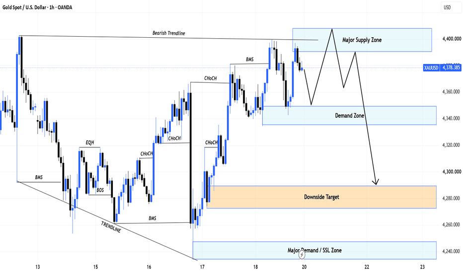
XAUUSD — Bullish Pullback Toward H1 SupportMarket Pulse
Gold ended the week on firmer footing, helped by easing oil prices that reduced some inflation pressure. The metal posted its first weekly gain in four weeks. However, the U.S. dollar remains firm and markets still see roughly a 55% chance of another Fed hike in October, so the macro picture is supportive but not fully bullish.
What the Chart Says
XAUUSD still shows a constructive H1 recovery after the strong rebound from the lower demand area.
Price reached the 4,390–4,400 region, then started to pull back. This is normal after the recent bullish expansion.
The main area I am watching is 4,325–4,345. This zone combines previous structure, Fibonacci support and the rising trend area.
If buyers defend this zone, Gold could build another higher low and recover toward the recent highs.
The first upside test remains around 4,390–4,400. A clean breakout above this resistance could open the way for a stronger continuation.
Levels That Matter
4,398–4,410 — Main resistance
4,370–4,380 — Current structure
4,325–4,345 — Main pullback / support zone
4,235–4,245 — Major demand zone
My Main Plan
The main plan remains bullish.
I prefer waiting for a controlled pullback toward 4,325–4,345 instead of chasing price near the highs.
If buyers return with clear confirmation, Gold could recover toward 4,390–4,400 again.
What I Need to See
I want the pullback to hold above the main support zone and form another higher low.
A sustained H1 break below 4,325 would weaken the immediate bullish continuation setup.
Final Read
The H1 recovery remains constructive, but Gold is still trading below an important resistance area.
For now, I prefer waiting for the pullback and bullish confirmation before following the next move higher. Long 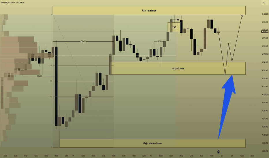
Pullback Before Another BSL TestFundamental Analysis
Gold is holding firm after posting its first weekly gain in four weeks, helped by easing oil prices and some reduction in inflation pressure. However, the U.S. dollar remains near a seven-week high, Treasury yields are around 5%, and markets still price roughly a 55% chance of another Fed hike in October.
Technical Analysis
On H1, Gold remains constructive after the recent bullish BOS, but price is now approaching the 4,395–4,410 BSL / major resistance.
The cleaner continuation setup is a controlled pullback into the 4,348–4,368 OB + Fibo zone. If buyers defend this area, the next bullish wave could retest upper liquidity.
Volume Profile also shows an important lower balance area around 4,300–4,318 POC.
Important Key Levels
4,395–4,410 — BSL / Major Resistance
4,348–4,368 — OB + Fibo
4,300–4,318 — POC
4,235–4,250 — SSL / Major Support
Trading Scenario
Buy priority remains on a pullback into 4,348–4,368 followed by bullish H1 confirmation.
Target: 4,395–4,410 BSL.
Invalidation: H1 acceptance below the OB + Fibo zone.
Overall View
The short-term structure remains constructive, but buying directly below BSL offers less attractive positioning. A pullback into support could provide the cleaner continuation setup.
Will Gold retest the OB + Fibo first before breaking 4,400? Long 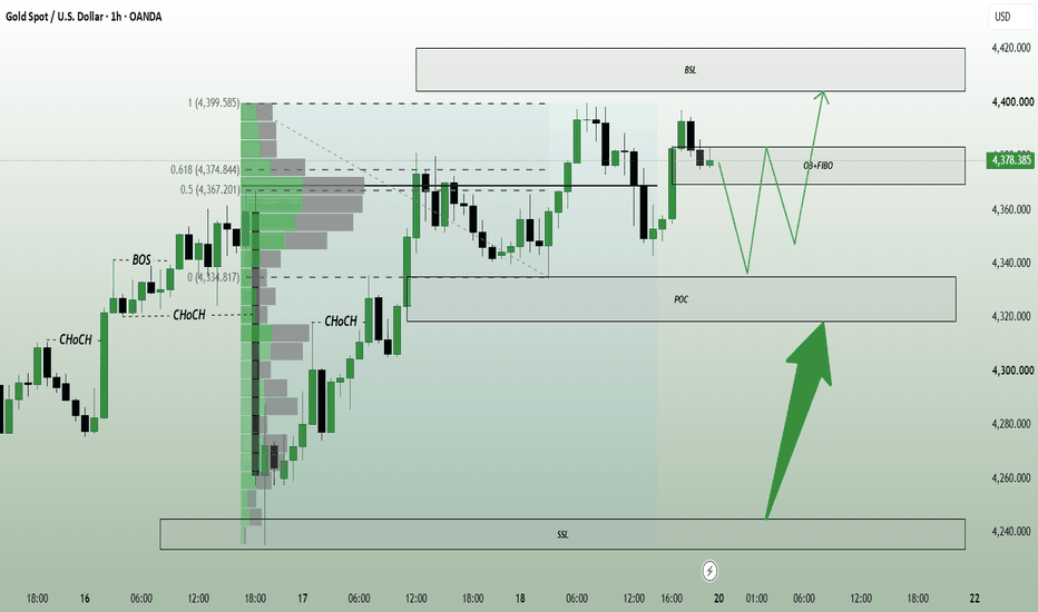
Meta — Healthy Correction or Trend Reversal?Market Structure
Meta remains in a strong bullish structure on the 4-hour chart, with higher highs and higher lows still intact. After an aggressive rally toward new swing highs, price has started to pull back from resistance, suggesting a short-term correction within the broader uptrend.
Market Sentiment - Moderately Bullish
The overall trend continues to favor buyers despite the recent pullback. Profit-taking has increased near resistance, but unless key support levels are broken, the broader bullish structure remains unchanged.
Bullish Scenario
If price finds support around 660 and buyers regain momentum, Meta could retest the 680 resistance. A successful breakout above 680 would expose the 688–690 area as the next upside objective.
Bearish Scenario
If price falls below 660, selling pressure could increase and lead to a deeper correction toward 645. A break below 645 would weaken the current bullish structure and shift momentum toward the sellers.
────────────────────
Market View
Meta has delivered an impressive rally over the past several sessions and is now experiencing its first meaningful pullback near resistance. At this stage, the decline appears more like profit-taking than a confirmed trend reversal. The reaction around support will likely determine whether buyers are ready for another leg higher.
────────────────────
Key Levels
First Resistance: 680
Second Resistance: 688
First Support: 660
Second Support: 645
────────────────────
Outlook
Holding above 660 would keep the bullish outlook intact and could allow buyers to challenge 680 once again.
However, a decisive break below 660 may trigger a deeper retracement toward 645 before the next directional move develops.
────────────────────
Event Risk
Meta may remain sensitive to broader Nasdaq performance, U.S. economic data, Treasury yields, AI-related developments, and company-specific news. These factors could increase short-term volatility.
────────────────────
Please share your view below:
Do you think Meta will resume its rally and break above 680, or is a deeper pullback more likely from here?
I'll continue sharing more Market Structure and Key Level updates. Tesla-Can Buyers Build Enough Momentum for Another Break Higher?Market Structure
Tesla remains in a medium-term bullish structure on the 4-hour chart. After recovering strongly from the late-July low, price has entered a consolidation phase below resistance. Higher lows continue to hold, suggesting buyers are still defending the trend despite the recent sideways movement.
Market Sentiment - Moderately Bullish
Momentum has cooled after the recent rally, but buyers continue to absorb selling pressure around support. As long as higher lows remain intact, the overall sentiment stays cautiously bullish.
Bullish Scenario
If Tesla breaks above the 368 resistance zone with strong buying volume, bullish momentum could accelerate toward 375, with 382 becoming the next upside target.
Bearish Scenario
If price falls below the 356 support area, short-term selling pressure could increase and drive the price toward 348. A decisive break below 348 would weaken the current bullish structure and shift momentum back to the downside.
────────────────────
Market View
Tesla is trading within a consolidation range after a solid recovery from recent lows. While buyers continue defending support, the market is waiting for a clear breakout before establishing the next directional move.
────────────────────
Key Levels
First Resistance: 368
Second Resistance: 375
First Support: 356
Second Support: 348
────────────────────
Outlook
A sustained breakout above 368 would confirm renewed buying strength and could open the door toward 375–382.
On the other hand, losing 356 would increase the probability of another corrective move toward 348 before buyers attempt to regain control.
────────────────────
Event Risk
Tesla may remain sensitive to broader Nasdaq performance, U.S. economic data, Treasury yield movements, EV industry developments, company-specific announcements, and overall market risk sentiment. These events could lead to increased short-term volatility.
────────────────────
Please share your view below:
Do you think Tesla is ready to break above resistance and continue its recovery, or will the current consolidation lead to another pullback?
I'll continue sharing more Market Structure and Key Level updates. Alphabet Approaches a Major Resistance ZoneMarket Structure
Alphabet is recovering from its recent correction and has established a sequence of higher lows on the 4-hour chart. Price is now approaching a key resistance area around 350, where buyers and sellers are likely to compete for short-term control.
Market Sentiment - Moderately Bullish
Momentum has improved following the recent rebound, but price remains below a major resistance zone. Buyers currently have a slight advantage, although confirmation is still needed before a sustained breakout can be expected.
Bullish Scenario
If price breaks above the 350 resistance and holds above it, bullish momentum could accelerate toward 358, with 365 becoming the next upside target.
Bearish Scenario
If price fails to break above 350 and falls below the 342 support, selling pressure could increase and push price toward the 335 area. A break below 335 would weaken the current recovery structure.
────────────────────
Market View
Alphabet has recovered steadily from its recent lows and is once again testing an important resistance level. The current consolidation suggests the market is preparing for its next move. Whether buyers can clear resistance or sellers defend this area will likely determine the short-term direction.
────────────────────
Key Levels
First Resistance: 350
Second Resistance: 358
First Support: 342
Second Support: 335
────────────────────
Outlook
A confirmed breakout above 350 would strengthen the bullish outlook and could open the door toward 358–365.
However, if buyers lose momentum below 342, the recovery may pause and a deeper pullback toward 335 could develop.
────────────────────
Event Risk
Alphabet may remain sensitive to broader Nasdaq performance, U.S. economic data, Treasury yields, AI-related developments, and company-specific news. These events could drive short-term volatility.
────────────────────
Please share your view below:
Do you think Alphabet is ready to break above 350, or will resistance trigger another rejection?
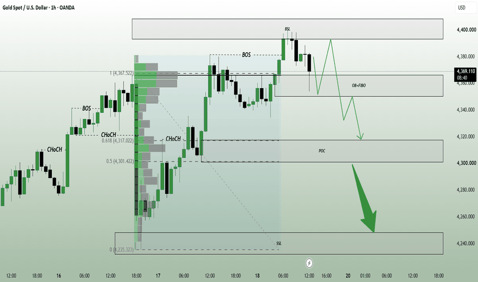
I'll continue sharing more Market Structure and Key Level updates. BSL Rejection Opens Corrective Move
Fundamental Analysis
Gold remains supported by softer oil prices and easing Treasury yields after the Fed’s latest rate hike. However, the Fed has signaled that further tightening is still possible, so Gold may remain sensitive to changes in yields, the dollar and energy prices.
Technical Analysis
On H1, Gold confirmed a bullish BOS and pushed into the 4,390–4,405 BSL, where price is now showing rejection.
This makes a short-term correction more likely. The first support sits around 4,350–4,367 OB + Fibo. If sellers break this zone, price could extend toward the 4,300–4,318 POC.
Important Key Levels
4,390–4,405 — BSL / Major Resistance
4,350–4,367 — OB + Fibo
4,300–4,318 — POC
4,235–4,250 — SSL / Major Support
Trading Scenario
Sell priority remains after rejection from 4,390–4,405.
Target: 4,350–4,367 first, then 4,300–4,318 if support fails.
Invalidation: H1 acceptance above 4,405.
Overall View
Gold has reached major upper liquidity after a strong recovery. The cleaner setup now is to watch for a corrective move toward lower support rather than chase buys near resistance.
Will Gold hold the OB + Fibo, or correct deeper toward the POC? Short