XAUUSD (Monthly)Yes, this is looking slightly bullish right now ,,, but I have doubt
will it be sustain??
will it be capable to hold its bullish strength?
I don't think so because, there is too many geographical incident is happening worldwide like
" Iran-America " War, too many War in Middle - east ,
" Germany " and " Britain " ordered to collect food and other essentials cause of Russia War,
" Russia " is also in war with " Ukraine ", " America " has the largest debt in the world , American soldiers is withdrawing its soldiers, America is mostly out of " NATO " . Also Our Government gave us a signal to " Out of Buying Gold ".
Something very big incident is coming soon.. But We don't know about it.
If Gold is retesting and may be booking profit then why retesting is not healthy , why retesting also feel bearish, and also in 2011 it took about 45 % down then gave a Bullish rally,
but till today it's only 29 % . May be it will hit harder as before , cause too many incidents have around us. and this type of retesting is not good.
So , maybe it will be bearish sooon......I think  Short
Short
XAUUSD (1M) Yes, this is looking slightly bullish right now ,,, but I have doubt
will it be sustain??
will it be capable to hold its bullish strength?
I don't think so because, there is too many geographical incident is happening worldwide like
"Iran-America" War, too many War in Middle - east,
"Germany" and "Britain" ordered to collect food and other essentials cause of Russia War,
"Russia" is also in war with "Ukraine", "America" has the largest debt in the world , American soldiers is withdrawing its soldiers, America is mostly out of "NATO" . Also Our Government gave us a signal to "Out of Buying Gold".
Something very big incident is coming soon.. But We don't know about it.
If Gold is retesting and may be booking profit then why retesting is not healthy , why retesting also feel bearish, and also in 2011 it took about 45 % down then gave a Bullish rally,
but till today it's only 29 % . May be it will hit harder as before , cause too many incidents have around us. and this type of retesting is not good.
So , maybe it will be bearish sooon......I think Short 
BTCUSD 15m Intraday: Buyside Liquidity Sweep & Bearish RejectionWhile many of us are usually hunting for bull targets in the market, today's 15-minute intraday BTCUSD chart presents a compelling technical case for a short-term bearish setup. Here is a breakdown of the current price action and why the intraday momentum currently favors the downside:
1. Buyside Liquidity Sweep & Rejection
Looking at the top of the chart, Bitcoin made a strong push toward the 76,401.46 resistance level. The sharp wicks in this zone indicate a classic buyside liquidity sweep. Price poked above previous local highs, trapping breakout buyers and triggering short stop-losses, but failed to sustain the momentum. The resulting sharp rejection is a strong initial signal that sellers have absorbed the buying pressure and taken control of the intraday trend.
2. Loss of Momentum & Consolidation
Currently trading around 75,777, the price has shifted away from the highs and is forming a tight consolidation. The series of lower highs following the rejection at 76.4k suggests that buyers are exhausted. This ranging behavior often acts as a distribution phase before a continuation of the downward move.
3. Downside Targets (Sell-side Liquidity)
If this bearish market structure holds, the price will naturally gravitate toward pools of sell-side liquidity, where long positions have placed their protective stops.
Target 1: The first immediate support zone is marked at 74,853.29.
Target 2: If selling pressure intensifies and breaks the first level, the next major zone of interest is down at 74,379.65.
The Setup & Invalidation:
Confirmation: A decisive breakdown below the current consolidation range confirms the move toward the 74.8k target.
Invalidation: A strong close back above the local resistance (around the psychological 76,000 level) would invalidate this bearish bias.
 Short
Short
XAUUSD 8H — Rally at Resistance Market Structure:
XAUUSD remains in a strong bullish market structure, printing a series of higher highs and higher lows since early August. Price recently accelerated into a major resistance zone near 4,670–4,720 and is now consolidating just beneath that area. The primary trend is still bullish, but momentum appears to be slowing as buyers encounter overhead supply.
Key Zone:
🔴 Resistance/Supply: 4,670–4,720
🟢 Support/Demand: 4,480 area (first reaction level)
🟢 Major Demand: 4,200 area (deeper retracement zone)
Bullish Scenario:
If buyers can reclaim and close above the current resistance zone, the consolidation could act as a continuation pattern. A confirmed breakout and hold above resistance may open the door for another leg higher and continuation of the broader uptrend.
Bearish Scenario:
Repeated rejection from the resistance zone followed by a break of near-term support could trigger profit-taking. In that case, price may retrace toward the 4,480 support area, with a deeper correction potentially targeting the 4,200 zone shown on the chart.
Trade Idea:
📌 Rejection Setup:
Resistance Rejection → Bearish Confirmation Candle → Retest Failure → Continuation Lower
📌 Breakout Setup:
Break Above Resistance → Retest as Support → Bullish Continuation
Wait for confirmation rather than anticipating the move.
Invalidation:
A strong sustained breakout and acceptance above the resistance zone would invalidate the bearish retracement idea and reinforce bullish continuation.
Conclusion:
Price is testing a critical supply area after a powerful rally. The next move is likely to be determined by whether bulls can break resistance or sellers successfully defend it. Double Top Breakdown and Retest Zone📌 Overview
This chart highlights a Double Top pattern, a commonly observed bearish reversal structure that forms after an uptrend. The pattern consists of two peaks near the same resistance level, followed by a breakdown below the neckline, indicating weakening bullish momentum and a possible shift in market structure.
___________________________________________________________
📘 Definition
A Double Top is a chart pattern that forms when price tests a resistance level twice but fails to break higher. The inability to create a new high may indicate reduced buying pressure and increasing seller participation.
• First Top – Initial peak formed after a strong upward move.
• Second Top – Price retests the resistance area but fails to continue higher.
• Resistance – Area where selling pressure repeatedly appears.
• Neckline – Support level formed between the two peaks.
• Breakdown – Price closes below the neckline, confirming weakness.
• Retest Zone – Area where price may revisit the broken neckline before continuing.
___________________________________________________________
📌 Key Points
• Double Tops typically form after an established uptrend.
• Resistance prevents price from moving higher on multiple occasions.
• A neckline breakdown may indicate weakening bullish momentum.
• Retests of the neckline can provide additional confirmation of the structure.
• Market participants often monitor the reaction around the retest zone.
• Pattern validity may weaken if price reclaims the neckline.
___________________________________________________________
📊 Chart Explanation
• Price advanced into a strong resistance area and formed the First Top.
• After a pullback to the neckline, buyers attempted another rally, creating the Second Top.
• The second peak failed to break above resistance, indicating reduced bullish strength.
• Price then moved below the neckline, creating a Breakdown.
• The highlighted Retest Zone represents a key area where price may react.
• If the neckline continues to act as resistance, bearish pressure may remain dominant.
• A sustained move back above the neckline could weaken the current pattern structure.
___________________________________________________________
📉 Summary
The chart shows a Double Top structure followed by a neckline breakdown and a retest area. The pattern illustrates how resistance, support, and market structure interact during potential trend transitions.
__________________________________________________________
💡 Why It Matters
• Helps traders understand reversal structures.
• Demonstrates the importance of resistance and support levels.
• Highlights the role of neckline confirmation.
• Shows how retests can influence market structure.
• Encourages objective chart analysis rather than emotional decision-making.
___________________________________________________________
📌 Conclusion
The Double Top pattern is a widely recognized chart structure used to study potential shifts in market momentum. Understanding resistance, neckline behavior, breakdowns, and retests can help improve chart-reading skills and market awareness.
___________________________________________________________
⚠️ Disclaimer
📘 For educational purposes only.
🙅 Not SEBI registered.
❌ Not a buy/sell recommendation.
🧠 Purely a learning resource.
📊 Not Financial Advice. $RAVE Another Chapter To One Of Crypto’s Craziest Pump & DumpsNASDAQ:RAVE Just Added Another Chapter To One Of Crypto’s Craziest Pump & Dumps
On April 18, NASDAQ:RAVE crashed from $28.30 → $0.4522, wiping out 98.40% in just 24 hours.
Then came the insane recovery:
$0.4522 → $2.6813 = ~480% bounce in 24 hours.
But the recovery didn’t last.
NASDAQ:RAVE has now fallen to ~$0.2045, meaning:
→ 88% additional dump from the recovery high
→ 99.28% total collapse from the $28.30 ATH
→ $1,000 invested at ATH → roughly $7 today
Remember, NASDAQ:RAVE went from $0.2279 → $28.30 in just 16 days (2 April - 18 April)
That’s a 124X move before the collapse.
This is exactly why chasing vertical pumps can be extremely dangerous.
From +12,300% to -99.28%.
What Actually Triggered The NASDAQ:RAVE Collapse?
Low Float + Concentrated Supply → Massive Pump → Short Squeeze → FOMO → Manipulation Allegations → Liquidity Exit → Liquidation Cascade.
Large token transfers to exchanges reportedly preceded the pump, and once the activity was flagged, confidence disappeared, Triggering the 98%+ collapse.
The Question now:
Was NASDAQ:RAVE simply a massive pump-and-dump cycle, or can it ever reclaim even a fraction of its ATH?
What do you think? 👇
NFA & DYOR  Short
Short
Long 
 Short
Short
 Short
Short
Liquidity Sweep - Bullish and Bearish 📌 Overview
Liquidity Sweeps occur when price briefly moves beyond a significant support or resistance level, triggering stop-loss orders before reversing direction. This concept helps traders understand how liquidity is collected and why confirmation is important before making trading decisions.
___________________________________________________________
📘 Definition
A Liquidity Sweep is a temporary move beyond a key price level that is often followed by a reversal.
Bullish Liquidity Sweep : Price moves below support, sweeps liquidity, and then reverses upward.
Bearish Liquidity Sweep : Price moves above resistance, sweeps liquidity, and then reverses downward.
These movements can occur around important support and resistance zones.
___________________________________________________________
📌 Key Points
Liquidity often exists above resistance and below support.
A temporary break of a key level does not always indicate a true breakout.
Strong rejection after the sweep may indicate a shift in short-term momentum.
Waiting for confirmation can help avoid reacting to false breakouts.
Liquidity Sweeps are commonly analyzed together with market structure and price action.
___________________________________________________________
📊 Chart Explanation
Bullish Example
• Price approaches a support level.
• Price briefly moves below support, sweeping liquidity.
• Buyers regain control and price reverses higher.
Bearish Example
• Price approaches a resistance level.
• Price briefly moves above resistance, sweeping liquidity.
• Sellers regain control and price reverses lower.
The examples shown illustrate possible market behavior and are intended for educational purposes.
___________________________________________________________
📉 Summary
Liquidity Sweeps highlight areas where price may temporarily move beyond important levels before reversing. Understanding this concept may help traders better interpret market behavior and avoid confusing temporary liquidity grabs with confirmed breakouts.
___________________________________________________________
💡Why It Matters
• Helps identify potential false breakouts.
• Improves understanding of market liquidity.
• Encourages waiting for price confirmation instead of reacting immediately.
• Can be combined with support and resistance, trend analysis, and market structure for additional context.
___________________________________________________________
📌 Conclusion
Liquidity Sweeps are a widely discussed price action concept that illustrates how markets can temporarily move beyond key levels before changing direction. Like any technical concept, they should be used alongside confirmation and sound risk management rather than in isolation.
___________________________________________________________
⚠️ Disclaimer
📘 For educational purposes only.
🙅 Not SEBI registered.
❌ Not a buy/sell recommendation.
🧠 Purely a learning resource.
📊 Not Financial Advice Head And Shoulders - Bearish Continuation Overview
The Head and Shoulders pattern is one of the most recognized bearish reversal formations in technical analysis. In this chart, price has formed a Left Shoulder, a higher Head, and a Right Shoulder before breaking below the neckline. The current structure suggests that sellers have gained momentum, while a possible retest of the neckline could provide additional confirmation if the pattern remains valid.
___________________________________________________________
Definition
A Head and Shoulders pattern is a price formation consisting of three peaks:
Left Shoulder : The first peak followed by a pullback.
Head : A higher peak followed by another decline.
Right Shoulder : A lower peak that fails to exceed the head.
Neckline : A support line connecting the swing lows. A close below this level is commonly viewed as confirmation of the pattern.
___________________________________________________________
Key Points
• Price formed a clear Left Shoulder, Head, and Right Shoulder.
• The neckline acted as an important support level before the breakdown.
• A close below the neckline increases the probability of continued bearish momentum.
• Price may revisit the neckline before deciding its next directional move.
• A sustained move back above the neckline may weaken the current bearish structure.
___________________________________________________________
Chart Explanation
• The Left Shoulder marked the first attempt by buyers before a pullback.
• Buyers pushed price to a new high, creating the Head.
• The Right Shoulder formed with a lower high, indicating reduced buying strength.
• Price then broke below the neckline, suggesting that sellers gained control.
• The illustrated path shows one possible scenario where price retests the neckline before continuing lower. This projection is for educational purposes and is not a prediction of future price movement.
___________________________________________________________
Summary
The current chart displays a completed Head and Shoulders pattern with a neckline breakdown. As long as price remains below the neckline, the bearish structure remains intact. Market participants may watch future price action around the neckline for additional confirmation or signs of invalidation.
___________________________________________________________
Why It Matters
• Recognizing chart patterns can help identify potential trend changes.
• It helps traders understand shifts in market sentiment.
• It highlights important technical levels for planning entries, exits, and risk management.
• Waiting for confirmation may reduce the likelihood of acting on false signals..
___________________________________________________________
Conclusion
This chart highlights a classic Head and Shoulders structure followed by a neckline breakdown. Whether the market continues lower or invalidates the setup will depend on future price action. As with any technical pattern, confirmation and proper risk management are essential before making trading decisions.
___________________________________________________________
Disclaimer
📘 For educational purposes only.
🙅 Not SEBI registered.
❌ Not a buy/sell recommendation.
🧠 Purely a learning resource.
📊 Not Financial Advice
 Short
Short
Short 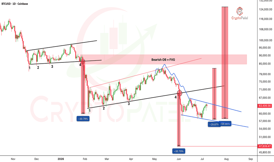
Long 
 Short
Short
Bitcoin Dumped From $126K to $60K as Per Exactly My AnalysisWhen Bitcoin was Between $115K-$110K, I shared a bearish chart setup and said CRYPTOCAP:BTC could eventually revisit sub-$50K levels.
Back then, many ignored the analysis because the timeline was full of "Buy, Buy, Buy" posts. Today, Bitcoin has already dropped to the $59K range and is trading near $62K.
The biggest lesson? Never follow anyone blindly, not influencers, not analysts, not even me. Always do your own research and think independently.
Most people get rich by accumulating during fear, panic, and bearish markets, not by chasing green candles in a bull run.
Personally, I see 2026-2027 as a potential accumulation period, with $50K-$40K remaining a strong long-term spot accumulation zone if reached. No leverage, no gambling, just patience and strategy.
The next major wealth transfer won't happen when everyone is euphoric. It will happen when everyone is scared.
NFA & Always DYOR Short 
$BTC Profit Update - Called It. Clean -19% Exactly As PlannedCRYPTOCAP:BTC Profit Update - Called It. Clean -19% Exactly As Planned
When I Told You $80K Was Heavy Resistance + FVG, And That From $82,800 We Were Ready To Dump Toward $68K... Many Called Me "Stupid." I Said Nothing. I Just Watched The Market.
Result → Bitcoin Dropped From $82,800 To $67,000. A Clean -19%.
This Is The Power Of SMC.
Liquidity Grab → FVG → Order Block. Most People Never See It Coming. I Layer Market Psychology On Top Of The Technicals, That's Where The Accuracy Comes From.
I Don't Win Every Time, Nobody Does. But I Always Give You My Best Read, Not Hype.
What's Next:
→ LH Finally Formed (Since Jan 2026). I've Been Waiting Long For This Confirmation.
→ Stop Loss Moved Down: $98,000 → $82,800 ( Because $98,000 Was Very Big Stop Loss)
→ $82,800 Is Now The Critical ChoCH Trigger. Only A High-Volume HTF Close Above Flips Us Bullish.
My Bias → Still Lower:
→ Possible Relief Bounce Toward ~$75K First
→ Next LL Target Around $50,000
→ Break Of BOS At $59,800 Opens The Door To $50K And If Momentum Stays Heavy, Even $45K–$40K In Play
We're Likely Heading Toward $50K This Year. Patience Over Prediction.
Bookmark This. Thank Me Later.
TA Only. Not Financial Advice. ALWAYS DYOR. Short 
X Ended the InfoFi Era. $KAITO Lost 64% and Still Im BearishX Ended the InfoFi Era. CRYPTOCAP:KAITO Lost 64% and Still Has No Reason to Be Bullish
#Kaito has been bleeding inside a falling channel since its listing top of $2.90 back in March 2025. The structure is clean and the bias is clear.
Here Is What Played Out:
Price lost the $0.70 support in November 2025. Came back for retest in January 2026 and got rejected hard. What followed was a brutal 64% dump in just 12 days, dragging price all the way down to $0.27.
But The Real Story is Not Just Technical:
In January 2026, X dropped a bomb on the InfoFi sector. They announced a ban on apps that reward users for posting, called out the AI spam problem, and revoked API access for affected platforms. Kaito's Yaps reward system was the biggest casualty and was forced to shut down.
Nikita Bier, X Product Head, made it official:
"We will no longer allow apps that reward users for posting on X."
That one statement killed the entire InfoFi narrative.
Now price is sitting at $0.5144, trying to recover inside a contracting wedge. The bounce looks decent on the surface but volume is weak and there is no real sign of smart money stepping in yet.
Levels I am watching:
Resistance: $0.70 (needs a high timeframe close above this with volume to shift bias)
Support: $0.45 then $0.27
Danger zone: Below $0.20
Honestly, this bounce feels corrective to me, not a real reversal. Until KAITO/USDT reclaims $0.70 with proper volume, I am not buying the recovery story. And if $0.45 gives up, do not be surprised if we see a flush below $0.20.
The narrative is broken. The chart is bearish. Patience over FOMO here.
TA Only. Not Financial Advice. ALWAYS DYOR.  Short
Short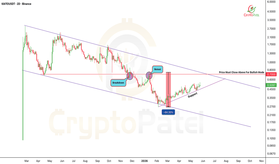
 Short
Short
 Short
Short