H1 Reclaim Recovery Below Dynamic ResistanceXAUUSD is trading around 4,332 after another selloff into the lower H1 structure. Price is now testing the 4,330–4,350 Demand / Reclaim Zone, but the broader structure remains capped by the descending dynamic resistance.
The macro environment remains difficult for gold. August U.S. CPI rose 0.4% MoM and 3.4% YoY, reinforcing expectations for a Fed hike this week; markets are pricing roughly an 86% probability of a rate increase. At the same time, Brent has surged above $107 amid renewed Middle East supply disruptions, adding further inflation pressure. The FOMC meets September 15–16, making this a high-volatility week for gold.
Technical View
The H1 structure remains broadly bearish below the descending resistance trendline, but price has reached an important short-term reaction area.
The 4,330–4,350 Demand / Reclaim Zone is currently being tested. If buyers defend this area and produce a bullish MSS, strong rejection or reclaim confirmation, a corrective recovery could develop.
The first upside objective sits around 4,380–4,400, where the descending resistance structure becomes relevant.
Above that, the stronger recovery target is 4,430–4,445, where the marked OB / supply structure aligns with dynamic resistance.
The larger 4,475–4,490 Major Supply remains a higher-timeframe resistance objective and should not be assumed reachable without a confirmed structural breakout.
Key Zones
Current Price: 4,331.700
Demand / Reclaim Zone: 4,330–4,350
Recovery Resistance: 4,380–4,400
OB / Key Resistance: 4,430–4,445
Major Supply: 4,475–4,490
Major Demand / Bullish OB: 4,285–4,305
Major Liquidity / Swing Low: 4,283.319
Trading Plan
Buy Priority: 4,330–4,350
Condition: wait for bullish rejection, liquidity sweep + reclaim, MSS or clear higher-low confirmation from the current demand area.
TP1: 4,380–4,400
TP2: 4,430–4,445
Invalidation: sustained H1 acceptance below 4,330 weakens the immediate recovery setup.
Buy/Sell View
The preferred idea is a confirmed recovery trade, not a blind buy.
Price remains below dynamic resistance and the macro backdrop still favors higher rates, so buyers need to prove control first.
If the reclaim zone fails, the deeper 4,285–4,305 Major Demand / Bullish OB becomes the next important reaction area rather than chasing shorts into support.
Final View
Gold enters FOMC week under strong macro pressure from hot inflation, elevated yields and surging oil, but H1 is now testing an important demand area.
The main scenario is a bullish reaction from 4,330–4,350, targeting 4,380–4,400 first and 4,430–4,445 if recovery momentum expands.
Can buyers defend the H1 reclaim zone before the Fed delivers the next major gold move?  Short
Short
H2 Bullish Recovery From Major Demand
XAUUSD is trading around 4,349 after another volatile session around the lower H2 structure. Price remains inside a broader descending channel, but the current location is close to a major demand cluster where a recovery setup may begin to develop.
The macro backdrop remains challenging for gold. U.S. August CPI rose 0.4% MoM and 3.4% YoY, while core CPI increased 0.3% MoM and 2.4% YoY. Markets now price roughly an 85% probability of a Fed rate hike next week, keeping pressure on non-yielding gold. However, the U.S. 10-year yield eased back toward 4.93% after nearly touching 5%, providing some short-term relief.
Technical View
The broader structure remains below the descending channel resistance, so the recovery is not confirmed yet.
Price is currently holding around the 4,335–4,360 Demand / Reclaim Zone. This area may support a short-term bounce, but the cleaner bullish location remains lower at the 4,275–4,300 Major Demand / Bullish OB.
A liquidity sweep into that major demand followed by a strong reclaim, bullish MSS or higher-low confirmation would support the recovery path shown on the chart.
The first upside obstacle is 4,385–4,405 Resistance / Bearish OB. Acceptance above this area would strengthen the recovery and expose the larger 4,475–4,490 Major Resistance / Supply zone.
Key Zones
Current Price: 4,349.420
Demand / Reclaim Zone: 4,335–4,360
Buy Priority: 4,275–4,300
Resistance / Bearish OB: 4,385–4,405
Major Resistance / Supply: 4,475–4,490
Trading Plan
Buy Priority: 4,275–4,300
Condition: wait for a liquidity sweep into Major Demand followed by bullish rejection, reclaim, MSS or clear higher-low confirmation.
TP1: 4,335–4,360
TP2: 4,385–4,405
TP3: 4,475–4,490
Invalidation: sustained acceptance below 4,275.
Buy/Sell View
The preferred setup is to wait for a deeper pullback into Major Demand rather than chase the current bounce.
Shorts also become less attractive near 4,300 because price would already be entering a major bullish OB. The cleaner decision is to let demand confirm whether buyers can absorb the remaining sell-side pressure.
Important Note
Inflation remains the main macro risk. With CPI and PPI both firm, Fed tightening expectations remain elevated, while oil above $100 continues to reinforce inflation concerns. Any renewed rise in Treasury yields could pressure gold again.
Final View
Gold remains structurally weak, but 4,275–4,300 is the key H2 area where the risk/reward begins to shift toward a recovery setup.
My main scenario is a liquidity sweep into Major Demand followed by bullish confirmation, targeting 4,385–4,405 first and potentially 4,475–4,490 if the recovery strengthens.
Will gold sweep Major Demand before starting the next H2 recovery? Long 
H1 Bullish Reclaim Toward Upper Liquidity
XAUUSD is trading around 4,430 after recovering from the 4,360–4,375 Major Demand + POI and reclaiming the short-term resistance structure. The latest H1 price action is beginning to shift from bearish delivery into a recovery phase, although the market still faces important supply overhead.
The macro backdrop remains mixed. Friday’s strong U.S. payroll report pushed expectations for a September Fed hike to around 60%, but the U.S. dollar is currently subdued as markets wait for fresh inflation data. Meanwhile, Brent crude has moved above $97 as Middle East tensions intensify, keeping inflation risks elevated and adding another layer of volatility for gold.
The next major U.S. catalysts are PPI on September 10 and CPI on September 11, both released at 8:30 a.m. ET. These reports could materially shift Fed expectations ahead of the September policy meeting.
Technical View
The H1 chart shows a meaningful recovery after price reacted from the 4,355–4,375 Major Demand + POI and formed a higher low.
Price has now pushed back above the 4,400–4,420 Key Reclaim / Resistance area. Holding this reclaimed structure would support another expansion higher.
The first major upside objective sits at 4,470–4,490 Supply / Resistance. Above that, buy-side liquidity near 4,510 becomes the next target.
The broader bullish recovery remains constructive while Major Demand continues to hold.
Key Zones
Current Price: 4,429.700
Key Reclaim / Support: 4,400–4,420
Major Demand + POI: 4,355–4,375
Supply / Resistance: 4,470–4,490
Buy-Side Liquidity: around 4,510
Bullish OB / Major Demand: 4,285–4,305
Trading Plan
Buy Priority: 4,400–4,420
Condition: wait for an H1 pullback into the reclaimed structure followed by bullish rejection, liquidity-sweep reclaim or higher-low confirmation.
TP1: 4,445–4,450
TP2: 4,470–4,490
TP3: around 4,510 BSL
Important Note
Price is already trading above the reclaim zone, so chasing the current recovery offers weaker positioning.
A deeper correction into 4,355–4,375 would still preserve the recovery structure if buyers defend the Major Demand + POI. Sustained H1 acceptance below this demand would weaken the immediate bullish thesis.
PPI and CPI later this week may also create sharp liquidity sweeps before the next clean directional move.
Buy View
The preferred setup is a controlled retest of 4,400–4,420, followed by confirmed buyer response.
If this zone holds, the path toward 4,470–4,490 remains open. Acceptance above supply would then expose the buy-side liquidity resting near 4,510.
Final View
Gold is showing an improving H1 recovery structure after defending Major Demand and reclaiming short-term resistance.
The main scenario is a retest of 4,400–4,420 followed by bullish continuation, targeting 4,470–4,490 first and the 4,510 buy-side liquidity above.
Can buyers defend the reclaim zone before inflation data drives the next expansion? Long 
OBEROIRLTY: Supply Worked Perfectly.. Now All Eyes Are on Demand📈 Institutional Zones in Action
Oberoi Realty recently respected a higher supply zone almost perfectly, where fresh selling pressure emerged and pushed the stock lower. This is a textbook example of the Supply & Demand concept, where price moved from an institutional selling zone directly toward an institutional buying zone.
The stock has now reached a high-quality daily demand zone formed after a powerful trend reversal. The zone is backed by a strong leg-out, excellent follow-through, and a breakout that confirmed buyers had taken control. Such explosive departures often indicate institutional participation, leaving behind unfilled buy orders that may still be waiting.
Adding another layer of confidence, this demand zone also coincides with a previous resistance level that is now expected to act as support based on the principle of polarity.
🎯 Trading Plan
The current demand zone offers an attractive buying area from a risk management perspective.
• Entry is considered inside the highlighted demand zone.
• Stop loss is placed below the demand zone, where the buying thesis becomes invalid.
• The initial objective offers approximately a 1:3 risk-to-reward ratio , providing a favourable reward relative to the defined risk.
This setup allows traders to keep risk controlled while participating from a location where institutional demand has previously dominated.
💡 Final Thoughts 🌟
The best setups are not just about finding a demand zone—they're about finding multiple reasons for buyers to step in. Here we have a respected supply zone triggering the correction, a premium trend-changing demand zone, polarity support, and a well-defined risk-to-reward structure. Now it's up to price action to reveal whether institutions defend this area once again.
⚠️ No trading setup is guaranteed. Always manage your risk, place your stop loss before thinking about your target, and never risk more than you can afford to lose.
📚 This analysis is shared purely for educational purposes and should not be considered investment or trading advice. I am not a SEBI-registered Research Analyst.
🚀 "Professional traders don't chase price—they wait for price to come back to quality." 📈
Thank you for your support, your likes & comments. Feel free to ask if you have questions.
 Long
Long
 Long
Long
HINDUNILVR Demand Zone Reversal________________________________________
📊 Hindustan Unilever Ltd. (HUL): Daily Technical Snapshot – Demand Zone Reversal
📊 STWP Technical Analysis
________________________________________
MARKET STRUCTURE SNAPSHOT | NSE: HINDUNILVR | DAILY
Closing Price:2,117.80 (+₹95.10 | +4.70%)
Core Trend: Downtrend (Long-Term Correction)
Market State: Recovery from Major Demand Zone
Price Structure: Price has rebounded sharply after testing a historically significant Demand Zone, indicating renewed buying interest. The latest bullish candle suggests a potential reversal attempt, although confirmation would require sustained strength above nearby resistance levels.
________________________________________
OPERATIONAL PRICE GRID & KEY REFERENCE LEVELS
Model Reference Level:2,123.00
Hard Invalidation Level:2,013.40
Structural Risk:109.60 (5.16%)
Resistance Levels: R12,144.87 | R22,171.93 | R32,220.87
Support Levels: S12,068.87 | S22,019.93 | S31,992.87
Range Structure: Low2,013.40 | High2,220.87
Higher Timeframe Observation Zones:2,220 |2,300 |2,408
________________________________________
⚠️ Disclaimer
This analysis is provided strictly for educational and informational purposes.
It does not constitute financial, investment or trading advice and should not be interpreted as a recommendation to buy or sell any security. Stock market investments are subject to market risks, including the possible loss of capital. Historical performance, chart patterns and technical indicators do not guarantee future outcomes. Please conduct your own research and consult a SEBI-registered investment adviser before making investment decisions.
STWP assumes no responsibility or liability for any financial loss arising directly or indirectly from the use of this analysis.
 Long
Long
 Long
Long
 Long
Long
 Long
Long
NIFTY: Trendline Breakout Meets Demand Zone – Bigger Move Ahead?🌍 The Bigger Picture Favors the Buyers 🌍
At first glance, NIFTY may appear to be moving sideways, but a closer look reveals an interesting story developing beneath the surface.
The most important area on this chart is the Weekly Demand Zone . This higher timeframe demand area has already demonstrated its strength by attracting buyers and preventing further downside. Recently, price revisited this zone and immediately found support, suggesting that institutional demand may still be active.
Higher timeframe zones often carry greater significance because they reflect decisions made by larger market participants. As long as this Weekly Demand Zone remains intact, the broader structure remains constructive.
📈 Daily Demand Emerging Inside Weekly Demand 📈
One of the strongest observations on this chart is the formation of a Daily Demand Zone within the larger Weekly Demand Zone.
This creates a powerful alignment between timeframes.
When a Daily Demand Zone forms inside an active Weekly Demand Zone, it often indicates that buyers are becoming active at multiple levels of the market.
The recent rally originated from this Daily Demand Zone, showing that buyers were willing to step in before price could move deeper into the Weekly Demand area.
This is exactly the type of behavior bulls want to see.
🔥 The Trendline Breakout Changes the Story 🔥
For several months, NIFTY remained under pressure from a falling trendline that guided the correction lower.
That situation has now changed.
Price has successfully broken above the descending trendline, which suggests that bearish momentum is weakening and market character may be shifting.
More importantly, after the breakout, price did not collapse back below the trendline. Instead, it has been consolidating above it.
This is often a healthier sign than a breakout followed by immediate rejection.
The Role of the Daily Supply Zone
The next important area on the chart is the Daily Supply Zone overhead.
This zone has already been tested previously, making it a key battleground between buyers and sellers.
Many traders focus only on the existence of supply, but the more interesting observation is that price continues to challenge this area after bouncing from demand.
Buyers defended the Daily Demand Zone.
Price broke the falling trendline.
The market recovered from the Weekly Demand Zone.
Price is now holding near Daily Supply instead of getting aggressively rejected.
This behavior can sometimes indicate that selling pressure is gradually being absorbed.
🎯 What the Price Action Is Telling Us 🎯
The current structure is no longer showing the characteristics of a strong downtrend.
Instead, the market appears to be transitioning into a phase of consolidation after a successful bounce from higher timeframe demand.
Weekly Demand Zone remains respected.
Daily Demand Zone successfully generated a rally.
Falling trendline has been broken.
Price is consolidating near Daily Supply.
Sellers have not regained complete control.
This doesn't guarantee a bullish move, but it does suggest that the market is in a much stronger position than it was during the decline.
🚦 What Traders Should Watch Next 🚦
Bullish Scenario
Daily Demand continues to hold.
Buyers maintain control above the broken trendline.
Daily Supply gets absorbed.
Momentum expands toward higher supply zones.
Bearish Scenario
Daily Supply produces a strong rejection.
Price falls back below the breakout area.
Daily Demand fails to attract buyers.
Market revisits deeper portions of the Weekly Demand Zone.
💡 Final Thoughts 💡
The most compelling aspect of this chart is not the Daily Supply Zone overhead, but the confluence between the Daily Demand Zone and the Weekly Demand Zone below.
This alignment, combined with the successful breakout above the falling trendline, suggests that buyers have started to regain control after months of corrective price action.
While the Daily Supply Zone remains an important obstacle, the overall structure appears healthier than many traders may initially assume.
The next major clue will come from how price behaves around this Daily Supply Zone. A successful breakout could significantly strengthen the bullish case, while a rejection would likely extend the current consolidation phase.
Great traders don't wait for certainty—they wait for confirmation. 📈🚀
This analysis is for educational purposes only and should not be considered financial, trading, or investment advice. I am not a SEBI registered analyst.
Thank you for your support, your likes & comments. Feel free to ask if you have questions. 📊
 Long
Long
Reliance: Price Breaks Support… But Demand Says Reversal?The current structure is extremely interesting from a pure demand and supply perspective. Price has reached a location where decisions matter — this is not a random pause, this is a zone where institutions previously showed strong intent.
One crucial context that changes everything:
• Price has arrived here after a breakdown of a traditional support level
• This type of move often traps retail sellers and injects fresh liquidity into the market
Now, price is entering a demand zone — creating a classic battlefield between aggressive sellers and institutional buyers .
🧠 Higher Timeframe Control (Weekly Perspective)
From a higher timeframe view, the market is currently positioned inside a well-formed demand zone. This zone stands out clearly due to its strong characteristics:
• Explosive move away : Indicates aggressive institutional buying
• Clean structure : Minimal noise, strong imbalance
• Fresh reaction potential : Price has returned after a long move
Another important observation:
• There is no significant weekly supply zone nearby , which means relatively low higher timeframe selling pressure
This creates a favourable condition where buyers can potentially dominate if demand holds.
🟢 Daily Demand Zone Analysis
Dropping down to the daily timeframe, the structure becomes even more refined:
• Price is currently inside a high-quality demand zone nested within weekly demand
• The zone is fresh — first revisit since formation
• The departure was strong and impulsive , confirming imbalance
Additionally:
• Price reached this zone after breaking a key support , meaning liquidity has already been taken from the market
• This increases the probability that stronger buyers (institutions) may step in at this level
From a professional perspective, this is a “best quality demand zone” .
However, one key concern remains:
• Selling pressure into the zone has been strong
So while buyers may be present, confirmation is critical before any decision.
🔍 What Needs to Happen Next
Smart traders don’t predict — they wait for confirmation:
• Strong bullish reaction from the zone
• Formation of fresh demand on lower timeframes
• Clear rejection showing buyers absorbing selling pressure
“We don’t just trade zones, we trade reactions at zones.”
⚠️ If Current Demand Fails
No demand zone is guaranteed to hold.
If this zone breaks with strength:
• It confirms that sellers are still in control
• The market may continue searching for the next imbalance
Below, there is another well-structured demand zone :
• Good base formation
• Decent imbalance
• Likely to act as the next demand wall
This becomes the next key area where buyers may attempt to absorb remaining supply.
🔴 Supply Zone Outlook
On the upside, supply is clearly defined and important:
• Formed after a strong bearish move
• Represents institutional selling activity
• relatively fresh
If buyers show strength from demand:
• This supply zone becomes the natural target area
• Expect reaction or resistance as price approaches it
⚖️ The Real Story – Battle at Demand
This is not just a demand zone — this is a battlefield :
• Retail sellers are active after breakdown
• Institutions may be accumulating at demand
• The outcome of this zone will define the next move
📌 Final Thoughts
This is a high-stakes location where patience matters more than prediction.
• Demand quality is high
• Higher timeframe support is present
• But selling pressure requires confirmation
“The market rewards those who wait, not those who rush.” 💡📊
No setup is ever guaranteed. Always manage your risk, define your stop loss before entering any trade, and protect your capital. Even the strongest zones can fail under pressure.
This analysis is for educational purposes only and not intended as financial advice. I am not a SEBI-registered analyst.
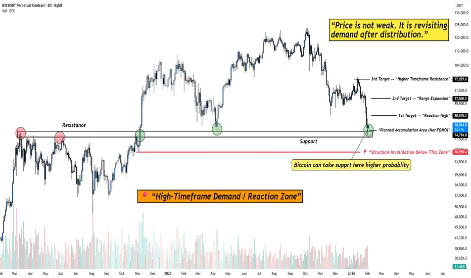
BITCOIN at High-Timeframe Demand: Reaction Zone in Play!When I look at this chart, I’m not seeing fear or structural damage.
I’m seeing price doing exactly what it should do after a distribution phase , revisiting demand and slowing down.
Bitcoin has come back into a clearly marked high-timeframe demand / reaction zone . This is not a random level. This is an area where price has previously flipped structure and attracted strong participation.
What stands out to me on the chart:
Price is holding above a major high-timeframe support , not slicing through it. That tells me sellers are no longer aggressive at these levels.
The current zone is labeled as a planned accumulation area (not FOMO) . Price is reacting here instead of accelerating lower, that’s important.
Downside risk is clearly defined with a structure invalidation level below demand. As long as that level holds, structure remains intact.
Upside targets are logical and sequential , starting from a reaction high, followed by range expansion, and then higher-timeframe resistance.
The psychology behind this phase:
This is the part of the market where most people feel uncomfortable.
Price isn’t exciting. It’s not trending fast. It’s just… sitting.
But that’s usually how strong moves begin.
If Bitcoin were truly weak, it wouldn’t pause here, it would break cleanly below demand.
So far, it hasn’t.
That tells me the market is evaluating value , not panicking.
My approach here is simple:
I don’t chase price away from demand.
I don’t panic inside support.
I observe how price behaves at this zone and let the market show its hand.
As long as price holds above the demand zone, reactions from here remain valid.
Only a clean acceptance below the invalidation level would change this view.
Until then, this is a patience zone .
And patience, more often than prediction, is what gets paid in this market.
Disclaimer:
This analysis is for educational purposes only. Not financial advice. Always manage risk and trade according to your own plan.  Long
Long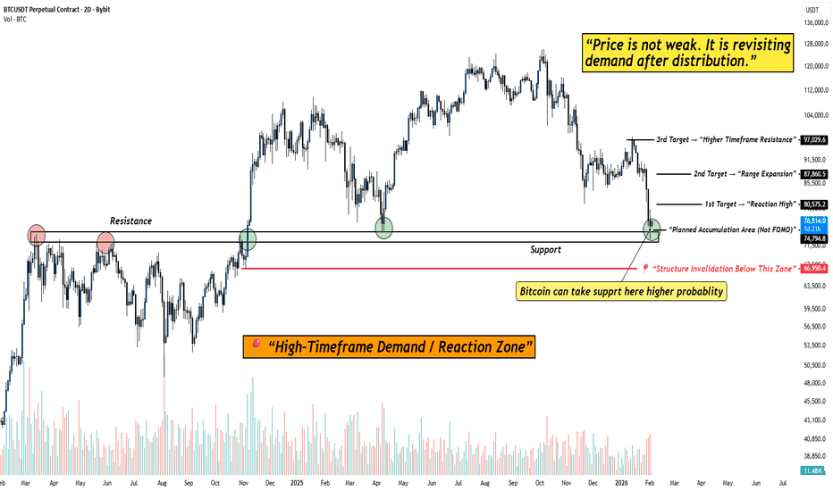
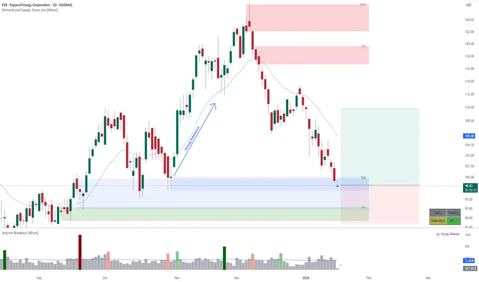
EXE - Institutional Demand at Work: High-Probability Trade Setup🧭 Overall Market Context 🧭
Price is currently trading inside an overlapping demand zone , and the quality of this zone is GOOD . What makes this setup stand out is the very strong follow-through seen when price previously left this area. Such impulsive exits are a clear footprint of institutional participation , where large players are unable to fill all their buy orders at once, leaving pending demand behind.
This return into the same zone gives the market a second chance to react — and these are often the areas where smart money steps in again.
🔍 Zone Quality & Structure 🔍
The structure of the current demand zone adds further confidence to the setup:
The demand zone is fresh and unviolated , meaning price has not yet consumed the pending buy orders.
The leg-out from the zone was impulsive , showing urgency and imbalance in favor of buyers.
Overlapping demand zones are present, which increases the probability of a strong reaction.
Price has now returned deep into the demand zone , which is an ideal location for planning long trades.
From a supply–demand perspective, this is exactly where we want price to be — low risk, high potential.
📈 Trend & Higher Timeframe Alignment 📈
Trend plays a crucial role in probability, and here the bigger picture is clearly supportive:
The weekly timeframe trend is UP , favoring buying opportunities from demand.
There is no higher-timeframe or daily supply zone overhead until the projected target area.
This creates clean upside space , reducing the risk of early rejection.
When demand aligns with the higher-timeframe trend and there is no nearby supply, the odds naturally tilt in favor of continuation.
🎯 Trade Plan & Risk Structure 🎯
A structured plan keeps emotions out of the equation:
Entry : From the current price area inside the demand zone.
Stop Loss : Below the distal line of the lower demand zone.
Target 1 : Minimum 1:2 risk–reward .
Risk here is clearly defined — a key characteristic of professional trade planning.
🧠 Market Logic Behind the Setup 🧠
Strong follow-through confirms institutional interest.
Higher-timeframe uptrend supports continuation.
Clean upside structure reduces friction for price movement.
This is a trend-aligned demand trade , not a counter-trend gamble.
When strong zones meet the right trend and location, probability quietly stacks in your favor.
🚀 Final Thoughts 🚀
This setup reflects the essence of demand and supply trading — clarity, structure, and patience . Trades like these don’t require prediction; they require discipline and alignment.
📉➡️📈 Trade with logic, manage risk with respect, and let probability do the heavy lifting. 💡🔥
Lastly, Thank you for your support, your likes & comments. Feel free to ask if you have questions.
This analysis is purely for educational purposes only and should not be considered as trading or investment advice..
 Long
Long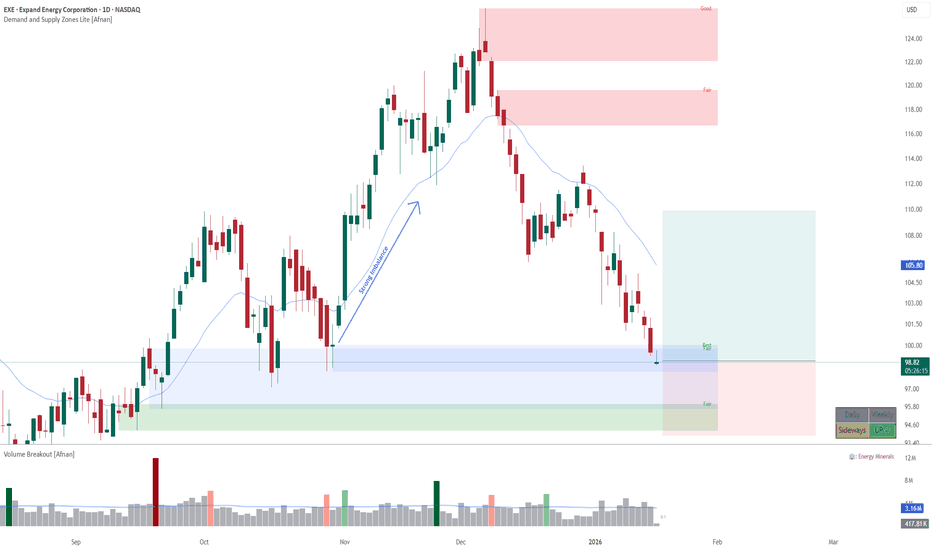
Long 
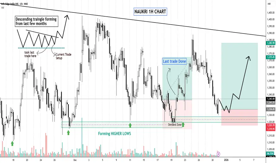
Reversal Trade – NAUKRI (Info Edge) | 1H ChartNSE:NAUKRI
📌 Trade Description
This is a classic demand-based reversal, not a random bottom-pick. Price has corrected sharply into a previously validated demand zone, where aggressive buying earlier pushed price up with momentum. Now price has returned to the same zone with declining momentum, offering a low-risk, high-R:R opportunity.
If this demand fails, the trade is invalid. Simple. No hope-trading here.
🔍 Technical Analysis
Trend Context: Short-term down-move, but within a broader range. This is a mean-reversion + base formation play, not a breakout chase.
Demand Zone (₹1320–₹1330):
⦿Earlier sharp impulse move originated from this zone → proves institutional participation.
⦿Price revisiting demand after time + correction = fresh probability.
Price Behaviour:
⦿Selling pressure is slowing down near demand.
⦿Smaller candles + wicks = absorption, not aggressive distribution.
Structure Expectation:
⦿First: base formation inside demand
⦿Then: higher low on 1H
Finally: reversal push toward ₹1370–₹1385 zone.
🎯 Trade Plan
Entry: Near demand zone after stabilization (no blind buying)
Stop Loss: Below demand zone (tight & non-negotiable)
Targets:
⦿T1: ₹1348–₹1360
⦿T2: ₹1375–₹1385
Risk–Reward: Minimum 1:2
This is a reaction trade, not a prediction.
Stay disciplined. Let price confirm, then execute.
Keep Learning,
Happy Trading.  Long
Long
Long 
 Long
Long
MTF Demand Confluence: High-RR Reversal SetupMulti Timeframe Supply & Demand Analysis
🕰️Yearly Timeframe
On the Yearly timeframe, price has already broken above a major supply zone, signaling strong higher‑timeframe bullish intent and possible long‑term accumulation by institutional players. Just above this breakout, price tapped into a previously tested yearly supply zone, from where it faced rejection and started to rotate lower, confirming active overhead supply.
This structure shows a classic “Break–into–higher supply” reaction, where long‑timeframe trend strength is present, but price is temporarily capped by remaining sell orders in the upper zone. A clean, sustained break above this upper yearly supply could unlock a fresh leg of long‑term upside.
📆 Half-Yearly Timeframe
On the Half-Yearly timeframe, price is currently approaching a strong demand zone — a critical level where significant buying pressure was previously observed. This prior bullish activity proved powerful enough to break through a previous Half-Yearly supply zone, clearly signaling the presence of institutional demand or major accumulation at this area. 💪
This HYTF demand confluence adds further conviction to the overall bullish structure, as it validates sustained buyer interest capable of overcoming historical supply barriers.
📉 Monthly Timeframe
On the Monthly Timeframe, price first reacted downward from a Monthly Demand Zone (MDZ) that coincided with a Half‑Yearly Supply Zone (HYSZ), creating a strong confluence area where sellers stepped in aggressively. As price moved away, the nearest Supply Zone (SZ) was respected again, extending the selling leg and confirming short‑term bearish order‑flow.
Currently, price is approaching Monthly Demand Zone that overlaps with a Half‑Yearly Demand Zone (HYDZ), forming a powerful HTF demand confluence with high probability of bullish reversal. If buyers manage to defend this HYDZ–MDZ cluster, it can act as a strong platform for a new upside swing.
If selling pressure remains elevated and this primary MDZ fails, there is one more MDZ sitting near the bottom of the structure, which can serve as a secondary demand pocket where price may still reverse to the upside. Both these stacked demand zones offer attractive areas to watch for confirmation‑based long setups.
Weekly Timeframe Focus (Reversal Zones)
On the Weekly timeframe, there are four clearly defined reversal zones where price has a high probability of reacting due to visible supply‑demand imbalances and prior impulsive moves. These levels align well with the higher‑timeframe zones, making them high‑quality decision points.
Monitoring these four zones for clean price action signals such as strong rejection wicks, engulfing candles, or structure breaks can help time entries with precision while keeping risk tightly controlled. This multi‑timeframe stacking significantly increases the reliability of any confirmed reversal from these areas.
Conclusion: Long‑Term Investment View
Given the strong confluence of demand zones across Yearly, Half-Yearly, and lower timeframes, plus multiple well‑defined reversal levels on the Weekly chart, this stock is positioned for a potentially strong bullish reversal from current or slightly lower zones. Notably, after the reaction from this higher timeframe demand zone, there are no significant supply hurdles visible on higher timeframes, clearing the path for sustained upside momentum and substantially increasing the chances of higher returns.
From a long‑term investment perspective, the structure suggests a favorable reward‑to‑risk profile and scope for strong performance if price holds above the mapped HTF demand. If demand is confirmed and price starts building a higher‑low structure from these zones, this can evolve into a high‑conviction long‑term swing or investment candidate, supported by institutional‑grade demand footprints and multi‑timeframe alignment.  Long
Long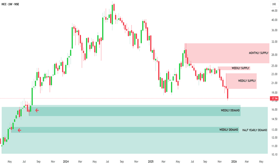
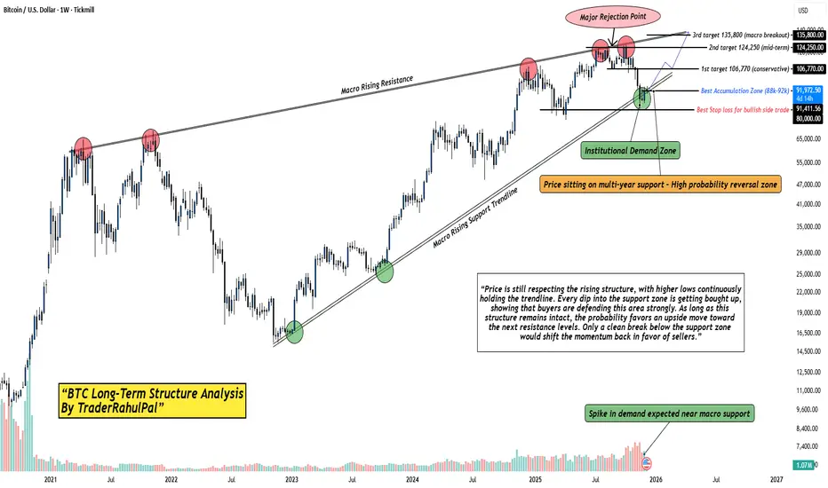
The Most Important Bitcoin Level of This Cycle — Don’t Miss It.Bitcoin is once again testing its multi-year rising support trendline, the same zone that has triggered every major rally since 2020. Price has repeatedly formed higher lows, showing that long-term buyers are still defending this structure.
What makes this zone special is the confluence:
A macro rising support trendline that has held for nearly 4 years.
A fresh institutional demand zone between 88k–92k.
Volume spike indicating renewed accumulation.
Rejection from macro rising resistance , resetting liquidity below.
This type of setup usually appears before expansion moves. As long as BTC holds above this macro support, the market continues to favor upside targets:
1st Target: 106,770 (conservative)
2nd Target: 124,250 (mid-term)
3rd Target: 135,800+ (macro breakout zone)
But here’s the key point:
A clean breakdown below the structure would delay the bullish cycle, until then, dips into the demand zone remain high-probability accumulation opportunities for long-term traders.
History rarely repeats perfectly…
but it often rhymes, and BTC is back at the same place where big moves begin.
Analysis By @TraderRahulPal | More analysis & educational content on my profile.
Disclaimer:
This analysis is for educational purposes only and is not financial advice. Markets can change quickly always manage risk, do your own research, and trade according to your plan. Long 
 Long
Long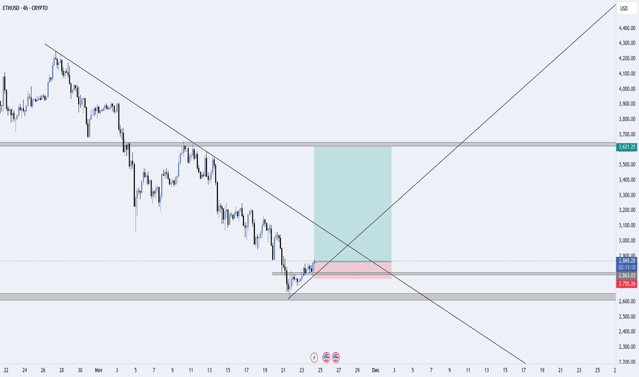
 Long
Long