GRASIM: Weekly Macro Base Breakout1. The Macro Perspective: The Multi-Month Accumulation Range
I am taking a LONG bias on Grasim Industries Limited (GRASIM) on the weekly (1W) timeframe.
When analyzing pure market structure, the most sustainable trends require periods of prolonged digestion. Look at the extensive structural development on this chart following the massive secular run up through early 2024. The stock entered a grueling, multi-month macro consolidation phase, heavily bounded by a structural floor near the 2,508.80 pivot and a thick overhead resistance ceiling between 2,847.50 and 2,952.60. This prolonged sideways grinding acts as a massive washing machine, successfully exhausting weak retail hands while strong institutional capital quietly absorbs liquidity at the lower boundaries. Establishing clear parameters around these zones is critical for maintaining discipline during the choppy accumulation phase.
2. The Educational Setup: Bollinger Band Compression and Volume Footprint
To understand the sheer technical validity of this current breakout, we must examine the interlinking mechanical signals aligning across the chart:
The Dynamic Support Reclaim: Notice how the price action transformed leading up to the breakout. After a deep shakeout in early 2026, buyers immediately stepped in to reclaim the weekly 20 SMA (the middle blue line of the Bollinger Bands). This moving average was methodically defended as a rising dynamic cushion, carving out a sequence of tight, higher structural lows right beneath the resistance zone.
The Squeeze and Surge: As the price compressed tightly against the upper resistance boundary, the Bollinger Bands narrowed. In technical analysis, extreme contraction is the precursor to violent expansion. Accompanying this upward pressure is a significant volume anomaly on the far right, proving that heavy institutional allocation is driving this structural transition.
3. Current Price Action: Volatility Expansion and Range Clearance
Look at the most recent weekly candle on the far right. The high-level pressure cooker has officially blown its lid off. Buyers have seized total control of the tape, printing a powerful, full-bodied green expansion candle that has closed completely above the ultimate 2,952.60 ceiling. By closing decisively outside this multi-month accumulation box, the price has successfully invalidated the historical overhead supply. Furthermore, this intense momentum has violently pierced and ridden outside the upper Bollinger Band, forcing the bands to snap wide open. This signifies a textbook shift from a low-volatility compression phase into a high-volatility, explosive markup trend.
4. The Trade Plan: Entries, Targets, and Risk Management
Entry Strategy: Current momentum is exceptionally strong with the stock trading near 3,155.30. Because the weekly candle is closing entirely outside the upper Bollinger Band, chasing the price immediately carries an inherent risk of a short-term mean-reversion pullback. The highest-probability, lowest-risk entry strategy involves stepping down to the daily timeframe and waiting for a minor structural cooling-off period. Look to scale into long positions if the price executes a healthy pullback to perfectly retest the 2,850.00 to 2,950.00 broken resistance zone. Letting old historical resistance prove itself as concrete new support provides an unmatched risk-to-reward ratio.
Take Profit (Targets): We utilize structural measured moves based on the depth of the accumulation base. By taking the absolute depth of the range (roughly 440 points from the 2,508.00 floor up to the 2,950.00 ceiling) and projecting it upward from the breakout point, our primary structural macro target sits comfortably in the 3,390.00 to 3,420.00 zone.
Invalidation (Stop Loss): An explosive range breakout thesis is completely invalidated if the asset fails to hold its newly claimed structural floor. A hard stop loss should be placed safely below the middle Bollinger Band (20 SMA) and back inside the core of the base, specifically around the 2,680.00 to 2,720.00 zone. A definitive weekly close completely back below the moving average would act as a massive warning sign of a failed breakout and a dangerous bull trap.
5. Time Horizon:
Because this technical setup is built on a 1-Week chart capturing a massive structural phase transition and multi-month base breakout, this is a medium-to-longer-term position trade designed to capture a secular markup phase over the coming weeks and months. Let the macro trend run!  Long
Long
I Turned $100 Into $10,000 — Here’s What Actually ChangedTurning $100 into $10,000 is the kind of trading story that makes everyone want to know the “secret strategy” behind it.
But if you focus only on the 100x return , you may end up learning the wrong lesson.
The real lesson isn’t how to turn $100 into $10,000 quickly. It’s what needs to change for a trader to stop relying on luck.
1. I Stopped Trying to Grow the Account Fast
Small accounts often create a dangerous mindset:
“$100 is too small. I need to risk big to make it worthwhile.”
That’s where high leverage, oversized positions, and revenge trading begin.
A few lucky trades can grow an account quickly, but the same risk management can take it back to $0 just as fast.
Fast growth does not mean you have a good system.
2. I Started Protecting Capital Before Chasing Profit
Instead of asking:
“How much can this trade make?”
I started asking:
“How much am I willing to lose if I’m wrong?”
Position size, Stop Loss, and invalidation were defined before the entry. One losing trade was no longer large enough to force me into trying to win it back on the next one.
It was a small change on the chart, but a massive change for the account.
3. I Traded Less — But Became More Selective
Before, almost every price movement looked like an opportunity.
Eventually, I understood that not trading is also a decision.
Instead of chasing ten average setups, I waited for trades that actually matched the plan: clear structure, good location, confirmation, and defined invalidation.
Trade frequency went down. Decision quality went up.
4. I Stopped Measuring Success by Account Balance Alone
Going from $100 to $200 could happen because of one extremely risky trade.
That doesn’t necessarily mean you became a better trader.
Better questions are:
Did I follow my plan?
How does my average win compare with my average loss?
Did I keep my risk consistent?
Can these results repeat across many trades?
A beautiful equity curve built on uncontrolled risk can disappear within a few trades.
What Actually Changed
It wasn’t a new indicator.
It wasn’t a secret setup.
And it certainly wasn’t always one life-changing trade.
The real shift happened when my mindset changed from:
“How do I turn a small account into a big account as fast as possible?”
to:
“How do I trade well enough to survive and keep growing?”
Turning $100 into $10,000 is an impressive result, but there is no safe or guaranteed method to achieve it. What matters more is whether the process behind that result can survive when luck is no longer on your side.
Don’t learn how to flip an account. Learn how to build a process that can survive long enough for the account to grow.
This content is for educational purposes only and does not constitute financial advice.  Education
XAUUSD 4294 stuck — 4229 is calling XAUUSD 4294 stuck — 4229 is calling
Gold is still heavy.
Not a clean dip. Not a healthy pullback. More like buyers are trying to breathe while sellers keep pressing the same wound.
Price is sitting around 4,294, right inside the old sellside liquidity zone. That zone should have acted as a strong reaction base if buyers were really in control. But so far, gold is just hovering there, failing to build any strong recovery.
That tells me one thing:
The market still wants lower liquidity.
The structure is clear. Gold has been moving inside a bearish channel since the rejection near the upper range. Every bounce is creating another lower high. Every recovery attempt is getting capped before price can reclaim real control.
Main bias stays bearish while gold trades below 4,320 - 4,360.
Macro also fits the pressure. Fed hike bets are still alive, inflation risk keeps US yields supported, and geopolitical tension is helping USD stay firm as a safe-haven currency. That combination limits gold’s upside, even when price is already near multi-week lows.
The first downside target is 4,229.
If sellers keep control, the deeper discount target around 4,157 becomes the next major area to watch. That is where I would start paying closer attention for a stronger reaction, not here in the middle of the channel.
The upside is not impossible, but it needs proof.
If gold can reclaim 4,320 and break out of the short bearish channel, price may recover toward 4,360 first. Above that, 4,422 becomes the key resistance and reaction zone. If price reaches 4,422 - 4,454 and starts rejecting, that area can become another sell setup.
Trading scenario:
Sell idea only if gold rejects 4,320 - 4,360 or breaks below 4,280 with clean pressure.
Entry zone: 4,320 - 4,360 after rejection
Alternative entry: below 4,280 after breakdown confirmation
Stop loss: above 4,422
TP1: 4,229
TP2: 4,157
TP3: 4,080 if bearish momentum expands
No rejection, no sell. No breakdown, no chase.
Buy scalp only if gold sweeps 4,229 and reclaims fast. That would be a reaction trade, not the main bias.
If gold closes strong above 4,422 - 4,454, this bearish idea gets messy. Then sellers may lose control and price can recover deeper.
For now, I’m reading this as weak recovery, bearish channel pressure, and 4,229 liquidity still waiting.
You think gold sweeps 4,229 first, or fakes one more bounce into 4,360?
Short 
BTCUSD 4H — BREAKOUT SETUP AT THE DECISION ZONE🔥 MARKET STRUCTURE
BTC is showing a mixed-to-bullish recovery structure on the 4H chart.
After the sharp decline from the 81,000+ area, price formed a series of lower highs and lower lows. However, the latest move from the 76,000–76,400 area shows buyers attempting to regain control.
The chart has clearly marked 76,825.5 as the BOS / long trigger, while price is currently around 77,315.5. The immediate bullish thesis therefore depends on BTC maintaining the breakout area.
💧 LIQUIDITY & SMART MONEY
The clearest liquidity reference on the chart is:
🟢 Sell-side liquidity: 76,072.5
🔵 BOS / Long Trigger: 76,825.5
🔵 Retest Entry: 76,383.5
🔴 Invalidation / SL area: around 75,700–75,726
The move around the 76,000 zone appears to have attracted buying interest before price pushed back above the marked BOS level.
The important question now is whether buyers can hold above 76,825.5 rather than allowing the breakout to fail.
📍 KEY ZONES
🔵 Current price: 77,315.5
🔵 Entry: 77,200
🔵 BOS / Long Trigger: 76,825.5
🔵 Retest Entry: 76,383.5
🟢 Sell-side liquidity: 76,072.5
🔴 Stop/invalidation area: 75,700–75,726
🟢 TP1: 79,600
🟢 TP2: 79,754.5
📦 Order Block: the chart marks a BU/ZO area around the recent 76K region, but the exact order-block boundaries are not clearly defined.
⚡ FVG: not clearly visible enough to identify confidently.
📊 Volume / POC / VWAP: not visible.
🟢 BULLISH SCENARIO
The bullish setup becomes stronger if BTC:
1. Holds above 76,825.5
2. Confirms the breakout on the 4H timeframe
3. Successfully retests the breakout area without losing the bullish structure
The chart's projected upside targets are:
🎯 TP1: 79,600
🎯 TP2: 79,754.5
A move toward these levels would represent approximately +3.1% to +3.3% from the marked 77,200 entry.
🔴 BEARISH SCENARIO
The bullish setup becomes questionable if BTC fails to hold the 76,825.5 BOS level and returns below it.
A deeper rejection could send price toward:
76,383.5 → 76,072.5
The loss of the 76,072.5 sell-side liquidity reference would increase bearish pressure, while a sustained move toward/below 75,700–75,726 would seriously damage the bullish setup.
🎯 TRADE IDEA
Preferred setup: LONG on confirmation/retest rather than chasing.
🟢 Potential entry: 77,200 as marked
🔄 Alternative retest entry: 76,383.5
✅ Confirmation: 4H close above 76,825.5 and successful hold/retest
🎯 TP1: 79,600
🎯 TP2: 79,754.5
🛑 Invalidation: around 75,700–75,726
The chart itself indicates approximately 4.7:1 R:R for the marked retest setup.
⚠️ INVALIDATION
The primary bullish idea loses technical validity if price fails the 76,825.5 breakout structure and subsequently breaks the lower support/liquidity area.
A decisive move below approximately 75,700–75,726 would invalidate the bullish setup shown on the chart.
🧠 TRADER'S VERDICT
🔥 BULLISH CONTINUATION — BUT CONFIRMATION MATTERS.
BTC has reclaimed the marked 76,825.5 BOS level and is trading above the 77,200 entry reference. The chart favors a move toward 79,600–79,754.5 if buyers successfully defend the breakout.
However, the cleanest risk-controlled opportunity is not to chase the pump—watch for a confirmed hold or retest of the breakout structure.  Long
Long
Liquidity Explained📌 Overview
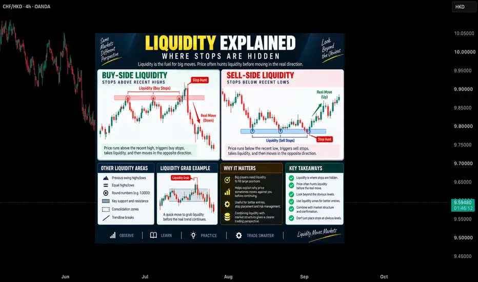
Liquidity refers to areas in the market where a large number of pending orders and stop-losses are concentrated. These zones often attract price because market participants seek liquidity to execute orders efficiently. This educational infographic explains Buy-Side Liquidity, Sell-Side Liquidity, Liquidity Grabs, and why understanding liquidity can help traders better interpret market behavior.
___________________________________________________________
📘 Definition
Liquidity is the availability of orders in the market that allows transactions to occur efficiently. In technical analysis, liquidity is commonly found around previous highs, previous lows, equal highs, equal lows, support, resistance, and other obvious price levels.
Buy-Side Liquidity – Areas above recent highs where buy stop orders and short-seller stop-losses may accumulate.
Sell-Side Liquidity – Areas below recent lows where sell stop orders and long-position stop-losses may accumulate.
Liquidity Grab – A temporary move into a liquidity zone where price collects available orders before potentially moving in another direction.
Stop Hunt – A market movement that reaches areas where many stop-loss orders are clustered.
Liquidity Zone – A price area where a significant number of orders are expected to be located.
Market Participants – Traders and institutions whose orders contribute to market liquidity.
___________________________________________________________
📌 Key Points
• Liquidity often exists around obvious swing highs and swing lows.
• Price may react strongly when liquidity areas are reached.
• Buy-Side Liquidity is commonly located above previous highs.
• Sell-Side Liquidity is commonly located below previous lows.
• Liquidity Grabs can occur before a larger market movement.
• Liquidity should be combined with market structure and confirmation.
• Liquidity concepts help traders understand price behavior, not predict future outcomes.
___________________________________________________________
📊 Chart Explanation
• The Buy-Side Liquidity example highlights how price can move above recent highs where buy stops may be clustered.
• The Sell-Side Liquidity example shows how price can move below recent lows where sell stops may be located.
• The Liquidity Grab example demonstrates a temporary move into a liquidity zone before a potential market reaction.
• The infographic identifies common liquidity locations including swing highs, swing lows, support, resistance, consolidation zones, and trendline areas.
• The examples are educational illustrations intended to explain liquidity concepts and market mechanics.
___________________________________________________________
📉 Summary
Liquidity is an important concept in market analysis because it helps explain why price frequently reacts around certain levels. Understanding Buy-Side Liquidity, Sell-Side Liquidity, and Liquidity Grabs can provide additional context when studying market structure and price action.
___________________________________________________________
💡 Why It Matters
• Helps identify areas where price may attract order flow.
• Improves understanding of market behavior.
• Explains why price may move beyond obvious levels.
• Encourages traders to look beyond simple support and resistance.
• Supports a more structured approach to market analysis.
• Builds a stronger foundation for learning advanced trading concepts.
___________________________________________________________
📌 Conclusion
Liquidity plays a significant role in how markets move. By understanding where liquidity is commonly located and how price may interact with these areas, traders can develop a deeper understanding of market structure and price action behavior.
___________________________________________________________
⚠️ Disclaimer
📘 For educational purposes only.
🙅 Not SEBI registered.
❌ Not a buy/sell recommendation.
🧠 Purely a learning resource.
📊 Not Financial Advice.
Gold Could Explode Higher This WeekXAUUSD remains bullish within the broader market structure, as the current decline is not yet enough to confirm that gold’s larger uptrend has come to an end.
From a fundamental perspective , gold is under pressure after U.S. August CPI came in hotter than expected, increasing market expectations that the Fed could raise interest rates at this week’s meeting . This is clearly a short-term headwind for gold. However, the metal still rebounded more than 1% in the final session of last week despite the hot inflation data, suggesting that some of the Fed-related pressure may already be priced in . As gold begins to absorb negative news more effectively, the possibility of a short-term bottom is becoming increasingly noteworthy.
On the H8 timeframe, the bullish structure remains intact . XAUUSD continues to trade within the ascending channel that has been in place since June and is now pulling back toward its lower boundary. Price remains below the Ichimoku Cloud, confirming that short-term selling pressure has not disappeared. However, the broader rising channel has not been broken , so the current decline can still be viewed as a correction within a larger uptrend.
The lower boundary of the ascending channel now acts as an important support for the region . If XAUUSD holds this structure and strong buying interest begins to return, the bullish recovery scenario will gain significant strength . A gradual move back above the Ichimoku Cloud could then open the door for another leg higher, with my main target around $4,800 per ounce , as highlighted on the chart.
Overall, XAUUSD appears to be going through a technical correction within a broader bullish trend . My preferred approach for the new week is to look for BUY setups on pullbacks , patiently waiting for price-action confirmation rather than chasing the decline while the dominant structure continues to favor buyers. Long 
BTCUSDT: Bears Dominate, Next DownsideBTCUSDT is trading around 78,260 USDT and remains within a descending channel on the H1 timeframe. The price is currently below the EMA34 (approx. 78,630) and EMA89 (approx. 78,930), indicating that sellers retain the short-term advantage.
The 78,500–79,200 range is a notable "Sell Zone," as it aligns with the EMA cluster and the upper boundary of the descending channel. Should BTC rally to this area but face rejection, I lean towards a scenario where the price breaks below 77,500, subsequently extending toward the 75,500 USDT target.
The day's macroeconomic backdrop supports a bearish outlook: Brent crude remains above $100/barrel, the 10-year Treasury yield hovers around 4.84%, and the market is pricing in a roughly 60% probability of a Fed rate hike—factors that are dampening risk appetite ahead of US inflation data.
The bearish scenario would be invalidated if BTC breaks out of the channel and establishes firm support above the 79,200–79,500 level. Short 
HUL Remains Weak Near Multi-Year Support ZoneHighlights
* HUL is trading around the ₹1,925–₹1,945 zone after another significant leg of correction. The stock has lost roughly 25% over the past year and is now trading near levels last seen several years ago. The broader technical structure remains bearish, with a clear lower-high and lower-low formation.
* The ₹1,900–₹1,920 region is now the most important immediate support zone. If this area fails decisively, the correction could extend towards ₹1,880 and subsequently ₹1,830–₹1,850.
* On the upside, ₹1,965–₹2,000 is the first major resistance zone. A sustained move above ₹2,000 would be the first meaningful sign of recovery and could push the stock towards ₹2,050–₹2,075. The larger trend, however, would improve substantially only after HUL reclaims ₹2,100–₹2,150.
* Momentum remains weak. RSI is around 32, placing the stock close to oversold territory, while MACD remains negative. HUL is also trading below its 20-day, 50-day, 100-day and 200-day moving averages, confirming that sellers remain firmly in control of the broader trend.
* The interesting aspect is that the stock is becoming technically stretched. Stochastic indicators are already oversold, while RSI is approaching 30. This increases the probability of a relief rally from the ₹1,880–₹1,920 region, but there is currently no confirmed reversal. A higher-low followed by a move above ₹2,000 would be the first constructive signal.
* Fundamentally, Q1 FY27 showed improving demand but disappointed the market on profitability. Revenue increased about 10% YoY to ₹17,341 crore and underlying volume growth reached 5%, while EBITDA increased around 8%. However, net profit declined about 3% to ₹2,673 crore and EBITDA margin contracted around 40 basis points, contributing to the sharp post-results correction.
* HUL is now prioritising faster volume-led growth, premiumisation and expansion into higher-growth consumer categories. Management is also increasing productive capital expenditure from roughly 2% to 3% of turnover while targeting a medium-term EBITDA margin of 22–24%. Successful execution of this strategy could eventually provide the fundamental catalyst required for a sustained stock-price recovery.
Takeaway
HUL remains technically bearish, but the stock is approaching an increasingly important ₹1,880–₹1,920 demand zone while momentum indicators are nearing oversold territory. This creates the possibility of a technical bottoming process, although confirmation is still missing.
If HUL holds ₹1,900 and subsequently crosses ₹2,000, a recovery towards ₹2,050–₹2,075 becomes possible. A sustained move above ₹2,100–₹2,150 would be much more significant and could indicate that the medium-term downtrend is finally reversing.
On the downside, a decisive break below ₹1,880 would invalidate the immediate bottoming setup and could expose ₹1,830–₹1,850. For now, I would treat HUL as an oversold stock attempting to establish a base rather than a confirmed bullish reversal.
Long 
 Short
Short
Crude Oil Trade Setup: The Big Move AheadCrude Oil Futures on MCX is flashing a high-stakes symmetrical triangle pattern on the 1-hour chart. Currently trading at 8,123, the price has surged past its moving average and is pressing directly against a massive, multi-week descending resistance line.
Key Levels
Overhead Resistance: 8,150 – 8,200 (Descending trendline boundary)
Dynamic Support: 7,962 (1H moving average)
Trendline Support: 7,500 – 7,600 (Ascending base)
Trade Setup: Bullish Breakout & Retest (~70% Probability)
Trigger: Wait for a definitive 1-hour candle close above 8,200. Enter long on the subsequent pullback/retest of the 8,150 – 8,180 zone once the old ceiling becomes a new floor.
Target: 8,350+ (Previous major swing high)
Stop-Loss: A 1-hour close back below 8,050.
Invalidation: A sharp rejection at the current resistance that drives the price back below the 7,962 moving average shifts the bias to short, targeting a drop toward the 7,600 lower support line. Long 
 Short
Short
XAUUSD – Bullish Pullback Could Set Up the Next Expansion📊 XAUUSD – Bullish Pullback Could Set Up the Next Expansion
🔍 Market Overview
XAUUSD is entering a deeper correction on the 8H timeframe after failing to maintain bullish momentum near the recent high. Although short-term selling pressure is present, the broader market structure has not yet turned bearish.
The key area to watch is 4,120–4,198. This zone represents previous structural support and also aligns closely with the ascending trendline, creating an important area of confluence. If price continues to pull back toward this region, the buyers’ reaction will determine whether the broader uptrend can continue.
📈 Market Structure Analysis
Main Trend: Bullish
Momentum: Corrective
Current Phase: Pullback → Retest → Potential Continuation
The current decline is bringing Gold back toward the area that previously provided the foundation for the last bullish expansion. More importantly, price is still trading above the broader ascending trendline.
For this reason, I do not yet view the current selling pressure as a confirmed reversal. Instead, it looks more like a return to support to test demand before the market determines its next major direction.
🚀 Trading Scenario
✅ Bullish Scenario
Key conditions:
Price pulls back toward the 4,120–4,198 support zone.
The ascending trendline remains protected.
Buyers show a clear bullish reaction or rejection from this area.
Price begins to reclaim bullish structure after the retest.
I prefer waiting for the market to complete its correction rather than chasing price at current levels. If support holds and buyers clearly return, this area could become the starting point for another bullish expansion.
🎯 Target 1: 4,615
🎯 Target 2: 4,752
❌ Invalidation Conditions
The bullish scenario would weaken if:
Price decisively breaks below the ascending trendline.
The 4,120–4,198 support zone fails.
An 8H candle closes strongly below support.
Market structure begins forming lower lows.
If this happens, the decline would no longer look like a normal pullback, and the possibility of a deeper correction would need to be considered.
📍 Key Levels
🟢 First Target: 4,615
🟢 Extended Target: 4,752
🔴 Key Support Zone: 4,120–4,198
⚠️ Trading View
My bias remains bullish, but that does not mean Gold needs to rally immediately from its current position.
The more interesting scenario is for XAUUSD to continue correcting toward support, test the ascending trendline, and then show a bullish reaction. If buyers successfully defend this area, 4,615 becomes the first upside target, followed by a potential extension toward 4,752.
The key is not trying to predict the exact bottom. It is waiting for the market to confirm that buyers are still defending support.
🧠 Expert View
The current setup is supported by:
The broader bullish structure remains intact.
The ascending trendline is still valid.
The support zone previously produced a strong reaction.
The pullback is approaching an important technical confluence area.
The structure still allows for the formation of a higher low.
Clear upside targets remain above current price.
Preferred approach: Stay patient and allow price to reach support. Avoid trying to catch the bottom without confirmation, and avoid chasing price when the location does not offer favorable risk-to-reward.
🛡️ Risk Management
Limit risk to 1–2% per trade.
Define invalidation before entering a position.
Place stops according to market structure rather than an arbitrary distance.
Do not increase position size simply because price continues falling toward support.
Wait for price-action confirmation before entering.
If support fails, respect the new structure rather than forcing the original bullish bias.
Disclaimer: This analysis is provided for educational purposes only and should not be considered financial or investment advice. Long 
 Long
Long
NITINSPIN has explosively broken out to new All-Time Highs on ma1. The Macro Perspective: The High-Level Multi-Year Base
I am taking a LONG bias on Nitin Spinners Limited (NITINSPIN) on the absolute macro monthly (1M) timeframe.
When analyzing pure market structure on a monthly chart, we are observing the true footprints of heavy institutional capital. Look at the staggering structural development spanning this entire chart. After a massive secular markup phase, the stock required a prolonged period of digestion. Over the last two years, it has been locked in a massive high-level accumulation zone, perfectly bounded by the 307.70 structural floor and the 455.40 resistance ceiling. Sellers repeatedly defended this upper boundary, shaking out impatient retail traders, while strong-handed institutional buyers quietly absorbed all available liquidity at the lows.
2. The Educational Setup: Dynamic Support and Volume Accumulation
To understand the sheer technical validity of this macro breakout, we look at how beautifully the price structure aligned right before the launch:
The 20 SMA Defense: During the deep shakeouts within this massive range, look at exactly where the bleeding stopped. The stock found perfect, concrete structural support right at the rising monthly 20 SMA (the middle blue line of your Bollinger Bands). Institutional capital aggressively defended this dynamic floor, refusing to let the secular bull trend break.
The High-Level Squeeze: After establishing that floor, the price chopped and compressed heavily against the 455.40 ceiling. This tight consolidation acted like a pressure cooker, storing immense kinetic energy under the surface. Notice the massive volume spikes accompanying the upward thrusts—this is undeniable institutional accumulation.
3. Current Price Action: Entering Pure Price Discovery
Look at the most recent monthly candle on the far right. The high-level pressure cooker has absolutely exploded. Buyers have stepped in with massive conviction, printing a powerhouse of a green monthly expansion candle backed by a staggering volume anomaly. This single candle has effortlessly obliterated the 455.40 multi-year ceiling, pushing the price well past 515. Furthermore, the price has violently pierced the upper Bollinger Band, forcing the bands to rapidly expand upward. By decisively clearing this multi-year accumulation zone, NITINSPIN has officially entered "Blue Sky Territory" (pure price discovery). All historical overhead supply has been completely eliminated.
4. The Trade Plan: Entries, Targets, and Risk Management
Entry Strategy: Macro momentum is exceptionally strong with the stock trading near 515.60. Chasing a massive vertical monthly candle closing entirely outside the upper Bollinger Band carries a risk of agonizing short-term drawdowns if the stock naturally breathes on lower timeframes. The highest-probability, lowest-risk entry involves stepping down to a weekly or daily timeframe and waiting for the initial excitement to cool off. Look to place limit orders to catch a potential structural pullback to perfectly retest the 455.00 to 470.00 broken resistance zone. Letting old macro resistance prove itself as a concrete new support floor offers a phenomenal risk-to-reward ratio.
Take Profit (Targets): Because the stock is breaking out of a massive multi-year structure into uncharted territory, we use a measured move strategy based on the depth of the high-level base. By taking the depth of this consolidation (roughly 148 points from the 307.70 floor up to the 455.40 ceiling) and projecting it upward from the breakout point, our primary structural macro target sits comfortably in the 600.00 to 610.00 zone.
Invalidation (Stop Loss): An explosive macro breakout thesis is completely invalidated if the stock crashes back deep inside the old consolidation boundaries. A hard stop loss should be placed safely below the 20 SMA and the mid-level structural pivot (dashed 387.30 line), around the 360.00 to 375.00 level. A definitive monthly close completely back below the moving average would confirm a massive failed breakout and a severe macro bull trap.
5. Time Horizon:
Because this technical setup is built on a 1-Month chart capturing a massive structural phase transition and multi-year All-Time High breakout, this is a longer-term position trade designed to capture a secular markup phase over the coming months and quarters. Let the macro trend run!  Long
Long
RISHABH: Cup & Handle Break & Retest1. The Macro Perspective: The Brutal Washout and The Cup
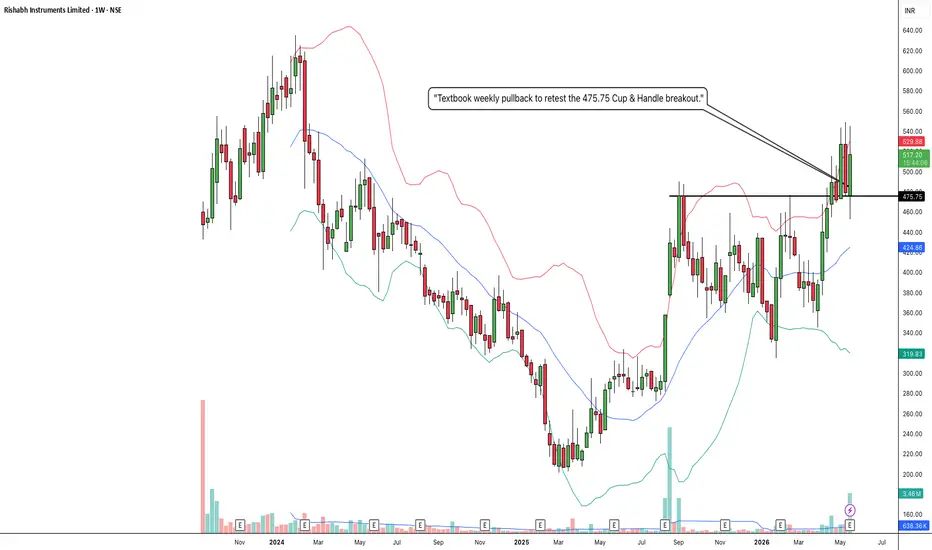
I am taking a LONG bias on Rishabh Instruments Limited (RISHABH) on the weekly (1W) timeframe.
When analyzing pure market structure, the most lucrative macro trends are born from deep, exhausting accumulation phases. Look at the massive structural development spanning this chart. Following a steep and agonizing markdown phase throughout 2024, the stock crashed down into the 200-220 zone. This brutal correction successfully washed out weak hands and forced mass retail capitulation. However, instead of bleeding into a permanent downtrend, heavy institutional capital stepped in to establish a concrete floor. Over the last year, the stock has quietly carved out an enormous "Cup" (Rounding Bottom) accumulation phase, systematically marching right back up the right side of the chart to challenge historical supply.
2. The Educational Setup: The Neckline and The Handle
To understand the sheer technical validity of this current setup, look at how the price systematically transitioned from accumulation back into a markup phase:
The Concrete Ceiling: The stock's recovery was heavily capped by a formidable horizontal resistance line at 475.75. Sellers repeatedly defended this zone, swatting the price down and creating a clear macro neckline.
The Squeeze: Notice how the price behaved right below this ceiling. Instead of suffering a massive double-top rejection, institutional buyers aggressively defended the structure, chopping sideways to form a textbook "Handle." This high-level consolidation gracefully transferred shares from impatient retail traders to strong-handed institutional buyers, allowing the 20 SMA (the middle blue line of your Bollinger Bands) to catch up and act as a dynamic springboard.
3. Current Price Action: The Ultimate Confirmation
Look at the right side of the chart. That pressure cooker finally exploded, shattering the 475.75 ceiling with massive green momentum expansion candles. But in technical analysis, a breakout is only half the battle. The most lucrative entries occur when a stock proves it can defend its newly claimed territory. Look at the current weekly candles on the far right. After an explosive vertical run into the 530s, the stock is taking a healthy, necessary breather. To amateur traders, these red candles look like a failed rally. To structural traders, this is a textbook "Break and Retest." The stock has pulled back to perfectly test the 475.75 line from above. By holding its ground here, that old, heavy historical resistance is officially being flipped into a brand-new, indestructible structural launchpad.
4. The Trade Plan: Entries, Targets, and Risk Management
Entry Strategy: We are currently sitting right in the "golden entry" digestion zone. Chasing massive vertical green candles is dangerous, which is exactly why we wait for pullbacks like this. The highest-probability, lowest-risk entry involves stepping down to a daily timeframe and looking for bullish reversal confirmation as it bounces off the 470.00 to 490.00 zone. Letting that heavy historical resistance prove itself as a new support floor offers a phenomenal risk-to-reward ratio.
Take Profit (Targets): We use measured structural targets based on the depth of the macro base. By taking the depth of the massive Cup (roughly 260 points from the ~215 floor up to the 475.75 ceiling) and projecting it upward from the breakout line, our primary structural macro target sits comfortably in the 730.00 to 740.00 zone over the coming months.
Invalidation (Stop Loss): A break-and-retest thesis is only valid if the new floor holds. A hard stop loss should be placed safely below the 475.75 breakout line and the rising 20 SMA, around the 410.00 to 425.00 level. A definitive weekly close completely back inside the old accumulation base and breaking below the moving average would act as a massive warning sign of a failed macro breakout and a severe bull trap.
5. Time Horizon:
Because this technical setup is built on a 1-Week chart capturing a massive structural phase transition and a textbook macro retest, this is a medium-to-longer-term position trade designed to capture a secular markup phase. Let the macro trend run!  Long
Long
HONASA: Massive Rounding Bottom and Textbook Break & Retest1. The Macro Perspective: The Brutal Washout and Capitulation
I am taking a LONG bias on Honasa Consumer Limited (HONASA) on the weekly (1W) timeframe.
When analyzing pure market structure, the most lucrative trend reversals come from the ashes of brutal corrections. Look at the massive structural development on the left side of this chart. After establishing a historical macro ceiling at the red 541.20 line, the stock suffered an agonizing, highly volatile markdown phase that dragged the price all the way down to the 200 zone. This deep, prolonged correction completely decimated weak hands and forced mass retail capitulation. However, instead of bleeding into bankruptcy, heavy institutional capital stepped in to establish an absolute concrete floor. Over the last several months, the stock has been quietly carving out a massive "Rounding Bottom" accumulation phase.
2. The Educational Setup: Flipping the Script
To understand the sheer strength of this current setup, look at how the price systematically transitioned from accumulation back into a markup phase:
The Neckline: For months, the stock's recovery was heavily capped by the solid black resistance line at 329.50. Sellers repeatedly swatted the price down from this level, establishing it as the ultimate accumulation ceiling.
The Breakout: Recently, buyers aggressively shattered this 329.50 ceiling with a massive green weekly momentum expansion candle, signaling a definitive shift in the macro trend.
3. Current Price Action: The Ultimate Confirmation
In technical analysis, breaking a major resistance line is only half the battle. The highest-probability entries occur when a stock proves it can defend its newly claimed territory. Look at the most recent weekly candles on the far right. The stock is taking a healthy breather, pulling back to perfectly test that 329.50 line from above. To amateur traders, red candles after a breakout look like a failed rally. To structural traders, this is a textbook "Break and Retest." By holding its ground and refusing to collapse back into the base, that old, heavy resistance ceiling is officially being flipped into a brand-new, rock-solid support floor.
4. The Trade Plan: Entries, Targets, and Risk Management
Entry Strategy: We are currently sitting right in the "golden entry" zone. The highest-probability, lowest-risk entry involves stepping in right here on the structural retest of the 330.00 to 345.00 zone. Letting that newly broken macro neckline prove itself as an indestructible support floor offers a phenomenal risk-to-reward ratio before the next momentum expansion.
Take Profit (Targets): Because the stock is systematically working its way back up the historical chart, we have crystal clear structural targets. The immediate hurdle is the dashed mid-level pivot resting at 400.50. Once that structural stepping stone is cleared, the ultimate macro target is a full retest of the massive red historical ceiling sitting at 541.20.
Invalidation (Stop Loss): A reversal thesis is only valid if the new market structure holds. A hard stop loss should be placed safely below the 329.50 breakout line and the recent higher-low structural pivots inside the base, around the 280.00 to 290.00 level. A definitive weekly close completely back inside the old accumulation box and below 300 would invalidate the immediate reversal thesis and signal a severe bull trap.
5. Time Horizon:
Because this technical setup is built on a 1-Week chart capturing a massive structural phase transition and textbook bottom retest, this is a medium-to-longer-term position trade designed to capture the explosive new markup phase toward historical highs. Let the macro trend run!  Long
Long
APOLLOHOSP: Massive Ascending Triangle and Blue Sky Breakout1. The Macro Perspective: The Secular Trendline
I am taking a LONG bias on Apollo Hospitals Enterprise Limited (APOLLOHOSP) on the weekly (1W) timeframe.
When analyzing pure market structure, the most powerful breakouts occur in alignment with an established secular trend. Look at the massive structural development on this chart. The defining feature is the steep, unbroken ascending trendline originating from the bottom left. Every single time the stock experienced a deep macro pullback, institutional buyers aggressively stepped in exactly at this dynamic support line. This tells us that heavy capital is systematically accumulating shares over the long term and refusing to let the secular bull trend break.
2. The Educational Setup: The Ascending Pressure Cooker
To understand the sheer strength of this current breakout, look at how the price systematically squeezed historical resistance to form a textbook "Ascending Triangle":
The Concrete Ceiling: The stock's recovery was heavily capped by a formidable horizontal resistance line at 7,968.20. Sellers repeatedly swatted the price down from this level.
The Squeeze: Notice how the pullbacks became shallower over time. Because buyers were defending the ascending trendline, they stepped in at higher and higher prices. By aggressively pressing up against the 7,968.20 horizontal ceiling while forming higher lows, the stock acted like the ultimate pressure cooker. It squeezed short-sellers and transferred shares to strong-handed buyers, storing immense kinetic energy for the final launch.
3. Current Price Action: Entering the Price Vacuum
Look at the most recent weekly candle on the far right. The high-level pressure cooker has absolutely exploded. Buyers have effortlessly shattered the 7,968.20 macro ceiling with a massive, full-bodied green momentum thrust, pushing the price above 8,000. By decisively clearing this multi-month accumulation zone, APOLLOHOSP has officially entered "Blue Sky Territory" (pure price discovery). There is absolutely zero historical overhead supply left. Every investor holding this stock is now in profit, meaning natural selling pressure evaporates.
4. The Trade Plan: Entries, Targets, and Risk Management
Entry Strategy: Momentum is exceptionally strong right now near 8,084.00. Chasing a massive vertical expansion candle on the weekly timeframe always carries a higher risk of agonizing intraday drawdowns as the stock naturally breathes. The highest-probability, lowest-risk entry involves stepping down to a daily timeframe and waiting for the dust to settle. Look to place limit orders to catch a potential structural pullback to retest the 7,950.00 to 8,000.00 breakout zone. Letting that heavy historical resistance prove itself as a new, indestructible support floor offers a phenomenal risk-to-reward ratio.
Take Profit (Targets): Because the stock is in pure price discovery, we use measured structural targets based on the depth of the pattern. By taking the widest part of the ascending triangle (roughly 1,150 points from the ~6,800 trendline bounce to the 7,968.20 ceiling) and projecting it upward, our primary structural macro target sits comfortably in the 9,100.00 to 9,150.00 zone. Immediate psychological milestones are 8,500.00 and 9,000.00.
Invalidation (Stop Loss): A trade thesis is only valid if the new market structure holds. A hard stop loss should be placed safely below the breakout line and the most recent swing low along the trendline, around the 7,300.00 to 7,400.00 level. A definitive weekly close completely back inside the triangle and breaking below the ascending trendline would invalidate the immediate continuation thesis and signal a severe macro bull trap.
5. Time Horizon:
Because this technical setup is built on a 1-Week chart capturing a massive structural phase transition and ascending triangle breakout, this is a medium-to-longer-term position trade designed to capture the explosive new markup phase. Let the new trend run!  Long
Long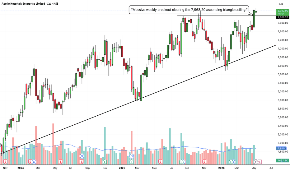
CRAFTSMAN:The Macro Staircase and Explosive Multi-Level Breakout1. The Macro Perspective: The Deep Washout and Rounding Recovery
I am taking a LONG bias on Craftsman Automation Ltd. (CRAFTSMAN) on the weekly (1W) timeframe.
When analyzing pure market structure, patience reveals the absolute highest probability setups. Look at the massive structural development on the left side of this chart. After a prior run, the stock suffered a deep, highly volatile markdown phase that dragged the price all the way down toward the 4,000 level. This brutal correction successfully washed out all the weak hands and impatient retail buyers. However, instead of collapsing into a permanent bear trend, the stock found an absolute floor and initiated a methodical, multi-month process of bottom accumulation, slowly carving out a massive "Cup" recovery to challenge the historical neckline at 7,104.55.
2. The Educational Setup: Conquering the Stepping Stones
To understand the sheer strength of this current breakout, look at how the price systematically dismantled historical resistance on the right side of the curve by building a "Staircase":
The First Floor: The stock aggressively broke above the solid black 7,104.55 neckline. Notice how it didn't immediately fail; it chopped sideways, perfectly absorbing selling pressure and flipping that old, heavy resistance into a rock-solid support floor.
The High-Level Base: Using 7,104.55 as its new foundation, the stock rallied and built a "Step-Up Base" directly underneath the next major resistance level at 8,079.25. Consolidating tightly for months right beneath a major structural ceiling acts like a pressure cooker. It transfers shares to strong-handed institutional buyers and stores immense kinetic energy for the next leg higher.
3. Current Price Action: Blue Sky Territory
Look at the most recent weekly candles on the far right, accompanied by a massive, undeniable surge in buying volume (visible on the bottom panel). The pressure cooker has absolutely exploded. In a violent display of momentum, buyers have effortlessly shattered the 8,079.25 macro ceiling, printing a massive expansion candle that pushed all the way up to the dashed 9,294.15 pivot. By decisively clearing this massive multi-month accumulation zone, CRAFTSMAN has officially entered "Blue Sky Territory" (pure price discovery). Historical overhead supply in this region has been eliminated.
4. The Trade Plan: Entries, Targets, and Risk Management
Entry Strategy: Momentum is exceptionally strong right now near 8,796.00, though it is naturally cooling off from the initial thrust. Chasing an enormous, vertical weekly expansion candle always carries a higher risk of an immediate intraday or daily drawdown. The highest-probability, lowest-risk entry involves stepping down to a daily timeframe and placing limit orders to catch a potential minor structural pullback to retest the 8,080.00 to 8,200.00 breakout zone. Letting that old heavy resistance prove itself as a new, indestructible support floor offers a phenomenal risk-to-reward ratio.
Take Profit (Targets): Because the stock is in pure price discovery, we use measured structural targets. By taking the depth of the recent step-up base (roughly 975 points from the 7,104.55 floor to the 8,079.25 ceiling) and projecting it upward from the breakout line, our immediate structural target was hit perfectly near the 9,050-9,300 zone. The next primary macro extension target based on the larger cup structure sits comfortably at the 10,000.00 century mark.
Invalidation (Stop Loss): A trade thesis is only valid if the new market structure holds. A hard stop loss should be placed safely below the recent high-level base floor, around the 7,500.00 to 7,600.00 level. A definitive weekly close completely back below the 7,104.55 line would act as a massive warning sign of a failed macro breakout and severe structural weakness.
5. Time Horizon:
Because this technical setup is built on a 1-Week chart capturing a massive structural completion and momentum thrust, this is a medium-to-longer-term position trade designed to capture the explosive markup phase. Let the macro trend run!  Long
Long
NAVINFLUOR: Explosive Box Breakout and Macro Continuation1. The Macro Perspective: The Digestion Phase
I am taking a LONG bias on Navin Fluorine International Limited (NAVINFLUOR) on the daily (1D) timeframe.
When analyzing pure market structure, you have to look at how a stock behaves after a massive run-up. Months ago, NAVINFLUOR experienced a massive gap-up and impulse leg. However, instead of going parabolic and collapsing, it did the healthiest thing a stock can do: it paused. For months, the price has been trapped in a massive consolidation "box," ping-ponging between a hard support floor near 5693.30 and a heavy resistance ceiling at 6690.80. This long, sideways chop was the market digesting those previous gains and transferring shares from weak hands to strong hands.
2. The Educational Setup: The Power of the Box
In technical analysis, there is a saying: The longer the base, the higher in space.
The Accumulation: Every time the stock approached the bottom of the box, buyers aggressively defended the 5693.30 level, refusing to let the macro trend break down.
The Pressure Cooker: By continuously testing the 6690.80 ceiling without making new macro lows, the stock acted like a pressure cooker. Moving sideways for an extended period stores immense kinetic energy because moving averages catch up, and both buyers and sellers place their stop losses just outside the range.
3. Current Price Action: The Lid Blows Off
Look at the most recent daily candle on the far right. The pressure cooker has finally exploded. Buyers have effortlessly shattered the 6690.80 macro resistance, closing near the absolute highs. Furthermore, look at the volume indicator at the bottom. The breakout is accompanied by a massive spike in buying volume, confirming that this is not a retail fake-out; this is heavy institutional capital aggressively forcing the stock into a new markup phase.
4. The Trade Plan: Entries, Targets, and Risk Management
Entry Strategy: The stock is currently experiencing extreme upside momentum near 6796.50. Chasing a massive daily expansion candle carries a higher risk of immediate drawdown as early buyers take partial profits. The highest-probability, lowest-risk entry would involve placing limit orders to catch a potential minor structural pullback to retest the 6690.00 breakout zone. Letting that old heavy resistance prove itself as a new, indestructible support floor offers a phenomenal risk-to-reward ratio.
Take Profit (Targets): We can find a measured technical target by taking the height of the previous consolidation box (roughly 1000 points) and adding it to the breakout level. This gives us a primary structural target in the 7600.00 to 7700.00 zone. Immediate psychological milestones sit at 7000.00 and 7250.00.
Invalidation (Stop Loss): A trade thesis is only valid if the new market structure holds. A hard stop loss should be placed safely below the breakout candle's origin, around the 6400.00 to 6500.00 level. A daily candle closing completely back inside the box and below the 6690.80 line would act as an early warning sign of a failed macro breakout (a "bull trap").
5. Time Horizon:
Because this technical setup is built on a 1-Day chart capturing a massive structural phase transition and box breakout, this is a short-to-medium-term swing trade designed to play out over the coming days to weeks. Let the trend run!  Long
Long
VEDL:Explosive High-Level Base and Structural Continuation Break1. The Macro Perspective: The Climb and The Digestion
I am taking a LONG bias on Vedanta Limited (VEDL) on the daily (1D) timeframe.
When analyzing pure market structure, the healthiest and most sustainable trends do not go straight up forever; they climb stairs. Look at the structural development on the left side of this chart. The stock initiated a massive, aggressive run-up from the 140s all the way to the 280 zone. Naturally, that kind of momentum causes exhaustion. However, instead of suffering a catastrophic reversal, institutional buyers stepped in. The stock underwent a prolonged period of healthy digestion, carving out a massive "Cup" or primary base below the solid black 280.75 line to absorb profit-taking and wash out weak hands.
2. The Educational Setup: The Pressure Cooker Handle
To understand the sheer strength of this current breakout, look at how the price systematically transitioned from accumulation back into a markup phase:
The Step-Up: The stock successfully broke out of its primary base at 280.75. However, instead of immediately shooting to the moon, it encountered a new layer of supply, establishing a temporary ceiling at the solid black 296.50 line.
The High-Level Base: Notice what happened next. The stock didn't collapse back to the bottom of the chart. It chopped sideways in a very tight, volatile range between ~270 and 296.50. Consolidating tightly directly underneath a major resistance line (and just below the psychological 300 century mark) forms a textbook "Handle" or "Step-Up Base." This acts like a pressure cooker, gracefully transferring shares from impatient retail traders to strong-handed institutional buyers.
3. Current Price Action: The Lid Blows Off
Look at the most recent daily candles on the far right, accompanied by a massive surge in buying volume. The high-level pressure cooker has absolutely exploded. Buyers have effortlessly shattered the 296.50 ceiling with a massive, near-vertical momentum thrust, slicing straight through the 300 psychological barrier and pushing into the 320s. By decisively clearing this secondary accumulation zone, VEDL has officially confirmed a powerful structural continuation. The digestion phase is over; the new markup phase has begun.
4. The Trade Plan: Entries, Targets, and Risk Management
Entry Strategy: Momentum is exceptionally strong right now near 323.35. Chasing a massive daily expansion candle always carries a higher risk of an immediate intraday drawdown as the stock naturally breathes. The highest-probability, lowest-risk entry involves stepping down to an hourly timeframe and placing limit orders to catch a potential minor structural pullback or consolidation flag to retest the 300.00 to 305.00 zone. Letting that old heavy resistance and psychological level prove itself as a new support floor offers a phenomenal risk-to-reward ratio.
Take Profit (Targets): We use measured structural targets based on the depth of the recent bases. By taking the depth of the primary consolidation (roughly 50 points from the ~230 floor to the 280.75 breakout) and projecting it upward from the recent 296.50 breakout line, our primary structural swing target sits comfortably in the 345.00 to 350.00 zone.
Invalidation (Stop Loss): A trade thesis is only valid if the new market structure holds. A hard stop loss should be placed safely below the high-level base floor and the 280.75 pivot, around the 265.00 to 270.00 level. A definitive daily close completely back below 280.00 would act as a massive warning sign of a failed structural continuation and severe weakness.
5. Time Horizon:
Because this technical setup is built on a 1-Day chart capturing an explosive continuation breakout from a high-level base, this is a short-to-medium-term swing trade designed to capture the violent momentum thrust. Let the new trend run!  Long
Long
JSWCEMENT: Macro Box Breakout [1W]1. The Macro Perspective: The Deep Washout and the Rounding Bottom
I am taking a LONG bias on JSW Cement Limited (JSWCEMENT) on the weekly (1W) timeframe.
When analyzing pure market structure, the most lucrative macro trends are born from deep, exhausting accumulation phases. Look at the massive structural development spanning this chart. Following a steep and agonizing markdown phase from the 160 level, the stock crashed down toward the 110 zone. This brutal correction successfully washed out weak hands and forced mass retail capitulation. However, instead of bleeding into a permanent downtrend, heavy institutional capital stepped in to establish a concrete floor. Over the last several months, the stock has quietly carved out the exact bottom of an enormous "Cup" (Rounding Bottom) accumulation phase.
2. The Educational Setup: The Accumulation Box and the Springboard
To understand the sheer technical validity of this current setup, look at how the price systematically transitioned from accumulation back into a markup phase:
The Accumulation Box: Notice the shaded rectangular box heavily defended by buyers. For months, the stock chopped sideways between roughly 110.00 and 129.00. This is a textbook institutional accumulation zone. Sellers were repeatedly absorbed at the floor, creating a massive foundational base while trapping impatient shorts.
The 20 SMA Reclaim: Notice how the price behaved inside this box right before the launch. The stock aggressively reclaimed the weekly 20 SMA (the middle blue line of your Bollinger Bands), flipping it from dynamic resistance into dynamic support. By chopping sideways and letting the moving average flatten out and turn upward, the stock created a perfect, tightly coiled structural springboard.
3. Current Price Action: Volatility Expansion and the Right Side of the Cup
Look at the right side of the chart. That pressure cooker finally exploded. Buyers have stepped in with massive conviction, printing a powerhouse of a green weekly expansion candle backed by a towering institutional volume spike (the cyan volume bar). This single vertical thrust has effortlessly obliterated the top of the accumulation box near 129.00, pushing the price well into the 137.00s. Furthermore, the price has violently pierced the upper Bollinger Band (the red line), snapping the bands wide open. By decisively clearing this accumulation block, JSWCEMENT has officially initiated the aggressive right-side recovery of the massive macro Cup formation.
4. The Trade Plan: Entries, Targets, and Risk Management
Entry Strategy: Macro momentum is exceptionally strong right now near 137.99. Chasing a massive vertical green candle closing outside the upper Bollinger Band carries a risk of a short-term pullback as the stock naturally breathes. The highest-probability, lowest-risk entry involves stepping down to a daily timeframe and waiting for a structural pullback to perfectly retest the 125.00 to 130.00 broken box resistance zone. Letting that heavy historical ceiling prove itself as a new support floor offers a phenomenal risk-to-reward ratio.
Take Profit (Targets): We use structural targets based on the macro Cup formation. The primary objective is the historical neckline and previous swing high that initiated the entire markdown. This projects our primary macro target comfortably into the 157.00 to 160.00 supply zone.
Invalidation (Stop Loss): An explosive box breakout thesis is completely invalidated if the stock crashes back deep inside the old consolidation boundaries. A hard stop loss should be placed safely below the weekly 20 SMA and the mid-level of the accumulation box, around the 115.00 to 118.00 level. A definitive weekly close completely back below the moving average would act as a massive warning sign of a failed breakout and a severe bull trap.
5. Time Horizon:
Because this technical setup is built on a 1-Week chart capturing a massive structural phase transition and the initiation of the right side of a macro Cup, this is a medium-term position trade designed to capture a strong markup phase over the coming weeks and months. Let the macro trend run!  Long
Long