Semiconductor Index May Be StabilizingThe Philadelphia Semiconductor Index has pulled back sharply, but some traders may think it can bounce.
The first pattern on today’s chart is the rally between March 27 and June 22. SOX stabilized after retracing half the move, which may confirm the advance.
Second, SOX rebounded after probing below the May 19 weekly low of 10,896. Has support been established?
Third, stochastics are turning up from an oversold condition.
Finally, SOX has held its rising 100-day simple moving average (SMA). That could be reminiscent of March, when it hugged the same SMA before breaking out.
TradeStation has, for decades, advanced the trading industry, providing access to stocks, options and futures. If you're born to trade, we could be for you. Learn more here about TradingView’s Broker of the Year!
Past performance, whether actual or indicated by historical tests of strategies, is no guarantee of future performance or success. There is a possibility that you may sustain a loss equal to or greater than your entire investment regardless of which asset class you trade (equities, options or futures); therefore, you should not invest or risk money that you cannot afford to lose. Online trading is not suitable for all investors. View the document titled Characteristics and Risks of Standardized Options at www.TradeStation.com . Before trading any asset class, customers must read the relevant risk disclosure statements on www.TradeStation.com . System access and trade placement and execution may be delayed or fail due to market volatility and volume, quote delays, system and software errors, Internet traffic, outages and other factors.
Securities and futures trading is offered to self-directed customers by TradeStation Securities, Inc., a broker-dealer registered with the Securities and Exchange Commission and a futures commission merchant licensed with the Commodity Futures Trading Commission). TradeStation Securities is a member of the Financial Industry Regulatory Authority, the National Futures Association, and a number of exchanges.
TradeStation Securities, Inc. and TradeStation Technologies, Inc. are each wholly owned subsidiaries of TradeStation Group, Inc., both operating, and providing products and services, under the TradeStation brand and trademark. When applying for, or purchasing, accounts, subscriptions, products and services, it is important that you know which company you will be dealing with. Visit www.TradeStation.com for further important information explaining what this means. First Support Zone: Around 0.04888Hello.
Nice to meet you, fellow traders.
If you “Follow,” you can quickly check new chart analyses.
I hope you have a successful trade today.
━━━━━━━━━━━━━━━━━━━━━━━━━━━━━━━━━
ZAMA is a project that applies Fully Homomorphic Encryption (FHE) technology to blockchain.
The core of FHE is that smart contracts can perform computations even without decrypting the data.
In other words, it allows for the processing of necessary calculations and verifications on-chain without disclosing the original source of sensitive data.
Due to these technical features, ZAMA is highly regarded for its potential in the following fields.
✓ DeFi requiring privacy
✓ Financial services for institutional investors
✓ RWA (Real-world Asset Tokenization)
✓ Private Stablecoins
✓ Sealed Bid Auctions
✓ AI-based On-chain Data Processing
✓ Protection of confidential data in on-chain finance
While existing privacy coins have focused on protecting transaction history or wallet information, ZAMA aims to be a next-generation privacy infrastructure that enables the utilization of encrypted data itself within smart contracts.
━━━━━━━━━━━━━━━━━━━━━━━━━━━━━━━━━━
The ZAMA token is a new token that has not been listed for long.
Therefore, the reliability of the support and resistance levels currently formed on the chart may be relatively low as sufficient trading history has not yet accumulated.
Since liquidity and volatility of newly listed coins can fluctuate rapidly, you must set your stop-loss criteria and position size in advance when entering a trade.
━━━━━━━━━━━━━━━━━━━━━━━━━━━━━━━━━
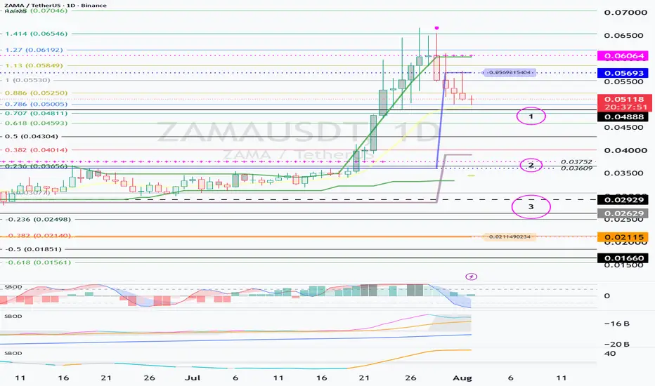
ZAMA is showing a corrective trend after forming a short-term high zone
0.05693 ~ 0.06064.
If the downtrend continues in the current zone, we need to check whether buying pressure flows in at the next support zone.
① 1st Support Zone: Around 0.04888
② 2nd Support Zone: 0.03609 ~ 0.03752
③ 3rd Key Support Zone: 0.02629 ~ 0.02929
━━━━━━━━━━━━━━━━━━━━━━━━━━━━━━━━━
In the current short-term trend, the first price to check is 0.04888.
If buying pressure flows in and the price shows signs of being supported around 0.04888, there is a possibility that the short-term correction will end and an upward wave will continue.
Therefore, the key point to watch on the current chart is:
“Can it be supported and rebound around 0.04888?”
However, if it breaks below 0.04888, the reaction of the Fibonacci retracement zones must be checked.
■ Key Fibonacci Zones
* 0.618 Zone: Around 0.04593
* 0.5 Zone: Around 0.04304
After the price touches these zones You must verify whether it recovers quickly and whether a rebound accompanied by trading volume occurs.
━━━━━━━━━━━━━━━━━━━━━━━━━━━━━━━━━━
The 0.03609 ~ 0.03752 range is the price level where the previous high was formed.
ZAMA formed a new high zone after breaking above this range.
Therefore, if a correction follows, you must verify whether this zone transitions from existing resistance to new support.
Resistance Breakout → Formation of Pullback → Support Transition
If this structure is completed, it can be judged that the uptrend is being maintained.
If the price remains stable above the 0.03609 ~ 0.03752 range, there is a possibility that a mid-term upward wave is still valid. It is high.
━━━━━━━━━━━━━━━━━━━━━━━━━━━━━━━━━━
A major supply zone has formed around 0.02629 based on the Volume Profile.
Therefore,
the 0.02629 ~ 0.02929 range can be viewed as a key support zone where
strong buying pressure is likely to flow in.
In this zone, the following conditions must be checked together:
✓ Whether trading volume is increasing
✓ Whether a long bullish candle or a candle with a lower wick appears
✓ Whether a bottom indicator is forming
✓ Whether there is a bullish divergence in auxiliary indicators
✓ Whether selling pressure is decreasing
However, if the price falls below 0.02629 and fails to recover, the likelihood of the existing support zone turning into a resistance zone increases.
Therefore, if it clearly breaks below 0.02629, aggressive It is advisable to stop trading and observe the market until a new bottom structure forms.
━━━━━━━━━━━━━━━━━━━━━━━━━━━━━━━━━━
Aggressive traders may consider a short-term entry after confirming support around 0.04888.
However, trading in this zone is best approached from a short-term or day trading perspective rather than a medium-to-long-term position.
Because newly listed coins are highly volatile, they may recover rapidly after temporarily breaking out of a support zone, or conversely, drop quickly after appearing to hold support.
Therefore, rather than entering a trade simply because the price has reached a support zone, you must also verify the following conditions:
✓ Candle reaction at the support zone
✓ Increase in trading volume
✓ Activation of the DOM (-60) indicator
✓ Position of the HA-Low indicator
✓ Bottom signal from auxiliary indicators
✓ Breakout of the short-term trend line Status
━━━━━━━━━━━━━━━━━━━━━━━━━━━━━━━━━━
Currently, the HA-Low indicator is
formed around 0.02115.
On the other hand, the DOM(-60) indicator has not yet been generated.
If the DOM(-60) indicator is newly generated during a further price decline, you must verify whether there is actual support at the price level where the indicator was formed.
Rather than buying immediately just because DOM(-60) has been generated, it is important to confirm the following movements:
Generation of DOM(-60)
→ Confirmation of support at that price level
→ Increase in trading volume
→ Breakout of short-term resistance
→ Review entry point
━━━━━━━━━━━━━━━━━━━━━━━━━━━━━━━━━
In the current chart structure, HA-Low The area around 0.02115, where the indicator is formed, can be viewed as the main buying candidate zone.
Therefore, trading strategies can be categorized as follows:
■ Short-term Trading Zone
* Around 0.04888
* Around 0.04304 ~ 0.04593
* Around 0.03609 ~ 0.03752
* Around 0.02629 ~ 0.02929
■ Main Buy Candidate Zone
* Around 0.02115, where the HA-Low indicator is formed
At price levels outside the main buying zone, you can consider a strategy of securing profits through short-term trading or increasing your holdings by the amount corresponding to the profits.
However, short-term trading quantities and medium-to-long-term holding quantities must be managed separately. ...does.
━━━━━━━━━━━━━━━━━━━━━━━━━━━━━━━━━━
Once the main purchase is completed, you must record the final average purchase price separately.
If you do not record the average purchase price, it is difficult to accurately assess actual returns and risks when prices surge or plummet.
━━━━━━━━━━━━━━━━━━━━━━━━━━━━━━━━━━
■ Short-term High Zone: 0.05693 ~ 0.06064
■ 1st Support: Around 0.04888
■ Fibonacci Support: 0.04593 / 0.04304
■ 2nd Support: 0.03609 ~ 0.03752
■ 3rd Key Support: 0.02629 ~ 0.02929
■ HA-Low: Around 0.02115
■ Trend Revocation Observation Zone: Failure to recover after breaking below 0.02629
━━━━━━━━━━━━━━━━━━━━━━━━━━━━━━━━━━
The first price to check on the current ZAMA chart is 0.04888.
If it finds support near 0.04888 and rises, there is a possibility that a short-term upward wave will continue.
Conversely, if it breaks below 0.04888, we must check for a rebound at the Fibonacci levels around 0.04593 and 0.04304.
In the medium term, it is important whether the price maintains above the previous high zone of 0.03609 ~ 0.03752.
Additionally, the major volume profile The formed range of 0.02629 to 0.02929 is a strong candidate for support.
However, if it fails to recover quickly after falling below 0.02629, there is a possibility that the existing support will turn into resistance; therefore, you should temporarily suspend trading and observe the market until a new trend forms.
It is worth watching to see if privacy blockchains, which have faded from market attention for some time, can regain focus based on the new technology known as FHE.
If ZAMA expands real-world use cases in fields such as institutional finance, RWA, AI, and DeFi, there is a possibility that it could create a new trend in the privacy blockchain market.
━━━━━━━━━━━━━━━━━━━━━━━━━━━━━━━━━
Thank you for reading to the end.
I wish you successful trading.
UNI(Uniswap): The Last Chance to Buy at the Bottom?
Hello, traders.
⭐ If you "Follow" us, you can receive new analysis and market trends quickly.
💰 We wish you successful trading today.
━━━━━━━━━━━━━━━━━━━
🔥 Is UNI preparing to break out of its long-term bottom?
UNI (Uniswap) is a representative DEX (Decentralized Exchange) in the Ethereum ecosystem.
With the DEX market growing steadily recently, it appears that UNI has also entered a position where it can once again attract attention from a long-term perspective.
━━━━━━━━━━━━━━━━━━━━
📈 Key Price Levels Based on Monthly Chart
Looking at the monthly chart, there are two major key zones.
✅ Long-term Accumulation Zone
▶ 2,000 ~ 4,390
✅ Long-term Target Zone
▶ 15,654 ~ 20,561
Therefore, from a mid-to-long-term perspective,
💎 Accumulate in the 2,000 ~ 4,390 range
➡️
🎯 Split selling in the 15,654 ~ 20,561 range
You can consider this strategy.
Currently, UNI is located around 4,390, so the most important factor is whether this price level can turn into a support line.
━━━━━━━━━━━━━━━━━━━━
🎯 Whether $4.390 holds support is key
If the current price settles above 4.390,
✅ Completion of long-term bottom formation
✅ Entry into the initial phase of a trend reversal
✅ Increased possibility of an uptrend cycle starting
In other words,
⚠️ "Support" is more important than a "breakout."
You must confirm whether 4.390 acts as a support line.
Additionally, whether there is an attempt to break out upward of the M-Signal on the monthly chart is also an important checkpoint.
━━━━━━━━━━━━━━━━━━━━
📊 Conditions for Forming an Upward Trend
The following conditions are required for a full-fledged bull market to emerge:
✅ 1. StochRSI
📌 Rise without entering the overbought zone
📌 Maintain a healthy upward trend structure
✅ 2. OBV
📌 Maintain above the High Line
📌 Confirmation of increased trading volume inflow
✅ 3. BSSC
📌 Maintain above the 0 line
📌 Confirmation of buying dominance
Currently, the above conditions are not yet fully met.
Therefore, it is appropriate to interpret the current situation not as
❌ a guaranteed upward zone
but as
✅ a process of creating the conditions for an upward movement
━━━━━━━━━━━━━━━━━━━━
📍 Key Support Zones
🟢 1st Support
▶ 4.190
🟢 2nd Support
▶ 3.687
In particular, the 4.190 level is a very important position that overlaps with
📌 the DOM (-60) on the 1W chart
📌 the mid-term bottom zone
If, during this correction, it falls to around 4.190
and then rebounds as strong buying pressure flows in
🔥 it has the potential to become the last accumulation opportunity at the bottom level
━━━━━━━━━━━━━━━━━━━━
🚀 Final Summary
✅ Whether the 4.390 support line reverses
✅ Whether the 4.190 support level is supported
✅ Attempt to break through the M-Signal on the 1M chart
✅ Satisfaction of StochRSI, OBV, and BSSC conditions
You must focus on verifying these four factors.
If the above conditions are met sequentially, the likelihood of UNI concluding its long-term bottoming phase and establishing a new uptrend increases.
💎 It seems appropriate to view this not as a phase for chasing the highs, but
🔥 as a phase to confirm the possibility of accumulation at the bottom.
━━━━━━━━━━━━━━━━━━━━
💰 Wishing you successful investment and a successful trade.
🚀 To The Moon! 🚀
Confirming Support at 1879.61
Support at 1879.61 and Breaking through the 1964.96 Line Are Key to Short-Term Trend Reversal
-----
Hello.
Nice to meet you, investors.
If you "Follow" us, you can receive new market analyses quickly.
We wish you a successful investment day today.
***
### Mid-to-Long Term Perspective
If the stock price remains stable above the 1,164.99 ~ 1,440.00 range, which was a major resistance zone in the past, it appears highly likely that the mid-to-long-term uptrend will continue.
However, it is expected that we will need to break through the upper boundary of the M-Signal indicator on the 1M chart to determine whether a full-scale uptrend has entered.
Therefore, until then, a response strategy focused on short-term trading rather than mid-to-long-term investment appears effective.
If the stock price corrects to the 1,164.99 to 1,440.00 range, there appears to be a high probability of strong buying pressure inflow in that area, so it is necessary to approach this from a staggered buying perspective.
***
### Analysis of Key Price Ranges
Currently, the stock price is showing a trend of attempting to break through the upper boundary of the key supply zone between 1,597.76 and 1,879.61.
For the future uptrend to strengthen, it is crucial whether the next major resistance zone between 2,419.83 and 2,706.15 is broken.
Conversely, if the stock price falls back below the 1,597.76 to 1,879.61 range, it is necessary to check for buying pressure inflow in the 1,164.99 to 1,440.00 range, which is considered a strong support level.
In the short term, breaking through and settling at the 1,964.96 level is considered the first condition for a trend reversal.
Furthermore, from a mid-to-long-term perspective, the breakthrough at the 2,887.66 level appears to be the benchmark for entering a full-fledged uptrend.
Therefore, in terms of investment strategy, securing a significant buying position in the zone below 1,964.96 seems effective.
However, it is advisable to consider a final chase purchase only after the breakout at 2,887.66 is confirmed.
***
### Short-term Perspective
Currently, the key point is whether the price can break through and settle at the 1,964.96 level after receiving support at 1,879.61.
If the price breaks through 1,964.96 and transitions into a support line, the likelihood of a short-term uptrend reversal is expected to increase.
Afterwards, along with the possibility of a breakout above the M-Signal on the 1M chart, you must verify whether the price rises to the 2,317.39 point, where the DOM (60) indicator on the 1D chart is located.
Conversely, if the price breaks below the 1,879.61 point, it is necessary to sequentially check the next support zones.
* 1st Support Line: 1,782.28 point
* 2nd Support Zone: 1,569.69 ~ 1,666.58 range
It is important to confirm the inflow of buying pressure and support at these price levels.
***
### Conditions for Sustaining an Upward Trend
For the price to continue its upward trend after breaking through a major resistance zone, the following conditions must be met.
1. The StochRSI will maintain an upward trend without entering the overbought zone.
2. The OBV will remain above the High Line.
3. The BSSC indicator will remain above the baseline of 0.
If these conditions are met, the likelihood of the upward trend continuing is considered high.
Since the current stock price has risen above the 1,879.61 point, it is necessary to continuously monitor whether the above conditions are met in the future.
***
Thank you for reading to the end.
I wish all investors successful investments and performance. 📈
BTC Enters a Volatility Phase : July 27 – August 5
BTC Enters a Volatility Phase – Need to Monitor Short-Term Direction (July 27 – August 5)
---
Hello, traders.
If you "follow" me, you'll be able to receive new updates quickly.
Wishing everyone a great trading day.
***
BTC has officially entered a major volatility period (July 27 – August 5).
This phase is likely to unfold through three separate volatility waves:
* 1st volatility wave: July 27 – July 29
* 2nd volatility wave: July 30 – August 1
* 3rd volatility wave: August 3 – August 5
As this period could determine the market's next directional move, it is important to monitor price action closely.
***
## Current BTC Market Situation
Although BTC has recently shown upward momentum, the price action is still closer to a sideways consolidation range than a true bullish trend.
On the weekly chart, the following levels remain strong resistance zones:
* HA-Low resistance level: 66,323
* Trend reversal confirmation level: 67,720
The key question during this volatility period is whether enough buying pressure and liquidity will enter the market to break through these resistance levels.
***
## Monitoring Stablecoin Capital Flows
Before any sustained market rally can occur, capital inflows must come first.
However, recent USDT and USDC chart activity has shown signs of gap-down movements.
This may indicate either:
* Capital is leaving the market, or
* The pace of new capital inflows is slowing.
This is generally not a positive sign and may suggest:
* Weakening liquidity inflows
* Reduced appetite for risk assets
* Insufficient short-term bullish momentum
Therefore, aggressive position-taking may not be ideal at the moment, and risk management should remain a priority.
***
## OBV Perspective
OBV is currently maintaining an upward trend and approaching the High Line resistance area.
Key points to watch:
* Whether OBV can break above the High Line
* Whether it can move above the EMA 3
* Whether rising volume accompanies the move
However, given the current weakness in market liquidity, traders should also consider the possibility that OBV fails to break resistance and turns lower again.
### Key Support Levels if BTC Declines
1st Support: 64,058
2nd Support: 62,793
3rd Support: 61,793
In particular, whether BTC can hold above the 62.8K area may become a critical factor in determining the medium-term direction of the market.
***
## Current Market Characteristics
Recently, some capital from traditional financial markets has flowed into crypto.
However, instead of concentrating in specific sectors, funds appear to be dispersing across multiple areas.
At the same time, stablecoin liquidity remains relatively weak, reducing overall capital concentration in the altcoin market.
As a result, rather than expecting an imminent altcoin season, BTC may first need to establish a strong bullish trend and restore overall market confidence.
***
## BTC Dominance & USDT Dominance
The following market developments are worth monitoring:
### BTC.D
* Target range: 55.01% – 62.47% or higher
### USDT.D
* Target area: Around 4.915%
Under current conditions, the preferred scenario would be:
* Rising BTC Dominance
* Falling USDT Dominance
This combination would generally support further BTC price appreciation.
From a longer-term perspective, a true altcoin season would more likely emerge when both BTC.D and USDT.D begin trending lower simultaneously.
***
# Trading Strategy Summary
### ① Monitor Capital Inflows
Keep tracking:
* USDT
* USDC
* Total stablecoin market capitalization
Continued growth in these metrics would support a healthier market environment.
### ② Watch for Key Resistance Breakouts
When BTC enters the 66,323–67,720 resistance zone, confirm whether the following conditions occur simultaneously:
* Rising StochRSI
* Rising OBV
* BSSC indicator remaining above zero
### ③ If the Rally Fails
At a minimum, BTC should maintain support around:
62,793
Holding this level would preserve the possibility of another upward move.
### ④ Current Market Favors Short-Term Trading
Until the M-Signal upper boundary on the 1M chart is broken, the market is better viewed as a range-bound environment rather than a trending one.
Therefore, the following approaches may be more effective:
* Short-term trading over swing trading
* Range trading
* Scaling into and out of positions
***
# Mid- to Long-Term Investment Perspective
Personally, I view the 57,694–61,300 area as a strong accumulation and support zone because it overlaps with previous major highs.
If BTC pulls back into this region, long-term investors may view it less as a fear zone and more as an accumulation opportunity.
However, if this support zone is lost, an additional correction toward approximately:
48,190
should also remain a possibility.
***
## Spot Investor Management Strategy
For long-term investors, it is important not to stop buying simply because prices decline.
A recommended approach is:
1. Divide purchases across multiple price zones.
2. Take partial profits during rebounds to recover initial capital.
3. Preserve cash for future buying opportunities.
4. Gradually increase overall holdings over time.
Until the M-Signal breakout occurs on the 1M chart, this type of cyclical trading strategy may be particularly effective.
***
## Something You Should Definitely Record
Once your main accumulation phase is complete, keep a record of your actual average purchase price.
Exchange-reported average costs can become distorted after repeated:
* Additional purchases
* Partial sales
* Re-entries
Knowing your true investment cost basis helps reduce emotional stress and allows for more disciplined trading.
Ultimately, the traders who survive long-term are not simply those who generate profits, but those who can remain psychologically steady and continue executing their strategy consistently.
***
## Key Takeaways
* July 27 – August 5 is a potentially decisive volatility period for BTC.
* The 66.3K–67.7K resistance zone is the key short-term hurdle.
* Monitoring stablecoin capital inflows is essential.
* If upside momentum fails, watch whether 62.8K support holds.
* Until the M-Signal breakout occurs on the 1M chart, short-term and range-trading strategies may be more effective.
* Long-term investors should focus on phased accumulation and cash management.
***
Thank you for reading.
Wishing you successful trades and strong risk management. 🚀📈
The Crypto Market Embraces Gold
Hello Traders,
Follow me to stay updated with the latest market insights and trading perspectives.
***
## Gold Is Now Trading On-Chain
Tether Gold (XAUt) is one of the leading Real-World Asset (RWA) tokens, designed to bring physical gold onto the blockchain.
Each XAUt token is backed 1:1 by one troy ounce (approximately 31.103 grams) of physical gold.
The gold backing XAUt is securely stored in Swiss vaults, and holders can verify the allocated gold through the platform.
While it is possible to redeem XAUt for physical gold above certain minimum requirements, redemption fees, shipping costs, and logistical constraints make it impractical for most retail investors. As a result, XAUt is generally used as a digital asset that tracks the price of gold.
In other words, gold has now become a digital asset that can be traded 24/7 and purchased in fractional amounts, much like Bitcoin or Ethereum.
***
## Traditional Finance Is Moving Into Crypto
In the past, it appeared that the crypto market was trying to integrate into traditional finance.
Today, we are increasingly seeing the opposite trend: traditional assets such as gold, government bonds, stocks, and real estate are entering the blockchain ecosystem.
This can be viewed as a sign that the cryptocurrency market is evolving beyond speculation and becoming a new financial infrastructure.
For retail investors, the crypto market offers several advantages:
* 24/7 trading access
* Fractional ownership
* Global market participation
* High liquidity
These features make digital asset markets significantly more accessible than many traditional investment markets.
***
## The Relationship Between Gold and XAUT
XAUT is designed to directly track the market price of physical gold.
Therefore, when the international gold price (XAUUSD) rises, XAUT tends to appreciate as well.
Likewise, when gold prices decline, XAUT generally follows the same direction.
From a trading perspective, buying and selling XAUT is essentially equivalent to trading gold within a blockchain-based environment.
***
## XAUUSD Monthly Chart Perspective
On the monthly timeframe, XAUUSD has recently pulled back from the 4,451.843 area and is currently testing the M-Signal zone.
The key question is whether this area can continue to serve as support within the long-term bullish cycle.
If the price breaks below the monthly M-Signal level, the long-term uptrend could weaken, increasing the possibility of a broader bearish transition.
In that scenario, traders should pay close attention to:
* DOM(-60) bottom signals
* HA-Low bottom signals
These indicators may help identify the formation of a new long-term support area.
***
## Short-Term Trading Outlook
The current short-term support zone is estimated to be:
4,017.315 ~ 4,054.755
The primary focus is whether buyers step in within this range and generate a meaningful rebound.
### Upside Levels to Watch
* First target: 4,451.843
* Second target: 4,895.440 ~ 5,030.630
Rather than simply looking for resistance breakouts, traders should monitor whether these levels can turn into support.
### Downside Levels to Watch
* First support: 3,854.845
* Second support: 3,332.019
If price declines further, the market should be evaluated for signs of a new bottom formation around these levels.
***
## XAUTUSDT Perspective
Since XAUTUSDT has a relatively short trading history, its chart lacks well-established support and resistance structures.
For that reason, monitoring XAUUSD (spot gold) alongside XAUT can provide a more reliable framework for analysis.
The current short-term support zone is:
3,995.89 ~ 4,046.68
The key factor is whether price can hold this area while attracting sufficient buying volume.
### Upside Targets
* First target: 4,281.04
* Second target: 4,779.01
### Risk Management Level
* A breakdown below 3,995.89
If this level is lost, it may be prudent to step back from trading and wait for clearer market direction.
***
## Conclusion
While it is beneficial for traders to understand the mechanics and structure of XAUT, a practical approach is simply to view it as a relatively stable RWA asset that tracks the price of gold.
At the end of the day, our goal is not to become experts in the asset's underlying structure, but to identify market opportunities and generate profits.
The boundary between traditional finance and cryptocurrency continues to fade.
As this trend progresses, however, the extreme volatility that once characterized many crypto assets may gradually diminish.
As a result, traders may need to shift away from aggressive momentum chasing and focus more on:
* Risk-managed trend-following strategies
* Capital rotation opportunities
* Long-term market structure analysis
These approaches are likely to become increasingly important as traditional and digital asset markets continue to converge.
***
Thank you for reading.
Wishing you successful and profitable trading. 🚀📈
 Education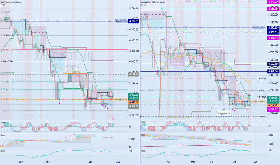
EPICUSDT Trading Strategy
Hello traders,
If you "follow" me, you’ll be able to get the latest updates faster.
Wishing everyone a great trading day.
***
EPIC is a project positioning itself around RWA (Real-World Asset Tokenization), entertainment, and AI-powered security & DRM solutions.
However, since the project has not yet been fully validated by the market, proper risk management remains essential.
***
The highest-probability trade setup is a breakout above the 0.8760–0.9546 resistance zone.
This area is currently acting as a major overhead supply zone, so the following conditions should be confirmed:
* Breakout above 0.9546
* Accompanied by strong volume
* Price holds above the breakout level
If all three conditions are met, the market may enter a strong trending phase.
In other words, the safest approach is a breakout entry after confirming a clean move through the 0.8760–0.9546 range.
***
## Key Levels to Watch
The strongest high-volume support zone is between 0.4230 and 0.5930.
As long as this area remains intact, the medium-to-long-term bullish scenario is still valid.
On the other hand, if 0.4230 breaks down, the current bullish structure could be compromised, making it better to stay on the sidelines.
***
## Short-Term Trend Analysis
Right now, the most important area is the 0.5372–0.7060 range.
A successful breakout and acceptance above this zone would open the door to the next target area of 0.7250–0.8760.
***
## Indicator Check
① Stoch RSI
Stoch RSI is currently in an overbought region, suggesting some short-term exhaustion.
However, if the market experiences:
* Sideways consolidation or a minor pullback
* Followed by renewed buying pressure
the indicator could quickly reset and provide room for another leg higher.
***
② OBV (On-Balance Volume)
OBV remains above its High Line and continues to trend higher.
This suggests that real buying pressure is flowing into the market.
At the moment, the ongoing price strength appears to be supported by solid accumulation reflected in OBV.
***
③ BSSC
As long as BSSC stays above the zero line, the bullish trend can be considered intact.
***
## Swing Long Strategy
For swing traders and medium-term investors:
### Entry Conditions
A more favorable setup would be:
* Price pulls back
* A rebound develops
* Support is confirmed within the 0.5372–0.7060 zone
The key point is that you should not blindly buy near 0.5372.
✅ What you want to see is:
Pullback → Rebound → Support Confirmation
before entering a position.
***
## Long Entry Checklist
Consider entering only when the following conditions align:
* Stoch RSI is not overbought
* OBV remains above the High Line
* BSSC stays above the zero line
* Price maintains its uptrend within the 0.5372–0.8760 range
From a risk/reward perspective, entries below 0.8760 offer a more attractive setup.
***
## Stop Loss & Risk Management
### Critical Support Level
If price breaks below 0.4230:
* Reassess the bullish thesis
* Avoid new long positions
* Shift into a wait-and-see mode
Once the lower boundary of a major volume profile is lost, it can turn into significant resistance, potentially delaying any meaningful recovery.
***
## Conclusion
### Bullish Scenario
* Support holds in the 0.5372–0.7060 zone
* Price breaks above 0.7250–0.8760
* Eventually clears 0.8760–0.9546 resistance
→ A strong bullish trend expansion becomes possible.
### Preferred Trading Plans
🥇 Breakout Trade
* Enter after a confirmed breakout above 0.8760–0.9546
🥈 Swing Long
* Enter on a pullback once support is confirmed within 0.5372–0.7060
### Invalidated Scenario
* Breakdown below 0.4230
* Stop trading the setup and remain sidelined
Ultimately, the key factor for EPIC is whether it can successfully break and hold above the 0.8760–0.9546 resistance zone.
If this resistance is cleared, the market could gain significant momentum and transition into a strong bullish trend.
***
Thank you for reading.
Wishing you profitable trades and successful risk management. 🚀📈
📌 Investment Disclaimer: This idea is for investment reference purposes only, and the final judgment and responsibility for investment lie solely with the investor.
1.230 Support Is the Key Level to Watch
Hello, traders.
ORCA appears to have established a local bottom around the 1.230 level, making this area the most important support zone to monitor in the near term.
▶ Key Support Levels
- Primary Support: 1.230
- Major Demand Zone: 1.034 ~ 1.230
- Last Defensive Support: 0.800
If buyers successfully defend 1.230 and price starts pushing higher, the next critical area will be around 2.150, where a significant volume profile resistance zone is located. A breakout alone is not enough — holding above this level is what matters.
━━━━━━━━━━━━━━━━━━
▶ Bearish Scenario
The current accumulation zone is formed between 1.034 and 1.230.
If 1.034 breaks to the downside, the market structure opens the possibility of a deeper move toward the 0.800 area. Traders should have a clear risk-management plan prepared for this scenario.
Blindly averaging down below 1.034 may not be the best approach unless strong support and reversal signals appear.
━━━━━━━━━━━━━━━━━━
▶ Bullish Scenario
The nearest resistance and supply zone sits between 1.897 and 2.088.
For ORCA to maintain a stair-step bullish structure, the market needs to:
1. Break above 2.150
2. Hold and consolidate above 2.150
Without acceptance above this level, upside momentum may remain limited.
━━━━━━━━━━━━━━━━━━
▶ Trading Strategy
First Entry Zone
Look for long entries only after support confirmation within the 1.034 ~ 1.230 range.
The key idea is confirmation before entry.
Rather than placing blind limit orders at 1.034 and hoping for a bounce, waiting for actual support, buying pressure, and reversal signals can provide a higher-probability setup.
━━━━━━━━━━━━━━━━━━
▶ Secondary Entry Zone
A potential second entry can be considered around 1.482, which corresponds to the midpoint between the HA-Low and HA-High indicators.
If price successfully flips 1.482 into support and holds above it, additional positioning may be considered.
━━━━━━━━━━━━━━━━━━
▶ Conditions for Trend Continuation
For ORCA to maintain bullish momentum, the following conditions should remain intact:
1. StochRSI
- Trending higher without entering an extreme overbought condition prematurely.
2. OBV (On-Balance Volume)
- Holding above the High Line.
3. BSSC
- Remaining above the zero line.
If these conditions are met while price reclaims and holds above:
- 1.230, or
- 1.482,
the probability of trend continuation increases significantly.
━━━━━━━━━━━━━━━━━━
▶ Mid-to-Long-Term Perspective
The 1.230 level aligns with the HA-Low on the monthly timeframe, making it a structurally important support level.
A sustained breakdown below 1.230 could signal the beginning of a longer-term stair-step downtrend.
Therefore, from a swing-trading or investment perspective, waiting for confirmation that 1.230 has been successfully defended may provide a more favorable risk-to-reward opportunity.
━━━━━━━━━━━━━━━━━━
▶ Thoughts on ORCA as an Investment
Understanding what ORCA does as a project is not necessarily the key factor behind a successful trade.
In the altcoin market, where speculation often drives price action, traders should focus more on capital inflows, liquidity, volume expansion, and market momentum rather than headlines and narrative-driven hype.
For most altcoins, a practical approach is to identify periods of strong money flow, capture the move, and secure profits rather than relying solely on long-term projections.
If you plan to hold ORCA for the mid or long term, consider using a capital-protection strategy:
Take profit equivalent to your initial investment once the position is sufficiently in profit, then allow the remaining "house money" position to ride the trend.
This approach reduces risk while maintaining exposure to further upside potential.
━━━━━━━━━━━━━━━━━━
⚠️ This analysis is for educational purposes only and is not financial advice.
Always define your risk, stop-loss levels, and trade management plan before entering any position.
Trade safe and good luck.
Key Support Retest at 65.8K–66.3K
Hello traders,
If you follow my profile, you'll always get the latest market updates quickly.
Hope you're having a great day, and good luck in the markets!
-------------------------------------
BTC has successfully broken above the 65,776.47–66,323.12 range and is now pulling back to retest that zone as support.
If this area holds, the probability of further upside increases significantly.
However, StochRSI is currently attempting to enter the overbought zone, which could create some short-term resistance to continued upside. For the bullish trend to remain intact, strong buying volume is required, and it's important to monitor whether OBV continues trending upward above the High Line.
In particular, 66,323.12 is a key level as it aligns with the Weekly (1W) HA-Low.
✅ If support holds
The probability of a medium-term bullish trend reversal increases substantially.
❌ If support fails
A step-down bearish structure may develop, making this retest a crucial market event.
---
🎯 Key Upside Targets
If BTC bounces from the current support zone, the next major resistance sits at 67,720.67.
This level corresponds to a previous Daily (1D) HA-Low. A breakout above this level followed by a successful support flip would be a strong indication that a market bottom has formed.
Ultimately, the key question is whether BTC can establish acceptance above the 65,776.47–67,720.67 range and build a solid bullish structure.
---
📈 Conditions for Continued Upside
1️⃣ StochRSI should continue rising without becoming deeply overbought.
2️⃣ OBV must remain above the High Line.
3️⃣ BBS indicator should stay above 0.
If all three conditions are met, BTC may attempt a breakout toward the next target range:
69,000–73,499.86
---
📉 Key Levels if Support Fails
1st Support: 64,058.15
2nd Support: 62,793.20
3rd Support: 61,299.80
If the Weekly HA-Low structure begins turning downward, a correction toward the third support zone cannot be ruled out.
---
🔥 Strong Bullish Signal
If aggressive buying pressure enters the market, traders should closely watch for a breakout above the EMA 3-Line cluster.
A breakout followed by a successful support retest would significantly increase the probability of a strong trend expansion to the upside.
---
📋 Trading Plan
✅ First Entry
Look for a long entry upon confirmation of support within the 65,776.47–66,323.12 zone.
✅ Risk Management
If price rallies toward the Fibonacci 1.13 level at 67,168.12, move the stop-loss to approximately +0.4% above the entry price to protect capital.
✅ Second Entry
After a breakout above 67,720.67:
- StochRSI
- OBV
- BBS
must all confirm bullish conditions. If the breakout holds and support is confirmed, consider adding to the position.
If those conditions fail, scale out partially.
✅ Take Profit Strategy
If BTC establishes acceptance above 67,720.67, consider taking partial profits around the 69,000 area.
✅ Scenario Invalidation
Even if price fails to break above 67,720.67 and starts moving lower, continue monitoring the market if your stop-loss remains intact.
For short-term trading, use the 15-minute chart and monitor HA-Low support:
- HA-Low holds → short-term long opportunity
- Bounce occurs → take profits into strength
Conversely, if price approaches HA-High resistance, focus on profit-taking and reducing exposure.
From a daily timeframe perspective, downside pressure still remains, so traders should be aware that any rebound could eventually turn into another leg lower.
---
📍 Key Takeaways
• 65.8K–66.3K = Most important support zone right now
• If support holds: Targets are 67.7K → 69K → 73.5K
• Bullish confirmation requires StochRSI, OBV, and BBS alignment
• If support fails: Watch 64K → 62.8K → 61.3K
• A breakout and support flip above the EMA 3-Line cluster would signal a strong bullish trend
-----
Thank you for reading all the way through.
Trade safe and stay profitable. 🚀
Tokenized Stocks
Tokenized Stocks: A New Narrative That Could Reshape the Crypto Market
-----
Hello, traders.
If you want to stay ahead of the market and catch new insights quickly, make sure to follow.
Wishing everyone a profitable trading day.
-------------------------------------
As institutional adoption continues to accelerate, the crypto market appears to be maturing and becoming less volatile than in previous cycles.
With spot Bitcoin ETFs and increasing institutional participation, crypto is gradually becoming part of the traditional financial system.
Now we're seeing the next major narrative emerge:
Stocks are moving onto the blockchain.
Tokenized stocks backed 1:1 by real U.S. equities are already being listed and traded within the crypto ecosystem.
If this trend gains momentum, it could have a significant impact on capital flows across the entire digital asset market.
Unlike many speculative crypto assets, tokenized stocks are directly linked to real companies with measurable fundamentals.
As a result, they may attract investors seeking exposure to traditional equities while maintaining the flexibility of crypto trading.
Meanwhile, many altcoins still struggle to demonstrate sustainable utility, revenue generation, or long-term value creation.
This creates a growing risk that weaker projects could lose liquidity and gradually become irrelevant as capital becomes more selective.
For that reason, investors should continuously reassess where their holdings stand within the market and adjust portfolio allocations accordingly.
Whenever a new narrative emerges, market capital tends to rotate.
Some assets benefit from the shift.
Others get left behind.
The reality is that many altcoins that once dominated previous bull markets have experienced prolonged downtrends after market narratives changed.
This is simply how capital rotation works.
Most crypto assets remain highly speculative by nature, which is why they often experience explosive rallies followed by severe corrections.
Looking ahead, the next bull cycle may see an even stronger concentration of liquidity.
Instead of broad-based gains across the entire altcoin market, capital may flow disproportionately into a smaller group of high-conviction assets.
Major cryptocurrencies, dominant ecosystem tokens, and real-world asset (RWA) narratives could attract the majority of market attention.
The rise of tokenized stocks may amplify this trend even further.
Rather than chasing speculative altcoins, some investors may choose tokenized equities as a lower-risk alternative within the crypto ecosystem.
If that happens, market polarization could become increasingly extreme.
-------------------------------------
SNDKB vs. SNDK
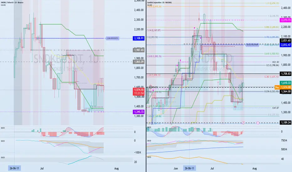
A comparison between SNDKB (tokenized stock) and SNDK (underlying stock) reveals an interesting dynamic.
Since crypto markets operate 24/7 and support fractional trading, the tokenized version can display short-term price behavior that differs from the underlying stock.
However, because the token ultimately tracks the real equity, its price action is likely to gravitate toward the underlying stock's valuation, especially during U.S. market hours.
Although extended-hours trading has expanded in traditional markets, it still cannot fully match crypto's continuous 24/7 liquidity.
Now consider the following question:
If dividends were excluded from the equation, where would you prefer to trade?
The crypto market offers 24/7 access, global participation, and fractional ownership.
Traditional stock markets provide dividends, shareholder rights, and direct ownership structures.
As more equities become tokenized, one of crypto's biggest historical risks—limited access to regulated assets—continues to decline.
This development may ultimately strengthen the long-term growth potential of the broader crypto ecosystem.
For example, buying shares of SNDK in the stock market may require a larger amount of capital.
In contrast, a tokenized version allows investors to gain exposure with significantly smaller allocations.
-------------------------------------
SNDK Technical Outlook
The key support zone currently lies between 1,564 and 1,708.83.
This area will likely determine the next major move.
If buyers successfully defend this range and liquidity begins to accumulate, a bullish continuation scenario remains valid.
However, a breakdown below support could open the door for a deeper correction toward the 1,115 region.
For now, the ideal scenario would be consolidation within the current range while attracting fresh buying interest.
It's important to note that SNDK has not yet confirmed a long-term bottom.
Therefore, monitoring price action around this support zone remains critical.
-------------------------------------
Thanks for reading.
Markets evolve.
Narratives change.
Liquidity rotates.
The traders who adapt are the traders who survive.
Wishing everyone successful trades and a profitable journey ahead.
Trend Reversal Level: 67,720.67
Hello Traders,
Follow for more market insights and technical analysis updates.
Wishing everyone a profitable trading day.
-------------------------------------
BTC is currently holding above the 1D HA-Low support level at 62,793.20 and continues to show signs of a potential recovery. As long as this support remains intact, the probability of maintaining the broader bullish structure continues to increase.
However, StochRSI is still pointing lower, suggesting that momentum has not fully shifted back in favor of the bulls. Confirmation of a bullish reversal in the indicator would strengthen the case for further upside.
Meanwhile, OBV has failed to break above its High Line and is showing weakness, indicating that buying pressure is still lacking. For this reason, it's important to monitor where fresh demand steps in and whether support can continue to hold.
From a higher-timeframe perspective, the key supply/resistance zone remains at 69,000 ~ 73,499.86.
For active traders, however, the real trigger level is 67,720.67. A breakout above this level followed by a successful retest and hold as support would be a strong indication that the market has transitioned back into a bullish trend.
The key question is whether BTC can continue consolidating above 62,793.20 into the next expected volatility window around July 29, building enough momentum for a breakout attempt above 67,720.67.
✅ Key Levels
• Major Support: 62,793.20
• Bullish Trend Reversal Confirmation: Break and hold above 67,720.67
• Major Resistance/Supply Zone: 69,000 ~ 73,499.86
• Indicators to Watch:
- StochRSI bullish reversal
- OBV showing renewed buying pressure
• Expected Volatility Window: Around July 29
-----
Thanks for reading.
Wishing all traders successful trades and solid risk management. 🚀
-------------------------------------------
Build Your Trading Plan Before Entering the Market
Hello traders,
If you enjoy this analysis, make sure to follow for more market insights and trading strategies.
Wishing everyone green candles and profitable trades. 🚀
---------------------------------
One question always comes up in trading:
✅ Which coin should I trade?
✅ What criteria should I use to select a coin?
At the end of the day, consistent profits come not from perfect chart analysis alone, but from having a solid trading plan and sticking to it.
Before entering any position, you should define three key elements:
1. Investment timeframe (Scalp / Day Trade / Swing / Long-Term)
2. Position sizing
3. Entry and profit-taking strategy
---------------------------------
📌 How to Choose the Right Coin
Fundamentals, utility, and project development are important.
However, what actually moves the price is capital flow and market participation.
That's why understanding where the price is positioned within the larger market structure is often more important than knowing every project detail.
By analyzing the chart, we can determine whether market participants still have confidence in a project.
For example, after a major decline, if a coin is able to establish a base and avoid making new ATL (All-Time Low) levels, it could indicate that selling pressure is gradually being absorbed and investors are still accumulating.
Looking at LINKUSDT as an example:
▶ 4.976 ~ 6.870 Zone
If price holds this support range and shows a clear reaction, the probability of a bullish trend reversal increases significantly.
Therefore, identifying these accumulation zones and waiting for confirmation can provide high-probability trading opportunities.
Newly listed tokens are slightly different.
Following their first major correction, it is common for them to revisit or even create a new ATL once or twice before establishing a long-term bottom.
Risk management remains critical.
---------------------------------
📌 Capital Management
Every trader has a different account size, but one rule applies to everyone:
Always keep at least 20% of your portfolio in cash or stablecoins.
This reserve capital can be used for:
✔ Buying major dips
✔ Taking advantage of new opportunities
✔ Lowering your average entry price
✔ Managing existing positions
If this reserve capital is deployed, make sure to rebuild your cash position as soon as possible.
Running out of liquidity often leads to emotional decisions, FOMO entries, and poor risk management.
---------------------------------
📌 Plan Your Entries and Exits Before Opening a Position
Trading is like a voyage.
A captain doesn't leave the harbor without knowing the destination.
Likewise, traders should determine beforehand:
✔ Where to accumulate
✔ Where to scale out
✔ Where to take profits
A trading plan should be established before entering the market and maintained throughout the life of the trade.
Market volatility is something to react to, not a reason to abandon your strategy.
A temporary pullback shouldn't change the long-term thesis unless the original premise becomes invalid.
---------------------------------
📌 Think Carefully Before Closing 100% of a Position
Whenever possible, avoid fully exiting your position before your primary target is reached.
A full exit means the trade is officially over.
After that, many traders end up chasing price action and re-entering without a clear plan.
If you decide to sell 100% of your position, there should be a strong and objective reason behind that decision.
If the sale was purely emotional, it is often best not to look back at that chart.
---------------------------------
📌 Current LINK Trading Perspective
From a macro market structure perspective,
▶ 4.976 ~ 6.870
remains a major demand zone.
If price finds support and begins showing bullish confirmation within that area, the probability of a trend reversal increases.
For swing traders and long-term investors, this would be a key accumulation area.
Most importantly:
Do not place blind limit orders.
Wait for support confirmation and evidence of a bullish reaction before entering.
---------------------------------
Currently, price is trading near the
▶ HA-Low Zone
Therefore, traders should monitor the
▶ 8.250 ~ 8.382 Range
for support confirmation.
If buyers successfully defend this area, it could provide an attractive long opportunity.
On the upside,
▶ HA-High
▶ DOM (60)
should be considered potential profit-taking zones.
This aligns with a basic trading framework:
✅ Buy between DOM(-60) and HA-Low
✅ Take profits between HA-High and DOM(60)
However, this should be viewed as a tactical execution strategy rather than the overall investment thesis.
---------------------------------
📌 Profit-Taking Strategies
There are generally two ways to take profits:
① Realize profits in cash.
② Sell enough to recover your original investment while keeping the remaining tokens as a "free position."
For swing and long-term traders, the second method can be extremely powerful.
Let's say price moves significantly higher.
Instead of fully exiting, you sell enough to recover your initial capital.
As a result:
✔ Original capital is secured
✔ Remaining tokens become pure profit
The remaining position effectively has a zero cost basis.
This creates a strong psychological advantage, allowing you to hold through volatility with far less stress.
For long-term crypto investing, this can be one of the most effective profit-taking methods.
---------------------------------
📌 Key Trend Reversal Level
A major bullish trend is more likely to begin if price can break above and hold:
▶ 11.064
Therefore, the final major accumulation opportunity can be viewed around this level.
---------------------------------
📌 Primary Target Zone
From a higher timeframe perspective, the expected target range remains:
▶ 20.111 ~ 25.782
Any price movement beyond this area should be treated as an overextension or bonus-profit zone.
Therefore:
▶ 4.976 ~ 11.064
should be considered the primary accumulation range.
Once your core position has been built, shorter-term trading strategies such as day trading or swing trading can be used to generate additional gains while maintaining the core position.
---------------------------------
📌 Track Your Core Average Entry Price Separately
After completing your core accumulation phase, record your actual average entry price separately.
Why?
Because repeated short-term trades will alter the average cost displayed by the exchange.
Although your core position may remain unchanged, exchange-reported averages can become distorted.
This can significantly affect trading psychology.
For that reason, it is highly recommended to track:
✅ Core Position Average Price
✅ Trading Position Average Price
as separate metrics.
---------------------------------
📌 Final Thoughts
Great chart analysis alone does not guarantee profits.
Without a clear strategy and proper execution, even the best market analysis can fail to produce consistent results.
The real question is not:
"What should I buy?"
The real question is:
"How will I manage the trade after I buy?"
Create your big-picture trading plan before entering the market.
Stay disciplined during volatility.
Trust the process.
In the long run, a well-executed strategy will always outperform emotional decision-making.
---------------------------------
Thank you for reading.
Wishing everyone disciplined risk management, successful trades, and many green candles ahead. 🚀📈
DYOR. Manage risk. Trade responsibly.
---------------------------------
0.3208–0.3242 Support Will Likely Determine the Short-Term Trend
Hello traders,
Follow for more market updates and trading insights.
Hope you all have a great trading day.
-------------------------------------
TRX is currently trading at a key technical area where multiple support and resistance levels overlap. The most important support zone is 0.3208–0.3242.
As long as this zone holds and buyers step in, higher targets remain on the table.
🎯 Key Upside Targets
1st Resistance: 0.3410–0.3445
2nd Resistance: 0.3657–0.3756
The main bullish signal will be whether price can break above and establish support within these resistance zones.
📉 Levels to Watch if Support Fails
If the 0.3208–0.3242 support zone breaks down, the next support areas become important.
1st Support: 0.3080
2nd Support: 1M Chart M-Signal
A breakdown below the 1M chart M-Signal could significantly increase the probability of a medium-to-long-term bearish trend reversal, making risk management essential.
📊 Indicator Analysis
At the moment, the market can be interpreted as being in a short-term consolidation phase, either moving sideways or building a base.
- StochRSI: Entering oversold territory
- OBV: Positioned between the Low Line and High Line
- BSSC: Below the zero line
Key conditions to monitor:
✅ StochRSI forms a bullish golden cross from the oversold zone
✅ OBV breaks above the High Line
✅ BSSC recovers above 0 and maintains strength
If these conditions are met, the probability of a bullish trend reversal increases considerably.
💡 Buying Strategy
The 1D HA-Low has already risen to around the 0.3208 area. If support is confirmed here, a long-biased approach can be considered.
However, if price falls below the HA-Low, a staircase-style decline may develop. For that reason, scaling into positions remains important.
Under current conditions, gradually accumulating down to 0.3080 appears reasonable. Below that level, additional entries should be considered only after confirming a trend reversal signal.
📌 Selling Strategy
The HA-High and DOM(60) zones can be regarded as short-term take-profit areas.
- Consider scaling out in these zones
- A breakout may lead to a staircase-style advance
- Continue taking partial profits as price moves higher
Every uptrend eventually experiences a correction, so locking in profits along the way is an essential part of risk management.
💰 Medium- to Long-Term Investment Perspective
For investors holding TRX over the longer term, a principal-recovery strategy may be effective.
Selling enough to recover your initial investment and letting the remaining position run can help reduce psychological pressure while maintaining exposure to potential upside.
🌐 TRX Market Assessment
In my view, TRX is better suited for active strategic trading than a pure long-term hold.
That said, several factors remain constructive:
- Ongoing demand for stablecoins within the TRON ecosystem
- Expansion efforts into the U.S. market
- Consistent network usage and activity
TRX is particularly sensitive to stablecoin circulation metrics and often shows price action that differs from Bitcoin.
Therefore, traders should not rely solely on BTC's direction. Monitoring TRX-specific flows, on-chain activity, and capital rotation is equally important.
Overall, compared with many altcoins trading near or below their listing prices, TRX still appears relatively attractive from an investment standpoint.
The key level remains 0.3208–0.3242.
If this support zone holds, the probability of testing higher resistance levels remains open.
-----
Thank you for reading.
Wishing everyone successful trades and strong risk management.
Key Supply Zone: 0.1679 ~ 0.1973
Hello, traders.
Follow for more ADA analysis, trade setups, and crypto market insights.
--------------------------------------------------
📈 ADA Monthly Chart (1M) Outlook
ADA is currently trading at a critical price zone that could determine whether a long-term trend reversal is underway.
The 0.1679 ~ 0.1973 range is a major supply zone where a strong bullish rally previously began after a successful breakout.
Going forward, the most important factor is whether ADA can break above this range and flip it into support.
On the other hand, as long as price remains below 0.1679, ADA is still considered to be trading within a long-term accumulation/investment zone. This means aggressive FOMO entries should be avoided, and a more patient approach is recommended.
--------------------------------------------------
📊 ADA Trading Strategy
In conclusion, the ideal trading opportunity for ADA comes when the market confirms support within the 0.1679 ~ 0.1973 range.
A key high-volume node (Volume Profile) is located around 0.1813.
Therefore, a bullish setup becomes more valid only after ADA establishes acceptance above 0.1813 and successfully confirms it as support.
At the moment, however, a full trend reversal has not been confirmed yet.
A stronger bullish trend is more likely to develop once the monthly (1M) candle breaks above the upper M-Signal level and sustains price action above it.
Until then, short-term trading and active day-trading strategies may offer better opportunities than longer swing positions.
--------------------------------------------------
🟢 Bullish Entry Checkpoints
The HA-Low zone stretches from 0.1456 on the 1D chart up to 0.1971 on the 1W chart.
If ADA confirms support within this area, traders can consider scaling into positions through staggered entries.
A successful support flip above 0.1813 would provide an even stronger bullish entry signal.
--------------------------------------------------
🚀 Conditions for Trend Continuation
For ADA to maintain bullish momentum after breaking key resistance levels, the following conditions should be met:
① StochRSI
- Must continue trending higher without becoming excessively overbought.
② OBV (On-Balance Volume)
- Must remain above the High Line with sustained volume inflows.
③ BSSC
- Must stay above the zero line, confirming trend strength.
If these conditions are met, ADA could have a higher probability of extending its rally after breaking above 0.1973.
--------------------------------------------------
💡 Trading Perspective
The market never moves exactly according to anyone's prediction.
Blindly buying based on someone else's outlook is extremely risky.
The goal is not to predict the market, but to identify tradable zones and wait for actual confirmation from price action.
Avoid FOMO entries and focus on high-probability setups. That's how traders protect their capital over the long run.
--------------------------------------------------
🎯 Mid-to-Long-Term Investment Strategy
For investors looking to hold ADA over the medium to long term, continuously injecting new capital simply to increase position size may not be the most efficient approach.
Instead, consider using trading profits to accumulate additional ADA.
One effective strategy is to scale in based on average entry prices, then partially take profit during rallies by withdrawing the principal amount and leaving only profit-generated holdings in the market.
This allows investors to gradually increase their ADA holdings while managing risk more effectively.
--------------------------------------------------
Always wait for the chart to confirm your setup before entering and let the market signals guide your decisions.
-----
Wishing you successful trading and profitable investments. 🚀
-----------------------------------------------
Whether 551.55 Can Be Flipped Into Support After Breakout
Hello traders,
Follow me to stay updated with the latest market insights.
Wishing everyone a profitable trading day.
────────────────────
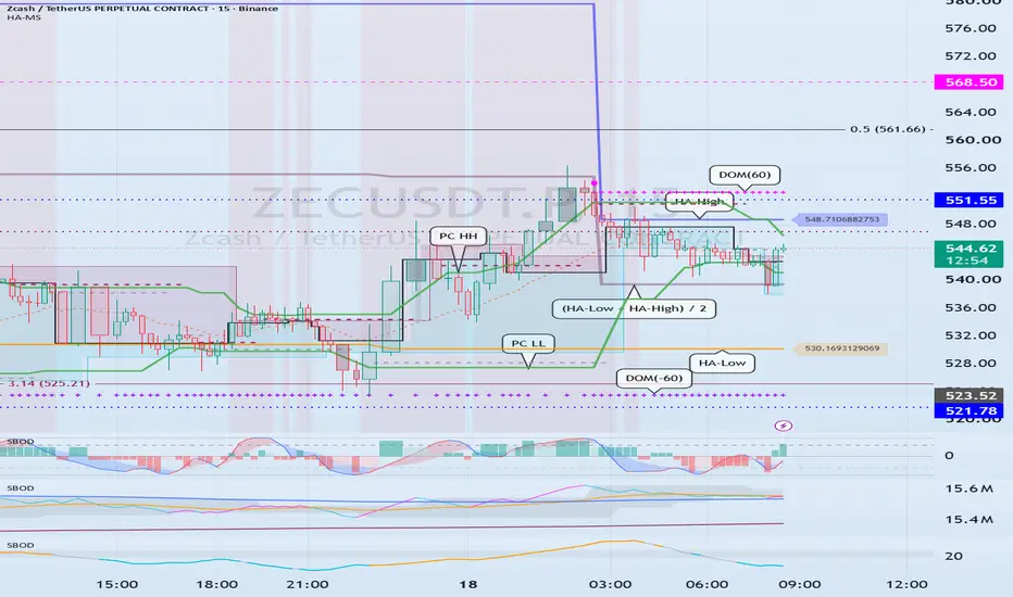
The current price is trading near the HA-High indicator, making this a short-term resistance zone where a rejection is possible.
However, if price breaks above this area and successfully flips 551.55 into support, the next upside target is 663.91.
A sustained move and acceptance above 663.91 would significantly increase the probability of a stair-step bullish trend developing.
────────────────────
📈 Conditions Required for Trend Continuation
1. StochRSI must maintain bullish momentum.
2. OBV must remain in an uptrend.
3. BSSC must stay above the zero line.
Most importantly, volume is the key factor.
For that reason, traders should closely monitor the position of OBV.
If OBV remains between the Low Line and High Line, it suggests a balance between buying and selling pressure, indicating a consolidation phase with the potential for increased volatility.
If OBV breaks above the High Line and holds there, it signals strong buying pressure entering the market, increasing the likelihood of a bullish trend continuation.
Conversely, if OBV falls below the Low Line, selling pressure gains control and the probability of a bearish trend increases.
Combining OBV analysis with StochRSI can provide a much clearer picture of potential price direction.
Currently, StochRSI is rolling over from the overbought region and moving lower.
This suggests that the current rally may face some limitations in the near term.
To overcome this resistance and continue higher, OBV must break above the High Line and maintain that position.
Ultimately, the most important factor right now is whether price can break above 551.55 and successfully establish it as support.
If the breakout fails, traders should watch whether price can find support near 521.78, where a new HA-High zone may form.
────────────────────
📊 Short-Term Outlook (15-Minute Chart)
Based on the daily timeframe analysis, short-term trading opportunities can be identified on the 15-minute chart.
The key takeaway from the daily chart is that if 551.55 cannot be flipped into support, the market is likely to revisit the 521.78 area.
Currently, price is declining between the HA-High and DOM(60) zones.
This places the immediate resistance range at:
🔹 548.71 – 552.65
A breakout above this range could trigger the formation of a stair-step bullish trend.
On the other hand, if price is rejected around 539.44, the midpoint between HA-Low and HA-High, it is likely to retest the DOM(-60) to HA-Low support zone.
📍 Key Support Zone
🔹 523.52 – 530.17
A breakdown below this zone would increase the probability of a stair-step bearish trend continuation.
────────────────────
📉 Indicator Summary
① StochRSI
StochRSI is currently attempting to enter the oversold region.
As a result, while downside pressure remains, additional downside may become increasingly limited.
② OBV
OBV is showing signs of moving below the Low Line.
This indicates growing selling pressure and increases the likelihood of bearish price action.
③ BSSC
BSSC is currently below the zero line.
Therefore, the broader trend still favors the bears.
When combining these three indicators, the current market environment leans slightly more bearish than bullish.
As such, traders should pay close attention to whether support emerges around 539.44.
────────────────────
🔍 PC LL Perspective
The PC LL line has currently disappeared.
If a new PC LL forms during a support test around 539.44, the probability of a bullish trend reversal will increase substantially.
However, if no new PC LL is formed, the current bounce should be viewed as a relief rally within the existing downtrend rather than a genuine trend reversal.
────────────────────
🎯 Trading Plan
🟢 Long Setup
• Scale into longs between DOM(-60) and HA-Low.
• Scale out between HA-High and DOM(60).
🔴 Short Setup
• Scale into shorts between HA-High and DOM(60).
• Scale out between DOM(-60) and HA-Low.
At the moment, the two most critical levels to monitor are:
✅ Whether 539.44 holds as support
✅ Whether 551.55 can be broken and reclaimed as support
In particular, traders should closely monitor whether OBV can move above the High Line alongside increasing volume.
────────────────────
Thank you for reading.
Trade safe and good luck. 🚀
Key Level to Watch: 1,782.28 Support
Hello, traders.
Follow for faster market updates and trading insights.
Wishing everyone a profitable trading day.
-------------------------------------
ETH is expected to remain in a volatility phase through July 18.
The next major volatility window is projected around August 12.
However, BTC's next key volatility period is expected around July 29, making it important to monitor whether the broader market establishes a clear direction at that time.
📉 Short-Term ETH Outlook
ETH recently faced rejection around 1,879.61 and appears to be forming a local top in the short term.
The most important level right now is the 1,782.28 support zone.
▶ If 1,782.28 Holds
- Potential for a relief rally
- Chance of trend continuation to the upside
- Watch for renewed buying pressure
▶ If 1,782.28 Breaks
- Increased probability of a move toward 1,666.58
- Risk management becomes critical
- A deeper correction cannot be ruled out
The 1,666.58–1,782.28 range remains a key accumulation zone and a potential value-buy area.
Rather than focusing solely on the decline itself, traders should watch for signs of a bottoming structure and a successful support reclaim before considering new long entries.
📈 Bullish Reversal Criteria
For ETH to regain a stronger bullish structure, price needs to break above and hold within the 1,964.96–2,111.42 range.
Additional confirmation signals include:
✅ StochRSI
- Maintaining upward momentum without entering extreme overbought territory
✅ OBV (On-Balance Volume)
- Holding above the High Line
- Showing continued volume-backed buying pressure
✅ BSSC
- Remaining above the zero line
- Confirming positive market momentum
If these conditions are met, ETH could have a higher probability of extending its bullish trend.
Therefore, it will be important to monitor whether ETH begins showing a meaningful trend reversal attempt ahead of BTC's volatility window around July 29.
📊 Mid-to-Long-Term Outlook
The 1,164.99–1,440.00 range remains a major long-term accumulation and demand zone.
This area is considered a critical support region that must hold to maintain the broader bullish market structure.
-------------------------------------
📌 Key Levels Summary
🔹 Major Support: 1,782.28
🔹 If Support Fails: Potential move to 1,666.58
🔹 Accumulation Zone: 1,666.58–1,782.28
🔹 Bullish Reversal Zone: 1,964.96–2,111.42
🔹 BTC Volatility Watch: Around July 29
🔹 Long-Term Support Zone: 1,164.99–1,440.00
---------
Thank you for reading.
Wishing all traders successful trades and solid risk management. 🚀
-----------------------------------
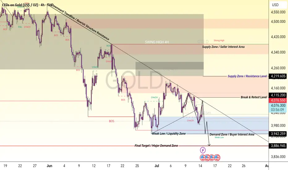
Gold 4H Market Structure Analysis | Bearish Trendline & Key zoneXAU/USD 4H Smart Money Concept Detailed Candle-by-Candle Analysis
Gold 4H chart is showing a complete market structure transition where every candle reflects the battle between buyers and sellers. The price started from higher levels with strong selling pressure after reaching the premium supply area. The early candles created rejection wicks, showing that sellers were defending the upper zone and preventing further upside continuation.
After the rejection from the high area, bearish candles started forming lower highs and lower lows. This sequence confirmed that sellers were gaining control. The first major Break of Structure (BOS) occurred when price broke previous swing lows, indicating a shift from bullish momentum into a bearish structure.
During the downward move, candles continued respecting the descending trendline, which acted as dynamic resistance. Each pullback candle toward this trendline showed weak buying strength, while rejection candles confirmed continuous seller interest. This created a clear bearish channel where smart money continued distributing positions.
After reaching the lower range, price formed a temporary recovery phase. Green bullish candles appeared as buyers entered from the demand area, creating a short-term Change of Character (CHoCH). However, the recovery failed to break the major supply zone, showing that buyers were not strong enough to reverse the overall trend.
The candles near the Supply Zone / Resistance Area showed hesitation and rejection. Multiple small-bodied candles indicated uncertainty, while bearish engulfing movements confirmed that sellers were still active. This area became a key reaction point for future price movement.
The next sequence of candles created another bearish leg, breaking previous support levels and confirming continuation of the downtrend. The strong bearish candles represented aggressive selling pressure, while small retracement candles showed weak attempts from buyers to regain control.
Near the Weak Low / Liquidity Zone, candles started moving sideways, indicating accumulation and liquidity building. The market created equal or nearby lows where stop liquidity may be resting. Smart money often targets these liquidity areas before making the next directional move.
The latest candles are showing reaction from the Demand Zone / Buyer Interest Area. Buyers are attempting to defend this region, but confirmation is required through a strong CHoCH or BOS before considering a complete reversal.
If price breaks below the demand zone, bearish continuation can target the Final Target / Major Demand Zone where stronger buying interest may appear. If buyers successfully defend the zone and break above resistance levels, price can move toward higher supply areas.
Complete Market Story:
Higher Timeframe: Bearish structure remains active.
Trendline: Sellers are controlling momentum below resistance.
Supply Zone: Main selling area and rejection point.
BOS: Confirms seller dominance.
Demand Zone: Buyer reaction area.
Liquidity Zone: Possible stop hunt area before next move.
Final Demand: Major area where institutional buyers may react.
This chart demonstrates Smart Money Concept analysis using market structure, liquidity, supply & demand, BOS, CHoCH, and trendline reactions to understand institutional price movement. Always wait for confirmation before entering any trade.  Short
Short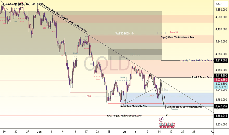
Low-Volume Node (LVN) : 145.30 ~ 154.60
Hello traders!
If you "Follow" us, you can always get new information quickly.
Have a nice day today.
-------------------------------------
Since this chart is still relatively new, the support and resistance levels marked on it have not been fully validated by price action yet. Therefore, extra caution is required when trading.
Based on the price action so far, I believe that any price below 168.35 is likely to fall within a medium-to-long-term accumulation zone.
A Low-Volume Node (LVN) has formed between 145.30 and 154.60 on the Volume Profile.
As a result, the key question is whether price can reclaim and hold support within the 145.30–154.60 range.
If the current downtrend continues, we should monitor the following Fibonacci extension levels for potential support:
1st target: Fibonacci Extension 1.618 (127.42)
2nd target: Fibonacci Extension 2.618 (102.41)
Support confirmation around these areas will be important.
As more time passes and additional price and volume data accumulate, indicators are gradually starting to form.
The first indicator to appear is the PC HH indicator.
Therefore, the short-term top is likely to be around the PC HH level at 198.98.
Since the PC LL indicator has not yet formed, the short-term bottom remains undefined and volatility is still relatively high.
In addition, the OBV indicator has established both a Low Line and a High Line. Therefore, we need to see whether OBV can move back above its Low Line and continue building bullish momentum.
Ideally, traders should wait until OBV returns above the Low Line and then confirm support at nearby support/resistance levels before entering positions.
If support is confirmed, that would be an appropriate short-term buying opportunity.
Since neither the HA-Low nor HA-High indicators—which form the foundation of my trading system—have appeared on the higher timeframe chart yet, I believe it is still too early for aggressive position trading.
---
Until then, trading should primarily be based on lower timeframes (1D and below), focusing on short-term/day trading opportunities.
On the 15-minute chart, both the HA-Low and HA-High indicators have already formed, providing useful trading signals.
A basic trading strategy would be:
- Buy when price finds support around the HA-Low or DOM(-60) levels.
- Take profit when price reaches the DOM(60) or HA-High levels.
It is always better to trade using objective market data.
Trying to predict price movements based on news, narratives, market rumors, external indexes, or unrelated market events is generally not a good approach.
At the end of the day, successful trading comes down to understanding how price and volume are actually behaving in the asset you are trading.
---
In my opinion, relying solely on traditional volume indicators is highly inefficient because they are often difficult to interpret correctly.
Instead, I prefer using indicators that incorporate actual volume flow more effectively, such as:
- OBV (On-Balance Volume)
- Volume Candles
Volume Candles provide a much clearer visual representation of whether current trading volume is stronger or weaker compared to previous periods.
In that sense, they are significantly more efficient than traditional volume bars.
One drawback of Volume Candles is that trendlines do not display very well on them.
Therefore, if you rely on trendline analysis, it is better to switch back to a standard candlestick chart when drawing or monitoring trendlines.
Personally, I rarely use trendlines because my core trading strategy revolves around the HA-Low and HA-High indicators.
When an HA-Low appears, it suggests that the market is attempting a bullish reversal and may be forming a bottom.
Therefore, if price successfully holds support near the HA-Low level, it can be considered a buying opportunity.
Conversely, when an HA-High appears, it suggests that the market may be preparing for a bearish reversal and could be forming a local top.
Therefore, if price encounters resistance near the HA-High level, it can be considered a selling opportunity.
If price remains somewhere between HA-Low and HA-High, then market direction should simply be interpreted based on ongoing price action.
I refer to a move below HA-Low as a "stair-step downtrend" and a move above HA-High as a "stair-step uptrend."
A stair-step downtrend eventually forms a bottom and transitions into an uptrend.
Likewise, a stair-step uptrend eventually forms a top and transitions into a downtrend.
Therefore, the primary strategy is:
- Build core positions around HA-Low levels.
- Gradually distribute those core positions during stair-step uptrends.
All other market conditions can be traded using a short-term/day trading approach.
For example, after building a core position near an HA-Low level, simply holding through the entire move often means that you will end up selling most or all of that position once price reaches an HA-High level.
Depending on market conditions, you may choose to take partial profits instead.
If price continues to rally afterward and develops into a strong stair-step uptrend, you may regret having sold.
However, that sale was still a well-executed trade because it followed a predefined trading plan.
This is why it is important to separate your core position from your active trading position.
While holding your core position, you should continue day trading around it to generate additional profits and potentially increase your overall coin holdings.
In that sense, traders should move away from focusing solely on their average entry price.
Instead, each purchase price should be managed independently.
When you trade based on individual entry prices, the average entry price displayed by the exchange becomes far less important.
Even if frequent trading causes your exchange-reported average cost to move closer to the current market price, there is no reason to feel pressured by it.
For that reason, I strongly recommend keeping a separate record of your true core-position average entry price.
---
Thank you for taking the time to read through this analysis.
Wishing you all successful trades and profitable opportunities ahead.
Explain charts only with objective information
Hello?
Hello traders!
If you "Follow" us, you can always get new information quickly.
Have a nice day today.
-------------------------------------
The reason for using the chart as an indicator is to maintain the objectivity of the explanation.
This is because objective information about why something was explained that way can be useful when passed on to others.
Indicators only provide objective information, but how to use them to explain is up to the explainer.
In that sense, I am trying to objectively explain objective information.
If the HA-Low indicator and the DOM(-60) indicator meet and receive support, it is time to buy.
The reason is that the HA-Low indicator and the DOM(-60) indicator appear in the low range.
In other words, it is an indicator that is created when the price shows signs of turning from falling to rising, so this is the time to focus on finding the right time to trade.
The HA-Low indicator appears when certain conditions are met when the Haikinashi candle shows signs of an upward turn.
If the HA-Low indicator forms a horizontal line after it is created, the horizontal line acts as support and resistance.
The DOM(-60) indicator is a comprehensive evaluation of the DMI indicator + OBV indicator + MOMENTUM indicator.
Therefore, the DOM(-60) indicator appears at the point where the upward transition begins (Close).
Therefore, it is not easy to proceed with trading immediately when the actual DOM(-60) indicator is generated.
As mentioned above, the HA-Low indicator is an indicator that appears only when the conditions on the Hikinashi chart are met, so the creation of the HA-Low indicator means that it is a point corresponding to the average value of the low point.
Therefore, in most cases, the HA-Low indicator is created after the DOM(-60) indicator is created.
So, it can be said that it is time to buy when it shows support in the DOM(-60) ~ HA-Low range.
-
The reason for using the Price Channel indicator is that when the Price Channel indicator forms a horizontal line, it can be used as support and resistance points.
By changing the formula of the existing Price Channel indicator, the Price Channel indicator is not created when volatility occurs at high or low points.
Therefore, if the Price Channel HH indicator disappears and then reappears, you should interpret that there is a possibility of resistance at that point and think about how to respond.
The Price Channel HH indicator was created until July 9th, then disappeared, and was created on July 12th, showing a diagonal line.
Therefore, we need to see if we can find support around the 63925.82 point.
However, since the Price Channel HH indicator was created, there is a high possibility that it will face resistance and fall, so you need to think about a response plan.
Looking at the 15m chart, the HA-Low indicator is formed around the 63925.82 point, so if it is supported and rises around this point, it is likely to basically lead to an attempt to rise near the HA-High indicator.
What you need to think about here is that in order to continue the upward trend at an important point or section, the following conditions must be met.
1. The StochRSI indicator must show an upward trend without entering the overbought zone.
2. The OBV indicator must remain above the High Line.
3. The BSSC indicator must remain above the 0 point.
Therefore, if the 63925.82 point is an important point, the above conditions must be met to continue the upward trend at this point.
The above does not include the author's subjective thoughts.
Although the indicators were explained as is, I think the chart analysis and interpretation were carried out naturally.
When analyzing or interpreting a chart like this, you should not try to explain it by including your subjective thoughts.
In that case, there is a possibility that the person who will listen to the explanation may misinterpret it when analyzing and explaining the chart to another person, and the analysis and explanation will ultimately reduce the credibility of the person who first explained the chart analysis.
Therefore, when analyzing and interpreting charts to others, you must exclude your own subjective thoughts based on the most objective information.
Usually, when analyzing or interpreting a chart, the conclusion section mentions an article or issue about that coin (token) or item and the subjective thoughts that interpret it, thereby reducing the weight of the aforementioned chart analysis or interpretation, and ultimately only highlighting what was said in the conclusion section, which often causes others to misunderstand.
-
When publishing an idea on TradingView, the main text uses objective information from the chart to analyze the chart and provide commentary.
Also, I think it would be a good idea to attach it as an Add Note and describe your subjective content.
Then, when other people see your ideas, I think there will be less chance of misunderstanding.
-
Thank you for reading until the end.
I wish you a successful transaction.
--------------------------------------------------
 Education