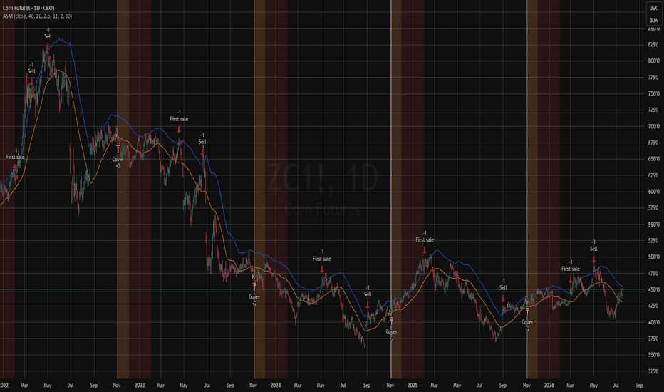
TASC 2026.08 An Ag Selling Model█ OVERVIEW
This strategy implements the "Ag Selling Model" as presented by Perry J. Kaufman in the August 2026 edition of the TASC Traders' Tips "Identifying The Best Price Levels For Selling Commodity Futures". The article describes a long-hold selling strategy for agricultural commodity futures based around the seasonal harvest timing of crops, mainly US grains traded on the CBOT and KCBOT, both which have been acquired by CME.
█ CONCEPTS
This model was originally presented in 1978 by the author to a group of commodity producers as an attempt to identify the best price levels to sell their products.
The core idea is that if there is only one crop per year, crop prices will be lowest around harvest and highest around peak growing season. Based on this timing, the strategy spaces out its sell orders up to three times throughout the year, and covers its position at harvest.
The goal of this strategy is simply to beat the average price. Since selling at harvest should typically provide a lower-than-average price exit, success for this strategy means having the average of its entries above the average price.
The level to sell at can be determined by finding a moving average that reflects seasonal changes. Once found, we measure volatility using Average True Range (ATR).
With these two figures, the volatility is added to the average based on a multiplication factor.
This creates a reasonable extreme at which to position short entries.
█ THE RULES
Sell short at the selling level.
Delay these sells to ensure two sells are not in the same rally.
Avoid selling immediately after harvest, as a long period of low prices typically follows.
Exit positions (cover shorts) at harvest.
▌Properties
IMPORTANT NOTE: The strategy parameters have been adjusted specifically for Corn Futures (ZC1!). This ticker operates in Cents (USX) rather than Dollars (USD); all the strategy values have been translated to account for this. To apply this strategy to other markets it is important to properly adjust the strategy parameters to simulate realistic conditions.
Initial Capital : 15,000,000¢ == $150,000; see note above.
Position Sizing : This strategy sells in one-contract increments up to three times per year.
Commissions : Commission value is set to 300¢ ($3) per order, which is a generous estimate.
Slippage : Slippage is set to one tick to simulate reasonable execution conditions.
█ INPUTS
Source : Source for calculations.
MA length : Moving Average length (Simple Moving Average). A 20 to 60 day range is recommended; with 40 as a starting point.
ATR length : Average True Range length.
ATR factor : Factor by which to multiply ATR when calculating selling level. 2.5 to 3.5 is generally recommended but higher has been seen for more volatile grains.
Month of Harvest : Set the month of harvest for the crop being traded, which changes depending on the seasonality of the commodity.
Delay in months after harvest : Set this to the typical downtime after harvest where prices are typically lowest. This can vary per instrument but 2 months is the suggested point for tuning.
Days between trades : Days to wait between sales.
ストラテジー
Uptrick: Flow Expansion TrendIntroduction
Uptrick: Flow Expansion Trend (FET) is an overlay tool built around an efficiency-adaptive midline that speeds up or slows down based on how directional recent price movement has been. The midline is paired with a volatility-based signal boundary and a minimum flow-strength filter to determine confirmed trend flips, and the script includes a market-state read that classifies current conditions as directional, developing, or compressed. Signal labels can be anchored to price highs and lows, a fixed ATR distance from price, or the midline itself.
Originality
This script's core is an efficiency ratio, calculated as the net price movement over a lookback divided by the sum of all bar-to-bar movement over that same lookback, which produces a value between 0 and 1 describing how directional versus choppy the recent path has been. Rather than using this ratio as a standalone oscillator, it is fed into the smoothing constant of the midline itself, so the midline's responsiveness continuously adjusts between a fast and slow smoothing constant based on current market efficiency. This is what separates the midline from a standard moving average, since it does not use a fixed lookback response but instead reshapes itself with the character of the move.
The signal boundary distance around the midline is also adaptive: it widens or narrows based on the same efficiency reading, so the distance price must travel to trigger a trend flip contracts in efficient, directional conditions and expands in choppier ones. A trend flip additionally requires a minimum flow-strength threshold, a normalized measure of the midline's own rate of change relative to ATR, so a boundary breach alone is not sufficient to flip the trend without accompanying follow-through in the midline's slope.
Combining an adaptive midline, an adaptive signal boundary, and a flow-strength confirmation filter into a single confirmed-trend mechanism is the original contribution of this script, since each of the three components is derived from the same efficiency and volatility inputs but serves a distinct role in preventing premature or noise-driven flips. The selectable signal anchor further separates the trend calculation from the signal display, letting traders choose whether labels sit at the bar's high/low, a fixed ATR offset from price, or directly on the midline, without altering the underlying trend logic in any way.
Features
Efficiency-adaptive midline that adjusts its smoothing speed based on how directional recent price action has been
Adaptive signal boundary that widens in choppy conditions and narrows in directional conditions
Minimum flow-strength filter required alongside a boundary breach to confirm a trend flip
Confirmed-bar trend state calculation to avoid intrabar repainting of the trend flip
Selectable signal anchor for up and down labels: high/low, fixed ATR distance from price, or midline
Adjustable ATR distance value when the ATR distance anchor is selected
Up and down trend signal labels
Optional candle coloring based on the most recent confirmed signal
Adjustable midline width
On-chart dashboard showing trend, market efficiency percentage, flow strength, market state classification, bars since the last signal, and current signal anchor mode
Four selectable dashboard positions
Four alert conditions: up signal, down signal, any trend signal, and market becoming directional
Inputs
Trend Engine: source, trend length, signal distance multiplier, minimum signal strength threshold.
Signals: show/hide up and down signals, signal anchor mode, signal ATR distance.
Visuals: candle coloring toggle, midline width, show/hide dashboard, dashboard position.
How It Works / How to Use
The script measures how efficiently price has moved over the trend length by comparing net displacement to total path length traveled. This efficiency value continuously reshapes the midline's smoothing speed, so the midline hugs price more closely in strong directional runs and lags more in choppy conditions. An ATR-based boundary is placed around the midline, with its distance also scaled by the same efficiency reading. A trend flip is confirmed only when price closes beyond this boundary on a confirmed bar and the midline's own rate of change exceeds the minimum flow-strength threshold in that direction.
Once a flip is confirmed, the up or down label is placed according to the chosen signal anchor: at the bar's high or low, at a fixed ATR distance beyond price, or directly on the midline. This is purely a display choice and does not affect when or why a trend flip occurs.
Traders can use the midline's slope and color for ongoing directional bias, the up and down signals for confirmed flips, and the dashboard's market-state classification to gauge whether current conditions are more suited to trend-following or more likely to produce choppy, range-bound behavior.
Conclusion
Uptrick: Flow Expansion Trend combines an efficiency-adaptive midline, a matching adaptive signal boundary, and a flow-strength confirmation filter into a single trend-following overlay, giving traders a trend read that reshapes itself with current market conditions rather than relying on a fixed-speed average, with flexible signal placement to suit different charting preferences.
Disclaimer
This script is provided for informational and educational purposes only and does not constitute financial advice. Past performance, whether shown historically or implied through the script's logic, does not guarantee future results. Always perform your own due diligence and risk management before making trading decisions. インジケーター

DNSE VN301!, Donchian Break Out Strategy"Donchian Channel Breakout with SMA Trend Filter" is a trend-following breakout strategy designed to capture sustained price movements while filtering out low-probability signals. The Donchian Channel identifies breakouts by tracking the highest high and lowest low over a specified lookback period, generating potential entry signals when price closes outside the recent trading range. Because breakouts during sideways or low-volatility markets often fail, the strategy incorporates a Simple Moving Average (SMA) as a trend filter.
Long signals are prioritized when the SMA is rising, while Short signals are prioritized when the SMA is falling, ensuring trades align with the prevailing market trend. By combining breakout detection with trend confirmation, the strategy aims to reduce false breakouts and improve overall signal quality.
*By default: each VN Futures contract requires VND 30,000,000 of initial margin. The strategy assumes an initial capital of VND 100,000,000, resulting in a fixed position size of 3 contracts for each trading signal.
To better reflect real-market trading conditions, the backtest incorporates a commission of VND 10,000 per contract and a minimum slippage assumption of 3 ticks on every executed trade.
Settings & Strategy Configuration:
Chart: recommended 15-minute timeframe
Donchian Channel Period: 20
SMA Period: 200
Stop Loss: 10 points
Take Profit: 20 points
SMA Trend Filter: On / Off
Use Take Profit: On / Off
Time Filter: On / Off
Trading Session: 09:00 – 14:30
Trade Direction: Long / Short / Both
Default Script Settings:
The strategy calculates the upper and lower bands of the Donchian Channel using the selected lookback period. A breakout above the upper band may indicate buying pressure, while a breakout below the lower band may indicate selling pressure.
When the SMA(200) trend filter is enabled, the script only allows Long entries when SMA(200) is rising and only allows Short entries when SMA(200) is falling. When the SMA filter is disabled, the strategy can trade both directions based only on Donchian Channel breakout signals.
Entry & Exit Conditions:
Entry Long:
Close Price > Upper Donchian Channel
AND SMA(200) is rising, if the SMA filter is enabled
AND the signal appears within the selected trading session
AND Long trading is allowed by the trade direction setting
Exit Long:
Stop Loss: 10 points from entry price
Take Profit: 20 points from entry price, if enabled
Opposite Donchian breakout signal
Position reversal when a valid Short signal appears
Automatic close at the end of the trading session
Entry Short:
Close Price < Lower Donchian Channel
AND SMA(200) is falling, if the SMA filter is enabled
AND the signal appears within the selected trading session
AND Short trading is allowed by the trade direction setting
Exit Short:
Stop Loss: 10 points from entry price
Take Profit: 20 points from entry price, if enabled
Opposite Donchian breakout signal
Position reversal when a valid Long signal appears
Automatic close at the end of the trading session
Disclaimers:
Trading futures contracts carries a high degree of risk, and price movements can be highly volatile. This script is intended as a reference and research tool only. It should be used by individuals who understand futures trading, have assessed their own risk tolerance, and are knowledgeable about the strategy’s logic.
All investment decisions are the sole responsibility of the user. DNSE bears no liability for any potential losses incurred from applying this strategy in real trading. Past performance does not guarantee future results.
______________________________________________________________________
"Chiến lược Breakout Donchian Channel kết hợp bộ lọc xu hướng SMA" là một chiến lược giao dịch theo xu hướng, được thiết kế nhằm tận dụng các đợt bứt phá giá mạnh đồng thời giảm thiểu các tín hiệu nhiễu. Donchian Channel xác định các điểm breakout bằng cách theo dõi mức giá cao nhất và thấp nhất trong một khoảng thời gian xác định, từ đó tạo tín hiệu khi giá đóng cửa vượt ra khỏi vùng dao động gần nhất. Do các tín hiệu breakout trong giai đoạn thị trường đi ngang hoặc biến động thấp thường có xác suất thất bại cao, chiến lược sử dụng thêm đường trung bình động đơn giản (SMA) làm bộ lọc xu hướng.
Khi đường SMA đang dốc lên, chiến lược ưu tiên các tín hiệu Long; ngược lại, khi SMA dốc xuống, chiến lược ưu tiên các tín hiệu Short, giúp các lệnh giao dịch đi cùng xu hướng chính của thị trường. Bằng cách kết hợp tín hiệu breakout với xác nhận xu hướng, chiến lược hướng tới việc giảm các tín hiệu phá vỡ giả và nâng cao chất lượng giao dịch.
*Theo mặc định, mỗi hợp đồng VN Futures yêu cầu ký quỹ ban đầu là 30.000.000 VNĐ. Chiến lược giả định vốn ban đầu là 100.000.000 VNĐ, tương ứng với quy mô vị thế cố định là 3 hợp đồng cho mỗi tín hiệu giao dịch được tạo ra.
Để phản ánh sát hơn điều kiện giao dịch thực tế, kết quả kiểm định (backtest) được giả định với phí giao dịch là 10.000 VNĐ cho mỗi hợp đồng và độ trượt giá (slippage) tối thiểu là 3 bước giá (ticks) đối với mỗi lệnh được khớp.
Cài đặt & cấu hình chiến lược:
Biểu đồ: khuyến nghị khung 15 phút
Chu kỳ Donchian Channel: 20
Chu kỳ SMA: 200
Cắt lỗ: 10 điểm
Chốt lời: 20 điểm
Bộ lọc xu hướng SMA: Bật / Tắt
Dùng chốt lời: Bật / Tắt
Bộ lọc giờ: Bật / Tắt
Khung giờ giao dịch: 09:00 – 14:30
Chiều giao dịch: Mua / Bán / Cả hai
Cài đặt mặc định của script:
Chiến lược tính toán biên trên và biên dưới của Donchian Channel dựa trên chu kỳ được chọn. Khi giá phá lên biên trên, lực mua có thể đang chiếm ưu thế. Khi giá phá xuống biên dưới, lực bán có thể đang chiếm ưu thế.
Khi bật bộ lọc xu hướng SMA(200), script chỉ cho phép lệnh Mua khi SMA(200) dốc lên và chỉ cho phép lệnh Bán khi SMA(200) dốc xuống. Khi tắt bộ lọc SMA, chiến lược có thể giao dịch cả hai chiều chỉ dựa trên tín hiệu breakout của Donchian Channel.
Điều kiện vào và thoát lệnh:
Vào lệnh Mua:
Giá đóng cửa > Biên trên Donchian Channel
VÀ SMA(200) dốc lên, nếu bật bộ lọc SMA
VÀ tín hiệu xuất hiện trong khung giờ giao dịch
VÀ chiều giao dịch cho phép lệnh Mua
Thoát lệnh Mua:
Cắt lỗ: 10 điểm từ giá vào lệnh
Chốt lời: 20 điểm từ giá vào lệnh, nếu bật
Có tín hiệu breakout ngược chiều
Đảo chiều khi xuất hiện tín hiệu Bán hợp lệ
Tự động đóng lệnh khi hết khung giờ giao dịch
Vào lệnh Bán:
Giá đóng cửa < Biên dưới Donchian Channel
VÀ SMA(200) dốc xuống, nếu bật bộ lọc SMA
VÀ tín hiệu xuất hiện trong khung giờ giao dịch
VÀ chiều giao dịch cho phép lệnh Bán
Thoát lệnh Bán:
Cắt lỗ: 10 điểm từ giá vào lệnh
Chốt lời: 20 điểm từ giá vào lệnh, nếu bật
Có tín hiệu breakout ngược chiều
Đảo chiều khi xuất hiện tín hiệu Mua hợp lệ
Tự động đóng lệnh khi hết khung giờ giao dịch
Tuyên bố rủi ro:
Giao dịch hợp đồng tương lai có mức độ rủi ro cao và giá có thể biến động mạnh. Script này chỉ phục vụ mục đích tham khảo, nghiên cứu và kiểm thử. Người dùng cần hiểu rõ giao dịch phái sinh, khẩu vị rủi ro cá nhân và logic của chiến lược trước khi áp dụng vào giao dịch thực tế.
Mọi quyết định đầu tư thuộc trách nhiệm của người dùng. DNSE không chịu trách nhiệm cho bất kỳ khoản lỗ nào phát sinh từ việc sử dụng chiến lược này trong giao dịch thực tế. Hiệu quả trong quá khứ không đảm bảo kết quả trong tương lai.
ストラテジー

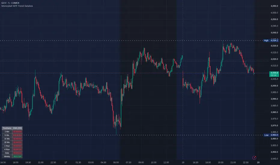
Moneyball MTF Trend Databox [VinnieTheFish]📊 Moneyball MTF Trend Databox
The Moneyball MTF Trend Databox is a powerful, lightweight companion dashboard designed specifically to complement the core Moneyball EMA-MACD indicator ecosystem.
When trading with the Moneyball strategy, keeping track of higher and lower timeframe market structures is vital. Instead of manually flipping through charts, this utility aggregates a comprehensive multi-timeframe (MTF) trend analysis across 8 critical timeframes simultaneously and packs them into a clean, customizable HUD directly on your current chart.
🔍 How It Works
The engine dynamically evaluates the current asset’s trend alignment using a single master trend filter of your choice. A timeframe is marked as BULLISH if the price is trading above your selected Moving Average, and BEARISH if it falls below.
By looking at the dashboard, you can instantly see if your lower-timeframe execution aligns with the higher-timeframe "macro" trend.
⚙️ Key Features:
8 Timeframe Coverage: Scans the 2m, 5m, 15m, 30m, 1h, 4h, Daily, and Weekly intervals concurrently.
4-in-1 Trend Filters: Choose your preferred trend line directly from the settings:
SMA (Simple Moving Average)
EMA (Exponential Moving Average)
DEMA (Double EMA - for faster response time)
TEMA (Triple EMA - ultra-low lag trend tracking)
Fully Customizable Display: Position the dashboard anywhere on your chart (Top Right, Bottom Left, etc.) and fine-tune the background opacity so it never obstructs your price action or candlesticks.
Optimized Execution (Pine Script v6): Built natively on TradingView's newest engine version. The table updates strictly on the live bar (barstate.islast), completely protecting your charts from browser lag or slow calculation times.
📈 How to Use This in Your Trading
Macro-Trend Alignment: Before taking a Moneyball buy or sell signal on your execution chart (e.g., the 5-minute), check the Databox. If the 1H, 4H, and Daily rows are screaming BULLISH, you have massive high-probability wind at your back for long positions.
Confluence Clustering: Look for moments when all (or most) timeframes switch to a single color. A full grid alignment often signals a massive breakout or a strong continuation wave.
Counter-Trend Warning: If you see a buy signal on your lower timeframe but the higher timeframes are strictly BEARISH, the dashboard acts as an early warning system to either pass on the trade or take quick, conservative profits.
🛠️ Recommended Setup
For the truest "Moneyball" alignment, set your configuration input to:
MA Length: 200
MA Type: EMA or DEMA
Pair this dashboard on your layout with the primary Moneyball EMA-MACD indicator oscillator to experience the full synergy of the trend-following system. インジケーター

Labeled EMA Ribbon + VWAP#Labeled EMA Ribbon + VWAP
## Overview
Custom Labeled EMA Ribbon + VWAP is a Pine Script v6 overlay indicator that combines five customizable exponential moving averages with a session VWAP and places clearly identified labels beside each line.
The indicator was created to solve a simple but persistent charting problem: when several moving averages are displayed at the same time, it can be difficult to remember which colored line represents which EMA.
This becomes especially challenging when traders use several averages with similar values, frequently change their EMA settings, or view charts where the lines are compressed closely together.
Rather than forcing the user to memorize a color scheme, open the indicator settings, or move the cursor over each line, this script places the name of each EMA directly beside its current value on the right side of the chart.
For example, when an EMA slot is set to a length of 21, its label displays “EMA 21.” If that same slot is changed to a length of 20, the label automatically updates to “EMA 20.”
The primary purpose of the indicator is to make a multi-EMA chart easier to read, customize, and interpret without changing the underlying meaning of the moving averages or VWAP.
## What the Indicator Displays
The default configuration includes:
* 8 EMA
* 21 EMA
* 34 EMA
* 50 EMA
* 200 EMA
* Daily VWAP
All five EMA lengths can be changed by the user.
Each line includes independent controls for:
* Visibility
* Length
* Color
* Line width
* Label visibility
* Label size
VWAP also has separate visibility, color, line-width, source, and label controls.
The indicator therefore functions as a customizable charting framework rather than a fixed moving-average template.
## Why the Labels Are Important
Most moving-average indicators identify their lines through color alone.
That approach can work when only one or two averages are displayed, but it becomes less practical when several EMAs are grouped together. During consolidation or strong directional movement, multiple averages may overlap or remain only a few ticks apart.
The right-side labels allow the user to immediately identify each line without relying exclusively on color.
This can be especially useful for traders who:
* Use several moving averages on one chart
* Frequently switch between different EMA combinations
* Analyze charts on different screens or devices
* Have difficulty remembering which color belongs to each average
* Share charts with traders who do not know their personal color system
* Want the chart itself to explain what each line represents
The labels are attached to the current EMA or VWAP value and update as the chart changes.
Users may also display the current numerical price beside each label. When this option is enabled, a label can show both the moving-average name and its present value.
## Custom EMA Slots
The indicator contains five EMA slots instead of permanently locking the user into one specific combination.
The default lengths are 8, 21, 34, 50, and 200, but each slot can be changed independently.
For example, a trader could change the default configuration to:
* 5 EMA
* 10 EMA
* 20 EMA
* 50 EMA
* 200 EMA
The labels automatically use the selected length. The user does not need to modify the script or manually rename anything after changing an input.
This dynamic labeling is one of the indicator’s main practical features. It allows the chart to remain accurate even when the user experiments with different moving-average combinations.
## Moving-Average Source
The EMA source is customizable.
The default source is the closing price, but users may select another available price source from the indicator settings.
All five EMA calculations use the selected source while retaining their individually selected lengths.
## VWAP
The script includes a daily anchored Volume Weighted Average Price calculation.
By default, VWAP resets at the beginning of each new trading day and uses HLC3 as its source.
The VWAP source can be changed by the user.
There is also an option to display VWAP only on intraday charts. This helps prevent a daily session VWAP from appearing on timeframes where the user may not find it relevant.
VWAP includes its own:
* Visibility control
* Source setting
* Color
* Line width
* Right-side label
* Label size
When current values are enabled, the VWAP label can also display its current price.
## Right-Side Labels
The indicator creates persistent labels for all five EMAs and VWAP.
The labels are positioned beyond the most recent candle so they do not cover the active price bar.
Users can control:
* Whether all labels are shown
* Which individual labels are visible
* How far labels appear from the current candle
* Whether labels are horizontally staggered
* The amount of spacing between staggered labels
* Label text color
* The size of each individual label
* Whether current price values appear inside the labels
The master label control allows all labels to be hidden without turning off the underlying EMA and VWAP lines.
Individual label controls allow a line to remain visible while its label is hidden.
## Staggered Label Placement
When multiple moving averages are close together, their labels may overlap.
The optional stagger feature moves each label progressively farther to the right. This creates horizontal separation between labels even when their underlying EMA values are nearly identical.
The stagger distance is adjustable.
This feature is especially useful during:
* Consolidation
* Moving-average compression
* Low-volatility periods
* EMA crossovers
* Strong trends where several averages remain tightly grouped
Staggering changes only the horizontal position of the labels. It does not alter the moving-average calculations or their actual price levels.
## Individual Label Sizes
Each EMA and the VWAP has its own label-size setting.
Available sizes include:
* Tiny
* Small
* Normal
* Large
* Huge
This allows the user to emphasize certain reference lines.
For example, a trader may use larger labels for the 200 EMA and VWAP while keeping faster moving-average labels smaller.
The sizing controls can also improve readability across different chart layouts and screen sizes.
## Optional EMA Ribbon
The indicator includes optional shading between the first four EMA slots.
The ribbon fills the areas between:
* EMA Slot 1 and EMA Slot 2
* EMA Slot 2 and EMA Slot 3
* EMA Slot 3 and EMA Slot 4
The shading changes according to the relative position of the two averages.
When the faster EMA is above the slower EMA, the selected bullish ribbon color is used.
When the faster EMA is below the slower EMA, the selected bearish ribbon color is used.
The bullish and bearish ribbon colors are customizable, and the user can adjust the ribbon transparency.
For the most intuitive ribbon display, faster EMA lengths should generally be placed in the lower-numbered slots and slower EMA lengths in the higher-numbered slots.
For example:
* Slot 1: 8 EMA
* Slot 2: 21 EMA
* Slot 3: 34 EMA
* Slot 4: 50 EMA
The ribbon is optional and is turned off by default so users can choose between a clean line-based chart and a shaded moving-average structure.
## Practical Uses
The indicator can support several types of chart analysis.
### Trend Context
Traders may use the position and slope of the EMAs to observe whether price is trading above, below, or between important moving averages.
A faster EMA remaining above a slower EMA may support a bullish trend interpretation, while the opposite arrangement may support a bearish interpretation.
### Dynamic Support and Resistance
Some traders use moving averages as areas where price may pause, react, reject, or continue.
The labels make it easier to identify which moving average price is approaching without having to remember its color.
### Pullback Analysis
A trader may observe whether price pulls back toward a faster EMA, a middle EMA, or a slower trend average.
For example, a shallow pullback may react near the 8 or 21 EMA, while a deeper pullback may reach the 34 or 50 EMA.
The script does not determine whether those reactions will succeed. It makes the relevant averages easier to identify.
### Long-Term Trend Reference
The 200 EMA is commonly used as a broader trend reference.
The default larger label and thicker line make it easier to distinguish the 200 EMA from the shorter averages, although both settings remain customizable.
### VWAP Context
Intraday traders may compare price with VWAP to evaluate whether price is trading above or below the session’s volume-weighted average.
VWAP can also be compared with the EMA structure.
For example, a trader may observe whether:
* Price is above both VWAP and the EMA group
* Price is below both VWAP and the EMA group
* VWAP is positioned inside the EMA ribbon
* Price is repeatedly crossing VWAP and the EMAs during consolidation
These observations provide context but are not automatic trade signals.
## Original Contribution
The formulas used for exponential moving averages and VWAP are standard technical-analysis calculations.
This script does not claim to create a new type of moving average or a new VWAP formula.
Its contribution is the combination of these familiar tools into a customizable chart-reading system that includes:
* Five independently adjustable EMA slots
* Labels that automatically display the selected EMA lengths
* Optional current-value labels
* Individually controlled line and label visibility
* Individual label sizes
* Adjustable right-side label placement
* Horizontal label staggering
* An optional multi-layer EMA ribbon
* A daily VWAP with its own label and settings
* A structured settings menu designed for easy customization
The main objective is usability and chart clarity.
## What the Indicator Does Not Do
This indicator is not a trading strategy.
It does not automatically determine:
* Trade entries
* Trade exits
* Stop-loss placement
* Profit targets
* Trend reversals
* Breakout validity
* Support or resistance strength
* Position size
* Risk-to-reward
* Market volatility
* Volume confirmation
* Whether price is overextended
An EMA or VWAP touch does not guarantee that price will reverse or continue.
Moving averages are calculated from historical price information and will react after price changes. Faster EMAs generally respond more quickly, while slower EMAs generally respond more gradually.
VWAP reflects the session’s volume-weighted average price, but trading above or below VWAP does not guarantee future direction.
## Recommended Use
The indicator is best used as a chart-organization and market-context tool.
Traders should combine it with their own methods for:
* Market structure
* Price action
* Support and resistance
* Volume
* Liquidity
* Entry confirmation
* Stop placement
* Position sizing
* Risk management
Its purpose is to help the trader clearly identify the moving averages and VWAP already being used in that analysis.
## Summary
Custom Labeled EMA Ribbon + VWAP was designed for traders who want the benefits of several moving averages without the confusion of trying to remember which line is which.
The indicator places dynamically updated labels beside five customizable EMAs and a daily VWAP. It also provides independent line controls, individual label sizes, optional price values, adjustable label spacing, horizontal staggering, and optional ribbon shading.
Its primary value is not generating signals. Its value is making a multi-average chart easier to read, modify, and use consistently.
インジケーター

Fund + Pullback Screener v5Fund + Pullback Screener — fundamental filter + pullback entry signal
WHAT IT DOES
This indicator combines fundamental screening and technical entry timing in a single tool. The logic is two-stage: a stock is first checked against fundamental criteria, then against a pullback setup (a retracement within an uptrend). All checks are displayed in an on-chart table: value, threshold, pass/fail.
PRESETS
5 built-in fundamental filter modes (switchable in settings):
- GARP — quality companies at a reasonable price: P/E 8–35, ROE > 15%, operating margin > 15%, EPS growth > 10%, Debt/Equity < 1, PEG < 2
- Growth — profitable companies with aggressive growth: P/E up to 120, EPS growth > 25%, revenue growth > 20%, PEG < 3
- Deep Value — cheap and profitable: P/E 5–18, PEG < 1.2, Debt/Equity < 0.7
- Emerging Growth — pre-profit hypergrowth (P/E, PEG, EPS, ROE are not used): revenue growth > 30%, revenue acceleration, gross margin > 40%, improving operating margin, Rule of 40, share dilution < 8%
- Custom — manual thresholds
SIGNAL LOGIC
Status in the table: NO / WATCH / ENTRY.
- Trend filter: weekly timeframe, price above SMA200 and SMA50 above SMA200. For young companies without 200 weeks of history, it automatically falls back to SMA50.
- WATCH: fundamentals passed, uptrend intact, RSI below 50, price within 4 ATR of support (pivot low or SMA50). A candidate to monitor.
- ENTRY: RSI in the 30–50 zone turning up, price within 1.5 ATR above support (an undercut down to 0.5 ATR is allowed). Shown as a triangle below the bar.
Distances are measured in ATR units, so the logic automatically adapts to each instrument's volatility.
HANDLING UNAVAILABLE DATA (N/A POLICY)
Some sectors structurally lack certain metrics (e.g., gross margin for insurers). Lenient mode (default) skips up to 2 unavailable metrics, marking them with a gray "–" and showing a skip counter. Core metrics (market cap, revenue growth) are never skipped. Strict mode: any unavailable metric = fail.
HOW TO USE
1. Recommended timeframe — daily.
2. Pick the preset matching the company type: mature names — GARP/Deep Value, expensive growers — Growth, pre-profit — Emerging Growth.
3. Shortlist candidates with the native TradingView screener, add them to a watchlist and flip through the charts — the table instantly shows the full picture for each ticker.
4. All thresholds are configurable in the settings.
LIMITATIONS
- Works on stocks only — crypto, forex and futures have no fundamental data.
- EPS and revenue growth are computed from the history of quarterly reports accumulated on the chart: full history is required (at least 8–9 quarters), otherwise growth metrics show n/a.
- Fundamental data updates quarterly as reports are released.
- The indicator is informational only and is not investment advice. インジケーター

Daily Key Levels + Weekly Year Opens v2.5 OPEN SOURCEDAILY KEY LEVELS + WEEKLY YEAR OPENS
A clean higher-timeframe map that automatically changes with the chart.
AUTOMATIC DAILY AND WEEKLY PROFILES
This indicator is built specifically for 1D and 1W charts . It detects the chart timeframe and switches profiles automatically.
On a 1D chart , it displays the important weekly and monthly levels, the daily moving averages, and the Daily Trend + Level Map.
When the chart is changed to 1W , the daily profile is removed and the indicator automatically switches to the yearly-open profile. No manual setting changes are required when moving between daily and weekly charts.
On other timeframes, a small notice appears instead of displaying the wrong profile.
DAILY CHART PROFILE
The daily chart includes Previous Month High and Low , Current Month High and Low , and Previous Week High and Low . It also plots the 20 EMA in white, 50 SMA in red, and 200 SMA in blue.
Previous week and previous month levels are confirmed after those periods close. Current month levels continue developing as the month trades.
The compact dashboard adds practical context without taking over the chart. It shows:
Trend , based on price location and the exact order of the 20 EMA, 50 SMA, and 200 SMA.
Momentum / Stretch , including the direction of the 20 EMA and 50 SMA and price's distance from the 20 EMA in ATR units.
ATR / Stop Distance , showing the current daily ATR plus 2x and 3x ATR reference distances. These are volatility measurements, not automatic stop recommendations.
Previous Week and Previous Month , showing whether price is above, below, or inside each completed range.
Nearest Above, Nearest Below, and Nearest Confluence , identifying the closest enabled levels and measuring their distance in daily ATR.
WEEKLY CHART PROFILE
On a weekly chart, the indicator automatically displays the current yearly open and the previous four yearly opens .
By default, all yearly opens extend into the current chart area and include the calendar year and exact price. An optional Year Segments mode is available for traders who prefer each open to remain within its original calendar year.
PURPOSE
The daily profile provides a clear view of trend structure, volatility, nearby support and resistance, and level confluence. The weekly profile provides a simple long-term map of yearly opening prices.
Levels, colors, labels, moving averages, ATR settings, confluence distance, and dashboard placement can all be customized. インジケーター

インジケーター

Volume Flow Matrix Pro [Forex_Market_Insights]Volume Flow Matrix Pro
Volume Flow Matrix Pro is a comprehensive professional volume-flow analysis indicator designed to help traders understand the relationship between price movement, trading volume, market participation, liquidity concentration, and buying versus selling pressure. Instead of looking only at candles or traditional volume bars, this indicator transforms historical price and volume data into a complete market activity framework that allows traders to better understand how the market is behaving beneath the surface.
Financial markets are driven by the continuous interaction between buyers and sellers. Every price movement occurs because one side becomes stronger than the other. Traditional indicators generally focus on price itself, but they often do not explain why the price moved or where the strongest participation occurred. Volume Flow Matrix Pro was developed to bridge that gap by combining several advanced volume analysis techniques into one integrated TradingView indicator.
The goal of this indicator is not simply to display volume—it is to organize market information into an intuitive visual structure that helps traders identify areas of heavy participation, measure buying and selling pressure, evaluate market strength, and recognize important price levels where the market has historically accepted or rejected value.
Why Volume Flow Matrix Pro Was Created
Most traders rely heavily on indicators such as Moving Averages, RSI, MACD, or traditional Volume. While these tools are useful, they often leave important questions unanswered.
For example:
Why did the breakout fail?
Why did price reverse from a specific level?
Where were buyers actually strongest?
Where were sellers most aggressive?
Which price levels attracted the highest trading activity?
Which areas represent fair market value?
Is the current trend supported by strong participation or weak volume?
Answering these questions usually requires several separate indicators.
Volume Flow Matrix Pro was created to simplify this process by combining multiple professional volume-analysis concepts into one complete analytical environment. Instead of switching between different tools, traders can evaluate volume distribution, buying and selling pressure, market balance, liquidity concentration, and price acceptance directly from a single indicator.
The objective is to help traders make more informed decisions by understanding how market participants interact with price, rather than relying on price movement alone.
How the Indicator Works
The indicator continuously analyzes historical price and volume data over a configurable lookback period.
Whenever supported by TradingView, it also uses lower timeframe (intrabar) information to estimate how buying and selling activity occurred inside each higher timeframe candle. This produces a more detailed representation of market participation compared to standard volume indicators.
The collected volume is distributed across multiple price levels to build an estimated Volume Profile. Rather than assigning all volume to a single closing price, the script distributes activity across the candle's trading range, creating a more balanced representation of where trading actually occurred.
Using this processed information, the indicator calculates and displays several important analytical components including:
Volume Profile
Point of Control (POC)
Value Area High (VAH)
Value Area Low (VAL)
High Volume Nodes (HVN)
Low Volume Nodes (LVN)
Estimated Buy Volume
Estimated Sell Volume
Delta
Cumulative Volume Delta (CVD)
Quantity Labels
Volume Flow Dashboard
Flow Ladder
Market Pressure
Liquidity Estimation
All of these components work together to provide a broader understanding of market participation.
Volume Profile
The Volume Profile visualizes how much trading activity occurred at each price level during the selected lookback period.
Unlike ordinary volume bars shown below the chart, the profile is displayed directly beside price, making it much easier to identify where the market spent the most time and where significant trading activity accumulated.
Wider profile sections indicate greater participation, while narrower areas indicate relatively low trading activity.
This information helps traders recognize:
High-interest price zones
Low-interest price zones
Price acceptance
Price rejection
Potential support and resistance
Buy and Sell Volume Distribution
One of the key features of the indicator is the separation of estimated Buy Volume and Sell Volume.
Instead of displaying only total volume, the script estimates how much volume was associated with buying activity and how much with selling activity.
This allows traders to evaluate whether buyers or sellers were more aggressive at specific price levels and provides additional insight into the underlying market balance.
Point of Control (POC)
The Point of Control represents the price level with the highest traded volume within the selected analysis range.
Since this level reflects the greatest concentration of market participation, it often acts as an important reference point where price may react, consolidate, or revisit.
Many traders monitor the POC as a potential area of support, resistance, or fair market value.
Value Area
The indicator automatically calculates the Value Area High (VAH) and Value Area Low (VAL), representing the price range containing the majority of traded volume.
These levels help traders understand where the market considered price to be relatively balanced during the selected period.
Price moving outside the Value Area may indicate changing market sentiment, while movement back into the Value Area can suggest a return toward equilibrium.
High Volume Nodes (HVN)
High Volume Nodes represent areas where unusually large amounts of trading activity accumulated.
These zones often become important market reference levels because they indicate areas where buyers and sellers were highly active.
Price frequently pauses, consolidates, or reacts around High Volume Nodes.
Low Volume Nodes (LVN)
Low Volume Nodes represent price levels where comparatively little trading occurred.
These areas are often associated with faster price movement because relatively little historical participation exists there.
Markets sometimes move rapidly through LVNs before slowing again at higher participation zones.
Quantity Labels
The indicator can display estimated Buy Volume, Sell Volume, and Delta values directly on recent candles.
These labels allow traders to compare participation from one candle to another without opening additional windows.
Large positive values suggest stronger buying participation, while larger negative values suggest stronger selling activity.
Cumulative Volume Delta (CVD)
The script maintains a running Cumulative Volume Delta, allowing traders to observe longer-term shifts in buying and selling pressure.
CVD can be useful when comparing overall market participation against price movement and may help identify potential divergence between price action and underlying volume behavior.
Volume Flow Dashboard
A professional dashboard summarizes the most important analytical information in one place.
The dashboard includes:
Point of Control
Value Area
Buy Volume
Sell Volume
Bar Delta
Cumulative Volume Delta
Market Pressure
Market Bias
Intrabar Status
Volume Dominance
Flow Strength
Data Source
Profile Quality
Rather than manually interpreting multiple visual components, traders can quickly evaluate the current market condition from a single information panel.
Flow Ladder
The Flow Ladder provides a structured representation of estimated liquidity around the current market price.
For each visible price level it displays:
Price
Estimated volume
Relative depth
This allows traders to quickly recognize where stronger participation appears to be concentrated.
The Flow Ladder complements the Volume Profile by providing an organized view of estimated volume distribution around the active trading area.
Practical Applications
Volume Flow Matrix Pro can be used for many different trading approaches including:
Identifying high-volume support and resistance.
Confirming breakout strength.
Detecting weak breakouts.
Measuring buying versus selling pressure.
Finding potential reversal zones.
Identifying areas of market acceptance.
Recognizing liquidity concentration.
Improving trade confirmation.
Understanding market participation.
Enhancing overall market context before entering trades.
Because the indicator focuses on market participation rather than fixed technical rules, it can be applied across multiple trading styles and timeframes.
Markets Supported
Volume Flow Matrix Pro can be used on:
Forex
Commodities
Stocks
Indices
Cryptocurrency
Futures
It supports both intraday and higher timeframe analysis depending on the trader's preferred workflow.
Important Information
The calculations performed by the indicator are based on historical price and volume information available through TradingView.
Where supported, lower timeframe data is incorporated to improve the estimation of buying and selling activity within each candle.
Some displayed metrics are statistical estimations designed to assist market analysis rather than direct measurements obtained from exchange infrastructure.
Verification
Volume Flow Matrix Pro is an original Pine Script indicator independently researched, designed, programmed, and developed by Forex_Market_Insights.
Every major component of this indicator—including its calculation methodology, dashboard design, visualization system, volume profile engine, flow ladder, market participation analysis, feature integration, user interface, and overall analytical workflow—has been developed specifically for this project. The indicator was built to provide traders with a professional yet practical framework for analyzing volume behavior, liquidity distribution, and market participation within the capabilities of TradingView.
Developer Clarification — Forex_Market_Insights
Volume Flow Matrix Pro is the result of independent development by Forex_Market_Insights. This publication is not a copy, clone, re-upload, or lightly modified version of another TradingView script. No copyrighted Pine Script source code, proprietary implementation, protected visual assets, or private algorithms from another developer have been copied, reverse-engineered, decompiled, or incorporated into this project.
The indicator uses well-established market concepts such as Volume Profile, Point of Control (POC), Value Area (VAH/VAL), Delta Analysis, Cumulative Volume Delta (CVD), High Volume Nodes (HVN), Low Volume Nodes (LVN), and Buy/Sell Volume estimation. These are widely recognized analytical methodologies used throughout the trading industry and are not exclusive intellectual property of any single developer. The way these concepts are calculated, integrated, organized, and presented in Volume Flow Matrix Pro represents the developer's own implementation and original work.
Furthermore, this indicator does not provide a real Level II exchange order book or live resting bid/ask data. TradingView Pine Script does not have access to institutional Level II market depth or exchange order book feeds. Therefore, all displayed metrics—including the Volume Profile, Flow Ladder, liquidity estimates, Buy/Sell Volume, Delta, CVD, Market Pressure, and related analytical values—are derived from historical price and volume data, with enhanced lower-timeframe (intrabar) analysis where available. These outputs are intended to provide an advanced analytical estimation of market participation rather than a direct representation of exchange order flow.
This indicator has been published in good faith as an original analytical tool and is intended to comply with TradingView's House Rules regarding originality, independent development, intellectual property, and responsible publication practices. It was created exclusively by Forex_Market_Insights to help traders better understand volume behavior, liquidity concentration, and market participation within the technical capabilities of the TradingView platform. インジケーター

Kurdistani BITCOIN POWER LAWKurdistani Bitcoin Power Law
The Kurdistani Bitcoin Power Law is a long-term macro analysis tool for Bitcoin ( CRYPTOCAP:BTC $), built entirely in **Pine Script v6**. It models Bitcoin's historical growth trajectory over time using a log-log power-law relationship, treating time not as a linear metric, but as an exponential driver of value.
This script maps out Bitcoin's structural "Fair Value" alongside its cyclical boundaries, providing long-term investors with clear macroeconomic floors, ceilings, accumulation zones, and historical touch-points.
---
🔬 The Math Behind the Model
Unlike standard exponential models that eventually experience unrealistic vertical explosions, a power law models a diminishing growth rate over time.
The indicator calculates elapsed days since Bitcoin's Genesis Block (January 3, 2009) and uses the following regression formula to establish the center fair value band:
$$P(t) = 8.31 \times 10^{-17} \times t^{5.48}$$
Where $t$ represents the total number of days elapsed since the genesis block. This model boasts an incredibly high historical correlation coefficient ($R^2 = 0.9976$).
---
🎨 Visual Breakdown & Color Map
The chart overlays a structured channel designed for high visual clarity, utilizing a custom dark theme interface:
Center Line (Pure Red): The fundamental **Fair Value** anchor of the Power Law model.
Upper Band (Pure Yellow): Represents a **+10% deviation** above the fair value corridor, acting as a historical resistance zone during expansion phases.
Lower Band (Pure Green): Represents a **-10% deviation** below the fair value corridor, acting as the structural macro support floor.
Holographic Line (Glow White Dotted): Projects the model's current fair value coordinate smoothly across the active price bars.
Glow Shading: Dynamic, semi-transparent background color fills between the bands to visually isolate overvalued or undervalued territories easily.
---
⚙️ Configurable Inputs & Features
The script features a highly customizable input menu divided into functional groups:
🌐 Language Localizer: Fully multi-lingual interface supporting **English**, **Persian (فارسی)**, and **Kurdish (کوردی)** across the HUD table layout.
🌀 Toggle Visibility: Independent control switches to show or hide the Main Power Law line, Upper Band, Lower Band, Holographic Dotted Line, and Channel Glow Fills.
🔮 Custom Macro Targets: Allows you to input custom price expectations for key future cyclical milestones (**2026E**, **2030E**, and **2035E**) directly into the on-screen display panel.
🟢 Dynamic Buy Zone Percentage: Define custom deep-value accumulation triggers (Default is **18% below the lower band**).
📜 Historical Touch Tracker: Automates historical data tracking by searching through historical bars to identify and display exactly when Bitcoin hit its ultimate cycle floors.
---
📈 How to Use the Indicator for Trading & Investment
1. Identifying the Macro Buy Zone
When Bitcoin’s market price drops below the defined lower band offset percentage, the chart background dynamically shifts to a soft green shade. Historically, these moments represent generational accumulation phases (e.g., the absolute bottoms of macro bear markets).
2. Fair Value Tracking (The Mean Reversion Anchor)
The center red line acts as a strong gravity anchor. During bull market bubbles, price overextends aggressively above it; during capitulations, it snaps below it. Long-term positions can be assessed relative to whether the current price is trading at a premium or a discount to this red value line.
3. The On-Screen HUD Table
Positioned cleanly in the top-right corner of your screen, the Head-Up Display (HUD) table keeps you constantly updated on:
* The raw underlying power-law formula.
* The live asset **Fair Value** adjusted to the current day.
* Your personalized macro target projections for upcoming years.
* An integrated ledger highlighting exactly which **Cycle Touch Years** marked historical bottoms alongside their precise historical dollar-value floors.
4. Automated Alert System
The script comes equipped with an integrated alert condition trigger. You can set a native TradingView server alert for the event `🟢 Bitcoin BUY ZONE` to notify your desktop or mobile device the exact moment Bitcoin drops into the structural deep-value buying zone.
---
💻 Source Code Overview
The code leverages the latest **Pine Script v6** performance upgrades, introducing modern array mechanics to track cycle anomalies efficiently without slowing down chart rendering engines, capping maximum visual line, label, and box memory footprints safely at 500 units each. インジケーター

TrendGrade Buy Sell SignalsTrendGrade — Buy & Sell Signals (MTF Confirmed)
What it does
TrendGrade is a signal-grading system built on top of a Supertrend trigger. Instead of treating every Supertrend flip as an equal trade opportunity, it classifies each buy signal by quality using trend-strength analysis (XTL), higher-timeframe confirmation, and a transparent rule-based priority score. It is designed primarily for intraday swing timeframes (e.g., 2H) with 4H confirmation and an optional Daily veto.
How it works
1. Base trigger — Supertrend
The entry engine is the classic ATR-based Supertrend (default ATR 14, multiplier 2.0). A buy setup appears when the trend flips from bearish to bullish; a sell setup appears on the opposite flip.
2. Signal grading — XTL (eXpert Trend Locator)
XTL is based on Tom Joseph's statistical concept for separating directional moves from random market noise, implemented here via a Double-CCI-style calculation with a selectable moving-average engine (28 MA types, default VWMA-26 on HLC3) and a fixed threshold (default 37).
XTL above the threshold = BULL environment
XTL below the negative threshold = BEAR environment
Otherwise = NEUTRAL
Optional bar coloring paints candles by XTL state (bull / neutral / bear).
3. Multi-timeframe confirmation (anti-repaint)
4H confirmation: close above the 4H EMA-21, EMA slope flat or rising, plus an optional RSI(14) momentum check (RSI > 50 or rising).
Daily veto (optional): if the Daily close is below its EMA-21 AND the EMA slope is down (strong downtrend), all buy signals are blocked. Blocked signals are still shown on the chart as an orange × for transparency.
By default only closed higher-timeframe bars are used (`lookahead_off` + confirmed-bar indexing), so MTF confirmation does not repaint. This can be disabled for faster (but mutable) live-bar confirmation.
4. Signal classes
STRONG BUY — Supertrend flip + XTL BULL + 4H confirmation (lime label)
BUY — Supertrend flip without full confirmation (green label)
SELL — Supertrend flip down, only fired if a valid buy occurred first (simple position tracking, so sells are not orphaned)
Filtered/blocked raw signals are plotted as gray circles or orange × marks so you can always see what was suppressed and why.
5. Optional EMA-89 filter
Buy signals can additionally be required to close above EMA-89 (with an adjustable % tolerance). Off by default.
6. Priority score (0–100)
Each signal gets a transparent, rule-based score from RSI, MFI, relative volume, EMA ribbon alignment (5/8/13/34/55/89/200), Parabolic SAR position and CMF. This is a simple checklist score — it is NOT a statistical probability.
7. Alerts & webhook automation
Standard `alertcondition()` alerts for Strong Buy / Buy / Sell / trend change.
A structured JSON alert (via `alert()`) designed for webhook automation (e.g., Make.com / n8n): symbol, timeframe, price, ATR-based Target-1/Target-2, Supertrend stop, R:R ratio, priority score, XTL state, 4H/Daily MTF status, RSI/MFI/CMF, relative volume, EMA support/resistance map, and flags such as "volume spike" (relative volume ≥ 3×) and "strong money inflow" (CMF ≥ 0.15).
Optional early intrabar alert: fires before bar close once a configurable percentage of the bar has elapsed (default 60%), clearly tagged `early_mode=1`. Early alerts can be invalidated before the bar closes (repaint risk is explicitly flagged); the confirmed bar-close alert is always sent separately.
Settings overview
Supertrend: ATR period, multiplier, source, ATR method
XTL: length, MA type (28 options), source, threshold, traditional/modern CCI formula
MTF: confirmation timeframe (default 4H), veto timeframe (default 1D), EMA length, slope lookback, momentum check, closed-bar mode
EMA-89 filter, EMA ribbon display, Parabolic SAR display
Targets: ATR multiples for Target-1 / Target-2 (used in alert messages)
Oscillators/volume lengths and attention thresholds (used in alert messages)
Early-signal toggle and minimum bar progress
Repainting notes
Confirmed signals are evaluated on bar close.
MTF data uses `lookahead_off` and, by default, the last closed higher-timeframe bar, so confirmation status does not change retroactively (at the cost of up to one higher-timeframe bar of delay).
The optional early intrabar alert is intentionally repainting by nature and is clearly labeled as a pre-warning; the final confirmation is always sent at bar close.
Credits
XTL (eXpert Trend Locator) concept by Tom Joseph — a statistical market evaluation distinguishing directional trends from random noise.
XTL implementation adapted from the public "Double CCI" approach on TradingView.
Supertrend logic based on the widely used ATR-based community implementation.
Moving-average library includes public implementations credited in-code to @everget (JMA), @DonovanWall (FRAMA, COVWMA), @allanster (VAMA), @RedKTrader (RSS_WMA), @Duyck (ADX MA) and @glaz (RSI EMA).
Disclaimer
This indicator is for educational and informational purposes only. It is not financial advice and past signal behavior does not guarantee future results. Always do your own research and manage risk appropriately. インジケーター

Session Intelligence Matrix ProSession Intelligence Matrix Pro
Session Intelligence Matrix Pro is a professional institutional-style session analytics indicator designed to reveal what each major Forex trading session historically contributes to the market. Instead of simply highlighting trading sessions with colored boxes, this indicator performs statistical analysis on hundreds of previous sessions and displays the probability, behavior, volatility, and smart-money characteristics of every session in one professional dashboard.
The primary objective of this indicator is to help traders understand which session is statistically strongest, which session usually creates the daily high or low, where volatility is most likely to appear, and when institutional activity is historically at its highest.
Whether you trade Forex, Gold, Indices, Crypto, or CFDs, Session Intelligence Matrix Pro allows you to make decisions based on historical session behavior rather than assumptions.
Why This Indicator Was Created
Most traders know the names of the major trading sessions:
Asia
London
New York AM
New York Lunch
New York PM
However, very few traders actually know:
Which session usually creates the largest move?
Which session most often sets the High of the Day?
Which session usually creates the Low of the Day?
Which session generates the largest Fair Value Gaps?
Which session contributes the highest percentage of daily volume?
Which session normally produces continuation after the previous session?
These statistics are extremely valuable for intraday traders, yet TradingView does not provide them.
Session Intelligence Matrix Pro was developed to solve this problem by collecting historical session statistics and presenting them in an easy-to-read institutional dashboard.
How the Indicator Works
The indicator automatically separates each trading day into five major sessions:
Asia Session
London Session
New York AM
New York Lunch
New York PM
For every completed session, it records important market information including:
Price range
ATR percentage
Candle size
Volume contribution
Bullish or bearish close
Highest price of the day
Lowest price of the day
Fair Value Gap creation
Session percentile
Over time, these records build a statistical database that is used to calculate historical averages and probabilities.
The dashboard is continuously updated as new market data becomes available.
Dashboard Metrics Explained
Average Range
Shows the average number of price points traveled during each session.
This helps identify which sessions normally produce the biggest market movement.
Large average range generally means:
Better trading opportunities
Higher volatility
Larger profit potential
Average ATR %
Displays how large each session is relative to the Daily ATR.
Instead of showing raw price movement, this metric compares every session against the market's normal daily volatility.
Higher values indicate stronger expansion.
Volume Share %
Shows how much of the entire day's trading volume is generated during each session.
This quickly reveals where institutional participation is strongest.
Average Candle Size
Calculates the average size of candles printed during every session.
Larger candles usually indicate:
Strong momentum
Institutional participation
Aggressive buying or selling
Highest Range
Displays the largest range ever recorded for that session within the available historical dataset.
Useful for understanding maximum expansion potential.
Lowest Range
Displays the smallest recorded range for every session.
This helps traders recognize when markets are historically quiet.
Bullish Session %
Shows how often each session closes bullish.
Example:
London Bullish Session = 54%
This means London has historically closed bullish approximately 54% of the recorded sessions.
High Of Day %
One of the most useful statistics.
Shows how frequently a session creates the day's highest price.
For example:
NY PM = 72%
This means that historically, the New York PM session has produced the High of the Day in 72% of the analyzed periods.
Low Of Day %
Shows how often each session creates the day's lowest price.
This helps traders anticipate where reversals or trend completions are most likely to occur.
Average FVG Count
Counts the average number of Fair Value Gaps created during every session.
Higher values indicate more institutional imbalance and stronger Smart Money activity.
Live Percentile
This feature compares the current session against historical data.
For example:
Live Percentile = 75%
This means the current session is already larger than 75% of previous sessions.
This allows traders to instantly understand whether today's market is:
Normal
Weak
Exceptionally volatile
Session Visualization
The indicator also draws colored session boxes directly on the chart.
Each box clearly highlights:
Session start
Session end
Session range
Session identification
This allows traders to quickly recognize where important moves occurred during the trading day.
Designed For
Session Intelligence Matrix Pro can be used on:
Forex
Gold (XAU/USD)
Silver
Crypto
Indices
CFDs
Futures
It is especially valuable for:
Intraday Traders
Scalpers
Smart Money Traders
ICT Traders
Session-Based Traders
Price Action Traders
Institutional Strategy Traders
Key Benefits
Automatically analyzes every major trading session.
Tracks historical session performance.
Displays institutional-quality statistics in a professional dashboard.
Identifies where volatility is historically concentrated.
Shows which session most frequently creates the High and Low of the Day.
Measures average volatility and ATR expansion.
Calculates volume contribution for each session.
Tracks Fair Value Gap frequency.
Displays live session percentile against historical data.
Helps traders trade with statistical confidence instead of emotion.
Disclaimer
This indicator is designed as a market analysis and statistical decision-support tool. Historical probabilities do not guarantee future market performance. Traders should always combine session statistics with proper market structure analysis, confirmation, and sound risk management before entering any trade.
Verification
Verified Original Script
Developed, programmed, and independently published by Forex_Market_Insights
This script represents original work created specifically for this TradingView publication and is not intended to copy or reproduce another author's proprietary implementation.
Clarification
Forex_Market_Insights is the original creator and developer of the concepts, analytical methodology, and overall trading framework reflected in this indicator.
This publication has been created with full acknowledgment of the original research and development behind the project. The verification reference to Forex_Market_Insights is included solely to recognize the origin of the analytical concepts and development process associated with this work.
The inclusion of Forex_Market_Insights in the verification section is intended as proper attribution and acknowledgment of the original creator's contribution to the methodology presented in this indicator. インジケーター

Astro Bias Dashboard 🧭 ASTRO BIAS DASHBOARD
A one-glance morning dashboard that combines five classical astronomical cycles into a single daily bias score — and then checks that bias against live price action before suggesting anything.
━━━ HOW IT WORKS ━━━
The script computes real astronomical values using mean-longitude formulas (J2000 epoch):
- Moon phase — waxing or waning, with illumination percent
- Sun-Moon angle — harmony (trine/sextile), tension (square/opposition), or neutral
- Mercury retrograde — approximated from the 115.88-day synodic cycle
- Eclipse season — Sun's proximity to the lunar nodes
- Planetary hour (hora) — Chaldean sequence from a user-set sunrise time
The first four factors are captured once at the start of each session and stay FIXED for the whole day (score out of 4). This is deliberate: a daily bias that flickers intrabar is useless. Only the hora row updates hourly, because it is a timing tool by design — and it is intentionally excluded from the score.
The dashboard then adds a live reality check: price versus EMA 50. A final Verdict row compares the fixed astro bias with the live trend:
- ALIGNED — astro bias and price agree
- CONFLICT — price is moving against the bias. Price always wins; the dashboard tells you to stand aside.
━━━ HOW TO USE ━━━
1. Check the dashboard once at market open — the bias is fixed for the day.
2. Trade only in the Verdict row's direction. On CONFLICT, reduce size or stay flat.
3. Use the hora row for entry timing: benefic horas (Moon, Mercury, Venus, Jupiter) are preferred entry windows.
4. Combine with your own levels and setups — this is a context filter, not an entry signal.
Alerts included: daily bias bullish/caution, hora change, astro-price conflict, astro-price alignment.
━━━ SETTINGS ━━━
Sunrise hour, dashboard position (8 placements), text size, EMA 50 plot toggle and color, trade-plan rows toggle.
━━━ NOTES & ORIGINALITY ━━━
All astronomical values are computed from scratch inside Pine using mean-longitude approximations — no external data, no libraries, no reused code. Accuracy is well within the tolerance needed for cycle-timing work, though exact panchang timings may differ by a few hours.
This tool treats astronomical cycles strictly as a timing reference. It does not predict market direction, and nothing here is financial advice. Always confirm with price action and manage risk. インジケーター

Native Timeframe Moving Average📈 Native Timeframe Moving Average
Overview
Native Timeframe Moving Average allows you to plot a moving average that is always calculated from its own selected timeframe, regardless of the chart timeframe you're viewing.
Instead of recalculating the MA using the current chart bars, this indicator performs the entire moving-average calculation inside the selected source timeframe before mapping the result back onto your chart. This ensures the moving average always remains true to its native timeframe.
For example, selecting a 200 SMA on the Daily timeframe will always display the genuine 200-day SMA whether you're viewing a 15-minute, 1-hour, 4-hour, Daily, Weekly, or any other timeframe.
✨ Features
✔ Native timeframe moving averages
✔ SMA, EMA, WMA, RMA & VWMA
✔ Any TradingView timeframe
✔ Developing and Confirmed calculation modes
✔ Connected and Native display modes
✔ Standard MA Offset
✔ Uses TradingView Style settings for colour and line width
✔ No repainting or future leakage
✔ Lightweight and fast
⚙️ Value Modes
📡 Developing (Default)
Includes the active source-timeframe candle in the calculation.
This behaves like traders generally expect when viewing a higher-timeframe moving average on a lower-timeframe chart, allowing the MA to update as the source candle develops.
Perfect for discretionary chart analysis.
🔒 Confirmed
Uses only completed source-timeframe candles.
The plotted value remains unchanged until the next source-timeframe candle closes.
Ideal for:
• Strategies
• Alerts
• Stable signal generation
• Any workflow requiring confirmed higher-timeframe values
📉 Line Modes
🔗 Connected (Default)
Connects each source-timeframe moving-average value using straight lines.
This provides a cleaner, smoother appearance that most traders prefer when analysing trends across multiple timeframes.
Note: The connecting segments are visual interpolation between confirmed source-timeframe values. They improve readability but should not be interpreted as the exact value that existed on every individual chart bar.
🪜 Native
Displays the actual sampled moving-average value available on every chart bar.
When the selected timeframe is higher than the chart timeframe, the line naturally appears as a staircase because the source-timeframe value only updates when that timeframe produces a new value.
This mode is recommended whenever the output is being used for:
• Strategy logic
• Alerts
• Numerical comparisons
• Other indicators
💡 Typical Uses
• Overlay a Daily 200 SMA while trading the 15-minute chart
• View Weekly trend direction without changing chart timeframe
• Display Monthly moving averages on swing-trading charts
• Compare multiple native timeframe moving averages by adding multiple indicator instances
• Keep important higher-timeframe trend references visible while executing on lower timeframes
🎯 Why use this instead of a standard Moving Average?
A standard Moving Average is always calculated from the timeframe of the chart you're viewing.
This indicator keeps the calculation anchored to the timeframe you choose.
That means a 200 Daily SMA always remains a 200 Daily SMA, regardless of whether you're looking at a 5-minute chart or a Weekly chart. It never silently becomes a 200-bar moving average of the current chart timeframe.
🚀 Final Notes
This indicator was designed to provide a clean, reliable and flexible way to work with native timeframe moving averages across any chart.
Whether you're monitoring long-term trend structure while trading intraday or building multi-timeframe confluence into your analysis, Native Timeframe Moving Average keeps your moving averages true to their original timeframe while giving you the flexibility to choose between the smooth appearance of Connected mode and the mathematically exact representation of Native mode. インジケーター

Higher Timeframe Levels ToolkitCombines HTF EMA context, key daily/weekly levels, ADR, FVG/BPR (IFVG) zones, and structural swing/fib tracking in one indicator — terminology drawn from ICT/Smart Money Concepts, built for traders who read multiple timeframes without switching charts or stacking scripts. Every module below can be shown, hidden, and styled independently.
📈 Higher-Timeframe EMAs (5m / 10m / 15m / 1h)
Up to three EMAs per timeframe, each with its own length, color, and toggle.
Historical Path plots the true HTF-calculated EMA through every bar of history — the real value, not a lower-timeframe approximation — so it steps at each HTF close exactly as it would look on that timeframe.
Smooth HTF EMAs replaces the stepped line with a provisional EMA that glides continuously between HTF closes while still landing on the exact true value at every close — no approximation error, just a cleaner line to read.
Independent line width, style, and right-extension per timeframe group.
🗓️ Previous Day & Weekly OHLC
Previous day Open/High/Low/Close and Weekly Open/High/Low/(previous) Close, each individually toggleable with its own color. Line width, style, and extension (Right / Left / Both / None) are configurable per group.
📏 Average Daily Range (ADR)
Plots an ADR band centered on the New York session open (9:30 AM ET, configurable timezone), built from a configurable lookback of prior daily ranges — a quick reference for how much of the day's typical range is left to play with.
🔲 FVG & BPR / IFVG Engine (5m / 15m / 1h)
Independent Fair Value Gap detection on each timeframe, with:
Compact mode — boxes float at a fixed width on the chart's right edge instead of stretching back to their formation point, keeping price action clean
High-Probability filter — gates detection to FVGs above a minimum tick size where the middle candle's volume exceeds the first candle's, for a stricter signal
Balanced quotas — bullish and bearish zones each get their own max-count limit per timeframe, so a one-sided trend can't crowd out the opposite side's zones
BPR (IFVG) detection — automatically merges a new FVG into a Balanced Price Range when it overlaps an opposing FVG within a configurable candle window
Mitigation tracking — zones are removed once price fills a configurable percentage of them, on either a wick or close basis
Full color, transparency, and border control, split by timeframe and direction
🎯 Swing Structure, Equilibrium & Fib Levels (5m / 15m / 1h)
Structural swing highs and lows — not a rolling highest/lowest window — confirmed only on closed candles and held until genuinely superseded, so unswept structure doesn't quietly age out from underneath you.
50% (EQ) and 0.786 Fib levels span the current swing range, with the anchor direction flipping automatically to track the more recent extreme
Incoming HH & LL shows the next unswept liquidity level beyond the current swing on both sides at once, with a minimum-gap filter so it always points at a meaningfully distinct level rather than a near-duplicate adjacent pivot
From Candle line mode anchors each level's line at the exact chart-timeframe candle that created it and stretches it precisely to its label — full visual provenance for every level on screen
🏷️ Label System
Show Price on Labels appends the exact price to every level label
De-stacking automatically shifts overlapping labels sideways so nothing gets hidden behind another
On-Line Labels is an alternate style per group: larger text, no background, sitting directly on its line instead of floating beside it
All higher-timeframe data is pulled through non-repainting request.security calls with no lookahead, and every level updates only once its underlying candle is confirmed. This is a visual context and structure tool, not a signal generator — it doesn't predict direction or issue trade alerts. Use it alongside your own analysis and risk management. インジケーター

EMA Ribbon Trend Filter [StrixEDGE]EMA Ribbon Trend Filter is a multi-layered trend analysis system built around a triple EMA ribbon (8/21/55) enhanced with squeeze detection, a composite momentum score, multi-timeframe confluence, and dynamic slope-adaptive coloring.
This is not another moving average overlay. It is a full trend diagnostics dashboard designed to answer five questions at a glance: what is the trend, how strong is it, how long has it been running, is the ribbon compressing toward a breakout, and do higher timeframes agree.
🔹 CORE CONCEPT
Three exponential moving averages — fast (8), mid (21), and slow (55) — form a visual ribbon on the chart. When the EMAs stack in order (fast > mid > slow), the trend is bullish. When they invert, the trend is bearish. Anything else is a transitional state labeled neutral.
The ribbon is more than directional. The distance between the fastest and slowest EMA (the "spread") measures trend strength as a percentage, and the rate at which the ribbon expands or contracts reveals momentum shifts before price confirms them.
🔹 WHAT MAKES THIS DIFFERENT
Most EMA ribbons stop at direction and color. This indicator adds four analytical layers that standard ribbons lack:
▸ Ribbon Squeeze Detection
The indicator continuously measures ribbon width against its own moving average. When the three EMAs converge below a configurable threshold (default: 30% of average width), the ribbon turns yellow and the dashboard flags an active squeeze. Compression precedes expansion — a squeeze ending often marks the start of a directional move. Dedicated markers appear on the chart when a squeeze releases into a bullish or bearish trend.
▸ Composite Momentum Score (0–100)
A single number synthesizing four components, each weighted equally at 25 points:
— EMA alignment: full bullish or bearish stack scores 25, mixed scores 0
— Slope agreement: all three EMAs rising or all falling scores 25, partial agreement scores 12
— Spread strength: scaled between 0–25 based on where the current spread falls relative to the user-defined weak and strong thresholds
— Price position: price above the ribbon in a bullish trend (or below in bearish) scores 25, inside the ribbon scores 10, on the wrong side scores 0
The score is color-coded: cyan (80+), teal (60–79), orange (40–59), red (below 40).
▸ Dynamic Slope-Adaptive Colors
When enabled, each EMA line independently changes color based on its own slope — rising EMAs render green, falling EMAs render red. This provides an early visual warning when individual EMAs begin to flatten or turn, even while the overall stack remains intact. A bullish stack where the slow EMA has turned red is a qualitatively different signal than one where all three are green.
▸ Multi-Timeframe Dashboard
A built-in table displays trend state, spread, and grade across five timeframes simultaneously: the current chart timeframe plus 15-minute, 1-hour, 4-hour, and daily. The active chart timeframe is marked with ► in the MTF rows if it matches one of the fixed timeframes. A confluence row at the bottom counts how many timeframes are bullish versus bearish and outputs a directional bias: Strong Bull (4–5 aligned), Bull Lean (3), Neutral (mixed), Bear Lean (3 bearish), or Strong Bear (4–5 bearish).
🔹 CROSSOVER SIGNAL HIERARCHY
Not all EMA crossovers carry equal weight. The indicator differentiates three tiers with distinct marker sizes and shapes:
▸ Fast × Mid (tiny triangles) — Early signal. The 8 EMA crossing the 21 EMA indicates short-term momentum shift. Frequent, noisy, best used as an alert rather than a trigger.
▸ Fast × Slow (standard triangles) — Confirmation signal. The 8 EMA crossing the 55 EMA has more significance and filters out minor pullbacks.
▸ Mid × Slow (diamonds) — Trend shift signal. The 21 EMA crossing the 55 EMA typically marks a genuine change in trend direction. This is the least frequent and most reliable crossover in the set.
All crossover markers can be toggled off independently.
🔹 DASHBOARD COMPONENTS
The top-right dashboard (position and size adjustable) contains:
Row 1 — TREND: Current trend state (▲ Bullish / ▼ Bearish / ◆ Neutral) with bar count showing how long the trend has been active.
Row 2 — ZONE: Where price sits relative to the ribbon (Above / Inside / Below) alongside the momentum score out of 100.
Row 3 — SQUEEZE: Active squeeze status with a visual strength bar (██████░░░░) showing current spread intensity relative to its recent range.
Rows 4–9 — MTF OVERVIEW: Trend, spread, and grade for the current chart, 15m, 1H, 4H, and 1D timeframes.
Row 10 — BIAS: Multi-timeframe confluence verdict with bull/bear count.
🔹 SETTINGS
EMA Settings
▸ Fast / Mid / Slow EMA Period — Default 8/21/55. Periods must be in ascending order.
▸ Source — Close, Open, High, Low, HL2, HLC3, or OHLC4.
Overlay Settings
▸ Background Transparency — Controls the intensity of the trend-colored chart background (0–99).
▸ Crossover Signals — Toggle the three-tier crossover markers.
▸ Ribbon Fill — Toggle the colored fill between EMA lines. Fill turns yellow during active squeeze.
▸ Dynamic EMA Colors — Toggle slope-based EMA coloring (green = rising, red = falling).
▸ Bar Coloring — Optional candle coloring by trend state and price position. Off by default.
▸ Squeeze Detection — Toggle squeeze markers and dashboard squeeze status.
Dashboard
▸ Table Size — Tiny, Small, Normal, or Large.
▸ Table Position — 8 positions (corners, centers, sides).
Thresholds
▸ Weak/Strong spread thresholds (%) — Define what constitutes a weak, moderate, or strong trend spread. These should be adjusted per asset class (e.g., lower for forex, higher for crypto).
▸ Squeeze Lookback — Number of bars used to calculate the average ribbon width for squeeze detection.
▸ Squeeze Ratio — The compression threshold. A ribbon narrower than this ratio × average width triggers a squeeze flag.
🔹 ALERTS
Nine configurable alert conditions:
▸ Bullish / Bearish EMA Crossover (any tier)
▸ Mid × Slow Bullish / Bearish Shift
▸ Bullish / Bearish Stack Formed
▸ Squeeze Detected (compression begins)
▸ Squeeze Released (expansion starts)
▸ High Momentum (score crosses above 80)
🔹 SUGGESTED USE
This indicator works as a trend filter, not a standalone entry signal. Use it to:
▸ Confirm directional bias across timeframes before entering trades
▸ Identify compression phases where breakouts are likely
▸ Gauge trend quality and exhaustion via the momentum score and bar duration
▸ Filter crossover signals — a Fast × Mid cross during an active squeeze with MTF confluence is a higher-probability setup than the same cross in isolation
Pairs well with oscillators (RSI, Stochastic), volume-based indicators, or support/resistance tools for entry timing. インジケーター

インジケーター

Swing Reversion Zones Swing Reversion Zones is an adaptive mean-reversion channel built around a smoothed price trajectory. It highlights the first moments when price reaches the upper or lower boundary of the channel.
The indicator is designed to help traders evaluate how far price has moved away from its local smoothed structure and identify areas where a return toward the central trajectory may become possible.
Boundary touches are displayed as semi-transparent bubbles:
🔴 Red bubble — touch of the upper boundary
🟢 Green bubble — touch of the lower boundary
The bubbles show that price has reached a user-defined deviation zone. They are not automatic buy or sell commands.
━━━━━━━━━━━━━━━━━━
🧭 Core Concept
The indicator is based on the concept that price may revert toward a smoothed central trajectory after reaching a sufficiently large deviation from it.
The central line is not calculated as a conventional moving average. Instead, the script uses Gaussian weighting.
Bars located closer to the calculated point receive greater weight, while the influence of more distant observations gradually decreases.
This approach is designed to:
• reduce the influence of short-term market noise
• preserve the natural shape of price movement
• create a smooth central trajectory
• measure deviations relative to local market structure rather than a conventional fixed moving average
━━━━━━━━━━━━━━━━━━
⚙️ How the Channel Is Calculated
The calculation consists of several connected stages.
1. Central Trajectory
For each historical bar, the script calculates a smoothed value of the selected price source.
The weight of each observation is determined by a Gaussian function. The closer an observation is to the point being calculated, the more influence it has on the resulting value.
The Smoothing Length parameter controls the degree of smoothing:
• lower values make the central line more responsive to local price movements
• higher values create a smoother trajectory that reflects broader market structure
2. Base Deviation
After calculating the central trajectory, the script measures the absolute distance between the selected price source and the smoothed line across the processed data.
These distances are averaged to produce the base deviation value.
Unlike channels based on ATR or standard deviation, Swing Reversion Zones uses the mean absolute error between price and the Gaussian-smoothed trajectory.
3. Upper and Lower Boundaries
The distance from the central trajectory to each boundary is calculated as:
Mean Absolute Deviation × Channel Width
The resulting value is:
• added to the central trajectory to create the upper boundary
• subtracted from the central trajectory to create the lower boundary
Both boundaries remain symmetrical around the central line.
━━━━━━━━━━━━━━━━━━
🎛 Manual Channel Width Adjustment
The Channel Width setting allows users to define how sensitive the channel should be.
Lower Channel Width values
• move the boundaries closer to the central line
• produce more frequent price touches
• increase the number of bubbles
• make the indicator more sensitive to smaller deviations
Higher Channel Width values
• create a wider channel
• produce fewer boundary touches
• highlight more substantial price deviations
• reduce the number of bubbles displayed on the chart
This allows the channel to be adapted to:
• a specific trading instrument
• the selected timeframe
• current volatility conditions
• the user’s preferred analytical approach
The script does not impose a universal channel width. The user decides which degree of deviation is meaningful for the selected market.
━━━━━━━━━━━━━━━━━━
🫧 How the Touch Bubbles Are Generated
The indicator does not place a bubble on every bar that remains outside the channel.
Instead, it marks the initial touch of a boundary.
Upper Boundary Touch
A red bubble appears when:
• the current bar’s high reaches or exceeds the upper boundary
• the previous bar’s high was below the previous upper-boundary value
Lower Boundary Touch
A green bubble appears when:
• the current bar’s low reaches or falls below the lower boundary
• the previous bar’s low was above the previous lower-boundary value
This logic highlights the moment when price initially enters a deviation zone. It avoids placing a new bubble on every subsequent bar while price remains beyond the same boundary.
The bubbles are positioned directly on the channel boundary rather than at the candle’s exact high or low. This makes it easier to see which calculated channel level was reached.
━━━━━━━━━━━━━━━━━━
✦ Originality and Practical Usefulness
Gaussian smoothing and mean absolute deviation are established mathematical concepts.
The originality of Swing Reversion Zones does not come from mechanically combining unrelated indicators. It comes from the way its components are integrated into one consistent calculation framework.
Within the script:
A Gaussian-smoothed central trajectory is calculated across the available data.
The channel scale is derived from the actual average distance between price and that trajectory.
The user manually controls the final channel width through a single multiplier.
Touch bubbles are calculated directly from the user-defined channel geometry.
Changing the settings recalculates both the channel boundaries and the historical map of boundary touches.
The bubbles are not produced by a separate signal indicator placed over the channel. Their position and frequency depend entirely on the current Gaussian trajectory, the measured price deviation and the selected Channel Width value.
The result is an interactive analytical tool that allows users to define which price deviations should be considered significant for a particular market and timeframe.
━━━━━━━━━━━━━━━━━━
📌 How to Use the Indicator
After adding the indicator to a chart, begin with the default settings and observe how price interacts with the channel boundaries.
The adjustment process can then be divided into two stages.
Step 1. Adjust the Smoothing
Change Smoothing Length until the central line reflects the type of price structure you want to analyse.
A more responsive central line may be suitable for examining local fluctuations.
A smoother central line may be more appropriate for evaluating deviations from a broader price structure.
Step 2. Adjust the Channel Width
After selecting the desired smoothing level, adjust Channel Width.
The objective is not necessarily to make the boundaries touch every swing high and low. The objective is to define a deviation level that is meaningful for the selected instrument.
A channel that is too narrow may produce many insignificant touches.
A channel that is too wide may produce very few or no touch markers.
Settings should be evaluated separately for different:
• instruments
• asset classes
• timeframes
• volatility regimes
━━━━━━━━━━━━━━━━━━
🔍 Interpreting Boundary Touches
A lower-boundary touch indicates that price has reached the selected negative deviation from the central trajectory.
An upper-boundary touch indicates that price has reached the selected positive deviation.
These areas may be useful for identifying potential mean-reversion conditions. However, reaching a boundary does not guarantee a reversal.
During a strong directional move, price may:
• repeatedly reach the same side of the channel
• continue moving after a bubble appears
• remain outside the boundary for several bars
• return toward the central line only after a further expansion
For this reason, bubbles should be treated as information about the current position of price relative to the channel, not as a complete trading system.
Users may combine the touch markers with additional analysis such as:
• higher-timeframe trend direction
• swing-high and swing-low structure
• support and resistance levels
• candle behaviour following a touch
• volume analysis
• personal risk-management rules
━━━━━━━━━━━━━━━━━━
🛠 Settings
Smoothing Length
Controls the Gaussian kernel width and the degree of smoothing applied to the central trajectory.
Lower values increase responsiveness.
Higher values create stronger smoothing.
Channel Width
Multiplies the mean absolute deviation between price and the central trajectory.
This is the main setting for controlling the distance between the central line and the channel boundaries, as well as the frequency of touch bubbles.
Source
Defines the price series used in the calculation.
The default source is the closing price.
Users may select another available source, including open, high, low, HL2 or other standard price series.
Style
The visual settings allow users to adjust:
• upper-boundary colour
• lower-boundary colour
• line thickness
• bubble transparency
━━━━━━━━━━━━━━━━━━
♻️ Repainting Behaviour
Swing Reversion Zones intentionally uses repainting Gaussian smoothing.
Historical points of the central trajectory are calculated using observations located on both sides of the corresponding point. As new bars become available, previously calculated values may change.
The width of the channel is also based on the average error measured across the processed data. Changes in the available dataset may therefore affect the deviation value and the position of both boundaries.
As new data appears, the following elements may change:
• the central trajectory
• the upper and lower boundaries
• the position of historical bubbles
• the number of historical bubbles
• individual historical touch locations
The indicator is also recalculated when the user changes:
• the trading instrument
• the timeframe
• the price source
• the smoothing length
• the channel width
Repainting is an intentional part of the indicator’s design. It is used to create a smoother historical representation of the price trajectory.
Historical bubbles must not be interpreted as fixed past signals that were necessarily available in exactly the same form in real time.
For the same reason, the visual history of the indicator should not be used to estimate historical profitability or as a substitute for proper strategy testing.
━━━━━━━━━━━━━━━━━━
🔔 Alerts
The script includes two alert conditions:
Upper Channel Touch — price reaches the upper boundary
Lower Channel Touch — price reaches the lower boundary
Alert conditions are calculated relative to the current position of the channel.
To reduce intrabar fluctuations, users may configure alerts to trigger only after the bar closes.
However, waiting for bar close only reduces intrabar changes. It does not make the indicator non-repainting. The historical channel geometry may still change as new data becomes available.
━━━━━━━━━━━━━━━━━━
⚠️ Limitations
Swing Reversion Zones is an analytical indicator, not a trading strategy.
It does not:
• open or close positions
• calculate stop-loss or profit targets
• determine position size
• account for commissions or slippage
• calculate performance statistics
• guarantee that price will return to the central trajectory
• evaluate the quality of each individual trading opportunity
Standard candlestick charts are recommended for interpretation.
On non-standard chart types, OHLC values may be synthetic. As a result, boundary touches may not correspond to actual traded market prices.
Users remain responsible for selecting the indicator settings, applying additional confirmation methods, defining entry and exit rules, and managing risk. インジケーター

VWAP Suite I EonMetricsVWAP Suite
VWAP Suite plots three independently anchored Volume-Weighted Average Price lines — Session, Weekly and Monthly — with volume-weighted deviation bands and the previous period's VWAP close kept on the chart as a reference level. Everything is computed from first principles at each anchor, so every line resets exactly where its period starts.
🔶 WHAT VWAP IS
VWAP is the average price of the period weighted by how much volume traded at each price. It answers one question: "what is the fair average price actually paid since the anchor?" That is why institutional execution desks benchmark fills against it, and why price so often reacts when it returns there — it is the level where the average participant in the period is at break-even. Above the VWAP the average buyer of the period is in profit; below it, under water.
🔶 WHAT IT DOES
Three anchors — Session (resets each trading day), Weekly and Monthly VWAP, each with its own toggle and color. Intraday traders typically work with Session, swing traders add Weekly, and Monthly serves as the higher-timeframe fair-value reference. Anchors that make no sense on the current chart timeframe (e.g. a Session VWAP on a daily chart) hide themselves automatically.
Deviation bands — ±1σ, ±2σ and optional ±3σ around ONE chosen anchor. The deviation is volume-weighted and anchored to the same period as the VWAP it wraps — not a rolling standard deviation — which is the statistically consistent way to band a VWAP (the same math TradingView's built-in VWAP bands use). ±2σ is the classic stretched-price reference; the optional gradient fill keeps the zones readable without clutter.
Previous VWAP Close — the exact level where the Session (or Weekly) VWAP finished its previous period, drawn flat through the current one. The same idea as previous day high/low, but volume-based: yesterday's fair price is a natural magnet and reaction level for today. Few VWAP tools carry this level forward — it is the reason this suite exists.
🔶 HOW IT IS CALCULATED
From each anchor the script accumulates three sums bar by bar: volume × price, volume, and volume × price². VWAP = Σ(volume × price) / Σ(volume). The band deviation comes from the volume-weighted variance Σ(volume × price²)/Σ(volume) − VWAP². At every period rollover the previous VWAP value is captured first, then the sums reset to zero. Values only update on confirmed data — there is no repainting logic anywhere in the script.
🔶 ALERTS
Seven alert conditions: price crossing each of the three VWAPs, price touching the +2σ or −2σ band, and price crossing the previous Session or previous Week VWAP close.
🔶 HOW TO USE
1. Pick your anchors — Session for intraday, add Weekly for swing context.
2. Choose which anchor carries the deviation bands (Bands Around).
3. Keep Previous Session VWAP on — reactions at yesterday's fair price are the cleanest thing this tool shows.
4. Set alerts on the crossings you actually trade around.
🔶 SETTINGS
Source (price input, hlc3 default) · Anchors (Session / Weekly / Monthly, each with color) · Deviation Bands (anchor selector, ±1σ/±2σ/±3σ toggles, gradient fill) · Previous VWAP Close (Session / Weekly levels).
🔶 HONEST LIMITATIONS
On CFDs and spot forex the data feed reports TICK volume (number of price updates), not true traded volume. VWAP built on tick volume is still the standard practice on those markets and tracks the real one closely on liquid symbols, but you should know what feeds the math. On symbols with no volume data at all the script deliberately shows nothing rather than fake a line. VWAP is a descriptive average, not a prediction — this tool draws levels, it does not generate signals.
Part of the EonMetrics toolset.
インジケーター

TrendPulse: 9 EMA + VWAP Continuation StrategyTrendPulse combines 9 EMA trend structure, VWAP positioning, and continuation logic into a chart-ready intraday strategy. It includes fully customizable visual aids, signal markers, dashboard metrics, and active trade overlays for entry, stop, target, and break-even visualization, allowing traders to tailor the display to their own strategy and charting preferences. Trade overlays appear only while a position is active and automatically disappear once the trade is closed to help keep charts clean and uncluttered.
TrendPulse combines 9 EMA trend structure, VWAP positioning, and continuation logic into a chart-ready intraday strategy built for traders who want both structure and flexibility. The script is designed to help identify trend alignment, continuation opportunities, and trade management levels while keeping the chart readable and customizable.
This strategy includes fully customizable visual aids, signal markers, dashboard metrics, and active trade overlays for entry, stop, target, and break-even visualization. All visual elements can be adjusted to better fit individual trading styles, chart layouts, and preferred market conditions. Active trade overlays appear only while a position is live and automatically disappear after the trade closes, helping reduce chart clutter.
How It Works
TrendPulse evaluates price structure using a combination of:
fast and slow EMA trend bias
a dynamic basis line
9 EMA context
VWAP positioning
volatility and regime conditions
volume and liquidity filters
optional benchmark confirmation
The strategy looks for breakout and continuation behavior when market conditions support trend movement. It is especially useful for traders who want a structured framework for momentum continuation setups while still having the ability to customize the chart presentation.
Key Features
9 EMA and VWAP overlays
Dynamic basis line with bullish, bearish, and neutral coloring
Breakout and continuation entry logic
Relative volume and dollar-volume liquidity filters
Optional market benchmark filter
Risk-based position sizing
Stop, target, and break-even trade overlays
Optional ATR-based trailing logic
Compact on-chart dashboard
Tiny buy/sell triangle signal markers
Fully customizable colors and visibility controls
Trade overlays shown only during active positions to reduce clutter
How To Use It
TrendPulse is best used as a structured intraday tool for identifying trend continuation conditions.
General long idea Look for:
bullish trend alignment
price holding above important structure
supportive VWAP positioning
improving momentum or continuation behavior
sufficient liquidity and relative volume
General short idea Look for:
bearish trend alignment
price staying below important structure
weak VWAP positioning
downside continuation behavior
sufficient liquidity and relative volume
Entry logic
Depending on the selected mode, the strategy can look for:
Breakout setups
Continuation setups
or Both
This lets traders adapt the script to different market conditions and personal preferences.
Risk management
The script can calculate:
entry
stop
target
optional break-even behavior
optional trailing behavior
The active trade lines are shown only while a trade is open, then removed automatically once the position closes so the chart stays clean.
Dashboard Guide
The TrendPulse dashboard is designed to help traders quickly assess market condition, directional quality, momentum participation, and whether price may already be extended.
State
Shows the current market regime: Trend, Expand, Quiet, or Noisy.
Trend suggests cleaner directional structure and better follow-through potential.
Expand suggests volatility is increasing, which can support strong momentum but also faster reversals.
Quiet suggests a slower or compressed market where breakouts may fail more often.
Noisy suggests mixed or unstable behavior with less reliable continuation.
How to use it: This is a context filter. Trend and Expand conditions are generally more favorable than Quiet or Noisy conditions for momentum-based setups.
L / S
Shows the current Long Score and Short Score.
A higher Long Score suggests stronger bullish alignment.
A higher Short Score suggests stronger bearish alignment.
If both are weak or close together, directional edge may be limited.
How to use it: Helps identify which side has better structure and quality. A clear score imbalance can support directional bias, while similar or weak scores may suggest patience.
Chop
Measures how choppy or directional recent price action has been.
Lower values generally suggest cleaner trend behavior.
Higher values usually suggest more back-and-forth movement.
How to use it: Lower Chop is generally more favorable for continuation-style setups. Higher Chop often means a greater chance of fakeouts, failed breakouts, or messy follow-through.
ATR Exp
Shows the ATR expansion ratio, which compares current volatility to its recent average.
Higher values suggest the market is becoming more active.
Lower values suggest a quieter or less energized environment.
How to use it: Helps gauge whether a move has enough energy behind it to continue. Rising ATR Exp can support momentum, but very high expansion can also mean the move is becoming aggressive and may be approaching exhaustion.
Trend
Shows the current directional bias: Bull, Bear, or Flat.
Bull favors long-side continuation thinking.
Bear favors short-side continuation thinking.
Flat suggests weaker directional edge.
How to use it: A quick directional filter to help traders stay aligned with broader short-term structure instead of trading against it.
% vs 9 EMA
Shows the percent distance of price from the 9 EMA.
Positive values mean price is above the 9 EMA.
Negative values mean price is below the 9 EMA.
How to use it: Helps judge short-term extension. The farther price moves from the 9 EMA, the more likely it may be becoming overextended or moving toward a capitulation/exhaustion phase. Smaller distances often reflect healthier continuation positioning, while larger distances can warn against chasing entries too late.
% vs VWAP
Shows the percent distance of price from VWAP.
Positive values mean price is above VWAP.
Negative values mean price is below VWAP.
How to use it: Helps judge how far price has moved from the session’s average traded value. A modest distance can support trend control, but a large distance may indicate emotional expansion, late-stage extension, or growing mean-reversion risk. If both the 9 EMA and VWAP distances are highly stretched in the same direction, the move may be strong but also increasingly vulnerable to pullback or exhaustion.
Vol
Shows relative volume compared with recent average volume.
Higher values suggest stronger participation.
Lower values suggest weaker participation.
How to use it: Stronger volume can support the credibility of a breakout or continuation move. Weak volume may mean the setup looks good visually but lacks enough participation to sustain follow-through.
Best practice
The dashboard works best when read as a group rather than field by field. For example, Trend or Expand state, strong directional score imbalance, lower Chop, healthy ATR expansion, and supportive volume can point to a cleaner continuation environment. On the other hand, high Chop, weak score separation, and very stretched distance from both the 9 EMA and VWAP may suggest caution, delayed entries, or increased exhaustion risk.
Customization
One of the main goals of TrendPulse is flexibility.
Users can customize:
visibility of moving averages, basis, channels, VWAP, and 9 EMA
signal marker colors
dashboard location, size, and theme
trade overlay colors
score label visibility and sizing
background regime highlights
This allows traders to simplify the chart or make it more information-rich depending on how they use it.
Best Instruments
TrendPulse is generally best suited for:
liquid stocks
active ETFs
high-volume intraday names
momentum-focused equities
It tends to be more useful on instruments where:
volume is meaningful
spreads are not excessive
VWAP and momentum behavior matter intraday
It may be less effective on:
illiquid symbols
very low-volume names
assets with inconsistent intraday movement
heavily erratic charts with poor liquidity
Best Timeframes
This strategy is primarily designed for intraday use.
Most suitable timeframes:
1 minute
3 minute
5 minute
15 minute
Some traders may also experiment with:
30 minute
As always, settings may need adjustment depending on the instrument and timeframe being traded.
Notes
This script is intended as a structured strategy and visualization tool.
Users should test settings across different symbols and timeframes.
No single parameter set is ideal for every market.
Traders may prefer different combinations of breakout, continuation, and filtering logic depending on their own process.
Disclaimer
For educational and research purposes only.
This script does not constitute financial advice.
Always forward test, validate settings, and manage risk appropriately before using any strategy in live markets.
If you find TrendPulse useful, consider saving it, sharing feedback, and adapting the visuals and filters to match your own trading workflow.
ストラテジー

MFx Structural Terrain Engine V1Description
Mfx Structural Terrain Engine is a market structure indicator designed to place price into a long-term structural context rather than relying on traditional overbought/oversold oscillators.
Instead of asking: "Is price high or low?"
the engine asks: "Where is price relative to its long-term structural growth path?"
The indicator combines:
Structural Power Law modeling
Long-term moving average context
Adaptive terrain zones
Multi-timeframe structural analysis to classify where price currently resides within the broader market cycle.
The engine is designed to work across multiple asset classes including cryptocurrencies, equities, ETFs, indices, commodities, and forex using asset-specific structural profiles and automatic higher-timeframe routing.
Rather than producing buy or sell signals, it provides a structural framework for evaluating opportunity, fair value, accumulation, and potential exhaustion.
Features
Multi-asset structural profiles
Automatic higher-timeframe routing (TradFi & Crypto)
Structural Power Law spine
Long-term structural moving average
Adaptive terrain bands
Market cycle positioning
Structural zone classification
Structural confidence scoring
Clean structural dashboard
Supported Markets
The Structural Terrain Engine is designed to analyze a wide range of markets, including:
Bitcoin
Cryptocurrencies
Stocks
ETFs
Market Indices
Commodities
Forex
Each asset class can use its own structural profile while the indicator automatically adapts its higher-timeframe context for continuous (crypto) and session-based (traditional) markets.
Terrain Zones...The terrain is divided into six structural regions.
Generational Opportunity...Historically represents periods of extreme structural undervaluation.
Deep Opportunity...Price remains significantly below structural value while long-term risk has historically been reduced.
Accumulation...Price begins transitioning back toward structural equilibrium.
Fair Value...Price is trading near its expected long-term structural path.
Extended...Price is becoming increasingly stretched above structural value.
Campaign Exhaustion...Historically associated with elevated structural risk and mature market cycles.
Dashboard Metrics
Market State...Summarizes the current structural zone together with the model's confidence.
Example: Deep Opportunity - Moderate Confidence
Price vs Spine: Shows where price is relative to the selected structural spine.
1.00× = Price is exactly on the structural model.
Above 1.00× = Price is trading above structure.
Below 1.00× = Price is trading below structure.
Distance to Spine: Displays the absolute price difference between the current market price and the structural spine.
Cycle Position: Normalizes price into a 0–100 structural cycle score.
Lower values generally represent deeper structural opportunity.
Higher values indicate progressively later-cycle conditions.
Current Zone: Displays the terrain region price currently occupies.
Model Alignment: Measures how closely the structural models agree with one another.
Higher values indicate stronger agreement between the independent structural models.
Signal Confidence: Represents the overall confidence of the structural assessment.
Higher confidence suggests stronger structural evidence supporting the current terrain classification.
Structural Growth: Shows how quickly the structural spine is advancing over time.
Positive values indicate structural expansion.
Timeframe Routing: The indicator automatically selects a higher-timeframe context based on the current chart.
Chart Context
15m 1H
30m 2H
1H 4H
3H 6H
6H 1D (TradFi) / 12H (Crypto)
12H 2D
1D 3D
3D 1W
1W 2W
2W 1M
Manual timeframe selection is also available.
Inputs
Structural Model
Asset Profile
Select the structural profile best suited for the instrument.
Examples include:
Bitcoin
Crypto
Equities
Commodities
Custom
Structural Spine
Choose which structural model is used as the primary reference.
Available options include:
Structural
Power Law
Context
Timeframe Routing
Choose how the higher-timeframe context is selected.
Options: Profile Default, Auto TradFi, Auto Crypto, Manual, Manual Higher Timeframe...Overrides automatic timeframe routing.
Terrain: Show Terrain Bands...Displays the structural valuation bands.
Show Structural Moving Average: Displays the higher-timeframe structural moving average.
Show Power Law: Displays the structural Power Law spine.
Show Zone Labels: Displays terrain zone labels beside the chart.
Zone Label Offset: Moves zone labels closer to or farther from price.
Zone Label Size: Adjusts the size of terrain labels.
Blending: Adjust how different structural models contribute to the final structural spine.
A reserved external-model weighting is included for future integration of additional verified structural models.
Who Is This For?
The Structural Terrain Engine is intended for investors and traders who want to understand where price sits within a larger structural cycle, rather than relying solely on short-term indicators. It can be used as a standalone market framework or alongside existing technical analysis for timing, confirmation, and risk management.
How to Use: The indicator is designed for structural analysis—not short-term trading signals.
Many traders use it to:
Identify long-term accumulation areas.
Gauge whether price is historically extended.
Monitor structural trend health.
Add higher-timeframe context to lower-timeframe decisions.
Evaluate market cycle progression.
Compare multiple asset classes using a consistent structural framework.
The terrain should be interpreted as a probabilistic framework rather than a prediction engine.
Notes
Confirmed higher-timeframe calculations do not repaint.
Structural models are intended for long-term market analysis.
Automatic timeframe routing adapts differently for traditional markets and 24/7 crypto markets.
The indicator is designed to provide structural context and should be used alongside sound risk management and additional market analysis. インジケーター

インジケーター

ATK/DEF Hyper Candle Context | Price Action Analyzer Hyper Candle Context is a comprehensive price action analysis tool to traders learning candle structure, market behavior, and current chart context through a multi-layer analytical dashboard.
This indicator focuses on pure price action observation by analyzing candle formation, including candle body strength, candle range, upper and lower wick behavior, closing position, volatility condition, and short-term market structure.
Unlike traditional indicators that rely mainly on mathematical oscillators, Hyper Candle Context focuses on reading the information contained inside each candle and presenting it in a structured way.
Candle Structure Analysis
The indicator evaluates candle characteristics through:
• Candle body size and strength
• Body-to-range percentage relationship
• Bullish and bearish candle balance
• Upper shadow and lower shadow analysis
• Doji and neutral candle identification
• Candle expansion and contraction behavior
These measurements provide a clearer understanding of how price is moving within each candle.
Price Action Context
Hyper Candle Context compares current candle behavior with previous candle information to highlight changes in market behavior:
• Bullish and bearish candle transitions
• Body strength changes
• Shadow development
• Momentum changes between candles
• Increasing or decreasing price pressure
This allows users to observe the evolution of candle behavior instead of looking at isolated candles.
Market Condition Analysis
The indicator includes market environment analysis using price volatility and range behavior:
• Current candle range compared with ATR volatility
• Narrow and expanding market conditions
• Volatility increase or decrease
• Market compression observation
This helps users understand whether the market is experiencing low activity, normal movement, or increased volatility.
Trend and Market Context
Additional context is provided through optional moving averages:
• EMA 9
• EMA 21
• EMA 50
The indicator displays the relationship between price and moving averages to help users observe general market alignment.
Support, Resistance and Liquidity Observation
The script monitors recent price areas and candle reactions:
• Recent high and low zones
• Potential support and resistance areas
• Upper wick rejection areas
• Lower wick reaction areas
• Liquidity-related candle behavior
These features are designed to assist manual chart analysis and market observation.
Information Dashboard
The built-in dashboard displays multiple layers of candle information:
• price data
• Candle direction
• Candle strength classification
• Candle pattern description
• Shadow condition
• Closing position
• Market volatility state
• Trend context
• Support and resistance context
• Liquidity observation
• Previous candle comparison
All information is organized into a visual dashboard for easier chart interpretation.
Designed For
Hyper Candle Context is designed for traders who learning:
• Price Action
• Candlestick analysis
• Market structure
• Volatility behavior
• Chart context
The indicator is intended as a visual analysis assistant to support independent market research and decision-making.
Important Notes
Hyper Candle Context does not provide trad decisions, outcomes, or advice.
It is a price action analysis tool designed to help users better understand current market information and develop their own interpretation of price behavior. インジケーター