Heikin Ashi Lag Meter [BSL]Heikin Ashi candles look clean because they arrive late.
That is not a criticism, it is arithmetic: the transform averages, and
averaging costs time. Heikin Ashi Lag Meter puts a number on the cost,
every single time the colour changes.
WHAT THE BOX IS
Your chart keeps its real candles. Only their colour comes from the Heikin
Ashi state, so you see the smoothing and the actual prices together instead of
choosing between them.
When the state flips, the script draws a box. It starts at the closing extreme
of the leg that just ended and runs to the bar the colour actually changed on.
That box is the part of the move that had already happened before the signal
appeared. It is what you would have missed if you had waited for the colour.
Its border is dashed, and that is deliberate. The box could only be drawn once
the flip had happened. It is a reconstruction taken backwards, not something
that was visible while the move was running. A solid border would suggest a
live region. The dashed one says: this was worked out afterwards.
READING THE NUMBER
The panel reports the median box length in bars, beside the number of flips
that median was taken over.
The smallest number it can ever report is 1. A flip is detected on the bar the
state changes, and the earliest a leg's extreme can sit is the bar before
that. So a reading of one bar means the transform was as fast as it is capable
of being: not that it was instant.
WHEN THERE IS NO NUMBER
Below the minimum flip count there is no median at all. The panel prints how
many flips it has and says so, rather than presenting the middle of three
observations as a typical value.
The leg still in progress gets no box and is not measured. Its extreme can
still move, and a box drawn over an unfinished leg would be measuring a guess.
You can cap how many boxes stay on the chart, and that cap changes what is
DRAWN and never what is COUNTED. The panel reports the full flip count beside
the number of boxes surviving the cap, so the gap between them is visible
rather than something you have to suspect.
CONTROLS
- Minimum flips before a median is shown: 5
- Keep this many lag boxes: 50
- Draw the lag regions: on
- Colour the real candles by Heikin Ashi state: on
- Panel detail: Compact
- Panel position: Bottom center
Six positions are offered. Bottom center is the default for a practical reason:
this script is meant to be read next to others, the right side is where they all
try to sit, and both left corners already have the platform's own furniture in
them.
IT WILL NOT RUN ON A HEIKIN ASHI CHART
This is the one refusal in the family with a reason that goes beyond good
practice.
The script computes the Heikin Ashi transform ITSELF, from standard candles.
On a chart already set to Heikin Ashi, the open, high, low and close it
receives have already been through the transform once. Applying it again would
compare a twice-smoothed state against bars that are not real candles. The
script would be measuring its own output and reporting the answer as a
property of the market.
So on Heikin Ashi, and equally on Renko, Kagi, Point & Figure and Range, the
paint, the boxes and the published values stop and the panel collapses to one
frozen row naming the chart type.
Switch the chart to standard candles and it works. That is the whole fix: this
tool is how you look at Heikin Ashi, not something you run inside it.
THE TWO PUBLISHED SERIES
The script publishes two series that another indicator can select in its
Source setting.
The first is the flip itself: +1 on the bar the state turns up, -1 on the bar
it turns down, 0 on every other bar. It returns to 0 between flips, so it
marks moments rather than conditions.
The second is the measured lag on those same bars.
Both carry no value at all before the script has an opinion, which is not the
same as a lag of zero. Nothing means "not measured". Zero would mean
"measured, and the lag was none", and as above that cannot happen.
The flip series is shaped for Signal Audit Lab , which can measure it
forward and report what the lateness actually cost.
Two alert conditions sit in the same list. They are not values. The candle
colouring and the lag boxes cannot be selected at all, so these two are the
whole readable surface of the script.
WHAT IT WILL NOT TELL YOU
Nothing here claims the lateness was worth paying, or was not. That is an
outcome, and this reports a distance in bars and never what followed it.
It does not judge Heikin Ashi. Lateness is measured, not scored, and a trader
who accepts the delay in exchange for fewer false turns is making a trade this
script has no opinion about. It offers no smoothing of its own, no variant
transform and no multi-timeframe version. It contains nothing you could act on
directly: no entry, no exit, no target.
This tool measures the latency of a transform. It does not predict price,
guarantee performance or provide trading advice. Validate the behaviour on
your own symbols, timeframes and execution assumptions before making
decisions.
Open-source Pine Script® v6. Educational use only. インジケーター

EMA Trend ProEMA Trend Pro
OVERVIEW
EMA Trend Pro is a dual moving-average trend tool with built-in confluence filters. It colors the trend, marks momentum shifts when the fast average crosses the slow one, and — unlike a plain moving-average cross — filters those signals through a higher-timeframe trend check and an ATR-based range check to cut down on false signals. A compact info panel keeps the current state visible at a glance.
HOW IT WORKS
The script builds two moving averages from a source of your choice, and you can select the averaging method (EMA, SMA, WMA, RMA, or VWMA):
• Fast MA (default 21) — reacts quickly to recent price.
• Slow MA (default 55) — represents the broader trend.
Their relationship defines the regime:
• Fast above slow → momentum aligned to the upside → bullish (green).
• Fast below slow → momentum aligned to the downside → bearish (red).
A moving average smooths price into a single line; an exponential MA weights recent bars more heavily so it tracks price faster than a simple average. Using two lengths separates short-term momentum (fast) from the prevailing trend (slow), and the point where they cross is a classic signal for a potential shift of control between buyers and sellers.
THE FILTERS (what makes this more than a plain cross)
A raw moving-average cross has two well-known weaknesses: it fires against the larger trend, and it whipsaws when the market is flat. EMA Trend Pro addresses both:
• Higher-timeframe (HTF) filter — the same two averages are also computed on a higher timeframe you choose. Long signals are only allowed when the HTF trend is up, and short signals only when it is down. This keeps you trading with the larger trend instead of against it. The HTF values are read without lookahead, so historical signals do not repaint.
• ATR separation filter — the Average True Range (ATR) measures how much price typically moves per bar. This filter ignores any cross where the two averages are closer together than a chosen multiple of ATR, which removes the low-conviction crosses that happen when the averages are tangled in a tight range.
Both filters are optional and independent, so you can run the tool as a simple cross, a trend-aligned system, or a strict range-aware system.
WHAT IT DRAWS
• Fast MA line, colored by the active trend (green / red).
• Slow MA line as a neutral reference.
• A fill between the two averages, tinted by direction — a wider gap means stronger separation.
• Optional background tint and optional bar coloring for the current regime.
• Triangle markers on the exact bar where a filtered signal occurs (up / down).
INFO PANEL
A small top-right table shows, at a glance:
• Trend — current lower-timeframe direction.
• HTF — the higher-timeframe direction and the timeframe used.
• Signal — LONG, SHORT, or none on the current bar.
HOW TO USE IT
• Trend bias: read green as a long bias and red as a short bias.
• Signals: the up / down triangles mark filtered momentum shifts. With the HTF filter on, they only appear in the direction of the larger trend.
• Reduce noise: enable the ATR separation filter, or raise its multiplier, to keep only stronger crosses.
• Tuning: shorter lengths give faster, more frequent signals; longer lengths give fewer, smoother ones. Try different MA types and a higher timeframe that suits your trading style (for example, a 4H filter for signals taken on lower timeframes).
SETTINGS
• MA type — averaging method (EMA / SMA / WMA / RMA / VWMA).
• Source — price series the averages are built from (default close).
• Fast length / Slow length — the two averages (defaults 21 / 55).
• Higher-timeframe filter + Higher timeframe — enable and choose the HTF trend check.
• Min separation filter + Min separation (× ATR) — enable and set the range filter.
• Trend fill / Trend background / Color bars by trend / Signal markers / Info panel — display toggles.
ALERTS
Four ready-made alerts: filtered Long and Short signals, plus Trend flip up and Trend flip down — so you can be notified on any symbol or timeframe.
NOTES & LIMITATIONS
Moving-average crosses are lagging by nature: they confirm a move after it has begun rather than predicting it. The filters reduce false signals but cannot remove them, and a higher-timeframe filter naturally produces fewer, later entries in exchange for better alignment. This tool is a visual aid for trend direction and momentum shifts — it is not a complete trading system and does not manage risk or position size. Always confirm with your own analysis.
Open-source — feel free to study, use, and build on it.
For research and educational purposes only. This is not financial advice. インジケーター

Warm-Up Curtain [BSL]Put a 200-period average on a 300-bar chart and the left third of that line is
made of almost nothing. It is drawn with the same confidence as the rest.
Warm-Up Curtain greys out the part of the chart where an indicator you
connected had not yet seen enough data to mean anything, and it draws a
second, lighter band at the right edge for a confirmation lag you tell it
about.
The two edges are drawn differently, and that difference is the point.
THE LEFT EDGE IS SOLID BECAUSE IT WAS SEEN
An indicator that has not warmed up returns nothing at all: not zero, nothing.
The script watches for the bar on which that stops being true, and that bar is
the edge. It was observed happening, on a specific bar, and the boundary is
drawn as a solid line.
Connect up to three indicators and the curtain dims everything before the
LATEST of their three edges, because a chart is only as warmed up as its
slowest input. A three-row panel prints how many bars each one needed.
THE RIGHT EDGE IS DASHED BECAUSE YOU ASSERTED IT
Some tools only confirm a reading several bars after the fact. That delay
cannot be recovered from a chart: in settled history a confirmed value and an
unconfirmed one look identical, and a +1 is a +1 whether it was known on the
day or three days later.
So you type the number in, and the band it produces is bounded by a DASHED
line. Nothing about it was measured. It is your claim, and it is drawn as one.
The lag defaults to zero, which means no band and no dashed edge at all, and
the panel says NONE DECLARED. A non-zero default would be this script
asserting a delay on your behalf, which is exactly the thing the dashed line
exists to prevent.
You can tell the observed edge from the asserted one without reading a word.
CONNECTING, AND SWITCHING OFF WHAT YOU ARE NOT USING
Each of the three slots has its own on/off switch. This is not tidiness, it is
correctness.
An empty connection does not stay empty. TradingView falls back to the chart's
own closing price, which is valid from the very first bar, so a slot you left
connected to nothing would report a warm-up of zero bars, and that would be a
measurement of the fallback rather than of your indicator. A slot you are not
using should be switched off. It then prints OFF and publishes nothing.
Only indicators that are already on the chart appear in the Source dropdown.
If the one you want is missing from the list, add it to the chart first.
DIMMED, NOT HIDDEN
The greyed region stays readable. You can still see the indicator drawn there
and judge it yourself; the curtain tells you how thin the ground under it is,
it does not take the evidence away.
If a connected series never produces a value across the whole loaded history,
the entire chart greys. That is the correct answer rather than a failure:
nothing on this chart has warmed up.
The bar counts are measured from the first LOADED bar, not from the
instrument's first ever bar. Scroll further back and they change.
THE SETTINGS AND THEIR DEFAULTS
- Measure series 1: on, connected to the chart's close
- Measure series 2: off
- Measure series 3: off
- Confirmation lag you declare: 0 bars
- Draw the two boundary lines: on
- Panel position: Bottom center
Any of six positions will do. Bottom center is the starting point by
elimination: the legend and the trading buttons occupy the top left, the
platform's own logo occupies the bottom left, and the price scale owns the
right-hand side.
WHY THIS ONE KEEPS WORKING ON HEIKIN ASHI AND RENKO
Most tools in this family stop on Heikin Ashi, Renko, Kagi, Point & Figure and
Range charts, because each of them measures a property of a bar and a
constructed bar has different properties.
This one does not stop, and the reason is worth stating rather than leaving as
an inconsistency. It does not measure bars at all. It measures when a
connected indicator started producing values, a fact about that indicator, on
whatever bars the chart happens to be made of, and equally true on constructed
ones. The panel names the chart type so you always know what you are looking
at.
WHAT IS PUBLISHED
Three values are published for other indicators to pick up in their Source
setting: the first valid bar for each of the three slots. A slot that is
switched off, or a configuration that does not make sense, publishes nothing
at all. That is not the same as a first valid bar of zero. Nothing means "not
measured". Zero would mean "valid from the very first bar".
The alert condition appears in that dropdown as well. It is not a reading.
Nothing else this script draws can be selected, because a shaded region and a
boundary line are not series.
WHAT IT WILL NOT TELL YOU
It makes no claim about the market: not a direction, not an outcome, not a
reading of any kind. It contains no entry, exit, stop or target, because it is
not about trades.
It will not guess your confirmation lag. And it does not judge the chart's own
bars: data holes, frozen prices and defective candles are a separate question,
at a different granularity, with a different remedy, handled by a different
tool.
This tool describes when connected indicators became valid. It does not
predict price, guarantee performance or provide trading advice. Validate the
behaviour on your own symbols, timeframes and execution assumptions before
making decisions.
Open-source Pine Script® v6. Educational use only. インジケーター

Rarity Tint [BSL]Almost every indicator uses colour to tell you something it believes. This one
uses colour to tell you how much it knows.
Rarity Tint shades the chart background by a single number: how many
earlier bars were in the same market state as the current one. A state the
market has been in hundreds of times is almost clear glass. A state seen twice
before is nearly opaque. A small panel prints the count and the total it was
drawn from, so the shading always has a number standing behind it.
ONE SUBSTITUTION, AND THAT IS THE WHOLE PRODUCT
The usual arrangement puts a claim in the colour and the sample size in a
footnote, if it appears at all. Here the colour IS the sample size. You cannot
look at the shading without also seeing how much evidence it rests on, because
they are the same thing.
There is nothing in the footnote, because there is no claim.
READING THE SHADE
Darker means rarer. The scale saturates: once a state has occurred as many
times as the saturation setting, the tint stops changing, so a state seen 400
times does not look different from one seen 40. Both are common; the
distinction between them is not worth a visual difference.
The count uses bars strictly BEFORE the current one. The bar being described
is never part of its own evidence.
Nothing is shaded until the minimum number of bars has been counted. A rarity
reading taken over 30 bars is a statement about those 30 bars, not about the
market, and showing it would be worse than showing nothing. Until the minimum
is reached the panel says how many bars it has and why there is no tint yet.
There is a second reason the chart can come up blank, and the panel names that
one too. If the current state has occurred more times than the saturation
setting, the shading is fully transparent by design, and on a long chart that
is true of nearly every state. The panel then reads SATURATION 40 · STATE SEEN
MORE OFTEN · NO TINT · RAISE SATURATION TO SEE ONE. A blank chart is a real
answer here, so the product says which answer it is rather than leaving you to
guess whether it is broken.
The bar still forming is marked with the word FORMING rather than a count that
the next tick could change. Beside it the panel prints the count of the last
CLOSED bar, so the number the shading stands for is visible while you are
watching a live chart.
WHAT A STATE IS HERE
A state is a cell built from three axes. By default the script computes its
own: how far the close sits from a 50-period EMA, the ATR, and volume, each
ranked over a rolling window so the cell means the same thing on any
instrument.
You can replace all three. Turn the built-in axes off and each one comes from
an indicator you connect through the Source setting, the same dropdown
TradingView uses everywhere for picking a series.
Two consequences are worth knowing before you do it. The Source dropdown
reaches only indicators ALREADY LOADED on the chart. It cannot see one you
have not added. And changing any axis redefines every cell, so the entire
history is recounted rather than adjusted. The numbers you were reading a
moment ago do not carry over.
The built-in axes sit behind a switch for an honest reason: TradingView only
allows a connectable input to default to a built-in price series, so none of
the three declared defaults could be offered as a default connection. The
switch is how they are delivered without pretending otherwise.
HOW FAR BACK THE COUNTING GOES
As far as the chart has loaded, and no further. A chart showing 5,000 bars
counts over 5,000 bars; scroll back and the counts grow. Nothing is stored
between sessions. The counters are rebuilt from the loaded history each time
the script runs. Two people looking at the same symbol can see different
numbers and both be right, and the panel prints the total so the difference is
never hidden.
THE SETTINGS
- Use the built-in three axes: on
- Built-in axis 1, EMA length: 50
- Built-in axis 2, ATR length: 14
- Rank window: 100 bars
- Minimum counted bars before any tint: 300
- Occurrences at full transparency: 40
- Panel position: Bottom center
The panel can go in any of six places. It starts at the bottom center: clear of
the price scale, clear of the other scripts in this catalogue, which keep to the
right, and clear of the legend and the logo, which hold the two left corners.
WHY IT STOPS ON HEIKIN ASHI AND RENKO
Ranking requires the values being ranked to be comparable to each other. On
Heikin Ashi, Renko, Kagi, Point & Figure and Range charts the bars are built
from the market rather than taken from it, so a state computed there describes
the construction. Counting how often a constructed state occurred is counting
something that never traded.
On those chart types the tint, the counters and the published values switch
off and the panel shows one frozen warning naming the chart type.
PUBLISHED FOR OTHER SCRIPTS
Two values are published for other indicators to pick up in their Source
setting.
The first is the cell the bar fell into. It is a NAME written as a number:
cell 7 is not larger than cell 3, and averaging these would produce nothing.
The second is the occurrence count: how many earlier bars shared that cell.
Both carry no value at all before the script has an opinion, which is
different from a count of zero. No value means "nothing measured yet". Zero
means "measured, and this state had never occurred".
The script's alert condition is listed in the same dropdown. It is not a value
and there is nothing useful to read from it. The two named here are what the
script publishes.
WHAT IT WILL NOT TELL YOU
It never says what a rare state implies. It measures how much evidence exists
and stops.
It does not name the state: cell 7 is a code, not "compression" or "trend",
because naming it would smuggle in a meaning the count does not support. It
does not suggest that rare is dangerous, tradeable or interesting. It reports
no outcome of any kind: adding what happened next would turn an evidence meter
into a prediction, which is a different product with different obligations.
Which historical bars were the nearest matches, and what followed them, is
that different product, where the distance measure and the neighbour count
have to be disclosed.
This tool describes how often a state has occurred. It does not predict price,
guarantee performance or provide trading advice. Validate the behaviour on
your own symbols, timeframes and execution assumptions before making
decisions.
Open-source Pine Script® v6. Educational use only. インジケーター

TradeManagementTradeManagement is a Pine Script® library designed to simplify common trade-management and position-sizing calculations in TradingView strategies.
The library provides reusable functions for calculating:
Take-profit prices
Stop-loss prices
Risk/reward-based take-profit prices
Position size based on monetary risk
Position size based on risk per unit/contract
Current strategy entry price
Features
tpPrice()
Calculates a take-profit price using a percentage.
You can specify whether the trade is long or short.
slPrice()
Calculates a stop-loss price using a percentage.
You can specify whether the trade is long or short.
tpRiskReward()
Calculates a take-profit price based on the distance between the entry price and stop-loss price, using a selected risk/reward multiplier.
For example, you can use a 2 multiplier for a 1:2 risk/reward target.
positionSize()
Calculates the position quantity based on:
Entry price
Stop-loss price
Maximum monetary risk
The calculation uses TradingView's symbol-specific syminfo.pointvalue.
positionSizeByRiskQuantity()
Calculates the position quantity based on:
Entry price
Stop-loss price
Risk amount per unit/contract
Use this when you want to specify risk per contract (e.g., "Risk 0.01 per contract") rather than total monetary risk.
entryPrice()
Returns the current strategy's average entry price when a position is open.
This allows you to keep your strategy code clean while using the same trade-management functions across multiple strategies.
Important Note About Position Risk
The positionSize() function calculates the position quantity based on the specified monetary risk. However, the final risk may not always exactly match the risk amount entered.
This is because some markets or trading environments only allow specific quantity increments, such as whole-number quantities:
1, 2, 3, ...
For example, you may enter $5 as your maximum intended risk, but the calculated position size could result in an actual risk of $3.79.
This happens because the required position size might be something like 1.3, but the market or broker may only allow a quantity such as 1 or 2.
Therefore, the risk input should be considered the maximum intended risk, while the actual risk depends on the quantity precision or increment supported by the specific symbol and trading environment.
Strategy Compatibility
This library is intended primarily for use with TradingView strategies.
The position-sizing and entry-price functions rely on TradingView strategy information and symbol-specific properties.
Risk Disclaimer
This library provides calculation tools and does not guarantee a specific trading result or risk outcome.
Always verify the calculated position size, stop-loss distance, quantity rules, and actual monetary risk for the specific market, broker, or exchange before using the calculations in live trading.
ライブラリ

Minimalistic Po3 (M1D)Minimalistic Po3 (M1D)
Draws the current higher timeframe candle once to the right of price, so the accumulation, manipulation and distribution taking place inside it can be read against your execution chart without switching timeframes.
One candle only — the live one. It is rebuilt on every tick of the last bar and never left behind as history, so the chart never accumulates old projections. Four dotted reference lines carry its open, high, low and close back to the bar that opened it, and each price is named at the candle's right edge, so the levels that candle is building from are on your chart at the prices they actually sit at.
Why one candle
A higher-timeframe candle is a whole session of intent compressed into one shape. On a low timeframe that shape is what you are trading inside of, but you cannot see it — you either flip timeframes and lose your place, or you keep a second chart and split your attention. Drawing the one candle you are inside of, beside live price, puts that context on the chart you are already executing on. It is deliberately one candle and no history: a chart full of past projections is a chart you stop reading.
What it draws
THE CANDLE — the forming higher-timeframe candle, body and wick, projected clear of live price with an adjustable gap and width. Up and down bodies take their own colours and the outline and wick are drawn separately, so it reads cleanly on a light or a dark chart.
OPEN / HIGH / LOW / CLOSE LINES — one dotted line per price, running from the bar that opened the candle out to the drawn one. These are the levels the candle is dealing between while it forms.
OPEN DIVIDER — a dotted vertical at the bar that opened the candle, joining the high and low lines so the whole period reads as one zone. It can run the full height of the pane like a session divider, or stop at the candle's high and low.
PRICE TAGS — the four prices named at the right edge of the drawn candle, so you can read the level without hovering.
CONSOLE — the timeframe in use, the time left in the candle, and its range so far. It also tells you when nothing is being drawn and why.
How to use it
Pick the timeframe you take your bias from and leave it there — the candle is context, not a signal, and changing it mid-session changes the story you are reading.
The open line is the reference the period is being measured from: price above it and price below it are two different days. The high and low are the extremes taken so far, and the divider marks where the period began, so a sweep of one side and a return inside the body is visible as it happens rather than after the candle closes.
The countdown tells you how much of the period is left. The same displacement means something different with five hours to run than it does with ten minutes.
Settings worth knowing
Timeframe is 4H by default, with 15m, 1H, 4H, 1D and 1W available.
The chart timeframe must be below the chosen candle timeframe. If it is not, nothing is drawn and the console says so rather than leaving you looking at an empty chart wondering.
Gap from live price, candle width, body and outline colours, line colour, divider height, price tags, text size and console corner are all adjustable. Every element can be turned off on its own.
How it differs from a plain higher-timeframe overlay
The candle is built from your chart's own bars as they print, not requested as a finished higher-timeframe bar, so it is the candle in progress from the first bar of the load rather than the last closed one. Its levels are carried back to the bar that opened the period instead of only being drawn beside it, so they are usable as levels on the chart you are executing on. And it draws exactly one, always the live one, with no history retained.
Notes
The drawn candle is the FORMING one and updates live, which is the point of it — you are watching that timeframe build. Its history is not kept: this shows you the candle in progress, not a record of previous ones.
The countdown reads --:-- when there is no live tick to count against, such as a closed market.
Everything drawn is context. There are no entries, no exits, no directional calls and no performance claims.
This is a market-analysis tool, not financial advice. Past market behaviour does not indicate future results. Test any tool thoroughly and trade your own plan. インジケーター

Hourly Alpha Profile Terminal [The Quant Science]Hourly Alpha Profile Terminal is an advanced quantitative analysis tool developed for the TradingView platform, designed for traders operating on intraday timeframes up to 60 minutes. Its main goal is to unveil the hidden structure of price volatility and directionality on an hourly basis , focusing on a specific day of the week chosen by the user. Instead of relying on traditional momentum indicators, this script historically maps market behavior hour by hour, calculating win rates and risk intensity for all 24 hours of the day.
🔷 What It Does
The script performs real-time statistical and visual analysis directly on the chart through two dedicated quantitative terminals.
The Win Rate Profile Terminal divides the entire day into 24 hourly slots from 00:00 to 23:59, analyzes how many hourly cycles closed bullish compared to the total for the selected day of the week, and returns a success percentage win rate and an explicit directional bias of bullish, bearish, or neutral, accompanied by a visual progress bar.
The Volatility Profile Terminal calculates the logarithmically normalized standard deviation of hourly returns for each time slot, generating a volatility index and risk-based intensity bars to identify precisely which hour of the day experiences the most violent price movements as the peak risk slot.
🔷 How to Use It
To obtain correct data, the indicator requires an intraday timeframe less than or equal to 60 minutes, such as 1m, 5m, 15m, or 60m. If applied to daily, weekly, or higher charts, the terminal blocks execution and displays an error warning.
Add the script to your intraday chart on TradingView, open the indicator settings to select the day of the week you want to analyze, and observe the overlapping tables on the chart to identify hours with high win rates above 55% for trend opportunities or hours with extreme volatility for risk management.
🔷 What It Is Used For
Hourly Seasonality Analysis for discovering during which times of day a given asset historically shows a strong directional tendency.
Entry Timing Optimization for avoiding false breakouts during low-directionality or erratic risk hours and focusing on statistical high-probability slots.
Risk Management and Volatility Mapping for understanding when the market becomes more volatile to prevent excessive slippage or correctly position stop losses based on peak risk hours.
🔷 Who Uses It
Day Traders and Scalpers who need a statistical edge based on recurring market behaviors during trading sessions like the London or New York opens.
Quantitative and Systematic Traders looking to filter operational setups by integrating hourly probability matrices.
Market Analysts seeking an objective and visual reading of market microstructure without cluttering the chart with classic oscillators.
🔷 User Interface Management
Settings: Day to Analyze allows you to choose the day of the week to analyze from Monday to Sunday.
Win Rate Terminal Positio n allows you to position the probability table in your preferred corner of the screen using options like Top Right, Top Left, Bottom Right, Bottom Left, or Center.
Win Rate Terminal Size lets you adjust the text size inside the table to Small, Normal, or Large.
Volatility Terminal Position manages the screen position of the volatility table.
Volatility Terminal Size modifies the text size of the volatility table to fit any screen resolution.
🔷 To be used in combination with the Bias Detector Terminal
This script completes a suite consisting of two scripts:
🔹 Bias Detector Terminal used to find a day with a bias. For example, by analyzing Bitcoin on a Daily timeframe, we find a bias for Saturday.
👉 Bias Detector Terminal:
🔹 Hourly Alpha Profile Terminal let us dive deeper into the market and analyze the Saturday intraday session.
インジケーター

ICT Silver BulletOVERVIEW
The ICT Silver Bullet (Silver-Bullet) is a highly specialized, time-based trading algorithm designed to automatically identify and execute Inner Circle Trader's (ICT) famous Silver Bullet setups.
Strictly operating on the 1m, 3m, or 5m timeframes, this indicator monitors specific 1-hour high-volatility windows (Killzones). It completely automates the process of finding higher timeframe bias, mapping liquidity, detecting Market Structure Shifts (MSS) with Fair Value Gaps (FVG), and projecting exact Risk-to-Reward (R:R) targets.
──────────────────────────────────────────────────
KEY FEATURES
Time-Based Execution (The Silver Bullet Windows)
• Automated Killzones: Visually highlights the specific ICT Silver Bullet windows: London (03:00-04:00 AM), NY AM (10:00-11:00 AM), and NY PM (02:00-03:00 PM).
• Out-of-Session Filtering: The model only actively looks for new setups during these specific time macros, ensuring you are trading when institutional volume is present.
Automated Narrative & Bias Integration
• HTF Bias Filter: Automatically aligns with a higher timeframe (e.g., 15m) bias. The indicator will filter out setups that go against the macro narrative.
• On-Chart HTF Candles: Draws a clean, customizable Higher Timeframe (HTF) candle panel directly on your execution chart, allowing you to read the macro story without switching timeframes.
Liquidity Sweeps & Market Structure Shift (MSS)
• Sweep Detection: Automatically plots short-term Buy Side (BSL) and Sell Side (SSL) liquidity. When price purges this liquidity during a Killzone, it marks the exact sweep extreme.
• MSS & FVG Confluence: After a sweep, it plots the MSS line. A setup is only validated if the displacement leg creates a Fair Value Gap (FVG).
Dual Entry Mechanics
• Mode 1 (MSS Close): Aggressive entry. The indicator triggers an entry the exact moment the MSS candle closes.
• Mode 2 (FVG Retest): Conservative entry. The indicator waits patiently for price to retrace back into the newly formed FVG before triggering the entry marker.
Automated Risk & Reward Projection
• Dynamic Stop Loss: Automatically sets the invalidation level (SL) at the absolute extreme of the liquidity sweep.
• R:R Targets: Projects a visual Take Profit line based on your desired Risk-to-Reward multiplier (e.g., exactly 2.0R or 3.0R from the entry point).
Real-Time Dashboard & Alerts
• On-Chart HUD: Tracks the active Killzone status, current narrative bias, execution timeframe warnings, and live trade status (Awaiting Entry, In Trade, Successful, Invalidated).
• Comprehensive Alerts: Get notified for every step: Liquidity Swept, MSS Confirmed, Entry Triggered, and Target Hit.
──────────────────────────────────────────────────
HOW TO USE (The Step-by-Step Logic)
1. Wait for the Window: The dashboard must show "ACTIVE NOW" indicating you are inside the London, NY AM, or NY PM Silver Bullet hour.
2. The Sweep: Watch for the indicator to mark a sweep of liquidity (marked by a dot and a sweep box).
3. The Displacement: Wait for the price to reverse, break the MSS line, and leave behind an FVG box.
4. The Execution: Depending on your chosen settings, enter instantly upon MSS close, or wait for the price to tap the FVG box.
5. Trade Management: Place your stop loss at the sweep extreme and take profit at the automated Risk-to-Reward projection line.
──────────────────────────────────────────────────
DISCLAIMER
This indicator is intended for analytical and educational purposes only. It does not constitute financial advice or trade signals. Past performance does not guarantee future results. インジケーター

Session Killzones + Opening Range [verticetrading]SESSION KILLZONES + OPENING RANGE
The Session Killzones + Opening Range indicator draws the Asia, London and New York sessions as live boxes on the chart, highlights each session's opening range, and adds a "fuel gauge" that compares the session's developing range with the symbol's own recent sessions.
🔶 USAGE
Add the indicator to an intraday chart of a market that trades across sessions (gold, forex, crypto, index futures). Each active session appears as a shaded box with its name; the first minutes of the session are shaded darker as the opening range. When price closes beyond that range, an alert can fire.
🔹 Reading the fuel gauge
* The session label shows the current range as a percentage of the typical range of that session's last 20 instances, e.g. "London — range at 137% of typical".
* Below roughly 60% late in the session: a quiet session; breakouts tend to have less follow-through.
* Around 60-110%: a normal session.
* Above roughly 120%: the session has already travelled more than usual; late entries face a statistically stretched move.
* The gauge measures amplitude, not direction: a 137% session can be a straight trend or a range that ends where it started — the candles inside the box tell you which.
🔹 Alerts
* Session opened.
* Opening range broken up / broken down (confirmed close only).
🔶 DETAILS
Sessions are evaluated in the timezone you choose (New York by default, the usual anchor for FX and metals). For every session the script stores the final range of its last 20 instances and divides today's developing range by that average; the label appears once a few sessions of history exist. Since a range can only grow, the percentage rises during the session and never falls, so the same 40% means "slow, still has room" mid-session and "a quiet day" at the close. Opening-range breakouts are detected on confirmed closes only, so nothing repaints. The statistics describe the loaded history of the chart only.
🔶 SETTINGS
🔹 General
* Language / Idioma: interface language (English by default, Spanish available). Every setting, tooltip and alert has an English label.
* Sessions timezone: the timezone the session hours refer to (Exchange, UTC, New York, London, Central America, Mexico City, Madrid/Paris/Berlin, Tokyo).
* Opening range (minutes): length of the opening range, 30 by default.
🔹 Session: Asia / London / New York
* Show: toggles the session.
* Hours: the session's time window in the selected timezone (defaults 18:00-03:00, 03:00-11:30 and 08:00-17:00 New York time).
* Color: box and label color.
Educational tool, not financial advice. A news day can print 200%; the gauge tells you when the context deserves attention, not where price will go. Trading involves risk. インジケーター

Advanced Harmonic & RSI Reversal Scanner (Dual-Wave)Description:
Most harmonic indicators suffer from two fatal flaws: they clutter your chart with overlapping lines, and they blindly signal entries at Fibonacci levels without checking if the market is actually slowing down.
The Advanced Harmonic & RSI Reversal Scanner solves both problems. By combining precise Fibonacci geometry (to find the location of a reversal) with an RSI exhaustion filter (to time the exact moment of the reversal), this script prevents you from catching falling knives.
This is a clean, professional-grade scanner designed for traders who want high-probability setups without the chart spam.
🔥 Core Features
Dual ZigZag Engine: The script simultaneously scans a "Major" wave and a "Minor" wave. It prioritizes finding larger, macro setups first, but will automatically scale down to find minor setups if the broader trend is noisy.
Live Point D Tracking: Unlike standard scripts that wait for a pivot to be fully confirmed (which causes late entries), Point D dynamically tracks the live wick of the current candle. The Fibonacci ratios update in real-time as the candle moves into the Potential Reversal Zone (PRZ).
RSI Entry Confirmation: A pattern alone is not enough. The script will only fire a Bull ▲ or Bear ▼ entry signal if Point D forms and the RSI confirms momentum exhaustion (crossing over/under the oversold/overbought thresholds).
Dynamic Risk & Targets: Forget manual measuring. Upon an entry trigger, the script instantly calculates and plots your Take Profit and Stop Loss lines:
TP1: 38.2% retracement of the A-to-D leg.
TP2: 61.8% retracement of the A-to-D leg.
Risk (Stop Loss): Dynamically placed 20% beyond Point D's structural size, safely protecting you against deep extensions like Butterfly or Crab patterns.
Anti-Spam Charting: Built with a strict visual state-machine. When a live candle twitches, the script cleanly deletes and redraws its lines rather than overlapping them. Your chart remains crystal clear.
Smart History Stamping: Once a trade setup completes, the script permanently "stamps" the pattern and its target lines onto the chart so you can accurately backtest past performance.
📐 Supported Patterns
The scanner precisely calculates internal and external Fibonacci ratios to identify:
Gartley
Bat
Butterfly
Crab
AB=CD (Functions as a fallback priority if an XABCD structure is invalid)
💡 How to Trade with this Indicator
Wait for the Setup: Let the script map the X, A, B, and C yellow pivot nodes. Watch as it projects Point D.
Wait for the Trigger: Do not enter blindly. Wait for the colored "Bull ▲" or "Bear ▼" pill to appear. This means price has hit the PRZ and the RSI has hooked, signaling momentum is shifting.
Execute the Plan: Place your entry. Set your Stop Loss at the red Risk line.
Manage the Trade: Take partial profits or move your stop to breakeven when price hits the green TP1 line. Leave a runner for TP2. インジケーター

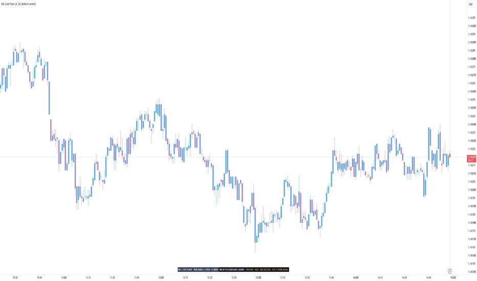
Cost Floor Painter [BSL]Is this bar even big enough to pay for its own round trip?
Most people pick a timeframe before they ever ask that. Cost Floor Painter
answers it for every bar on the chart, and then reports how often the
answer was yes.
HOW IT ANSWERS
You enter a round-trip cost once, in ticks: your spread plus your commission
plus whatever slippage you expect to pay. The script converts that to a price
distance using the instrument's own tick size, so the same setting keeps
working when you switch symbols.
Every closed bar is then measured against it. A bar that covered the cost is
painted solid. A bar that did not is painted in the SAME colour, faded. A
single-row panel reports how many of the last 50 closed bars cleared, with the
50 printed beside it.
The measurement is true range, not high minus low. If a session opened away
from the previous close, that jump is distance the instrument actually
travelled, and counting it is the honest reading. The panel names this on its
face, TRUE RANGE followed by your cost in ticks and in price, so you can see
which definition produced the number. Cost-to-Range Gauge measures the
same predicate over a window and names it the same way, so two tools that
agree by construction can be seen to agree.
A bar whose range lands exactly on the cost counts as covered.
WHERE THE READING BITES
On daily bars almost everything clears, whatever cost you enter. A day of
EURUSD moves eighty pips and a round trip costs two; the comparison is not
close and the panel will read 100%. That is a true answer and a dull one. The
reading gets interesting on the timeframes where bar size and cost are the
same order of magnitude, which for most instruments means minutes rather than
days. Checked on 2026-09-04: at the default cost, BTCUSDT, AAPL and EURUSD all
read 100% on the daily.
WHY FAILING BARS ARE THE SAME COLOUR
A second colour would say: this is a different kind of bar. It is not. A bar
one tick short of the cost is not a different animal from one a tick over, and
colouring it separately would invent a boundary the market does not have.
Fading says: the same kind of thing, weaker. That is the true statement, and
it is the only claim the paint makes.
THE BAR STILL OPEN GETS NO VERDICT
The current bar is drawn as an outline. It is never painted, never counted and
never published, because its range can still change. Whatever it looks like
now, it has not finished being a bar.
THE COST IS YOURS AND THE SCRIPT CANNOT CHECK IT
Spread, commission and slippage are numbers you supply. No chart indicator can
read your broker's fee schedule, and this one does not pretend to. If your
figure is wrong, every reading here is wrong by the same amount, and that is
why the panel shows the conversion from ticks to price, so you can
sanity-check it against your own fills.
WHAT YOU CAN SET
- Round-trip cost: 4.0 ticks
- Coverage window: 50 closed bars
- Colour the bars: on
- Outline the forming bar: on
- Panel position: Bottom center
There are six positions to choose from and the panel starts at the bottom
center. That is the strip TradingView leaves empty. The chart legend and the
trading buttons live top left, the platform's own logo sits bottom left and
covers whatever starts there, and the price scale takes the right. Move it if it
covers something.
The two display switches change the picture and nothing else. Turn the paint
off and the counts, the share and the published value are identical.
Below 50 closed bars there is no share at all. The panel says how many bars it
has instead of dividing by a number it does not have.
WHERE IT REFUSES TO WORK
Heikin Ashi, Renko, Kagi, Point & Figure and Range charts build their bars
from the market rather than showing them. The range of a constructed bar is
not the distance a trade would have paid for, so measuring a cost against it
would produce a number that looks right and means nothing.
On those chart types the paint, the share and the published value stop, the
background carries a wash you cannot miss, and the panel collapses to one
frozen row naming the chart type.
WHAT OTHER SCRIPTS CAN READ
One value is published for other indicators to pick up in their Source
setting: whether the bar cleared the cost. It is 1 for a bar that covered it,
0 for a bar that did not, and no value at all before the script has an
opinion. That is not the same as a 0.
That value is a filter, not a signal. It describes bar size and carries no
direction. It says nothing about whether to be long or short, and connecting
it to a tool that expects entry events would produce entries nobody signalled:
the value sits at 1 for every large bar in a row, and a tool reading events
would treat each change from 0 to 1 as a fresh instruction.
The dropdown will show more than this one value. The outline drawn on the
forming bar is offered there too, along with the two alert conditions, and the
outline is switched off by a display box. Take the value named above.
WHAT IT WILL NOT TELL YOU
It never reports what happened after a bar cleared the cost. There is no
direction in it, no entry, no exit, no stop and no position size. It
recommends no timeframe, no instrument and no cost figure. No percentage
appears anywhere without the number it was divided by.
What a cost does to a sequence of trades is a different question, answered by
Execution-Aware Trend , where the same figure becomes an executed cost
with next-bar fills and a fixed in-sample / out-of-sample split.
This tool describes bar size against a cost you declare. It does not predict
price, guarantee performance or provide trading advice. Validate the behaviour
on your own symbols, timeframes and execution assumptions before making
decisions.
Open-source Pine Script® v6. Educational use only. インジケーター
Breaker Block Detector [algotim]Overview
Breaker Block Detector is a structure-based indicator designed to identify Breaker Block formations only after a defined swing sequence and structural break have occurred.
The purpose of the script is to make Breaker Block analysis more systematic. Instead of marking every visually similar candle formation, it first establishes confirmed swing structure, waits for a qualifying Break of Structure, validates the displacement of the breakout candle relative to ATR, and then derives the relevant zone from the preceding Order Block structure.
This creates a sequential workflow in which a breaker is the result of a structural event rather than an isolated candle pattern.
Problem Statement
Basic Breaker Block indicators can produce large numbers of zones because the underlying concept is often reduced to simple swing relationships.
The difficulty is determining which structural events are significant enough to retain.
This script addresses that problem by adding confirmation layers around the Breaker Block formation:
1. Confirm the relevant swing structure.
2. Detect the structural break.
3. Test the breakout candle for sufficient displacement.
4. Identify the originating Order Block candle.
5. Create the Breaker Block zone.
6. Filter near-duplicate zones and manage the number of active zones.
The result is intended to provide a more structured representation of breaker formations while reducing some of the visual noise created by treating every local pattern equally.
Methodology
1. Confirmed Swing Structure
The script uses configurable pivot length to identify swing highs and swing lows.
A pivot is only available after the required bars on both sides have formed. Consequently, the swing itself is confirmed retrospectively rather than being treated as known at the original pivot bar.
This confirmation process is important because the subsequent Break of Structure calculation depends on established swing levels.
2. Break of Structure
Once a confirmed swing level is available, price is monitored for a structural break.
For bullish structure, price must move above the relevant confirmed swing high.
For bearish structure, price must move below the relevant confirmed swing low.
The BOS confirmation method can be configured to use either the candle close or the candle wick.
Using Close requires the candle to finish beyond the structural level. Using Wick allows the structural event to be recognized from an intrabar excursion beyond that level.
3. Displacement Validation
A structural break alone does not automatically qualify as a breaker event.
The BOS candle is measured using its complete high-to-low range.
That range is compared with the current ATR:
Displacement requirement = ATR × Displacement Multiplier
Only when the BOS candle exceeds the configured ATR threshold does the displacement filter pass.
This provides a volatility-adjusted way to distinguish larger structural moves from relatively small breaks.
4. Originating Order Block
After a qualifying structural event, the script examines the configurable number of candles preceding the BOS impulse.
The relevant opposite-direction candle is used to define the originating Order Block region.
This means the Breaker Block is not selected independently from the structural event. The zone is derived from the candle structure associated with the move that produced the qualifying break.
5. Breaker Formation
The script evaluates the relationship between confirmed swing points to determine whether the required structural sequence has occurred.
Bearish formations are based on a high-low-high relationship followed by a close or wick break through the intervening structure, depending on the selected confirmation mode.
Bullish formations use the corresponding low-high-low relationship followed by a break through the intervening structure.
This structural sequence is what determines whether a region is treated as a Breaker Block.
6. Zone Management
Once created, breaker zones are maintained as chart objects and extended to the right for the configured number of bars.
The script can limit the number of active breaker zones displayed on each side.
ATR-relative duplicate filtering is also used so that closely overlapping breaker formations are not unnecessarily repeated on the chart.
Signal Workflow
The complete analytical workflow is:
1. Detect and confirm swing highs/lows.
2. Store the relevant structural levels.
3. Monitor price for a Break of Structure.
4. Determine whether the BOS candle satisfies the ATR displacement threshold.
5. Evaluate the associated structural sequence.
6. Locate the originating Order Block candle.
7. Create the corresponding bullish or bearish Breaker Block.
8. Reject sufficiently similar duplicate zones.
9. Extend and maintain the active zone.
10. Monitor subsequent interaction with the zone and its validity state.
The indicator therefore treats a Breaker Block as the output of a sequence of structural conditions rather than as a standalone visual pattern.
Why This Indicator Is Different
A conventional Breaker Block script can simply identify a swing pattern and draw a box around it.
This implementation adds a validation layer between structure and zone creation.
The important distinction is the sequence:
**Confirmed Structure -> Break of Structure -> ATR Displacement Validation -> Originating Order Block -> Breaker Zone**
The ATR component is not included as a separate volatility indicator. Its purpose is specifically to determine whether the structural break has sufficient range relative to the current market volatility.
Likewise, the Order Block component is not intended to create an unrelated collection of zones. It provides the price region from which the qualifying structural move originated.
This interaction is the central design of the indicator.
Inputs
Structure Detection
**Swing Length**
Controls the number of bars used on each side to confirm swing highs and swing lows. Larger values produce fewer, more significant structural points.
**BOS Confirmation**
Choose between Close and Wick confirmation for structural breaks.
**Max Active Breakers**
Controls the maximum number of active breaker zones retained on each side.
Breaker Validity Engine
**ATR Length**
Determines the ATR calculation used for displacement validation.
**Displacement Multiplier**
Sets the minimum BOS candle range relative to ATR required for the displacement filter.
**OB Candle Lookback**
Controls how many candles preceding the BOS impulse are examined when identifying the originating Order Block.
Visual Settings
Users can configure bullish and bearish zone colors, borders, midline width, right-side extension length, mitigation labels, and BOS lines.
Alerts
The script provides alert conditions for:
* New Bullish Breaker
* New Bearish Breaker
* Bullish Breaker Retest
* Bearish Breaker Retest
* Bullish Breaker Invalidation
* Bearish Breaker Invalidation
These alerts allow users to monitor newly created zones and subsequent interactions without continuously watching the chart.
Practical Usage
The indicator is intended primarily as a structural analysis tool.
A typical workflow is to first use the confirmed swing structure to understand the current market context, then examine newly created breaker zones only after the structural break and displacement conditions have been satisfied.
Users may then monitor a breaker for a later retest or invalidation and combine that information with their own price-action, trend, volatility, or risk-management framework.
The configurable swing length and displacement threshold can be adjusted according to the instrument and timeframe. More restrictive settings generally produce fewer qualifying formations, while less restrictive settings can produce more zones.
Limitations
Breaker Block terminology represents a market-structure interpretation rather than a directly observable measurement of institutional orders.
The script does not measure actual institutional order flow, market participant identity, or future price direction.
Confirmed pivots require subsequent bars before the swing is established, so historical swing points become available only after confirmation.
Wick-based BOS confirmation is less restrictive than close-based confirmation and can therefore recognize structural breaks that do not persist through the candle close.
ATR displacement is a volatility-relative filter; it does not determine whether a move will continue.
Breaker zones and alerts should therefore be treated as analytical references rather than standalone trading signals.
Notes
This indicator is designed to provide a systematic framework for studying Breaker Block formations through confirmed swing structure, structural breaks, volatility-adjusted displacement, and originating candle analysis.
The calculations describe price behavior observable in the chart. Terms such as Break of Structure, Order Block, and Breaker Block are used as technical-analysis concepts and should not be interpreted as evidence of specific institutional activity.
Users should validate the resulting zones within their own market analysis and risk-management process. インジケーター

Bitcoin Liquidity WaveBTC Liquidity Wave
What it does
This indicator values Bitcoin against global central bank liquidity instead of against calendar time or halving cycles. It draws a liquidity based baseline, a wave that shifts above or below that baseline as liquidity accelerates or contracts, and a channel around the wave that narrows as Bitcoin matures. It also projects the model forward, using liquidity data that is already published for the first part of the projection.
The liquidity index
The script builds a global liquidity index in US dollars from eleven series:
Fed total assets minus the Treasury General Account minus overnight reverse repo, plus the balance sheets of the ECB, the Bank of Japan, the People's Bank of China and the Bank of England, each converted to dollars at the spot rate. Every component can be switched off in the settings. The index is expressed in trillions of dollars.
How the model works
Baseline (green): the log of price is modeled as a function of the log of the liquidity index, read with a 60 day lead, plus a time term with curvature. Time stands in for adoption; the curvature term lets the growth rate slow as the asset ages. Liquidity enters with an exponent of about 1.5, so a doubling of the index corresponds to roughly a 2.8x change in the baseline, all else equal.
Wave (magenta): the baseline is shifted by a liquidity impulse, defined as the smoothed 270 day change in the log of the index, applied with a 90 day lead. When liquidity has been expanding, the wave rides above the baseline; when it has been contracting, it sits below. Because the impulse uses a lead, the next 90 days of the wave are determined by liquidity that has already been reported.
Channel: the outer levels are the wave multiplied and divided by an envelope that shrinks with the age of the asset. The upper envelope decays faster than the lower one, which matches the observation that upside overshoots have compressed far more than downside ones. Inner levels sit halfway between the wave and the outer levels.
Projection: for the first 60 to 90 days the projection uses liquidity that is already known. Beyond that the index is extended at its trailing three year growth rate by default, or at a fixed rate you choose, so you can compare a tightening scenario with an easing scenario. A dashed vertical line marks where published data ends.
How to read it
Load the script on a daily Bitcoin chart, for example INDEX:BTCUSD. It also works on weekly charts, since every lookback is converted from days to bars.
Green is the liquidity baseline. Magenta is the baseline adjusted for the current liquidity impulse. The colored bands around the wave are the channel; the background turns green when price touches the lower outer level and red when it touches the upper one. Optional extras in the settings include the baseline channel with its sub levels and shading, markers where the liquidity impulse crosses zero, and a mode that paints the close by its position inside the baseline channel.
The Fit group exposes every coefficient. They were estimated by least squares on daily data from mid 2012 to September 2026, then the envelope was scaled to the cycle extremes over that period. Changing them changes the model; the defaults are the fitted values.
What is original here
The concept of drawing a trend with colored bands around it is a well known family of Bitcoin charts. This script differs in what drives the lines. The baseline is not a function of time alone: liquidity is inside the valuation equation, the wave is generated by measured liquidity momentum rather than by a fixed sine cycle, the channel decays with age instead of using fixed multipliers, and the projection is fed by real liquidity data before it switches to an assumed growth rate. All code was written from scratch for this indicator.
Limitations
This is a descriptive model fitted to past data. The coefficients were chosen after the fact and will not necessarily hold in the future. The projection is a scenario, not a forecast; its later part depends entirely on the growth rate you assume for liquidity. Foreign balance sheets are converted at spot exchange rates, so part of what the index measures is the strength of the dollar. Nothing here is financial advice. インジケーター

Percent Range Tool
Percent Range Tool is an overlay indicator that lays a percentage scale over the chart, measured from the current close.
It's built for anyone who thinks in percentage distances rather than in absolute prices — for judging how far a move would have to carry, for setting targets and stops in percentage terms, or for comparing symbols whose price levels have nothing in common.
Rather than working from fixed percentage steps that have to be reset for every symbol and every timeframe, the scale sizes itself: it takes the highest high and the lowest low within a lookback window, measures how far each of them sits from the current close, and lets the wider of the two distances stand for one hundred percent. Everything in between is divided into equal steps.
A single length input therefore governs the entire scale, while its placement and its color stay adjustable.
Calculation
Length: number of bars searched for the highest high and the lowest low.
Appearance
Offset: distance in bars between the current bar and the right-hand end of the levels.
Extend Levels to the Left: carries every level to the left across the whole chart.
Line Color: color of the lines and of their labels.
Label Size: font size of the percentage labels.
The indicator draws twenty horizontal lines, ten above the close and ten below it, each labelled with its percentage at the right-hand end.
The outermost pair marks the full distance the market covered within the lookback window; from there the levels step inward in equal increments, and their alternating lengths and line styles make the steps easy to count at a glance.
Since only the wider of the two distances sets that outer edge, the nearer of the two extremes lands somewhere inside the scale rather than on an edge of its own.
On higher timeframes the scale often runs wider than one hundred percent, because the distance to the high is open-ended while the distance to the low can never exceed one hundred percent — a price cannot fall further than to zero.
The levels that would land at or below zero are left out entirely, so on those charts fewer lines appear below the close than above it.
The whole block sits to the right of the last candle, in the empty space beyond the current bar rather than over the price action itself, so depending on how much room the chart leaves on the right it may take some scrolling before the levels come into view.
Extended to the left, they run back across the chart instead, which places every percentage beside the bars it refers to — the staggered lengths then no longer have any effect, and the steps are told apart by line style alone.
Only the current state is drawn.
Nothing is placed on past bars and there is no history to scroll back through: with every new bar the lookback window moves on, and both the close and the two extremes it is measured against can change, so the levels are rebuilt and the percentages on the labels shift with them.
On the bar still forming they follow the live price and settle once that bar closes.
Because the scale is derived from the range rather than fixed, its numbers differ from symbol to symbol and from timeframe to timeframe — a quiet market produces a narrow scale, a volatile one a wide scale.
This indicator is intended solely for market analysis and does not constitute investment advice or a guarantee of success.
Use it at your own discretion and risk; past results are not indicative of future performance.
インジケーター

The Distilled HTF PO3The higher-timeframe candle you're trading inside, drawn on the chart you're trading on. Its manipulation leg, the level it swept, the candle that swept it, and whether the move behind that sweep has since been undone.
Governing candles are aggregated from your own chart's bars — no request.security, so nothing repaints off higher-timeframe lookahead and the panel can never disagree with what the engine scored.
On the chart
The manipulation zone of every completed HTF candle — open to the adverse wick, across its own span. Where the candle went to get its liquidity before it did what it did.
The sweep, marked at the level that was taken — not at the wick that took it. A HTF candle that takes the previous candle's extreme and closes back inside it.
The confirmation line, dashed while it waits and solid with a tick the moment price closes back through it. It sits at the open of the run that delivered the sweep — where that delivery began, and so where it gets undone.
The gap that run left, drawn as a zone, and optionally required to invert as well before anything is called confirmed.
The chart candle that actually printed the HTF high or low, coloured in, with its own small sweep line and a c2 tag. The C2 inside the C2 — the fractal read the model rests on, with an optional filter so it only names genuine pivots rather than any candle mid-move.
HTF gaps on price — blue while unfilled, purple once price closes through the edge they fail on.
A divider at every HTF candle open, time-stamped, so the chart reads as the candles it really is rather than a stream of bars.
A panel of HTF candles beside price, C1 and C2 labelled, carrying their own gap boxes and sweep lines. The newest slot is the candle still forming and updates tick by tick.
Live — a forming HTF candle that currently qualifies is drawn dashed and tells you "CISD hit · on this close" before the close happens.
How each one resolves
Pending — the sweep is marked, the confirmation hasn't landed
Confirmed — it landed inside the C2 or C3 candle
Failed — the sweep extreme was taken back; the level was not given back after all
Unconfirmed — the extreme held, but nothing confirmed in time
Failed and unconfirmed are hidden by default and can be kept if you want to see everything the engine considered.
Dashboard
Detected, confirmed, failed, unconfirmed, and how many confirmations were corroborated by the gap as well as the line — split today against the whole chart, so a quiet session is obvious rather than looking like a broken indicator.
Pairing
Auto pairs the chart to the frame that ranges it: 1m→15m, 3m→30m, 5m→1h, 15m→4h, 1h→7h, 4h→D, D→W, W→3M. The hour pairs to 7H rather than stepping over it to Daily. Manual override available.
Every colour, width, style, size, offset and placement is exposed.
One honest note
The manipulation zone is drawn because it's useful to see, not because it predicts. Read as a signal, open-to-adverse-wick is close to a tautology — it fires on roughly 98% of candles, and the live reclaim of it tested anti-predictive in our own work. It shows you where the manipulation was. It does not claim that's tradeable. インジケーター

Pivot Channel TrendLines [BigBeluga]🔵 OVERVIEW
The Pivot Channel TrendLines is an advanced technical analysis indicator designed by BigBeluga to automatically map structural pivot points, project dynamic trendline channels, and track directional breakout signals directly on the chart. Traditional manual trendline drawing is often subjective and time-consuming, while standard indicators fail to account for slope progression and volatility filters. To solve this limitation, this script combines an automated pivot detection engine with ATR-filtered extension lines and real-time breakout triggers.
The indicator visualizes key market highs and lows, dotted projection channels, and directional signals. The core calculations identify confirmed pivot extremes using configurable lookback periods, compute slope values between successive pivots, and filter out insignificant structures using Average True Range thresholds. Customizable color palettes, line styles, and extension lengths allow traders to fine-tune the geometric mappings across various asset classes and timeframes.
🔵 HOW IT WORKS
The system operates through an integrated architecture where each component dynamically influences chart behavior:
1 — Automated Pivot Detection Engine
Lookback Scanning: Evaluates bar ranges using user-defined lookback criteria to identify significant swing highs and lows.
ATR Filtering: Compares successive pivot price differentials against Average True Range thresholds to ensure only meaningful structural shifts generate active channels.
2 — Dynamic Trendline Projection & Channels
Confirmed Trendlines: Connects historical pivot points with solid boundary lines to map ongoing trend channels.
Dotted Extensions: Projects sloping extension lines forward by a user-defined bar length to monitor future support and resistance interactions.
3 — Directional Breakout & Price Dash System
Breakout Triggers: Monitors active extension lines in real time, plotting directional labels ("Up" or "Down") whenever price closes beyond expected threshold boundaries.
Last Pivot Dashes: Renders customizable horizontal dashed or dotted lines alongside precise price level tags for the latest identified high and low pivots.
🔵 HOW TO USE
Apart from serving as an automated structural mapping tool, the indicator can be applied in several ways:
Identify Trend Channels: Follow the solid and dotted trendlines connecting major pivot highs and lows to track prevailing market direction and channel boundaries.
Catch Structural Breakouts: Monitor the chart for Up or Down directional labels indicating when price has successfully broken through active projected extension lines.
Track Recent Reference Prices: Use the last pivot price dashes to quickly reference key support and resistance boundaries established by the most recent market swings.
🔵 NOTES
Why this implementation is unique:
It automates complex pivot channel mapping and slope projections directly on the chart.
Features integrated ATR volatility filters to eliminate insignificant structural noise.
Fully optimized for high-performance rendering under Pine Script version 6 standards.
インジケーター

Strong Burst Fader | ProjectSyndicateStrong Burst Fader measures the one thing a mean-reversion trader actually needs — how far price has over-extended — and prints it as heat. Every bar that punches beyond a volatility envelope is a burst, and the further it stretches past the band, the taller and hotter the diamond column the indicator stacks at that bar. A quiet market prints nothing. A violent, over-cooked thrust prints a towering, red-hot column that says the move is running on fumes. Your chart stays clean — heat columns and nothing else — while the engine measures every burst underneath, across your entire history.
Most volatility tools draw a band and leave you to guess which touch matters. This one grades the burst.
GBPUSD
🔥 The Burst Engine — the core. Around a configurable moving-average basis, the tool builds an ATR envelope (basis ± Band Width × ATR). The moment a bar's wick pokes past that envelope, it's a burst — an over-extension, not a normal bar. The engine measures exactly how far the wick travelled beyond the band and expresses it in ATR units, so a burst on gold and a burst on a quiet FX pair are scored on the same volatility-normalized scale. The bigger the stretch, the more oversized the move — and the stronger the fade case.
🌡️ Heatmap Stack — the signature read. Burst size is double-encoded so you can read it at a glance from across the room. Height: the column grows one diamond per step of ATR beyond the band, up to the cap. Heat: the colour ramps through a four-stop gradient — cool → warm → hot → extreme — as the stretch deepens. A one-diamond cool poke is a shrug. A six-high, white-hot tower is a market screaming that it has gone too far, too fast. Taller and hotter = more oversized, no interpretation required.
📏 The Volatility Basis — what "too far" is measured against. Choose the reference the burst is judged from: EMA, SMA, HMA, WMA, VWMA or RMA, any length, with an independent ATR length and band width. Widen the band in trending regimes so only real over-extensions register; tighten it in ranges to catch smaller exhaustion. The basis is also the natural first target when a burst fades back toward the mean.
📍 Peak Collapse — one clean vertical column per burst. A fast thrust fires the burst condition on several bars in a row. Instead of smearing a stack across every one of them, the engine collapses each run to its magnitude peak — the single bar where the stretch is greatest — and draws the whole column there, pinned to that one bar. Every diamond shares a single x-coordinate, so the column is dead-straight vertical with zero diagonal drift. One burst, one column, marking the exact climax you want to fade.
NQ
🔻🔺 Fade Cues — direction, on demand. When a burst is oversized enough to clear your threshold, an arrow prints at the column: ▽ above an up-burst (over-extended high → fade short) and △ below a down-burst (over-extended low → fade long). Set the minimum stack height that earns an arrow, so only the genuinely stretched moves get flagged and minor pokes stay quiet.
♾️ Full-History Heat — no drawing-object limit. The entire heatmap is rendered through plot-shape symbols rather than chart objects, so it covers all of your history at once — no 500-object ceiling, no zones silently dropping off the left edge as you scroll back. Every burst your data holds is measured and coloured, from the first bar to the live one.
🧼 Clean-Chart Discipline — heat and nothing else. No moving-average spaghetti, no band lines cluttering price, no stat panel, no signal labels stamped across your candles. Just the heat columns and the optional fade arrows. An optional background tint flags only the most extreme bursts. Everything else lives in the alerts.
🎨 Fully Themed & Configurable. Custom mild / warm / hot / extreme heat colours; diamond spacing and offset from the wick; band width and ATR length; basis type and length; ATR-per-step (how fast the stack grows); heat-saturation point (where the colour maxes out); max stack height; the closing-burst filter; the confirm-on-close toggle; the fade-arrow threshold; and the extreme-burst background tint.
🔒 Honest, Non-Repainting Core. A burst peak is confirmed from the bar's neighbours, which — like any pivot-style read — settles a bar after the fact; that lag is inherent, not a defect. With Confirm on Bar Close enabled, columns are evaluated only on closed bars and are fixed once printed; disable it and the newest column can still update on the live forming bar until it closes, as any close-based read does. The height and heatmap are descriptive frameworks for ranking over-extension and directing attention — not a backtested edge and not a promise that any burst will reverse.
XTI
🔔 Native Alerts. Up burst (fade-short candidate), Down burst (fade-long candidate), and the two headline extremes — Extreme Up and Extreme Down — that fire only when a burst tops out at maximum stack. Wire them once and let the chart stay silent until a move is genuinely stretched.
🎯 Why this is different. A raw band is static — you eyeball a touch and guess whether it matters. An oscillator tells you overbought / oversold but caps out and loses all sense of scale exactly when a move goes parabolic. Strong Burst Fader keeps measuring past the extreme: it quantifies the over-extension itself in ATR, ranks it by height and heat, and marks the single climax bar of each thrust. You see not just that price is stretched, but how stretched — and where the stretch peaked.
🚀 Apply to Gold (XAUUSD), Silver, Forex, Crypto, Indices and Futures on any timeframe. Because bursts are measured in ATR beyond an adaptive band, the read travels across symbols and timeframes without re-tuning; volume-weighted bases (VWMA) sharpen it where a market carries clean volume.
💡 Cleanest setup: widen Band Width and raise ATR-per-step so only real over-extensions build tall columns; keep Confirm on Bar Close on for a non-repainting read; turn on the closing-burst filter when you want acceptance beyond the band rather than pure wick pokes; and lower the fade-arrow threshold only if you want cues on smaller stretches.
USDSGD
🎯 How To Trade It — Two Approaches
Everything hinges on one read: how oversized is this burst, and has it climaxed?
🔥 1) Fade the burst — trade the over-extension (the core thesis)
Use when a tall, hot column prints — a burst that has stretched well beyond the band.
Mark the extreme columns — five- and six-high, hot-to-extreme colour are the moves that have run too far, too fast; the taller and redder, the stronger the fade case.
Wait for the peak — the column marks the burst's climax bar, not a mid-move poke. That's your reference.
Trigger: take the fade in the reclaim direction — short an over-extended up-burst, long an over-extended down-burst — ideally on the fade arrow (▽ / △) and confirmed once the peak bar closes.
Stop: beyond the burst extreme (the wick that made the column). If price accepts further out, the "over-extension" was real trend expansion — stand aside.
Target: the basis / mean first, then the opposite band or the next unstretched level in your direction.
⚖️ The cleanest version: a six-high, white-hot up-burst tops out after a vertical thrust, a ▽ fade-short arrow prints, and the peak bar closes back inside the band. Too far, too fast, and now rolling over — the exact event this tool is built to frame.
✋ 2) Stand down — the heat says wait
Cool, short columns — one- or two-diamond pokes are minor stretches, not exhaustion. Nothing to fade.
A trend that keeps bursting — column after column in the same direction with the band riding along is acceptance, not over-extension; don't stand in front of it. Wait for the climax column and a close back inside.
No peak yet — a bar merely touching the band is not a burst that has topped out. Wait for the tall, hot column and its close.
Rule of thumb: 🔥 Tall + hot column + fade arrow + close back inside → fade the burst toward the basis. ❄️ Cool/short columns, a trend that keeps bursting, or no climax yet → stand down until the heat agrees. インジケーター

Master Line Lite: 5-MA ConsensusMaster Line Lite condenses five different moving-average families into a single, easy-to-read consensus trend line, then filters its direction with a volatility-aware band so the trend only changes when price commits. It's a clean, open-source alternative to stacking several moving averages on one chart.
How it works
Each moving-average type reacts to price differently. An EMA and a WMA weight recent bars heavily and turn quickly; an SMA weights every bar equally and turns slowly; an RMA (Wilder's) is the smoothest; and an HMA cuts lag while staying responsive. Any single one is a compromise — fast types whipsaw in chop, slow types lag at turns.
Master Line Lite computes all five over the same length and averages them into one line:
consensus = ( EMA + SMA + WMA + HMA + RMA ) / 5
Blending the five balances their individual biases: the fast members keep the line responsive while the slow members damp noise. That's the purpose of the combination — not to stack indicators, but to average out the weakness of each MA type into one steadier reference than a single fast MA, yet more responsive than a single slow one.
Direction is then decided with an ATR band instead of a raw cross. The trend turns bullish only when price closes above the line by more than Flip band × ATR, and bearish only when it closes the same distance below; between those thresholds the previous trend is held. This deadband is what suppresses the constant flip-flopping of a plain price/MA cross during sideways markets.
The line is colored by the current trend, an optional band shows the flip thresholds, and triangles mark the exact bar where the trend flips.
How to use it
Use the line as a trend reference and bias filter — favor longs while it's teal, shorts while it's red.
The triangles flag where the consensus trend changes — a "context has shifted" cue, not a standalone entry.
Widen the Flip band on noisy/ranging instruments to cut false flips; narrow it on clean trends for earlier turns.
Increase Length for a slower higher-timeframe bias; decrease it for a faster intraday read.
Two built-in alerts fire on bullish and bearish flips.
Settings
Source — price series the averages are built from (default: close).
Length — lookback used for all five moving averages.
Flip band (× ATR) — how far price must clear the line to change the trend; the core noise filter.
Show band — draw the upper/lower flip thresholds.
Color bars by trend — tint candles with the trend color.
Show status box — small top-right label with the current Bull / Bear / Flat state.
Notes and limitations
Like all moving-average methods, this lags at turning points and can flip late after sharp reversals — the ATR band trades some timing for fewer false signals. Values can update on the still-forming real-time bar until it closes. It does not predict price and makes no performance claims; use it as one input alongside your own analysis and risk management.
For research and education only. This is not financial advice. インジケーター

EMA Trend SignalsEMA Trend Signals
OVERVIEW
EMA Trend Signals is a clean, lightweight trend-following tool built around two exponential moving averages (EMAs). It colors the trend, highlights the space between the two averages, and marks the exact bars where the fast average crosses the slow one — giving an at-a-glance read on direction and momentum shifts without cluttering the chart.
HOW IT WORKS
The script calculates two EMAs from a source of your choice:
• Fast EMA (default 21) — reacts quickly to recent price.
• Slow EMA (default 55) — represents the broader trend.
The relationship between them defines the regime:
• Fast EMA above the slow EMA → momentum is aligned to the upside → bullish (green).
• Fast EMA below the slow EMA → momentum is aligned to the downside → bearish (red).
An EMA is a weighted average that gives more importance to recent bars, so it follows price faster than a simple moving average while still smoothing out noise. Using two lengths separates short-term momentum (fast) from the prevailing trend (slow); the point where they cross is a classic, widely used signal for a potential shift in control between buyers and sellers.
WHAT IT DRAWS
• Fast EMA line, colored by the active trend (green / red).
• Slow EMA line as a neutral reference.
• A soft fill between the two EMAs, tinted by direction — a wider gap means stronger separation.
• An optional light background tint showing the current regime.
• Triangle markers on the exact bar where a cross occurs (up / down).
HOW TO USE IT
• Trend bias: read green as a long bias and red as a short bias. Many traders only take positions in the direction of the color.
• Signals: the up-triangle (fast crosses above slow) and down-triangle (fast crosses below slow) mark momentum shifts. They perform best in trending conditions and will whipsaw in tight ranges — pair them with your own structure, key levels, or a higher-timeframe filter.
• Tuning: shorten the lengths for faster, more frequent signals; lengthen them for fewer, smoother ones. Change the Source input to apply the logic to hl2, hlc3, and so on.
ALERTS
Two ready-made alerts are included — "EMA Cross Up" and "EMA Cross Down" — so you can be notified the moment a cross happens on any symbol or timeframe.
SETTINGS
• Source — price series the EMAs are built from (default close).
• Fast EMA length — short-term average (default 21).
• Slow EMA length — trend average (default 55).
• Trend background — toggle the regime tint.
• Cross markers — toggle the triangle shapes.
NOTES & LIMITATIONS
Moving-average crosses are lagging by nature: they confirm a move after it has already begun rather than predicting it, and they can produce false signals in sideways markets. This tool is a visual aid for trend direction and momentum shifts — it is not a complete trading system and does not manage risk or position size. Always confirm with your own analysis.
Open-source — feel free to study, use, and build on it.
For research and educational purposes only. This is not financial advice. インジケーター

Liquidity Label above BarLiquidity Label
Shows a single floating label above the latest candle with the stock's average traded value (liquidity), so you can judge at a glance whether a stock is liquid enough to trade without opening a screener.
Time unit: Days or Minutes
Period count: number of periods used for averaging (default 50)
Price source: close by default
Display unit: Crore, Lakh, Million, Billion, or Raw
Decimals and optional unit suffix (Cr, L, M, B)
Label look
Text size, text color, background color
Shape: down arrow, box, or plain text
Margins
Vertical margin: how far above the high the label sits, as a percent of price
Horizontal margin: shift the label left or right by bars
Notes
Only one label is drawn, always on the last bar, and it updates live
Crore and Lakh units make this handy for NSE/BSE traders, while Million/Billion covers global markets
Works on any symbol and any chart timeframe
Also You can use it for intraday インジケーター

Multiday Anchored Auto VWAP by ByblloOVERVIEW
Multiday Anchored Auto VWAP plots up to 10 automatically anchored, rolling Volume Weighted Average Price (VWAP) lines - Rolling Day #0 (today) through Rolling Day #9 (9 days ago) - plus 5 fully independent manual VWAP lines you anchor to any date/time you choose.
Unlike anchored-VWAP tools that force a choice between automatic or manual mode, the 10 automatic Rolling Day lines and the 5 Manual Input lines here run completely independently and can be shown together - keep the last few rolling days visible for a short-term picture while also anchoring a Manual line to a specific earnings date or session open.
INTENDED USE
Well suited to short-term futures scalping - Nasdaq futures (NQ/MNQ) and similar instruments. Primarily used on the 1-minute chart, but the rolling VWAP levels hold up just as well on 2, 3, and 5-minute charts and other intraday timeframes, since the anchor logic is independent of your chart's timeframe.
FEATURES
- 10 automatic Rolling Day VWAP lines, each recalculated fresh from "now" every run (via timenow) - no hardcoded dates, so the lines never go stale or need republishing.
- 5 independent Manual Input VWAP lines with full date/time pickers, for anchoring to a specific event, earnings date, or session open.
- Single "Auto Mode Session Start Time (HHMM)" input applies to all 10 rolling lines at once - default 07:00 (Asia/Seoul), aligned with the Nasdaq futures (Globex) 18:00 ET session open during US Daylight Saving Time (shifts to 08:00 KST during US Standard Time - adjust as needed around the DST transition).
- Calendar-day based rolling (not trading-day based) for simple, predictable anchoring - see the author's companion script "Multiday VWAP by Bybllo" if you need trading-day-aware anchoring instead.
- Anchor-point safety guard prevents accumulation before each line's actual start, so no artificial spikes at the anchor bar.
- Optional anchor-start labels (#0-#9, M1-M5) marking exactly where each line begins.
- Works on any chart type (candlestick, Heikin Ashi, Renko, etc.) since prices are pulled via request.security() from the underlying ticker.
This script requires volume data from your data provider. For educational and informational purposes only, not financial advice. Always verify how these levels behave on your specific symbol and timeframe before relying on them for live trading. インジケーター

Tail Range Percentile Radar [Pineify]Tail Range Percentile Radar
Overview
Tail Range Percentile Radar separates candle rarity from candle shape. Four aligned scan lanes compare true range, real body, upper wick and lower wick with their own recent histories. It describes anatomy, not the next move.
Problem Definition
An ATR multiple measures distance from an average, but the same multiple can occur in very different distributions. A long range may also be mostly gap, body or wick. A wick-to-body ratio alone is unstable near a doji and says nothing about historical rarity. Ask two questions: is this component unusual, and does it occupy enough of this candle to matter?
Design Rationale
Separate ranks preserve anatomy hidden by one volatility score. The candidate is excluded from its reference window so an extreme cannot alter its own baseline. Half-weight ties avoid treating repeated tick sizes as distinct observations. A minimum high-low share rejects historically rare but visually trivial parts. Averaging all four ranks was rejected because a large body could mask an exceptional wick; retaining four lanes costs screen space but preserves the reason for each event.
Key Features
Four prior-only percentile populations with explicit zero handling.
Independent range and share-qualified body or wick flags.
A confirmed anatomy strip, three close-only alerts and optional statistics.
How It Works
TR is the largest of high-low, the distance from high to the previous close, and the distance from low to the previous close. Body is absolute close-open; wicks are the distances from the body edges to high and low. Each magnitude is rounded to the symbol's tick size. Its rank is 100 times the count of smaller prior values plus half the equal values, divided by N. Zero parts receive zero. All N preceding bars must have valid OHLC and previous-close data; invalid coverage leaves every lane blank.
A flag needs rank at or above Q. Body and wick flags additionally need their configured share of high-low; a zero high-low gives zero shares. Tail flags do not require extreme TR. The displayed type prioritizes dual tail, upper tail, lower tail, directional body, gap-led range, then range only. Gap-led requires extreme TR and at least 35% of TR outside high-low. Component flags remain independent of this display priority.
How Multiple Indicators Work Together
The four measurements are one candle decomposition, not unrelated trading signals. Rank supplies historical context; share supplies geometric relevance; their conjunction supplies body and tail flags. TR retains total movement, including movement beyond high-low relative to the previous close. Without share, tiny parts can be highlighted; without separate ranks, unusual anatomy disappears inside a single range score.
Trading Ideas and Insights
An upper-tail event identifies an unusually large upper wick, not proven selling pressure or a short entry. A lower tail is equally descriptive. Compare a tail inside ordinary TR with a range event dominated by a body: the patterns answer different anatomy questions. Clusters invite chart review but do not establish reversal odds.
Unique Aspects
Relative to an ATR threshold or candle ratio, the added mechanism is a prior-only, tie-aware four-population comparison with geometric qualification and explicit mixed-tail precedence. It preserves tail rarity even when total range is ordinary. Zero suppression prevents absent wicks from becoming exceptional merely because a reference sample contains many zeros.
How to Use
Read the lanes from top to bottom: gold TR, purple body, orange upper wick, teal lower wick. Each uses its own zero baseline and equal height for 0-100; stacked positions are not a shared numeric axis. Dashed rails mark Q, vivid columns show qualifying components and dots confirm them at close. Use the table or Data Window for actual ranks and anatomy codes. The diamond strip marks the selected closed-bar type.
Customization
Start with N=200, Q=95, wick share=20% and body share=55%; these are design starting points, not optimized settings. Shorter N responds sooner but uses fewer comparisons; higher Q or shares rejects more bars. The statistics window defaults to 100 chart bars. Its rates use eligible closed bars, with sample coverage shown; overlapping flags can sum above 100%. Guides, tips, strip, table and four colors are configurable.
Assumptions and Limitations
Use standard OHLC charts; synthetic candles change the meaning of anatomy. Price scale changes, splits, session gaps, stale bars and regime shifts can distort the raw-size reference. No volume or order-flow data is used. Rank 95 is a sample comparison, not a 5% future probability; it also does not measure how far beyond history a new maximum lies. At least N valid prior observations plus previous-close coverage are needed. Live ranks, shading and table type can change intrabar; tips, strip and alerts require close. Alerts apply to every qualifying closed bar, so consecutive bars can each alert and dual tails can trigger both tail alerts. Choose once per bar close. Parameters, chart history and feed revisions can change results. There is no entry, exit, profitability or reversal model.
Conclusion
The range percentile radar distinguishes unusual total movement from unusual candle parts while keeping rarity and shape separate. Use it as a compact explanation of observed tail volatility, with independent decision rules.
インジケーター

BFG Profil3dProfil3d — Higher-Timeframe Candles and Volume Profile in One View
Profil3d combines a configurable volume profile with a live higher-timeframe candle overlay, allowing traders to study market structure without leaving their execution chart.
For example, traders using a 1-minute chart can display developing 3-minute, 5-minute, or 15-minute candles alongside a volume profile calculated from the underlying chart bars. This provides lower-timeframe precision while keeping higher-timeframe context visible.
Key Features
Higher-Timeframe Candle Overlay
Displays configurable higher-timeframe candles beside the current price action, complete with candle bodies, wicks, timestamps, and timeframe identification.
Integrated Volume Profile
Maps traded volume across price levels for the selected analysis window.
POC, VAH, and VAL
Automatically calculates and displays:
Point of Control
Value Area High
Value Area Low
Configurable value-area percentage
Three Volume Display Modes
Up/Down volume
Total volume
Directional delta approximation
Rolling or Session-Based Analysis
Rolling HTF Window profiles the latest higher-timeframe candles.
Session Window restricts the profile and candle overlay to a selected market session.
Automatic Session Templates
Includes presets for equity core hours, equity Globex, metals, energy, cryptocurrency, London, Tokyo, Hong Kong, and custom sessions.
Independent Profile Depth
The profile can analyze up to five times the displayed candle window while leaving the higher-timeframe overlay unchanged. This allows broader volume context without sacrificing a compact visual footprint.
Flexible Profile Resolution
Build the profile using either a fixed number of rows or a selected number of ticks per row.
Range High and Low Mapping
Finite guide lines connect the price bars that established the active range to the right-side display.
Extensive Visual Controls
Customize profile colors, row density, candle colors, line styles, line widths, placement, timestamps, and display components.
Practical Use
Profil3d is designed to help identify:
High-volume acceptance areas
Low-volume transition zones
Developing value
POC attraction or rejection
VAH and VAL reactions
Higher-timeframe candle structure
Balance, breakout, and failed-breakout conditions
Areas where lower-timeframe price action aligns with higher-timeframe context
Important Notes
The selected overlay timeframe must be higher than the chart timeframe.
Profil3d’s Delta mode is a directional volume approximation derived from candle behavior. It is not true bid-versus-ask order-flow delta.
The volume-allocation model was adapted from LonesomeTheBlue’s Volume Profile / Fixed Range work under the Mozilla Public License 2.0.
Profil3d is an analytical and visualization tool. It does not provide financial advice, guarantee trading performance, or replace independent risk management. インジケーター


