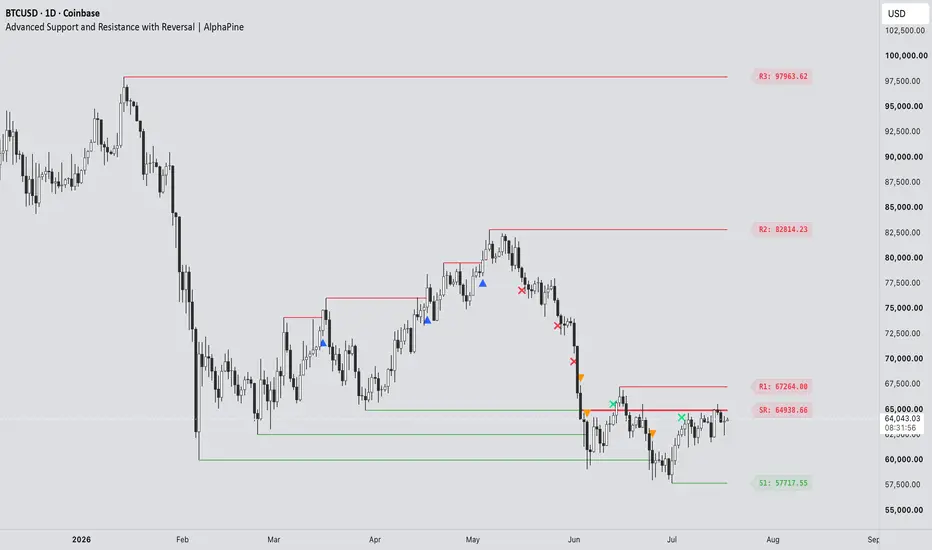
Market Structure BOS, CHoCH, HH HL LH LL & Trend Health [LunqFX]Market structure is the skeleton of every trend: a series of higher highs and higher lows, or lower highs and lower lows, until a break says the trend has changed. This indicator maps that skeleton automatically — labelling every swing as HH, HL, LH or LL, drawing each Break of Structure (BOS) and Change of Character (CHoCH) — and adds one thing no other structure tool has: it tells you the trend is failing BEFORE the structure actually breaks.
❶ THE STRUCTURE MAP
▸ SWING LABELS — every confirmed swing point is labelled HH (higher high), HL (higher low), LH (lower high) or LL (lower low). The sequence of those four labels IS the trend, and having it on the chart removes the guesswork from reading price action.
▸ BOS — Break of Structure. Price closes through the last swing level in the direction of the trend: the trend is continuing. Drawn as a dashed line from the broken level with a BOS label.
▸ CHoCH — Change of Character. Price closes through the last swing level against the trend: the trend has flipped. Drawn as a solid, highlighted line — this is the reversal signal smart-money traders wait for.
▸ STRUCTURE CANDLES — the candles themselves are coloured by the structural trend, not by whether each bar closed up or down. Green means the market structure is bullish, violet means bearish, so the regime is obvious at a single glance. Their brightness fades as Trend Health falls.
❷ TREND HEALTH 0–100 — THE EARLY WARNING
Every other structure tool tells you a trend has ended after CHoCH prints. By then the move is already gone. Trend Health measures the two things that decay before every structure break:
▸ EXPANSION — in a healthy trend each new extreme clears the previous one by at least as much as the last leg did. When new highs barely exceed the old ones, the trend is running out of fuel.
▸ RETRACEMENT — in a healthy trend pullbacks stay shallow. When each pullback eats deeper into the previous leg, control is shifting to the other side.
Both are measured on the live leg, normalised by ATR so the score behaves the same on any symbol and timeframe, and blended into a single 0–100 reading. When it drops below your threshold the dashboard flags WEAKENING — while the trend is still technically intact. That is the warning CHoCH cannot give you, because CHoCH is confirmation, not anticipation.
❸ THE STRUCTURE TAPE
Instead of a table of numbers, the dashboard shows a timeline of the last five structure events, oldest to newest: BOS ▲ · BOS ▲ · CHoCH ▼ · BOS ▼. Reading the sequence tells you instantly whether the market is trending cleanly (a run of BOS in one direction) or chopping (CHoCH flipping back and forth) — context you cannot get from a single label on the chart.
❹ HOW TO TRADE IT
1 — Establish the bias from MARKET STRUCTURE in the panel. Bullish structure = look for longs, bearish = look for shorts. Do not fight it.
2 — Use BOS as continuation. A BOS in the direction of your bias confirms the trend is intact; the broken level often becomes support or resistance on the retest.
3 — Use CHoCH as the reversal trigger. A CHoCH against the prevailing trend is the earliest confirmed signal that structure has flipped. Wait for it before trading a reversal.
4 — Use TREND HEALTH for timing and risk. Health above 65 with a run of BOS on the tape = a clean trend, hold your position and trail. Health falling into WEAKENING = tighten stops, take partials, and stop adding — the structure is decaying and a CHoCH becomes more likely.
5 — Read the tape for market state. Several BOS in a row = trending market, trade continuations. Alternating CHoCH = choppy market, stand aside or trade the range instead.
❺ HOW IT WORKS
Swing points come from confirmed pivots, so a swing only exists once the bars on both sides of it have closed. The most recent swing high and swing low become the active structure levels. When a bar CLOSES beyond one of them (a wick-based mode is available), the break is registered: in the direction of the current trend it is a BOS, against it a CHoCH, and the trend state flips. Trend Health compares the size of the current expansion leg with the previous one in ATR units, and the depth of the latest pullback against the leg it retraced, then blends them 60/40 into the 0–100 score. Immediately after a CHoCH there is no second leg to compare yet, so the panel honestly reports NEW TREND instead of a misleading health reading.
Works on every symbol and timeframe — forex, gold, indices, crypto and stocks — because every threshold is either structural or ATR-normalised, with nothing to configure per market.
SETTINGS — swing length (how major a swing must be), break on close or wick, the health threshold that flags weakening, swing labels and BOS/CHoCH lines on/off, number of events kept, structure candles on/off, and dashboard position.
ALERTS — BOS up, BOS down, CHoCH up, CHoCH down, and Structure Weakening (the early warning).
NON-REPAINTING — swings are built from confirmed pivots and every break is validated on bar close. A label or line that has printed never moves or disappears.
Every component here describes the same object — the market's structure — at a different resolution: the swings build it, BOS and CHoCH break it, Trend Health measures its condition, and the tape is its history. That is why they belong in one tool rather than five.
This indicator is an educational market-analysis tool, not financial advice. Trend Health describes the current structure's condition and does not predict future prices. Always confirm with your own analysis and manage your risk.
Pre-publish checklist インジケーター

Liquidity Sweep & ATR Envelope⚡ Liquidity Sweep & ATR Envelope
The market hunts stops. This tool shows you where it just happened — and whether price actually rejected the grab or kept right on going. 🎯
Liquidity sweeps caught at volatility extremes, confirmed by a real reclaim, fully resolved on the bar they fire. No repaint. No HTF trickery.
🔍 THE MECHANICS
📐 The envelope — an ATR band around a 20-period basis. It's the visual anchor on the chart AND the qualification threshold at once: the same measurement does both jobs, so there's no separate cosmetic ATR filter bolted on top.
🎯 Pivot + envelope, both required — a signal needs the wick to breach a confirmed pivot level AND clear the band plus a clearance buffer. Levels are one-shot: any wick through a tracked pivot consumes it, signal or not. Re-arms on the next confirmed pivot.
↩️ Reclaim, not just recovery — the close has to snap back past the swept level by at least half the wick's own penetration depth (adjustable, 0 to disable). A candle that barely creeps back over the line doesn't count as a rejection — the snap-back has to beat the sweep.
Levels are one-shot: any wick through a tracked pivot consumes it — signal or not — and the tool re-arms on the next confirmed swing. What you see is exactly what happened.
🛡️ Non-repaint by construction — pivots confirm after their right-side bars, and every signal, marker, zone, and alert is gated to bar close. A triangle that printed yesterday printed on that bar and never moved. What you backtest is what you trade. ✅
🎨 On the chart:
🌊 Hero ATR envelope with event-driven band glow — bands light up when price presses them or on a fresh sweep.
📦 Gradient sweep zones from swept level to wick extreme — historical signals legible at a glance.
👣 Swept-history footprints so you can read where liquidity already got taken.
🎛️ 8 themes (Suite, Ocean, Royal, Ember, Mono, Frost + full Custom), optional bar tint, trigger-threshold line, compact status table.
🔔 Clean JSON alerts (direction / level / trigger) — wire it straight into your automation.
⏱️ Timeframe notes — single-timeframe and scale-free. Every threshold is measured in ATR or as an intra-bar ratio, so it ports across instruments and timeframes with zero rescaling. Defaults are tuned on H1 and carry to M15 unchanged — comparable signal frequency and reclaim quality on both. On H4 and above the setup is rarer by nature; drop Pivot Left/Right to 3 if you want more events there. Read every signal as liquidity-location context, not a standalone entry — pair it with your structure read (or Confluence Context, regime/confluence indicator on my profile) for direction. 🧭
📈 How to use it — the tool tells you where the market just swept liquidity and rejected. Stack it with structure.
Built to one standard: still useful after it's been on your chart for a while. インジケーター

Fan Principle Signals [MarkitTick]💡 Maps out market structure using a sequence of ascending swing lows (or descending swing highs) to construct a three-legged trendline fan, then triggers actionable trade signals the moment price breaks through the steepest line in that fan. Rather than relying on a single moving average or oscillator crossover, this script builds its bias from the actual geometry of recent price swings, giving traders a structural, visually intuitive way to time entries around the exhaustion of a trend.
✨ Originality and Utility
Most breakout tools react to a single reference line, such as a moving average, a fixed channel, or a static trendline drawn from only two points. This script instead applies the fan principle, a technique that connects a common origin point to three successive pivots in the same trend, producing three lines of increasing steepness. The logic behind this approach is that the third and steepest line in the fan typically represents the most aggressive rate of trend continuation, and a decisive close beyond it has historically signaled that the prevailing trend has lost its structural support.
What makes this implementation useful in practice is that it does not stop at drawing the fan. It automatically identifies valid pivot sequences from raw price action, filters out insignificant micro-swings using a minimum leg percentage threshold, validates the freshness of the structure with a lookback cap, and then converts the break event into a complete trade plan, including entry, stop-loss, and three take-profit levels, all derived mathematically from the fan's own geometry and the market's current volatility. The optional volume and higher-timeframe filters allow traders to demand additional confirmation before a signal is accepted, and the built-in dashboard keeps the entire state of the system visible at a glance. The combination of automated structural fan detection, ATR-adaptive risk placement, and live trade monitoring is what distinguishes this from a simple trendline break script.
🔬 Methodology and Concepts
• Pivot Detection
The script continuously scans for swing highs and swing lows using a symmetrical lookback and lookforward window defined by the Pivot Len input. A bar qualifies as a swing high only if it is strictly greater than every other bar within that window on both sides, and a swing low only if it is strictly lower than every bar in that window. Each time a new pivot is confirmed, its bar index and price are stored in a rolling array, keeping the most recent twenty pivots in memory for both highs and lows.
• Fan Construction
Once at least four pivot lows (for an uptrend fan) or four pivot highs (for a downtrend fan) are available, the script selects the four most recent ones. The oldest of the four becomes the fan's origin point. The remaining three form Leg 1, Leg 2, and Leg 3 respectively, each connected back to that same origin. A slope is then calculated for each leg using simple rise-over-run between the origin and that leg's pivot. For the fan to be accepted, the price move between the origin and the first leg must exceed the Min Leg % threshold, which filters out fans built from statistically insignificant noise, and the origin must fall within the Max Fan Lookback window, which prevents the script from anchoring to structure that is too old to remain relevant.
• The Break Condition
Leg 3, the line connecting the origin to the most recent and steepest pivot, is treated as the trigger line. Its price value is projected forward on every bar using the slope calculated at formation. A bullish break requires the fan to currently be in an uptrend orientation, the previous confirmed bar's close to be above the projected Leg 3 value, and the bar before that to have closed at or below it, meaning the break itself happens on a confirmed, completed bar rather than an in-progress one. The bearish break condition mirrors this logic in the opposite direction for downtrend fans. This confirmed-close approach means the script never fires or removes a signal based on an incomplete, still-forming bar, so historical signals will not disappear or move once printed.
• Optional Confirmation Filters
Two independent filters can be layered on top of the raw break condition. The volume filter requires the breaking bar's volume to exceed a multiple of its recent moving average, screening out breaks that occur on unusually thin participation. The higher-timeframe filter compares the breakout bar's close against the prior, fully closed bar on a higher timeframe of your choosing, requiring the breakout direction to align with that broader trend context before a signal is allowed to fire.
• Trade Level Calculation
When a break is confirmed, the script builds an entry, stop, and three take-profit levels automatically. Entry is anchored to the close of the breakout bar. The stop-loss is placed beyond the nearest of the two most recent fan legs, offset further by a small ATR buffer to avoid being clipped by minor wicks, but it is also capped by a maximum ATR distance so a single outlier swing cannot produce an oversized stop. The distance between entry and stop becomes the base risk unit, and the three take-profit levels are placed at user-defined multiples of that risk unit, giving a consistent, R-multiple-based framework for managing the position rather than arbitrary fixed-price targets.
🎨 Visual Guide
Dotted lines connecting the origin point to Leg 1 and Leg 2 show the earlier, less steep sections of the fan structure and provide visual context for how the trend developed.
The solid, extended line represents Leg 3, the active trigger line. It is colored using the Bull Fan color when the fan is in an uptrend orientation and the Bear Fan color when it is in a downtrend orientation, and it projects forward in real time as new bars form.
A blue dashed line marks the Entry level once a signal fires, extending to the right for as many bars as the trade remains active or until a new signal replaces it.
A red solid line marks the Stop-Loss level, with a light red shaded zone (the Risk Fill) drawn between the entry and stop lines to make the risk portion of the trade immediately visible.
Three dashed lines in progressively deeper shades of teal mark Take-Profit 1, 2, and 3, moving from lightest (TP1, closest to entry) to fully opaque (TP3, furthest away). A light teal shaded zone (the Reward Fill) spans from the entry line to the TP3 line, visually contrasting the reward portion of the trade against the risk portion.
Small labels are anchored to each of these lines on the left, displaying the exact price of the Stop, Entry, and each Take-Profit level, and updating their horizontal position as the trade progresses.
An upward-pointing "▲ BUY" label appears below the breakout bar on a bullish break, and a downward-pointing "▼ SELL" label appears above the breakout bar on a bearish break.
An optional on-chart dashboard table displays the ticker and timeframe, whether the Lock Signal feature is active, the current fan orientation, the origin price, the live value of the Leg 3 trigger line, the current entry, stop, a live risk-to-reward progress bar showing how far price has travelled toward TP3 relative to the initial risk, the volume filter status, and the number of bars elapsed since the last signal.
📖 How to Use
A signal is generated only when price decisively closes beyond the Leg 3 trigger line of an established fan, so treat the fan's orientation, shown both by the line color and by the Fan State readout on the dashboard, as the prevailing structural bias before a break occurs. When a bullish break prints, the suggested plan is to consider a long entry near the displayed Entry line, with the Stop-Loss line defining the invalidation point below and the three Take-Profit lines offering staged exit levels as the move develops. A bearish break mirrors this in the opposite direction for short setups.
The R:R Progress bar on the dashboard is useful for monitoring an active trade at a glance: it fills from 0% toward 100% as price advances from entry toward the TP3 target, and its color shifts from red through amber to teal as the trade's risk-to-reward ratio improves. If the Lock Signal option is enabled, the script freezes the most recently confirmed signal and its levels in place rather than allowing a new one to overwrite them, which can help when you want to manage an open position without the on-chart levels shifting. Because signals are confirmed only on closed bars, always wait for bar close before acting on a fresh line break rather than reacting to an in-progress wick.
Enabling the optional Volume and HTF filters will typically reduce signal frequency while raising the bar for confirmation, so consider testing both configurations to see which better matches the behavior of the instrument and timeframe you trade.
⚙️ Inputs and Settings
Pivot Len — Controls how many bars on each side must confirm a swing high or low. Smaller values detect pivots faster but produce noisier, more frequent fan structures; larger values produce fewer but more structurally significant pivots.
Max Fan Lookback — The maximum age, in bars, that a fan's origin point can have and still be considered valid. Lowering this keeps the script focused on recent structure only.
Min Leg % — The minimum percentage price move required between the origin and the first leg for a fan to be accepted, filtering out fans built on insignificant price movement.
Use Vol Filt / Vol Avg Len / Vol Mult — Enables a volume confirmation requirement, comparing current volume against its moving average over the specified length, multiplied by the chosen factor.
Use HTF Filt / HTF — Enables a higher-timeframe trend alignment requirement, comparing the breakout close against the prior confirmed close on the chosen higher timeframe.
SL ATR Buf — The ATR-based buffer added beyond the nearest fan leg when placing the stop-loss, giving the stop room to avoid minor wick noise.
SL Max ATR — A ceiling, expressed in ATR multiples, on how far the stop-loss can be placed from entry, preventing outsized stops on unusually wide fans.
ATR Len — The lookback length used for the ATR calculation that feeds both the stop buffer and the stop cap.
TP1 R / TP2 R / TP3 R — The risk-multiple distances used to place the three take-profit levels relative to the initial risk unit between entry and stop.
Lock Signal — Freezes the current signal and its associated levels in place, preventing a new signal from overwriting them until manually disabled.
Show Fan Lines / Show Trade Levels / Show Labels — Independently toggle the visibility of the fan structure lines, the entry/stop/TP levels, and their accompanying price labels.
Show Dash / Dash Pos — Toggle the on-chart dashboard and choose which corner of the chart it is anchored to.
A full set of color inputs is available to customize the fan lines, trade level lines, fill zones, signal labels, and dashboard appearance to match your own chart theme.
🔍 Deconstruction of the Underlying Scientific and Academic Framework
The fan principle applied here descends from classical technical analysis literature on trendline construction, most notably the Gann fan and Andrews' Pitchfork family of tools, which share the premise that connecting a structural origin point to successive swing extremes produces a family of trendlines whose slopes carry predictive meaning about the trend's rate of change. Where this script departs from those older, largely manual techniques is in how the origin and legs are selected: rather than relying on the analyst's subjective choice of anchor points, pivot selection here is fully algorithmic, using a symmetric local-extremum test to ensure each point used is objectively the highest or lowest price within its surrounding window.
The core statistical assumption underlying any trendline-break system is that price trends exhibit a degree of serial correlation, meaning that the rate of ascent or descent between swing points tends to persist for some period before mean-reverting or reversing, and that a violation of the most recent, steepest rate of change is informative about a shift in that underlying process. This is conceptually related to the broader family of change-point detection methods used in time-series analysis, where a structural break in a fitted trend line is used as a signal that the data-generating process has shifted regime. The ATR-based position sizing layered on top draws from the well-established use of Average True Range as a volatility-normalized unit of risk, a concept popularized in behavioral and quantitative trading literature as a way of scaling stop and target distances to the instrument's own recent volatility rather than using arbitrary fixed-point distances, which do not generalize across different assets or market conditions.
⚠️ Disclaimer
All provided scripts and indicators are strictly for educational exploration and must not be interpreted as financial advice or a recommendation to execute trades. We expressly disclaim all liability for any financial losses or damages that may result, directly or indirectly, from the reliance on or application of these tools. Market participation carries inherent risk where past performance never guarantees future returns, leaving all investment decisions and due diligence solely at your own discretion. インジケーター

Trend Channel Navigator [MQLSoftware]Trend Channel Navigator maps price action as a chain of trend phases, each drawn as its own channel: phase boundaries come from an adaptive swing scanner whose window breathes with the volatility regime, each channel side sits at a quantile of its own deviations instead of a symmetric envelope, a recency-weighted regression tracks the momentum slice inside the active phase, and an original Navigator Entry Score condenses channel position, momentum quality and higher-timeframe agreement into a single 0-100 confluence read - shown live on the panel together with its full component breakdown.
This is a visual analytical tool for chart reading and market-structure context. It does not execute trades and does not provide financial advice.
Key Features
Adaptive phase detection: the swing window scales with the volatility regime, so phases are recognized sooner in a heating market and noise swings are ignored in quiet tape
Asymmetric quantile channels: each side's width is a percentile of that side's own deviations, so one spike no longer inflates the whole envelope and the top and bottom bands are independent
Recency-weighted Micro regression: the newest bars dominate the fit, so the momentum read turns earlier than a uniform regression; a weighted R-squared gate hides it when the fit is poor
Navigator Entry Score: a 0-100 confluence read built from four weighted components - macro/micro alignment, channel position, regression fit quality and dual-timeframe agreement
Live Score Breakdown on the panel: every component's points are shown next to its budget, so the number is never a black box
Scored markers: every structural event (BREAK, PULLBACK, CONTINUATION) prints the matching side of the live score and passes a configurable minimum, and the dedicated ENTRY marker fires when the score crosses your threshold
Pullback Zone and Quarter Grid: the favorable quarter of the active channel is shaded and faint quarter lines make Channel Position readable on the chart itself
Self-explanatory chart language: markers and labels are written in plain words, every marker and pivot carries an explanatory tooltip, and a Compact mode switches to short codes
Non-Repaint Mode on by default: markers fire only on confirmed bars and the active structure is built from closed-bar data
Core Concept
Most channel tools on TradingView take one of two approaches. They fit a single regression channel over the latest N bars, or they draw one channel from manually chosen anchors. Both force all recent history into one line fit, so the chart cannot show where one trend phase ended and the next began.
Trend Channel Navigator treats price as a sequence of structural phases. The phase idea started in our earlier open-source script Anchored Trend Channels; Navigator rebuilds the engine around five mechanisms of its own - the detection, the channel geometry, the momentum fit, the score and its on-chart language all differ from that script.
1. Adaptive phase detection. Swings are found by a strict-extremum scan whose window is re-derived on every bar from the volatility regime - the ratio of short-term ATR to its long baseline. When the market heats up the window contracts and new phases are recognized sooner; in quiet tape it dilates and noise swings never become phases. Builtin pivot functions take a fixed window, which is why the scanner is written by hand. A swing is confirmed a window's worth of bars after it forms, exactly like a classic pivot. When a later swing confirms beyond a phase's endpoint in the same direction - a higher high in an up-phase, a lower low in a down-phase - the phase extends to that new confirmed swing instead of leaving an orphan stretch, so the chain of channels stays continuous.
2. Asymmetric quantile channels. The channel basis is the straight line between the two anchoring swings, which keeps clean joints between phases. The width is not a symmetric envelope: highs above the basis set the top band and lows below it set the bottom band, each at a configurable percentile of its own deviations with an ATR floor. A single spike no longer inflates the whole channel, and a phase that leans on one side of its basis shows that lean honestly.
3. Recency-weighted Micro regression. The inner channel is a weighted least-squares fit in which each bar back weighs a fixed fraction of the previous one, so the newest bars dominate and the momentum read turns earlier than a uniform regression of the same length. The fit quality gate and the residual band use the same weights. Setting the decay to 1.00 reproduces the classic unweighted fit.
4. Navigator Entry Score with a live breakdown. The score is computed independently for the long side and the short side on every bar. Macro and micro direction agreement contributes 35 points, channel position contributes up to 20 and rewards proximity to the favorable edge rather than chasing the far edge, the micro fit quality contributes up to 20, and each of the two higher-timeframe rows contributes 12.5 when it agrees with the side being scored. The panel shows each component's points next to its budget on every bar, so the number is never a black box. An ENTRY marker fires once when the winning side crosses the threshold on a confirmed bar, with its own cooldown; an optional strict mode caps the score below the threshold unless both higher timeframes agree. The other marker families pass through the same score: BREAK, PULLBACK and CONTINUATION print the matching side's value and respect a configurable minimum, so every event on the chart is a scored event.
5. Pullback Zone and Quarter Grid. The score's channel-position component is made visible: the favorable quarter of the active channel is shaded - near the base in an up phase, near the top in a down phase - and faint quarter lines split the channel into the quarters the Channel Position row reads. The channel does not only show where price has been; it shows where the next trend-side read matters.
Anatomy of the Display
Macro channels are the large structures between confirmed swing points. Historical phases are dimmed and frozen; the active phase is bright, carries the shaded Pullback Zone, and extends forward with a dashed projection.
The Micro channel is the smaller regression channel inside the active phase, labelled "Momentum" with its current direction. It shows whether the current momentum slice agrees with the larger phase or is pulling back against it.
Markers name their event in plain words and print the matching side of the live score. BREAK marks a confirmed close beyond the active channel boundary, PULLBACK marks a touch of the favorable edge in trend direction, CONTINUATION marks a micro breakout aligned with the macro phase early in the segment, and ENTRY belongs to the score engine and fires on a threshold cross. Every marker carries a tooltip that explains the event.
The status badge shows the Trend Bias of the recent phases and the live Entry Score with its stronger side.
The panel is the main readout: Trend Bias, active segment angle, direction and age, the chain of recent phases, Channel Position, anchor pivot, channel width in ATR, the last fired event, micro regression metrics, the two higher-timeframe rows, and the live Entry Score against your threshold - followed by the Score Breakdown, where each of the four components shows its current points against its budget.
Multi-Timeframe Panel
The two higher-timeframe rows are selected automatically from a standard ladder based on the chart timeframe, for example 240 and 1D on a 1-hour chart. Higher-timeframe values are requested without lookahead and read with a one-bar offset, so only closed higher-timeframe bars are used. Their agreement is not only displayed - it feeds the Entry Score directly.
Notes on Repainting
Historical channels do not repaint intrabar. They are anchored to confirmed swings, and one honest exception is stated openly: when a same-direction swing confirms beyond a phase's endpoint, the completed channel extends to that new confirmed swing and its width is recomputed - on closed data only, at confirmation time. It never moves otherwise.
Swing detection carries an inherent delay equal to the current window: a swing becomes visible only after that many bars close past it. With the Adaptive default the window typically resolves to 11-26 bars, tighter in heating markets. This confirmation contract is the same as for all pivot-based tools.
Non-Repaint Mode is on by default: the active channel and the micro regression are computed from closed-bar data, so the visible structure does not wobble intrabar. Turning it off lets the active structure update on the live bar for responsiveness; this affects display only.
All markers are gated by confirmed bars. ENTRY, BREAK, PULLBACK and CONTINUATION can only appear on the close of their bar and cannot appear or vanish intrabar.
Higher-timeframe rows use the standard non-repainting pattern: no lookahead, one-bar offset, closed bars only.
The panel and the live score update within the bar. This is display only; no marker or alert is created from an unconfirmed bar.
Typical Analysis Workflow
A common analytical workflow may include:
Reading Trend Bias and the active phase direction first to understand the current structure
Checking Channel Position to see whether price is near the favorable edge or already stretched toward the far edge
Waiting for price to reach the shaded Pullback Zone in the direction of the active phase
Using the Momentum channel and its fit quality to judge whether the current slice is clean enough to trust
Checking the higher-timeframe rows for agreement
Treating the Entry Score as the final confluence read rather than a standalone trade command, and raising the threshold when you want fewer, higher-confluence marks
Configuration
Pivot Sensitivity - Adaptive (default) scales the swing window with the volatility regime; the fixed presets from Short to Very Long and Custom Lookback pin it instead.
Min Segment Size (x ATR) / Min Segment Length (bars) - quality filters that skip noise phases.
Channel Width Multiplier / Min Band Width (x ATR) - how tightly the channel wraps price and the floor under each side's width.
Channel Quantile (%) - the percentile each side's width sits at. 100 reproduces a full envelope; lower values ignore single spikes and hug price tighter.
Max Segments Stored - how many historical phases stay on the chart.
Regression Length / Std Dev Multiplier / Min R2 to Show - the Micro channel window, its band width and its fit gate.
Recency Weight (decay) - how strongly the newest bars dominate the Micro fit. 1.00 = classic unweighted regression.
Segment Break / Macro Pullback / Micro Continuation Signals - enable each marker family independently. Signal Cooldown - minimum bars between same-family markers.
Min Signal Score - structural markers only fire when the matching side of the live score is at least this value. 0 = raw structural events.
Entry Score Threshold - the confluence level an ENTRY marker requires. Require MTF Confluence - strict mode: both higher timeframes must agree for the score to reach the threshold. Entry Cooldown - minimum bars between ENTRY markers.
Non-Repaint Mode - closed-bar data for the active structure (default on).
Line Width / Neon Glow - core line width and the layered glow tier (Off, Subtle, Balanced, Bright).
Show Channel Fills / Show Basis / Show MTF Mini-Screener - display toggles.
Marker Style - Descriptive markers in plain words, or Compact short codes.
Highlight Pullback Zone / Show Quarter Grid - the shaded favorable quarter of the active channel and the faint quarter lines.
Bull / Bear Colors - recolor the whole structure. Defaults are a dark-theme identity; pick deeper tones for light charts.
Markets and Timeframes
The indicator can be applied across multiple markets and timeframes:
Forex
Stocks and Indices
Commodities
Cryptocurrencies
Channel widths and segment filters are scaled in ATR rather than in fixed price units, so behaviour stays consistent across instruments. Defaults are tuned for 1H-4H charts; Pivot Sensitivity is the lever for faster or slower timeframes.
Alerts
Segment Direction Changed - the active phase flipped direction
Segment Break - a confirmed close beyond the active channel boundary
Micro Continuation - a micro breakout aligned with the macro phase
Entry Score - the score crossed your threshold on a confirmed bar
All alerts evaluate on confirmed bars and respect the same cooldowns and score gates as the chart markers, so an alert fires only when the corresponding marker event fires.
インジケーター

Untested Levels - PD Highs, Lows & GapsUntested Levels automatically maps the session prices futures traders commonly mark by hand: previous regular-session highs and lows, current and prior overnight highs and lows, previous closes and unfilled gap levels, plus the all-time high.
The purpose is simple: spend less time redrawing levels every morning and keep important price context visible as the market develops. Each line begins where its high, low, or close was established and is labeled with both its name and exact price.
The indicator is designed around the session structure of CME equity index futures, particularly Nasdaq futures (NQ/MNQ) and S&P 500 futures (ES/MES). Its session times are fully configurable, so the same framework can be used with other futures markets whose trading sessions are defined appropriately.
WHY IT IS DIFFERENT
Many session-level tools either show only the most recent day or remove a level as soon as price reaches it. This indicator maintains a structured history and treats a level's first breach separately from its display timing.
By default, a prior level that is breached during the current trading day remains visible until the day rolls over. This preserves the line for the rest of the session, allowing you to see whether a former high or low is subsequently respected, rejected, or used as support or resistance. If you prefer immediate removal, the "Hide breached levels immediately" setting is available.
Regular-session highs and lows, overnight highs and lows, and prior closes each have their own lookback setting. You can retain more history for one class of level without overcrowding the chart with every other class.
The calculations are session-defined rather than chart-defined. They are built from the symbol's extended-hours feed, so switching the chart between Regular Trading Hours and Electronic Trading Hours does not change the underlying levels. An RTH chart can therefore remain visually clean while still displaying the overnight high and low.
LEVEL NAMES
The numbering follows trading days, not calendar dates. The overnight session belongs to the same trading day as the regular session that follows it.
YD High / YD Low
Yesterday's regular-session high and low.
PD 2 High / PD 2 Low
The regular-session high and low from two trading days ago.
PD 3, PD 4, and later numbers continue in the same way.
YD is effectively the first prior trading day, so there is no separate
"PD 1 High" or "PD 1 Low" label.
ON High / ON Low
The current trading day's overnight-session high and low.
These update while the overnight session is forming.
ETH 1 High / ETH 1 Low
The overnight high and low associated with yesterday's regular session.
ETH 1 therefore pairs with YD.
ETH 2 High / ETH 2 Low
The overnight high and low from two trading days ago.
ETH 2 pairs with PD 2, ETH 3 pairs with PD 3, and so on.
YD Close
The most recent configured session close. This level always displays when
previous-close levels are enabled.
PD 2 Close, PD 3 Close, etc.
Older configured closes that remain unfilled by a later regular session.
These levels identify still-open historical gaps within the selected
gap lookback.
ATH
The all-time high. If a displayed high is also the all-time high, its
normal label receives an ATH prefix. If the all-time high is not one of
the displayed session levels, a separate ATH line is drawn.
SESSION CALCULATIONS
Each configured trading day is divided into three parts:
Overnight session:
Trading-day start to the regular-session open.
This produces ON and ETH highs and lows.
Regular session:
Regular-session open to regular-session close.
This produces YD and PD highs and lows.
Post-close tail:
Regular-session close to the next trading-day start.
This does not create a new session high or low, but its price action can
breach an existing level.
The default times are expressed in Pacific Time:
Trading day starts: 15:00
Regular session opens: 06:30
Regular session closes: 13:15
Close candle opens: 13:55
The time zone and all session boundaries can be changed in the settings. The "Close candle" input identifies the opening time of the candle whose closing price will be stored. If that exact candle is unavailable, the script uses the last available candle before the selected time.
WHAT COUNTS AS UNTESTED
A prior regular-session high remains unbreached until later price trades above it. A prior regular-session low remains unbreached until later price trades below it. The calculation considers price action after the level's own regular session, including that day's post-close tail, later overnight sessions, and later regular sessions.
An overnight high or low is evaluated only against price action after that overnight session ends. This prevents the price action that created the level from also invalidating it.
By default, an exact touch does not count as a breach; price must trade through the level. Enable "Exact touch counts as a breach" if you want a touch to invalidate it.
YD High, YD Low, ON High, ON Low, and YD Close remain available as current reference levels even when tested. Older PD and ETH levels are filtered according to their breach status and your selected display timing.
PREVIOUS CLOSES AND GAPS
YD Close always shows when enabled. Older closes appear as PD n Close only while their gap remains unfilled.
Gap status is based on later regular-session price action. Overnight and post-close-tail activity do not fill a close gap. This keeps the gap logic aligned with the cash-session context rather than allowing overnight movement alone to remove the level.
An alert condition is included for price touching or crossing YD Close during the regular session.
ALL-TIME HIGH
The ATH calculation combines available chart history, extended-hours intraday history, and extended daily history. If the ATH matches a displayed high, that label is prefixed with ATH and emphasized. Otherwise, the indicator creates a standalone ATH level so the price remains marked even when it falls outside the selected session lookbacks.
LOOKBACKS AND DISPLAY CONTROLS
The indicator provides independent controls for:
• Regular-session high/low lookback
• Overnight high/low lookback
• Prior-close and gap lookback
• YD, PD, ON, ETH, close, ATH, and label visibility
• Immediate or end-of-day removal of breached levels
• Exact-touch breach behavior
• Session times and time zone
• Colors, line style, line width, label size, and label offset
Separating the lookbacks makes it possible to retain a broad history of untested highs and lows while using a shorter window for overnight levels or gaps.
RTH AND ETH CHART BEHAVIOR
All session values are requested from extended-hours data, so the same calculated levels appear whether the chart is displaying RTH or ETH candles.
TradingView scripts only execute when the chart receives a bar. An RTH chart therefore cannot update live while its chart session is closed. To handle this, "Roll levels at the regular session close" is enabled by default. It advances the labels and removes levels breached during the completed day on the final regular-session bar, leaving a frozen RTH chart in the correct end-of-session state. The extended-hours feed completes the normal rollover when the next chart session begins.
For live overnight development of ON High and ON Low, use an ETH chart.
HOW TO USE THE LEVELS
These lines identify historically significant prices; they do not predict which level price will visit or how price will react when it gets there. Traders may use them as context for targets, breakouts, failed breakouts, support/resistance flips, gap fills, and confluence with their own trade setups.
The retained-line behavior is especially useful after a breach: instead of losing the reference immediately, you can observe whether price returns to the level and changes its behavior around it later in the same session.
LIMITATIONS
This indicator is intended for intraday charts. Its session calculations use an extended-hours intraday feed, set to five minutes by default. Available lookback depth depends on the amount of intraday history TradingView provides for the symbol and the user's plan.
Session defaults are designed for the stated CME equity index futures workflow. Confirm and adjust the time zone, trading-day start, regular-session boundaries, and close-candle time before using the indicator on another market.
Holiday schedules, shortened sessions, missing bars, exchange data differences, and delayed feeds can affect the levels. Use standard price charts and verify the settings for the instrument being traded.
Untested Levels is a charting and market-context tool, not a trading system. It does not provide entries, exits, profit targets, or guarantees of future support or resistance. インジケーター

GProf - Break & RetestGProf - Break & Retest
═══════════════════════════════════════════
OVERVIEW
This indicator detects one complete sequence: consolidation against a key level, a breakout WITH momentum, and the retest of the broken level. It watches the levels for you, stays silent through weak drifts and fakeouts, and speaks at the two moments that matter — when a level breaks with force, and when price comes back to test it.
The core idea is polarity: a level that held for hours gets violated with conviction, and the trade is the market returning to confirm the flip — old support rejecting as new resistance, or old resistance holding as new support.
───────────────────────────────────────────
TWO CONSOLIDATION PATTERNS, ONE CONFIRMATION GATE
PATTERN 1 — TIGHT COIL: a short compressed window pressing directly against the level, with zero closes beyond it. Price knocking on a door.
PATTERN 2 — RANGE-SIT: price spends an extended window entirely on one side of the level, the whole range within a capped height of it, then breaks the boundary. This captures the classic premarket-range breakout or breakdown, where the premarket high or low is the boundary of the consolidation itself.
Either pattern must then be CONFIRMED. A break with no force is fully silent — no label, no alert:
• MOMENTUM CANDLE — the breakout (or a continuation candle within a few bars) has a body of at least a set percentage of the daily ATR; OR
• QUALIFIED FVG — a Fair Value Gap of a set minimum size prints within the confirmation window.
Whichever arrives first arms the setup, and the alert tells you which one it was.
───────────────────────────────────────────
LEVELS AND THE ONE-BREAK DOCTRINE
Tracked levels: PMH/PML, YH/YL, PDC, WH/WL — computed internally, non-repainting, with session boundaries read in exchange time so they hold up through daylight-saving changes and holiday-shortened weeks.
LIFETIME VIRGINITY: a level may signal ONE break per lifetime. The first close beyond it consumes the level; wicks never spend it — sweeps that close back are probes, not violations. A spent level renews when its value changes or at the session roll. This kills re-break noise: a level violated at midday cannot fire again in the evening.
LIVE-LEVEL MATURITY: running levels (WH/WL always; PMH/PML while the premarket window is open) must rest untouched for a set number of bars before they can arm — every new weekly high is technically a "break of WH," and this suppresses that churn while keeping the first quality break.
WHEN "YESTERDAY" ROLLS: Roll Mode is Auto by default — futures roll at the 18:00 ET session open, equities at the next regular-session open — so evening and overnight sessions trade against the levels of the session that just completed.
The full doctrine in one sentence: a level may signal one break per lifetime, provided it has aged while live and is broken with momentum.
───────────────────────────────────────────
THE RETEST — TWO SPECIES
IMMEDIATE KISS-BACK: while the breakout leg is still building, a return to within tolerance of the broken level fires the retest — the fast test-and-reject, often within a bar or two of the break.
SWING 50% RETEST: if price runs instead, the swing confirms, the leg's 50% level is drawn, and the deeper retracement to the 50% or the level — whichever price reaches first — fires the retest.
A+ FLAG: when the leg's 50% coincides with the broken level itself, the retest is tagged A+ — two independent trade logics agreeing on one price.
───────────────────────────────────────────
SIGNALS AND ALERTS
On the chart: the consolidation box, a "B&R " label on the confirmed break, a dotted 50% line once the swing confirms, and a "RETEST " label (with A+ when earned). Breaks that armed but failed are marked with a small x; unconfirmed breaks leave no trace.
Two independent alert stages, each toggleable:
• CONFIRMED BREAKOUT — the level, the direction, and which confirmation fired.
• RETEST ENTERED — the level and price, with the A+ tag when the 50% sits on the level. Off by default; many traders use the breakout alert to get to the chart and watch the retest form.
Alert setup: ONE alert per chart, condition "Any alert() function call", expiration Open-ended. The toggles in settings control what fires. Note: TradingView alerts snapshot settings at creation — after changing settings, recreate the alert.
───────────────────────────────────────────
HOW TO USE IT
Traders who study break-and-retest setups typically treat the breakout alert as the heads-up and the retest as the decision point — watching for a confirmation candle at the retest before acting. The consolidation box shows you what broke; the tags tell you how it was confirmed.
This indicator identifies structure and sequence. It does not generate buy/sell recommendations, does not place trades, and does not replace your own analysis and risk management.
───────────────────────────────────────────
TECHNICAL NOTES
• Non-repainting: every state transition confirms on bar close; ATR uses completed daily bars; no lookahead anywhere.
• Intraday timeframes only. Built for index and commodity futures but works on any liquid symbol; thresholds are a percentage of daily ATR with tick floors, so they travel across instruments and volatility regimes.
• Coil and range windows, momentum and FVG thresholds, maturity, timeouts, retest tolerance, and session times are fully configurable.
───────────────────────────────────────────
DISCLAIMER
This script is for informational and educational purposes only. It does not constitute financial, investment, or trading advice. A broken level retesting is a pattern, not a guarantee of future price behavior. All trading decisions made using this tool are solely the responsibility of the user. インジケーター

GProf - Kangaroo TailGProf - Kangaroo Tail
═══════════════════════════════════════════
OVERVIEW
This indicator detects a single, specific reversal event: a liquidity-sweep candle at a meaningful level — the Kangaroo Tail. Price runs an extreme, sweeps through a level where liquidity rests, and is rejected hard within one candle, closing back on the other side.
It is deliberately quiet. Most sessions it prints nothing. It speaks only when a candle sweeps a genuine multi-hour extreme, shows textbook rejection anatomy, and does so at a nameable level. The Kangaroo Tail is not a candle pattern that happens to be near a level — it is a level rejection whose evidence is a candle.
───────────────────────────────────────────
THE CANDLE (KT Short shown — KT Long is the mirror)
1. THE SWEEP — the candle's high prints a new high versus a long lookback (default 78 bars, about 6.5 hours on the 5m). Room to the left, measured in time: the extreme must be genuinely fresh, which excludes signals from inside congestion — you cannot sweep a multi-hour high from within chop.
2. REJECTION ANATOMY — the entire body sits in the bottom third of the range (body position is the filter; color is reported, not required). The opposite wick is capped tightly, and the sweep wick itself must be significant: at least a set percentage of the daily ATR, with a tick floor, so the threshold scales across instruments.
3. CONTEXT — the body sits inside the previous candle's range (toggleable), and a large prior same-direction candle raises a caution tag on the signal rather than suppressing it: the thrust into a level is often strong, and that thrust-sweep-reject sequence is the pattern at its best.
───────────────────────────────────────────
THE LEVEL — REQUIRED, AND MEASURED CORRECTLY
No level, no signal. The confluence set:
• Session levels: PMH/PML, YH/YL, PDC, WH/WL — computed internally, non-repainting.
• Camarilla pivots: R3/R4 for shorts, S3/S4 for longs, from yesterday's RTH high/low/close, DRAWN on the chart (S3/S4 green, R3/R4 red, central pivot marked).
• Up to three custom levels — enter your own higher-timeframe lines and they become part of the confluence set.
Two details most level tools get wrong:
LEVEL-IN-WICK GEOMETRY: the level must lie within the sweep wick's span. A deep sweep THROUGH the level is the pattern at its strongest, not a disqualification. When the wick spans more than one level, the nearest to the wick tip is named.
LIVE-LEVEL MATURITY: a running level (WH/WL always; PMH/PML while the premarket window is open) must rest untouched for a set number of bars before it counts — a sweep candle's own extreme IS the newborn premarket high, and a level seconds old is not structure.
WHEN "YESTERDAY" ROLLS: Roll Mode is Auto by default — futures roll at the 18:00 ET session open, equities at the next regular-session open — so evening and overnight signals test the session that just completed and the Camarilla levels derived from it. Session boundaries are read in exchange time, correct year-round through daylight-saving changes.
───────────────────────────────────────────
SIGNALS AND ALERTS
A qualifying candle prints one label — "KT ▼" or "KT ▲" — carrying its context: the level swept, whether the wick landed inside an unfilled qualified Fair Value Gap, and a caution tag when the prior candle was large.
The alert message includes everything needed to assess without opening the chart: sweep depth in points, the level, FVG confluence, body color, and reference trade geometry — trigger one tick beyond the KT extreme, stop one tick beyond the wick, and the 1:1 target.
Alert setup: add the indicator, create ONE alert with condition "Any alert() function call", expiration Open-ended. Direction is controlled in settings. Note: TradingView alerts snapshot settings at creation — after changing settings, recreate the alert.
A near-miss diagnostics mode (off by default) is available for investigation: candles at a level that fail exactly one anatomy check print a small marker naming it.
───────────────────────────────────────────
HOW TO USE IT
The Kangaroo Tail marks a completed liquidity event at structure. Traders who study these typically look for entry on a break of the candle's extreme in the rejection direction, with the stop beyond the sweep wick — the geometry the alert pre-computes. Keep your own higher-timeframe levels current in the custom slots: the level set is the heart of the tool.
This indicator identifies a candle pattern at a level. It does not generate buy/sell recommendations, does not place trades, and does not replace your own analysis and risk management.
───────────────────────────────────────────
TECHNICAL NOTES
• Non-repainting: all detection confirms on bar close; ATR uses completed daily bars; levels are built from session windows with no lookahead.
• Intraday timeframes only. Built for index and commodity futures but works on any liquid symbol; size thresholds are a percentage of daily ATR with tick floors, so they travel across instruments.
• Sweep lookback, anatomy thresholds, proximity band, maturity, and session times are fully configurable.
───────────────────────────────────────────
DISCLAIMER
This script is for informational and educational purposes only. It does not constitute financial, investment, or trading advice. A rejection candle at a level is a pattern, not a guarantee of future price behavior. All trading decisions made using this tool are solely the responsibility of the user. インジケーター

GProf - Levels, RVOL, ATRGProf - Levels, RVOL, ATR
═══════════════════════════════════════════
OVERVIEW
This indicator answers the three questions an intraday trader asks before and during every session, in one tool:
1. LOCATION — Where is price relative to the structure that matters?
2. PARTICIPATION — Who showed up today, compared to a normal day?
3. RANGE — How much movement is statistically normal, and how much has already been spent?
It combines key session levels, time-of-day Relative Volume (RVOL), and a 14-day ATR with a live Range/ATR reading, shown as clean level lines plus a compact on-chart dashboard. Built with index and commodity futures in mind (NQ, ES, YM, RTY, GC, CL and their micros), it works on any intraday symbol with volume data, and adapts its session logic automatically between futures and equities.
───────────────────────────────────────────
LAYER 1: LOCATION — SESSION LEVELS
• YH / YL — Yesterday's High and Low, RTH-only or full session day.
• PDC — Previous Day Close.
• PMH / PML — Premarket High and Low (4:00am–9:30am ET, or the full overnight session to capture the entire Globex range on futures). Live during the premarket, then frozen at the open.
• WH / WL — The current week's running High and Low, updating in real time.
Each level is a labeled horizontal line with a matching price-scale marker. Colors, width, and labels are configurable, and each group toggles independently.
WHEN "YESTERDAY" ROLLS: by default, Roll Mode is Auto — futures roll yesterday's levels at the 18:00 ET session open (the exchange's own trading-day boundary, so evening and overnight sessions reference the day that just completed), while equities and other symbols roll at the next regular-session open. A manual override is available. Session-day and week boundaries are read in exchange time, so they are correct year-round through daylight-saving changes and hold up across holiday-shortened weeks.
───────────────────────────────────────────
LAYER 2: PARTICIPATION — RVOL
Raw volume comparisons mislead: the first 30 minutes of a session always dwarf lunch hour. This RVOL is time-of-day aware. It records the cumulative session-volume profile for each of the last N sessions, then compares today's cumulative volume to the average at the same elapsed minute of the session.
A reading of 100% means participation is exactly normal for this time of day; 150% means today is running half again above normal. The dashboard colors the reading against a configurable threshold. RVOL is a regular-session metric and reads N/A outside those hours.
───────────────────────────────────────────
LAYER 3: RANGE — ATR(14) AND RANGE/ATR
The dashboard shows the daily ATR (default 14 days), calculated from completed daily bars only — stable all day, never repainting intraday.
More useful than the raw number is Range/ATR: today's range so far as a percentage of the ATR. Under 70% (green), a statistically normal amount of range remains. Between 70–100% (orange), the day is approaching its average. Over 100% (red), the day has already exceeded a normal range, so late continuation attempts are fighting a mostly-spent tape.
Optional ATR Projection Bands (off by default) draw Today's Low + ATR and Today's High − ATR as live exhaustion estimates; when they invert, the day has exceeded its average range — visible at a glance.
───────────────────────────────────────────
HOW TO USE IT
Before the open: note where price sits relative to PMH/PML, YH/YL, and PDC. Confluence between these marks the zones most likely to produce reactions.
At the open: watch RVOL. An opening drive on 130%+ participation behaves very differently from one on 60%.
During the session: use Range/ATR as context for continuation versus exhaustion. A breakout attempt at 95% of ATR deserves more skepticism than the same pattern at 40%.
This indicator draws context only. It does not generate signals, place trades, or replace your own analysis and risk management.
───────────────────────────────────────────
TECHNICAL NOTES
• Non-repainting by design: no lookahead requests, no lower-timeframe data. Levels are built from chart-bar session windows; ATR uses completed daily bars; RVOL uses only accumulated history.
• Best on standard intraday timeframes (1m, 3m, 5m, 15m, 30m). Not intended for daily or higher charts.
• RVOL needs its lookback period of visible chart history to build a full profile; readings in the first sessions after loading are based on fewer samples.
• Session times, timezone, and roll behavior are fully configurable; defaults follow US equities/futures conventions.
───────────────────────────────────────────
DISCLAIMER
This script is for informational and educational purposes only. It does not constitute financial, investment, or trading advice. Past behavior of price, volume, or volatility does not guarantee future results. All trading decisions made using this tool are solely the responsibility of the user. インジケーター

GProf - FVG AlertsGProf - FVG Alerts
═══════════════════════════════════════════
OVERVIEW
This indicator detects standard 3-candle Fair Value Gaps (FVGs), draws every gap as a live zone, and fires an alert only when a gap is both large enough to matter and sits in an area with room to the left. It is built to surface displacement worth trading and stay silent on the rest.
Everything confirms on the close of the third candle — nothing is drawn or alerted intrabar, so a gap that appears mid-candle and vanishes before the close never produces a false alert.
───────────────────────────────────────────
DETECTION
• Bullish FVG — the current candle's low is above the high from two bars ago. The zone spans from that prior high (bottom) to the current low (top).
• Bearish FVG — the current candle's high is below the low from two bars ago. The zone spans from the current high (bottom) to that prior low (top).
───────────────────────────────────────────
THE ALERT FILTER — SIZE AND ROOM
Every FVG is drawn. An alert fires only when BOTH conditions are met:
1. SIZE — the gap is at least a set percentage of the daily ATR (default 2%), with a tick floor. Measuring against ATR rather than a fixed point value makes the threshold portable: it means the same thing on a fast index future and a slow one, and it adapts as volatility changes. A fixed-points mode is also available.
2. ROOM TO THE LEFT — the origin of the impulse that created the gap must be in clean territory: the anchor level (the extreme of the move) has few prior candle bodies overlapping it across a lookback window (defaults: 3 bodies over 20 bars). A gap that forms in the middle of prior congestion is drawn but does not alert.
Gaps are shown in three tiers so the chart teaches you over time:
• Full color — qualified on size AND room: these alert.
• Muted gray — big enough, but the anchor lacked room to the left: drawn, silent.
• Faint — below the size threshold: drawn, silent.
Watching which large gaps had room and which did not, and how price treats each, tells you where your own thresholds belong.
───────────────────────────────────────────
ZONE MANAGEMENT
• Zones extend right until fully filled: a bullish gap is removed when price trades down through the bottom of the zone, a bearish gap when price trades up through the top.
• Partial fills leave the zone at its original size — the original boundaries remain the reference, not the shrinking remainder.
• A configurable cap limits how many zones stay on the chart; oldest are removed first.
───────────────────────────────────────────
ALERTS — HOW TO SET UP
1. Add the indicator to your chart.
2. Open the Alert dialog and set the Condition to this indicator.
3. Select "Any alert() function call".
4. Set Expiration to Open-ended and choose your notification methods.
One alert covers everything. The Alert Direction input controls what fires: Both, Bullish Only, Bearish Only, or Off. Alert messages include the symbol, timeframe, direction, gap size in points and as a percentage of ATR, whether room-to-the-left is clean, and the exact zone boundaries.
Note: TradingView alerts snapshot the indicator's settings when created. If you change the size threshold or other settings later, edit and re-save (or recreate) the alert for the new values to take effect.
───────────────────────────────────────────
HOW TO USE IT
FVGs mark displacement — areas price moved through so fast that an imbalance was left behind. Many traders study them as zones of interest for retracement entries, targets, or invalidation. This indicator identifies and sizes the gaps, flags the significant ones that also have room to the left, and otherwise stays out of the way. Combine it with your own market structure analysis, session context, and risk management.
This indicator identifies a chart pattern. It does not generate buy/sell recommendations, does not place trades, and does not replace your own analysis and risk management.
───────────────────────────────────────────
TECHNICAL NOTES
• Non-repainting: detection, drawing, and alerts occur on confirmed bar closes only.
• Works on any symbol and timeframe. Size thresholds are a percentage of daily ATR with tick floors, so they travel across instruments and volatility regimes; a fixed-points mode is available.
• Colors, transparency, borders, size threshold, and the room-to-the-left lookback are fully configurable.
───────────────────────────────────────────
DISCLAIMER
This script is for informational and educational purposes only. It does not constitute financial, investment, or trading advice. Fair Value Gaps are a chart pattern, not a guarantee of future price behavior. All trading decisions made using this tool are solely the responsibility of the user. インジケーター

Opening Range Formation Trace - ORB & Initial BalanceOpening Range Formation Trace is an intraday research indicator that records a configurable opening range, preserves the chronology of its formation, and tracks neutral post-range evidence after the range is complete.
It is intended for users who want to study more than the final opening-range high and low. The script focuses on how the range was built, when its extremes formed, how efficiently price traveled during the opening window, and what occurred after the range locked.
The default opening-range duration is 15 minutes. Setting Range duration to 60 minutes provides an Initial Balance-style workflow.
Session configuration
The script includes reference presets for:
- US equities open
- Tokyo cash open
- London cash open
- CME equity regular trading hours
- Exchange-time opening
- Custom IANA timezone and opening time
The opening time, duration, active weekdays, projection period, and sampling resolution are configurable.
Session presets are editable reference anchors. They are not an exchange holiday or early-close calendar. Users should confirm that the selected opening time and chart session match the instrument being studied.
What makes this implementation distinct
Cumulative formation trace
A conventional opening-range display normally shows only the completed high and low. This script also preserves cumulative high-low envelopes at configurable elapsed-time checkpoints during the opening window.
Each trace slice shows the range that had been reached by that point in time. The slices are cumulative and are not treated as independent mini-ranges.
The trace colors distinguish whether a checkpoint added:
- Upper-side expansion
- Lower-side expansion
- Expansion on both sides
- No new final extreme
This makes it possible to inspect whether the opening range developed through an early directional move, alternating expansion, late acceleration, or rotation.
Independent research checkpoints
The visual trace can use between two and eight time slices. Formation classification does not depend on the selected number of visual slices.
Classification uses separate fixed research checkpoints:
- The halfway point of the opening-range duration
- A user-configurable early checkpoint
This separation allows users to change visual detail without unintentionally changing the definition of the formation classification.
Opening-range measurements
The script calculates the following transparent measurements:
Opening-range width
The completed high-low distance. It is available in native price units and as a percentage of the sampled opening price.
Width percentile
The current width is compared with prior complete opening ranges calculated from the same current configuration.
At least five prior complete observations are required before a percentile is displayed. Equal values receive a midpoint rank. The current observation is ranked before it is added to the comparison history.
The percentile is a relative description of recent opening-range width. It is not a probability of a breakout, target, or profitable result.
Sampled path efficiency
Path efficiency compares the absolute distance from the opening sample to the final sampled close with the cumulative sampled closing-price path traveled during the opening window.
A higher value indicates a more direct sampled path. A lower value indicates more back-and-forth movement.
Path efficiency is descriptive. It is not a confidence score or prediction.
Close location
Close location expresses where the final sampled close sits inside the completed range.
A value near zero is close to the range low. A value near one is close to the range high.
Expansion skew
Expansion skew compares the distance expanded above the opening price with the distance expanded below it.
Positive values indicate more upper-side expansion. Negative values indicate more lower-side expansion. Values near zero indicate more balanced expansion.
Late expansion share
Late expansion share measures how much of the final opening-range width was added after the halfway checkpoint.
This value describes when the range expanded. It does not forecast the next move.
Early checkpoint width share
This measures how much of the final width had already formed at the independent early checkpoint.
Final extreme order
The script records whether the final high or final low was first established earlier in the sampled sequence. When both final extremes are first observed in the same sampled interval, the order is reported as simultaneous rather than inventing a more precise sequence.
Formation classifications
Completed and non-partial opening ranges are assigned to one of eight descriptive formation states:
- Upper-led drive
- Lower-led drive
- Late upper expansion
- Late lower expansion
- Late two-sided expansion
- Rotational formation
- Two-sided formation
- Mixed formation
The classifications are derived from path efficiency, close location, expansion skew, late expansion share, and early checkpoint width share.
All classification thresholds are exposed as user inputs. The classifications are descriptive research labels and are not buy or sell signals.
Research equilibrium
The script can display one of four opening-range equilibrium references:
- Volume-weighted sampled HLC3
- Arithmetic mean of sampled HLC3
- Opening-range midpoint
- Sampled opening price
When usable volume is unavailable, the volume-weighted method falls back to the arithmetic mean of sampled HLC3.
Post-range evidence
After a complete opening range locks, the script can track a neutral sequence of observable events.
Accepted departure
The first accepted departure can occur above or below the completed range.
Users can define acceptance using:
- Sample close
- Sample wick
- A buffer measured as a fraction of the completed range
- A required number of consecutive samples
The word accepted refers only to this configurable operational definition. It does not claim institutional participation or predict continuation.
Re-entry
After the first accepted departure, the script records whether price returns through the departed range boundary.
Opposite-edge traverse
After re-entry, the script records whether a later sample reaches the opposite opening-range edge.
Re-entry and opposite-edge traversal are not credited from the same sampled interval. The opposite edge is evaluated only from a later sample so the script does not invent an intrabar order that the available data cannot prove.
Additional post-range observations include:
- Upper-edge test count
- Lower-edge test count
- Closing-sample dwell inside, above, and below the range
- Maximum upper reach measured in completed-range units
- Maximum lower reach measured in completed-range units
Visual research panel
The fixed research panel summarizes the rightmost relevant opening range in the current chart view.
It can display:
- Formation classification
- Width percentile
- Path efficiency
- Late expansion share
- Current post-range state
- Accepted-departure, re-entry, and traverse progression
- Upper and lower edge-test counts
- Maximum reach above and below the range
- Sampling or fallback resolution
The panel is a research summary. Its colors and state labels do not constitute trade instructions.
Realtime and historical behavior
The script is designed for standard intraday candlestick charts.
It intentionally disables processing on synthetic chart types and daily-or-higher charts because their price construction or session assumptions can make opening-range chronology ambiguous.
Lower-timeframe sampling can be selected from 1, 3, 5, or 15 minutes. When the selected sampling timeframe is higher than the chart timeframe, the chart timeframe is used instead.
During a live opening window, the developing high, low, trace, equilibrium, and panel can update as new completed samples become available. Developing values should therefore be treated as provisional until the configured range has ended.
The script does not request future data and does not use lookahead.
Historical lower-timeframe bars contain finalized OHLC values. They do not reproduce every update that occurred while those bars were live.
Visible chart adaptive mode
In Visible chart adaptive mode, the script uses the current chart viewport to prioritize opening-range sessions that intersect the displayed period. Scrolling or zooming causes the visual layer to be recalculated for the newly visible history.
Most recent sessions mode is also available for users who prefer a rolling, live-first display.
Confirmed chart-bar fallback
The amount of available lower-timeframe history depends on the symbol, chart history, and TradingView plan.
When lower-timeframe arrays are unavailable on older confirmed bars, the optional fallback can continue the study with confirmed chart-timeframe bars if the chart timeframe can fit inside the configured opening-range duration.
Fallback sessions are identified as coarse-resolution observations in the research panel. They should not be interpreted as having the same chronological precision as lower-timeframe sessions.
If the first available sample begins after the configured session open, the session is marked as partial. Formation classification, width-history inclusion, and post-range evidence are intentionally disabled for that incomplete session.
Alerts and Data Window outputs
Neutral alert conditions are available for:
- Opening range locked
- Accepted departure above
- Accepted departure below
- Range re-entry
- Opposite-edge traverse
The alert conditions describe observable events and are exposed on confirmed chart bars.
Research measurements are also available in the Data Window without adding values to the chart status line.
Suggested workflow
1. Use a standard intraday candlestick chart.
2. Select the session preset or custom timezone and opening time that match the intended research window.
3. Set the opening-range duration. Use 60 minutes for an Initial Balance-style study.
4. Select the finest practical sampling resolution available for the chart and instrument.
5. Review the formation trace before interpreting the completed classification.
6. Use the panel to compare width, path efficiency, late expansion, and the post-range event sequence.
7. Treat all readings as market-context observations and combine them with independent analysis and risk controls.
Limitations
The script does not maintain an official exchange calendar and does not automatically adjust for holidays or early closes.
Results depend on the selected session, duration, sampling timeframe, chart session, and classification thresholds.
Historical lower-timeframe availability varies by symbol and TradingView plan.
Coarse chart-bar fallback has lower chronological resolution than lower-timeframe sampling.
Volume-weighted equilibrium depends on the quality and meaning of the volume data supplied for the instrument.
Width percentile describes the script's available comparison sample and is not a probability of future behavior.
Formation classifications and post-range evidence describe observed price behavior. They do not guarantee continuation, reversal, support, resistance, or profitability.
The script does not place orders, calculate position size, generate targets or stops, produce a strategy backtest, or provide financial advice.
日本語説明
Opening Range Formation Traceは、設定した寄り付きレンジを記録し、そのレンジがどのような順序と速度で形成されたか、完成後に価格がどのように推移したかを研究するための日中足インジケーターです。
完成した高値と安値だけでなく、形成途中の累積高安、最終極値の記録順序、経路効率、上下拡張の偏り、後半拡張比率などを表示します。
既定の形成時間は15分です。形成時間を60分に設定すると、Initial Balance型の研究に使用できます。
セッション設定
以下の基準時刻プリセットを備えています。
- 米国株式市場
- 東京現物市場
- ロンドン現物市場
- CME株価指数RTH
- 取引所時間
- IANA時間帯と開始時刻を指定するカスタム設定
これらは編集可能な基準時刻です。取引所の祝日や短縮取引日を自動判定する公式カレンダーではありません。
累積形成トレース
形成時間を2から8個の経過時間区間に分け、各時点までに到達していた累積高値と累積安値を保存します。
各区間は独立した小レンジではありません。
色によって、上側拡張、下側拡張、両側拡張、新しい最終極値なしを区別します。
形成分類で使用する50%地点と初動チェックポイントは、表示トレースの分割数から独立しています。そのため、表示の細かさを変更しても分類定義が意図せず変化しません。
主な研究値
レンジ幅
完成した高値と安値の差です。価格単位と始値比率で確認できます。
幅パーセンタイル
現在の設定で計算された過去の完全なレンジ幅と比較します。
表示には最低5件の過去観測が必要です。同値は中間順位として扱い、現在値を履歴へ追加する前に順位を計算します。
この順位は過去レンジ幅に対する相対位置であり、ブレイクや利益の確率ではありません。
経路効率
寄り付きサンプルからレンジ内最終終値までの純移動距離を、形成中に終値が移動した累積経路で割った値です。
高い値は比較的直接的な経路、低い値は往復の多い経路を示します。予測の信頼度ではありません。
終値位置
完成レンジ内での最終終値位置を0から1で表します。
拡張偏り
始値より上へ拡張した距離と、始値より下へ拡張した距離を比較します。
後半拡張比率
形成時間の50%地点以降に追加された最終レンジ幅の比率です。
初動幅比率
ユーザー指定の初動チェックポイント時点で、最終レンジ幅の何割が既に形成されていたかを示します。
形成分類
完全なレンジを以下の8状態へ分類します。
- 上側主導ドライブ
- 下側主導ドライブ
- 後半上側拡張
- 後半下側拡張
- 後半両側拡張
- 回転型形成
- 両側形成
- 混合形成
分類は経路効率、終値位置、拡張偏り、後半拡張比率、初動幅比率から判定します。
すべての基準値をユーザーが変更できます。分類は研究用の記述であり、売買シグナルではありません。
レンジ後の検証
レンジ完成後は、以下の順序を中立的に記録します。
受容離脱
完成レンジの上側または下側への最初の受容離脱です。
終値またはヒゲ、レンジ幅に対する余白、必要な連続サンプル数を設定できます。
受容という言葉は、この設定による操作的な判定だけを意味します。機関投資家の参加や継続を保証するものではありません。
再侵入
最初の受容離脱後に、価格が離脱したレンジ境界を通って戻ったかを記録します。
反対端到達
再侵入後の、より後のサンプルで反対側のレンジ端へ到達したかを記録します。
再侵入と反対端到達を同一サンプルから同時に認定せず、利用可能なデータから証明できない時系列を作らない設計です。
上端と下端のテスト回数、レンジ内外の終値滞在比率、レンジ幅を1Rとした上下最大到達量も記録します。
リアルタイムと過去表示
標準の日中足ローソク足チャートを対象としています。
合成足および日足以上では、セッション時系列が曖昧になるため処理を停止します。
サンプリング足は1分、3分、5分、15分から選択できます。
リアルタイムのレンジ形成中は、新しい確定サンプルに応じて高値、安値、トレース、均衡値、研究パネルが更新されます。形成終了までは発展中の値として扱ってください。
将来データやlookaheadは使用しません。
表示中チャート適応モードでは、スクロールまたはズームした期間と交差する過去セッションを優先して再描画します。
古い履歴で下位足を取得できない場合、条件を満たす確定チャート足を使うフォールバックを選択できます。フォールバックを使用したセッションは、研究パネルで粗い解像度として明示します。
開始前半のデータがないセッションは不完全レンジとして表示し、形成分類、幅履歴への追加、レンジ後検証を停止します。
制限事項
取引所の祝日や短縮取引日を自動判定しません。
結果はセッション、形成時間、サンプリング足、チャートセッション、分類しきい値によって変わります。
利用できる下位足履歴は、銘柄、履歴量、TradingViewプランによって異なります。
チャート足フォールバックは、下位足処理よりも時系列解像度が低くなります。
出来高加重均衡値は、銘柄から提供される出来高データの品質に依存します。
幅パーセンタイルは利用可能な過去標本内の順位であり、将来の確率ではありません。
形成分類とレンジ後イベントは観測された値動きを記述するものであり、継続、反転、支持、抵抗、利益を保証しません。
このインジケーターは注文、ポジションサイズ、利益目標、損切り、ストラテジーバックテストを提供せず、金融助言を行うものではありません。 インジケーター

インジケーター

Sniper FVGThis Pine Script indicator, Sniper FVG, is designed to highlight Fair Value Gaps (FVGs) within a defined trading session based on India Standard Time (IST). The user specifies a session window (default 19:00–01:40 IST), and the script automatically shades the chart background outside this range to keep focus on active trading hours. It also draws dashed vertical lines at session start and end for clear visual boundaries.
To filter signals, the script references higher‑timeframe EMA values (15m, 30m, 1h). At the first candle of each session, a bias is set: bullish if price is below all EMAs, bearish if price is above all EMAs, and neutral otherwise. Only FVGs aligned with this bias are drawn. The detection logic checks for gaps between the high of candle 1 and the low of candle 3 (bullish) or the low of candle 1 and the high of candle 3 (bearish). Boxes are extended a few bars forward, with customizable transparency, color, and minimum size percentage to avoid insignificant gaps.
Overall, the script combines session management, bias filtering, and gap visualization to help traders focus on meaningful FVG setups during their chosen trading hours. インジケーター

Linear GANN 2.0 - Adib NooraniLinear GANN 2.0 is a clean, visually unobtrusive indicator designed to automatically plot key mathematical price levels on your chart. Instead of manually drawing horizontal lines every day, this script instantly applies a massive array of predefined Gann-based numerical levels, saving you time and keeping your analysis consistent.
The Math Behind the Indicator
TradingView requires transparency in how indicators are calculated. This script does not use moving averages or volume; instead, it plots a hardcoded sequence of mathematical values inspired by Gann theory and the Square of Nine.
If you look at the underlying array, the price levels follow a distinct geometric sequence based on squares. The pattern alternates between perfect odd squares and even squares plus one:
1
5 (which is 2² + 1)
9 (which is 3²)
17 (which is 4² + 1)
25 (which is 5²)
37 (which is 6² + 1)
...and so on, scaling all the way up to accommodate high-value assets like Bitcoin or major indices.
How to Use It in Your Trading
Because these numbers act as psychological and mathematical pivot points, traders can use these lines as traditional Support and Resistance zones.
1. Trend Continuations - If the price breaks cleanly above a Gann line and retests it, that level often flips from resistance to support. The next line up becomes your logical take-profit target.
2. Reversals - Watch for exhaustion or liquidity sweeps around these exact levels. If price wicks heavily at one of these lines, it can signal a potential reversal.
Key Features
Dynamic Labels - To prevent chart clutter, the price labels are coded to constantly push to the far right edge of your screen, mimicking the native price scale.
Infinite Lines - The lines use the `extend.both` property, meaning no matter how far back or forward you scroll, your levels are always there.
Customization - Fully customizable line thickness and colors to match both dark and light themes, with a toggle to turn labels on or off.
Always use candlestick patterns or consolidation breakouts around the GANN levels to enter with good Risk : Reward インジケーター

Kurdistani BITCOIN POWER LAWKurdistani Bitcoin Power Law
The Kurdistani Bitcoin Power Law is a long-term macro analysis tool for Bitcoin ( CRYPTOCAP:BTC $), built entirely in **Pine Script v6**. It models Bitcoin's historical growth trajectory over time using a log-log power-law relationship, treating time not as a linear metric, but as an exponential driver of value.
This script maps out Bitcoin's structural "Fair Value" alongside its cyclical boundaries, providing long-term investors with clear macroeconomic floors, ceilings, accumulation zones, and historical touch-points.
---
🔬 The Math Behind the Model
Unlike standard exponential models that eventually experience unrealistic vertical explosions, a power law models a diminishing growth rate over time.
The indicator calculates elapsed days since Bitcoin's Genesis Block (January 3, 2009) and uses the following regression formula to establish the center fair value band:
$$P(t) = 8.31 \times 10^{-17} \times t^{5.48}$$
Where $t$ represents the total number of days elapsed since the genesis block. This model boasts an incredibly high historical correlation coefficient ($R^2 = 0.9976$).
---
🎨 Visual Breakdown & Color Map
The chart overlays a structured channel designed for high visual clarity, utilizing a custom dark theme interface:
Center Line (Pure Red): The fundamental **Fair Value** anchor of the Power Law model.
Upper Band (Pure Yellow): Represents a **+10% deviation** above the fair value corridor, acting as a historical resistance zone during expansion phases.
Lower Band (Pure Green): Represents a **-10% deviation** below the fair value corridor, acting as the structural macro support floor.
Holographic Line (Glow White Dotted): Projects the model's current fair value coordinate smoothly across the active price bars.
Glow Shading: Dynamic, semi-transparent background color fills between the bands to visually isolate overvalued or undervalued territories easily.
---
⚙️ Configurable Inputs & Features
The script features a highly customizable input menu divided into functional groups:
🌐 Language Localizer: Fully multi-lingual interface supporting **English**, **Persian (فارسی)**, and **Kurdish (کوردی)** across the HUD table layout.
🌀 Toggle Visibility: Independent control switches to show or hide the Main Power Law line, Upper Band, Lower Band, Holographic Dotted Line, and Channel Glow Fills.
🔮 Custom Macro Targets: Allows you to input custom price expectations for key future cyclical milestones (**2026E**, **2030E**, and **2035E**) directly into the on-screen display panel.
🟢 Dynamic Buy Zone Percentage: Define custom deep-value accumulation triggers (Default is **18% below the lower band**).
📜 Historical Touch Tracker: Automates historical data tracking by searching through historical bars to identify and display exactly when Bitcoin hit its ultimate cycle floors.
---
📈 How to Use the Indicator for Trading & Investment
1. Identifying the Macro Buy Zone
When Bitcoin’s market price drops below the defined lower band offset percentage, the chart background dynamically shifts to a soft green shade. Historically, these moments represent generational accumulation phases (e.g., the absolute bottoms of macro bear markets).
2. Fair Value Tracking (The Mean Reversion Anchor)
The center red line acts as a strong gravity anchor. During bull market bubbles, price overextends aggressively above it; during capitulations, it snaps below it. Long-term positions can be assessed relative to whether the current price is trading at a premium or a discount to this red value line.
3. The On-Screen HUD Table
Positioned cleanly in the top-right corner of your screen, the Head-Up Display (HUD) table keeps you constantly updated on:
* The raw underlying power-law formula.
* The live asset **Fair Value** adjusted to the current day.
* Your personalized macro target projections for upcoming years.
* An integrated ledger highlighting exactly which **Cycle Touch Years** marked historical bottoms alongside their precise historical dollar-value floors.
4. Automated Alert System
The script comes equipped with an integrated alert condition trigger. You can set a native TradingView server alert for the event `🟢 Bitcoin BUY ZONE` to notify your desktop or mobile device the exact moment Bitcoin drops into the structural deep-value buying zone.
---
💻 Source Code Overview
The code leverages the latest **Pine Script v6** performance upgrades, introducing modern array mechanics to track cycle anomalies efficiently without slowing down chart rendering engines, capping maximum visual line, label, and box memory footprints safely at 500 units each. インジケーター

S&R + Trends | Polytrends Method (gracefultrading)SUPPORT & RESISTANCE + TRENDS | POLYTRENDS METHOD
Maps market structure automatically: every trend is detected, classified, and turned into support/resistance levels that know their own state. Built around the polytrends method of reading structure through trends and progression. This is my own independent, open-source interpretation of the framework, coded from scratch based on publicly available material. For educational purposes only — not financial advice.
TRENDS AND CONTAINMENT
Every pivot is compared against the previous pivot in the same direction. A swing that pushes past the prior trend is a valid continuation and draws in the trend colour. A swing that fails to exceed it — a lower high on the way up and or a lower low on the way down — is a containment trend, drawn in its own colour and style.
The current in-progress leg draws dashed, so you always see the swing being built. Pivot detection reacts to wick pullbacks, close-breaks of the prior candle, structural breaks, and same-bar reversals — not fixed-length lookbacks.
LEVELS WITH STATE
Each trend leaves a level at the candle body, committed only after the next opposite pivot confirms it. Every label shows the level's current state at a glance:
G — gained
SG — support gained
L — lost
RL — resistance lost
State updates bar by bar as price closes through or reclaims a level. An optional break/test offset (in ticks or percent) means a level only counts as gained, lost, or tested once price clears it by your buffer.
PAIRED STRUCTURE
Levels come from trends and draws in colour-matched pairs from a 12-colour set, each pair originating from the same piece of structure.
Tested levels draw in a different line style from untested ones and can be hidden entirely; when hidden, you choose whether each pair still shows its tested partner so pairs stay intact. At high relevance settings, clustered tested levels within a tick distance thin down to the strongest one.
POLYBOUNDS
Experimental.
A corner readout that reduces the chart to the two prices that matter:
▲ hold above — the key gained level below price. Bulls are in control while price holds above it.
▼ hold below — the key lost level above price. Bears are in control while price holds below it.
Each line is coloured to match its pair on the chart, and the box only quotes levels that are actually drawn. A Trend Day row (1H and below) reads whether the session is shaping up bullish, bearish, or rangebound based on where price sits against the bounds.
SETTINGS
Levels above/below counts. A relevance dial controlling how deep into history levels are pulled from (50 bars to full history). Independent colours, styles, and widths for trends, containment trends, and levels. Configurable label background and twelve pair colours. A right-offset so all level rays align cleanly ahead of price.
HOW TO READ IT
The market is always in progression — always attempting either a new high or a new low. Every swing this indicator draws is one attempt in that sequence, and every level is the footprint it leaves behind.
Progression rule: in an uptrend, price should not lose the previous swing low if it intends to go higher — losing it shifts probability toward the opposite objective. Mirror logic in a downtrend. Watch the level states: a support flipping from SG to L is that shift happening in real time.
Containment is the early warning. A containment trend (lower high in an uptrend, higher low in a downtrend) means the progression is failing before any level has broken. Trend weakness is the warning; level failure is the confirmation.
Levels mark accepted value. They're built from candle bodies, not wicks — the goal is to see where the market accepted or rejected value, which is why the break/test offset exists to filter wick noise.
Untested levels react first. Fresh levels are the highest-priority reaction zones; tested levels remain valid structure and become targets when price is nearer to them. The pair colours show you which structure each level came from.
Timeframes nest. Higher-timeframe levels are destinations; lower-timeframe levels are the navigation between them. Significant trends typically start from higher-timeframe pivots — the biggest swings on your chart usually trace back to them. RTH-formed levels tend to carry the most weight.
Works on any symbol and timeframe; the Trend Day readout is built for intraday. This is a tool for reading structure, not a signal service — nothing replaces risk management. インジケーター

Advanced Support and Resistance with Reversal [AlphaPine]Advanced Support and Resistance with Reversal | AlphaPine
I built this indicator for a simple reason: a breakout line on its own does not tell me enough. I also want to know whether price comes back, holds the level from the other side, and later loses it again.
The script starts with confirmed swing highs and lows. Those become resistance and support. It then follows each level through three possible events: breakout, retest, and failure. Nothing here predicts the next move. It is a way to keep market structure organised without redrawing the same levels by hand.
The image below shows the full level lifecycle in one view, including the symbols that appear at each stage:
How a level is created
A resistance level comes from a confirmed pivot high. A support level comes from a confirmed pivot low. If zones are enabled, the zone uses the wick range of the pivot candle rather than an arbitrary fixed width.
Pivot confirmation takes time. With Pivot Length set to 10, for example, the script needs ten bars on the right side of the pivot before the level exists. This delay is intentional.
Pivot Length controls how selective the swing detection is. A larger value usually gives fewer levels and confirms them later.
Lookback Period sets how long a level remains in the script's working history.
Maximum Levels per Type limits stored resistance and support records so the chart does not keep growing indefinitely.
Wick Dominance Filter keeps only pivot candles whose rejection wick is larger than the body and opposite wick.
Merge Nearby Active Levels removes clutter by skipping a new pivot when an active level of the same type is already nearby. Broken levels do not block a fresh one.
The merge distance uses ATR-14, so it adjusts to the instrument instead of relying on one fixed price interval.
Breakouts
The default breakout mode is Close . Resistance must close above its boundary, while support must close below it. This avoids counting every small wick through a level.
Wick mode reacts earlier. It triggers when the high or low crosses the boundary during the live candle. The recorded extreme cannot retract, but price can still close back inside the level, so Wick mode will naturally include more intrabar fakeouts.
Breakout Buffer adds an optional ATR-based distance beyond the level. Leave it at zero for the exact boundary, or raise it if very small breaks are not useful for your chart.
By default:
A resistance breakout prints an upward blue triangle below the candle.
A support breakout prints a downward orange triangle above the candle.
The marker colours are fully adjustable.
Retests and role reversals
After resistance breaks, the script waits to see whether price can retest it as support. After support breaks, it watches for the same level to act as resistance.
RS means old resistance has been confirmed as new support.
SR means old support has been confirmed as new resistance.
Reversal Confirmation controls what counts as a retest:
Close (default) requires the retest candle to touch the original zone and close back beyond the whole zone on the new-role side.
Touch accepts any later overlap with the zone. It is more sensitive and less strict.
Once confirmed, the new role stays fixed. An RS level remains tracked as support; it does not turn red merely because the latest candle happens to sit below it.
When a flip fails
A flipped level is removed when a confirmed candle closes through the far side of its zone. In other words, RS support fails below the zone and SR resistance fails above it.
If Show Reversal Failures is enabled, an ✕ marks the failure candle. The flipped line stops there, but the cross stays on the chart as a record of where the level died. That is why a failure cross can appear without a continuing line.
Breakout triangles and failure crosses use the original pivot as their Lookback anchor. This keeps their expiry on the same structural clock as the level they came from instead of giving every marker a new lifetime from its event candle.
Reading the chart
R1 is the nearest active resistance above price, followed by R2, R3, and so on.
S1 is the nearest active support below price, followed by S2, S3, and so on.
RS marks a confirmed resistance-to-support flip.
SR marks a confirmed support-to-resistance flip.
Triangles mark breakouts. Crosses mark failed flips.
A breakout marker is an event, not an entry instruction. I find the retest more useful than the first break, but how it is traded still depends on trend, execution, and risk rules outside this indicator.
Lines, zones, and historical placement
Historical Level Start decides where an original level begins:
Confirmation (default) starts it on the bar where the pivot became known in real time.
Pivot extends it back to the swing candle. This is useful for visual context, but the level was not available on that earlier candle.
Display as Zones replaces the single-price lines with the original pivot-wick range. If that level flips, the same price range is preserved; the zone is not moved to the opposite side of the price.
Colours
The Colors group separates colours by purpose, so changing a label does not force the matching line to use the same colour.
Resistance and support lines/zones.
RS and SR lines/zones.
Resistance, support, RS, and SR price labels.
Resistance and support breakout triangles.
Support and resistance failure crosses.
Zone fills and borders use transparent versions of the selected line colour so candles remain visible underneath.
Alerts
Seven alert conditions are included:
Resistance Breakout
Support Breakout
Resistance to Support Flip
Support to Resistance Flip
Flipped Support Failed
Flipped Resistance Failed
Any S/R Event
The combined alert is useful when one alert should cover every structural event. Separate conditions are available when different actions are needed for breaks, flips, or failures.
A sensible starting setup
The defaults use Close confirmation for both breakouts and retests. Start there if you prefer signals that wait for the candle to finish. Wick breakout and Touch retest are available when earlier, more sensitive reactions are more important.
If the chart feels crowded, try increasing Pivot Length, increasing Merge Distance, enabling the Wick Dominance Filter, or reducing Maximum Levels per Type. Settings should be adjusted for the instrument and timeframe rather than treated as universal values.
Important limitations
Confirmed pivots always arrive late by Pivot Length bars. That is how pivot confirmation works, not a hidden predictive signal.
Pivot historical placement back-draws a confirmed level for context. Use Confirmation placement when real-time availability matters.
Wick mode can mark a breakout that later closes back inside the level.
The current-bar drawings rebuild while the candle updates.
The script uses chart data only. It does not request higher-timeframe data or use lookahead.
It does not place orders, calculate position size, or guarantee that a level will hold.
Use it as a structure tool, then apply your own trade plan and risk management.
インジケーター

インジケーター

Previous Day Pivot Path - Intraday Support ResistancePrevious Day Pivot Path - Intraday Support Resistance
Overview
Previous Day Pivot Path is an intraday reference-level study built from the confirmed OHLC values of the previous selected trading day. It plots the current day's central pivot and support/resistance levels, then records the first chart bar in which each level is reached and assigns a compact arrival rank.
The script is intended for traders and researchers who want to identify the current day's mathematically derived reference levels without converting them into buy/sell instructions. It does not predict whether a level will hold or break, and it does not present win-rate, profitability, or performance claims.
What makes this implementation different
1. First-arrival path instead of static lines only
Each tracked level begins the day as pending. When the selected price source first reaches it, the script records an arrival rank and can place a numbered badge at the corresponding time.
If more than one previously unreached level is reached in the same chart bar, those levels receive the same rank. OHLC bars do not reveal the true tick-by-tick order inside that bar, so the script deliberately avoids inventing an intrabar sequence that the available data cannot prove.
2. Reached-level fading and next-level focus
Reached levels can fade automatically. The nearest unreached level can receive stronger line emphasis and an optional translucent focus halo. After all displayed levels have been reached, the focus can fall back to the nearest level or remain inactive.
This visual hierarchy separates completed parts of the day's path from levels that remain unvisited, while preserving the exact horizontal prices.
3. Confirmed previous-day data
All daily formula inputs are requested from the last completed daily bar. Open time, close time, open, high, low, and close are all offset by one daily bar before they are used. The current developing daily high, low, or close is never used in the pivot formulas.
The script also checks that the completed daily session is chronologically aligned with the selected intraday source day before it initializes new levels or arrival events.
4. Source-session freshness protection
Three OHLC source modes are available:
- Automatic: uses chart-context OHLC on standard candles and standard-symbol OHLC on non-standard charts.
- Chart context: preserves the chart's ticker modifiers, session, adjustment, and chart-type context.
- Standard symbol: removes non-standard ticker modifiers and uses standard market OHLC.
When the selected standard source has no bar aligned with the current chart timestamp, the script does not reuse an old forward-filled OHLC value. Arrival events pause, and existing drawings remain fixed at the last valid source bar until aligned data becomes available again.
5. Session-aware day handling
The script uses a trading-day key suitable for markets whose sessions cross midnight. This prevents a simple calendar-date change from being treated as the session boundary on many overnight Forex and futures markets.
If the first loaded dataset begins after the selected source day's opening bar, the earlier first-arrival sequence is unknowable. For that one partial day, arrival tracking and open-dependent features are conservatively bypassed rather than reconstructed from incomplete history.
6. Time-anchored persistent drawings
Persistent lines, boxes, right-edge labels, and arrival badges use UNIX-time coordinates. This avoids relying on very old bar_index coordinates on dense second charts and keeps historical drawings independent of the number of bars elapsed since their creation.
7. Multiple formula families plus an editable research mode
The script includes:
- Traditional
- Classic
- Fibonacci
- Camarilla
- Custom research
The custom mode lets users select the pivot center and edit three previous-range multipliers. The multipliers are sorted from smallest to largest before assignment to R1/S1, R2/S2, and R3/S3.
8. Price-grid and duplicate-level controls
Calculated levels can remain raw, round to the nearest minimum tick, or round outward so resistance is rounded upward and support downward. When rounding produces the same price for multiple logical levels, the script can merge them into one line and one badge with a combined code such as P/R1.
9. Researchable arrival definitions
Users can define a first arrival with:
- Wick range
- Candle body range
- Confirmed close crossing
Optional tolerance can be exact, a number of ticks, or a percentage of the previous-day range. Gap crossings can be counted or ignored. Arrival ranking can follow only displayed levels, the selected depth, or all levels produced by the formula.
10. Deliberate chart hygiene
The default presentation prioritizes P, R1/S1, and then outer levels through width, line style, transparency, and optional reached-level fading. Right-edge labels support automatic text contrast and horizontal lane staggering when prices are close.
Optional context references include:
- Central Pivot Range (CPR)
- Previous-day high and low (PDH/PDL)
- Previous-day close (PDC)
- Current selected-source day open
- Opening bracket between the nearest displayed levels above and below the day open
- Compact session brief
All context elements can be disabled independently.
Formula reference
Let O, H, L, and C be the confirmed previous selected daily bar, and let Range = H - L.
Traditional
P = (H + L + C) / 3
R1 = 2P - L
S1 = 2P - H
R2 = P + Range
S2 = P - Range
R3 = H + 2(P - L)
S3 = L - 2(H - P)
Classic
P = (H + L + C) / 3
R1 = 2P - L
S1 = 2P - H
R2 = P + Range
S2 = P - Range
R3 = P + 2Range
S3 = P - 2Range
Fibonacci
P = (H + L + C) / 3
R1/S1 = P +/- 0.382 x Range
R2/S2 = P +/- 0.618 x Range
R3/S3 = P +/- 1.000 x Range
Camarilla
P = (H + L + C) / 3
R1/S1 = C +/- 1.1 x Range / 12
R2/S2 = C +/- 1.1 x Range / 6
R3/S3 = C +/- 1.1 x Range / 4
Custom research
The center can be HLC3, HLCC4, OHLC4, midpoint, or previous close. Three editable multipliers are applied symmetrically to the previous-day range after being sorted from smallest to largest.
Arrival timing
Confirmed bar
This is the reproducible default. An arrival is recorded only after the chart bar is confirmed.
Live bar
Live timing is available for wick arrivals. Intrabar-persistent state latches a wick touch across realtime updates of the open bar. Because all levels first reached inside the same chart bar share one rank, the script does not claim a tick-level order that bar data cannot establish.
Body and close-cross modes automatically use confirmed bars to avoid transient open-bar signals.
Non-standard charts
Heikin-Ashi, Renko, Kagi, Line Break, Point & Figure, and Range bars can be synthetic or approximate. Automatic mode uses standard-symbol OHLC for the level and event source on non-standard charts, but arrival events are paused by default. Users can explicitly allow them for research after accepting the chart-type limitation.
The script is designed for time-based intraday charts. Tick charts and daily-or-higher charts are intentionally rejected with a visible notice rather than processed with ambiguous session assumptions.
Language and user interface
English is the default dynamic chart language. Selecting 日本語 changes dynamic labels, tooltips, safety notices, session-brief text, and language-aware alert() messages. Input names remain short bilingual labels so both English and Japanese users can configure the study.
Key Japanese UI translations:
未到達 = Pending
到達 = Reached
確定足 = Confirmed bar
ライブ・ヒゲ保持 = Live wick latch
前日値幅 = Prior range
次の未到達 = Next unreached
準備完了 = Ready
ソース足なし = Source bar unavailable
日次データ整合待ち = Aligning daily data
合成足イベント停止 = Synthetic events paused
International level codes such as P, R1, S1, PDH, and PDL remain unchanged in both languages.
Alerts
Neutral alert conditions are available for:
- Any pivot's first arrival
- P, R1, S1, R2, S2, R3, and S3 first arrivals
- Confirmed close crossing above or below P
An optional language-aware alert() call can include the reached level codes, shared rank, symbol, timeframe, and selected calculation method. Alerts describe observable level events only; they are not trade recommendations.
Suggested workflow
1. Use a standard candlestick intraday chart for the most direct interpretation.
2. Keep Automatic, Traditional, Nearest tick, Confirmed bar, and Wick for the conservative defaults.
3. Select the desired level depth and optional previous-day references.
4. Enable live timing only when intrabar wick monitoring is required.
5. Create alerts from the neutral first-arrival or confirmed P-cross conditions as needed.
6. Use Market Replay and several symbols/session types before relying on customized settings.
Important limitations
- A previous-day pivot is a mathematical reference, not a prediction that price will reverse or continue.
- Data vendors can revise historical bars, and exchange session definitions can differ across instruments.
- Standard-symbol mode can intentionally have no aligned bar outside its selected session. In that case, events pause instead of carrying stale OHLC forward.
- The first loaded partial source day cannot provide a complete earlier arrival sequence.
- A chart bar cannot prove the order of multiple level touches inside that bar; those first touches share one rank.
- Live wick tracking reacts to realtime updates. Reloaded historical bars contain finalized OHLC, not the original tick stream.
- Synthetic chart bars may not represent executable market prices. Arrival tracking on such charts is disabled by default.
- The study does not provide entries, exits, position sizing, stop placement, or performance statistics.
日本語説明
概要
Previous Day Pivot Pathは、選択したデータソースの確定済み前日OHLCから、当日のP・R・Sを自動計算して描画する日中足向けインジケーターです。
単に水平線を表示するだけではなく、各水準へ当日初めて到達したチャート足を記録し、到達順を番号で表示できます。売買推奨、勝率、収益性、将来予測を提示するものではなく、当日の数理的な節目と到達経路を研究するためのツールです。
主な特徴
初回到達経路
各水準は当日開始時に未到達状態となり、選択した価格ソースが初めて到達すると順位を記録します。同じチャート足の中で複数水準へ初回到達した場合、その足の内部順序はOHLCだけでは証明できないため、すべて同順位とします。
確定前日OHLC
日足リクエストでは、時刻・始値・高値・安値・終値のすべてを1本前へオフセットして使用します。形成中の日足高安や終値はピボット計算に使いません。
ソース欠損時の安全処理
標準銘柄ソースに現在時刻と一致する足がない場合、過去のOHLCを現在足へ持ち越して判定しません。到達イベントを停止し、既存描画を最終有効ソース足で固定します。
夜間市場を考慮した日付管理
Forexや先物など、セッションが日付をまたぐ市場に対応するため、単純なカレンダー日ではなく取引日キーを使用します。
秒足で古くなった描画への耐性
長期間保持する線、ボックス、到達バッジ、右端ラベルはUNIX時刻座標で管理します。高密度な秒足でも、古いbar_index座標による制限へ近づきにくい設計です。
5種類の計算方式
Traditional、Classic、Fibonacci、Camarilla、Custom researchを選択できます。Custom researchでは中心値と3つの前日値幅倍率を変更できます。
到達判定の研究性
ヒゲ、実体、確定終値通過から選択でき、許容幅は厳密一致、ティック数、前日値幅比率から設定できます。ギャップ通過を到達扱いにするかも切替可能です。
視認性
到達済み水準のフェード、最寄り未到達水準の強調、フォーカスハロー、自動文字コントラスト、近接ラベルの横方向段組みを実装しています。
CPR、前日高安、前日終値、当日始値、始値ブラケット、セッション概要は個別に表示・非表示を変更できます。
推奨初期設定
OHLC source Automatic
Pivot method Traditional
Level rounding Nearest tick
Arrival timing Confirmed bar
Arrival basis Wick
Touch tolerance Exact
Arrival universe Displayed levels
Synthetic chart events Off
Auto-stagger labels On
Auto contrast On
Focus halo On
ライブ中のヒゲ到達を監視するときだけ、Arrival timingをLive barへ変更してください。実体・終値通過は安全のため確定足判定になります。
言語切替
Language / 言語でEnglishまたは日本語を選択できます。日本語へ切り替えると、チャート上の動的ラベル、ツールチップ、安全性メッセージ、セッション概要、言語連動alert()が日本語になります。
P、R1、S1、PDH、PDLなどの国際共通コードは両言語で同じ表記です。
重要な注意事項
- ピボットは数理的な参照水準であり、反転やブレイクを保証しません。
- 読み込み初日が選択ソースの日中途中から始まる場合、それ以前の到達順は復元できないため、その日だけ経路追跡を停止します。
- 1本の足内で複数水準へ触れた正確な順序はOHLCから判定できないため、同順位になります。
- 標準銘柄ソースのセッション外では、古い価格を流用せず到達判定を停止します。
- Heikin-Ashi、Renko、Kagiなどの合成足では、到達イベントを既定で停止しています。
- Live barのヒゲ到達はリアルタイム更新に反応します。再読み込み後の履歴足には最終OHLCが残り、当時のティック列そのものは残りません。
- 本インジケーターはエントリー、決済、ストップ、ロット、成績表を提供しません。 インジケーター

Round Number GridRound Number Grid is a visual price reference tool that draws psychological round-number levels around the current market price.
The purpose of this script is to help traders quickly see nearby round-number levels such as 50, 100, 150, 200, 250, 300, 500, or other clean price steps depending on the symbol and its volatility.
This is a visual tool only. It does not generate buy or sell signals, does not predict future price movement, and does not claim that round numbers will act as support or resistance.
How it works
The script can calculate the grid step in two ways:
- Auto from ATR: the script uses recent volatility to estimate a suitable distance between levels, then converts that distance into a clean round-number step.
- Manual: the user can manually choose the distance between grid levels.
In Auto mode, the script converts the ATR-based distance into a clean step such as:
- 1
- 2.5
- 5
- 10
- 25
- 50
- 100
This helps the grid adapt to different symbols and price ranges.
What the script shows
- Round-number levels above and below current price
- The nearest round-number level above price
- The nearest round-number level below price
- Optional major levels every selected number of steps
- Optional labels for visible levels
- A compact state label showing:
- Current grid step
- Nearest round level above
- Nearest round level below
- Percentage distance to the nearest levels
Visual features
The nearest level above price can be highlighted with a separate color and width.
The nearest level below price can also be highlighted separately.
Users can control:
- Number of levels shown above and below price
- Step mode: Auto or Manual
- Auto step multiplier from ATR
- Manual step size
- Major level frequency
- Line colors
- Line width
- Line style
- Label size
- Label visibility
- State label visibility
- Right-side line extension
Right extension
The script includes a right-extension setting so users can extend the grid lines farther to the right.
Users can choose between:
- Manual bars: extend levels by a selected number of bars
- Infinite right: extend the grid lines continuously to the right side of the chart
This makes the grid easier to read when the user wants more space between price, labels, and the right edge of the chart.
Alerts
The script includes alert conditions for:
- Round level crossed
- Nearest upper round level crossed
- Nearest lower round level crossed
These alerts are descriptive price-reference events only. They are not buy or sell signals.
Important note
Round numbers are psychological reference levels. They may be watched by market participants, but they are not guaranteed support or resistance levels.
A reaction near a round number does not guarantee a reversal, continuation, breakout, or rejection.
This indicator is intended for visual analysis, education, and chart context. It should be used together with broader market structure, trend, volume, support and resistance, and risk management.
Repainting / behavior note
This script does not use pivot confirmation, future-looking calculations, or predictive signals.
However, the visible grid is centered around the current price area. When price moves significantly, the displayed grid can recenter around the new price area. This is normal behavior for a visual round-number grid and should not be interpreted as a signal change.
The script is not a strategy, not financial advice, and not a standalone trading system. インジケーター

Nebbia Session Map & HTF Levels Nebbia Market Sessions & Liquidity Levels is an open-source intraday market-mapping indicator designed to combine session structure, liquidity references, higher-timeframe levels and the US Initial Balance in a single charting tool.
The script is intended primarily for traders who work on lower intraday timeframes and want a clear view of where price is trading relative to important session ranges, historical highs and lows, confirmed swing levels, opening prices and Initial Balance projections.
Market Sessions
The indicator can display the main intraday trading sessions:
Asia
London
New York AM
New York Lunch
New York PM
Each session can be enabled or disabled independently and has customizable hours, colors and transparency.
The first hour of the Asia and London sessions can also be highlighted separately, making it easier to identify their initial range and early-session price development.
Session times use timezone-aware calculations, allowing daylight-saving changes to be handled correctly when IANA timezones such as America/New_York, America/Chicago, Europe/London, Europe/Rome and Asia/Tokyo are selected.
Killzone Pivots
For every enabled killzone, the script can track the session high and low and extend them forward as potential liquidity levels.
These pivots can remain active according to three different expiration rules:
until the end of the trading day;
until the next occurrence of the same session;
until the level is mitigated.
A pivot stops extending once price trades through it.
Alerts can also be enabled for killzone pivot breaks.
Higher-Timeframe Liquidity Levels
Nebbia can display historical liquidity references from several timeframes:
past daily highs and lows;
past weekly highs and lows;
past monthly highs and lows;
two optional confirmed swing-timeframe slots.
The two swing slots are fully configurable. They may be used, for example, for:
4-hour swings;
1-hour swings;
30-minute swings;
or any other supported timeframe.
Swing highs and lows are confirmed only after the selected number of right-side bars has closed, preventing an unconfirmed pivot from being displayed prematurely.
The timeframe name is generated automatically in the label, producing references such as:
4H H
4H L
1H H
30M L
When two swing levels occur at the same price, the higher timeframe takes priority.
Level Confluence
When multiple liquidity references share the same price, Nebbia merges them instead of drawing several overlapping lines.
The hierarchy is:
Monthly → Weekly → Daily → higher swing timeframe → lower swing timeframe
The highest-priority line remains visible, while the label can report the relevant confluence.
Examples:
W LOW 09.06 / 4H L
D HIGH 16.07 / 1H H
M LOW 01.07 / W LOW 07.07
This keeps the chart readable while preserving the information contained in lower-timeframe confirmations.
Active and Mitigated Levels
Active liquidity levels are displayed using the selected active line style.
Once price trades through a level, it can be converted into a mitigated level using a separate broken-line style and transparency.
A dedicated setting allows mitigated levels to be shown or hidden completely.
This means the chart can be configured either to retain historical interaction points or to display only liquidity levels that remain untouched.
Level labels can also be enabled or disabled independently.
High labels are positioned above their level, while low labels are positioned below it.
Current Trading-Day High and Low
An optional developing mode can display the high and low of the current Chicago trading day.
These levels update throughout the session and are treated as provisional rather than as already-confirmed historical levels.
At the beginning of the next trading day, the completed daily range is transferred into the normal historical daily-level logic.
ADR5 Distance Filter
Nebbia includes an optional ADR5 filter, based on the average daily range of the five most recently completed trading days.
The ADR5 value is calculated and frozen at the beginning of each new trading day.
Only levels located within the selected ADR5 distance multiplier are displayed.
This can reduce chart clutter by hiding historical liquidity references that are too far away from current price.
For example:
1.0 displays levels within one ADR5;
1.5 displays levels within one and a half ADR5;
2.0 displays levels within two ADR5.
Opening Prices
The indicator can display the latest opening price for:
Daily Open — 00:00 Rome
Tokyo Open — 09:00 Tokyo
London Open — 08:00 London
US Cash Open — 08:30 Chicago
Each opening price has an independent visibility option, color and editable label text.
Only the latest relevant opening line is retained, preventing older opening levels from unnecessarily accumulating on the chart.
Time Markers and Separators
Optional vertical timestamps can identify:
00:00 Rome;
08:30 Chicago.
Daily, weekly and monthly separators can also be displayed independently.
Optional day-of-week labels may be placed at the top or bottom of the chart, with the possibility of hiding weekend labels.
US Initial Balance
Nebbia includes a dedicated US Initial Balance module based on the first hour of the US cash session:
08:30–09:30 America/Chicago
The Initial Balance can display:
IB High;
IB Low;
50% midpoint;
optional ×2 and ×3 extensions;
optional 50% levels between the main extensions;
a highlighted IB time window;
a tinted area between IB High and IB Low;
optional price labels;
configurable extension direction and line styles.
When lines are extended to the right, they remain active until the beginning of the next trading day’s Initial Balance rather than extending indefinitely.
The script can also calculate statistics from the previous 20 completed Initial Balance sessions.
Customization
Most visual components can be configured independently, including:
session colors and transparency;
swing timeframes and pivot sensitivity;
level colors and widths;
active and mitigated line styles;
label visibility and distance;
opening-price labels;
timestamp styles;
Initial Balance colors, widths and extensions;
timeframe visibility limits;
session-history drawing limits.
Credits
This open-source project was inspired in part by:
ICT Killzones + Pivots
by tradeforopp
Full recognition is given to the original author for the concepts and foundation that helped inspire the session and pivot components of this project.
Nebbia Market Sessions & Liquidity Levels is an independent expansion and redesign that adds higher-timeframe liquidity mapping, swing-timeframe slots, confluence management, ADR5 filtering, opening prices, timestamps and a complete US Initial Balance module.
Disclaimer
This indicator is provided for educational and analytical purposes only.
It does not constitute financial advice, investment advice or a recommendation to enter or exit any trade. Historical levels, session ranges, pivots and Initial Balance projections do not guarantee future market behavior. インジケーター

Anchored VWAP Engine [Quantum Algo]Anchored VWAP Engine
====================================================
🔶 OVERVIEW
Anchored VWAP Engine is a multi-stream anchored Volume Weighted Average Price indicator that removes the hardest part of trading with anchored VWAP: choosing the anchor. The engine runs up to seven independently anchored VWAP streams that place and reset their own anchors automatically — the week open (the default stream), session open, month open, confirmed swing highs and swing lows, the highest-volume bar in a lookback, and a liquidity-sweep anchor that re-anchors from the exact bar where a stop run occurred. On top of the streams it adds volume-weighted deviation bands, automatic confluence cluster zones where multiple streams converge, band-rejection signals, and a stability metric that names which VWAP the market is currently respecting most.
Out of the box the chart shows a single clean line: the week-anchored Volume Weighted Average Price with its deviation bands. Every additional stream is one checkbox away.
🔶 WHAT IS AN ANCHORED VWAP?
The Volume Weighted Average Price is the average price of an instrument weighted by traded volume — the closest public approximation of the average position price of everyone who transacted since a chosen starting point. An anchored VWAP starts that calculation from a meaningful event rather than an arbitrary date: a weekly open, a swing low, a high-volume climax bar. Price above an anchored VWAP means the average participant since that event is in profit; price returning to it often behaves as a decision level, because it is where the average position breaks even. The power of the tool depends entirely on where it is anchored — which is exactly what this engine automates.
🔶 WHY THIS SCRIPT IS ORIGINAL
1. Automatic multi-anchor engine. Seven streams anchor and re-anchor themselves from objectively defined events — no manual anchor placement, no stale anchors, no guessing.
2. The liquidity-sweep anchor. When a swing level is wicked through and rejected — a stop run — the sweep stream re-anchors from that exact bar and colors itself by implication: the accumulation tone after a sell-side sweep, the distribution tone after a buy-side raid. Averaging from the stop-run bar tracks the entry basis of the participants who engineered it. To our knowledge this anchor type has not been published before.
3. Exact swing anchoring. Swing-anchored streams rebuild their sums retroactively from the true pivot bar once the pivot confirms, so the calculation is mathematically identical to a VWAP hand-anchored on the swing itself — not started late at the confirmation bar.
4. Confluence clusters. When two or more active streams converge within an Average True Range tolerance, the engine draws a cluster zone and labels its strength. Multiple independent volume-weighted averages agreeing on one price is the strongest form of VWAP confluence, detected automatically.
5. The In Control metric. An exponentially decayed crossing-rate measures how cleanly price is respecting each stream; the dashboard names the stream currently in control. Users learn which anchor matters today instead of watching all of them equally.
6. True volume-weighted deviation bands. The bands are built from the volume-weighted variance of the primary stream — not a simple price standard deviation — at two configurable widths, with band-rejection signals printed as a single σ character whose full context lives in the hover tooltip, protected by a signal cooldown.
7. Quiet by default. One stream, one set of bands, capped signals, and a compact dashboard. The engine detects everything; the chart shows only what is asked of it.
🔶 HOW IT WORKS
Streams: Each stream maintains volume-weighted price and variance sums that reset on its anchor event — new week, new session, new month, a confirmed swing, a lookback volume record, or a qualified liquidity sweep. Between events the sums accumulate bar by bar, producing the stream's live anchored VWAP.
Sweep detection: A sweep qualifies when price wicks through the last confirmed swing level but closes back inside it, with per-level memory so the same level cannot re-trigger. The sweep stream then re-anchors from that bar.
Deviation bands: The primary stream (selectable; week open by default) carries inner and outer bands at configurable sigma multiples computed from its own volume-weighted variance, with softly tinted zones between them.
Signals: A wick beyond the outer band with a close back inside, on the correct side of the VWAP, prints the σ rejection signal — reversion bias toward the average — evaluated on closed bars only and rate-limited by the cooldown.
Clusters: On the live bar the engine groups all active stream values within the tolerance and draws a labeled zone for each group of two or more.
Dashboard: A fully themeable panel lists every stream with its live distance from price in Average True Range units and side, plus the In Control stream, active cluster count, and the current band width.
Non-repainting: Anchors use confirmed events, sweeps and signals are evaluated at bar close, and swing streams rebuild exactly rather than approximately.
🔶 HOW TO USE IT
1. Works on any market with reliable volume — cryptocurrency, stocks, indices, futures. On the default settings, read the week-anchored VWAP as the institutional benchmark: above it with rising distance means the average weekly participant is in profit.
2. Treat the VWAP itself as the decision level and the outer bands as stretch: σ rejections at the outer band carry a reversion bias back toward the average.
3. Enable the swing and sweep anchors to study reactions: price returning to a sweep-anchored VWAP is returning to the average entry of the stop-run — a level worth watching.
4. Cluster zones are the highest-value levels the engine produces: several independent volume-weighted averages agreeing on one price. Watch how price behaves on first touch.
5. Use the In Control row to pick which stream deserves your attention today, and the distance column to see what is nearby before it is hit.
6. Intraday traders can switch the primary stream to Session Open; swing traders can promote Month Open.
🔶 SETTINGS
- Anchors: independent toggles for all seven streams, swing pivot length, highest-volume lookback. Default: Week Open only.
- Primary stream selection with inner and outer band multiples.
- Cluster detection with Average True Range tolerance.
- Signals: toggle, cooldown, and signals to keep.
- Individual colors for every stream plus accent and neutral colors.
- Themeable dashboard: position, four text sizes, title band, background, frame, grid, and three text colors.
🔶 ALERTS
- Bullish / Bearish Band Rejection — price rejected the outer deviation band of the primary stream.
- Price Crossed Above / Below Primary VWAP.
- VWAP Cluster Formed — two or more streams converged into a confluence zone.
- Sweep Anchor Reset — a liquidity sweep occurred and the sweep stream re-anchored from the stop-run bar.
🔶 FREQUENTLY ASKED QUESTIONS
Does the indicator repaint? No. Anchor events are confirmed before they act, swing streams rebuild exactly from the confirmed pivot bar, and signals are evaluated on closed bars. Swing confirmation carries its standard pivot lag by design.
Why do I only see one line? By default only the week-anchored stream is enabled for a clean first chart. Every other anchor is a checkbox in settings.
What makes the sweep anchor special? It averages price and volume from the exact bar where stops were run — the basis of the participants who engineered the move — rather than from a calendar date or swing alone.
Why is there no cluster or In Control reading? Both features compare multiple streams; enable two or more anchors and they activate.
Which markets should avoid it? Any Volume Weighted Average Price tool is only as good as the volume feed. On symbols with unreliable or synthetic volume reporting, treat every stream with caution.
🔶 CREDITS
The Volume Weighted Average Price was introduced by Stephen Berkowitz, Dennis Logue and Eugene Noser (1988), and the anchored application was popularized by Brian Shannon, whose work established anchoring from meaningful events as a discipline. This script gratefully acknowledges both. The multi-stream auto-anchoring engine, the liquidity-sweep anchor, the exact retroactive swing rebuild, confluence clustering, the In Control stability metric, and all code in this script are original work — no third-party or open-source script code was reused.
🔶 LIMITATIONS
Volume quality determines VWAP quality; symbols with unreliable volume produce unreliable averages. Deviation bands need bars to mature after each re-anchor. Cluster detection reports convergence, not a guarantee of reaction. The In Control metric measures recent respect, not future behavior. No indicator replaces independent analysis.
🔶 DISCLAIMER
This script is provided strictly for educational and informational purposes. It is not financial advice, an investment recommendation, or a solicitation to buy or sell any financial instrument. Past behavior of any average, band, or cluster does not guarantee future results. Trading involves substantial risk. Always do your own research and manage risk independently. インジケーター

Auto Support and Resistance [3Commas]Auto Support and Resistance
This indicator maps market structure automatically. Instead of drawing levels by hand, it derives them from recent price action and volatility, then presents a single, consistent read of where price is trading, the zones around it, and the two most likely paths from here.
How it works (the method):
- Macro ceiling & floor — the highest high and lowest low over a configurable lookback window define the outer boundary of the current regime (Macro Resistance / Macro Support).
- Local decision levels — the indicator tracks confirmed swing pivots (a high or low with a set number of bars on each side) and selects the nearest significant pivot above and below price, ignoring any that hug the current price so the levels stay meaningful. These become the Local High / Decision and Local Low. Equilibrium marks the current price.
- Volatility-scaled zones — the Resistance, Support and Accumulation zones are sized from Average True Range (ATR), so they widen on volatile symbols and tighten on calm ones, staying meaningful across different assets and timeframes.
- Two scenario paths — from equilibrium the script projects a bullish and a bearish path as multi-leg zig-zags scaled to ATR, each ending at a target. You choose what the targets represent: an ATR-based measured move (default), the nearest local levels, or the macro boundary. Measured-move targets are capped to the macro range so they always stay on the chart.
How to use it:
1. Add it to any chart and timeframe. Levels, zones and paths populate automatically.
2. Tune detection in Settings: "Macro lookback" sets how far back the ceiling/floor is measured; "Swing sensitivity" controls how strong a pivot must be to count; "Min level distance", "Zone width" and "Scenario swing size" refine spacing; "Scenario target" picks what the arrows aim at.
3. Read it as a decision map: is price nearer the ceiling or the floor, which local level must break first, and which scenario path is in play.
Optional manual mode: turn "Auto-detect" off to enter your own levels, zones and targets — useful for presenting a pre-planned idea.
Colors: red = resistance/ceiling, blue = equilibrium/current price, green = support/floor. White = projected scenario paths.
This tool is for chart visualisation and educational purposes only and is not financial advice. It does not generate buy/sell signals. インジケーター

Auto Support/Resistance ZonesAuto Support Resistance Zones is a visual support and resistance mapping tool built from confirmed pivot highs and pivot lows.
The script automatically detects confirmed swing pivots, clusters nearby pivot prices into horizontal zones, and displays the most relevant zones around current price. Instead of drawing single-price support or resistance lines, it builds price areas because real market reactions often occur around ranges rather than exact levels.
What the script shows
- Horizontal support and resistance zones
- Zones built from confirmed pivot highs and pivot lows
- Touch count for each zone
- Zone role: S, R, or Inside
- Relative strength label: Valid, Good, or Strong
- Pivot source label: H, L, or H/L
- Zone price range
- A compact state label showing the nearest support and resistance context
- Optional alerts for zone entry, zone exit, support break, and resistance break
How it works
The script uses confirmed pivot highs and confirmed pivot lows. A pivot is only available after the selected Pivot strength bars have passed.
Nearby pivot prices are grouped into zones using an ATR-based clustering method. If multiple pivots occur close to the same price area, they are merged into one zone. The script then evaluates each zone using touch count, recency, and zone width.
The displayed zones can be selected using:
- Nearest to price
- Most touches
- Balanced strength
Balanced strength is designed to keep the chart cleaner by considering both the number of touches and the freshness of the zone.
Zone labels
Each zone label can show:
- S: price is above the zone, so the zone is currently acting as support
- R: price is below the zone, so the zone is currently acting as resistance
- Inside: price is currently trading inside the zone
- x count: number of confirmed pivot touches
- H: zone mainly built from pivot highs
- L: zone mainly built from pivot lows
- H/L: mixed pivot-high and pivot-low area
- Valid / Good / Strong: a relative descriptive strength label
The strength label is not a prediction. It is only a descriptive score based on the zone’s structure.
State label
The state label summarizes the current relationship between price and nearby zones. It can show whether price is inside a zone or between zones, and it displays the nearest resistance and support areas when available.
Main inputs
Pivot Detection:
- Pivot strength
- Lookback bars
Zone Building:
- Cluster width x ATR
- Zone padding x ATR
- Maximum zone height x ATR
- Minimum touches
- Minimum bars between touches
- Maximum zones shown
- Zone selection mode
Display:
- Zone starts from first touch or last touch
- Show zone labels
- Show S/R role
- Show touch counts
- Show strength
- Show pivot source H/L
- Show price ranges
- Show state label
- State label offset
- Right-side zone extension
- Label size
Style:
- Zone border width
- Zone fill transparency
- Zone border transparency
- Support color
- Resistance color
- Inside-zone color
- State label text color
Alerts
The script includes alert conditions for:
- Zone entered
- Zone exited
- Resistance broken
- Support broken
These alerts are descriptive chart events. They are not buy or sell signals.
Repainting and confirmation note
This script uses confirmed pivot highs and confirmed pivot lows. Because pivots require confirmation, a new pivot appears only after the selected Pivot strength bars have passed.
When new pivots are confirmed, zones can be rebuilt, merged, or reclassified as support, resistance, or inside-zone areas depending on current price. This is normal behavior for a confirmed-pivot support and resistance tool.
The script does not use future-looking signals to predict price movement. It displays zones derived from confirmed historical pivot structure.
Limitations
Support and resistance zones are visual reference areas, not guaranteed reaction levels.
A zone with more touches or a stronger label does not guarantee that price will reverse, hold, reject, or break from that zone.
The script is intended for chart analysis, education, and visual review of horizontal price structure. It is not a trading system, financial advice, or a standalone buy/sell tool. インジケーター