Long
Long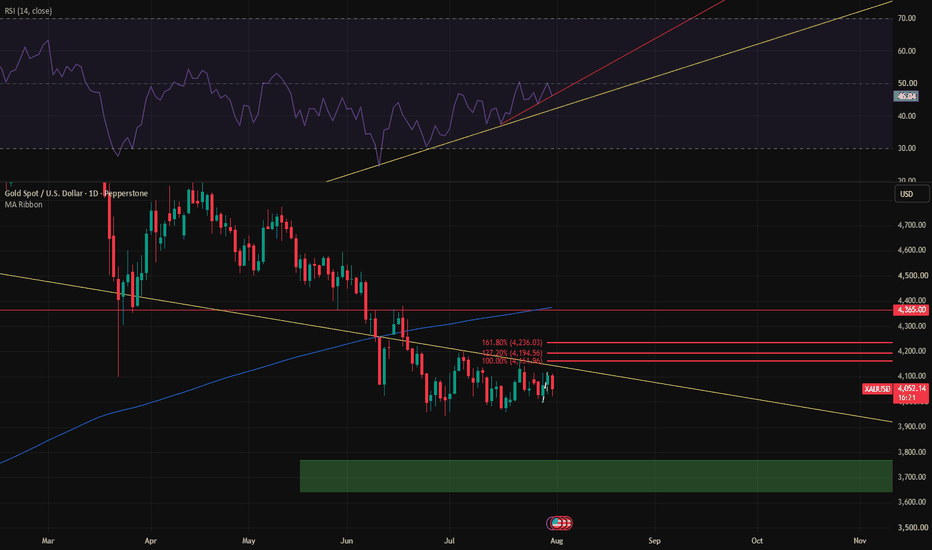
Webull (BULL) 1DWebull (BULL) is currently trading at a point where the company’s name feels almost ironic. The “bull” has been walking downhill for months, compressing inside a descending wedge, while investors wait for the earnings report on March 4, 2026 to decide whether this is capitulation or accumulation.
Webull is a digital brokerage platform focused on retail traders. Revenue is primarily driven by options trading, margin interest, payment for order flow, market data services, and premium subscriptions. In simple terms: when retail traders are active and volatility is high, Webull performs well. When markets cool down, earnings become unpredictable.
Recent quarterly results showed improvement. In Q3 2025, EPS came in at $0.07 versus expectations near $0.02. Revenue was approximately $156M compared to forecasts around $132M. That was a meaningful beat. However, trailing twelve-month profitability remains volatile. The company is transitioning from inconsistent losses toward operational stabilization, but it has not yet proven structural earnings durability.
Strategically , Webull continues expanding its mobile trading ecosystem, strengthening options infrastructure, enhancing subscription analytics tools, and broadening international access. The focus is shifting from pure user acquisition to deeper monetization and retention. The question heading into earnings is simple: can improved margins persist in a less euphoric market environment?
Technically , the chart shows a persistent downtrend: lower highs, lower lows, and a contracting descending wedge. Price is testing the 5.5–6.0 region - a historical support zone and potential accumulation area. The recent low around 5.47 marks the structural boundary.
RSI is emerging from oversold territory and showing early bullish divergence. Momentum histogram is contracting. ADX suggests weakening trend strength. Importantly, volume at the recent lows does not reflect panic capitulation. That often signals exhaustion rather than acceleration.
Key resistance levels sit at 7.96, 10.18, and 15.08. A strong earnings release could trigger short covering toward 8–10. A weak report, however, opens downside below 5.47.
BULL is not priced as a growth darling. It is priced as a company under skepticism. And that is often where asymmetric opportunities begin.
March 4 decides whether this wedge resolves upward - or confirms continuation.
 Long
Long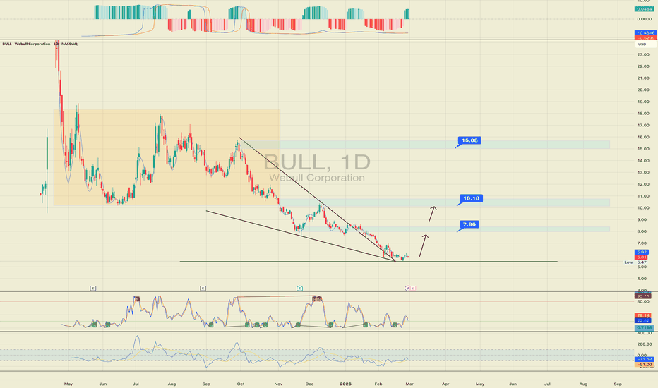
HOOD Oversold at HTF WCL | RSI Bullish DivergenceHOOD has now reached a higher-timeframe WCL and also met + exceeded the bearish C target , which tells me price is trading in an oversold location .
What makes this area more interesting is that RSI is showing regular bullish divergence inside the WCL , which adds a bullish reaction signal right where I would want to see one.
So from a structure standpoint, this is not a random bounce area.
It is a zone where price has already stretched into a key HTF reaction point, while momentum is starting to disagree with the downside.
Because of that, I expect price to attempt at least a move back toward the WCL of the bearish sequence .
That said, I am not blindly forcing the idea.
If the current divergence disappears or gets invalidated, I will simply wait for a fresh bullish signal before reassessing.
The main idea here is simple:
oversold price location + HTF WCL + bullish RSI divergence = valid area for a reaction higher .
Not financial advice. This is just my market view based on bias, context, phase, and location.  Long
Long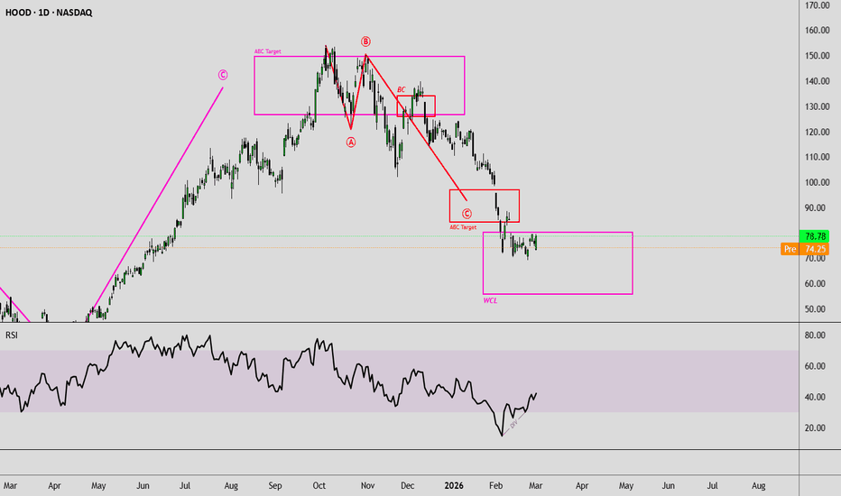
XAUUSD — Bearish Retest in FocusFundamental View
Gold remains sensitive to changes in the US dollar, Treasury yields and interest-rate expectations. Renewed strength in yields could maintain short-term pressure, while softer macro conditions may support corrective rebounds.
Technical View
On the M30 chart, XAUUSD rebounded from the 4,020 area after RSI formed a bullish divergence near oversold territory. This momentum signal supported the current recovery toward the moving-average resistance structure.
Price is now trading above the EMA 34 but remains below the EMA 89 around 4,067, suggesting that the rebound may still be corrective rather than a confirmed bullish reversal.
The 4,068–4,080 zone combines horizontal supply with the slower moving average, making it the main reaction area. RSI has recovered toward 60, showing improved momentum, but it is not yet confirming a complete trend reversal.
Key Levels
Main resistance: 4,068–4,080
Near-term support: 4,040–4,050
Primary downside zone: 3,978–3,988
Deeper support: 3,950–3,960
Trading Scenario
My primary view remains bearish while price stays below 4,068–4,080.
A final push into this resistance area, followed by bearish rejection and weakening RSI momentum, could support another decline toward 4,040, followed by 3,978–3,988.
The current rebound should therefore be treated as a corrective move unless price establishes sustained acceptance above the EMA 89 and the marked supply zone.
Sell Condition
Bearish confirmation from 4,068–4,080 would support the continuation scenario.
A sustained M30 close above 4,080 would weaken my bearish view and suggest that buyers are regaining stronger short-term control.
Overall View
The RSI divergence successfully supported a rebound from the recent low, but price is now approaching an important moving-average and supply confluence.
I remain cautious near resistance and would prefer confirmation before expecting the broader bearish move to resume.
Do you expect XAUUSD to reject from 4,068–4,080 or break above this resistance first? Short 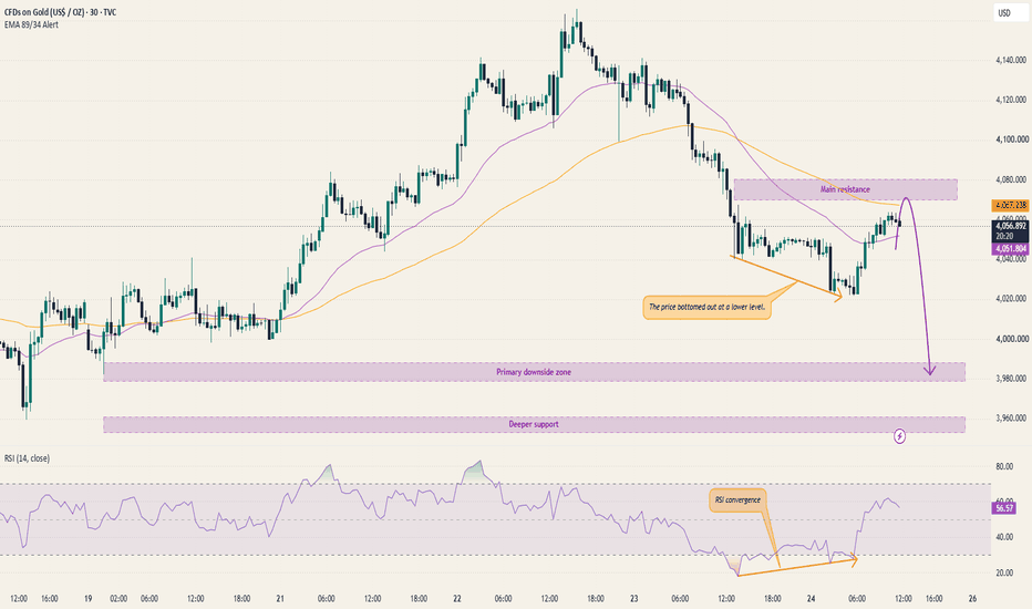
XAUUSD 4H Confluence: EMA, RSI & MACD Define the Next ExpansionGold is entering the new week with mixed momentum and a compressed 4-hour structure. This tutorial shows how to combine independent tools instead of relying on a single signal.
Current 4H evidence (FOREXCOM, market closed):
• Price closed near 4,052.78, below the 9-period EMA near 4,060.88.
• RSI(14) is around 47 and below its RSI moving average, so momentum has not confirmed a bullish regime.
• MACD remains below the zero line, showing that recovery momentum is still fragile.
• Price structure is rotating between the 4,020 support region and the 4,060–4,080 resistance band.
Bullish confirmation framework:
A 4H close above 4,080, followed by a successful retest, would place price back above the short-term EMA and improve momentum conditions. That would open a path toward 4,100 and 4,128. A move back below 4,050 after the breakout would invalidate the bullish continuation.
Bearish confirmation framework:
Rejection from 4,060–4,080, combined with RSI remaining below 50 and MACD staying below zero, would keep pressure on 4,020. A confirmed 4H close below 4,020 could expose 3,980 and then 3,940. A sustained reclaim above 4,080 invalidates this bearish framework.
Execution lesson:
Confluence does not mean stacking random indicators. Structure answers WHERE, the EMA shows short-term trend, RSI measures regime, and MACD confirms momentum. Take the trade only when these tools tell the same story.
For Gulf and European-session traders, watch how price behaves around the early London liquidity window. Avoid chasing the first move; wait for the 4H level to confirm.
This is educational analysis, not financial advice. Education 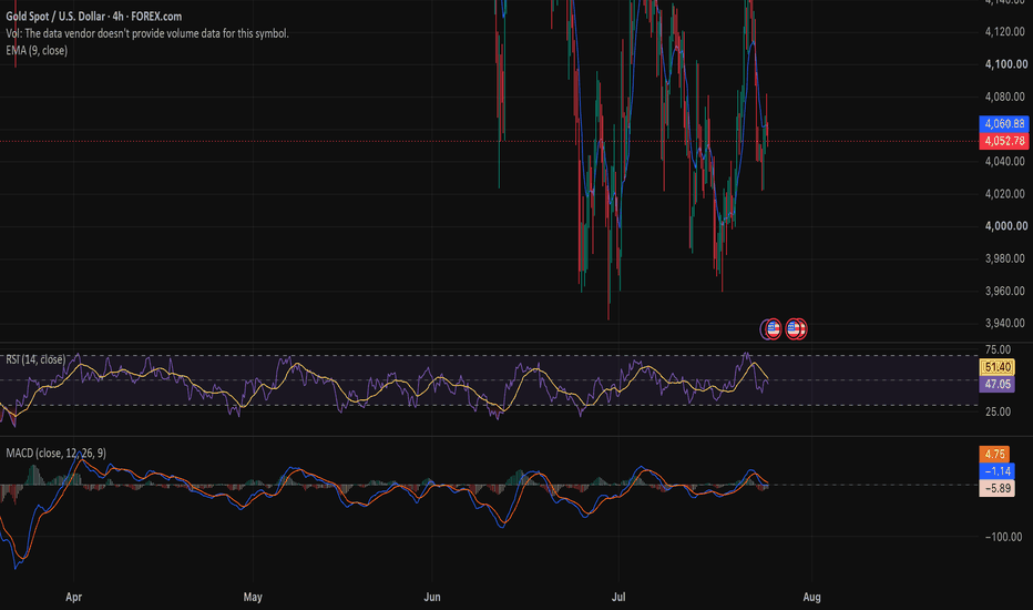
(UPD) NNE: Are the bears ready for a short squeeze? NASDAQ:NNE
Greetings, colleagues! I‘m updating the technical picture for NANO Nuclear Energy Inc. on the weekly timeframe as a follow-up to my previous publication.
An extremely interesting entry setup is developing: after a prolonged decline from the all-time high of $60.87, price is trapped inside a descending wedge and is approaching its apex, which historically precedes a powerful impulsive breakout.
The current drop has brought us into the key medium-term support zone of $15.00–$15.60, which represents a deep 78.60% Fibonacci retracement of the entire historical impulse from $3.25 to $60.87. This is a classic global pivot level where large capital begins to defend positions and re-accumulate for long-term portfolios.
Technical indicators fully confirm an upcoming reversal: CCI has plunged into deeply oversold territory at -150.08, indicating seller exhaustion, while a clear bullish divergence is forming on the weekly RSI as price makes lower lows while the indicator prints higher lows.
At the same time, the technical reversal from the 0.786 Fibonacci level is backed by a powerful fundamental factor: short interest stands at approximately 39.5% of the float with Days to Cover above 6 days. The very first attempt to rally or strong news from the Q2 earnings report on August 13 will force bears to panic-cover at market, triggering a cascading short squeeze.
Our trading plan is as follows: accumulate positions in the long-term buy zone of $15.00–$15.60. Take-profit targets: TP1 at $27.87 (nearest mirror resistance), TP2 at $38.50 (upper wedge boundary), and TP3 at $48.05 (global target on a pattern breakout).
This publication is for informational purposes only and does not constitute individual investment advice. Share your thoughts in the comments and don‘t forget to like this idea if you found it helpful!  Long
Long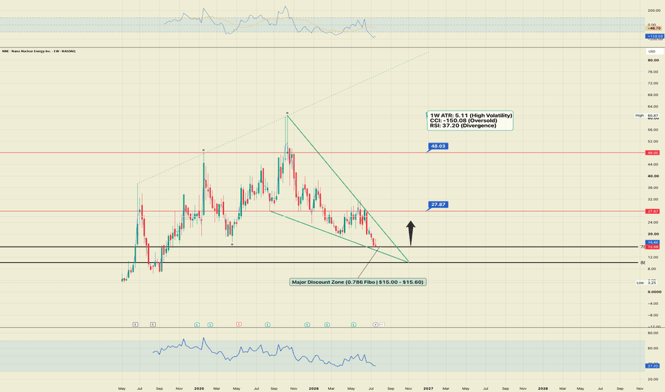
Which Momentum Indicator Is Best?I recently asked traders which momentum indicator they use most often.
The responses were interesting. While there was no overwhelming winner, the poll confirmed something I've observed throughout my career: there is no single "perfect" momentum indicator. Each has strengths and weaknesses, and much depends on how you incorporate it into your overall analysis.
What 35 Years in the Markets Taught Me
During my years as a bank technical analyst, my research was used by fund managers, central banks, corporates, sales desks and traders. Working with such a diverse range of market participants gave me a unique perspective on how technical analysis is applied in the real world.
One lesson became very clear: no single momentum indicator consistently outperforms the others. The edge doesn't come from finding a "magic" indicator—it comes from understanding how different indicators complement one another and using them alongside trend analysis and price action.
After more than 35 years as a professional technical analyst, my own approach has evolved into using several momentum indicators together rather than relying on just one.
My Preferred Momentum Indicators
If I had to rank the indicators I use most frequently, it would probably look something like this:
• Relative Strength Index (RSI)
• Directional Movement Index (DMI)
• MACD
• Slow Stochastics
The RSI remains my favourite because it is simple, versatile and works well across multiple timeframes. It can help identify trend strength, momentum shifts and potential divergences before they become obvious on price charts.
That said, I rarely use RSI in isolation. I prefer to combine it with other momentum indicators that measure different aspects of market behaviour.
My Simple MACD and RSI Strategy
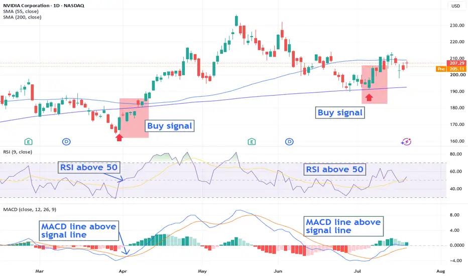
One of the cleanest momentum combinations is MACD together with RSI.
Rather than looking for overbought or oversold readings, I focus on confirmation between the two indicators.
Buy Setup
I look for:
• The MACD line crossing above the Signal Line, indicating bullish momentum is beginning.
• The RSI moving above the 50 level, confirming that buyers are taking control.
When both conditions occur together, it provides a much stronger signal than either indicator on its own.
Sell Setup
Conversely, I look for:
• The MACD line crossing below the Signal Line.
• The RSI falling below the 50 level.
Again, the combination provides confirmation that downside momentum is increasing.
This approach keeps the analysis simple and helps remove much of the subjectivity that can creep into trading decisions.
Why I Focus on the 50 Level on RSI
Many traders become fixated on the traditional 70 and 30 overbought and oversold levels.
Personally, I find the 50 level far more useful when analysing established trends.
I generally use a 9-period RSI and pay particular attention to whether it remains above or below the 50 line.
In a strong uptrend:
• RSI holding above 50 confirms the underlying bullish trend remains healthy.
• Pullbacks that remain above 50 are often simply corrections within the larger trend.
In a strong downtrend:
• RSI remaining below 50 confirms bears remain in control.
• Rallies that fail beneath 50 often present opportunities in the direction of the prevailing trend.
Rather than trying to call every market top and bottom, I prefer using RSI to determine whether momentum continues to support the primary trend.
Combining DMI with RSI
Another combination I use extensively is the Directional Movement Index (DMI) alongside RSI.
The DMI helps determine whether buyers or sellers are in control and whether a trend has sufficient strength to continue. When combined with RSI, it becomes a powerful way of filtering out weaker signals and focusing only on higher-probability opportunities. For example if you have a buy signal on the DMI but the new high has been accompanied by a diverging RSI, I would hold off adding to any long positions.
I also explain in more detail why I focus on the RSI 50 level rather than simply looking for overbought or oversold conditions: See my trading view comment regarding “most traders misunderstand the RSI – Here’s why?” date 13th March 2026
No Indicator Should Be Used Alone
Perhaps the biggest lesson I've learned over the years is that no indicator should be used in isolation.
Momentum indicators are simply tools. They become much more powerful when combined with:
• Trend analysis
• Support and resistance
• Moving averages
• Price action
• Multiple timeframe analysis
When several pieces of evidence align, confidence in the trade increases significantly.
This is precisely why I believe debates about whether RSI is "better" than MACD, or whether DMI is superior to Stochastics, miss the point. Each indicator measures a different aspect of market behaviour. Used together, they provide a far more complete picture than any one indicator can on its own.
Final Thoughts
There isn't a universally "best" momentum indicator.
The best indicator is the one you understand thoroughly and apply consistently within a disciplined trading process.
For me, RSI remains my first choice, particularly when combined with MACD or DMI. Together they provide a straightforward, objective framework that helps identify whether momentum is supporting the prevailing trend.
I'd be interested to hear your thoughts.
Which momentum indicator do you rely on most, and why?
 Education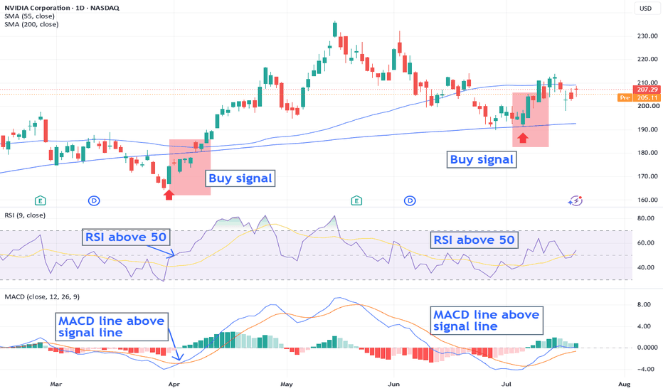
Short 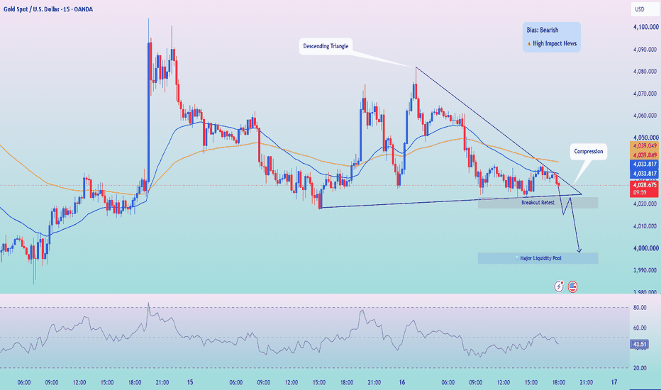
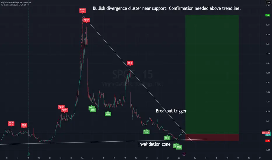
NNBR: Multi-Year Base + Bullish Divergence ClusterNNBR: Multi-Year Base + Bullish Divergence Cluster
NNBR is showing an interesting weekly turnaround setup after a long multi-year decline and compression phase.
This is not a confirmed breakout yet. I would treat it as a conditional long setup that still needs confirmation above the descending structure.
What I see on the weekly chart
1. Multi-year compression
After the large historical moves in 2014–2018, the stock entered a long decline and then started building a base.
From 2022 to 2026, price has been moving near the lower part of the historical range. This kind of compression can become interesting when price stops making clean downside continuation and starts reacting from the same lower zone multiple times.
2. Bullish divergence cluster
Several bullish RSI divergence signals appeared near the lower part of the base.
This means price continued to pressure the lows, but RSI was no longer confirming the same downside momentum.
For me, this is not a buy signal by itself. It is an early warning that selling momentum may be weakening.
3. Descending trendline
The key level is the descending weekly structure.
A clean breakout and hold above this trendline would be the first important confirmation that the long-term downtrend pressure is weakening.
Without that breakout, the setup is still only a potential reversal attempt.
4. Volume reaction
There is also a visible volume reaction near the current base area.
For a weekly turnaround setup, I want to see volume supporting the move. A breakout without volume would be weaker. A breakout with expanding volume would make the setup more interesting.
Possible plan
This is how I would read the setup:
Aggressive idea:
– early long near the base / reclaim area
– only if price continues to hold above the lower structure
– higher risk because the breakout is not fully confirmed yet
Safer idea:
– wait for a weekly close above the descending trendline
– then look for a hold / retest of the breakout zone
– confirmation is more important than catching the exact bottom
Invalidation
The setup becomes much weaker if price loses the lower base area and fails back under the current structure.
For me, the invalidation zone is below the base. If price breaks down with follow-through, the reversal thesis is no longer valid.
Potential upside zones
I would not treat the upper green box as an immediate target. On a weekly chart, it is better to think in zones:
– first reaction zone: 5.00–6.00
– next resistance zone: 8.00–10.00
– larger historical zone: 16.00–20.00
– extended scenario: 30.00+ only if momentum fully returns
Main idea
Bullish divergence shows that downside momentum may be weakening.
The multi-year base shows that sellers may be losing control.
But the trendline still needs to break.
For me, the key is simple:
Base must hold.
Weekly structure must break.
Volume should confirm.
Until then, this remains a high-risk conditional turnaround setup.
Educational content only. Not financial advice.  Long
Long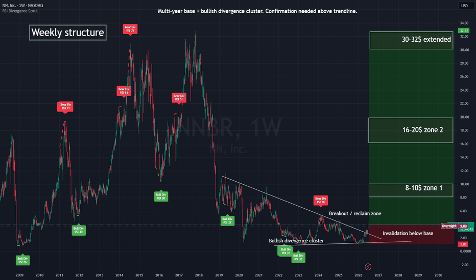
 Short
Short
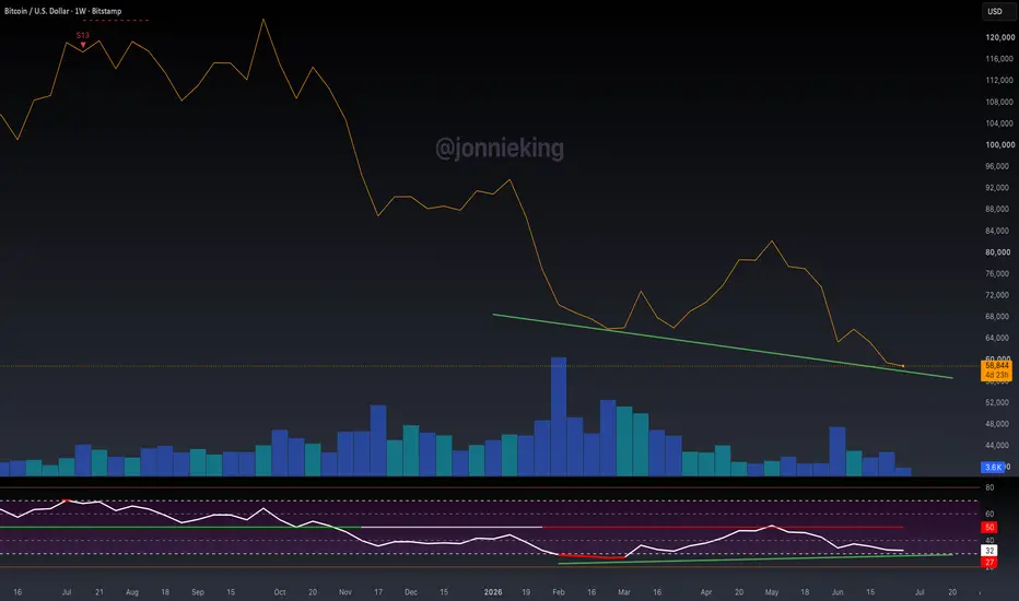
$BTC Very WEAK Bullish Divergence LESSON - Must ReadLately I’ve been seeing a ton of large accounts calling for a
CRYPTOCAP:BTC bottom because of the extremely weak bullish divergence on the Weekly chart.
This means absolutely nothing without confluence from PA, volume and other indicators-- all which are horrendous, such as volume which you can clearly see.
If PA keeps going lower, the bull div goes away, along with this silly bull-slop.
Example:
Low #1: BTC = $65,200 RSI = 27
Low #2 (today): BTC = $58,500 RSI = 32
That's a bullish RSI divergence because price made a lower low while RSI made a higher low.
But if ₿itcoin keeps falling...
Low #3: BTC = $54,000 RSI = 25
The divergence is invalidated because RSI made a lower low (25 < 27).
Bullish divergences aren't permanent. They can disappear if price and RSI continue making new lows before reversing.
The important threshold isn't the price, it's the RSI.
As long as BTC keeps making lower lows while RSI stays above ~27, the bullish divergence remains intact. If a future weekly low pushes RSI below that prior low, the divergence is no longer valid.
Please be careful with the financial advice you take from people on X and YouTube. Most of these people have very little experience with technical analysis and just shill you bull-slop for clicks. Education 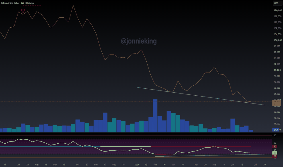
Gold’s Bizarre AdventureWhat in the world is PEPPERSTONE:XAUUSD Gold doing lately? If you’ve been watching the charts since mid-May, you might feel like you’re on a roller coaster where the safety bar is slightly loose. After our last correction ended, Gold has been in a relentless downward grind.
Let’s put on our technical goggles and break down why things are getting weird, why the Bulls are sweating, and where we might be heading next.
📉 The Technical Picture: Riding the ABC Down
Looking at the chart since the mid-May peak, we are clearly riding a continuous downward trend.
The Micro View: The structure looks like a textbook 1 to 5 impulsive wave down.
The Macro View: Zooming out to the higher timeframes, this fits perfectly into a broader A-B-C correction. Right now, it looks like we are firmly in the grips of Wave C.
The psychological 4,000 level has been acting as a massive battleground. We’ve dipped below the 4k mark a couple of times over the last few days, only to be heroically saved by the Bulls at the last second. But how long can they hold the gates?
🤪 The Fundamental Weirdness: Jobs, Dollars, and Disconnected Markets
Today’s price action was, for lack of a better word, weird.
We got the latest jobs data, showing a massive +300k jobs added. Historically, a hot labor market like this strengthens the US Dollar (USD), which in turn should hammer Gold down. But markets love to make fools of us, right?
Instead of dropping, Gold pumped up initially on the news, only to roll over and fall later in the session. Even weirder? The Dollar and Gold were moving in the exact same direction for quite some time today. When the safe-haven metal and the fiat currency hold hands like that, you know things are out of balance.
📊 RSI and the Wave C Danger Zone
Let’s talk momentum. The Daily RSI is currently sitting around 35. Normally, you might look at that and think, "Hey, we are almost oversold, time to buy!" Caution! Remember where we are: Wave C.
Wave C is notorious for being ruthless. In these waves, RSI can get completely buried and stay heavily oversold for an extended period. Expect this RSI to drop a lot lower before this move is over.
🎯 The Game Plan: How Far Can We Fall?
If you see signs of the price starting to drop—whether it gets triggered by sudden macroeconomic news or simply by failing to hold a key support level—pay close attention. Do not blindly catch the falling knife.
So, what’s the target?
My absolute "Dream Target" for the culmination of this C-wave is down around the 3,700 level.
Am I 100% sure we will make it all the way down there? Of course not, the market does whatever it wants. But structurally, it is a very valid and realistic possibility.
Key Takeaways:
Watch the 4k level closely; if the Bulls get exhausted, the floor falls out.
Don't trust the daily RSI just yet—Wave C can easily push it much lower.
Keep an eye out for sudden drops reacting to news or key level rejections.
Trade safe, manage your risk, and let's see if the Bears can deliver us to 3700! 🐻
-------------------------------------------------------------------------
This is just my personal market idea and not financial advice! 📢 Trading gold and other financial instruments carries risks – only invest what you can afford to lose. Always do your own analysis, use solid risk management, and trade responsibly. Short 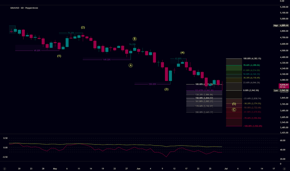
 Long
Long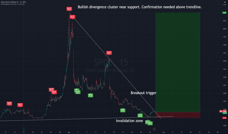
 Education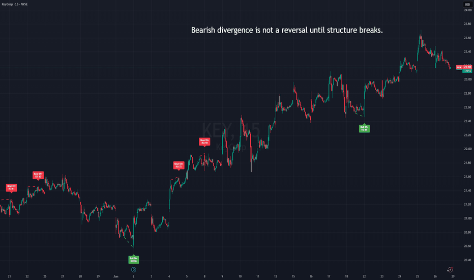
"Cheat Sheet" for Technical Indicators to Succeed in TradingTrading in financial markets can be challenging in the light of multiple trading markets, instruments, assets, and orders that can be executed to make some gains. Also, after analysing the above, success is not guaranteed in the financial market. Most traders try to mitigate the risks and maximise the chances of hitting the jackpot using technical indicators and analysis to look at the market trends differently.
Technical indicators help paint a bigger picture of what is happening in the market and spot the light on underlying meanings behind a particular price action. Ensure you read until the end of this article and find a cheat sheet to excel at technical analysis.
Key Takeaways
Technical indicators are tools and signals that help traders better understand market trends and price movements.
Indicators can be found on trading platforms for free, while some indicators are downloadable from different sources.
Technical indicators assist traders in identifying potential trends, entry/exit points, resistance/support levels, and more.
Indicators are technical tools provided in the trading platform, including signals, technical analysis, and options you can apply to a trading chart.
Most platforms offer a plethora of trading indicators that you drag and drop on the trading charts to explore different readings of the price trend and direction. Beginner traders may find it intimidating because there are many indicators, and not all apply to every asset.
Different technical indicators depend on your trading strategy, style, and industry. Some indicators are more risk tolerant than others, which can be applied to more volatile markets like cryptocurrencies, while other technical indicators are well-suited for long-term investments.
Why Use Trading Indicators
Financial markets involve a complex structure and several dependencies and variables, and a single glimpse at the price chart patterns may not tell everything the trader needs to know.
Therefore, trading indicators and tools help traders understand the full picture, track previous price tendencies, and reasonably predict future price movements.
For example, the price of asset A may face a sudden price increase, higher than that last 15 days average. A trader may think it is time to buy and capitalise on the increasing asset price.
However, a technical indicator may show that this price increase is an outlier movement due to overbuying, and the price will soon return to the average price, meaning that buying now is not the best move.
Top Technical Indicators You May Need to Know About
Technical indicators are usually shown in the options tab on the trading platform, and you may find different indicators between the platforms. However, here’s a cheat sheet of the most popular technical indicators you can use with your trading strategies.
Moving Averages
The moving averages are a commonly used technical indicator due to their simplicity and the useful technical analysis they provide. Moving averages use a price line of an asset’s previous price averages over a period of time.
This technical analysis helps traders identify market trends and to better respond to market sentiment. Most traders use the moving averages through Simple Moving Averages and Exponential Moving Averages.
Simple moving averages (SMA) measure the historical price averages during different timeframes.
Exponential moving averages (EMA) measure historical price averages during different timeframes, giving more value to recent periods. For example, a 10-day EMA line has more weight than a 50-day EMA line to focus on trend changes.
Using this technical analysis, if the price increases and crosses above its MA line, it refers to a possible price increase. On the other hand, if the price drops below the MA line, it indicates a possible downward trend.
Moving Average Convergence Divergence
The Moving Average Convergence Divergence is a momentum indicator that helps traders identify future price movements to capitalise on accelerated price changes. The MACD works well with trend trading strategy, where traders follow and act on market trends.
The MACD indicator is derivative from the moving averages technical indicators, using EMA as a baseline. MACD works by subtracting EMA-26 from EMA-12 as a fast line on the one hand.
On the other hand, the fast line is combined with a slow line, which is the EMA-9 line. This technical analysis compares the fast line “MACD line” against the slow line “signal line” to find market sentiment.
When the MACD line drops below the signal line, it indicates a downward trend; when the MACD price breaks over the signal line, it indicates an upward trend.
Relative Strength Index
The RSI is another momentum indicator that reveals a price trend's strength by using average price losses and gains over historical periods. This technical analysis indicator displays the results and gives a score ranging from 0 to 100.
RSI score above 70: The asset is overbought, and a trend reversal is expected.
RSI score under 30: The asset is oversold, and a potential trend reversal can happen to average price levels.
Bollinger Bands
Bollinger Bands are volatility indicators that assist traders in identifying volatility levels and determining entry and exit points. BB technical indicators use three lines or bands: an upper band, a lower band, and a middle band, that is, the SMA line.
The upper and lower bands expand and shrink, simulating market volatility, while the SMA line dictates if an asset is overbought or oversold. If the middle line moves close to the upper bands, the asset is overbought, and vice versa.
Stochastic Oscillator
This technical indicator measures price momentum by calculating an asset closing price and comparing it to historical price averages over a certain period of time.
The Stochastic Oscillator technical analysis gives a score ranging from 0 to 100, indicating how strong is a given price trend.
Stochastic Oscillator over 80: asset is overbought.
Stochastic Oscillator below 20: an asset is oversold.
Ichimoku Cloud
Ichimoku Cloud is like multiple indicators in one tool because it helps traders determine market trends, momentum, entry and exit points, and more.
This technical analysis draws a shaded cloud on the trading chart, indicating support and resistance levels, current price action, and if a potential trend reversal is expected.
This indicator works for different trading strategies because it powers various technical analysis tools that suit different markets.
Concluding Thoughts
Technical indicators are tools and signals that help traders better read chart patterns and understand price movements, which can be combined with different trading strategies. Multiple indicators are used to measure volatility, while others analyse momentum and how strong is the current price movement.
Applying technical indicators will assist you in market forecasting and making informed decisions to increase your chances of success. Ethereum Long-Term Outlook: Potential Correction Toward $1,000–$Ethereum remains under pressure as global macroeconomic conditions continue to challenge risk assets, including cryptocurrencies.
Several factors may continue to weigh on the market:
• Persistent restrictive monetary policies by major central banks
• Delayed interest rate cuts and the possibility of higher rates for longer
• Ongoing inflationary pressures in the United States and Europe
• Rising geopolitical uncertainty and global market instability
From a technical and liquidity perspective, Ethereum may still be in a broader corrective phase.
Key scenarios:
🔴 Scenario 1:
A significant market reaction could occur around the $1,000 liquidity zone.
🟢 Scenario 2 (Higher Probability):
A deeper correction toward the $700 area.
The $700 region stands out as a major long-term support zone due to the combination of liquidity concentration, historical market structure, and macroeconomic conditions.
In addition, the RSI is showing signs of a potential bullish divergence, suggesting that a long-term bottoming process could develop as price approaches these key demand areas.
It is important to note that these levels are not predictions of certainty but rather potential zones where a major market bottom may form.
Unless there is a meaningful shift in monetary policy or a significant improvement in global economic conditions, the broader outlook for Ethereum remains cautious and bearish into late 2026.
This analysis represents a long-term scenario and should not be considered financial advice.
If you found this analysis useful, feel free to support it with a like and share your thoughts in the comments.
#ETH #ETHUSD #ETHUSDT #Ethereum #Crypto #Cryptocurrency #TechnicalAnalysis #RSI #Liquidity #MacroEconomics #FederalReserve #InterestRates #TradingView  Short
Short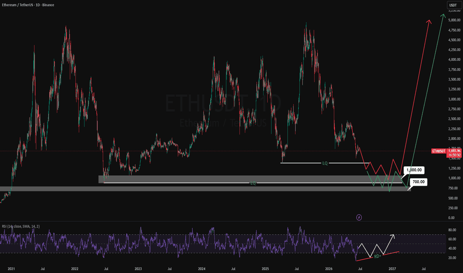
Short 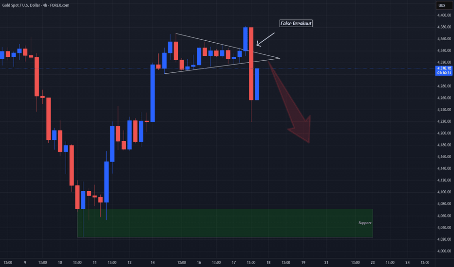
 Long
Long
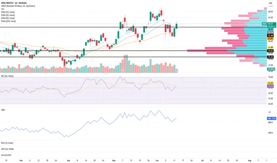
Momentum Above Value Area High | IREN Structure Update IREN continues to show constructive behavior on the daily timeframe as price trades above a key volume profile level.
Price is currently trading above the Value Area High (VAH), suggesting continued acceptance above the upper boundary of the primary value area
The Value Area Low (VAL) remains below current price and represents an area worth monitoring if momentum begins to weaken
The Point of Control (POC) sits below both levels and represents the price where the highest volume has historically been transacted
Trend structure remains constructive:
The 10, 20, and 50 EMA remain aligned, supporting a healthy trend environment
The 10 EMA is showing upward curvature, reflecting improving short-term momentum
Moving averages have generally been trending higher since the April 2nd pivot, reinforcing the broader structural improvement
Momentum conditions remain supportive:
RSI is currently near 54, reflecting constructive momentum without reaching extended levels
OBV has shown constructive behavior since April 2nd, suggesting participation has generally supported the advance
What I'm Watching 👀
Whether price can continue holding above the Value Area High
If the 10 EMA continues supporting short-term momentum
Whether RSI can continue strengthening while maintaining healthy participation
Continued confirmation from OBV as price approaches prior swing highs
At the moment, structure remains constructive, with price maintaining acceptance above the value area while trend and momentum continue showing signs of improvement.
⭐ Final Clarity Note ⭐
This is a structure-based observation, not a prediction — focused on trend alignment, momentum behavior, participation, and liquidity positioning across key structural levels. SPY Structure Update (Daily Chart)SPY remains in a constructive trend environment despite today's pullback, with the broader moving average structure continuing to hold.
The 10, 20, 50, and 200 EMAs remain positively aligned
Price continues to trade above all major moving averages, keeping the larger trend structure intact
While short-term momentum has weakened, the overall trend remains constructive until key support areas begin to fail
Momentum conditions have cooled:
RSI is currently near 49, reflecting a notable loss of short-term momentum following the recent decline
The move from overbought conditions back toward the midpoint suggests momentum is being reset rather than fully rebuilt
OBV has begun to pause, showing slight downward pressure, though participation has not yet deteriorated into a meaningful distribution phase
This creates a structure where trend remains constructive, but momentum and participation warrant closer monitoring.
What I'm Watching 👀
Whether RSI can stabilize and begin rebuilding from current levels
If OBV can hold recent gains or begins showing deeper signs of distribution
How price reacts around the rising 10, 20, and 50 EMA support cluster
Whether participation returns on any recovery attempt or continues to weaken
At the moment, the broader trend remains intact, but momentum has clearly cooled. The next clues will likely come from how RSI and OBV behave as price interacts with key support areas.
⭐ Final Clarity Note ⭐
This is a structure-based observation, not a prediction — focused on trend alignment, momentum behavior, participation, and liquidity positioning across key structural levels.