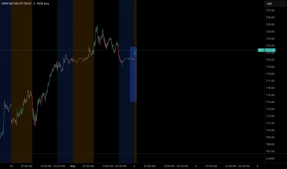
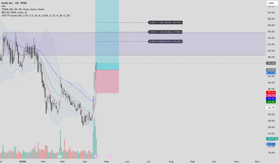
Daily ATR BoxDaily ATR Box
A volatility-based price box anchored to the key levels traders watch most — previous day high/low, premarket high/low, current day high/low, current close, or a manual price — sized automatically by the Daily ATR so the range always reflects current market conditions.
How It Works
The box height equals the Daily Average True Range multiplied by a user-defined multiplier. You select the anchor level and the indicator places the box either above or below it depending on the anchor type. High anchors (Previous Day High, Premarket High, Current Day High) place the box top at the level and extend downward, showing how far price may retrace after testing that high. Low anchors (Previous Day Low, Premarket Low, Current Day Low) place the box bottom at the level and extend upward, showing the potential bounce range from that support.
Anchor Modes
Previous Day High — Box top sits at PDH, extending down by one ATR. Useful for measuring retracement potential after reclaiming the prior session's high
Previous Day Low — Box bottom sits at PDL, extending up by one ATR. Identifies the bounce range off prior session support
Premarket High — Box top sits at the current session's premarket high, extending downward. Updates live during premarket and locks at the 9:30 AM ET open
Premarket Low — Box bottom sits at the current session's premarket low, extending upward. Same live tracking and lock behavior as premarket high
Current Day High — Box top sits at the highest point reached so far in the current session including premarket, extending downward. Updates in real time as new highs are made
Current Day Low — Box bottom sits at the lowest point reached so far in the current session including premarket, extending upward. Updates in real time as new lows are made
Current Close — Box floats with the current bar's close price. Useful for projecting the ATR range from wherever price currently sits
Manual Price — Set any custom price level as the anchor for full flexibility
Features
ATR length and multiplier fully adjustable
Drag Offset input shifts the entire box up or down freely without changing the anchor
Box width adjustable in bars
Optional right extension to project the zone forward on the chart
Fully customizable fill and border colors
Label displays the live ATR value, anchor mode, anchor price, and drag offset when applied
All key levels plotted to the Data Window for easy reference — ATR, Box Top, Box Bottom, PDH, PDL, Premarket High, Premarket Low, Current Day High, Current Day Low
Built in Pine Script v6
Recommended Usage
Designed for intraday charts from 1 minute to 15 minutes where the daily ATR provides meaningful context for expected range. Pair with volume or order flow tools to identify whether price is likely to accept or reject the ATR zone when it arrives at a key anchor level. 지표

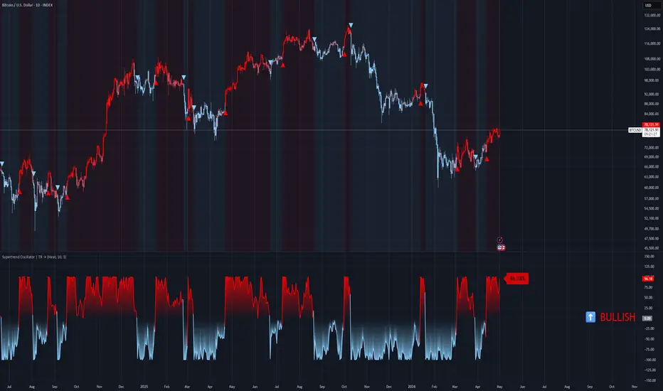
Supertrend Oscillator Pro | TR🎯 Overview
Supertrend Oscillator Pro transforms the classic Supertrend into a versatile, dual‑mode oscillator. It measures price distance from the Supertrend line either as a signed percentage (-100% to +100%) or as a raw ATR ratio. The indicator adds a powerful smoothing engine (11 moving average types), dynamic momentum‑based transparency, two independent signal systems (level crosses and reversal diamonds), plus comprehensive visual enhancements – gradient candles, trend fills, a persistent trend table, and nine color themes. It turns the simple Supertrend into a complete trend‑momentum trading system.
⚙️ Core Calculations
1. Base Supertrend (Classic Pine Logic)
Source: hl2 (high+low)/2
ATR Period: user defined (default 10)
Factor: user defined (default 3.0)
Outputs: stLine (Supertrend line), stDir (trend direction: -1 = uptrend, +1 = downtrend), atrValue
2. Raw Oscillator (rawOsc)
3. Oscillator Mode (User Selectable)
Mode A – Percentage (0‑100)
oscValue = (rawOsc / bandWidth) * 100
Then clamped to .
Mode B – Ratio (ATR)
oscValue = rawOsc / bandWidth (unbounded ratio, typically between -3 and +3)
Then normalised over last 70 bars to a range:
norm = (smoothOsc - minRatio) / rangeRatio → oscPlot := norm * 6 - 3.
4. Smoothing (Moving Average Engine)
The raw oscillator is passed through one of 11 moving averages (user choice):
EMA, SMA, RMA, WMA, VWMA, HMA, DEMA, TEMA, TRIMA, FRAMA, SWMA, T3 (with adjustable T3 factor).
Default: HMA(25).
5. Normalisation for Gradient Coloring (normOsc)
Over the last 70 bars, oscPlot is re‑scaled to a range → used for smooth candle color interpolation.
6. Momentum & Dynamic Fill Transparency
Momentum = absolute 5‑bar change of oscPlot
Max momentum over 50 bars → normalised normMomentum
Fill transparency = 35 - (normMomentum × 25), clamped 0‑100 (user can disable dynamic transparency).
→ Higher momentum = less transparent (more vivid fill).
🎨 Visual Features
9 Color Themes
Same palette as the classic version:
Classic, Modern, Heat, Robust, Accented, Monochrome, Moderate, Aqua, Cosmic.
Each defines upColor (bullish) and dnColor (bearish).
Gradient Candles (Overlay on Price)
Candle color interpolates between dnColor and upColor based on normOsc.
Plotted via plotcandle directly on the price chart.
Dynamic Fills (Oscillator Pane)
Positive area (osc > 0) – gradient from solid upColor (at upper level) to transparent (at zero), with momentum‑based transparency.
Negative area (osc < 0) – gradient from transparent (zero) to solid dnColor (at lower level).
Two separate fill pairs handle Percentage vs Ratio modes (levels differ).
Supertrend Overlay (Optional)
When Plot Supertrend Line is true, the classic Supertrend line is drawn on the price pane:
Uptrend (stDir < 0) → green (upColor)
Downtrend (stDir > 0) → red (dnColor)
Signal Markers
Triangles (level crosses) – user toggles showTriangles
LONG (bull cross) → green triangle below bar
SHORT (bear cross) → red triangle above bar
Diamonds (reversal signals) – user toggles showReversals
Reversal Up (price reverses from downtrend to uptrend) → diamond above/below bar with semi‑transparent upColor
Reversal Down → diamond with dnColor
Background Tint (Zone Background)
When bgZone enabled, the chart background gets a very light bullish or bearish tint matching the current trend (trendST).
Trend Table (Middle‑Right Corner)
Shows ⬆️ BULLISH or ⬇️ BEARISH in large colored text. Updates on trend changes.
Value Label (Last Bar)
Floating label showing the current oscillator value (e.g., 42.35% or 1.24). Positioned near the oscillator line with a semi‑transparent background matching the trend color.
Upper / Lower Level Lines
Percentage mode → user‑defined overbought (default 70) and oversold (default -70)
Ratio mode → automatically scaled to equivalents (e.g., 70% → 2.1, -70% → -2.1)
Plotted as gray circle‑style lines.
📈 Signal System
1. Level Cross Signals (Triangles)
LONG (Bull_Cross) – ta.crossover(oscPlot, lowerLevel) OR ta.crossover(oscPlot, upperLevel)
(Entering oversold or overbought zone from below)
SHORT (Bear_Cross) – ta.crossunder(oscPlot, lowerLevel) OR ta.crossunder(oscPlot, upperLevel)
Debouncing logic:
lastSignal stores the direction (1 = long, -1 = short). A new signal is only generated if it differs from the last one.
2. Reversal Signals (Diamonds)
Reversal Up (Bullish reversal) – ta.crossover(oscPlot, oscPlot ) AND oscPlot < -thresholdForSignal
(Oscillator turns up from deep negative territory)
Reversal Down (Bearish reversal) – ta.crossunder(oscPlot, oscPlot ) AND oscPlot > thresholdForSignal
Cooldown mechanism:
Reversals are only plotted if the last reversal bar was more than 10 bars ago (prevents clustered signals).
3. Trend Persistence (trendST)
Set to 1 (bullish) on any LONG signal (level cross)
Set to -1 (bearish) on any SHORT signal
Used for background tint, table text, and fill reference colors.
4. Interpretation Guide (Percentage Mode)
+100 → price is exactly one full ATR‑bandwidth above Supertrend (very strong uptrend)
-100 → price is exactly one full ATR‑bandwidth below Supertrend (very strong downtrend)
Crossing zero → price crosses the Supertrend line (classic trend change)
Oversold / Overbought zones (e.g., ±70) → potential exhaustion / reversal areas.
5. Divergence Possibility (Not Coded, But Usable)
The raw oscPlot value (especially in Ratio mode) can be used for divergences:
Price makes higher high, oscillator makes lower high → bearish divergence
Price makes lower low, oscillator makes higher low → bullish divergence.
🚨 Alert System
Four alert conditions available (user‑toggleable):
LONG (Cross) – level cross triggers a bullish entry
SHORT (Cross) – level cross triggers a bearish entry
LONG (Reversal) – reversal diamond (bullish)
SHORT (Reversal) – reversal diamond (bearish)
Alerts include the ticker symbol in the message. 지표

IND001 - Tide Flow Structure Map==================================================
WARNING
==================================================
This indicator is designed to read trend structure. It is not designed to act on every drop only because price reaches a lower or red area.
The correct use is to first check whether the market still has a supportive structure. The indicator works best when price action is stable, liquid, and structured. It is less suitable for very risky, illiquid, speculative, or erratic instruments.
The script does not predict the future. It helps the user read whether current market conditions are supportive, neutral, weakening, or risk-off.
==================================================
(1) INTRODUCTION
==================================================
IND001 - Tide Flow Structure Map is a public open-source trend-structure indicator.
The idea behind Tide Flow is simple: markets often move in phases. Some phases are healthy and structured, while others are weak, noisy, or damaged. This indicator was built to help users read those phases more clearly by combining trend direction, active flow, structure, volatility, trend strength, and optional asset-quality checks.
It is not meant to be a simple signal tool. It is meant to help the user understand the current market condition first.
==================================================
(2) OVERVIEW
==================================================
Tide Flow is mainly a structure-reading and trend-following tool. It is designed to work best when the market shows clear continuation behavior and enough stability for the curves to reflect real structure.
The main question is:
Is the current movement still healthy and structured, or is the structure starting to weaken?
Instead of using one simple signal, the indicator combines several layers of information:
main trend direction
active trend flow
upper and lower price structure
volatility
trend strength
higher-timeframe confirmation
RSI extension control
optional asset-quality filtering
Quick color key
🟨 Yellow - main trend environment
🟦 Blue - active trend flow
🟩 Green - upper structure and strength
🟥 Red - lower structure and risk
--------------------------------------------------
WHERE TIDE FLOW FITS BEST
--------------------------------------------------
Best trading styles
Swing trading - usually the best fit, because structure is clearer on higher timeframes.
Intraday / day trading - can work well on liquid and cleanly trending assets.
Position trading - suitable for following broader structure on higher timeframes.
Less suitable trading style
Scalping - usually the weakest fit, because very low timeframes often contain more noise and false shifts.
Timeframe guidance
Best fit: 1H, 4H, Daily
Good fit: 15m, Weekly
Use with caution: 5m and lower
Best asset types
liquid stocks
major crypto assets
index-related instruments
assets with stable trend structure
markets with clear continuation behavior
Less suitable asset types
very low-liquidity assets
small speculative instruments
thin or manipulated markets
assets with frequent abnormal spikes or unstable gaps
sideways markets with weak structure
Practical summary
Best overall use: swing trading
Good use: day trading on liquid trending assets
Weakest use: scalping on very low timeframes
==================================================
(3) MOST IMPORTANT: HOW TO USE IT PROPERLY
==================================================
The correct way to use this indicator is to read the market structure first, then use the table, background colors, and alerts only as extra confirmation.
Simple workflow
🟨 Start with the yellow curve.
Check whether price is above or below the main trend. If price is below the yellow curve, the broader structure is weaker and long-side ideas need more caution.
🟦 Then check the blue curve.
The blue curve shows the active trend flow. A rising or stable blue curve is healthier. A falling blue curve means the active flow is weakening.
🟩 Then check the green curve.
The green curve shows upper structure and strength. Price moving toward or above the green curve can show stronger expansion, but chasing too far above it can create poor risk-reward.
🟥 Then check the red curve.
The red curve shows lower structure and risk. Price moving close to or below the red curve means the structure is weakening or breaking.
Only after that, check the table and background colors.
The table and BG colors are helpers. They should support the structure reading, not replace it.
Use alerts only for monitoring.
An alert means a chart condition has appeared. It is not a trade instruction and does not guarantee a result.
Correct use
Use it when the market is liquid, structured, and trending clearly.
Use it to separate supportive structure from weak or risk-off structure.
Use it to avoid acting too early when price is below the main trend.
Use it with your own risk management and position sizing.
Incorrect use
Do not use it as a simple green-buy / red-sell system.
Do not act only because the table shows a stronger state.
Do not act only because the background color changes.
Do not act only because price touches the red or lower area.
Do not expect the script to predict future price movement.
The most important rule is: read the curves first. The helpers come second.
==================================================
(4) CURVES
==================================================
The indicator is built around four main curves. Each curve represents a different layer of market structure.
🟨 Yellow curve - Main trend
The yellow curve represents the broader trend environment.
Price above yellow: the broader trend condition is more supportive.
Price below yellow: the broader trend is weaker or damaged.
🟦 Blue curve - Active trend flow
The blue curve represents the active movement inside the main trend.
Price above blue: active flow is stronger.
Price around blue: the market is testing the flow.
Price below blue: the active flow is weakening.
🟩 Green curve - Upper structure
The green curve represents the upper part of recent smoothed price structure.
Price below green: price is still building inside structure.
Price at or above green: strength or expansion is increasing.
🟥 Red curve - Lower structure
The red curve represents the lower part of recent smoothed price structure.
Price above red: lower structure is still holding.
Price near red: structure is becoming weaker.
Price below red: lower structure is breaking.
==================================================
(5) LOGICAL SEQUENCE
==================================================
The indicator should be read in order. Each curve gives a different part of the full picture.
Correct reading order
🟨 Yellow curve - defines the broader environment
🟦 Blue curve - defines the active flow
🟩 Green curve - shows strength and expansion
🟥 Red curve - shows weakness and risk
What is normal
A healthier bullish structure usually develops in a stable way:
price is above the yellow curve
blue curve is flat-to-rising or rising
price respects the blue curve during pullbacks
price moves toward or above the green curve
red curve remains clearly below price
This suggests that the market structure is still functioning in a supportive way.
What is not normal
A weaker or damaged structure usually looks different:
price falls below the yellow curve
blue curve starts to flatten or decline
price cannot recover toward the green curve
price moves too close to the red curve or breaks below it
This suggests that the tide flow is no longer healthy and the market should be treated with caution.
==================================================
(6) EXAMPLE 1: CLEAN PULLBACK IN TREND
==================================================
Price is above the yellow curve, so the broader environment is still supportive. The blue curve is rising, showing that the active flow is healthy. Price pulls back toward the blue curve, respects it, and then continues toward the green curve.
Main reading
above yellow = supportive environment
blue rising = healthy active flow
pullback to blue = controlled movement
This is a structured use case because the idea is based on trend behavior, not on chasing price.
==================================================
(7) EXAMPLE 2: BREAKOUT AFTER BUILDING
==================================================
Price remains above the yellow curve and spends time moving between the blue and green curves. This shows that the market is building structure. Later, price moves above the green curve with stronger behavior.
Main reading
above yellow = supportive condition
movement between blue and green = structure building
move above green = expansion
This is a better-quality setup because the move happens after structure has already developed.
==================================================
(8) EXAMPLE 3: RECLAIM OF THE BLUE CURVE
==================================================
Price briefly moves below the blue curve but remains above the yellow curve. Soon after, price moves back above the blue curve and continues higher.
Main reading
above yellow = broader trend still valid
temporary move below blue = short-term weakness
reclaim of blue = active flow improves again
This is useful because the main structure did not break and the active flow was restored.
==================================================
(9) EXAMPLE 4: AVOIDING A WEAK CONDITION
==================================================
Price moves below the yellow curve. This means the broader trend environment is no longer supportive. A small bounce may appear, but the structure is still weak.
Main reading
below yellow = weak environment
small bounce = not enough confirmation
structure still weak = caution
This helps the user avoid acting too early in a damaged structure.
==================================================
(10) EXAMPLE 5: SIDEWAYS MARKET
==================================================
Price moves around the blue curve with no clear direction. The blue curve is flat, and price does not clearly move toward the green curve or break structure with strength.
Main reading
flat blue = weak active flow
sideways movement = unclear structure
no clean expansion = lower-quality condition
This is a situation where patience is usually better than forcing a trade idea.
==================================================
(11) OPTIONAL HELPERS: BG COLORS, TABLE, SETUP / RISK USE
==================================================
The indicator includes helper tools to make the chart easier to read. These tools are not the full system by themselves. The main reading still comes from the four structure curves.
--------------------------------------------------
1. BG COLORS - VISUAL HELP FOR IMPROVING CONDITIONS
--------------------------------------------------
Background colors can appear when the indicator detects improving structure after a weaker phase.
They can help the user notice:
improving recovery conditions
strengthening active flow
a transition from weaker structure to healthier structure
They should not be used as standalone entry signals.
BG colors are not:
direct trade instructions
standalone entry signals
a replacement for reading the curves
a guarantee that price will continue
Correct use: first read the yellow, blue, green, and red curves. Then use background colors as extra visual context only.
--------------------------------------------------
2) TABLE - QUICK SUMMARY OF CURRENT CONDITION
--------------------------------------------------
The table gives a compact summary of the current market state. It helps organize the most important checks in one place.
The table can show:
current state
direction
higher-timeframe trend
trend condition
ADX strength
ATR condition
structure zone
asset quality
quality data
quality explanation
The table is useful because it shows whether the current move is supported by more than one condition. It should still be treated as a summary panel, not as a replacement for chart reading.
--------------------------------------------------
3) SETUP / RISK USE - EXTRA CONFIRMATION ONLY
--------------------------------------------------
The indicator is first a structure-reading tool. The table, background colors, and alerts can support the reading, but they should not replace it.
A stronger long-side condition may be present when:
price is above the yellow curve
the blue curve is healthy or rising
price respects structure instead of breaking it
price moves toward or above the green curve
the table supports the stronger condition
background colors show improving structure
A weaker or risk-off condition may be present when:
price falls below the yellow curve
the blue curve weakens or turns down
price fails to recover toward the green curve
price moves close to or below the red curve
the table no longer supports the stronger condition
Simple summary
the curves explain the structure
the background colors show visual improvement
the table summarizes the internal checks
alerts help with monitoring
When these parts agree, the reading is stronger. When they disagree, the user should be more careful.
==================================================
(12) HOW EVERYTHING IS CALCULATED
==================================================
This section explains the internal logic in simple terms.
How the curves are calculated
Yellow curve: an EMA of price using the main trend length.
Blue curve: a faster EMA of price.
Green curve: recent highest highs over a lookback period, then smoothed.
Red curve: recent lowest lows over a lookback period, then smoothed.
How the main conditions are calculated
ATR checks whether volatility is active enough.
ADX checks whether trend strength is acceptable.
Higher-timeframe filter checks whether broader direction supports the trend.
RSI helps avoid overly extended long-side conditions.
The active-flow check uses the slope of the blue curve to detect weakness.
How asset quality is calculated
The optional asset-quality guard uses:
market cap
20-day average dollar volume
60-day average dollar volume
price level
These values are combined into a quality score and grouped into a quality rank. The purpose is to help avoid instruments with weak liquidity, weak size, or unstable trading conditions.
In practice, the indicator combines:
trend structure
active flow
volatility
trend strength
higher-timeframe confirmation
asset quality
liquidity quality
The purpose is not to predict the future exactly. The purpose is to judge whether current market conditions are supportive enough.
==================================================
(13) 10 POINTS: WHAT IS WRONG WHEN USING TIDE FLOW
==================================================
Using it like a simple signal tool
The indicator is not meant to be a simple green-buy / red-sell system.
Acting below the yellow curve without caution
When price is below the yellow curve, the broader environment is weaker.
Ignoring the blue curve
If the blue curve is flat or falling, the active flow is weak.
Treating every dip as an opportunity
A drop in price alone is not a valid reason to act.
Chasing price too far above the green curve
Late entries after large expansion can create poor risk-reward.
Ignoring the red curve
When price gets close to or below the red curve, structure is weakening.
Using it in sideways markets without caution
The indicator works best when the market has structure and direction.
Skipping the reading sequence
The correct order is yellow first, blue second, green third, red last.
Expecting prediction instead of interpretation
The indicator helps interpret condition. It does not predict future price.
Using it without patience
Better readings usually come when structure is clear and supportive.
==================================================
(14) ALERTCONDITION
==================================================
The indicator includes alert conditions so users can monitor important chart events.
Alerts can be used for conditions such as:
main gates becoming aligned
price moving above the upper structure curve
a long-side setup forming
recovery conditions appearing
asset quality warning
price crossing below important structure levels
price confirming below the active risk line
Alerts are only monitoring tools. They are not trade instructions, performance claims, or guarantees of future results.
==================================================
(15) SUMMARY TO USE
==================================================
Use Tide Flow as a trend-following and structure-reading indicator, not as a simple buy or sell signal tool.
Simple reading process
🟨 Start with the yellow curve to check the broader environment.
🟦 Use the blue curve to confirm active trend flow.
🟩 Use the green curve to identify strength or expansion.
🟥 Use the red curve to monitor weakness and risk.
Use the table and background colors only as helpers.
Use alerts only for monitoring chart conditions.
Avoid forcing trades in weak, sideways, illiquid, or unstable markets.
Use your own risk management and analysis.
The indicator is most useful when the market is structured, liquid, and trending clearly.
==================================================
DISCLAIMER
==================================================
This script is a public open-source indicator for educational and informational use.
It is not financial advice, investment advice, or a recommendation to buy or sell any asset.
The indicator does not guarantee profitable trades, signal accuracy, or future performance. It can produce false or late signals, especially in sideways, illiquid, volatile, or news-driven markets.
Users should always apply their own analysis, position sizing, and risk management before making any trading decision.
==================================================
PINE NOTE
==================================================
// Public open-source indicator
// Alerts identify chart conditions only
// No future performance is guaranteed
지표

지표

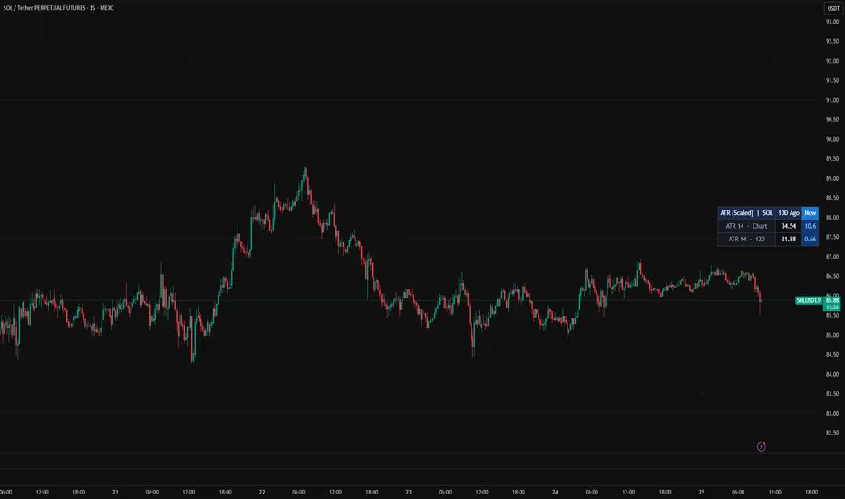
Black Tie ATR + Position SizerMulti-timeframe ATR with a built-in position sizing calculator. Computes the position size required to risk a fixed percentage of your account, given an ATR-based stop-loss distance. Displays SL distance, risk in account currency, and projected profit at three R:R targets.
This is for traders who size every position by risk, not by gut feeling.
WHAT IT SHOWS
A table on the chart with: current ATR value, SL distance in price units, account size, risk percentage, risk amount in account currency, position size (in the correct unit for your instrument), total notional value, and projected profit at TP1 / TP2 / TP3.
Optional preview lines on the chart show where the long SL and short SL would sit at the current price given the configured ATR multiplier. These lines are hypothetical references, not trade signals.
INSTRUMENT-AWARE POSITION SIZING
The indicator detects the instrument type and displays position size in the unit your broker actually uses:
Forex pairs: standard lots, mini lots, and micro lots (1 standard lot = 100,000 units).
Gold (XAUUSD): standard lots, mini lots, and micro lots (1 standard lot = 100 oz).
Silver (XAGUSD): standard lots, mini lots, and micro lots (1 standard lot = 5,000 oz).
Crypto, stocks, and indices: contracts, shares, or units as appropriate.
Detection is automatic but can be overridden manually if your symbol naming is non-standard.
ALGORITHM
Position size is computed as Risk Amount / SL Distance, then converted to the appropriate trading unit. The SL distance is ATR multiplied by the SL ATR Multiplier. The risk amount is account size multiplied by the risk percentage divided by 100.
The Risk classification field labels the configuration as Conservative (under 0.5%), Standard (0.5-1%), Aggressive (1-2%), or HIGH RISK (over 2%) based on the input. The professional standard is 0.5-1% per trade.
USAGE
Set your account size and the percentage you risk per trade. Adjust the ATR multiplier to match your typical stop-loss distance. The table will display the position size you should enter in your broker's order ticket on the next trade.
SETTINGS
ATR Timeframe lets you compute ATR on a higher timeframe than the chart (useful for swing position sizing on intraday charts).
ATR Period and Smoothing match standard ATR conventions (default RMA, 14).
SL ATR Multiplier defaults to 1.5; lower for tighter stops, higher for more breathing room.
TP1 / TP2 / TP3 R:R are configurable.
Account currency display can be set to USD, EUR, GBP, JPY, AUD, CAD, or CHF.
Note on cross-currency: calculations assume 1:1 conversion to the instrument's quote currency. On cross-currency forex pairs, verify the conversion rate manually with your broker. 지표

Supertrend Oscillator | TR🎯 Overview
Supertrend Oscillator transforms the classic Supertrend (which plots a directional line on price) into a bounded oscillator that ranges from -100% to +100%. It measures how far price is from the Supertrend line relative to the ATR‑based bandwidth, giving a clear, normalised view of trend strength. The indicator keeps all the familiar Supertrend logic but adds gradient candle coloring, dynamic fills, nine color themes, entry signals, and a persistent trend table – turning a trend‑following line into a full visual momentum system.
⚙️ Core Calculations
1. Standard Supertrend
Source: hl2 (high+low / 2)
ATR Period: default 10
Factor: default 3
The Supertrend line and direction (pineDir) are computed using the classic Pine Script logic:
pineDir = -1 → uptrend (price above Supertrend)
pineDir = +1 → downtrend (price below Supertrend)
2. Oscillator (%)
Uptrend (pineDir = -1): positive values (0 to +100)
Downtrend (pineDir = +1): negative values (0 to -100)
The result is clamped to .
3. Normalised Percent (0..1)
Over the last 70 bars, percent is re‑scaled to a 0–1 range. Used for gradient candle coloring (smooth transition between bearish and bullish theme colors).
4. Momentum & Fill Transparency
Momentum = absolute 5‑bar change of percent
Normalised over a 50‑bar max → normMomentum
Fill transparency = 35 - (normMomentum × 25) clamped 0–100
→ Higher momentum = less transparent (more visible fill).
🎨 Visual Features
9 Color Themes
Same palette as the previous Williams %R indicator:
Classic, Modern, Heat, Robust, Accented, Monochrome, Moderate, Aqua, Cosmic.
Each theme defines UpC (bullish color) and DnC (bearish color).
Gradient Candles
Candle color interpolates between DnC and UpC based on the normalised percent.
Overlay on the price chart (plotcandle).
Dynamic Fills (between oscillator and zero line)
Overbought fill (percent > 0) – gradient from solid UpC (at +100) to transparent (at 0)
Oversold fill (percent < 0) – gradient from transparent (at 0) to solid DnC (at -100)
Trend‑direction fill – only fills the side of the current trend (bullish or bearish), with momentum‑based transparency. Higher momentum = less transparent.
Supertrend Overlay (optional)
Plot Chart toggle (false by default). When enabled, plots the classic Supertrend lines directly on the price pane:
Uptrend line (green) when pineDir = -1
Downtrend line (red) when pineDir = +1
Signal Markers
LONG (Bull_Cross): percent crosses above zero → green triangle below bar.
SHORT (Bear_Cross): percent crosses below zero → red triangle above bar.
Background Tint
Very light bullish / bearish tint matching the active trend.
Trend Table (middle‑right corner)
Shows “BULLISH” (⬆️) or “BEARISH” (⬇️) in large colored text.
Floating Value Label
On the last bar, shows the current percent value (e.g., 42.35%) near the oscillator line, with a semi‑transparent background matching the trend color.
📈 Signal System
Entry Signals
LONG (Bull_Cross): percent crosses above 0
→ Occurs when price moves from below Supertrend to above it, pushing the oscillator from negative into positive territory.
SHORT (Bear_Cross): percent crosses below 0
Trend Persistence
Trend_Supertrend stores the last confirmed direction:
1 = bullish (percent > 0)
-1 = bearish (percent < 0)
The trend state only changes on a zero‑line cross – prevents flickering near the threshold.
Overbought / Oversold Interpretation
+100 → price is exactly one ATR‑bandwidth above the Supertrend (strong uptrend).
-100 → price is exactly one ATR‑bandwidth below the Supertrend (strong downtrend).
Crossing zero indicates the price has just crossed the Supertrend line – a classic reversal signal.
Divergence Possibility
Although not explicitly coded, the oscillator’s raw percent value can be used to spot divergences:
Price makes a higher high but percent makes a lower high → bearish divergence.
Price makes a lower low but percent makes a higher low → bullish divergence. 지표

Median ATR TrendMedian ATR Trend
Median ATR Trend is a trend-following indicator that identifies the dominant market direction using a percentile-based median combined with an ATR buffer and a standard deviation filter — confirming trend changes only when price shows genuine strength beyond its own statistical boundaries.
The result is a dynamic line that moves with the market — sitting above price in a bullish trend and below price in a bearish trend, with a fill between the line and price for clear visual trend identification.
How It Works
A moving average of your choice is calculated on a configurable source and length. The median of this MA is then derived using a percentile calculation — giving a robust, noise-resistant central reference level that adapts to recent price behavior.
Two independent filters then validate whether a trend change is genuine:
ATR buffer — the ATR defines a zone around the median. For longs, price must stay above the lower boundary of this zone — if price drops too far below the median the long condition fails. For shorts, price must fall below the upper boundary of this zone — meaning the bullish momentum has faded and price has re-entered the median zone from above. The ATR Multiplier controls how wide this zone is — higher values create a wider zone and fewer signals, lower values make the indicator more sensitive
Standard deviation filter — price must additionally clear the upper standard deviation band of the median before a long is confirmed, ensuring only statistically significant moves trigger an entry
A confirmation mechanism requires both conditions to hold for a defined number of bars before the trend state changes — separately configurable for long and short signals. This prevents the indicator from reacting to brief spikes that immediately reverse, keeping the trend state stable and reducing false signals in choppy market conditions.
By default the indicator is asymmetric — longs require SD confirmation while shorts only require the ATR condition. This means the long side is stricter and more selective, while the short side reacts faster to any weakness. Enabling the Short SD Filter makes the short condition equally strict, requiring price to additionally break below the lower standard deviation band before confirming a bearish trend — making both sides symmetric.
In markets like crypto that have a strong structural bullish bias, the default asymmetry makes a lot of sense — price spends significantly more time trending upward than downward. A strict long condition ensures only genuine bullish moves are entered, while a fast short condition allows quick exits when momentum fades. Enable the Short SD Filter in ranging or bearish markets where you want both sides to require the same level of statistical confirmation before triggering.
Why This Approach Works
Most trend indicators use fixed levels or simple moving average crossovers that trigger on any price touch — even weak or noise-driven ones. By combining a percentile-based median with two independent volatility filters, Median ATR Trend requires price to demonstrate genuine statistical strength before confirming a trend. Minor retracements and noise-driven spikes around the median are ignored — only moves with real conviction behind them trigger a signal.
Settings
MA Type — Moving average type used as the basis for the median calculation: DEMA, EMA, SMA, WMA, HMA, RMA (default: DEMA)
MA Length — Lookback period for the moving average (default: 9)
MA Source — Price source for the moving average calculation (default: close)
Median Length — Lookback period for the percentile median calculation (default: 61)
ATR Length — Lookback period for ATR calculation (default: 12)
ATR Multiplier — Controls the size of the ATR buffer. Set to 0 to disable the ATR filter entirely (default: 0.5)
SD Length — Lookback period for standard deviation calculation (default: 29)
SD Multiplier Long — Controls the strength of the standard deviation filter for long signals. Set to 0 to disable (default: 1.0)
Use Short SD Filter — Enables a symmetric standard deviation filter for short signals, matching the long side. When disabled the indicator is asymmetric by default — longs require SD confirmation, shorts do not (default: false)
SD Multiplier Short — Controls the strength of the standard deviation filter for short signals when enabled (default: 1.0)
Long Confirmation Bars — Number of bars the bullish condition must hold before confirming (default: 1)
Short Confirmation Bars — Number of bars the bearish condition must hold before confirming (default: 1)
Use Bar Coloring — Colors bars based on the current trend state (default: true)
How to trade it
Long — when the line turns blue and the fill appears above price, a bullish trend has been confirmed. This is the signal to look for long entries or to hold existing long positions
Short / Cash — when the line turns red and the fill appears below price, the bullish structure has broken down. This is the signal to exit longs, move to cash, or look for short entries depending on your strategy
Avoid trading against the trend — if the line is red do not look for longs, if the line is blue do not look for shorts
Recommended Usage
Best used on the 1D timeframe for clean and reliable trend identification
Should not be used alone for trade entries — combine with a momentum or volume indicator for confirmation
Set SD Multiplier Long to 0 to rely solely on the ATR filter — useful in trending markets where the SD filter may delay entries
Keep the Short SD Filter disabled for bullish or trending markets — the default asymmetry keeps long entries strict while allowing fast exits when momentum fades
Enable the Short SD Filter in ranging or bearish markets where you want both sides to require the same level of statistical confirmation before triggering
Higher ATR Multiplier values increase signal quality at the cost of fewer signals — lower values make the indicator more reactive
Higher Confirmation Bar values reduce false signals at the cost of slightly later entries — useful in choppy or ranging markets
Swing trading — the confirmation mechanism keeps the indicator stable during pullbacks, allowing you to hold through minor retracements without being shaken out prematurely
Breakout trading — the combination of ATR buffer and SD filter ensures you only act on genuine breakouts with real momentum behind them
All signals are confirmed on bar close. 지표

전략

OT S/R Edge[roongee]Here is the comprehensive guide for the OT S/R Edge indicator, translated and organized for professional use.
1. Dashboard Overview (The Command Center)
The dashboard summarizes the market state in real-time, allowing you to assess the situation at a glance without cluttering your chart.
Resistance: Displays the nearest resistance price and its Touch Count (x). A high touch count (3x or more) suggests the level is significant or may soon break.
Support: Displays the nearest support price and its Touch Count (x).
Trend: Indicates the current "Momentum" based on the most recent breakout.
Bullish ↑: A resistance level was recently broken (Buying is favored).
Bearish ↓: A support level was recently broken (Selling is favored).
Active (x/5): Tracks the number of "Live Barriers" currently on the chart. This helps you identify if the market is in a clear "vacuum" or a congested area.
2. Decision Logic: The Break Score Framework
This indicator doesn't just watch price cross a line; it calculates the "Quality" of a breakout using a 3-layer filter:
The Gate (ADX Filter): If ADX is outside the 15–45 range, the system assumes there is either insufficient volatility to break or the move is already "overextended."
The Pressure (Touch Count): The more a level is tested, the higher the Break Score. Statistically, levels weaken after multiple hits.
The Momentum (ADX Rising & Last Break): If ADX is sloping upward and the direction aligns with the most recent trend, the probability of a successful break reaches High Probability (Score 4+).
3. Trading Strategies (Action Plan)
Strategy 1: Trend Following
Check Dashboard: If the Trend is Bullish ↑, look for Buy opportunities only.
Entry Point: Wait for a "Buy the Dip" scenario at an Active support level or a "flipped" level (Old Resistance turned New Support, shown as a gray dotted line).
Target: Take Profit (TP) at the next Resistance level shown on the Dashboard.
Strategy 2: Breakout Trading
The Signal: Look for a ↑ Break or ↓ Break label accompanied by a "High Probability Break" alert.
Entry Point: Enter a trade once the candle closes outside the designated Zone.
Key Indicator: If the Active count on the dashboard drops suddenly (e.g., from 4/5 to 1/5), it signals a major "clearing" of levels, often leading to a powerful price run.
Strategy 3: Range/Sideways Play
Check Dashboard: Use this when the Trend is Neutral and the Active count is high (4/5 or 5/5).
Entry Point: Sell at the Resistance ceiling and Buy at the Support floor.
Confirmation: Check the Touch Count. If it is low (1x or 2x), the level is more likely to "bounce" than "break."
4. Visual Guide (Color & Line Logic)
Solid Green/Red Lines: Active support/resistance. Increased line thickness represents longevity (the older the level, the more important it is).
Colored Zones: These represent "Areas of Interest." Markets rarely reverse at a precise decimal point; they reverse within a zone.
Gray Dotted Lines (Broken): Levels that have been breached. These often serve as Retest points.
Break Labels: Mark the exact point where momentum successfully overcame a barrier.
Pro Tip: Pay close attention to the Active count. When it drops to 1/5 or 2/5, the market is usually entering a "clean" state where a long-term trend can finally begin. 지표

지표

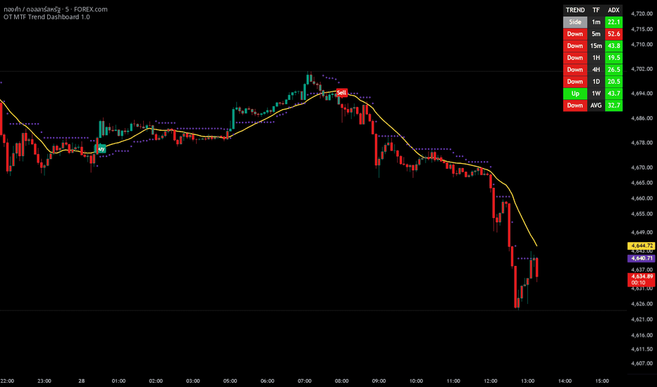
OT MTF Trend Dashboard 1.0OT MTF Trend Dashboard 1.0, is a sophisticated trend-following system designed to filter out "market noise" and focus on high-probability entries by aligning multiple technical factors across various timeframes.
Here is a breakdown of its logic and how to trade with it.
1. The Core Components (The Logic)
The script relies on a "triple-filter" logic to generate signals:
A. OT Bot (Sensitivity Filter)
This is a custom volatility-based trailing stop (similar to a Supertrend). It uses a "Key Value" (Sensitivity) and ATR to determine the immediate trend direction.
Heikin Ashi Option: It can use Heikin Ashi candles to smooth out price action, reducing "fake-outs."
SMA 17: A yellow Simple Moving Average acts as a secondary visual baseline for the short-term trend.
B. Supertrend (Main Trend Filter)
This acts as the "Master Trend." For a signal to be valid:
Buy signals only occur when the Supertrend is in a Bullish state (Price above the line).
Sell signals only occur when the Supertrend is in a Bearish state (Price below the line).
C. ADX Filter (Strength Filter)
The Average Directional Index (ADX) measures trend strength, not direction.
Active Range: The script only triggers signals when the ADX is between 15 and 45.
Logic: If ADX < 15, the market is too flat (choppy). If ADX > 45, the trend might be overextended and due for a reversal.
2. The Multi-Timeframe (MTF) Dashboard
The table on your screen is a Confirmation Hub. It looks at timeframes from 1 minute (1m) to 1 week (1W) using the following logic:
Trend Column: Uses EMA 20 and EMA 50 crossovers combined with price slope.
Green (Up): Fast EMA > Slow EMA + Positive Slope.
Red (Down): Fast EMA < Slow EMA + Negative Slope.
Gray (Side): No clear trend or low momentum.
ADX Column: Shows the trend strength for each specific timeframe.
Green: Trending (15–45).
Red: Not trending (below 15 or above 45).
3. How to Trade with this Indicator
Buying Strategy (Long)
Wait for the 'Buy' Label: This appears when the OT Bot flips bullish, the Supertrend is already bullish, and the ADX is in the "Goldilocks" zone (15–45).
Dashboard Confirmation: Look at the MTF Dashboard. Ideally, the AVG (Average) row and the timeframes higher than your current chart should be Green (Up).
Entry: Enter on the close of the candle where the "Buy" label appears.
Stop Loss: Place your stop loss slightly below the Supertrend Line or the OT Trailing Stop line.
Selling Strategy (Short)
Wait for the 'Sell' Label: This appears when the OT Bot flips bearish, the Supertrend is already bearish, and ADX is between 15–45.
Dashboard Confirmation: Ensure the MTF Dashboard shows Red (Down) on higher timeframes and the AVG row.
Entry: Enter on the close of the candle where the "Sell" label appears.
Stop Loss: Place your stop loss slightly above the Supertrend Line.
4. Pro-Tips for Success
The Power of "AVG": Never trade against the AVG Trend on the dashboard. If you are on a 5m chart but the AVG Trend is "Down," skip the "Buy" signals.
Confluence is King: The best trades happen when the Trend color and the ADX color on the dashboard are both Green across multiple timeframes.
Avoid "Side" Markets: If the dashboard is mostly Gray (Side), the market is ranging. This is where most trend-following indicators lose money. Wait for the dashboard to show a clear direction.
Yellow Line (SMA 17): Use this as a trailing exit. If price closes significantly on the "wrong" side of the yellow line, it may be time to take profits before the main signal flips. 지표
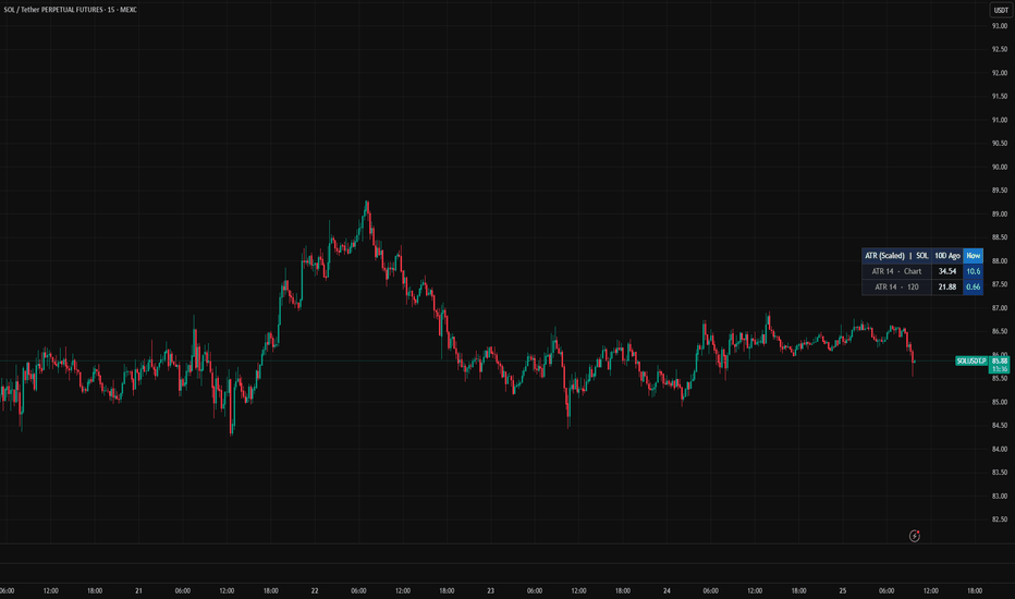
ATR Precision Stop Loss | BocchiTheTrader ATR Precision Stop Loss | BocchiTheTrader
Precision Risk Management for Professional Traders
The BocchiTheTrader | ATR Precision SL is a high-performance volatility tracking tool designed to protect capital and optimize exit points. Unlike basic stop-loss scripts that only look at closing prices, this indicator utilizes the extremes of market action to provide a "safety buffer" that respects price volatility.
How It Works & The Methodology
The indicator calculates market noise using the Average True Range (ATR). To provide the most "optimal" stop-loss level, it anchors its calculations to the High and Low of each candle rather than the Close. This ensures that the stop loss stays outside the reach of common price spikes and liquidity hunts (wicks).
The Formula
The mathematical model behind the indicator is as follows:
For Long Positions: Long_SL = Low - (ATR_{length} \times Multiplier)$
For Short Positions: Short_SL = High + (ATR_{length} \times Multiplier)$
By subtracting the volatility from the Low (in longs) and adding it to the High (in shorts), the script creates a dynamic zone that adapts to the current market expansion or contraction.
Key Features
Wick-Aware Protection: Uses High/Low anchors to prevent premature stop-outs caused by market noise.
Triple Direction Logic: Switch between Long, Short, or Long + Short modes to visualize both sides of the market volatility simultaneously.
ATR Precision Stop Loss | BocchiTheTrader
Profesyonel Yatırımcılar İçin Hassas Risk Yönetimi
BocchiTheTrader | ATR Precision SL, sermayeyi korumak ve çıkış noktalarını optimize etmek için tasarlanmış yüksek performanslı bir volatilite takip aracıdır. Sadece kapanış fiyatlarına odaklanan standart stop-loss araçlarının aksine, bu gösterge piyasa hareketlerinin uç noktalarını kullanarak fiyat oynaklığına saygı duyan bir "güvenlik tamponu" oluşturur.
Nasıl Çalışır ve Metodoloji
Gösterge, piyasa gürültüsünü Average True Range (ATR) kullanarak hesaplar. "En uygun" stop-loss seviyesini belirlemek için hesaplamalarını Kapanış (Close) yerine her mumun En Yüksek (High) ve En Düşük (Low) değerlerine sabitler. Bu, stop seviyenizin fiyat iğnelerinden (fitillerden) ve likidite avlarından korunmasını sağlar.
Kullanılan Formül
Göstergenin arkasındaki matematiksel model şöyledir:
Long Pozisyonlar İçin: Long_SL = Low - (ATR_{length} \times Multiplier)$
Short Pozisyonlar İçin: Short_SL = High + (ATR_{length} \times Multiplier)$
Volatiliteyi Düşük seviyeden çıkararak (long) veya Yüksek seviyeye ekleyerek (short), script piyasadaki genişleme veya daralmaya uyum sağlayan dinamik bir koruma bölgesi yaratır.
Öne Çıkan Özellikler
İğne Korumalı Yapı: Piyasa gürültüsünün neden olduğu erken stop-out durumlarını önlemek için High/Low referanslarını kullanır.
Üç Yönlü Mantık: Piyasa volatilitesinin her iki tarafını aynı anda görmek için Long, Short veya Long + Short modları arasında geçiş yapın.
BocchiTheTrader
지표

지표

지표
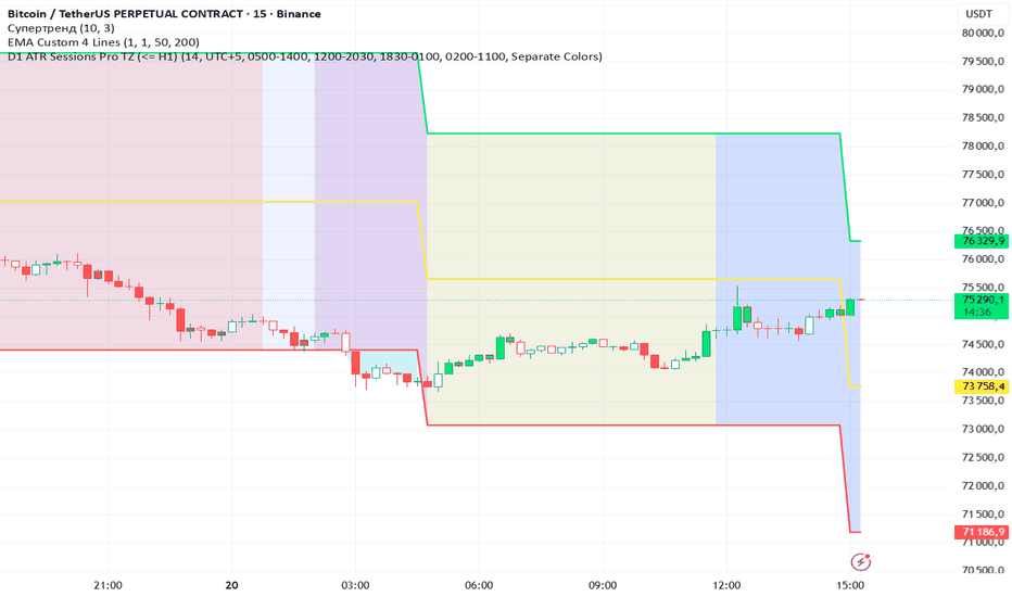
VWAP Auto Anchored TrendVWAP Auto Anchored Trend
This indicator is a Pine Script v6 recreation of an auto-anchored VWAP tool with an added trend and flatness readout. It is designed to help you study how volume-weighted price develops from a selected anchor and how stable or directional that VWAP remains over time.
What It Does
At its core, this script calculates a Volume Weighted Average Price (VWAP) . Unlike a simple moving average, VWAP gives more influence to bars with higher volume. That allows it to reflect where trading activity has been concentrated during the active anchor period.
The line begins at the selected anchor and updates forward from there, giving you a focused view of how price and volume have behaved from that point.
Anchor Periods
The script supports multiple anchor types, including:
Auto
Highest High
Lowest Low
Highest Volume
Session
Week
Month
Quarter
Year
Decade
Century
Earnings
Dividends
Splits
For time-based anchors such as Month , Quarter , or Year , the indicator displays only the currently active anchor period. That keeps the chart focused on the most recent cycle rather than extending the VWAP through the entire chart history.
Source and Calculation
The VWAP can be calculated from a selectable source, such as hlc3 , which is commonly used as a balanced price basis. The script accumulates price multiplied by volume, then divides that running total by cumulative volume over the active anchor period.
This makes the line responsive not only to price movement, but to how much trading participation occurred at those prices.
Bands and Visual Structure
The script includes optional upper and lower VWAP bands. These bands can be calculated using:
Standard Deviation
Percentage
Up to three band levels can be enabled, each with its own multiplier. When active, they can help frame how tightly or loosely price is trading around the anchored VWAP.
A background fill can also be used between the outer visible bands to make the VWAP zone easier to read visually.
Offset Support
An offset setting is included so the VWAP and its bands can be shifted visually on the chart. This affects display placement only and does not change the underlying VWAP calculation.
VWAP Flatness and Trend Readout
One of the main additions in this version is the VWAP Flatness section.
Instead of only judging the VWAP slope by eye, the script measures how much the VWAP has drifted from its anchor to the current bar. It then normalizes that drift using ATR to produce a more comparable trend/flatness reading.
The table compares two views:
All Period - the entire active anchor period
Last 50% - the most recent half of that same period
This can help show whether the VWAP has remained balanced over the full anchor period, or whether the more recent portion has started to trend more clearly.
Table Readout Includes
VWAP State - VERY FLAT, FLAT, MODERATE, TRENDING, or STRONG TREND
ATR Score - VWAP drift measured against ATR
Drift % - total percentage drift in VWAP over the measured section
Per Bar % - average drift per bar over that section
This is intended as a structured way to describe VWAP behavior. It does not predict future price movement, but it can help organize how stable or directional the VWAP has been within the chosen anchor window.
How It May Be Used
This indicator can be used as a reference for:
Tracking where volume-weighted price has developed from an anchor
Comparing current price to anchored average value
Observing whether price is staying near VWAP or expanding away from it
Viewing optional VWAP band structure
Comparing overall VWAP behavior with the most recent half of the anchor period
Notes
This script is intended as a charting and analysis tool.
The flatness and trend labels describe measured VWAP behavior, not guarantees.
Different symbols, timeframes, and anchor periods can produce very different readings.
Summary
This script combines anchored VWAP logic, optional bands, and a two-part flatness/trend readout into one tool. Its goal is to help you study where weighted price has developed, how price is behaving around that value, and whether the VWAP itself has remained relatively flat or become more directional over the active anchor period.
지표

지표

지표

Conflux Engine | AnonycryptousConflux Engine | Anonycryptous
Description & user manual
Why this indicator is different?
Most signal indicators work the same way. One condition triggers. One signal fires. The trader either takes it or does not.
The problem is that a single condition — a crossover, a level break, a momentum read — is almost never enough to define a genuinely high-quality trade. Markets are too complex and too noisy for that.
Conflux Engine works differently.
It does not fire on one condition. It requires multiple independent market forces to align simultaneously before a signal appears. Structure has to agree. Volume has to confirm. Momentum has to support. Volatility has to be in the right zone. Session positioning has to be favorable. And optionally, the higher timeframe trend and the ribbon have to be aligned too.
Only when enough of these forces agree — and agree clearly — does the indicator produce a signal.
This is what confluence means in practice. Not one thing being right. Multiple independent things being right at the same time.
The result is fewer signals. But the signals that do appear carry more weight than anything a single-condition system can produce.
Important notice
Conflux Engine generates trading signals based on a multi-factor scoring engine.
These signals are not financial advice.
They do not predict the future.
They do not guarantee profitability.
They are a systematic read of current market conditions across multiple dimensions.
All trading decisions are made entirely by the user.
Always manage your own risk. Always apply your own judgment.
1. Overview
Conflux Engine is a scoring-based signal indicator for traders who want structured, high-conviction entries rather than frequent, noisy ones.
Six independent pillars evaluate the market continuously. Each pillar scores independently. The scores combine into a total out of 100. When the total exceeds the signal threshold — and the dominant direction leads the opposite direction by a minimum gap — a signal fires.
Additional hard gates can be enabled: an ADX noise filter to block signals during choppy markets, a VWMA filter to ensure macro trend alignment, a Supertrend filter for dynamic trend confirmation, and an Ultra Ribbon filter using 15 Hull Moving Averages for the fastest momentum read.
The result is an indicator that is selective by design. It is not built to fire constantly. It is built to fire well.
2. The six pillars
2.1 Structure
Evaluates market structure using swing pivot highs and lows. A higher high combined with a higher low defines a bullish structure. A lower high combined with a lower low defines a bearish structure.
This pillar answers the most fundamental question in trading: is the market making progress in a direction, or is it deteriorating?
Weight: up to 16 points.
2.2 Volume
Uses OBV slope via linear regression to determine whether volume is accumulating in the direction of price or diverging from it.
Rising OBV slope on a bullish signal means participation supports the move. Falling OBV slope on a bullish signal is a warning. This pillar separates moves with institutional backing from moves without it.
Weight: up to 16 points.
2.3 Momentum
Evaluates three independent momentum reads: KAMA position (a Kaufman adaptive moving average that adjusts its speed to market conditions), RSI relative to the 50 midline with slope direction, and Williams %R for price positioning within the recent range.
Two of three aligned scores partial points. All three aligned scores full points.
Weight: up to 16 points.
2.4 Liquidity
Detects sweep events — moments where price wicks beyond a recent swing high or low and closes back inside. These events mark liquidity grabs and often precede directional moves.
A confirmed bull sweep sets up a long bias context. A confirmed bear sweep sets up a short bias context. The context remains active for a configurable number of bars, decaying over time.
Weight: up to 16 points.
2.5 Volatility
Measures ATR relative to its own moving average to identify the volatility sweet spot. Signals during dead, flat markets carry less meaning. Signals during chaotically explosive moves are harder to execute cleanly. This pillar rewards the in-between: active, directional, manageable volatility.
Weight: up to 16 points.
2.6 Session
Evaluates price positioning within the current day's developing range. Price in the lower portion of the range (discount) favors long bias. Price in the upper portion (premium) favors short bias.
This pillar can be toggled independently from the session time filter — you can use session scoring without restricting signals to specific hours, or vice versa.
Weight: up to 20 points.
3. Hard gates
Beyond the six scoring pillars, Conflux Engine includes four optional hard gates. These do not add points. They block signals entirely when their condition is not met.
3.1 ADX noise filter
Blocks signals when ADX is below a configurable threshold. ADX measures trend strength. A low ADX means the market is ranging and directionless — exactly the environment where momentum signals fail most often. Default threshold: 35. Adjustable up to 100 for maximum selectivity.
3.2 VWMA filter
Price must be above the Volume Weighted Moving Average for long signals, and below it for short signals. The VWMA is slower than a standard EMA and reflects the average price weighted by volume — a more meaningful macro reference than a simple average. Default length: 200.
3.3 Supertrend filter
The Supertrend must confirm the signal direction. This is a dynamic trend line based on ATR bands that flips cleanly between bull and bear states. It acts as an additional structural confirmation that the trend environment supports the entry.
3.4 Ultra Ribbon filter
The fastest gate. Built from 15 Hull Moving Averages spanning a range of lengths. When the fastest HMA is above the slowest HMA, the ribbon is bullish. When below, bearish. Because Hull MAs minimize lag, this gate reacts to trend changes earlier than most moving average systems.
The ribbon also serves as a trailing stop option in the backtest — the slowest HMA tracks trend without being too reactive.
4. Signal scoring
Every bar, both a bullish and bearish score are computed from the six pillars. The scores are added together.
A signal fires when:
- The dominant score meets or exceeds the signal threshold (default 70)
- The dominant score exceeds the opposite score by at least the directional lead (default 20)
- All enabled hard gates are cleared
This two-condition check — threshold plus gap — prevents marginal signals from appearing when the market is ambiguous. Both bull and bear can score reasonably high during mixed conditions. The gap requirement ensures the dominant direction is meaningfully ahead.
Pillar weights are individually adjustable. The system allows traders to prioritize the factors most relevant to their trading style and instrument.
The Extreme Threshold (default 90) flags signals where the confluence score is exceptionally high. These are the highest-conviction setups in the system.
5. The Ultra Ribbon
The Ultra Ribbon is a 15-layer Hull Moving Average ribbon that sits on the chart as both a visual trend tool and a momentum gate. Three themes are available:
Classic — green and red. Clear, functional, no ambiguity.
Phantom — cyan and pink with purple exhaustion. A darker, stylized read of the same data. (the default)
Custom — full color control for bull, bear, and exhaustion states.
The ribbon color adapts dynamically. When the spread between the fastest and slowest HMA is wide relative to its historical average, the ribbon fades toward the exhaustion color — a visual signal that the trend may be overextended. When the spread is moderate, the ribbon shows its full trend color.
Candle coloring follows the ribbon's bull/bear state continuously, giving an immediate read of trend direction on every bar.
The dashboard accent color and signal indicators follow the active theme, giving the entire indicator a unified visual identity across chart and panel.
6. Multi-timeframe filter
When enabled, the MTF filter evaluates the trend on a higher timeframe using a 50-period EMA. If the higher timeframe trend agrees with the signal direction, a weight bonus is added to the total score. If it disagrees, no bonus is added — but the signal is not blocked unless the score falls below threshold as a result.
This behavior is intentional. The HTF filter adds weight to aligned signals without making every counter-trend setup impossible. It rewards confluence with the bigger picture without enforcing hard alignment.
Default timeframe: 240 (4-hour).
Default weight bonus: 20 points.
7. Backtest and performance tracking
Confluence Engine includes a built-in performance tracker that logs every signal, applies configurable stop and target multipliers based on the current regime, and tracks wins, losses, and win rate across the visible history.
Stop loss modes:
- ATR — a fixed multiple of ATR from the entry price. Simple and consistent.
- Pivot — stop placed at the most recent swing low (for longs) or swing high (for shorts). Respects structure.
- Supertrend — stop placed at the dynamic Supertrend level at the time of entry. Tighter and adaptive.
- Trailing (h15) — stop follows the slowest HMA of the Ultra Ribbon. Trends with the market and gives winners more room.
Target multipliers are adjustable for each regime: Scalp, Intraday, and Swing. The regime is determined by the current ADX value.
Recent log shows the last three trade results in R multiples. This gives a quick read on recent system performance without requiring a separate journaling tool.
Note: the backtest uses bar close logic and approximated fill prices. It is a directional performance reference, not a precise simulation. Session filtering does not retroactively apply to historical trades — enabling session filtering after a test period will affect forward signals but not past performance data.
8. Dashboard reference
The dashboard updates on every bar and shows:
- Header: indicator name and current timeframe
- Pillar rows 1–6: score per pillar, colored by direction
- HTF Trend: higher timeframe alignment and weight (when MTF enabled)
- Signal: LONG / SHORT / WAIT with direction color
- Win Rate: percentage of tracked signals that hit target
- Recent Log: last three results in R multiples
- Score: total confluence score out of 100
- Session: OPEN or FILTERED
The dashboard header and accent colors follow the active ribbon theme.
Tiny, Small, and Normal size options are available.
9. Settings reference
General Settings
- Signal Threshold: minimum score to trigger a signal (50–95, default 70)
- Extreme Threshold: score above which extreme confluence is flagged (80–100, default 90)
- Directional Lead: minimum gap between bull and bear score (default 20)
Multi-Timeframe Trend
- Enable MTF Filter
- HTF Timeframe (default 240)
- HTF Weight (default 20)
Quality Filters (Noise Reduction)
- Enable ADX Noise Filter
- Min ADX Value (0–100, default 35)
Trend Confirmation
- Enable VWMA Filter + length
- Enable Supertrend Filter + ATR length + multiplier
- Show/hide Supertrend and VWMA lines
Pillar Weights
- Individual weight for each of the six pillars
Session Filtering
- Filter Entries by Session (time gate)
- Enable Session Pillar Scoring (premium/discount scoring)
- Trading Session input
Trade Suggestions (ATR Multipliers)
- SL and TP multipliers for Scalp, Intraday, and Swing regimes
Ultra Ribbon
- Enable Ribbon Filter
- Show Ribbon on Chart
- Base Length and Length Step
- Theme: Classic / Phantom / Custom
- Custom color inputs (bull, bear, elite)
Backtest & UI
- Enable Performance Tracking
- Start Year
- Show Active Trade Lines
- Show Recent Trade Log
- Stop Loss Mode: ATR / Pivot / Supertrend / Trailing (h15)
UI Settings
- Show Dashboard
- Dashboard Position
- Dashboard Size: Tiny / Small / Normal
10. How to use
10.1 Initial setup
1. Load the indicator on your preferred chart and timeframe.
2. Select a ribbon theme that matches your visual preference.
3. Set the signal threshold based on your desired selectivity. Start at 70.
4. Set the directional lead. 15–20 is a balanced starting point.
5. Enable the hard gates relevant to your style. For intraday trading, ADX + Supertrend is a strong combination. For swing trading, VWMA + MTF adds macro context.
6. Configure the session scoring if you trade specific sessions. NY traders: set session to 1330–2000 UTC (or your local equivalent).
7. Set your backtest start year and stop mode preference.
10.2 Reading a signal
When a signal appears:
- Check the dashboard. Which pillars are active? A signal with Structure + Volume + Momentum all scoring is stronger than one carried primarily by Session and Volatility.
- Check the score. A signal at 72 with a 20-point gap is valid but tight. A signal at 88 with a 30-point gap is a high-conviction setup.
- Check the ribbon. Is it cleanly bullish or bearish? Is it near exhaustion color? Signals during ribbon exhaustion carry more risk.
- Check the hard gates. They cleared — but were they close? A signal that barely cleared ADX 35 is different from one with ADX at 55.
10.3 Managing entries
Confluence Engine does not tell you the exact entry price. It tells you when conditions align. Your entry technique — pullback, breakout, limit at structure — remains your decision.
Use the stop mode that fits your trade: ATR for consistency, Pivot for structure-respect, Supertrend for dynamic adaptation, Trailing h15 for trend trades you want to hold.
10.4 Interpreting win rate
The built-in win rate is a useful reference, not a guarantee of future performance. A 65% win rate over 50 signals on a specific asset and timeframe tells you the system has been profitable in that environment. It does not guarantee the next signal wins.
Win rate should always be evaluated alongside average RR. A 60% win rate at 2R average beats a 70% win rate at 0.8R average. Use the recent log and the trade lines together to assess both dimensions.
10.5 Optimizing settings
If you see too many signals: raise the threshold, raise the directional lead, raise the ADX minimum, or enable additional hard gates.
If you see too few signals: lower the threshold slightly, reduce the directional lead, or disable one or two hard gates.
Do not optimize purely for win rate without considering signal frequency. A system that fires once per week at 80% win rate is different in practice from one that fires daily at 65%. Both can be profitable. Choose what fits your trading style.
11. Timeframe guide
1m–5m — Ultra Ribbon filter on, ADX threshold 30–40, Supertrend on, session scoring on. Focus on fast momentum signals during active sessions.
15m–30m — Full filter stack recommended. Threshold 70–75. Strong balance of frequency and quality.
1H–4H — VWMA and MTF filter add significant value. Threshold 75–80. Fewer signals, higher conviction.
Daily — Disable session scoring. Enable VWMA and MTF only. Use as swing context, not scalp tool.
12. What this indicator does not do
- Does not predict price direction with certainty
- Does not guarantee profitability
- Does not replace your own risk management
- Does not account for news events, gaps, or liquidity voids
- Does not track open positions in real time
- Does not connect to any broker or execution system
- Does not replace the Risk Management Engine for position sizing and account compliance
For position sizing, drawdown compliance, and trade logging, pair with Risk Management Engine | Anonycryptous.
For complete session analysis and market context, pair with Environment | Anonycryptous.
Together, the three tools cover strategy context, signal generation, and risk execution — a complete framework for structured trading.
13. Disclaimer
This indicator is provided for educational and informational purposes only. Nothing in this document constitutes financial advice or any form of recommendation.
All trading decisions are made entirely by the user. The indicator provides signal analysis based on configurable parameters — the relevance of any output depends on how those parameters are set and the market conditions in which the indicator is used.
Trading financial instruments involves substantial risk of loss. Past performance of the backtest function is not indicative of future results. You may lose all of your invested capital.
Anonycryptous accepts no responsibility or liability for any losses incurred as a result of using this indicator or any content in this manual.
지표

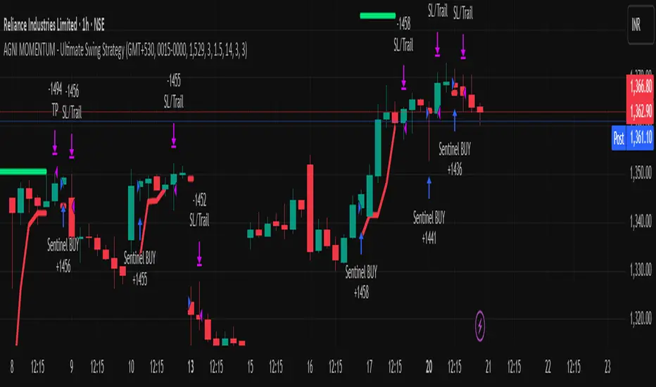
AGNI MOMENTUM - Ultimate Swing StrategyThe AGNI MOMENTUM is a high-performance swing trading system developed by The Stock Yogi. Designed specifically for the 1-Hour, 4-Hour, and Daily timeframes, this strategy is built to identify and ride major market waves while maintaining professional-grade risk controls.
Why "AGNI" Momentum?
In the Indian markets, catching a trend at the right moment is like capturing fire. This strategy uses a triple-layered approach to ensure you only enter when the "spark" is confirmed and the trend has the fuel to continue.
Technical Pillars:
The Institutional Anchor (VWAP): We only look for Long opportunities when the price is trading above the Volume Weighted Average Price, ensuring we are on the side of institutional money.
The Momentum Trigger (Stochastic RSI): A precision-tuned oscillator that identifies overextended markets and triggers entries exactly as momentum shifts in our favor.
The Volatility Shield (ATR): Instead of fixed-point stops, we use Average True Range. This allows your stop loss to adjust automatically based on market "Garam-Hawa" (volatility), preventing unnecessary stop-outs.
The Trailing Sentinel: A built-in trailing stop follows the price, protecting your "Kamai" (earnings) as the trade progresses.
Key Features:
Optimized for Indian Markets: Defaulted to IST (GMT+5:30) with customizable session windows.
Aggressive Reward: Set to a default 1:3 Risk-to-Reward ratio to ensure long-term profitability.
Clean Visuals: Thick Target/SL lines and "AGNI Stickers" ($) make the trade status clear at a glance.
Toggle Flexibility: Easily switch off Sell trades to focus on a "Buy Only" trending market.
How to Use:
Preferred Timeframes: 1H, 4H for aggressive swings, 1D for structural wealth building.
Assets: Optimized for Nifty, BankNifty, and high-volume Blue-chip stocks. 전략

지표
ATR Extension to SMA50# How to Use the "ATR Extension to SMA50" Indicator
**Author:** CANSLIM Research by hkpress
**Platform:** TradingView
---
### Introduction
The **ATR Extension to SMA50** is a custom TradingView indicator designed to mathematically measure how "extended" or "stretched" a stock's price is from its 50-period Simple Moving Average (SMA50).
Instead of relying on fixed percentages, this tool uses the stock's own Average True Range (ATR) to calculate overbought or oversold conditions. This normalizes volatility, allowing you to use the exact same thresholds for a highly volatile tech stock and a slow-moving utility stock. It is an invaluable tool for risk management, identifying exhaustion points, and timing your entries or profit-taking.
---
### Section 1: How to Install on TradingView
Follow these steps to add the indicator to your TradingView charts:
1. **Open TradingView:** Log in to your account and open any chart.
2. **Open the Pine Editor:** At the very bottom of the charting screen, click on the tab labeled **Pine Editor**.
3. **Clear the Editor:** If there is any default code in the window, highlight all of it and delete it so you have a completely blank workspace.
4. **Paste the Code:** Copy the entire Pine Script code provided previously and paste it into the empty Pine Editor.
5. **Add to Chart:** Click the **Add to Chart** button located in the top right corner of the Pine Editor panel.
6. **Save the Script (Optional but Recommended):** Click **Save** in the Pine Editor, name it "ATR Extension to SMA50", so you can easily add it to other charts later from your "Indicators" menu under "My scripts".
---
### Section 2: Indicator Settings
Once the indicator is on your chart, you can adjust its parameters by hovering over the indicator's name in the bottom pane and clicking the **Settings (gear)** icon.
* **SMA Length (Default: 50):** The baseline moving average. 50 is the standard for intermediate-term trend following (favored by CANSLIM traders). You can adjust this to 20 for short-term trading or 200 for long-term investing.
* **ATR Length (Default: 14):** The lookback period for calculating the stock's volatility. 14 is the industry standard developed by J. Welles Wilder.
---
### Section 3: How to Read the Threshold Lines
The indicator plots as an oscillator with a baseline of `0` (which represents the exact price of the SMA50). Positive numbers indicate the stock is *above* the SMA50, and negative numbers indicate it is *below* it. The indicator line changes color dynamically based on the current extension.
#### Above the Mean (Uptrends)
* **0 to +1 ATR (Gray):** *Normal Base.* The stock is hugging its moving average. It is consolidating or moving quietly.
* **+2 ATR (Green):** *Healthy Trend.* The stock is trending up smoothly. A safe zone to hold.
* **+3 ATR (Yellow):** *Overextended.* The stock is starting to run hot. Breakout buyers entering here face higher risks of a pullback.
* **+4 ATR (Orange):** *Exhaustion Zone.* The stock is deeply extended. It is highly recommended to stop buying and consider protecting existing profits.
* **+5 ATR or up (Red):** *Extreme Parabolic.* A historically rare extension. Usually marks a blow-off top or climax run. Mean reversion (a sharp pullback) is highly probable.
#### Below the Mean (Downtrends)
* **0 to -1 ATR (Gray):** *Normal Pullback.* Slight weakness below the moving average.
* **-2 ATR (Green):** *Downtrend.* The stock is consistently weak.
* **-3 ATR (Yellow):** *Oversold.* The stock is getting hammered and may be due for a relief bounce.
* **-4 ATR (Orange):** *Capitulation Warning.* Deeply oversold. Sellers are exhausted.
* **-5 ATR or down (Red):** *Extreme Waterfall.* A rare panic-selling event. Often marks a tradable bottom or "V-shaped" recovery point.
---
### Section 4: Practical Trading Application
Here is how you can integrate this indicator into a trading system like CANSLIM:
**1. Avoid Chasing Breakouts**
If a stock breaks out of a base, but the ATR Extension reads **+3 or higher**, the breakout is considered "extended." It is mathematically safer to skip the trade and wait for the stock to build a new base or pull back closer to the SMA50 (the 0 to +1 zone).
**2. Defensive Profit Taking**
If you bought a stock correctly out of a base and it goes on a massive run, watch the ATR Extension. If it hits the **+4 (Orange) or +5 (Red)** levels, sell 20% to 50% of your position into the strength to lock in profits before the inevitable reversion to the mean.
**3. Spotting Climax Tops**
If a stock gaps up on massive volume after a long uptrend and the indicator hits **+5 ATR or up**, it is a classic "Climax Run" sell signal.
**4. Hunting for Snapback Bounces (Counter-Trend)**
If a fundamentally strong stock experiences a brutal sell-off due to market panic and hits the **-4 or -5 ATR or down** zone, aggressive traders can look for intraday reversal signals to buy the stock for a quick, violent snapback rally toward the SMA50.
---
*Disclaimer: This indicator is a mathematical tool designed to aid in technical analysis. It does not guarantee future performance or prevent losses. Always use proper risk management and stop losses when trading.* 지표

ATR TP LevelsATR TP Levels is a trade management tool for swing traders operating on the daily timeframe. Instead of guessing profit targets, it calculates three take profit levels directly from the ATR (Average True Range) recorded on the day you opened the trade — locking volatility as a fixed ruler for the entire duration of the position.
Why ATR-based exits?
Most traders set targets based on round numbers or arbitrary percentages. ATR-based targets are different — they reflect the actual volatility of the instrument at the moment you entered.
Recommended setup — the 2 ATR combo
This indicator is designed to pair with a 2 ATR stop loss below your entry. With the default take profit levels set at 3, 4, and 5 ATR above entry, the risk/reward ratios are:
TP1 at 3 ATR → 1.5:1 R/R — first partial close
TP2 at 4 ATR → 2:1 R/R — second partial close
TP3 at 5 ATR → 2.5:1 R/R — third partial close
The multipliers and close percentages are fully customizable — every trader has a different style, risk tolerance, and position sizing approach. Adjust the ATR multipliers to match how far you typically expect a move to extend, and set the close percentages to reflect how aggressively you want to scale out. There are no right or wrong values here — the defaults are a starting point, not a prescription.
How to use it
Add ATR(14) to your chart. When your trade opens, note the ATR value on that candle.
Open the indicator settings and fill in three values under Trade setup:
Entry price — your exact fill price
ATR at entry — the ATR(14) value from your entry candle
Quantity — your total position size in shares, contracts, or units
Set the trade open date (day, month, year) to the date you entered. The lines will draw from that bar forward.
Optionally adjust the ATR multipliers and close percentages under Take profit levels to match your strategy.
Reading the labels
Each line shows a label at the right end in the format:
3.0 ATR → 0.150 (187.50, +2.34%)
3.0 ATR — how many ATRs from entry this level is
0.150 — how many units to close at this level (based on your quantity and close %)
187.50 — the exact price of this take profit level
+2.34% — percentage gain from your entry price
Settings reference
Trade setup — entry price, ATR value, and total position quantity.
Trade open date — the date your trade was opened. Lines start from this bar so the chart stays clean and accurate to your actual trade.
Take profit levels — three independently configurable levels. Each has an ATR multiplier (how far the target is) and a close % (what fraction of your position to sell there). Defaults are 3/4/5 ATR at 15/20/25%.
Notes
ATR is locked to your entry day — it does not update as the trade progresses. This is intentional. Your targets should reflect the volatility you accepted when you entered, not today's conditions.
Works on any instrument and timeframe, but is designed and calibrated for daily swing trades.
For short trades, you would need to flip the TP calculations — this version is long-only. 지표
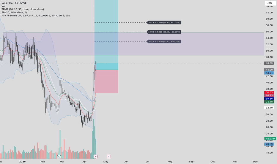
지표