Check support near 1782.28
Hello?
Nice to meet you, fellow traders.
If you "follow" me, you can always get new information quickly.
Have a great day today.
------------------------------------
#ETHUSDT
This volatility period is expected to last until July 12, but since the next volatility period is around July 17, eventually July 18 should be viewed as a volatility period.
If the HA-Low indicator of the 1W chart is to be generated at the 1782.28 point next week, support around that point is key.
However, in the big picture, the section 1597.76 to 1879.61 is an important section, so it is important to see if it can rise in this section.
Over the course of a period of volatility,
1. The StochRSI index is showing a dip near the 50th point,
2. OBV indicators are located near the High Line.
3. As the ADX Line is trying to enter the lateral section, it is important to support it near the section 1666.58 to 1782.28.
We also need to see if the Price Channel HH indicator disappears due to this rise.
-
The next significant segment is between 2419.83 and 270.6.15, so if it breaks up and rises above the M-Signal index on the 1M chart, it is likely to show a full-fledged uptrend.
Therefore, it still takes time for the upward trend to begin, so we need to proceed with the transaction while controlling the weight.
You need a strategy to buy when you meet the HA-Low or DOM (-60) indicators and see support, and to increase or earn a profit by selling some or 100% when the price rises and then falls.
We recommend that these transactions go ahead until they show support above the M-Signal indicator on the 1M chart.
If you can afford the funds, it is recommended to proceed with the transaction in the direction of increasing the weight rather than selling 100%.
If it falls below 1440, there is a possibility of entering the mid- to long-term investment area, so we need to think about countermeasures.
-
Thank you for reading until the end.
I wish you a successful transaction.
--------------------------------------------------
Check if it can rise above 1.1475 and receive support
Hello?
Nice to meet you, fellow traders.
If you "follow" me, you can always get new information quickly.
Have a great day.
-------------------------------------
I remember when I first started trading cryptocurrencies.
Before I began trading, I looked at how others analyzed charts.
However, unlike stock analysis, trading volume was missing from cryptocurrency analysis.
At first, I thought this was because it was difficult to examine the movement of trading volume due to the sheer number of exchanges.
But it turned out that they were omitting volume due to differences in chart analysis methods.
Although it is said that the movement of trading volume can be manipulated, I still believe that trends are ultimately formed based on the movement of volume.
Therefore, I use the OBV indicator, which corresponds to trading volume, as a supplementary indicator.
To overcome the limitations of interpreting the OBV indicator, I attempted to verify the trend and strength of the OBV by adding the formula from the Price Channel indicator to create Low Lines and High Lines.
Additionally, by using the StochRSI indicator together, I tried to confirm the movement of waves as well.
Therefore, to sustain the uptrend,
1. the StochRSI indicator must show an upward trend, and
2. the OBV indicator must be maintained above the High Line.
Looking at the current movements,
1. the StochRSI indicator is showing signs of declining from the overbought zone, and
2. the OBV indicator is heading toward the Low Line.
Accordingly, to transition to an uptrend, it must rise to around 1.1475 and show signs of being supported.
If it fails to do so and falls, it is highly likely to drop to around 0.93.
Since the HA-Low indicator on the 1D chart is currently formed at the 1.1475 point, the time to buy corresponds to when it shows signs of being supported near this point.
However, as it is currently showing a stepwise downtrend, position sizing must be adjusted.
In other words, position sizing and capital management must be handled through day trading.
A full-scale uptrend is highly likely to begin when the price rises above the M-Signal indicator on the 1M chart and maintains that level.
However, since XRP has significant support and resistance levels formed between 1.5 and 1.9669, it is expected that a full-scale uptrend will only begin once this zone is broken upwards.
If the price falls below 0.93, it will enter the medium-to-long-term investment zone, so you should prepare a response plan for this.
-
Since various indicators are set up on the chart, it will simply be a confusing chart if you do not understand how to interpret them.
I hope you will take a moment to reflect on why these indicators were added and consider how to interpret them.
Explanations regarding the indicators are provided across various ideas.
-
Thank you for reading to the end.
I wish you successful trading.
--------------------------------------------------
The key is whether it can rise to the 0.16 and find support
Hello.
Nice to meet you, fellow traders.
If you "follow" me, you can always get new information quickly.
Have a great day.
------------------------------------
Since the chart was created recently, the role of the support and resistance points marked on the chart is weak, so caution is required when trading.
The point where you can start trading is the 0.1600 level, where the HA-Low indicator is formed.
Therefore, you should look for a buying opportunity when the price shows signs of support around the 0.1600 to 0.1756 range.
If the price rises above 0.1814, there is a possibility of a sharp upward trend, but since selling pressure could be equally strong, a quick response is required.
Once the rise begins:
1st: 0.2120
2nd: 0.2428
3rd: 0.2783
You must check for support around the 1st to 3rd levels above and consider a response strategy accordingly.
-
If you look at the 15m chart for day trading, it is as follows:
1. Since the M-Signal indicator on the 1D chart is passing near 0.1390, buying is possible when the price shows signs of support in this area.
2. If the price falls below 0.1390, you must check whether it finds support around 0.1243.
3. If the price rises, you should focus on finding a selling timing when it climbs to the HA-High ~ DOM(60) zone, specifically the 0.1665 ~ 0.1719 range.
-
Thank you for reading to the end.
I wish you a successful trade.
--------------------------------------------------
Check if it can receive support and rise around 62793.20
Hello?
Hello traders!
If you "Follow" us, you can always get new information quickly.
Have a nice day today.
-------------------------------------
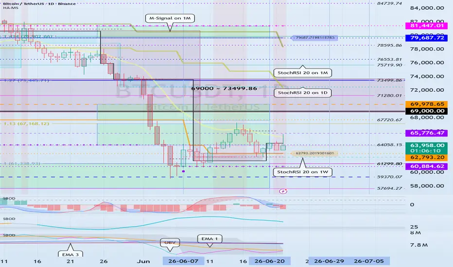
This period of volatility is expected to last until around July 5th (July 4th to 6th).
The next period of volatility is around July 29th, so we need to pay close attention to the trends that have formed over this period of volatility.
In order to rise at an important point or section and continue the upward trend, the following conditions must be met.
1. The StochRSI indicator must show an upward trend without entering the overbought zone.
2. The OBV indicator must be maintained above the High Line.
3. The BSSC indicator must remain above the 0 point.
If we interpret the current movement according to the above conditions, the StochRSI indicator and BSSC indicator are satisfied with the conditions.
However, because the OBV indicator is located in the Low Line to High Line section, it is not satisfactory.
Therefore, we need to test support around 62793.20 and see if the OBV indicator rises above the High Line.
If the conditions are not met, it will eventually decline.
If a support test is performed around 62793.20, it seems likely that the StochRSI indicator will enter the overbought zone.
If the StochRSI indicator enters the overbought zone, there is a possibility that upside will be limited.
A strong buying trend is needed to ignore these restrictions and rise.
Therefore, the OBV indicator must rise above the High Line and show an upward trend.
In the end, even if it is supported and rises around 62793.20, the StochRSI indicator will enter the overbought zone and will eventually fall again, resetting the StochRSI indicator.
Therefore, you need to adjust your investment proportion with peace of mind.
I think it needs to rise above 67720.67 to break out of the bottom.
This is because it corresponds to the previous HA-Low indicator point.
When the HA-Low indicator is created, it can be considered that a low point has been formed, and if the HA-Low indicator falls, there is a possibility of a stepwise decline.
This cascading downward trend will eventually form a bottom and turn into an upward trend.
The 62793.20 point is also the previous HA-Low indicator point, so if it is supported, it is a buying time.
However, because point 67978.65 forms a longer horizontal line, it can be considered a more important point than point 62793.20.
Therefore,
1st: 62793.20
2nd: 67720.67
If support is received around the 1st and 2nd positions above, it is time to buy.
As the price falls, the first DOM(60) indicator point is formed at 73909.36 at the current price.
Therefore, if it is supported at 67720.67 and rises, the area around 73909.36 is likely to be the first volatility zone.
This is because the DOM(60) indicator is an indicator of the high point, so it rises from the low point and appears to be trying to break through the first high point upward.
Since an important support and resistance area has been formed between 69000 and 73499.86, it seems likely that the first volatility will occur in this area.
In any case, caution is needed in trading as it is highly likely that the StochRSI indicator will enter the overbought zone after this period of volatility.
If it fails to rise, it may fall below 61299.80, so you need to think about a response plan.
This is because if the HA-Low indicator is encountered again, there is a possibility of a cascading decline.
-
Thank you for reading until the end.
I wish you a successful transaction.
--------------------------------------------------
BBES$TT — Crypto Settlement Infrastructure Corewww.tradingview.com
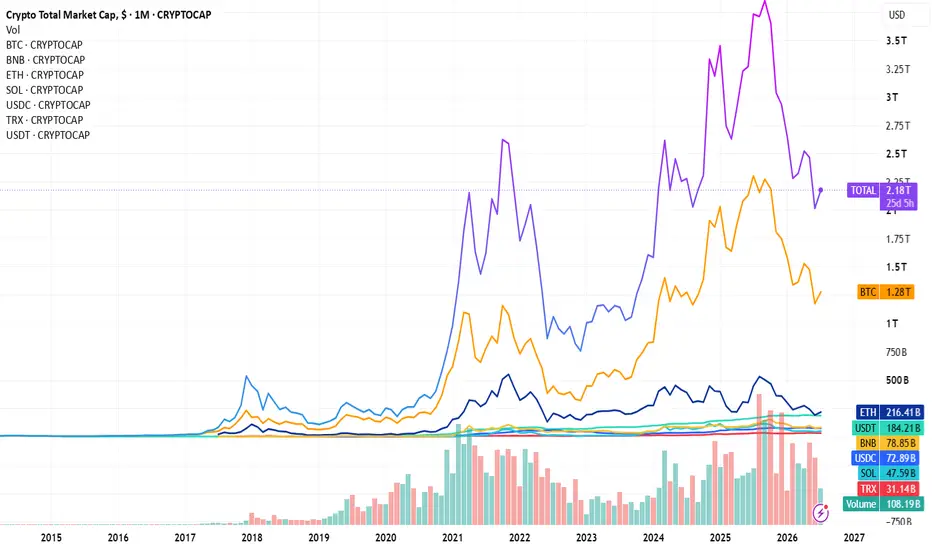
BBESSTT is a proposed term for the core settlement infrastructure of crypto: the dominant monetary assets, stablecoin liquidity, and transaction networks through which most crypto-native value transfer currently happens.
The goal is to track whether crypto settlement is concentrating in this core — or moving away from it.
Methodology: A rules-based, cap-weighted basket of the top 7 crypto assets by market capitalization, excluding memecoins and L2 tokens, while explicitly including stablecoins as the liquidity layer. Rebalanced quarterly. Cap-weighted.
The core of the crypto industry accounts for roughly 87% of the entire crypto market's $2.18T capitalization.
B - CRYPTOCAP:BTC $1.28T
B - CRYPTOCAP:BNB $78.82B
E - CRYPTOCAP:ETH $216.54B
S - CRYPTOCAP:SOL $47.67B
$ - CRYPTOCAP:USDC $72.89B
T - CRYPTOCAP:TRX $31.14B
T - CRYPTOCAP:USDT $184.21B
Three derived readings:
1. Core BTC share (BTC / BBESSTT ): ~67%
→ Bitcoin's weight within the settlement core, stripped of long-tail noise.
2. Liquidity layer (USDC+USDT / BBESSTT ): ~13.5%
→ Share of the core sitting in cash-equivalents vs. deployed into volatile assets.
3. Risk-tier spread ((BNB+SOL+TRX) / (BTC+ETH)): ~10.5%
→ Weight of higher-beta assets relative to the core tier (BTC/ETH).
For scale, not equivalence: at $1.91T, the settlement core roughly matches total US physical currency in circulation (~$2.4T, Fed data) — the entire crypto market (~$2.18T) sits at about a quarter of all physical cash in circulation worldwide across every currency (~$8.9T). Against broader money supply, BBESSTT is ~8.4% of total US M2 (~$22.8T, cash + bank deposits) but just ~1.9% of global M2 across all currencies (~$98.6T) — crypto's scale is far more significant relative to the dollar system specifically than to world money as a whole, consistent with stablecoins' near-total USD-peg.
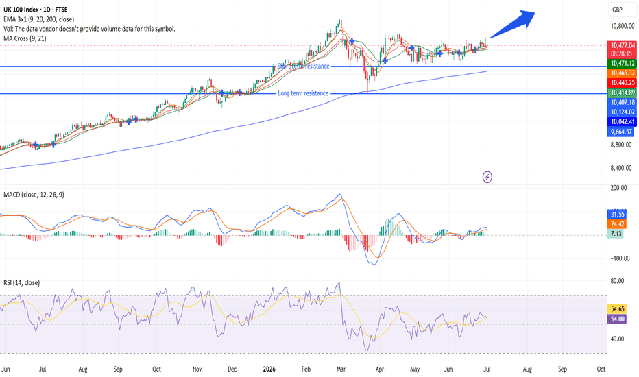
This isn't a price-prediction tool — it's a structural snapshot of how capital is currently distributed across crypto’s settlement infrastructure: cash-equivalent, core-tier, and risk-tier. The key question is simple: is crypto’s settlement BBESSTT infrastructure expanding or contracting in dollar terms? UK100: Record highs, going nowhere fast?This video contains an analysis of the UK 100 as well as the trade setup that I have created on the 30 June , where the index is trading near all-time highs above 10,484 but without any conviction whether up or down. The MA Cross is right under price, the RSI is holding onto the neutral fifty line, and yet the MACD histogram is forming a formation that price action does not reveal on its own. In this video, you will get a comprehensive look at the FTSE 100 index in which I will explain to you the macroeconomic background, why the announcement of a positive ceasefire in Iran did not result in any significant move, and how I am planning to trade this from here. In this video, you can expect an analysis of the EMA formation, the MA Cross signal, and the three scenarios that I am watching out for as of July.  Long
Long
Resistance Zone: 117.87 ~ 129.44
Hello?
Nice to meet you, fellow traders.
If you "follow" me, you can always get new information quickly.
Have a great day.
------------------------------------
Important zones are marked with circles and square boxes.
The 117.87 ~ 129.44 range is a high point zone and corresponds to a resistance zone.
However, if it finds support in this range and rises, there is a possibility of a stair-step upward trend.
Therefore, if it finds support around the 117.87–129.44 range and rises, it is expected to increase to the Fibonacci ratios 2.618 (160.79)–3.618 (162.17).
If it fails to rise and falls:
1st: 95.69
2nd: 70.33–79.62
We need to check if it finds support around the 1st and 2nd levels mentioned above.
Since a gap is expected to occur in the 70.33–79.62 range, if it finds support near this area, it can be considered a strong buying opportunity.
However, since the area around 96.69 corresponds to a high point from a sharp rise, it appears highly likely that it will find support in this vicinity.
-
In order to receive support at a key point or zone and continue the uptrend,
1. The uptrend must be observed while the StochRSI indicator has not entered the overbought zone.
2. The OBV indicator must be maintained above the High Line.
3. The BSSC indicator must be maintained above the 0 point.
- Currently, only the BSSC indicator is maintaining above the 0 point,
- It appears highly likely that the StochRSI indicator will enter the oversold zone,
- Since the OBV indicator appears to have fallen from the High Line, it seems likely that a support test will follow to sustain the uptrend.
-
Thank you for reading to the end.
I wish you a successful trade.
--------------------------------------------------
Key Volatility Period: Around July 5th
Hello.
Nice to meet you, fellow traders.
If you "follow" me, you can always get new information quickly.
Have a great day today.
------------------------------------
You must proceed with trading according to your trading strategy by identifying volatility zones or support and resistance points on the chart.
To do this, we use various methods that suit our own criteria.
In that sense, you can use indicators such as the Price Channel or Bollinger Bands.
I use the Price Channel indicator because when the indicator shows a horizontal line, it can be utilized as a support and resistance point.
The fact that the Price Channel line itself is not being generated indicates that it is in a volatility period.
Therefore, since the LL line of the Price Channel indicator is currently not being generated, we can see that the low point is in a volatility period.
Therefore, if the Price Channel indicator forms a diagonal line one day, whether support is found near the endpoint becomes a critical factor.
In this way, indicators provide the information you need, allowing you to save time in interpreting charts.
------------------------------------
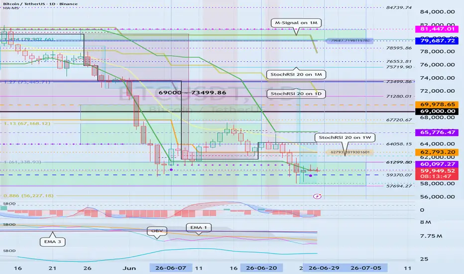
Since this year can be considered a bear market, I believe that a significant volume of trading is required for a bullish reversal.
However, considering existing support and resistance points, the current price level—around 57,694.27 to 61,299.80—can be seen as a critical zone.
This is because it corresponds to the previous high point range.
If the price falls below this level, support must be confirmed around 48,189.84.
Therefore, when falling to around 48,189.84, you must verify whether it shows signs of being supported while generating a large volume of trading.
If the price turns upward without being accompanied by significant trading volume, it is likely to end in a rebound, and the rebound zone is expected to be around points 1 and 2.
Therefore, you must check the movement when the Price Channel indicator's LL line is formed, as it shows signs of support.
-
Although the chart displays a chaotic array of lines, as mentioned earlier, you should first check for support around the 57694.27 ~ 61299.80 range.
If the price falls from the 57694.27 ~ 61299.80 range, as previously mentioned, you must consider a response strategy while monitoring trading volume movements as it approaches the 48189.84 point.
However, since it has encountered the HA-Low indicator, you must formulate a buy strategy to respond.
The formation of the HA-Low indicator signifies that a bottom zone has been established; therefore, even if the downtrend continues, it will eventually reverse into an uptrend following a stepwise decline.
If the price rises from the 57,694.27 ~ 61,299.80 range, looking at the big picture:
1st: 62,793.20
2nd: 69,000 ~ 73,499.86
3rd: 79,687.72 ~ 81,447.01
You must check for support around the 1st to 3rd levels mentioned above.
If the price rises and maintains a sideways movement above the M-Signal indicator on the 1M chart, it will play a crucial role in monitoring the subsequent trend, as there is a possibility that it will eventually transition to an uptrend.
Since the LL line of the Price Channel indicator on the 1D chart has formed, you must carefully observe for support around 60,097.27. You must verify whether the OBV indicator rises above EMA 1 and maintains that level, and whether it can rise above the High Line.
If it fails to do so, it will likely only feign an upward trend before showing signs of a decline.
This period of volatility is expected to continue until June 30th.
-
Thank you for reading to the end.
I wish you successful trading.
-------------------------------------------------
Support and resistance range: 372.0 ~ 414.23
Hello?
Hello traders!
If you "Follow" us, you can always get new information quickly.
Have a nice day today.
-------------------------------------
The areas marked with circles are important support and resistance areas.
The current price is located in the range 372.0 to 414.23.
I think that anything below 216.60 is likely to enter the mid- to long-term investment zone.
The start of the uptrend is expected to begin when the price holds above 427.94.
-
The key is whether it can rise above 414.23 to 427.94 and receive support.
If not, you should check for support in the 338.72 to 372.0 range.
If it falls below the 338.72 to 372.0 range, it is expected to fall to around 216.60 to 237.86.
-
The HA-Low indicator, which marks the low point, is at 237.86, and the HA-High indicator, which marks the high point, is at 551.97.
Therefore, since the section 372.0 to 414.23 corresponds to the middle section, it can be said that support in this section is important.
In order for the price to continue its upward trend, buying pressure must eventually increase.
Therefore, the OBV indicator should show an upward trend.
In that sense, I think it is highly likely that the upward trend will continue only if the secondary indicator OBV indicator rises above the High Line and remains there.
However, since the current OBV indicator is located near the Low Line, we can see that the buying trend is weak.
Therefore, when it rises to the 414.23 to 427.94 range and shows support, you should check whether the OBV indicator has risen above the High Line.
-
The current price can be considered to be in a good range for trading ZEC.
However, there are some ambiguities about buying at the current price with a new transaction.
As explained above, it is unclear whether support will rise as it rises to the 414.23 to 429.94 range, so if possible, you should check whether the OBV indicator shows an upward trend when it shows support in the 414.23 to 427.94 range.
Since the current price is in the middle range, you can match the average purchase price by making the first purchase near the current price and making the second purchase when the price falls and approaches 237.86.
At this time, the important thing is that when the price starts to rise and then starts to fall, you need a strategy to secure cash by selling part of the secondary purchase.
This gives you the power to buy when it falls again.
-
Thank you for reading until the end.
I wish you a successful transaction.
--------------------------------------------------
Next Volatility Period: Around June 29 (June 28 ~ 30)
Hello?
Nice to meet you, fellow traders.
If you "follow" me, you can always get new information quickly.
Have a great day.
------------------------------------
It appears that the price is testing support near the StochRSI 50 indicator point.
If the price fails to find support and falls, you must check for support in the low zone between DOM (-60) and HA-Low.
At this point, if the price falls below the OBV Low indicator, there is a possibility of a sharp decline, so caution is required when trading.
When buying in the low zone between DOM (-60) and HA-Low, it is advisable to buy when the price finds support and rises.
Otherwise, the point where you bought could become the peak.
Since the OBV High indicator is not currently formed above the candle, you must check for support in the vicinity once the OBV High indicator is generated again due to price changes.
The OBV High indicator corresponds to the High Line when the OBV indicator is divided into Low Line and High Line.
Therefore, if the price maintains a level above the OBV High indicator, it can be expected to lead to a further upward movement.
No matter how much the current price rises, as long as the StochRSI 20 indicator is formed at the 72,512.49 point, it is advisable to proceed with trading under the assumption that the price is still located in the bottom zone.
In other words, quick response is required from a day trading or short-term perspective.
--------------------------------
The previous DOM (-60) indicator point (64,058.15) is formed at the current price level.
Therefore, you must verify whether the price finds support near the 64,058.15 point.
To continue an uptrend at a critical point or zone, the following conditions must be satisfied:
1. The StochRSI indicator must show an upward trend without entering the overbought zone.
2. The BSSC indicator must be maintained above the 0 point.
3. The OBV indicator must be maintained above the High Line. Judging by the current movements of the indicators, it appears there is still insufficient room for further upside.
Therefore, a further decline may occur to pave the way for an upward movement.
At this point, it is necessary to check for support around the 60,884.62 to 62,793.20 range.
This is because it is entering the 57,694.27 to 61,299.80 range, which is a very important support and resistance zone.
If the price falls below the 57,694.27 to 61,299.80 range, the support structure may collapse, potentially leading to a sharp decline, so caution is required.
-
The next period of volatility is around June 29 (June 28 to 30).
Since this period of volatility is considered a critical time that will determine the trend for the second half of the year, it is necessary to examine where the price stands at that point.
-
Even if prices show signs of rising, if capital continues to flow out of the cryptocurrency market, it is highly likely that prices will eventually continue their downward trend.
Therefore, as an individual investor, it is advisable to monitor the movements of USDT and USDC to understand the current flow of funds.
I believe that a gap-up, which indicates an inflow of funds into the cryptocurrency market, should appear.
Conversely, a gap-down, which indicates an outflow of funds from the market, should appear.
So, as the next period of volatility approaches around June 29th, you should observe whether USDT and USDC show signs of a gap-up.
Since the USDT and USDC charts are aggregated, it may take at least 1 to 3 days for the changes to be properly reflected on the chart.
-
Thank you for reading to the end.
I wish you successful trading.
--------------------------------------------------
Let's find a chart interpretation method that suits you!
Hello.
Nice to meet you, fellow traders.
If you "follow" me, you can always get new information quickly.
Have a great day.
------------------------------------
The method for interpreting the auxiliary indicators StochRSI and OBV is as follows.
I believe that looking at the StochRSI and OBV indicators together can help you understand the waves.
Basically, the StochRSI indicator displays waves based on the 50 point.
This allows you to understand regression to the mean and median, which are important for understanding charts.
If the StochRSI indicator rises above 80, it can be interpreted as a higher probability of forming a peak, as there is a possibility that the upward movement will be constrained.
Conversely, if the StochRSI indicator falls below 20, it can be interpreted as a higher probability of forming a bottom, as there is a possibility that the decline will be constrained.
-
A rise in the OBV indicator signifies an increase in trading volume.
This trading volume allows us to determine whether the price is rising or falling.
Therefore, we establish Low Lines and High Lines; we interpret a drop below the Low Line as an increase in selling pressure, and a rise above the High Line as an increase in buying pressure.
We also create short-term (EMA 1), medium-term (EMA 2), and long-term (EMA 3) lines to monitor the current flow of trading volume.
-
Consequently, if the OBV indicator rises above the High Line and remains above it when the StochRSI indicator rises above 80, the likelihood of an upward trend driven by buying pressure increases.
Therefore, when the StochRSI indicator rises above 80, it is necessary to observe the movement of the OBV indicator in conjunction to determine whether a peak will be formed or if it will lead to further gains.
------------------------------
It is practically difficult to view the auxiliary indicators StochRSI and OBV alongside the price candles.
Therefore, we have added the StochRSI and OBV indicators to the price candle section to enable intuitive interpretation.
The indicators representing the lows are OBV Low and StochRSI 20.
Consequently, if the price shows signs of support near OBV Low and StochRSI 20, it should be considered a buying opportunity, and you should focus on identifying the optimal buying timing.
The indicators representing the highs are OBV High and StochRSI 80.
Consequently, if the price shows signs of resistance near OBV High and StochRSI 80, it should be considered a selling opportunity, and you should focus on identifying the optimal selling timing.
-
Let's interpret the chart by looking at the indicators displayed at the current price level.
The indicators are arranged in the order of OBV Low < StochRSI 80 < Price < OBV High < StochRSI 20.
In other words, since the price is located within the OBV Low to OBV High range, it can be considered that the price is currently in a sideways or box range.
Since the price is positioned above StochRSI 80, it can be interpreted that there is a high probability of an upward movement if the price maintains a level above StochRSI 80.
However, since the price is positioned below StochRSI 20, such a rise is likely to be short-term or day trading.
Therefore, for the price to show a full-fledged uptrend, it must rise above StochRSI 20 and maintain the price.
Consequently, the condition must be OBV High and StochRSI 80 < Price.
-
The StochRSI 50 indicator can be considered a reference point.
In other words, when the StochRSI 50 indicator is generated or touched, the likelihood of creating a new trend increases depending on whether it acts as support.
This is because the 50 mark of the StochRSI indicator corresponds to the median and average value.
Therefore, since the price has encountered the StochRSI 50 mark while the OBV is low and the StochRSI is below 80, it indicates a high probability that a new trend is forming.
Consequently, whether the price will rise or fall in the future depends on whether support is found at the StochRSI 50 mark.
-
Although the OBV and StochRSI indicators were added near the price candles, the reason they were included in the auxiliary indicators is to observe the overall trend.
For example, while the StochRSI 50 mark was generated as the price rose, the auxiliary indicators show the StochRSI dropping below 50.
Therefore, this helps prevent errors in interpretation.
Since the auxiliary StochRSI indicator has dropped below 50, it appears highly likely that the price will fall further.
Therefore, it can be interpreted that there is a higher probability of encountering resistance at the StochRSI 50 indicator point marked on the price candle.
In this case, referring to the movement of the OBV indicator can aid in interpreting the StochRSI.
If the price finds support at the StochRSI 50 point and rises, it is highly likely that the OBV indicator will show a rise above EMA 1.
If the OBV indicator fails to rise above EMA 1, it is highly likely that it will show a decline at the StochRSI 50 point.
-
There is one more thing to consider here.
That is, you must examine whether the zone formed by the Low Line to the High Line of the auxiliary indicator, the OBV, is in a converged state or an expanded state.
Currently, the zone formed by the OBV Low Line to the High Line can be considered to be in an expanded state.
In such an expanded state, a wide volume profile is formed, which increases the likelihood of facing constraints on either upward or downward movements.
Since the OBV indicator is currently located near the Low Line, it is highly likely that upward movement will be constrained, and it would not be surprising if the price fell at any moment.
Therefore, it is advisable to wait until the price consolidates and the zone formed by the Low Line and High Line converges.
--------------------------------------
The HA-Low and HA-High indicators were created for trading on Heikin Ashi charts.
If a Heikin Ashi candle has fallen and then turned bullish, indicating a genuine uptrend, there is a high probability that the HA-Low indicator will be generated.
Therefore, the generation of the HA-Low indicator signifies that a bottom zone has been formed.
Consequently, if the price shows signs of support near the HA-Low indicator, it is a buying opportunity.
To further confirm this, the DOM (-60) indicator has been added to mark the bottom zone.
Therefore, the low point zone is formed within the DOM(-60) ~ HA-Low indicator range.
If the price falls when the DOM(-60) ~ HA-Low indicator range is formed, it is likely to exhibit a stepwise downtrend by renewing the low point zone.
This stepwise downtrend will eventually form a bottom zone, and the likelihood of a transition to an uptrend in the near future increases.
-
The HA-High ~ DOM(60) range represents the high point zone.
Therefore, when the HA-High ~ DOM(60) range is formed, you should focus on finding the timing to sell.
If the price rises above the HA-High ~ DOM(60) range, there is a possibility of a stepwise uptrend.
Since this stepwise uptrend corresponds to the formation of a high point that will eventually lead to a downtrend, it would not be surprising at all if it were to fall at any time.
Therefore, while you can buy from a day trading perspective when the price rises after finding support in the HA-High ~ DOM (60) range, caution is required during trading as a quick response is necessary.
------------------------------------
Although I have explained various indicators above, what we must focus on is confirming whether support is being maintained.
In other words, the core of trading lies in verifying whether support or resistance is being encountered at the point where each indicator is generated, and responding accordingly.
However, regarding how to select the timing of a trade, understanding the meaning of each indicator will reduce the difficulty of making a choice.
-
1. You must not forget that the start of a trade—that is, the buying time—is when the price shows signs of support near the DOM (-60) and HA-Low indicators,
2. The end of a trade—that is, the selling time—is when the price shows signs of resistance near the DOM (60) and HA-High indicators.
3. You will respond based on whether support is being maintained by the remaining indicators, or proceed with day trading.
-------------------------
Ultimately, where you start and end a trade depends on your own choice.
Since this is influenced by your investment capital and average purchase price, you cannot trade based on the perspectives or interpretations of others.
The greatest advantage of the cryptocurrency market is the ability to conduct transactions in fractional units.
This significantly eases restrictions on trading.
Furthermore, it allows for the trading of high-priced coins (tokens).
Trading in fractional units enables transactions based on the average purchase price.
This is highly advantageous for increasing your coin (token) holdings.
In other words, by trading based on the average purchase price and selling an amount equal to the purchase principal (including transaction fees), you will be left with coins (tokens) corresponding to the profit.
By continuing to expand this holding, you can eventually increase the number of coins (tokens) with an average purchase price of zero.
Therefore, it becomes easier to increase your coin (token) holdings during spot trading.
-
Thank you for reading to the end.
I wish you a successful trade.
--------------------------------------------------
 Education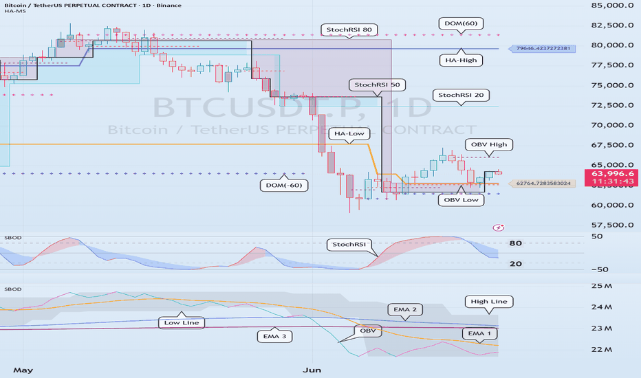
Weekly Review - Internals Recover Before PriceTLDR:
The most important message from the dashboard is that internals improved faster than price. Leadership expanded, participation recovered and volatility normalized while price remains below recent highs. That combination suggests the market's internal condition is currently stronger than the recent price action alone would imply. The evidence therefore supports a regime of Acceptance with Renewed Participation, where market internals are once again confirming rather than questioning the message of price.
1️⃣ What do we see?
A week ago, the dashboard was raising legitimate questions about participation, leadership and volatility pressure.
Today, the picture looks very different.
The most important observation is not that price bounced. It is that the internal market structure improved significantly.
* VIX/VIX3M fell back to 0.86, indicating volatility normalization.
* S&P 500 stocks above SMA20 rose to 71%.
* S&P 500 stocks above SMA200 increased to 61%.
* NYSE New Highs expanded to 140 versus only 18 New Lows.
* NASDAQ New Highs expanded to 174 versus 91 New Lows.
* Advancing issues and advancing volume regained dominance across both exchanges.
Participation, leadership and breadth all improved simultaneously.
That combination is difficult to dismiss as a simple short-covering rally.
⸻
2️⃣ Thesis
The dashboard currently supports a view of Acceptance with Renewed Participation.
The recent selloff appears increasingly consistent with a rotation-induced shakeout rather than the beginning of a broad deterioration phase.
Leadership is expanding again.
Participation is broadening again.
Volatility pressure is easing again.
The market is not simply rising. The internal engine generating price has improved.
⸻
3️⃣ What validates the thesis?
The thesis remains valid if:
* VIX/VIX3M remains below 1.0 and continues normalizing.
* New Highs continue expanding relative to New Lows.
* % of stocks above SMA20 remains elevated or improves.
* % of stocks above SMA200 remains stable or trends higher.
* Advancing volume continues confirming price strength.
* Leadership remains broad across sectors rather than concentrated in a handful of names.
In that environment, internals continue confirming price.
⸻
4️⃣ What invalidates the thesis?
The thesis is invalidated if:
* VIX/VIX3M moves back toward or above 1.0.
* New Lows begin expanding materially.
* Leadership narrows again.
* % Above SMA20 rolls over sharply.
* Breadth weakens while price continues advancing.
That would indicate the recent improvement was temporary and that internal deterioration is re-emerging beneath the surface.
⸻
Why This Dashboard Matters
1. Reduction of Uncertainty / Confusion
Most market participants focus on the index and ask:
“Was the selloff meaningful?”
This dashboard asks a more useful question:
“Did market internals improve or deteriorate?”
Only a week ago, volatility pressure was rising, leadership was weakening and participation was becoming more selective. Today, those same indicators have improved materially. The framework allows us to observe that shift objectively rather than relying on opinions or emotions.
Instead of predicting the future, we measure whether the weight of evidence is strengthening or weakening.
I don’t need to know the future; I need to assess whether evidence is improving.
⸻
2. Reduction of Effort
Without a framework, every market move feels different.
With this dashboard, we repeatedly examine the same recurring conditions:
* Volatility
* Participation
* Leadership
* Breadth
* Volume confirmation
This week we did not need hundreds of charts to understand the market. By monitoring VIX/VIX3M, New Highs versus New Lows, % Above SMA20, % Above SMA200 and Up/Down Volume, the market’s internal condition became clear.
The framework converts complexity into a small number of repeatable observations.
I don’t need to analyze everything; I need to recognize a handful of recurring conditions.
⸻
3. Identity Reinforcement
The objective is not to predict whether the market will be higher or lower next week.
The objective is to follow evidence.
A week ago, the dashboard suggested caution because participation was weakening and volatility pressure was rising. Today, the same framework identifies improving breadth, expanding leadership and normalized volatility.
The process did not change.
The evidence changed.
That is how disciplined investors operate. They adapt when evidence changes rather than defend opinions.
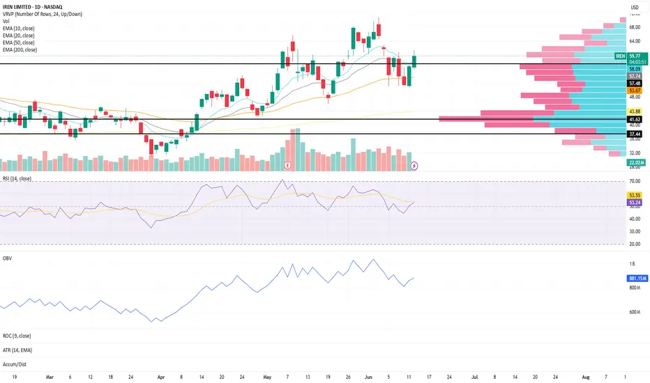
I am a process-driven investor, not a prediction-driven investor. Momentum Above Value Area High | IREN Structure Update IREN continues to show constructive behavior on the daily timeframe as price trades above a key volume profile level.
Price is currently trading above the Value Area High (VAH), suggesting continued acceptance above the upper boundary of the primary value area
The Value Area Low (VAL) remains below current price and represents an area worth monitoring if momentum begins to weaken
The Point of Control (POC) sits below both levels and represents the price where the highest volume has historically been transacted
Trend structure remains constructive:
The 10, 20, and 50 EMA remain aligned, supporting a healthy trend environment
The 10 EMA is showing upward curvature, reflecting improving short-term momentum
Moving averages have generally been trending higher since the April 2nd pivot, reinforcing the broader structural improvement
Momentum conditions remain supportive:
RSI is currently near 54, reflecting constructive momentum without reaching extended levels
OBV has shown constructive behavior since April 2nd, suggesting participation has generally supported the advance
What I'm Watching 👀
Whether price can continue holding above the Value Area High
If the 10 EMA continues supporting short-term momentum
Whether RSI can continue strengthening while maintaining healthy participation
Continued confirmation from OBV as price approaches prior swing highs
At the moment, structure remains constructive, with price maintaining acceptance above the value area while trend and momentum continue showing signs of improvement.
⭐ Final Clarity Note ⭐
This is a structure-based observation, not a prediction — focused on trend alignment, momentum behavior, participation, and liquidity positioning across key structural levels. Bank of America: Potential Breakout Bank of America has been grinding higher as the broader market falls, and some traders may expect an acceleration to the upside.
The first pattern on today’s chart is the series of lower highs since early January. The lender ended yesterday above that falling trendline. It also registered its highest closing price in almost four months. Those signals could suggest prices are trying to break resistance.
Second, the 50-day simple moving average (SMA) is nearing a potential “golden cross” above the 200-day SMA. That may reflect an improved long-term trend.
Next, the 8-day exponential moving average (EMA) is above the 21-day EMA and MACD is rising. Those signals could reflect short-term bullishness.
Finally, BAC is an active underlier in the options market. (Its average daily volume of 191,700 contracts ranks 20th in the S&P 500, according to TradeStation data.) That could help traders take positions with calls and puts.
TradeStation has, for decades, advanced the trading industry, providing access to stocks, options and futures. If you're born to trade, we could be for you. Learn more here about TradingView’s Broker of the Year!
Past performance, whether actual or indicated by historical tests of strategies, is no guarantee of future performance or success. There is a possibility that you may sustain a loss equal to or greater than your entire investment regardless of which asset class you trade (equities, options or futures); therefore, you should not invest or risk money that you cannot afford to lose. Online trading is not suitable for all investors. View the document titled Characteristics and Risks of Standardized Options at www.TradeStation.com . Before trading any asset class, customers must read the relevant risk disclosure statements on www.TradeStation.com . System access and trade placement and execution may be delayed or fail due to market volatility and volume, quote delays, system and software errors, Internet traffic, outages and other factors.
Securities and futures trading is offered to self-directed customers by TradeStation Securities, Inc., a broker-dealer registered with the Securities and Exchange Commission and a futures commission merchant licensed with the Commodity Futures Trading Commission). TradeStation Securities is a member of the Financial Industry Regulatory Authority, the National Futures Association, and a number of exchanges.
TradeStation Securities, Inc. and TradeStation Technologies, Inc. are each wholly owned subsidiaries of TradeStation Group, Inc., both operating, and providing products and services, under the TradeStation brand and trademark. When applying for, or purchasing, accounts, subscriptions, products and services, it is important that you know which company you will be dealing with. Visit www.TradeStation.com for further important information explaining what this means. SPY Structure Update (Daily Chart)SPY remains in a constructive trend environment despite today's pullback, with the broader moving average structure continuing to hold.
The 10, 20, 50, and 200 EMAs remain positively aligned
Price continues to trade above all major moving averages, keeping the larger trend structure intact
While short-term momentum has weakened, the overall trend remains constructive until key support areas begin to fail
Momentum conditions have cooled:
RSI is currently near 49, reflecting a notable loss of short-term momentum following the recent decline
The move from overbought conditions back toward the midpoint suggests momentum is being reset rather than fully rebuilt
OBV has begun to pause, showing slight downward pressure, though participation has not yet deteriorated into a meaningful distribution phase
This creates a structure where trend remains constructive, but momentum and participation warrant closer monitoring.
What I'm Watching 👀
Whether RSI can stabilize and begin rebuilding from current levels
If OBV can hold recent gains or begins showing deeper signs of distribution
How price reacts around the rising 10, 20, and 50 EMA support cluster
Whether participation returns on any recovery attempt or continues to weaken
At the moment, the broader trend remains intact, but momentum has clearly cooled. The next clues will likely come from how RSI and OBV behave as price interacts with key support areas.
⭐ Final Clarity Note ⭐
This is a structure-based observation, not a prediction — focused on trend alignment, momentum behavior, participation, and liquidity positioning across key structural levels. Weekly Review - One Chart -> Market Deterioration or Rotation?TLDR:
The market is sending a mixed but interpretable message. Internal momentum has weakened and volatility pressure has returned, yet long-term participation remains constructive and leadership is rotating rather than collapsing. For now, the evidence supports a view of sector rotation under pressure, not broad market deterioration. The next important question is whether participation re-expands and validates the rotation—or whether weakness spreads and transforms pressure into genuine
1️⃣ What do we see today?
Price remains near recent highs, but the real story is happening beneath the surface.
The latest session showed very weak breadth, with only 30% of NYSE stocks and 23% of NASDAQ stocks advancing. Declining volume dominated the NYSE, and volatility pressure has risen sharply as the VIX/VIX3M ratio moved back toward the critical 1.0 threshold.
At first glance, this appears bearish.
However, the broader dashboard tells a more nuanced story:
* % of stocks above SMA200 continues to improve.
* % of stocks above SMA20 improved over the past week before the recent setback.
* NYSE New Highs still exceed New Lows.
* Long-term participation remains healthy.
* Sector leadership is broadening beyond Technology into Energy, Industrials and selected Financial and Healthcare groups.
The evidence suggests capital is still participating in the market, but it is increasingly changing location within the market.
⸻
2️⃣ Thesis
The dominant message is rotation under pressure, not broad deterioration.
The market is no longer experiencing the powerful participation expansion that fueled the April–May recovery. Leadership has become more selective, breadth has weakened, and volatility pressure has increased.
Yet long-term participation continues to improve and NYSE leadership remains positive.
This suggests money is rotating between sectors rather than exiting the market altogether.
The framework therefore classifies the environment as:
Acceptance under Pressure with Evidence of Sector Rotation.
⸻
3️⃣ What validates the thesis?
The rotation thesis remains valid if:
* % Above SMA200 continues to rise or remains stable.
* NYSE New Highs continue to exceed New Lows.
* Financials and Healthcare continue repairing.
* Energy and Industrials remain leadership groups.
* VIX/VIX3M stabilizes below or around 1.0.
* Participation improves after weakness rather than collapsing further.
In this scenario, the market broadens leadership rather than breaking structurally.
⸻
4️⃣ What invalidates the thesis?
The thesis is invalidated if:
* % Above SMA20 rolls over persistently across both exchanges.
* % Above SMA200 starts declining.
* NYSE New Lows begin exceeding New Highs.
* Leadership deterioration spreads beyond NASDAQ.
* VIX/VIX3M establishes itself above 1.0 and continues rising.
* Sector rotation fails and weakness becomes market-wide.
At that point, the evidence would shift from rotation toward genuine internal deterioration.
⸻
Why This Dashboard Matters
1. Reduction of Uncertainty / Confusion
Most investors see a large down day and immediately ask:
“Is the bull market over?”
This dashboard asks a better question:
“Is participation improving or deteriorating?”
Our analysis showed that while breadth weakened sharply on the latest session, long-term participation remains healthy, NYSE leadership remains positive, and sector leadership is rotating rather than collapsing.
Instead of forming an opinion from price alone, we separate:
* short-term participation
* long-term participation
* leadership
* volatility
* volume
That distinction allows us to conclude that the market is under pressure, but not yet under broad structural stress.
I don’t need to know the future; I need to assess whether evidence is improving.
⸻
2. Reduction of Effort
Without a framework, every market move requires a new explanation.
With this dashboard, we repeatedly focus on the same recurring conditions:
* Are more stocks participating?
* Are New Highs expanding?
* Is volume confirming?
* Is volatility stabilizing or increasing?
* Is leadership broadening or narrowing?
In this case, the framework quickly revealed that the important question was not whether Technology sold off, but whether leadership was migrating into Energy, Industrials, Financials and Healthcare.
The answer emerged from a handful of indicators rather than hundreds of charts.
I don’t need to analyze everything; I need to recognize a handful of recurring conditions.
⸻
3. Identity Reinforcement
The purpose of this framework is not prediction.
It is evidence assessment.
During this analysis, the easy conclusion would have been either:
* “Everything is fine because price is near highs.”
or
* “Everything is broken because breadth was terrible today.”
The framework rejected both extremes.
Instead, it identified a more evidence-based conclusion:
Participation has weakened.
Leadership has narrowed.
Volatility pressure has increased.
But long-term participation remains healthy and sector rotation is still occurring.
That conclusion comes from process, not opinion.
I am a process-driven investor, not a prediction-driven investor.
::: -3.33% - The Start of a Bubble Deflating? I am Out!I am not a perma bear. I believe in equities, innovation, and long-term wealth creation. Markets rise more often than they fall, and betting against human progress is usually a mistake.
But there are times when risk becomes too obvious to ignore. For me, that happened in March 2026. I sold all my stocks because I believed the market had moved from expensive to irrational. Since then, the market has gone parabolic, and missing that rally has been painful.
Even so, I cannot bring myself to buy back in.
So, to see this -3-3% shock today signaled that this might be the start. According to my analysis, a -3.3% broad market 1-day decline is a shock event.
The first issue is valuation.
The Shiller CAPE ratio, which compares prices to ten years of inflation-adjusted earnings, suggests the S&P 500 is among the most expensive markets in modern history. Valuations can stay elevated for a while and may even rise further, but eventually earnings must justify prices. I do not believe they currently do.
]The second issue is AI.
I believe AI is a transformative technology. But transformative technologies can still create bubbles. The internet was real in 1999, yet investors paid absurd prices for future profits that often never arrived.
Today, AI is being priced as if massive profits are inevitable and imminent. Yet the costs are enormous: chips, energy, data centers, infrastructure, talent, and ongoing model training. Investors seem focused on the upside while ignoring the economics. AI may change the world, but that does not guarantee attractive returns at current valuations.
The third issue is inflation.
Markets are still pricing in a future where inflation falls, rates decline, and liquidity supports higher asset prices. But that outlook depends on favorable conditions. If oil prices remain elevated because of conflict in Iran or broader energy disruptions, inflation could remain stubbornly high.
Higher energy costs affect transportation, manufacturing, food, and consumer spending. If inflation stays elevated, the Federal Reserve may be unable to cut rates aggressively. Higher bond yields would put pressure on equity valuations, particularly high-growth and AI-related stocks.
The fourth issue is political and regulatory risk.
I see signs of weaker investor protections and increasing tolerance for speculation. Crypto is the clearest example. Much of the sector appears driven more by speculation, insider incentives, and political influence than by genuine economic utility. When regulation weakens and speculation dominates, ordinary investors often bear the consequences.
Then there is the coming IPO wave.
Companies such as SpaceX, OpenAI, and Anthropic are frequently discussed as future public listings. These are impressive businesses, but they are also capital-intensive, expensive, and valued on extremely optimistic assumptions.
My concern is that if these companies are rapidly included in major indexes, passive investors, pension funds, and retirement accounts will be forced to buy them regardless of valuation. That shifts risk from venture capital firms and insiders to the broader public.
This is often how bubbles end: insiders seek liquidity while retail investors buy the story.
Taken together, I see a dangerous combination of risks: extreme valuations, persistent inflation, elevated energy prices, speculative AI spending, crypto excess, weaker regulation, and a pipeline of highly valued private companies preparing to enter public markets.
Maybe I am wrong. Maybe AI profits exceed expectations. Maybe inflation falls and rates decline. Maybe the market continues climbing.
But I cannot justify buying at these prices.
Missing the rally hurts, but I would rather miss the final stage of a bubble than buy into a market that appears priced for perfection.
I am simply waiting for valuations and expectations to reconnect with reality.
If this is a late-stage bubble, a 35% decline is probable. It may be what is required to bring prices, expectations, and investor psychology back to earth.  Short
Short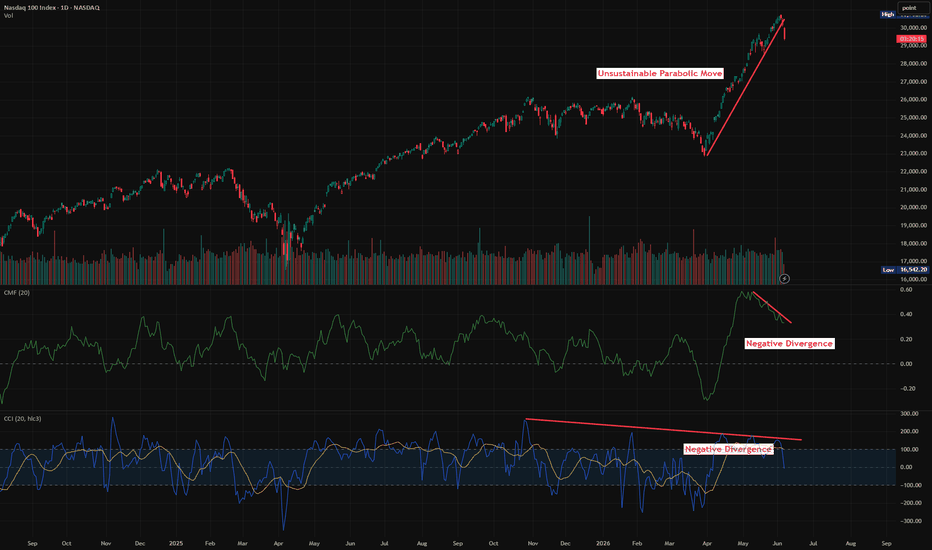
Weekend Review - One chart that makes you act with confidenceIn this post, I show that the S&P 500 is not running on fumes — market internals are confirming the advance and the rally has healthy support.
Using the Market Internal Pressure Dashboard, this article explains why participation is improving, leadership is expanding, and volatility is normalized, giving the uptrend real staying power.
And this is why you can act with confidence — because you understand what’s happening beyond price.
1️⃣ What is it today?
The S&P 500 has largely repaired the damage from the March-April stress event and is trading near recent highs. However, the more interesting story is not price itself but what is happening underneath the surface.
Market internals show:
VIX/VIX3M has moved back below 1, indicating stress normalization.
New 52-week highs continue to outnumber new lows.
Participation has improved materially from the breadth washout seen during the correction.
The percentage of stocks above their SMA20 and SMA200 has recovered, but remains far from euphoric extremes.
Leadership remains constructive rather than collapsing.
The market is behaving like a system testing whether higher prices can be accepted.
2️⃣ Thesis
The current market environment is best described as Recovery transitioning into Acceptance.
The key observation is that volatility normalized before participation fully recovered.
Price has returned to the highs faster than breadth has returned to extremes.
This is important because it suggests the advance is not being driven by indiscriminate optimism. Instead, participation is gradually rebuilding while leadership (currently: Chips, Semis, Fabs, AI) remains intact.
The market appears to be moving from stress relief toward acceptance.
3️⃣ What validates the thesis?
The thesis remains valid while internal conditions continue to support price:
VIX/VIX3M remains below 1 (better below 0.9).
New highs continue to exceed new lows with expanding leadership (other sectors joining such as SaaS and IGV recovering recently)
Breadth (% above SMA20 and SMA200) stabilizes or improves >60%.
Up volume continues to dominate down volume over time (effort confirming the move).
Most importantly:
The market's internal behavior must continue to confirm the message of price.
4️⃣ What invalidates the thesis?
The thesis weakens if price continues higher while internal participation deteriorates.
Warning signs would include:
New highs stop expanding.
New lows begin increasing.
Breadth rolls over while price remains elevated.
VIX/VIX3M starts rising back toward or above 1.
Leadership narrows significantly (even more narrowed on the AI theme; SaaS bounce fails).
Up volume deteriorates despite stable index levels.
A healthy market can withstand pullbacks. What matters is whether participation and leadership remain intact during those pullbacks.
------------------
Grabbing this chart and using it will do the following for you:
1. Reduction of Uncertainty / Confusion
This chart replaces guesswork with clear evidence by showing whether participation, leadership, and volatility are improving or deteriorating. Instead of predicting price, you simply assess if the weight of internal data supports the move.
2. Reduction of Effort
The framework trains you to scan the same five recurring conditions every time — volatility regime, participation, leadership, effort, and price confirmation. Once you recognize these patterns, decisions become faster and far more consistent.
3. Identity Reinforcement
This approach shifts your identity from a prediction-driven trader to a process-driven trader who follows evidence over opinion. You no longer tie self-worth to being right on every trade, but to consistently applying a disciplined framework.
I wish you a fruitful and confident week!
 Long
Long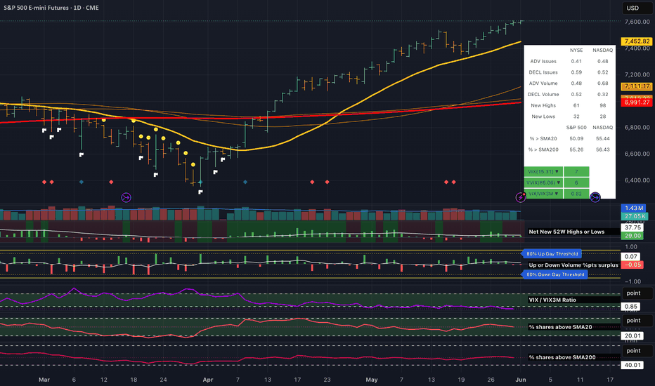
 Short
Short