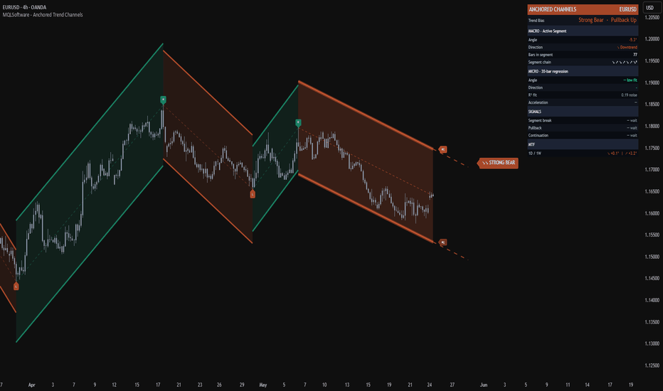
Anchored Trend Channels [MQLSoftware]Anchored Trend Channels is a structural overlay that maps each phase of price action between confirmed swing points as its own parallel trend channel. Instead of fitting one curve or band to all of price history, it breaks the chart into discrete pivot-to-pivot segments and renders each one as a self-contained anchored channel with its own slope, width, and angle. The active channel projects forward with a dashed extension so future support and resistance levels are visible at a glance.
A second, finer regression channel (Micro) lives inside the currently forming Macro segment to show local momentum and its relationship to the broader trend. A compact right-side panel reads off the resulting structure, the active segment angle, the segment chain, multi-timeframe context, and three optional structural events.
This is a visual analytical tool intended for chart reading and structure mapping. It does not execute trades and does not provide financial advice.
Key Features
Pivot-anchored Macro channels that segment price action into discrete trend phases (one channel per phase, anchored on confirmed swing pivots)
Active segment with a forward-extending dashed projection of about 20 bars, showing where the channel boundaries would lie if the trend continues
Adaptive Micro regression channel inside the active segment, with R-squared fit quality readout
Trend Bias scoring weighted by segment length and angle, combined with net price move across the analysis window
Acceleration metric showing how much the Micro angle deviates from the Macro angle (faster, slower, or flat)
Right-side panel with Macro angle, segment chain visualization, Micro R-squared, MTF context, and three structural signal states
Non-Repaint Mode toggle for users who prefer closed-bar-only updates on the active segment
Three optional structural event markers (Segment Break, Macro Pullback, Micro Continuation) with a configurable cooldown to avoid clustering
Core Concept
Most channel and trend indicators on TradingView take one of two approaches. They either fit a single continuous curve to all of price (linear regression channels, ATR-trailing bands, smoothed moving averages with deviation bands) or they detect individual trendlines through two pivots and project them indefinitely. Both approaches have known limitations. A single continuous channel cannot describe a market that has clearly changed phase. Two-pivot trendlines drift, get broken, and need constant manual maintenance.
This indicator builds on a third approach: piecewise channels anchored on confirmed pivots. Each finished segment is a closed, immutable object that describes one phase of price action between two opposite swing points. The chain of segments left behind is a structural history of how the trend developed, where it accelerated, where it reversed.
The indicator adds three specific algorithmic elements on top of that base.
1. Quality Filters at Segment Birth. Before a new segment is committed, two filters check that the pivot move is structurally meaningful. The pivot-to-pivot price distance must exceed a configurable ATR multiple (default 2.5x), and the bar count must exceed a minimum length (default 8 bars). Pivots that fail either check are skipped, so the visible chain reflects real phase changes, not noise.
2. Pivot-Anchored Geometry with Max-Deviation Width. Each segment's basis line is the straight line between its two anchor pivots. The channel half-width is the maximum deviation of any bar inside the segment from that basis line, scaled by a user multiplier and floored by an ATR-based minimum. This produces channels that visibly contain the price action that built them, rather than mathematical fits that ignore visible swings.
3. Trend Bias from Weighted Segments Plus Net Move. Most chain-based indicators classify direction by counting up-segments versus down-segments. That gives equal weight to a 30-bar trending move and a 5-bar choppy retracement. This indicator weights each segment by the product of its bar count and its absolute angle, then combines that with the net price move across the analysis window measured in ATR units. The result is a Trend Bias label (Strong Bull, Bullish, Mixed, Bearish, Strong Bear) that reflects which side has accumulated the actual structural progress, not just the count of segments.
Anatomy of the Display
Historical segments are drawn as parallel green or coral channels between confirmed past pivots. They are immutable once committed and form a left-to-right chain that visually traces the structure of the trend.
The active segment is the right-most channel, drawn in bright color with a wider glow layer. It anchors on the most recent confirmed pivot and extends to the current bar. The dashed projection continues the channel about 20 bars to the right at the current slope, so users see where price would touch the upper and lower boundaries if the segment kept its angle.
The Micro channel is a 20-bar linear regression with standard-deviation bands, rendered in cyan or pink depending on its own direction. It only appears when the regression's R-squared fit quality clears a user threshold, so it auto-hides when local price action is too noisy for a meaningful regression.
H and L pivot markers sit at the pivot anchor points. H labels mark confirmed high pivots, L labels mark confirmed low pivots.
The right-side panel groups the data into Trend Bias (top), Macro Active Segment (angle, direction, bars in segment, segment chain), Micro Channel (angle, direction, R-squared, acceleration), Signals (three states), and MTF (current angle of two higher timeframes).
Acceleration in the panel is the Micro angle minus the Macro angle. A positive number means the local momentum is steeper than the surrounding trend phase (often early-stage continuation). A negative number means the local momentum is flattening relative to the surrounding trend phase (often late-stage or stalling).
Optional Structural Event Markers
Three structural events can be displayed as on-chart markers. These describe what is happening to the channel geometry. They are not trade entries.
Segment Break (BRK). Price closes beyond the opposite boundary of the active segment. In an active uptrend channel, this is a close below the lower boundary. In a downtrend channel, a close above the upper boundary. This marks a violation of the active phase structure.
Macro Pullback (PB). Price closes within 0.2 ATR of the band on the same side as the trend direction. In an uptrend, price closes near the lower boundary. In a downtrend, price closes near the upper boundary. This marks a touch back to the channel boundary in the direction of the active phase.
Micro Continuation (CONT). The Micro channel breaks its own boundary in the same direction as the Macro segment, while the segment is still in its early stage (3 to 25 bars in). This marks a moment when local momentum aligns with the broader trend phase early in its life.
All three event types are gated by a configurable cooldown (default 15 bars) to prevent clustering. Each event is computed on closed bars only.
Multi-Timeframe Panel Row
The MTF row at the bottom of the panel shows the active segment angle on two higher timeframes. The two HTFs are selected automatically from the standard timeframe ladder based on the current chart timeframe. For example, on a 15m chart the panel reads 4H and 1D. On a 1H chart it reads 1D and 1W. HTF values are read with `lookahead=barmerge.lookahead_off` and a one-bar offset, which is the standard non-repainting pattern for higher-timeframe reads.
Notes on Repainting
Historical segments do not repaint. They are built from confirmed pivots (`ta.pivothigh` and `ta.pivotlow` with a right-bars parameter). A pivot is only confirmed several bars after it forms, so historical segments remain anchored in place forever once committed.
The active segment updates as new bars print. With Non-Repaint Mode ON (default), it recalculates only on closed bars, so its boundaries remain stable intra-bar. With Non-Repaint Mode OFF, it updates on every tick for users who prefer maximum responsiveness and accept the visual jitter.
Pivot detection has an inherent delay equal to the pivot lookback (default 30 bars on Very Long sensitivity). A pivot becomes visible after that many bars have closed past it. This is a property of all pivot-based indicators, not a flaw specific to this script.
All signal markers and alerts are gated by `barstate.isconfirmed`. They fire exactly once per closed bar and never intra-bar.
MTF panel data uses `lookahead=barmerge.lookahead_off` with a one-bar offset on every series, which is the canonical non-repainting pattern for higher-timeframe context.
Typical Analysis Workflow
A common analytical workflow may include:
Reading the Trend Bias label and color in the panel header to anchor an overall directional view
Checking the segment chain in the panel against the visible historical channels on the chart to confirm structure is consistent
Watching the active segment's dashed projection to identify forward levels where the channel boundaries are heading
Comparing the Micro channel direction and angle against the Macro segment direction and angle (Acceleration row) to read whether local momentum aligns with the broader phase
Cross-checking the MTF row to see whether higher timeframes are in the same structural direction or in conflict
Treating Segment Break, Macro Pullback, and Micro Continuation markers as structural events for context, then combining that read with other forms of analysis and risk management
Configuration
Pivot Sensitivity - Short (5), Medium (10), Long (18), or Very Long (30). Lower values produce more segments of shorter average length. Higher values produce fewer, longer-lived segments. Very Long is the default and produces the cleanest premium look.
Min Segment Size (x ATR) - Minimum price distance between consecutive pivots, measured in ATR. Pivots below this threshold are skipped. Higher values produce fewer, more significant segments.
Min Segment Length (bars) - Minimum bar count between consecutive pivots. Short segments are skipped.
Channel Width Multiplier - Multiplier on the max-deviation width. 1.0 means the channel just contains the price action that built it. 1.2 to 1.5 adds visible breathing room.
Min Band Width (x ATR) - Floor on the channel half-width. Prevents razor-thin channels on short segments where deviation is small.
Max Segments Stored - FIFO cap on historical segments (default 15). Older segments are removed as new ones form.
Regression Length (Micro) - Number of bars in the Micro regression window (default 20).
Std Dev Multiplier (Micro) - Width of the Micro band in standard deviations.
Min R-squared to Show (Micro) - Hides the Micro channel when regression fit quality is below this threshold.
Signal Cooldown (bars) - Minimum bars between consecutive same-type signal markers.
Non-Repaint Mode - When ON (default), the active channel uses closed-bar data only. When OFF, it updates live with each tick.
Show toggles - Macro segments, Micro channel, panel, status badge, endpoint labels, pivot markers, signal markers, basis lines, channel fills, MTF row.
Markets and Timeframes
The indicator can be applied across multiple markets and timeframes:
Forex
Stocks and Indices
Commodities
Cryptocurrencies
Because slope is ATR-normalized and channel width is ATR-floored, the visual behavior remains consistent across instruments and timeframes. The Pivot Sensitivity preset can be tuned per chart for the cleanest read on a given symbol and timeframe.
Alerts
Three alert conditions are available:
Segment Direction Changed - fires when the active segment direction flips between uptrend and downtrend
Segment Break - fires when price closes beyond the opposite boundary of the active segment
Micro Continuation - fires when the Micro channel breaks its own boundary in the same direction as the active Macro segment, in the early portion of the segment
All alerts evaluate on confirmed bars to avoid intra-bar oscillation. อินดิเคเตอร์
Auto Trendlines & Market Structure - MTFAuto Trendlines & Market Structure - MTF
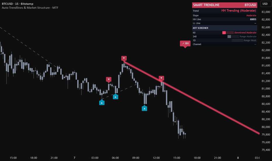
Auto Trendlines & Market Structure - MTF is a visual analytical indicator that automatically draws support and resistance trendlines through swing pivots and classifies the resulting structure into one of seven states: Uptrend, Downtrend, Expanding, Contracting, Range, HH Trending, or LL Trending. A compact panel in the top-right shows how that classification compares across the current chart timeframe and three higher timeframes.
The goal is to remove the subjectivity of manual trendline drawing while keeping the chart readable: only the two currently relevant lines (one from recent pivot highs, one from recent pivot lows) are drawn as active, while older invalidated lines fade into a dashed historical layer for context.
This is a visual analytical tool intended for chart reading and structure mapping. It does not execute trades and does not provide financial advice.
Key Features
Auto-detected trendlines through the two most recent valid pivot highs (resistance) and pivot lows (support)
Adaptive pivot lookback that scales with ATR-relative volatility, with optional fixed-length mode
Seven-class structure classification rather than a binary up/down trend
Multi-timeframe panel scanning the current TF plus three higher TFs
Validation logic that rejects lines penetrated by older pivots beyond an ATR-based tolerance
Historical line trail (dashed) preserved when an active trendline gets broken or replaced
Two-layer neon line rendering and gradient channel fill scaled by ATR
Core Concept
Most automatic trendline scripts simply connect the two most recent pivots and call it a trendline. This produces noisy output in choppy markets and resists no contradiction from older swings. This indicator adds three layers on top of that base.
1. Pivot Validation. Before a candidate trendline becomes active, it is checked against up to four older pivots in the same direction. If any of them sits more than 0.3 ATR above a resistance line (or below a support line), the candidate is rejected. This filters out lines that look correct on the latest two pivots but conflict with established structure.
2. ATR-Normalized Slope. Slope is stored not in raw price-per-bar units but in ATR-per-bar units. This makes slope comparable across instruments and timeframes: a normalized slope of 0.1 means roughly one-tenth of an ATR per bar regardless of whether the chart is EURUSD on 15m or BTCUSD on 4H. Strength buckets (Weak / Moderate / Strong / Very Strong) are then defined on this normalized scale.
3. Seven-Class Structure Classification. Instead of collapsing everything into "up or down", the indicator combines the slope sign of both lines:
Both up — Uptrend
Both down — Downtrend
Resistance up, support down — Expanding (broadening)
Resistance down, support up — Contracting (converging)
Both flat within threshold — Range
Only support active — LL Trending (one-sided structure)
Only resistance active — HH Trending (one-sided structure)
This classification surfaces structural states that a single trend label cannot describe — particularly Expanding and Contracting, which often precede volatility expansions or breakouts.
Trendline Lifecycle
Each line goes through a defined lifecycle:
Built from the two newest valid pivots in its direction
Projected to the right and rendered with a colored core plus a wider transparent glow
Replaced when a newer pivot pair forms a more recent line — the previous line is then frozen as a dashed historical reference
Invalidated when price closes more than 0.5 ATR beyond the line — at that moment the line stops projecting, freezes at the breakpoint, and a break alert can fire
The historical trail is capped at 80 frozen lines (FIFO) so the chart does not accumulate clutter on long histories.
Multi-Timeframe Panel
A compact panel in the top-right corner displays the current trend classification across the current timeframe and three higher timeframes. The three HTFs are selected automatically from the standard ladder (1m, 5m, 15m, 1H, 4H, 1D, 1W, 1M, 3M, 12M) based on the active chart timeframe — for example, on a 1H chart the panel shows 4H, 1D, 1W.
Each row shows:
Timeframe label
Block-bar strength gauge
Class name (Uptrend / Downtrend / Expanding / Contracting / Range / HH Trending / LL Trending / Building)
Strength tier (Weak / Moderate / Strong / Very Strong)
The panel also shows the current chart's HH and LL line levels and the absolute and percentage channel width when both lines are active. HTF data is pulled with non-repainting parameters so the panel stays consistent on confirmed bars.
Typical Analysis Workflow
A common analytical workflow may include:
Reading the structure class on the chart timeframe to understand the immediate state
Comparing it to the three higher timeframes in the panel to detect alignment or conflict
Watching the channel width as the structure transitions between Expanding, Contracting, and Range
Using line breaks and the dashed historical trail to time potential structure shifts
Combining the structure read with other forms of analysis and risk management
Configuration
Pivot Lookback Mode — Adaptive (default) scales the pivot length with ATR-relative volatility (between 5 and 10 bars on each side). Fixed lets you set a single lookback between 3 and 15 bars.
Show Trend Lines — Toggles the active two-layer neon trendlines.
Show Channel Fill — Fills the area between active lines with a gradient. Only rendered when both lines are active and the structure is Uptrend, Downtrend, or Range (skipped during Expanding and Contracting to avoid visual confusion).
Show MTF Panel — Toggles the multi-timeframe panel.
Show Pivot Markers — Triangle markers at the most recent pivots, capped at 6 to avoid clutter.
Show Trend Status — Large class badge above price.
Show Line Labels — "HH" and "LL" anchor markers at the right end of each active line.
Line Width (Core) — Width of the inner core line. The outer glow is always rendered at core + 7.
Markets and Timeframes
The indicator can be applied across multiple markets and timeframes:
Forex
Stocks and Indices
Commodities
Cryptocurrencies
Because slope is ATR-normalized and pivot lookback is volatility-adaptive, the visual behavior remains consistent across instruments and timeframes without manual re-tuning.
Alerts
Three alert conditions are available:
Trend Class Changed — fires when the structure classification transitions between any of the seven states
Resistance Break — fires when price closes more than 0.5 ATR above the active resistance line
Support Break — fires when price closes more than 0.5 ATR below the active support line
All alerts evaluate on confirmed bars to avoid intra-bar oscillation.
Notes on Repainting
Active trendlines are anchored to confirmed pivot highs and pivot lows, which are themselves only validated after a pivot lookback window has fully passed. Once an active line is drawn its anchor points do not move. The MTF panel uses confirmed higher-timeframe values with a one-bar offset, so its readings stay consistent across historical and realtime bars. Alerts trigger only on confirmed bars.
Important Notes
This indicator is an analytical visualization tool. It does not execute trades and does not provide financial advice. All outputs are informational and should be interpreted within the context of independent market analysis and proper risk management.
Past behavior of any technical indicator does not guarantee future results.
If you find this indicator useful, feel free to add it to your favorites and share your feedback in the comments. Community feedback helps improve future updates. อินดิเคเตอร์
Pythagorean Time Price Geometry Ver 1.0Pythagorean Time Price Geometry — Ver 1.0
By Timepricedecoder
Overview
This indicator applies W.D. Gann's Time = Price principle using Pythagorean geometry to project natural time cycles and price grid levels directly on the chart.
Gann believed that financial markets move in geometric harmony — that price and time are not independent variables, but two sides of the same equation. When they balance, the market reaches a natural turning point.
This script operationalises that idea using the Pythagorean theorem — the ancient mathematical relationship where in a right-angled triangle, the square of the hypotenuse equals the sum of squares of the other two sides (a² + b² = c²). In market terms:
Side A (time) — the number of bars in the anchor swing
Side B (price) — the range of the anchor swing (High − Low)
Side C (hypotenuse) — the natural cycle projection derived from both
By selecting a Pythagorean Triple (sets of whole numbers satisfying a² + b² = c², such as 3-4-5, 5-12-13, 8-15-17), the script scales the time-price relationship into a precise geometric ratio. This ratio then defines the grid cell size, the cycle length, and the angle of the diagonal — all derived from a single anchor swing.
The result is a self-organising grid that maps where price should find support or resistance, and when time cycles are due to complete — giving the trader a structured, geometry-based framework rather than arbitrary indicator levels.
When time and price arrive at the same Pythagorean node simultaneously — the market is squaring — and that is where the highest-probability signals are generated.
Core Concepts
Time = Price Squaring
Price range and time duration are treated as the two legs of a right triangle. When they balance — the market is at a Square — reversals or accelerations are most likely.
Pythagorean Nodes
From the anchor swing (High → Low or Low → High), the script calculates:
Sq — Square of the swing (time leg = price leg). Highest grade signal
Hyp — Hypotenuse projection. Major cycle marker
½Hyp — Half Hypotenuse. Minor cycle node
½Sq — Early warning zone
These project forward as repeating time cycles across the chart.
Harmonic Grid
Price is divided into cells derived from the Pythagorean triple ratio (B/A × Range). The grid repeats both in time (columns) and price (rows), creating a natural map of support, resistance, and time confluence.
Signal Tiers
🟨 BUY/SELL-Sq — Time node + Price grid level align. Strongest signal
🟩 BUY/SELL-T — Time node only. Moderate signal
⬜ BUY/SELL-P — Price grid level only. Weakest, disabled by default
Confluence Zones ⚡
⚡ — Quarter cycle node
⚡⚡ — Half cycle node
⚡⚡⚡ — Full cycle node (highest confluence)
Recommended Settings
StyleGann NumberDivisorTripleSwing WidthScalping221/44-3-5NarrowShort Term441/24-3-5NormalMedium Term881/23-4-5NormalLong Term176Full3-4-5Wide
InstrumentType SettingNotesOptionsOptionsGrid origin auto-adjustedIndicesIndicesUse 88, 1/2 divisorStocksStocksUse Adaptive stabilityFuturesFuturesUse 44 or 88
Grid Stability
Strict — Anchors rarely shift. Best for trending markets
Adaptive — Default. Balances stability and responsiveness
Relaxed — Reanchors more freely. Best for ranging markets
How To Use
Let the script auto-detect the swing anchor (or set manually)
Watch for Sq labels on vertical cycle lines — these are key dates
Enter on BUY-Sq / SELL-Sq signals with candle confirmation
Use ⚡⚡⚡ confluence zones as high-alert turning point windows
The active zone box shows current grid cell position (Upper = bullish bias, Lower = bearish bias)
Disclaimer
This script is published for educational purposes only. It does not constitute financial advice. Past signal accuracy does not guarantee future results. The swing detection uses Daily OHLC data with lookahead enabled — results may differ slightly on live bars versus historical bars. Always use proper risk management. Trade at your own risk. อินดิเคเตอร์

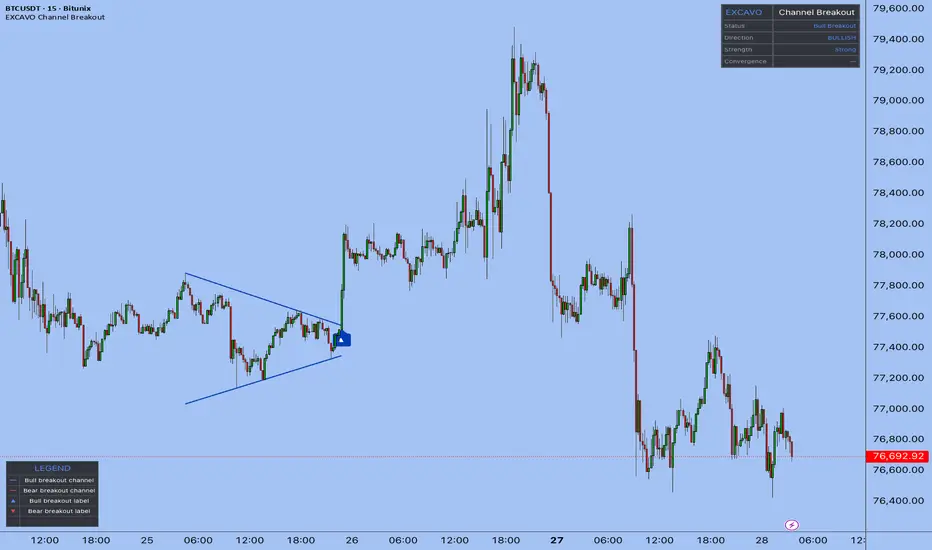
Channel Breakout [EXCAVO]Automatic Convergent Channel Detection with Multi-Filter Breakout Confirmation
The Channel Breakout automatically detects convergent channel patterns — wedges, flags, and triangles — by fitting trendlines through confirmed swing pivots on both boundaries simultaneously. When price breaks out with volume and momentum confirmation, the indicator signals the direction with colored channel lines and an entry label on the breakout candle.
This is not a basic highest/lowest channel. The boundaries are built from verified pivot points, and a convergence filter ensures only genuinely contracting channels qualify — expanding ranges and sideways boxes are excluded.
━━━━━━━━━━━━━━━━━━━━━━━━━━━━━━━━━━━━━━━
▸ HOW TO USE
Step 1 → Add the indicator. It begins scanning for convergent channel
patterns using swing pivots on the current timeframe.
Step 2 → Wait for a channel to form. The indicator draws the upper and
lower boundary lines in blue while price remains inside.
Step 3 → Watch for the breakout signal. When price closes beyond either
boundary with confirmation, channel lines turn blue (bull) or
red (bear), and an arrow label appears on the breakout candle.
Step 4 → Check the dashboard. It shows the current pattern state,
breakout strength (Strong / Medium / Weak), and the directional
bias score that built up while price was inside the channel.
Step 5 → Read the strength rating. Strong breakouts combine high volume,
deep body penetration, and RSI alignment. Weak breakouts show
fewer confirming factors and may warrant additional analysis.
━━━━━━━━━━━━━━━━━━━━━━━━━━━━━━━━━━━━━━━
▸ HOW IT CALCULATES
◆ Pivot Detection
Swing highs and lows are identified with ta.pivothigh / ta.pivotlow using a
configurable lookback (Pivot Detection Length, default 5 bars each side). Only
confirmed, closed pivots are used — no repainting. All recent pivots within the
Max Channel Width lookback are stored and passed to the trendline fitting engine.
◆ Best-Fit Trendline Algorithm
For the upper boundary, the engine tests every pair of stored pivot highs (a, b).
For each candidate line through (a, b), it counts how many other pivot highs lie
within ATR × Touch Tolerance of the line while no pivot exceeds it by more than
ATR × Max Deviation. The line with the most qualifying touches becomes the upper
boundary. The same process runs independently for pivot lows to find the lower
boundary. Both boundaries must exist with at least Min Touches (default 2) to
form a valid channel.
◆ Convergence Filter
Once both boundaries are found, the engine measures channel width at the earliest
shared bar (widthStart) and at the current bar (widthNow):
convRate = 1 − (widthNow / widthStart)
A channel is only accepted when convRate >= Min Convergence Rate (default 0.02).
This rejects expanding wedges and flat ranges, keeping only contracting patterns.
◆ Breakout Detection and Strength Score
On each confirmed bar close, the engine projects both boundary lines to the current
bar. A bull breakout fires when close > upper boundary; a bear breakout when
close < lower boundary. The breakout strength score blends five components:
penetration depth relative to ATR (25%), candle body ratio (15%), body commitment
relative to the broken boundary (15%), volume vs SMA-20 spike (25%), and RSI
alignment above/below 50 (20%). Score >= 65 = Strong, >= 35 = Medium, < 35 = Weak.
◆ Confirmation Filters
Three optional filters gate the breakout signal. Volume Spike Multiplier requires
the breakout bar's volume to exceed 20-bar SMA by a configurable factor. Volume
Contraction Filter requires that average volume inside the channel was lower than
before the channel formed — confirming energy compression. Momentum Confirmation
requires RSI > 50 for bull breakouts and RSI < 50 for bear breakouts. Any filter
can be disabled for forex or low-volume instruments.
━━━━━━━━━━━━━━━━━━━━━━━━━━━━━━━━━━━━━━━
▸ WHAT MAKES IT DIFFERENT
◆ Pivot-Confirmed Boundaries
Most auto-channel scripts use ta.highest / ta.lowest, which anchors lines to the
highest wick in a window regardless of pattern shape. This indicator builds
boundaries only through confirmed swing pivot points, the same anchor logic a
trader would use when drawing manually.
◆ Convergence-Only Filter
The convRate filter rejects any channel that is not actively narrowing. Sideways
ranges, expanding wedges, and parallel channels are all excluded. Only patterns
where price is compressing toward a decision point qualify.
◆ Best-Fit Touch Counting
The engine evaluates every pair of pivots and selects the line with the highest
touch count, not just the first two pivots it finds. A channel supported by four
touches is stronger than one supported by two, and the algorithm reflects that
by preferring denser confirmation.
◆ Multi-Component Strength Score
The breakout strength is not a simple volume check. It combines five independent
signals — penetration depth, body ratio, body commitment relative to the broken
level, volume spike, and momentum direction — into a single 0-100 score that
classifies the breakout as Strong, Medium, or Weak.
◆ Directional Bias Score
While price is inside the channel, the dashboard tracks a real-time directional
bias built from channel slope (35%), RSI deviation from 50 (35%), and price
position within the channel range (30%). This gives a probabilistic lean on
which side of the channel is more likely to break before the signal fires.
━━━━━━━━━━━━━━━━━━━━━━━━━━━━━━━━━━━━━━━
▸ DASHBOARD
Real-time panel (top right) with key state metrics:
Status - Active (channel forming) / Bull Breakout / Bear Breakout / Scanning
Direction - directional bias with arrow and % while channel is active (e.g. ▲ 64%); BULLISH or BEARISH after breakout
Strength - Strong / Medium / Weak (breakout strength score); — while channel is forming
Convergence - narrowing rate of the active channel in %; — when no channel
Legend table (bottom left) explains every visual element. Toggle in Dashboard settings.
━━━━━━━━━━━━━━━━━━━━━━━━━━━━━━━━━━━━━━━
▸ SETTINGS
Main Settings
Pivot Detection Length - 5 (bars left/right for swing pivot confirmation; lower = more sensitive)
Min Touches per Boundary - 2 (minimum pivot touches required per trendline)
Max Channel Width (bars) - 120 (maximum lookback for channel search)
Min Convergence Rate - 0.02 (minimum narrowing ratio; higher = stricter contraction)
Filters
Volume Spike Mult - 1.2 (breakout bar volume vs SMA-20; set 0.5 to disable on forex)
Volume Contraction Filter - ON (require declining volume inside the channel)
Momentum Confirmation - ON (RSI > 50 for bull, < 50 for bear)
Visual
Show Channel Patterns - ON (draw boundary lines)
Show Pattern Background - OFF (subtle bgcolor while inside active channel)
Channel Lines
Line Width - 2 (boundary line thickness; 1-4)
Risk Management
Show Entry Labels - ON (arrow label on the breakout candle)
Dashboard
Show Dashboard - ON
Position - Top Right (Top Left / Top Right / Bottom Left / Bottom Right)
Font Size - Small (Small / Normal)
Advanced
Touch Tolerance (ATR) - 0.15 (pivot distance to count as a touch; 0.10-0.25)
Max Deviation (ATR) - 0.30 (maximum pivot overshoot from the line)
Min Channel Width (ATR) - 0.5 (minimum channel width filter)
Alerts
JSON Alerts - OFF (structured JSON payload for 3Commas, Wunderbit, and similar bots)
━━━━━━━━━━━━━━━━━━━━━━━━━━━━━━━━━━━━━━━
▸ ALERTS
Bull Breakout - price closes above the upper channel boundary with confirmation
Bear Breakout - price closes below the lower channel boundary with confirmation
Any Breakout - either direction; use for a single alert covering both signals
New Pattern - a new convergent channel has been detected and is now active
━━━━━━━━━━━━━━━━━━━━━━━━━━━━━━━━━━━━━━━
Best regards,
EXCAVO
Disclaimer
Trading involves significant risk. This indicator is a technical analysis tool
and does not constitute financial advice, investment recommendations, or a
guarantee of future results. Past indicator behavior does not guarantee future
performance. Always use proper risk management and your own judgment.
อินดิเคเตอร์

Lumina Trend Channels & Bands [Pineify]Pineify - Lumina Trend Channels & Bands
Lumina Trend Channels & Bands is an overlay indicator that builds a volatility-adjusted trend channel around a Volume-Weighted Moving Average (VWMA). VWMA forms the baseline, while ATR bands define how far price must move before trend state changes.
Key Features
VWMA midpoint weighted toward higher-volume closes.
ATR-based upper and lower bands that adapt to current range.
Persistent trend state while price remains inside the channel.
Triangle markers on the first cross above the upper band or below the lower band.
How It Works
The script calculates a VWMA of close, then adds and subtracts ATR multiplied by the Band Multiplier. A close above the upper band sets bullish state; a close below the lower band sets bearish state. Between the bands, the prior state is preserved.
Compute the VWMA baseline.
Measure ATR and scale it by the Band Multiplier.
Plot upper and lower channel bands around the VWMA, then mark the first crossover or crossunder.
How the Components Work Together
VWMA supplies the directional anchor, while ATR decides how much evidence price needs before a breakout is treated as meaningful. In high volatility the bands widen and demand a stronger close; in quiet conditions the channel tightens and reacts sooner. The cloud fill emphasizes the active side of the trend.
Trading Ideas and Insights
A bullish triangle may indicate continuation after price clears the upper boundary.
A bearish triangle may flag downside momentum when price loses the lower band.
Inside-channel movement is a drift zone. Wait for bar close on live bars; fast reversals can lag, and ranges can whipsaw.
Unique Aspects
Trend state is retained inside the ATR channel, reducing flip-flopping around the VWMA.
The asymmetric cloud emphasizes the active trend side while keeping the opposite band visible.
How to Use
Add the indicator to a clean price chart.
Use the midline and channel to judge bullish, bearish, or undecided territory.
Treat triangles as potential breakout starts, then look for confirmation.
No built-in alert conditions are included in this version.
Customization
Trend Baseline Length (default: 50) - VWMA lookback. Higher values smooth the channel but add lag.
Volatility (ATR) Length (default: 14) - ATR lookback for band width.
Band Multiplier (default: 2.0) - Channel distance. Higher values reduce breakouts; lower values are more sensitive.
Bullish/Bearish Trend Colors - Adjust line, cloud, and marker colors.
Conclusion
Lumina Trend Channels & Bands is for traders who want a clean VWMA trend channel with volatility-aware breakout markers. Use it as context alongside structure, volume, and risk management rather than as a standalone system.
อินดิเคเตอร์

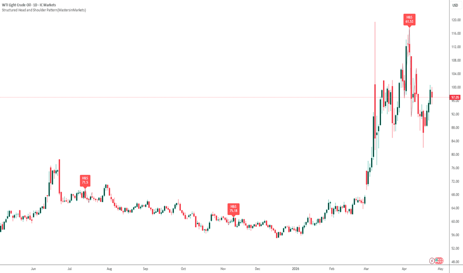
Structured Head and Shoulder Pattern (MastersinMarkets)Overview
This proprietary indicator automates the detection of classic Head and Shoulders (H&S) and Inverse Head and Shoulders patterns using a rigorous structural approach. Designed for traders who prioritize geometric symmetry and statistical quality, it filters out "noisy" or low-probability formations that often lead to false breakouts.
Core Logic
The script utilizes a multi-stage validation engine to confirm pattern integrity:
Pivot Analysis: Identifies high-fidelity swing points using a configurable "Swing Strength" to ensure only significant market turns are considered.
Symmetry Scoring: A proprietary algorithm evaluates patterns based on price symmetry (Shoulder height similarity), time symmetry (duration between peaks), and neckline slope.
ATR Volatility Scaling: The "Min Pattern Size" filter ensures the pattern is large enough relative to current market volatility to be considered structurally significant.
Key Features
Dynamic Quality Score: Every detected pattern is assigned a score (0–100). Only those meeting your "Min Quality Threshold" are displayed, helping you focus on high-probability setups.
Flexible Necklines: Allows for both horizontal and sloping necklines with a "Max Slope" constraint to maintain structural validity.
Visual Structure Mapping: Automatically plots the connecting lines of the pattern and extends the neckline for clear breakout monitoring.
Real-time Alerts: Integrated alerts trigger the moment a validated pattern completes its Right Shoulder.
How It Works
Detection: The script looks for a sequence of five swing points (High-Low-High-Low-High for bearish setups).
Validation: It checks if the "Head" is higher than both "Shoulders" and if the distance between swings meets the minimum bar count.
Scoring: It calculates the $Price\_Symmetry$, AMEX:TIME \_Ratio$, and $Slope\_Score$.
Execution: If the cumulative score exceeds the user-defined threshold (e.g., 60), the pattern is drawn on the chart.
Disclaimer
Trading involves significant risk. This indicator is a tool for technical analysis and does not constitute financial advice. Past performance, including high-quality symmetry scores, does not guarantee future results. Always use proper risk management and consider market context before executing trades. อินดิเคเตอร์
Wedge Reversal Detector [AGPro Series]Wedge Reversal Detector
🔷 Overview
Wedge Reversal Detector is a focused chart-pattern engine built for one specific structure: the rising wedge and falling wedge. Instead of scanning every possible reversal pattern, drawing broad support and resistance, or behaving like a generic breakout dashboard, this script studies the geometry of a wedge itself: confirmed pivot boundaries, slope convergence, pattern maturity, reversal break quality, projected reaction zone, and invalidation context.
The goal is to make wedge analysis cleaner and more objective on a live chart. A valid wedge is not treated as just two random trendlines. The script requires a confirmed pivot structure, a meaningful initial width, a narrowing final width, and the correct slope relationship for either a rising wedge or a falling wedge. Once a qualified structure is active, it draws the converging boundaries directly on the chart and waits for a reversal-side break.
The detector also includes two visual preparation layers. The developing-wedge preview layer can draw dashed boundaries before the structure is fully armed. The Wedge Radar layer keeps the latest compression window visible when no confirmed candidate is active. Radar projection is capped so higher-timeframe charts stay clean, and low-compression radar states can remain boundary-only until the structure becomes visually meaningful. Break labels, reaction zones, and invalidation guides remain reserved for stricter confirmed candidates. This keeps the chart visually informative without weakening the actual confirmation logic.
The visual layer includes compact boundary tags that label the upper and lower rails directly on the right side of the structure. These tags are designed as chart annotations, not signal spam: they identify whether the rail is acting as a rejection rail, compression rail, reclaim rail, break rail, or invalidation rail. A single optional compression tag can also summarize the current radar or wedge state.
🔶 Why This Is Different
Many wedge indicators stop at pattern drawing. Others become broad pattern scanners that mix wedges with channels, double tops, double bottoms, triangles, support and resistance zones, and unrelated reversal signals. Wedge Reversal Detector intentionally stays narrower.
Its edge is the sequence:
1. Detect a qualified rising or falling wedge from confirmed pivots.
2. Measure whether the boundaries are genuinely converging.
3. Grade wedge maturity before any break occurs.
4. Confirm the reversal-side break with an optional close-based rule and ATR buffer.
5. Score break quality using maturity, boundary expansion, candle structure, close location, and volume participation.
6. Project a concept-native reaction zone from the wedge width.
7. Display a clean invalidation guide so the structure remains readable after the break.
This makes the script a wedge lifecycle tool, not a general reversal scanner.
💎 Unique Edge
The most important difference is that the script treats a wedge as a living geometric compression structure. It does not simply connect the latest two highs and lows and call the pattern complete. A candidate must pass span, width, convergence, and slope requirements before it becomes active.
For rising wedges, the script looks for rising pivot highs and rising pivot lows where the lower boundary is climbing faster than the upper boundary. This creates upward compression, which is the core geometry behind a rising wedge. For falling wedges, it looks for falling pivot highs and falling pivot lows where the upper boundary is falling faster than the lower boundary. This creates downward compression, which is the core geometry behind a falling wedge.
That difference matters because many weak wedge tools confuse ordinary channels with wedge compression. This script separates those structures by requiring the final width to be materially smaller than the starting width.
🔹 Methodology
The engine begins with confirmed pivot highs and pivot lows. The user controls the pivot confirmation length, which allows the detector to be tuned for intraday, swing, or higher-timeframe charts.
From the latest confirmed swing pair, the script builds two boundary lines:
- Upper boundary from confirmed pivot highs
- Lower boundary from confirmed pivot lows
The detector then evaluates:
- Pattern span in bars
- Initial boundary width measured against ATR
- Final boundary width relative to the starting width
- Upper boundary slope
- Lower boundary slope
- Correct rising-wedge or falling-wedge geometry
Only when those requirements align does the pattern become an active wedge.
🔸 Break Quality Model
A wedge break is scored only after the reversal-side boundary is broken. The break quality score is built from multiple factors:
- Wedge maturity
- Distance beyond the broken boundary
- Candle body participation
- Close location inside the break candle
- Volume ratio versus recent average volume
The score is translated into a simple grade so the chart stays easy to read. This does not claim that a break must continue. It gives the user a structured read of how strong the confirmed break appears under the script's own rules.
🎯 Projected Reaction Zone
After a confirmed wedge reversal break, the script projects a reaction zone using the initial wedge width. This zone is not a generic support/resistance box. It is tied directly to the wedge geometry and appears only after the structure confirms. The goal is to show the next area where price may naturally react after escaping the compression.
The zone width and projection length are configurable, so users can keep the chart compact or allow more forward context depending on timeframe and style.
🧭 Invalidation Context
The script also draws an invalidation guide after a confirmed break. For a bullish falling-wedge break, invalidation is tracked below the opposite wedge boundary with an ATR buffer. For a bearish rising-wedge break, invalidation is tracked above the opposite wedge boundary with an ATR buffer.
This keeps the post-break structure organized without adding trade instructions or turning the script into a strategy.
📊 Panel
The compact AGPro panel summarizes the current wedge lifecycle:
- Wedge Type
- Maturity
- Break Quality
- Target Zone
Panel location, panel theme, and panel font size are adjustable from settings. The first panel row uses the AGPro standard: one merged blue header row containing only the panel title.
⚙️ Key Settings
- Pivot Confirmation Length controls how strict the swing structure is.
- Minimum Wedge Span filters out tiny patterns.
- Maximum Final Width Ratio controls how much convergence is required.
- Developing Wedge Preview Ratio controls how early dashed formation boundaries can appear.
- Wedge Radar controls the latest-window visual radar that prevents panel-only charts while waiting for confirmed wedge geometry.
- Radar Projection Bars limits how far radar boundaries extend into future bars.
- Radar Fill Threshold keeps low-compression radar structures from creating oversized filled areas.
- Boundary Tags add compact right-side rail annotations so the structure is easier to read without covering candles.
- Compression Tag shows one status label for radar compression or armed-wedge maturity.
- Boundary Break Buffer ATR adds confirmation distance beyond the wedge boundary.
- Volume Confirmation Ratio contributes to break quality scoring.
- Projection Length Bars controls how long the reaction zone extends forward.
- Label Font Size and Label Offset ATR help maintain a clean chart presentation.
🧩 How It Differs From Other AGPro Tools
This script is intentionally separate from AGPro channel, breakout, liquidity, and broad reversal tools.
It is not a channel map. Channel tools organize parallel or multi-family structure. Wedge Reversal Detector only studies converging wedge geometry.
It is not a double top or double bottom detector. Those patterns are based on repeated horizontal rejection and neckline behavior. This script is based on converging diagonal boundaries.
It is not a broad reversal scanner. It does not combine every reversal pattern into one dashboard. It stays focused on wedge compression, wedge maturity, reversal break, projected reaction zone, and invalidation.
It is not a generic breakout quality tool. Break quality is evaluated only after a valid rising or falling wedge exists.
🔔 Alerts
The script includes alerts for:
- Bullish falling wedge break
- Bearish rising wedge break
- High quality wedge break
- Wedge invalidation
These alerts are event notifications for the detected structure, not automated trading instructions.
✨ Best Use Case
Wedge Reversal Detector is best suited for traders who already watch chart patterns, market structure, compression, and failed trend continuation. It helps reduce manual drawing by highlighting qualified wedge structures, then keeping the chart organized through the confirmation, projection, and invalidation phases.
The result is a clean, premium, wedge-specific workflow designed for public chart reading: fewer random lines, fewer noisy labels, and a clearer view of whether the wedge structure is still forming, breaking, projecting, or invalidating.
อินดิเคเตอร์

Gaussian Channel System [GCS]## DESCRIPTION
Gaussian Ribbon Engine (GRE) is a multi-layer trend analysis system built on the Arnaud Legoux Moving Average (ALMA), which applies a Gaussian (bell curve) weighting function to price data instead of the linear or exponential weights used by traditional moving averages.
**Mathematical Foundation**
ALMA uses a Gaussian kernel — the same bell-curve distribution found in statistics and physics — to weight the prices in its lookback window. The Gaussian function is parameterized by two values: offset (which shifts the bell curve left or right, controlling responsiveness vs. smoothness) and sigma (which controls the width of the bell curve, determining how sharply weights decay from the center). The formula applies: w(i) = exp(-((i - offset * (N-1))^2) / (2 * sigma^2 * N^2)), where each price bar receives a weight according to its position on the Gaussian curve. This produces a moving average with mathematically optimal noise filtering properties.
GRE constructs five ALMA layers with increasing periods (default 9, 21, 55, 100, 200), creating a visual ribbon. When all five layers align in order (fastest on top for bullish, fastest on bottom for bearish), the market is in full directional agreement. The spread between the outermost layers, measured as a percentage and compared to its own historical average, identifies squeeze (convergence) and expansion (divergence) conditions.
**9-Point Confluence Scoring**
The scoring matrix evaluates: price vs. Layer 1, Layer 1 vs. 2, Layer 2 vs. 3, Layer 3 vs. 4, Layer 4 vs. 5 alignment, Layer 1 slope direction, Layer 3 slope direction, RSI above/below 50, and DI+/DI- directional movement. Signals fire when the score crosses the configurable threshold with ADX confirmation.
**Features**
- Five-layer ALMA ribbon with Gaussian kernel weighting
- Adjustable offset (0-1) and sigma parameters for fine-tuning the Gaussian bell shape
- Ribbon spread analysis with squeeze and expansion detection
- 9-point confluence scoring with visual dot notation in dashboard
- ATR-based dual take-profit levels (TP1 and TP2)
- Squeeze breakout signals when ribbon compresses then expands
- ADX and volume confirmation filters
- Full color-coded dashboard with regime classification
- Multiple alert conditions
--- อินดิเคเตอร์

Double Top / Bottom Quality [AGPro Series]Double Top / Bottom Quality
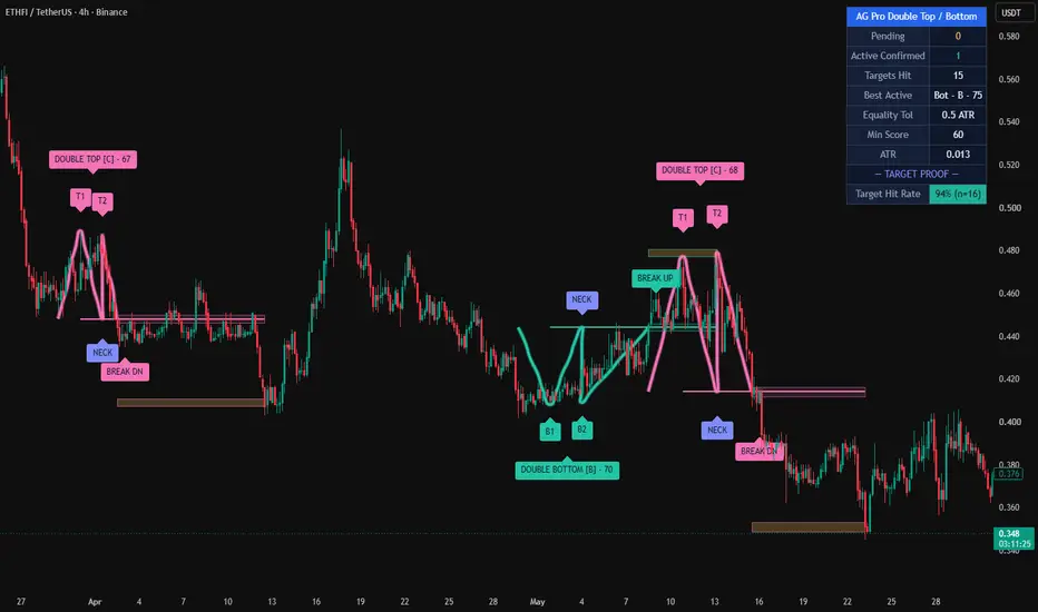
Double Top / Bottom Quality is a disciplined, rules-based detector for the two most iconic reversal chart patterns: the Double Top (M-shape) and the Double Bottom (W-shape). Unlike basic pattern finders that fire on any two similar swings, this indicator scores every candidate pattern on a transparent 0–100 Quality Score across four independent factors — and only confirms patterns that pass a user-defined minimum. The result is a cleaner chart with fewer, higher-conviction setups.
Every confirmed pattern delivers a full trading lifecycle: a neckline flip S/R zone (resistance → support on a Double Bottom; support → resistance on a Double Top) and a measured-move target projection band. Pending, confirmed, target-hit and invalidated states are all tracked with disciplined cleanup, so the chart never becomes cluttered.
🔹 WHAT THE INDICATOR DOES
It detects classic Double Top and Double Bottom reversal structures using pivot-based swing analysis with ATR-normalised equality, depth and time-window filters. Each valid candidate is then scored on four independent quality factors. Only candidates that exceed the user-defined minimum score and break the neckline on close are confirmed. Once confirmed, the pattern draws its neckline flip zone and target projection band, labels the setup with its letter grade and score, and tracks the outcome until target hit or invalidation.
🔹 UNIQUE EDGE — WHY IT IS DIFFERENT
Most Double Top / Double Bottom scripts simply connect two similar swings and draw a line. This indicator adds a transparent 4-component Quality Score so every setup is rated before confirmation, not just flagged. Three factors that most scripts ignore are treated as first-class inputs here:
• Pattern Symmetry — the left leg and the right leg of the M / W must be comparable in time, or the pattern is penalised
• Break Volume Confirmation — the neckline break bar is compared to its rolling volume average, and thin breaks score lower
• Depth Quality — shallow, flat patterns are filtered out in favour of deep, decisive reversals
The full lifecycle visualisation (pending → confirmed → target hit) and same-region deduplication are also uncommon in this pattern category, and together they produce a chart that reads cleanly even on long history.
🔹 METHODOLOGY
• Pivot detection via ta.pivothigh / ta.pivotlow with user-configurable length
• Equality check: the two peaks (or troughs) must be within a configurable ATR tolerance
• Time-window filter: minimum and maximum bars allowed between the two pivots
• Depth filter: the vertical distance from peaks to neckline must exceed a minimum ATR threshold
• Neckline: lowest low between the two peaks for a Double Top, or highest high between the two troughs for a Double Bottom
• Confirmation trigger: daily close beyond the neckline
• Invalidation: price exceeds the pattern extreme before the neckline break
• Cooldown: after confirmation, new patterns in the same price region are suppressed for N bars to prevent clustering
🔹 QUALITY SCORE (0–100)
Each confirmed pattern receives a transparent score based on four equally-weighted factors (25 points each):
1. Peak / Trough Equality — how close the two extremes are to each other, measured in ATR units
2. Break Volume Confirmation — break-bar volume relative to the 20-bar average
3. Pattern Symmetry — ratio of the shorter leg to the longer leg (time-based)
4. Depth Quality — pattern height relative to ATR (deeper = higher score)
Score → Grade mapping:
• 85–100 = A
• 70–84 = B
• 55–69 = C
• <55 = D
🔹 SIGNALS, ZONES & ALERTS
Once a pattern confirms, the indicator renders:
• A solid neckline that extends to the right edge
• A neckline flip zone (rectangular S/R band at the neckline level)
• A target projection zone at the measured-move price (pattern height projected from neckline)
• A grade label (A / B / C) and numeric score on the pattern
Two alert types are available: "Confirmed Pattern" fires on confirmation, and "Target Hit" fires when the measured-move target is reached.
🔹 KEY INPUTS
• Pivot Length, ATR Length
• Peak / Trough Equality tolerance (ATR)
• Min / Max bars between peaks
• Minimum Pattern Depth (ATR)
• Break Volume Multiplier
• Cooldown bars
• Minimum Quality Score filter
• Show Pending Patterns toggle
• Show Neckline Flip Zone / Target Zone toggles
• Zone Width (ATR)
• Stale Cleanup Distance, Max Active Zones
• Label size, Panel position / theme / size
• Alert toggles
🔹 HOW TO USE
• Choose a liquid market and a timeframe that matches your trading style (4H and 1D are particularly well-suited to classic reversal patterns)
• Watch for Pending patterns (dashed lines) — these mark candidates awaiting a neckline break
• A Confirmed pattern with grade B or higher is the typical entry signal; aggressive traders may use C-grade while conservative traders may filter to A-grade only
• Use the neckline flip zone as a logical stop-loss reference (above it for Double Tops, below for Double Bottoms)
• Use the target projection zone as a take-profit reference based on the classical measured-move rule
• Combine with higher-timeframe trend, volume profile or an independent confluence tool for best results
🔹 LIMITATIONS & TRANSPARENCY
• Pivot-based detection means patterns confirm with a natural lag equal to the pivot length
• No strategy is 100% reliable — Quality Score filters improve average conviction but do not guarantee outcomes
• Very low-liquidity markets may produce unstable pivots; a longer pivot length helps
• Measured-move targets are a classical reference, not a prediction
• Historical statistics shown in the panel are pattern-completion counts on the loaded chart; they are not a guaranteed forward performance estimate
🔹 RISK DISCLOSURE
This script is provided for educational and analytical purposes only. It is not financial advice and does not constitute a recommendation to buy, sell or hold any asset. Trading involves substantial risk of loss; past pattern performance is not indicative of future results. Always perform your own research and use appropriate risk management.
Open-source under the Mozilla Public License 2.0 — contributions and feedback are welcome. อินดิเคเตอร์

AG Pro Reversal Pattern Quality Scanner [AGPro Series]AG Pro Reversal Pattern Quality Scanner
Overview / What it does
AG Pro Reversal Pattern Quality Scanner is an overlay tool designed to detect and visualize selected classical reversal structures directly on the chart while adding a structured quality layer to each valid setup. The script focuses on four widely recognized reversal formations: Double Top, Double Bottom, Head & Shoulders, and Inverse Head & Shoulders.
Instead of marking every possible structural resemblance, the script applies a filtered detection workflow based on pivot structure, pattern width, peak or trough equality, pullback depth, neckline logic, and an internal quality model. The goal is not simply to identify a shape, but to highlight formations that display more balanced structure and more usable context.
Each detected pattern can be displayed with a pattern box, a projected neckline, and a quality label that summarizes the pattern type, directional bias, quality score, and grade. This makes the script suitable for traders who want a structured visual map of potential reversal zones rather than a raw pattern-highlighting tool with no ranking logic.
The indicator is built for chart reading and workflow support. It does not attempt to forecast future price movement with certainty, and it should not be interpreted as a standalone trade system. Its role is to help users organize reversal structures, compare them visually, and focus on higher-quality formations when reviewing price action.
Unique Edge
The main distinction of this script is that it does not treat all reversal patterns as equivalent. A detected pattern is further evaluated through a composite quality framework that considers structural symmetry, pullback depth, and volume behavior during formation and break conditions.
For Double Top and Double Bottom structures, the script checks whether the two peaks or troughs remain sufficiently close to each other within a defined tolerance and whether the intermediate pullback is large enough to make the structure meaningful. For Head & Shoulders and Inverse Head & Shoulders structures, the script evaluates shoulder symmetry, time symmetry, and relative positioning of the head against the shoulders.
The volume component is not used as a promise of confirmation. It is used as an additional contextual factor inside the quality score. In general terms, contracting volume during formation and stronger participation during the break candidate can improve the overall score when those conditions are present.
Another important part of the design is visual prioritization. The script does not only draw the structure. It also attempts to keep the chart readable by organizing labels, neckline extensions, and pattern boxes in a way that preserves interpretation. The result is a cleaner reversal-pattern map that aims to be more practical than a simple shape detector.
Methodology
The script begins with swing pivot detection. These pivots act as the structural foundation for all pattern candidates. Once enough pivot highs and lows are available, the script evaluates whether recent pivot sequences fit the requirements of one of the supported reversal structures.
For Double Top detection, the script checks whether two recent highs are similar enough, whether the interim low forms a valid neckline reference, whether the pattern width stays within defined limits, and whether price has broken below the neckline. For Double Bottom detection, the logic is mirrored on the bullish side through two similar lows, an interim high as the neckline reference, and a bullish break condition above that neckline.
For Head & Shoulders detection, the script evaluates a sequence of three pivot highs where the middle high must exceed the two shoulders. It then estimates neckline structure from the lows between those highs and applies symmetry and pullback checks before accepting the setup. Inverse Head & Shoulders applies the same structural concept in reverse using pivot lows.
After a valid break condition is detected, the script calculates a composite quality score. This score is based on user-controlled weights for volume behavior, symmetry, and pullback depth. The final output is normalized into a 1 to 10 quality scale, then translated into a grade label for easier scanning.
Signals & Alerts
The script can generate pattern-based alert conditions for:
- Double Top
- Double Bottom
- Head & Shoulders
- Inverse Head & Shoulders
These alerts are tied to the script’s internal structural conditions and neckline break logic. As with any chart-based alert workflow, users should confirm that the selected settings match their market, timeframe, and execution style.
Visual output can include:
- Pattern boxes
- Neckline lines
- Neckline labels
- Pattern quality labels
- Break candle highlighting
- Information panel with detection statistics
The quality label is intended to summarize the detected structure, not to guarantee outcome quality. A higher score means the pattern aligned more closely with the script’s internal criteria. It does not mean the setup must succeed.
Key Inputs
The script includes adjustable inputs for both detection behavior and presentation. Key controls include:
- Swing Pivot Length
- Peak / Trough Equality tolerance
- Minimum Pullback Between Peaks or Troughs
- Minimum and Maximum Pattern Width
- Minimum Quality to Display
- Weighting of volume, symmetry, and pullback depth inside the quality score
- Box, neckline, and pattern-label visibility
- Global label size
- Panel font size
- Panel position
- Neckline extension length
- Pattern-specific alert toggles
These controls make it possible to adapt the scanner to different chart densities, volatility profiles, and personal visual preferences.
Limitations & Transparency
This indicator is a rule-based pattern scanner. It is not a predictive engine, and it does not claim that all detected formations will lead to continuation or reversal. Classical chart structures can fail, invalidate, or behave differently depending on volatility, trend strength, liquidity conditions, timeframe, and broader market context.
Pattern recognition on live charts is inherently sensitive to pivot settings and bar structure. Small changes in pivot length, equality tolerance, or minimum pullback can materially change how many formations appear. Because of that, users should treat the script as a configurable analytical framework rather than a universal template.
The quality score is an internal ranking model built from the script’s own criteria. It is meant to help compare setups inside the same framework. It should not be interpreted as an objective probability model, a performance promise, or a substitute for independent trade management.
Volume analysis also depends on the reliability and characteristics of the symbol’s reported data. On some instruments, volume may be less informative or behave differently than expected. Users should evaluate this in the context of their own market.
Risk Disclosure
This script is provided for chart analysis, workflow organization, and educational use. It does not provide financial advice, investment advice, or guaranteed trade signals. All trading and investment decisions remain the sole responsibility of the user.
Reversal patterns can fail even when they appear clean and well-structured. Breaks can reverse, neckline moves can trap participants, and high-scoring formations can still underperform. Risk management, confirmation process, position sizing, and overall strategy design remain essential.
Use this tool as a structured visual aid inside a broader decision-making process, not as a standalone reason to enter or exit a position. อินดิเคเตอร์

อินดิเคเตอร์
Spline Quantile Regression Channel [LuxAlgo]The Spline Quantile Regression Channel indicator implements an advanced non-linear regression model to fit a flexible, multi-level channel over recent price action. Unlike standard linear regression which identifies the mean trend, this tool fits specific price percentiles (quantiles) using cubic splines, providing robust support and resistance zones that adapt to market volatility and non-linear structures.
🔶 USAGE
The indicator is designed to provide a sophisticated view of the current trend and its extremes. By fitting cubic splines to specific quantiles, the script offers a "bendable" channel that can follow complex price movements more accurately than traditional straight-line regressions.
🔹 Trend Identification
The median line (default 0.5 quantile) represents the central tendency of the price action. When the spline is sloping upward, it indicates a non-linear bullish regime; a downward slope indicates a bearish regime.
🔹 Support and Resistance
The upper and lower bands represent the specified extremes (e.g., the 90th and 10th percentiles). These act as dynamic boundaries:
Prices reaching the upper band often indicate overextended conditions within the current lookback period.
Prices reaching the lower band suggest the asset is trading at the lower end of its recent distribution.
🔹 Forecasting
The indicator projects the calculated spline into the future using a dashed line. This forecast is a mathematical extrapolation of the current non-linear trend, helping traders visualize where the price distribution is headed if the current momentum and curvature persist.
🔶 DETAILS
The script employs several advanced mathematical concepts to ensure accuracy and stability:
Cubic Spline Basis: The model uses a piecewise polynomial basis ($1, x, x^2, x^3$) combined with truncated power functions at "knots." This allows the curve to change its curvature locally, adapting to swings that a simple polynomial cannot capture.
Quantile Optimization: Instead of minimizing squared errors (OLS), the script uses an Iteratively Reweighted Least Squares (IRLS) solver to minimize the "check function." This allows the script to target specific percentiles of the price data.
Numerical Stability: To prevent matrix overflows common in high-degree polynomial calculations, the script standardizes price data (Z-score) and scales time coordinates between 0 and 1 before performing matrix inversion.
🔶 SETTINGS
🔹 Spline Configuration
Lookback Period: The number of historical bars used to fit the spline regression. Larger windows result in a more "macro" trend, while smaller windows react quickly to recent changes.
Internal Knots: Determines the "flexibility" of the spline. More knots allow the curve to follow price swings more tightly, while fewer knots yield a smoother, more rigid curve.
🔹 Optimization
IRLS Iterations: The number of optimization passes for the solver. Higher values improve the accuracy of the quantile fit, especially in volatile markets.
Forecast Length: The number of bars to project the calculated spline into the future.
🔹 Quantile Levels
Upper Quantile: The specific percentile for the upper band (e.g., 0.95 for the top 5%).
Median Quantile: The central percentile (typically 0.5 for the median).
Lower Quantile: The specific percentile for the lower band (e.g., 0.05 for the bottom 5%).
🔹 Visuals
Colors: Individual color settings for the upper, median, and lower bands.
Line Width: Controls the thickness of the polylines rendered on the chart.
อินดิเคเตอร์

อินดิเคเตอร์

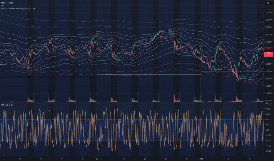
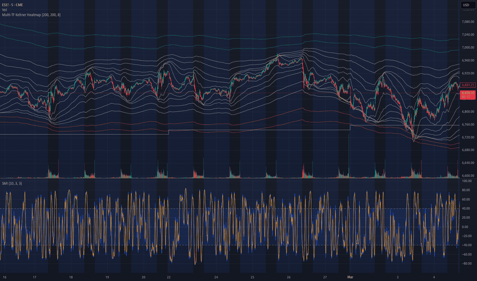
Multi-TF Keltner Heatmap# Multi-TF Keltner Heatmap
A multi-timeframe volatility structure indicator designed to show where momentum pivots are forming across timeframes.
Instead of plotting a single Keltner Channel, this script overlays Keltner envelopes from 12 timeframes simultaneously, allowing traders to see when lower timeframe volatility begins pivoting relative to higher timeframe structure.
For options traders, these pivot points often represent the moments where momentum changes fastest while options are still relatively cheap.
The goal is to identify the earliest structural shift in volatility expansion before the larger move becomes obvious.
## Core Idea
Momentum rarely appears suddenly on higher timeframes.
Instead, it typically builds from smaller timeframes upward.
Lower timeframes begin expanding volatility until they interact with or surpass the volatility boundaries of larger timeframes.
When this occurs, the script identifies it as a pivot event.
A pivot means the shorter timeframe volatility envelope has reached or crossed the adjacent higher timeframe envelope, indicating that momentum pressure is shifting.
As these pivots propagate upward through the timeframe ladder, a momentum chain forms.
This chain represents how many layers of the market structure are currently shifting direction.
## Timeframes Included
The script pulls Keltner Channel data from the following timeframes:
- 1 Minute
- 3 Minute
- 5 Minute
- 10 Minute
- 15 Minute
- 30 Minute
- 45 Minute
- 1 Hour
- 2 Hour
- 4 Hour
- 1 Day
- 1 Week
These timeframes together create a stacked volatility structure showing how pressure builds through the market.
## Keltner Channel Construction
Each timeframe uses the same parameters.
Basis
EMA (default length: 200)
Volatility Envelope
ATR (default length: 200)
Bandwidth Multiplier
ATR × 8
These intentionally large settings create structural volatility envelopes rather than short-term reactive channels.
The focus is on major volatility shifts rather than micro fluctuations.
## Visual Structure
The indicator uses color to separate layers of the timeframe hierarchy.
### White Bands (1m – 15m)
These represent short-term market microstructure.
They allow traders to see:
- short-term compression
- micro volatility expansion
- early directional pressure
Opacity is reduced so these bands remain informational rather than dominant.
### Intermediate Layer (30m / 45m)
Upper bands are colored green.
Lower bands are colored red.
These timeframes often act as the bridge between intraday volatility and higher timeframe momentum.
When price begins interacting strongly with these bands, it often signals that pressure is building toward a larger pivot.
### Higher Timeframe Bands (1H – 1W)
Higher timeframe bands are hidden by default.
They only appear when a pivot condition occurs.
A pivot occurs when:
Shorter timeframe upper band ≥ adjacent higher timeframe upper band
or
Shorter timeframe lower band ≤ adjacent higher timeframe lower band
Example:
45m upper ≥ 1H upper
When this happens, the 1H upper band becomes visible.
This signals that short-term volatility is now interacting with higher timeframe structure.
## Pivot Chain
Momentum shifts are tracked using adjacent timeframe pivots.
Upper band pivots follow this sequence:
- 45m → 1H
- 1H → 2H
- 2H → 4H
- 4H → 1D
- 1D → 1W
Lower band pivots follow the same sequence.
This adjacency logic reflects how momentum realistically propagates through the market rather than skipping timeframes.
## Pivot Chain Depth
The indicator calculates two values shown in the status line and data window.
Bull Chain
Number of upward pivot steps currently active.
Example:
45m pivoting above 1H
1H pivoting above 2H
2H pivoting above 4H
Bull Chain = 3
Bear Chain
Number of downward pivot steps currently active.
Example:
45m pivoting below 1H
1H pivoting below 2H
2H pivoting below 4H
Bear Chain = 3
## Interpreting Chain Depth
Lower chain values typically indicate:
- localized volatility
- range conditions
- early momentum shifts
Higher chain values indicate:
- stronger structural alignment
- expanding volatility
- sustained directional momentum
Deep pivot chains are relatively rare and often occur during:
- breakouts
- strong trend continuation
- macro directional moves
## Why This Matters for Options
Options traders benefit most when they can identify large momentum shifts early, before volatility expansion fully develops.
When lower timeframes begin pivoting relative to higher timeframe envelopes, it often means:
- directional pressure is building
- volatility expansion may follow
- option pricing has not fully reacted yet
This creates the opportunity to enter positions before volatility and delta expansion make contracts expensive.
## Practical Uses
This indicator can help traders:
- identify early momentum pivots
- visualize multi-timeframe volatility alignment
- detect volatility expansion before breakouts
- confirm trend continuation across timeframes
It is particularly useful when looking for high momentum opportunities while options remain relatively inexpensive.
## Conceptual Summary
Momentum builds from smaller timeframes upward.
When lower timeframe volatility begins interacting with and pivoting against larger timeframe envelopes, the market is often entering a structural shift phase.
This indicator visualizes that process so traders can see momentum transitions while they are still forming. อินดิเคเตอร์
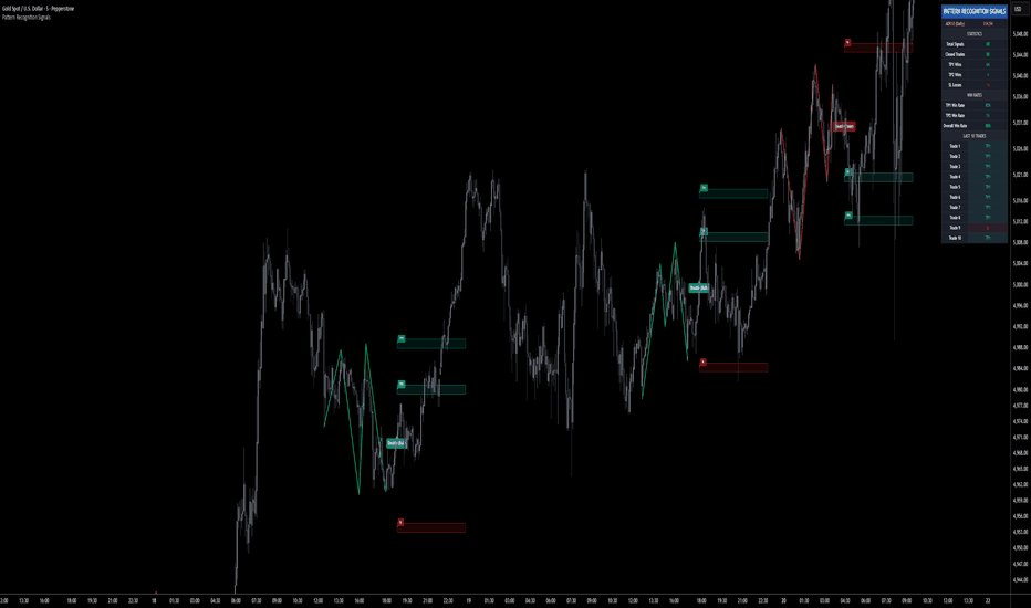
Pattern Recognition Signals | ProjectSyndicatePattern Recognition Signals automatically identifies and validates high-probability, non-repainting Double Top and Double Bottom patterns. It filters for structural quality, calculates adaptive take-profit and stop-loss zones based on Average Daily Range (ADR), and presents a complete statistical breakdown on a non-intrusive dashboard to provide a quantifiable edge.
🧠 NRP Multi-Wave Detection — identifies classic Double (W/M) and Triple (W/M) patterns using a non-repainting pivot engine, ensuring signals are confirmed and stable.
🎯 ADR-Adaptive TP/SL Zones — automatically calculates and plots TP1, TP2, and SL zones based on a percentage of the 10-day ADR, allowing the strategy to dynamically adapt to any asset's volatility.
🎨 Direction-Matched Colors — Bullish pattern labels are colored green to match the TP zones, and Bearish labels are colored red to match the SL zone, providing instant visual confirmation of trade direction.
📊 Full Performance Dashboard — provides a complete statistical overview, including the real-time ADR10 value, total signals, win rates for TP1/TP2, and a log of the last 10 trade outcomes.
✅ Advanced Quality Control Filters — user-configurable inputs for Max Pattern Bars, Max Pattern Height (% of ADR10), and Min Bars Between Signals eliminate low-quality or excessively large patterns and prevent over-signaling.
🔔 Comprehensive Alerts — get a single, detailed alert per signal—including the symbol, timeframe, entry price, SL, TP1, and TP2—formatted for easy integration with automated trading systems.
🔧 Fully Customizable — control everything from pivot lengths and pattern quality filters to the colors and extension of all zones, labels, and dashboard elements.
🎯 Why this algo is unique: Standard ZigZag and pattern indicators are notorious for repainting and providing subjective signals with no statistical backing. This algorithm provides an objective, fully-gated, non-repainting signal engine. It doesn’t just draw a pattern; it builds a complete, quantifiable trading framework around it with adaptive risk management (ADR-based zones) and a dashboard to prove its historical performance on the chart you are trading.
🚀 Apply to Gold (XAUUSD), Forex, Crypto, and Indices on any M5/M10/M15/M30/H1. The ADR-based system and extensive quality filters allow it to adapt to anything from M5 scalping to H4 swing trading.
🎯 How to use this? Use the dashboard to understand the strategy's recent performance on the current asset/timeframe. Adjust the TP/SL and pattern filter percentages to match your risk tolerance. Consider taking trades that align with the higher-timeframe trend for higher probability setups.
⚠️ IMPORTANT NOTICE: This indicator is designed to identify statistically-backed pattern signals. It should NOT be used as a standalone signal for entering trades. Always use it in conjunction with your own trading strategy, price action analysis, and other technical indicators to confirm trade setups and manage risk. อินดิเคเตอร์
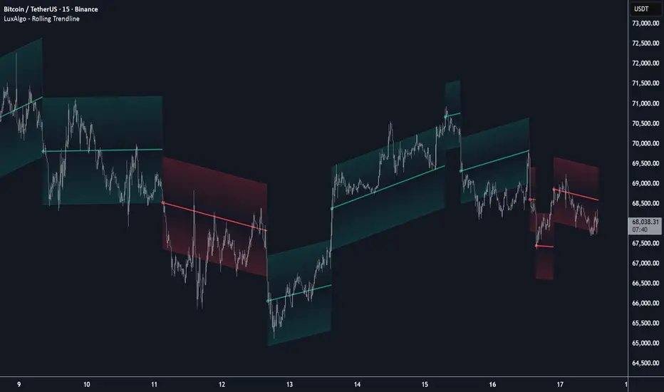
Rolling Liquidity Clusters Channel [LuxAlgo]The Rolling Liquidity Clusters Channel indicator identifies dynamic support and resistance zones by calculating levels that maximize candle wick touches while strictly avoiding intersections with candle bodies within a rolling window. This tool provides a unique perspective on liquidity clusters, highlighting price levels where historical rejection is most concentrated without being invalidated by price "closing" through them.
🔶 USAGE
The indicator plots a channel consisting of an Upper Level, a Lower Level, and a Mid Level. The space between these levels is filled with a vertical gradient to visually represent the strength of the liquidity zone.
Upper Level (Red): Represents a resistance zone where the most upper wicks are concentrated without any candle body in the lookback window crossing above it.
Lower Level (Green): Represents a support zone where the most lower wicks are concentrated without any candle body in the lookback window crossing below it.
Mid Level (Orange): Represents the equilibrium or average of the current liquidity channel.
Traders can use these levels to identify potential reversal points or areas of price consolidation. A breakout from the channel might indicate a shift in market structure as price moves beyond the most inclusive "non-broken" wick levels.
🔶 DETAILS
The script employs a specific constraint logic to ensure the levels represent true "untouched" liquidity:
🔹 Body-Crossing Constraint
Before identifying the wick touches, the script calculates the highest candle body high and lowest candle body low within the user-defined window. The resulting levels are guaranteed to stay outside of this "body zone," ensuring that the plotted levels represent prices that the market reached but failed to sustain via a close.
🔹 Maximizing Touches
To find the most significant level, the algorithm searches for the most inclusive price point. For the upper level, it identifies the lowest "high" that remains above all candle bodies. For the lower level, it identifies the highest "low" that remains below all candle bodies. This mathematical approach effectively finds the level where the most price action "clusters" via wicks.
🔹 Vertical Gradient Fills
The visual style uses a vertical gradient fill. The upper half fades from 90% transparency at the Upper Level (Red) to 100% transparency at the Mid Level. The lower half follows a similar logic, fading from the Lower Level (Green) toward the center. This creates a "glow" effect, emphasizing the outer boundaries where liquidity is highest.
🔶 SETTINGS
Window Size: The number of bars used for the rolling calculation. A larger window creates more stable, long-term levels, while a smaller window adapts quickly to recent price action.
Upper Level: Customize the color of the upper resistance level and its associated gradient fill.
Lower Level: Customize the color of the lower support level and its associated gradient fill.
Mid Level: Customize the color of the central equilibrium line.
อินดิเคเตอร์
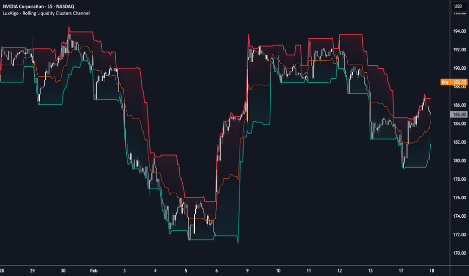
Adaptive Bounds RSI [LuxAlgo]The Adaptive Bounds RSI indicator utilizes online 1D K-Means clustering to dynamically adapt RSI overbought and oversold bounds based on evolving market conditions. Unlike traditional RSI thresholds (70/30) that remain static, this tool identifies five shifting clusters to better categorize price action into regimes ranging from deep discount to extreme premium.
🔶 USAGE
The indicator provides a more responsive way to identify overextended market conditions by learning from recent RSI distributions. Instead of relying on fixed levels that may be irrelevant in strong trends, the adaptive bounds expand and contract based on the volatility and momentum of the asset.
🔹 Regime Classification
The tool classifies the market into five distinct regimes based on five internal centroids (clusters):
Extreme Premium (Upper Bound): Represents highly overextended bullish conditions.
Bullish: The zone between the center and the upper bound.
Neutral: The area surrounding the 50-level midline.
Bearish: The zone between the center and the lower bound.
Deep Discount (Lower Bound): Represents highly overextended bearish conditions.
🔹 Signal Markers
The indicator plots circular markers directly on the RSI line when the oscillator crosses the adaptive bounds:
A Bullish Marker appears when the RSI crosses below the adaptive lower bound (Deep Discount).
A Bearish Marker appears when the RSI crosses above the adaptive upper bound (Extreme Premium).
To prevent signal clutter, these markers only reappear once the RSI has returned to cross the 50-level midline, ensuring the market has "reset" before a new overextended signal is generated.
🔶 DETAILS
The core of this indicator is an Online 1D K-Means algorithm. Unlike standard clustering which requires a full dataset, this online version updates its centroids bar-by-bar.
When a new RSI value is calculated, the algorithm determines which of the five centroids is closest to that value. It then shifts that "winning" centroid toward the RSI value by a factor determined by the Learning Rate. This allows the boundaries to "breathe" with the market; in a persistent uptrend, the upper bound will naturally migrate higher to avoid premature overbought signals.
🔶 SETTINGS
🔹 Oscillator Settings
RSI Length: Determines the lookback period for the underlying Relative Strength Index calculation.
🔹 K-Means Settings
Learning Rate (K-Means): Controls how quickly the adaptive bounds react to new data. A higher value makes the bounds move faster, while a lower value provides more stable, "sticky" boundaries.
🔹 Visuals
Lower Bound Color: Sets the color for the lower adaptive boundary and bullish signals.
Upper Bound Color: Sets the color for the upper adaptive boundary and bearish signals.
Auto RSI Color: When enabled, the RSI line matches the chart's foreground color.
RSI Color: Sets the color of the RSI line when "Auto RSI Color" is disabled.
🔶 ALERTS
Regime Flip: Triggers when the market transitions from a Neutral state into a trending cluster (Bullish or Bearish).
Lower Bound Cross: Triggers when the RSI crosses into the Deep Discount zone.
Upper Bound Cross: Triggers when the RSI crosses into the Extreme Premium zone.
อินดิเคเตอร์

Neighboring Price Bands [LuxAlgo]The Neighboring Price Bands indicator provides dynamic support and resistance levels based on the local statistical distribution of historical prices relative to the current market position. Unlike traditional volatility bands that rely on fixed standard deviations, this tool identifies "price neighbors" within a sorted historical buffer to determine where the market has previously found friction.
🔶 USAGE
The indicator helps traders identify potential reversal zones and breakout opportunities by analyzing the density of price action around the current level.
🔹 Support and Resistance
The bands act as flexible zones of interest. The upper (green) band represents a bullish boundary derived from historical prices slightly higher than the current price, while the lower (red) band represents a bearish boundary from prices slightly lower. When the price interacts with these bands, it is entering a zone where historical price density suggests a potential reaction.
🔹 Price Discovery & Breakouts
A unique feature of this tool is the "Discovery" mechanism. If the current price moves beyond the range of its historical "neighbors" (e.g., reaching a new multi-period high or low), the corresponding band will disappear, and a background highlight will appear.
Bullish Discovery: A green background highlight indicates the price is entering uncharted territory relative to the historical buffer, suggesting a strong bullish breakout.
Bearish Discovery: A red background highlight indicates the price is dropping below its local historical distribution, suggesting a strong bearish breakdown.
🔶 DETAILS
The script maintains a historical buffer of prices, which it constantly sorts to create a price distribution. For every new bar, the algorithm performs the following:
It locates the current price within the sorted distribution.
It identifies a specific number of "neighbors" (K) above and below that position.
It calculates a specific percentile within those neighbors to plot the bands.
Because the bands are derived from actual price frequency rather than a calculation like standard deviation (Bollinger Bands) or Average True Range (Keltner Channels), they adapt more specifically to "sticky" price levels where the market has historically spent time.
🔶 SETTINGS
Historical Buffer (Bars): The total number of past bars used to build the price distribution. A larger buffer includes more historical context, while a smaller buffer makes the bands more reactive to recent local ranges.
Neighboring Range (K): Determines how many samples from the sorted distribution are used to calculate the bands. A smaller K makes the bands tighter and more sensitive to the immediate price position.
Percentile: Controls the width of the bands within the neighbor groups. Higher values push the bands further away from the current price.
Smoothing: Applies an SMA to the resulting bands to reduce noise and provide a cleaner visual output.
อินดิเคเตอร์

LOWESS Channel & Extrapolation [LuxAlgo]The LOWESS Channel & Extrapolation indicator calculates a Locally Weighted Scatterplot Smoothing (LOWESS) curve to define a non-linear trend and projects it into future bars using local regression slopes. It provides a dynamic channel based on the standard deviation of residuals, helping traders identify overextended price levels and potential mean-reversion points.
The LOWESS Channel & Extrapolation indicator is subject to repainting and displayed retrospectively.
🔶 USAGE
This tool is primarily designed for trend analysis and identifying exhaustion points. Because the LOWESS algorithm recalculates based on the most recent data window, the entire historical curve can adjust, making it a powerful tool for backtesting and analyzing past market structures rather than for real-time signal generation without confirmation.
🔹 Trend Identification
The central fit line represents the smoothed local trend. When the curve is sloping upward, the local market sentiment is considered bullish; conversely, a downward slope indicates bearish sentiment.
🔹 Overbought/Oversold Conditions
The dashed outer channels represent a volatility-adjusted boundary. When price moves outside these boundaries, it is statistically overextended relative to the local trend, often preceding a move back toward the mid-line.
🔹 Extrapolation
The indicator extends the most recent local regression slope into the future. This provides a "path of least resistance" projection based on the current momentum of the smoothed curve.
🔶 DETAILS
The LOWESS (Locally Weighted Scatterplot Smoothing) algorithm works by performing a separate weighted linear regression for every data point in the window.
It uses a "tricube" weighting function, which ensures that data points closer to the focal point have a higher influence on the fit than points further away. This results in a curve that is much more flexible than a simple moving average and can adapt to complex price cycles without the lag associated with traditional filters.
The channel width is determined by calculating the Standard Deviation of the residuals (the difference between the actual price and the LOWESS fit). This ensures the channel expands during high volatility and contracts during consolidation.
🔶 SETTINGS
Length : Determines the number of historical observations used to fit the LOWESS curve. Larger values result in a smoother, more macro trend. Span : The fraction of data points used for each local regression. A higher span (closer to 1.0) creates a smoother line, while a lower span allows the curve to follow price more tightly. Channel Multiplier : Multiplier applied to the standard deviation of residuals to define the distance of the upper and lower bands from the mid-line. Extrapolation Bars : The number of bars to project the current trend into the future. Fit Color : Sets the color and transparency of the central LOWESS line. Channel Color : Sets the color of the dashed outer bands and the background fill. Line Width : Adjusts the thickness of the central fit line. อินดิเคเตอร์

Rolling Trendline [LuxAlgo]The Rolling Trendline indicator provides a dynamic, self-adjusting trendline that tracks price action using linear regression slope projections and automatically resets when price deviates beyond a specific threshold.
🔶 USAGE
The indicator is designed to provide a continuous trend bias without the "lag" often associated with static linear regression lines. It projects a line forward based on a calculated slope and only shifts its trajectory when the market demonstrates a significant change in momentum.
The addition of ATR-based volatility zones allows traders to visualize a range of expected price action around the projected trend, providing a buffer that accounts for market volatility at the time of each trend reset.
🔹 Interpreting the Line and Zones
Bullish Phase (Green): Indicates an upward-sloping trajectory. The trendline and its surrounding ATR zones will be colored green, suggesting a bullish bias.
Bearish Phase (Red): Indicates a downward-sloping trajectory. The trendline and its surrounding ATR zones will be colored red, suggesting a bearish bias.
ATR Zones: These shaded areas represent a volatility-adjusted range. As long as price remains within the deviation threshold, the zones follow the trendline's trajectory.
Reset Points: Visualized by a small circle and a break in the line, these occur when price moves too far from the projection. At this moment, the indicator re-anchors to the current price and recalculates both the slope and the ATR zone width.
🔶 DETAILS
The indicator follows a specific logic flow to maintain its "Rolling" characteristic:
1. Slope Calculation: It calculates the Linear Regression slope over a user-defined lookback period. This slope represents the average rate of change in price.
2. Projection: On every new bar, the indicator projects the next value of the trendline by adding the active slope to the previous trendline value.
3. Deviation Check: The indicator calculates a Standard Deviation threshold. If the distance between the current price and the projected trendline value exceeds this threshold, a reset is triggered.
4. Re-Anchoring: Upon a reset, the trendline "rolls" to the current price and adopts the most recent linear regression slope. Simultaneously, it captures the current ATR to set the width of the new trend zones.
🔶 SETTINGS
🔹 Trend Settings
Slope Lookback: The period used to calculate the linear regression slope. Higher values result in a slope that considers more historical data.
Deviation Multiplier: Determines how far price can deviate from the trendline before a reset occurs.
Slope Divisor: This setting allows you to tame the trajectory of the line. Higher values divide the captured slope, resulting in flatter trendlines.
Source: The price data used for all calculations (default is Close).
🔹 ATR Zones
ATR Length: The lookback period used for the Average True Range calculation, which determines the width of the volatility bands.
ATR Multiplier: Controls the width of the shaded zones around the trendline.
🔹 Visuals
Bullish/Bearish Trend Colors: Customizes the colors for the trendline and zones based on the slope direction.
Zone Color: Sets the base color for the ATR area fills.
Line Width: Adjusts the thickness of the primary rolling trendline.
อินดิเคเตอร์

Whittaker Envelope [LuxAlgo]The Whittaker Envelope indicator is a visualization tool that uses Asymmetric Least Squares (ALS) to create a smooth, non-linear envelope that adapts to price extremes and troughs.
This indicator is for visualization purposes only and should not be used for direct trading signals without confirmation.
It is important to note that this script is displayed retrospectively . Because it calculates the best fit over a fixed historical window (the last N bars) using an iterative optimization process, the entire shape of the envelope can change as new data arrives. This means the indicator repaints and should be used to analyze overall market structure and volatility rather than for real-time execution.
🔶 USAGE
The Whittaker Envelope provides a unique way to visualize the "breathing" of the market. By applying different asymmetry parameters, the indicator generates a lower boundary that seeks out price troughs and an upper boundary that seeks out price peaks.
🔹 Trend and Volatility Analysis
The area between the upper and lower bounds represents the smoothed price range. A widening envelope suggests increasing volatility, while a narrowing one indicates consolidation. The dashed midline acts as a smoothed average of these two extremes, providing a baseline for the current trend.
🔹 Extrapolation
The tool includes a linear extrapolation feature that projects the current trajectory of the envelope into the future. This can help users visualize the potential direction of the trend if the current momentum persists.
🔶 DETAILS
The script implements the Whittaker-Eilers smoothing algorithm, which balances two conflicting goals: fitting the data points closely and keeping the resulting curve smooth.
By using Asymmetric Least Squares (ALS), we assign different weights to prices depending on whether they are above or below the curve. For the upper band, we use a high asymmetry value ( p ) so the curve is "pushed" toward the peaks. For the lower band, a very low p value is used to "pull" the curve toward the troughs.
🔶 SETTINGS
Length : The number of recent bars included in the calculation window.
Lambda (λ) : The smoothing factor. Higher values result in a stiffer, straighter envelope, while lower values allow the bands to follow price more closely.
Lower Asymmetry (p) : Controls how the lower band reacts to prices. Typically set to a very low value (e.g., 0.001) to ensure it follows the bottom of the price action.
Upper Asymmetry (p) : Controls how the upper band reacts to prices. Typically set to a very high value (e.g., 0.999) to ensure it follows the top of the price action.
Iterations : The number of times the ALS algorithm runs to refine the fit. More iterations provide a more accurate envelope but require more computational power.
Extrapolation : The number of bars to project the current slope of the bands into the future.
Source : The price data used for the calculation (default is Close).
อินดิเคเตอร์

อินดิเคเตอร์

Dynamic Extreme Channels & Reversals [LuxAlgo]The Dynamic Extreme Channels & Reversals indicator provides an adaptive framework for identifying price extremes and trend shifts through self-adjusting boundaries. Unlike static channels, this tool dynamically resets its levels based on price activity, offering a responsive environment for trend following and mean-reversion analysis.
🔶 USAGE
The indicator functions by tracking the highest highs and lowest lows over a specific window. When the price fails to make a new extreme within the defined period, the boundaries contract toward the current price action. This behavior creates a "breathing" channel that adapts to market volatility and consolidation phases.
Users can toggle between two primary viewing modes:
Channel Mode: Displays the upper, lower, and midline boundaries. This is ideal for identifying overextended price levels and potential mean-reversion targets.
Trailing Stop Mode: Simplifies the visual output into a single step-line that tracks the lower boundary during uptrends and the upper boundary during downtrends, serving as a dynamic exit or trend-following level.
🔹 Reversal Signals
The script includes built-in reversal signals designed to catch "blow-off" tops or "panic" bottoms where price briefly exceeds a boundary but immediately loses momentum.
Bullish Signal (▲): Occurs when the price hits a new lower extreme (LL) but the current candle manages to peak back above the channel midline.
Bearish Signal (▼): Occurs when the price hits a new higher extreme (HH) but the current candle manages to drop below the channel midline.
The sensitivity and frequency of these signals are directly influenced by the Lookback Period and Reset Alpha % :
Lookback Period: A shorter lookback causes the channel boundaries to "reset" more frequently. This results in tighter channels and more frequent reversal signals, as the midline becomes easier to cross. A longer lookback creates wider, more stable channels, resulting in fewer, high-conviction signals.
Reset Alpha %: This determines how aggressively the levels move toward the price after the lookback period expires. A high Alpha (e.g., 100%) creates sharp adjustments, which can lead to rapid signal generation during choppy markets. A lower Alpha creates smoother transitions, filtering out noise in the reversal logic.
🔶 DETAILS
The core logic avoids standard rolling maximum/minimum functions to provide a more "sticky" boundary. Instead of the channel edge constantly moving with every bar, it remains fixed until a new extreme is reached or the "timer" (Lookback Period) runs out.
When the timer runs out, the level interpolates toward the price based on the Reset Alpha. This simulates a decaying memory of past price extremes, ensuring the indicator remains relevant even after long periods of sideways movement.
🔶 SETTINGS
🔹 Core Settings
Lookback Period: The number of bars the indicator waits before adjusting an extreme level if no new high/low is found.
Reset Alpha %: Controls the intensity of the level adjustment. 100% resets the level entirely to the current price, while 0% keeps it static.
Trailing Stop Mode: Switches the display from a three-line channel to a single trend-following stop line.
🔹 Visuals
Show Reversal Signals: Toggles the visibility of the triangle reversal labels.
Upper Color: Customizes the color and transparency of the upper boundary.
Midline Color: Customizes the color and transparency of the center line.
Lower Color: Customizes the color and transparency of the lower boundary.
🔹 Dashboard
Dashboard: Toggles the on-screen information panel.
Position: Controls the location of the dashboard on the chart.
Size: Controls the scale of the dashboard text and cells.
อินดิเคเตอร์