指標
IrishGOD PDH/PDL Zones + Pre-Market H/L + MA RibbonPDH/PDL Zones + Pre-Market H/L + MA Ribbon
A comprehensive overlay indicator for TradingView (Pine Script v5) that combines three institutional-grade tools on a single chart: historical previous-day high/low zones drawn from full candle wicks, intraday pre-market extremes, and a fully configurable multi-timeframe moving average ribbon. Designed for intraday traders who need clean, actionable levels without switching between charts or timeframes.
Pine Script v5
Overlay
Intraday
Multi-Timeframe
Alerts Included
1
Previous Day High / Low Zones
Automatically identifies the highest and lowest candle of each prior session and draws a shaded zone that spans the full wick of that candle — from the wick tip (the session extreme) down to the candle body edge (max or min of open/close). This provides a realistically sized supply or demand zone rather than a single horizontal line, accurately representing the price range where the reversal originated. Zones are stored across up to 50 prior trading days and drawn efficiently on the last bar to avoid unnecessary repainting.
Lookback
Up to 50 previous days retained and displayed simultaneously
Zone geometry
Wick tip → candle body edge; minimum 4-tick thickness for doji candles
Extension
Most recent zone optionally extends to the right edge of the chart
Labels
PDH / PDL price labels on the latest zone; four size options
Color picker
Border width 0–4px
Adjustable opacity
Toggle on/off
2
Pre-Market High / Low
Tracks the highest high and lowest low recorded during the configurable pre-market window (default 4:00–9:30 AM Eastern Time) and draws horizontal lines at those levels the moment the regular session opens. These levels are widely watched by professional traders as the first potential support and resistance areas of the day, and are particularly relevant on gap-up or gap-down open days. All time calculations are anchored to America/New_York to handle daylight saving time correctly.
Session window
Fully configurable start hour, end hour, and end minute (24h ET)
Line style
Solid, dashed, or dotted; line width 1–4px
Extension
Lines optionally extend rightward through the rest of the session
Labels
"PM High" / "PM Low" labels with exact price values
Requires a TradingView subscription that includes extended-hours data. Levels reset each new trading day.
3
Multi-Timeframe MA Ribbon
A ribbon of up to 8 independent moving averages rendered directly on the price chart. Each MA is fully self-contained: it has its own toggle, length, color, and — critically — its own timeframe selector. This allows a single ribbon to simultaneously display a short-term trend on the current chart timeframe alongside higher-timeframe MAs (e.g. a daily 21 EMA or a weekly 50 SMA) without opening additional chart panes. When an alternate timeframe is active, the value label automatically appends a tag for instant visual identification.
MA types available
SMA
EMA
WMA
VWMA
HMA
DEMA
TEMA
RMA
LSMA
Ribbon count
8 MAs; MAs 1–5 enabled by default (lengths 8, 13, 21, 34, 55)
Per-MA timeframe
Each MA resolves on its own timeframe via request.security(); blank = current chart
Fill
Gradient color fill between consecutive MA lines; adjustable opacity
Value labels
Live price labels pinned to the right edge; show tag for HTF MAs
Source
Configurable price source: close, open, high, low, hl2, hlc3, ohlc4, etc.
Line width
Global line width control (1–4px) applied to all active MAs
lookahead=barmerge.lookahead_off is enforced on all request.security() calls to prevent higher-timeframe data leakage into historical bars.
4
Alerts
Five built-in alert conditions, configurable from TradingView's alert dialog:
Price enters the most recent PDH zone (within 0.1%)
Price enters the most recent PDL zone (within 0.1%)
Price enters either PDH or PDL zone
MA1 crosses above MA2 — bullish signal
MA1 crosses below MA2 — bearish signal
5
Technical notes
Compatibility
Intraday charts (1m – 4h). Requires extended-hours data for pre-market feature.
Object limits
max_boxes_count 500 · max_lines_count 500 · max_labels_count 200
Rendering
PDH/PDL boxes drawn only on barstate.islast to eliminate per-tick redraw overhead
DST handling
All session time logic uses America/New_York timezone natively 指標

IrishGOD (ORB)Opening Range Breakout (ORB) Indicator — Professional Description
Pine Script v5 Overlay Indicator Intraday
Opening Range Breakout (ORB)
A precision intraday indicator that defines the high and low of a configurable opening range window, locks those levels once the window expires, and flags the first directional breakout of the day with a clear visual signal directly on the chart.
Overview
The Opening Range Breakout strategy is one of the most widely used frameworks in active intraday and momentum trading. The theory holds that the high and low established during the first N minutes of a session represent a market structure boundary — a zone of price discovery where institutional and retail participants alike are establishing positions. A decisive break above or below this range often signals the direction of the day's dominant trend.
This indicator automates the entire process: it watches price during the formation window, locks the range the instant the window closes, draws clean reference lines, and marks the first breakout in each direction with a non-cluttering arrow label — without requiring any manual input from the trader after initial setup.
Core logic
Phase 1 — Range formation
From the configured session open time, the indicator tracks the rolling high and low of every bar within the ORB window. No lines are drawn yet; the range is still live and expanding with each new bar.
Phase 2 — Range lock
On the first bar after the ORB window closes, the high and low are frozen. Two horizontal lines are drawn from that exact bar extending forward for the remainder of the session. The range will not change again for the rest of the day.
Phase 3 — Bullish breakout signal
If price closes above the ORB High after the window has locked, a green upward arrow is plotted below the breakout candle. This signal fires only once per day — the first confirmed close above the range.
Phase 4 — Bearish breakout signal
If price closes below the ORB Low after the window has locked, a red downward arrow is plotted above the breakout candle. Like the bullish signal, this fires once per day on first confirmed close below the range.
Configuration parameters
Parameter Default Description
Session Start Hour 9 Hour of day (24-hour format) when the session opens and ORB formation begins. Adjust for futures, forex, or international markets.
Session Start Minute 30 Minute offset within the start hour. Combined with the hour input, defines the exact session open (default: 9:30 for US equities).
ORB Duration 30 min How many minutes the range formation window remains open. Common settings are 5, 15, 30, and 60 minutes. Accepts 1–240 minutes.
Range High Line Color Teal Color of the horizontal ORB High reference line. Fully customizable via the TradingView color picker.
Range Low Line Color Orange Color of the horizontal ORB Low reference line. Distinct from the high to allow instant visual separation at a glance.
Line Width 1 Thickness of the range lines in pixels. Range of 1–4. Useful for scaling visibility on higher-resolution monitors.
Arrow Size small Controls the rendered size of breakout arrow labels. Options: tiny, small, normal, large. Sized to avoid obscuring surrounding price action.
Extend Lines true When enabled, range lines extend 500 bars to the right — effectively to the right edge of the visible chart. Disable to limit lines to ~390 bars (standard session length).
Enable Alerts false When enabled, fires a TradingView alert on the first bullish or bearish breakout of each session. Compatible with webhooks, email, and push notifications.
Visual features
Formation Window
Yellow background tint
A subtle highlight shades the candles within the ORB formation window so you can immediately see which bars contributed to the range definition.
Reference Lines
Clean horizontal levels
Single solid lines mark the ORB High and Low from the moment the window closes, extending forward without visual clutter. Previous day's lines are removed automatically.
Breakout Arrows
Directional label markers
Arrow labels are offset from price using ATR(14) so they never overlap the candle body or wick. Transparent backgrounds keep the chart unobstructed.
Data Window
ORB level readout
Once the range is locked, the exact ORB High and Low values appear in TradingView's Data Window panel for precise reference at any bar.
Compatibility
The indicator is designed for intraday timeframes — it is most effective on charts from 1-minute through 30-minute bars. It will not produce signals on daily or higher timeframes, as the ORB window logic depends on intraday time-of-day calculations.
The session start time defaults to 9:30 AM ET for US equity and ETF markets. For futures markets (ES, NQ, CL), crypto, or forex, adjust the start hour and minute to match the relevant session open.
US Equities
ETFs
Equity Futures
Crypto
Forex
Commodities
Installation
Open the Pine Script Editor in TradingView, paste the full source code, click Save, then click Add to chart. The indicator will appear immediately on the active chart. All inputs are accessible via the gear icon in the indicator title bar. 指標

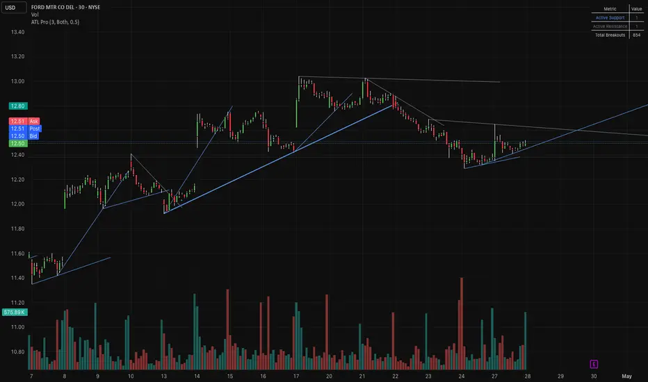
Auto Trend Lines [ZOM]Auto Trend Lines (ATL Pro) is a dynamic trendline detection tool designed to automatically identify, draw, and manage support and resistance lines based on market structure.
The indicator uses pivot-based logic to detect both short-term and long-term swing points, allowing it to construct trend lines that adapt to evolving price action. By connecting relevant pivot highs and lows , it generates real-time support and resistance levels without requiring manual drawing.
To reduce noise and improve clarity, the script includes a proximity filtering system that prevents overlapping or redundant lines. This ensures that only meaningful structural levels are displayed, keeping charts clean while preserving key information.
Each trend line is continuously monitored for interaction with price. The indicator tracks touches, extensions, and breakout conditions , providing insight into how price respects or violates these levels over time. Breakouts are confirmed using a configurable number of consecutive closes beyond a line, helping filter out false breaks and improve signal quality.
Additional features include:
- Automatic detection of small and large pivot-based trend lines
- Real-time extension of active support and resistance levels
- Breakout confirmation logic based on candle closes
- Touch detection for tracking line validation
- Optional breakout markers for visual confirmation
- Alert system for new lines, touches, and confirmed breakouts
- Built-in statistics table showing active support/resistance and total breakouts
The indicator is designed to assist with identifying trend direction, key reaction zones, and potential breakout opportunities, all while minimizing manual chart work.
Its flexible settings allow traders to tailor sensitivity, structure size, and visual output to fit different strategies — from scalping to swing trading. 指標

Market Structure Suite [ZOM]Market Structure Suite is a comprehensive, all-in-one technical analysis toolkit designed to help traders visualize price structure, identify trend direction, and locate high-probability continuation and reversal zones.
At its core: the indicator maps market structure using pivot-based logic to identify higher highs (HH) , lower highs (LH) , higher lows (HL) , and lower lows (LL) . These structural shifts are dynamically connected with a pathing system, allowing users to clearly see the evolving trend and momentum of the market in real time.
The script introduces a retracement-based entry model, where signals are only triggered after price pulls back a defined percentage of the current structural leg. This approach encourages entering on value rather than chasing momentum, aligning with disciplined trading practices.
Beyond structure, the suite integrates a wide range of optional tools to provide deeper market context, including:
- Previous day, week, and month high/low levels for key liquidity zones
- ATR-based volatility bands to highlight expansion and exhaustion
- Anchor VWAP tied to structural pivots for dynamic fair value tracking
- RSI divergence detection for early reversal signals
- Bollinger/Keltner squeeze detection for identifying breakout conditions
- Liquidity sweep labeling to highlight stop-runs and reversals
- Session and killzone visualization for timing market activity
- Round number highlighting for psychological levels
- Initial balance range for intraday structure
- A built-in multi-timeframe dashboard provides higher timeframe trend alignment, alongside additional metrics such as ADR, ADX strength, correlation, and volume spikes. This allows traders to quickly assess whether conditions support continuation or caution.
The indicator is highly customizable, enabling users to toggle features on or off depending on their trading style — whether focused on pure structure, intraday execution, or broader contextual analysis.
This tool is designed to act as a unified decision-support system, combining structure, volatility, momentum, and liquidity concepts into a single streamlined interface. 指標

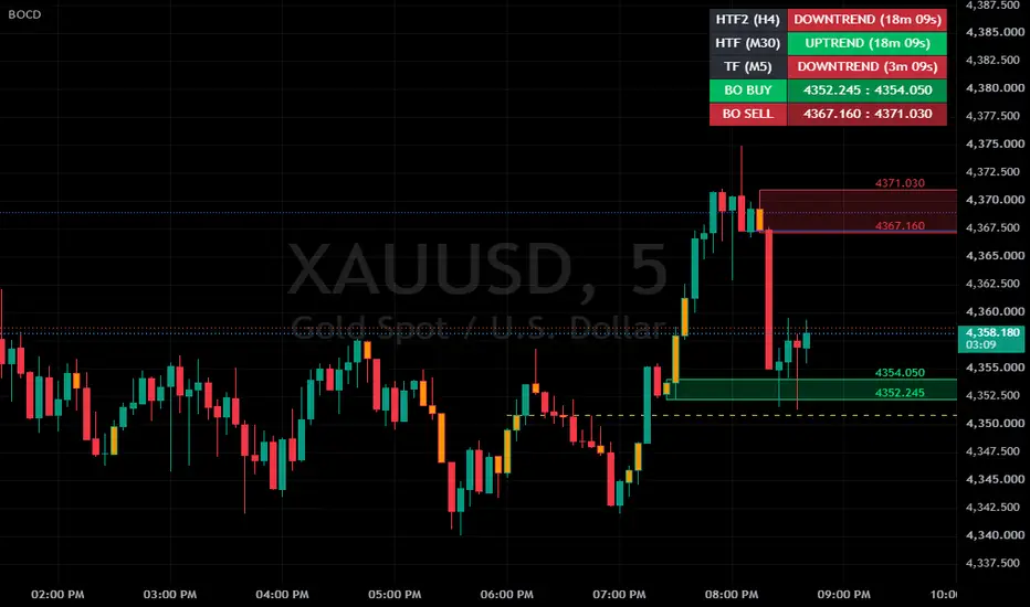
Big Order Candle DetectorBig Order Candle Detector (BOCD) – Explanation & Usage
The Big Order Candle Detector (BOCD) is an indicator designed to identify potential large institutional order activity in the market. It focuses on detecting strong price displacement, which may signal the early stage of a trend.
This structure allows the indicator to capture moments where price moves aggressively, often without overlap with previous price ranges. Such behavior can indicate the presence of strong buying or selling pressure.
How Big Order is Detected
A Bullish Big Order is identified when the current candle’s low is higher than the high of Candle A. This indicates a clear gap or displacement upward, suggesting strong buying interest.
A Bearish Big Order, on the other hand, occurs when the current candle’s high is lower than the low of Candle A, reflecting strong downward pressure.
To reduce noise, the script only marks the first Big Order signal when multiple signals appear consecutively. This ensures cleaner and more meaningful signals.
Visual Representation on Chart
The indicator provides several visual elements to assist analysis:
Triangle Signals
Green triangle → Bullish Big Order
Red triangle → Bearish Big Order
→ Represents early momentum or possible trend initiation
Highlighted Candle (Orange)
→ Considered the origin of the move or liquidity zone
Support & Resistance Box
Drawn based on the high and low of Candle A
→ Acts as a reaction zone for future price movement
Strategy & How to Use
This indicator is best used as a supporting tool for price action analysis, not as a standalone trading signal.
BUY Scenario (Bullish Setup)
When a bullish Big Order appears, it suggests that strong buying momentum has entered the market. Instead of entering immediately, traders typically wait for price to retrace.
Approach:
Wait for price to pull back into the support box, Look for confirmation signals before entering
Confirmation Examples:
Bullish candlestick pattern (e.g., engulfing, pin bar)
Minor break of structure
Increase in volume
Trade Plan:
Entry: Inside the support box (after confirmation)
Take Profit: Nearest resistance zone or previous high
Stop Loss: Below the support box
SELL Scenario (Bearish Setup)
In a bearish setup, the indicator signals strong selling pressure. Similar to the bullish case, traders wait for a retracement rather than chasing the move.
Approach:
Wait for price to move back into the resistance box, Look for signs of rejection
Confirmation Examples:
Bearish rejection candle
Formation of lower high
Weak bullish momentum
Trade Plan:
Entry: Inside the resistance box (after confirmation)
Take Profit: Nearest support zone
Stop Loss: Above the resistance box
Key Concept Summary
Big Order = Strong displacement (possible institutional activity)
Triangle = Signal of momentum
Orange Candle = Origin zone
Box = Key support/resistance area
Retracement = Entry opportunity
Confirmation = Risk control
Important Considerations
This indicator:
Does not guarantee winning trades
Should not be used alone
Always combine with:
Risk management
Market structure analysis
Additional confirmation tools
In practice, BOCD works best as:
A decision-support tool to identify high-probability zones, rather than a direct buy/sell system. 指標

指標

Smart Money Matrix ICT + Volume Profile [Point algo]This indicator is a comprehensive institutional-grade toolkit designed to bridge the gap between Market Structure (SMC/ICT) and Volume Analysis (Volume Profile). By combining these two distinct analytical disciplines, the indicator provides a high-confluence "Matrix" view of the market, helping traders identify where high-conviction orders are resting and how price structure is reacting to them.
Core Functionality
The script is divided into three primary modules that work in synergy:
1. ICT & Smart Money Structure
This module tracks the "DNA" of market movement using high-precision pivot detection:
Market Structure Shift (MSS) & Break of Structure (BOS): Automatically identifies trend transitions and continuations.
Liquidity Sweeps: Highlights "stop hunts" where price wicks beyond previous swing points before reversing, signaling institutional absorption.
Dynamic Fair Value Gaps (FVG): Plots active FVGs and automatically removes them (mitigation) once price returns to fill the imbalance.
2. Advanced Volume Profile (VP)
While most volume profiles are static, this engine calculates volume distribution over a user-defined lookback period to find the "fairest" price levels:
Point of Control (POC): The price level with the highest traded volume, acting as a massive magnet or pivot.
Value Area (VAH/VAL): Highlights the zone where 70% (customizable) of the volume took place, distinguishing between value-driven moves and "excess" price action.
Bull/Bear Volume Split: The profile histogram is color-coded to show whether buyers or sellers were more aggressive at specific price nodes.
3. Master Intelligence Dashboard (HUD)
A real-time terminal in the corner of your chart that synthesizes all data points:
Market Bias: Real-time bullish/bearish/neutral status based on structural breaks.
Zone Positioning: Instantly tells you if price is above, below, or at value (POC).
Distance Metrics: Calculates the percentage distance to the POC for mean-reversion planning.
How to Use
High Confluence Entry: Look for a Liquidity Sweep or MSS that occurs exactly at the Value Area Low (VAL) or POC. This suggests institutions are defending a high-volume zone.
Targeting: Use the POC as a primary take-profit level during mean-reversion trades.
Imbalance Trading: Use the FVG boxes to identify "magnets" in the market. If price breaks structure (BOS) and leaves an FVG near the Value Area High, expect a retracement to that zone before the next leg.
Technical Breakdown
Pivots: Uses a customizable lookback length to detect swing points.
Volume Binning: Divides the price range into numBins to calculate volume density accurately across the lookback period.
Non-Repainting: All structural labels (MSS/BOS/Sweeps) and FVG boxes are calculated on closed bars to ensure signal integrity.
Transparency: All features, from FVG transparency to the number of Volume bins, are fully adjustable via the user settings menu.
Disclaimer: Trading involves significant risk. This tool is designed for technical analysis and educational purposes. It does not provide financial advice. Past performance of structural patterns is not indicative of future results. 指標

指標

[ A L P H A X ] Structure Flow ProAlphaX Structure Flow Pro — Market Structure Engine, HPZ Order Blocks, Fair Value Gaps, Liquidity Sweeps, Equal Highs/Lows & SMC Confluence Signals
AlphaX Structure Flow Pro is a professional-grade Smart Money Concepts indicator built on a pivot-driven market structure engine that detects swing highs and lows in real time, identifies Market Structure Breaks with momentum Z-score validation and Body-Confirmed Breaks, discovers and scores Order Blocks using a proprietary High Probability Zone algorithm, maps Fair Value Gaps and Liquidity Sweeps as they form, identifies Equal Highs and Lows as liquidity pools, and synthesizes every active condition into a tiered SMC Confluence Score — all displayed on a live dashboard with 15+ alert conditions. Designed for traders who operate within the institutional Smart Money framework on any liquid instrument and timeframe.
━━━━━━━━━━━━━━━━━━━━━━━━━━━━━━━━━━━━━━━━
📸 Visual Overview
Full chart view showing Market Structure swing lines, MSB/BMS labels, HPZ Order Blocks with POC lines, FVG zones, Liquidity Sweep markers, Equal High/Low connections, SMC tiered entry labels, and the live Dashboard panel on XAUUSD
━━━━━━━━━━━━━━━━━━━━━━━━━━━━━━━━━━━━━━━━
🔬 The Market Structure Engine — How It Works
At the core of AlphaX Structure Flow Pro is a real-time pivot-based swing detection system that continuously tracks confirmed swing highs and swing lows using a configurable lookback window. Every confirmed pivot is labeled, connected, and used as the structural reference for all break logic downstream.
Each confirmed pivot produces:
A dotted swing line connecting the current and previous swing high or swing low — a live map of whether price is building higher highs and higher lows, or lower highs and lower lows
Small compact H and L labels at every swing point to mark the structural sequence clearly
From these pivots, the engine monitors two distinct types of structural break — each progressively more powerful than the last:
━━━━━━━━━━━━━━━━━━━━━━━━━━━━━━━━━━━━━━━━
1 ─ Market Structure Break (MSB)
A confirmed close beyond the last tracked swing high or low, validated by a Momentum Z-Score filter . The Z-Score measures how many standard deviations the current bar's price change sits above or below its 50-bar mean. Only breaks where momentum is statistically significant above your configured threshold are accepted — low-conviction wicks, slow grinds, and false closes through structure are automatically ignored.
When a valid MSB fires:
A horizontal line is drawn from the breached pivot to the current bar, anchored at the exact structural level
An MSB ▲ or MSB ▼ label appears at the midpoint of that line
The breached swing level is reset so the engine never double-fires on the same break
━━━━━━━━━━━━━━━━━━━━━━━━━━━━━━━━━━━━━━━━
2 ─ Break of Market Structure (BMS)
A stricter and more powerful structural confirmation. In addition to closing beyond the pivot, BMS requires the breaking candle to have a body-to-range ratio above 50% — the break must be driven by a full-bodied candle, not a wick spike. BMS fires as a compact BMS label when it occurs without a simultaneous MSB, giving you a clear visual distinction between a momentum-confirmed break and a body-confirmed break.
How to read them together:
MSB — momentum is statistically significant but the candle body is below 50% — a valid break, treat it with context
BMS — the candle closed through structure with conviction — higher-probability structural shift
When both fire simultaneously, only the MSB label is shown as it already captures the event
Together, MSB and BMS form the structural backbone from which all Order Block discovery, FVG anchoring, and SMC Confluence scoring is triggered.
━━━━━━━━━━━━━━━━━━━━━━━━━━━━━━━━━━━━━━━━
📦 Order Block Engine with HPZ Scoring
Every Market Structure Break triggers an automatic search backward through the preceding candles to identify the originating Order Block — the last candle moving against the direction of the break before price impulsed away. For a bullish MSB the engine finds the last bearish candle within the lookback window. For a bearish MSB it finds the last bullish candle.
Each discovered Order Block is assigned a Quality Score from 0 to 100 built from four independent factors:
Momentum Strength
The absolute magnitude of the Momentum Z-Score at the time of the MSB. Stronger impulsive moves away from the OB produce higher scores — a zone that launched a 3-sigma move ranks far above one that launched a 0.5-sigma drift.
Volume Percentile
The current bar's volume ranked against its last 100 bars using percentile rank. High-volume structural breaks indicate institutional participation — OBs discovered on high-volume breaks score significantly higher.
Candle Body Ratio
The proportion of the breaking candle that is body versus wick. A full-bodied impulsive candle away from the OB signals conviction. A wick-heavy or indecision candle signals a weaker origin.
OB Size Relative to ATR
The Order Block's height measured against the current 14-period ATR. Compact, well-defined OBs close to 1 ATR score proportionally — excessively large or tiny zones are naturally discounted.
These four factors are combined into the final Quality Score displayed on every OB label. Zones that score above your configured HPZ Threshold (default 75%) are promoted to High Probability Zones ⬡ and rendered with a brighter border and a distinct ⬡HPZ badge — the highest-conviction institutional zones on your chart.
HPZ Order Blocks rendered with enhanced borders and ⬡HPZ badge — standard OBs shown with dimmer styling for instant visual hierarchy
━━━━━━━━━━━━━━━━━━━━━━━━━━━━━━━━━━━━━━━━
Order Block Management
Active Order Blocks are not static — AlphaX Structure Flow Pro manages every zone dynamically bar by bar:
Live extension — every active, unmitigated OB extends its right edge forward to the current bar automatically, keeping your zones current at all times
Point of Control (POC) line — a dashed line at the exact midpoint of every OB, showing the most important price level within the zone
Mitigation detection — when price trades into the OB (low below OB bottom for bullish, high above OB top for bearish), the zone is marked as mitigated and dimmed to neutral gray
Historical mode — mitigated OBs remain visible on the chart dimmed for reference, letting you study how price reacted after mitigation
Present mode — mitigated OBs are deleted automatically, keeping the chart clean with only live unmitigated zones visible
Extend Broken OBs — optionally continue extending mitigated zones for up to 50 bars after mitigation for post-mitigation analysis
Overlap filtering — optionally hide new OBs that overlap existing active zones, preventing zone clustering in congested areas
OB Reliability tracker — the dashboard shows a live percentage of how many total OBs have been mitigated versus left untouched, giving you a real-time measure of how well price is respecting the zones on your current instrument and timeframe
━━━━━━━━━━━━━━━━━━━━━━━━━━━━━━━━━━━━━━━━
📊 Fair Value Gaps (FVG)
AlphaX Structure Flow Pro detects Fair Value Gaps — three-candle imbalances where price moved so fast that the market left an unfilled gap between candle one's high/low and candle three's low/high.
Bullish FVG — candle three's low is above candle one's high — an upward gap in price action that the market may return to fill
Bearish FVG — candle three's high is below candle one's low — a downward gap
A minimum FVG size filter (ATR × your configured factor) prevents micro-gaps from cluttering the chart — only imbalances of meaningful size relative to current volatility are plotted.
Each FVG is drawn as a shaded box that extends forward bar by bar. When price trades back into the gap, the box is marked as filled and dimmed to neutral, stopping its extension. The dashboard tracks how many FVGs remain unfilled at all times, and the SMC Confluence engine uses unfilled FVGs above and below price as draw-on-liquidity targets when scoring entry signals.
━━━━━━━━━━━━━━━━━━━━━━━━━━━━━━━━━━━━━━━━
⚡ Liquidity Sweeps
A Liquidity Sweep is one of the most important Smart Money patterns — institutions engineer price to run stop-loss liquidity beyond obvious highs or lows, then reverse sharply. AlphaX Structure Flow Pro identifies these events in real time.
Bullish Sweep — the candle's low breaks below the lowest low of the recent lookback window but the candle closes back above that level as a bullish close. Stops below recent lows were hunted, liquidity was absorbed, and price reversed upward.
Bearish Sweep — the candle's high breaks above the highest high of the recent lookback window but the candle closes back below that level as a bearish close. Stops above recent highs were hunted.
Each sweep is marked with a compact ⚡ label at the wick extreme. Sweeps feed directly into the SMC Confluence scoring system — a bullish sweep adds 20 points to the Bull SMC Score because it signals smart money accumulation, and a bearish sweep adds 20 points to the Bear SMC Score for the same reason in reverse.
━━━━━━━━━━━━━━━━━━━━━━━━━━━━━━━━━━━━━━━━
〰 Equal Highs and Equal Lows (EQH / EQL)
Equal Highs and Equal Lows are areas where price has printed two swing highs or two swing lows at nearly the same level — these levels represent clusters of resting stop-loss orders and are prime targets for institutional liquidity sweeps.
AlphaX Structure Flow Pro detects EQH and EQL automatically by comparing consecutive confirmed pivots. When two swing highs are within your configured ATR-scaled tolerance of each other, an EQH label and dotted connection line are drawn. When two swing lows match, an EQL label appears.
The ATR-scaled tolerance ensures the detection adapts to current market volatility — what counts as "equal" on a calm Asian session is different from a high-volatility London open, and the indicator adjusts automatically.
Equal Highs and Equal Lows marked with purple dotted lines — clear visual identification of stop-hunt targets above and below current price
━━━━━━━━━━━━━━━━━━━━━━━━━━━━━━━━━━━━━━━━
🧠 SMC Confluence Scoring System
Every signal in AlphaX Structure Flow Pro feeds into a real-time SMC Confluence Engine that evaluates all active conditions simultaneously and produces a score from 0 to 100 for both the bullish and bearish side. Only scores that meet your configured minimum threshold generate a visible entry label — weak, ambiguous, or isolated setups never reach the chart.
Bull SMC Score Factors:
Market Structure Break (30 points) — an MSB bull fires adds 30 points as the core structural trigger. A BMS bull without simultaneous MSB adds 20 points.
Liquidity Sweep (20 points) — a bullish sweep on the current bar adds 20 points — smart money has absorbed sell-side liquidity
Near Bullish HPZ Order Blocks (up to 18 points) — two or more unmitigated bullish HPZ OBs within 2 ATR of price adds 18 points. One HPZ OB nearby adds 10 points.
Bearish FVG Draw on Liquidity (up to 10 points) — two or more unfilled bearish FVGs above price (magnets drawing price upward) adds 10 points. One adds 5 points.
Momentum Z-Score confirmation (up to 12 points) — strong upward momentum (Z > 2.0) adds 12 points. Moderate (Z > 1.0) adds 7. Mild (Z > 0.5) adds 3.
Volume ratio (up to 8 points) — volume spike (×2.0) adds 8, high volume (×1.3) adds 5, above average (×1.0) adds 2
Candle body (up to 6 points) — a bullish close with body ratio above 60% adds 6 points. Any bullish close adds 3.
Penalties — strong downward momentum (Z < −1.0) deducts 10 points. Two or more nearby bearish HPZ OBs deduct 8 points.
Bear SMC Score Factors are the exact mirror of the above, applied in reverse for all bearish conditions.
━━━━━━━━━━━━━━━━━━━━━━━━━━━━━━━━━━━━━━━━
Signal Tiers and Entry Labels
Every signal that clears the minimum SMC score threshold is classified into one of three tiers based on its final score:
S-Tier — score ≥ 70. Maximum confluence. All major factors aligned. The highest-confidence setups the engine produces.
A-Tier — score 55–69. Strong confluence with most major factors present.
B-Tier — score at or above your minimum threshold but below 55. Valid setup with meaningful confluence but fewer confirming factors.
Entry labels appear directly on the chart with the tier and score displayed:
▲ S-SMC (82) — bullish S-tier signal with a score of 82
▼ A-SMC (61) — bearish A-tier signal with a score of 61
Label color intensity reflects the tier — S-tier labels use the brightest bull or bear color, A-tier uses the primary color, B-tier uses the dimmed shade. This gives you instant visual priority — your eyes go to the brightest labels first.
A configurable Signal Cooldown prevents back-to-back signals within a set number of bars, eliminating label spam during fast-moving structural events.
S-tier and A-tier entry labels appearing below bars during bullish SMC confluence — label brightness reflects confidence tier at a glance
━━━━━━━━━━━━━━━━━━━━━━━━━━━━━━━━━━━━━━━━
🗓 Session Ranges
AlphaX Structure Flow Pro includes a full Session Range overlay for the four major trading sessions — London, New York, Tokyo, and Sydney — each independently toggleable with customizable colors and time windows.
Session boxes draw in real time as the session opens, expanding their high and low dynamically as price prints new extremes within the session. The session label updates its position to stay centered above the range. Each session closes when its time window ends, leaving the completed range as a permanent reference box for that period.
Use session ranges to:
Identify the high and low of a session as key liquidity targets for sweeps
Determine whether an MSB or OB formation occurred during a high-liquidity or low-liquidity window
Spot the London or New York open as a structural break origin
━━━━━━━━━━━━━━━━━━━━━━━━━━━━━━━━━━━━━━━━
📊 Live Dashboard
The AlphaX Structure Flow Pro dashboard gives you a complete real-time readout of every active market condition in a compact panel — no need to visually scan the chart for each element individually.
Market Structure section:
MSB STATUS — shows whether a Bull MSB, Bear MSB, or no MSB is active on the current bar
BMS (BODY) — shows whether a body-confirmed structural break is active
MOMENTUM Z — current Z-score reading with direction label (STRONG / MODERATE / MILD / FLAT) and raw value
Order Blocks section:
ACTIVE OBs — total count of unmitigated Order Blocks currently on the chart
HPZ OBs — count of active High Probability Zone OBs, highlighted when any are present
OB RELIABILITY — live percentage of total OBs that have been mitigated since the indicator started tracking — your real-time measure of how well structure is being respected
Liquidity & Imbalance section:
LIQ SWEEP — shows whether a Bull or Bear liquidity sweep is active on the current bar
OPEN FVGs — count of unfilled Fair Value Gaps currently active
DRAW ON LIQ — shows whether price has unfilled FVGs drawing it upward, downward, or on both sides
SMC Confluence section:
BULL SMC SCORE — current bullish confluence score with tier label (S-TIER / A-TIER / B-TIER / LOW)
BEAR SMC SCORE — current bearish confluence score with tier label
HPZ PROXIMITY — shows whether price is near a Bull HPZ zone, Bear HPZ zone, both sides, or neither
Market Conditions section:
VOLUME — current volume classified as SPIKE / HIGH / NORMAL / DRY with the live ×ratio
ATR (14) — current 14-period ATR value in price terms
CANDLE BODY — current candle body ratio classified as STRONG / MODERATE / WEAK with percentage
Active Signal section:
SIGNAL — shows the active entry signal direction and tier, or NONE — the single most important row if you need a quick status check
Dashboard position (Top Left / Top Right / Bottom Left / Bottom Right) and text size (Tiny / Small / Normal / Large) are fully configurable.
━━━━━━━━━━━━━━━━━━━━━━━━━━━━━━━━━━━━━━━━
⚠ Identifying Low-Quality Conditions — When NOT to Trade
Knowing when to stay out is just as important as knowing when to enter. AlphaX Structure Flow Pro gives you clear signals that the market is not in a tradeable condition:
How to identify unfavorable conditions:
No MSB or BMS on the dashboard — if the MSB STATUS row shows NONE, there is no confirmed structural trigger. No structural break means no Order Block discovery, and no SMC signals should be acted on.
Bull and Bear SMC Scores both show LOW — when neither side can build enough confluence to reach even B-tier, the market is either ranging, choppy, or lacking institutional participation. Wait for a clear dominant side to emerge.
OB RELIABILITY is very high (above 80–90%) — when nearly every OB is being quickly mitigated, price is not respecting structure and the market is in a sweep-and-reverse or noise regime. Reduce position size or stand aside.
No SMC entry labels appearing — the confluence engine is running on every bar. If no labels are printing even after MSB events, the filters are doing their job blocking low-quality setups. Do not lower the threshold to force signals — wait for real confluence.
DRAW ON LIQ shows BOTH SIDES — unfilled FVGs above and below simultaneously means price is in the middle of a contested range with equal magnets in both directions. No clean directional edge exists.
MOMENTUM Z reads FLAT on the dashboard — flat momentum at a structural level often means a failed break rather than a true MSB. Treat these events with extra caution.
What to do during unfavorable conditions:
Wait for a clean MSB or BMS to set the directional bias before considering any entry
Look for one dominant side in the SMC Confluence section — both Bull and Bear scores being low simultaneously is a ranging signal
Watch for a liquidity sweep followed immediately by an MSB in the same direction — that sequence is one of the highest-probability SMC setups and will produce a strong confluence score when it fires
Consider switching to a higher timeframe to find cleaner structure — if the current timeframe is printing rapid alternating MSBs, the higher timeframe trend will show you the dominant direction
━━━━━━━━━━━━━━━━━━━━━━━━━━━━━━━━━━━━━━━━
🚀 How to Trade with AlphaX Structure Flow Pro — Step by Step
Step 1 — Read the Dashboard
Check MSB STATUS and BMS — is there a live structural break?
Check Bull and Bear SMC Scores — is one side clearly dominant with a B-tier or higher score?
Check DRAW ON LIQ — are unfilled FVGs pulling price in one clear direction?
If no clear dominant side and no MSB → do not trade. Wait for structure.
Step 2 — Identify the Structural Trigger
An MSB ▲ or BMS bull sets your bullish directional bias
An MSB ▼ or BMS bear sets your bearish directional bias
Do not enter blindly on the MSB label alone — use it to set context, then wait for a tiered SMC signal to confirm
Step 3 — Enter on a Tiered SMC Signal
Wait for a ▲ SMC or ▼ SMC label to appear with a tier of B or higher
Prioritize S-tier and A-tier signals — these have the most factors aligned
Check that an unmitigated HPZ Order Block is nearby in the direction of the trade — HPZ proximity is displayed on the dashboard in real time
Place your stop loss beyond the most recent swing low (for longs) or swing high (for shorts), or just beyond the relevant OB's outer edge
Step 4 — Use FVGs and OBs as Targets and Re-Entry Zones
Unfilled FVGs in the direction of the trade are natural draw-on-liquidity targets — they show you where price is likely being pulled toward
Mitigated OBs (shown dimmed in Historical mode) mark areas where price has already visited and absorbed — useful as reference for prior institutional activity
If price pulls back into an unmitigated bullish OB without triggering a new bearish MSB, that is a potential re-entry zone aligned with the original structural break
Step 5 — Monitor for Structural Invalidation
If an opposing MSB fires after your entry, the structure has shifted — close or reduce your position
If the SMC Score for your trade direction drops to LOW on the dashboard without a new signal, momentum is fading
A liquidity sweep against your position that does not produce a reversal SMC signal is a warning — tighten your stop
Step 6 — Watch for Equal Highs/Lows as Exit Targets
EQH levels above price during a bull trade are natural exit zones — institutions often sweep equal highs as final liquidity grabs before reversal
EQL levels below price during a bear trade serve the same purpose
Consider taking partial profit as price approaches an EQH or EQL level, then hold the remainder for a potential sweep and continuation
━━━━━━━━━━━━━━━━━━━━━━━━━━━━━━━━━━━━━━━━
⚡ Key Features
🔬 Pivot-based market structure engine with configurable swing lookback — tracks confirmed swing highs and lows in real time
📈 MSB detection with Momentum Z-Score validation — filters out low-conviction structural breaks statistically
💪 BMS detection with candle body ratio confirmation — only full-bodied closes through structure qualify
📦 Order Block discovery anchored to every MSB — automatically finds the originating institutional candle
⬡ Proprietary HPZ Quality Score (0–100) — four-factor scoring system promotes the highest-conviction zones to High Probability Zone status
📍 Point of Control line on every Order Block — shows the midpoint of the zone for precision entries
🔄 Dynamic OB management — live extension, mitigation detection, Historical and Present display modes, overlap filtering, and broken OB extension
📊 Fair Value Gap detection with ATR-scaled minimum size filter — bullish and bearish imbalances mapped and tracked until filled
⚡ Liquidity Sweep detection — wick-beyond plus close-inside logic identifies institutional stop hunts in real time
〰 Equal Highs and Equal Lows detection with ATR-scaled tolerance — automatic identification of resting liquidity pools
🧠 Multi-factor SMC Confluence Scoring Engine — synthesizes structure, sweeps, HPZ OBs, FVG draw, momentum, volume, and candle body into a single 0–100 score per side
🏆 Three-tier signal classification — S-Tier (≥70), A-Tier (55–69), B-Tier (threshold to 54) with color-coded label intensity
⏱ Signal cooldown timer — configurable minimum bars between signals to eliminate label spam
✅ Optional volume confirmation filter — require minimum volume ratio before any signal fires
🗓 Four-session range overlay — London, New York, Tokyo, and Sydney each independently toggleable with custom colors and time windows
📋 Live 7-section dashboard — MSB/BMS status, momentum Z, OB counts, HPZ proximity, FVG draw direction, SMC scores, volume, ATR, and active signal — all in one panel
🎨 Fully customizable color theme — 13 configurable colors covering bull, bear, neutral, FVG, sweep, EQL, and dashboard elements
🔔 15+ alert conditions — MSB bull/bear, BMS bull/bear, S/A/B-tier bull signals, S/A/B-tier bear signals, any SMC signal, bull/bear sweeps, bull/bear FVGs, and MSB + HPZ confluence alerts
⚙ Fully configurable — every lookback, threshold, score, toggle, color, and session window adjustable from the settings panel
━━━━━━━━━━━━━━━━━━━━━━━━━━━━━━━━━━━━━━━━
⚙ Settings Reference
Market Structure
Pivot Lookback — bars on each side required to confirm a swing high or low (default: 7, range: 3–21)
MSB Momentum Z-Score — minimum standard deviation threshold for a valid Market Structure Break (default: 0.5)
Show MSB Lines & Labels — toggle visibility of MSB/BMS lines and labels
Show Structure Swings — toggle visibility of swing lines and H/L pivot labels
Detect Break of Market Structure (BMS) — enable or disable body-confirmed structural break detection
Order Blocks
Max Active OBs — maximum number of unmitigated Order Blocks kept on the chart at once (default: 10)
OB Lookback (candles) — how many candles back the engine searches for the originating OB after an MSB (default: 10)
Extend Broken OBs — continue extending mitigated OBs for up to 50 bars after mitigation
Hide Overlapping OBs — skip new OBs that overlap existing active zones
Display Mode — Historical (keep mitigated OBs dimmed) or Present (delete mitigated OBs automatically)
HPZ Threshold Score (%) — minimum quality score required for HPZ promotion (default: 75%)
Show OB Point of Control — toggle the midpoint POC dashed line on Order Blocks
Liquidity & Imbalance
Show Fair Value Gaps — toggle FVG detection and display
Min FVG Size (ATR × factor) — minimum gap size as a multiple of ATR to qualify as a valid FVG (default: 0.05)
Show Liquidity Sweeps — toggle sweep detection and ⚡ markers
Sweep Lookback (bars) — lookback window for determining the recent high/low that is swept (default: 20)
Show Equal Highs / Lows — toggle EQH and EQL detection and display
EQL Tolerance (ATR × factor) — how close two pivots must be to qualify as equal, scaled to ATR (default: 0.1)
Smart Money Confluence (SMC)
Enable SMC Confluence Engine — master toggle for the scoring system and all entry labels
Min SMC Score to Signal — minimum confluence score required to display an entry label (default: 30)
Signal Cooldown (bars) — minimum bars between consecutive signals in the same direction (default: 3)
Require Volume Confirmation — only fire signals when volume ratio meets the minimum threshold
Min Volume Ratio — minimum volume-to-SMA ratio required when volume filter is enabled (default: 0.7)
Sessions
Show Session Ranges — master toggle for the session overlay
London / New York / Tokyo / Sydney — independently toggle each session with configurable time window and color
Dashboard
Show Dashboard — toggle the dashboard panel on or off
Position — Top Left / Top Right / Bottom Left / Bottom Right
Size — Tiny / Small / Normal / Large
Appearance
Label Size — controls the size of all MSB, BMS, sweep, EQH/EQL, and entry labels (Tiny / Small / Normal)
Colors
Bull Primary / Bright / Dim — three shades of the bullish color family for OBs, labels, and signals
Bear Primary / Bright / Dim — three shades of the bearish color family
Neutral / Neutral Light — colors for mitigated zones and inactive states
Text Light — color for dashboard row labels
Dashboard Background — background color of the dashboard panel
FVG Bull / Bear Color — colors for bullish and bearish Fair Value Gap zones
Liquidity Sweep Color — color for sweep ⚡ labels
Equal Hi/Lo Color — color for EQH and EQL lines and labels
━━━━━━━━━━━━━━━━━━━━━━━━━━━━━━━━━━━━━━━━
🔔 Alert Conditions
Bull Market Structure Break — fires on every bullish MSB
Bear Market Structure Break — fires on every bearish MSB
Bull Break of Market Structure (Body Close) — fires on every bullish BMS
Bear Break of Market Structure (Body Close) — fires on every bearish BMS
S-Tier Bull SMC Signal — bullish signal with score ≥ 70
A-Tier Bull SMC Signal — bullish signal with score 55–69
B-Tier Bull SMC Signal — bullish signal below 55 but above minimum threshold
S-Tier Bear SMC Signal — bearish signal with score ≥ 70
A-Tier Bear SMC Signal — bearish signal with score 55–69
B-Tier Bear SMC Signal — bearish signal below 55 but above minimum threshold
Any SMC Signal — fires on any bullish or bearish signal regardless of tier
Bull Liquidity Sweep — wick below recent lows with bullish close
Bear Liquidity Sweep — wick above recent highs with bearish close
Bullish Fair Value Gap — new bullish FVG formed
Bearish Fair Value Gap — new bearish FVG formed
Bull MSB + HPZ Confluence — bullish MSB with at least one nearby unmitigated HPZ OB
Bear MSB + HPZ Confluence — bearish MSB with at least one nearby unmitigated HPZ OB
All alert messages include {{ticker}} and {{interval}} placeholders for clean webhook and bot integration.
━━━━━━━━━━━━━━━━━━━━━━━━━━━━━━━━━━━━━━━━
🎯 Recommended Settings by Use Case
The default configuration is tuned for intraday trading on liquid instruments including XAUUSD, forex majors, and indices on M1 to M15 timeframes.
For tighter, higher-conviction signals:
Increase Min SMC Score to 45–55 — only S-tier and strong A-tier setups fire
Enable Require Volume Confirmation and set Min Volume Ratio to 1.0–1.3
Increase Pivot Lookback to 9–12 for larger, more significant swing points
Set HPZ Threshold to 80% to tighten HPZ qualification
For more signals and aggressive scalping:
Reduce Min SMC Score to 20–25
Reduce Signal Cooldown to 1–2 bars
Reduce Pivot Lookback to 3–5 for faster swing detection
Keep Volume Confirmation off
For higher timeframes (H1, H4, Daily):
Increase Pivot Lookback to 10–15
Increase OB Lookback to 15–20
Increase Min SMC Score to 40–50
Increase Sweep Lookback to 30–50
For ranging or news-driven markets:
Enable Hide Overlapping OBs to reduce zone clutter
Switch Display Mode to Present to keep only live zones visible
Monitor DRAW ON LIQ on the dashboard — if both sides show FVGs, avoid directional trades
━━━━━━━━━━━━━━━━━━━━━━━━━━━━━━━━━━━━━━━━
👥 Who This Is For
🥇 Smart Money Concepts traders — built specifically around the MSB → OB → FVG → Sweep framework that institutional-style traders use
📉 Forex and Gold traders — fully applicable to XAUUSD, forex majors and minors, and all liquid currency pairs
📊 Index traders — works on US30, NAS100, SPX500, DAX, and all major equity indices
🧠 Systematic and rule-based traders — the confluence scoring system provides a quantitative, objective framework rather than purely subjective visual reads
📈 Traders who want one complete SMC system — structure, OBs, FVGs, sweeps, EQH/EQL, sessions, scoring, and dashboard in a single indicator rather than layering five separate tools
⚠ Traders who struggle with overtrading — the minimum score filter, cooldown, and volume gate physically prevent low-quality signals from reaching the chart
🔔 Alert-driven traders and bot operators — 17 alert conditions with clean webhook-ready message formatting cover every meaningful event the indicator can detect
━━━━━━━━━━━━━━━━━━━━━━━━━━━━━━━━━━━━━━━━
📝 Notes
Session range features use the time zone of each configured session string — set your London and New York session times to match your chart's time zone if ranges appear offset
The Momentum Z-Score is calculated over a 50-bar rolling window — on very short histories or immediately after a chart loads, early bars may have lower Z-Score values until the window fills
OB Reliability percentage starts from zero when the indicator first loads and builds over time as OBs are discovered and mitigated — it is most meaningful after a full session of price action
The SMC Confluence Engine evaluates conditions on bar close — all signals are non-repainting and confirmed on the closed bar
With max_boxes_count, max_lines_count, and max_labels_count each set to 500 and max_bars_back at 500, on very low timeframes with extended chart history the oldest visual elements may be automatically removed by TradingView's rendering limits — this is a platform constraint, not an indicator limitation
The HPZ proximity check uses a 2 ATR radius around the current close price — zones further away than 2 ATR are not counted in the SMC score even if they are unmitigated and visible on the chart
━━━━━━━━━━━━━━━━━━━━━━━━━━━━━━━━━━━━━━━━
⚠ Disclaimer
This indicator is a technical analysis and visualization tool intended for educational and informational purposes only. It does not constitute financial advice or a recommendation to buy or sell any financial instrument. All signals are generated from historical and real-time price data using mathematical calculations — their accuracy or profitability is not guaranteed. Past performance of any signal type does not guarantee future results. Always conduct your own analysis, use proper risk management, and consult a licensed financial advisor before making any trading decisions. The author accepts no responsibility for any losses incurred from the use of this indicator.
━━━━━━━━━━━━━━━━━━━━━━━━━━━━━━━━━━━━━━━━
Built for traders who demand structure, confluence, and precision from their Smart Money analysis. 指標

Entry Execution Readiness [AGPro Series]Entry Execution Readiness
🧠 Core Idea
Is this setup ready for execution attention now, or should it remain on watch?
📌 Overview / What it does
Entry Execution Readiness is a chart-first decision engine built to evaluate whether an active setup has enough structure, risk quality, and target room to deserve execution attention.
The script produces a 0-100 Readiness Score, a clear entry state, an entry pocket, an invalidation rail, a target-room band, premium state labels, and a compact AGPro panel. It is designed to organize setup quality, not to predict price or automate execution.
It does not publish buy or sell commands. It does not replace a trader's own execution model. Its purpose is to turn observable setup conditions into a cleaner readiness map.
🎯 Purpose & Design Philosophy
This script was built for traders who already see a potential setup but need a disciplined way to decide whether the setup is clean enough to keep under execution review.
The gap it fills is practical: many tools identify signals, levels, or zones, but they do not answer whether the setup has acceptable risk distance, enough target room, suitable volatility, and directional confirmation at the same time.
The design philosophy is simple: execution should be reviewed through readiness, not excitement.
⚡ Why This Script Is Different
Most tools focus on printing a signal or highlighting a level.
This script does NOT act as a full Position Planner, position sizing model, signal service, or trade automation system.
Instead, it evaluates execution readiness through a compact decision layer: trend alignment, candle efficiency, distance to invalidation, target-room quality, and volatility fit are compressed into one transparent score and one clear next-action state.
⚙️ Methodology
1. Context Detection
The script detects the active setup side automatically, or lets the user force a long-bias or short-bias readiness view.
2. Reference Mapping
It maps an entry pocket around the active trend reference, builds an invalidation rail from recent structure, and projects target room from nearby structure or ATR-adjusted continuation space.
3. Reaction Evaluation
It scores trend alignment, candle efficiency, risk distance, reward room, and volatility fit from 0 to 100.
4. Visual Output
The chart displays the readiness state through zones, labels, alerts, and a premium AGPro panel with the key decision fields.
🗺️ How to Read the Chart
Zones = the active entry pocket and target-room band.
Invalidation rail = the structural level that would weaken or reset the current setup context.
Labels = the current readiness state, score tier, and risk context.
Colors = teal for stronger long-readiness contexts, pink for bearish or invalidation contexts, amber for waiting states, and indigo for monitoring/transition states.
Panel = the fastest summary of score, state, risk distance, target room, and next action.
🚦 Signals & States
• READY → the setup meets the score threshold and confirmation filter.
• MONITOR → the setup is improving but still needs cleaner confirmation or score strength.
• WAIT → the setup exists, but risk, target room, or confirmation is not yet strong enough.
• BLOCKED → the current context does not offer a clean execution-readiness profile.
• INVALIDATED → price closed beyond the active invalidation rail.
🔔 Alerts Logic
READY alerts trigger when the state upgrades into READY.
Downgrade alerts trigger when the active setup weakens from a stronger state.
Invalidation alerts trigger when price closes beyond the current invalidation rail.
Confirmation alerts trigger when score and confirmation improve together near the READY threshold.
Alerts are attention markers. They are not trade instructions.
🧩 Confluence Logic
The setup becomes stronger when directional trend alignment, candle quality, controlled invalidation distance, acceptable volatility, and clean target room improve at the same time.
The score is intentionally multi-factor so a single strong candle or a single clean level cannot dominate the full readiness view.
📊 When to Use
• Trend continuation setups
• Pullback-to-reference execution reviews
• Breakout continuation contexts with enough target room
• Active trade-planning workflows where the trader already has a directional thesis
• Intraday or swing charts where risk and target room need to be evaluated quickly
• 4-hour swing/execution review charts where the active pocket, invalidation rail, and target room can be read without excessive label compression
⚠️ When NOT to Use
• Very low liquidity markets
• Extremely noisy sideways conditions
• News-driven volatility spikes
• Charts where the user has no independent setup thesis
• Markets with poor execution conditions, wide spreads, or unreliable fills
🎛️ Key Inputs
• Setup Direction → Auto, Long Bias, or Short Bias readiness mode.
• Sensitivity → controls how selective the model is.
• Structure Lookback → affects structure, risk rail, target room, and volatility context.
• Minimum READY Score → defines the threshold required for READY state.
• Confirmation Mode → controls how much candle and trend confirmation is required.
• Label Cooldown / Max Visible Labels → controls label density.
• Panel Location / Panel Theme / Font Sizes → controls visual presentation.
🖥️ Interface & Visual Design
The interface is built around a clean premium overlay.
The panel uses the AGPro standard single merged blue header row and summarizes only the most decision-relevant fields.
The chart visuals are deliberately limited to the current entry pocket, invalidation rail, target room, and moderate state labels so the script remains readable in publication screenshots.
🧪 Practical Usage Workflow
1. Read the panel state and Readiness Score.
2. Check whether price is interacting cleanly with the entry pocket.
3. Review the invalidation rail and risk distance.
4. Compare the target-room band against the current risk.
5. Treat READY as a review state, not as an automatic execution command.
🔍 Interpretation Guidelines
Think of the output as a readiness filter.
A high score means the modeled conditions are aligned more cleanly than usual. It does not mean the setup will work.
A WAIT or MONITOR state can still be useful because it shows what part of the setup is not yet ready.
An INVALIDATED state means the current setup context should be reset or reviewed again from a fresh structure.
🚫 What This Script Is NOT
• Not a prediction engine
• Not financial advice
• Not auto trading
• Not guaranteed signals
• Not a full position-sizing planner
• Not a buy/sell command system
⚠️ Limitations & Transparency
Timeframe differences can change how structure, volatility, and target room appear.
Volatility expansion or contraction can make the readiness state change quickly.
Market conditions can shift faster than any rule-based chart tool can summarize.
The model is transparent and deterministic, but it cannot know future price behavior.
🧠 Market Context Notes
Entry readiness is most useful when it is read together with liquidity, structure, session context, and broader volatility conditions.
The script is strongest when the trader already has a setup thesis and needs a cleaner way to review whether execution conditions are improving or weakening.
🧾 Use Case Examples
When price pulls back toward the entry pocket, trend alignment remains intact, risk distance stays controlled, and target room remains clean, the setup may upgrade into MONITOR or READY.
When price stretches too far from the pocket or target room becomes too thin relative to invalidation distance, the score can weaken even if direction still looks attractive.
When price closes beyond the invalidation rail, the active setup context is marked as INVALIDATED.
🧱 System Philosophy
AGPro tools are designed to support structured chart reading, decision clarity, and rule-based interpretation.
This script follows that philosophy by focusing on execution readiness instead of generic signals.
🔐 Non-Promise Statement
No script can provide certainty.
No score can guarantee a future outcome.
This tool organizes visible chart conditions so the user can make a more structured review.
📉 Risk Disclosure
Trading involves risk. Market movement can be unpredictable, and any setup can fail.
Users are responsible for their own analysis, execution, risk management, and decisions.
This script does not provide financial advice, investment advice, or guaranteed trading outcomes.
📚 Educational Note
Use the script as a structured decision-support layer. The strongest benefit comes from reviewing why the state is READY, WAIT, MONITOR, BLOCKED, or INVALIDATED rather than treating any single label as a standalone answer.
指標

Gap Fill Reaction Planner [AGPro Series]Gap Fill Reaction Planner
🧠 Core Idea
Is this gap reaction actually ready for planning, or is it just another rectangle on the chart?
📌 Overview / What it does
Gap Fill Reaction Planner is a planner-style price action tool built around gap fill behavior, reaction quality, and execution readiness. Instead of simply drawing gap zones, it evaluates whether the active gap reaction has enough structure to become a measurable plan.
The script detects gap support and gap resistance zones, tracks fill progress, classifies reaction state, and converts the active setup into a 0-100 readiness score. It also maps a live entry reference, invalidation level, target projection, and estimated R multiple so the user can review the structure as a plan rather than as an isolated signal.
It does not automate trades, predict future price, or replace independent analysis. Its purpose is to organize gap reaction context into a cleaner decision framework.
🎯 Purpose & Design Philosophy
This script was built to move beyond passive gap marking. A normal gap indicator can show where a gap exists, but it does not answer the questions that matter before a trade idea is considered:
Is the reaction valid?
How strong is the setup?
Where is the invalidation?
Where is the target?
What should the trader watch next?
Gap Fill Reaction Planner was designed for traders who want a structured workflow around opening gaps, continuous-market reaction bands, partial fills, full fills, rejection behavior, and acceptance risk. The mindset is not "take every gap." The mindset is "measure the reaction first."
⚡ Why This Script Is Different
Most gap tools focus on detection. They draw every gap, imbalance, or separation zone and leave the decision process to the user.
This script does NOT act as a generic gap highlighter, generic support/resistance map, or broad imbalance catalog.
Instead, it treats each gap as a planning object. Every active zone is evaluated through fill depth, reaction state, volatility context, participation, age, and structural validity. The panel then translates that context into readiness, next action, invalidation, target, and risk/reward information.
That planner layer is the difference. The script helps the user decide whether a gap reaction deserves attention, not merely whether a gap exists.
⚙️ Methodology
1. Context Detection
The script first searches for gap reaction zones. It prioritizes classic open-to-previous-close gaps, then supports adaptive reaction bands for continuous markets where clean opening gaps may be rare.
2. Reference Mapping
Each detected zone receives a fixed-length rectangular band. The zone is not dragged forward forever; it remains anchored to its origin so old structures do not distort the current chart. Thin zones are displayed with a minimum visual height so the chart keeps a cleaner, more professional planning layer.
3. Reaction Evaluation
The engine tracks fill percentage, partial fill, full fill, rejection, and acceptance. Rejection behavior is treated differently from simple fill behavior because a filled gap and a rejected gap communicate different planning context.
4. Planner Scoring
The readiness score combines gap size, fill quality, reaction behavior, volatility participation, and recency. The score is normalized from 0 to 100.
5. Risk / Target Projection
For the active planner zone, the script calculates an invalidation reference beyond the far side of the gap and projects a target using the selected R multiple.
6. Visual Output
The chart shows gap zones, centered zone labels, optional fill progress, planner labels, and active plan levels. The panel summarizes the decision state.
🗺️ How to Read the Chart
Zones
Gap Support zones represent upward gap reactions that may act as support-style planning areas.
Gap Resistance zones represent downward gap reactions that may act as resistance-style planning areas.
Zone Labels
Focused zones can display a centered label showing the zone role, state, and readiness score. This keeps the chart readable without turning every historical zone into a text cluster.
Colors
Bullish planner context uses the AGPro green state color.
Bearish planner context uses the AGPro pink state color.
Neutral or unfinished context uses restrained secondary colors.
Panel
The panel shows readiness, next action, plan side, gap size, fill/state, invalidation, target/R, and bias.
Plan Levels
When an active planner zone exists, the script can display entry reference, invalidation, and target lines.
🚦 Signals & States
• Fresh → A new gap zone exists but has not reached meaningful fill depth.
• Partial Fill → Price has returned into the gap enough to begin reaction monitoring.
• Rejected → Price filled part of the gap and then closed back away from the zone.
• Full Fill → The gap has reached the full-fill threshold and becomes more neutral.
• Accepted → Price closed beyond the far boundary of the gap, meaning the zone has lost its original reaction role.
• Planner Ready → A rejection setup reached the configured readiness threshold.
🔔 Alerts Logic
New Gap Support Zone
Triggers when a bullish gap support planning zone is created.
New Gap Resistance Zone
Triggers when a bearish gap resistance planning zone is created.
Gap Partial Fill
Triggers when a tracked zone reaches the partial-fill threshold.
Gap Full Fill
Triggers when a tracked zone reaches the full-fill threshold.
Gap Planner Ready
Triggers when a rejection setup reaches the readiness score threshold.
Gap Acceptance
Triggers when price accepts beyond the far side of the gap.
Alerts are attention markers and workflow prompts. They are not trade instructions.
🧩 Confluence Logic
The planner score becomes stronger when multiple conditions align:
• The gap has enough ATR-normalized size
• Fill depth is meaningful but not exhausted
• Reaction behavior confirms away from the zone
• Current volatility and participation support the reaction
• The zone is recent enough to remain relevant
When these pieces align, the gap becomes a stronger planning candidate.
📊 When to Use
• After large opening gaps
• During pullbacks into gap support or gap resistance
• Around partial fill and rejection behavior
• In trending markets where gaps create reaction shelves
• In volatile markets where gap fill behavior matters
• On crypto and FX charts where adaptive reaction bands may help continuous-market analysis
⚠️ When NOT to Use
• Extremely low-liquidity symbols
• Very noisy micro timeframes
• Market conditions where spread, slippage, or data quality is poor
• When the chart is moving too fast for structured planning
• When a trader has not defined broader market context
🎛️ Key Inputs
Detection Mode
Controls whether the script uses only classic open gaps or adaptive reaction bands.
Minimum Gap Size
Filters out small gaps using ATR normalization.
Readiness Threshold
Defines the minimum score required for a planner-ready label.
Target Multiple (R)
Projects the target from the current reference price using the invalidation distance.
Invalidation Buffer
Adds ATR-based spacing beyond the far side of the gap zone.
Zone Right Extension
Controls how far each zone projects from its origin.
Panel / Label Settings
Control panel visibility, panel theme, panel location, and font sizes.
🖥️ Interface & Visual Design
The interface is built for quick decision review. The panel provides the planner summary, while the chart emphasizes the most important structural elements: premium-height zones, focused centered labels, action labels, and active plan levels.
The visual hierarchy is intentionally clean. Zones explain context, labels explain state, and the panel explains what to do next from an analytical standpoint.
🧪 Practical Usage Workflow
1. Read the panel readiness score.
2. Check whether the next action is monitor, wait, plan, or stand aside.
3. Review the active gap zone and its centered label.
4. Compare fill percentage with the reaction state.
5. Review invalidation and target levels.
6. Confirm the idea with broader market context before acting.
🔍 Interpretation Guidelines
A high score does not mean certainty. It means the gap reaction has stronger planning structure.
A partial fill means price has started interacting with the gap, but reaction quality still matters.
A rejection state is more meaningful when it occurs with strong score, clean invalidation, and acceptable target distance.
An accepted zone should usually be treated as a failed reaction context rather than an active planning area.
🚫 What This Script Is NOT
This script is not a prediction engine.
This script is not an automated trading system.
This script is not a financial advice tool.
This script does not provide guaranteed outcomes.
This script does not replace risk management, trade review, or independent confirmation.
⚠️ Limitations & Transparency
Gap behavior can change significantly across symbols and timeframes.
Continuous markets may produce fewer classic opening gaps, which is why the script includes adaptive detection modes.
Volatility expansion can make targets and invalidation levels wider.
Low-liquidity environments may reduce the reliability of reaction labels and score readings.
No rule-based tool can fully account for news events, sudden liquidity shifts, or execution quality.
🧠 Market Context Notes
Gap reactions are often more useful when they are read together with trend structure, volatility, session behavior, and liquidity context. A gap zone is not automatically important because it exists. It becomes more useful when price returns to it, reacts clearly, and produces a measurable planning structure.
🧾 Use Case Examples
When price returns into a Gap Support zone and rejects upward with a high readiness score, the panel can help review whether invalidation and target structure are measurable.
When price fills a Gap Resistance zone and accepts above it, the script marks the context as acceptance rather than treating the zone as a still-valid resistance area.
When the panel shows low readiness, the script is communicating that the structure may exist visually but is not yet a strong planner candidate.
🧱 System Philosophy
AGProLabs tools are built around structured interpretation. The goal is not to add more noise to the chart. The goal is to convert raw market behavior into a cleaner decision framework that traders can review with discipline.
🔐 Non-Promise Statement
No indicator can remove uncertainty.
No score can guarantee a result.
No planner can replace the trader's responsibility to manage risk.
📉 Risk Disclosure
Trading involves risk. This script is provided for educational and analytical use only. It does not provide financial advice, investment advice, or guaranteed trading outcomes. Users remain responsible for their own research, risk management, position sizing, and execution decisions.
📚 Educational Note
The best use of this script is not to chase every gap. The best use is to slow the decision process down, measure the reaction, and decide whether the setup is structured enough to deserve attention.
指標

1-2-3 Reversal Map [AGPro Series]1-2-3 Reversal Map
🔹 OVERVIEW
1-2-3 Reversal Map is a focused TradingView overlay built for traders who want a clean, structured way to follow one of the most recognizable reversal formations in price action: the confirmed 1-2-3 reversal.
This tool maps the full life cycle of a 1-2-3 structure. It identifies the confirmed swing sequence, marks Point 1, Point 2, and Point 3, projects the neckline from Point 2, evaluates the neckline break, and highlights the retest pocket after confirmation. The goal is not to fill the chart with generic reversal signals. The goal is to make the actual 1-2-3 process easier to see, compare, and track.
The script is designed around visual clarity. The latest active structure stays readable through numbered swing labels, restrained guide lines, a clearly identified neckline, and a concept-specific retest pocket. The panel then summarizes the current stage, neckline status, retest status, and reversal score in a compact AG Pro layout.
🔹 WHAT MAKES IT DIFFERENT
Most reversal tools try to do too many things at once. They mix candle patterns, double tops, double bottoms, head and shoulders structures, failed breakouts, generic support and resistance zones, trend filters, and broad reversal markers into one crowded chart.
1-2-3 Reversal Map takes a more disciplined approach. It stays inside one lane: the confirmed 1-2-3 reversal sequence.
The script does not mark every possible turning point. It waits for a defined swing chain:
1. Point 1 establishes the original swing extreme.
2. Point 2 forms the neckline reference.
3. Point 3 confirms that price has created a structurally relevant retracement.
4. The neckline break turns the structure from a setup into a confirmed map.
5. The retest pocket shows where the broken neckline can be evaluated again.
This creates a cleaner workflow than broad reversal scanners. Instead of asking the chart to show everything, the script asks one focused question: has a valid 1-2-3 structure progressed from swing formation to neckline break and retest behavior?
🧭 WHY THIS DOES NOT OVERLAP WITH OTHER AGPRO TOOLS
This script was intentionally built to avoid overlapping with other AGPro public tools.
It is not a broad reversal pattern scanner. It does not combine double top, double bottom, head and shoulders, inverse head and shoulders, wedge, or candle-pattern logic. It focuses only on the 1-2-3 reversal sequence.
It is not a Turtle Soup or failed-breakout tool. It does not begin with a failed range break or liquidity sweep. Its starting point is a confirmed three-point swing structure.
It is not a wedge reversal tool. It does not evaluate converging trendlines, compression geometry, or wedge breakout behavior.
It is not a generic support and resistance map. The rectangle is not a general zone engine. It is a neckline retest pocket that appears only after a valid 1-2-3 neckline break.
It is not a breakout dashboard. Breakout logic exists only as one stage inside the 1-2-3 reversal process.
This makes the script narrow enough for a differentiated AGPro release while still being visually useful and searchable for traders who specifically look for 1-2-3 reversal structure, neckline break, and retest confirmation workflows.
⚙️ METHODOLOGY
The script uses confirmed pivot structure to define each 1-2-3 sequence.
For a bullish 1-2-3 structure:
- Point 1 is a confirmed swing low.
- Point 2 is the recovery swing high and neckline reference.
- Point 3 is a higher low that holds above Point 1.
- The neckline break requires price to close beyond Point 2 with a configurable ATR buffer.
- The retest pocket is projected around the broken neckline after confirmation.
For a bearish 1-2-3 structure:
- Point 1 is a confirmed swing high.
- Point 2 is the reaction swing low and neckline reference.
- Point 3 is a lower high that holds below Point 1.
- The neckline break requires price to close beyond Point 2 with a configurable ATR buffer.
- The retest pocket is projected around the broken neckline after confirmation.
The reversal score is structure-native. It evaluates:
- P1-P2 leg size relative to ATR
- Point 3 hold quality
- P3 retracement balance
- Timing symmetry between structure legs
- Break distance beyond the neckline
- Break candle body quality
- Close location inside the break candle
- Optional volume participation
The score is not designed as a prediction model. It is a ranking layer for comparing the quality of structures that meet the script's own rules.
📊 PANEL
The AG Pro panel is built to keep the structure status readable without forcing the user to interpret every chart object manually.
Panel rows:
- Stage: shows whether the structure is waiting, armed, broken, retested, expired, or invalidated.
- Neckline Break: shows whether the neckline has been confirmed.
- Retest: shows whether the retest pocket is inactive, being watched, or held.
- Reversal Score: shows the current 0-100 score and quality grade.
The panel uses the AGPro standard format:
- One merged blue header row
- Only the script name in the first row
- Adjustable panel location
- Adjustable panel theme
- Adjustable panel font size
🎛️ KEY INPUTS
Pivot Left Bars / Pivot Right Bars:
Controls how mature the swing points must be before the 1-2-3 structure can form. Higher values create fewer and cleaner structures. Lower values make the script more responsive.
Minimum P1-P2 Leg ATR:
Filters out small structures by requiring a minimum distance between Point 1 and Point 2.
Minimum Point 3 Hold ATR:
Defines how much Point 3 must hold relative to Point 1. This helps separate valid structural retracements from weak retests of the original extreme.
Minimum / Maximum P3 Retracement:
Controls the acceptable retracement range for Point 3. This prevents both shallow noise and near-failed structures from being accepted too easily.
Neckline Break Buffer ATR:
Adds a configurable buffer beyond the neckline before the break is accepted.
Retest Pocket Width ATR:
Controls the height of the retest pocket around the broken neckline.
Retest Pocket Projection Bars:
Controls how far the pocket is projected forward.
Show Context Tags:
Adds compact labels such as Neckline and Retest Pocket so the visual elements are easier to identify.
Show Recent Structure Traces:
Keeps a small rolling set of recent structure lines and pockets while keeping numbered swing labels focused on the latest active setup.
Label Font Size:
Controls all chart labels, including swing numbers, context tags, and optional event labels.
Panel Font Size:
Controls the AG Pro panel text size separately from chart labels.
🔍 HOW TO READ IT
Start with the numbered swing labels.
Point 1 marks the original structural extreme. Point 2 marks the neckline reference. Point 3 marks the retracement that must hold for the 1-2-3 structure to remain valid.
Next, watch the neckline.
The neckline is the main confirmation level. Before it breaks, the panel shows the structure as armed or waiting. After it breaks, the structure becomes a confirmed 1-2-3 map.
Then watch the retest pocket.
The retest pocket appears around the broken neckline after confirmation. This is the script's key context zone. It helps the user observe whether price can return to the neckline area and hold the structure instead of treating every move after the break as equally important.
Finally, use the panel score as a quality filter.
A high score means the structure has stronger internal balance according to the script's rules. A lower score means the 1-2-3 sequence may still exist, but its structure quality is weaker.
🧩 BEST USE CASES
This script is best suited for:
- Traders who use classic 1-2-3 reversal logic
- Swing traders who want confirmed pivot structure
- Price-action traders who track neckline breaks
- Traders who prefer breakout-retest workflows
- Users who want fewer, clearer chart objects instead of broad reversal scanners
- Multi-timeframe chart review where structure clarity matters
- Public chart sharing where visual cleanliness is important
It can be useful on crypto, forex, indices, equities, and commodities, especially on charts where swing structure and neckline behavior are visually meaningful.
🧠 VISUAL DESIGN PHILOSOPHY
The design goal is clarity through restraint.
The script avoids a crowded signal-board style. It uses numbered labels only for the current active swing structure. It separates the neckline from the retest pocket with distinct visual language. Recent traces are kept limited and softened so they provide context without dominating the chart.
The active neckline is drawn with a stronger accent color. The retest pocket is shown as a clean rectangle around the broken neckline. Structure legs are dotted and restrained, helping the user understand the geometry without overpowering price.
The chart should feel premium, readable, and publication-ready. The indicator is built to support a clean TradingView screenshot rather than create visual noise.
🔔 ALERTS
The script includes alerts for the main 1-2-3 lifecycle events:
- 1-2-3 structure armed
- Bullish 1-2-3 neckline break
- Bearish 1-2-3 neckline break
- 1-2-3 retest pocket held
- 1-2-3 structure invalidated
These alerts are designed around structure progression, not generic reversal marking.
🔹 LIMITATIONS AND TRANSPARENCY
The script uses confirmed pivots, which means swing points appear only after the required right-side confirmation bars. This is intentional. It prioritizes confirmed structure over instant but unstable markings.
The script does not attempt to identify every possible reversal pattern. It does not evaluate macro trend, fundamentals, order flow, news, or external liquidity conditions.
The reversal score is a structured quality model, not a certainty model. It helps compare 1-2-3 structures inside this script's framework, but it does not forecast outcomes.
Retest pockets are contextual areas around the broken neckline. They are not universal support or resistance zones, and they are not designed to replace broader market analysis.
✅ IDEAL USER
This script is ideal for traders who:
- Understand classic 1-2-3 reversal structure
- Prefer confirmed market structure over early noise
- Want a clean neckline and retest workflow
- Value visual clarity and chart discipline
- Use TradingView for structured price-action review
- Want a focused public-free AGPro tool that does one concept well
1-2-3 Reversal Map is built for users who want a focused reversal map, not a crowded reversal scanner.
🔹 RELEASE NOTES
- Initial public release of 1-2-3 Reversal Map .
- Added confirmed Point 1, Point 2, and Point 3 swing mapping.
- Added neckline projection with close-based break confirmation.
- Added breakout retest pocket around the broken neckline.
- Added context tags for Neckline and Retest Pocket.
- Added AG Pro panel with Stage, Neckline Break, Retest, and Reversal Score.
- Added adjustable panel location, panel theme, label size, and panel font size.
- Added recent structure traces with softened historical visuals.
- Added alerts for armed structures, neckline breaks, retest holds, and invalidations. 指標

指標

TMA - True NY MidnightWelcome to the Trend Master Akademi (TMA) institutional toolset.
The TMA - True NY Midnight indicator is designed for precision price action and SMC/ICT traders who need absolute accuracy in defining the daily algorithmic bias.
The Problem with Standard Indicators:
Most Midnight Open indicators on TradingView fail when applied to Regular Trading Hours (RTH) charts (like CME futures or traditional equities). Because the actual 00:00 candle is hidden during RTH, standard scripts mistakenly plot the midnight open at the 09:30 AM RTH opening price, destroying your bias.
The TMA Edge (ETH Bypass Engine):
We solved this by engineering an "Extended Trading Hours (ETH) Bypass". Regardless of your chart's session settings (RTH or 24/7), this indicator runs a ghost data feed in the background. It connects to the 1-minute ETH chart, extracts the exact 00:00 New York print, and projects it directly onto your current chart.
How to Use It (The Institutional Narrative):
In algorithmic trading, the true New York Midnight Open acts as the ultimate daily equilibrium.
Premium Zone: When price is above this line, the asset is considered expensive. Look for Institutional Distribution and Short (Sell) setups.
Discount Zone: When price is below this line, the asset is considered cheap. Look for Institutional Accumulation and Long (Buy) setups.
Judas Swing: Watch for the price to aggressively sweep above or below this line in the early sessions to trap retail traders before reversing to the true daily direction.
Key Features:
Absolute Precision: Extracts the true 00:00 NY price flawlessly, immune to chart session errors.
Zero Chart Clutter: Professionally coded to auto-delete yesterday's line. It only projects the current day's active level, keeping your workspace clean and focused.
Fully Customizable: Adjust line color, thickness, and style to match your charting theme.
Stay disciplined, trade the narrative, and let the algorithms show their hand.
Tags:
#ICT #SmartMoneyConcepts #SMC #NYMidnight #PriceAction #TMA #AlgorithmicTrading #DayTrading 指標

MACD + 200 EMA + Support/Resistance Strategy This open-source strategy is an educational Pine Script implementation of a MACD + 200 EMA + support/resistance trading concept.
It was created to convert a visually explained strategy idea into clear, testable rules, so traders can study how the logic behaves under backtesting conditions.
The strategy combines three main components:
1. MACD momentum logic
2. A 200 EMA trend filter
3. A pivot-based support and resistance filter
For long setups, the strategy looks for a bullish MACD crossover below the zero line, while price is above the 200 EMA.
For short setups, the strategy looks for a bearish MACD crossover above the zero line, while price is below the 200 EMA.
A support and resistance filter can also be enabled. This filter uses confirmed pivot levels, wick-based touches, ATR-based tolerance, and a maximum level age to create a more objective interpretation of support and resistance behavior.
Main features:
- MACD default settings
- 200 EMA trend filter
- Optional pivot-based support and resistance filter
- Confirmed pivots only
- Wick-based touch detection
- ATR-based tolerance
- Long and short logic
- Multiple stop-loss modes
- Risk/reward based take-profit logic
- Optional pyramiding controls
- Strategy backtesting support
Stop-loss logic:
The script includes more than one stop-loss interpretation because the original concept does not define the stop placement with full precision.
Stop option 1:
A stop placed above or below the 200 EMA by a user-defined number of ticks.
Stop option 2:
A stop placed at the nearest valid swing within a user-defined lookback window. If no valid swing is found, the script falls back to the EMA-based stop.
Take-profit logic:
The take-profit target is calculated using a fixed risk/reward multiple based on the distance between entry and stop-loss.
Default risk/reward:
1.5R
Execution assumptions:
- Entries are placed on the next candle open after the signal bar.
- Exits are handled through stop-loss and take-profit only.
- MACD is calculated on close.
- EMA is calculated on close.
- Support and resistance levels are based on confirmed pivots only.
- The strategy is designed for educational backtesting and research, not for automatic live trading.
Important backtesting notes:
Backtest results can vary significantly depending on the symbol, timeframe, commission, slippage, spread, data provider, and strategy settings.
Users should always adjust commission and slippage settings to match the market being tested. A zero-cost setup may produce unrealistic results.
This script does not guarantee profitability, future performance, or a specific win rate.
This is not the original creator’s code. It is a testable logical interpretation of the strategy idea, built by converting unclear visual rules into explicit Pine Script conditions.
If you believe a different interpretation of the unclear parts would be more accurate, you can modify the open-source code and test your own version.
Disclaimer:
This script is provided for educational and research purposes only. It is not financial advice, investment advice, or a recommendation to buy, sell, short, or trade any asset.
Trading involves risk. Past performance and backtested results do not guarantee future results. Always do your own research and test thoroughly before using any strategy in live market conditions.
No strategy, indicator, or backtest can guarantee profits or eliminate trading risk. 策略

Institutional IOF ZonesThe Institutional IOF (Order Flow) Zones - Pro is a high-precision technical indicator designed to identify and track "Smart Money" interest through the mathematical lens of Candlestick Imbalance and Momentum Displacement. Unlike standard Supply/Demand indicators, this script requires a specific "Cause and Effect" relationship before a zone is validated, filtering out market noise and focus on high-probability institutional footprints.
The Mathematical Framework
The indicator operates on two primary quantitative filters to validate a zone:
1. Imbalance Detection (The Cause)
The script identifies "Imbalance Candles" (Dojis, Hammers, Spinning Tops) where the market is in a state of high compression or indecision.
Total Range (R) = High - Low
Body Size (B) = |Close - Open|
Wick Ratio (W) = (R - B) / R
Criterion: A candle is marked for potential imbalance ONLY IF W > Threshold (Default 50%). This ensures the candle represents a battleground of orders where wicks dominate the body.
2. Displacement Validation (The Effect)
An imbalance candle is only meaningful if it is followed by an institutional "run." The following candle (Index 0) must show significant Displacement:
Momentum Ratio (M) = B / R
Criterion: The breakout candle must satisfy M > 0.60. Mathematically, this means the body must occupy at least 60% of the total candle range, proving that one side of the market has overwhelmed the other with high-volume intent.
Zone Physics & Institutional Order Flow (IOF)
Once validated, the zone is projected forward using specific price coordinates:
Demand Zone (Bullish): Top = Close of Imbalance Candle; Bottom = Low of Imbalance Candle.
Supply Zone (Bearish): Top = High of Imbalance Candle; Bottom = Close of Imbalance Candle.
Mitigation & Flip Logic (Dynamic Calculus)
The indicator tracks price interaction with these zones in real-time:
Mitigation: If Price (P) enters the zone (P < Zone Top for Demand), the state transitions to "Mitigated." This suggests the "unfilled orders" have been tapped.
The Flip (Breaker Logic): If Price (P) entirely violates the zone (P < Zone Bottom for Demand), the zone mathematically "Flips."
Bullish -> Bearish: Becomes a Supply zone.
Bearish -> Bullish: Becomes a Demand zone.
Fibonacci & Internal Defense Levels
Within each zone, the script calculates internal mathematical equilibrium points:
Midline (Equilibrium): (Zone Top + Zone Bottom) / 2
Golden Pocket (GP): Zone Top - (Range * 0.618)
Optimal Trade Entry (OTE): Zone Top - (Range * 0.705)
These levels act as high-sensitivity areas where institutions typically re-accumulate or distribute positions. 指標

指標

Premarket High/Low - KermezHere's a description you can paste into TradingView's publish form. It follows their publication guidelines (clear explanation, no vague claims, no promotion) and is structured how experienced publishers format theirs.
---
**Premarket High/Low**
This indicator tracks the highest high and lowest low made during the US equity premarket session (04:00–09:00 ET by default) and projects those two levels as horizontal lines across the regular trading session (09:30–16:00 ET). Many traders use premarket extremes as intraday support and resistance — breaks above the PM high or below the PM low often coincide with momentum moves during regular hours.
**How it works**
During premarket, the script records the running high and low of that window. Once premarket closes at 09:00, the levels lock in and are drawn as horizontal lines that extend through to the 16:00 close. Lines do not carry over past the close — each trading day gets its own fresh PM range.
**Features**
- Timezone-aware session detection — works correctly regardless of your chart timezone (default America/New_York, configurable to major exchange zones).
- Live range building during premarket so you can watch the levels form in real time.
- Projected horizontal lines from 09:00 to 16:00, drawn even before the current bar catches up to 16:00.
- Labels at the regular-session open showing the exact PM high and PM low prices.
- Optional premarket background tint to visually highlight the session window.
- Two built-in alert conditions: **Break above Premarket High** and **Break below Premarket Low**, both restricted to regular trading hours so you aren't woken up by overnight prints.
- All colors, line width, and toggles exposed as inputs.
**How to use**
Apply to any US equity, ETF, or index on an intraday timeframe — 1, 5, or 15-minute charts work best. The indicator will not draw on daily or higher timeframes (by design). Once applied, right-click either plotted line and select "Add alert on…" or use the chart-level Alerts dialog to wire up breakout notifications.
**Settings**
- *Premarket Window* — default 04:00–09:00. Adjust if you trade a different session.
- *Regular Session* — default 09:30–16:00. Used to detect the open bar and restrict alerts.
- *Timezone* — set this to match the instrument you're trading.
- *Style* — colors, line width, background tint, and label visibility.
- *Alerts* — toggle breakout alerts on/off.
**Notes**
This is an informational tool, not a trading system — the PM high and PM low are reference levels, not signals on their own. Breakouts can and do fail; always combine with your own risk management. Works on any symbol that has meaningful premarket activity; low-volume instruments may produce noisy ranges.
Pine Script v6.
---
A few practical tips for the rest of the publish form:
- **Title** — keep it short, something like `Premarket High/Low`. TradingView rejects titles that sound marketing-y.
- **Tags/Categories** — pick Volatility or Trend Analysis; tag with `premarket`, `support`, `resistance`, `breakout`, `day-trading`.
- **Screenshot** — TradingView requires one. Take a clean chart shot with the indicator applied, ideally on a liquid name like SPY or QQQ on a 5-min chart showing both lines and a label. Avoid screenshots with other indicators or personal annotations cluttering the view.
- **Release notes** — leave blank on first publish; you'll use this field later if you update the script. 指標

Big C Entry & LevelsMost intraday charts get ruined by clutter. Too many lines, too many signals, and no clear idea what actually matters.
Big C Entry & Levels was built to solve that.
This is a clean intraday trading system focused on liquid names and fast-moving charts. It combines momentum, trend structure, and key price levels into one tool designed to help spot higher-quality breakout, continuation, and sweep opportunities without overwhelming the screen.
What It Does
The script filters setups using multiple layers of context, including:
Trend alignment with EMA structure
VWAP positioning
Relative volume (RVOL)
Candle quality and momentum
Stretch from trend averages
Time-of-day conditions
Reward-to-risk viability before confirming entries
The goal is not to fire signals constantly. The goal is to highlight cleaner opportunities when multiple factors align.
Smart Support & Resistance
Instead of plotting endless levels everywhere, the script scans major reference points such as:
Previous Day High / Low
Opening Range High / Low
Session extremes
Recent pivots
It then prioritizes the nearest relevant support and resistance zones so the chart stays readable and decision-focused.
Setup Types
CONT
Continuation setups during established trend conditions, often after shallow pullbacks.
BO
Breakout setups through important structure with momentum confirmation.
SWEEP
Reclaims after liquidity grabs or failed pushes through key levels.
Preset Modes
A built-in preset system lets users adapt quickly without changing dozens of inputs.
Balanced
Recommended default. Strong mix of quality and frequency.
Conservative
Stricter filters, fewer signals, more selectivity.
Aggressive
More responsive settings for fast markets and active traders.
Custom
Manual control of thresholds and behavior.
Clean Visual Design
The chart is designed to stay usable:
Clear EMA hierarchy
VWAP context
Opening Range plotting
Active stop and target levels during trades
Compact entry labels
Optional advanced visuals hidden by default
Alerts Included
Long Entries
Short Entries
Trade Exits
Breakout Triggers
Continuation Triggers
Support / Resistance Crosses
Best Use
Designed primarily for intraday traders using lower timeframes where momentum, level-to-level movement, and clean structure matter most.
Notes
No indicator predicts every move. This tool is built to improve structure, context, and consistency so decisions become clearer.
Use proper risk management and test settings that fit your market and style. 指標

指標

Liquidity Grab Detector [AGPro Series]🧲 LIQUIDITY GRAB DETECTOR
Detects single-bar multi-level liquidity raids — the precise moment price sweeps a cluster of 2 or more distinct liquidity pools within a single candle and immediately reverses. Built for ICT, Smart Money, and institutional order-flow analysis, this engine identifies the liquidity raids that matter most: simultaneous multi-level stop hunts that typically precede the sharpest reversals.
═══════════════════════════════════════
🔹 OVERVIEW
Most liquidity tools either track single sweeps or lifecycle-based breach-and-reclaim patterns. This detector focuses on a different, rarer, and higher-conviction event: the single-bar multi-level raid. When one candle sweeps a cluster of two or more untouched liquidity levels (swing highs/lows, session H/L, previous day H/L, previous week H/L) in a single motion, the odds of a meaningful reversal increase significantly. The engine validates each grab with four independent filters, deduplicates overlapping levels, merges adjacent reversal zones for a clean chart, tiers signals by quality, and projects forward target zones.
One-click preset modes (Aggressive / Balanced / Conservative / Custom) make the detector instantly suitable for any style — from high-frequency scalping to premium-only confluence trading — without manual tuning.
This is not a strategy and makes no directional prediction. It is a detection and visualization engine for a specific institutional order-flow footprint.
═══════════════════════════════════════
🔹 UNIQUE EDGE — HOW THIS DIFFERS
The single-bar multi-level criterion is the defining separator from conventional liquidity tools:
▪ Traditional liquidity sweep detectors flag any single-level sweep. High signal rate, low conviction per signal.
▪ Breach-and-reclaim engines (equal-highs / equal-lows style) require a full lifecycle across multiple bars. Different mechanic, different timing.
▪ This detector requires a cluster of 2+ distinct liquidity levels to be swept in a single candle, within a user-defined ATR proximity. ATR-normalized thresholds adapt across all timeframes and symbols.
▪ ATR-based level deduplication merges coincident sources (e.g. Swing + PDH stacked at the same price) into a single logical level, preventing inflated sweep counts.
▪ Zone overlap-awareness: adjacent same-direction reversal zones are merged into a single extended zone rather than piling multiple boxes on top of each other. Premium, chart-clean visualization.
▪ Strikethrough length clamp keeps historical consumed-level lines from crossing the entire chart, even on long-running indicators.
▪ Preset modes encapsulate calibrated filter stacks, making the detector genuinely plug-and-play.
The combined filter stack (cluster + volume + wick + reversal + cooldown + dedup + zone-merging) produces fewer but significantly higher-quality signals with a clean visual footprint.
═══════════════════════════════════════
🔹 METHODOLOGY
Preset modes calibrate the detection engine with one selection:
▪ Aggressive — minimum 2 levels, 0.7 ATR cluster, 1.1× volume, 0.15 ATR wick, 2 bar cooldown.
▪ Balanced — minimum 2 levels, 0.45 ATR cluster, 1.5× volume, 0.3 ATR wick, 5 bar cooldown. Default.
▪ Conservative — minimum 3 levels, 0.35 ATR cluster, 2.0× volume, 0.45 ATR wick, 10 bar cooldown. Premium-only.
▪ Custom — honors manually configured input values.
Level registry with deduplication. The script maintains a live registry of untouched liquidity levels built from four configurable sources. Incoming levels within a configurable ATR tolerance of an existing level are merged. Each level is time-stamped, capped at a configurable maximum count, and pruned once it ages beyond the lookback window or is consumed by a grab.
Cluster detection. On every bar, the engine scans active levels on both sides and classifies a bar as a multi-level sweep candidate when it penetrates the minimum level count whose vertical span fits within the ATR proximity band.
Confirmation layers:
1. Volume spike — grab bar volume must exceed the rolling SMA by the preset multiplier.
2. Wick ratio — rejection wick on the grab side must exceed the preset ATR fraction.
3. Immediate reversal — within a configurable window, price must close back beyond the swept cluster.
4. Cooldown — after a confirmed grab, new detections are suppressed.
Zone overlap-awareness. When a new grab's reversal zone falls within a configurable ATR distance of a recent same-direction zone, the existing zone is extended rather than drawing a new overlapping box. Aggregate targets stay clean.
Quality tier classification. Confirmed grabs are automatically tiered by level count, with 4-level grabs and 5+ level grabs receiving progressively stronger visual emphasis.
═══════════════════════════════════════
🔹 SIGNALS & VISUALS
Confirmed bullish grab — triangle marker below the bar, "LIQ GRAB · N levels swept" label with tier stars for high-quality grabs, and a forward-projected reversal zone above the cluster with a target micro-label.
Confirmed bearish grab — mirror image with bear coloring.
Stagger-aware label placement. When multiple confirmed grabs occur close together on the chart, their labels are automatically offset vertically to prevent visual overlap.
Clean default visual profile. Swept-level strikethrough lines are disabled by default for a premium chart-clean look; enable them for detailed post-grab review. When enabled, a max-age clamp prevents extremely long lines.
Statistics panel (8 rows) — active level count, total grabs, bars since last grab, last grab source composition (dynamic, e.g. "PDL+Swing"), bullish vs bearish breakdown, reversal success rate, and average levels swept per grab.
Alerts — separate alert conditions for bullish and bearish grab confirmations, triggered on bar close.
═══════════════════════════════════════
🔹 KEY INPUTS
Detection Engine
▪ Preset Mode — Aggressive / Balanced / Conservative / Custom.
▪ Minimum Levels Swept, Cluster Proximity, Cooldown — honored in Custom mode.
▪ Level Deduplication (ATR) — merge tolerance for coincident levels.
▪ Level Lookback, Max Active Levels — registry housekeeping.
Liquidity Level Sources — swing highs/lows, session H/L, PDH/PDL, PWH/PWL.
Confirmation Filters — volume multiplier and averaging length, reversal window, minimum wick ratio, ATR length.
Visuals
▪ Toggle labels, strikethroughs, zones, statistics panel.
▪ Label and panel font size (default Normal).
▪ Panel position (8 options) and theme (Dark / Light).
▪ Zone projection length, zone height, zone transparency.
▪ Zone merge distance (ATR-based overlap suppression).
▪ Max strikethrough length (bars).
═══════════════════════════════════════
🔹 HOW TO USE
1. Start with Balanced preset on any timeframe. The ATR-based cluster logic adapts automatically, but 15m–4H timeframes on liquid instruments produce the cleanest signal set.
2. Switch to Conservative for premium-only signals at key institutional levels, or Aggressive when scalping intraday liquidity dynamics.
3. Watch for grab labels near well-defined liquidity clusters — session opens, PDH/PDL interactions, and at range edges. Tiered grabs (4+ levels raided in one bar) deserve special attention.
4. Use the reversal projection zone as a reference target area, not a mechanical take-profit. Combine with your existing structure, order blocks, or mean-reversion levels.
5. Check the "Last Sources" panel row to see which specific liquidity pools were raided most recently.
6. For detailed post-grab analysis, enable "Show Swept Level Strikethroughs" in the Visuals group. For a clean chart, leave disabled.
7. For fine-grained control, select Custom mode and adjust each filter manually.
═══════════════════════════════════════
🔹 LIMITATIONS & TRANSPARENCY
▪ No repaint on confirmed signals — grabs are finalized only after the reversal window closes with all filters passing. Swing pivots used as level sources are inherently delayed by the pivot length (standard pivot behavior).
▪ The reversal success metric uses a fixed 1 ATR / 10 bar definition and is provided as context only. It is not a performance claim or win rate.
▪ In strongly trending markets, multi-level sweeps can occur without reversal, producing failed grabs. The filter stack reduces but does not eliminate this.
▪ On very low-liquidity symbols or extremely short timeframes, volume data can be noisy. Consider disabling the volume filter in those conditions.
▪ Session, PDH/PDL, and PWH/PWL levels are derived from the chart symbol's native session definition.
═══════════════════════════════════════
🔹 RISK DISCLOSURE
This indicator is an analytical and visualization tool. It does not generate buy or sell recommendations, does not guarantee any outcome, and is not a trading strategy. All trading decisions are the sole responsibility of the user. Past pattern behavior does not guarantee future results. Always combine indicator output with your own analysis, risk management, and position sizing framework. 指標

Asian Range Liquidity Map [AGPro Series]Asian Range Liquidity Map
🔹 OVERVIEW
Asian Range Liquidity Map is a precision tool for ICT and smart-money traders who focus on the London Open liquidity sweep. The indicator maps the Asian session high/low liquidity pool, tracks which side gets taken on the London kill-zone, and keeps a rolling 60-session record of post-sweep reactions. The engine calculates live Reversal / Continuation / Mixed probabilities for both bull and bear sweeps and displays everything in a compact info panel without cluttering the chart.
Whether you trade Turtle Soup setups, session-based liquidity grabs, or simply want clean Asian range context, this indicator gives you the structural read most traders spend months building manually.
🔹 UNIQUE EDGE
This is not another session-box plotter. Three design choices separate it from generic Asian range indicators:
1. ATR-Normalized Quality Filter — the range width is measured against the Daily ATR, not the chart timeframe. Sessions that are abnormally narrow (illiquid) or abnormally wide (news-driven noise) are filtered out of the statistics engine automatically. Only clean, tradable ranges count.
2. Live Historical Statistics Engine — every past sweep in the 60-session rolling window is classified as Reversal, Continuation, or Mixed using close-based validation. When a new sweep fires, a state label immediately shows the historical bias: "Bull Sweep -> Historical Reversal 73% (n=26)". You see the context the moment price reacts.
3. Three-Tier Classification — most tools treat sweep reactions as a binary outcome. This engine separates clean reversals, clean continuations, and indecisive mixed responses, giving a more honest statistical picture. The Mixed bucket is visible in the panel so the trader always knows how confident the signal actually is.
🔹 METHODOLOGY
1. Session Tracking — the Asian window is tracked using pure UTC hour/minute math (default 00:00-08:00 UTC), fully independent of chart timezone. Start and end hours are configurable.
2. Range Validity — on session close, the range width is compared to the Daily ATR. If the ratio falls outside the user-defined band (default 0.3-2.0 x dATR), the session is marked Filtered Out and excluded from statistics.
3. Sweep Detection — after the session closes, the engine watches a configurable post-open window (default 6 hours) for the first break of the Asian High or Low. Only the first sweep per session is recorded, which keeps the sample clean.
4. Reaction Classification — after the reaction window (default 10 bars), the engine evaluates post-sweep closes:
- Reversal: price closed through the opposite side by at least Reversal Threshold x Range
- Continuation: price sustained past the sweep level with pullback under Continuation Threshold x Range
- Mixed: neither condition was met
5. Rolling Sample — the most recent 60 classified sweeps feed the Bull and Bear statistics independently. Default is 60, configurable from 20 to 100.
🔹 SIGNALS AND ON-CHART ELEMENTS
- Asian Range Box: dotted amber rectangle during the session, solidifies on close if the range passes the ATR filter. Filtered sessions fade to near-invisible.
- High and Low Dotted Extensions: projected right from each validated session, showing the liquidity levels the market will target.
- Sweep State Label: appears on the bar that first breaks the range. Color-coded green for bull sweeps, pink for bear sweeps, with the historical bias and sample size baked in.
- Sweep Line: thick horizontal line at the taken level, drawn forward across the projection zone.
- Projection Zone: rectangular post-sweep forecast box where follow-through (or rejection) typically plays out.
- Multi-Day Overlay: up to the last 5 validated Asian ranges rendered with fade hierarchy (oldest most faded, newest most visible).
- Three alerts are included: Bull Sweep Detected, Bear Sweep Detected, and London Open with Valid Asian Range.
🔹 KEY INPUTS
Session Settings:
- Asian Session Start/End Hour (UTC)
- Sweep Detection Window (hours after London Open)
Quality Filter:
- Use ATR filter (on/off)
- Min and Max Range Width (x Daily ATR)
- ATR Length
Historical Stats Engine:
- Sample Size (20-100 sessions)
- Reaction Window (bars after sweep)
- Reversal Threshold (x Range)
- Continuation Threshold (x Range)
Multi-Day Overlay:
- Show historical sessions (on/off)
- Days to show and fade intensity
Post-Sweep Projection:
- Show projection zone (on/off)
- Projection length in bars
Visual Style:
- Label Font Size (independent from panel)
- Show sweep state label (on/off)
Info Panel:
- Show panel, location, theme (Dark/Light)
- Panel Font Size (independent from labels)
🔹 HOW TO USE
Best fit: intraday timeframes from 1m to 60m. The 15m chart is the intended sweet spot and what the defaults are tuned around. The script auto-disables on 4H and higher with a clear on-chart notice.
Typical workflow:
1. Confirm Range Status shows Valid after the Asian session closes. If Filtered Out, stand aside that day.
2. Wait for the London Sweep Window state and watch the Asian High/Low levels.
3. When a sweep fires, read the state label. A high Reversal probability near a major higher-timeframe level often flags a Turtle Soup opportunity. A high Continuation probability suggests fading is risky and trend-aligned entries are preferred.
4. Use the projection zone as a post-sweep attention area, not a target in itself.
5. Cross-check with your own higher-timeframe bias, volume, and structure before committing.
🔹 LIMITATIONS AND TRANSPARENCY
- This is a context tool, not a strategy. No buy/sell signals are generated and no backtest or performance claim is made.
- The historical percentages shown are descriptive statistics of recent price behavior in the sample window. They describe what has happened, not what will happen. A reading like 80% Reversal means four out of five prior sweeps in the sample reversed; the fifth did not.
- On strongly trending or low-volatility instruments, distributions can skew heavily to one category. For example, on a tight range-bound market a liquidity sweep almost always reverts, producing very high Reversal readings. This is a feature of the data, not a bug. If a distribution looks extreme, tighten the Reversal Threshold and shorten the Reaction Window for a stricter definition, or widen them for a looser one.
- Request.security is used to pull Daily ATR and is evaluated without lookahead; no future data is used.
- First-run sample size will be small until the chart has enough history to fill 60 sessions. Expect the panel to show progress like 18 / 60 until the buffer fills.
🔹 RISK DISCLOSURE
This indicator is a research and analysis tool for educational purposes. It does not constitute financial advice, a recommendation, or a solicitation to buy or sell any asset. Past behavior of liquidity sweeps does not guarantee future outcomes. Trading carries substantial risk of loss. Always perform your own analysis, apply risk management that suits your account, and consult a qualified professional before making financial decisions. 指標