NP NYSE / NASDAQ Breadth RatioThis is a custom indicator that gives us the volume ratios for both the NYSE and the Nasdaq.Chỉ báocủa NPOptionsTraderCập nhật 117
EGX Multi Symbol Accumulation Screener 20 EGX Multi Symbol Accumulation Screener 20 This indicator is designed to help investors in the Egyptian market quickly scan multiple stocks and identify the ones that are getting closer to technically suitable accumulation zones. It displays a group of stocks in one table with key data that long term investors usually need during review, including Current price Weekly RSI Daily RSI Distance between price and the daily EMA200 If the stock is above the daily EMA200 it is labeled Still Bullish and the percentage is shown as positive If the stock is below the daily EMA200 it is labeled Downtrend and the percentage is shown as negative Distance from the weekly SMA20 Distance from the lower Bollinger Band on the weekly timeframe Distance from the 3 month low Distance from the 6 month low Distance from the 52 week low The indicator also shows how many accumulation conditions are currently met for each stock, helping the user quickly focus on the names that deserve deeper review. The purpose of this indicator is not to generate direct buy or sell orders Its role is to provide an organized filtering tool that saves time and helps investors review many stocks more efficiently. This indicator is more suitable for medium term and long term investors It is not intended for short term trading or scalping. Main features Scans multiple stocks at once Highlights stocks getting closer to accumulation zones Shows the stock status relative to the daily EMA200 Still Bullish or Downtrend Displays the EMA200 distance as positive or negative depending on price location Uses visual coloring for faster reading Shows the number of conditions met for each stock Important note This indicator is a support tool for screening and review only It should be used together with chart review, fundamental analysis, and proper capital management before making any investment decisionChỉ báocủa khalidaladdin15
CVD IQ [TradingIQ]Hello Traders! 🔹 CVD IQ CVD IQ is a delta-driven analytical tool designed to reveal how aggressive buying and selling activity translates into price movement. Instead of relying purely on price, this indicator reconstructs order flow dynamics using lower timeframe data , allowing you to see: Where did the pressure come from… and how efficiently did it move price? It focuses on answering a deeper question: Was the move driven by real participation, or was it inefficient, absorbed, or divergent? aggressive buy vs sell activity (CVD) price vs delta divergences efficiency of price movement relative to flow cost of moving price (delta per tick) absorption and imbalance conditions multi-scale flow analysis (bar, day, swing) classic divergence detection (RSI style) 🔹 What the indicator shows 🔸 Cumulative Volume Delta (CVD) CVD is built using lower timeframe data to approximate aggressive buying and selling. This allows you to track: whether buyers or sellers are in control how much pressure is building over time when participation is increasing or fading 🔸 IMMEDIATE Divergence detection (Classic & Cost Models) The indicator detects when price and delta are out of sync . Classic divergence highlights: price making new highs while delta weakens price making new lows while delta strengthens potential exhaustion or reversal conditions Cost-based divergence goes further by evaluating: how much delta was required to move price whether moves are becoming more or less efficient hidden weakness in “expensive” price movement This shifts your perspective from: “price is moving” to: “how much effort did it take to move price?” 🔸 CVD Cost Per Tick (Efficiency Analysis) One of the most important features. The indicator measures: Delta per tick = how much aggressive volume was required to move price This allows you to identify: efficient moves (low cost → strong response) inefficient moves (high cost → weak response) potential exhaustion when cost rises sharply Each swing is classified into categories like: Very High Cost High Cost Normal Cost Low Cost Very Low Cost High cost often signals absorption or resistance from opposing liquidity . 🔸 Swing-based flow analysis The indicator breaks market structure into swings and evaluates: delta across each swing cost of movement between pivots relative efficiency vs previous swings This helps you understand: whether trends are strengthening or weakening if continuation is becoming harder when liquidity is likely opposing the move 🔸 Delta-Implied Close (Expected Price) The script estimates where price should have closed based on delta. This gives insight into: whether price overperformed or underperformed relative to flow hidden absorption when price fails to match delta inefficiencies between participation and result Important Note This model is adaptive and continuously updates based on changing market conditions. It is not a predictive engine, but rather a framework for interpreting how order flow is currently interacting with price. 🔸 Delta Analysis Table (Bar / Day / Swing) A live table provides a structured breakdown of flow and price response across three contexts: current bar current day current swing It includes: aggressive buy & sell volume buy/sell percentages net delta imbalance ratios price movement in ticks close position within range delta cost per tick cost classification absorption detection This allows you to quickly answer: Who is in control, and is price responding properly? 🔹 Table Overview Metric Name of the metric shown in each row. Bar Value calculated for the current bar only. Day Value accumulated from the start of the current day. Swing Value accumulated from the start of the current swing. 🔹 Flow Aggressive Buys Total buy-side market order volume. Higher values indicate stronger buying pressure. Aggressive Sells Total sell-side market order volume. Higher values indicate stronger selling pressure. Buy % Percentage of total aggressive volume coming from buyers. Higher values indicate buy-side dominance. Sell % Percentage of total aggressive volume coming from sellers. Higher values indicate sell-side dominance. Net Delta Aggressive buys minus aggressive sells. Positive values favor buyers, negative values favor sellers. Imbalance Ratio Relative dominance between buyers and sellers, expressed as a multiple. Higher values indicate stronger directional control. 🔹 Price Response Total Aggression Combined aggressive buy and sell volume. Represents total market participation. Bar Tick Move Price movement measured in ticks. Shows how far price moved over the period. Close Position Where price closed within its range. Higher values mean the close is nearer the high, lower values nearer the low. 🔹 Efficiency & Cost Delta Cost / Tick How much delta was required to move price by one tick. Higher values indicate less efficient movement and potential absorption. Cost Classification of how expensive the move is relative to recent conditions. High cost suggests resistance or absorption, low cost suggests efficient movement. Ticks per 1k Delta Number of ticks price moved per 1000 delta. Higher values indicate more efficient price movement. Price Move per 1k Delta Actual price movement per 1000 delta. Higher values indicate stronger price response to order flow. 🔹 Delta-Based Expectations Delta-Implied Close The price level where the bar would be expected to close based on the underlying delta. Move Ratio Actual price movement relative to the delta-implied move. 1.0 = expected response 1.0 = stronger than expected <1.0 = weaker than expected 🔹 How to read it Each component provides a different layer: CVD → who is active Divergence → when price and flow disagree Cost → how efficient the move is Table → structured confirmation across contexts Together, this shifts your thinking from: “price moved up” to: “buyers were aggressive - but did price actually respond?” 🔹 Example interpretations strong delta + efficient move → clean continuation strong delta + weak move → absorption rising cost over time → trend weakening divergence signals → potential reversal or trap low cost + expansion → strong directional move 🔹 Why this indicator is useful It gives you: participation behind price context for whether moves are efficient early detection of exhaustion or absorption a way to quantify “effort vs result” multi-timeframe flow insight (bar, day, swing) 🔹 Best use cases confirming trend strength identifying weak breakouts spotting absorption at key levels analyzing liquidity interaction enhancing price action or liquidity-based models 🔹 Important note This script uses lower timeframe data to approximate aggressive volume. This means: accuracy depends on data availability different symbols may behave differently lower timeframe selection impacts results 🔹 Inputs you can customize lower timeframe for CVD calculation divergence models (Classic / Cost / Both) divergence sensitivity (small, medium, large swings) cost structure length and thresholds visual styling and colors delta analysis table size Closing Notes CVD IQ is built to show the relationship between participation and outcome . As always, thank you TradingView!Chỉ báocủa Trading-IQ3939 1.1 K
Rolling Kinetic Energy [Velocity x Pace x Friction]Volume, OrderFlow, CVD, Momentum, Volatility, Scalping, Physics Description: The Rolling Kinetic Energy oscillator translates the laws of physics into order flow analysis. Rather than viewing volume and price as separate entities, this tool treats the market as an object in motion, calculating the "Kinetic Energy" behind a price swing to determine its true physical momentum. The Underlying Logic & Calculations: In classical physics, Kinetic Energy is calculated as 1/2 * Mass * Speed^2. This script applies that exact formula using market data proxies over a strict, unanchored rolling window (default 5 bars): Mass (Volume Flow): The script calculates the intra-bar Delta (buying volume vs. selling volume) based on price action relative to the open, high, low, and close. It sums this Delta over the rolling window, and takes the absolute value to represent the market's "Mass." Speed (Price Pace): It calculates the net point change of the asset over the exact same rolling window and divides it by the window length. This output (points per bar) represents the "Speed" or pace of the market. Kinetic Calculation: The engine computes the raw energy using the formula: 0.5 * Mass * (Pace ^ 2). Because squaring the pace removes the negative sign during a downtrend, the script intentionally reapplies the directional sign based on the original price pace (positive for uptrends, negative for downtrends). Visual Features: Histogram: Plots the directional Kinetic Energy. Electric Blue represents bullish kinetic energy, while Deep Orange represents bearish kinetic energy. Zero Baseline: The equilibrium point where market energy flips. Kinetic Smoothing Line: A 3-period Weighted Moving Average (WMA) layered over the histogram to smooth out erratic energy spikes and reveal the broader momentum trend. How to Use It in Trading: This tool is highly effective for fast-paced scalping on volatile indices. Confirming Breakouts: A true, sustainable breakout requires high mass (volume) moving at high speed (price). When breaking a key level, a massive surge in Kinetic Energy confirms that heavy market participation is driving the move. Spotting Hollow Moves: If price is drifting higher or lower but the Kinetic Energy histogram remains flat and close to the zero line, it indicates a "hollow" move—low mass and low speed. These moves are highly susceptible to sudden mean-reversion, making it a great filter for fading choppy, low-energy market conditions.Chỉ báocủa DarwinIsidro22
Highs & Low Prices show on the chart This script will show the prices at high and low turning points Chỉ báocủa William_Playfair125
Targets High/LowUlepszona strategia buy/sell na podstawie ruchu ceny w wybranym zakresie czasu. Chỉ báocủa paulkc_30Cập nhật 4426
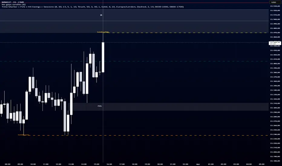
Session Liquidity + FVG ToolkitSession Liquidity + FVG Toolkit is an all-in-one smart money concepts overlay designed for traders who want key intraday and higher-timeframe reference points directly on the chart. It includes: Fair Value Gaps (bullish and bearish) Optional extension of FVGs to the right Dynamic open-gap reduction as price partially fills the imbalance Automatic removal of fully filled gaps Minimum FVG size filter in ticks Centered FVG labels Custom daily time markers with adjustable time and color H4 swing highs and lows visible on any timeframe Asia session high and low London session high and low Broken level coloring before removal Full customization for colors, visibility, line style, and line width This script is built for traders who focus on liquidity, imbalances, higher-timeframe reaction levels, and session-based execution. Key Features Combines multiple tools into one chart overlay Helps identify liquidity levels across sessions Highlights unfilled price imbalances Keeps the chart cleaner by hiding filled or broken zones Works across different timeframes while preserving H4 referencesChỉ báocủa jonas0777204
RSI + MACD + EMA Alignment Trend Signals [eunchoding]Trend-following signal indicator combining RSI regime filter, MACD confirmation, and EMA 7/25/99 alignment. This indicator uses RSI relative to the 50 midline, MACD/signal positioning around the zero line, and EMA 7/25/99 alignment to identify directional long and short signals. It also visualizes RSI and normalized MACD in a separate panel while plotting EMA lines and entry/exit markers on the price chart.Chỉ báocủa eunchoding27
forex swingIt detects swing highs and lows based on a chosen length. When price breaks these levels, it marks BOS (Break of Structure) or CHOCH (Change of Character). It tracks the current trend (bullish or bearish) based on these breaks. 👉 Then it adds a filter using the Weekly Pivot: If price is above Weekly Pivot + bullish structure → green background If price is below Weekly Pivot + bearish structure → red background ✔️ It also plots the Weekly Pivot line on the chart. In simple terms: ➡️ It shows market structure (SMC) + confirms it using Weekly Pivot to highlight bullish/bearish zones visually.Chỉ báocủa sudhakar_kb29
market sentimentThis code acts as a Market Momentum & Intensity Tracker. It converts raw price and volume data into a clear "Mood Dashboard" to help you identify the strength of a trend. Simple Breakdown of What the Code Does: * Data Extraction: It automatically pulls data (Price and Volume) for the asset you select from the menu, such as NIFTY, BANKNIFTY, CNXFINANCE, or HDFCBANK, regardless of which chart you are currently viewing. * The "Intensity" Logic: The code calculates a Speed Ratio. It compares today's Candle Body Size and Trading Volume against their 20-day averages. * High Ratio (> 2.0): Means the move is twice as strong as usual (Institutional activity). * Low Ratio (< 1.2): Means the move is weak or standard (Retail activity). * Classification into 6 Stages: Based on the color of the candle (Red for Selling, Green for Buying) and the Speed Ratio, it classifies the market into 6 specific "Sentiments": * Stage 1 (Heavy): Panic selling or aggressive FOMO buying. * Stage 2 (Normal): A steady, healthy trend. * Stage 3 (Low): Exhaustion; the move is slowing down or stabilizing. * Visual Dashboard: It creates a clean, customizable table on your chart showing the last 7 days of data. This allows you to see at a glance if the market is shifting from "Panic Selling" to "Stable Buying." The Main Benefit: It filters out "Market Noise." By looking at the Sentiment column, you can avoid "catching a falling knife" during Heavy Selling or chasing a rally that has already reached Low Buying (Exhaustion) levels. In short: It tells you not just where the price is going, but with how much force it is moving.Chỉ báocủa sudhakar_kb27
Past Months High And Low Author: Josh0183 // Version: 1.0.0 Past Months High And Low A configurable multi-month indicator that visualizes the current month (CM) and up to 12 previous months (PM1–PM12) on the price chart. Each month can be shown or hidden and styled with separate High/Low colors. Includes optional mid-lines, a zone overlay, and a Broken Level system with per-month coloring, labeling, and a break-marker. Proximity alerts are available to notify when price approaches key monthly levels. Auto-fade feature helps keep the chart readable by diminishing older months. Key features: - CM (Current Month) visualization with customizable High/Low colors and line style - PM1 … PM12 visualization with individual visibility and color pairs - Optional Mid Lines with a dedicated color - Zone overlay to emphasize a price band - Broken Level indicators with configurable colors, labels, and break markers - Proximity alerts (Enable Proximity Alerts + Alert Distance %) - Auto-Fade Older Months to emphasize recent activity - Fully input-driven, scalable design for clarity and customization Use cases: - Trend context: observe month-over-month dynamics - Support/resistance visualization across a rolling 12-month window - Quick visual cues for near-term levels and potential break points */ // Extended "How to read" section /* Extended How to Read (text-only guidance) How to read this indicator at a glance - CM (Current Month): The active month line(s) show today’s context. If CM High/Low colors are blue/green, look for current momentum and immediate resistance/support cues around the present price. - PM1–PM12: Each past month displays a High/Low band in its own color pair. PM1 is the most recent completed month, PM12 is the oldest visible month. More recent months are generally more relevant for short- to mid-term context. - Mid-lines: A light reference line runs across the chart to mark the mid-point of the visible range for each month, helping you gauge how price sits relative to the month’s range. - Zone overlay: A shaded band highlights a target zone or risk area. If price sits inside the zone, pay attention to whether price is gravitating toward the zone’s boundaries or crossing through it. - Broken Levels: If a month’s level has been breached recently, the indicator marks the breach with month-specific colors. A “Broken” label may appear near the breached line, and, if enabled, a break marker will appear on the exact bar where the break occurred. - Price scale labels: The scale shows which line corresponds to which month (e.g., PM1 = most recent past month, PM12 = oldest), with CM representing the current month. Quick-start checklist (minimum viable setup) - Set Number of Previous Months (i_numMonths) to 3–6 to validate the visuals without clutter. - Enable CM (Show Current Month) if you want current-month context; pick CM High/Low colors that contrast with PM colors. - Enable PM1–PM12 as needed: - Show PM1 (the most recent past month) - Show PM2 - … continue up to PM12 as desired - Choose per-month High/Low color pairs that are distinct and easy to differentiate. - If you want mid-lines, enable Show Mid Lines and select a visible Mid Line Color. - If you want a reference band, enable Zone and adjust Zone Color to your palette. - If you’re monitoring strength/reversals near level boundaries, enable Proximity Alerts and configure the Alert Distance (%). - If you plan to emphasize recent activity, enable Auto-Fade and set Max Fade to taste (e.g., 40–70%). How to read common scenarios - Price rising toward PM1 High: look for a potential push into PM1’s upper band; watch for a test of CM boundaries for momentum shift. - Price crossing the Zone boundary from below: the zone acts as a target; a break through the zone may indicate a stronger move; check PM2/PM3 levels for alignment. - Break event on PM4: if a PM4 level breaches (Broken Level active), check CM and PM1–PM3 for supporting context; a break marker indicates the exact bar of breach. - Auto-fade engaged: the most recent months (PM1–PM3) appear darker/less transparent; older months fade toward the background, helping you focus on recent dynamics. What to look for during live trading - Confirm convergence/divergence between CM and PM1–PM3 signals. - Use PM1–PM3 as a layered support/resistance map; stronger confluence across several PMs increases level significance. - If proximity alerts fire, review price relative to corresponding month’s High/Low and break status to decide on entries/exits. Notes on readability and customization - If you publish with many months visible (PM1–PM12), consider enabling Auto-Fade to maintain readability on smaller displays. - For dense charts, you can temporarily hide PM9–PM12 and rely on CM plus PM1–PM6 for a cleaner view, then re-enable as needed. Chỉ báocủa josh01837
OBS and FVGSSimple market structure and ides Uptrend (Bullish): Characterized by a series of higher highs (HH) and higher lows (HL). Downtrend (Bearish): Identified by lower lows (LL) and lower highs (LH). Consolidation (Sideways): The market moves within a range, often before a large move, representing an accumulation or distribution phase. Structure Components: Involves identifying key swing highs (peak before a down move) and swing lows (trough before an up move).Chỉ báocủa Tryder_OG11150
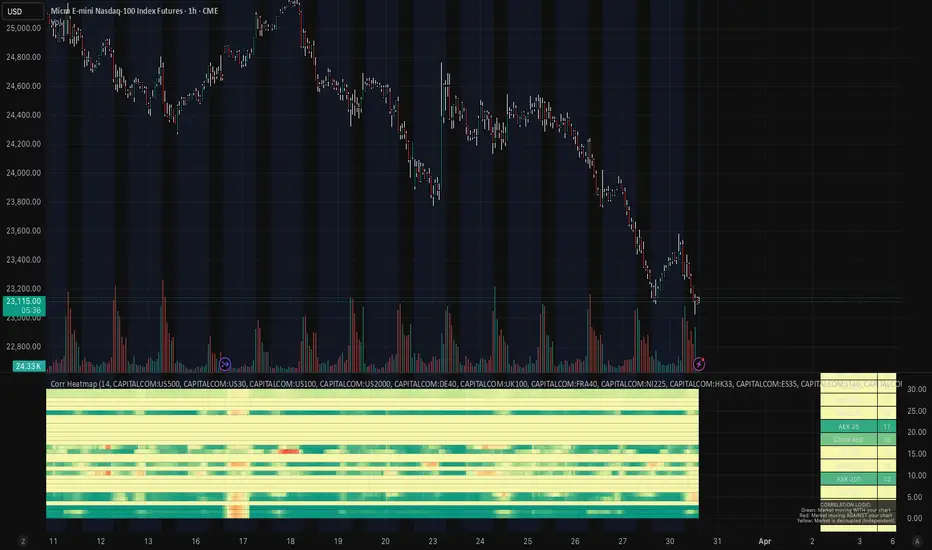
Stock Market Correlation Heatmap PROStock Market Correlation Heatmap PRO This script is designed to provide a real-time view of how global equity markets are moving relative to the current chart, using correlation as the primary metric. Instead of focusing on a single instrument in isolation, it offers a broader perspective by tracking multiple indices simultaneously and visualizing their relationship through a structured heatmap. Core Concept Markets rarely move independently. Major indices across the world are often highly correlated during risk-on or risk-off environments, and understanding these relationships can provide additional context for trade decisions. This script calculates rolling correlation values between the current chart and a basket of global indices, then translates those values into a visual heatmap. Correlation Logic Correlation measures how closely two instruments move together: • +1.0 → Strong positive correlation (moving together) • 0.0 → No meaningful relationship • -1.0 → Strong negative correlation (moving opposite) By continuously recalculating these values over a configurable lookback period, the script provides a dynamic view of market alignment. Global Market Coverage The heatmap includes a wide range of global indices, including: • US markets (S&P 500, NASDAQ, Dow, Russell) • European markets (DAX, FTSE, CAC, Euro Stoxx) • Asian markets (Nikkei, Hang Seng, KOSPI, China A50) • Emerging and regional indices This allows users to quickly assess whether moves are localized or part of a broader global trend. Spectral Heatmap Visualization Correlation values are mapped to a multi-step color gradient for clarity: • Dark Green → Strong positive correlation • Light Green → Moderate alignment • Yellow → Neutral / decoupled • Orange → Weak inverse correlation • Red → Strong negative correlation This “spectral” approach allows for quick interpretation without needing to read raw numbers. Market Tide (Average Correlation) The script calculates an aggregate correlation value across all tracked indices, referred to as the “Market Tide.” This represents overall global alignment with the current chart and can be used to identify: • Broad market consensus • Divergence between the chart and global flows • Strength or weakness of a move relative to the wider market Use Cases This tool can be used for: • Confirming trade direction with global market alignment • Identifying divergence (when your chart moves independently) • Avoiding trades during low correlation / mixed conditions • Understanding risk-on vs risk-off environments It is particularly useful for indices, futures, and macro-driven markets. Interpretation Guide • Strong Green Across Board → Broad market agreement (trend confirmation) • Mixed Colors → Fragmented market (lower conviction environment) • Red Across Board → Inverse positioning (potential hedge or divergence) • Yellow / Neutral → Lack of clear global direction Customization • Adjustable correlation lookback period • Fully customizable symbol list • Editable color palette for visual preference Notes This script is intended as a contextual tool to support decision-making. It does not generate direct buy or sell signals and should be used alongside price action, structure, and risk management.Chỉ báocủa ZenOutMan2214
Breadth Alpha Breadth Alpha A quantitative market-breadth dashboard that transforms raw breadth data into actionable, regime-aware trade signals — then validates them with a built-in backtest engine. What It Does 1. Data Layer Pulls the percentage of S&P 500 stocks trading above their 20 / 50 / 100 / 200-day moving averages and blends them into a single weighted composite (200d weighted 10x more than 20d) to emphasize structural trend health over short-term noise. 2. Momentum Layer Four stacked histogram bars show the rate-of-change of the composite at four lookback horizons (default 1 / 4 / 10 / 20 bars). When all four layers agree ("4/4 confluence"), directional conviction is highest. 3. Regime Detection The composite is classified into four regimes — Overbought, Bullish, Bearish, Oversold — using configurable thresholds (default 70 / 30). Background gradient zones and a real-time info table keep the current state visible at a glance. 4. Smart Signal Scoring Six raw signals (OS Entry/Exit, OB Entry/Exit, Golden/Death Cross) are scored by historical edge. High-EDGE signals (e.g. OS Entry) receive double weight; negative-EDGE signals (e.g. Golden Cross) are disabled. A regime filter ensures long signals fire only in Bear/Oversold regimes and short signals only in Bull/Overbought regimes — solving the classic "losing money in bull markets" problem of naive mean-reversion breadth strategies. 5. Backtest Analytics (10 x 16 table) For every signal the panel reports: count, hit rate, average & median forward return, standard deviation, best/worst case, and a risk-adjusted EDGE ratio (avg / std). A regime section adds per-bar Sharpe ratios, and a confluence section quantifies the value of momentum alignment. Users can sweep the Forward Bars parameter to study signal decay over holding periods. How To Use It - Look for Smart Buy/Sell markers — they only appear when score >= minimum threshold AND the regime filter passes. - Check the Info Table (top-right) for real-time breadth values, momentum count (x/4 Up), and the current signal score (BUY/SELL x/5). - Use the Backtest Table (bottom-left) to audit which signals actually deliver edge on your chosen symbol and timeframe. Signals with EDGE > 0.5 are statistically meaningful; negative EDGE means the signal works in reverse. - Adjust Forward Bars (5 / 10 / 20 / 50) to find the optimal holding period where signal edge peaks before decaying. Design Philosophy Most breadth indicators show data. Breadth Alpha shows data, scores it, filters it by context, and proves whether it works — all inside a single Pine Script indicator with zero repainting. Chỉ báocủa possu7
PROP VAULT Buy and Sell Signal PROP VAULT Clean signals for simulation purposes. Shows clear BUY (green) and SELL (red) labels Draws horizontal entry line at signal price Works on any timeframe and any asset Signals are for simulation / educational purposes only. Not financial advice.Chỉ báocủa Propvaultsignals229
ORB Retest Strategy (15m ORB + 5m Entry) we will win this is the orb strategy we will win this is the orb strategy we will win this is the orb strategy we will win this is the orb strategy we will win this is the orb strategy we will win this is the orb strategy Chỉ báocủa Gioharper23
Multi-TF Dashboard: RVOL, RSI, & Comp RSthis script displays relative volume across multiple time frames, relative strength and relative strength vs various etfs . the ETF is customizedChỉ báocủa duodom10
Dynamic Daily Levels & FlipsDaily levels to be entered manually. those levels are based on night and morning session. I use the level that Roger Scott is providing in his morning pre watch show. I use this levels on etf's onlyChỉ báocủa duodom10
Momentum Candle - Engulfing / PanjangKonfirmas khusus LTF , di M5 m3 dan m1 supaya menipis sl dan lainnya , bisa pake buat scalping Chỉ báocủa Devriputraa103
NMC FX HTF Key Level FINAL v3Key level dari metode NMC FX hanya mencari zona di HTF m15 , m30, H1 , H4 dan lain lainChỉ báocủa Devriputraa54
swag blocksswags script to show orderblocks that are strong with volume. it aligns heavily to levels that are shown on heatmap.Chỉ báocủa notswxg34
Trish A+ Sweep EngineA mechanical liquidity‑sweep detector for London and NY sessions. Confirms A+ setups using trend bias (200 SMA), micro‑momentum (5/8/13 EMA), volume expansion, and sweep‑reclaim structure. Designed for 5‑minute sweeps with 1‑minute execution.Chỉ báocủa trishmurray31722