Ichimoku Cloud: Reading Market Structure Through One IndicatorThe Ichimoku Cloud looks like chart spaghetti at first. Fair enough. Once you know what to watch, though, the Ichimoku indicator puts trend, momentum, support, resistance, and crypto market structure on one chart.
☁️ Start With the Cloud
Ichimoku Cloud explained in plain English: crypto trading above the cloud has a bullish bias. Below it, bears have the upper hand. Inside? Usually chop. Best not to get cute there.
Two Ichimoku components, Senkou Span A and B, build the cloud and plot potential support and resistance ahead of price. A fat cloud can be tough to punch through. A twist can hint at a change in structure. Both are worth watching in Ichimoku Cloud crypto setups.
⚡ Tenkan Sen + Kijun Sen
The Tenkan Sen reacts faster to price, while the Kijun Sen is the slower baseline. Keep an eye on a flat Kijun, too. Price has a habit of drifting back toward it.
Tenkan above Kijun leans bullish; below leans bearish. Still, don’t ape into every crossover. A bullish cross above the cloud carries more weight than one buried in sideways garbage.
A decent Ichimoku strategy needs context. One crossover alone doesn’t cut it.
👀 Chikou Span: Quick Reality Check
The Chikou Span helps weed out sketchy setups. Say Bitcoin is above the cloud, Tenkan holds above Kijun, and Chikou has clear space behind it. Bulls have a much cleaner setup.
Everything tangled together? Pass. No trade is a trade.
₿ Reading Crypto Structure
With Ichimoku Bitcoin, you want the pieces backing each other up. Price, cloud, Tenkan, Kijun, and Chikou moving in sync make trend analysis cleaner and keep bitcoin technical analysis from turning into crossover roulette.
Same idea works outside crypto. On gold, a cloud breakout followed by a Kijun retest can help filter a legit move from a cheap fakeout.
For Ichimoku TradingView setups, the default settings are fine to start with. Read the Senkou Span, Tenkan Sen, Kijun Sen, Chikou Span, cloud, and price as one picture. Chart looks messy? Leave it alone. Crypto will cough up another setup soon enough.
This content is for informational purposes only and does not constitute financial or investment advice.  Education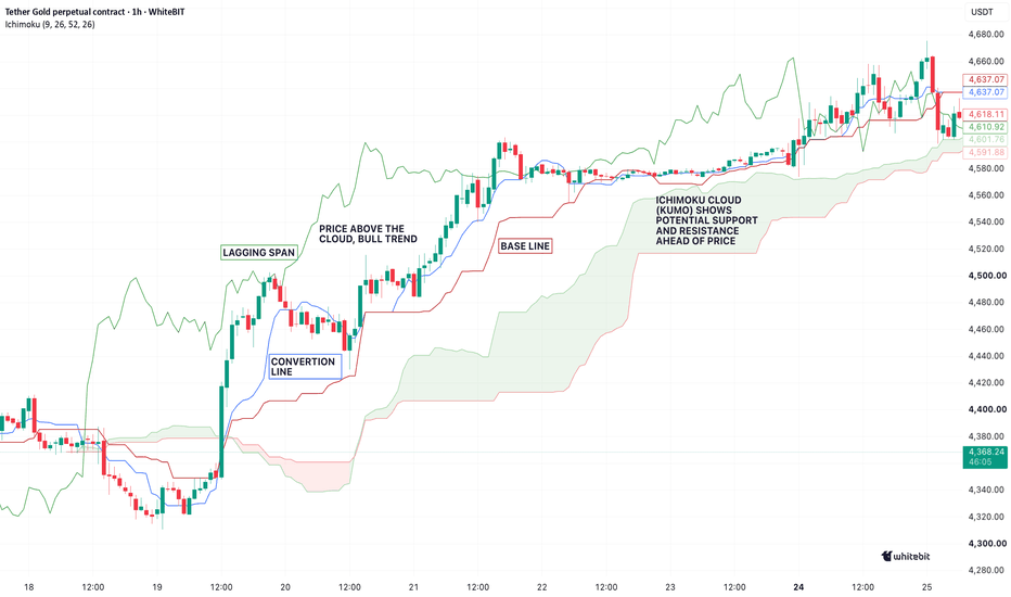
Why Every Trend Needs a PauseCrypto traders love when the market just sends it. But healthy market trends never move in a straight line. Every move needs a breather.
🫁 No Trend Goes Full Send Forever
Trend development has a natural market rhythm: push, pause, pullback, repeat. A trend correction lets traders take profit, leverage cool off, and price find new liquidity.
That’s why a pullback doesn’t automatically kill trend continuation. The real question is whether the market structure is still intact.
📉 Correction or Reversal?
This is where price action matters. Are higher lows holding? Did previous resistance become support? Has the crypto market structure actually broken?
Good trend analysis separates normal price movement from a genuine shift in market behavior. Calling every red candle a reversal is jumping the gun.
And it’s not just crypto. Take the S&P 500: even during strong bull runs, the index regularly pulls back or trades sideways before pushing higher. Different market, same basic mechanics.
₿ Bitcoin Plays the Same Game
Look at bitcoin trends through historical market analysis and the pattern is obvious. Expansion, correction, consolidation, expansion again.
Solid bitcoin chart analysis means understanding these trend phases, not freaking out over one ugly candle. The same applies when tracking broader crypto trends.
A pause can look boring or even nasty. But sometimes the market isn’t running out of gas — it’s just clearing the decks for the next leg.
This content is for informational purposes only and does not constitute financial or investment advice.
Education 
Linear Regression Channel: Understanding Trend DeviationSup Traders! 👋
Crypto charts can be messy as hell. One minute Bitcoin is cruising, the next it’s all over the place. A linear regression channel cuts through the noise, showing where the market trend is heading and how far price movement has drifted from its normal path.
📐 What’s Under the Hood?
The linear regression indicator draws a best-fit line through price data and builds a trend channel around it. The center line reflects the general direction, while the outer bands highlight trend deviation and price deviation.
For crypto trend analysis, this beats eyeballing the chart and hoping for the best. You get cleaner trend visualization and a quick read on whether price is stretched.
🎯 How Traders Use It
In linear regression trading, start with the slope. Rising regression channel? Bulls have the wheel. Falling? Bears are calling the shots. Flat? Welcome to chop city.
Price near the upper band can signal an overheated move, while a dip toward the lower band in an uptrend may offer a cleaner entry. But don’t jump the gun — confirm the setup with volume, market structure, RSI, or support and resistance.
For bitcoin trend setups, play around with lookback periods.
Shorter channels react faster
Longer ones are better for historical trend analysis and filtering market noise
🛠️ TradingView Setup
Use the tradingview regression channel across a meaningful trend, not two random points that make your setup look sexy. For better crypto chart analysis, check whether channel boundaries overlap with previous highs, lows, or breakout zones.
⚠️ Don’t Treat It Like a Crystal Ball
Linear regression crypto analysis tracks historical behavior — it doesn’t predict the future. News, liquidations, or sudden volatility can blow price straight through the channel.
Use the linear regression channel to read direction, structure, and deviation. It’s a solid map, but definitely not autopilot.
This content is for informational and educational purposes only and does not constitute financial, investment, or trading advice.
 Education
The Best Moves Never Ring a BellMost crypto trends don't start with fireworks. They sneak up while everyone's calling the market "dead" or sitting around waiting for confirmation that shows up way too late.
Smart money doesn't FOMO — it stacks positions.
That's why trend formation usually looks boring: low volume, tight ranges, zero hype. Funny enough, that's when trend analysis actually gets interesting.
📉 Boring Doesn't Mean Weak
One of the biggest tells is volatility contraction. Price chills out, sellers run out of steam, and buyers quietly soak up supply.
This shift in market behavior won't go viral, but it's often where the real move starts.
Pull up your crypto charts and watch the price action. If bad news can't knock the market lower, somebody's loading up.
🧩 Structure First, Momentum Later
Forget chasing pumps. That's how people get wrecked.
Read the crypto market structure instead.
Higher lows, repeated resistance tests, and cleaner breakouts are early signs of trend development. Most traders only notice price trends once the easy part of the move is already gone.
📊 History Doesn't Lie
Go back and study old bitcoin trends with proper bitcoin chart analysis and historical market analysis.
The strongest market trends usually spend weeks doing absolutely nothing before trend emergence kicks in. Once momentum shows up, trend continuation often feels obvious—but by then, the market has already done most of the heavy lifting.
This content is for informational purposes only and shouldn't be considered financial or investment advice. Always do your own research before making any trading decisions. Education 
Fractal Nature of Crypto Markets: The Market Loves an Encore✌️ Sup Traders!
Ever looked at a chart and thought, "Hold up... I've seen this movie before"? Chances are, you have. That's how a fractal market works. The same fractal patterns keep popping up because traders never stop making the same emotional mistakes. History doesn't repeat, but it sure as hell rhymes.
Forget crystal balls. Fractal analysis is all about spotting familiar setups before they unfold. Crypto fractals won't tell you where price is headed, but they can give you an edge while everyone else is busy chasing breakouts and getting rekt.
📈 Zoom Out or Trade Blind
One timeframe? That's how people get rekt.
Do your multi timeframe analysis first. Weekly and daily tell you where the money is flowing. The 4H and 1H are for execution, not guessing.
Wait for price action to line up.
If the higher timeframe isn't on your side, don't try to be the hero.
🟠 Bitcoin Keeps Pulling the Same Tricks
The funny thing about bitcoin fractals? Bitcoin loves recycling old moves.
Solid bitcoin chart analysis isn't about hunting for identical candles. Compare the current price structure with previous cycles, watch for liquidity grabs, fakeouts, failed breakouts, and familiar chart patterns. Those recurring moves tell you way more than candle-by-candle copycats ever will.
⚡ Trade the Story, Not the Indicators
Indicators are late to the party more often than not. Market geometry and crypto market structure usually tip their hand first.
Dig through historical chart patterns, replay charts in crypto TradingView, and hunt for market fractals backed by clean price action. You're not trying to call every top or bottom—that's a fool's errand. You're simply stacking the odds in your favor before everyone else catches on.
This article is for informational purposes only and does not constitute financial or investment advice. Education 
Education 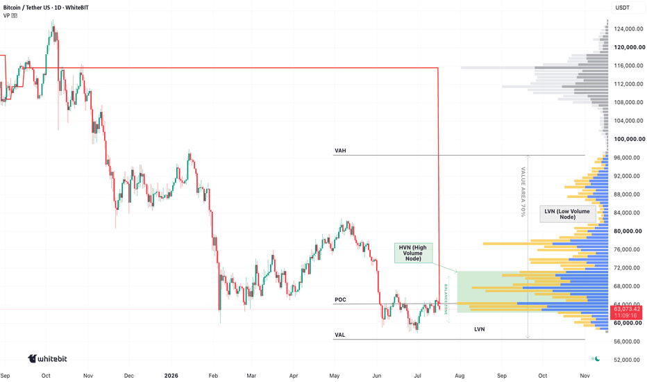
Why Volatility Comes in ClustersThink the market's dead because nothing's moving? Don't get comfy. One headline, one whale, one liquidation cascade—and suddenly all hell breaks loose. That's volatility clustering: quiet markets often explode into chaos, and once things get wild, they usually stay wild for a while.
🌊 Low Volatility Is a Trap
Low volatility isn't the market resting—it's pressure building. Leverage stacks up, liquidity gathers around key levels, and traders let their guard down. Then the market pulls the rug. That's how volatility expansion begins. In volatility in crypto, calm can turn into chaos in minutes. That's the nature of crypto volatility.
When the market stays flat for days, traders often start reaching for setups that aren't really there. Alerts, key levels, and confirmation matter more than forcing action out of boredom.
🔥 Volatility Feeds on Itself
Once high volatility kicks in, it snowballs. Stops get smoked, shorts get squeezed, algos jump in, and retail FOMOs at the top. That's classic market behavior, which is why market volatility comes in waves instead of random spikes. Trying to catch a falling knife rarely ends well.
🪙 Bitcoin Sets the Pace
Bitcoin volatility still drives the market. If BTC rips or gets nuked, most altcoins follow. That's why any solid crypto market analysis starts with bitcoin price volatility.
📊 When the Market Shifts
Markets don't stay in the same gear forever, and volatility analysis is one way to spot it early. Historical volatility, recurring volatility cycles, and changing market dynamics often tell a bigger story than a single candle. That's why volatility clustering matters—once price volatility wakes up, it rarely disappears overnight.
This content is provided for informational and educational purposes only and should not be considered financial, investment, or trading advice. Education 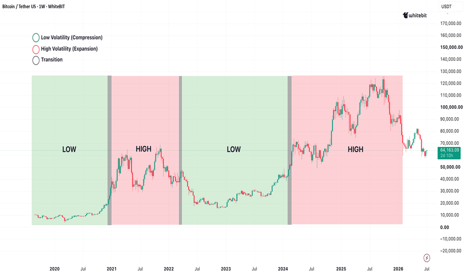
Education 
Education 
Why Traders Keep Coming Back to ItHello, traders! ✌️
Crypto loves chaos.
One day Bitcoin is grinding higher, the next it's shaking everyone out with a nasty wick. That's exactly why the supertrend indicator remains popular. It gives traders a cleaner view of trend direction without cluttering the chart with a dozen extra tools.
Unlike fixed trend tools, the supertrend indicator adjusts to volatility in real time. Sharp moves push the line farther from price, while quieter conditions pull it closer. The result is a cleaner view of trend strength and direction, which is exactly why it's widely used as an atr volatility indicator and volatility trend indicator.
🙅♂️ Stop Trading Every Flip
A lot of newer traders get chopped up by treating every color change as a buy or sell signal.
That's usually where supertrend trading goes sideways.
Many experienced traders use Supertrend as a filter instead. If the indicator is pointing up, they focus on long setups and ignore most countertrend noise. If it's pointing down, they stop trying to catch every bounce.
In that role, Supertrend works surprisingly well as a trend following indicator traders can read at a glance, and a practical crypto trend indicator for staying on the right side of momentum.
📈 Where Supertrend Actually Earns Its Keep
Strong directional markets are where supertrend crypto setups tend to shine. During major moves, including plenty of well-known supertrend bitcoin trends, the indicator often stays aligned with price while filtering out minor pullbacks and random volatility spikes.
For traders focused on market direction crypto analysis, that's valuable. The indicator turns raw price action into a simple form of price trend visualization, making crypto chart analysis faster and less subjective.
⚠️ The Weak Spot
No trend tool enjoys chop, and Supertrend is no exception.
When the market starts ranging, the indicator can flip back and forth, creating a string of fakeouts and whipsaws. That's why a solid supertrend strategy usually combines trend structure, key levels, liquidity zones, or volume rather than relying on the indicator alone.
The biggest takeaway from any serious supertrend analysis is pretty simple: Supertrend doesn't create trends. It helps you see them more clearly when they're already there.
For educational purposes only. Nothing in this article should be considered financial or investment advice.
Education 
Imbalance in Crypto: How Price Moves Too Fast in One DirectionA market imbalance is what happens when price just rips in one direction and barely gives the market time to breathe.
In plain trader language, price imbalance crypto is that moment when the chart skips through a zone instead of moving through it slowly. One big candle, very little back-and-forth, and suddenly the level is gone.
On the chart, it usually looks clean and aggressive. Under the hood, it often means one side showed up hard, while the other side got run over.
🚀 Why Crypto Moves Like This
Crypto is thin, emotional, and heavily leveraged. A whale order, liquidation cascade, news event, or sudden drop in liquidity can turn quiet chop into rapid price movement within seconds.
That is why crypto price movement often feels so sharp. During strong crypto volatility movement, price can move through levels fast and leave messy zones behind.
Bitcoin does this too. A bitcoin imbalance after a sweep or breakout can show that buyers or sellers came in with serious force.
🕳️ Fair Value Gap Crypto: The Skipped Zone
A fair value gap crypto setup is basically a zone where price didn’t spend much time. It moved through fast, left a thin spot on the chart, and kept going.
That thin spot is what traders call a market inefficiency. In fair value gap trading and price inefficiency trading, these zones get attention because they show where the move was too one-sided.
But not every gap is a big deal. Some price gaps crypto traders mark on charts get filled fast, some sit there for weeks, and some just fade into the background like nothing happened.
🧱 Imbalance and Crypto Market Structure
Imbalance trading makes more sense when it is viewed inside crypto market structure.
A big candle alone does not explain much. Context matters: liquidity, key highs and lows, volume, and whether there was a market structure shift before or after the move.
A fair value gap in random chop can be just noise. A fair value gap after a clear shift in structure can carry more information about the move.
🔥 Price Delivery Imbalance
Price delivery imbalance means price was delivered too aggressively in one direction.
Buyers ran over sellers, or sellers nuked the bids. There was no clean auction, no real balance, and no smooth movement through the level.
That is why these areas can appear in crypto chart analysis as zones where momentum, liquidity, and market inefficiency all meet.
✅ Bottom Line
Imbalance can help explain momentum, liquidity, price inefficiency, and possible reaction zones, but it is not a standalone signal. The real value is in how market imbalance connects with fair value gap crypto zones, crypto market structure, and the story behind the move.
This article is for educational purposes only and does not contain financial, investment, or trading advice.
Education 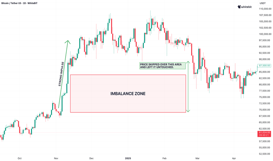
Why Markets Move Sideways Most of the Time✌️ Sup Traders!
A sideways market is not dead price action. It is the market taking a breather after a strong move. In crypto, this often shows up as crypto consolidation, where buyers and sellers fight inside a tight zone without a clear winner.
That is one reason why markets move sideways: price needs time to absorb liquidity, reset momentum, and build the next structure.
📦 Range Bound Market: The Chop Zone
A range bound market happens when price keeps moving between support and resistance. Bulls buy the lows, bears sell the highs, and the chart starts crab-walking.
This type of sideways price action can look boring, but it tells a lot about crypto market behavior. The market is testing levels, trapping late entries, and building liquidity on both sides.
₿itcoin Sideways Movement
A bitcoin sideways movement often slows down the whole crypto market. When BTC is stuck in a range, altcoins usually follow the same mood: fake pumps, sudden wicks, and plenty of chop.
This is typical market consolidation crypto behavior. The chart may look quiet, but under the hood, positions are being built and flushed.
⚔️ Trend vs Range Market
The key difference in a trend vs range market is direction. A trend has clean momentum. A range has rotation.
In a ranging market crypto setup, price often moves from one side of the range to the other. Some traders may view price range trading as an option, focusing on range highs, range lows, and the midpoint. But fakeouts are common, so context matters.
📊 Market Structure Matters
Reading market structure crypto helps separate real moves from noise. A clean breakout can shift the range into a trend. Until then, the market is still in chop mode.
That is why crypto chart consolidation and other price movement patterns should be read as context, not certainty.
🚦 Final Takeaway
Markets spend a lot of time sideways because price needs to reset, absorb liquidity, and prepare for the next move. A range trading market may look boring, but it is often where the next big setup starts forming.
This material is for educational purposes only and does not constitute financial advice. Education 
Keltner Channels in Crypto: A Volatility-Based View of PriceSup Traders! 👋
Crypto rarely moves in a straight line. One minute the chart is stuck in a tight range, the next it breaks out with a nasty wick and a volume spike. That is where keltner channels come in. They help traders read price through volatility, not just direction, giving a cleaner view of when the market is calm, stretched, or starting to expand.
📊 Keltner Channel Explained
The keltner channel indicator is a channel based indicator built around a moving average, usually an EMA. Above and below that middle line, it plots bands based on ATR — Average True Range. That is why it is also known as an ATR channel indicator or average true range channel.
In simple trader language: the middle line shows the market’s baseline, while the outer bands show how far price is moving relative to recent volatility.
⚡ Why It Works Well in Crypto
The logic behind keltner channels crypto is simple: crypto lives and dies by volatility. Tight bands often show compression, while wider bands suggest the market is heating up. As a crypto volatility indicator, Keltner Channels help frame crypto price ranges without making the chart feel overloaded.
For example, in bitcoin volatility analysis, expanding bands may show that BTC is moving into a more aggressive phase, while narrow bands can signal that price is coiling before a bigger move.
🔥 Keltner vs Bollinger Bands
Keltner Channels and Bollinger Bands both show how far price has moved from its average, but they measure volatility in different ways.
Bollinger Bands are based on standard deviation, so they expand quickly when price makes sharp moves or prints aggressive wicks. Keltner Channels use ATR, which tracks the average trading range and usually creates smoother, more stable bands.
In crypto, this difference matters. Bollinger Bands can highlight sudden volatility spikes, while Keltner Channels often give a cleaner view of the broader price range. For volatility bands crypto analysis, Keltner Channels may help traders cut through some market noise and focus on the underlying volatility structure.
📖 How Traders Read the Channels
Basic keltner channel analysis usually looks at where price trades inside the channel. If price keeps pushing near the upper band, momentum may be strong. If it stays near the lower band, sellers may be in control. If price keeps returning to the middle, the market may be ranging.
This is the core idea behind price channel trading: the bands are not magic levels, but they help map the current playing field.
🛠️ Strategy Without the Hype
A keltner channel strategy is not about blindly buying or selling every touch of the band. Crypto is full of fakeouts, stop hunts, and sudden reversals. The indicator works better when combined with market structure, volume, liquidity zones, and trend context.
In other words, Keltner Channels do not predict the future. They simply show how price is behaving against its recent volatility.
✅ Final Take
Keltner Channels are a practical volatility-based indicator for reading crypto market structure, helping traders identify when price is moving within a normal range, when volatility is expanding, and when the market may be stretching beyond its usual limits. They are not a signal machine, but rather a useful framework for understanding price action with more context.
This content is for educational purposes only and should not be considered financial or trading advice. Always DYOR and manage risk responsibly. Education 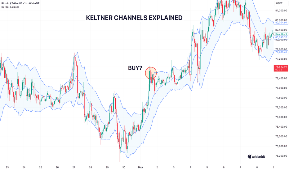
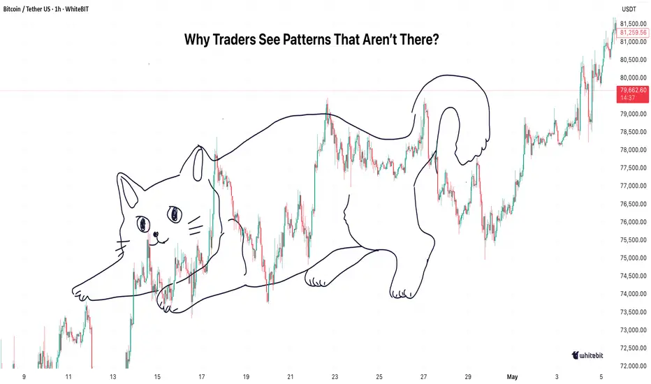
Seeing Patterns That Don’t Exist: How We Misread Crypto ChartsLet’s face it—every trader has been there: staring at a crypto chart, convinced there's a hidden pattern just waiting to be uncovered. The thing is, sometimes those patterns are purely in our heads. Welcome to the world of pattern recognition bias.
📈 The Allure of Patterns
Traders are hardwired to look for patterns. It's what we do. Pattern recognition trading is practically in our DNA. Our brains love structure, and when it comes to crypto chart analysis, we’re constantly on the lookout for patterns that promise to give us an edge. But here's the catch: sometimes, that quest for order creates an illusion in trading. Our minds love to force structure onto random price movements. And that, my friends, can lead us down a dangerous road.
🪤 The Trap of the False Pattern
The crypto market behavior is chaotic, plain and simple. It doesn’t follow a neat and tidy script. But when we look at a chart, we might think we’ve spotted a classic head-and-shoulders setup. Spoiler alert: it’s usually just noise. This is where false patterns trading becomes dangerous—traders mistake random price fluctuations for something meaningful. The reality? The market is just doing its thing—unpredictable and messy.
🧠 Trading Psychology: The Battle with Bias
So, why do we fall into this trap? Trading psychology is to blame. Our brains are wired to search for patterns, even when they aren’t there. This cognitive bias, called pattern recognition bias, is a huge stumbling block for traders.
For example , imagine you’re looking at a chart and spot what looks like a perfect double bottom setup. You get excited, thinking it's your ticket to a breakout. But in reality, it's just the market bouncing between random support and resistance levels. You’re craving structure, but the crypto market doesn’t care about your need for predictability. Instead, you’ve ended up in a visual bias trading zone, seeing a pattern that isn’t really there, just because you want it to be.
🥴 Market Perception vs. Price Action Psychology
Here’s the deal: when you're feeling the heat, don’t rush to act on every price move. Market perception trading often tricks us into thinking random fluctuations are trends. But in reality, it’s usually just noise.
Here’s a tip:
Pause before reacting – Don’t be in a hurry. Assess the broader market, not just the chart in front of you.
Identify key levels – Focus on support, resistance, and established trends instead of hunting for every pattern.
Stick to the facts – Let the price action guide you, not your brain’s urge to find structure. If something feels too good to be true, it probably is.
By slowing down and focusing on real price action, you’ll be able to avoid chasing illusions.
🔮 Price Action Psychology: Recognizing the Illusion
Price action psychology is all about focusing on how the market behaves at key levels—not chasing after patterns that may not even exist. When a setup looks “too perfect,” take a second to step back. Question whether it’s real or just noise. Trust your instincts, but don’t be afraid to hit pause. Patience and awareness will keep you from getting fooled by the illusion.
🏁 Final Take: Don’t Fall for the Illusion
At the end of the day, seeing patterns that aren’t really there is a textbook case of trading cognitive bias. Crypto market behavior is anything but predictable. It’s easy to get caught up in the fantasy of what we want to see, but that’s where the danger lies. Stay sharp, and don’t fall for the illusion.
This article is for informational purposes only and does not constitute trading advice. Education 
Wicks and Rejections: How Price Fails to Hold Levels✌️Hey folks!
In crypto, price doesn’t always break clean. Sometimes it taps a level, fakes everyone out, and snaps right back. That’s where price rejection comes into play. If you’re into wick analysis trading, reading candlestick wicks can tell you a lot about who’s really in control — bulls, bears, or just pure market chaos.
🗣️ What Are Wicks Really Telling You?
Wicks are the shadows on a candle, but in crypto, they’re basically footprints. Long wicks crypto traders watch often signal failed breakouts, liquidity grabs, or panic buying/selling.
A long upper wick? Buyers pushed price up, but sellers slammed it back down.
A long lower wick? Sellers dumped it, but buyers stepped in hard.
That’s classic candlestick rejection and one of the clearest signs that price fails to hold level.
📍 Spotting Market Rejection Levels
Strong market rejection levels usually form around:
previous highs and lows
support and resistance zones
round numbers
liquidity clusters
When price taps these zones and leaves rejection candles, it often reveals real market behavior crypto traders care about.
This is where price action wicks matter more than indicators. The wick tells the story before the candle closes.
📉 Bitcoin Wick Analysis and Fakeouts
If you’ve ever watched Bitcoin wick analysis in real time, you know BTC loves to run stops. One sharp move above resistance, everyone screams breakout… then boom — instant rejection .
These price rejection patterns often happen during volatile sessions or around news. It’s smart money shaking out weak hands before the real move starts.
On crypto chart wicks, these fakeouts are common because crypto trades 24/7 and liquidity can be thin.
📖 Read the Wick, Not the Hype
Not every wick means reversal. Context is king.
Ask yourself:
Did volume spike?
Is the wick rejecting a key level?
Is overall crypto price movement trending or ranging?
Did multiple candlestick wicks form at the same zone?
One wick can be noise. Repeated price rejection crypto signals at the same level? That’s information.
🏁 Final Take
Wicks show where price got slapped back. They expose failed moves, trapped traders, and weak breakouts. Learn to read candlestick rejection properly, and you’ll start seeing the market’s real intentions — not just the headline move.
This content is for educational purposes only and should not be considered financial or investment advice. Education 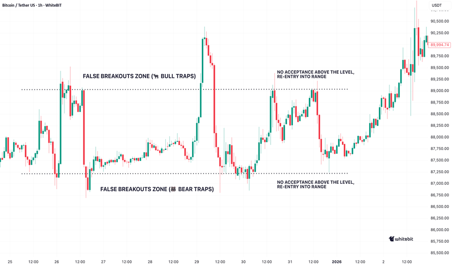
Why Trends Look Obvious Only in HindsightHello, traders! 😎
You’ve seen it a hundred times. Price moves, trend plays out, and suddenly the chart looks clean — almost too clean. Entries feel obvious, structure makes sense, and it seems like the market practically told you what was coming. That’s exactly where hindsight bias trading creeps in.
🌫️ It Never Feels That Clear in Real Time
The idea that trends are “easy to spot” mostly exists after the move is done. In live conditions, trading decision making is messy. Price action is noisy, signals conflict, and conviction is never 100%. What later looks like a clean breakout often felt like a coin flip in the moment. That disconnect is pure market hindsight bias — your brain smoothing out uncertainty after the fact.
🧠 The Brain Edits the Story
A big part of trading psychology hindsight is how memory works. You don’t remember the hesitation, the doubt, or the invalidations along the way. You remember the outcome. This is a classic case of cognitive bias trading, where the brain compresses a complex sequence of events into a simple narrative: “trend was obvious, I just missed it.” In reality, the psychology of markets is anything but obvious.
⚡ Bitcoin Trends Look Cleaner Than They Were
Take any bitcoin trend analysis. Zoom out, and it’s a textbook move. Higher highs, higher lows, strong continuation. But zoom into the actual execution phase, and it’s a different story. Pullbacks look like reversals, sentiment shifts fast, and liquidity grabs shake confidence. This is where crypto market psychology and real market behavior analysis come into play — not theory, but reaction.
🎭 Perception vs Reality
Most issues in trading mistakes psychology come from this gap. In real time, your market perception trading is influenced by emociones, uncertainty, and incomplete information. Your read on price action psychology evolves with every candle. But once the move is complete, your brain reframes it into a clean, logical sequence. That’s decision bias trading in action.
🏁 Final Take
The reason why trends look obvious is simple: your brain prefers clarity over chaos. But markets don’t operate in hindsight — they operate in uncertainty. Understanding crypto trader psychology means accepting that clean charts are a luxury you only get after the trade is over.
This content is for informational purposes only and should not be considered financial advice. Education 
VWAP in Crypto: Understanding Price Relative to VolumeSup Traders! 👋
VWAP is a go-to for most traders, but how much are you actually relying on it? Let’s unpack how the VWAP indicator works and why it’s a key part of any trader’s toolkit.
📉 What is the VWAP Indicator?
The VWAP indicator calculates the average price of a cryptocurrency, weighted by the trading volume. It gives a more accurate reflection of price action by factoring in how much of an asset is traded at each price point.
When looking at the VWAP chart analysis, you'll see a line showing the average price, which fluctuates based on both price and volume. This makes it a key tool in crypto trading, as it shows you where the market is positioned relative to volume.
🤔 Why VWAP Matters in Crypto Trading
In crypto trading, it’s crucial to understand both price and volume. VWAP helps you do this by showing how the price is moving in relation to the amount of trading activity.
The VWAP strategy is used by traders to identify key levels of support and resistance. If the price is above the VWAP, it suggests an uptrend. If it’s below, you might be looking at a downtrend. VWAP crypto trading is especially useful for intraday trading, helping traders spot market reversals and consolidations.
🛠️ How to Use VWAP in Your Trading
Here’s how you can incorporate VWAP into your trades:
VWAP as Support/Resistance. The VWAP indicator explained shows areas where price may reverse. If the price is above the VWAP, it’s likely in an uptrend, and if it’s below, you’re probably in a downtrend. These levels act as support and resistance zones.
VWAP Strategy for Confirmation. You can use the VWAP strategy to confirm price action. If the price breaks above the VWAP with high volume, it might signal a breakout. If it fails, watch for a potential reversal.
VWAP and Trend Confirmation. For Bitcoin VWAP analysis, you can confirm trends. When prices stay above the VWAP during an uptrend, it's a sign of sustained buying interest. If the price remains below the VWAP in a downtrend, it’s bearish.
⚖️ VWAP vs Other Indicators
Unlike price-only indicators, VWAP is volume-based, considering both price and trade volume. It helps distinguish between moves supported by strong volume and those driven by weak interest.
To get the most out of VWAP, you can pair it with trend indicators like Moving Averages (MA) or momentum indicators like RSI . These complement VWAP by confirming trends with volume.
⚠️ Avoid using VWAP with price-only tools like Bollinger Bands or basic support/resistance levels, as they miss the volume context.
📈 How to Read the VWAP Chart
The key to reading a VWAP chart is to observe the relationship between the price and the VWAP line. If the price is above the VWAP, it’s an uptrend , and if it’s below, it’s a downtrend.
⬆️ Above VWAP: Indicates an uptrend, and you might consider long positions.
⬇️ Below VWAP: Indicates a downtrend, and short opportunities may arise.
VWAP Crossovers: A price crossing above the VWAP is a bullish signal, while a cross below is bearish.
🪙 VWAP Trading in Bitcoin
For Bitcoin traders, the VWAP Bitcoin analysis is a must . With Bitcoin’s volatility, the VWAP helps you determine whether recent price movements are backed by strong volume. A breakout above the VWAP with heavy volume often signals bullish momentum, while a drop below could indicate a bearish reversal.
🏁 Final Take
To sum it up, VWAP is a volume-based indicator that provides a deeper look into market sentiment. It helps you understand where the price stands relative to trading activity, making it an essential tool for both intraday trading and long-term strategy. Whether you're trading Bitcoin or altcoins, VWAP can give you more insight into market dynamics.
This information is for educational purposes only and is not financial advice. Education 
Accumulation vs Distribution: How Market Phases Appear on ChartsSup traders 😎
Let’s be real — most losses don’t come from bad entries, they come from trading the wrong phase. If you can’t tell accumulation vs distribution, you’ll keep buying tops and selling bottoms. The chart shows it all — you just need to read the context.
📊 Understanding Market Phases in Crypto
If you strip the noise away, every chart is just a reflection of positioning. The idea behind accumulation vs distribution is simple: markets don’t move because of news — they move because large players build and unwind positions across different crypto trend phases. That’s the foundation of any serious market cycle analysis.
In market phases trading, the cycle rotates through accumulation, markup, distribution, and markdown. In crypto, this loop tends to be faster and more aggressive, but the logic stays the same. Understanding where you are inside the market cycle crypto helps you stop reacting to price and start reading crypto market structure instead.
⬇️ Accumulation Phase Crypto: Reading the Bottom
The accumulation phase crypto typically forms after a downtrend, when selling pressure fades and price enters price range consolidation. It looks slow and uneventful, but this is where positioning happens. You’ll often see subtle volume accumulation crypto, where dips are absorbed rather than extended. A clean bitcoin accumulation phase usually includes failed breakdowns and consistent reactions from support, showing that supply is being quietly taken off the market.
⬆️ Distribution Phase Crypto: Reading the Top
The distribution phase crypto plays out after an uptrend, when price shifts into another range but with a different intent. Structurally, it still looks like price consolidation crypto, which is why it traps late buyers. The difference is in behavior: rallies start to weaken, breakouts fail, and volatility increases. A typical bitcoin distribution phase reflects exhaustion — not through a sudden reversal, but through the inability to sustain higher prices.
🧠 Crypto Chart Structure and Market Behavior
Both phases look nearly identical on the surface, which is why traders misread them. The edge comes from understanding market behavior crypto within the range. In accumulation, the market defends lows and absorbs selling; in distribution, it struggles to hold highs and sells into strength. This is where reading crypto chart structure becomes more important than relying on standalone indicators.
Volume profile, OBV , or VWAP can add context, but only if they align with the broader bitcoin market phases. Indicators don’t lead — they confirm. The real signal is always in how price reacts around key levels.
⚡ Final Take
Once you start thinking in phases instead of setups, trading gets cleaner. Most mistakes come from ignoring the cycle — buying into distribution or shorting into accumulation. When you align with the market cycle crypto, you’re no longer guessing direction; you’re following positioning. That said, this is not financial advice — always make your own decisions and manage risk based on your own strategy. Education 
Noise vs Signal: What Crypto Charts Really Show🫡Sup folks!
Noise and signals are always fighting for your attention. But how do you separate the meaningful from the meaningless? In this post, we’ll break down the differences between market noise and trading signals, and how you can use this knowledge to sharpen your crypto trading game.
🔊 What Is Market Noise in Crypto?
Market noise crypto is all about the random price movements that don’t follow any predictable pattern. Think of it as static on your radio—you can hear it, but it doesn’t help you understand the music. In crypto, this noise can be caused by things like rumors, overreactions, or just random events that have no real impact on the long-term trend. Price action noise is often just short-term volatility that doesn’t represent the actual market structure. While it’s easy to get caught up in these movements, remember—they’re typically not signals you want to trade on.
🔍 Trading Signal vs Noise: Finding the Real Deal
On the flip side, a trading signal is a clear indication that something’s happening in the market that could be worth trading. Unlike random price movements, a signal is backed by data and market structure. Whether it’s a break of support or resistance, a pattern like an ascending triangle, or even a shift in volume, these signals give you actionable insights. In crypto market analysis, being able to identify trading signals amid the noise is the key to successful trading. If you’re constantly reacting to crypto volatility noise, you’re likely chasing shadows.
💥 Market Structure vs Noise: What’s the Difference?
One of the most important skills in crypto chart analysis is recognizing market structure. It’s the backbone of how price moves and provides a framework for understanding where the market is likely to head. Market structure vs noise isn’t just about ignoring the distractions—it’s about focusing on the bigger picture. The price action on your chart will often show you whether the market is trending or ranging. If you focus on this instead of getting distracted by random price fluctuations, you’re more likely to catch the right signals.
📉 Crypto Price Noise and Its Impact
We’ve all seen it—those moments when the Bitcoin price behavior seems to go completely off the rails. This is a classic case of crypto price noise. It’s often caused by factors like whale activity or sudden panic in the market. While it can be tempting to try and trade during these moments, the chances of success are slim. If you’re reacting to random price movements, you might be buying into a fake breakout or selling into a fake dip.
📝 Signal vs Randomness: How to Spot the Difference
To distinguish between real signals and randomness in the crypto market, here’s a quick checklist to help you filter out the noise:
Check for Consistency: Are the price movements consistent over time or just short-term fluctuations? Real trends show consistency.
Identify Key Levels: Look for support and resistance levels. If the price is repeatedly bouncing off these levels, it's a signal, not randomness.
Look for Patterns: Check if any recognizable patterns are forming (e.g., triangles, channels). These are signs of structure, not randomness.
Monitor Volume: A surge in volume during a price move is usually a strong signal. Low volume during price changes suggests randomness.
Ignore Sudden Spike: If the price jumps dramatically without any clear reason (like news or volume), it’s likely noise. Wait for confirmation before acting.
Evaluate Market Sentiment: Is the market reacting to real news or just sentiment-driven? Genuine moves are often based on real market events or shifts in sentiment.
🏁 Final Take
By learning to distinguish price action noise from real market movements, and focusing on the market structure vs noise, you’ll have a much clearer picture of what’s actually happening. Remember, signal vs randomness is a constant battle, but with the right approach, you can ride the waves of volatility without getting swept away.
However, always keep in mind that this is not financial advice make your own decisions and trade responsibly. Education 
Donchian Channels Explained: How Crypto Price RangesWhat’s up folks!
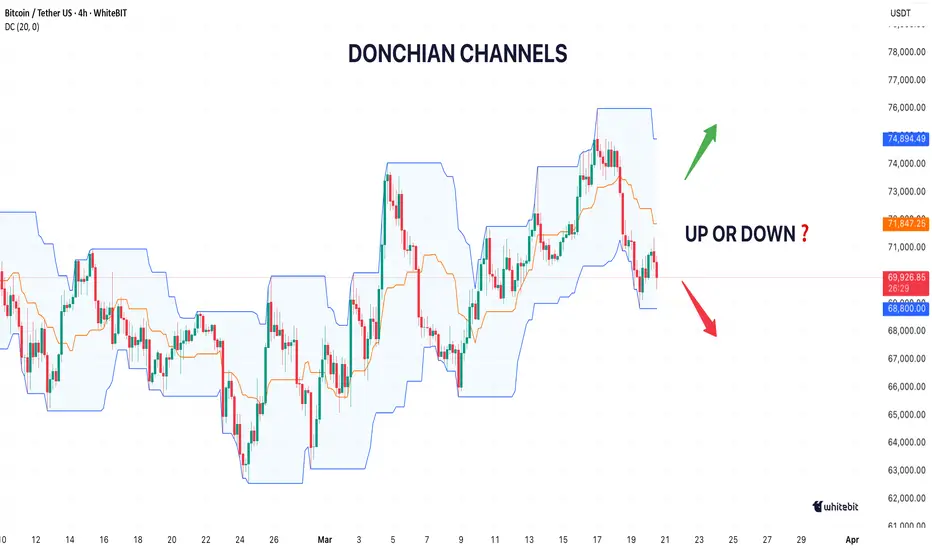
Wanna trade with confidence? The Donchian Channel gives you the edge you need by outlining the highest high and lowest low — perfect for identifying price channels and breakouts. In this guide, we’ll dive into how the Donchian Channel Indicator can be your best friend when navigating the fast-paced world of crypto trading.
Let’s get started!
🤔 What Are Donchian Channels?
At its core, the Donchian Channel is a technical tool that shows the highest high and lowest low over a set period. This creates a price channel that’s perfect for spotting trends, volatility, and potential entry or exit points. Think of it like a box that holds the price action — when it breaks out, you can bet the market’s about to make a move.
📈 How Donchian Channels Help in Crypto
The Donchian Channel is perfect for volatile assets. Traders use it to spot range breakouts, especially in sideways markets. A Donchian breakout occurs when the price moves above or below the channel, signaling a trade opportunity.
For example , if Bitcoin's price breaks above the upper Donchian Channel band, traders may enter a long position, anticipating upward momentum. Conversely, if the price drops below the lower band, it signals a potential short trade. This strategy works well in both trending and consolidating markets, giving traders a clear visual of potential price movement.
🔧 Donchian Channel Settings: Customizing for Your Trades
Every trader is different, and Donchian Channel Settings should be adjusted based on your trading style. You can customize the number of periods used to calculate the highest high and lowest low, allowing you to fine-tune your chart for Donchian Channel Analysis.
Shorter periods react faster to price moves
Longer periods smooth out the noise and help you catch the bigger trends
📊 The Donchian Trading System
A lot of traders swear by the Donchian Trading System, especially when it comes to spotting range breakouts. The beauty of this setup is how straightforward it is. When the price breaks above the upper channel line, that’s your cue to think long. On the flip side, if it dips below the lower band, it’s time to consider shorting.
It’s also clutch for historical analysis — checking out past Donchian Channel Charts can help you spot recurring patterns and get a feel for where the market might go next.
This indicator gives you the big-picture view of price action over time, which is pure gold when you’re hunting for solid trade setups.
📡 Donchian Channel: Not Just for Bitcoin
While Bitcoin gets most of the attention, the Donchian Channel Indicator works like a charm across all cryptos. Whether you're trading Ethereum, Solana, or any other altcoin, the game stays the same. It helps you track price ranges, manage risk, and catch those breakout opportunities, no matter what crypto you're rolling with.
The Bottom Line
The Donchian Channel is a powerful tool for identifying breakouts and price trends, especially in volatile markets like Bitcoin . Remember — this is not trading advice. Always do your own analysis and make decisions based on your own research. Education 
Global Stress, Market Response: What Crypto History Reveals✌️Hey folks!
You know how it goes — every time another global crisis hits, markets start to get nervous. But in crypto, things tend to get a lot wilder. Over time, we've seen how the crypto market reacts uniquely to global stressors, sometimes acting as a safe asset, and other times just feeding the panic.
Let’s break down some key moments in crypto history where geopolitical events, economic fears, and global uncertainty drove the market’s reaction.
🦠 March 2020: Pandemic Panic and the Crypto Market's Rollercoaster
When COVID-19 hit in early 2020, global markets freaked out. Stock prices plummeted, oil prices went negative, and the crypto market wasn’t immune to the chaos. Bitcoin, often hailed as a "protective asset", dropped over 60% in just a matter of days, a clear sign of crypto volatility spikes. This dramatic decline happened during one of the most severe market panic behaviors in recent memory.
However, what’s interesting is the crypto market reaction that followed. As governments ramped up stimulus measures and inflation fears grew, Bitcoin began its climb back, fueled by institutional adoption and concerns over fiat currency devaluation.
Bitcoin during crisis periods like these revealed its dual personality – one of initial shock and market fear, followed by a subsequent rebound driven by bitcoin macro correlation and global risk sentiment.
At the same time, we saw just how volatile the market was. The RVI (Relative Volatility Index) repeatedly broke the 80-mark, highlighting the extreme price swings and the high levels of market uncertainty during that period.
⚔️ February 2022: War in Ukraine and the Global Stress Test
Fast forward to February 2022. The geopolitical tensions surrounding Russia’s invasion of Ukraine turned the world upside down. As traditional markets scrambled to adjust, crypto once again showed its own form of market psychology under stress. Bitcoin, along with other cryptocurrencies, initially took a hit.
However, in the days that followed, crypto seemed to decouple from traditional assets.
Many viewed Bitcoin as a crypto safe haven, particularly in regions with high inflation and unstable currencies. The crypto market’s reaction to geopolitical risk markets was more nuanced this time, with investors seeing Bitcoin as a store of value amid the escalating geopolitical risks.
On the flip side, there was also a significant crypto uncertainty as market participants weighed the potential for regulatory crackdowns in the wake of financial sanctions and capital controls.
😰 Other Macro-Driven Stress Periods
Looking at other periods of crypto volatility history, it’s clear that the market’s response to global stress isn’t always predictable. Risk‑on / risk‑off behavior often dictates how crypto moves amid heightened uncertainty.
For example, in January 2026 , Trump made statements about the potential threat from Iran, suggesting that the U.S. needed to be prepared for military action if necessary. Following these remarks, Bitcoin began to hit new lows, dropping nearly 39% to $60,000 as market uncertainty and geopolitical tensions intensified.
When the U.S.–Iran operation began , the market dropped only 4.5% due to the fact that tensions had already been priced in, with investors anticipating some form of escalation.
After the initial dip, risk-on sentiment and expectations of limited conflict sparked a rebound, leading investors back into assets like Bitcoin.
The market reacted cautiously, as traders believed the situation wouldn't escalate into a full-scale war, which helped stabilize prices.
🏁 Final Take
What does this reveal about Bitcoin and crypto in general? While crypto often experiences sharp volatility at the start of a crisis, what follows is a complex mix of market panic and macro factors.
Crypto’s role as a “safe asset” is still debated, as it can both provide refuge during geopolitical stress and mirror the crypto market fear in times of uncertainty.
As global risk sentiment crypto shifts , so will the market's response, with Bitcoin showing time and again that crypto uncertainty is an inherent, unpredictable form of volatility.
This material does not constitute financial advice. Always do your own research and consider the risks before making any decisions.
Education 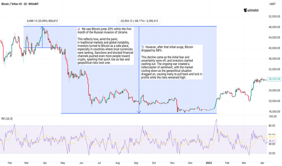
How to Choose Timeframes in TradingSup folks ✌️
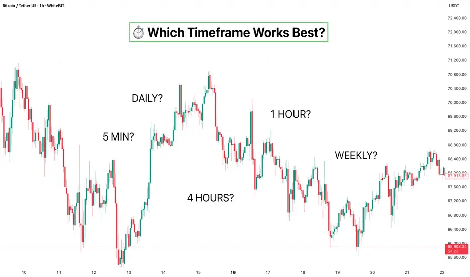
If you’ve ever switched from a 5-minute chart to a daily and felt like you were looking at a completely different market, you weren’t imagining it. Let’s take a look at what timeframes in trading really are, how they reshape price structure, and why choosing the right one can completely change the way you read the chart. This is your no-BS version of chart timeframes explained — without turning it into a textbook.
⏳ What a Timeframe Actually Changes
A timeframe defines how much time one candle represents. That’s the technical definition. But in reality? It changes your whole perception.
On lower trading timeframes, price looks aggressive. Fast pushes, sharp pullbacks, constant breakouts. It feels like the market is doing something every minute. On higher crypto timeframes, the same move suddenly looks calm, structured, almost obvious. It’s like zooming in on a wave. Up close, it’s chaos. From afar, it’s just part of a trend.
This difference is exactly why short term vs long term trading feels like two different professions — even when you’re trading the same asset.
🎯 Lower Timeframes: Action Mode
Drop to 1m, 5m, 15m — and you’re in action mode. This is the classic day trading timeframe zone. Traders chase intraday momentum, scalp small inefficiencies, react to liquidity spikes. Everything moves fast. Structure forms quickly and breaks just as quickly.
The upside? Plenty of opportunities. The downside? Plenty of fakeouts. Lower timeframes amplify noise. A minor pullback can look like a full reversal. Indicators flip constantly. If discipline slips, overtrading becomes very real.
If you’re looking at a BTC trading timeframe on 5m, Bitcoin can feel wildly volatile. Switch to a higher Bitcoin chart timeframe, and the same move may barely register. Same chart. Different scale.
🔭 Higher Timeframes: Big Picture Energy
Move up to 4H, daily, weekly — and you’re entering typical swing trading timeframe territory. The market slows down. Structure becomes clearer. Key levels stand out. Trends are easier to define.
Instead of reacting to every candle, you can start thinking in swings. Higher highs and higher lows. Lower highs and lower lows. The noise fades, and what’s left is intent. This applies whether you’re analyzing a BTC trading timeframe or an ethereum trading timeframe. On the ETH chart timeframe daily view, what looked like chaos on 15m often becomes clean structure.
The trade-off? Time. Setups take longer to form. Candles take longer to close. Everything unfolds at a slower pace.
🎭 One Market, Different Stories
Here’s the twist: the market can be bullish and bearish at the same time — depending on the timeframe.
Daily chart trending up. 1H chart pulling back. Both are valid. A correction on a higher timeframe often looks like a downtrend on a lower one. That’s not contradiction — that’s scale.
This is where multiple time frame analysis comes in. Higher timeframe gives context. Lower timeframe gives detail. Big picture first, execution second. That’s how experienced traders avoid getting trapped by noise.
🤔 Which Timeframe to Choose?
Now we get to the classic question: what’s the best timeframe for trading? There isn’t one.
The real question is how to choose timeframe in trading based on your style, schedule, and tolerance for volatility.
If you like speed, quick feedback, constant engagement — lower timeframes will feel natural. If you prefer structure, breathing room, and fewer decisions — higher timeframes usually make more sense.
Your timeframe shapes your entire trading experience. It affects stress levels, patience, and even confidence. It’s not about which one is smarter. It’s about which one fits your rhythm.
🏁 Final Take
Timeframes don’t change the market. They change how you see it. Zoom in and you’ll find volatility. Zoom out and you’ll find structure. Same asset. Same data. Different perspective.
Mastering timeframes in trading isn’t about hunting for some magic setting. It’s about understanding how each timeframe tells a different version of the same story — and being aware of which version you’re choosing to operate in. This isn’t financial advice. Markets are complex, risk is real, and no timeframe guarantees anything. Do your own research, question assumptions, and make decisions based on your own analysis. Education 
On Balance Volume (OBV) in CryptoSup traders 😎
If price tells the story, on balance volume tells you who’s actually behind it. The OBV indicator is one of those old-school tools that never really left the game. Markets don’t move just because candles look nice — they move because of volume pressure, and OBV helps you see where that pressure is building before everyone else notices.
At its core, OBV is just cumulative volume.
🟢 Green close? Volume gets added.
🔴 Red close? Volume gets subtracted.
Sounds simple — and that’s the whole point. The idea is that volume behavior often shows intent before price fully reacts.
In crypto, where moves can come out of nowhere, tracking crypto OBV helps you figure out whether big players are quietly loading or slowly heading for the exit.
🕵️♂️ Reading the OBV Trend Like a Trader
First thing traders look at: the OBV trend. If price is chopping sideways but OBV keeps climbing, someone’s buying under the radar. That’s classic stealth accumulation and a good example of real OBV dynamics forming before a move.
Flip the situation, and it’s just as useful — price pumping while OBV fades usually means the rally might be running on borrowed energy. When you look at an OBV chart crypto, treat it like a reality check. Comparing OBV vs price is where things get interesting, especially when divergences show up.
⚙️ OBV Patterns, Peaks, and Cycles
Experienced traders don’t just watch direction — they watch structure. A clean OBV pattern, repeated OBV peaks, or rising OBV lows can tell you a lot about who’s actually in control. Over time, you start seeing familiar OBV cycles — accumulation, expansion, exhaustion — playing out again and again.
This is where volume interpretation turns into feel. OBV doesn’t predict the future; it shows whether the market is backing the move or just faking confidence. Think of it as reading the crowd’s body language instead of listening to the noise.
💡 OBV can also be viewed alongside other tools for additional context.
Some traders combine it with moving averages, RSI, or market structure analysis to better understand momentum and volume behavior. It can be applied across different timeframes too — higher timeframes may reveal broader OBV trend direction, while lower ones can highlight shorter-term shifts in volume pressure. The key idea is that OBV doesn’t have to stand alone; it can be used as part of a wider volume interpretation framework.
⚡Why OBV Still Works in Crypto
Some traders ignore OBV because it’s old-school. That’s missing the point. The logic behind OBV history still works because trader psychology hasn’t changed. Fear, greed, and FOMO still drive markets, and volume still exposes intent.
Looking at OBV historical zones can help you spot areas where serious buying or selling happened before. And in crypto — where fakeouts are almost a daily event — OBV helps separate hype from real conviction.
🧠 Final Take
The beauty of on balance volume is its simplicity. No complicated formulas, no flashy signals — just raw insight into volume pressure and market intent. Traders use it to confirm breakouts, spot divergences, and understand the story behind price action. In crypto, where noise is everywhere, OBV helps you tune into the signal.
This is educational content, not trading advice — always think for yourself and trade based on your own analysis. Education 
Bollinger Bands in Crypto: See Volatility in ActionHey traders! 😎
Bollinger Bands — they’re everywhere in crypto trading, and for good reason. This powerhouse of an indicator helps you track volatility and forecast price moves like a seasoned trader. Let's explore how you can use them to navigate the market, whether it's a breakout or a pullback, and effectively manage your trades.
Bollinger Bands and Volatility: Where to Look
Bollinger Bands are built around a simple moving average (SMA), with the upper and lower bands reflecting standard deviation bands. When the bands contract, it’s a sign that volatility is low — often referred to as a BB squeeze. This is typically followed by a period of expansion, where the price starts to move more aggressively. If you're watching for price breakouts, this is where to pay attention.
However, Bollinger Band width alone doesn’t always tell the full story. When using BB, combine it with other indicators for a more accurate view of market conditions:
RSI: Confirm if the market is overbought or oversold. Extreme values may signal a less sustainable breakout;
MACD: Identify trend reversals or confirm breakout strength with bullish or bearish crossovers;
Volume: High volume confirms breakout strength; low volume suggests a potential fakeout;
Stochastic Oscillator: Overbought (above 80) or oversold (below 20) conditions can indicate reversal points.
Combining Bollinger Bands with Other Indicators
Bollinger Bands work best when used in combination with momentum indicators like the MACD (Moving Average Convergence Divergence) or Stochastic Oscillator. These can help you confirm whether a trend is strong enough to break out of the BB squeeze or if a potential reversal is on the horizon:
⬆️ Price hits the upper Bollinger Band and MACD shows a bearish crossover, that could indicate a potential reversal, even if the price is technically in an uptrend.
⬇️ Price hits the lower Bollinger Band and MACD shows bullish momentum, it could suggest the price might bounce back.
Avoiding Overreliance on Bollinger Bands
While Bollinger volatility behavior can be useful, don’t rely solely on band contraction and band expansion for your trading decisions. These signals are helpful for understanding the overall market atmosphere, but they don’t provide an exact entry or exit point. It’s essential to look at the BB dynamics alongside other data points, like volume and price action, to get a fuller picture.
⚠️ When volatility is high and BB expansion is happening, be cautious. Price can get erratic, and big swings may not always give you the clearest direction. It’s important to watch for confirmation from other indicators, especially when the market is volatile.
When to Stay Away from Bollinger Bands
Bollinger Bands can sometimes be less reliable in certain market conditions. Here are a few scenarios where you should be cautious:
Strong Trending Market: When the market is trending, Bollinger Bands may give false reversal signals, as prices move consistently in one direction.
Choppy or Range-Bound Market: In sideways markets, frequent band squeezes and expansions can lead to false breakout signals with little price follow-through.
Short-Term Focus: Avoid focusing too much on short-term price movements. Instead, combine Bollinger Bands with trend-following indicators like moving averages to confirm the overall market direction.
Wrapping It Up
Bollinger Bands are like a weather forecast for market volatility, helping you spot potential breakouts. However, just like you wouldn’t rely solely on a weather report to plan your day, you shouldn’t use Bollinger Bands in isolation. You can combine them with other indicators like RSI, MACD, and volume to confirm trends and avoid false signals. Band contraction and expansion provide insight into crypto volatility, but always assess the broader market context.
This isn’t trading advice—always DYOR and make decisions based on your analysis.
This material is for informational purposes only and does not constitute trading or investment advice.  Education