How to use step line charts
Step line charts are similar to line charts but with a stair-like visualization. Data points here are linked with horizontal and vertical lines, creating "steps" that represent the price for a specific time interval.
CONTENTS:
What is a step line chart?
Step line charts may be a good choice when you need to display sudden price changes which occur, for example, after earnings reports or policy changes.
Horizontal lines display periods of stability, while vertical lines represent price moves.
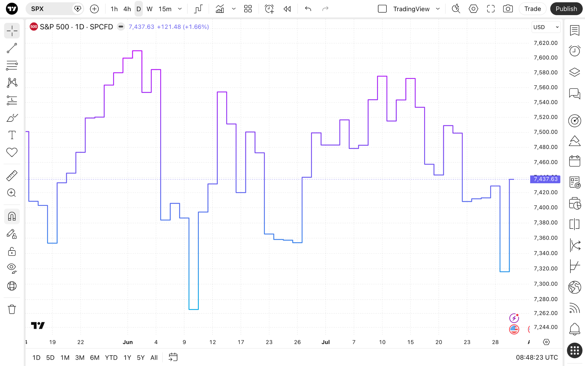
Step line charts vs line charts
Due to their structure, both of these chart types have unique applications and benefits.
Step lines
- Help spot levels where the price experienced a significant change.
- Better for determining event-driven changes (stock splits, earnings reports, etc.).
Standard lines
- Doesn't show the exact point at which a change occurs.
- Easier to read general trends.
- Better suited for pattern recognition.
Enabling the chart type
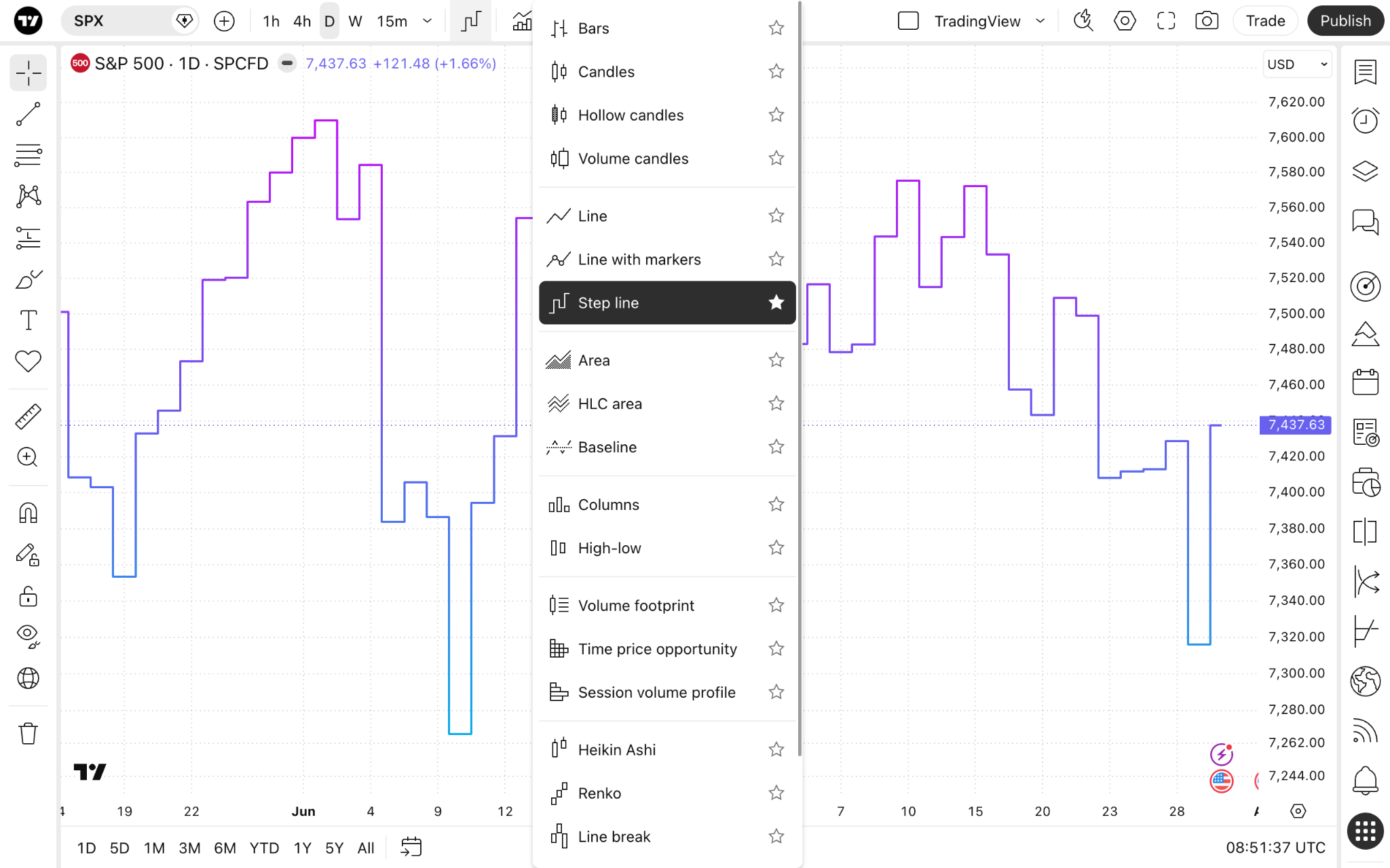
On Supercharts, open the chart type menu on the upper toolbar, and select "Step line."
Settings
To change the chart's appearance, click the gear button on the upper toolbar and open the "Symbol" tab.
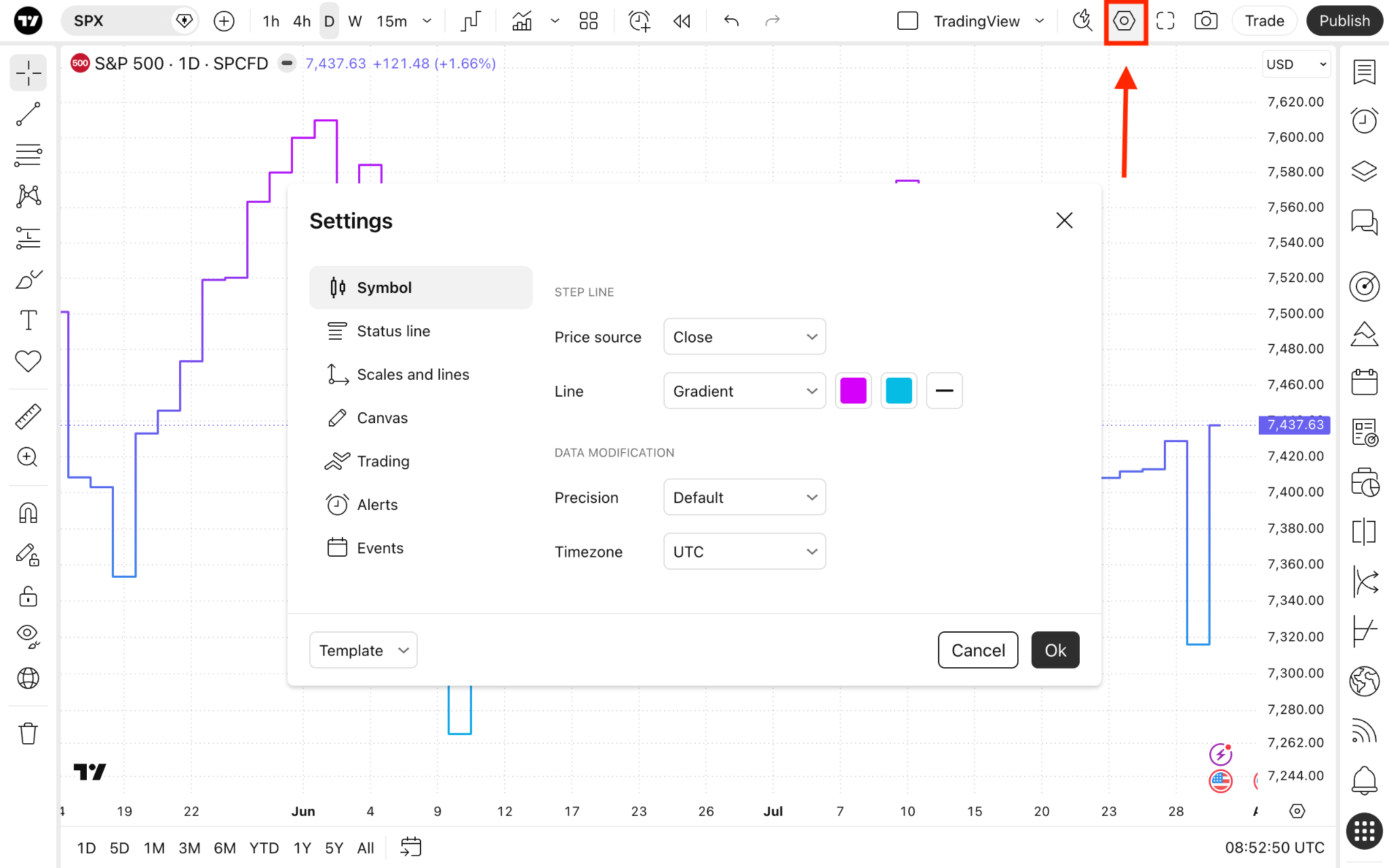
The "Step line" section lists settings specific to this chart type:
- Price source: Choose the price you want the chart to show. By default, it is set to close price, meaning the line will be plotted by connecting the asset's closing price during the selected timeframe in a sequence. But you can change it to one of the following:
- Open: Shows the opening prices.
- High: Shows the highest prices.
- Low: Shows the lowest prices.
- Close: Shows the closing prices.
- (H + L)/2: Shows the average of the highest and lowest prices.
- (H + L + C)/3: Shows the average of the highest, lowest, and closing prices.
- (O + H + L + C)/4: Shows the average of the opening, highest, lowest, and closing prices.
- Line: Customize the line's color, gradient, thickness, and opacity.
Step line charts in a nutshell
If you chart financial data or need to see the exact time period where a price has changed dramatically, step line charts may be a good choice. They are better suited for understanding sharp value changes than other chart types and can help you more easily understand the relationships between two price moves.
Also read: