Do Humans Still Use This Site?I'm wondering if people still use this site, and specifically read my posts?
60% or so of my comments are clearly bots. I've ran a LLM detection analysis on the Top/Popular ideas page on various different weeks with it routinely returning 80-90% of it is LLM content, and most of that is no effort LLM content ("write me a post why gold is strong") - which any of us could replicate in under 20 words into a free LLM model.
I have a bunch of research posts and long form analysis I am working on but the Tradingview rules require everything you do to be native to the site so to do this I'd have to do 20 - 30 posts over the full series to explain it.
I'm not going to do that if I'm posting to bots.
US 500 CASH
No trades
No trades
In-depth trading ideas
The History of Quant Trading Centuries ago, back in 2023 (man, time flies fast around here), I did a post on the history of the S&P using SPX to illustrate key moments in history, from the 1900s to the current day of 2023, you can read it here.
This was one of the biggest posts I had done that required the most amount of research. And one of my objectives this year was to give more education content, so I thought about doing another history post.
You can probably imagine that I am, well, a nerd. I like math and applying math to markets. I actually hate trading, the joy I get from trading is using math and statistics to solve complicated real world problems, like where is ticker Y going to go and where will ticker X find a bounce. This is what keeps me engaged. Well that, and the payout. But another thing I enjoy are computers. Since I was a kid in the 90s, I had a real fascination with computers. My father, being a Ford executive here in Canada, would frequently bring home old industrial computers that were used on the production floor and I would tinker around, take apart the insides, swap components and the like. It became a huge fascination of mine and that actually went dormant until recently, when I entered the realm of high impact, quantitative analysis, which required me to build up my own server and rig with very specific components to handle the task. This brought back memories of me being a kid in the 90s and it was surprising how little has changed in terms of the internal components and building of computers between the 90s and now. Only, my new setup smelled less like machines and oil.
So I thought what better than to talk about the history of Quantitative finance, and in particular, the evolution of how data availability, computing and, of course, AI has shaped the financial markets as we know them today.
The Absolute Beginning
It started in 1900 in a French university basement with a PhD thesis on agricultural commodities, drawing heavily on physics and fluid dynamics. A gentleman by the name of Louis Bachelier (1900), a French mathematician, published his dissertation, The Theory of Speculation (or Théorie de la spéculation). In this research, as an effort to model option prices on the Paris Stock exchange (or la Bourse), he described Brownian motion, a concept and method commonly applied today in indicators and quantitative models.
Keep in mind, this was five years before Einstein famously used the exact same mathematics to model the physical movement of pollen floating in water.
Bachelier hypothesized that asset price changes were unpredictable and followed a continous “random walk” (again, another term and theory commonly used today in 2026). This left the door open for the future of modern stochastic calculus applications.
Why did this not revolutionize the market at the time? While the stock market was very much alive and moving in the 1900s, Brownian motion is an incredibly complex process, requiring hundreds if not thousands of random simulations to find a central tendency. During this time, there were not even calculators, never mind computers, so this was not a realistic theory to apply to markets. It would take days if not weeks/months to do the required calculations by hand, at which point, the time had already passed in the market and the predictions would be old.
Then, in 1952, along came a man named Harry Markowitz. Markowitz introduced the Modern Portfolio Theory or MPT. Instead of just picking stocks that were constantly winning (*cough* NVDA *cough*), Markowitz proposed diversification. But he went many steps further than just “proposing”, he mathematically proved that investors cold construct an optional portfolio by balancing expected return against variance using covariance matrices!
The most interesting thing about Harry Markowitz isn’t actually his theory and his conclusion, but how he came to solidify this theory as a conclusion. To prove that asset diversification actually meaningfully contributed to better outcomes, Markowitz used an IBM 701 (one of IBM’s first commercial mainframe computers) to calculate his thesis. This computer used physical punch cards to solve quadratic programming problems.
And 1952, just 6 years after WWII ended, marked the moment of the Quantitative Finance and Computing intersection.
Towards 1964, along came a man named William Sharpe. And I know you’re naturally thinking, “Oh is this the founder of the Sharpe Corporation?” and no, he is not haha. But what he did, was simplified Markowitz’s math into what he termed “Capital Asset Pricing Models” or CPAMs. This introduced the concept of systematic market risk and the process for separating market risk from stock-specific risk.
Around the same time, in 1970, Eugene Fama formulated the Efficient Market Hypothesis (EMH), asserting that asset prices reflect all available information, making it impossible to consistently “beat” the market without taking on higher risk or utilizing algorithmic edge. This also reflected the general sentiment that the 70s were revolutionary and the halmark of a global connected world, with telephone systems now spanning globally, you could call your friend in Europe from New York, and the rise of more complex computers that could process more data and faster! These breakthroughs were seen in:
The IBM 370 in 1970: Replaced magnetic core memory with silicon microchips and introduced Virtual Memory (VM), allowing programs to use far more memory than was physically installed. Also, letting my nerd show again, bears an awfully similar resemblance to the Red Queen in Resident Evil.
Hmmm…
The Cray-1 (1976): Designed by Seymour Cray, the Cray-1 was the world's first commercially successful vector supercomputer, operating at a record-breaking 160 MFLOPS (million floating-point operations per second).
Other groundbreaking computers of the 1970s that directly impacted and lead to advancements in Quantitative and Banking analysis/data:
And we would be nowhere in our discussion of the history of quantitative finance without discussing the fringe Edward Thorp, a math professor at MIT who used an IBM mainframe to invent card counting in Blackjack. When he successfully managed to do this, he turned the algorithms toward Wall Street, publishing “ Beat the Market ” in 1967. He went on to launch Convertible Arbitrage and founded Princeton/Newport Partners, running the first fully quantitative hedge fund using delta-neutral hedging. He was the first to also heavily use computers within his fund to perform his algorithm. Princeton/Newport went on to do an unbelievable 20 year run without a single losing quarter, only to be shut down due to some scandals unrelated to its actual success. Crazy honestly. If you compare Warren Buffet to Thorp, Buffett produced a higher raw annualized return over a longer time horizon, Thorp achieved something almost mathematically impossible: high returns with virtually zero downside risk. You can see why Math is king when it comes to markets. I will now idollize Thorp as my role model. Not to mention he is currently 94 and looks max 60. Jeeze.
Anyway, in 1973, three interesting cats, Fischer Black, Myron Scholes, and Robert Merton, published what became known as the Black-Scholes Model for pricing European options. Options had been traded for centuries, but pricing them was pure guesswork because every existing model relied on predicting the underlying stock’s expected return, a nearly impossible variable to pinpoint.
What this trio did was revolutionize financial math through a concept called Dynamic Delta Hedging (or no-arbitrage pricing). They proved that if you continuously buy and sell tiny fractions of the underlying stock to offset the risk of an option, you create a completely risk-free portfolio. And because the position becomes risk-free, the stock's expected return drops out of the equation entirely, replaced by the risk-free interest rate. Fischer Black even derived the core partial differential equation by transforming the financial problem into the Heat Equation from classical physics, treating option price movement like heat diffusing through a solid object!
Their timing couldn't have been better: 1973 was the exact same year the Chicago Board Options Exchange (CBOE) opened. Within months, traders were walking onto the floor carrying Texas Instruments calculators programmed with the Black-Scholes formula, using it to instantly spot and exploit mispriced contracts on the fly.
And from the work of those 3 Cats, came the arrival of TXN or Texas Instruments. In 1973, traders on the Chicago Board Options Exchange (CBOE) began carrying customized Texas Instruments Calculators onto the trading floor, programmed with the Black-Scholes formula to instantly spot mispriced options. Let’s roll up a picture of these 70s TXN calculators:
The 80s
Now on to one of my favourite decades, the 80s! Though I never lived them being a 90s child, I still find it interesting. So what happened here?
Well, a man by the name of Jim Simons, a former Cold War codebreaker and MIT mathematician, founded RenTech and launched the Medallion Fund in 1988. Instead of using contemporary economic theory, Simons hired astrophysicists, signal processing engineers, and cryptographers, using Hidden Markov Models (originally used for speech recognition) to extract statistical noise patterns from market data.
At the same, Morgan Stanley came up with the Automated Trading Desk or ATD. Nunzio Tartaglia, a nuclear physicist at Morgan Stanley, assembled a team of mathematicians to invent Pairs Trading, executing automated trades whenever two historically correlated stocks drifted apart.
One of the more groundbreaking advancements in the 80s was the Bloomberg Terminal in 1981. Michael Bloomberg introduced it in 1981, brining real time price feeds, analytics and historical data directly onto trading desks. Meanwhile UNIX workstations (like Sun Microsystems) began replacing central mainframes on trading floors.
The 90s
Oh yeah, my year! The year of the Pentium processors and the Steversteves Birth.
Some real advancements happened in the 90s in terms of quantiative finance, both in technological advancement, and in practice and process. One such example is the FIX protocol of 1992. The creation of the Financial Information eXchange (FIX) protocol standardized digital communication between brokerages and exchanges, laying the digital plumbing for modern algo order routing.
The 80s and 90s were also a simplier and easier time for Quantitative finance. If you think about it, today we have billions of people accessing the markets, from their laptops, desktops, phones, anywhere. With thousands of trading platforms, access to high speed internet globally, the market has seen participants the likes of which it has never seen before! This was not the case in the 90s Dial up era. Market participants were first and foremost large market makers themselves, with indie retail mostly acting as investors, that is until the dotcom bust where more “retail” started entering into the market with software like Watcher. But that is for another post.
Because of smaller participation, the 90s early algorithmic traders exploting NASDAQ’s small order execution system (SOES) to front run slow human floor brokers. Other things like Long Term Capital Management (LTCM) (1994 – 1998), founded by John Meriwether, used extreme leverage to exploit tiny fixed income arbitrage spreads. However, this ended badly for them when in 1998, Russia experienced a financial crisis and their theoretical models broke down, triggering a 3.6 billion dollar Wall Street bailout, the first major systemic warning about over-leveraged quantitative risk models.
But the 90s were also interesting in its more democratic approach to quantitative finance. Having read this far, if you have, you will see that the major advancements were done on computers the size of living rooms and the costs of 50 homes back in the 70s and 50s. This left Quantitative computing out of reach for retail and only in reach for enterprise and academic institutions. However, in the 90s, computing was fairly even. Corporate and commercial servers utilized the same “Pentium” and “PowerPC” processors that consumers had access to. This was the true democratization of quantitative finance. In fact, famously a man by the name of David E. Shaw lead the way in monopolizing computing power in the 90s. Instead of buying expensive proprietary hardware (like Cray supercomputers), David Shaw realized he could assemble massive computational power at a fraction of the cost by buying standard, off-the-shelf consumer Intel PC components, specifically Intel Pentium and Pentium Pro processors, and running them in parallel using customized Linux/Unix cluster configurations. These are known as Beowulf clusters, with an image from the 90s below:
There was one little nuance that was the halmark of a transition from analogue memory (up until the end of the 80s) to digital memory, and that was data archiving. In the 1990s, quantitative finance hit a brutal wall that had nothing to do with smart algorithms and everything to do with data architecture and accessibility. Before modern cloud APIs, real-time data feeds, and pre-packaged historical datasets existed, early quants spent over 80% of their time acting as data plumbers rather than mathematicians. Financial data was stored on massive physical reels of magnetic tape, floppy disks, or early CD-ROMs shipped via mail from vendors like CRSP or Compustat. Ingesting this data into early Unix servers or consumer PC clusters required writing custom parser scripts just to read raw byte streams, where a single corrupted bit on a magnetic tape could corrupt an entire backtest.
Beyond physical access, the sheer "dirtiness" of historical data made quantitative backtesting a minefield:
Survivorship Bias: Early databases only included companies that were currently active. If a firm went bankrupt in 1993, vendor databases simply erased it from history, making backtests look unrealistically profitable unless quants manually hunted down old microfiche records to rebuild dead stocks into their models.
Corporate Actions & Splits: Stock splits, dividends, spin-offs, and ticker changes weren't automatically adjusted by data providers. A 2-for-1 stock split would register as a sudden 50% crash in price, triggering false algorithm sell signals unless clean, split-adjusted adjustments were applied by hand.
Intraday Tick Data Gaps: Minute-by-minute tick data was practically non-existent or prohibitively expensive to store. Early high-frequency pioneers had to set up their own local hard drives to capture live satellite feeds in real time, dealing with frequent packet drops, missing timestamps, and out-of-order quotes.
Firms like Renaissance Technologies and D. E. Shaw built their early competitive moats not just on better mathematical formulas, but on employing armies of engineers solely to clean, align, and store clean historical datasets that no one else on Wall Street possessed.
So where is this data today?
Good question, because I really want to know. As a quant trader myself, I would pay anything to get my hands on a CD ROM from the 90s that contains tick level or minute level or even 5 minute level data from the 90s, specifically before and during the dotcom boom! I have scoured online to find this data, or if I can purchase it from some source, but alas it really seems to be an enigma!
If anyone is a keeper of archaic computers (like me) and comes across something like this, feel free to send it my way!
YTK and GPUs
There is a lot to unpack from this era, from regulations, the introduction into High Frequency Trading (HFT) and GPU hacking leading to the introduction of CUDA. So bear with me for this continued lengthy post!
Regulation NMS and the HFT Big Bang (2005)
Before 2005, human floor brokers on the NYSE could still manually hold onto orders for tens of seconds. That changed when the SEC enacted Regulation NMS (National Market System).
The Order Protection Rule: Reg NMS mandated that a trade must be executed at the best available price across any electronic exchange in the country (the National Best Bid and Offer, or NBBO).
The Result: If Exchange A had a stock listed for $100.00 and Exchange B had it for $99.99, an algorithm had to route the trade to Exchange B.
This resulted in the Birth of HFT. Suddenly, speed was everything. Early HFT firms (like Getco, Tradebot, and Citadel) built ultra-low latency infrastructure, laying specialized fiber-optic cables through mountains and placing servers right inside exchange data centers (co-location) to front-run quote changes by microseconds.
GPU Hacking
Long before official machine learning tools existed, quants ran into a major CPU bottleneck: running thousands of simultaneous Monte Carlo simulations for derivative pricing or risk management took hours on x86 server farms.
Around 2001, clever researchers realized that consumer 3D graphics cards (like the NVIDIA GeForce and ATI Radeon) were essentially massive parallel matrix math engines built to calculate light and pixels.
Clever coders developed what was called the “Shader Hack”. Because GPUs only spoke "graphics languages" (like OpenGL and DirectX), early quants disguised raw financial data matrices as 2D image textures. They mapped linear algebra equations onto pixel shader operations, forcing a gaming card meant for Quake III or Doom 3 to crunch option pricing matrices 10x to 20x faster than an Intel CPU.
NVIDIA was very much alive during this time and very much aware of these Shady Hacks, I mean, SHADER hacks. In fact, NVIDIA saw this as a marketing advantage for their components. In November 2006, NVIDIA officially unveiled CUDA (Compute Unified Device Architecture). This was the exact turning point for modern GPU compute.
CUDA allowed software engineers to write standard C/C++ code directly for the GPU without needing to trick 3D graphics engines. Instead of running 4 or 8 threads on a high-end dual-socket server CPU, a single GPU could run thousands of lightweight parallel threads simultaneously. For quantitative desks, algorithms that previously took an overnight batch run on a server rack were suddenly executing in seconds on a single workstation fitted with
NVIDIA Tesla cards.
The Dark Side of YTK
The 2000s also exposed the catastrophic tail-risk of relying too blindly on mathematical models:
The August 2007 "Quant Quake": Over three trading days in August 2007, several major multi-billion-dollar statistical arbitrage funds suffered massive losses simultaneously. Because everyone was using similar factor models and statistical arbitrage algorithms, a single fund liquidating positions caused a domino effect that triggered automated stop-losses across the entire quant industry.
The 2008 Financial Crisis & The Copula Failure: Wall Street used a famous mathematical formula called the Gaussian Copula (developed by David X. Li) to price complex credit derivatives like Collateralized Debt Obligations (CDOs). The model assumed historical correlation between mortgages would remain stable. When housing prices dropped nationally, mortgage defaults correlated at unprecedented levels, breaking the models and triggering the global credit freeze.
This really highlighted then and currently, why Math isn’t always King, contrary to my personal bias. Fundamentals play a key role still in sifting through exuberance and over-extension to answer the “how”, “why” and “what if” questions that lead to bubbles popping and markets imploding (i.e. Michael Burry).
Fast Track, Quantitative Trading of Today
Between the late 1990s and the 2010s, the arrival of broadband internet, standardized financial APIs, and ultra-fast data feeds changed everything. Suddenly, historical stock prices, tick data, and market depth were no longer physical commodities locked inside specialized terminals; they were accessible to any algorithm via a web connection. Quants built high-frequency trading engines, co-located their servers right next to exchange matching engines, and ran automated statistical arbitrage strategies around the clock. Business as usual meant writing code to scrape raw price feeds, backtesting signals against decades of clean numeric data, and racing in microseconds to exploit tiny pricing mismatches.
However, as every firm gained access to the exact same high-speed internet infrastructure and API data streams, the industry ran into a wall. The biggest structural problem quants faced as computing power exploded was Alpha Decay. The moment a pure mathematical pricing anomaly was discovered, thousands of automated algorithms front-ran it, arb’d it out, and crushed the profit margin down to zero. Pure statistical price-action models hit a wall because every algorithm on Wall Street was staring at the exact same structured price and volume data.
To survive this wall, quant firms throughout the 2010s and early 2020s turned to mathematical engineering, feature expansion, and machine learning. Quantitative analysts shifted from simple statistical arbitrage to factor-based multi-factor models, statistical signal processing, and supervised machine learning algorithms like Gradient Boosted Decision Trees and XGBoost. They expanded their feature matrices by sourcing specialized, high-cost alternative datasets, tracking credit card transaction feeds, web-scraping e-commerce inventories, and logging supply chain manifests. The core objective of a quant analyst during this era was to hand-craft hyper-specific numerical features, feed them into mathematical models, and squeeze tiny, uncorrelated micro-edges out of structural market behavior before competing algorithms could discover them.
This operating model reached another inflection point around 2023 with the sudden explosion of Generative AI and Large Language Models. Suddenly, firms scrambled to integrate LLMs into their investment stacks, expecting a gold rush of automated trading profits. But as the honeymoon phase settled into reality, many quant funds discovered a harsh truth: using AI to directly trade financial markets is surprisingly unhelpful, and often unsuited for generating direct trading alpha. Large language models are fundamentally non-deterministic, prone to hallucination, slow at low-latency execution, and notoriously poor at making numeric time-series predictions. When firms simply asked LLMs to generate trading strategies or predict price movements using public datasets, the models hallucinated, fit noise, or produced conventional, highly crowded signals that decayed almost immediately.
Instead of discovering a magical AI money-printing machine, the quantitative finance world of today has adapted AI into a hyper-efficient operational backend rather than a primary trader. Rather than replacing quantitative mathematical models, AI serves as an intelligence filter, processing unstructured real-world data like SEC filings, transcript audio, news feeds, and legal disclosures, then converting that qualitative chaos into clean, structured numeric vectors. The modern quant stack uses AI models as pre-processors to digest complex qualitative realities, while leaving the actual pricing, execution, portfolio optimization, and risk management to traditional, time-tested mathematical and statistical engines. AI didn't replace quantitative math; it simply gave math a way to comprehend unstructured human language.
And The Future is Now
And that is where it stops. The evolution of quantitative finance. While there really is no more risk free trading like Thorp had in the 60s and 70s, arbitrage in one way or another still remains one of the gold standards for trading, it just looks different. From high frequency trading pricing microsecond mispricings on order flows, to AI scanning fundamental revenue sheets for sectors and finding PE ratios and revenue that is falling behind others in its basket (a current strategy I also use), we are kind of at a crossroads in Quantiative finance, in my honest opinion. Scrounging for a little bit of Alpha in an over-saturated market is hallmark of what is currently happening. Ultra-competitive firms, hiding their processes for fear of them being arbitraged out and using data that mostly is only available to HFT firms (such as direct line time and sales) are how most major Quantitative firms operate to this day. It makes it incredibly hard for a lil’ ol’ retail quant trader like me to pick up the scraps left behind because obviously we cannot compete with these HFT firms. But we can find signals buried in that noisy data, if you look in the right place and find the right filtering metrics.
So what is next for Quant Finance?
The biggest shaker-uper will be the release of Quantum computing. This will slam retail harder than they can expect, and hobbyist quant traders like me. Consumer Quantum computing will never be a thing in our lifetime, at least by the looks of it. The introduction of quantum computing will likely bring us back to 1950s, where the elite institutions continue the processing power needed to solve impossible questions.
How quantum computing will work, is by generating billions of simulations and fitting price action to the single most similar simulation that matches. As well as tracking multiple order flows simultaneously across thousands of stocks. I am personally excited about Quantum computing, but preparing for it to completely destroy even more of the market than has already been destroyed with the current onslaught of quant firms and algo trading. I suspect it will be a dark day for retail quants when Quantum hits the trading stage, it will surpass anything that AI is capable of doing in terms of arbitrage and trading execution.
Final Thoughts
If you read this far, thanks! This was a long post and took some time for me to research and put together over the course of last week. I am a bit of a vintage computer collector myself, I still have my iBook Clamshell from 2001 from when I was a Teen and my Macbook Pro from 2009 as well as my Thinkpad from 2011. I was going to, as part of this post, run benchmarks of current quantitative methods I use to see how computing changed over the years. I was genuinely interested to see a PowerPC Clamshell at 466 MhZ process a 1 million simulation Monte Carlo, but that will probably be an idea for another post as this turned out to be long enough.
I really hope you enjoyed, please like if you found this interesting to keep me motivated to do these long researched out posts.
As always, safe trades everyone!
S&P500 The '1W MA100 correction Rule' that calls for 6800.S&P500 (SPX) has been trading on a very consistent and structured pattern since 2022, which involves around the 1W MA100 (green trend-line). As you can see, since the 2022 Bear Cycle, the index has periodically corrected back to its 1W MA100 and the use of the Sine Waves mark almost exactly those pull-back contacts.
The last time the price was on the 1W MA100 was on the week of April 21 2025. Based on the Sine Waves, the S&P500 'should' touch its 1W MA100 around September 28 2026 again. A few weeks later of course, wouldn't set this cyclical pattern off of course and it is more likely as such a strong correction within only such a short period of time would require a major catalyst to do so.
It is also worth noting that the 2025 correction was -21.87%, roughly 6% less than the -27.65% of the 2022 Bear Cycle. If this rate continues to hold on the potential upcoming one also, then S&P500 could correct by -15.80%. That would make a 1W MA100 contact at 6800 a very much plausible one.
---
** Please LIKE 👍, FOLLOW ✅, SHARE 🙌 and COMMENT ✍ if you enjoy this idea! Also share your ideas and charts in the comments section below! This is best way to keep it relevant, support us, keep the content here free and allow the idea to reach as many people as possible. **
---
💸💸💸💸💸💸
👇 👇 👇 👇 👇 👇
SP500 15M CHART PATTERN📊 The SP500 15-minute chart is approaching a critical decision zone around 7,750, which remains the key level for the next directional move. 🟢 Holding above 7,750 would keep the short-term structure bullish and support a continuation toward the bullish target at 7,802.
Buyers need to defend this level and maintain momentum for the upside scenario to remain valid. 🚀 A sustained move higher could attract additional buying and strengthen the recovery structure visible on the chart. 🔴 On the other hand, holding below 7,750 would weaken the bullish setup and increase the probability of a decline toward the bearish target at 7,708. Traders should closely monitor price action, candle closes, and rejection or acceptance around this pivot.
⚠️ Overall, 7,750 is the main trigger: above it favors 7,802, while below it favors 7,708. Risk management remains essential because volatility can increase sharply around this important support and resistance area.
If you found this analysis helpful, don’t forget to LIKE 👍 and COMMENT 💬
SPX500 | CPI in Focus as the Market Waits for a Breakout
The S&P 500 ended Monday nearly unchanged as investors balanced renewed uncertainty surrounding U.S.-Iran negotiations against optimism that the Strait of Hormuz could eventually reopen, easing pressure on oil prices and inflation.
Market sentiment remains supported by strong second-quarter earnings, while last week's weaker U.S. jobs report has reduced expectations for an immediate Federal Reserve rate hike. However, all eyes are now on this week's U.S. CPI inflation report, which is expected to be the primary catalyst for the next major move in equities.
Technically
The market remains in a bearish consolidation between 7740 and 7777, awaiting a confirmed breakout.
As long as the price remains below 7777, the bearish correction is expected to continue toward 7710. A break below 7710 would expose the next downside target at 7622.
However, a 1H or 4H candle close above 7777 would invalidate the bearish scenario and support a bullish move toward 7809, followed by 7850 and 7924.
Pivot Line: 7777
Support: 7740 – 7710 – 7622
Resistance: 7809 – 7850 – 7924
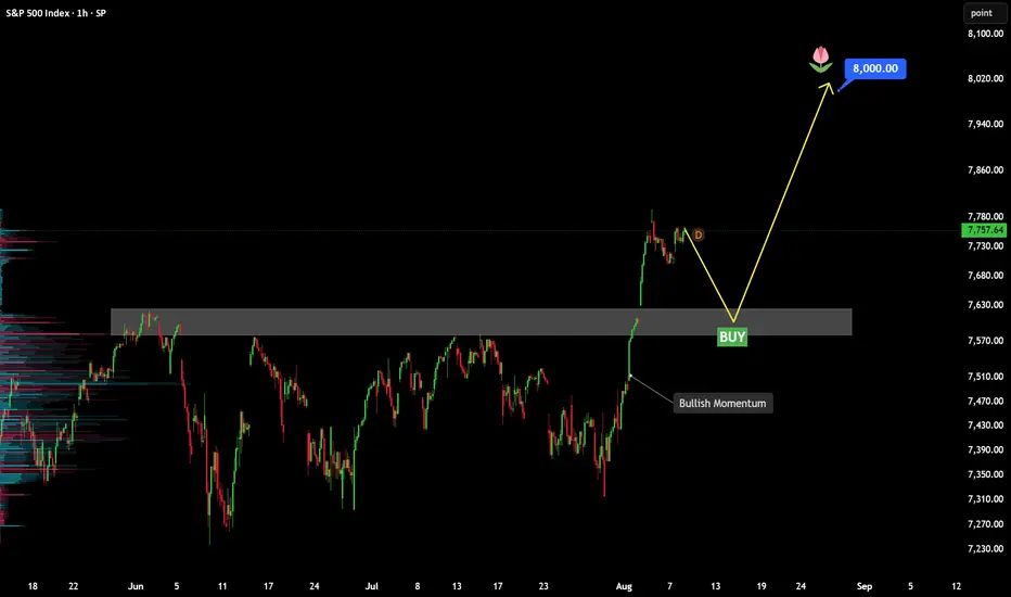
SPX500 – Breakout Retest Setup With 8,000 in Sight📊 SPX500 – Breakout Retest Setup With 8,000 in Sight
🔍 Market Overview
SPX500 has finally broken above a resistance zone that repeatedly capped price throughout the previous range. The move was not subtle either. Buyers pushed through with strong momentum and quickly established price above the old ceiling, which is the first sign that the market may be entering a new expansion phase.
After such a sharp breakout, chasing price at current levels is not my preferred approach. What interests me more is a controlled pullback toward the 7,580–7,630 area. If buyers defend that zone and former resistance turns into support, it could provide a much cleaner base for the next leg higher.
📈 Market Structure Insight
Primary Bias: Bullish
Momentum: Strong after breakout
Current Phase: Expansion followed by a potential retest
The important shift is that SPX500 is no longer trapped below the previous range high. Price has already moved into higher territory, so a pullback into the breakout zone would be viewed as a retest rather than an immediate bearish reversal, as long as support holds.
🚀 Bullish Scenario
I would be watching for:
A controlled pullback into the former resistance zone.
Rejection wicks or bullish candles around support.
Buyers stepping back in before price falls deeply into the old range.
If that happens, I expect SPX500 to resume the move higher, with 8,000 becoming the next major target.
🎯 Target: 8,000
❌ Invalidation
The bullish continuation setup would lose strength if price breaks decisively below the breakout zone and begins trading back inside the previous range. That would suggest the breakout failed to attract enough follow-through.
⚠️ Trading Perspective
The breakout has already shown us where the strength is. Now the question is whether buyers can defend the level they fought so hard to reclaim.
For me, the better opportunity is not buying after an extended push. It is waiting for the market to come back, test the breakout, and prove that the old resistance has truly become support.
🧠 Professional Insight
This setup stands out because of:
A clear breakout from a well-defined resistance zone.
Strong bullish follow-through after the break.
Price holding above the previous range.
A logical retest area below current price.
A clean psychological target at 8,000.
Breakout confirmed. Now the retest could decide whether 8,000 comes next.
This analysis is for educational purposes only and should not be considered financial advice.
Do you think SPX500 retests first, or goes straight for 8,000? Share your view below.
SP500S&P 500 is showing signs of rejection near a well-defined resistance zone around 7,840–7,880 after a strong bullish move. Price is currently consolidating below resistance, while the rising trend structure is showing signs of weakening.
As long as price remains below the major resistance zone, the bearish downside scenario remains valid. A strong breakout and close above resistance would invalidate the immediate bearish setup.
🎯 Key Levels (Must Watch)
Strong Support / Target: 7,520
Strong Resistance Zone: 7,840 – 7,880
📌 Bearish Trigger: Rejection from resistance + break below the 7,680–7,720 area.
📈 Bullish Invalidation: Sustained breakout and close above 7,880 could signal continuation toward higher levels.
⚠️ Disclaimer: This analysis is for educational purposes only and is not financial advice. Levels can change with market structure and volatility.
S&P500 INDEX (US500): Confirmed Breakout
US500 Index looks bullish too.
The price violated the horizontal neckline of the ascending triangle pattern on a daily time frame.
It indicates a highly probable trend continuation.
Next goal - 7850
❤️Please, support my work with like, thank you!❤️
I am part of Trade Nation's Influencer program and receive a monthly fee for using their TradingView charts in my analysis.
Hellena | SPX500 (4H): LONG toward the 7843.70 resistance area.It has been quite some time since my last SPX500 update, but the chart is now presenting an interesting setup. The index remains within a broad bullish structure, and the latest strong upward impulse suggests that the advance is probably not complete yet.
According to the current wave count, the price is developing higher-degree wave "1". Within it, intermediate wave "3" is unfolding and should eventually be completed through the development of the smaller wave "5".
The main question is whether the smaller corrective wave "4" has already ended. Its low may have formed slightly earlier, although another local decline toward the 7701.00 support area is still possible before the bullish move resumes.
In either case, I expect the smaller wave "5" to develop next. SPX500 should break above the smaller wave "3" high around 7799.00 and continue toward the next resistance area.
My nearest target is 7843.70. Once this level is reached, we can assess whether the entire intermediate wave "3" is complete and how deep the following corrective wave "4" may become. That will be the subject of a separate forecast.
As long as the price remains above the 7701.00 support area, the bullish scenario stays in priority. A decisive break and hold below this support would require a reassessment of the short-term wave structure.
The fundamental backdrop is also providing some support to buyers. Moderate U.S. inflation data reduced expectations of a Federal Reserve rate increase in September, while strong results from AI-related companies continue to support the technology sector and the broader index.
Manage your capital properly and wisely! Enter trades only based on reliable patterns!
S&P 500 at a Major PRZ: New ATH or Deeper Correction?The S&P 500 ( CAPITALCOM:SPX500 ) rallied after the probability of an agreement between Iran and the United States increased, allowing the index to print a new All-Time High(ATH).
However, the rally over the past week has been accompanied by relatively low trading volume, which may indicate weakening bullish momentum.
Can the S&P 500 print another ATH, or is a deeper correction beginning?
Macro Outlook
Improving expectations surrounding a potential U.S.–Iran agreement supported risk sentiment and helped U.S. stock indices move higher.
However, the lack of strong trading volume during the recent rally raises concerns about whether buyers have enough strength to sustain the bullish trend.
Technical Analysis
The S&P 500 has reacted to the Potential Reversal Zone(PRZ) and has started to move lower.
From an Elliott Wave perspective, the index appears to have completed, or is very close to completing, its main wave 5.
💡 Educational Note: When an index reaches a new ATH with declining or weak volume, it can indicate reduced market participation and increase the risk of a pullback.
I expect the S&P 500 to decline toward the key trading level of $7,637.
If bearish momentum increases, the index could break below the Support Zone and eventually fill the lower gap.
Trade Setup
First Take Profit(TP): $7,637
Second Take Profit(TP): $7,614
Stop Loss(SL): $7,804
Which level do you think the S&P 500 will reach first?
🔴 $7,614
🟢 $7,804
📌 S&P 500 Analysis(SPX), 4-hour time frame.
🛑 Always use proper risk management and set a Stop Loss(SL) for every position.
🚀 If this analysis helps your trading plan, a BOOST would help more traders discover it.
Why Yesterday's Point of Control MattersMost traders begin the session by marking out the previous day's high and low. Those levels often provide a useful framework for the day ahead, highlighting where momentum accelerated or where buyers and sellers previously lost conviction. Yet another reference point often receives far less attention despite representing where the market spent most of its time doing business.
The Prior Day's Point of Control (PoC) , derived from the Session Volume Profile, identifies the price at which the greatest volume traded during the previous session. It isn't a buy or sell signal, nor should it automatically be treated as support or resistance. Instead, it provides a useful reference point that can help traders understand where the market previously found the greatest agreement on price. Three observations are particularly worth paying attention to.
Strong trends often see value move higher
One of the more interesting characteristics of strong trends is that they aren't driven purely by price. As markets continue to trend, the Point of Control will often migrate higher from one session to the next.
The market isn't simply pushing to higher prices before immediately rejecting them. Instead, the greatest concentration of trading activity is gradually shifting upwards as buyers and sellers become increasingly willing to transact at higher prices.
This doesn't guarantee the trend will continue, but it does suggest that the market is accepting those higher prices rather than merely visiting them.
US500 Five-Minute Candle Chart
Past performance is not a reliable indicator of future results
The recent S&P 500 provides a good example. As the market continued to rally, each session's Point of Control gradually stepped higher. Rather than repeatedly returning to previous value areas, the market established new areas where the majority of business was conducted, consistent with the strength of the underlying trend.
The prior day's Point of Control creates a useful reference
Once the session closes, yesterday's Point of Control becomes a level worth carrying forward into the next trading day.
Not because the market must react there, but because it highlights an area where a significant amount of business was previously transacted. Whenever price returns to that level, traders have an opportunity to observe whether the market still considers it an area of value or whether sentiment has shifted.
US500 Five-Minute Candle Chart
Past performance is not a reliable indicator of future results
Here, the Session Volume Profile identifies the price where the greatest volume traded throughout the session. While the profile itself disappears once the day has finished, the Point of Control remains a useful reference point that can be projected into the following trading session.
Watch the reaction, not the level
Perhaps the biggest mistake traders make is assuming the Prior Day's Point of Control should automatically act as support or resistance.
Like every technical level, its value comes from how the market behaves around it rather than from the line itself.
Sometimes price will trade straight through it without hesitation, signalling that yesterday's area of value is no longer particularly relevant. On other occasions, the market will repeatedly struggle to establish itself above or below the level, suggesting participants are once again making decisions around the same price.
Repeated reactions often become far more meaningful than the first touch.
US500 Five-Minute Candle Chart
Past performance is not a reliable indicator of future results
In this example, price repeatedly tested the Prior Day's Point of Control from below before failing to establish acceptance above it. Each rejection reinforced the level as an area where selling pressure re-emerged , providing traders with a useful intraday reference rather than a mechanical trading signal.
A reference point rather than a prediction
The Prior Day's Point of Control won't identify every turning point, nor should it be expected to. Its real value lies in providing additional context.
Like any technical tool, the Point of Control can provide additional context when considered as part of a broader analytical framework.. Used in isolation it is simply another horizontal line. Used alongside price action, it becomes a practical way of identifying where yesterday's auction may still be influencing today's decisions.
Disclaimer: This is for information and learning purposes only. The information provided does not constitute investment advice nor take into account the individual financial circumstances or objectives of any investor. Any information that may be provided relating to past performance is not a reliable indicator of future results or performance. Social media channels are not relevant for UK residents.
Spread bets and CFDs are complex instruments and come with a high risk of losing money rapidly due to leverage. 89% of retail investor accounts lose money when trading spread bets and CFDs with this provider. You should consider whether you understand how spread bets and CFDs work and whether you can afford to take the high risk of losing your money.
The Macro Implications of the 6.8 Extension I've posted a lot of stuff here in the past about using fibs as decision levels and the macro decision at the 4.23 of the 2008 drop.
My original premise was that would be a bear level. It was for a tiny while but not anything significant. I've used the 4.23 model a lot and I know 4.23s can fail as resistance and when they do the move is usually strong but it happens rarely. It happens so rarely with the breaks being so hard to qualify how far they go my rules used to just be if that happened go to a bigger timeframe or sit out until a new swing comes.
But you cant do that off the 2008 crash. So instead I just vaguely posted about it going parabolic.
(Link to previous post)
The forecast of SPX going parabolic turned out to be right but my plan for what to do in a big 4.23 break was very poor. If I'd continued to post content and forecasts on it I'd have been just saying, "I think it might go up more" - and what's the point in that. Its very washy for a trading plan. So I decided I had to do a full study of all times 4.23s broke in major trends.
Every Major DJI Study
I decided the first thing to do would be to study everything in the history of the oldest indice so I went back to the start of the DJI and then went through everything that has happened in the last 140 years.
Took a really deep look into this. Building simulations to replay the moves, marking in the fib levels and overlaying the news major global news events of the time. I looked at all of the main full cycle rallies, all of the rallies out of crashes and I also looked at all 42 of the DJI drops in history over 10%, 38 of which I could model.
And through this I found my idea about the 4.23 being a top in equities trends was entirely incorrect. With very few exceptions the 4.23 was never a big top. In 100% of the full cycle swings it was never a big top. It always broke. I went on to test this against various stocks during the Nasdaq bubble, currency crashes and commodity booms/busts.
I generally found inside of a mania, the 4.23 should not be expected to be a top. That was something I'd assumed and then supported with what in hindsight was bad swing selection for my limited historic study. After doing a full historic study and spending months working on automated swing detection and refining rules to draw fibs I found something far more interesting.
To keep this post inside of scope I am just going to focus on the major trend cycles of the DJI. There are many more supporting things I could add and much more expansion on the range of decisions that can happen after a 4.23 break but to explain the main concept I want to explain today only the three major DJI bull markets in history are needed.
The First Full Rally (Late 1980s to 1929)
I started zooming in to the very start of the DJI and found the first full complete trend leg, retracement and continuation. This is what I used for my starting fibs.
When I zoomed out on that what I saw was the 4.23 on this broke and then we went parabolic. We went parabolic to the 6.8 extension.
I'm not going to sidetrack into the story of why I added a 6.8 extension but this is the next logic ratio in the sequence. It took me longer than it should have to think of trying this.
The Second Full Rally (1932 - 1987)
For a consistent rule for drawing the fib once I seen the 6.8 pullback I decided from here on I'll use the pullback of the 6.8 as my next anchor swing. So now I'll draw it on the Depression and if there's any pullback in the 6.8 area I'll use that for the next leg.
Then when you zoom out that is the 1987 high.
Again notice here when the 4.23 breaks we go parabolic. Like in the Roaring 20s there are two main sections to the move and it then ends at the 6.8, with a small spike above.
So now the 1987 crash is the next fib anchor.
And the 6.8 of that was the high of the Dotcom bubble.
This didnt present as big a crash in the DJI as expected though, with previous ones coming to (or close to) the 4.23.
But this would ultimately prove to be a false low, with 2008 crash giving a 2009 low on the 4.23.
This was highly concerning when it comes to modelling the move because 29 is a perfect hit, 87 is a slight spike out and 07 is a very complex set of actions above the 6.8.
All of these do crash 40% or more, but the variance in the topping pattern gives a lot of strategic problems to solve when it comes to actually betting on this.
2009 is where the real low is and the 4.23 hit so the 2008 crash is now the anchor.
On that swing, we are just under the 6.8.
With SPX being at it already (as shown in the feature image).
Note what has happened above the 4.23. It's went parabolic as I vaguely explained before but with this added context we can also see its moved in two main legs and then it started to slow down at the 6.8. Now we are inside of a 6.8 break or a fake out of it.
Bubble Break Instances
As per DJI history there has always been a drop from around this zone and it's been 40/50% or full Depression. Clearly bear porn stuff - but here's the caution to my bear friends.
It is a BUBBLE DECISION level. I could gather so much evidence for this I think it almost amounts to proof (although you can not prove the future of a probabilities based game). It can be a huge short level but if bears are wrong, they are screwed.
Here's Nasdaq fib swing.
Here's Nasdaq at the 6.8.
Here is the Nasdaq bubble...
==================================================================================
I did a huge amount of work on my model over the last year. Initially I thought the model was just wrong and I was working out what I got wrong about it. The finding was more that the model was fine but incomplete and I'd made some dumb assumptions.
Overall it has not changed my core thesis that we are inside of a bubble. And that we are at the decision point where we get a fat tail soon.
Either we are close to a 40% (min) drop.
Or indices can double or better in the coning years - with FAR more aggressive trends.
This is a brief summary of a large study which would take 100s of pics and many thousands of words to fully explain. I'll follow it up with some more info on what happened inside of a bubble and planning trades in it, crash or correction examples and then ultimately my long term decision tree of outcomes and trade plans based on this.
SPX (D) — record high with the first real support far belowSPCFD:SPX
The S&P 500 closes the session at 7,785.76 after printing a fresh all-time high at 7,816.70 in the previous session, and it does so with a short bodied bearish candle (open at 7,806.60, high at 7,810.01, low at 7,776.31) that describes a pause rather than a rejection. The index is up 13.87% over the last one hundred and twenty sessions and works above the entire moving average stack, with the EMA 5 (7,762.37) and the EMA 9 (7,722.31) hugging price, the EMA 20 (7,638.08) and the EMA 50 (7,520.18) as the next step down, and the EMA 100 (7,359.19) alongside the EMA 200 (7,097.31) already far away. Short term momentum backs the move. The daily MACD works in a bullish cross with its main line (85.02) above its signal (62.65) and a histogram that keeps expanding (22.36), while the TRIX holds its fast line (0.29) over the slow one (0.23). The oscillators place the stage of the rally well, because the slow periods remain loaded with the Stoch 89 at 97.28 and the Stoch 50 at 94.49, yet the Stoch 5 has already started to unwind toward 72.56 without dragging the rest with it. What stands out is that the RSI 14 (66.04) and the RSI 2 (65.81) both stay below saturation at an all-time high, which speaks of an orderly breakout rather than an exhausted thrust. The nuance comes from flow, where the daily A/D has just turned with its fast line (85.98) slipping under the slow one (87.18) and a negative histogram (−1.20). Below price, the first unmitigated zone of institutional demand does not appear until the 7,452 to 7,383 band, some 4.3% lower.
Monthly Analysis. The larger timeframe is what holds everything else up and it does not show a single crack. Price trades above all six averages, with the EMA 9 (7,251.81) and the EMA 20 (6,744.15) clearly below, and the distance to the EMA 50 (5,775.69) measures on its own the size of the ongoing bull cycle. The monthly MACD keeps its main line (591.02) over its signal (538.05) with a positive histogram (52.98), and the TRIX holds its fast line (1.60) above the slow one (1.44). The warning lies in exhaustion, because all four stochastics are stacked in extreme overbought with the Stoch 89 at 98.26 and even the fastest one still at 92.77, while the RSI 2 (91.28) and the RSI 14 (75.88) both work in high ground. Flow remains on the buying side, with the A/D fast line (98.16) over the slow one (97.58), although the histogram has narrowed to 0.58 and describes a much flatter thrust than the previous legs. This is the frame that turns any pullback into a pause inside a primary trend that is still alive.
Weekly Analysis. The intermediate timeframe is where the first signs of fatigue show up. Price rests on the EMA 5 (7,637.11) and the EMA 9 (7,557.23) with the rest of the stack perfectly ordered below, from the EMA 20 (7,378.72) down to the EMA 200 (5,797.70), after a 20.8% rise over the last fifty two weeks. The weekly MACD remains bullish with its main line (210.39) above its signal (194.97) and a positive histogram (15.42), but the TRIX has just crossed down with its fast line (0.42) under the slow one (0.45) and a barely negative histogram (−0.03). All four stochastics stay high, with the Stoch 89 at 97.68 and the Stoch 5 at 84.01, and the RSI 2 prints a clear saturation reading (92.84) against a more contained RSI 14 (68.14). The weekly A/D has also turned, with the fast line (78.77) under the slow one (82.29) and a histogram at −3.52. On this frame the demand zone widens between 7,525.94 and 7,376, it engulfs the daily one, and it leaves both timeframes pointing at the same band as first structural support.
The S&P 500 gathers the five hundred largest listed companies in the United States weighted by market capitalisation, so its behaviour depends increasingly on the weight that the big technology names have built inside the index. That concentration explains the steepness of the current leg and also its main vulnerability, because an index rising on the back of few names needs that leadership to keep delivering quarter after quarter. The break to new highs arrives after a 20.8% rise in a year, a pace that already prices in a favourable scenario and leaves little room for disappointment. The risk, however, is not in the structure, which is flawless across all three timeframes, but in the distance price has put between itself and its last accumulation zone. While monthly flow stays on the buying side that gap is only a data point, but it is worth having it located before it matters.
Key levels:
- All-time high: 7,816.70 (trend reference ceiling)
- Psychological resistance: 7,900 (next round number)
- Extension: 8,000 (target of the leg)
- Dynamic support: 7,762 and 7,722 (daily EMAs 5 and 9)
- Support 1: 7,638 (daily EMA 20)
- Support 2: 7,520 (daily EMA 50)
- Structural support: 7,452-7,376 (daily and weekly order blocks)
Setup Rating — 4/5 ⭐⭐⭐⭐⭒ (Break to new highs with an ordered structure across all three timeframes and no daily overbought, against an intermediate flow already turned and a first structural support far below)
✅ Positive factors:
- Moving average stack ordered upward on daily, weekly and monthly at the same time
- MACD bullish across all three frames, with an expanding histogram on the daily
- Daily RSI 14 at 66.04, without overbought despite the all-time high
- Confirmed break of the last relevant structural level, located at 7,581.50
- Monthly A/D still in accumulation, with the fast line above the slow one
- Price holding above the entire moving average stack after printing the high
⚠️ Cautions:
- Daily and weekly A/D turned, with the fast line below the slow one on both frames
- Weekly TRIX crossed down, the first turn of intermediate momentum
- Extreme monthly overbought, with all four stochastics above 92
- First structural support 4.3% lower, with no intermediate reference other than averages
👍 As long as the index holds the daily EMA 9 (7,722.31) on closes, the breakout stays alive and the natural path points to the 7,900 psychological zone first and 8,000 afterwards. A lateral consolidation between 7,638 and 7,816 for a few weeks would even be preferable, because it would cool the monthly overbought without breaking anything and would give the short averages time to catch up with price. The sign that the pause is over would be a close above 7,816.70 with the daily A/D histogram turning positive again.
👎 Losing the daily EMA 20 (7,638.08) on a close would open the door to a pullback toward the EMA 50 (7,520.18), and below that the index would be left without dynamic support until the 7,452 to 7,376 band, where the daily and weekly order blocks overlap. That would be the first serious test of the breakout and the level that decides whether this high was one of continuation or the ceiling of the leg. Not even a move like that would invalidate the larger trend, which would need to lose the weekly EMA 20 (7,378.72) in a sustained way, but it would force us to call the vertical phase over and count on weeks of sideways action.
Which level would the index have to lose for you to call this leg exhausted? 👇
SP500 – Breakout Retest Setup With Two Buy Zones📊 SP500 – Breakout Retest Setup With Two Buy Zones
🔍 Market Overview
SP500 has broken decisively above a resistance area that had capped price several times before. The move was followed by strong bullish expansion, and price is now holding well above the former ceiling, which keeps the short-term structure constructive.
After the breakout, I see two areas worth watching rather than chasing price at current levels. The first is the shallow support around 7,700–7,730, while a deeper pullback could bring price back toward the original breakout zone around 7,600–7,630.
📈 Market Structure Insight
Market Bias: Bullish
Momentum: Strong after breakout
Current Phase: Expansion followed by a potential retest
The important change is that SP500 is no longer trapped beneath the previous resistance. As long as price continues to hold above the breakout structure, pullbacks can still be treated as potential buying opportunities rather than immediate reversal signals.
🚀 Primary Bullish Scenario
Entry Buy 2: A shallow pullback into the first support area, followed by a bullish reaction.
Entry Buy 1: If the correction becomes deeper, the former breakout zone offers the stronger structural retest.
In both cases, I would prefer to see rejection wicks, bullish candles, or renewed upside momentum before considering a long position. If buyers defend either zone, SP500 could resume the move toward the 7,850–7,900 area shown by the projected paths.
❌ Invalidation
The bullish continuation idea would weaken if price breaks decisively back below the original breakout zone and begins trading inside the previous range again. That would suggest the breakout is failing to hold.
📍 Key Levels to Monitor
🟢 Buy Zone 2: ~7,700–7,730
🟢 Buy Zone 1: ~7,600–7,630
🎯 Upside Area: ~7,850–7,900
🔴 Invalidation: Sustained move back below the breakout structure.
⚠️ Trading Perspective
The breakout has already given us the direction. The better question now is where buyers are willing to defend it. A shallow retest offers earlier participation, while a deeper return to the original breakout zone could provide a cleaner structural entry.
🧠 Professional Insight
What makes this setup interesting is that the chart gives us two ways to participate without chasing the rally. The first zone tests immediate bullish strength; the second tests whether former resistance can truly become support.
Breakout confirmed. Now let the pullback come to us.
🛡️ Risk Management
Wait for bullish confirmation at either support zone, avoid chasing extended candles, keep invalidation below the confirmed structure, and size the position appropriately.
No confirmed reaction, no trade.
This analysis is for educational purposes only and should not be considered financial advice.
6.8 Breaks and Mania Targets Click below to read the first post framing the 6.8 as an inflection point.
There's strong evidence to support the idea 6.8 breaks can induce mania conditions.
Let's first address the obvious objection to using one single line from established by two prices I picked, which could be easily curve fitted.
The arguement here isnt the 6.8 is important alone. What I found was there is a common path through the previous fibs and then this builds up to the 6.8 break where common outcomes happen. The pattern calls for there to be observable things at three different levels and then the 6.8. So even if the 6.8 was perfectly fitted, those previous levels should then be meaningless. If I can show you they're not, that's weird.
Agreed? Good.
The Tech Bubble
I tested this on many different things by building simulators that could find the swings I'd draw, map in the fib and then let me do bar by bar playbacks of it and get programmatic reports.
To keep the post readable I'll focus only on the main stocks in the Nasdaq bubble. Few reasons I pick this one;
-- I straight up believe we must be in 1996 or 2000 like part of a bubble now.
I may be wrong and I dont make trade plans that demand thats right. I'll trade what is happening. But in my heart and soul I will be stunned if we do not see something spectacular in the coming years.
-- Nasdaq bubble was the scariest one in the failed 4.23 model.
When I started to examine ways the 4.23 model could fail the nasdaq bubble was scary. It proved I could get all the same signals I had now and be wrong by such a big margin that it didnt matter I was eventually right. It was one of the big drivers for the study because I do well in markets that pullback and reverse. With no pullbacks to draw fibs from I get lost.
-- These were the initial rallies in what would become today's biggest stocks.
So thats interesting to look at, right?
Inception Swing
When I attempted to backtest my previous work programmatically I found it very hard to do auto swing for the fibs I'd drawn. This made me realise although my fibs were drawn on good swings and had decent reactions paths through them my inability to be able to explain this in set rules must mean its inconsistent.
This made me work on more consistent and objective swings and one of these is the "Inception swing / rally". It's the low to the first major high of the first trend move in the asset. It can only be used on something that has uptrended (or down) through its lifetime. When I used this swing to test my 2008 4.23 extension thesis I instantly seen that was wrong and I should have expected the 4.23 to stall and break.
So thats the rule for this. And if you want to follow along at home, I propose this works on most things. I didnt check them all but i checked a lot. The rules are really simple to test on other assets. Its the low to the high of the first major rally. Which will often be entirely non subjective (although not always).
Path Expectations
What I want to do in this post is show you 6.8 breaks and mania targets. This is the actionable part of the research because we are at a 6.8 now. But you should pay attention to the paths price takes to get to the 6.8.
I propose an approx set of rules. These can be generated from drawing the inception swing on the DJI and then making a model based on the market up to the 1929 top. So that is building a model based on the first ever rally in a US index and then testing it against the majro stocks of the Dotcom bubble up to the 6.8.
They are;
1.27 - 1.61 zone = Chop, stall and eventual strong action on the break to the 2.20 / 2.61 fibs.
2.61 = Stall and possible sharp pullback. Strong action when broken.
4.23 = Stall / pullback but extremely strong when broken. two legs into 6.8.
Should look like this:
But I digress.
Blind Fibs
For most honest results doing this zoom right into the starting action. Draw the fibs on the swing when you can only see that bit of the chart and then expand to see what happened.
Never draw fibs when you can see where the extensions are landing while you are drawing them.
Higher Order Fibs
Could write a lot on the work Ive done to find and test this but to keep it simple I'm just going to propose the fib sequence can continue to run after 4.23 and it goes 6.8, 11.3, 17 and 29 (point something, im rounding because im lazy).
So those are the targets I have for 6.8 breaks in the test. Okay?
AAPL
AAPL is probably the weakest example of the main stocks but its still fairly good.
The move starts with resistance at the 1.61 and 2.61.
The trend goes into strong acceleration above the 2.61 and this one actually tops on the 4.23.
This study is on 6.8 breaks and we hit that later. In this instance we got the 6.8 pullback (very common) to close to 4.23.
When that broke, it went super parabolic!
Pullback from around the 11 level.
50% crash off the 29 level.
MSFT
Early action has 2.20 > 1.61 pullback.
2.61 break / retest and boom.
6.8 break and trend to 11. 11 holds retest.
And then strong uptrend to 29.
From where it kept going, but when planning a possible SPX 6.8 break we're talking 20K or so target on this so there's a limit to how far its worth planning ahead. We'll stop at 29.
AMZN
Then mega boom.
Modern Day Extrapolation
If we map the same ideas on the DJI of today we have something like this.
Which would make me the mooniest moon-boi around if we see the 6.8 break.
But while the 6.8 decision point is pending, this is the time there is most bear risk. In a standard distribution we drop from this level more often than not. Usually not less than 40% and if over 60%, usually over 75%. If the low isnt in the 40-50% range this is usually fatal for the foreseeable bull trend.
==================================================================================
Responsibility note: although i have high "conviction" one of these boom / bust resolutions to this level will come, we are looking at weekly and monthly charts and this could be entirely correct without there being any of the major exciting action in the next couple years. Price could trap around the 6.8 for a long time.
Although the evidence for big reactions at 6.8s is compelling, it is not enough in and of itself to place trades on. It's only a long term levels and style roadmap.
US 500 – Too Soon to Talk About 8000?The US 500 index faced significant challenges moving into the end of July with Washington and Tehran trading missile strikes, the Strait of Hormuz shut to oil tanker traffic, potential for incoming Fed rate hikes and investors concerned that the AI trade was ready to reverse its meteoric rise as chipmakers came under increased scrutiny.
However, despite all the negative headlines, the index held around 7300 and moving into the first week of August the sentiment backdrop started to improve, forcing traders to recalibrate positioning accordingly, especially once the US 500 broke above its previous all-time high at 7625 from June 2nd and then gathered upside momentum helped along by solid Q2 earnings, a pause to tit for tat strikes in the Middle East and a weaker than expected US jobs report on Friday, which saw markets scale back pricing for a September Fed rate hike from roughly a 65% to a 45% chance (Bloomberg).
This new trading week has started slowly, with prices fluctuating either side of Monday’s opening levels around 7752. Traders may be keeping a close watch on events in the Middle East and readying themselves for the possibility of an announcement confirming the reopening of the Strait of Hormuz or disappointment as the US responds to Iranian requests for reparations, while at the same time preparing for the latest series of US inflation releases for July (CPI: Wednesday, 1330 BST 1330, PPI: Thursday, 1330 BST), that could ultimately decide whether the Fed hikes interest rates in September or waits until later in the year.
Right now, it may be too early to discuss a serious challenge of the psychological 8000 level, however by the end of the week it’s possible that the outlook may have changed dramatically.
Technical Update: Price Strength Held by Extension Resistance
The important technical development in the US 500 index last week was the successful closing break above what might have been expected to continue acting as strong resistance level at 7625 (June 2nd previous all‑time high). This activity appeared to end the recent sideways range to the upside, something traders may have anticipated could lead to further price strength.
While the initial reaction to the break of 7625 could be described as positive for the index, the chart above shows that price strength has so far been held by what could be viewed as the next key resistance at 7780 (38.2% Fibonacci extension). Traders may now be wondering whether further price strength could emerge to breach the 7780 level, or if it may continue to cap gains and ultimately lead to price weakness developing again. In this situation, being aware of the key support and resistance levels may help guide decision making.
Potential Resistance Levels:
The 38.2% extension level at 7780 has already been identified as the first potential key resistance, and this argument appears to have been strengthened further by the fact that this level capped gains again on Monday. Therefore, if risks are to turn toward further price strength, it may be closing breaks above 7780 that lead to it.
If the 7780 level is broken on a closing basis, it could open the way for further price strength toward 7874 (61.8% Fibonacci extension), possibly even 8000/8024 (psychological number and higher 100% extension).
Potential Support Levels:
While the resistance at 7780 continues to hold on a closing basis, it’s possible that price weakness may emerge again. If that’s the case, trader focus could be directed toward a first potential support at 7699 (August 6th low).
Closing breaks below the 7699 level could trigger a deeper retracement of the strength developing from the July 29th low, with scope toward 7603 (38.2% Fibonacci retracement) and possibly then 7484 (62% retracement).
The material provided here has not been prepared accordance with legal requirements designed to promote the independence of investment research and as such is considered to be a marketing communication. Whilst it is not subject to any prohibition on dealing ahead of the dissemination of investment research, we will not seek to take any advantage before providing it to our clients.
Pepperstone doesn’t represent that the material provided here is accurate, current or complete, and therefore shouldn’t be relied upon as such. The information, whether from a third party or not, isn’t to be considered as a recommendation; or an offer to buy or sell; or the solicitation of an offer to buy or sell any security, financial product or instrument; or to participate in any particular trading strategy. It does not take into account readers’ financial situation or investment objectives. We advise any readers of this content to seek their own advice. Without the approval of Pepperstone, reproduction or redistribution of this information isn’t permitted.
Trading Around All-Time HighsThe S&P 500 has once again moved into record territory. Whenever that happens, the debate quickly shifts away from what price is doing towards what traders think it should do. Has the market gone too far? Is it too expensive? Should we wait for a pullback before getting involved?
Trading around all-time highs requires a slightly different way of thinking. Rather than focusing on the fact that price has reached a record, its good to focus on how the market behaves once it gets there.
Assumption One: There Is No Resistance
One of the most common observations when a market reaches an all-time high is that there is "no resistance overhead". While it's true there are no historical prices above the market, concluding that resistance has therefore disappeared oversimplifies how price actually moves.
Resistance isn't created solely by previous highs. It develops wherever buying and selling temporarily fall out of balance.
As markets move into record territory, traders begin making decisions. Some take profits after an extended rally, others look for confirmation that the breakout is genuine, while shorter-term participants search for opportunities on both sides of the market. The result is often a period where price rotates around the breakout level rather than accelerating immediately away from it.
This is one reason why lower timeframe analysis can become increasingly valuable. While the daily chart may have entered price discovery, four-hour or one-hour charts continue to develop swing highs, swing lows and areas where liquidity begins to build. Those shorter-term structures often provide the technical reference points for managing trades once the higher timeframe resistance has been overcome.
S&P 500 Four-Hour Candle Chart
Past performance is not a reliable indicator of future results
Assumption Two: The Market Must Be Too Expensive
Buying at an all-time high rarely feels comfortable.
Nobody wants to be the trader who buys the final push before a major reversal. The problem is that price alone tells us very little about whether a market is genuinely expensive.
A chart measures where the market is trading. It doesn't tell us whether that price is justified.
Recent earnings season demonstrated that point well. Corporate earnings have continued surprising to the upside, with analysts revising expectations higher following another round of stronger-than-expected results. Markets don't reach record highs simply because investors become more optimistic. Quite often they reach them because expectations around future earnings continue improving.
That doesn't mean every breakout will succeed, nor does it mean valuations can never become stretched. It simply reminds us that an all-time high is not, by itself, evidence that a market has become overvalued.
For traders, the more productive question is rarely whether the market is expensive. It's whether the trade offers a favourable balance between risk and reward. Clearly defining risk parameters and recognising that any individual trade may not develop as expected can help reduce some of the emotion that naturally surrounds buying strength.
Assumption Three: Waiting For A Pullback Is Always Safer
Technical analysis textbooks often encourage traders to wait for price to break resistance before buying the first pullback into the breakout level. It's a sensible framework and, in many cases, an effective one.
The difficulty comes when it becomes the only framework.
Strong trends don't always provide the textbook retest that traders hope for. Sometimes acceptance develops through a clean pullback into previous resistance. At other times, the market simply consolidates above the breakout before continuing higher. Occasionally, it offers no meaningful retracement at all.
Being too rigid can therefore become just as costly as chasing price.
The objective isn't to buy every breakout or to insist on the perfect entry. It's to apply the same process consistently. When position sizing and risk management are doing their job, each trade becomes one of many rather than one that has to be right. That shift in mindset often makes it much easier to trade markets making new highs without feeling the need to predict exactly what happens next.
Trade The Price, Not The Assumption
All-time highs tend to generate strong opinions because they sit at the intersection of optimism and uncertainty. For some, they represent confirmation that the trend remains intact. For others, they are evidence that the market has finally gone too far.
Neither conclusion can be reached from price alone.
The more useful approach is to treat record highs like any other important technical area. Observe how price behaves around them, pay attention to the quality of the breakout rather than the breakout itself, and remain disciplined with risk management if the market proves your original idea wrong.
Record highs are not a signal to become either bullish or bearish. They are simply another environment that asks traders to remain objective while allowing price, rather than assumption, to shape the next decision.
Disclaimer: This is for information and learning purposes only. The information provided does not constitute investment advice nor take into account the individual financial circumstances or objectives of any investor. Any information that may be provided relating to past performance is not a reliable indicator of future results or performance. Social media channels are not relevant for UK residents.
Spread bets and CFDs are complex instruments and come with a high risk of losing money rapidly due to leverage. 89% of retail investor accounts lose money when trading spread bets and CFDs with this provider. You should consider whether you understand how spread bets and CFDs work and whether you can afford to take the high risk of losing your money.
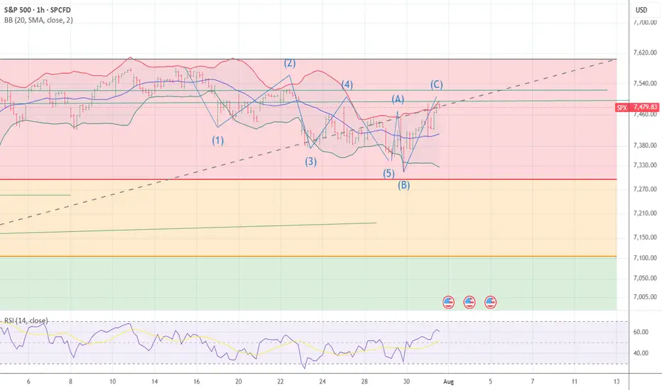
ABC and {A] x 1,618 = [C] 7489 I moved back to 90 % short SPYThe chart posted is the sp 500 I was flat early and now have moved back to 90 % long in the money puts The spiral from march 9th is 8/5 and The 10yr yield is doing what the 20 and 30 yr have been doing and The us /yen finally turned down from my 161.8 target I am NOT sure what is holding up the sp other that rotation But I am back again in puts at 7475 and 7488 best of trades WAVETIMER
Is this a real break out? Part 1 8/5/26Hi everyone I'm back with another video for all of my subscribers I found a new and interesting chart pattern that might give us cluse to know weather this is a true break out or not. If you look at it from the lens of the wedge pattern that we were previously studying it says that it is a break out but in the lens of the new parallel that I have found it says were into resistance and were more likely to get a retrace to maybe retest the previous all time high and fill the gap to maybe go higher and that will be the real test in the markets! If we cant hold the retrace (if we get it) then its a failed move and a massive fake out. BUT if we do hold then we can go much higher in the SP500 for now I'm a skeptic of the markets. Yes I'm still long certain individual stocks still but I have been taking profits along the way. The bigger time frames are telling me to stay cautious but that doesn't mean you cant take advantage of the current momentum, you just have to analyze properly and look for high probability chart set ups. And if your pattern fails be quick to react to it and drop the ego and cut the position.