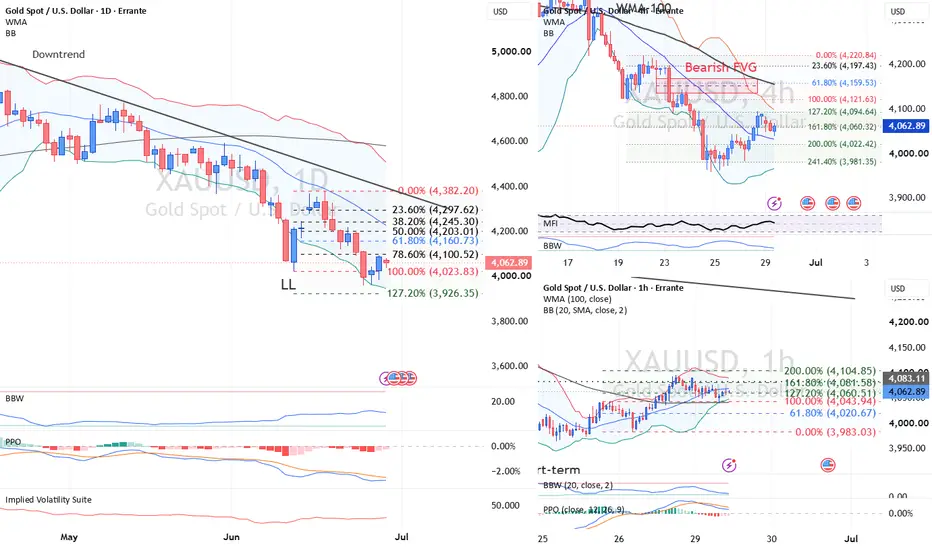
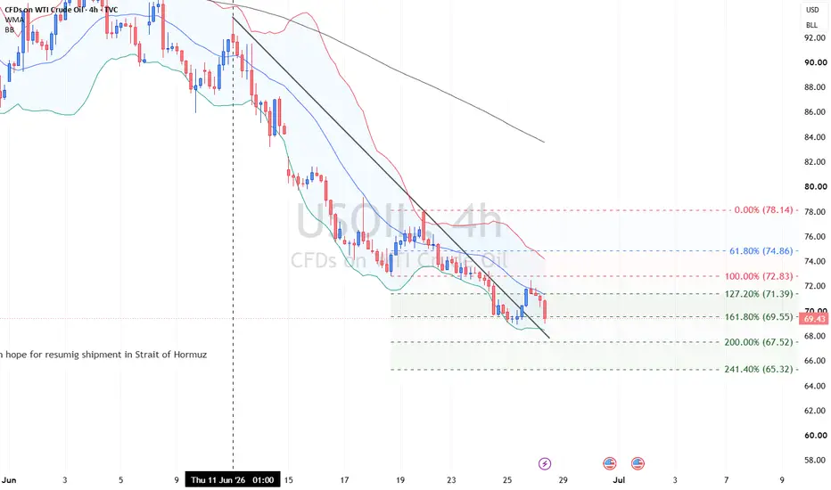
Why can stocks rise while the dollar stays strong?In this 18-minute Errante Analysis & Education session, Ali Mortazavi, our head of education, explains one of the most useful lessons in cross-asset trading:
lower inflation pressure does not automatically mean easier monetary policy.
Using current charts for oil, U.S. Treasury yields, DXY, gold and the S&P 500, we follow the transmission from cheaper oil to inflation expectations, Fed pricing, real yields and asset prices.
The key lesson is simple: traders should not analyse markets in isolation. The same development can support equities while leaving the dollar firm if the interest-rate channel remains restrictive.
Learn how to distinguish:
supply-dri
ven versus recession-driven oil declines
inflation relief versus monetary-policy relief
nominal yields versus real yields
risk sentiment versus front-end rate differentials
temporary price moves versus genuine macro regime change
s
Read the cause first, then follow how it travels through the market.
Educational content only. Not investment advice.  Education
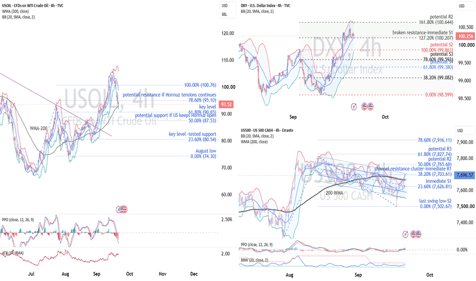
EUR/USD Breakdown: The ECB Hikes but the Euro Gets Energy BillThe European Central Bank has announced a rate hike. The euro has responded by breaking support.
This is not the currency market failing Economics 101. It is the market remembering the small print: higher interest rates can support a currency, provided the economic reasons behind them are not doing more damage elsewhere.
On the chart, EUR/USD is trading near 1.15506, below the September swing low at 1.15640. The ECB’s quarter-point increase, which takes the deposit rate to 2.50% from September 16, has not persuaded buyers to defend that level.
The problem is not a shortage of monetary resolve. It is an increasingly expensive energy shock, a dollar supported by expectations of tighter Fed policy, and a European economy trying to absorb both higher borrowing costs and a larger import bill.
Higher rates are attractive. Higher rates imposed on an economy facing an expensive supply shock are a more complicated sales pitch.
The Chart Has Stopped Giving the Recovery the Benefit of the Doubt
The four-hour structure provides a disciplined way to test that macro argument.
EUR/USD declined from its August peak near 1.1710 to the early-September low around 1.15640. The subsequent rebound reached 1.16537 but stopped below the August high.
That created a lower high. Buyers had improved the immediate price action without repairing the preceding decline.
The latest selloff has now pushed beneath the intervening swing low. This is the important development: the market is attempting to extend a sequence of lower highs and lower lows, rather than merely retreating from resistance.
However, the latest four-hour candle was still forming when the chart was captured. The distinction between a penetration and a completed break remains relevant.
A close below 1.15640, followed by an inability to reclaim it, would strengthen the continuation case. A rebound rejected near the broken level would be especially informative. Under the polarity principle, former support would be starting to function as resistance.
Above that immediate pivot, 1.15982 marks another broken-support reference. Farther overhead, the 200-period WMA near 1.16102 and Bollinger middle band near 1.16119 form a compact moving-average area.
The recovery therefore has several tasks ahead of it. Reclaiming the broken swing low would ease immediate pressure. Recovering the moving-average area would improve the short-term structure. Neither, by itself, would remove the lower high that defines the broader bearish argument on this chart.
The Scenarios That Would Change the Argument
The base case is a bearish continuation attempt. It becomes stronger with a completed close below the broken swing low and subsequent evidence that buyers cannot reclaim it.
The alternative is not necessarily a sudden return to a major uptrend. It can begin as a failed breakdown and develop into a corrective recovery.
Confirmation reduces ambiguity; it does not remove risk. A brief bounce would not erase the downtrend, just as a brief move below support would not guarantee its continuation.
The Euro Needs More Than a Hawkish Headline
Monday’s decline does not mean ECB tightening is irrelevant. It means the interest-rate benefit is competing with an increasingly uncomfortable energy-and-growth calculation.
The euro must absorb the consequences of more expensive imports while the dollar approaches a Fed meeting with substantial tightening already anticipated. That leaves the currency pair sensitive not only to the decisions themselves, but to changes in the expected path beyond them.
The chart reflects that tension. The rebound stopped at a lower high. Price is pressing beneath a significant swing low. Momentum supports the selling, but the completed close and the behaviour around broken support still matter.
The central question is not whether the ECB sounds determined. It is whether the euro’s relative economic proposition is improving.
For now, the market appears unconvinced.
The ECB has raised the prospective return on euros. The energy market has raised the cost of owning the European outlook. EUR/USD is where those two calculations meet.
Why a Softer Dollar Is Not Enough for SterlingMarket: GBP/USD
Timeframe: 1 Hour
Current condition: Bearish pressure is building below 1.3552, but the 1.3521–1.3528 confluence zone is the real technical test.
GBP/USD is doing something more interesting than the headline dollar story suggests.
The Dollar Index is softer near 98.8, yet sterling has failed again around 1.3550 and is slipping toward 1.3530. At first glance, that looks contradictory. If the dollar is weakening, why is GBP/USD not moving higher?
Because the dollar is not weakening evenly.
Much of today’s pressure on the greenback is coming from a powerful yen rally. USD/JPY has fallen sharply as traders unwind short-yen carry trades and price a faster Bank of Japan tightening cycle. The yen has gained roughly 4.5% from last week’s lows, enough to weigh materially on the broad dollar index. Sterling, by contrast, is roughly flat against the dollar.
That gives us the central lesson from this chart:
A weaker DXY does not automatically mean a weaker dollar against every currency. FX is always a relative-value market.
For GBP/USD, the question is not whether the dollar is broadly strong or weak. It is whether the UK monetary, fiscal and growth outlook is improving faster than the U.S. outlook.
Right now, the answer is not clear enough to push sterling through resistance.
Sterling Has Rate Support, But It Comes With a Catch
The pound does have an important fundamental support: the Bank of England is no longer discussing only how quickly it can ease.
Chief Economist Huw Pill has argued for raising Bank Rate from 3.75% to 4%, warning that an early and decisive move could prevent the energy shock from becoming embedded in wages and prices. Three of nine MPC members already voted for a hike in July.
Normally, a more hawkish central bank is positive for its currency. Higher expected rates raise the prospective return on sterling assets and can attract capital.
But there is an important distinction between good higher yields and bad higher yields.
If UK yields rise because markets expect tighter BoE policy alongside resilient growth, sterling can benefit.
If yields rise because investors demand more compensation for inflation uncertainty, fiscal risk or excessive government borrowing, the currency may not benefit at all. In extreme cases, gilt yields can rise while sterling falls.
That distinction has become crucial in Britain.
The BoE itself has acknowledged that UK financial conditions have tightened materially and that the upward slope of the rate curve reflects not only Bank Rate expectations but also higher risk premia.
So the pound cannot simply treat every increase in UK rates as bullish carry.
Fiscal Reassurance Is Helpful, But Not Yet a Sterling Catalyst
Recent government communication has tried to address exactly this problem.
The UK government has reiterated its commitment to fiscal discipline, controlling borrowing and maintaining a buffer against uncertainty, while also proposing supply-side measures intended to improve long-term investment and productivity.
That matters for sterling because fiscal credibility affects the currency through the sovereign-risk channel.
A credible budget can reduce the risk premium embedded in gilts, attract longer-term capital and lower the probability that monetary policy must compensate for loose fiscal policy.
But reassurance is not the same as a new bullish catalyst.
Markets are still waiting for harder answers on spending, taxation and fiscal headroom. Sterling has therefore received some support from improved credibility, but not enough to generate a major repricing.
That is exactly the kind of environment in which a currency can remain fundamentally supported without being able to break technical resistance.
The UK Economy Is Sending a Mixed Signal
The second constraint is growth. Recent British Retail Consortium data showed total retail sales growth slowing to just 0.7% year on year in August, from 1.3% in July, the weakest pace in four months. Like-for-like growth slowed to 0.5%. This is not the same as official ONS retail-sales data, but it provides a useful high-frequency indication of consumer demand.
For the BoE, weak demand matters because the current inflation problem is largely supply-driven. Higher energy prices can push inflation upward while simultaneously reducing household purchasing power.
That creates an uncomfortable policy mix:
Higher inflation argues for tighter policy.
Weaker domestic demand argues for caution.
This is why sterling’s rate story is less straightforward than simply saying “the BoE is hawkish, therefore GBP should rise.”
The Dollar Has the Opposite Problem
The U.S. side of GBP/USD is almost the mirror image.
Friday’s employment report was much stronger than expected. Nonfarm payrolls rose 162,000, almost three times consensus, while unemployment held at 4.1% despite an increase in the labor force.
Markets responded by rebuilding Fed-hike expectations. Traders are now assigning a meaningful probability to another September increase. That is fundamentally supportive for the dollar.
Oil complicates the picture further.
Brent remains elevated as Middle East tensions threaten energy infrastructure and shipping through the Gulf. For the Fed, higher energy costs raise the risk that inflation stays sticky just as the labor market appears stronger than previously feared. This makes this week’s inflation data unusually important.
The market has already learned that employment is strong enough to keep another hike alive. Inflation now determines whether the Fed actually needs to use that option.
So despite the softer DXY, the bilateral USD side of GBP/USD still has meaningful rate support.
The Chart Is Showing That Relative Balance
That macro tension is visible almost perfectly around 1.3550. GBP/USD has repeatedly struggled in the 1.3548–1.3552 area. The latest rally reached the previous swing high near 1.35523, failed to establish acceptance above it and reversed sharply.
That rejection matters because price did not stall randomly. It failed at an established supply zone and then broke the intervening swing low near 1.35331. That changes the short-term sequence.
The chart now shows:
Resistance rejection → lower rotation → swing-low break
The bearish case therefore has structural evidence behind it, although it is still early. A sustained hourly close below 1.35331 would make the break more meaningful. A rebound that subsequently fails beneath 1.35331 would be even stronger confirmation because former support would have become resistance under the polarity principle.
Momentum Is Turning, But It Has Not Fully Broken Yet
The PPO adds another layer. Momentum has rolled over near the zero line, the fast line has slipped below the signal line and the histogram has turned negative. That supports the bearish price action, but the location matters. The PPO is only marginally below equilibrium. This is not yet a mature bearish momentum regime. A cleaner move below zero with an expanding negative histogram would provide stronger evidence that the rejection from 1.3550 is developing into a directional decline rather than another short-lived oscillation inside the range.
This is a good example of why indicators should confirm structure rather than replace it.
The swing break came first.
The PPO is now being asked to validate it. The Most Interesting Signal Is Actually Volatility
Bollinger Band Width is close to 0.13, almost at the lower end of its recent range.
That means spot-price volatility is extremely compressed.
At the same time, the chart’s implied-volatility rank is around 54, placing options volatility around the upper half of its recent range. That contrast is useful. The spot market is quiet, but the options market is not completely relaxed.
Why?
Because known event risk is approaching: U.S. inflation data, the FOMC decision, the Bank of England meeting and continued geopolitical uncertainty. This is exactly the type of environment in which price can remain compressed until one new piece of information forces a rapid repricing. For the current bearish break to gain credibility, traders should therefore watch Bollinger Band Width closely.
A move below 1.35331 accompanied by rising Band Width would suggest that the market is moving from compression into bearish expansion.
If Band Width stays pinned near its lows, the probability of another false break increases.
The Real Technical Test Sits Below 1.3530
The first Fibonacci projection is near 1.35279, but the more important area lies slightly lower.
Between roughly 1.3521 and 1.3528, several technical references begin to overlap:
• 127.2% Fibonacci projection near 1.35279
• 200-period WMA near 1.35255
• Rising trendline support in the same region
• 161.8% projection near 1.35212
This is the strongest confluence zone on the chart. That makes the area more important than any individual Fibonacci number.
If GBP/USD reaches this region and buyers respond strongly, the current decline may still be another correction within the broader rising structure.
If the pair breaks through the entire zone while momentum and Band Width expand negatively, the technical message changes considerably. The 200% projection near 1.35139 then becomes the next downside reference.
What Would Invalidate the Bearish Case?
The bearish setup is straightforward to invalidate. A recovery above 1.35404, the 61.8% internal level, would show that sellers are losing immediate control.
But the more important level is 1.35523. That is the recent swing high and the top of the current resistance zone. A sustained break above it would remove the failed-breakout structure and show that buyers have finally absorbed the supply that has repeatedly capped sterling.
At that point, the bearish thesis would no longer be technically justified.
The Two Scenarios That Matter
The bearish continuation scenario needs more than another red candle.
GBP/USD should remain below 1.35331, PPO should move deeper into negative territory and Bollinger Band Width should begin expanding. That would expose the 1.3521–1.3528 confluence zone, followed by 1.35139 if support fails.
Fundamentally, the strongest confirmation would come from U.S. inflation remaining firm enough to preserve Fed-hike expectations while UK growth data continue to show limited ability to absorb additional tightening.
The bullish failure scenario begins if the current breakdown cannot survive the confluence support zone. A recovery through 1.35404 followed by a break above 1.35523 would indicate that the bearish move was another failed attempt to leave the range.
Fundamentally, that would become more plausible if U.S. inflation cools enough to unwind Fed-hike pricing while UK policy expectations remain relatively firm.
The Bigger Lesson From GBP/USD
Today’s GBP/USD chart teaches something more useful than whether cable trades at 1.3510 or 1.3560 next. Currencies do not respond to economic news in isolation.
They respond to relative changes in expectations. Sterling has a more hawkish BoE debate, but it also has weak consumer momentum and unresolved fiscal questions.
The dollar is falling on the DXY, but much of that weakness is being generated by a dramatic repricing of the yen rather than a collapse in U.S. rate support.
That is why GBP/USD can reject resistance even on a day when the broad dollar index is falling.
The technical chart is simply showing where those relative forces meet.
For now, that battlefield is clear:
1.35523 defines bullish invalidation of the bearish setup.
1.35331 is the broken short-term pivot.
1.3521–1.3528 is the key confluence support zone.
The important lesson is not “GBP bearish” or “USD bullish.”
It is this:
In FX, never analyse one currency. Analyse the spread between two economic stories.
That is where the trade actually lives.
This analysis is for educational purposes only and does not constitute investment advice.
The Bond Market Is Pricing More Than a Fed Hike
Market: TVC:US10Y U.S. 10-Year Treasury Yield
Current condition: Bullish yield breakout above 4.744%, testing the 4.78–4.80% resistance zone
The U.S. 10-year Treasury yield is back near 4.78%, breaking above a resistance area that had repeatedly stopped the market around 4.74–4.75%.
The obvious explanation is simple: the Federal Reserve has turned more hawkish.
But that is only part of the story.
If this were purely a Fed-hike trade, we would expect most of the pressure to sit at the front end of the curve. Instead, longer-dated yields are also pushing aggressively higher, the curve is steepening, oil is back above $90, global bond markets are selling off together, and investors are asking for more compensation to own duration.
That changes the interpretation completely.
The market is no longer asking only:
“Will the Fed hike again?”
It is increasingly asking:
“What yield do I need to own a 10-year bond in a world of sticky inflation, heavy government borrowing and higher global rates?”
That is a much bigger question.
First, What Are We Actually Looking at?
The 10-year Treasury yield is often described as the market’s view of future interest rates. That is useful, but incomplete.
Conceptually, a long-term yield can be broken into two broad components:
Expected short-term rates + term premium
The first part reflects where investors think Fed policy and short-term rates will average over time.
The second is the extra compensation investors demand for taking long-duration risk, inflation uncertainty, changing real rates, fiscal policy, bond supply and the possibility that the world looks very different several years from now.
This distinction is the key to understanding the current breakout.
Chair Kevin Warsh changed expectations for the policy path.
Oil and fiscal concerns are changing the price investors demand for duration.
Both are pushing yields higher, but through different channels.
Warsh Lit the Match
The latest repricing began with a clear message from the Fed.
Warsh argued that inflation remains too high, the labor market is still compatible with full employment, consumer and investment demand remain healthy, and financial conditions are difficult to describe as genuinely restrictive.
He highlighted PCE inflation running at 3.7% over twelve months and roughly 4.1% over six months, while unemployment remained around 4.1%.
For the bond market, the implication was straightforward:
The Fed may not be finished.
That immediately pushed traders toward a much higher probability of another rate increase in September.
And importantly, the first large reaction appeared in the short end.
That makes sense.
The 2-year Treasury is tightly linked to expectations for the next several Fed meetings. Change the expected policy path, and the 2-year usually reacts first.
Last week was largely a Fed repricing story.
Today is becoming something broader.
Then Oil Changed the Question
Brent crude moving back above $90 matters for bonds because energy shocks do more than lift next month’s inflation print.
They alter the distribution of future inflation.
If an oil shock is brief, the Fed can potentially look through part of it. But if higher energy prices feed transportation costs, manufacturing inputs, services prices and household expectations, investors have to consider a more persistent inflation regime.
For a 2-year note, the question is mainly:
Does this force another Fed hike?
For a 10-year bond, the question is wider:
Does this mean inflation, nominal growth and policy uncertainty remain higher for longer?
That second question feeds directly into the term premium.
This is why a sustained energy shock can push the long end higher even without an endless series of Fed hikes.
The 10-year is not simply pricing the next FOMC meeting. It is pricing the uncertainty around the next decade.
The Curve Is Telling Us Where the Pressure Comes From
This is where the yield curve becomes much more useful than the headline 10-year yield.
The 2-year is trading around 4.36%.
The 10-year is near 4.78%.
The 30-year is around 5.27%.
So the 2s10s spread is roughly +42 basis points, while the 30-year trades almost another 50 basis points above the 10-year.
The curve is positively sloped - and the long end remains under significant pressure.
Why does that matter?
A pure hawkish-Fed shock often pushes short rates up faster than long rates. That tends to flatten the curve.
But when long yields rise aggressively as well, investors are telling us that the problem extends beyond the next policy decision.
That is usually where inflation uncertainty, stronger nominal growth, fiscal supply and term premium enter the story.
This makes today’s market much more interesting than a simple “Fed hawkish, yields up” headline.
And It Is Not Just America
There is another clue: the selloff is global.
Japanese 10-year yields have reached levels not seen in decades. German and other European sovereign yields are also moving higher.
That matters because global bond markets compete for capital.
When foreign sovereign bonds suddenly offer meaningfully higher yields, Treasuries become less exceptional. Global investors do not have to accept yesterday’s U.S. yield when comparable alternatives now offer better returns.
So U.S. yields must adjust.
In other words, part of today’s move is not about the Fed at all.
It is about the global price of duration moving higher.
That is an important distinction for the dollar as well. Rising U.S. yields normally support USD when the move increases America’s relative rate advantage. But when Japanese and European yields are climbing at the same time, that relative advantage becomes less powerful.
Higher Treasury yields do not automatically mean a proportionally stronger dollar.
Then Comes the Supply Problem
There is another force sitting quietly behind the move: Treasury issuance.
The U.S. government expects to borrow roughly $739 billion in privately held net marketable debt during the July–September quarter, above its previous estimate.
The simple version is “more supply pushes yields higher.”
The more useful version is this:
Every new Treasury security must find a buyer.
If the amount of duration being issued rises faster than investors' willingness to absorb it at current prices, bonds have to become cheaper.
Cheaper bond prices mean higher yields.
The adjustment continues until the market clears.
This is one reason fiscal policy affects the long end differently from the front end. The Fed largely controls the overnight policy rate. It does not directly determine the yield investors require to absorb enormous amounts of 10-, 20- and 30-year government debt.
That price is discovered in the market.
And when supply is high while inflation uncertainty is rising, investors tend to demand a larger term premium.
Why the Driver of the Yield Matters
Two markets can both show a 4.78% 10-year yield and still send completely different signals.
Suppose yields rise because economic growth expectations improve.
That can be reasonably constructive for cyclicals and risk assets.
Now suppose the same yield rises because investors demand more compensation for inflation uncertainty and government borrowing.
That is much less comfortable.
And if the increase comes mainly through real yields, the consequences can be especially powerful.
Higher real yields raise the discount rate applied to future cash flows. That puts pressure on assets whose valuation depends heavily on earnings far into the future - particularly high-duration technology and growth shares.
It can also challenge gold because the opportunity cost of holding a non-yielding asset rises.
This is why traders should never stop at:
“The 10-year is rising.”
The better question is:
“Which component is rising - expected policy rates, inflation expectations, real yields, or term premium?”
That is where cross-asset analysis begins.
The Chart Says the Market Has Accepted Higher Yields
Now the macro story becomes visible in price.
For weeks, the 10-year yield repeatedly struggled near 4.744%.
That area was genuine resistance because the market tested it several times and failed.
Now it has broken.
This is important from a CMT perspective because resistance represents a zone where supply was previously strong enough to stop the advance. Once the market pushes through and holds above it, the balance of pressure has changed.
The old ceiling becomes the first potential floor. So 4.744% is no longer just a former swing high. It is now the first structural support under the breakout. That is the polarity principle in action.
4.78–4.80% Is the First Real Test
The yield is now trading almost exactly around the 127.2% Fibonacci expansion at 4.778%.
At the same time, the upper Bollinger Band sits near 4.80%. That creates an immediate technical resistance zone around:
4.78–4.80%
This is where the current move becomes interesting. A clean push above the zone would suggest that the market is accepting a new, higher yield regime rather than simply overshooting the previous resistance.
If that happens, the next Fibonacci projections sit near:
4.821% - 161.8% expansion
and then:
4.869% - 200% expansion
These are not guaranteed targets. They are potential reaction zones where the balance between fresh bond selling and duration demand should be reassessed.
Momentum Is Supporting the Breakout
The Percentage Price Oscillator is giving the breakout technical credibility.
The PPO line is above its signal line, both are above zero, and the histogram is expanding positively. That combination tells us more than a simple bullish crossover.
Momentum is strengthening in an already positive regime.
The Bollinger Band Width is also expanding rapidly after a period of compression.
This is exactly the behaviour technicians normally want to see after a resistance breakout:
structure breaks first, then momentum accelerates, then volatility expands.
That sequence is currently intact.
There is one important trap to avoid, however.
The yield is sitting near the upper Bollinger Band.
That does not automatically mean it is “overbought” and ready to reverse.
Strong trends often ride the outer band. The warning comes when the market stops making progress while momentum deteriorates and volatility expansion fades.
We do not have that combination yet.
The Support Map Matters More Than Chasing the High
The first support is now 4.744%, the broken swing high.
A shallow retest of that area would not damage the bullish structure. In fact, a successful retest could strengthen it by showing that former resistance has turned into support.
Below that sits a much more interesting confluence zone around 4.68–4.70%.
Why?
Because the 61.8% Fibonacci level near 4.696% sits close to the rising 200-period WMA around 4.68%.
That gives the area two independent technical references: Fibonacci structure and dynamic trend support.
Below both sits the August swing low around 4.619%. That is the level where the bullish yield structure would become much harder to defend.
So the hierarchy is straightforward:
Above 4.744%: breakout remains intact.
Below 4.744%: momentum cools, but trend structure can survive.
Below 4.68–4.70%: the breakout loses significant quality.
Below 4.619%: the broader bullish yield structure is damaged.
Four Regimes Traders Should Understand
The cleanest outcome for higher yields would be strong growth, firm labor demand and persistent price pressure. That combination would validate both a higher Fed path and a higher nominal-growth regime. In that environment, 4.821% and potentially 4.869% become realistic technical tests.
A more difficult outcome would be weak growth but stubbornly high prices. That is a stagflationary mix, and it can be surprisingly hostile to long-duration bonds because the Fed has less freedom to ease while inflation uncertainty remains elevated.
The cleanest bullish case for Treasury prices would be weaker labor demand combined with cooling manufacturing prices. That could pull the 10-year back below 4.744% and expose the 4.68–4.70% confluence zone.
But there is a fourth regime that deserves more attention: weak labor data alongside persistent oil pressure and rising global yields.
In that case, the front end may rally while the long end refuses to follow. That would tell us the problem has moved away from the Fed and deeper into term premium. And that may be the most important signal of all.
What the Bond Market Is Really Saying
The 10-year Treasury is not simply forecasting the next Fed decision. It is clearing the market for long-term money.
Expected Fed policy matters.
Inflation matters.
Real growth matters.
Oil matters.
Treasury supply matters.
Foreign bond yields matter.
The term premium ties all of them together.
Last week, Warsh pushed the market toward a higher expected policy path.
Now oil, global yields and fiscal supply are pushing investors to demand more compensation for holding duration.
The technical breakout above 4.744% tells us those forces have become strong enough to change the market structure.
The next battlefield is 4.78–4.80%.
Acceptance above it opens 4.821%, followed by 4.869%.
Failure there would shift attention back toward the 4.744% breakout level.
But the bigger lesson is not whether the 10-year eventually prints 4.8%, 4.9% or 5%.
It is learning to identify why it is moving.
If short and long yields rise together because the market expects stronger growth and tighter Fed policy, that is one regime.
If the long end keeps rising while the front end stabilizes or falls, that is another and potentially more important regime.
The curve tells us the source of the pressure.
The chart tells us when the market accepts it.
And the fundamentals explain why investors are demanding a different price for duration.
That is how the bond market should be read: not as one yield, but as a system.
 Education
Education
Sterling Tests 1.3564 as UK Data Take Control of the BreakoutSummary
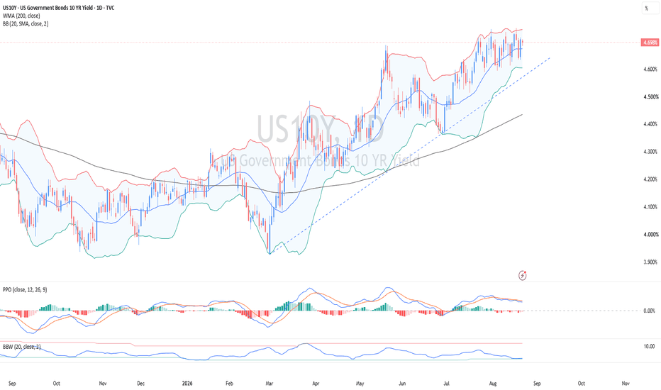
GBP/USD ERRANTE:GBPUSD maintains a bullish 4-hour structure above 1.3518, but is testing major resistance around 1.3564-1.3570.
The fundamental backdrop is mildly GBP-positive due to UK resilience and a relatively cautious Fed outlook.
UK labour data and CPI are the key directional catalysts this week.
A confirmed break above 1.3564 would expose 1.3589, followed by 1.3616 and 1.3645.
Technical momentum supports continuation, but price is at a decision zone requiring fundamental confirmation.
Fundamental Thesis (Primary Driver)
GBP/USD is currently being driven more by relative macro expectations than pure technical structure, with the UK–U.S. policy divergence acting as the dominant catalyst.
The UK economy has shown resilient growth momentum, with Q2 GDP expanding and household consumption remaining firm. However, the labour market is beginning to soften, with elevated unemployment and moderating private-sector wage growth. This creates a key tension: growth is holding up, but disinflationary pressures are emerging.
The Bank of England remains structurally hawkish on inflation risk, reinforced by the fact that three MPC members recently preferred a rate increase. This signals that policy is not yet pivoting decisively toward easing, and keeps UK rate expectations relatively elevated.
The most important near-term catalyst is this week’s UK labour data and CPI release. Strong wage growth or upside inflation surprise would reinforce the BoE’s restrictive stance and support sterling. Conversely, softer data would quickly weaken the hawkish narrative and reduce GBP support.
On the U.S. side, the macro tone has softened. Q2 GDP slowed, payrolls contracted, and retail sales declined, while inflation has moderated enough to reduce expectations for an imminent Fed hike. However, the Fed remains cautious, and upcoming FOMC minutes could reintroduce short-term dollar support if they lean hawkish.
Overall, the fundamental bias is mildly GBP-positive, but highly event-dependent. The UK data this week will determine whether GBP/USD can sustain a breakout above resistance or remain range-bound.
4-Hour Chart: Bullish Structure Meets Major Resistance
The 4-hour chart remains structurally bullish. GBP/USD has recovered from the August swing low near 1.3474 and established a sequence of higher lows and higher highs. Price is also trading well above the rising 200-period WMA near 1.3438, confirming that the current advance is not merely a short-term mean-reversion move.
The Bollinger basis near 1.3514 is rising underneath price, while the upper band near 1.3563 overlaps almost precisely with the 127.2% Fibonacci projection at 1.3564. This creates a technically significant resistance cluster.
Momentum is supportive. PPO has turned higher above its zero line and the histogram is expanding, while Bollinger Band Width is beginning to increase. The combination of positive momentum and expanding volatility generally supports trend continuation.
However, price is now testing resistance after a substantial advance, meaning the bullish thesis requires fundamental confirmation to sustain continuation.
Momentum and Market Conditions
The two timeframes show constructive but asynchronous momentum.
On the 4-hour chart, PPO momentum is strengthening and Bollinger Band Width is expanding. This supports the continuation thesis.
Key Levels to Watch
Resistance
• 1.3564-1.3570 - Immediate resistance cluster, 127.2% projection and breakout trigger zone
• 1.3589 - 161.8% Fibonacci extension and first breakout target
• 1.3616 - 200% extension and continuation target
• 1.3645 - 241.4% extension and higher bullish objective
Support
• 1.3545 - Immediate support and first short-term invalidation level
• 1.3518 - 61.8% level and 30-minute 200-WMA confluence
• 1.3474 - August swing low and major structural support
• 1.3438 - 4-hour 200-WMA and deeper trend support
Fundamentally Driven Scenario Outlook
Bullish Scenario (Fundamental Confirmation Required)
The bullish continuation scenario depends on UK data reinforcing BoE hawkishness.
If UK labour data and CPI surprise to the upside, markets would likely reprice BoE policy toward tighter-for-longer conditions. This would strengthen gilt yields and support GBP.
In that environment, a sustained break above 1.3564-1.3570 would likely trigger momentum continuation toward 1.3589, followed by 1.3616 and 1.3645.
The strongest bullish setup would combine:
Strong UK inflation or wage data
Stable or weaker U.S. activity data
Breakout confirmation above resistance
Neutral Scenario (Data Wait State)
GBP/USD may remain trapped between 1.3545 and 1.3564 as markets await UK labour and CPI data.
This would reflect a macro equilibrium phase, where neither BoE nor Fed expectations are shifting decisively.
In this case, technical signals alone are insufficient, and breakouts above resistance would remain unconfirmed without macro support.
Bearish Scenario (UK Data Disappointment)
A downside scenario would emerge if UK labour data and CPI both disappoint, reducing expectations for further BoE tightening.
In that case:
1.3545 breaks first
1.3518 becomes the key downside trigger
1.3474 becomes exposed on deeper correction
This would likely coincide with:
Softer UK wage/inflation data
Relatively stable or hawkish Fed messaging
Rising USD demand on yield support
Trading Considerations
From a macro-technical integration perspective:
Bullish traders should prioritize confirmation above 1.3564-1.3570, ideally supported by strong UK data.
Range traders may focus on 1.3545–1.3564 compression while awaiting CPI and labour data.
Bearish traders require a break below 1.3545, with stronger conviction below 1.3518.
Event risk is elevated this week, with UK labour data, CPI, and FOMC minutes all capable of shifting rate expectations and invalidating technical setups.
Conclusion
GBP/USD remains in a technically bullish structure but fundamentally conditional breakout phase.
The 4-hour chart shows strong trend characteristics, with rising momentum and expanding volatility. However, price is now testing a major resistance zone at 1.3564-1.3570, where direction will be determined by macro data.
The fundamental backdrop is mildly supportive for GBP due to UK resilience and a relatively softer U.S. growth profile, but this advantage is data-dependent and fragile.
A confirmed break above resistance, supported by strong UK labour and inflation data, would validate continuation toward 1.3589, 1.3616, and 1.3645.
Failure of UK data or a break below 1.3545 would shift focus back toward 1.3518 and potentially 1.3474.
In summary, GBP/USD is not yet a confirmed breakout, it is a fundamentally conditional bullish setup awaiting UK data validation.
France 40 Breaks to a Record: Fundamental and Technical ViewEducation / Technical and Fundamental Analysis
Market: France 40 Cash
Timeframe: Daily
Bias: Constructive above 8,648, with confirmation required beyond 8,762
The France 40 has broken above a multi-month triangle and moved beyond its previous year-to-date record. At first glance, the message appears straightforward: price is rising, momentum is strengthening and new highs are attracting buyers.
But a breakout becomes more useful when we understand what the market is actually repricing.
An equity index does not rise simply because economic news is “good.” It rises when investors revise expected corporate cash flows upward, reduce the discount rate applied to those cash flows, or become willing to accept a lower risk premium.
The current France 40 breakout reflects elements of all three processes. Corporate earnings expectations have improved, geopolitical optimism has reduced part of Europe’s energy-risk premium, and the recovery in luxury shares has strengthened one of the index’s most influential segments.
The chart therefore represents more than a geometric pattern. It shows how changing expectations are being translated into price.
Why the France 40 Is Not the French Economy
The first analytical mistake is to treat the France 40 as a direct measure of domestic French growth.
France’s economy remains relatively weak. Growth is expected to stay below 1% in 2026, while unemployment is projected to rise and the government continues to operate with a large fiscal deficit and an increasing public-debt ratio.
Yet the index is breaking to a record.
This is not necessarily a contradiction.
The France 40 is a free-float-capitalisation-weighted portfolio of large companies listed in Paris. Its largest constituents include TotalEnergies, Schneider Electric, LVMH, Air Liquide, Sanofi, Airbus, Safran, BNP Paribas, L’Oréal and AXA. The ten largest members account for nearly 60% of the index.
Many of these companies earn a substantial part of their revenue outside France. Their profits depend on global luxury spending, aerospace orders, energy prices, industrial investment, financial conditions, exchange rates and international growth.
The index is therefore better understood as a collection of globally exposed French-listed companies than as a pure domestic-economy portfolio.
That distinction explains how the France 40 can strengthen while French household demand and employment remain soft. The market is not pricing current French GDP alone. It is discounting the future earnings of multinational companies.
The Fundamental Bridge: From News to Index Price
A useful fundamental analysis framework is to view an equity index as the present value of its constituents’ expected future cash flows.
Fundamental developments affect the index through three main channels.
The first is the cash-flow channel. Stronger revenue, wider margins, improved guidance or better earnings expectations increase the numerator in the valuation equation.
The second is the discount-rate channel. Lower bond yields, softer inflation risk or reduced uncertainty increase the present value of future earnings because investors apply a lower required return.
The third is the risk-premium channel. Even when expected earnings are unchanged, equities can rise if investors perceive that the probability of an adverse outcome has declined.
The current France 40 advance includes all three, but their contributions are not equal.
European second-quarter earnings forecasts have been upgraded materially during the reporting season. That improves the cash-flow side of the valuation. Meanwhile, optimism surrounding a potential diplomatic framework in the Middle East has reduced the probability of a prolonged disruption to shipping through the Strait of Hormuz. That lowers the perceived energy and geopolitical tail risks embedded in European assets.
At the same time, the ECB has not committed to an easing cycle. Policy rates were left unchanged in July, and the central bank continues to monitor the inflationary consequences of the energy shock. The rally is therefore not simply a low-rate liquidity trade. It is increasingly dependent on earnings delivery and a reduction in risk premia.
That makes the breakout fundamentally healthier than a rally driven entirely by valuation expansion, but also more sensitive to corporate guidance.
Earnings Are Doing More Work Than the Domestic Economy
The timing of the breakout matters.
European corporate earnings expectations have risen significantly during the reporting season. Investors are no longer merely hoping that companies can absorb the energy and geopolitical shock. They are seeing evidence that many businesses have preserved revenue, margins or capital returns better than initially expected.
This changes the market’s probability distribution.
Suppose investors originally expected a severe decline in profits but companies instead report modest growth. The market does not require outstanding results to rally. It only needs the realised outcome to be better than the discounted expectation.
That is one reason price can rise in a mediocre economic environment.
The France 40 is particularly sensitive to this process because of its concentration. A relatively small number of large constituents can move the index meaningfully. When luxury shares such as Hermès and LVMH rebound, the impact is larger than their daily percentage changes might suggest because consumer non-durables represent one of the index’s largest sector exposures.
The current recovery in luxury shares therefore matters. It is not just a sector story; it is an index-level earnings and sentiment signal.
However, the quality of the breakout will depend on breadth. A rally driven only by a few luxury companies would be less durable than one supported by industrials, aerospace, financials, healthcare and energy.
Oil Creates a Two-Sided Effect
Falling geopolitical tension and lower oil prices are often described as automatically bullish for European equities. The relationship is more complex for the France 40.
Lower oil prices can support the index through several channels:
They reduce input and transportation costs, improve household purchasing power, lower the risk of second-round inflation and reduce pressure on the ECB to maintain a more restrictive policy stance. This benefits consumer companies, manufacturers, airlines, chemicals and other energy-sensitive sectors.
But TotalEnergies is the largest component of the index, with a weight of roughly 9.5% in Euronext’s March factsheet. Lower oil can weaken the expected cash flows of this major constituent.
The net effect therefore depends on whether the benefit to the remaining companies outweighs the drag on energy earnings.
The current breakout suggests that the market is treating lower energy risk as broadly positive. In other words, investors appear to believe that improved margins, consumer conditions and reduced inflation risk across the rest of the index are more valuable than the potential decline in oil-company profits.
That conclusion must still be confirmed by sector participation. If TotalEnergies weakens sharply while luxury, industrial and financial shares lose momentum, the headline index could struggle to maintain the breakout.
The Technical Structure: From Compression to Price Discovery
The daily chart shows a large contracting triangle formed between the March peak, the March low, the May recovery high and the later higher low.
A triangle represents a temporary balance between supply and demand. Successive lower highs show that sellers are entering earlier, while successive higher lows show that buyers are becoming more aggressive.
The pattern itself is neutral until price breaks one of its boundaries.
France 40 first moved above the triangle’s descending resistance line. That was the initial technical signal that supply inside the pattern had been absorbed.
The more important confirmation followed when price cleared the July high around 8,559 and then broke above the previous year-to-date record near 8,648.
This created a two-stage breakout:
A break from the contracting triangle.
A break above horizontal record resistance.
The second event is especially important. A pattern breakout can fail while price remains below a major swing high. By clearing both the pattern boundary and the horizontal high, the index has entered a price-discovery phase in which historical overhead supply is limited.
Former resistance near 8,648 should now be monitored as immediate support under the polarity principle.
What the Indicators Add
The Percentage Price Oscillator has moved into a bullish regime. The PPO line is above its signal line, both are above zero, and the positive histogram is expanding.
This tells us that the short-term moving average is rising faster than the longer-term average. More importantly, momentum is strengthening above the equilibrium line rather than merely producing a crossover from deeply negative territory.
That supports the breakout.
Bollinger Band Width is also rising from a compressed base. This matters because triangles are volatility-contraction structures. A credible breakout should normally be followed by volatility expansion as price moves away from the former equilibrium area.
The current combination is constructive:
Price has broken resistance, momentum is positive and volatility is expanding.
However, Band Width remains well below its previous extreme. This suggests the market has entered expansion, but not yet an uncontrolled or climactic phase. The move may still have room to develop before volatility becomes excessive.
The implied-volatility reading near 30 also indicates that options markets are not yet pricing a severe stress regime. That supports orderly continuation, but it should not be interpreted as safety. Moderate implied volatility can quickly rise if earnings disappoint, oil rebounds or French sovereign risk re-emerges.
Fibonacci Expansion and the Next Decision Zones
The chart’s Fibonacci grid measures the correction from the July swing high near 8,559.35 to the July swing low near 8,232.04 and projects possible resistance levels above the prior high.
The index has already cleared the 127.2% expansion at 8,648.38, which closely overlaps with the former year-to-date record. This overlap created a technical confluence zone.
The breakout above it is meaningful because two independent forms of resistance - the historical high and the Fibonacci projection - were removed together.
The next resistance is the 161.8% expansion at 8,761.63. With price near 8,729, the index is approaching this level and may require either consolidation or another earnings catalyst before extending.
Beyond that, the next projections are:
8,886.66: 200% expansion
9,022.17: 241.4% expansion
These levels are not forecasts. They are areas where the balance between profit-taking and new demand should be reassessed.
The immediate technical question is whether France 40 can close above 8,762. A confirmed break would suggest that the breakout is developing into a broader markup phase rather than ending as a short-lived move above the former record.
Support Is More Important Than the Target
In breakout analysis, traders often focus too heavily on upside targets. The more useful question is where the bullish thesis would begin to fail.
The first support is 8,648.38, the former record high and 127.2% Fibonacci level. A temporary retest would be normal. A strong bullish structure should attract demand in this area.
The next support is the July swing high at 8,559.35. A close back below this level would place price inside the previous range and raise the probability of a failed breakout.
Below that, the 61.8% level near 8,434.32 aligns with the upper part of the former triangle. This is the deeper support zone that separates a routine pullback from a more substantial deterioration.
The July low at 8,232.04 stands close to the rising 200-day weighted moving average near 8,245. This creates a major confluence area. A break below this region would invalidate the immediate bullish expansion and materially weaken the medium-term structure.
The hierarchy is therefore clear:
Above 8,648: breakout remains active.
Below 8,559: breakout quality deteriorates.
Below 8,434: risk of re-entry into the old consolidation rises.
Below 8,232–8,245: the medium-term bullish structure is compromised.
What Could Break the Relationship?
The current alignment between fundamentals and technicals is constructive, but it is conditional.
The first risk is an earnings reversal. The market has already upgraded profit expectations, so the hurdle for future guidance is now higher. Once expectations rise, merely meeting forecasts may no longer be enough.
The second risk is renewed energy inflation. A rebound in oil would initially support TotalEnergies but could eventually damage the broader index through higher costs, weaker consumption and a more restrictive ECB reaction.
The third risk is the euro. A sharp appreciation can reduce the translated value of foreign revenue for multinational companies reporting in euros. This is particularly relevant for luxury, aerospace and industrial exporters.
The fourth risk is French fiscal stress. France’s large deficit, rising debt burden and elevated financing needs can widen the sovereign spread over Germany. Higher sovereign yields increase discount rates, pressure valuation multiples and may revive concerns about the interaction between banks and government debt.
These risks explain why the index can break higher without the underlying macro environment becoming risk-free.
How to Judge the Breakout’s Quality
A professional assessment should not rely on the index level alone. The next phase should be evaluated through participation, momentum and fundamental confirmation.
The bullish case becomes stronger if price holds above 8,648, the PPO remains above zero, Band Width continues expanding and the advance broadens beyond luxury shares into industrials, aerospace, healthcare and financials.
The signal becomes weaker if the index reaches 8,762 while momentum slows, volatility stops expanding or the rally narrows to only a few large companies.
A close back below 8,648 would not automatically end the uptrend, but it would warn that buyers have failed to establish acceptance above the former record. A close below 8,559 would be more serious because it would return price beneath the original breakout level.
Final Takeaway
The France 40 breakout is not evidence that every problem in the French or European economy has disappeared.
It shows something more specific: the market is raising its estimate of future corporate cash flows while reducing the probability assigned to the most damaging energy and geopolitical outcomes.
That repricing is visible in the chart.
The triangle recorded a period of uncertainty. The break above its descending boundary showed that demand was gaining control. The move above the July high and former year-to-date record confirmed that buyers were willing to transact at prices not previously sustained.
Momentum and volatility currently support the move, while moderate implied volatility suggests that the advance has not yet entered a full stress or speculative phase.
The next test is 8,761.63. Above it, attention shifts toward 8,886.66 and 9,022.17. Below the market, 8,648.38 is the first level that must hold if the breakout is to remain credible.
The broader lesson is straightforward:
Fundamentals explain why expectations are changing. Price action shows when investors are prepared to act on those expectations.
Neither should be analysed in isolation.  Long
Long
Gold 1-Hour: How Trend Reversals Develop, Confirm and ProjectMarket: Gold / U.S. Dollar
Timeframe: 1 Hour
Current condition: A bearish reversal is developing, but the structure still needs confirmation.
A trend rarely reverses in one dramatic candle. More often, it weakens in stages.
The market first loses momentum. Then buyers or sellers fail to extend the existing trend. After that, an important swing level comes under pressure. Only when that level breaks does the market provide structural evidence that control may be changing hands.
Gold’s one-hour chart illustrates this process clearly. The previous advance has lost momentum, a lower high has formed beneath the recent peak, and price is now testing the swing low that supports the bullish structure.
The key level is 4,084.46.
A confirmed hourly close below this level would complete the first meaningful break in the rising peak-and-trough sequence. Until then, the chart shows a reversal attempt rather than a confirmed new downtrend.
What Is a Trend Reversal?
A trend is defined by the direction of its successive peaks and troughs.
An uptrend contains higher highs and higher lows. Each new high shows that demand can push price farther, while each higher low shows that buyers are willing to enter before price returns to the previous bottom.
A downtrend follows the opposite sequence: lower highs and lower lows.
A reversal begins when the existing pattern stops progressing. In an uptrend, the first warning often appears when price fails to make another higher high. The stronger signal arrives when the market then breaks below an important higher low.
This distinction separates a normal correction from a genuine reversal.
A correction is a temporary decline within an intact bullish structure. A reversal is a change in that structure.
The timeframe also matters. A bearish reversal on the one-hour chart does not automatically mean the daily or weekly gold trend has turned bearish. It only means the short-term price structure has changed.
Reading the Existing Uptrend
Gold advanced from approximately 4,049 to the area around 4,111. During that move, price produced rising highs and lows before reaching the peak marked HH, or higher high, on the chart.
At that stage, the trend remained healthy. Buyers had successfully extended the advance and no major swing support had been lost.
Price then corrected toward 4,084.46. That decline alone did not confirm a reversal. Every sustainable trend includes countertrend movement, profit-taking and temporary consolidation.
The low near 4,084.46 became important because it was the reaction low separating the recent higher high from the next recovery attempt. It therefore represented the level buyers needed to defend to preserve the short-term bullish sequence.
The First Warning: A Lower High
Gold rebounded from the swing low, but the recovery stopped around 4,105.93, below the previous high near 4,111.
That created a lower high.
A lower high is significant because it shows that the latest group of buyers could not reproduce the strength of the previous rally. Supply appeared earlier, and the market failed to extend its sequence of higher peaks.
The structure now reads:
Higher high → reaction low → lower high → renewed test of the reaction low
This is commonly described as a bearish price failure swing. The trend attempted to continue but failed to establish another higher high.
However, the lower high is only a warning. The bullish structure is not fully broken until price moves below the intervening swing low.
That is why 4,084.46 matters more than the lower high itself.
The Confirmation Level
The current candle has traded below the swing low, reaching approximately 4,081.63. But an intrabar move below support is not always enough.
Price can temporarily penetrate a level, trigger stops, attract liquidity and then recover before the candle closes. This is why technicians often place more weight on closing prices than on brief intraday violations.
A stronger bearish confirmation would involve three stages:
An hourly candle closes clearly below 4,084.46.
Price fails to recover immediately above the broken level.
A later rebound is rejected near the former support.
The third stage is particularly useful.
If gold closes below 4,084.46 and then rallies back toward it, the market will test the principle of polarity. Former support should begin acting as resistance. A rejection from that area would show that buyers are no longer able to reclaim the broken structure.
The most convincing sequence would therefore be:
Breakdown → close below support → retest → rejection
This is stronger evidence than a single bearish candle because it shows acceptance below the former swing low.
Moving Averages: Confirmation After the Structure Changes
The chart shows price testing two moving-average references around 4,085.
The Bollinger Band basis is near 4,085.36, while the additional simple moving average is close to 4,085.68. Price has moved below both, but the averages themselves have not yet produced a decisive bearish separation.
This is normal. Moving averages lag because they are calculated from historical prices.
A structural change usually occurs before the crossover:
Price forms a lower high, breaks a swing low and begins trading below the averages. Only after weakness persists do the moving averages turn lower or cross.
The pending crossover would therefore be confirmation, not the original reversal signal.
This is an important trading lesson. Moving averages are useful for defining trend persistence, but they should not replace price structure. A bearish crossover without a confirmed break of 4,084.46 could still be vulnerable to whipsaw.
RSI and the Shift in Momentum
RSI is currently close to 50.85 and is testing its central threshold.
The 50 level is important because it separates positive from negative momentum. RSI above 50 indicates that average gains are greater than average losses over the selected lookback period. Below 50, average losses begin to dominate.
Gold’s RSI has already moved below its smoothing line, which is near 59.88, and is now approaching the 50 threshold. A sustained move below 50 would support the bearish structure by showing that momentum has shifted in the same direction as price.
But RSI should remain a confirmation tool.
A break below 50 without a structural price breakdown can quickly reverse. Conversely, a close below 4,084.46 accompanied by RSI holding below 50 would provide stronger evidence that the market is moving from correction into a short-term bearish phase.
The 70 and 30 levels are often overemphasized. In trending markets, the behaviour of RSI around 40, 50 and 60 can provide more useful information about trend consistency than a simple overbought or oversold label.
Volatility: The Missing Ingredient
Bollinger Band Width is around 1.64. It has declined from a recent reading near 3.21, although it remains above its recent low around 0.74.
This tells us that volatility contracted after the initial bullish expansion.
Volatility contraction does not reveal direction. It shows that price movement has become more compressed. The next directional signal must still come from price.
For a healthier bearish reversal, the breakdown should be accompanied by renewed volatility expansion. Traders would want to see the lower Bollinger Band turn downward, the bands begin to widen and price move away from the middle band.
If gold closes below 4,084.46 but Band Width continues to contract, the breakdown may lack energy and could fail.
If price breaks support while Band Width turns higher, the move has a better chance of developing into a sustained directional leg.
Volume: Evidence of Participation
Unlike exchange-traded futures, spot gold does not have one centralized volume source. The figure generally reflects activity within the specific price feed or broker network.
That does not make it useless. It means volume should be compared with its own recent history rather than treated as a complete measure of global gold activity.
During a bearish confirmation, stronger evidence would include rising activity during the breakdown, lighter participation during a retest and renewed selling volume if price is rejected from former support.
Volume should support the price story, not replace it.
Projecting the Downside Move
Once the swing low breaks, the chart uses the decline from 4,105.93 to 4,084.46 as the measurement range.
The distance is approximately:
4,105.93 − 4,084.46 = 21.47 USD
External Fibonacci levels are then projected below the swing low to identify potential reaction zones.
The first projection is the 127.2% level at 4,078.62. This is the nearest extension and may act as an initial pause or short-term reaction area.
The next level is the 161.8% projection at 4,071.19. This is a more meaningful continuation target because it represents a deeper extension of the measured bearish swing.
The 200% level at 4,062.99 represents full symmetry. At this point, the distance travelled below 4,084.46 equals the original 21.47-point decline from the lower high to the swing low.
The deepest marked projection is the 241.4% level at 4,054.10.
This final zone deserves extra attention because the lower Bollinger Band is near 4,051.88. The overlap between the Fibonacci extension and the volatility boundary creates a potential confluence area around 4,052–4,054.
These levels are not predictions. They are areas where traders should reassess price behaviour. Gold may pause, reverse, consolidate or continue through any of them.
Invalidation: Where the Bearish Structure Fails
A reversal thesis is incomplete without an invalidation level.
The immediate bearish setup would weaken if gold recovered above 4,092.66, the 61.8% internal level shown on the chart. Such a move would place price back above the broken moving-average region and reduce the strength of the breakdown.
The more important invalidation point is 4,105.93.
A sustained move above that lower high would remove the structure on which the bearish failure swing is based. If price can trade above the lower high, sellers have failed to defend the key recovery point.
A break above the previous higher high near 4,111 would be even more decisive. It would restore the sequence of higher highs and indicate that the original bullish trend had resumed.
This creates three clear structural states:
Below 4,084.46: bearish reversal gains confirmation.
Between 4,084.46 and 4,105.93: the market remains in a transition or consolidation phase.
Above 4,105.93, and especially above 4,111: the bearish setup is invalidated.
What Technical-Analysis Research Tells Us
Academic research does not support treating chart patterns as deterministic signals. It does, however, suggest that some price formations and rule-based technical signals can contain information beyond pure randomness.
Research by Andrew Lo, Harry Mamaysky and Jiang Wang used systematic pattern-recognition methods rather than subjective chart reading. Their work found that some technical formations provided incremental information, although results differed across patterns and market conditions.
Earlier research by Brock, Lakonishok and LeBaron also found that moving-average and trading-range-break rules produced return patterns that were difficult to reconcile with several standard random-price models.
Later work by Sullivan, Timmermann and White introduced a stricter warning. Once many indicators, parameters and trading rules are tested, some will appear successful simply by chance. This is the problem of data snooping.
The practical conclusion is not that technical analysis always works or never works. The conclusion is that one isolated signal is rarely enough.
Price structure, momentum, volatility and confirmation should be considered together.
Research on RSI published by the CMT Association also supports a more nuanced approach. In a 20-year S&P 500 sample, RSI exceeded 70 only about 6.3% of the time and fell below 30 around 3.5% of the time. This reinforces the idea that RSI extremes are relatively rare and that the indicator’s behaviour around its middle range can be more relevant for identifying persistent trends.
Those statistics come from equity data and should not be transferred mechanically to one-hour gold. Their value is conceptual: RSI is more useful as a measure of trend and momentum behaviour than as a standalone reversal button.
A Practical Reversal Checklist
Before calling this gold setup a confirmed bearish reversal, look for alignment across four areas:
Structure: An hourly close below 4,084.46 and preferably a failed retest.
Momentum: RSI moves below 50 and remains there.
Trend confirmation: Price stays below the moving averages and they begin turning lower.
Volatility: Bollinger Band Width expands as the lower band opens downward.
When these conditions develop together, the reversal case becomes more robust. If they conflict, the setup remains vulnerable to failure.
Final Takeaway
The most important lesson from this chart is that reversals are built in stages.
Gold first produced a higher high. It then formed a reaction low, failed to make another high and created a lower high. Price is now testing the level that separates an ordinary correction from a structural reversal.
That level is 4,084.46.
A confirmed close below it would complete the first bearish break in structure. RSI, moving averages and volatility would then help judge whether the move has enough momentum and participation to continue.
If the breakdown holds, the Fibonacci map identifies potential reaction zones at 4,078.62, 4,071.19, 4,062.99 and 4,054.10.
If price instead recovers above 4,105.93, the bearish thesis loses its foundation.
The sequence is simple:
Structure identifies the reversal. Confirmation measures its quality. Projection maps the next decision zones.
This analysis is for educational purposes only and does not constitute investment advice.  Education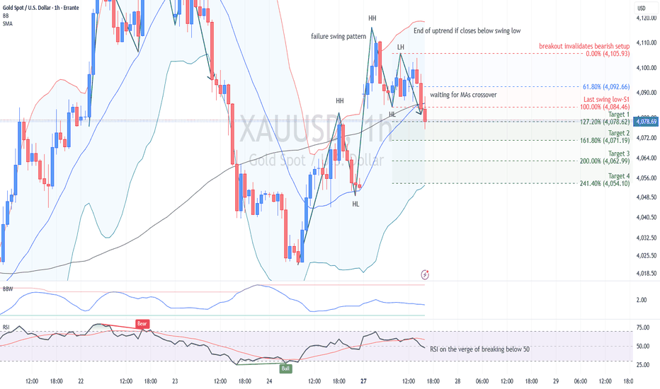
BoS, CHoCH, and Liquidity Sweep on the XAU/USD 1H ChartThis live ERRANTE:XAUUSD chart is a good classroom because it contains almost every market-structure trap traders love to misread: a strong rally, a double top, a neckline break, several bearish continuation breaks, a late bullish attempt, and one suspicious liquidity sweep that looks like the market briefly said, “Thanks for the stops, goodbye.”
First, the structure language
Before defining BoS and CHoCH, we need a clean swing map.
In an uptrend, price should form higher highs and higher lows. Buyers are defending pullbacks, and each new rally pushes beyond the previous peak.
In a downtrend, price should form lower highs and lower lows. Sellers are defending rallies, and each new decline breaks the previous trough.
Everything else is noise, theatre, or a chart trying to ruin your confidence before lunch.
What is BoS?
BoS means Break of Structure.
A BoS happens when price breaks a previous meaningful swing point in the direction of the existing trend.
In an uptrend, a bullish BoS happens when price breaks above a previous swing high. It confirms trend continuation.
In a downtrend, a bearish BoS happens when price breaks below a previous swing low. It confirms bearish continuation.
The key phrase is “in the direction of the existing trend.” BoS is not usually the first reversal signal. It is normally a continuation confirmation.
On this gold chart, after price fails near the double-top region around 4,200–4,203 and breaks below the neckline near 4,155, the market shifts into bearish structure. After that, the later downside breaks marked “BoS” are continuation signals. Each time gold breaks below a prior short-term low, sellers prove they still control the structure.
The visible BoS sequence is important:
Price breaks below the neckline area near 4,155.
Then it forms lower highs.
Then it breaks successive swing lows around the 4,120–4,095 region.
Then it extends toward the 4,040–4,020 zone.
That is bearish structure doing its job. Not glamorous, but effective. Like a boring risk manager who is always right.
How to identify BoS correctly
A proper BoS should have three elements.
First , identify the current trend. Do not label every tiny break as BoS. If the market is already bearish, a break below a prior swing low is meaningful. If the market is bullish, a break above a prior swing high matters more.
Second , use meaningful swing points. A tiny one-candle low inside a noisy consolidation is usually internal structure, not major structure.
Third , look for displacement or a clean close. A wick through a level can be a sweep. A stronger candle close beyond the level is more reliable as a structural break.
On this XAU/USD chart, the bearish BoS signals are more convincing because price does not only wick below prior lows. It pushes lower, accepts below those levels, and then forms new lower highs. That is structure, not just noise.
What is CHoCH?
CHoCH means Change of Character. A CHoCH happens when price breaks against the previous structure for the first time, suggesting that the prior trend may be losing control.
In an uptrend, a bearish CHoCH occurs when price breaks the last meaningful higher low. It tells us buyers are no longer defending the structure properly.
In a downtrend, a bullish CHoCH occurs when price breaks above a previous lower high. It tells us sellers may be losing control.
The key difference is this:
BoS confirms continuation.
CHoCH warns of a possible shift.
CHoCH is earlier, but less reliable. BoS is later, but more confirmatory.
In other words, CHoCH is the market saying, “Something is changing.” BoS is the market saying, “Yes, the new side is now in control.”
CHoCH on this gold chart
The first important bearish CHoCH appears after gold forms the double-top structure around 4,200–4,203. Price had been rising strongly from the left side of the chart, supported by the short-term uptrend line.
Then the market fails to extend cleanly above the previous high. It forms a lower high, loses the rising structure, and breaks below the neckline near 4,155.
That break is the important character shift. Before that, the market was still broadly bullish. After that, gold stops behaving like an uptrend and starts behaving like a distribution-to-downtrend transition.
Later, on the far right of the chart, there is a bullish CHoCH marked after gold rebounds from the 4,020–4,040 area and breaks above a minor short-term lower high. This tells us that downside momentum has paused. But it does not yet confirm a full bullish reversal.
That distinction matters.
The right-side bullish CHoCH is an early warning that sellers are no longer pressing as cleanly as before. But price is still capped near resistance, the 100-WMA area, and the descending dashed trendline. So the larger structure remains fragile unless gold can reclaim stronger resistance levels.
A CHoCH is not a magic reversal wand. It is a yellow light, not a green light.
What is a Liquidity Sweep?
A liquidity sweep happens when price moves beyond a visible high or low, triggers stop orders or breakout orders, and then quickly rejects back inside the prior range.
Above old highs, there are usually buy stops from breakout traders and stop-losses from short sellers.
Below old lows, there are usually sell stops from breakout sellers and stop-losses from long traders. A liquidity sweep is the market moving into that stop cluster, taking liquidity, and then reversing.
The important point is that not every wick is a liquidity sweep. A proper sweep should take a visible liquidity pool and then fail to accept beyond it.
A clean liquidity sweep has three parts:
A clear prior high or low.
A move beyond that level.
A rejection back below the swept high or above the swept low.
No rejection, no sweep. Just a breakout wearing expensive sunglasses.
Liquidity Sweep on this chart
The chart marks a liquidity sweep near the upper-middle section, around the 4,173 region.
Gold rallies above a prior short-term high after already forming weaker structure. That move likely triggers buy stops from breakout traders and stop-losses from traders who were short below the prior high. But price does not continue toward the 4,200 high. Instead, it rejects and rolls over.
This is a textbook bearish liquidity sweep interpretation:
Gold takes liquidity above a short-term swing high.
The move fails to hold.
Price rejects back below resistance.
Sellers regain control.
After that, the market resumes lower and produces further bearish BoS signals.
This is why traders must be careful with breakouts after a lower-high sequence. A breakout above a minor high inside a broader weakening structure may not be genuine demand. It may simply be liquidity collection before continuation lower.
Reading the double top correctly
The double top around 4,200–4,203 is the dominant pattern on this 1H chart.
The first high establishes resistance. The second high tests the same area again but fails to create sustained upside continuation. The neckline is around 4,155.
Once price breaks below the neckline, the double top becomes active. The projected downside levels on the chart show how traders can map possible extension targets after the neckline break.
The key levels are visible:
Neckline: 4,155.36
Resistance zone: 4,107–4,126
Higher resistance: 4,142 and 4,155
Liquidity sweep region: around 4,173
Prior high / bullish resumption level: 4,202.87
Current price area: around 4,097
Near support: 4,094 and 4,078
Deeper support: 4,060, 4,040, 4,012, and 4,000
The double top remains technically relevant as long as price trades below the neckline and below the descending resistance structure. A move back above 4,155 would weaken the bearish pattern. A move above 4,173 would challenge the post-sweep bearish interpretation. A return above 4,202 would invalidate the double-top breakdown and suggest prior uptrend resumption.
How to interpret the current right-side price action
The current section of the chart shows a rebound from the lower band area around 4,020–4,040 into the 4,107–4,115 resistance zone.
That rebound creates a short-term bullish CHoCH, because price breaks above a minor lower high. But the rally then runs into resistance near the 100-WMA and the 200% projection around 4,107.85.
This is where inexperienced traders often make a mistake. They see CHoCH and immediately assume reversal. But a professional technician asks:
Did price break the major lower high?
Did it reclaim the neckline?
Did it close above the moving average and hold?
Did momentum expand after the break?
Did the market invalidate the bearish sequence?
On this chart, the answer is mostly no.
So the current condition is better described as a corrective rebound inside a broader bearish structure, unless price can reclaim 4,126, then 4,142, and especially the neckline at 4,155.
Practical interpretation
The bullish case needs more proof. A simple CHoCH is not enough. Bulls need acceptance above 4,107–4,126 first. Then a stronger move above 4,142 and 4,155 would show that the market is no longer respecting the double-top breakdown. Above 4,173, the prior liquidity sweep would be challenged. Above 4,202, the previous uptrend would resume.
The bearish case remains structurally valid while gold stays below 4,126–4,142 and especially below the neckline at 4,155. The recent rejection near 4,107–4,115 suggests sellers are still defending the recovery.
A move below 4,094 would weaken the short-term bullish CHoCH. A break below 4,078 would suggest sellers are regaining pressure. A clean bearish BoS below 4,040 would confirm downside continuation and expose 4,012 and 4,000.
The clean lesson for traders
BoS is continuation confirmation.
CHoCH is an early warning of possible change.
Liquidity sweep is a stop-run beyond a visible high or low followed by rejection.
The current bullish CHoCH on the right side is useful, but it is not enough to declare a full trend reversal. Until gold reclaims the major resistance stack, the larger structure remains corrective-to-bearish rather than cleanly bullish.
The market structure message is simple: respect the CHoCH, but do not marry it. Wait for BoS confirmation before calling a real regime shift.
Education 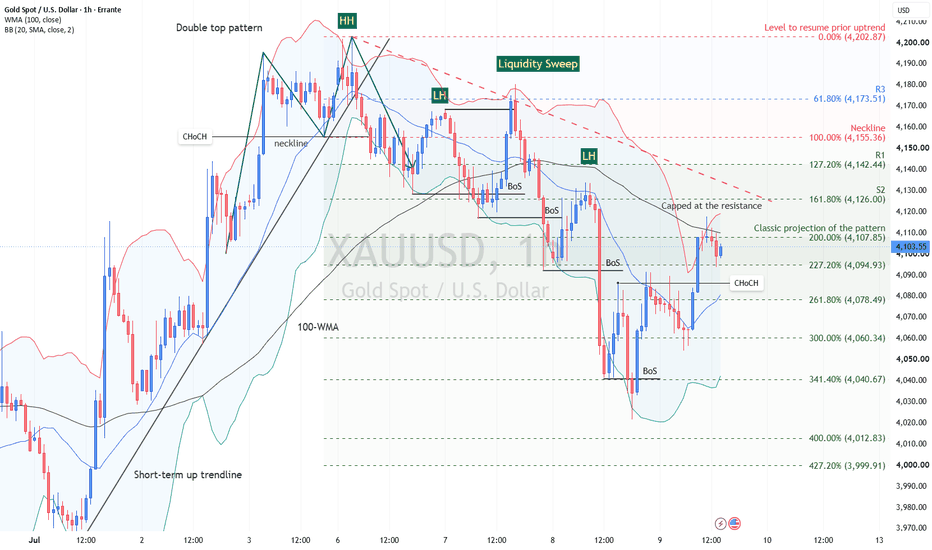
USD/JPY Daily: Support and Resistance, Rules and ToolsMain lesson: Support and resistance are not random lines. They are decision zones created by market memory, trend structure, swing points, moving averages, trendlines, Fibonacci projections and confluence.
ERRANTE:USDJPY is a strong chart for learning how support and resistance work in real technical analysis.
The chart shows a broad uptrend, a long rising trendline, a 200-WMA, previous swing highs and lows, and two Fibonacci expansion grids. Together, these tools help us understand one important idea:
The best levels are not drawn randomly. They are built from evidence.
Let’s start from the foundation and then move into the advanced part.
1. What Is Support?
Support is a price area where buying interest is strong enough to slow, stop or reverse a decline.
In simple language, support is where sellers begin to lose control and buyers start defending the market.
Support can form because:
• Buyers see value and enter the market.
• Existing longs add to positions.
• Short sellers take profit.
• Traders remember a previous reaction low.
• Orders and liquidity cluster around the same area.
Support does not mean price must rise. It means the probability of a reaction increases because demand has appeared there before.
On this USD/JPY chart, the area near 160.47–160.71 is a support zone because price previously struggled around that region, broke above it, then returned and held above it.
That is price memory in action.
2. What Is Resistance?
Resistance is a price area where selling interest is strong enough to slow, stop or reverse an advance.
In simple language, resistance is where buyers begin to lose control and sellers start defending the market.
Resistance can form because:
• Traders take profit near previous highs.
• Short sellers enter the market.
• Trapped buyers exit near breakeven.
• Breakout traders hesitate before new highs.
• Liquidity clusters above obvious highs.
On this chart, the 162.26–162.83 area is immediate resistance. It includes the current market top near 162.826 and the 127.2% Fibonacci projection near 162.260.
This does not mean USD/JPY must reverse there. It means this is the first important area where price reaction should be watched carefully.
3. Main Types of Support and Resistance
Support and resistance can be divided into three practical groups.
Static support and resistance
These are horizontal levels. They come from previous price action.
Examples include:
• Previous swing highs
• Previous swing lows
• Range highs and lows
• Breakout and breakdown levels
• Former resistance turned support
• Former support turned resistance
On this chart, 160.47–160.71 is static support because it is based on previous horizontal structure.
Dynamic support and resistance
These levels move over time.
Examples include:
• Trendlines
• Moving averages
• Channels
• Envelopes
On this chart, the rising trendline and the 200-WMA are dynamic support references.
Projected support and resistance
These are forward-looking levels calculated from previous structure.
Examples include:
• Fibonacci expansions
• Fibonacci projections
• Measured moves
• Pattern targets
On this chart, 162.260, 164.231, 164.283 and 166.407 are projected resistance levels.
The most useful analysis comes when these groups overlap.
That overlap is called confluence.
4. The First Rule: Support and Resistance Are Zones, Not Exact Lines
A common beginner mistake is treating support and resistance as exact numbers.
Markets rarely reverse from the exact same price. Price can overshoot a level, sweep liquidity, trigger stops, and then return back into the zone.
That is why advanced traders think in zones.
On this chart, the key short-term support is not one exact price. It is better defined as:
160.47–160.71
This zone includes:
• The former resistance near April’s top around 160.711
• The recent pullback low near 160.469
• The broken resistance area that turned into support
• A structural swing area
This is a decision zone, not a single line.
5. The Second Rule: Polarity
Polarity means that support can become resistance, and resistance can become support.
This happens because market psychology changes after a breakout or breakdown.
If price breaks above resistance, that old ceiling may become a new floor. Buyers who missed the breakout may wait for a retest. Short sellers may cover. Breakout traders may defend the level.
On this USD/JPY chart, 160.71 acted as resistance around April. After price broke above it, the market pulled back toward the 160.47–160.71 region and held.
That is polarity.
The old resistance became support.
This is one of the most important principles in technical analysis.
6. Dynamic Support: The Rising Trendline
A trendline is a straight line that connects important swing points and shows the direction of the trend.
In an uptrend, a trendline is usually drawn below price by connecting rising reaction lows. It acts as dynamic support.
In a downtrend, a trendline is usually drawn above price by connecting declining reaction highs. It acts as dynamic resistance.
On this USD/JPY chart, the rising trendline starts from the April 2025 low area and connects later higher lows. The numbered points on the chart show where price touched or approached this line.
The important points are:
• Point 1 begins the trendline.
• Point 2 gives the second anchor.
• Points 3, 4, 5 and 6 show later reactions around the same rising support structure.
The more times price reacts near a trendline, the more visible that line becomes to market participants.
A good trendline should follow three rules:
1. It should connect meaningful pivots, not random noise.
2. It should not be forced to fit the analyst’s bias.
3. It becomes more important when price reacts to it several times.
On this chart, the trendline is useful because it has acted as a support guide throughout the broader uptrend.
7. What Do the Long Lower Shadows Near the Trendline Show?
The chart shows important lower-shadow reactions around the rising trendline, especially near the later support tests.
A long lower shadow means sellers pushed price lower during the session, but buyers stepped in before the close.
Near support, this often signals:
• Selling pressure was absorbed.
• Buyers defended the zone.
• A liquidity sweep may have failed.
• The market rejected lower prices.
This does not automatically mean “buy.”
It means the support area is active.
The correct interpretation is:
When a long lower shadow appears near a valid support zone, it shows demand response. But confirmation still depends on the following candles and whether price can hold above the zone.
On this chart, the lower shadows around the trendline and 200-WMA area show that sellers attempted to break the structure, but buyers defended the broader uptrend.
8. Dynamic Support: The 200-WMA
A moving average smooths price data to show the underlying trend. A weighted moving average, or WMA, gives more weight to recent prices. This makes it more responsive than a simple moving average. A moving average can act as dynamic support or dynamic resistance.
It can act as support when:
• Price is above it.
• The average is rising or flattening upward.
• Pullbacks toward it attract buyers.
It can act as resistance when:
• Price is below it.
• The average is falling or flattening downward.
• Rallies toward it attract sellers.
On this chart, USD/JPY is trading above the 200-WMA, and the 200-WMA sits below price near the broader support area around 158.53.
This matters because the 158.53 region also aligns with:
• The rising trendline area
• A Fibonacci 61.8% retracement level near 158.535
• Prior price reaction in April 2026
So, the 200-WMA is not important alone. It becomes more useful because it overlaps with other support evidence at that level
That is called confluence.
9. What Is Confluence?
Confluence means that different technical tools point to the same price zone. It is one of the most important concepts in advanced support and resistance analysis. A single level may be interesting. But a zone where several independent tools agree is more important.
Confluence can include:
• A previous swing high or low
• A broken resistance or support level
• A trendline
• A moving average
• A Fibonacci level
• A candlestick rejection
• A psychological round number
Confluence helps traders because it allows them to rank levels.
Instead of asking, “Where is the next line?” the better question is:
Where do several independent methods agree?
That is where price is more likely to react.
10. Confluence Examples on This Chart
Another example of a major confluence area on this USD/JPY chart.
164.23–164.28: Fibonacci resistance confluence
This zone includes:
• Larger Fibonacci grid 161.8% projection near 164.231
• Smaller Fibonacci grid 161.8% projection near 164.283
This is a Fibonacci cluster, which is a more specific form of confluence.
We will explain that shortly.
11. Static Support and Resistance: Swing Highs and Swing Lows
But first, let's look at another type of support and resistance levels. Static support and resistance often come from swing points.
A swing high is a local peak where price rises, stops, and then turns lower. It forms when buying pressure fails and supply takes control.
A swing low is a local trough where price falls, stops, and then turns higher. It forms when selling pressure fails and demand takes control.
In simple terms:
A swing high is a temporary victory for sellers.
A swing low is a temporary victory for buyers.
On this chart:
• 160.711 is an important swing high and former resistance.
• 155.015 is a major correction swing low.
• 162.826 is the current market top.
• 160.469 is the recent pullback swing low.
These swing points are not random. They are where the market changed direction. That is why they are used for support, resistance and Fibonacci analysis.
12. Why Swing Points Matter
Swing points matter because they reveal market decisions.
At a swing high, buyers tried to continue the trend but failed. That level can become resistance later.
At a swing low, sellers tried to continue lower but failed. That level can become support later.
The stronger and more visible the swing, the more important it becomes.
A high-quality swing point usually has:
• A clear directional move into the level
• A visible rejection or reversal
• Enough distance from surrounding price action
• Relevance on the chosen timeframe
For this USD/JPY daily chart, the key swings are clear enough to be used for Fibonacci expansion.
13. Two-Point Fibonacci Expansion: The Correct Logic
The Fibonacci levels on this chart are drawn with a two-point Fibonacci expansion method.
This is not the same as a classic three-point trend-based Fibonacci extension.
The two-point method uses a completed correction swing to project future support or resistance beyond the previous extreme.
The key rule here is:
Draw from left to right, following the completed price structure, against the prior trend.
The first point must appear earlier in time.
The second point must appear later in time.
The projection is then read beyond the prior extreme.
This keeps the analysis objective.
You are not drawing what you want to happen. You are measuring what the market has already completed.
14. Why Do We Use Corrections for Fibonacci Expansion?
Corrections are important because they define the next decision point in the trend.
In an uptrend, price rallies, then corrects. Once the correction low is completed, traders can project where the next bullish leg may face resistance.
In a downtrend, price falls, then corrects higher. Once the correction high is completed, traders can project where the next bearish leg may find support.
That is why correction is essential. Without a completed correction, the Fibonacci expansion is only speculation. With a completed correction, the tool measures the structure and projects possible reaction zones.
15. Bullish Two-Point Fibonacci Expansion
In a bullish continuation setup, the market first makes a swing high, then pulls back into a correction swing low.
To draw the Fibonacci expansion:
Point 1: previous swing high
Point 2: correction swing low
Direction: left to right
Projection: resistance levels above the previous swing high
This may feel unusual because many traders learn Fibonacci retracement by drawing from low to high in an uptrend. But this chart is not using Fibonacci only for retracement. It is using the two-point grid to project expansion levels beyond the prior high. So in an uptrend, after the correction low is completed, drawing from the swing high to the correction low allows levels above 100% to project upside resistance. That is exactly what is happening on this chart.
16. Bearish Two-Point Fibonacci Expansion
In a bearish continuation setup, the market first makes a swing low, then corrects upward into a correction swing high.
To draw the Fibonacci expansion:
Point 1: previous swing low
Point 2: correction swing high
Direction: left to right
Projection: support levels below the previous swing low
So the logic is the mirror image of the bullish setup. Bullish expansion projects resistance above the market. Bearish expansion projects support below the market.
The rule is consistent:
Measure the completed correction structure from left to right.
17. First Fibonacci Grid on This Chart: The Larger Swing
The first Fibonacci grid measures the larger bullish structure.
It is drawn from:
Point 1: swing high near 160.711
Point 2: correction swing low near 155.015
This follows the correct sequence because the swing high came first and the correction low came later. After prices recovered and broke above 160.711, the levels beyond 100% became upside resistance projections.
The important levels are:
• 127.2% projection: 162.260
• 161.8% projection: 164.231
• 200% projection: 166.407
Current price is around 162.46, close to the immediate resistance zone.
That resistance zone is: 162.26–162.83
It includes the 127.2% projection and the current market top near 162.826.
18. Second Fibonacci Grid on This Chart: The Smaller Swing
The second Fibonacci grid measures the more recent bullish structure.
It is drawn from:
Point 1: current market top near 162.826
Point 2: pullback low near 160.469
Again, this is drawn from left to right after the correction low is formed. This smaller grid projects the next resistance levels above the current market top.
The key projected level is: 161.8% projection: 164.283
This level becomes important because it nearly overlaps with the larger grid’s 161.8% projection. That creates a Fibonacci cluster.
19. What Is a Fibonacci Cluster?
A Fibonacci cluster occurs when multiple Fibonacci levels from different swing measurements appear in the same price area. A cluster is a special form of confluence.
The difference is simple:
Confluence means different types of tools agree. A Fibonacci cluster means multiple Fibonacci measurements agree.
On this chart, the major Fibonacci cluster is: 164.23–164.28
It includes:
• Larger grid 161.8% projection: 164.231
• Smaller grid 161.8% projection: 164.283
These two levels are almost identical. This is important because two different swing measurements are pointing to the same resistance area. That makes 164.23–164.28 a higher-quality resistance zone than a single Fibonacci level by itself.
20. Rules for Drawing Multiple Fibonacci Expansions
When drawing multiple Fibonacci grids, follow these rules.
First , use meaningful swings only. Do not measure every small fluctuation.
Second , each Fibonacci grid must be based on a completed structure. In an uptrend, wait for the correction low. In a downtrend, wait for the correction high.
Third , draw from left to right. The first point must happen before the second point.
Fourth , separate larger swings from smaller swings. A larger grid gives the macro projection. A smaller grid gives the tactical projection.
Fifth , focus on overlapping. The value of multiple Fibonacci grids is not the number of lines. The value is where the lines cluster.
Sixth , treat clusters as reaction zones, not guaranteed targets.
Seventh , give more weight to a Fibonacci cluster if it also overlaps with price structure, trendlines or moving averages. On this chart, the 164.23–164.28 zone is strong because two independent Fibonacci grids project almost the same 161.8% level.
21. Ranking the Key Levels on USD/JPY
Now we can rank the chart properly.
Immediate resistance : 162.26–162.83
This is the first resistance zone. It includes:
• Larger grid 127.2% projection at 162.260
• Current market top at 162.826
A clean break above this zone would suggest the bullish structure is still extending.
Major Fibonacci cluster resistance : 164.23–164.28
This is the strongest projected resistance area on the chart. It includes:
• Larger grid 161.8% projection at 164.231
• Smaller grid 161.8% projection at 164.283
This is the main Fibonacci cluster.
Higher resistance : 166.40
This is the larger grid’s 200% projection. It is a higher technical resistance level if the trend extends further.
Primary support : 160.47–160.71
This is the most important short-term support zone. It includes:
• Broken resistance turned support
• Swing structure
• Recent pullback reaction
• Fibonacci references
Secondary support : 158.53
This is deeper dynamic confluence support. It includes:
• Fibonacci support
• 200-WMA
• Rising trendline structure
Major structural support : 155.01
This is the larger correction swing low. A break below it would weaken the broader bullish structure.
22. Confirmation: The Final Rule
Support and resistance levels are not automatic signals.
They are decision zones.
At resistance, traders should watch for:
• Rejection candles
• Long upper shadows
• Failed breakout attempts
• Momentum loss
• Breakout and successful retest
At support, traders should watch for:
• Long lower shadows
• Strong bullish reaction
• Failed breakdowns
• Higher lows
• Break below support and failure to reclaim it
The level gives the location. Price action gives the confirmation.
On this chart, the immediate question is whether USD/JPY can hold above 160.47–160.71 and break through 162.26–162.83.
If it does, the next major zone is the Fibonacci cluster at 164.23–164.28.
If it fails, the market may rotate back toward 160.47–160.71, then possibly 158.53.
The main lesson is simple:
Basic traders draw lines. Advanced traders build zones from evidence.
Support and resistance are not about guessing where price will reverse. They are about identifying where the market is most likely to make its next important decision.
US 2-Year Yield: How to Read Fibonacci Extension After Reversal Market: TVC:US02Y US Government 2-Year Yield
Main lesson: Fibonacci extension is a projection tool, not a prediction tool.
Let’s dive into a chart that’s quietly telling a powerful story.
The US 2-year yield is giving us a textbook example of how traders can use the Fibonacci extension tool after a clean A-B-C structure forms. But this isn’t just about drawing lines and hoping for the best - it’s about understanding how trends evolve and where momentum might take us next.
Before we get into the fun stuff, one quick reminder; this chart shows yields, not bond prices. When yields rise, it usually reflects tighter rate expectations or stronger policy repricing. When they fall, it often signals easing expectations. Keep that in mind - it adds context to everything we’re about to explore.
What Is Fibonacci Extension?
Fibonacci tools can feel a bit mystical at first, but they’re actually pretty straightforward.
A retracement tells you how far price pulls back within a move, while the Fibonacci extension tool helps project where price might go next after a move and a correction.
Think of it like a three-step sequence:
A to B is the first push,
B to C is the pullback,
and from C onward, we project the next potential move.
The extension tool takes the size of that first push (A to B) and projects it forward from point C using Fibonacci ratios. It’s a simple concept, but when applied correctly, it becomes a powerful way to map potential future price zones.
Rules for Drawing Fibonacci Extension Correctly
To get meaningful levels, you need to draw the tool properly. While the process is straightforward, the quality of your inputs matters a lot.
First, you need to identify a clear trend shift or impulse. Point A should represent a meaningful swing low (in an uptrend) or swing high (in a downtrend), not just minor noise. From there, the move to point B should be a strong, directional impulse with visible momentum.
After that, you wait for a corrective pullback to form point C. Ideally, in an uptrend, this pullback holds above point A, confirming that the market structure is improving. Clean structure is key here - if price action is choppy or overlapping, extension levels tend to lose reliability.
Finally, it’s important to remember that Fibonacci works best when combined with other tools. Higher timeframes generally provide stronger signals, and confirmation from trend, momentum, and volatility indicators helps validate the levels.
The A-B-C Structure on This Chart
Here’s how the structure plays out on the chart.
Point A marks the four-month low near 3.376% in early March. This is where the previous decline in the 2-year yield stopped, and the market began to reverse higher.
From there, yields rallied sharply into Point B, around late March. This was the first strong upside impulse. The move was important because price broke away from the low, pushed above the 100-WMA, and showed that short-term rate expectations were being repriced higher.
After Point B, the market did not continue straight up. It corrected into Point C, near the 3.679% area in mid-April. This pullback is the key part of the structure. It held well above Point A, creating a higher low. That tells us sellers failed to return yields to the previous low, which is often an early sign that the market structure has shifted from decline to recovery.
Once yields bounced from Point C, the Fibonacci extension tool became useful. The tool takes the size of the first impulse from A to B and projects it upward from C. That gives traders a structured map of potential resistance levels.
The price action after Point C has respected this map well. Yields moved through the 38.2% and 50% zones, then held above the 61.8% extension near 4.088%, which is now acting as immediate support. The market is currently trading around 4.17%, just below the 78.6% extension near 4.199%, which is the next critical resistance.
How to Read the Extension Levels
Right now, the yield is hovering around 4.17%, sitting between two key Fibonacci levels:
• 61.8% extension at 4.088% (support)
• 78.6% extension at 4.199% (resistance)
This area acts as a decision zone. Holding above 4.088% keeps the recovery structure intact and suggests buyers are still in control. On the other hand, a break above 4.199% would signal stronger momentum and open the door for further upside.
The next major level above is the 100% extension near 4.341%, where the second move would match the size of the initial rally. Beyond that, the chart highlights additional resistance zones:
• January peak: 4.424%
• 127.2% extension: 4.521%
These levels help frame the potential path forward if momentum continues to build.
Why the 100% Level Matters
The 100% extension level represents symmetry in the market. It reflects a scenario where the move from point C matches the strength of the original A-to-B impulse.
In strong trends, price often reaches or exceeds this level. In weaker conditions, the move tends to stall earlier, typically around the 61.8% or 78.6% zones.
At the moment, the yield is approaching resistance but hasn’t fully broken through. That hesitation is important - it suggests the market is still deciding whether it has enough strength to continue higher.
Trend Context: The Recovery Is Still Constructive
Looking at the broader picture, the trend remains constructive, but it’s not accelerating aggressively.
The yield is holding above the 100-period weighted moving average, which indicates that the overall structure has improved since the March low. However, instead of trending sharply higher, price is beginning to move sideways near resistance.
This kind of behavior often reflects a pause - a period where the market consolidates before making its next directional move.
Bollinger Bands: Calm Before the Move?
The Bollinger Bands are tightening, signaling volatility compression. This typically means the market is entering a quieter phase, often followed by a larger move.
In general, narrow bands suggest low volatility and the potential for a breakout, while wider bands indicate that a trend is already in motion. Price positioning within the bands can also provide context, but it should always be interpreted alongside other tools.
In this case, the combination of compressed Bollinger Bands and nearby Fibonacci extension levels creates a clear setup. If the yield breaks above 4.199% and the bands begin to expand, it would support a move toward 4.341%. Conversely, rejection at resistance followed by a drop below 4.088% would weaken the structure.
PPO: Momentum Is Waiting
The PPO indicator is currently showing a lack of strong directional momentum. The lines are close together, and the histogram is hovering near zero, which is typical of a range-bound environment.
In general, the PPO helps identify shifts in momentum. Moves above the zero line suggest bullish conditions, while moves below indicate bearish pressure. Crossovers and changes in the histogram can signal strengthening or weakening momentum.
Right now, the key takeaway is that momentum hasn’t fully aligned with a breakout yet. For a stronger bullish signal, traders would typically look for a combination of factors:
• A clean close above resistance
• PPO turning higher
• Expanding histogram
• Bollinger Bands widening
• A successful retest of the breakout level
Until then, the structure remains constructive, but not fully confirmed.
Implied Volatility: Something’s Brewing
Implied volatility is starting to rise, which suggests the market may be preparing for a larger move.
Rising volatility often reflects expectations of increased price movement, while falling volatility points to stability or consolidation. When volatility increases near key support or resistance levels, it can signal that a breakout or rejection may be approaching.
In this case, the rise in implied volatility could be tied to upcoming macro catalysts such as inflation data, employment reports, or central bank communication. These factors can have a significant impact on short-term yield expectations.
Key Levels to Watch
The most important levels on the chart can be grouped into support and resistance zones.
Support levels:
• Immediate: 4.088%
• Secondary: 4.010%
• Deeper: 3.932%, 3.835%, 3.679%
Resistance levels:
• Critical: 4.199%
• Major extension target: 4.341%
• January peak: 4.424%
• Extended projection: 4.521%
At the moment, the key battleground lies between 4.088% and 4.199%. A breakout above this range could drive momentum toward 4.341%, while a breakdown below it may signal that the recovery is losing strength.
Educational Takeaway
The Fibonacci extension tool isn’t a crystal ball - it’s a roadmap. It highlights areas where price might react, not where it must go.
The real value comes from combining it with other elements of analysis, including trend structure, moving averages, momentum indicators, volatility signals, and, most importantly, price confirmation.
On this chart, the setup is clear. The structure is constructive, but the market is still in a decision phase. We’re sitting near a key inflection point, where the next move could define the direction of the trend.
Bottom line: Fibonacci gives you the map - but price action tells you when to move.
Education 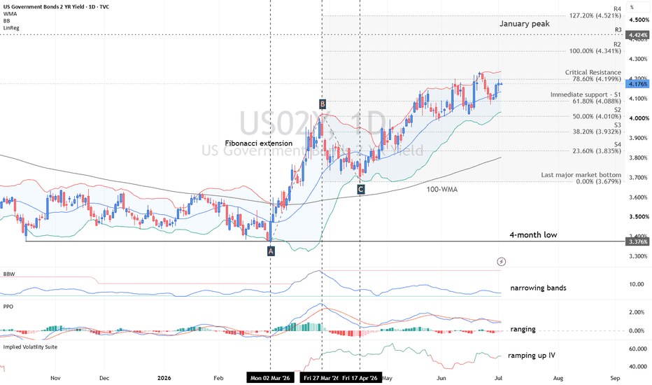
EUR/GBP: Reading a Triangle BreakdownMarket: ERRANTE:EURGBP
Timeframe: Daily
Bias: Neutral to bearish, with confirmation needed below the compression base
EUR/GBP is offering a useful educational case study in how an uptrend can gradually lose structure before turning into a bearish continuation setup.
The chart does not show a sudden reversal. It shows a sequence: first a mature uptrend, then a trendline break, then a failed recovery, then a tightening triangle, and now a test of the lower boundary. This is often how market control shifts from buyers to sellers.
1. The Trend Structure: From Higher High to Lower High
The first important feature is the prior bullish trend. Price advanced through a sequence of higher lows and eventually printed a clear higher high, marked as HH on the chart.
That higher high confirmed that buyers were still in control at that stage.
The problem started when EUR/GBP failed to continue higher and later formed a lower high, marked as LH. This matters because a lower high after a higher high is often the first structural warning that the trend is weakening.
In simple terms:
The higher high showed bullish strength.
The lower high showed fading demand.
The break of the rising trendline showed that buyers had lost trend control.
The market then pulled back toward the broken trendline.
This is a classic technical event. Old support often becomes new resistance. When price revisits a broken trendline and fails to reclaim it, the bearish case becomes stronger.
2. The Triangle Pattern: Compression Before Expansion
After the trendline break and lower high, price moved into a narrowing triangle structure. This is important because triangles represent compression. Neither side has full control yet, but pressure is building.
In this chart, the upper boundary of the triangle is descending, while the lower boundary is relatively flat around the 0.8620 area. That makes the pattern more vulnerable to a bearish resolution because each recovery attempt is being sold at a lower level.
The key area is around 0.8619–0.8620. A daily close below this zone would suggest that sellers are starting to break the compression base.
However, traders should avoid assuming that the break is valid too early. A false breakdown is always possible, especially when price is near the lower Bollinger Band and volatility has been compressed.
3. Classic Triangle Identification Rules and Projection
To properly understand this setup, it is useful to review the classic rules traders use to identify triangle patterns and estimate their potential targets.
Identification rules:
1. At least five touchpoints: A valid triangle typically has a minimum of five touches across both trendlines (for example, three touches on one side and two on the other). This confirms that both boundaries are respected by the market.
2. Converging trendlines: The upper and lower boundaries should move toward each other, forming a visible compression zone. In descending triangles, the top slopes downward while the base remains relatively flat.
3. Decreasing volatility: Price swings tend to get smaller as the pattern develops, reflecting reduced volatility and tightening price action.
4. Volume contraction (if available): In classical analysis, volume often declines during the formation of the triangle and expands on the breakout.
5. Context matters: Triangles are typically continuation patterns, meaning they are more likely to break in the direction of the prior trend. In this case, the prior uptrend has already weakened, which shifts the probability toward a bearish continuation after structural deterioration.
Classic projection method:
The traditional way to estimate a triangle target is by measuring the height of the pattern at its widest point and projecting that distance from the breakout level.
Steps:
1. Measure the vertical distance between the highest point and lowest point at the start of the triangle.
2. Identify the breakout level (in this case, the lower boundary near 0.8620).
3. Project the measured height downward from the breakout point.
This method provides an approximate target rather than a precise level. It is best used alongside support zones, Fibonacci levels, and momentum confirmation.
In this chart, that classical projection aligns with the broader downside target area near 0.8438, reinforcing the bearish continuation scenario if the breakdown is confirmed.
4. Bollinger Bands: A Squeeze Before a Possible Move
The Bollinger Band Width panel shows a clear squeeze. This means volatility has contracted.
A squeeze does not predict direction by itself. It only tells us that the market has become quiet and that a larger move may be preparing. Direction must come from price action.
In this chart, the squeeze is happening while price is pressing against the lower side of the triangle. That gives the setup a bearish bias, but confirmation still depends on a clean breakdown.
The lower Bollinger Band is near 0.8602, which means price is already testing the lower volatility boundary. If price breaks lower and the bands begin to widen, that would signal a transition from compression into bearish expansion.
5. PPO Momentum: Bearish Pressure Is Building
The PPO indicator adds another useful layer.
The PPO lines are below the zero line, and the histogram is negative. This tells us that downside momentum is active. More importantly, the chart marks intensifying bearish momentum, which means sellers are gaining strength while price is sitting near the triangle base.
This is the type of confluence traders should look for:
Price structure is weakening.
The trendline has already broken.
The rebound formed a lower high.
The triangle is compressing.
Momentum is turning bearish.
No single signal is enough on its own. But when structure, volatility, and momentum point in the same direction, the setup becomes more meaningful.
6. Implied Volatility: Quiet Conditions Can Precede a Breakout
The implied volatility panel remains relatively low. This is useful because markets often move from low-volatility regimes into higher-volatility regimes.
Low implied volatility does not mean risk is low. It can mean the market is underpricing the next directional move.
For this chart, the important question is whether volatility starts to rise after a confirmed breakdown. If implied volatility and Bollinger Band Width both begin to expand while price moves below support, that would strengthen the bearish continuation case.
Key Levels to Watch
Resistance levels: 0.8645, 0.8687
Support levels: 0.8577, 0.8551, 0.8509, 0.8483
Pattern projection: around 0.8438
The 0.8687 area is important because it acts as the invalidation zone on this chart. If price recovers above that level, the bearish triangle structure would lose credibility.
The first bearish confirmation area is below 0.8619–0.8620. A sustained daily close below that zone would expose the Fibonacci extension levels at 0.8577, 0.8551, 0.8509, and 0.8483. The larger classical pattern projection points toward approximately 0.8438.
Educational Takeaway
This chart is a good example of why traders should study the full sequence, not just the pattern.
A triangle by itself is not enough. A bearish view becomes stronger because the triangle appeared after:
1. A completed prior uptrend.
2. A trendline break.
3. A lower high.
4. A failed pullback into broken support.
5. A volatility squeeze.
6. Bearish PPO momentum.
The strongest technical setups usually come from this kind of alignment. Price structure shows who is losing control, momentum shows whether pressure is increasing, and volatility shows whether the market has enough energy for expansion.
For EUR/GBP, the message is clear: the pair is testing a decisive compression zone. A confirmed daily breakdown would support a bearish continuation scenario. A recovery above the invalidation area would suggest that the breakdown attempt has failed.
The main lesson is simple: do not trade the triangle alone. Trade the context around the triangle. EURUSD: Spotting a Head and Shoulders Before Everyone ElseERRANTE:EURUSD
EUR/USD is starting to sketch out something interesting on the weekly chart - a potential Head and Shoulders reversal pattern. This is one of those classic setups traders love, but here’s the catch: it’s not confirmed yet. And that’s where things get exciting.
This pattern often shows up right when an uptrend starts running out of steam. Think of it like a market that’s been partying too hard and is finally getting tired. But just because it looks like a Head and Shoulders doesn’t mean it’s ready to roll over. Price still needs to prove it.
The Story Behind the Pattern
Zooming out, EUR/USD had a solid bullish run starting in early 2025. That strong move is exactly what you want to see before a potential reversal - it sets the stage.
Now, let’s break down the structure:
• The first peak? That’s your left shoulder - strong, confident buying.
• Then comes a pullback, followed by a push to a higher high - the head.
• After that, price tries to rally again… but falls short. That lower high could be the right shoulder.
That failure to make a new high is key. It’s the market quietly saying, “Yeah… buyers aren’t as strong as before.”
The Line That Matters Most
All eyes should be on the neckline, sitting around the 1.1380-1.1400 zone.
This level connects the lows between the shoulders and the head - and it’s the battleground. If price breaks and closes below this area on the weekly chart, that’s when things get real. That’s when sellers might finally take control.
Until then? It’s just a setup in progress.
Why Patience Pays
Jumping in too early is one of the most common mistakes traders make with this pattern. It’s tempting to short as soon as the right shoulder forms - but that’s risky.
A smarter approach is to wait for confirmation:
1. A clean weekly close below the neckline
2. A retest of that neckline acting as resistance
3. Bearish momentum backing the move
4. Expanding volatility to fuel continuation
Right now, momentum is starting to lean bearish. The PPO is weakening, and the histogram is in negative territory - a sign that bullish energy is fading. Meanwhile, Bollinger Band Width is beginning to expand, hinting that volatility might be waking up.
That combo? It’s what you want to see if a breakdown is coming.
Indicator Confirmations
Beyond price structure, indicators can help strengthen or weaken the case for a Head and Shoulders breakdown.
Here are a few key confirmations to watch:
• PPO / MACD: Look for bearish crossovers and sustained movement below the signal line. A widening negative histogram suggests increasing downside momentum.
• RSI: A failure to reach overbought levels on the right shoulder, or a break below the 50 level, can signal weakening bullish strength.
• Volume: Ideally, volume should decrease from the left shoulder to the head and remain subdued on the right shoulder. A spike in volume on the neckline break adds credibility to the move.
• Bollinger Bands: Expanding bands during a breakdown indicate rising volatility, which often supports trend continuation.
• Divergence: Bearish divergence between price and momentum indicators during the formation of the head can hint at underlying weakness.
No single indicator should be used in isolation. The strongest setups occur when multiple signals align with the price structure.
Where Could Price Go?
If the pattern confirms, traders often measure the distance from the head to the neckline and project it downward.
Based on this chart:
• First potential downside zone: 1.1057
• Larger projection target: around 1.0713
These aren’t guarantees - think of them as areas where price might react, pause, or reverse.
What This Chart Teaches You
A Head and Shoulders pattern isn’t just three bumps on a chart - it’s a shift in psychology:
• The left shoulder = strong demand
• The head = final bullish push
• The right shoulder = weakening buyers
• The neckline = where sellers might take over
If EUR/USD breaks below the neckline with conviction, the bearish case strengthens. If it holds and pushes back up? The pattern could fail - and that’s part of the game.
The Big Takeaway
Great technical analysis isn’t about guessing - it’s about reading structure and waiting for confirmation.
When analyzing a Head and Shoulders, always check:
Trend context: Was there a strong uptrend before?
Pattern clarity: Are the shoulders, head, and neckline well-defined?
Confirmation: Has price actually broken the neckline?
Momentum: Are indicators backing the move?
Right now, EUR/USD is at a crossroads. The structure is forming, momentum is softening, and price is testing a critical level.
But the final verdict? Still pending.
For now, the takeaway is simple: bearish potential is building - but the market hasn’t made its move yet.
Gold Defends $4,000 Without a Full Rates TailwindGold is trading near $4,055, still below the daily downtrend line and below the key retracement cluster above $4,100. The metal has bounced from the lower-low area, but the rebound has not yet repaired the broader bearish structure.
The next support levels are $4,023, then $4,000 and $3,926.
Resistance sits at $4,100, $4,160, $4,203 and $4,245.
A move back above $4,160 would be the first real sign that sellers are losing control. Until then, rallies remain corrective.
The issue for gold is not the absence of risk. It is the strength of dollar cash. When markets still believe the Fed can keep policy tight, non-yielding protection becomes less attractive.
Gold needs two things together, lower yields and a softer dollar. At the moment, it only has partial yield relief.
Stocks Hold Support as AI Doubts Cap the ReboundUS500 is trading near 7,390, holding above the 23.6% retracement at 7,310. That level is important because it marks the first major support shelf after the June pullback. The index has not broken down, but it has also not rebuilt convincing upside momentum.
Resistance is 7,438, then 7,500 and 7,618.
Support is 7,310, followed by 7,119 and 6,965.
The chart remains constructive only while 7,310 holds, but buyers need a move back above 7,438–7,500 to confirm that the recovery is real.
The hesitation is not only about rates. It is also about earnings quality. Lower front-end yields usually help equities, but investors are still digesting AI valuation risk and chip-cost pressure. The market is becoming more selective, separating companies with pricing power from those exposed to higher input costs. That keeps US500 supported, but not yet confident.
Long 
WTI: Oil Has Moved from Peace Discount to Demand QuestionWTI is no longer just pricing the removal of the war premium. The first stage of the selloff was clear: improved tanker flows, lower Hormuz risk and resumed supply movement reduced the need to pay an energy-risk premium. But now that WTI is near $70.70, the market is asking a second question: is lower oil still good disinflation, or is it becoming a warning about weaker demand?
The chart shows that buyers tried to stabilize price from $68.90, but the rebound failed near $72.43. That failure matters because it shows sellers are still active on rallies. Price is back below the WMA near $72.97 and close to the Bollinger midline around $70.99. Immediate support is $69.46, then $68.90. Resistance is $71.08, followed by $72.43 and $73.52.
The macro read is two-sided. Lower oil helps inflation expectations and reduces pressure on consumers. But if oil keeps falling while equities also weaken, markets will stop treating it as a clean positive. It starts to look like a demand problem. That is why Baker Hughes data matters today. If rig activity stays firm while crude is already heavy, the market may read it as a supply-heavy backdrop, keeping pressure on oil.
If oil breaks below $68.90, the disinflation story becomes more negative for growth sentiment.
 Short
Short
US500: Lower Yields Are Not Enough While Tech Margins Are Under US500 is the clearest sign that today’s market is not trading a simple “yields down, stocks up” playbook. If lower US2Y were being treated as pure relief, equities should be bouncing more decisively. Instead, US500 is trading near 7,311 after breaking below 7,336 and testing the 141.4% extension near 7,299. This means the index is still trying to find demand, not confirming recovery.
Technically, the structure remains weak. Price is below the WMA near 7,422 and below the Bollinger midline around 7,353. PPO is still negative, and implied volatility has moved higher. Resistance sits at 7,336, then 7,371 and 7,428. Support is 7,299, then 7,280 and 7,245. A move back above 7,371 would show that buyers are stabilizing the market. A break below 7,280 would expose a deeper downside extension.
The fundamental pressure is coming from two directions. First, sticky PCE keeps the Fed from giving equities a clean policy cushion. Second, chipflation has created a new problem for technology valuations. Higher memory and storage-chip costs may help chip suppliers, but they can hurt device makers such as Apple if input costs squeeze margins or force price increases. That makes the AI trade more selective and less forgiving. US500 is therefore not only reacting to yields; it is also repricing the risk that technology earnings quality may become more uneven.
BTCUSD 4H — Technical Analysis⚠️ Macro Context: −24.4% from May High
BTC has shed nearly a quarter of its value since the $78,187 May 21 high, touching $59,120 on Jun 18. The bounce to $67,279 was sharp (+13.8%), but the pullback to $62,258 and the latest 4H close at $62,452 puts the micro-structure's higher low at risk.
Market Structure
Macro (bearish):
An unbroken LH/LL cascade since early May — bearish CHoCH confirmed. $67,279 is a lower high relative to $78,187 (−4.6% lower), extending the macro bear trend.
Micro (in transition):
The micro picture is trying to build a bottom: the HL at $62,258 (+5.3% above the LL) was the first sign of structural repair. But the LH at $64,212 (−4.6% below the HH) shows bulls couldn't follow through. The latest 4H close sits just ~$194 above the HL — this is the defining test.
Smart Money
Structure Zone Side Status
Bearish FVG $62,456 – $63,599 🔴 Immediately overhead — acting as supply
Bullish OB $60,755 – $61,934 🟢 Nearest demand — 2.7% below
Bearish OB $73,173 – $74,434 🔴 Mid-range supply
Bearish OB $77,507 – $78,187 🔴 Origin of the sell-off
Bearish FVG $67,825 – $68,985 🔴 Wide gap above
Bearish FVG $69,836 – $70,097 🔴 Open gap
The most important SMC observation: a bearish FVG at $62,456–$63,599 sits directly above the latest 4H close. The bar close at $62,452 is at the very bottom edge of this gap. This FVG acts as the first ceiling — if price can't reclaim it, every bounce will be sold into. Below, the bullish OB at $60,755–$61,934 is the only institutional demand zone visible.
Indicator Snapshot
Indicator Value Interpretation
Bollinger Upper $65,186 Far away — no overhead band resistance nearby
Bollinger Basis $63,930 −2.3% below — bearish
Bollinger Lower $62,675 −0.36% below — 4H close was below the band
WMA $64,064 Price heavy below
MFI 30.79 Near oversold, sellers in control
BB Width 3.93% 21.8% of max expansion — compressed vs peak, not coiling
⚠️ Close below BB Lower is unusual — in a downtrend, this signals continuation, not a bounce. The last time this happened (May 28–29), price dropped another ~$3,000 before bottoming.
Bull & Bear Cases
📉 Bear case (60% — dominant): The macro LH/LL structure is intact. The micro HL at $62,258 is the last line of defense. A 4H close below $62,258 opens the path to the bullish OB at $60,755–$61,934, then a full retest of the $59,120 low. The bearish FVG at $62,456–$63,599 is a heavy supply zone — price is struggling at its bottom edge. MFI at 30.79 has room to drop before hitting oversold.
📈 Bull case (40% — micro counter-trend): The HL at $62,258 holds, forming a base for another rally. Price fills the bearish FVG above and reclaims the BB Basis at $63,930. From there, a break of the LH at $64,212 would target $67,279. The bullish OB at $60,755 is the high-probability buy zone if price dips further.
Risk Plan
Entry trigger (long — counter-trend): 4H close reclaiming $62,456 (bottom of the bearish FVG) with MFI crossing above 35
Invalidation: $62,258 (HL) — structural. Stop below at $61,900 (−0.9% from entry)
T1: $63,930 (BB Basis) — R:R ~1.6:1
T2: $64,212 (LH) — R:R ~3.2:1
Entry trigger (short — trend continuation): 4H close below $62,258
Invalidation: Reclaim of $63,600 (top of FVG)
T1: $60,755 (bullish OB top)
T2: $59,120 (LL)
 Short
Short
US Tech Compresses Before BreakoutMonday, 22 June 2026
US Tech is where the geopolitical relief trade is most visible. Price is trading around 30,375, above the 61.8% retracement at 30,296 and inside a tightening triangle. The chart is constructive while price holds above 30,024 and the lower triangle support. The next upside levels are 30,464, 30,584, 30,736 and 30,904.
The logic is straightforward. Lower oil reduces inflation risk. Lower geopolitical risk reduces the equity risk premium. That combination helps long-duration growth assets first. But the rally is not free. It is being taxed by the 2-year yield. If US2Y keeps rising toward 4.24%–4.27%, the tech triangle can fail below 30,024. If US2Y stabilizes, the squeeze can resolve higher toward the previous top.
Technically, Bollinger bandwidth is tight and PPO is flat, so the chart is storing energy rather than trending cleanly. The next move should be event-sensitive, with Fed Waller’s speech and U.S. rate expectations more important than oil alone.  Long
Long
US500 shows a partial risk repair, not a full recoveryThe index trades near 7,426 after rebounding from 7,380, but price is still below the WMA near 7,467 and below the key 50% and 61.8% retracement levels at 7,440 and 7,455. This makes the rebound corrective rather than impulsive. The 38.2% retracement at 7,426 is the immediate pivot. A move above 7,455 would show that investors are willing to look through the weekend shock and rebuild equity exposure.
A failure below 7,409 would suggest the bounce is only short-covering after Monday’s volatility spike.
For FX, a stronger equity recovery would reduce defensive USD demand. A failed rebound keeps pressure on growth-sensitive currencies and supports the dollar against cyclical FX.
GBP/USD Weakens as UK Growth Slows and Dollar Data FirmsGBP/USD is bearish across the top-down structure. The daily chart has lost its reclaim zone, the 4H chart is below moving-average resistance, and the 1H chart confirms the short-term support break.
Advanced traders should avoid selling directly into 1.3406 without confirmation. The better bearish setup is either a rejection from 1.3435-1.3458 or a clean acceptance below 1.3422. For bullish repair, price must close above 1.3458 and hold there.
The main risk to the bearish view is U.S. labor data. If the dollar weakens after softer employment numbers, GBP/USD can squeeze higher. But until price reclaims 1.3458, the technical bias remains lower.
The 1H chart confirms the short-term breakdown. Price has lost the rising intraday support line and failed to reclaim the 61.8% Fibonacci level at 1.3435. The WMA near 1.3448 is now above price and acts as dynamic resistance. This tells us the short-term regime has shifted from compression into bearish continuation risk.
The 1H support map is important for traders. The first support is 1.3422. A sustained break below that level exposes 1.3406, which is the major intraday downside target. Below 1.3406, the next levels are 1.3386 and 1.3375. For repair, buyers first need to reclaim 1.3435, then 1.3447-1.3458. Without that, rebounds are likely to remain corrective.
Key levels:
Immediate resistance: 1.3435
Main reclaim zone: 1.3447-1.3458
Higher resistance: 1.3481
Immediate support: 1.3422
Key support: 1.3406
Deeper support: 1.3391 and 1.3375
Invalidation level for the bearish setup: sustained close above 1.3458 US500 is holding near record highs, but jobs-week risk is now thFundamental Outlook
The equity rally depends on whether AI-led earnings momentum can continue to offset inflation and Fed risk. So far, the market is rewarding companies linked to AI infrastructure, chips, cloud investment, and productivity gains. That keeps the index supported even when macro conditions are not fully benign.
The risk is that the rally remains narrow. If technology leadership weakens, the broader index may struggle because high input costs, elevated PCE inflation, and geopolitical oil risk still create pressure on margins and valuation multiples.
Today’s JOLTS report is important because it will help define the labor-market backdrop before Friday’s payrolls. A softer job-openings number could ease wage-pressure concerns and support equities through lower yield expectations. A stronger number could reinforce the view that the labor market remains too tight, keeping the Fed cautious and limiting multiple expansion.
Traders should also monitor oil and Middle East headlines. If U.S.-Iran tensions push oil higher again, inflation expectations may rise and yields could move against equities. If oil stabilizes and labor data soften moderately, the path of least resistance remains higher.
Scenario Map
Main scenario:
US500 remains bullish while price holds above 7,565 and 7,515. A confirmed 4H close above 7,629 would support continuation toward 7,699, especially if JOLTS and payrolls do not trigger a yield shock.
Alternative scenario:
If labor data are too strong, oil rebounds, or AI leadership fades, the index may fail near 7,629 and rotate back toward 7,565, then 7,515.
Invalidation signal:
The bullish short-term setup weakens on a 4H close below 7,515 and is invalidated below 7,501. That would break the moving-average support zone and expose 7,445.
Trading Takeaways
US500 remains technically constructive, but the market is close to resistance and entering a heavy labor-data week. Traders should avoid assuming that record highs alone confirm broad strength.
The cleaner bullish signal is a 4H close above 7,629 with stable yields and continued AI leadership. The warning signal is a failed breakout followed by a close below 7,515.
Risk management should focus on confirmation. The market can continue higher, but near highs and with implied volatility low, negative macro surprises can produce fast pullbacks. Long