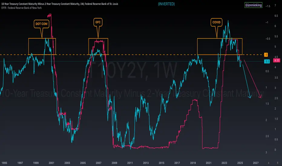
Yield Curve Inversion IHS Breakout - Recession WarningMORE RECESSION INDICATORS FLASHING 🚨
The Yield Curve Inversion chart appears to have broken out of an Inverse Head & Shoulders pattern reclaiming the 50MA.
Note the constant higher lows and higher highs since this trend started making its way back to inversion in 2011.
probably nothing 👀
Profile
Related indicators
T10Y2Y: From Inversion To SteepeningHow to read it in the first place
Above zero (positive spread)
Long-term interest rates (10-year) are higher than short-term rates (2-year).
→ This is normal. Investors expect to be paid more for locking money away longer.
Below zero (negative spread):
Short-term interest rates are higher t
T10Y2Y 3M chart: Plotted US recessions since 1980US recessions since 1980 plotted on the T10Y2Y 3M chart.
Orange circles indicate value on the curve and the Stoch RSI value at the start of the first month and year of recession.
Red vertical bars are length of recessions.
Orange vertical lines on the Stoch RSI are the first month and year of the
Yield Curve Inversion Watch Chart - Fed Has To Cut!If you’re worried about a recession, you should be watching the Yield Curve Inverting.
Historically, an inversion signals a recession, but with a lag.
We can see this on the chart whenever the yield curve hits 0%
This shows the 2Y yield higher than the 10Y which is a signal that the market expect
The Inverted Yield Curve - A History LessonThe yield curve has just recently reverted back to normal after the longest inversion in history. The yield curve has been perhaps the most reliable and only indicator needed to predict recessions. This time is no different. We are entering the final stages now, we are seeing the type of extreme gre
See all ideas