Eternal Ltd Q1 FY27: Fundamentals Strong, Charts NeutralThis analysis is published solely for educational and informational purposes. The views expressed are based on publicly available information and technical chart analysis and should not be construed as investment advice, a recommendation, or an offer to buy or sell any financial instrument. Stock market investments are subject to market risks, and past performance does not guarantee future results. Investors and traders should conduct their own research and consult a SEBI-registered investment advisor before making any investment decisions.
Overview
Eternal Ltd reported its Q1 FY27 financial results with strong year-on-year growth in both revenue and profitability. Following the earnings announcement, the stock continues to trade near its recent highs while entering a consolidation phase on the daily and lower timeframes.
From a technical perspective, the long-term trend remains positive as the price continues to trade above its key moving averages. However, short-term price action suggests that the stock is currently attempting to establish direction after a strong rally.
Q1 FY27 Earnings Highlights
According to the company's quarterly results:
Consolidated net profit increased 268% YoY to ₹92 crore.
Revenue from operations rose 182% YoY to ₹20,211 crore.
Sequentially (QoQ), revenue improved while net profit declined compared to the previous quarter, indicating mixed short-term earnings momentum despite strong annual growth.
Growth was supported by continued expansion across the company's businesses, with the quick commerce segment remaining a significant contributor.
The quarterly numbers indicate continued business expansion, although investors may also monitor profitability trends over the coming quarters.
Daily Chart Analysis (1D)
The daily chart continues to reflect a constructive trend.
Technical Observations
Price is trading above the 20, 50, 100 and 200-period moving averages.
The broader higher high and higher low structure remains intact.
RSI is around 61, indicating positive momentum without entering extreme overbought territory.
After the recent rally toward the ₹300 zone, price has started moving sideways, suggesting consolidation rather than a confirmed trend reversal.
Overall, the primary trend remains positive while the stock digests recent gains.
4-Hour Chart Analysis
The 4-hour timeframe highlights a range-bound structure.
Observations
Price is oscillating between nearby support and resistance levels.
RSI is near 53, reflecting balanced momentum.
Moving averages continue to slope upward, indicating that the intermediate trend remains constructive.
No confirmed bearish trend reversal is visible at present.
This suggests that buyers and sellers are currently in equilibrium while awaiting the next directional move.
1-Hour Chart Analysis
The hourly chart reflects short-term consolidation.
Key Points
Price is trading close to the short-term moving averages.
RSI is around 48, indicating neutral momentum.
Intraday volatility has reduced following the recent earnings-related move.
Volume has moderated compared to the breakout sessions earlier in the month.
Short-term traders may prefer to wait for confirmation before assuming a new trend.
Key Technical Levels
Support
Immediate Support: ₹285
Strong Support: ₹280
Major Support Zone: ₹269–₹265
Resistance
Immediate Resistance: ₹290
Major Resistance: ₹300
These levels are based on recent price action and may evolve as new market data becomes available.
Conclusion
Eternal Ltd's Q1 FY27 results reflected strong year-on-year growth in revenue and consolidated net profit, supported by continued business expansion.
From a technical perspective, the stock continues to maintain its broader uptrend while consolidating below the ₹300 region. Price action across the daily, 4-hour, and hourly charts suggests that market participants are currently assessing the next directional move after a strong rally.
As always, traders should monitor price action, volume, and broader market conditions before making trading decisions. ADANIENT: Massive Trendline Break and Explosive Macro Breakout 1. The Macro Perspective: The Squeeze and The Floor
I am taking a LONG bias on Adani Enterprises Limited (ADANIENT) on the daily (1D) timeframe.
When analyzing pure market structure, the most violent reversals happen when a major descending trend is broken. Look at the structural development on the left half of this chart. The stock suffered a deep, agonizing markdown phase, with every attempted rally being aggressively swatted down by that massive descending black trendline. This brutal correction successfully washed out weak hands, eventually establishing a rock-solid floor around the 1,800 zone.
2. The Educational Setup: Conquering the Confluence
To understand the sheer strength of this current breakout, look at how the price systematically transitioned from a downtrend back into a markup phase:
The Trendline Break: The first major signal of institutional accumulation was the aggressive push through the descending trendline. The stock didn't just break it; it blasted through and used the 2,286.45 horizontal line as a mid-level stepping stone to build a higher launchpad.
The High-Level Squeeze: After conquering the trendline, the stock marched directly up to the ultimate macro ceiling at the solid black 2,556.10 line. Instead of suffering a massive double-top rejection, buyers aggressively defended the structure, absorbing supply and forming a tight consolidation flag right beneath the resistance. This high-level absorption acts like a pressure cooker, transferring millions of shares to strong-handed buyers.
3. Current Price Action: The Lid Blows Off
Look at the most recent daily candles on the far right. The pressure cooker has absolutely exploded. Buyers have effortlessly shattered the 2,556.10 macro ceiling with a violent, near-vertical momentum thrust, pushing the price above 2,700. Furthermore, look at the RSI indicator on the bottom panel. It is trading strongly in the bullish zone (mid-70s), confirming that the momentum expansion is completely validated by buying pressure. The prolonged markdown phase is officially dead; a brand-new macro markup phase has begun.
4. The Trade Plan: Entries, Targets, and Risk Management
Entry Strategy: Momentum is exceptionally strong right now near 2,712.90. Chasing a massive daily expansion candle always carries a higher risk of an immediate intraday drawdown as the stock naturally breathes. The highest-probability, lowest-risk entry involves stepping down to an hourly timeframe and placing limit orders to catch a potential minor structural pullback to perfectly retest the 2,550.00 to 2,600.00 breakout zone. Letting that massive historical resistance prove itself as a new, indestructible support floor offers a phenomenal risk-to-reward ratio.
Take Profit (Targets): We use measured structural targets based on the depth of the macro base. By taking the depth of the massive recovery (roughly 750 points from the ~1,800 floor to the 2,556.10 ceiling) and projecting it upward from the breakout line, our primary structural macro target sits comfortably in the 3,250.00 to 3,300.00 zone. The massive 3,000.00 century mark will act as the immediate psychological magnet.
Invalidation (Stop Loss): A trade thesis is only valid if the new market structure holds. A hard stop loss should be placed safely below the high-level flag and recent swing lows, around the 2,350.00 to 2,400.00 level. A definitive daily close completely back below the 2,286.45 mid-level pivot would act as a massive warning sign of a failed structural breakout and a severe bull trap.
5. Time Horizon:
Because this technical setup is built on a 1-Day chart capturing a massive trendline reversal and macro ceiling breakout, this is a short-to-medium-term swing trade designed to capture the explosive markup phase. Let the new trend run!  Long
Long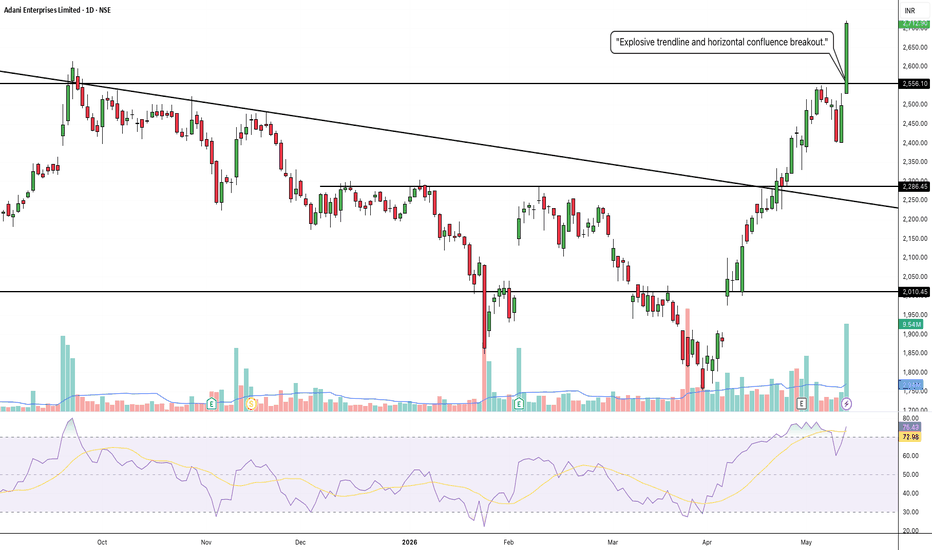
IDEA: Massive Volume Breakout and Cup Completion1. The Macro Perspective: The Deep Washout and the Cup
I am taking a LONG bias on Vodafone Idea Ltd (IDEA) on the daily (1D) timeframe.
When analyzing pure market structure, the most reliable reversals occur when a stock forms a massive, rounded base. Look at the structural development on this chart. After a prior run-up, the stock suffered a deep, highly volatile markdown phase that dragged the price all the way down toward the 8.00 level. This brutal correction successfully washed out weak hands and impatient retail buyers. However, instead of collapsing further, the stock found an absolute floor and initiated a methodical, multi-month process of bottom accumulation, carving out an enormous "Cup" structure to march right back to the scene of the crime.
2. The Educational Setup: The Ceiling and the Volume
To understand the sheer strength of this current breakout, look at the mechanics of the resistance and the institutional footprints left behind:
The Accumulation Lid: For months, the stock's recovery was heavily capped by the formidable solid black resistance line at 12.44. Sellers aggressively defended this zone, creating the ultimate accumulation ceiling.
The Institutional Footprint: Look at the volume profile at the bottom of the chart. On the exact day the price pushed through the 12.44 ceiling, there was an absolute explosion in buying volume. Retail traders cannot generate that kind of volume; that is the undeniable footprint of heavy institutional capital forcing the stock into a new markup phase.
3. Current Price Action: Breakout and Boiling Indicators
Look at the most recent daily candles on the far right. The pressure cooker has absolutely exploded, pushing the price straight toward the 13.00 mark. By decisively clearing this massive accumulation zone, IDEA has officially confirmed a structural trend continuation. However, look at the RSI indicator on the bottom panel. It has surged into extreme overbought territory (above the 80 level). While this confirms massive underlying strength, it is also a structural warning that the momentum is boiling hot and a healthy breather or retest is highly likely.
4. The Trade Plan: Entries, Targets, and Risk Management
Entry Strategy: Momentum is exceptionally strong right now near 12.97. Chasing a stock with an 80+ RSI and a massive vertical expansion candle carries a severe risk of an agonizing intraday drawdown. The highest-probability, lowest-risk entry involves stepping down to an hourly timeframe and placing limit orders to catch a potential structural pullback to perfectly retest the 12.00 to 12.45 breakout zone. Letting that old, heavy resistance prove itself as a new, indestructible support floor offers a phenomenal risk-to-reward ratio.
Take Profit (Targets): We use measured structural targets based on the depth of the macro base. By taking the depth of the Cup (roughly 4.5 points from the ~8.00 floor up to the 12.44 ceiling) and projecting it upward from the breakout line, our primary structural swing target sits comfortably in the 16.50 to 17.00 zone. Immediate psychological milestones are 14.00 and 15.00.
Invalidation (Stop Loss): A trade thesis is only valid if the new market structure holds. A hard stop loss should be placed safely below the 12.44 breakout line and the recent consolidation structure, around the 10.50 to 11.00 level. A definitive daily close completely back inside the old accumulation base and below 11.00 would act as a massive warning sign of a failed macro breakout and a severe bull trap.
5. Time Horizon:
Because this technical setup is built on a 1-Day chart capturing an explosive volume breakout and Cup completion, this is a short-to-medium-term swing trade designed to capture the violent momentum thrust. Let the new trend run!  Long
Long
TATASTEEL: The Macro Staircase and Explosive High-Level Breakout1. The Macro Perspective: The Perfect Staircase
I am taking a LONG bias on Tata Steel Limited (TATASTEEL) on the daily (1D) timeframe.
When analyzing pure market structure, the healthiest and most sustainable trends do not go straight up in a single volatile line; they climb stairs. Look at the beautiful structural development on this chart. The stock established a rock-solid floor at the 164.46 line. From there, it rallied to the 185.36 line, paused to build a base, broke out, and used that 185 zone as a higher launchpad. This is textbook institutional behavior—systematically absorbing supply and stepping the price higher to prevent catastrophic pullbacks.
2. The Educational Setup: The Pressure Cooker Handle
To understand the sheer strength of this current breakout, look at how the price behaved after reaching the ultimate resistance ceiling at the solid black 215.79 line:
The Washout and Retest: After hitting 215.79, the stock suffered a healthy corrective pullback. Notice where it stopped? Exactly at the dashed 182.31 / solid 185.36 zone. It perfectly retested its previous structural stepping stone, confirming that old resistance had officially become indestructible support. This formed a massive "Cup" structure.
The High-Level Squeeze: As the price marched back up to the 215.79 ceiling, it didn't just smash into it and fail. It consolidated tightly directly underneath it, forming a "Handle." Consolidating right below major historical resistance acts like a pressure cooker, gracefully transferring shares from impatient retail traders to strong-handed institutional buyers and storing immense kinetic energy.
3. Current Price Action: The Lid Blows Off
Look at the most recent daily candles on the far right. The high-level pressure cooker has exploded. Buyers have effortlessly shattered the 215.79 macro ceiling with a strong momentum thrust, pushing the price past 220. Furthermore, look at the RSI indicator at the bottom of the chart. The RSI has smoothly broken out of its own consolidation and is pointing sharply upward (around the 65 level). This confirms that bullish momentum is accelerating beautifully without being dangerously overbought yet. The digestion phase is over; the new markup phase has begun.
4. The Trade Plan: Entries, Targets, and Risk Management
Entry Strategy: Momentum is exceptionally strong right now near 221.13. Chasing a daily expansion candle always carries a risk of an immediate intraday drawdown as the stock naturally breathes. The highest-probability, lowest-risk entry involves placing limit orders to catch a potential minor structural pullback to perfectly retest the 214.00 to 216.00 breakout zone. Letting that old heavy resistance prove itself as a new support floor offers a phenomenal risk-to-reward ratio.
Take Profit (Targets): We use measured structural targets based on the depth of the recent base. By taking the depth of the Cup (roughly 33 points from the ~182 floor to the 215.79 ceiling) and projecting it upward from the breakout line, our primary structural swing target sits comfortably in the 248.00 to 250.00 zone.
Invalidation (Stop Loss): A trade thesis is only valid if the new market structure holds. A hard stop loss should be placed safely below the handle consolidation and recent swing lows, around the 198.00 to 200.00 level. A definitive daily close completely back below the 200 mark would act as a massive warning sign of a failed structural breakout and a severe bull trap.
5. Time Horizon:
Because this technical setup is built on a 1-Day chart capturing an explosive Cup and Handle completion into a new markup phase, this is a short-to-medium-term swing trade designed to capture the violent momentum thrust. Let the new trend run!  Long
Long
HAL — Trendline Breakout Retest SetupHAL has given a strong recovery from the recent swing low near the 3,500–3,700 zone and is now trading above the long descending trendline that acted as resistance for several months.
Key observations:
The major descending trendline appears broken.
Price is attempting to sustain above the breakout zone.
Recent recovery shows strong bullish momentum.
Immediate resistance zone: 4,750–5,000
Major resistance zone: 5,200–5,600
Important support zone: 4,300–4,400
Breakdown below 4,250 may weaken the bullish structure.
View: Bullish above the breakout zone as long as price sustains above 4,300–4,400.
Possible setup:
A pullback/retest near the breakout trendline or support zone could offer a better risk-reward entry than chasing the current candle.
Invalidation:
Close below 4,250 may indicate breakout failure.
Disclaimer: Educational view only. Not financial advice. Use proper risk management.  Long
Long
RSI Divergence — A Price Action & Momentum Study📌What This Chart Is Showing
This is a purely observational, educational study combining classical chart pattern analysis, polarity zone behaviour, and RSI momentum divergence — all converging at the same structural area on the weekly timeframe. No forecast. No bias. Just what the chart is communicating through price and momentum.
📌The Descending Triangle — Historical Context
Going back 2–3 years, this chart carved out a well-defined descending triangle pattern — one of the most recognized structures in classical technical analysis.
- A flat horizontal support level (marked S) — where price repeatedly finds buyers at the same price area
A series of Lower Highs converging downward toward that support — indicating that sellers are becoming progressively more aggressive, willing to sell at lower and lower prices with each rally
📌Now — RSI Divergence
Understanding RSI Divergence — In Depth
The Relative Strength Index (RSI) is a momentum oscillator. It doesn't measure price — it measures the speed and strength of price movement. This distinction is everything when reading divergence.
⚠️What is Divergence?
Divergence occurs when price and momentum stop agreeing with each other. In a healthy, sustained move, price and momentum trend together. When they begin to disagree — when price goes one way but momentum goes another — it signals that the move may be losing its internal engine.
📌Regular Bullish Divergence
Price prints a new Lower Low — on the surface, the downtrend appears to be continuing
But the RSI prints a Higher Low — meaning that despite price falling further, the selling momentum behind that move is actually weakening
Fewer sellers are participating with conviction
The bears are still pushing price down, but they are doing so with less and less force
Think of it like this: imagine a car moving forward but the driver is easing off the accelerator. The car is still moving, but the engine is losing power. Divergence is the gauge showing you the engine is weakening — even if the car hasn't stopped yet.
⚠️ Disclaimer: This post is strictly educational and intended purely for the study of technical analysis concepts including chart patterns, polarity zones, and RSI divergence. This is not financial advice, not a trade signal, and not a directional forecast of any kind. No bullish or bearish bias is expressed or implied.
 Long
Long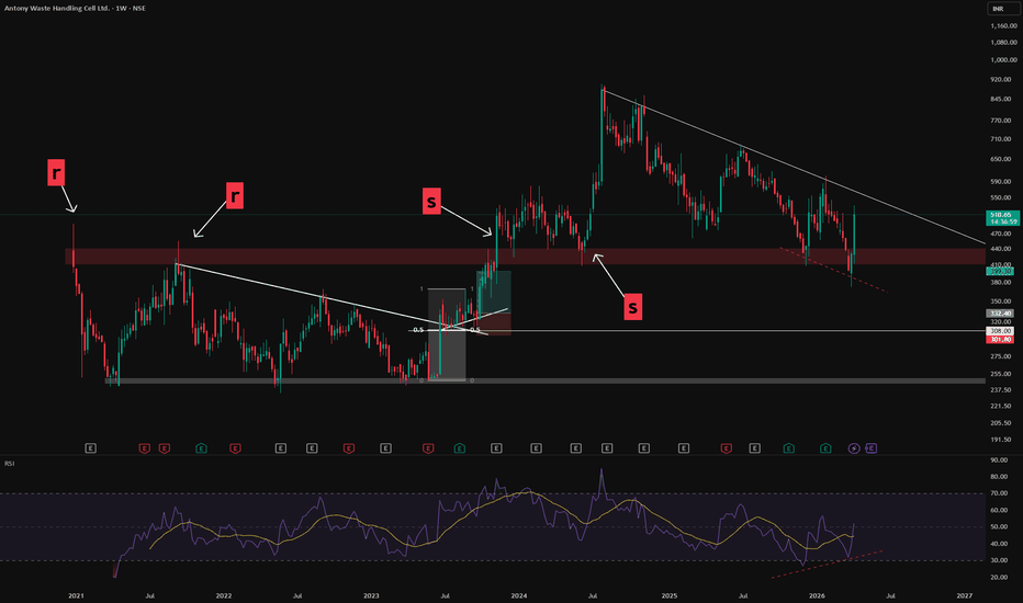
 Short
Short
Evaluating Trend and Momentum Alignment with EMA & RSI🔎 Intro / Overview
This idea presents an EMA + RSI Alignment Framework designed to help traders understand market conditions rather than chase price movements.
Often, traders feel they have “missed the move”.
In most cases, this happens not because of late entries, but because market context was not clearly defined beforehand.
This framework focuses on evaluating trend direction and momentum quality first, so traders can better understand when conditions were supportive, unclear, or weakening.
⸻
📔 Concept
Indicators are frequently misused when applied in isolation.
This framework assigns clear and specific roles to each tool:
• EMA defines trend bias, not support or resistance.
• RSI measures momentum quality, not overbought or oversold levels.
A market environment is considered valid only when EMA and RSI are aligned.
When alignment is missing, price movement alone is treated as low-quality information.
This shifts focus away from prediction and toward environment assessment.
⸻
📌 How to Use
The framework is applied through three structured steps:
1. Identify Trend Bias (EMA)
• Price holding above EMA → bullish environment
• Price holding below EMA → bearish environment
• Price frequently crossing EMA → unstable environment
2. Assess Momentum Quality (RSI)
• RSI holding above 40 → supportive bullish momentum
• RSI holding below 60 → supportive bearish momentum
• RSI fluctuating around 50 → momentum instability
3. Confirm Alignment
• EMA + RSI aligned → valid market environment
• EMA + RSI misaligned → low-quality environment
This framework is used strictly for evaluation and learning, not execution.
⸻
📊 Chart Explanation
• Bullish Alignment Zone
Price holds above EMA while RSI confirms stable bullish momentum.
• No Alignment Zone
EMA flattens and RSI becomes unstable, indicating a low-quality environment.
• Bearish Alignment Zone
Price holds below EMA while RSI confirms bearish momentum.
The RSI panel is used only for confirmation, never for signal generation.
⸻
👀 Observation
Many traders feel they missed a move only after alignment has already occurred.
This framework helps visualize:
• When alignment was present
• When conditions became unclear
• When momentum weakened
Understanding this sequence helps traders learn from price behavior instead of reacting emotionally to it.
⸻
❗ Why It Matters?
Market movement alone does not equal opportunity.
By learning to recognize alignment vs misalignment, traders can:
• Avoid chasing price after moves are over
• Stay out of choppy or unstable conditions
• Build patience and contextual awareness
Context is often the difference between consistency and frustration.
⸻
🎯 Conclusion
The EMA + RSI Alignment Framework is a context-first approach to understanding market behavior.
It does not attempt to forecast future price moves.
Instead, it explains why certain environments supported movement and why others did not.
This makes it a valuable educational tool for developing disciplined, structured market understanding.
⸻
⚠️ Disclaimer
📘 For educational purposes only.
🙅 Not SEBI registered.
❌ Not a buy/sell recommendation.
🧠 Purely a learning resource.
📊 Not financial advice. Market View & Trade PlanBased on current structure, NIFTY is trading inside a rising channel on both 5-minute and 15-minute timeframes, with short-term price action forming a potential bullish cup-and-handle pattern on the 5-minute chart. Momentum indicators and price behavior suggest a bias toward the upside as long as the index holds above the channel support zone. A buy-on-breakout can be considered above 26,175–26,185, with an initial stop loss below 26,110 (below the handle low and channel support). On confirmation, the upside potential lies toward 26,240 / 26,300, while a failure to hold the channel could open a downside move back toward 26,080–26,040.
Risk Note & Probability View
The bullish scenario remains valid only if price sustains above VWAP and the short-term EMA cluster; rejection from the upper channel or a breakdown below support will invalidate the setup and shift the bias to neutral-to-bearish. This is a probability-based trade, not a prediction — execution discipline and risk control matter more than direction.
Disclaimer: I am not a SEBI-registered research analyst. This view is for educational and informational purposes only and should not be considered investment advice. Please consult a qualified financial advisor before taking any trade decisions.  Long
Long
Bullish FVG Retracement With RSI & MACD📈 AUDUSD – Bullish FVG Retracement With RSI & MACD Momentum Confluence
This chart highlights a well-defined bullish structure on AUDUSD, characterized by a sequence of Higher Lows (HL) followed by a clean Higher High (HH). The latest impulsive leg upward created multiple Fair Value Gaps (FVGs), each formed by sharp displacement that left behind inefficiencies in price.
As price extends higher, the nearest unmitigated FVG becomes the primary area of interest. This imbalance represents the most logical level for a corrective retracement before bullish continuation resumes.
While a deeper FVG exists below, the nearest imbalance tends to offer stronger stability and higher probability in forex due to tighter liquidity behavior and more frequent shallow retracements.
In this setup, the combination of FVGs + RSI Behavior + MACD Histogram provides a high-confluence framework for identifying discount retracement zones and timing momentum re-acceleration.
⸻⸻⸻⸻⸻⸻⸻⸻⸻⸻
📊 Key Observations
1️⃣ Recent Bullish FVG Creation
The most recent impulsive leg upward generated a clear bullish FVG.
AUDUSD responded strongly to displacement, confirming active buy-side order flow.
Price has not yet returned to rebalance this inefficiency, making it the most probable retracement magnet.
2️⃣ Primary FVG (High-Probability Zone)
The upper FVG has the strongest confluence:
Formed by strong bullish displacement
Closest imbalance to current price (forex tends to fill nearest inefficiency first)
Aligns with bullish structure (HL → HH progression)
RSI remains elevated, signaling temporary overextension before a healthy pullback
MACD histogram shows slowing momentum, suggesting a cooling phase before continuation
This makes the upper FVG the most structurally significant level for a bullish reaction.
3️⃣ Secondary FVG Below
A deeper FVG also exists, but:
Formed during a smaller displacement
Much lower probability in forex due to shallower retracements
Carries less relevance unless the primary FVG fails
Momentum and structure currently favor reacting to the nearest imbalance
The zone may still attract price in extreme volatility, but it is not the main expectation.
4️⃣ RSI Behavior (Pullback Confirmation)
RSI is currently near the overbought region, indicating:
Market is stretched after a strong rally
A retracement is healthy and expected
During FVG entry, RSI must stay above 40 to maintain bullish structure and prevent a reversal signal
This acts as a structural momentum filter.
5️⃣ MACD Histogram Confirmation
MACD histogram is showing:
Momentum deceleration
A potential shift to light-green bars as price cools
A bullish continuation signal expected once the histogram begins turning upward from the pullback
Together, this confirms the classical model:
impulse → slowdown → retracement → continuation.
6️⃣ Structural Context
AUDUSD maintains a clean bullish sequence:
HL → HH progression
Deep liquidity sweep in the previous leg
Strong displacement aligned with bullish flow
As long as price holds above the FVG and prior HL, pullbacks are more likely to act as rebalancing events, not reversals.
⸻⸻⸻⸻⸻⸻⸻⸻⸻⸻
📊 Chart Explanation
Symbol → OANDA:AUDUSD
Timeframe → 1D
This chart illustrates how Smart Money Concepts blend with momentum indicators:
Clean HL → HH bullish structure
Fresh bullish FVG acting as primary discount zone
Secondary FVG present but lower probability in forex
RSI signaling temporary exhaustion before a pullback
MACD histogram confirming momentum slowdown into the FVG
Expected sequence:
displacement → inefficiency → retracement → mitigation → continuation
Price remains bullish unless structure breaks below the HL and the FVG fails to hold.
⸻⸻⸻⸻⸻⸻⸻⸻⸻⸻
📘How RSI & MACD Strengthen FVG Setups (Bullish & Bearish)
🔹 1. RSI + FVG
Bullish Setup:
RSI holding above 40 during the retracement confirms bullish structure.
Rising RSI from oversold strengthens the likelihood of continuation.
Bearish Setup:
RSI staying below 60 during the pullback confirms bearish structure.
Falling RSI from overbought increases the probability of downside continuation.
RSI shows whether the retracement is a healthy correction or a potential reversal.
🔹 2. MACD Histogram + FVG
Bullish Setup:
Decreasing histogram during the retracement = healthy cooldown.
Histogram turning upward inside or after the FVG = bullish continuation signal.
Bearish Setup:
Increasing histogram during the pullback = losing bearish momentum temporarily.
Histogram turning downward again at the FVG = bearish continuation confirmation.
MACD provides momentum timing for the reaction out of the FVG.
🔹 3. Combined Logic (Works Both Ways)
Displacement creates an FVG
Price retraces into the imbalance
RSI respects structural boundaries (bullish >40, bearish <60)
MACD momentum aligns with the trend direction
Price rejects the FVG and continues the trend
This combined approach filters low-quality FVG zones and identifies the highest-probability continuation setups in both bullish and bearish markets.
⸻⸻⸻⸻⸻⸻⸻⸻⸻⸻
⚠️ Disclaimer
📘 For educational purposes only
🙅 Not SEBI registered
❌ Not financial or investment advice
🧠 Smart-Money-Concepts explanation only Coforge (D): Strongly Bullish, Triple Top BreakoutTimeframe: Daily | Scale: Linear
The stock has confirmed a major breakout from a 6-month consolidation structure. By closing above the triple-test resistance zone, the "bearish" triple top pattern has been invalidated and converted into a bullish breakout .
📈 1. The Long-Term Structure (The Reversal)
> The Cycle:
- Peak: ATH of ~2,005 in Dec 2024.
- Correction: A downward spiral until April 2025 .
- Turnaround: Since April, the stock has shifted structure to Higher Lows , indicating buyers are stepping in aggressively on dips.
> The "Lid" (Resistance Zone): The 1,951 – 1,959 zone acted as a stiff resistance, rejecting the price three times (ATH, July 2025, and recently). This made it a "Triple Top" barrier.
💥2. The Breakout (Today's Action)
> Pattern Shift: Today, the stock finally **closed above** this resistance zone (1,951–1,959).
- Technical Significance: A close above a Triple Top resistance negates the bearish reversal and triggers a powerful continuation breakout .
> Volume Confirmation: The surge of 2.81% was backed by 3.12 Million in volume. This expansion (after a period of decreasing volume) confirms that "smart money" pushed the price through the wall.
📊 3. Technical Indicators
> RSI: Rising in Monthly, Weekly, and Daily timeframes.
- Caution: Watch for Bearish Divergence (Price making a higher high while RSI makes a lower high) as the stock approaches its ATH.
> EMAs: The PCO (Positive Crossover) state across all timeframes confirms the trend is synchronized to the upside.
🎯 4. Future Scenarios & Key Levels
With the "lid" at 1,960 removed, the path is open to retest the highs.
> 🐂 Bullish Targets:
- Target 1: 2,005 (The ATH). This is the immediate magnet.
- Target 2: Blue Sky . A sustained close above 2,005 puts the stock in price discovery mode.
> 🛡️ Support & Re-test:
- The "Safe" Entry: Waiting for a re-test of the 1,951–1,959 level is the prudent strategy. If the stock pulls back and bounces from here, it confirms the breakout.
- Stop Loss: If the stock falls back below 1,920 , it would signal a "fakeout" and likely trap the new buyers.
Conclusion
The breakout is valid. The "Triple Top" is no longer a threat; it is now a launchpad. Watch for the stock to hold above 1,951 to confirm the move toward 2,005 . FVG Retracement With EMA, RSI & Fib Confluence📈 Bitcoin Chart – FVG Retracement With EMA, RSI & Fib Confluence in a Bearish Market Structure
This chart showcases a sustained bearish sequence on BTC, defined by a clean continuation of Lower Highs (LH) and Lower Lows (LL). Throughout this decline, multiple Fair Value Gaps (FVGs) have formed both locally and at higher levels — each created by strong institutional sell-side displacement.
As price trends downward, these unmitigated FVGs above the market consistently act as magnet zones:price retraces into previous inefficiencies, rebalances them, and resumes the dominant bearish trend.
In the current setup, the integration of FVGs + Fibonacci Retracement(Point A to B) + EMA Levels + RSI Momentum provides a highly structured roadmap for anticipating retracements and continuation points.
The most significant imbalance sits near the major Fib retracement zone and under key EMAs — making it the highest-probability reaction area. Secondary FVGs below it may still induce a bounce, but carry lower structural relevance.
⸻⸻⸻⸻⸻⸻⸻⸻⸻⸻
📊 Key Observations
1️⃣ Prior FVG Mitigation
A previously formed FVG under the EMA was cleanly filled, followed by immediate downside continuation.
This confirms bearish order-flow control and validates the role of FVGs as efficient retracement targets in a downtrend.
2️⃣ High-Priority FVG (Primary Zone)
The upper FVG holds the strongest confluence:
Created by strong displacement
Sits below the EMA50
Aligns with the 38.2%–61.8% Fib retracement zone
This cluster makes it the most likely zone for a meaningful bearish rejection if price retraces into it.
3️⃣ Secondary FVG Reaction Zone
A lower FVG also exists beneath the main zone.
Although it can cause a minor corrective bounce, it formed during a smaller move and does not align with the key trend or Fib levels — giving it lower probability.
4️⃣ RSI Momentum Context
RSI remains below 50, confirming bearish momentum.
When RSI stays under mid-line, bearish FVG reactions tend to be more reliable and continuation setups form cleanly.
5️⃣ Structural Context
The broader structure remains decisively bearish as long as price trades below the EMAs and below the major upper FVG.
Retracements into these zones are more likely to serve as rebalancing moves rather than genuine reversal attempts.
⸻⸻⸻⸻⸻⸻⸻⸻⸻⸻
📊 Chart Explanation
Symbol → BTCUSDT
Timeframe → 1D
This visualization illustrates how Smart Money Concepts apply cleanly during strong trending conditions:
A clear LH–LL downtrend
Several historical FVGs acting as retracement magnets
A previously mitigated FVG confirming bearish control
A high-confluence FVG aligned with EMAs and Fib levels
A secondary imbalance that can still induce short-term reactions
RSI showing momentum remains bearish
Together, these elements outline a textbook sequence:
displacement → inefficiency → retracement → rebalancing → continuation.
Price remains under firm bearish control unless it breaks above the upper FVG with conviction.
⸻⸻⸻⸻⸻⸻⸻⸻⸻⸻
📘 Using Fib Retracement, EMA50, and RSI With FVGs (Bullish + Bearish)
🔹 1. Fibonacci Retracement + FVG
In a downtrend, draw Fib from swing high → low; in an uptrend, draw low → high
The 38.2%–61.8% zone is the prime retracement area in both directions.
If an FVG forms or sits inside this Fib zone, it becomes a high-probability reaction point (bearish rejection in downtrend, bullish bounce in uptrend).
🔹 2. EMA50 + FVG
In a bearish trend, price and FVGs forming below EMA50 act as stronger bearish retracement zones.
In a bullish trend, price and FVGs forming above EMA50 act as stronger bullish retracement zones.
EMA50 acts as a mean reversion point where price often returns to rebalance before continuation.
🔹 3. RSI + FVG
RSI below 50 → bearish momentum → bearish FVG reactions are more reliable.
RSI above 50 → bullish momentum → bullish FVG reactions are more reliable.
If RSI rises from oversold (or falls from overbought), it often signals a retracement phase toward nearby FVGs.
🔹 4. Combined Logic (Works for Bullish and Bearish)
Displacement creates an FVG (inefficiency).
Price retraces into the 38–61% Fib zone.
Retracement taps EMA50 or stays on the correct side of EMA50 (below for bearish, above for bullish).
RSI confirms momentum (below 50 for bearish continuation, above 50 for bullish continuation).
Price rejects from the FVG and continues the trend.
⸻⸻⸻⸻⸻⸻⸻⸻⸻⸻
✅ Summary
Market structure remains bearish with consistent LHs and LLs.
A previously filled FVG under the EMA validated the continuation move.
The upper FVG is the highest-strength level due to EMA + Fib + displacement confluence.
A lower FVG exists but carries reduced importance.
RSI below 50 reinforces bearish momentum and reliability of bearish FVG reactions.
⸻⸻⸻⸻⸻⸻⸻⸻⸻⸻
⚠️ Disclaimer
📘 For educational purposes only.
🙅 Not SEBI registered.
❌ Not investment advice.
🧠 Smart-Money-Concepts explanation only.  Short
Short
 Education
 Long
Long
 Long
Long
GMDC - Chart of The Week, Testing Trendline, Change of PolarityNSE:GMDCLTD has a beautiful structure on the Weekly Timeframe to qualify for my Chart of the Week idea. It saw Decent Above-Average Volumes and confirmed a Change of Polarity and is Now Testing the Falling Trendline with RSI and MACD trending upwards.
About:
NSE:GMDCLTD is primarily engaged in 2 sectors, i.e. mining and power. Its projects include Lignite, Bauxite, Fluorspar, Multi-Metal, Manganese, Power, Wind and Solar.
Trade Setup:
It could be a good Swing Trade if it breaks the trendline and the Change of Polarity is Still Intact.
If the Trade gets activated after breaking the trendline, then keep this Week's Low as the Stop Loss or Even Take RSI and MACD as a Stop Loss Signal.
📌Thank you for exploring my idea! I hope you found it valuable.
🙏FLLOW for more
👍BOOST if useful
✍️COMMENT below with your views.
Meanwhile, check out my other stock ideas on the right side until this trade is activated. I would love your feedback.
Disclaimer: "I am not SEBI REGISTERED RESEARCH ANALYST AND INVESTMENT ADVISER."
This analysis is intended solely for informational and educational purposes and should not be interpreted as financial advice. It is advisable to consult a qualified financial advisor or conduct thorough research before making investment decisions.  Long
Long
 Long
Long
SHARDACROP – Cup & Handle Breakout with Explosive Volume📊 SHARDACROP – Cup & Handle Breakout with Explosive Volume | RSI > 80
📅 Chart Date: July 26, 2025
📍 CMP: ₹1,087.10 (+19.63%)
📈 Symbol: NSE:SHARDACROP | 1D Timeframe
🔍 Technical Analysis Breakdown
☕ Cup and Handle Breakout
A clear Cup and Handle formation has completed.
Breakout above the neckline (~₹940) with a massive bullish candle.
💥 Volume Spike
Volume surged to 8.82M, against the 20-day average of ~887K — institutional buying visible.
This is the highest volume in months, confirming the breakout strength.
📈 RSI (14, close): 80.51
Momentum is extremely strong, entering the overbought zone — may signal continuation or short-term pullback before resuming rally.
📌 Breakout Level: ₹940
📌 Immediate Resistance: ₹1,100–₹1,150
📌 Support on Retest: ₹940–₹960
🎯 Trade Setup
Entry on Retest: ₹960–₹980
Stoploss: ₹920 (below handle base)
Target: ₹1,150 / ₹1,200+
Risk Level: Moderate–High (due to RSI overbought, but pattern is strong)
⚠️ Disclaimer: This is an educational chart setup and not trading advice. Please conduct your own research and risk management.
📣 Follow @PriceAction_Pulse for more such clean breakouts and chart pattern analysis!
🔁 Drop a comment if SHARDACROP is on your radar for the next breakout rally 📈  Long
Long
 Long
Long
 Long
Long
 Long
Long