Long
Long
ARVIND: Massive Macro Squeeze and Explosive Trendline Breakout1. The Macro Perspective: The Floor and The Lid
I am taking a LONG bias on Arvind Limited (ARVIND) on the weekly (1W) timeframe.
When analyzing pure market structure, some of the most powerful moves come from prolonged periods of sideways consolidation. Look at the massive structural development on this chart. After a volatile period, the stock established an absolute concrete support floor at the solid black 290.60 line. However, every time buyers tried to push the price higher, sellers aggressively stepped in at lower and lower prices, creating the heavy descending trendline (the lid).
2. The Educational Setup: The Volatility Squeeze
To understand the sheer strength of this current breakout, look at how the price action compressed into an apex on the right side of the curve:
The Symmetrical Triangle: The stock was perfectly trapped between aggressive dip-buyers (forming the steep ascending trendline of higher lows) and motivated sellers (forming the descending trendline of lower highs).
The Pressure Cooker: This tightening geometric structure is the ultimate definition of volatility contraction. As the price gets squeezed into the apex of the triangle, it acts like a tightly coiled spring. It forces early buyers to hold through chop and frustrates short-sellers, storing immense kinetic energy for the inevitable expansion.
3. Current Price Action: The Spring Uncoils
Look at the most recent weekly candle on the far right. The pressure cooker has absolutely exploded. In a violent display of momentum, buyers have effortlessly shattered the descending trendline and sliced straight through the dashed 393.60 horizontal pivot. By clearing this massive structural squeeze with such a full-bodied green expansion candle, ARVIND has officially confirmed a macro trend reversal and initiated a brand-new markup phase.
4. The Trade Plan: Entries, Targets, and Risk Management
Entry Strategy: Momentum is exceptionally strong right now as the stock surges past 430.00. Chasing a massive, near-vertical weekly expansion candle out of a squeeze always carries a higher risk of an immediate intraday drawdown. The highest-probability, lowest-risk entry involves stepping down to a daily timeframe and placing limit orders to catch a potential minor structural pullback to retest the 395.00 to 405.00 breakout zone (the apex of the triangle). Letting that broken trendline prove itself as new support offers a phenomenal risk-to-reward ratio.
Take Profit (Targets): We can find a measured technical target by taking the widest part of the triangle's base (roughly 150 points from the 290.60 floor to the initial ~440 peak) and projecting it upward from the breakout point. Our primary macro extension target sits comfortably in the 540.00 to 550.00 zone. Immediate psychological milestones are 475.00 and 500.00.
Invalidation (Stop Loss): A trade thesis is only valid if the new market structure holds. A hard stop loss should be placed safely below the breakout zone and the steep ascending trendline, around the 360.00 to 370.00 level. A definitive weekly close completely back inside the triangle and below the 393.60 line would act as a massive warning sign of a failed macro breakout (a "bull trap").
5. Time Horizon:
Because this technical setup is built on a 1-Week chart capturing a massive structural squeeze and momentum thrust, this is a medium-to-longer-term position trade designed to capture the explosive markup phase. Let the new trend run!  Long
Long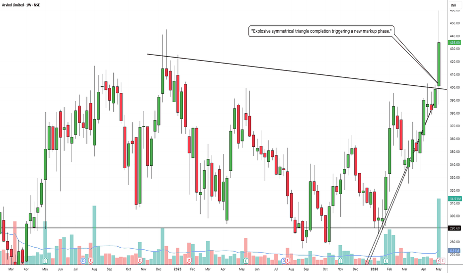
Where Everything Meets: A Decade Long TrendlineThis post is educational and observational in nature based on historical price action on the monthly timeframe. It is not a forecast or a trading recommendation. Using 3 months old charts only
The Monthly Trendline
A trendline drawn on the monthly timeframe carries significant structural weight, since it reflects price behavior compressed across years rather than days or weeks. In this chart, the green trendline originates from 2014, touches the market bottom again in 2020, and is respected once more in 2025. A trendline holding across three separate touches spanning more than a decade demonstrates a level of consistency that shorter timeframe lines rarely show.
The Rally From the 2020 Bottom
From the 2020 low, the stock delivered a strong rally, forming a higher high and breaking out of its prior structure by 2021. Since markets cannot sustain a purely vertical move indefinitely, this rally was followed by an extended period of sideways consolidation.
The Fibonacci Retracement and the Golden Zone
A Fibonacci retracement tool was applied from the swing low to the swing high of that 2020 to 2021 rally. Within this tool, the 61.8% level, marked in gold, represents the golden retracement zone, one of the more closely watched levels in technical analysis, often where corrective moves find their footing.
The Symmetrical Triangle
Marked with white lines, a symmetrical triangle pattern formed between 2023 and 2024 on the monthly timeframe, defined by converging lower highs and higher lows compressing into a tighter range over this period.
The Confluence
The most notable observation on this chart is where these separate elements converge. The decade spanning trendline, the lower support line of the symmetrical triangle, and the 61.8% golden retracement zone all align at the same area. This overlap of three independently derived technical references at a single point is what is referred to as confluence, and when multiple tools point to the same zone, that area tends to carry more observational significance than any single line or level would on its own.  Long
Long
Three Faces of Consolidation: How the Same Rally have 3 FacesThis post is educational and observational in nature based on historical price action. It is not a forecast or a trading recommendation.
Setup: The Bullish Rally
This chart begins with a strong bullish rally, the foundation from which three separate consolidation structures went on to form at different points along the stock's journey.
Pattern One: The Triangle
Following the initial rally, price consolidated into a triangle pattern, converging highs and lows compressing into a tighter range as the market paused to absorb the prior move.
Pattern Two: Inverse Head and Shoulders on a Slanted Trendline
After another rally, price formed an inverse head and shoulders pattern, a reversal structure built from a low, a deeper low, and a higher low. What makes this instance distinct is that its neckline was not a flat horizontal breakout level, but a slanted counter trendline instead, with a symmetrical triangle also forming along this same slanted structure. This combination shows how a reversal pattern can develop against an angled reference line rather than the more commonly seen horizontal one.
Pattern Three: The Parallel Channel
Following the next rally, price settled into a parallel channel, contained between two consistent, roughly equidistant boundaries, reflecting a more evenly structured consolidation phase compared to the converging patterns seen earlier.
 Long
Long
The Golden Rest Zone: Where Rallies Pause After the ClimbThis post is educational and observational in nature based on historical price action. It is not a forecast or a trading recommendation.
The Fibonacci Retracement Tool
The Fibonacci retracement tool is used here by anchoring it from the lowest point of the swing to the topmost point of that same swing, measuring the full move from bottom to top. This tool maps out key levels within that range, most notably 50% and 61.8%, which together form what is often referred to as the golden zone, one of the more closely watched retracement areas in technical analysis.
The Observation
A recurring behavior on this chart, and one seen across many stocks after a strong rally from a swing low to a swing high, is that price often pauses and consolidates for an extended period specifically within this 50% to 61.8% zone. Rather than retracing shallowly or falling all the way back to the origin of the move, the market frequently settles right within this golden area before deciding its next direction.
The Symmetrical Triangle Pattern
Within this golden zone, a symmetrical triangle pattern has formed. This is a consolidation structure defined by converging lower highs and higher lows, compressing price into a progressively tighter range. Its presence here, sitting precisely within the golden retracement zone, adds another layer of structural context to this pause in the broader move.
The Bigger Picture
This chart highlights how a mathematically derived zone like the Fibonacci golden area can also become the physical location where a price based pattern like a symmetrical triangle forms. Recognizing that consolidation after a strong rally often gravitates toward this specific retracement range is a useful observation for understanding how rest phases in the market tend to take shape.  Long
Long
History May Not Repeat, But Patterns Clearly DoAll price action shown in this chart is historical and older than three months. This post is purely educational and observational in nature. It is not a forecast or a trading recommendation.
The First Instance: 2008 to 2014
Between 2008 and 2014, this stock formed a symmetrical triangle pattern on the monthly timeframe. The eventual breakout in 2014 coincided with price reclaiming the 50 day exponential moving average on the same timeframe, with the triangle breakout and the EMA reclaim occurring together.
The Pattern Returns: 2022
Following a substantial rally in the years after, a strikingly similar symmetrical triangle structure formed again in 2022. Once again, this consolidation appeared after an extended upmove, echoing the same setup that had played out roughly a decade earlier.
The Pattern Returns Again: 2024
The same sequence repeated once more in 2024, a symmetrical triangle breakout aligning again with support being taken at the 50 day exponential moving average on the monthly timeframe. Three separate instances, years apart, each showing the same structural fingerprint.
The Bigger Observation
This chart is not about predicting whether the same outcome will occur a fourth time. It is about recognizing something more fundamental, that while history as a specific outcome may never truly repeat itself, the patterns and structures the market tends to form clearly do recur. The same triangle formation, the same moving average interaction, showing up across three distinct periods on the same chart, is a reminder that price action often rhymes even when the underlying story around it is completely different each time.
 Long
Long
Nifty Bank Weekly Analysis [24 - 28 August, 2026]Probable Price Structure and Scenario Analysis for the Nifty Bank NSE:BANKNIFTY Index. The analysis is restricted to the week of 24 - 28 August, 2026.
🟢 Bullish Scenario
Presently, there is no bullish scenario. Firstly, for a bullish setup, the price must give a sustainable breakout above 58000. Then a weak bullish target will be 58500. There will be strong resistance at 58500. Next, if the price decisively breaks out above 58500, then strong bullish sentiment would emerge. The probable bullish targets above 58500 would be - 59000, 59500, and 60000.
🔴 Bearish Scenario
Presently, there is no bearish scenario. The price is perfectly indecisive. The first sign of bearishness will emerge if the price gives a sustainable breakdown below 57000. A weak bearish target below 57000 would be 56500. There will be strong support at 56500. Next, if the price breaks down below 56500, then strong bearishness will emerge. The probable bearish targets below 56500 would be - 56000, 55500, and 55000.
🟡 No Trading Zone (NTZ): (58000 - 57000).
⏺ Range of Consolidation (ROC): (58500 - 56500).
Here, 57500 is the median of the ROC. The median works like a trading session sentiment evaluator. The price trading above the median would offer bullish sentiment, while the price trading below the median would trigger bearish sentiment within the ROC.
● Event
There is no major event or holiday this week. But geopolitical issues are omnipresent and beyond our control.
● Intraday, Weekly, and Monthly Bias
Establish bias with respect to the opening price (of the particular session - Intraday, Weekly, and Monthly). If the price sustains above the opening price, then don't think of shorting. Look for bullish trades only. On the contrary, if the price sustains below the opening price, then don't think of going long. Look for bearish trades in that case.
● Disclaimer + End Note
- All the analyses would fail in the case of a major gap up, gap down, or price structure anomaly. Thus, practice PRAGMATISM in the live session.
- Trade only if there is a set-up. Remember, not trading is an extension of the trading activity.
- Mark your points. Trade your points. Price is GOD. Anything can happen in the markets. Thus, trade what you see, not what you believe.
- Always PRACTICE RISK MANAGEMENT. Always PROTECT YOUR CAPITAL. Be RESPONSIBLE.
- Be Strategic. Be Courageous. Be Patient. Be Wise.
- Every day is a new day. Thus, do not carry the baggage of past successes or failures. Leave the gardens of winning and losing. Establish yourself in equanimity. Always think from a new perspective.
- Let the joy of trading drive your effectiveness, not greed or fear. Believe in Possibilities.
Happy Trading! HINDUSTAN UNILEVER — Testing Triangle Support, Bullish SetupOverview
Hindustan Unilever is trading at 2,077, down 0.72%, now testing the lower boundary of its 2-year symmetrical triangle. This is the same triangle covered in our earlier post, where price was watching the upper resistance zone; instead, price has drifted down and is now testing support at the opposite end of the same structure.
Pattern Explanation
The triangle's upper resistance line connects the October 2024 high (2,988) down through the September 2025 secondary high, converging toward the lower support line, which connects a series of rising lows since late 2024. Price is now testing this lower support again near current levels, trading below the 200 EMA (2,238.5), reflecting the recent weakness. This support zone has held on prior tests and remains the key level for a bullish reversal setup.
Trade Setup
Entry: Buy near current levels (2,070–2,090), on strength off triangle support
Stop Loss / Invalidation: Close below 2,000
Target 1: 2,175
Target 2: 2,238.5 (200 EMA)
Target 3: 2,325
Target 4: 2,408
Target 5: 2,480 (Triangle Upper Resistance)
Key Levels
Triangle Support / Entry Zone: 2,000–2,090
Invalidation: Close below 2,000
Target 1: 2,175
Target 2: 2,238.5
Target 3: 2,325
Target 4: 2,408
Target 5: 2,480
Beginner's Lesson
In a symmetrical triangle, support and resistance testing can happen many times before the eventual breakout. A stock testing the lower boundary isn't necessarily bearish, it's simply price checking whether buyers will defend that zone again, just as it earlier tested the upper boundary and pulled back. Watching how price reacts right at this support, rather than assuming which way the triangle eventually breaks, is the key skill here.
Conclusion
HINDUNILVR is testing important triangle support, with the invalidation clearly marked below 2,000. A bounce from here with strength would support a bullish case through a staged target ladder up to the 2,480 zone. A close below 2,000 would invalidate this setup and suggest a deeper breakdown.
This is for educational purposes only and not investment advice. Please do your own research or consult a financial advisor before making any trading decisions.  Long
Long
HAL - Symmetrical Triangle Coiling on Weekly ChartOverview
Hindustan Aeronautics has been consolidating inside a large symmetrical triangle since its July 2024 high of 5,674.75, with price now compressing right into the apex around the 4,320–4,385 zone. This is the first time we're covering the defense/aerospace space, and the multi-timeframe setup here — both weekly and daily charts showing the same structure — makes it a notable one to watch.
Pattern Explanation
On the weekly chart, a descending resistance line connects the July 2024 high down through lower highs to the current Resistance Zone at 4,737.60, while a rising support line connects the March 2025 low near 3,046.05 up through higher lows to the current Support Zone at 3,600.25. These two lines are converging, and price is now sitting almost exactly at the 50-week EMA (4,320.96) — a tight coiling right at this average that often precedes a decisive directional move once the triangle resolves. The 200-week EMA (3,474.54) sits well below, closer to the triangle's support boundary, giving a longer-term reference if the pattern resolves lower.
On the daily timeframe, the same structure is visible at finer resolution: price is pinned closely between its own daily EMAs (4,339.93 and 4,344.59), confirming this is a genuine multi-timeframe consolidation rather than noise on a single chart. The daily chart also shows the same descending resistance and rising support lines converging toward the same zone, reinforcing the weekly picture.
Key Levels
Resistance (Triangle Upper Boundary): 4,737.60
Support (Triangle Lower Boundary): 3,600.25
Current Consolidation Zone: 4,320–4,385
50-week EMA: 4,320.96
200-week EMA: 3,474.54
Major Reference High: 5,674.75
Major Reference Low: 3,046.05
Scenarios
If resistance breaks: A close above 4,737.60 would suggest the triangle is resolving bullishly, with the prior swing highs near 5,000–5,200 as a reasonable first reference and the July 2024 high (5,674.75) as a longer-term marker.
If support breaks: A close below 3,600.25 would suggest the triangle is resolving bearishly, with the 200-week EMA (3,474.54) as an immediate reference and the 3,046.05 zone as the next major level below.
Beginner's Lesson
A symmetrical triangle is one of the more neutral chart patterns — unlike an ascending or descending triangle, it doesn't inherently favor one direction. The value of spotting one isn't predicting which way it breaks, but recognizing that the compression itself signals decreasing volatility and an approaching decisive move. Here, the added detail of price consolidating right at the 50-week EMA on the weekly chart, and near dual EMAs on the daily, adds extra weight to this specific zone as the one to watch.
Conclusion
HAL is coiling tightly inside a well-defined symmetrical triangle across both weekly and daily timeframes. As always, wait for a confirmed close beyond either boundary before drawing directional conclusions, and manage risk according to your own plan.
Not investment advice. For educational purposes only. Please consult your financial advisor before making any trading decisions. The Midpoint Nobody Watches: Equilibrium, Flip Zones, PatternsThis post is educational and observational in nature based on historical price action. It is not a forecast or a trading recommendation.
Flip Zone (Green)
A price level that once acted as resistance and, after being broken and sustained above, converted into support. This shift in role is what defines a flip zone.
Equilibrium Point
The midpoint calculated between the biggest swing low and the biggest swing high on the chart. This level divides the overall range into two equal halves and is often used as a reference point to gauge whether price is trading in the upper or lower half of a larger structural move.
Symmetrical Triangle Pattern
A consolidation pattern formed between converging lower highs and higher lows, compressing into a tighter range over time. In this case, the pattern formed directly between the flip zone and the equilibrium point, sitting within that broader structural context rather than in isolation.
The Bigger Picture
This chart brings together three layers of context, a flip zone marking a change in level behavior, an equilibrium point marking the midpoint of the larger swing, and a symmetrical triangle forming in the space between them. Studying where a pattern forms relative to the broader range it sits within, rather than looking at the pattern alone, offers a much deeper read of the chart's structure.  Long
Long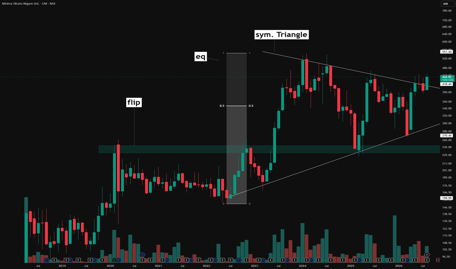
 Long
Long
Nifty 50 Trade Plan - Pennant Formation [10.08.2026: Monday]Probable Scenario Analysis and Trade Plan for the Nifty 50 Index NSE:NIFTY for the 10th of August, 2026. The day is Monday.
🟢 Bullish Scenario
Presently, there is no bullish scenario. For a bullish scenario to emerge, the price has to sustain above level 24650 with an exclusive green marubozu candle. The probable weak bullish target above 24650 would be - 24700. There will be strong resistance at 24700. Next, if the price sustains above 24700, then a strong bullish move would emerge. The probable strong bullish targets above 24700 would be - 24750, 24800, and 24850.
🔴 Bearish Scenario
Presently, there is no bearish setup. The market is sideways. Level 24500 is strong support. A decisive breakdown below 24500 would trigger a bearish setup. There must be one exclusive red bearish candle formation below 24500. Also, the price must sustain below 24500 with a tendency to go lower. The probable bearish targets below 24500 would be - 24450, 24400, 24350, and 24300.
🟡 No Trading Zone (NTZ): (24650 - 24500).
⏺ Minor Range of Consolidation (Mi-ROC): (24700 - 24500).
Here, 24600 is the median of the Mi-ROC. The median works like a trading session sentiment evaluator. The price trading above the median would offer bullish sentiment, while the price trading below the median would trigger bearish sentiment within the ROC.
⏺ Major Range of Consolidation (Ma-ROC): (24800 - 24400).
Here, 24600 is the median of the Ma-ROC. The median works like a trading session sentiment evaluator. The price trading above the median would offer bullish sentiment, while the price trading below the median would trigger bearish sentiment within the ROC.
● Event
There is no major event or holiday. But geopolitical issues are omnipresent and beyond our control.
● Intraday, Weekly, and Monthly Bias
Establish bias with respect to the opening price (of the particular session - Intraday, Weekly, and Monthly). If the price sustains above the opening price, then don't think of shorting. Look for bullish trades only. On the contrary, if the price sustains below the opening price, then don't think of going long. Look for bearish trades in that case.
● Disclaimer + End Note
- All the analyses would fail in the case of a major gap up, gap down, or price structure anomaly. Thus, practice PRAGMATISM in the live session.
- Trade only if there is a set-up. Remember, not trading is an extension of the trading activity.
- Mark your points. Trade your points. Price is GOD. Anything can happen in the markets. Thus, trade what you see, not what you believe.
- Always PRACTICE RISK MANAGEMENT. Always PROTECT YOUR CAPITAL. Be RESPONSIBLE.
- Be Strategic. Be Courageous. Be Patient. Be Wise.
- Every day is a new day. Thus, do not carry the baggage of past successes or failures. Leave the gardens of winning and losing. Establish yourself in equanimity. Always think from a new perspective.
- Let the joy of trading drive your effectiveness, not greed or fear. Believe in Possibilities.
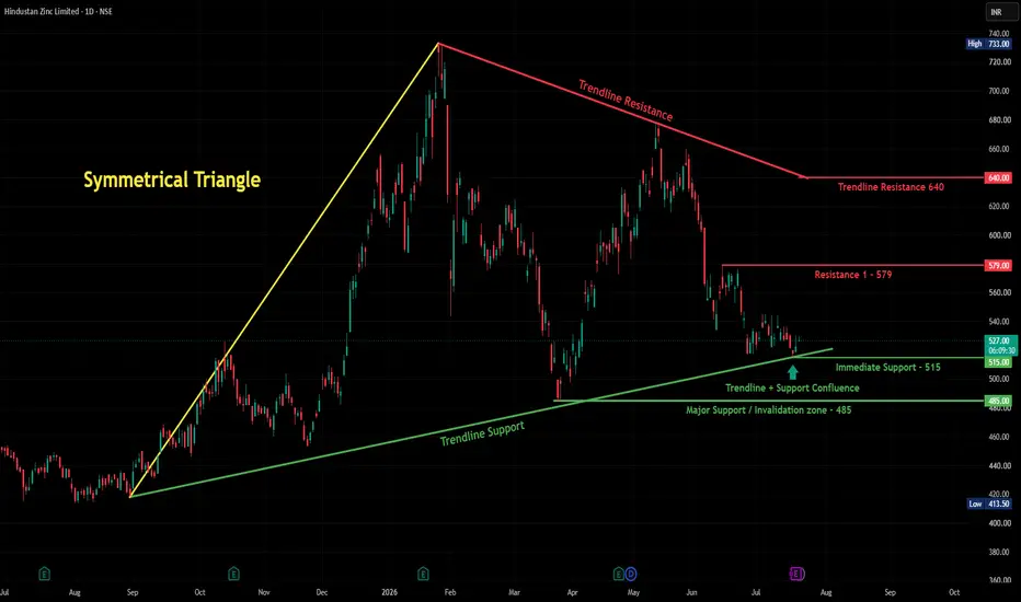
Happy Trading! Hindustan Zinc - Squeezed Between Trendline Support & ResistanceOverview
Hindustan Zinc is trading in a tightening zone right now — a rising trendline support from below is meeting resistance levels from above, and price is currently sitting right at the middle of this squeeze around 527.
What's Happening
The stock had a big rally from around 420 last year up to a high of 733, then pulled back hard. Since then, it's been finding support along a rising trendline (currently near 500-515), while facing resistance from a falling trendline coming down from the highs (currently around 640).
Right now, price is sitting just above the Immediate Support at 515, and just below Resistance 1 at 579. It's a fairly tight range at the moment — not too far from either boundary.
Key Levels to Watch
Immediate Support: 515
Major Support / Invalidation Zone: 485
Resistance 1: 579
Bigger Trendline Resistance: 640
Two Ways This Can Go
If support holds: A bounce from here, especially with a strong green candle, would be a good sign. First target to watch would be Resistance 1 at 579, and beyond that, the bigger trendline resistance near 640.
If support breaks: A close below 515, and especially below the Major Support/Invalidation zone at 485, would mean sellers are in control, and the broader uptrend structure (from the rising trendline) would be in question.
Beginner's Lesson
When a rising support trendline and a falling resistance trendline start meeting each other, price gets squeezed into a smaller range — like a spring being compressed. This usually means a bigger move is coming eventually, though it's hard to know which direction until price actually breaks one side clearly. That's why we wait for confirmation rather than guessing early.
Conclusion
Hindustan Zinc is at an interesting squeeze point between support and resistance. As always, we're watching for a clear break either way rather than assuming a direction. We'll update once this resolves.
For educational purposes only. Not financial advice. Always manage your risk. Adani Green at a Critical Inflection PointAdani Green Energy has reached one of the most decisive zones on its long-term monthly chart. After respecting its rising support trendline for several years, the stock is now trading near the intersection of a long-term ascending support and a falling resistance trendline. This creates a high-probability decision point where the next major trend is likely to begin.
The chart also illustrates a possible ABCDE corrective pattern, with waves (a), (b), (c), and (d) already completed. If the current move forms the final (e) wave while holding the long-term support, the stock could complete its correction and prepare for a fresh bullish cycle. However, failure to hold this support would invalidate the bullish setup and open the door for a deeper correction.
🟢 Bullish Scenario
The bullish case remains valid as long as the long-term rising support continues to hold. A decisive breakout above the falling resistance trendline, preferably with strong monthly closing strength and increased volume, would confirm that buyers have regained control.
Bullish Targets:
Target 1: ₹1,620+
Target 2: ₹2,225+
Long-Term Breakout Target: ₹3,000+
A confirmed breakout could mark the beginning of the next long-term uptrend, offering significant upside potential over the coming quarters.
🔴 Bearish Scenario
If the stock fails to sustain above the rising support trendline and breaks below the highlighted support zone, the current bullish structure would weaken considerably. Such a breakdown would indicate that sellers remain in control and the correction is not yet complete.
Bearish Target:
Initial Downside Zone: ₹900
A sustained move below this support could trigger fresh selling pressure and delay any long-term bullish reversal.
🟡 Consolidation Trading Opportunity
Until Adani Green gives a decisive breakout or breakdown, the stock is likely to remain in a consolidation phase between the rising support and falling resistance trendlines. During this period, swing traders can capitalize on short-term price movements by buying near the support zone and booking profits near the resistance zone, while maintaining strict stop-loss discipline.
However, traders should avoid taking aggressive positional bets until the stock confirms its next major direction. A breakout above the resistance could trigger a fresh bullish rally, whereas a breakdown below support may lead to a deeper correction. Until then, range-bound (consolidation) trading remains the preferred strategy.
Trading Strategy
This is not an ideal level to chase aggressively. Conservative traders should wait for a confirmed breakout above the descending resistance before initiating long positions. On the other hand, a breakdown below the rising support would shift the technical bias to bearish and warrant caution.
Conclusion
Adani Green is approaching a make-or-break technical zone where both bullish and bearish possibilities exist. The next major move will likely be decided by whether price breaks above the falling resistance or falls below the long-term rising support. Until confirmation arrives, traders should remain patient and allow the market to reveal its direction. HAL Symmetrical Triangle Breakout Watch_______________________________________
📊 Hindustan Aeronautics Ltd. (HAL): Daily Technical Snapshot – Symmetrical Triangle Breakout Watch
📊 STWP Technical Analysis
________________________________________
MARKET STRUCTURE SNAPSHOT | NSE: HAL | DAILY
Closing Price: ₹4,581.70 (+₹90.70 | +2.02%)
Core Trend: Strong Uptrend
Market State: Consolidation Within Uptrend
Price Structure: Price is consolidating inside a Symmetrical Triangle, following a strong prior advance. The recent Bullish Engulfing candle suggests improving buying interest as the stock approaches the upper boundary of the pattern.
________________________________________
OPERATIONAL PRICE GRID & KEY REFERENCE LEVELS
Model Reference Level: ₹4,594.00
Hard Invalidation Level: ₹4,155.20
Structural Risk: ₹438.80 (9.55%)
Resistance Levels: R1 ₹4,630.00 | R2 ₹4,678.30 | R3 ₹4,762.60
Support Levels: S1 ₹4,497.40 | S2 ₹4,413.10 | S3 ₹4,364.80
Range Structure: Low ₹4,155.20 | High ₹4,762.60
Higher Timeframe Observation Zones: ₹4,678 | ₹4,763 | ₹4,900
________________________________________
MOMENTUM, PARTICIPATION & CPR DATA
Volume Profile: 697.57K Shares
Volume Character: Normal Relative Participation
RSI: 63.43 (Strong Momentum Zone)
ADX: 11.59 (Low Trend Strength – Compression Phase)
ROC: +4.12%
MACD Status: Strong Positive Momentum Structure
CCI: +173.39 (Strong Bullish Momentum)
Stochastic Reading: 95.73 (Extended Momentum Zone)
Current Bias: WAIT FOR BREAKOUT CONFIRMATION
CPR State: Bullish Zone | CPR Moving Up (Narrow)
Today's CPR: Pivot ₹4,489.00 | Top ₹4,490.00 | Base ₹4,488.00
Tomorrow's CPR (Projected): Pivot ₹4,545.70 | Top ₹4,563.70 | Base ₹4,527.70
________________________________________
📚 EDUCATIONAL OBSERVATION
Hindustan Aeronautics Ltd. (HAL) continues to trade within a Symmetrical Triangle, a consolidation pattern that often develops after a strong trending move. The formation of higher lows alongside lower highs indicates that buyers and sellers are gradually reaching equilibrium, leading to price compression before the next significant directional move.
The recent Bullish Engulfing candlestick near the rising trendline reflects renewed buying interest and suggests that buyers are attempting to challenge the upper boundary of the triangle. However, the pattern remains under development, and a decisive breakout above the resistance trendline, supported by stronger-than-average volume, would provide stronger confirmation of a potential continuation of the broader uptrend.
Momentum indicators continue to remain constructive. The RSI at 63.43 reflects healthy bullish momentum, while the MACD remains positive, indicating sustained upside strength. The ROC of +4.12% signals improving price acceleration, and the CCI reading of +173.39 confirms strong buying momentum. The Stochastic reading of 95.73 highlights continued participation, although elevated momentum levels may also lead to short-term consolidation before the next directional move. Meanwhile, the ADX at 11.59 indicates that the market is currently in a compression phase, which is common during triangle formations.
The projected Central Pivot Range (CPR) for the next trading session has shifted higher, with the projected Pivot at ₹4,545.70. A rising CPR reflects improving market acceptance of higher prices and supports the prevailing bullish bias.
Immediate technical attention remains on the resistance zone between ₹4,630 and ₹4,678, which also coincides with the upper boundary of the Symmetrical Triangle. A sustained breakout above this region could strengthen the existing bullish structure and bring the higher-timeframe observation zones near ₹4,763 and ₹4,900 into focus. On the downside, ₹4,497 remains the first important support, while the structural invalidation level is positioned near ₹4,155.
________________________________________
🏢 BUSINESS & FUNDAMENTAL UPDATE
Hindustan Aeronautics Ltd. (HAL) remains India's largest aerospace and defence manufacturer, benefiting from the Government of India's continued focus on defence modernisation and indigenous manufacturing under the Govt. initiative. The company maintains a strong order book across fighter aircraft, helicopters, engines and defence systems, providing healthy long-term revenue visibility. Increasing defence capital expenditure, export opportunities and sustained execution of major defence programmes continue to support HAL's long-term growth outlook.
________________________________________
📖 Educational Note
Support and resistance levels should be treated as observation zones rather than predictive targets. Chart patterns, price action, volume analysis, momentum indicators and CPR are educational tools that help market participants understand evolving market structure within a disciplined risk-management framework.
________________________________________
⚠️ Disclaimer
This analysis is provided strictly for educational and informational purposes.
It does not constitute financial, investment or trading advice and should not be interpreted as a recommendation to buy or sell any security.
Investments in the stock market are subject to market risks, including the possible loss of capital.
Historical performance, business developments, chart patterns and technical indicators do not guarantee future outcomes.
Please conduct your own research and consult a SEBI-registered investment adviser before making investment decisions.
STWP assumes no responsibility or liability for any financial loss arising directly or indirectly from the use of this analysis.
 Long
Long
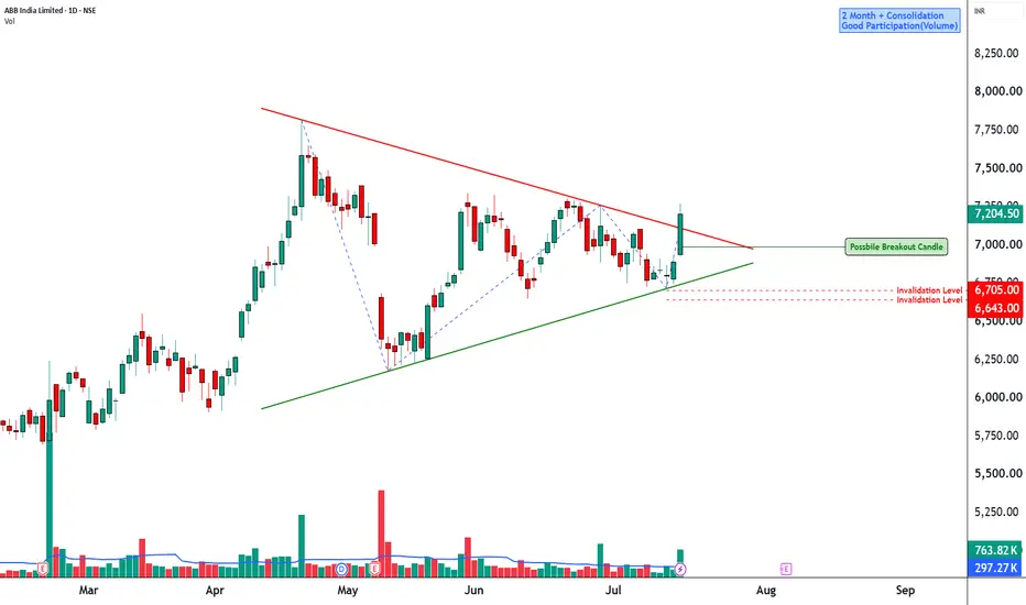
ABB Symmetrical Triangle Consolidation________________________________________
📊 ABB India: Daily Technical Snapshot – Symmetrical Triangle Consolidation
📊 STWP Technical Analysis
________________________________________
MARKET STRUCTURE SNAPSHOT | NSE: ABB
Closing Price: ₹7,204.50 (+₹312.50 | +4.53%)
Core Trend: Long-Term Uptrend
Market State: Consolidation Within Uptrend
Price Structure: Price is consolidating inside a Symmetrical Triangle, reflecting a period of compression following the previous rally. The structure suggests that buyers and sellers are reaching equilibrium, with a breakout likely to determine the next directional move.
________________________________________
OPERATIONAL PRICE GRID & KEY REFERENCE LEVELS
Model Reference Level: ₹7,270.00
Hard Invalidation Level: ₹6,643.20
Structural Risk: ₹626.80 (8.62%)
Resistance Levels: R1 ₹7,340.83 | R2 ₹7,477.17 | R3 ₹7,684.33
Support Levels: S1 ₹6,997.33 | S2 ₹6,790.17 | S3 ₹6,653.83
Range Structure: Low ₹6,643.20 | High ₹7,684.33
Higher Timeframe Observation Zones: ₹7,477 | ₹7,684 | ₹8,000
________________________________________
MOMENTUM, PARTICIPATION & CPR DATA
Volume Profile: 763.82K Shares
Volume Character: Strong Relative Participation
RSI: 58.93 (Positive Momentum Zone)
ADX: 11.75 (Low Trend Strength – Compression Phase)
ROC: +3.86%
MACD Status: Momentum Improving
CCI: +68.25 (Positive Momentum)
Stochastic Reading: 88.19 (Strong Momentum Zone)
Current Bias: WAIT FOR BREAKOUT CONFIRMATION
CPR State: Bullish Zone | CPR Moving Up (Wide)
Today's CPR: Pivot ₹6,852.00 | Top ₹6,872.00 | Base ₹6,832.00
Tomorrow's CPR (Projected): Pivot ₹7,133.65 | Top ₹7,169.10 | Base ₹7,098.25
________________________________________
📚 EDUCATIONAL OBSERVATION
ABB India continues to consolidate within a Symmetrical Triangle, a chart pattern that commonly develops after a strong directional move as the market enters a temporary period of balance between buyers and sellers. The series of lower highs and higher lows reflects gradually narrowing price swings, often preceding a volatility expansion.
The stock remains within its broader uptrend despite the ongoing consolidation. Rather than signalling weakness, the current structure appears to represent a pause following the previous advance. Such consolidation phases frequently allow momentum indicators to cool before the next significant move develops.
Momentum indicators remain constructive despite the consolidation. The RSI at 58.93 remains comfortably above the neutral zone, suggesting buyers continue to hold an advantage. ROC at +3.86% reflects positive price momentum, while CCI at +68.25 remains in bullish territory. MACD is stabilising after the previous correction, indicating improving momentum. Meanwhile, ADX at 11.75 confirms the market is currently in a low-trend environment, which is typical during triangle formations before a decisive breakout.
The projected Central Pivot Range (CPR) for the next trading session has shifted higher, with the projected Pivot at ₹7,133.65. A rising and widening CPR generally reflects improving acceptance of higher prices and provides a supportive backdrop should a breakout emerge.
The immediate technical focus remains on the upper boundary of the Symmetrical Triangle, which coincides with the resistance zone between ₹7,340 and ₹7,477. A decisive close above this region, supported by stronger-than-average trading volume, would confirm the continuation breakout and strengthen the probability of a move towards ₹7,684 and potentially the psychological ₹8,000 level. Conversely, failure to hold the lower trendline could shift attention towards the support levels near ₹6,997 and ₹6,790.
________________________________________
🏢 BUSINESS OVERVIEW
ABB India is a leading provider of electrification, industrial automation, robotics and motion technologies. The company benefits from India's ongoing investment in manufacturing, infrastructure, renewable energy, data centres and industrial automation. Rising capital expenditure across these sectors continues to support long-term demand for ABB India's products and engineering solutions.
________________________________________
📖 Educational Note
Support and resistance levels should be treated as observation zones rather than predictive targets. Chart patterns, price action, volume analysis, momentum indicators and CPR are educational tools that help market participants understand evolving market structure within a disciplined risk-management framework.
________________________________________
⚠️ Disclaimer
This analysis is provided strictly for educational and informational purposes.
It does not constitute financial, investment or trading advice and should not be interpreted as a recommendation to buy or sell any security.
Stock market investments are subject to market risks, including the possible loss of capital.
Historical performance, chart patterns and technical indicators do not guarantee future results.
Please conduct your own research and consult a SEBI-registered investment adviser before making investment decisions.
STWP assumes no responsibility or liability for any financial loss arising directly or indirectly from the use of this analysis.
 Long
Long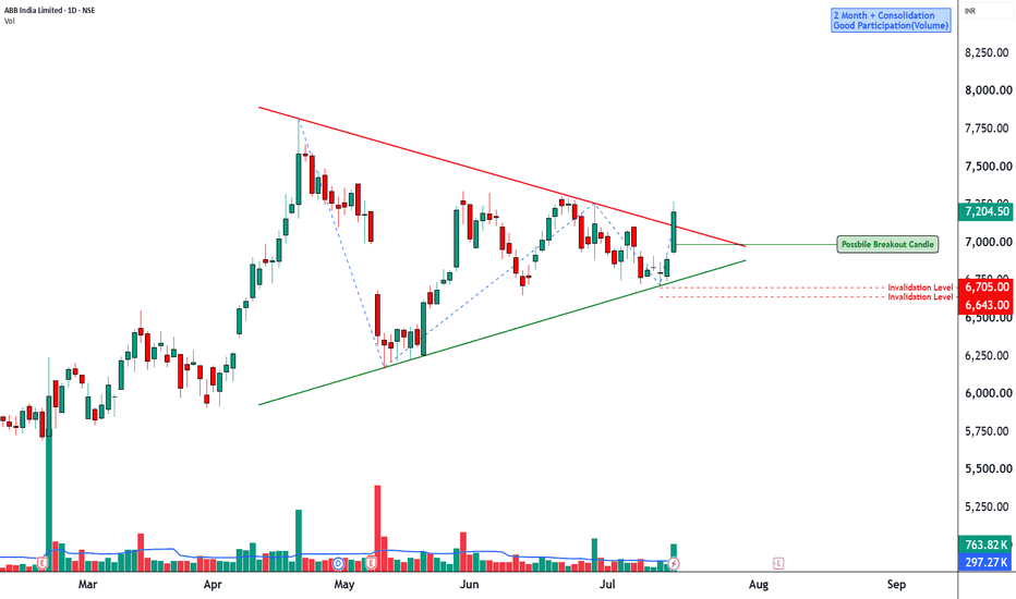
 Long
Long
 Long
Long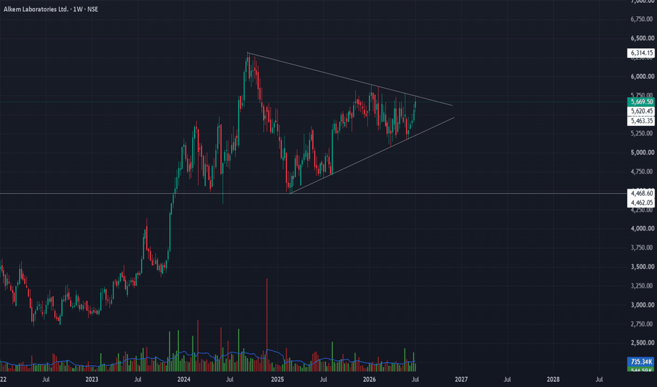
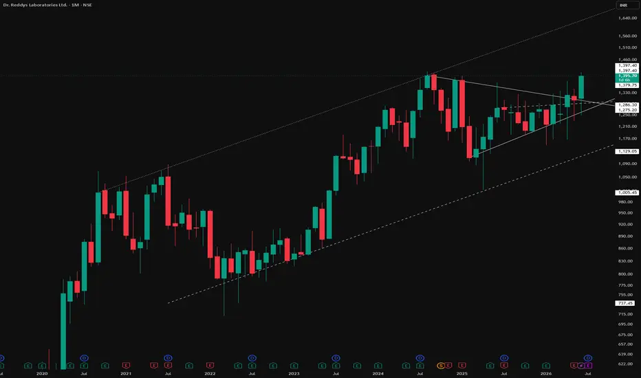
Layered Structures: Multi patterns formations Explained The Ascending Parallel Channel
Marked by the dotted lines, this is a rising channel — two parallel trendlines, both sloping upward, containing price action between them. It reflects a steady, structured uptrend where price oscillates between a rising support line and a rising resistance line.
The Symmetrical Triangle Within It
Inside this channel, a symmetrical triangle has formed — converging highs and lows compressing into a tighter range. What stands out here is its location: this triangle consolidated near the upper half of the channel, not near the base.
Why Location Matters
This is the core lesson of this chart. The same pattern can behave very differently depending on where it forms inside a larger structure:
1) When consolidation happens near the bottom of a channel, a breakout from there is often referred to as a base breakout — these tend to be the cleaner, more reliable setups to observe, since price is breaking out from a zone of accumulated support.
2) When consolidation happens near the top of a channel, a breakout from there is more of a horizontal top breakout — these are generally less favorable for trading and are better suited for observation only.
The Bigger Picture
This chart is a reminder that multiple patterns often exist within each other, and recognizing not just the pattern but where it sits inside the broader structure is what separates surface-level pattern reading from a deeper understanding of price behavior.
Disclaimer: This post is for educational and informational purposes only. It does not constitute financial advice, a forecast, or a recommendation to buy, sell, or hold any security. Please conduct your own research and consult a licensed financial advisor before making any investment decisions.
PRAJIND – Technical View (Daily Chart)PRAJIND has been in a prolonged corrective phase since its all-time high, forming a sequence of lower highs while repeatedly giving up previous support levels. Each former support has now turned into a potential resistance, clearly reflecting the dominance of sellers over the past several months.
However, the recent price action is becoming interesting. After finding support near the ₹295–310 demand zone, the stock has staged a sharp recovery and is now consolidating within a symmetrical triangle. The rising trendline from recent lows and the falling trendline from the long-term downtrend are converging, indicating that the stock is approaching a decisive breakout zone.
Bullish Scenario
A decisive breakout above the descending trendline, backed by strong volumes, may signal the end of the corrective phase.
Once the breakout is confirmed, the stock may gradually attempt to reclaim its previous resistance zones:
₹401
₹445
₹537
₹595
₹653
Each of these levels represents a previous support-turned-resistance and may act as interim profit-booking zones.
Bearish Scenario
Failure to hold the rising trendline followed by a breakdown below the ₹340–350 zone would weaken the current recovery.
A decisive close below the major demand zone around ₹295–310 may resume the broader downtrend.
Technical Highlights
Pattern: Symmetrical Triangle
Primary Trend: Long-term Downtrend
Current Structure: Base Formation within Consolidation
Major Support: ₹295–310
Immediate Resistance: Descending Trendline
Bias: Neutral with Positive Undertone (Awaiting Breakout Confirmation)
Trading Strategy
The stock is approaching a technical decision point. Rather than anticipating the move, wait for a decisive breakout above the descending trendline with strong volume. A confirmed breakout could mark the beginning of a medium-term trend reversal, while a breakdown below support would invalidate the current bullish setup.
Disclosure : This technical view is based on price action and chart analysis and reflects the prevailing market structure at the time of publication. Market conditions may change without notice. There are no guaranteed returns in the stock market. Investors should conduct their own due diligence and assess their risk profile before making any investment decisions. The Research Analyst and/or clients may have positions in the security discussed.  Long
Long
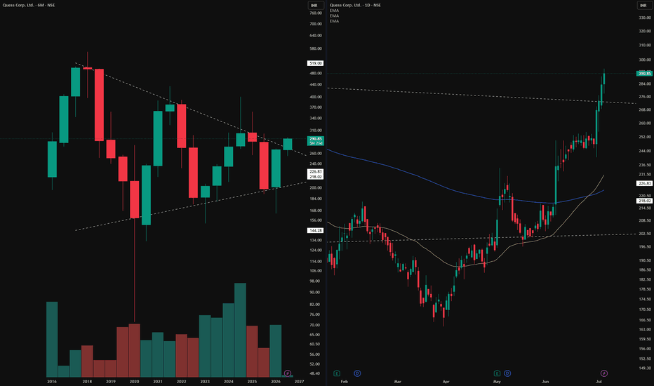
You Found the X. But How Big Is the Canvas?The Trap of Looking at One Timeframe
It does not matter how clean the setup looks. It does not matter if the market structure on the daily is textbook perfect, higher highs, higher lows, clean breakouts, a beautiful EMA crossover. None of that context matters in isolation if you have not asked one simple question first.
Where is this on the bigger canvas?
What the Daily Shows
The daily chart tells a confident story. Market structure is healthy. Higher lows are forming. Maybe a breakout has occurred. Maybe the EMAs have crossed in the right direction. From this lens, everything looks constructive. A trader looking only here would feel justified in their read.
What the 6 Month Reveals
Switch to the left side of this post. The monthly chart. Zoom out and suddenly the same price area that looked like open space on the daily is sitting directly beneath a major counter trendline. Or inside a symmetrical triangle pattern that has been compressing for years. Or approaching a resistance zone that has rejected price multiple times across a decade.
The X that looked like opportunity on the daily is sitting at the edge of a wall on the monthly. Same price. Completely different story depending on which canvas you are reading it from.
The Multi Timeframe Habit
This is not about ignoring the daily. It is not about only trading the monthly. It is about making sure that whatever you observe on your working timeframe, you have visited the higher timeframe first to understand the location of that observation within the broader structure.
Disclaimer: This post is purely educational and observational in nature based on historical price action across multiple timeframes. It does not constitute financial advice, a forecast, or a recommendation to buy, sell, or hold any security. Multi timeframe analysis is a personal observational approach and does not guarantee future price behavior.  Long
Long