Macro Monday 25~The Feds Inflation Barometer – Core PCE Macro Monday 25
The Feds Favorite Inflation Barometer – Core PCE
The US Core Personal Consumption Expenditures (PCE) are released this Friday 22nd December 2023. Currently Core PCE is the most important component to the Federal Reserve in making their interest rate decisions and thus it will provide a great insight into what lies ahead in terms of interest rate policy for Q1 2024.
Known as the Federal Reserve’s favorite gauge for inflation, Core PCE is a crucial economic indicator that provides insights into the general trend in consumer spending (it excludes the more volatile energy & food costs).
Jerome Powell
“I will focus on core PCE inflation, which omits the food and energy components.”
25th Aug 2023
The Bureau of Economic Analysis (BEA) compiles and publishes the Core PCE report which is considered a more comprehensive measure of general trends in consumer spending than some other indicators, such as the Consumer Price Index (CPI).
We will briefly cover the differences between CPI and PCE which will eventually lead us to why specifically the Core PCE is the preferred barometer for inflation (over headline and core CPI and over headline PCE).
Stick with me here and lets have a look at CPI vs PCE first…
CPI Vs PCE - Main differences?
Consumer Price Index: CPI is a metric that follows a fixed basket of goods. This fixed basket of items is measured month to month providing a consistent “basket of goods” cost for the common urban consumer. This allows for the basket of items to remain relatively unchanged thus providing an indication of how costs may be increasing or decreasing for the common consumer using the said basket (the basket is updated but not a frequently as the PCE basket).
Personal Consumption Expenditures: PCE includes a broader range of goods and services, and it is based on more frequent updates to the basket of goods and services that represent consumer spending, thus PCE captures more of the trend or trend changes in consumer spending. PCE includes expenditures on durable goods (e.g., cars and appliances), nondurable goods (e.g., food and clothing), and services (e.g., healthcare and education). This breakdown provides insights into which sectors of the economy are experiencing changes in consumer spending. We covered Durable Goods in a prior Macro Monday (I will link same under the published version on my TradingView). The bottom line on PCE is that it is more broader and more consumer led report thus arguably providing a more accurate indication of the wider spending habits of the consumer
Headline Vs Core (for both CPI and PCE)
In general Headline CPI and Headline PCE have an all-encompassing basket of goods and services included whilst Core CPI and Core PCE focus on a subset by excluding the volatile components of food and energy.
Analysts and policymakers often consider both Headline and Core to gain a comprehensive understanding of inflation trends, however Core PCE in particular provides the deepest and broadest insights into consumer led spending habits and provides the true underlying inflation by removing volatile commodities (Food & Energy). Lets look at CORE PCE a more closely
What is the benefit of excluding food and energy from inflation figures for Core PCE and why is this so beneficial?
1. Reduced Volatility: Energy and food prices are known to be more volatile and subject to temporary fluctuations due to factors such as weather conditions, geopolitical events, and supply chain disruptions. By excluding these components, Core PCE aims to provide a more stable measure of inflation.
2. General Inflation Trend Focus: As noted above, the short-term volatility in energy and food prices can mask the underlying aggregate trend in other goods and services, so the PCE eliminates some of this short term noise from food and energy inflation figures.
3. Captures Persistent Underlying Inflation Forces: Core PCE filters out the impact of temporary shocks to energy and food prices. This can be valuable for assessing whether inflationary pressures are becoming ingrained in the economy in the general sense.
4. Long Term Planning for the Consumer and the Fed: Understanding the underlying inflation trend is crucial to knowing the base level of the cost trend. Core PCE can provide a more reliable gauge for long-term economic planning by smoothing out short-term fluctuations.This provides investors, consumers and the Fed with a sort of long term general expenditure based moving average (the Core PCE) for the underlying inflation burden that is trending in an economy. All three participants can make the necessary adjustments to cater to this long term trajectory and thus the metric is a powerful tool for all involved.
Now that we know why the PCE is such a useful metric we can have a look at the long term PCE chart and see how things have been trending.
For the record CPI already came out for the month of November as CPI is typically released mid-month whilst PCE is released towards the end of the month.
Remember we will have an update this Friday from the BLS on the November readings for Core and Headline PCE, so we can see how we are looking then.
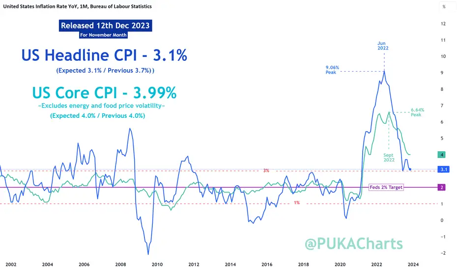
The Core and Headline CPI Chart
This CPI chart illustrates the following:
▫️ You can clearly see how Core CPI is less volatile than Headline CPI. As discussed above, Core CPI removes the volatile food and energy expenditures to provide a more general view of underlying inflation (based on a fixed basket of goods)
▫️ It is clear that we are not at the Federal Reserves target of 2% which is also outlined on the chart (purple line). It is critical to understand that we are still not at or below the target 2% level regardless of the FOMC’s determination of a likely hold on interest rates and reductions to interest rates in 2024. Lets see can the target be met first.
▫️ You can see that since 2002 Core CPI has fluctuated one standard deviation above and below the 2% inflation level between 1% and 3%. It is clear that we are not back into this standardized zone between 1 – 3%.
The Core and Headline PCE Chart (SUBJECT CHART AT TOP PROVIDED TODAY)
(will be updated this with newly released figures this Friday 22nd Dec)
This CPI chart illustrates many of the same findings from the CPI chart above:
▫️ Core PCE provides the deepest and broadest insights into consumer led spending habits versus a more fixed and stringent basket of goods for CPI, making Core PCE the Feds favorite inflation barometer to watch.
▫️ You can clearly see how Core PCE is less volatile than Headline PCE. As discussed above, Core PCE removes the volatile food and energy expenditures to provide a more general view of underlying inflation (based on a fixed basket of goods).
▫️ It is clear that we are not at the Federal Reserve’s target of 2% which is also outlined on the chart (purple line). The Federal Reserve have advised that Core PCE is expected to decline to 2.2% by 2025 & finally reach its 2% target in 2026. Anything that happens to interfere with this between now and then will need to be addressed by the fed.
▫️ You can see that since 1991 Core PCE has fluctuated one standard deviation above and below the 2% inflation level between 1% and 3%. It is clear that we are not back into this standardized zone between 1 – 3%.
Summary
You can visualize on the charts why the Core CPI and Core PCE is more important to Chair Powell, both Core metrics on the charts are almost like a slower moving average providing an indication of the longer term inflation trend. Right now Headline metrics are diving down past the Core metrics and the Federal Reserve cannot just take that volatile headline figure to make long term decisions. The Core PCE/CPI provides the long term trend trajectory whilst the Headline can offer early/lead signals of the direction of inflation, however core must be observed to determine the resilience of the long term trend. Furthermore, Core PCE is perceived by the FED as having more value as it has its finger on the pulse of the consumers spending habits by covering a broader range of expenditures whilst also accounting for consumer led spending trends. The CPI basket of goods in more fixed/restricted in terms of the goods it accounts for. This is why the FED values Core PCE so highly as a versatile and all encompassing gauge of inflation.
Hopefully you’ve come away today with a greater understanding of why the Core CPI and PCE data is preferred by the Fed ahead of headline inflation and also why the Core PCE comes out ahead as the chosen long term inflation gauge.
Any questions or observations, please throw them into the comments and I will be onto them as quickly as possible,
Thanks for reading,
PUKA Keep an eye on continuing claims as early recession indicatorLast year, continuing claims for unemployment insurance hit the lowest level since 1970. After a sharp uptick this year due to layoffs that mostly affected white collar tech workers, the absolute number remains strong relative to history, but is now above the lows of 1972–73, 1987–88, 2000, and 2018–2019.
An upward move this sharp usually accelerates and becomes recessionary, but I don't think we're past the point of no return yet. The Fed could stabilize the situation with a rate cut (although it just raised rates and shows no sign of wanting to cut), or Congress could possibly stabilize it with some kind of pro-growth reform bill (although currently it's engaged in debt-ceiling brinksmanship that might result in technical default). It's also possible that productivity gains due to rapid technological advances might offset the bad rate environment. Anecdotally, venture capital still seems willing to take risks despite the bad rate environment. (After getting laid off late last year, I just launched an AI startup with some angel investment, and many other laid off tech workers are doing the same.)
For gauging whether the jobless claims numbers are looking recessionary or not, I quite like Chris Moody's Ultimate Moving Average Multi-Timeframe indicator. This indicator has predicted 6 of the last 8 recessions—arriving a bit late to the other two—with only one false positive. (Of course, the definition of "recession" is a bit arbitrary. In general, this has been a good early signal that joblessness is accelerating—again, with only one false positive.) Note, however, that this is much better on the front end of a recession than the back end. You need a faster signal to let you know when the recession is over, because this one always calls it late.
Presently, this signal hasn't triggered yet. However, we're getting close. Often, claims accelerate because something in the financial system breaks. So keep an eye on headlines related to banks. I think the banks that have collapsed so far were unusually exposed, and most other regional banks don't look anywhere near as at-risk, so hopefully the collapses are over now. But if you see them pick up again, that's a bad sign, because it means liquidity has dried up to the point where it's affecting a much more stable tier of banks than the ones that fell first. I suspect the risk to pension funds has passed, because inflation has peaked and is going to continue coming down, so bonds should see some gains. I'm also watching for trouble with the major crypto exchanges and commercial real estate. (If more banks do collapse, it will probably be because of CRE.) Macro Monday 22 - ISM Services Vs PMI US ISM Non-Manufacturing Index (ISM Services)
Next Release: 5th December 2023 (released on third business day of each month)
The U.S. Institute for Supply Management (ISM) Non-Manufacturing Index (“ISM Services”) encompasses a wide range of services across various industries.
The index is designed to measure the economic activity and health of the services sector in the United States some of which are professional services (accounting, legal, etc.), healthcare (hospitals, clinics & other practitioners), accommodation, leisure and food services.
Similar to the ISM Manufacturing Index (aka as the Purchasers Managers Index) which surveys producers and manufacturers which we covered in Macro Monday 13, the ISM Services index is also based on surveys conducted on participants in the relevant services sectors noted above. Also similar to the ISM Manufacturing index, the ISM Services is reported as a diffusion index, where values above 50 indicate expansion or growth in the sector, while values below 50 suggest contraction.
This makes both the ISM Manufacturing Index and ISM Services Index easy to compile onto a chart for comparison purposes.
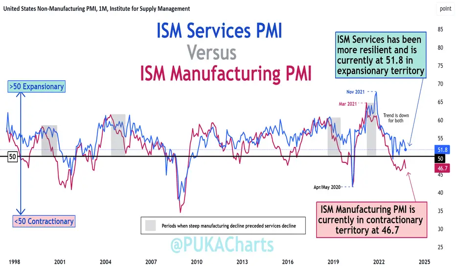
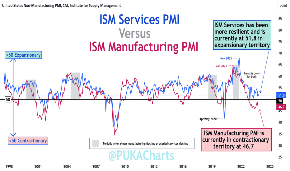
The ISM Services Vs ISM Manufacturing Chart
The chart demonstrates the following:
▫️ At present ISM Services has been more resilient and is in expansionary territory at 51.8 (above 50) whilst ISM Manufacturing is in contractionary territory below the 50 level at 46.7.
▫️ Both the ISM Services Index and the ISM Manufacturing Index have been in a downward trajectory since 2021.
- You can clearly see that since March 2021 the
Manufacturing Index has declined from 64.5 down
to 46.7 today (Red Line).
- Thereafter from November 2021 the ISM Services
Index declined from 67.5 down to 51.8 today (Blue
Line).
▫️ As you can see on the chart a steep manufacturing decline can often provide advance an warning of a subsequent services decline (grey areas on chart).
It’s important to acknowledge that the Manufacturing Index can lead the ISM Services Index. It is important because we discovered in Macro Monday 13 that the Manufacturing Index (AKA Purchaser Managers Index) reading below 42 can provide an advance/confirmation warning of recession, thus more weight could be assigned to the Manufacturing Index than Services Index in predicting a recession (as it appears to lead services direction). For this reason we will review the ISM Manufacturing Index (PMI) indications below.
The ISM Manufacturing Chart
The main findings of the ISM Manufacturing Index (AKA Purchaser Managers Index)
From a Recession Perspective
▫️ 11 of the 12 recessions on the chart coincided with a PMI of less than 42.
▫️ 1 recession occurred that did not breach below the 42 level (No. 9 on the chart)
From a PMI Perspective
▫️ 12 of the 13 times that the PMI moved below the 42 level, this coincided with a recession.
▫️ 1 time we have had a sub 42 PMI reading without a recession (Between 11 & 12 on the chart).
At present we are at a level of 46.7 so we do not currently have a trigger event for a recession but we know exactly what to look for.
Based on both historical perspectives, there is an c.92% probability of a recession should a sub 42 PMI level be established, or vice versa, in the event of a recession confirmation there is a c. 92% probability it would coincide with the sub 42 PMI level.
Timing ISM Manufacturing Bottoms
o 10 out of 12 PMI Bottoms occurred in Q1 and the remaining two bottoms were in Q2. 83% of the time the PMI bottoms occur in Q1 which is good to know and watch for with Q1 2024 approaching swiftly.
o The average PMI Bottom to bottom timeframe over the past 6 cycles is 58 months (Min 37 – Max 86). We are presently at month 44 and month 58 is Jan 2025 (Q1)
The ISM New Orders Index (30% of the PMI)
Similar to the ISM New Orders Index Chart (covered in Macro Monday 6) which makes up 30% of the Purchaser Managers Index or Manufacturers Index (PMI), we have not reached below the 42 level on this chart either which has provided a 100% confirmation of recession when we have had a definitive move below the 42 level historically. At present we are at 45.5 on this chart and we seem to have a downward trajectory at present unless something changes upon the next data release.
In summary, we now know now that the Manufacturers Index (PMI) often leads the Services Index, and we need to pay close attention to the 42 level on both the New orders Index (Makes up 30% of PMI) and the Manufacturing Index (PMI) as a breach below this level on these charts increases the probability of a recession upwards of 92%. We are also now aware that there is a high incidence of the PMI bottoming in Q1 (83% of the time) and occasionally in Q2. These are quarters we can be on high alert for a sub 42 level.
The ISM Services PMI is released on the third business day of each month at 10:00 a.m. (EST) or 15:00 GMT. The next release will be on the Tuesday the 5th December 2023. Most of the ISM data releases commence within the first 5 working days of the month.
As always folks, I will watch the numbers and keep you informed. All of the above charts are updated on TradingView as data is released.
PUKA
U
A Holly Jolly Inflation OutlookLast Friday's University of Michigan Survey of Consumers revealed some surprising bullish trends as we head into the heart of the holiday season. November’s 69.4 sentiment score, the highest since August, was a massive jump from 61.3 in October, making a positive change in how consumers feel about the state of the economy. Within the report, though, is what really raised eyebrows on trading desks to wrap up last week.
My chart of the week is UMich 1-year inflation expectations. At 3.1%, it was the softest outlook for inflation since March 2021 and the biggest monthly drop since 2001. The stunning reversal comes amid rapidly falling gasoline prices. Bigger picture, the 5-year inflation outlook also came in tame at just 2.8%, tying for the lowest figure since July 2021.
It’s all music to the Fed’s ears ahead of this week’s key December FOMC meeting. Bond traders widely expect no change in the policy rate, but households’ collective outlook for lower inflation means they could be less aggressive in asking for significant wage increases in the new year, thus squashing the chance of a wage-price inflation spiral to take place in the coming quarters.
What does it mean for investors? It is yet another sign that inflation should continue its downward trajectory. Headline CPI is seen printing 0.0% for November, following October’s goose egg, while core prices are forecast to have risen by 0.3% last month. I assert this good news should help get the usually bullish back half of the December period off to a strong start, and the Santa Claus Rally period (the last five trading days of the year followed by the first two sessions of the new year) appear on track for gains.
 Long
Long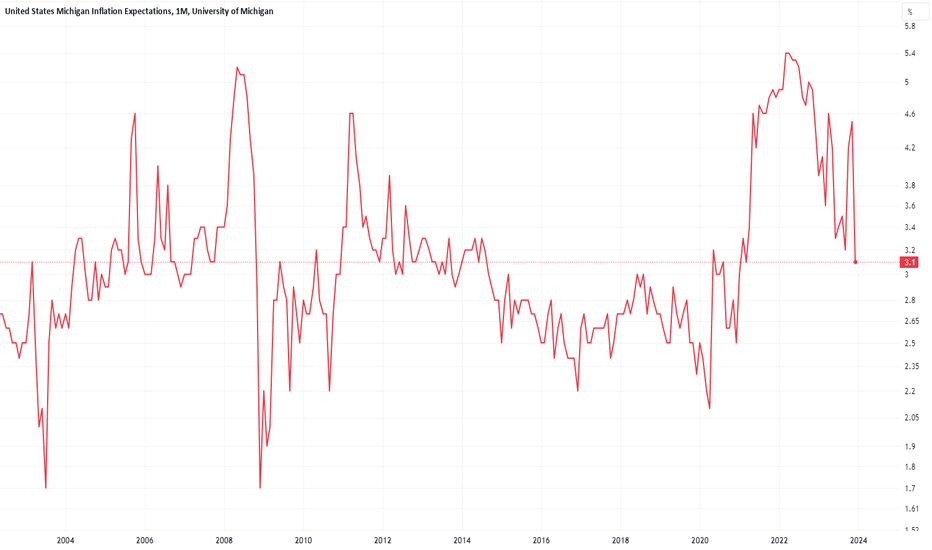
Long 
Long