$GBUR - U.K Unemployment RateECONOMICS:GBUR
March2026
source: Office for National Statistics
- The UK unemployment rate rose to 5.0% in the three months to March 2026, above expectations and February’s 4.9%.
The reading marked the first set of figures for the opening month of the US–Iran war, which added pressure to business costs and hiring conditions.
Despite the higher rate, the number of unemployed people fell by 77,000 to 1.806 million, mainly driven by declines among those unemployed for up to six months and those out of work for between six and 12 months.
Compared with the same period last year, however, unemployment increased by 192,000, with all unemployment durations rising.
Meanwhile, total employment increased by 148,000 to 34.392 million, topping expectations of a 107,000 rise, and was up 416,000 on the year, supported by gains in both full-time and part-time work among employees and the self-employed.
The number of people holding second jobs declined in the latest quarter to 1.275 million, accounting for 3.7% of all employed individuals.
 Long
Long
Is the UK housing bubble about to burst? Two years of pain aheadSince the late 1980s the UK House Price Index (3M YoY) continues to trade within a longterm descending channel of lower highs and lower lows. Growth is shown above the horizontal black line, decline below. Every cyclical bounce has failed beneath the upper band of this trend with 1992 & 2008 marking the two major cycle lows.
Each rally since has produced progressively lower peaks (2002, 2022). The recent move in 2024–25 is labelled as a Lower High (Black arrows) within this trend. The last time this happened was back in April 2007, just before the market experienced a significant collapse to -20% YoY returns. The UK property market may be about to re-enter that period.
However, there’s more to this picture than first appears. To call it nefarious would be kind. During my research of this idea it is difficult not to feel angered at the situation, speaking as a Gen x.
Throughout the first 18 year cycle shown above workers saw relatively healthy wage growth during the housing boom that followed the 1990s until 2007.
1992-2008: You could refer to this as the “Normal” period, not long after my first degree, and entering the workplace we had:
1. A non Inflationary environment, consistent growth
2. Consistent 2% annual real wage growth
3. Low inflation, steady economic expansion
4. Strong productivity growth supporting wage increases
5. 32% total real wage growth over 16 years
Compare this with 2008-2025: Let’s call it “The great stagnation”:
1. Financial crisis triggers unprecedented wage decline
2. Longest period of wage stagnation in modern history
3. Productivity growth collapsed post 2008
4. Austerity, Brexit, and inflation crises compounded effects
5. Real wages still below 2008 levels in 2025!
The contrast between these two periods represents one of the most dramatic shifts in UK economic history. While workers enjoyed steady improvements in living standards from 1992 to 2008, post 2008 has seen real wages stagnate for over 15 years, a phenomenon unprecedented since modern records began.
The period since 2008 is historically noteworthy, not just because of stagnate wages, but the references in history. These levels of wage stagnation were last seen during the interwar period (1919–1939), affordability under pressure just as in the past 15 years. Before that the early industrial revolution stagnation (1790–1830s), wages flat while costs (food, housing) rose. That’s incredible, it is why many economists call this the worst period for UK pay growth in 200 years.
Replace price against hours worked per square meter of shelter obtainable to compare past and present times and you discover why most workers today shared similar struggles to the historical examples. It astonishing to be able to make those comparisons. Especially during times of peace.
But it doesn’t stop there…
Similar to the USA, many folks have seen personal levels of debt grow out of control as markets have soared. The money was still needed in the absence of wage growth so people borrowed, even if it was to purchase groceries.
Throughout 2008 to 2025 the FTSE 100 has grown 150% as workers are rewarded with 0% wage increases. Coming from a working class background, those statistics are infuriating. This isn’t a lost decade, it is a lost double decade, 20 years of no wage growth.
Why talk about wage growth in a house market forecast?
Globally, the real estate market has seen one of the most dramatic growth periods of recent history, especially as measured against medium incomes (when ignoring price). However workers are not seeing wage growth, so why are house prices so high?
If you’re not familiar with Garys Economics, I highly recommend you hope over to his channel on Youtube. Throughout his content you’ll be presented with facts on wealth chasing a limited resource. Regardless of the source of this cash, it seeks a return.
In normal times house price growth is driven by simple factors like supply and demand, wage growth, productivity.
Today none of those factors apply.
The core reason for the asset price crisis is that wealthy individuals accumulate billions of dollars and invest this money into assets deemed safe, which drives up prices. That’s the only core reason. The growth in real estate valuations is nothing to do with the conditions seen from 1990 to 2007 and everything to do with money seeking a safe return.
It is important to understand that the money that caused the market bubble can equally cause it to deflate just as fast.
British 10 year Gilt (Treasury)
If there’s one thing the rich hate, it is losing money. Underperforming assets are like a wound to a rich person, growing more painful the longer it is unattended. Right now you can receive a 4.5% yield on the 10 year Gilt. Maintenance free asset management!
Many wealthy individuals seek value protection through asset purchases such as housing, as a result, the cost of housing is artificially inflated. However if a similarly safe asset such as a treasury begin to outperform real estate...
It is a very real dynamic, wealthy investors often move capital toward the safest asset that still preserves (or grows) purchasing power. Gold is overbought, housing a bubble, the debt markets is the last game in town.
If Treasuries (or other government bonds) begin offering yields that are not only safe but meaningfully higher than real estate’s effective returns (after accounting for taxes, maintenance, illiquidity, etc.), capital can and does rotate out of property and into debt instruments. This is especially true when wealthy individuals care less about maximising upside and more about preserving value without headaches.
The technical analysis
The above monthly chart compares the UK housing market with the 10 year Gilt. Notable observations:
1. The 10 year Gilt breakout from a 42 year downtrend
2. The house price index now prints bearish divergence
3. A failed support channel in price action and RSI.
Conclusion
You may have once heard “Above all else, the Bond market dictates all”, when treasuries pay more, real estate pays less. Housing isn’t inflated by bricks and mortar, but by capital seeking safety. As such the rich will chase the safest yield, not the prettiest house. If bonds beat homes, money will move faster than you can blink. Especially with the prospect of double digit corrections as treasures return positive yields. The rich will lead this market correction selling to cash buyers long before Mr and Mrs Joe Bloggs read about it. In the end wealth preserves itself by rotation, not loyalty. Bitcoin maximalists whimper at the thought of billions of dollars of Bitcoin sold off over the last several weeks as price action flirts with all time highs. That is wealth rotation, not loyalty in action. The same will happen soon enough with housing, just takes more time.
Ww
These views are personal and should not be interpreted as reflecting the position of my company or known associates. Warsh vs Powell: who will dominate the Fed?Jerome Powell steps down as Chairman of the Federal Reserve of the United States on Friday, May 15, and Kevin Warsh becomes the new Chair of the Fed. However, Jerome Powell is expected to remain a member of the FOMC for some time, as a governor. Powell will therefore retain a vote in upcoming monetary policy decisions and will maintain weight and influence over other members of the FOMC.
So in the context of a cohabitation between Jerome Powell (now simply a governor) and Kevin Warsh (new Chair of the Fed, pro-Trump and pro-market), who will actually dominate the Fed’s monetary policy decisions?
The answer is not as simple as a head-on duel. Power within the FOMC is structurally collegial: 12 voting members, a simple majority, and above all a decision-making process based on building consensus beforehand. Certainly, the Chair, here Kevin Warsh, will control the agenda, the timing, and the communication, which gives him a decisive advantage. But he cannot impose a decision alone if a majority does not form behind him.
In this context, Jerome Powell remains a key player. Even without the chairmanship, he retains very strong institutional credibility, a solid internal network, and significant intellectual influence over several governors. He can therefore structure a “pragmatic” bloc capable of counterbalancing an overly dovish or overly political pro-Trump orientation.
But the true pivot of the system is neither Warsh nor Powell. It is John Williams, President of the Federal Reserve Bank of New York. His role is unique: he is a permanent voter, oversees the execution of market operations, and historically sits at the center of consensus. In practice, no major decision is sustainably made without his alignment.
Thus, the real balance of power will depend on Warsh’s ability to rally Williams. If Williams aligns with Powell, a moderate majority bloc may emerge, limiting the influence of the new Chair. Conversely, if Williams shifts toward Warsh, the balance of the committee may quickly tilt in favor of a more aggressive or pro-market stance.
Ultimately, Warsh will dominate the form (agenda, communication), but Powell and Williams will shape the substance. The Fed will not be led by a single individual, but by a subtle balance, with Williams acting as the true arbiter. However, if Jerome Powell eventually leaves the FOMC, then Kevin Warsh would truly take control, implying a strong influence of President Donald Trump on US monetary policy.
DISCLAIMER:
This content is intended for individuals who are familiar with financial markets and instruments and is for information purposes only. The presented idea (including market commentary, market data and observations) is not a work product of any research department of Swissquote or its affiliates. This material is intended to highlight market action and does not constitute investment, legal or tax advice. If you are a retail investor or lack experience in trading complex financial products, it is advisable to seek professional advice from licensed advisor before making any financial decisions.
This content is not intended to manipulate the market or encourage any specific financial behavior.
Swissquote makes no representation or warranty as to the quality, completeness, accuracy, comprehensiveness or non-infringement of such content. The views expressed are those of the consultant and are provided for educational purposes only. Any information provided relating to a product or market should not be construed as recommending an investment strategy or transaction. Past performance is not a guarantee of future results.
Swissquote and its employees and representatives shall in no event be held liable for any damages or losses arising directly or indirectly from decisions made on the basis of this content.
The use of any third-party brands or trademarks is for information only and does not imply endorsement by Swissquote, or that the trademark owner has authorised Swissquote to promote its products or services.
Swissquote is the marketing brand for the activities of Swissquote Bank Ltd (Switzerland) regulated by FINMA, Swissquote Capital Markets Limited regulated by CySEC (Cyprus), Swissquote Bank Europe SA (Luxembourg) regulated by the CSSF, Swissquote Ltd (UK) regulated by the FCA, Swissquote Financial Services (Malta) Ltd regulated by the Malta Financial Services Authority, Swissquote MEA Ltd. (UAE) regulated by the Dubai Financial Services Authority, Swissquote Pte Ltd (Singapore) regulated by the Monetary Authority of Singapore, Swissquote Asia Limited (Hong Kong) licensed by the Hong Kong Securities and Futures Commission (SFC) and Swissquote South Africa (Pty) Ltd supervised by the FSCA.
Products and services of Swissquote are only intended for those permitted to receive them under local law.
All investments carry a degree of risk. The risk of loss in trading or holding financial instruments can be substantial. The value of financial instruments, including but not limited to stocks, bonds, cryptocurrencies, and other assets, can fluctuate both upwards and downwards. There is a significant risk of financial loss when buying, selling, holding, staking, or investing in these instruments. SQBE makes no recommendations regarding any specific investment, transaction, or the use of any particular investment strategy.
CFDs are complex instruments and come with a high risk of losing money rapidly due to leverage. The vast majority of retail client accounts suffer capital losses when trading in CFDs. You should consider whether you understand how CFDs work and whether you can afford to take the high risk of losing your money.
Digital Assets are unregulated in most countries and consumer protection rules may not apply. As highly volatile speculative investments, Digital Assets are not suitable for investors without a high-risk tolerance. Make sure you understand each Digital Asset before you trade.
Cryptocurrencies are not considered legal tender in some jurisdictions and are subject to regulatory uncertainties.
The use of Internet-based systems can involve high risks, including, but not limited to, fraud, cyber-attacks, network and communication failures, as well as identity theft and phishing attacks related to crypto-assets.
Education 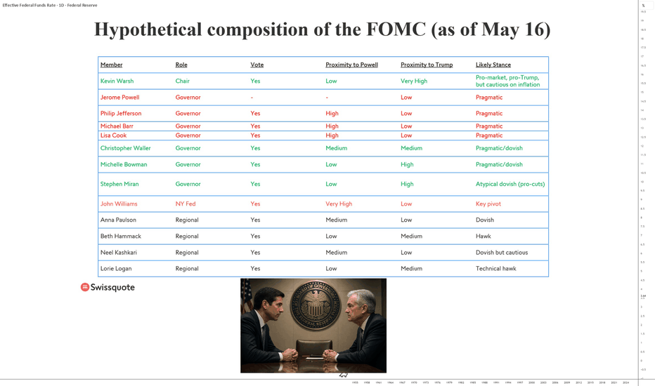
USA military conflicts vs InflationWar costs money.
It seems the US Government remains flash with the cash despite a near $39 trillion dollars of debt. Where does the money come from to fund the conflict?
International lenders? Unlikely. Many international lenders are unwinding US treasury positions.
The US Tax payer? Not really a popular option with mid-term elections coming up.
Where will the money come from? Wars are expensive, before, during and after. Right now the US Government would pick a fight with its own reflection. So where does the money come from?
Stealth tax.
One of the largest wealth transfers in history is on the verge of getting underway. That is the transfer of purchasing power from one set of hands to the next. Are you going to be a provider of cash or a beneficiary? Decide now.
While retail traders and investors exit the equity market waiting for “the crash” that’ll never come, others increase exposure to precious metals after a 400% rally in price in less than 10 years.
“The dollar is about to crash”
Easily the most misunderstood narrative circulating the internet at the moment.
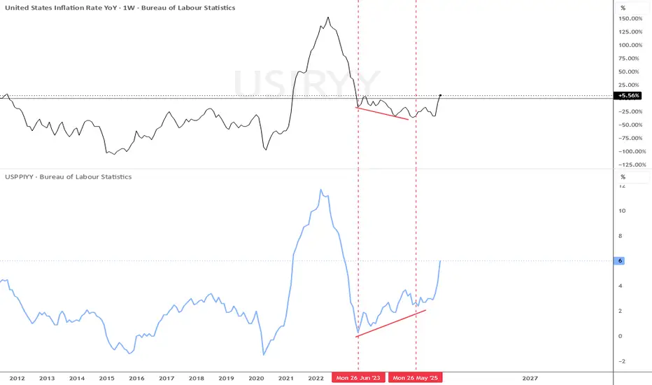
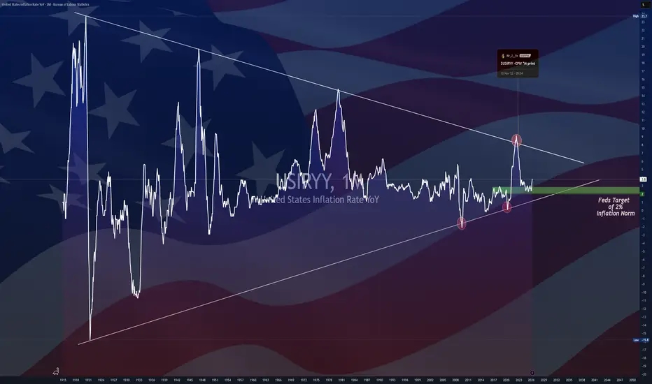
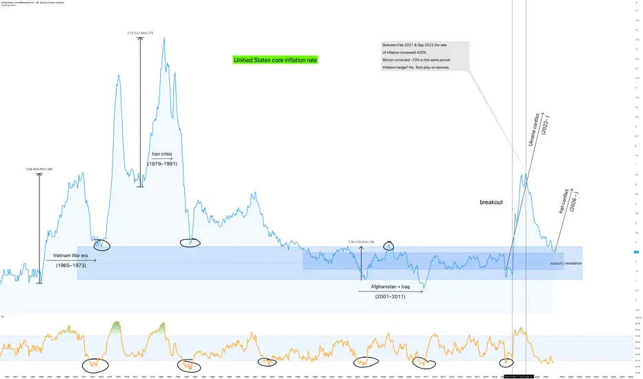
On the above monthly the chart core US inflation rate is shown. You’ll notice how inflation soared each time the US increased its involvement in overseas conflict.
What I want you see on the above chart is how inflation soared during periods of intense US conflict. This was the result of dollar devaluation. That’s how the conflicts were funded. The devaluation period to come is mostly likely begun as the FED purchases debt.
Devaluation means inflation, lots of it. Most people don’t see it coming until it’s too late. Most will not realise realise they’re paying for the conflict by working more hours for less pay than they did the day before.
** Military conflict correlates with inflation mainly when it’s financed by monetising debt or occurs alongside independent supply shock, not simply by virtue of happening. **
How do YOU benefit?
Be invested.
Gold / Silver is not an investment, it’s an insurance. Be invested in businesses that are generating a profit generating revenue. Be invested in companies that are undervalued oversold yet turning a profit. Hint, Open AI isn’t one of them.
Inflation to sky rocket
I know, an unpopular statement. It causes followers to hit the “un-follow” button and exit the chat quicker than a whippet with a bum full of dynamite. That’s fine, but it does not make the facts of the chart less relevant.
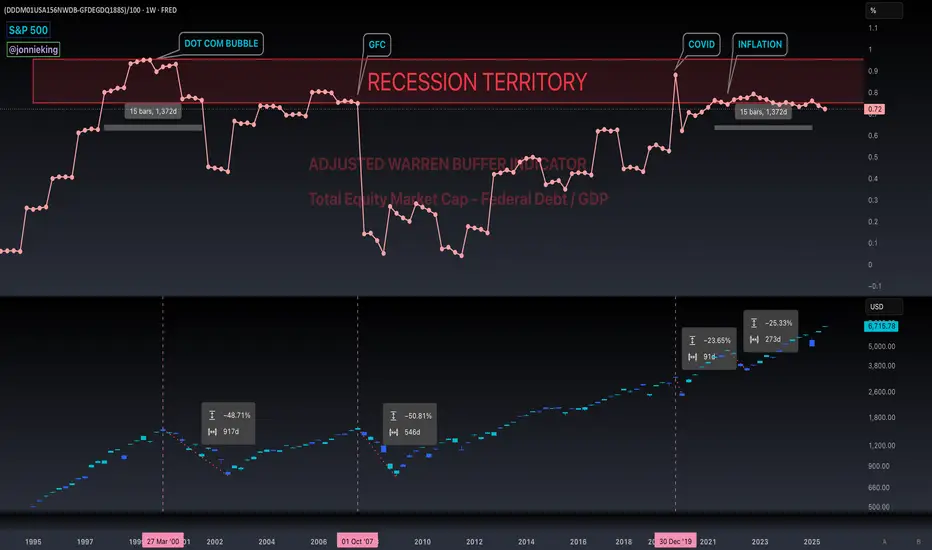
Overlayed on the main chart below is the S&P 500 (black) and Dow Jones industrial average index (Green). Did those markets crash or rally during the conflict?
No. They rallied. Not just a little bit, but a lot.
Do you remember this post?
“ S&P 500 to 10,000 inside the next 4 years - December 2025 ”
Read it carefully.
This is not an endorsement of the US Stock market or expected strengthening of the US economy to come. A 10k S&P 500 in a handful of years is no different to a 7k S&P 500 today if the dollar drops in value by about 30% (roughly 40–43% cumulative inflation).
Wait what 30-40% cumulative inflation?!
Yeah you read the right, hence the part from me to you, be invested. Don’t be a typical retail trader hoarding cash or shiny precious metals waiting for armageddon. This is the wealth transfer, from cash holders to asset holders.
Ww
=============================================================
Disclaimer
As always, these are personal views and shared for educational purposes only. They do not constitute financial advice. Please do your own research and manage risk accordingly. $CNBOT - Balance of Trade (April/2026)ECONOMICS:CNBOT $84.82 Billion
April/2026
source: General Administration of Customs
- China’s trade surplus narrowed to $84.82 billion in April 2026 from $95.85 billion in the same period of 2025, but surpassed market expectations of $83.3 billion.
Export growth accelerated sharply to 14.1%, reaching a record high of $359.44 billion, up from March’s 2.5% rise and much faster than forecasts of 7.9%, due to seasonal factors, as companies rushed to stockpile components from the manufacturing powerhouse amid fears that the Iran war could push input costs even higher.
Meanwhile, imports surged 25.3% year-on-year to $274.62 billion, above expectations of 15.2% and marking the second consecutive month of record-high imports, though slightly lower than the 27.8% jump in the previous month.
The trade surplus with the US stood at $23.07 billion in April.
For the first four months of 2026, China’s trade surplus reached $347.70 billion, down from $368.8 billion in the same period of 2025, with exports rising 14.5% while imports grew at a faster 23.6%. $USUR -U.S Unemployment Rate (April/2026)ECONOMICS:USUR 4.3%
April/2026
source: U.S. Bureau of Labor Statistics
- The US unemployment rate held at 4.3% in April 2026, in line with market expectations. However, the number of unemployed rose by 134,000 to 7.37 million, while total employment fell by 226,000 to 162.62 million.
The labor force shrank by 92,000 to 170.0 million, pushing the participation rate down 0.1 percentage point to 61.8%, its lowest since October 2021.
The employment rate also declined to 59.1%, the lowest in over four years, from 59.2%. Meanwhile, the broader U-6 unemployment rate, which includes discouraged and underemployed workers, increased to 8.2% from 8.0%. Short 
 Short
Short
Short 
$EUIRYY - E.U Inflation Rate (April/2026)ECONOMICS:EUIRYY
April/2026
source: EUROSTAT
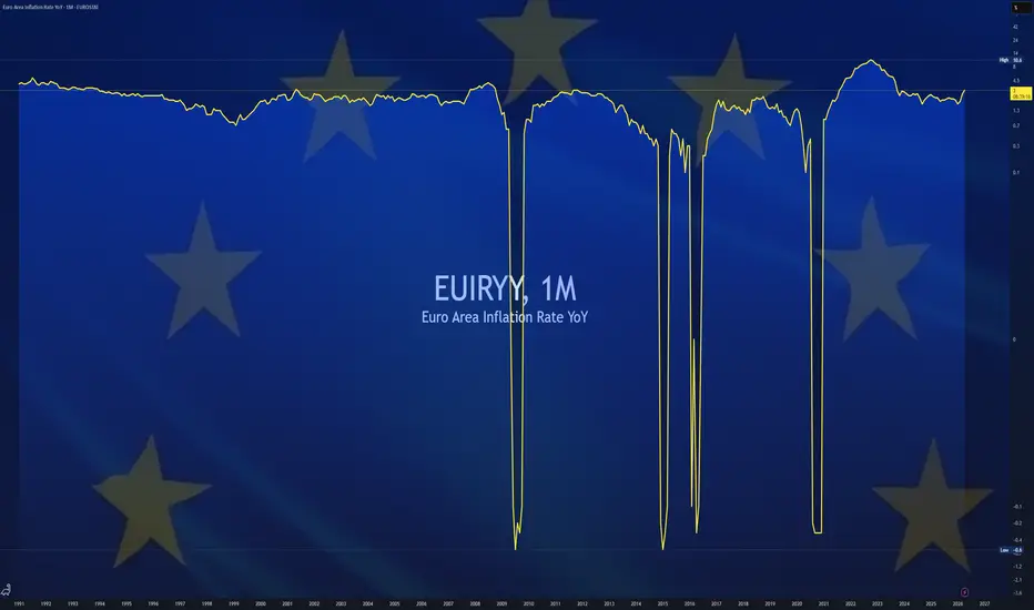
- Euro area annual inflation climbed to 3% in April 2026, the highest since September 2023, up from 2.6% in March and slightly above market expectations of 2.9%, according to a preliminary estimate.
Energy costs soared 10.9%, the most since February 2023, driven by the Middle East conflict. Also, prices rose faster for non-energy industrial goods (0.8% vs 0.5%), and food, alcohol, and tobacco (2.5% vs 2.4%).
On the other hand, services inflation slowed to 3.0%, from 3.2%. The core rate, excluding volatile energy, also cooled to 2.2% from 2.3%.
Among the Eurozone’s largest economies, inflation accelerated in Germany (2.9% vs 2.8%), France (2.5% vs 2%), Italy (2.9% vs 1.6%) and Spain (3.5% vs 2.4%).